Bastion Execution Protocol [JOAT]Bastion Execution Protocol
Introduction
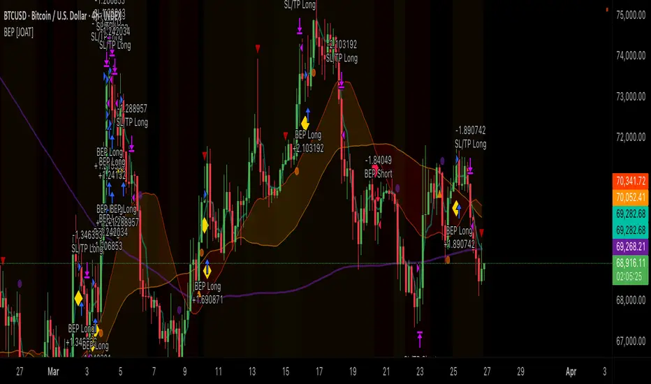
The Bastion Execution Protocol is an open-source automated trading strategy built in Pine Script v6. It combines regime detection, market structure analysis, dual momentum confirmation (RSI + Stochastic Momentum Index), order flow validation (CVD), candle pattern recognition, session filtering, and dynamic risk management into a single institutional-grade execution framework. The strategy is designed to take high-confluence directional trades only when multiple independent factors align — regime, structure, momentum, volume flow, and session — while managing risk through ATR-based stop losses, configurable reward-to-risk ratios, trailing stops, regime-adaptive position sizing, daily trade limits, and end-of-day forced closes.
This is not a "set and forget" black box. It is a transparent, fully configurable framework where every entry condition, risk parameter, and filter can be adjusted. The strategy is published open-source so traders can study the logic, understand why each trade is taken, and adapt the parameters to their instruments and timeframes.
Why This Strategy Exists
Most published strategies on TradingView fall into two categories: overly simple (single indicator crossover) or overly complex (dozens of conditions that overfit to historical data). This strategy occupies the middle ground — it requires meaningful confluence from independent analytical dimensions without over-optimizing to specific historical patterns:
Multi-Factor Entry Gate: Every trade requires agreement from regime detection, market structure, momentum oscillators, and optionally CVD order flow and candle patterns. No single factor can trigger a trade alone.
Regime-Aware Execution: The strategy only trades in trending regimes by default. It avoids squeeze conditions and can be configured to require specific regime states. Position sizing automatically reduces in volatile or uncertain regimes.
Session Intelligence: Trades are filtered by session (London, New York, Kill Zones) and day of week. The strategy avoids low-quality periods and forces position closure at end of day.
Dynamic Risk Management: ATR-based stop losses adapt to current volatility. Trailing stops activate after a configurable profit threshold. Position sizing is calculated from account equity and risk percentage, then adjusted by regime conditions.
Performance Tracking: Real-time HUD displays win rate, profit factor, max drawdown, daily trade count, and current position status.
Strategy Architecture — 9 Modules
The strategy is organized into 9 sequential modules, each responsible for a specific aspect of the trading process:
Module 1: Regime Detection
The regime engine classifies the market into four states using SMA alignment and VWAP slope:
Trend Up: SMA 20 > 50 > 200 (bull alignment) AND positive VWAP slope — clear upward momentum
Trend Down: SMA 20 < 50 < 200 (bear alignment) AND negative VWAP slope — clear downward momentum
Squeeze: Bollinger Band width in the bottom 10th percentile — volatility compression
Range: No SMA alignment and flat VWAP slope — sideways conditions
The VWAP slope is normalized by ATR to make it comparable across instruments with different price scales. The regime state directly controls whether trading is allowed — by default, the strategy requires a trending regime.
Module 2: Market Structure
Swing-based structure tracking identifies the directional bias:
Pivot highs and lows are detected using configurable lookback
When price closes above the last swing high while structure was bearish or neutral, structure flips bullish
When price closes below the last swing low while structure was bullish or neutral, structure flips bearish
Structure must agree with the regime for entries — regime bullish + structure bullish = long allowed
Displacement candle detection identifies aggressive institutional order flow — candles with body >= 70% of range and body >= 1.8x the 20-bar average body. These serve as entry triggers when all other conditions are met.
Module 3: Momentum Confirmation
Dual momentum confirmation requires both RSI and SMI to agree:
RSI: Must be above the bull threshold (default 55) for longs, below the bear threshold (default 45) for shorts
Stochastic Momentum Index: Must be positive for longs, negative for shorts. The SMI measures where price sits relative to the midpoint of its recent range, double-smoothed for noise reduction.
Both must agree — RSI bullish AND SMI bullish = momentum confirmed for longs
Module 3B: CVD Order Flow Confirmation
When enabled, Cumulative Volume Delta must support the trade direction:
Buy volume is estimated from bullish candles (close > open = full volume, otherwise proportional)
Sell volume = total volume minus buy volume
CVD = cumulative sum of (buy volume - sell volume)
CVD must be above its moving average for longs, below for shorts
This ensures that actual volume flow supports the intended trade direction
Module 3C: Candle Pattern Detection
When enabled, the strategy detects institutional candle patterns as entry triggers:
Bullish Engulfing: Current bullish candle fully engulfs the prior bearish candle's body, with volume above average
Bearish Engulfing: Current bearish candle fully engulfs the prior bullish candle's body, with volume above average
Bullish Pin Bar: Lower wick > 2x body, upper wick < 0.5x body — rejection of lower prices
Bearish Pin Bar: Upper wick > 2x body, lower wick < 0.5x body — rejection of higher prices
Patterns serve as alternative entry triggers alongside displacement candles. Either a displacement candle, a pattern, or price above SMA20 + VWAP can trigger entry when all other conditions are met.
Module 4: Session Filter
The session filter controls when trading is allowed:
Four session windows: NY Kill Zone (7-10am), London Kill Zone (2-5am), NY Session (9:30am-4pm), London Session (3am-9:30am)
Each session can be individually enabled/disabled
Day of week filter allows disabling specific days (e.g., avoid Mondays or Fridays)
Configurable timezone (default: America/New_York)
End-of-day forced close at configurable time (default: 3:45pm)
Module 5: Daily Trade Counter
A daily trade counter prevents overtrading:
Resets at the start of each new day
Configurable maximum trades per day (default: 3)
Combined with squeeze avoidance and regime filtering for comprehensive trade gating
Module 6: Entry Signal Generation
Entry signals require ALL of the following to be true simultaneously:
// Long entry requires full confluence:
// 1. Regime = Trend Up
// 2. Structure trend = Bullish (swing break confirmed)
// 3. RSI > bull threshold AND SMI > 0
// 4. CVD above its MA (if enabled)
// 5. Bar is confirmed (barstate.isconfirmed)
// 6. Trade is allowed (daily limit, session, no squeeze)
// 7. Trigger: displacement candle OR pattern OR price > SMA20 + VWAP
This multi-gate approach ensures that trades are only taken when regime, structure, momentum, volume flow, session, and a specific trigger all agree. The probability of a random signal passing all gates is very low, which is by design.
Module 7: Risk Calculations
Risk is calculated dynamically for each trade:
Stop Loss: ATR * configurable multiplier (default 1.5x) below entry for longs, above for shorts
Take Profit: SL distance * reward-to-risk ratio (default 2.0x)
Position Size: (Account Equity * Risk Percentage * Regime Multiplier) / SL Distance
Regime-Adaptive Sizing: When enabled, position size is reduced to 50% during squeeze conditions and 70% during non-trending conditions. Full size is used only in trending regimes.
Module 8: Trade Execution
Entries are executed using strategy.entry() with calculated position size. The strategy tracks active trade parameters (entry price, SL, TP) for trailing stop management.
Module 9: Exit Management
Three exit mechanisms operate simultaneously:
Fixed SL/TP: strategy.exit() with the calculated stop loss and take profit levels
Trailing Stop: When enabled, activates after price moves a configurable multiple of R in profit (default 1.0R). The trail distance is ATR * configurable multiplier (default 1.0x). The trailing stop only moves in the favorable direction and replaces the fixed SL when it is tighter.
End-of-Day Close: All positions are closed at the configured time to avoid overnight risk
Performance Tracking
The strategy tracks and displays real-time performance metrics:
Win Rate: Wins / (Wins + Losses) as a percentage
Profit Factor: Gross Profit / Gross Loss — values above 1.5 indicate a healthy edge
Max Drawdown: Peak-to-trough equity decline as a percentage
Net P&L: Total net profit/loss
Daily Trade Count: Current day's trades vs maximum allowed
Strategy Settings and Backtesting Notes
The strategy is configured with realistic default parameters:
Initial Capital: $100,000
Default Position Size: 2% of equity
Risk Per Trade: 1.5% (configurable)
Commission: Not included by default — users should add commission appropriate to their broker in the strategy settings
Slippage: Not included by default — users should add slippage appropriate to their instrument
calc_on_every_tick: false — the strategy only evaluates on confirmed bar closes to prevent repainting
calc_on_order_fills: true — allows trailing stop updates on fill events
Important: Before evaluating backtest results, users should:
Add realistic commission for their broker (e.g., $5 per trade for stocks, 0.1% for crypto)
Add realistic slippage (e.g., 1-2 ticks for liquid instruments)
Verify that the backtest period includes different market conditions (trending, ranging, volatile)
Check that the number of trades is sufficient for statistical significance (100+ trades recommended)
Understand that past performance does not guarantee future results
Input Parameters
Risk Management:
Risk Per Trade %: Percentage of equity risked per trade (default: 1.5%)
Reward:Risk Ratio: TP distance as multiple of SL distance (default: 2.0)
SL ATR Multiplier: Stop loss distance as ATR multiple (default: 1.5)
ATR Length: Period for ATR calculation (default: 14)
Use Trailing Stop: Enable/disable trailing (default: true)
Trail After X R Profit: Profit threshold to activate trail (default: 1.0R)
Trail ATR Multiplier: Trail distance as ATR multiple (default: 1.0)
Max Trades Per Day: Daily trade limit (default: 3)
Regime-Adaptive Sizing: Reduce size in non-trending conditions (default: true)
Regime Filter:
VWAP Slope Lookback: Period for slope calculation (default: 20)
Slope Threshold: Normalized threshold for trend detection (default: 0.12)
Bollinger Length/Multiplier: BB parameters for squeeze detection (default: 20/2.0)
Avoid Squeeze Entries: Skip entries during squeeze (default: true)
Require Trend Regime: Only trade in trending conditions (default: true)
Structure:
Swing Lookback: Pivot detection length (default: 5)
Displacement Min Body Ratio: Minimum body/range for displacement (default: 0.7)
Displacement Body Multiplier: Minimum body vs average for displacement (default: 1.8)
Momentum:
RSI Length/Thresholds: RSI parameters (default: 14, bull 55, bear 45)
SMI Lookback/Smoothing: SMI parameters (default: 13/25/2)
Session Filter:
Enable Session Filter: Toggle session-based trade gating
Individual session toggles: NY KZ, London KZ, NY, London
Day of week toggles: Monday through Friday
Force Close End of Day: Toggle EOD position closure
Close Hour/Minute: EOD close time (default: 15:45)
Order Flow:
CVD Confirmation: Require delta direction to match entry (default: true)
CVD Lookback: Period for CVD moving average (default: 10)
Candle Patterns:
Use Pattern Confirmation: Enable pattern detection as entry trigger (default: true)
Pattern Volume Multiplier: Minimum volume for pattern confirmation (default: 1.3x)
How to Use This Strategy
Step 1: Configure for Your Instrument
Adjust the ATR multiplier and displacement thresholds for your instrument's volatility. Add realistic commission and slippage in TradingView's strategy settings.
Step 2: Set Your Risk Parameters
Choose a risk percentage that matches your risk tolerance. The default 1.5% with 2:1 R:R is conservative. Adjust the trailing stop parameters based on your preference for locking in profits vs giving trades room.
Step 3: Configure Sessions
Enable the sessions relevant to your instrument. For US equities, NY KZ and NY Session are most relevant. For forex, both London and NY Kill Zones are important. Disable days you prefer not to trade.
Step 4: Run the Backtest
Apply the strategy to your chart and review the backtest results. Check win rate, profit factor, max drawdown, and number of trades. Ensure results are realistic and not the product of overfitting.
Step 5: Forward Test
Before trading live, run the strategy in paper trading mode for at least 2-4 weeks to verify that live performance matches backtest expectations.
Best Practices
Always add commission and slippage before evaluating backtest results
The strategy works best on liquid instruments with reliable volume data
Higher timeframes (15m+) produce fewer but higher-quality trades
The multi-gate entry system means trades are infrequent by design — this is a feature, not a bug
Regime-adaptive sizing is recommended — it automatically reduces exposure in uncertain conditions
The daily trade limit prevents revenge trading and overexposure
End-of-day forced close eliminates overnight gap risk for intraday strategies
Monitor the HUD during live trading for real-time regime, momentum, and session context
If win rate drops below 40% or profit factor drops below 1.0, re-evaluate parameters for current market conditions
Limitations
The strategy uses lagging indicators (SMAs, RSI, SMI) for entry conditions. Entries occur after the trend has started, not at the exact turn.
Regime detection can lag regime changes. The strategy may miss the first portion of a new trend or take a trade just as a trend is ending.
CVD is estimated from candle direction, not true order flow data. This is an approximation.
Backtest results are hypothetical and do not account for real-world execution issues (partial fills, requotes, connectivity).
The strategy is designed for intraday/swing trading. It is not optimized for scalping or long-term position trading.
Session filtering is based on EST timezone. Instruments traded primarily in other timezones may need different session definitions.
The multi-gate entry system can be too restrictive in some market conditions, producing very few trades. This is intentional — the strategy prioritizes quality over quantity.
Past performance in backtesting does not guarantee future results. Market conditions change, and strategies that worked historically may not work in the future.
Technical Implementation
Built with Pine Script v6 using:
calc_on_every_tick=false for non-repainting execution
barstate.isconfirmed gating on all signal generation
9-module architecture with clear separation of concerns
ATR-based dynamic stop loss and take profit calculation
Trailing stop with configurable activation threshold and trail distance
Regime-adaptive position sizing with squeeze and non-trending penalties
Session detection with timezone support and day-of-week filtering
Daily trade counter with automatic reset
End-of-day forced close mechanism
Real-time performance tracking (win rate, profit factor, max drawdown)
Dual momentum confirmation (RSI + SMI)
CVD order flow validation
Candle pattern detection (engulfing, pin bar) with volume confirmation
6 alert conditions covering entries, regime changes, EOD close, patterns, and drawdown
Originality Statement
This strategy is original in its multi-dimensional confluence framework. While individual components (RSI, SMI, SMA alignment, session filtering) are established concepts, this strategy is justified because:
The 9-module architecture creates a clear, auditable decision pipeline where each module's contribution to the final trade decision is transparent
The multi-gate entry system (regime + structure + dual momentum + CVD + session + trigger) requires an unusually high level of confluence, reducing false signals
Regime-adaptive position sizing automatically adjusts exposure based on market conditions, a feature rarely seen in published strategies
The combination of trailing stops with regime-aware sizing creates a dynamic risk framework that adapts to changing conditions
Session filtering with Kill Zone preference and day-of-week controls provides institutional-grade time management
CVD order flow confirmation adds a volume-based validation layer that pure price-based strategies lack
The real-time HUD with performance tracking provides transparency into strategy behavior that most published strategies do not offer
The Volcanic theme provides a cohesive visual identity where every color choice carries meaning (lava = entry, amber = warning, teal = VWAP, crimson = bearish)
Disclaimer
This strategy is provided for educational and informational purposes only. It is not financial advice or a recommendation to buy or sell any financial instrument. Backtested results are hypothetical and do not represent actual trading. Past performance does not guarantee future results. The strategy involves risk of loss, including the potential loss of the entire investment. Commission, slippage, and other real-world execution costs are not included in the default configuration and must be added by the user for realistic evaluation. The author makes no claims about the profitability of this strategy and is not responsible for any losses incurred from its use. Always use proper risk management, trade with capital you can afford to lose, and consider consulting a qualified financial advisor before trading.
-Made with passion by officialjackofalltrades
ストラテジー

ON sqrtRange -> RTH Open LevelsOvernight sqrtRange → RTH Open Levels
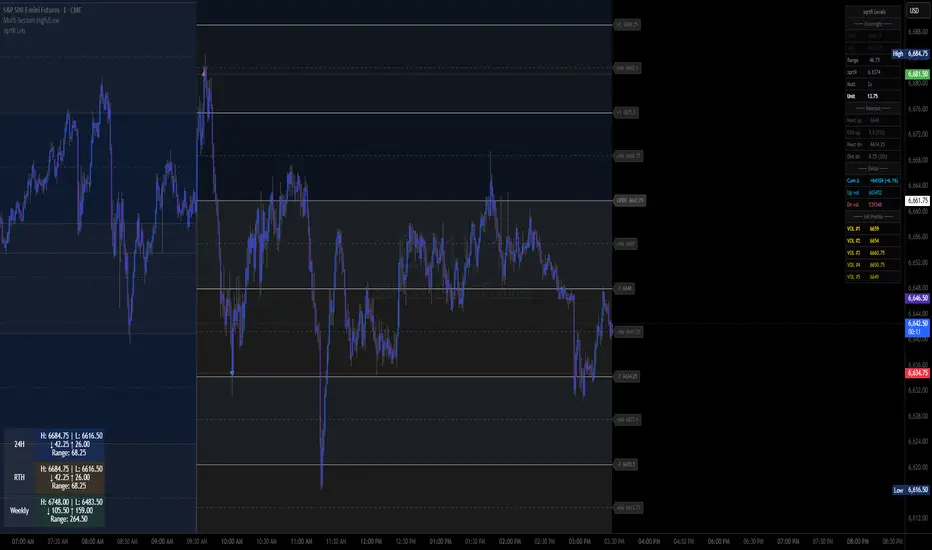
This indicator captures the overnight session range (6 PM – 9:30 AM ET), takes the square root of that range, multiplies it by a user-defined factor, and snaps the result to the nearest tick to produce a dynamic unit (U). Starting from the RTH open at 9:30 AM, it plots up to 8 levels above and below, creating a structured price map for the entire trading day.
Features:
-Auto-calculated unit size from overnight range math
-Up to 8 levels each side with color-coded band fills and midpoints
-ONH / ONL lines with breach markers
-Day type classifier at open (Trend Up / Trend Down / Two-sided)
-Gap detection above ONH or below ONL at the open
-Live info table showing range, sqrtR, unit size, nearest levels, and tick distances
-Alert conditions for every level cross, ONH/ONL breach, and gap opens
-All levels drawn with line objects — zero plot budget wasted
Best used on: ES, NQ futures, but not limited to, individual names may need to tweak the settings for individual names to avoid big or small ranges, which is what the multiplier setting is for(I typically only work with 1,2,4,8 on the multiplier)
For ES, 2x multiplier is ideal and 4x on NQ and dow
individual names vary but typically 1x-2x on the multiplier インジケーター

Trend Resonance Oscillator [JOAT]Trend Resonance Oscillator
Introduction
The Trend Resonance Oscillator is an open-source non-overlay indicator that measures multi-timeframe trend alignment and produces a composite resonance score. It fetches trend data from up to five configurable timeframes, calculates whether they agree on direction, and outputs an oscillator that reflects the degree of alignment. When most or all timeframes point the same way, the oscillator reaches extreme values and the indicator declares a state of "resonance" — a condition where directional conviction is high across the time spectrum. It also includes quantum-inspired coherence scoring, harmonic pattern detection, and momentum alignment visualization.
Built with Pine Script v6, the indicator uses custom types for trend state, resonance state, timeframe data, quantum state, and harmonic patterns.
Why This Indicator Exists
A trade taken in the direction of the 5-minute trend may fail if the 1-hour and daily trends disagree. Multi-timeframe alignment is one of the most reliable filters for trade quality, but checking multiple timeframes manually is tedious and subjective. This indicator automates that process by:
Simultaneous MTF analysis: Fetches close, EMA, and rate-of-change data from five configurable timeframes in a single indicator
Alignment scoring: Quantifies how many timeframes agree on direction and how strong each trend is, producing a single composite score
Resonance detection: Identifies periods when alignment exceeds a configurable threshold, signaling high-conviction directional conditions
Confluence signals: Generates labeled signals when a minimum number of timeframes align, providing clear entry confirmation
Coherence and entanglement metrics: Measures the consistency and correlation between timeframe trends, adding depth beyond simple directional agreement
Core Components Explained
1. Multi-Timeframe Trend Detection
For each of the five timeframes (default: 5m, 15m, 1H, 4H, Daily), the indicator fetches close price, EMA, and rate-of-change using `request.security()` with proper lookahead settings to avoid repainting:
float _tf1Close = request.security(syminfo.tickerid, tf1, close, barmerge.gaps_off, barmerge.lookahead_off)
float _tf1EMA = request.security(syminfo.tickerid, tf1, _globalEMA, barmerge.gaps_off, barmerge.lookahead_off)
Each timeframe's trend is classified as bullish, bearish, or flat based on the percentage difference between close and EMA relative to a configurable threshold (default 0.5%). The trend strength is calculated as the magnitude of that percentage difference, capped at 100.
2. Alignment Score Calculation
The alignment score counts how many timeframes are bullish versus bearish, then produces a normalized score from -100 (all bearish) to +100 (all bullish):
+100: All active timeframes are bullish — maximum bullish alignment
+60: Majority bullish with some neutral — strong bullish bias
0: Equal bullish and bearish — no directional consensus
-60: Majority bearish — strong bearish bias
-100: All bearish — maximum bearish alignment
The alignment score is weighted by the average trend strength across all active timeframes, so a +80 alignment with strong individual trends produces a higher oscillator value than +80 alignment with weak trends.
3. Resonance Detection
Resonance occurs when the ratio of aligned timeframes to total active timeframes exceeds the resonance threshold (default 0.7) and the aligned count meets the minimum confluence requirement (default 4 timeframes). During resonance, the background is tinted to indicate the directional bias, and a duration counter tracks how long the resonance state has persisted.
Sustained resonance (high duration) suggests a strong, established trend. New resonance (low duration) may signal the beginning of a directional move. The dashboard displays the resonance score, aligned count, and duration for quick assessment.
The Trend Resonance Oscillator panel showing the main oscillator line with gradient coloring, MTF trend bars at the bottom showing individual timeframe directions, resonance background shading during a strong bullish alignment, and confluence/resonance signal labels
4. Quantum Coherence and Entanglement
The indicator calculates two additional metrics inspired by quantum physics concepts (used as analytical metaphors, not literal physics):
Coherence: The ratio of aligned timeframes to total timeframes. A coherence of 1.0 means perfect agreement. When coherence exceeds the threshold (default 0.8), the indicator enters a "coherent" state, which is visualized as a subtle wave pattern on the oscillator.
Entanglement: Measures the pairwise correlation between all timeframe trends. For each pair of timeframes, if they agree on direction, the entanglement score increases; if they disagree, it decreases. High entanglement means timeframes are moving in lockstep.
for i = 0 to 3
for j = i + 1 to 4
if trend_i != 0 and trend_j != 0
correlation = trend_i == trend_j ? 1.0 : -1.0
entanglement += correlation
pairs += 1
When the quantum superposition score (combination of coherence and entanglement) exceeds a threshold, a "quantum collapse" signal fires, indicating that all timeframes have converged to a single directional state.
5. Harmonic Pattern Detection
The harmonic module detects cyclical patterns in the resonance data. When resonance is sustained for more than 10 bars, the pattern is classified as a sine wave (smooth, established trend). When resonance is new or intermittent, it is classified as a square wave (choppy, emerging trend). The harmonic wave is plotted as a subtle overlay on the oscillator.
6. Confluence and Signal System
The indicator generates three tiers of signals, with higher tiers taking priority:
CONF (Confluence): Minimum timeframes aligned with alignment score >= 70
RES (Resonance): Strong resonance with score >= 80
QTM (Quantum): Quantum collapse — all metrics converge to a single state
Each signal fires only on its first bar (not continuously), preventing chart clutter. Signals are color-coded with gradient intensity based on the underlying strength.
Visual Elements
Main Oscillator: Smoothed alignment score plotted as a line with gradient coloring from bearish to bullish
Reference Levels: Lines at 0 (neutral), +/-50 (moderate), +/-80 (strong)
MTF Trend Bars: Five colored column bars at the bottom of the panel, each representing one timeframe's trend direction and strength
Resonance Background: Tinted background during resonance states
Quantum Superposition Line: Step-line showing the quantum composite score
Coherence Wave: Subtle area plot showing coherence oscillation
Harmonic Pattern: Sine/square wave overlay during active resonance
Momentum Alignment: Area histogram showing aggregate momentum across timeframes
Convergence/Divergence: Histogram showing agreement between momentum and oscillator
Signal Labels: CONF, RES, and QTM labels at signal points
Entanglement Lines: Visual connections when timeframe entanglement is high
Dashboard: Comprehensive table showing each timeframe's trend, strength, and the aggregate resonance metrics
Input Parameters
Multi-Timeframe Settings:
Toggle and configure each of 5 timeframes (default: 5m, 15m, 1H, 4H, Daily)
Trend Detection:
Trend EMA Length (default 20), Momentum Length (default 14), Trend Threshold (default 0.5%)
Resonance Settings:
Resonance Lookback (default 20), Resonance Threshold (default 0.7)
Show Resonance Zones toggle
Alignment Scoring:
Min TFs for Confluence (default 4)
Show Alignment Score and Confluence Signals
Advanced Resonance:
Quantum Resonance, Coherence Waves, Entanglement Lines, Harmonic Patterns toggles
Coherence Threshold (default 0.8), Harmonic Period (default 8)
Visual Settings:
Show Oscillator, MTF Bars, Dashboard, Glow Effects, Waveform
Color Scheme: Quantum, Classic, Professional, Neon
How to Use This Indicator
Step 1: Check the MTF trend bars at the bottom of the panel. If all five bars are the same color (all bullish or all bearish), you have strong multi-timeframe alignment.
Step 2: Read the oscillator value. Values above +50 indicate moderate bullish alignment; above +80 indicates strong alignment. The inverse applies for bearish readings.
Step 3: Watch for resonance background shading. When the background turns bullish or bearish, the indicator has detected sustained multi-timeframe agreement — this is the highest-conviction environment for directional trades.
Step 4: Use CONF, RES, and QTM signals as entry confirmations. A CONF signal in the direction of the oscillator provides moderate confirmation. A RES or QTM signal provides strong confirmation.
Step 5: Monitor the momentum alignment area. When momentum and the oscillator agree, the move has both directional alignment and momentum behind it. When they diverge, the move may be losing steam.
Dashboard showing all five timeframes with their individual trend states, the aggregate resonance score, coherence level, entanglement reading, and harmonic pattern status
Indicator Limitations
Multi-timeframe data requires sufficient history on all selected timeframes. On newly listed instruments, higher timeframe data may be limited.
The indicator uses `request.security()` with `barmerge.lookahead_off` to prevent repainting, but the inherent delay of higher timeframe data means signals reflect confirmed (not real-time) higher timeframe states.
Alignment does not guarantee profitable trades. All timeframes can align in one direction and then reverse simultaneously.
The quantum and harmonic features are analytical metaphors that provide useful metrics, not literal physics simulations.
On very low timeframes (1m or less), higher timeframe data updates infrequently, which can make the oscillator appear static for extended periods.
The indicator makes multiple `request.security()` calls, which counts against TradingView's security call limit.
Originality Statement
This indicator is original in its comprehensive multi-timeframe resonance framework. While MTF trend indicators exist, this indicator is justified because:
It produces a quantified resonance score that measures not just direction but the degree and duration of multi-timeframe agreement
The coherence and entanglement metrics add pairwise correlation analysis between timeframes, going beyond simple directional counting
The three-tier signal system (CONF/RES/QTM) provides graduated confidence levels based on the strength of alignment
Harmonic pattern detection on the resonance data identifies whether alignment is sustained (sine) or emerging (square)
The momentum alignment overlay shows whether aggregate momentum across timeframes supports the directional reading
The weighted oscillator combines alignment direction with individual trend strength for a more nuanced composite score
Disclaimer
This indicator is provided for educational and informational purposes only. It is not financial advice or a recommendation to buy or sell any financial instrument. Trading involves substantial risk of loss. Multi-timeframe alignment is a powerful filter but does not guarantee profitable trades. Always use proper risk management. The author is not responsible for any losses incurred from using this indicator.
-Made with passion by officialjackofalltrades
インジケーター

Volume Dispersion Field [JOAT]Volume Dispersion Field
Introduction
The Volume Dispersion Field is an open-source non-overlay indicator that provides a comprehensive volume analysis suite combining relative volume classification, buy/sell delta tracking, volume dispersion measurement, climax detection, volume profile calculation, smart money activity analysis, and anomaly detection. Rather than showing a simple volume histogram, this indicator dissects volume into multiple analytical layers that reveal who is participating, how aggressively, and whether the activity is normal or anomalous.
Built with Pine Script v6, the indicator uses custom types for volume state, delta state, dispersion bins, profile data, smart money state, and volume pulse tracking.
Why This Indicator Exists
Standard volume indicators show a single bar per candle. This tells you how much volume occurred but not who was buying or selling, whether the volume is unusual, or how volume is distributed across the price range. This indicator addresses those gaps by providing:
Seven-tier volume classification: Categorizes each bar from Extreme Low to Extreme High relative to the moving average, giving immediate context about whether current activity is normal or exceptional
Delta analysis: Estimates buying and selling volume using candle structure, then calculates smoothed delta and cumulative delta to show the net direction of volume pressure
Volume dispersion: Measures how volume is distributed between the upper and lower halves of the recent price range, revealing whether volume is concentrated at highs (distribution) or lows (accumulation)
Climax detection: Identifies volume spikes that exceed a configurable threshold, often marking exhaustion points or the start of major moves
Smart money analysis: Tracks institutional-sized volume activity and classifies the market phase as Accumulation, Markup, Distribution, or Markdown
Anomaly detection: Uses Z-score analysis to flag statistically unusual volume events that may indicate institutional intervention
Core Components Explained
1. Volume Classification System
Every bar is classified into one of seven categories based on its ratio to the volume moving average:
volMA = ta.sma(volume, volMaLength)
volRatio = volume / volMA
Extreme High (>= 3.0x): Institutional-level activity, potential climax
High (>= 2.0x): Significant above-average interest
Above Average (>= 1.0x): Healthy participation
Average (>= 0.5x): Normal market conditions
Below Average (>= 0.25x): Reduced interest
Low (< 0.25x): Thin liquidity, potential for slippage
Extreme Low: Minimal activity
Each category is color-coded with a distinct color from the Quantum Volume palette, making it instantly visible which bars carry institutional weight and which are retail noise. The high and low volume multiplier thresholds are fully configurable.
2. Delta Analysis
The delta engine estimates buying and selling volume by analyzing candle structure. For a bullish candle (close > open), buying volume is estimated as the proportion of the candle range from low to close, multiplied by total volume:
if close > open
buyVol := volume * (close - low) / (high - low + 0.0001)
sellVol := volume - buyVol
else if close < open
sellVol := volume * (high - close) / (high - low + 0.0001)
buyVol := volume - sellVol
The raw delta (buyVol - sellVol) is smoothed with an EMA and also accumulated over a configurable period to produce cumulative delta. Rising cumulative delta with rising price confirms bullish conviction. Falling cumulative delta with rising price warns of hidden distribution.
The indicator also detects delta divergences — when price moves in one direction but delta moves in the opposite direction over a 10-bar window. These divergences are marked with cross symbols on the chart.
The Volume Dispersion Field panel showing color-coded volume bars, delta histogram, cumulative delta line, and smart money accumulation/distribution arrows with the dashboard displaying all metrics
3. Volume Dispersion Measurement
Dispersion quantifies how volume is distributed between the upper and lower halves of the recent price range. Over the dispersion lookback period (default 50 bars), the indicator sums volume for bars that closed in the upper half versus the lower half:
Positive dispersion (> 20): Volume is concentrated in the upper range — bullish bias, potential distribution if extended
Negative dispersion (< -20): Volume is concentrated in the lower range — bearish bias, potential accumulation if extended
Near zero: Volume is balanced across the range — no clear directional bias
Dispersion is plotted as a filled area chart, providing a visual representation of where the volume weight sits within the price range.
4. Volume Profile and POC
The indicator calculates a simplified volume profile by dividing the recent price range into configurable bins (default 10) and summing volume in each bin. From this profile, it derives:
Point of Control (POC): The price level with the highest volume — acts as a magnet for price
Value Area High (VAH): Upper boundary of the 70% volume concentration zone
Value Area Low (VAL): Lower boundary of the 70% volume concentration zone
The profile type is classified as Normal (balanced), Imbalanced (narrow value area, directional), or Ranged (wide value area, consolidation).
5. Smart Money and Anomaly Detection
The smart money engine analyzes volume distribution across the price range over a 50-bar window. If significantly more volume occurs in the lower 30% of the range while price is below its 50-period SMA, the indicator classifies the phase as Accumulation. If more volume occurs in the upper 30% while price is above the SMA, it classifies as Distribution.
Anomaly detection uses Z-score analysis:
volState.zScore := (volume - volMA) / (volStdDev + 0.0001)
volState.isAnomaly := math.abs(volState.zScore) > anomalyThreshold
Volume events with Z-scores exceeding the threshold (default 3.0 standard deviations) are flagged as anomalies and marked with diamond symbols. These statistically rare events often indicate institutional intervention or major news-driven activity.
6. Market Phase Classification
The indicator classifies the current market phase based on the combination of price direction and volume trend:
Markup: Price rising + volume rising — healthy uptrend
Distribution: Price rising + volume falling — potential top forming
Accumulation: Price falling + volume rising — smart money buying the dip
Markdown: Price falling + volume falling — healthy downtrend
Visual Elements
Volume Histogram: Color-coded bars by classification tier
Volume MA Line: 20-period moving average of volume
High/Low Volume Bands: Reference bands at the high and low multiplier levels with fill
Delta Histogram: Smoothed buy/sell delta with gradient coloring
Cumulative Delta Line: Running sum of delta over configurable period
Dispersion Area: Filled area showing volume distribution bias
Climax Markers: Triangle markers for buy and sell climax events
Anomaly Markers: Diamond markers for statistically unusual volume
Smart Money Arrows: Accumulation (up arrow) and Distribution (down arrow) signals
Volume Pulse: Circle markers when volume exceeds the pulse threshold
Heatmap Background: Subtle background coloring based on volume intensity
Dashboard: 14-row metrics table showing volume category, anomaly status, phase, delta direction, dispersion, and more
Close-up of the dashboard showing volume classification as "HIGH", phase as "Markup", delta as "BULLISH" with "BUY SIDE" flow, and an anomaly detection reading
Input Parameters
Volume Analysis:
Volume MA Length (default 20)
High Volume Multiplier (default 2.0) and Low Volume Multiplier (default 0.5)
Delta Analysis:
Delta Smoothing (default 3)
Cumulative Delta Length (default 20)
Dispersion Settings:
Dispersion Lookback (default 50) and Dispersion Bins (default 10)
Climax Detection:
Climax Threshold (default 2.5) and Climax Lookback (default 50)
Advanced Volume:
Smart Money Concepts, Institutional Activity, Volume Anomalies toggles
Anomaly Threshold (default 3.0 std dev)
Volume Pulse toggle and Pulse Threshold (default 1.5)
Visual Settings:
Volume Profile, Dashboard, Glow Effects, Heatmap toggles
Profile Width and Color Scheme (Quantum, Classic, Professional, Neon)
How to Use This Indicator
Step 1: Monitor the volume classification. Extreme High and High bars deserve attention — they indicate institutional participation. Consecutive high-volume bars in one direction confirm conviction.
Step 2: Check the delta direction. Bullish delta with rising price confirms the move. Bearish delta with rising price (divergence) warns of potential reversal.
Step 3: Watch for climax events. A buy climax (extreme volume + bullish candle) at a resistance level may signal exhaustion. A sell climax at support may signal capitulation.
Step 4: Monitor the market phase. Accumulation phases often precede significant upward moves. Distribution phases often precede declines.
Step 5: Pay attention to anomaly markers. These statistically rare volume events often mark turning points or the start of major institutional campaigns.
Step 6: Use dispersion to understand volume positioning. Positive dispersion (volume at highs) during an uptrend is healthy. Positive dispersion during a downtrend suggests distribution.
Indicator Limitations
Delta estimation uses candle structure as a proxy for actual order flow. It is an approximation, not true Level 2 data.
Volume analysis works best on instruments with reliable, consistent volume data. Forex spot volume from brokers is tick volume, not true exchange volume.
Anomaly detection assumes volume follows a roughly normal distribution. During earnings seasons or major events, multiple "anomalies" may fire in succession.
The volume profile is a simplified calculation using close prices, not a tick-by-tick profile. It provides a useful approximation but not exchange-grade precision.
Smart money phase classification is based on volume distribution patterns, not on actual institutional order data.
Climax detection identifies extreme volume events but does not predict the direction of the subsequent move.
Originality Statement
This indicator is original in its comprehensive, multi-layer approach to volume analysis. While individual volume tools exist, this indicator is justified because:
It combines seven distinct volume analysis methodologies (classification, delta, dispersion, profile, climax, smart money, anomaly) into a unified system
Z-score-based anomaly detection provides a statistical framework for identifying unusual volume that simple threshold methods miss
Market phase classification (Accumulation/Markup/Distribution/Markdown) adds a Wyckoff-inspired context layer to raw volume data
Volume dispersion measurement quantifies the spatial distribution of volume across the price range, a metric not available in standard volume indicators
The delta divergence detection system identifies hidden disagreements between price and volume pressure
The comprehensive dashboard presents 14 metrics simultaneously for holistic volume analysis
Disclaimer
This indicator is provided for educational and informational purposes only. It is not financial advice or a recommendation to buy or sell any financial instrument. Trading involves substantial risk of loss. Volume analysis is a tool for understanding market participation, not a crystal ball for predicting future price movement. Always use proper risk management. The author is not responsible for any losses incurred from using this indicator.
-Made with passion by officialjackofalltrades
インジケーター

Fibonacci Imbalance Zones [JOAT]Fibonacci Imbalance Zones
Introduction
Fibonacci Imbalance Zones is an open-source overlay indicator that merges automatic Fibonacci retracement with Fair Value Gap (FVG) detection and order block identification to find high-probability confluence zones where institutional concepts overlap. When a Fibonacci level aligns with an unmitigated FVG or an active order block, the indicator highlights that zone as a confluence point and optionally generates entry signals. It bridges the gap between classical Fibonacci analysis and modern Smart Money Concepts.
Built with Pine Script v6, the indicator uses custom types for Fibonacci levels, FVG zones, confluence points, swing points, order blocks, and institutional levels.
Why This Indicator Exists
Fibonacci retracement and FVG analysis are both widely used, but they are almost always applied as separate tools. Traders manually eyeball whether a Fibonacci level happens to overlap with an FVG, which is subjective and error-prone. This indicator automates that process by:
Auto-Fibonacci calculation: Automatically identifies the most recent significant swing high and swing low using pivot detection, then draws Fibonacci levels between them — no manual drawing required
FVG lifecycle tracking: Detects bullish and bearish FVGs, filters them by minimum size (ATR-based), tracks mitigation, and classifies them as premium or discount relative to fair value
Confluence detection: Programmatically checks whether any active Fibonacci level falls within a configurable ATR tolerance of any unmitigated FVG or order block, and calculates a confluence strength score
Entry signal generation: When price enters an FVG zone that overlaps with a key Fibonacci level (0.500-0.786 range), the indicator generates a directional entry signal
Core Components Explained
1. Automatic Fibonacci Levels
The indicator uses pivot detection to find the most significant recent swing high and swing low. The pivot strength parameter (default 5) controls how many bars on each side must be lower/higher for a point to qualify as a swing. Once swings are identified, Fibonacci levels are calculated:
calcFibLevel(float swingH, float swingL, float ratio, int direction) =>
float level = na
if direction > 0
level := swingL + (swingH - swingL) * ratio
else
level := swingH - (swingH - swingL) * ratio
level
Standard levels include 0.236, 0.382, 0.500, 0.618, and 0.786, each toggleable independently. Extensions at 1.618 and 2.272 are also available. When harmonic ratios are enabled, additional levels at 0.127, 0.414, 0.707, and 0.886 are drawn, covering the full spectrum of Fibonacci and harmonic trading levels.
Each level is drawn as a dashed line extending from the swing range to the right of the chart, with a label showing the ratio. Harmonic ratios receive a glow effect (thicker line, lower transparency) to visually distinguish them from standard levels.
2. FVG Detection with Premium/Discount Classification
Fair Value Gaps are detected using the standard three-bar pattern: a bullish FVG forms when the current bar's low is above the high from two bars ago. The indicator filters FVGs by a minimum size threshold (default 0.3x ATR) to avoid plotting insignificant gaps.
Each FVG is classified as premium or discount relative to the fair value of the middle candle:
Premium FVG: The gap's midpoint is above fair value — sellers may have an edge
Discount FVG: The gap's midpoint is below fair value — buyers may have an edge
FVGs are drawn as colored boxes. Premium FVGs use a gold color, discount FVGs use cyan, and neutral FVGs use the standard bull/bear colors. When mitigation tracking is enabled, the indicator monitors each FVG and updates its visual style (dotted border, faded color) when price fills the gap's midpoint.
Chart showing auto-drawn Fibonacci levels between swing high and swing low, with FVG boxes classified as premium (gold) and discount (cyan), and confluence diamonds where Fibonacci levels overlap with FVGs
3. Order Block Detection
The indicator identifies order blocks as the last opposing candle before a significant swing point, filtered by volume. A bullish order block is the last bearish candle before a swing high, but only if the volume on that candle exceeds 1.5x the 20-period volume average. This volume filter ensures that only institutionally significant order blocks are tracked.
Order blocks are drawn as semi-transparent boxes and monitored for sweeps. When price breaks through an order block, it is marked as swept and its visual is updated to a neutral, dotted style.
4. Confluence Detection Engine
The confluence engine is the core innovation of this indicator. It iterates through all active Fibonacci levels and checks each one against all unmitigated FVGs and active order blocks:
tolerance = atrVal * confluenceTol
for fib in fibLevels
if fib.isActive
for fvg in fvgZones
if not fvg.isMitigated
if math.abs(fib.price - fvg.mid) < tolerance
confStrength += 1
Each confluence point receives a strength score based on how many factors align:
Fibonacci level + FVG = base confluence
Add +1 if the Fibonacci level is a harmonic ratio (0.382, 0.618, etc.)
Add +1 if the FVG is in the premium or discount zone
Add +1 if the FVG has above-average volume
Add +1 if an order block also overlaps
Confluence points are drawn as labeled boxes showing which factors are present (e.g., "Harmonic+Discount+Volume"). A minimum confluence strength threshold (default 2) filters out weak confluences.
5. Entry Signal Generation
When entry signals are enabled, the indicator generates a bullish entry when price enters a bullish FVG zone that overlaps with a Fibonacci level in the 0.500-0.786 range (the "golden pocket") and the current candle closes bullish. The bearish entry is the inverse. These signals are plotted as circles below (bullish) or above (bearish) the price bars.
Visual Elements
Fibonacci Lines: Dashed lines at each active ratio with labels, harmonic ratios get glow effect
FVG Boxes: Color-coded by direction and premium/discount status, updated on mitigation
Order Block Boxes: Semi-transparent boxes with sweep tracking
Confluence Boxes: Highlighted zones where Fibonacci and FVG/OB overlap, with strength labels
Entry Signals: Circle markers for bullish/bearish entries at confluence zones
Structure Line: Line connecting the swing high and swing low
Background Coloring: Subtle trend-direction background tint
Dashboard: Displays current Fibonacci range, trend direction, active FVG count, confluence count, and entry status
Input Parameters
Fibonacci Settings:
Swing Lookback (default 50) and Pivot Strength (default 5)
Toggle each standard level (0.236, 0.382, 0.500, 0.618, 0.786) and extensions
FVG Detection:
FVG Max Age (default 50 bars)
Track Mitigation toggle
Min FVG Size (default 0.3 ATR)
Confluence Settings:
Confluence Tolerance (default 0.3 ATR)
Show Entry Signals and Confluence Strength
Min Confluence Strength (default 2)
Advanced Fibonacci:
Show Harmonic Ratios (0.127, 0.414, 0.707, 0.886)
Show Institutional Levels (volume-based levels near swings)
Show Smart Money Concepts and Order Blocks
Show Premium/Discount classification
Visual Settings:
Color Scheme: Quantum, Classic, Professional, or Minimal
Show Structure Lines, Dashboard, Glow Effects, Animation
Max Visual Elements (default 30)
How to Use This Indicator
Step 1: Let the indicator automatically identify the current swing range and draw Fibonacci levels. The structure line shows the swing high to swing low connection.
Step 2: Identify the trend direction from the structure line. In an uptrend (swing low formed after swing high), look for bullish setups at discount Fibonacci levels (0.618, 0.786). In a downtrend, look for bearish setups at premium levels.
Step 3: Watch for confluence diamonds. When a Fibonacci level overlaps with an unmitigated FVG, the confluence box appears. Higher strength confluences (3+) are more significant.
Step 4: If entry signals are enabled, wait for price to enter the confluence zone and print a confirming candle (bullish close for longs, bearish close for shorts).
Step 5: Use order blocks within the confluence zone as precise entry levels. The order block's range provides a natural stop-loss area (below the OB for longs, above for shorts).
Close-up of a high-strength confluence zone showing a 0.618 Fibonacci level overlapping with a discount FVG and a bullish order block, with an entry signal circle below the bar
Indicator Limitations
Automatic Fibonacci levels depend on pivot detection, which has an inherent delay. The swing points update only after the pivot is confirmed.
Fibonacci levels are drawn between the two most recent significant swings. In choppy markets with many equal swings, the selected range may not be the most relevant one.
FVG detection uses the standard three-bar pattern, which can produce many gaps on volatile instruments. Use the minimum size filter to manage this.
Confluence detection is proximity-based. A Fibonacci level near an FVG does not guarantee a price reaction — it identifies a zone of potential interest.
Entry signals are mechanical and do not account for broader market context. They should be used as alerts for further analysis, not as standalone trade triggers.
The indicator draws many visual elements. On busy charts, consider using the Max Visual Elements setting and disabling less critical features.
Originality Statement
This indicator is original in its automated confluence detection between Fibonacci analysis and Smart Money Concepts. While Fibonacci tools and FVG indicators exist separately, this indicator is justified because:
It programmatically detects overlap between Fibonacci levels and FVG zones, eliminating subjective visual assessment
The confluence strength scoring system quantifies how many institutional factors align at each zone
Premium/discount FVG classification adds a fair-value context layer to standard FVG detection
Volume-filtered order block detection integrated with Fibonacci levels creates a three-way confluence system
Harmonic ratio support extends beyond standard Fibonacci to cover the full spectrum of institutional trading levels
The entry signal system combines Fibonacci position, FVG presence, and candle confirmation into a structured trigger
Disclaimer
This indicator is provided for educational and informational purposes only. It is not financial advice or a recommendation to buy or sell any financial instrument. Trading involves substantial risk of loss. Fibonacci levels and FVG analysis are interpretive tools, not predictive guarantees. Always use proper risk management. The author is not responsible for any losses incurred from using this indicator.
-Made with passion by officialjackofalltrades
インジケーター

Harmonic Resonance Field [JOAT]Harmonic Resonance Field
Introduction
The Harmonic Resonance Field is an open-source overlay indicator that combines dynamic range detection, Renko-style trend tracking, harmonic frequency analysis, and magnetic field visualization into a unified system for identifying consolidation zones, trend direction, and potential reversal points. It is designed for traders who want to understand where price is within its current range, how strong the prevailing trend is, and when conditions are ripe for a breakout or mean reversion.
Built with Pine Script v6, the indicator uses custom user-defined types for Renko state management, range detection, reversal signals, harmonic bands, magnetic fields, and resonance points.
Why This Indicator Exists
Range-bound markets account for a significant portion of trading time, yet most indicators are optimized for trending conditions. This indicator fills that gap by providing:
ADX-based range detection: Automatically identifies when the market is ranging versus trending using ADX with a configurable threshold, so traders know which strategy framework to apply
Multi-style band calculation: Offers four band calculation methods (ATR, Percentage, Standard Deviation, Harmonic) so traders can choose the volatility measure that best fits their instrument
Renko trend overlay: A smoothed Renko-style trend line that filters noise and shows the dominant direction without requiring a separate Renko chart
Harmonic frequency analysis: Uses sine-wave modulation to create bands that expand and contract with market rhythm, capturing cyclical behavior that static bands miss
Magnetic field visualization: Plots dynamic attraction/repulsion levels around the mean, helping traders visualize where price is likely to gravitate
Core Components Explained
1. Range Detection Engine
The indicator uses ADX to classify market conditions. When ADX falls below the configurable threshold (default 25), the market is classified as ranging, and the indicator highlights the range boundaries. When ADX rises above the threshold, the market is trending, and the indicator shifts focus to the Renko trend line and harmonic bands.
adxSmoothed = ta.rma(dx, adxLength)
isRanging = adxSmoothed < adxThreshold
During ranging conditions, the indicator calculates the highest high and lowest low over the range lookback period and draws a dynamic range box with upper, lower, and midline levels. This gives traders clear boundaries for mean reversion strategies.
2. Harmonic Band System
The band system supports four calculation styles:
ATR: Bands based on Average True Range multiplied by a configurable factor
Percentage: Bands at a fixed percentage distance from the mean
Standard Deviation: Bollinger-style bands using standard deviation
Harmonic: Bands modulated by a sine wave that creates rhythmic expansion and contraction
The harmonic mode is unique to this indicator. It calculates a phase and amplitude based on bar position and ATR, then modulates the band width with a sine function:
harmonicPhase = math.sin(bar_index * 2 * math.pi / bandLength) * 0.5 + 0.5
harmonicAmplitude = atrVal * bandMultiplier
bandWidth = harmonicAmplitude * (0.5 + harmonicPhase * 0.5)
This creates bands that breathe with the market's natural rhythm rather than remaining static or purely reactive.
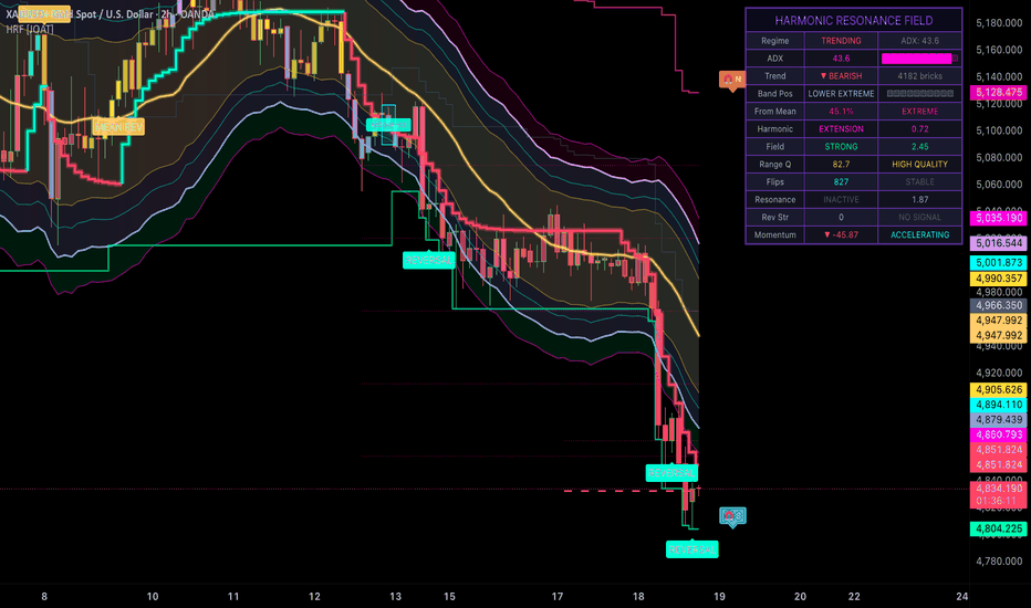
Chart showing the Harmonic Resonance Field with harmonic bands expanding and contracting around price, Renko trend line, and range detection box during a consolidation period
3. Renko Trend Engine
Rather than requiring traders to switch to a Renko chart, this indicator calculates a Renko-style trend directly on the standard candlestick chart. The brick size can be set using ATR, a fixed percentage, or a static value. The Renko state is managed as a custom type that tracks the current level, direction, and brick boundaries.
When price moves by one brick size in the trend direction, the Renko level advances. When price reverses by the configurable reversal multiplier (default 2 bricks), the trend flips. The result is a stepped trend line overlaid on the chart that filters minor fluctuations and shows only significant directional changes.
4. Magnetic Field Visualization
The magnetic field creates a set of attraction levels around the mean price. These levels represent zones where price tends to gravitate based on the configurable field strength parameter. The field is calculated using the distance from the mean and the current ATR:
Strong attraction zone: Within 0.5x ATR of the mean — price tends to consolidate here
Moderate zone: 0.5x to 1.0x ATR from the mean — normal trading range
Weak zone: Beyond 1.0x ATR — price is extended and may revert
The magnetic field lines are drawn with gradient transparency, becoming more transparent as they move away from the mean, visually communicating the decreasing "pull" of the mean at greater distances.
5. Reversal and Resonance Detection
The indicator generates two types of signals:
Reversal signals: Triggered when price reaches the outer bands with momentum showing signs of exhaustion (RSI-based or rate-of-change based). These are plotted as directional markers on the chart.
Resonance signals: Triggered when multiple conditions align — price at a band extreme, ranging market detected, and volume above average. Resonance points represent higher-conviction mean reversion opportunities.
Visual Elements
Harmonic Bands: Upper and lower bands with gradient fill between them
Renko Trend Line: Stepped line showing the dominant trend direction
Range Box: Dynamic box highlighting the current consolidation range
Magnetic Field Lines: Gradient-colored attraction levels around the mean
Reversal Markers: Directional signals at potential turning points
Resonance Points: High-confluence mean reversion signals
Candle Coloring: Optional trend-based candle coloring
Dashboard: Displays trend direction, range status, band width, Renko state, and resonance count
Input Parameters
Range Detection:
Range Lookback (default 50)
ADX Length (default 14) and ADX Threshold (default 25)
Band Settings:
Band Style: ATR, Percentage, Standard Dev, or Harmonic
Band Length (default 20) and Band Multiplier (default 2.0)
Renko Settings:
Brick Size Style: ATR, Percentage, or Static
Brick Size (default 1.0) and Reversal Multiplier (default 2)
Magnetic Field:
Field Strength (0.1-2.0, default 1.0)
Visual Settings:
Show Candle Coloring, Gradient Fill, Dashboard, Glow Effects, Pulse Effects
How to Use This Indicator
Step 1: Check the dashboard for the current market regime. If the market is ranging, focus on the range box boundaries and magnetic field levels for mean reversion setups.
Step 2: In trending conditions, follow the Renko trend line. Stay with the trend as long as the Renko direction holds. A Renko reversal (direction flip) is a significant event that suggests the trend may be changing.
Step 3: Watch for price reaching the outer harmonic bands. In ranging markets, these represent potential reversal zones. In trending markets, they may indicate overextension.
Step 4: Look for resonance signals. These combine multiple conditions (band extreme + ranging + volume) and represent the highest-conviction mean reversion setups.
Step 5: Use the magnetic field levels as dynamic support and resistance. Price tends to gravitate toward the strong attraction zone near the mean.
Close-up showing reversal markers at band extremes with resonance signals highlighted during a ranging market, with the magnetic field gradient visible around the mean
Indicator Limitations
ADX-based range detection has an inherent lag. The transition from trending to ranging (and vice versa) is identified after it has already begun.
Harmonic bands use a fixed-frequency sine wave. Real market cycles are not perfectly periodic, so the harmonic modulation is an approximation.
Renko trend calculations on a candlestick chart are a simulation. They will not match a true Renko chart exactly due to differences in bar construction.
Reversal signals at band extremes do not guarantee reversals. In strong trends, price can ride the outer band for extended periods.
The magnetic field visualization is a conceptual tool for understanding mean reversion tendency, not a precise prediction of where price will go.
Performance may be affected on very low timeframes with many visual elements enabled. Consider reducing visual effects on sub-minute charts.
Originality Statement
This indicator is original in its synthesis of range detection, harmonic frequency analysis, and magnetic field visualization. While individual components (ADX range detection, Renko trends, Bollinger-style bands) are established concepts, this indicator is justified because:
The harmonic band mode introduces sine-wave modulation to create bands that rhythmically expand and contract, a method not found in standard band indicators
The magnetic field visualization provides a novel way to represent mean reversion tendency using gradient-based attraction zones
Combining Renko trend tracking with ADX range detection on a standard chart gives traders both trend-following and mean-reversion frameworks simultaneously
Resonance detection creates a multi-factor confluence signal by combining band position, range status, and volume conditions
The four-style band system (ATR, Percentage, StdDev, Harmonic) allows traders to adapt the indicator to different instruments and market conditions
Disclaimer
This indicator is provided for educational and informational purposes only. It is not financial advice or a recommendation to buy or sell any financial instrument. Trading involves substantial risk of loss. Range detection and band analysis are tools for understanding market structure, not guarantees of future price movement. Always use proper risk management. The author is not responsible for any losses incurred from using this indicator.
-Made with passion by officialjackofalltrades
インジケーター
VWAP daily, weekly, monthly, yearlyVWAP Multi-Timeframe with Colored Corridors
This indicator provides a comprehensive View Weighted Average Price (VWAP) analysis across multiple timeframes, featuring highly customizable visual zones and individual label controls.
🚀 Key Features
📅 Multi-Timeframe Analysis
Track Daily, Weekly, Monthly, and Yearly VWAP simultaneously on a single chart.
Compare short-term intraday value with long-term structural trends effortlessly.
📊 Dynamic Standard Deviation Bands
Includes 3 levels of Standard Deviation (1σ, 2σ, 3σ) to identify overextended or value areas.
Colored Corridors: Features background fills between bands to visualize "value zones" (Inner, Middle, and Outer).
Default Focus: Optimized by default to highlight the Outer 2-3σ corridor in a sleek blue shade (#6d94fe) at 7% opacity for a premium, non-cluttered look.
🎨 Total Visual Control
Independent Labels: Every VWAP label (Daily, Weekly, etc.) can have its own color, position, and offset.
Visibility Toggles: Easily toggle individual VWAP lines or specific corridor fills on/off to suit your strategy.
Modern UI: Clean, auto-updating price labels prefixed with "VWAP" for instant clarity.
🛠️ How to Use
Identify Value: Use the standard deviation corridors to spot potential reversals or trend continuations.
Contextualize Trend: Observe how the shorter-term VWAP interacts with Monthly or Yearly levels to gauge overall market sentiment.
Customize: Head to the "Settings > Inputs" tab to adjust the transparency of the corridors or change the label colors to match your favorite theme.
Perfect for day traders and swing traders looking for a professional-grade VWAP toolkit. インジケーター

Directional Bias Aggregator [JOAT]Directional Bias Aggregator
Introduction
The Directional Bias Aggregator is a sophisticated multi-timeframe bias scoring system designed to measure and aggregate directional conviction across multiple timeframes. This indicator solves the critical problem of conflicting signals across different timeframes by providing a weighted, systematic approach to bias analysis. Understanding the true directional bias requires looking beyond the current timeframe - professional traders always consider the bigger picture, and this tool brings that institutional approach to your trading.
This indicator is built for traders who understand that trends exist on multiple timeframes simultaneously and that the highest probability trades occur when these timeframes align. Whether you're a day trader needing higher timeframe context, a swing trader confirming trend direction, or a position trader assessing long-term bias, this aggregator provides the comprehensive directional intelligence needed to trade with confidence and clarity.
Why This Indicator Exists
Most traders struggle with timeframe analysis - they might see a bullish signal on the 15-minute chart but bearish conditions on the 4-hour, leading to confusion and poor decisions. This indicator addresses that problem by:
Multi-Timeframe Analysis: Evaluates bias across up to four timeframes simultaneously
Weighted Aggregation: Assigns importance to each timeframe based on trading style
Bias Scoring: Provides numerical bias scores (-100 to +100) for objective analysis
Alignment Detection: Identifies when multiple timeframes agree on direction
Trend Integration: Adds trend filter to prevent trading against major moves
Conviction Measurement: Quantifies the strength of directional bias
The aggregator transforms the complex, often subjective process of multi-timeframe analysis into an objective, systematic framework that can be consistently applied.
Core Components Explained
1. Single Timeframe Bias Calculation
Each timeframe's bias is calculated using multiple indicators:
// Single timeframe bias calculation
f_calc_bias(float src_close, float src_high, float src_low) =>
// MA trend component
float ma_fast = ta.ema(src_close, i_ma_fast)
float ma_slow = ta.ema(src_close, i_ma_slow)
float ma_diff = ma_slow != 0 ? (ma_fast - ma_slow) / ma_slow * 100 : 0
float ma_score = math.max(math.min(ma_diff * 10, 100), -100)
// Price position component
float price_pos = 0.0
if src_close > ma_fast and ma_fast > ma_slow
price_pos := 100
else if src_close < ma_fast and ma_fast < ma_slow
price_pos := -100
// ... additional price position logic
// RSI component
float rsi_val = ta.rsi(src_close, i_rsi_len)
float rsi_score = (rsi_val - 50) * 2
// MACD component
float macd_line = ta.ema(src_close, i_macd_fast) - ta.ema(src_close, i_macd_slow)
float macd_signal = ta.ema(macd_line, i_macd_sig)
float macd_hist = macd_line - macd_signal
float atr_val = ta.atr(14)
float macd_score = atr_val > 0 ? (macd_hist > 0 ?
math.min(macd_hist / atr_val * 50, 100) :
math.max(macd_hist / atr_val * 50, -100)) : 0
// Composite score
float composite = ma_score * 0.35 + price_pos * 0.30 + rsi_score * 0.15 + macd_score * 0.20
composite
Bias components:
MA Trend (35% weight): Fast/slow EMA relationship and slope
Price Position (30% weight): Price relative to moving averages
RSI Momentum (15% weight): RSI centered at 50 for directional bias
MACD Histogram (20% weight): Trend acceleration/deceleration
Score Range: -100 (strong bearish) to +100 (strong bullish)
Neutral Zone: Scores between -30 and +30 considered neutral
Each component contributes unique directional information for comprehensive analysis.
2. Multi-Timeframe Data Requests
The indicator requests bias calculations from multiple timeframes:
// Request bias from each timeframe
f_request_bias(string tf) =>
request.security(syminfo.tickerid, tf, f_calc_bias(close, high, low) ,
lookahead=barmerge.lookahead_on)
float bias_tf1 = f_request_bias(i_tf1) // Fastest timeframe
float bias_tf2 = f_request_bias(i_tf2) // Medium timeframe
float bias_tf3 = f_request_bias(i_tf3) // Slow timeframe
float bias_tf4 = f_request_bias(i_tf4) // Slowest timeframe
MTF features:
Configurable Timeframes: User-defined timeframe selection
Confirmed Bars: Uses previous bar to prevent repainting
Lookahead Management: Proper security request handling
Current TF Bias: Also calculates bias on current timeframe
Data Validation: Handles missing or invalid data gracefully
The MTF system ensures you always have the bigger picture context.
3. Weighted Aggregation System
Timeframes are weighted based on their importance:
// Normalize weights
float total_weight = i_w1 + i_w2 + i_w3 + i_w4
float w1_norm = total_weight > 0 ? i_w1 / total_weight : 0.25
float w2_norm = total_weight > 0 ? i_w2 / total_weight : 0.25
float w3_norm = total_weight > 0 ? i_w3 / total_weight : 0.25
float w4_norm = total_weight > 0 ? i_w4 / total_weight : 0.25
// Aggregate bias score
float aggregate_bias = nz(bias_tf1) * w1_norm + nz(bias_tf2) * w2_norm +
nz(bias_tf3) * w3_norm + nz(bias_tf4) * w4_norm
// Smoothed aggregate
float smooth_bias = ta.ema(aggregate_bias, 3)
Weighting features:
Customizable Weights: Assign importance to each timeframe
Automatic Normalization: Ensures weights sum to 100%
Default Weights: Higher weight to slower timeframes (15%, 25%, 30%, 30%)
Smoothing: EMA smoothing for cleaner signals
Flexibility: Adjust weights based on trading style
The aggregation system creates a single, unified bias score from all timeframes.
4. Bias Alignment Analysis
The indicator measures how many timeframes agree on direction:
// Count aligned timeframes
int bullish_count = 0
int bearish_count = 0
if nz(bias_tf1) > i_weak_thresh
bullish_count += 1
else if nz(bias_tf1) < -i_weak_thresh
bearish_count += 1
// Repeat for TF2, TF3, TF4...
// Alignment score (0-4)
int alignment_score = math.max(bullish_count, bearish_count)
// Alignment direction
int alignment_direction = bullish_count > bearish_count ? 1 :
bearish_count > bullish_count ? -1 : 0
// Perfect alignment check
bool perfect_bullish = bullish_count == 4
bool perfect_bearish = bearish_count == 4
Alignment features:
Alignment Score: Number of timeframes agreeing (0-4)
Alignment Direction: Overall consensus direction
Perfect Alignment: All timeframes agree (strongest signal)
Weak Threshold: Minimum bias for alignment (default 30)
Mixed Signals: When timeframes disagree (lower confidence)
Higher alignment scores indicate higher probability setups.
5. Trend Filter Integration
An optional trend filter prevents trading against major moves:
// Trend filter
float trend_ma = ta.ema(close, i_trend_ma)
bool above_trend = close > trend_ma
bool below_trend = close < trend_ma
float trend_distance = trend_ma != 0 ? (close - trend_ma) / trend_ma * 100 : 0
// Trend-adjusted bias
float trend_adjusted_bias = smooth_bias
if i_use_trend
if above_trend and smooth_bias > 0
trend_adjusted_bias := smooth_bias * (1 + i_trend_weight)
else if below_trend and smooth_bias < 0
trend_adjusted_bias := smooth_bias * (1 + i_trend_weight)
else if above_trend and smooth_bias < 0
trend_adjusted_bias := smooth_bias * (1 - i_trend_weight * 0.5)
else if below_trend and smooth_bias > 0
trend_adjusted_bias := smooth_bias * (1 - i_trend_weight * 0.5)
Trend filter features:
Trend MA: Long-term moving average (default 200)
Trend Weight: Bonus for trading with trend (default 20%)
Penalty System: Reduces bias when trading against trend
Trend Distance: Measures how far price is from trend
Optional: Can be disabled for counter-trend strategies
The trend filter adds an extra layer of confirmation for directional bias.
6. Conviction and Consistency Metrics
The indicator measures the strength and stability of bias:
// Confluence quality
float confluence_quality = (float(alignment_score) / 4.0) *
(math.abs(smooth_bias) / 100.0) * 100
// Bias conviction score
float conviction_score = 0.0
conviction_score += float(alignment_score) * 15 // Max 60
conviction_score += math.abs(smooth_bias) * 0.3 // Max 30
if i_use_trend
if (above_trend and smooth_bias > 0) or (below_trend and smooth_bias < 0)
conviction_score += 10 // Trend alignment bonus
conviction_score := math.min(conviction_score, 100)
// Bias consistency
var int bias_consistency_counter = 0
if smooth_bias > i_weak_thresh and smooth_bias > i_weak_thresh
bias_consistency_counter := math.min(bias_consistency_counter + 1, 20)
else if smooth_bias < -i_weak_thresh and smooth_bias < -i_weak_thresh
bias_consistency_counter := math.min(bias_consistency_counter + 1, 20)
else
bias_consistency_counter := math.max(bias_consistency_counter - 1, 0)
float bias_consistency = float(bias_consistency_counter) / 20.0 * 100
Quality metrics:
Confluence Quality: Combines alignment and strength (0-100%)
Conviction Score: Overall signal strength (0-100)
Bias Consistency: How stable the bias has been (0-100%)
Momentum: Rate of change in bias
Acceleration: Change in bias momentum
These metrics help assess signal reliability and persistence.
Visual Elements
Bias Histogram: Main bias display with gradient coloring
Conviction Ribbon: Visual representation of conviction strength
MTF Breakdown Lines: Individual timeframe bias lines
Alignment Markers: Diamonds for perfect alignment
Momentum Plot: Bias momentum visualization
Background Colors: Regime-based background shading
Dashboard: Comprehensive metrics panel
Glow Effects: Intensity-based visual enhancements
The dashboard displays:
1. Individual timeframe biases and weights
2. Aggregate bias and trend-adjusted bias
3. Alignment score and direction
4. Confluence quality percentage
5. Conviction score and consistency
6. Bias momentum and acceleration
7. Trend filter status and distance
8. Signal strength and recommendations
Input Parameters
Timeframe Settings:
Timeframe 1-4: Individual timeframes for analysis
Default: 15m, 60m, 240m, Daily
Flexible: Can be any valid timeframe combination
Weighting Settings:
TF1-TF4 Weights: Individual importance weights
Default: 15%, 25%, 30%, 30% (favoring slower timeframes)
Total: Automatically normalized to 100%
Calculation Settings:
Fast/Slow MA: Bias calculation periods (default: 8/21)
RSI Period: Momentum oscillator (default: 14)
MACD Settings: Fast/Slow/Signal (default: 12/26/9)
Threshold Settings:
Strong Bias Threshold: Strong signal level (default: 60)
Weak Bias Threshold: Minimum bias for alignment (default: 30)
Trend Weight: Bonus for trend alignment (default: 20%)
How to Use This Indicator
Step 1: Analyze Individual Timeframes
Check the dashboard to see bias on each timeframe. Look for consistency - if most timeframes show the same direction, confidence is higher.
Step 2: Check Aggregate Bias
The aggregate bias provides a unified directional score. Values above 60 indicate strong bullish bias, below -60 indicate strong bearish bias.
Step 3: Verify Alignment
Higher alignment scores (3-4 timeframes) offer the highest probability setups. Perfect alignment (4/4) often precedes strong moves.
Step 4: Assess Conviction
High conviction scores (>75%) indicate strong, consistent bias. Low conviction (<50%) suggests uncertainty - wait for clarity.
Step 5: Consider Trend Filter
If enabled, ensure bias aligns with the major trend. Trading against the trend reduces conviction and increases risk.
Step 6: Monitor Momentum
Accelerating bias in the direction of alignment suggests the move is gaining strength. Decelerating bias warns of potential reversals.
Best Practices
Perfect alignment (4/4) provides the highest probability setups
Higher timeframe bias should generally override lower timeframe signals
Increasing conviction scores suggest strengthening trends
Divergence between timeframes often precedes reversals
Use the trend filter unless you're specifically trading counter-trend setups
Bias consistency is key - look for stable, persistent bias
Sudden changes in aggregate bias often signal regime shifts
Combine with price action for optimal entry timing
Adjust timeframe weights based on your trading style
Keep a bias journal to track how different instruments behave
Trading Applications
Trend Following:
Enter when bias > 60 on at least 3 timeframes
Add to positions as conviction increases
Stay in trades as long as bias remains aligned
Exit when bias weakens or reverses on slower timeframes
Mean Reversion:
Look for extreme bias (>80 or <-80) on faster timeframes
Enter when faster timeframe bias opposes slower timeframe
Target mean reversion to neutral bias levels
Quick exits - don't fight the longer-term bias
Breakout Trading:
Wait for bias alignment across all timeframes
Enter on breakouts with supporting bias momentum
Use wider stops due to potential volatility
Scale out as bias reaches extreme levels
Strategy Integration
This indicator enhances any trading system:
Use as a directional filter for existing strategies
Import aggregate bias for trend confirmation
Use alignment score as signal strength filter
Apply conviction scoring for position sizing
Integrate trend filter for additional safety
Export individual timeframe biases for custom logic
Technical Implementation
Built with Pine Script v6 featuring:
Multi-timeframe bias calculation with proper security requests
Weighted aggregation system with automatic normalization
Advanced alignment detection with perfect alignment alerts
Trend filter integration with adjustable weighting
Conviction and consistency scoring systems
Momentum and acceleration analysis
Comprehensive visualization with multi-layer effects
Real-time dashboard with 12 key metrics
Alert conditions for all major bias events
Export functions for strategy integration
The code uses confirmed bars and proper lookahead management to prevent repainting.
Originality Statement
This indicator is original in its comprehensive approach to multi-timeframe bias aggregation and scoring. While individual components (moving averages, RSI, MACD) are established tools, this indicator is justified because:
It synthesizes bias analysis across multiple timeframes into a unified scoring system
The weighted aggregation allows customization based on trading style and preferences
Alignment detection provides objective measures of timeframe consensus
The conviction scoring system quantifies signal strength and reliability
Trend filter integration adds an extra layer of confirmation
Consistency analysis identifies stable, persistent bias versus noisy fluctuations
The dashboard presents complex multi-timeframe analysis in an accessible format
Export functions enable integration with any trading system
Each timeframe contributes unique context: faster timeframes show immediate bias, slower timeframes show established trends
The indicator solves the real problem of conflicting signals across timeframes through systematic aggregation
The indicator's value lies in transforming the complex, often confusing world of multi-timeframe analysis into a clear, objective system that traders can use to make informed decisions with confidence.
Disclaimer
This indicator is provided for educational and informational purposes only. It is not financial advice or a recommendation to buy or sell any financial instrument. Multi-timeframe analysis is a tool for understanding market context, not a prediction system.
Bias can change suddenly due to news events, economic data, or changes in market structure. Past bias patterns do not guarantee future behavior. The indicator's signals are mathematical calculations based on historical patterns and should be used in conjunction with other forms of analysis.
Always use proper risk management, including stop losses and position sizing appropriate for your account and risk tolerance. Strong bias alignment does not guarantee success - markets can remain irrational longer than you can remain solvent.
The author is not responsible for any losses incurred from using this indicator. Users assume full responsibility for all trading decisions made using this system.
-Made with passion by officialjackofalltrades
インジケーター

インジケーター
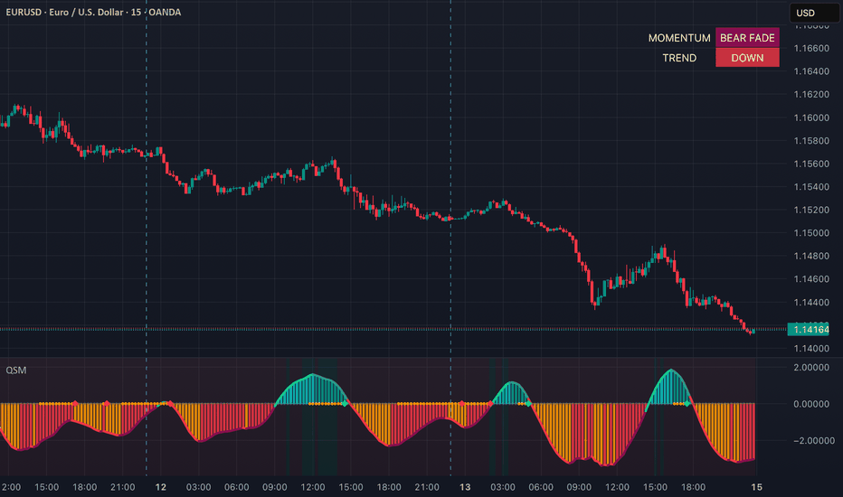
インジケーター

Planetary Aspect Lines [PyraTime]The Problem This Solves
Traders utilizing W.D. Gann methodologies and financial astrology often face three major hurdles: manually calculating geocentric planetary aspects across varying timezones, dealing with cluttered charts that obscure price action, and the persistent "Floating Indicator Issue" where graphical lines and labels detach from historical price bars or freeze in mid-air when panning and zooming.
The Solution
PyraTime is a self-contained visual ephemeris built specifically to automate planetary aspect tracking while maintaining strict chart stability. It calculates geocentric mean longitudes for up to three customizable planet pairs, alerts you to exact angular aspects, and anchors all visual data directly to absolute UNIX timestamps. This ensures your astrological analysis remains perfectly aligned with the historical price action, regardless of chart scale.
Key Features:
Predictive HUD Dashboard: A clean, minimal chart overlay that scans forward to project the next upcoming aspect. It provides a live countdown (in days) alongside the calculated directional bias.
Directional Bias System: Instantly gauge the astrological weight of an aspect directly on the chart labels and HUD. The script categorizes Trines and Sextiles as Bullish; Squares, Oppositions, Semi-Squares, and Sesquiquadrates as Bearish; and Conjunctions and Quincunxes as Neutral.
Floating Indicator Protection: We explicitly solved the native TradingView floating object bug. By anchoring all line objects to absolute UNIX timestamps (xloc.bar_time) rather than relative bar indices, and using dynamic vertical positioning for labels, your aspect lines will never detach or float away when scrolling through data.
Layered Aesthetics: Aspects are plotted using a 3-layer overlapping line technique for a clean neon aesthetic without muddying the candles. When an aspect reaches exact status (within 0.1 degrees of the target orb), the visual labels dynamically scale to full opacity to highlight the exact pivot point.
Retrograde Filtering: An optional toggle allows users to automatically suppress aspect alerts and visuals if either planet in a monitored pair is currently moving in retrograde.
Timezone Agnostic: The internal ephemeris engine relies on absolute time data, meaning it synchronizes automatically with your local TradingView clock. No manual UTC offset configurations are required.
How to Use:
Apply the indicator to your chart and open the settings menu.
Select your target planet pairs (e.g., Sun and Mars) and enable any additional pairs you wish to track.
Toggle the specific aspects you want to monitor and adjust your target orbs (degrees of tolerance) based on your trading strategy.
Set standard TradingView alerts to trigger when a confirmed aspect prints on the chart.
Technical Note: This script uses an internal Mean Longitude mathematical engine to calculate planetary positions. This provides fast, self-contained visual performance without relying on external libraries. Traders looking for extreme precision on highly elliptical planets or specific retrograde stations should note there may be slight orb drift compared to a full Swiss Ephemeris array. インジケーター

ストラテジー

Harmonic Pulse Tracker [JOAT]Harmonic Pulse Tracker
Introduction
The Harmonic Pulse Tracker is an open-source institutional-grade wave and rhythm analysis system that combines Elliott Wave principles, Fibonacci harmonic analysis, WaveTrend oscillator mechanics, and cycle detection into a unified oscillator. This sophisticated system integrates multiple proven methodologies to identify high-probability reversal zones where harmonic patterns, wave cycles, and momentum indicators converge.
The indicator is designed for traders who understand that market movements follow natural harmonic patterns and cyclical rhythms. By synthesizing detrended price oscillation, Fibonacci retracement levels, WaveTrend momentum analysis, money flow dynamics, and volume confirmation, this tool helps identify structural market turning points with mathematical precision.
Why This Integration Exists
This indicator combines six distinct analytical frameworks that complement each other:
Harmonic Wave Analysis: Uses detrended price oscillation combined with Ehlers cycle detection to identify natural market rhythms
Fibonacci Harmonic Levels: Calculates dynamic Fibonacci retracements and extensions based on wave swing points
WaveTrend Oscillator: Implements LazyBear's WaveTrend algorithm for momentum and overbought/oversold detection
Money Flow Integration: Tracks institutional buying and selling pressure through Money Flow Index analysis
Volume Analysis: Confirms wave movements with volume spikes and directional volume pressure
Elliott Wave Counting: Simplified wave counting system to identify impulse and corrective wave phases
Each component addresses different aspects of market rhythm and harmony. The harmonic wave engine identifies natural price cycles, Fibonacci levels provide mathematical support/resistance, WaveTrend shows momentum extremes, money flow reveals institutional activity, volume confirms genuine moves, and Elliott Wave counting provides structural context. Together, they create a multi-dimensional view of market harmony and discord.
Core Components Explained
1. Harmonic Wave Engine
The core wave calculation combines two advanced techniques:
DPO (Detrended Price Oscillator) = close - sma(close, length/2 + 1)
Ehlers Cycle Component = High-pass filtered price with cycle smoothing
Harmonic Wave = Smoothed DPO + (Cycle Component * 0.5)
This creates a wave that removes trend bias while preserving cyclical components, revealing the natural harmonic rhythm of price movement.
Wave Derivatives:
- Wave Momentum: Rate of change in harmonic wave
- Wave Acceleration: Rate of change in momentum
- Wave Velocity: Percentage rate of change over 5 periods
These derivatives help identify wave phase transitions and momentum shifts before they become obvious in price.
2. Fibonacci Harmonic Level System
The indicator calculates dynamic Fibonacci levels based on harmonic wave swing points:
Standard Retracements:
- 23.6%, 38.2%, 50.0%, 61.8%, 78.6% of wave range
Extensions:
- 127.2%, 161.8%, 261.8% beyond wave high
Golden Pocket Zone:
The critical 61.8% to 78.6% retracement zone where most harmonic reversals occur. This zone represents the mathematical sweet spot where Fibonacci ratios converge with natural market rhythm.
Harmonic Resonance Detection:
The system identifies when price is within 5% of key Fibonacci levels and calculates confluence scores when multiple levels align.
3. WaveTrend Oscillator Integration
Implements the proven WaveTrend algorithm:
ESA = ema(hlc3, channel_length)
D = ema(abs(hlc3 - ESA), channel_length)
CI = (hlc3 - ESA) / (0.015 * D)
WT1 = ema(CI, average_length)
WT2 = sma(WT1, 4)
WaveTrend Signals:
- Crossovers in oversold zone (< -50): Bullish reversal signals
- Crossunders in overbought zone (> 50): Bearish reversal signals
- Regular crossovers: Momentum shift confirmation
4. Money Flow Analysis
Tracks institutional buying and selling pressure:
MFI = Money Flow Index over specified period
MFI Centered = (MFI - 50) * multiplier
- Positive MFI: Institutional buying pressure
- Negative MFI: Institutional selling pressure
- Strong MFI: Absolute value > 25 indicates significant institutional activity
5. Volume Analysis Engine
Comprehensive volume analysis including:
Volume Spikes: Volume > Average Volume * Threshold
Volume Ratio: Current volume / Average volume
Volume Strength: Normalized volume intensity (0-100)
Directional Volume:
- Bullish Volume Spike: High volume + green candle
- Bearish Volume Spike: High volume + red candle
6. Elliott Wave Phase Detection
Simplified wave analysis to identify market structure:
Impulse Waves:
- Impulse Up: Positive momentum + acceleration + velocity
- Impulse Down: Negative momentum + acceleration + velocity
Corrective Waves:
- Mixed momentum and acceleration signals indicating consolidation
Wave Counting:
Basic 5-wave count system that resets after wave 5 completion, helping identify potential reversal zones.
Multi-Factor Confluence Scoring System
The indicator calculates a real-time confluence score (0-100) by weighting each component:
Confluence Score Components:
- Fibonacci Zone: Up to 20 points (Golden Pocket = 20, other Fib levels = 4 each)
- Wave Strength: Up to 20 points (based on wave momentum intensity)
- WaveTrend: Up to 20 points (extreme zone crossovers = 20, regular = 15)
- Money Flow: Up to 20 points (strong institutional activity = 20)
- Volume: Up to 20 points (volume spikes = 20, elevated = 15)
Scores above 80 indicate exceptional confluence for potential trades. The dashboard displays individual component scores for transparency.
Perfect Harmonic Alignment Detection
The system identifies rare "Perfect Harmonic" setups when:
- Price is in Golden Pocket zone
- Impulse wave phase is active
- Wave strength > 70
- WaveTrend crossover in extreme zone
- Positive money flow (for bullish) or negative (for bearish)
- Volume spike confirmation
These setups represent the highest probability reversal opportunities.
Visual Elements
Harmonic Wave: Main oscillator with gradient coloring based on wave position
Wave Momentum: Histogram showing rate of change in wave movement
Fibonacci Levels: Key retracement and extension levels (38.2%, 50%, 61.8%, 78.6%, 161.8%)
Golden Pocket Zone: Highlighted area between 61.8% and 78.6% levels
WaveTrend Lines: WT1 and WT2 with overbought/oversold zones
Money Flow Columns: Institutional buying/selling pressure visualization
Volume Strength: Volume intensity histogram
Signal Markers: Perfect Harmonic signals and strong confluence alerts
Background Zones: Golden Pocket and Perfect Signal highlighting
Dashboard: Real-time display of all component values and confluence score
How Components Work Together
The integration creates a harmonic analysis approach:
Layer 1 - Wave Rhythm: Harmonic wave identifies natural market cycles and turning points
Layer 2 - Mathematical Levels: Fibonacci ratios provide precise support/resistance zones
Layer 3 - Momentum Context: WaveTrend shows overbought/oversold extremes
Layer 4 - Institutional Flow: Money flow reveals smart money positioning
Layer 5 - Volume Confirmation: Volume analysis validates genuine moves vs noise
Layer 6 - Wave Structure: Elliott Wave context provides structural framework
Example scenario: Harmonic wave reaches Golden Pocket zone (Layer 1 + 2) during WaveTrend oversold crossover (Layer 3) with positive money flow (Layer 4) and volume spike (Layer 5) in corrective wave phase (Layer 6). This confluence suggests exceptional reversal probability.
Input Parameters
Wave Settings:
Wave Length: Period for harmonic wave calculation (default: 34)
Smoothing Period: Wave smoothing factor (default: 5)
WaveTrend Settings:
Show WaveTrend: Toggle WaveTrend display
WT Channel Length: Channel calculation period (default: 9)
WT Average Length: Smoothing period (default: 12)
WT Overbought: Overbought threshold (default: 50)
WT Oversold: Oversold threshold (default: -50)
Money Flow Settings:
Show Money Flow: Toggle money flow display
MFI Length: Money Flow Index period (default: 14)
MFI Multiplier: Sensitivity adjustment (default: 1.5)
Volume Settings:
Show Volume Analysis: Toggle volume indicators
Volume Spike Threshold: Multiplier for spike detection (default: 1.5)
Fibonacci Settings:
Show Fibonacci Levels: Toggle Fibonacci level display
Fibonacci Lookback: Period for swing point calculation (default: 100)
Cycle Settings:
Cycle Period: Ehlers cycle detection period (default: 20)
Cycle Smoothing: Cycle component smoothing (default: 3)
How to Use This Indicator
Step 1: Identify Wave Phase
Check the dashboard for current wave phase (Impulse Up/Down, Corrective, Neutral) and Elliott Wave count.
Step 2: Locate Fibonacci Zones
Look for price approaching key Fibonacci levels, especially the Golden Pocket zone (61.8%-78.6%).
Step 3: Check WaveTrend Position
Identify if WaveTrend is in extreme zones and watch for crossovers in oversold/overbought areas.
Step 4: Analyze Money Flow
Confirm institutional positioning through Money Flow Index - positive for bullish setups, negative for bearish.
Step 5: Verify Volume Confirmation
Ensure volume supports the move - look for volume spikes in the direction of the expected reversal.
Step 6: Review Confluence Score
Check the dashboard confluence score. Scores above 80 indicate high-probability setups.
Step 7: Wait for Perfect Harmonic Signals
The highest probability trades occur when "PERFECT" signals appear, indicating all factors are aligned.
Best Practices
Use on 15-minute to 4-hour timeframes for optimal harmonic detection
Focus on Golden Pocket zone entries - this is where most harmonic reversals occur
Wait for WaveTrend crossovers in extreme zones for best risk:reward
Confirm with money flow direction - institutional flow should support the trade direction
Volume spikes add significant confirmation to harmonic setups
Perfect Harmonic signals are rare but offer exceptional probability
Wave 5 completions often coincide with major reversal opportunities
Use confluence scores above 80 as primary filter for trade selection
Indicator Limitations
Harmonic patterns can extend beyond expected Fibonacci levels
Perfect Harmonic signals are rare - patience is required for best setups
Wave counting is simplified and may not match complex Elliott Wave analysis
Fibonacci levels are dynamic and may adjust as new swing points form
Money flow can remain extreme longer than expected during strong trends
Volume confirmation may be less reliable in low-liquidity markets
Confluence scoring is mathematical, not predictive of future performance
Requires understanding of harmonic analysis principles for effective use
Technical Implementation
Built with Pine Script v6 using:
Advanced detrended price oscillation with Ehlers cycle detection
Dynamic Fibonacci calculation based on swing point analysis
LazyBear WaveTrend algorithm implementation
Real-time Money Flow Index with institutional bias detection
Volume analysis with spike detection and directional confirmation
Simplified Elliott Wave counting with phase detection
Multi-factor confluence scoring system with component weighting
Anti-overlap signal filtering to prevent signal clustering
The code is fully open-source and can be modified to suit individual trading styles and preferences.
Originality Statement
This indicator is original in its harmonic integration approach. While individual components (DPO, Fibonacci, WaveTrend, MFI, volume analysis, Elliott Wave) are established concepts, this integration is justified because:
It synthesizes six distinct methodologies that address different aspects of market harmony
The harmonic wave engine combines detrended oscillation with cycle detection for superior rhythm analysis
Dynamic Fibonacci levels adjust to current wave structure rather than using static retracements
Golden Pocket zone identification provides mathematical precision for reversal timing
Multi-factor confluence scoring quantifies setup quality across all components
Perfect Harmonic detection identifies rare, high-probability reversal opportunities
Each component contributes unique harmonic information: wave analysis reveals natural cycles, Fibonacci provides mathematical levels, WaveTrend shows momentum extremes, money flow indicates institutional positioning, volume confirms genuine moves, and Elliott Wave provides structural context. The integration's value lies in identifying moments when all these harmonic factors align simultaneously.
Disclaimer
This indicator is provided for educational and informational purposes only. It is not financial advice or a recommendation to buy or sell any financial instrument. Trading involves substantial risk of loss and is not suitable for all investors.
Harmonic analysis and Fibonacci levels are mathematical concepts that do not guarantee future price movement. Past performance and backtested results do not guarantee future results. Market conditions change, and harmonic patterns that worked historically may not work in the future.
Always use proper risk management, including stop losses and position sizing appropriate for your account size and risk tolerance. Never risk more than you can afford to lose. Consider consulting with a qualified financial advisor before making investment decisions.
The author is not responsible for any losses incurred from using this indicator. Users assume full responsibility for all trading decisions made using this tool.
-Made with passion by officialjackofalltrades インジケーター

Cascade Trend Navigator [JOAT]Cascade Trend Navigator
Introduction
The Cascade Trend Navigator is an open-source institutional-grade multi-timeframe trend and flow system that combines dynamic support/resistance zones, volume profile analysis, and liquidity detection into a unified overlay indicator. This comprehensive system integrates multiple proven methodologies to identify high-probability trend continuation and reversal zones where institutional and retail liquidity converge.
The indicator is designed for traders who understand that successful trend following requires more than simple moving average crossovers. By synthesizing adaptive moving averages, dynamic support/resistance zones, volume profile analysis, and liquidity pool detection, this tool helps identify structural market inflection points with institutional-grade precision.
Why This Integration Exists
This indicator combines four distinct analytical frameworks that complement each other:
Adaptive Moving Average System: Uses Hull, TEMA, DEMA, ZEMA, and VWMA calculations for superior trend identification with reduced lag
Dynamic Support/Resistance Zones: Calculates real-time zones using Hull Moving Averages and ATR-based deviation bands
Volume Profile Analysis: Identifies Point of Control (POC) and high-volume price levels where institutional activity concentrates
Liquidity Pool Detection: Tracks equal highs/lows, swing points, and liquidity zones where stop hunts typically occur
Each component addresses different aspects of market structure. The adaptive MA system provides trend direction with minimal lag, dynamic zones reveal real-time support/resistance levels, volume profile shows where institutions are most active, and liquidity detection identifies areas where price reversals are likely. Together, they create a multi-dimensional view of market flow and structure.
Core Components Explained
1. Advanced Moving Average Engine
The indicator offers seven different moving average types, each optimized for specific market conditions:
Hull MA (HMA): wma(2 * wma(src, length/2) - wma(src, length), sqrt(length))
TEMA: 3 * ema1 - 3 * ema2 + ema3 (Triple smoothed)
DEMA: 2 * ema1 - ema2 (Double smoothed)
ZEMA: Zero-lag EMA with lag compensation
VWMA: Volume-weighted for institutional flow tracking
The system uses three MA periods: Fast (default 20), Slow (default 50), and Trend (default 200). Trend direction is determined when Fast MA > Slow MA and price > Trend MA for bullish conditions, with the inverse for bearish conditions.
2. Dynamic Support/Resistance Zone System
Unlike static pivot levels, these zones adapt to current market volatility:
Resistance Zone: HMA(high, length) + (ATR * deviation) to HMA(high, length)
Support Zone: HMA(low, length) to HMA(low, length) - (ATR * deviation)
The zones automatically adjust width based on ATR, making them more relevant during high volatility periods and tighter during consolidation. This adaptive nature provides more accurate entry and exit levels compared to fixed percentage-based zones.
3. Volume Profile Integration
The indicator calculates a real-time volume profile over a specified lookback period:
- Divides the price range into configurable bins (default 20)
- Accumulates volume for each price level
- Identifies Point of Control (POC) - the price level with highest volume
- Displays POC as a dynamic level where institutional activity is concentrated
This helps traders understand where the majority of trading activity occurred and where price is likely to find support or resistance based on volume acceptance.
4. Liquidity Pool Detection System
The system identifies multiple types of liquidity pools:
Equal Highs/Lows: Price levels where multiple highs or lows form at similar levels, creating liquidity pools for institutional players to target
Swing Points: Pivot highs and lows that represent areas where retail stops are likely clustered
Liquidity Sweeps: Instances where price briefly moves beyond recent highs/lows but fails to sustain, indicating stop hunting activity
These areas often precede significant price moves as institutions clear retail positions before establishing their own.
5. Trend Strength Calculation
The indicator calculates trend strength as:
Trend Strength = abs((Fast MA - Slow MA) / Slow MA) * 100
This provides a quantitative measure of trend momentum, helping traders distinguish between strong trending moves and weak corrective phases.
Visual Elements
Moving Average Cloud: Fill between Fast and Slow MAs with gradient coloring based on trend direction
Dynamic Zones: Support zones in green, resistance zones in red with glowing borders
POC Line: Golden cross marking the highest volume price level
Liquidity Markers: Triangles for equal highs/lows, diamonds for swing points
Signal Arrows: BUY/SELL labels for trend changes and zone touches
Trend Background: Subtle background coloring indicating overall market bias
Dashboard: Real-time display of trend status, strength, and distances to key levels
How Components Work Together
The integration creates a layered analysis approach:
Layer 1 - Trend Identification: Adaptive MAs determine primary trend direction with minimal lag
Layer 2 - Dynamic Levels: Support/resistance zones provide entry and exit levels that adapt to volatility
Layer 3 - Volume Confirmation: POC shows where institutions are most active
Layer 4 - Liquidity Mapping: Equal highs/lows and swing points reveal where reversals are likely
Layer 5 - Signal Synthesis: All components combine to generate high-probability trade signals
Example scenario: Price approaches a dynamic support zone (Layer 2) in an uptrend (Layer 1), near the POC level (Layer 3), with equal lows nearby (Layer 4). This confluence suggests a high-probability bounce location.
Input Parameters
Trend Settings:
Fast MA Length: Period for fast moving average (default: 20)
Slow MA Length: Period for slow moving average (default: 50)
Trend MA Length: Period for trend filter (default: 200)
MA Type: Choose from SMA, EMA, HMA, TEMA, DEMA, ZEMA, VWMA
Show MA Cloud: Toggle cloud fill between fast and slow MAs
Zone Settings:
Zone Calculation Length: Period for HMA zone calculation (default: 50)
Zone Deviation: ATR multiplier for zone width (default: 1.5)
Show Support/Resistance Zones: Toggle zone display
Volume Profile Settings:
Volume Profile Length: Lookback period for volume calculation (default: 100)
Number of Price Bins: Granularity of volume profile (default: 20)
Show Volume Profile: Toggle POC display
Liquidity Settings:
Show Liquidity Zones: Toggle liquidity markers
Liquidity Lookback: Period for swing point detection (default: 50)
How to Use This Indicator
Step 1: Identify Trend Direction
Check the MA cloud color and trend background. Green indicates bullish trend, red indicates bearish trend.
Step 2: Locate Dynamic Zones
Identify current support and resistance zones. These adapt to volatility and provide better levels than static pivots.
Step 3: Check Volume Profile
Note the POC level - this shows where most institutional activity occurred and often acts as magnetic price level.
Step 4: Map Liquidity Pools
Look for equal highs/lows and swing points. These areas often see stop hunting before major moves.
Step 5: Wait for Confluence
Best setups occur when multiple elements align: trend direction + zone touch + POC proximity + liquidity pool.
Step 6: Monitor Dashboard
Use the dashboard to track trend strength, distances to key levels, and current signal status.
Best Practices
Use on 15-minute to daily timeframes for optimal signal quality
Combine with proper risk management - zones provide levels, not exact entries
Pay attention to trend strength - stronger trends have higher continuation probability
Watch for zone touches in trending markets as continuation signals
Liquidity sweeps often provide excellent risk:reward entries when they fail
POC acts as magnetic level - price often returns to test these areas
Volume confirmation is critical - avoid signals during low volume periods
Indicator Limitations
Does not provide exact entry/exit signals - requires trader interpretation
Can generate false signals in choppy, sideways markets
Dynamic zones may adjust too quickly in highly volatile conditions
Volume profile requires sufficient lookback data to be meaningful
Liquidity pools don't always get tested - not every level provides opportunity
Trend strength can remain elevated longer than expected during strong moves
Performance varies across different markets and timeframes
Requires understanding of institutional order flow concepts for effective use
Technical Implementation
Built with Pine Script v6 using:
Advanced moving average calculations with zero-lag techniques
Real-time volume profile computation with dynamic binning
Adaptive support/resistance zone calculation using HMA and ATR
Pivot-based liquidity pool detection with swing analysis
Dynamic color gradients based on trend strength and direction
Comprehensive dashboard with real-time statistics
Anti-overlap signal filtering to prevent signal clustering
The code is fully open-source and can be modified to suit individual trading styles and preferences.
Originality Statement
This indicator is original in its integration approach. While individual components (moving averages, support/resistance, volume profile, liquidity detection) are established concepts, this integration is justified because:
It synthesizes four distinct methodologies that address different market aspects
The adaptive zone calculation provides dynamic levels that adjust to current volatility
Volume profile integration shows institutional activity concentration in real-time
Liquidity pool detection reveals areas where institutional stop hunting typically occurs
The combination helps identify confluence zones where multiple factors align
Anti-overlap filtering and trend strength calculation provide quantitative edge
Each component contributes unique information: adaptive MAs provide trend direction with minimal lag, dynamic zones offer volatility-adjusted levels, volume profile reveals institutional activity, and liquidity detection identifies reversal zones. The integration's value lies in presenting these complementary perspectives simultaneously with unified signal generation.
Disclaimer
This indicator is provided for educational and informational purposes only. It is not financial advice or a recommendation to buy or sell any financial instrument. Trading involves substantial risk of loss and is not suitable for all investors.
Technical indicators are tools for analysis, not guarantees of future performance. Past performance and backtested results do not guarantee future results. Market conditions change, and strategies that worked historically may not work in the future.
Always use proper risk management, including stop losses and position sizing appropriate for your account size and risk tolerance. Never risk more than you can afford to lose. Consider consulting with a qualified financial advisor before making investment decisions.
The author is not responsible for any losses incurred from using this indicator. Users assume full responsibility for all trading decisions made using this tool.
-Made with passion by officialjackofalltrades インジケーター

インジケーター
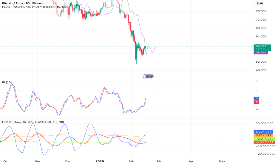
Harmonic Confluence Wave Detector [JOAT]Harmonic Confluence Wave Detector
Introduction
The Harmonic Confluence Wave Detector is an open-source oscillator-based indicator that combines WaveTrend, Money Flow Index (MFI), RSI, MACD, and Stochastic RSI into a unified momentum analysis system. This mashup creates a multi-layered oscillator framework designed to identify momentum shifts, overbought/oversold conditions, and divergence patterns across multiple timeframes and calculation methods.
The indicator addresses a common trading challenge: single oscillators can give conflicting or premature signals. By synthesizing five different momentum calculations that use distinct mathematical approaches, this tool provides confluence-based signals that occur when multiple momentum indicators align, significantly reducing false signals compared to using any single oscillator alone.
Chart showing WaveTrend oscillator, MACD histogram, and multi-signal system on 1H timeframe
Why This Mashup Exists
This indicator combines five oscillators that complement each other through different calculation methodologies:
WaveTrend: Smoothed momentum oscillator based on price deviation from exponential moving average
Money Flow Index (MFI): Volume-weighted RSI showing buying/selling pressure
RSI: Classic momentum oscillator measuring speed and magnitude of price changes
MACD: Trend-following momentum indicator showing relationship between two EMAs
Stochastic RSI: Stochastic calculation applied to RSI for enhanced sensitivity
Each oscillator has unique strengths: WaveTrend excels at identifying wave-like momentum cycles, MFI incorporates volume for institutional flow analysis, RSI provides reliable overbought/oversold readings, MACD shows trend strength and direction, and Stochastic RSI catches early momentum shifts. Together, they create a comprehensive momentum picture that no single oscillator can provide.
The mashup is justified because these oscillators use fundamentally different calculations (price-based, volume-weighted, moving average convergence, stochastic) that respond to different market conditions. When they align, it indicates genuine momentum shift rather than noise.
Core Components Explained
1. WaveTrend Oscillator (Primary Signal Generator)
WaveTrend is the primary oscillator, calculated using this methodology:
// Calculate exponential average of HLC3
esa = ta.ema(hlc3, channelLength)
// Calculate deviation
d = ta.ema(abs(hlc3 - esa), channelLength)
// Calculate channel index
ci = (hlc3 - esa) / (0.015 * d)
// Apply smoothing to create WaveTrend 1
wt1 = ta.ema(ci, averageLength)
// Create WaveTrend 2 as simple moving average of WT1
wt2 = ta.sma(wt1, 4)
WaveTrend oscillates around zero, with:
Values above +60: Overbought zone
Values above +80: Extreme overbought
Values below -60: Oversold zone
Values below -80: Extreme oversold
Crossovers between WT1 and WT2: Momentum shift signals
The indicator plots WT1 and WT2 as lines with dynamic coloring based on momentum direction and strength.
2. Money Flow Index (MFI) - Volume-Weighted Momentum
MFI calculation incorporates both price and volume:
// Calculate typical price
typicalPrice = (high + low + close) / 3
// Calculate raw money flow
rawMoneyFlow = typicalPrice * volume
// Separate positive and negative money flow
positiveFlow = close > close ? rawMoneyFlow : 0
negativeFlow = close < close ? rawMoneyFlow : 0
// Sum over MFI period
positiveSum = sum(positiveFlow, mfiLength)
negativeSum = sum(negativeFlow, mfiLength)
// Calculate MFI
mfi = 100 - (100 / (1 + positiveSum / negativeSum))
MFI ranges from 0-100, with readings above 80 indicating buying pressure and below 20 indicating selling pressure. The indicator plots MFI as a line and uses it for confluence scoring.
3. RSI - Classic Momentum Oscillator
Standard RSI calculation over 14 periods (configurable):
RSI > 70: Overbought
RSI < 30: Oversold
RSI > 65 with other bearish signals: Potential reversal
RSI < 35 with other bullish signals: Potential reversal
RSI provides reliable baseline momentum readings and is used for divergence detection.
4. MACD - Trend Momentum Indicator
MACD uses standard 12/26/9 settings:
= ta.macd(close, 12, 26, 9)
The indicator displays MACD histogram with enhanced width (linewidth 8) for visibility. Histogram color changes based on:
Green: Positive and increasing (bullish momentum)
Light green: Positive but decreasing (weakening bulls)
Red: Negative and decreasing (bearish momentum)
Light red: Negative but increasing (weakening bears)
MACD histogram provides visual confirmation of momentum strength and direction.
5. Stochastic RSI - Enhanced Sensitivity
Stochastic calculation applied to RSI values:
stochRSI = ta.stoch(rsi, rsi, rsi, 14)
Stochastic RSI oscillates between 0-100 and is more sensitive than regular RSI, catching momentum shifts earlier. The indicator plots both K and D lines for crossover analysis.
Example showing all oscillators with divergence markers and signal labels
Multi-Signal System
The indicator generates six tiers of signals based on confluence strength:
BUY Signals:
BUY: WT1 crosses above WT2 in oversold zone (WT1 < -40)
STRONG BUY: BUY + volume above average + MACD histogram positive
MEGA BUY: STRONG BUY + WT1 < -60 (extreme oversold) + RSI < 35
ULTRA BUY: MEGA BUY + MFI < 30 + Stoch RSI oversold + bullish divergence
SELL Signals:
SELL: WT1 crosses below WT2 in overbought zone (WT1 > 40)
STRONG SELL: SELL + volume above average + MACD histogram negative
MEGA SELL: STRONG SELL + WT1 > 60 (extreme overbought) + RSI > 65
ULTRA SELL: MEGA SELL + MFI > 70 + Stoch RSI overbought + bearish divergence
Signal labels appear on chart with size proportional to signal strength (tiny for BUY/SELL, normal for ULTRA).
Divergence Detection System
The indicator detects divergences across multiple oscillators:
RSI Divergence:
Bullish: Price makes lower low, RSI makes higher low
Bearish: Price makes higher high, RSI makes lower high
WaveTrend Divergence:
Bullish: Price makes lower low, WT1 makes higher low
Bearish: Price makes higher high, WT1 makes lower high
MACD Divergence:
Bullish: Price makes lower low, MACD histogram makes higher low
Bearish: Price makes higher high, MACD histogram makes lower high
Divergences are marked with bright orange/yellow "D" labels (color.rgb(255, 200, 0)) with black text for maximum visibility. When multiple oscillators show divergence simultaneously, it signals strong momentum exhaustion and potential reversal.
Confluence Scoring System
The indicator calculates a real-time confluence score (0-100) by evaluating:
Confluence Components:
- WaveTrend Position: Up to 25 points (extreme zones add more weight)
- WaveTrend Momentum: Up to 15 points (WT1-WT2 relationship)
- RSI Level: Up to 15 points (extreme readings add weight)
- MFI Level: Up to 15 points (volume pressure confirmation)
- MACD Histogram: Up to 15 points (trend momentum)
- Stochastic RSI: Up to 10 points (early momentum detection)
- Divergence Presence: Up to 5 points (any divergence detected)
The dashboard displays the current confluence score with color coding:
Green (80-100): Strong bullish confluence
Light green (60-79): Moderate bullish confluence
Yellow (40-59): Neutral/mixed signals
Light red (20-39): Moderate bearish confluence
Red (0-19): Strong bearish confluence
Visual Elements
WaveTrend Lines: WT1 (blue) and WT2 (orange) with dynamic coloring
Overbought/Oversold Zones: Horizontal lines at +60/-60 and +80/-80
Zero Line: Reference line at 0
MACD Histogram: Large bars (linewidth 8) with gradient coloring
MFI Line: Purple line showing volume-weighted momentum
RSI Line: Green line with overbought/oversold reference levels
Stochastic RSI: K (blue) and D (red) lines
Signal Labels: BUY/SELL markers with size based on signal strength
Divergence Labels: Bright orange "D" markers at divergence points
Dashboard: Top-right table showing confluence score and oscillator readings
Chart demonstrating signal hierarchy from BUY to ULTRA BUY with divergence markers
How Components Work Together
The mashup creates a layered momentum analysis:
Layer 1 - Primary Momentum: WaveTrend identifies wave cycles and crossover signals
Layer 2 - Volume Confirmation: MFI validates moves with volume-weighted pressure
Layer 3 - Baseline Momentum: RSI provides reliable overbought/oversold context
Layer 4 - Trend Strength: MACD histogram shows underlying trend momentum
Layer 5 - Early Detection: Stochastic RSI catches momentum shifts before other oscillators
Layer 6 - Exhaustion Signals: Divergences across oscillators indicate momentum exhaustion
Example scenario: WT1 crosses above WT2 in oversold zone (Layer 1), MFI shows buying pressure increasing (Layer 2), RSI is below 35 (Layer 3), MACD histogram turns positive (Layer 4), Stochastic RSI crosses up (Layer 5), and RSI shows bullish divergence (Layer 6). This generates an ULTRA BUY signal with 90+ confluence score.
Input Parameters
WaveTrend Settings:
Channel Length: Period for EMA calculation (default: 10)
Average Length: Smoothing period for WT1 (default: 21)
Overbought Level: Upper threshold (default: 60)
Oversold Level: Lower threshold (default: -60)
Extreme OB Level: Extreme upper threshold (default: 80)
Extreme OS Level: Extreme lower threshold (default: -80)
Oscillator Settings:
RSI Length: Period for RSI calculation (default: 14)
MFI Length: Period for MFI calculation (default: 14)
MACD Fast: Fast EMA period (default: 12)
MACD Slow: Slow EMA period (default: 26)
MACD Signal: Signal line period (default: 9)
Stochastic RSI Length: Period for Stoch RSI (default: 14)
Signal Settings:
Show Signals: Toggle signal labels (default: enabled)
Show Divergences: Toggle divergence markers (default: enabled)
Volume Confirmation: Require volume for STRONG signals (default: enabled)
Min Confluence for Signals: Minimum score to display signals (default: 60)
Display Options:
Show Dashboard: Toggle confluence score table (default: enabled)
Show MACD Histogram: Toggle MACD display (default: enabled)
Show MFI Line: Toggle MFI display (default: enabled)
Show RSI Line: Toggle RSI display (default: enabled)
Show Stochastic RSI: Toggle Stoch RSI display (default: enabled)
Color Theme: Choose between multiple color schemes
How to Use This Indicator
Step 1: Monitor WaveTrend Oscillator
Watch for WT1/WT2 crossovers in extreme zones. Crossovers in oversold zone (< -60) suggest bullish reversals, crossovers in overbought zone (> 60) suggest bearish reversals.
Step 2: Check Confluence Score
Review the dashboard. Scores above 70 indicate strong momentum alignment. Higher scores generally produce more reliable signals.
Step 3: Identify Signal Strength
Pay attention to signal labels. ULTRA signals have highest probability but occur less frequently. STRONG signals offer good balance between frequency and reliability.
Step 4: Look for Divergences
Divergence markers indicate momentum exhaustion. When divergences appear with extreme oscillator readings, reversal probability increases significantly.
Step 5: Confirm with MACD Histogram
Check MACD histogram direction and strength. Large histogram bars confirm strong momentum, shrinking bars suggest momentum loss.
Step 6: Validate with Volume (MFI)
Ensure MFI supports the move. Bullish signals with rising MFI are stronger, bearish signals with falling MFI are stronger.
Best Practices
Use on 15-minute to 4-hour timeframes for optimal signal quality
Wait for STRONG or MEGA signals rather than acting on every BUY/SELL
Divergences work best when combined with extreme oscillator readings
Multiple oscillator divergences (RSI + WT + MACD) are most reliable
Use confluence score as filter - avoid signals below 60 score
MACD histogram size indicates momentum strength - larger bars = stronger moves
MFI divergence from price often precedes reversals (volume leads price)
Combine with price action and support/resistance for best results
Indicator Limitations
Oscillators can remain overbought/oversold longer than expected in strong trends
Divergences can persist for multiple bars before reversal occurs
Multiple signals in choppy markets can lead to whipsaws
Confluence score is mathematical calculation, not prediction of future movement
ULTRA signals are rare - waiting only for these may miss opportunities
Volume data quality varies across markets and can affect MFI reliability
Stochastic RSI is very sensitive and can generate premature signals
No indicator combination eliminates false signals entirely
Requires understanding of oscillator behavior for effective interpretation
Technical Implementation
Built with Pine Script v6 using:
Custom WaveTrend calculation with dual-line system
Proper MFI formula with volume-weighted money flow
Multi-oscillator divergence detection with pivot analysis
Confluence scoring algorithm with weighted components
Enhanced MACD histogram visualization (linewidth 8)
Dynamic color gradients for momentum visualization
Anti-overlap logic for signal labels
Real-time dashboard with oscillator readings
The code is fully open-source and can be modified to adjust oscillator weights, signal thresholds, and visual preferences.
Originality Statement
This indicator is original in its multi-oscillator integration approach. While individual components (WaveTrend, MFI, RSI, MACD, Stochastic RSI) are established oscillators, this mashup is justified because:
It combines five oscillators using fundamentally different calculation methods
The tiered signal system (BUY to ULTRA) provides graduated confidence levels
Multi-oscillator divergence detection catches momentum exhaustion across different timeframes
Confluence scoring quantifies momentum alignment across all oscillators
Volume integration through MFI adds institutional flow perspective
Enhanced visualization (large MACD histogram, bright divergence markers) improves usability
Each oscillator contributes unique information: WaveTrend provides wave-cycle analysis, MFI incorporates volume, RSI offers reliable baseline, MACD shows trend strength, and Stochastic RSI catches early shifts. The mashup's value lies in identifying when these different momentum calculations align, significantly reducing false signals compared to any single oscillator.
Disclaimer
This indicator is provided for educational and informational purposes only. It is not financial advice or a recommendation to buy or sell any financial instrument. Trading involves substantial risk of loss and is not suitable for all investors.
Oscillator-based indicators are lagging tools that analyze past price data. They do not predict future price movement. Overbought conditions can persist in strong uptrends, and oversold conditions can persist in strong downtrends. Divergences can continue for extended periods before reversals occur.
The confluence score is a mathematical calculation, not a guarantee of trade success. High confluence scores do not ensure profitable trades. Past signal performance does not guarantee future results. Market conditions change, and oscillator behavior varies across different market regimes.
Always use proper risk management, including stop losses and position sizing appropriate for your account size and risk tolerance. Never risk more than you can afford to lose. Consider consulting with a qualified financial advisor before making investment decisions.
The author is not responsible for any losses incurred from using this indicator. Users assume full responsibility for all trading decisions made using this tool.
-Made with passion by officialjackofalltrades インジケーター

インジケーター

インジケーター

インジケーター

Folded RSIFolded RSI: Spectral-Adaptive Momentum Oscillator
A cycle-responsive RSI that automatically tunes its calculation period based on real-time spectral correlation analysis, featuring gradient-visualized momentum extremes.
Overview
The Folded RSI revolutionizes traditional momentum analysis by replacing static periods with dynamic, data-driven adaptation. Using phase-invariant spectral correlation , the indicator measures how closely price action aligns with theoretical cyclical patterns, then adjusts the RSI length accordingly. When markets exhibit strong cyclical structure, the RSI compresses to capture rapid oscillations; during chaotic or trendless periods, it expands to filter noise.
Key Features
Phase-Invariant Cycle Detection: Calculates Pearson correlation against pure sine/cosine waves to detect cyclical strength regardless of phase position (uses quadrature sum of sin/cos correlations)
Dual-Harmonic Analysis: Optionally evaluates both the target period and its 2× harmonic, automatically selecting the stronger correlation for optimal adaptation
Nonlinear Length Mapping: Maps correlation magnitude (0-1) to RSI length through a power function—strong cycles produce fast, responsive RSI; weak cycles produce smooth, lagged readings
Pure Mathematical Implementation: Custom Wilder RSI using dynamic smoothing factors (alpha = 1/length) and custom EMA—zero dependency on built-in TA functions
Gradient Visual System: Dynamic color transitions from neutral blue to hot red (overbought) or cool green (oversold) with gradient fills showing momentum intensity
Extreme Level Markers: Automatic visual alerts when RSI crosses above 70 (red markers) or below 30 (green markers)
Real-Time Diagnostics: On-chart table displaying current correlation magnitude, adaptive length, and detected dominant period
How It Works
1. Spectral Analysis
The indicator computes correlation between price returns and synthetic sinusoidal basis functions over the Cycle Window . By testing both sine and cosine components simultaneously, it achieves phase-invariance —detecting cyclical presence regardless of whether the cycle is currently at a peak, trough, or zero-crossing.
2. Harmonic Selection
When enabled, the algorithm compares correlation strength at both the Target Period and its octave (2× length), selecting whichever exhibits stronger statistical alignment with price action.
3. Adaptive Length Calculation
The correlation magnitude determines the RSI period through the formula:
High correlation → Shorter length (minimum setting)
Low correlation → Longer length (maximum setting)
Adjustable nonlinearity (power) curve to emphasize or flatten the response
4. Dynamic RSI Computation
A custom Wilder-style RSI calculates using the adaptive length, with optional post-smoothing EMA to reduce whipsaws.
Settings Guide
Cycle Window: Lookback bars for correlation calculation (40+ recommended for statistical significance)
Target Sine Period: Expected dominant cycle in bars (e.g., 20 for monthly cycles on daily charts)
RSI Length Min/Max: Bounds for adaptive calculation (5-50 standard range)
Nonlinearity (Power): Response curve shape—>1.0 emphasizes strong cycles, <1.0 creates more gradual transitions
Invert Mapping: Reverses logic (strong cycles → longer RSI) for contrarian strategies
Post Smoothing: EMA period applied to raw RSI output (1 = no smoothing)
Visual Interpretation
▼ Red Markers: RSI above 70 (potential overbought)
▲ Green Markers: RSI below 30 (potential oversold)
Diagnostics Table: Top-right display showing:
Current RSI value
Correlation magnitude (higher % = stronger cyclical structure)
Current adaptive length
Best detected period (base or harmonic)
Monitor the correlation magnitude in the diagnostics table to gauge indicator confidence—values above 60% indicate strong cyclical behavior where the adaptive length is optimized for current market conditions. Values below 30% suggest the market is in a non-cyclical state (trending or chaotic), triggering longer, smoother RSI periods.
インジケーター

Adaptive Harmonic Forecast [LuxAlgo]The Adaptive Harmonic Forecast indicator decomposes price action into multiple cyclical components and a linear trend to forecast future market movement.
By extracting the most dominant frequencies from recent price data, the tool projects a multi-harmonic model into the future to identify potential reversal points and trend continuations.
🔶 USAGE
The indicator provides a mathematical projection of price action based on the assumption that markets exhibit cyclical behavior. Users can utilize the forecast to anticipate upcoming shifts in momentum or to identify the underlying trend direction.
It is important to note that the forecast is dynamic and recalculates on the most recent bar; therefore, it is best used to confirm momentum shifts when price action aligns with the projected harmonic direction.
🔹 Historical Fit & Forecast
The script displays a solid line over the historical lookback period, representing how well the harmonic model fits the actual price data. Beyond the current bar, a dotted line extends the forecast. This forecast is color-coded: green represents projected upward movement, while red represents projected downward movement. The forecast should be viewed primarily as a timing tool rather than an exact price target, as it projects where the "rhythm" of the market is heading based on current harmonics.
🔹 Trend Line & Reversal Markers
A linear trend line is calculated alongside the sinusoids to show the overall bias (slope) of the lookback period. Additionally, the indicator can plot reversal markers (dots) at the specific points where the forecasted cycles reach a peak or trough. These markers highlight potential future turning points where the composite cycles converge to create a local maximum or minimum.
🔹 Detected Cycles Table
The "Detected Cycles" dashboard allows traders to identify if current price action is dominated by short-term "noise" cycles or larger "structural" cycles. By observing the period lengths (in bars), users can determine the frequency of market swings. If the detected periods are small relative to the lookback, the market is in a high-frequency state; if they are large, the market is exhibiting more stable, long-term cyclicality.
🔶 DETAILS
The script operates through a two-step mathematical process involving spectral analysis and matrix-based regression:
Periodogram Logic (Cycle Detection): The indicator first detrends the data within the lookback window using a linear fit. It then performs a spectral analysis by scanning a range of periods to calculate "spectral power" (the correlation between price and a specific frequency). It identifies "spectral peaks" where price variance is most concentrated, ensuring that only the most meaningful cycles are selected for modeling rather than random noise.
Multi-Harmonic OLS Regression: Once the dominant periods are identified, the script uses Ordinary Least Squares (OLS) regression to solve for the coefficients of a linear combination of basis functions. Specifically, it constructs a model consisting of multiple sine and cosine waves (representing the cycles) and a first-order polynomial (representing the trend). By solving the normal equation using matrix math, the script finds the optimal amplitudes and phases that minimize the squared error against historical price. This composite model is then solved for future time coordinates to create the extrapolation.
🔶 SETTINGS
🔹 Settings
Fit Lookback (N): Determines the number of historical bars used to analyze cycles and fit the model.
Extrapolation Bars: Sets how many bars into the future the forecast should extend.
Number of Sinusoids: The maximum number of individual cycles to include in the composite model (1-10).
🔹 Automatic Cycle Detection
Min Period: The shortest cycle length (in bars) the algorithm is allowed to detect.
🔹 Visuals
Show Reversal Dots: Toggles the markers at forecasted local highs and lows.
Dot Size: Adjusts the visual scale of the reversal markers.
Show Detected Periods: Toggles the data table showing the lengths of the dominant cycles.
🔹 Trend Line
Show Trend Line: Toggles the display of the underlying linear regression line.
Trend Line Color: Sets the color for the historical and projected trend line.
インジケーター

Harmonic Resonance Oscillator [LuxAlgo]The Harmonic Resonance Oscillator indicator provides a specialized oscillator that decomposes price action into multiple harmonic cycles to identify confluence in market rotations.
By isolating short, medium, and long-term frequencies, the tool aims to pinpoint exhausted price movements and potential reversal zones through the concept of cyclic resonance.
🔶 USAGE
The Harmonic Resonance Oscillator can be used to identify market turning points by observing when the aggregate cycle resonance reaches extreme levels. Unlike standard oscillators that rely on a single lookback period, this tool aggregates multiple filtered cycles to provide a more robust view of market momentum and exhaustion.
When the oscillator enters the dynamic overbought (upper) or oversold (lower) zones, it indicates that the various price cycles are aligning at an extreme, often preceding a corrective move or a trend reversal.
🔹 Harmonic Multipliers
The script uses a Reference Period combined with three multipliers to define the cycles:
The Short Multiplier captures fast, intraday-style fluctuations.
The Medium Multiplier focuses on the primary trend rhythm.
The Long Multiplier tracks broader market cycles.
When all three cycles reach peak or trough levels simultaneously, the oscillator displays a "resonance" peak, which is highlighted by background coloring if the signal exceeds the dynamic thresholds.
🔶 DETAILS
The indicator is built upon three primary technical pillars:
🔹 Ehlers' Bandpass Filter
At its core, the indicator uses John Ehlers' Cycle decomposition method. The bandpass filter is designed to pass only price components within a specific frequency range while attenuating everything else. This allows the script to "tune in" to specific market rhythms without the lag typically associated with moving averages.
🔹 Normalization & Resonance
Each isolated cycle is normalized onto a scale of 0 to 100 using a specific lookback length. The final "Harmonic Resonance" signal is the arithmetic mean of these three normalized cycles. A value of 50 represents a neutral state, while values approaching 0 or 100 represent extreme harmonic alignment.
🔹 Dynamic Volatility-Adjusted Zones
The Overbought and Oversold thresholds are not static. They adjust dynamically based on the standard deviation of the resonance signal. During periods of high cyclic volatility, the bands expand to require stronger confluence for a signal; during low volatility, the bands contract to stay sensitive to smaller market rotations.
🔶 SETTINGS
🔹 Harmonic Settings
Reference Period: The base period used to calculate the harmonic cycles.
Short Multiplier: Multiplier applied to the reference period for the short-term cycle.
Medium Multiplier: Multiplier applied to the reference period for the medium-term cycle.
Long Multiplier: Multiplier applied to the reference period for the long-term cycle.
Bandwidth: Controls the "tightness" of the bandpass filter. Lower values isolate specific cycles more precisely.
🔹 Normalization Settings
Normalization Lookback: The window used to scale the cycles and calculate the volatility of the resonance signal.
🔹 Overbought / Oversold Control
Overbought Threshold: The base level for the upper dynamic zone (default 80).
Oversold Threshold: The base level for the lower dynamic zone (default 20).
🔹 Style
Bullish Color: Color of the oscillator when above the 50 midpoint.
Bearish Color: Color of the oscillator when below the 50 midpoint.
Overbought Color: Color of the upper dynamic threshold.
Oversold Color: Color of the lower dynamic threshold.
Show Background Highlighting: Toggles the background coloring when resonance reaches extreme levels.
インジケーター
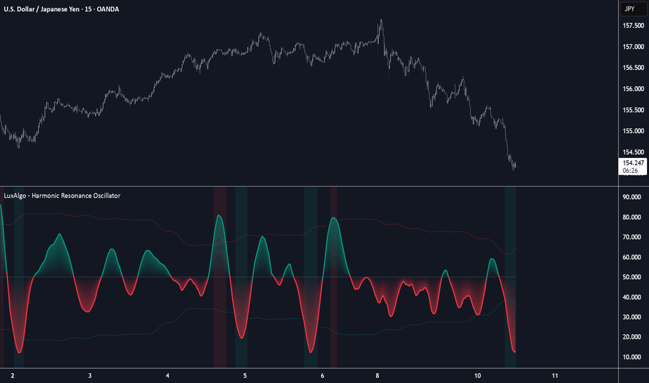
インジケーター