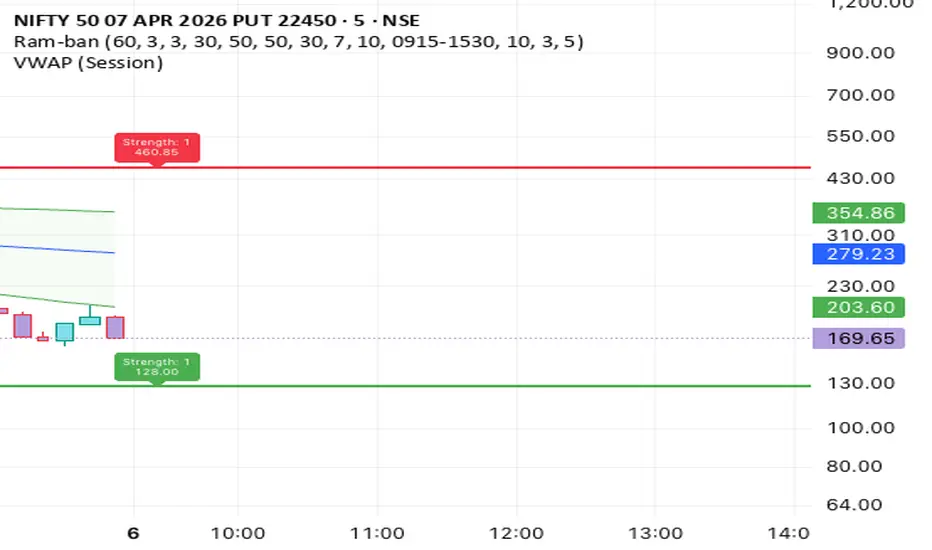
Aura Pivot S/R Matrix [Pineify]Aura Pivot S/R Matrix
This indicator turns confirmed swing pivots into volatility-adaptive support and resistance zones rather than single horizontal lines. The thickness of each zone is derived from a 200-bar ATR snapshot taken at the pivot bar itself — so a level formed during a quiet consolidation gets a narrower zone than one formed during a wide-range expansion, without any manual tuning per instrument. Each zone tracks forward with price until a full close breaks through it, at which point the zone is frozen and labeled as a breakout or breakdown.
Key Features
ATR-scaled zone thickness anchored to the volatility regime at the pivot bar, not the current bar
Forward-extending zones that visually "track" price until broken, then freeze as a historical record
Close-based break detection that filters out wick probes and test-and-reject candles
Per-zone state management via a user-defined type — each zone behaves as an independent object with its own lifecycle
Breakout and breakdown labels printed at the exact bar of confirmation
How It Works
Each zone is built through a three-stage pipeline — pivot confirmation, volatility-scaled construction, and lifecycle tracking.
A swing is detected when a bar's high is higher than the surrounding pivotLen bars on both sides (for resistance), or the low is lower (for support). Because the right-side requires N bars of confirmation, zones appear with a deterministic pivotLen -bar lag and do not repaint once drawn
At the moment a pivot confirms, the script measures the 200-bar ATR as it existed pivotLen bars ago — that is the volatility context at the actual swing bar, not the current bar. The zone is then drawn as a box extending ±(ATR/2) around the pivot price
Each zone is stored in an SRZone user-defined type that bundles its box, midline, label, pivot level, and a boolean broken flag. Two arrays — one for resistance, one for support — hold the active inventory
On every bar, unbroken zones have their right edge extended forward. When the close exceeds the top of a resistance zone (or falls below the bottom of a support zone), the zone stops extending, is marked broken, and a labeled marker is drawn at the break bar
How the Components Work Together
Three design decisions interact to produce the final behavior.
The pivot detection answers where market structure previously turned — these are locations where orders likely clustered and will likely cluster again on retest. The ATR scaling answers how wide the reaction range around that pivot should be, because a pivot formed during a low-volatility session does not represent the same defensive range as one formed during a volatile expansion. Combining the two produces zones that are structurally anchored but volatility-proportional.
The close-based break filter then handles the noise problem. The most common false break is a wick that tags the level, prints a panic candle, and reverses immediately. By requiring a full close beyond the zone, the indicator rewards conviction moves and ignores exploratory probes — the break is registered only when price has committed to the new regime.
Trading Ideas and Insights
Repeated tests of a fresh resistance zone without a closing break frequently precede a sustained reversal. The more times a zone is defended, the more meaningful the eventual breakout becomes
When a resistance zone breaks and then holds as support on retest, that flip is a classic structural shift — an opportunity to align with the new direction using the flipped zone as a clear invalidation level
Support zones broken during strong trending conditions rarely hold on retest. Support broken during ranging conditions often reforms because the market was simply oscillating — context from the broader trend matters
A cluster of multiple pivots at similar prices (three or four zones stacking) marks a confluence area that carries more weight than an isolated swing
Past behavior at these levels does not guarantee future reactions. Treat zones as bias filters rather than standalone signal generators.
Unique Aspects
Most S/R indicators use fixed-distance zones, round numbers, or percentage bands. This one scales zone thickness to a rolling ATR measured at the exact bar of the pivot — so a 2020 level and a 2024 level on the same chart can have very different zone widths depending on the volatility regime that produced them
Zones freeze on break rather than being deleted, preserving a visual history of which structural levels have been tested and lost. This acts as a passive context map for traders reading price action
State is managed through a UDT array rather than a flat set of lines, which makes the extend-until-broken behavior clean and predictable — each zone owns its own break detection logic
How to Use
Add the indicator to any chart and timeframe you actively trade. 1H and 4H are good starting points for swing traders; lower timeframes work but will produce more zones and benefit from a higher pivot lookback value
Identify the nearest active support zone (green) and resistance zone (red) — these are the first levels price is likely to react to
Watch for one of two outcomes: a controlled approach followed by rejection (fade setup), or a decisive close through the zone (breakout setup). The indicator labels the breakout or breakdown automatically
When a level breaks, expect a retest. Retests often offer better reward-to-risk entries than chasing the initial breakout bar itself
Customization
Pivot Lookback Length (default: 15) — Bars required on each side of a swing for confirmation. Lower values (5-10) produce smaller, more frequent zones suitable for scalping. Higher values (20-30) isolate only major structural swings and reduce chart clutter
Zone Width (ATR Multiplier) (default: 1.0) — Scales the ATR-derived zone thickness. Raise to 1.5-2.0 on volatile instruments where zones should absorb normal noise; lower to 0.5 for tighter precision-entry levels
Support / Resistance Color — Visual differentiation between bullish and bearish zones, their midlines, and labels
Zone Transparency (default: 85) — Controls the fill opacity of zone boxes. Values around 80-90 keep price action readable inside the zone
Limitations to Be Aware Of
The pivot confirmation delay equals the lookback length. A 15-bar lookback means the zone is drawn 15 bars after the actual swing high or low. This is fine for levels (they do not repaint) but unsuitable for entries at the exact swing bar
Zones do not automatically merge. When multiple pivots form within an ATR of each other, their zones will overlap on the chart. Increasing the pivot lookback reduces this visual clutter
Break detection uses close , not wicks. A bar can spike well beyond the zone and return inside without triggering a break — by design, but worth remembering on volatile instruments with large intrabar swings
Conclusion
Rather than plotting dozens of static lines, the Aura Pivot S/R Matrix treats each structural pivot as a live object with a volatility-scaled range and a clear lifecycle — active, then broken. The ATR scaling grounds each zone in the volatility context of its own formation, and the close-based break detection emphasizes conviction moves over noise. Most useful as a structural framework for swing and position traders who want to see where the market has been defended, where those defenses have been lost, and how the battleground has evolved across different volatility regimes.
インジケーター

インジケーター

PhantomFlow V4.1 Gold IndicatorPhantomFlow V4.1 Gold Indicator is a structure-and-momentum trend tool built for XAUUSD and other fast intraday markets. It combines swing structure, EMA trend alignment, higher-timeframe bias, session filtering, and previous day/week liquidity levels to highlight cleaner continuation opportunities while reducing low-quality signals.
How it reads trend
The indicator uses confirmed swing highs and lows together with a fast and slow EMA. When structure and EMA direction agree, it marks bullish or bearish trend conditions. An optional higher-timeframe filter can be used to keep signals aligned with the broader market direction.
Candle colors
Lime = fresh bullish entry signal
Fuchsia = fresh bearish entry signal
Green = bullish trend / hold condition
Red = bearish trend / hold condition
Faded green = bullish trend weakening
Faded red = bearish trend weakening
Gray = neutral / no clear directional edge
Signal logic
Signals appear when price is in trend, pulls back toward value around the EMA zone, then shows momentum back in the trend direction. This is designed to help identify continuation entries rather than constantly calling reversals.
Previous Day / Previous Week levels
The indicator plots:
PDH = Previous Day High
PDL = Previous Day Low
PD50 = Previous Day Midpoint
PWH = Previous Week High
PWL = Previous Week Low
These levels act as liquidity and reaction zones. They can help identify likely targets, breakout points, and areas where price may hesitate or reject.
Level filter
An optional level-aware filter blocks new signals when price is too close to an important previous day or previous week level. This helps avoid entries with poor room to move.
Dashboard
The top-right dashboard shows:
current bias
current state
trend score
higher-timeframe direction
session status
previous day levels
previous week levels
available room to key levels
whether the level filter is on
Trend score
The score is a quick strength reading based on EMA spread, EMA slope, structure, break conditions, momentum, session alignment, and optional HTF agreement. Higher values mean stronger trend conditions.
Best use
This indicator is best used as a trend-bias and continuation-entry tool, especially on lower intraday timeframes such as 5m and 15m, with the 1H chart used as the higher-timeframe filter.
Here’s a shorter version for the TradingView description box if you want something tighter:
Short description:
PhantomFlow V4.1 Gold Indicator is a structure-based trend and continuation tool built for intraday trading. It combines swing structure, EMA alignment, HTF bias, session filtering, and previous day/week liquidity levels to highlight cleaner long and short opportunities. Candle colors show trend state and fresh entry triggers, while the dashboard displays bias, score, HTF direction, session status, and key PD/PW levels. インジケーター

インジケーター

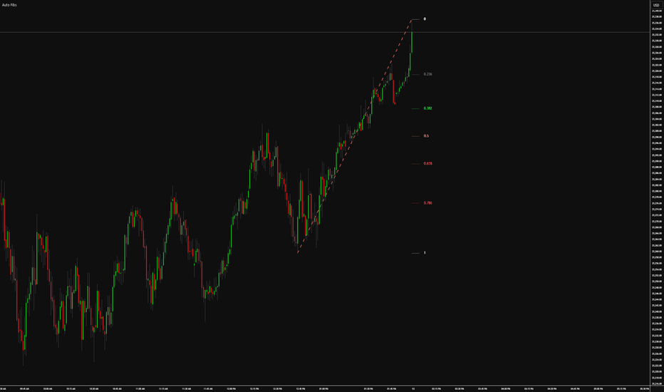
Auto Fibonacci LevelsAuto Fibonacci Levels is a dual Fibonacci retracement indicator that automatically detects swing highs and swing lows and plots Fibonacci levels between them in real time — no manual drawing required. It runs two completely independent Fibonacci sets simultaneously, allowing you to track retracements across two different swing sizes at the same time.
How It Works:
The indicator uses a pivot detection algorithm that scans a defined number of bars to identify the most recent significant swing high and swing low. Once a swing is identified, an anchor line is drawn connecting the two points, and Fibonacci retracement levels are automatically calculated and plotted from that range. As new swings form, the levels update dynamically.
Settings Breakdown:
Pivot Sensitivity - Controls how many bars back the indicator looks to identify a swing high or low. Lower values detect smaller, more frequent swings. Higher values require larger price moves before registering a new swing. Accepts any value from 1 to 500.
Show Anchor Line - Toggles the visibility of the diagonal line connecting the swing high and swing low. The anchor line visually represents the range the Fibonacci levels are drawn from.
Line Color - Sets the color of the anchor line.
Line Style - Sets the style of the anchor line — Solid, Dashed, or Dotted.
Line Thickness - Sets the thickness of the anchor line from 1 to 5.
Show Levels - Master toggle that turns all Fibonacci level lines on or off at once without affecting the anchor line.
Extend Level Lines - When enabled, stretches all Fibonacci level lines leftward to the beginning of the anchor line, so the levels span the full width of the detected swing range rather than only appearing at the right side of the chart.
Individual Levels (0, 0.236, 0.382, 0.5, 0.618, 0.786, 1.0) - Each level has its own show/hide toggle, adjustable value, and color picker. This allows you to display only the levels you trade with and color-code them however you prefer. Values are fully editable so you can substitute any custom retracement or extension levels you want.
Show Recent Fib Levels - When enabled, displays the previous Fibonacci sets from recently completed swings alongside the current active set. Historical sets are rendered progressively more transparent the older they are, making it easy to distinguish past ranges from the current one. Anchor lines are included for each historical set.
Recent Fib Count - Controls how many previous Fibonacci sets are displayed, from 1 to 5. Only fully completed swings are shown — the current active set is never duplicated.
Final Notes:
Both Fibonacci sets are fully independent and can be configured separately. The indicator is non-repainting within its current bar — levels update as new swings are confirmed. Works on all timeframes and all asset classes インジケーター
TheStrat Markov Percentages RoadmapTheStrat Markov Percentages Roadmap
Overview
The Markov Percentages Roadmap is a high-precision statistical engine designed for practitioners of The Strat. It bridges the gap between objective price action patterns and mathematical probability. By combining the structural rules of Broadening Formations (BF) with a historical Markov-style audit, this indicator calculates the real-world frequency of setups reaching user-defined "Reaction Zones."
Trading is not about being "right"; it is about understanding the frequency of success for a specific setup within a specific structural context. This roadmap provides the evidence.
The Background: Why "Markov"?
In probability theory, a Markov Chain is a model describing a sequence of possible events in which the probability of each event depends only on the state attained in the previous event.
In this indicator, we apply that logic to price action:
Current State: A specific "Strat" trigger (e.g., a Failed 2, a 2-1-2 Reversal, or a Continuation).
Next State: Price entering your user-defined Reaction Zone (defaulted to the 50% and 70% levels).
The Roadmap scans your historical data (Stat Lookback) to find every instance where a setup occurred and calculates exactly how many of those "states" successfully transitioned into the "Zone" within your chosen time horizon (Success Window).
Core Features
1. The Iron-Clad Anchor
The indicator locks onto the previously closed Higher Timeframe (HTF) candle. This ensures that the structural levels (BF High and BF Low) remain perfectly horizontal and fixed for the duration of the session. There is zero "lagging" or "trailing"—the goalposts are set before the first bar of the current session even opens.
2. Automatic Polarity Correction
Standard Fibonacci retracements often require manual flipping when the trend changes. This engine automates that logic.
Bullish HTF Candle: The 50/70 zone is measured down from the High (Reclaim/Retracement logic).
Bearish HTF Candle: The 50/70 zone is measured up from the Low (Reclaim/Retracement logic).
3. The Structural "Zoom Lens"
Using the Structure Lookback input, you can define your playing field:
Lookback = 1: Anchors the roadmap to the single prior HTF candle.
Lookback = 70+: Anchors the roadmap to the extremes of a major multi-day Broadening Formation.
4. The Statistical Dashboard
The real-time table provides a granular audit of:
Count: Total occurrences of the setup within the lookback period.
Prob. To Zone: The percentage frequency of that setup hitting your target.
Prob. To High/Low: The likelihood of price reaching the structural extremes.
How to Use the Roadmap
Identify the Playing Field: Set your Structural Timeframe (e.g., 4H) and Lookback.
Define the Goal: Input your Floor and Ceiling percentages (e.g., 50% and 70%).
Audit the Evidence: Check the dashboard for the setup currently triggering on your execution chart (e.g., 15m). If the "Prob. To Zone" is high (e.g., >65%), the roadmap suggests a high-probability "Reclaim" trade is in play.
Project the Move: Use the Extension Bar Count to project the current levels into the future space, allowing you to visualize the price's trajectory toward the target.
Disclaimer
This indicator is a statistical analysis tool based on historical price action. It does not provide financial advice, nor does it guarantee future results. Trading involves significant risk. The Markov probabilities generated are for educational and research purposes only.
Visual Settings Tip: If you use a light-colored chart, remember to adjust the "Table Text Color" in the Visuals group to ensure all statistical data is clearly visible. インジケーター

Wedge Chart Patterns [SSFX]Wedge Chart Patterns
Wedge Chart Patterns is a pattern-based breakout indicator designed to detect rising wedge and falling wedge formations, then transform valid breakouts into structured trade setups with predefined entry, stop loss, and take profit levels.
The script is built for traders who want more than simple visual pattern recognition. Instead of only drawing wedge structures, it filters breakouts using candle body strength, then projects a complete risk framework directly on the chart. This makes the tool suitable for both discretionary chart reading and systematic trade planning.
What this indicator does ?
This indicator continuously scans price action using pivot-based structure detection to identify wedge formations. Once a valid wedge is found, it tracks the upper and lower converging trendlines in real time and waits for a breakout in the expected direction.
A breakout is only considered tradable when the breakout candle shows enough conviction. The script measures the candle body as a percentage of the entire candle range and only allows entries when that body percentage is above a user-defined threshold. This helps filter out weak breakouts and reduce low-quality signals caused by indecision candles or excessive wicks.
After a valid breakout is confirmed, the indicator automatically builds a complete trade map:
✅ Entry level
✅ Stop loss
✅ Take profit
✅ Risk zone fill
✅ Reward zone fill
These levels are displayed directly on the chart and can be retained for the most recent trades for review and post-analysis.
Main features
✅ Detects rising wedges and falling wedges
✅ Uses pivot-based structure logic to form converging trendlines
✅ Validates wedge integrity before breakout
✅ Filters breakouts using minimum candle body percentage
✅ Generates long and short entry signals
✅ Supports multiple stop loss methods
✅ Supports risk-reward or fixed-point take profit
✅ Draws entry, SL, TP directly on the chart
✅ Adds filled SL/TP zones for fast visual trade reading
✅ Keeps the last several trade setups on screen
Best use cases
It can be used on multiple asset classes, including forex, gold, indices, crypto, and stocks, though results will depend on symbol behavior, timeframe, volatility conditions, and user settings.
Notes
This script is designed as a charting and trade-planning tool, not a guarantee of performance. Wedge patterns can fail, and breakout confirmation does not eliminate market risk. Users should always forward-test and adapt settings to the instrument and timeframe they trade. インジケーター

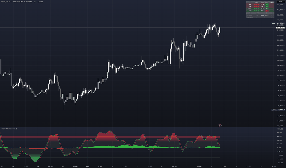
Trend Hunter v1.5Trend Hunter
A multi-timeframe WaveTrend momentum system with an integrated dashboard, Cipher B-style Money Flow, and instrument-specific entry alerts.
What it does
Trend Hunter calculates WaveTrend oscillators across six timeframes (4H, 1H, 30m, 15m, 5m, 1m) simultaneously and displays their state, value, and Money Flow direction in a compact overlay dashboard. It identifies pullback entries within established higher-timeframe trends by detecting fresh WaveTrend crossovers on lower timeframes while higher timeframes confirm directional bias.
How WaveTrend works
WaveTrend (originally by LazyBear) is a normalized momentum oscillator. It measures how far price deviates from its exponential moving average, normalizes that deviation, then smooths the result. Two lines are produced: WT1 (the main signal, EMA of the normalized channel index) and WT2 (a simple moving average of WT1). When WT1 crosses above WT2, a bullish dot appears. When it crosses below, a bearish dot appears. Overbought is above +53/+60, oversold below -53/-60.
The key insight this indicator exploits: when higher timeframes are trending (WT1 > WT2) and a lower timeframe pulls back below the zero line and then crosses bullish again, that pullback entry has a statistical edge over random entries. Backtesting across 6-17 months of data confirmed this for Gold (PF 1.51), Bitcoin (PF 1.17), and Ethereum (PF 1.12).
Money Flow (Cipher B method)
Instead of traditional volume-based MFI (which is unreliable on CFD instruments where broker volume is tick count, not real volume), this indicator uses the Cipher B approach: the ratio of candle body size to total candle range, smoothed over 60 periods. This produces a volume-independent momentum wave that oscillates around zero. Green = buying pressure dominant, red = selling pressure dominant. This works identically on forex, CFDs, crypto, and futures.
The formula: SMA((close - open) / (high - low) * 150, 60) - 2.5
Multi-timeframe dashboard
The overlay table shows each enabled timeframe's trend state (BULL/BEAR), WT1 value, Money Flow direction, and whether a fresh crossover dot just appeared (NEW). This eliminates the need to flip between timeframes manually. Timeframes are individually toggleable.
Instrument-specific alerts
Three backtested entry configurations are built in, each symbol-locked so they only fire on the correct instrument:
Gold/Silver (XAUUSD/XAGUSD): 4H and 1H both bullish, 1H WT still below zero, 5m green dot with WT2 below -10. This configuration produced the strongest backtest results (Profit Factor 1.51 across 350 trades). Recommended exit: fixed 1:3 risk-reward.
Bitcoin (BTCUSDT): 1H bullish, 1H WT still below zero, 5m green dot with WT2 below -20. Marginal edge (PF 1.17). Recommended exit: WT overbought (+53).
Ethereum (ETHUSDT): 1H bullish, 1H WT still below zero, 5m green dot with WT2 at or below zero. Marginal edge (PF 1.12). Recommended exit: WT overbought (+53).
All instrument alerts fire once per cycle. A cycle resets only when the 1H WaveTrend crosses back through the zero line in the setup direction, ensuring the alert cannot re-fire on brief oscillations near the crossover point.
Short-side alerts use the inverse logic with flipped thresholds.
Additional alerts
Generic green/red dot alerts on the current chart timeframe, filtered dot alerts (oversold/overbought only), generic HTF pullback alerts (4H+1H bias with LTF dot below zero), full alignment alerts (all enabled timeframes agree), and Money Flow zero-cross alerts.
How to use
Add the indicator to a 5m chart of your instrument. Enable the "Any alert() function call" alert to receive all relevant signals. The dashboard provides at-a-glance multi-timeframe context. Use the instrument alerts as entry candidates and confirm with price action, support/resistance levels, and risk management before entering.
This indicator does not generate buy/sell orders. It identifies statistical pullback setups within established trends. Not every alert is a trade.
Settings
WaveTrend parameters default to 9/12/3 (matching Cipher B). Money Flow defaults to period 60, multiplier 150. All inputs are accessible in settings but hidden from the status line by default to keep the chart clean. Dashboard position and size are configurable.
Credits
WaveTrend calculation based on LazyBear's WaveTrend with Crosses. Money Flow concept inspired by Cipher B's volume-independent approach. Multi-timeframe architecture and instrument-specific alert system are original. インジケーター
インジケーター

インジケーター

AG Pro Pivot Points Reaction Map [AGPro Series]AG Pro Pivot Points Reaction Map
Overview / What it does
AG Pro Pivot Points Reaction Map is an overlay indicator designed to analyze how price behaves around classical pivot levels rather than only plotting those levels as static horizontal references. The script builds Daily or Weekly pivot structures from prior period OHLC data and then tracks the currently active pivot in order to highlight nearby price interaction, reaction quality, and short-term context.
Instead of treating every pivot line equally at all times, the script uses an active-pivot framework. This allows the chart to stay focused on the level that is currently most relevant to price while still keeping broader pivot structure visible in the background. The goal is to help traders evaluate whether price is reacting constructively, rejecting, reclaiming, compressing, or losing a key pivot area.
The visual design is intentionally split into two layers. The first layer is the classical pivot structure itself, including PP, R1, S1, and optional extended levels such as R2 and S2. The second layer is the reaction map built around the active pivot. This layer adds an ATR-based reaction zone, state detection, filtered event labeling, active context tags, and an information panel so the chart can communicate more than a simple “price above” or “price below” condition.
This indicator is intended for chart analysis, workflow support, and structured market reading. It does not attempt to predict future prices, and it should not be interpreted as a standalone trade execution system. It is best used as a contextual overlay that helps organize price behavior around widely followed pivot references.
Unique Edge
The core distinction of this script is that it is not just another pivot plotting tool. Classical pivot indicators usually stop at drawing levels. This script continues one step further by evaluating reaction behavior around the currently active level.
Its main differentiator is the active reaction framework. The script identifies a current pivot focus, builds a dynamic reaction zone around that level, and then classifies price interaction into states such as reclaim, loss, holding behavior, rejection behavior, and compression near pivot. This moves the indicator away from passive level display and toward structured price-context mapping.
A second differentiator is the sticky active pivot logic. Instead of shifting focus too aggressively whenever price becomes marginally closer to a different level, the script attempts to keep chart attention anchored to the current active pivot until conditions justify a transition. This improves visual continuity and makes the chart easier to read during multi-bar interaction.
A third differentiator is signal hygiene. Reaction labels can be filtered through cooldown logic, score thresholds, and event selection rules so that the chart remains readable. Major events can be emphasized while weaker or more repetitive reactions remain in the background. This helps preserve interpretability instead of overwhelming the screen with every minor touch.
Finally, the script combines chart-side cues with a compact state panel. The panel reports the active pivot, pivot price, current distance, live state, last score, and directional bias. This allows users to scan the present context without losing the full visual relationship on the chart.
Methodology
The pivot engine uses prior Daily or Weekly OHLC values to construct standard pivot levels. These levels form the structural base of the indicator. Depending on settings, the script can display the central pivot point together with first and second resistance/support layers.
From that structure, the script evaluates which pivot is currently most relevant to price and assigns that level as the active pivot. A sticky selection process is then used so the active focus does not rotate too easily on minor fluctuations. This helps the script behave more like a context map and less like a constantly flickering nearest-line tracker.
Around the active pivot, the script builds a reaction zone using ATR. This means the mapped zone adapts to the instrument’s recent volatility rather than using a fixed absolute distance. A wider volatility environment naturally leads to a wider interaction zone, while a calmer environment keeps the zone tighter.
Inside that zone, the script studies price behavior using a combination of position relative to the pivot, candle body structure, wick emphasis, and short-term displacement from the level. It also computes a reaction score designed to quantify how constructive or decisive the interaction appears under the script’s logic. Stronger reclaim or rejection characteristics can therefore stand out from weaker, noisier touches.
The result is a layered read of market structure:
- classical pivot references define the environment,
- the active pivot identifies current relevance,
- the ATR-based zone frames the interaction area,
- event logic classifies notable reactions,
- the panel summarizes the current state.
Signals & Alerts
The script can identify and label several reaction types around the active pivot. Depending on settings and score thresholds, these may include reclaim events, pivot loss events, reaction holding behavior, and reaction rejection behavior.
In addition to chart labeling, the script includes alert conditions for major workflow events. These are designed to notify the user when price is showing a notable interaction around the active pivot. Available alert categories include bullish reaction confirmation, bearish reaction confirmation, pivot loss confirmation, compression near pivot, and active pivot changes.
Because this is a contextual indicator rather than a complete strategy, alerts should be interpreted as informational events. They are intended to help users monitor evolving price behavior around important pivot areas, not to replace independent analysis, execution rules, or risk management.
Key Inputs
Pivot Anchor
Selects whether the pivot structure is built from Daily or Weekly source data.
Show R2 / S2
Allows the extended pivot structure to remain visible for users who want broader context beyond PP, R1, and S1.
Base Pivot Line Width / Active Pivot Line Width
Controls the visual hierarchy between background pivot references and the currently active pivot.
Reaction Zone (ATR Multiplier)
Defines the width of the active reaction zone relative to recent volatility.
Wick Emphasis
Adjusts how strongly wick behavior contributes to reaction interpretation.
Signal Cooldown (Bars)
Prevents labels and events from clustering too tightly during noisy price interaction.
Show Reaction Labels / Label Mode / Minimum Label Score
Controls which reaction labels appear on the chart and how selective the script should be.
Focus Mode
Adjusts how aggressively non-active pivot lines fade into the background.
Reaction Label Size
Changes the chart label size for reaction events and edge tags.
Show Event Markers / Show Active Pivot Halo / Show Right Edge Active Tag
Controls optional visual layers that can make the active structure easier to follow.
Passive Context Tags
Adds simplified right-edge tags for passive pivot references so faded background levels remain interpretable.
Show Info Panel / Panel Position / Panel Theme / Panel Font Size
Configures the summary panel to match user preference and chart layout.
Limitations & Transparency
This script is based on classical pivot concepts and volatility-adjusted reaction mapping. It does not know future price direction, and it does not forecast whether any pivot will hold or fail before price interacts with that area.
Reaction labels and scores are formula-driven representations of the script’s internal logic. They are not objective truth statements about market intent, and they should not be interpreted as guaranteed support, guaranteed resistance, or guaranteed continuation/reversal behavior.
Like all level-based overlays, the script can produce different impressions depending on the selected timeframe, instrument volatility, and chart conditions. Fast-moving instruments, low-liquidity environments, and sudden news-driven candles may reduce the practical value of any fixed structural framework, including pivots.
The active pivot model is intentionally selective. That improves chart focus, but it also means the script emphasizes one current pivot context over other simultaneously visible levels. Users who want a broader or more aggressive level-tracking style may prefer different settings than the default configuration.
The indicator is also not a backtesting engine and does not provide complete entry, exit, stop, or position sizing logic. It should therefore be used as one analytical component within a broader decision process.
Risk Disclosure
This indicator is for analytical and educational use only. It does not provide investment advice, trading advice, or financial advice.
Markets involve risk. Price can move through pivot levels without respecting them, reaction quality can deteriorate quickly, and conditions that appear constructive on one bar can fail on the next. No indicator can remove uncertainty from live markets.
Users should evaluate this script together with their own market framework, timeframe selection, execution process, and risk controls. Decisions involving capital should never rely on a single indicator, label, panel reading, or alert event in isolation. インジケーター

ストラテジー

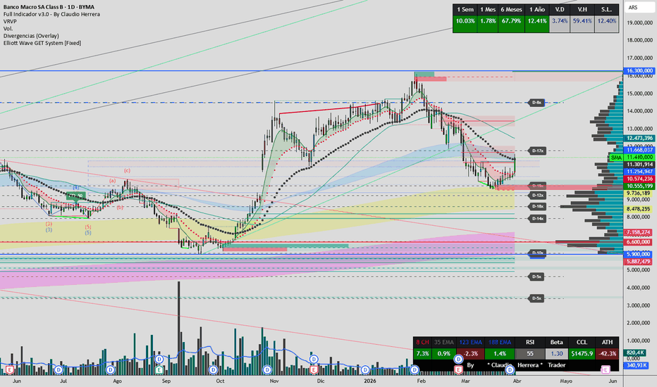
Full Indicador v3.0 - By Claudio HerreraThis script combines several custom indicators to create a configuration that adapts to all timeframes.
The Domenec Tunnel, with its custom, modified moving averages, allows us to always know where we stand. The moving averages and correction tapes, calibrated to fit any chart, provide a visual advantage during analysis, enabling us to quickly recognize trends and critical areas.
The color-coded indicator adds extra value by highlighting "strength/weakness/doubt" in the movement or direction, as well as indicating whether an impulse is strong enough to sustain over time. It allows us to quickly recognize trend exhaustion and reversals.
The inclusion of ICT indicators, support and resistance levels, trend lines, market structure, and FVG detection allows us to identify areas of interest with high volume where the price consistently returns. インジケーター
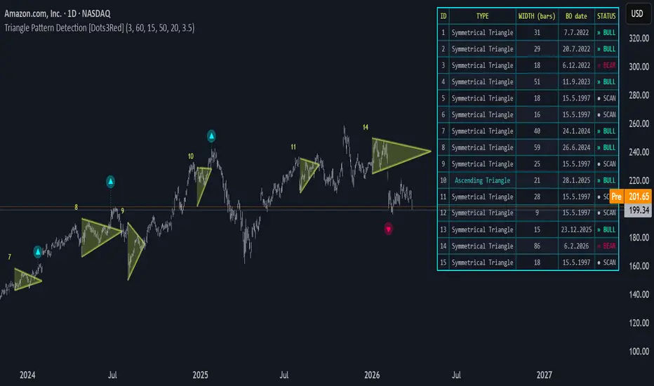
Triangle Pattern Detection [Dots3Red]Triangle Pattern Detection Indicator detects and draws triangle chart patterns in real time. The indicator identifies pivot highs and lows, validates converging trendlines, calculates the mathematical apex, and classifies each pattern by type.
How it works
The indicator scans for pivot highs and pivot lows using a configurable lookback length. Once two valid pivot highs and two valid pivot lows are found, it verifies that:
The trendlines are genuinely converging (spread shrinks from left to right)
No bar between the pivots violates the trendline boundary
The upper and lower patterns are aligned in time
The pattern meets minimum and maximum width requirements
If all conditions pass, the apex is calculated mathematically as the exact intersection point of the two trendlines, and the full triangle is drawn from the shared start bar to the apex.
Pattern Types Detected
Symmetrical Triangle — both lines converging toward each other
Ascending Triangle — flat upper resistance, rising lower support
Descending Triangle — declining upper resistance, flat lower support
Rectangle — both lines near horizontal
Visuals
🟡 Electric glow triangle
▼ / ▲ Pivot markers at pattern boundaries ( commented out in the code )
🔵 Bullish breakout signal / 🔴 Bearish breakout signal with glow effect and stem line
Number label at each triangle's start for cross-referencing with the info table
Info Table (top right)
Keeps a record of the last 5 detected triangles showing:
Column - Description
ID - Triangle number
Type- Pattern classification
Width - Pattern width in bars
BO date - The day the price broke out from the triangle pattern
Status - Live breakout status — Bull / Bear / Inside
The Status column updates on every bar so you can see in real time whether price has broken out of any recent pattern.
Settings
Pivot Length - Sensitivity of pivot detection (1–10). Lower = more patterns
Max Pattern Width - Maximum bars between first and second pivots
Start Bar Alignment Tolerance - Max distance between the start of the upper and lower pivots of the triangle's sides
Max Apex Distance - How far ahead the apex can project
Min Pattern Width - Filters out patterns that are too narrow to be meaningful
Breakout Threshold % - How far the price must close beyond the trendline to confirm a breakout
Notes
All triangles are drawn on the last bar only, avoiding repainting of historical patterns
Breakout detection scans from the leftmost bar of the pattern to the apex, firing on the first confirmed close beyond the boundary
Example on BTC 🪙 chart
インジケーター

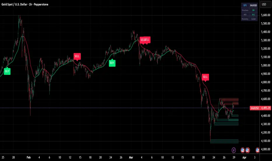
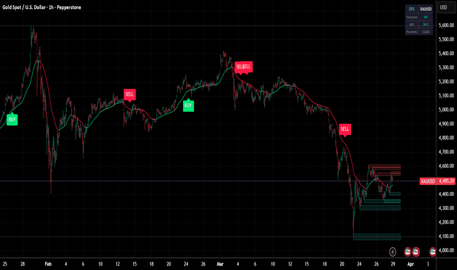
Dynamic Pivot Structure [DPS]Dynamic Pivot Structure (DPS) is a price structure analysis tool that automatically detects pivot points, classifies market structure (HH, HL, LH, LL), and generates dynamic support/resistance zones with mitigation tracking.
**Mathematical Foundation:**
The indicator uses the standard pivot point detection algorithm with configurable left and right bar confirmations. A pivot high is confirmed when the high of a bar is greater than the highs of all N bars to its left and N bars to its right. Similarly for pivot lows. This provides mathematically validated local extremes rather than arbitrary level selection.
Market structure classification follows the Dow Theory framework: Higher Highs (HH) and Higher Lows (HL) define uptrends; Lower Highs (LH) and Lower Lows (LL) define downtrends. The indicator tracks consecutive pivot sequences and labels each new pivot with its structural classification.
Support and resistance zones are generated around each pivot using the Average True Range (ATR) for zone width. This creates proportional zones that automatically adjust to the instrument's volatility. The indicator tracks zone mitigation — when price penetrates a zone, it is marked as mitigated and visually faded.
**Signal Logic:**
Buy signals fire when price is near an unmitigated support zone, above the trend EMA, with RSI below 40 or bullish structure (HH/HL), and ADX confirming a trending environment. Sell signals fire near resistance with bearish conditions.
**Features:**
- Automatic pivot high/low detection with adjustable sensitivity
- Market structure classification (HH, HL, LH, LL)
- Dynamic ATR-based support and resistance zones
- Zone mitigation tracking with visual feedback
- ADX trend strength filter
- Trend EMA overlay
- Dashboard showing structure type, ADX, and proximity status
インジケーター
Pivot Strategy [OmegaTools]Pivot Strategy by OmegaTools is a systematic trading strategy designed to evaluate price behavior around key pivot point levels. The script builds a complete pivot framework using the selected calculation method, with support for Traditional, Fibonacci, Woodie, Classic, and Camarilla pivots. From this structure, the strategy derives the central pivot level together with the first three resistance and support extensions, creating a clear and objective map of potential reaction zones for the session.
This script shouldn't be used as a stand alone strategy, a proper trigger and confluence filters are missing, instead try using this script to study market reaction to key levels in order to be able to create and test your own strategy.
The strategy is built around two distinct execution models. In TF mode, it operates as a breakout system, entering long positions when price closes upward through the selected bullish pivot level and entering short positions when price closes downward through the selected bearish pivot level. In MR mode, the logic shifts to a mean reversion framework, taking the opposite side of a level interaction: a touch of the selected support-side level from above can trigger a long entry, while a touch of the selected resistance-side level from below can trigger a short entry. This dual structure allows the script to be adapted to both continuation-driven and reversal-driven market conditions.
Entry selection is configurable through the central pivot or through one of the first three support/resistance tiers, allowing traders to test different degrees of aggressiveness and selectivity. A central-pivot configuration may produce more frequent signals, while higher-level entries such as SR2 or SR3 generally focus on more extended price movement before participation. This makes the strategy suitable not only for direct backtesting, but also for comparative research across instruments, volatility regimes, and pivot methodologies.
Risk management is handled through pivot-based exit logic. Stop loss and take profit levels are independently configurable and are mapped directly to the pivot structure. For long positions, stop losses are derived from the support side and take profits from the resistance side. For short positions, the inverse logic is applied. The script also validates these levels relative to the average entry price, so exits remain structurally coherent with the active position. This keeps the framework simple, transparent, and fully anchored to the same pivot environment used for entries.
To reinforce execution discipline, the strategy includes a maximum trades per day parameter, limiting the number of entries allowed during each reset cycle. At the beginning of a new reset period, the strategy clears its internal trade counter and closes any open position, ensuring that each new session starts independently from the previous one. This design makes the model particularly useful for traders who want strict session-based behavior and clean daily segmentation in their testing.
Overall, Pivot Strategy is intended for traders and quantitative researchers seeking a structured way to test pivot-driven breakout and mean reversion behavior with clearly defined rules. It is especially useful for studying how different pivot formulas, entry locations, and exit configurations influence performance across markets and timeframes, while maintaining a consistent and interpretable framework.
Disclaimer: This script is provided for educational and research purposes only. It does not constitute financial advice, investment advice, trading advice, or a recommendation to buy or sell any financial instrument. Past performance, backtest results, and hypothetical simulations are not indicative of future results. Market conditions, slippage, commissions, execution differences, and instrument-specific factors can materially affect real-world performance. Users should conduct their own analysis, apply proper risk management, and perform thorough out-of-sample validation before considering any live use. ストラテジー

G.O.D Trades1. G.O.D SR Zones (Wide Pink & Green Areas)
What it is:
These are the large semi-transparent rectangles — pink for G.O.D Resistance and green for G.O.D Support.
They are created using the highest high and lowest low over your chosen lookback period (default 25 bars).
Why it matters:
These act as institutional supply and demand zones. Big players often defend or attack these areas. Price tends to react strongly (reverse or accelerate) when it touches them.
How to use:
Price approaching G.O.D Resistance (pink) from below → potential short opportunity.
Price approaching G.O.D Support (green) from above → potential long opportunity.
When price breaks a zone with strong momentum candles → expect continuation toward the next opposite zone.
Best trades happen at the edges of these zones.
Pro Tip: The wider the zone, the stronger it is. You can increase lookback for broader zones or decrease it for more responsive ones.
2. Liquidity Pools + Sweeps (Blue & Orange Boxes + Triangles)
What it is:
Liq High (blue box): Area slightly above recent swing highs.
Liq Low (orange box): Area slightly below recent swing lows.
Sweep markers: Small red triangle (above bar) for high sweep, green triangle (below bar) for low sweep.
Why it matters:
Institutions hunt stop-loss orders. Liquidity pools are where many retail traders place their stops (above highs or below lows). A "sweep" is when price briefly takes that liquidity and then reverses.
How to use:
A sweep (triangle appears) is often a high-probability reversal signal.
Example: Price wicks above Liq High → red triangle appears → price reverses down → look for short.
The opposite for longs at Liq Low.
These are especially powerful when they occur near G.O.D SR zones.
Pro Tip: The best setups are sweep + reversal signal + G.O.D zone confluence.
3. L Pivots (Red & Green "L" Labels)
What it is:
Automatically detects swing highs and lows using ta.pivothigh(5,5) and ta.pivotlow(5,5).
Labels them as L1, L9, L15, L25, etc. Red = bearish pivots (resistance), Green = bullish pivots (support).
Why it matters:
These show market structure in real time (Break of Structure, Change of Character). Higher L numbers usually mean more recent and significant levels.
How to use:
Bounce trades: Price reacts at an L pivot inside a G.O.D zone → good reversal setup.
Break trades: Price breaks an L pivot with momentum → continuation trade.
Use them as precise entry or stop-loss levels (tighter than the big SR zones).
Pro Tip: L25+ levels are generally stronger than L1–L10.
4. Daily NY Session High/Low (SH & SL Lines)
What it is:
Red line = Session High (SH)
Green line = Session Low (SL)
Automatically resets at 9:30 ET (New York open) and tracks the high/low during regular trading hours (09:30–16:00 ET).
Why it matters:
These are psychological and institutional reference points for the entire day. Many algorithms and traders watch these levels closely.
How to use:
Breaking SH with momentum → bullish bias for the day.
Breaking SL with momentum → bearish bias for the day.
Retests of SH/SL after breakout often provide excellent entries.
5. Momentum Oscillator (Yellow Line in Separate Pane)
What it is:
A simple 10-period Momentum indicator (ta.mom(close, 10)). It plots above or below the zero line.
Why it matters:
It shows the speed and strength of price movement. Helps filter fakeouts.
How to use:
Momentum rising above zero → bullish strength.
Momentum falling below zero → bearish strength.
Divergence: Price makes new high but momentum fails to → warning of reversal (often matches REV↓ signal).
Use it to confirm direction before entering on sweeps or pivots.
Pro Tip: Combine with reversal signals — the REV labels already use momentum divergence internally.
6. Reversal Signals (REV↑ and REV↓ Labels)
What it is:
Green REV↑ at lows and red REV↓ at highs. These appear automatically.
Why it matters:
It detects when a pivot low/high forms and momentum is diverging — a classic reversal pattern in SMC/ICT.
How to use:
REV↑ near G.O.D Support or after a Liq Low sweep → strong long setup.
REV↓ near G.O.D Resistance or after a Liq High sweep → strong short setup.
These are excellent for scalping or catching early turns.
7. Background Highlight (Red Tint on Strong Down Moves)
What it is:
Light red background when a candle has a strong bearish close.
Why it matters:
Helps you quickly spot aggressive selling pressure without staring at every candle.
How to use:
Use it as a visual filter — strong red background + sweep or reversal signal = higher conviction short. インジケーター

Supply & Demand Zones XLDescription
Supply & Demand Zones XL is a non-repainting supply and demand indicator designed to model market structure with a focus on stability, clarity, and quantitative strength evaluation.
The script identifies supply and demand zones using pivot-based structure and sizes each zone dynamically using ATR, ensuring consistent scaling across different market conditions. Zones are extended forward in real time and maintained as either active or historical depending on user preference.
Each zone is scored using a composite strength model that incorporates volume participation, zone width efficiency, time in market, and touch frequency. The resulting strength rating is normalized to a simple X/10 format and displayed at the end of each zone for immediate readability.
A non-repainting mode ensures that zones are only confirmed after pivot completion, preventing forward-looking bias. An optional volume filter allows users to require above-average participation before a zone is formed.
The script includes logic to prevent redundant structure by disallowing overlapping zones of the same type while the current zone remains valid. Once a zone is broken, new zones are allowed to form, preserving structural continuity.
Zones are considered broken only on confirmed closes beyond their boundaries, not intrabar wicks. Broken zones are downgraded in strength and can be visually differentiated using customizable color controls. Users can independently control coloring for active and historical broken zones, as well as define separate colors for supply, demand, broken supply, and broken demand.
Historical zones can be toggled on or off, with optional strength labels, allowing users to balance context versus chart clarity.
The result is a structured, state-driven supply and demand model that avoids noise, reduces duplication, and provides a consistent framework for evaluating zone quality and market behavior. インジケーター

Volumetric Gann StyleVolumetric Gann Style
Overview
Volumetric Gann Style is a rule-based chart visualization tool built around a pivot-anchored Gann structure.
The script organizes its calculations around confirmed structural pivots, then renders a multi-layered Gann framework that can include fan geometry, box/grid structure, heat-zone visualization, volumetric pressure mapping, Square of 9 references, contextual labels, and a structure-based signal layer.
This indicator is designed for visual, structural, and educational analysis.
It is not a financial advisory tool.
It does not provide investment advice.
It does not generate standalone buy or sell recommendations.
It does not guarantee future outcomes, profitability, or market direction.
Any labels, breaks, reclaims, rejections, or alert conditions displayed by the script are derived from predefined structural rules inside the indicator. They should be treated as contextual chart events, not as direct trade instructions.
Image 1 — Full System Overview
Complete chart view showing the main Gann structure, volumetric visual layers, and the overall architecture of the script.
Core Architecture
The script is built around a pivot-based anchor engine.
Confirmed pivots are used to define the active structural framework, and the rendered Gann geometry updates according to that anchor logic. The goal is not to forecast future price behavior, but to display how price interacts with a structured Gann environment derived from chart data.
This framework allows the indicator to maintain a coherent visual relationship between:
anchor points,
fan projections,
box/grid levels,
pressure zones,
volumetric structure blocks,
and structural event labels.
The output is therefore intended as a chart-structure visualization system, not a predictive model.
Image 2 — Pivot Anchor + Fan Structure
Example of how the active anchor logic defines the current fan environment and the main structural framework.
Two Display Engines
Volumetric Gann Style includes two distinct display modes:
1) Volumetric Gann Style
This mode emphasizes the custom visual architecture of the script and its volumetric presentation logic.
Depending on the active settings, it can display:
structured level boxes,
internal pressure segmentation,
volumetric buy/sell pressure presentation inside the active range,
heat-zone logic,
right-side informational elements,
and a denser structural overlay.
This mode is designed to make structural pressure easier to read visually by combining Gann geometry with volumetric distribution concepts inside the displayed framework.
Image 3 — Volumetric Gann Style Mode
The custom volumetric mode with structured boxes, internal pressure layout, and denser visual context.
2) Classic Gann
This mode presents a cleaner and more traditional Gann-style visual framework.
It focuses more directly on the geometric side of the structure while preserving the same underlying anchor logic.
These two modes are alternative visual interpretations of the same structural engine. They are not separate trading systems and they do not represent separate market predictions.
Image 4 — Classic Gann Mode
A cleaner geometric presentation using the same anchor engine and structural logic.
Gann Fan Structure
The indicator can project a Gann fan from the active pivot structure and display its internal angle framework visually on the chart.
The fan is used here as a structural reference layer. It helps users observe how price moves relative to the active angular framework and how that framework evolves when anchor conditions change.
The fan display is a visualization component.
It does not predict direction, define future targets, or produce guaranteed signal quality.
Image 5 — Gann Fan Structure
Visual example of the active fan and its angle relationships inside the current framework.
Gann Box / Grid Structure
The script can also build a Gann box-style environment around the active structure.
This box/grid component is used to visualize:
structural expansion,
internal level relationships,
horizontal and vertical reference alignment,
and interaction areas inside the active framework.
In Volumetric Gann Style mode, this same structural area can also host pressure-oriented visual blocks, allowing the framework to communicate not only geometry, but also internal volumetric balance in a more readable way.
This creates a more readable structural field for observing how price behaves inside the current anchor-defined range.
The box and grid are analytical chart objects only. They are not standalone trade setups, not future projections, and not investment recommendations.
Image 6 — Gann Box / Grid Layout
Structural box and grid presentation around the active range.
Heat Zone and Volumetric Volume Logic
One of the defining visual layers of this script is its volume-oriented display logic.
Depending on the selected mode and settings, the indicator can render:
heat-style emphasis zones,
internal buy/sell volume boxes,
volumetric range-based structure blocks,
total volume information,
level and price information,
and contextual structure mapping inside the active framework.
These elements are intended to make internal structure easier to observe visually.
They do not claim order flow certainty, execution quality, or predictive edge.
They should be interpreted as part of the script’s visual framework rather than as direct trading commands.
Image 7 — Heat Zone and Volumetric Pressure
Example of heat-style emphasis and volumetric pressure distribution inside the active structure.
Signal Engine
The script includes a structural signal layer that can mark events such as:
break-type conditions,
reclaim behavior,
rejection behavior,
and aggressive structural reactions.
These events are generated from predefined internal conditions tied to the active Gann structure.
Important:
These labels are not standalone buy/sell calls.
They are not personalized advice.
They do not replace independent analysis, testing, or risk management.
They are best understood as structure-based chart annotations that highlight how price is behaving relative to the indicator’s active framework.
Image 8 — Signal Layer / Structural Events
Break, reclaim, rejection, or reaction-style labels shown as contextual chart annotations.
Square of 9
The indicator also includes Square of 9 style reference plotting.
This module is used as an additional structural reference layer and can help users visually compare chart behavior against the script’s projected Gann-style numerical framework.
As with the rest of the indicator, this component is informational and visual in nature. It does not imply certainty, future target precision, or directional guarantees.
Image 9 — Square of 9
Additional Gann-style numerical reference structure plotted on the chart.
Trend Score / Panel / Labels
The script may display summary panels, state labels, or trend-score style information derived from its internal logic.
These visual summaries are intended to improve chart readability and to present the current structural state in a more organized way.
They should be treated as descriptive outputs of the indicator’s rule set, not as guaranteed market conclusions.
Image 10 — Trend Panel / Labels
Panel-based summaries and contextual label outputs derived from the current structure.
How to Use
This indicator is best used as a structural chart companion.
Typical use may include:
observing pivot-defined Gann structure,
comparing price position against fan and box geometry,
monitoring volumetric pressure zones and contextual labels,
reviewing structural events on the chart,
and combining the visualization with the user’s own broader analysis process.
It should not be used as a substitute for independent judgment.
What This Script Does
Displays a pivot-anchored Gann framework on the chart
Supports both Volumetric Gann Style and Classic Gann display modes
Visualizes fan, box/grid, heat-zone logic, volumetric pressure structure, and contextual chart behavior
Includes optional structural event labeling
Adds Square of 9 and panel-based context elements
Organizes chart information into a rule-based visual framework
What This Script Does Not Do
Does not provide financial or investment advice
Does not generate standalone buy or sell recommendations
Does not guarantee profitable outcomes
Does not predict future market direction with certainty
Does not replace independent analysis, testing, or risk management
Disclaimer
This script is provided for informational, analytical, and educational purposes only.
All calculations are based on chart data and predefined internal rules. Market behavior can vary, and no visual element in this script should be interpreted as a guarantee, promise, or financial recommendation.
All trading and investment decisions remain solely the responsibility of the user. インジケーター

インジケーター

Trendline Breakout Indicator [Dots3Red]Trendline Breakout Indicator is an upgraded version of the existing "Trendline Breakout with Volume Confirmation ".
What is this indicator for?
The indicator is built to automatically detect and visualize trending price channels, both bullish and bearish . It draws channels (or polygons, optionally) across pivot-based trendlines, tracks them in real time, and signals when price breaks out of them with a certain N% (can be confirmed by volume activity too).
How does it work?
The indicator identifies pivot highs and lows of a configurable length. Consecutive pivots of the same type (lows for bullish, highs for bearish) form a trendline. Each trendline is then extended bar by bar until the price breaks it.
Channel mode draws a parallel channel around the trendline, where the channel width is determined by the maximum price deviation from the trendline within the channel's range - not a fixed offset. This means every channel is fitted to actual price behavior.
Polygon mode instead fills the area between the trendline and the extreme price reached within it, giving a triangular wedge shape that highlights price compression.
Channels are color-coded: cyan/teal for bullish, red/pink for bearish .
Breakout Detection
A breakout is confirmed when:
For bullish channels : price closes below the lower trendline by more than the configured Breakout %
For bearish channels : price closes above the upper trendline by more than the configured Breakout %
When a breakout occurs, the channel is frozen and drawn at its final shape. A BO▲ / BO▼ label marks the breakout bar.
Only channels that have persisted for at least the configured minimum length (in bars) are drawn - this filters out insignificant short-lived moves
Volume Confirmation
Volume is measured relative to its 20-bar moving average. When volume at the breakout bar exceeds the Volume % Breakout threshold, a bar visualization is drawn at the breakout point.
Key Inputs
C hannel / Polygon - Switch between channel and polygon visualization mode
Breakout % - How far price must close beyond the trendline to confirm a breakout
Slope Factor - Minimum slope required for a trendline to be considered a valid trend
Pivot Length - Lookback length for pivot high/low detection
Channel Min Length - Minimum bar length a channel must reach before being drawn
Volume % Breakout - Volume spike threshold relative to the 20-bar average (can be toggle on/off)
The code has been cleaned so as not to contain duplicate execution functions.
Example
Above is the Trendline analysis of the Nvidia stock behaviour.
The following configurable parameters have been chosen:
2.5% for price break out
1.02 for slope factor
3 for Pivot length
20 for min channel's length
30% for min volume % breakout indicaton
It is interesting to observe what happens when two opposite channels overlap. From Jan 2025 to mid May 2025, the stock was in a clear bearish channel, yet a bullish channel started to develop since April 2025. The bearish channel got broken on May 13, 2025, at the time when the bullish channel had already been established - a more powerful signal to enter long.
Changing indicator settings might give different visual interpretations, especially the slope factor and the minimum pivot length. インジケーター

インジケーター

Geass SRV - Support Resistance VolumeGeass SRV - Support Resistance Volume
by MasterTony
Volume profile engine adapted from Zeiirman's work — used with respect and full credit.
Most indicators tell you where price is. This one tells you where the market lives. The Support Band + Volume Profile is built around a single idea: price gravitates toward zones where real participation has happened, and it respects dynamic boundaries defined by the market's own momentum structure. This indicator surfaces both at once — a trend-adaptive zone on price and the volume history behind it.
How It's Calculated
Trend Direction (ADX + 200 SMA)
Market direction is read continuously using the DMI system — DI+ vs DI− for directional dominance, with the 200 SMA as a tiebreaker when they are equal. There is no neutral state. The indicator always commits to bull or bear, and all colors and zone behavior follow from that.
The Support Band (SMA 20 / EMA 21)
The innermost layer is a filled zone between the 20-period SMA and the 21-period EMA. These two averages are nearly identical in length but calculated differently, so the gap between them stays tight — producing a precise dynamic level rather than a wide smear. This is the mean of the recent trend. In a bull market it is the floor price returns to on pullbacks. In a bear market it is the ceiling price fails at on rallies. Green in a bull trend, red in a bear trend.
The Kijun Band — Main Trend Support and Resistance
The outer layer is the primary structural boundary of the indicator. The Kijun-Sen and Tenkan-Sen form a filled zone that acts as the main dynamic support in uptrends and the main dynamic resistance in downtrends, derived from Ichimoku Cloud. When price holds above this band the trend is intact. When price breaks through it and cannot reclaim it, the trend is in trouble.
Both lines adapt their lengths based on market conditions — compressing when momentum is strong and price is trending cleanly, expanding when conditions are weak or choppy. This means the boundary zone tightens in fast trends and widens when the market is uncertain, automatically adjusting to the environment. The lines are colored cyan in a bull regime and magenta in a bear regime, keeping them distinct from the inner band at all times.
The Kijun line within that band is the single most important level to watch. It is the baseline the trend must hold. Everything else in the indicator gives context to what happens at the Kijun.
Volume Profile — Reading the Zones
Volume profile engine adapted from Zeiirman's original work.
The volume profile is drawn to the right of price covering the last 240 bars. It answers the question the bands cannot: how much real participation has happened at each price level. A band sitting on a high-volume node is structurally different from a band sitting in empty space.
Point of Control (POC): The price level with the highest total volume — the market's center of gravity. When the POC aligns with the Kijun or the support band, that level is not just a moving average. It is a price the market has repeatedly chosen, making it the highest-conviction read the indicator can produce.
Value Area: The central 68% of all volume, shown as the brightest bars on the profile. The edges of the Value Area are high-probability reaction levels. Price approaching from outside tends to stall at the boundary or accelerate into the core. When the band zone overlaps a Value Area edge, dynamic structure and volume history are stacked at the same level.
Buy/Sell Split: Every row is divided between buying volume (green) and selling volume (red). When one side exceeds 60% it renders as a strong single color. This shows not just where volume was high — it shows who was in control. A dominant green node below price is demand. A dominant red node above is supply.
Low Volume Gaps: Rows with very little volume are structural gaps. Price moves through them quickly with little friction and accelerates until it hits the next meaningful cluster. When the band sits at the edge of a gap, a break can be fast and directional.
Freshness Fade: Recent volume glows brighter. Older volume fades. This prevents the profile from treating a level from 200 bars ago the same as one from yesterday.
Price Pivot S/R Lines
The last three swing highs and swing lows drawn as horizontal dashed lines — red for resistance, green for support. These are price memory. The exact levels where the market has previously reversed.
Bollingerbands
Custom Bollinger bands that can be toggled on to see outer lines of directional trend
How to Read It
The zone between the support band and the Kijun boundary is the core read. Green means the corridor is support — healthy pullbacks happen here. Red means it is resistance — rallies fail here. A tight narrow zone signals strong trend momentum. A wide zone signals a slower or more uncertain market.
The Kijun line is the level that matters most. A pullback that holds above it and bounces is trend continuation. A close below it is a warning. A reclaim from below is the first sign of a potential reversal. Every trade setup built with this indicator lives or dies at the Kijun.
The volume profile tells you whether the Kijun level carries real weight. A Kijun sitting on a large green volume node has been defended by buyers repeatedly — it has structural backing. A Kijun sitting in thin faded volume is unproven. When the POC and the Kijun are at the same price, that is the strongest signal this indicator can produce.
Value Area edges add a second volume-based reference layer. Watch for the band or Kijun to overlap with the top or bottom of the Value Area — that is confluence of two independent structural forces at the same level.
Pivot lines show the nearest price structure above and below. A green pivot just below the Kijun in a bull trend means two separate historical references are stacked — structural and volume-based support reinforce each other.
How to Trade With It
Bull Trend Pullback
Band is green. Price pulls back into the support band or toward the Kijun. Check the volume profile — is there a high-volume green node or the POC near that level? If yes, the zone has volume backing. Wait for a reversal signal inside the zone. Enter long with a stop below the Kijun. The nearest green pivot below is your hard invalidation.
Bear Trend Rally
Band is red. Price rallies into the band or toward the Kijun. Check the volume profile — is there a high-volume red node or the POC near the Kijun? If yes, the resistance is volume-confirmed. Wait for rejection inside the zone. Enter short with a stop above the Kijun. The nearest red pivot above is your invalidation.
Volume Gap Move
When price breaks out of the band and enters a low-volume section of the profile, expect the move to accelerate. There is no structural resistance in that gap. Price will run until it hits the next meaningful volume cluster. Use the profile to identify where that cluster is and target it.
Trend Change Warning
When the band flips color, stop trading the previous direction. Wait for price to pull back and hold the newly-colored zone on a retest before entering the new direction. Check the POC — if it is already on the new direction's side of price, the flip has volume support and is more likely to hold.
Confluence Filter
The cleanest setups occur when everything agrees: band color matches the trade direction, price is testing the Kijun, the POC or a high-volume node is at or near that level, and a pivot line adds nearby structure. When all of that stacks at one price, the zone is as high-conviction as this indicator gets.
Credits
Volume profile engine — Gaussian volume distribution, buy/sell split, POC calculation, Value Area logic, and freshness fade — adapted from Zeiirman's original work. Full credit to Zeiirman for the foundation that powers the volume layer of this indicator. インジケーター