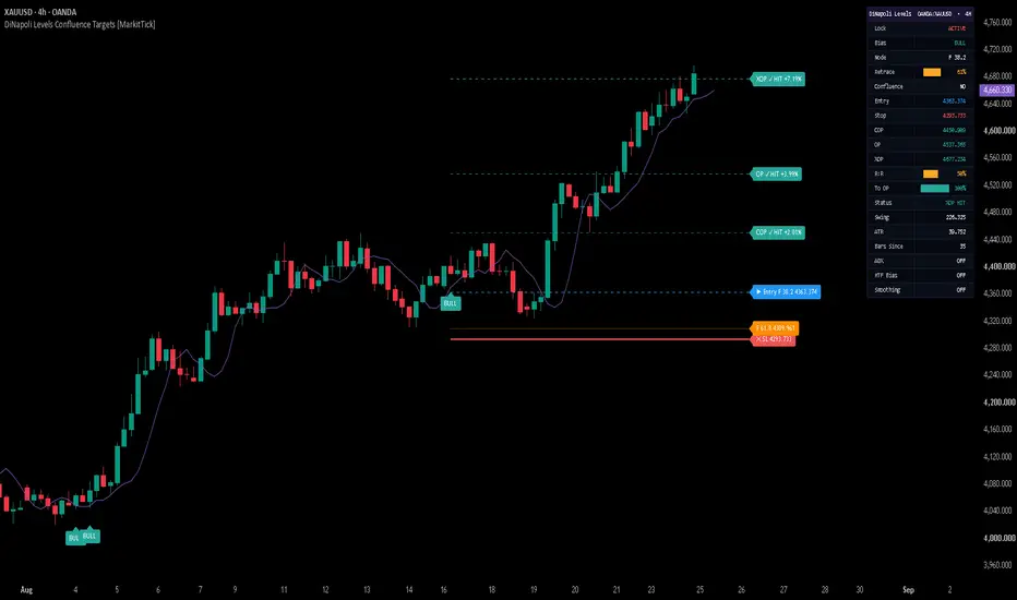
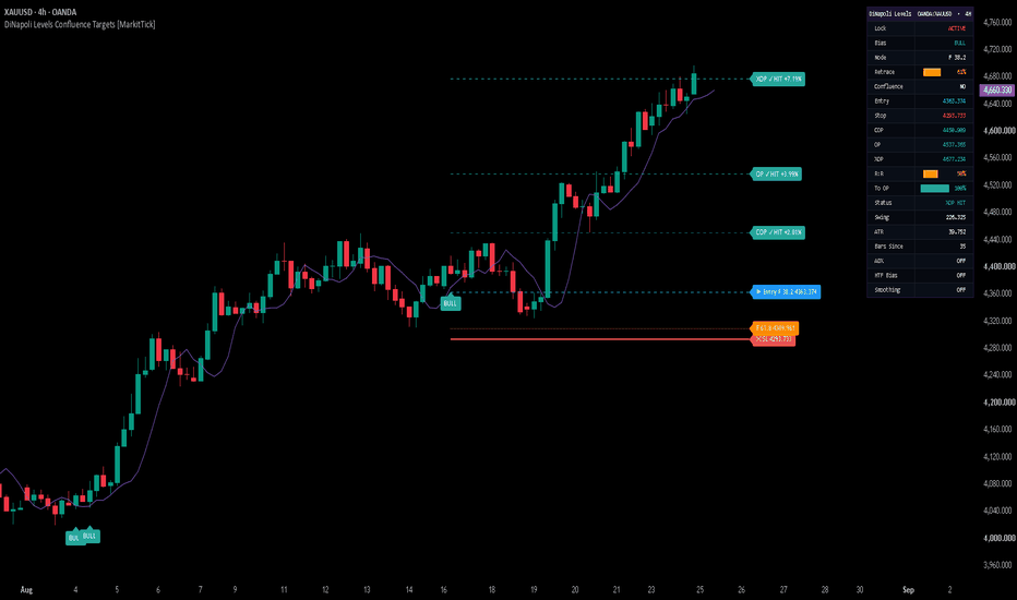
DiNapoli Levels Confluence Targets [MarkitTick]💡 This script automates the complete DiNapoli-style Fibonacci workflow on any symbol and timeframe: it locates confirmed swing pivots, measures the resulting impulse leg, selects an appropriate Fibonacci retracement entry from that leg, projects a three-tier set of Fibonacci profit objectives from the pullback point, cross-checks a second independent swing for confluence, filters everything through a displaced-average trend context, and then tracks the resulting trade in real time through on-chart levels and a live dashboard.
Rather than requiring a trader to manually draw retracement and expansion tools on every fresh swing, cross-reference two different Fibonacci grids by eye, and mentally track a displaced moving average's bias, the script performs all of that detection, labeling, and state-tracking automatically, and exposes the resulting signals through webhook-ready alert payloads for automation.
✨ Originality and Utility
This is not a rehash of a single built-in Pine tool or a simple retracement drawing utility. It implements the full, interdependent DiNapoli Levels sequence as one coherent system, where each stage consumes the output of the previous one:
Confirmed fractal pivot detection builds the swing skeleton the entire tool depends on.
The most recent three-to-five pivots are used to define both a primary swing (for entries and objectives) and a secondary, older swing (used only for confluence cross-checking).
Retracement depth of the pullback determines which of two Fibonacci entry levels is actually referenced, rather than relying on a single fixed ratio for every setup.
Profit objectives are geometric extensions of the very same swing used to derive the entry, not independent, arbitrarily chosen levels.
The displaced-average trend filter, ATR-based stop, and confluence check all read from the same pivot/swing state, so removing any one of them would break the internal logic rather than simply "simplify" the script.
Because the entry, stop, and all three objectives are all mathematically derived from the same confirmed swing, the tool gives traders a single, internally consistent read on a setup instead of several disconnected indicators layered on top of one another. The value is in the integration and automation of a documented, multi-step methodology, the live tracking of trade state once a signal fires, and the structured webhook output for downstream automation — not in inventing a new mathematical formula.
🔬 Methodology and Concepts
• Pivot and Swing Detection
Swing highs and lows are identified using a standard confirmed-fractal method: a candidate high (or low) is only accepted once it is verified to be the extreme point across a window of Pivot Left bars before it and Pivot Right bars after it. Confirmed pivots are stored in a rolling, alternating high/low sequence (capped at the eight most recent) that forms the script's live market-structure map.
• Swing Classification
The three most recent pivots are labeled, oldest to newest, A, B, and C. A bullish structure requires the sequence low → high → low (A low, B high, C low), representing an upward impulse leg from A to B followed by a pullback into C. A bearish structure is the mirror image. The distance from A to B defines the primary swing used for every subsequent calculation.
• Retracement Measurement
The pullback's depth is expressed as a percentage of the A–B swing: how far price has travelled back from B toward A by the time pivot C is confirmed. This retracement percentage drives both setup validity and entry-level selection.
• Fibonacci Retracement Entry Zone
Two retracement levels of the A–B swing are calculated, at 38.2% and 61.8%. If the confirmed pullback has already reached 61.8% or deeper, the script references the 61.8% level as the entry; otherwise it references the shallower 38.2% level. This dynamic selection reflects the idea that the appropriate entry reference depends on how deep the actual retracement has gone, rather than committing to one ratio for every swing.
• Fibonacci Objective Targets
Three profit objectives are projected from pivot C using the primary swing magnitude, following the classic three-tier DiNapoli objective-point structure:
COP (Contracted Objective Point) — C plus 0.618 times the swing.
OP (Objective Point) — C plus 1.000 times the swing.
XOP (Expanded Objective Point) — C plus 1.618 times the swing.
These represent successively less conservative price projections derived from the same impulse leg used for the entry.
• Setup Validation
A setup is only considered valid when all of the following hold: the alternating high/low pattern is intact, the retracement sits between 38.2% and the user-defined Max Retrace ceiling (filters out pullbacks that have gone too deep to be a valid retracement), the swing's magnitude is at least the Min Swing × ATR threshold (filters out insignificant, noise-driven swings), the swing direction is consistent with the claimed bias, the trend filter (if enabled) agrees, and a confluence zone exists (if Confluence Required is enabled).
• Dual-Swing Confluence Detection
A second, independent swing is measured from an older pivot (A2) to B, and the same 38.2%/61.8% retracement math is applied to it. The script then compares all four combinations of the primary and secondary retracement levels and, if the two closest levels fall within Confluence Tolerance × ATR of each other, marks the midpoint between them as a confluence zone. This reflects agreement between two independently measured Fibonacci grids rather than a single grid taken in isolation, which is the basis of the confluence concept in DiNapoli's original methodology.
• Displaced Moving Average Trend Filter
A short simple moving average (DMA Length) is calculated, and the internal trend comparison uses that average's value from DMA Displace bars earlier, effectively lagging the filter by that many bars. The same average is plotted on the chart with a forward visual offset equal to the same displacement, so the line drawn on the chart lines up with the value actually being compared against price. When enabled, only setups where price sits on the correct side of this displaced average are accepted.
• Stop and Objective Placement Logic
The stop is placed a user-defined multiple of ATR beyond pivot C, giving the stop room proportional to the instrument's own recent volatility rather than a fixed distance. All targets are recalculated fresh each time a new, valid setup fires and remain fixed for the life of that trade.
• Signal Firing and State Tracking
A new signal fires only on a confirmed (closed) bar, and only once per underlying pivot, preventing duplicate or repeated firing on the same structure. Once fired, the script tracks live high/low crosses against the stop and each objective; a stop hit takes priority over a same-bar target hit, and each hit updates the relevant level's on-chart label and color permanently for that trade. The Lock Signal input can freeze the presently tracked setup on the real-time bar so that a fresh pivot does not override an open position mid-trade.
⏱️ Confirmation Lag Notice
Because a pivot cannot be confirmed until Pivot Right bars have elapsed past it, both the pivot itself and any signal built from it only become visible on the chart after that many bars have passed — the resulting lines and labels are drawn retroactively onto a swing that has already formed. This is a structural characteristic of any confirmed-pivot Fibonacci tool rather than a flaw, but it does mean a signal never appears exactly at the live turning point; it appears with a short, deliberate confirmation delay.
The script contains no request.security() calls and references no higher-timeframe or future data, so outside of this inherent pivot-confirmation delay there is no forward-looking bias in the setup logic. Entry signals fire only on confirmed, closed bars, and once a signal and its levels are drawn they do not later shift to a different bar or disappear — they are only replaced outright when a new, opposite setup fires.
The DMA line's forward visual offset is a display convention matching the traditional presentation of a displaced moving average: the values plotted are ordinary trailing averages, simply drawn shifted to the right so the line visually tracks price with the same lag the trend filter itself uses internally. It is not a projection or forecast of future price.
🎨 Visual Guide
• Trade Level Lines and Labels
When a setup fires, five horizontal lines and their accompanying labels extend from the signal bar: the Stop (solid, thicker line), Entry (dashed), and the COP, OP and XOP objectives (dashed, drawn in progressively fuller shades of the same bullish or bearish color to reflect their increasing distance). All five lines automatically extend to the current bar while the trade remains open, and extend up to the closing bar once the trade is stopped out or reaches XOP.
• Fibonacci Node Reference Line
A dotted line marks whichever of the two retracement levels (38.2% or 61.8%) was not selected as the entry, shown for reference so the alternate level remains visible alongside the chosen one.
• Confluence Line
When a confluence zone is detected and the Confluence Line option is enabled, a dashed line marks the midpoint between the two agreeing Fibonacci levels from the primary and secondary swing grids.
• Merged Labels
When two or more levels land at the same price, their labels are merged into a single combined label (separated by a middle dot) instead of stacking overlapping duplicate labels, keeping the chart readable.
• Signal Markers
A "BULL" or "BEAR" label is plotted at the low or high of the firing bar respectively, colored to match the configured bullish or bearish color.
• Displaced Moving Average Line
The DMA is plotted in its configured color, shifted forward on the chart by the DMA Displace setting, matching the internal trend-filter reference described above.
• Live Dashboard Table
An on-chart table (position configurable to any corner) shows, row by row: symbol and timeframe, Lock status, current bias, which Fibonacci node is active, retracement depth as a ten-block progress bar with percentage, whether confluence was present, the Entry/Stop/COP/OP/XOP price levels, risk-to-reward expressed as a block bar scaled to 5R, progress toward OP as a block bar, current trade status (open, or which level was hit), the swing size, the current ATR value, and the number of bars elapsed since the last signal.
📖 How to Use
Wait for a "BULL" or "BEAR" marker and its accompanying level lines to appear; remember these will appear with the short pivot-confirmation delay described above rather than exactly at the swing extreme.
On a bullish setup, price will already be sitting in the retracement zone of the prior up-leg; the Entry line marks the DiNapoli-selected reference level, the Stop sits an ATR-buffered distance beyond the swing low, and COP/OP/XOP are staged, increasingly distant profit levels. Bearish setups mirror this on the downside.
Enable Confluence Required to restrict signals to setups where two independently measured Fibonacci grids agree — this produces fewer but more selectively filtered setups.
Leave the DMA Filter enabled to only take setups aligned with the displaced-average trend context, or disable it to see every structurally valid swing regardless of that bias.
Use Lock Signal on the real-time bar if you are already in a tracked trade and do not want a newly forming pivot to override the current levels mid-position.
Watch the dashboard's Status row and block-bar visualizations for a fast read of retracement depth, risk-to-reward, and progress toward the OP objective without needing to read exact prices.
Configure the Alerts group's action strings to match the JSON keys your webhook or automation platform expects, then use TradingView's "Any alert() function call" option to route long, short, close, objective-hit, and stop-hit events.
Treat the Stop, COP, OP and XOP levels as a structured framework for planning risk and staged exits, not as a guarantee that price will reach any particular level — always size positions according to your own risk tolerance.
⚙️ Inputs and Settings
• Core
Pivot Left / Pivot Right — number of bars required on each side of a candidate swing point before it is confirmed; larger values confirm more significant but slower-appearing swings.
Min Swing × ATR — minimum size, in ATR multiples, an A–B swing must have to be considered valid, filtering out noise-sized structures.
Max Retrace — the deepest retracement (as a fraction of the swing) still accepted as a valid pullback.
ATR Len — lookback period for the Average True Range used throughout the stop, minimum-swing, and confluence-tolerance calculations.
• Filters
DMA Filter — toggles the displaced-average trend requirement on entries.
DMA Len / DMA Displace — period and forward displacement of the trend-filter average.
Confluence Required — toggles whether a confluence zone is mandatory for a setup to fire.
Confluence Tol × ATR — maximum distance, in ATR multiples, between two Fibonacci levels for them to be treated as confluent.
• Trade Tools
Lock Signal — freezes the currently tracked setup on the real-time bar, blocking new signals from overriding it.
Stop Buffer × ATR — distance, in ATR multiples, the stop is placed beyond pivot C.
• Visuals
Fibnodes — shows or hides the unused Fibonacci reference node line.
Confluence Line — shows or hides the confluence-zone line.
Signal Markers — shows or hides the BULL/BEAR labels.
DMA Line — shows or hides the displaced moving average plot.
• Dashboard
Show Dashboard — toggles the on-chart table.
Position — selects which chart corner hosts the dashboard.
• Alerts
Long / Short Action, Close Long / Close Short Action — the "action" values sent in the JSON payload for entries and exits.
COP / OP / XOP Action, Stop Action — the "action" values sent when each objective or the stop is hit.
• Colors
Individual color controls are provided for the bullish and bearish themes, stop, entry, each of the three objectives, both Fibonacci nodes, the confluence line, the DMA line, label text, the dashboard's three-tier progress-bar shading, and the dashboard's header, background, and text colors, allowing the full visual theme to be adapted to any chart background.
🔍 Deconstruction of the Underlying Scientific and Academic Framework
The core methodology follows Joe DiNapoli's published approach from "Trading with DiNapoli Levels" (1998), which combines a displaced moving average for trend context with Fibonacci retracement levels for entry timing and a three-tier set of Fibonacci expansion objectives — the Contracted, standard, and Expanded Objective Points — for profit projection. The script's DMA filter and COP/OP/XOP target structure are direct implementations of that framework.
The use of Fibonacci ratios in price analysis traces back to the Fibonacci sequence itself (Leonardo of Pisa, 13th century) and its adoption into market analysis through Ralph Nelson Elliott's wave theory and W.D. Gann's work on proportional price relationships, later formalized by DiNapoli into a discrete, rules-based entry and objective framework.
Swing-point identification via a confirmed left/right bar window reflects the standard swing-high/swing-low definition used broadly across technical analysis, closely related to the fractal concept popularized by Bill Williams, and provides an objective, repeatable substitute for discretionary chart reading.
Average True Range, developed by J. Welles Wilder, supplies the volatility-normalized basis for the stop distance and minimum-swing filter, allowing the same input values to scale automatically across instruments and volatility regimes rather than relying on fixed point or pip distances.
The confluence-detection logic reflects the broader "cluster" or "confluence zone" concept found throughout Fibonacci-based technical analysis: treating agreement between two independently derived retracement grids as a stronger signal than either grid considered alone, a filtering approach explicitly discussed within DiNapoli's own writings on Fibonacci analysis.
⚠️ Disclaimer
All provided scripts and indicators are strictly for educational exploration and must not be interpreted as financial advice or a recommendation to execute trades. We expressly disclaim all liability for any financial losses or damages that may result, directly or indirectly, from the reliance on or application of these tools. Market participation carries inherent risk where past performance never guarantees future returns, leaving all investment decisions and due diligence solely at your own discretion. インジケーター
インジケーター
インジケーター
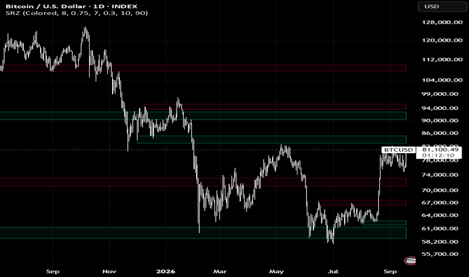
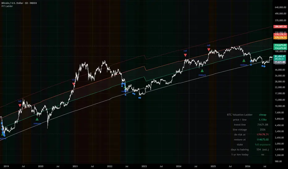
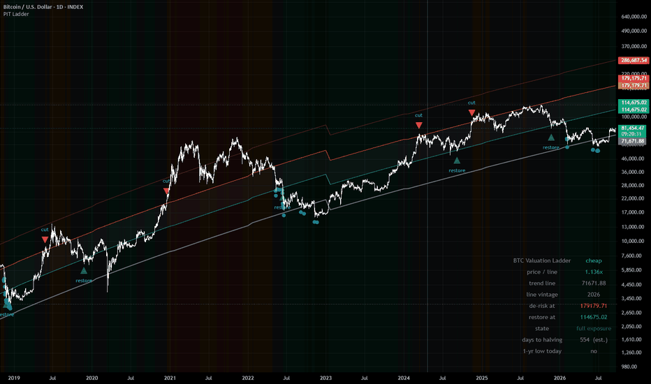
BTC Power-Law Ladder (Point-in-Time)WHAT IT DOES
Divides Bitcoin's daily close by a power-law trend line fitted to the lower edge
of its own price history, then sorts the result into five labelled rungs. The
reading answers one question: how far is price stretched above the floor that
has historically held it?
This is a risk-framing tool. It is not an entry signal and it is not advice.
THE TREND LINE
line(d) = 10^a * d^b d = days since the genesis block, 2009-01-03
The coefficients come from a quantile regression through the 1% lower quantile
of log price against log days — a line that tracks the bottom edge of the
distribution rather than its middle.
What makes this version different: the line is refit every January, and each
year is drawn with the coefficients that were available in that year. The 2016
fit uses only data through 2015-12-31. The 2020 fit uses only data through
2019-12-31. Thirteen vintages are stored, 2014 through 2026. Nothing on the
chart was fitted on the history it is being drawn over.
Most published power-law charts use a single set of constants fitted across the
entire history, then plot them back over that same history. Those charts show
you a line that knew how every cycle ended. This one does not.
Because a hard coefficient switch on January 1 would move the line — and
therefore the ratio — overnight with no price action behind it, each new vintage
is phased in over the first 21 bars of the year (adjustable). Both fits are
known on January 1, so the blend introduces no future information. The 2016
vintage sits 43% below the 2015 vintage; without the blend that single step
would jump the ratio by 77% and could trip a rung change on its own.
THE RUNGS
Fixed at 1.0x, 1.6x, 2.5x and 4.0x. These boundaries do not move when you change
the de-risk settings, because the statistics below were measured at these
specific values.
What followed each rung, 2014-01-01 to 2026-09-16 (4,642 daily closes, medians):
rung days 2-yr median positive next-yr drawdown P(dd < -50%)
below 1.0 445 9.77x 100% -30% 0%
1.0 - 1.6 1,544 4.31x 100% -30% 14%
1.6 - 2.5 1,162 2.05x 89% -49% 46%
2.5 - 4.0 764 1.60x 76% -62% 90%
above 4.0 727 0.74x 28% -72% 97%
Read the day counts as overlapping windows, not as independent observations. The
ratio's one-day autocorrelation is 0.997, so consecutive days in the same rung
are very nearly the same observation counted again.
THE DE-RISK STATE MACHINE
Optional markers for a hysteresis rule: reduce exposure when the ratio closes
above 2.5, restore when it closes below 1.6. The band between the two levels
prevents the state from flipping on noise. The machine only evaluates confirmed
closes, so what you see on the chart is what the rule would have done, not what
an intrabar wick briefly suggested.
Over the same window, with costs and exposure lagged one day:
buy and hold Sharpe 0.88 max drawdown -83.6% 101x
the rule Sharpe 1.16 max drawdown -55.9% 260x 6 round trips
Tested against 5,000 random vetoes of the same six durations at random dates:
p = 0.0022 (Sharpe), 0.0006 (drawdown), 0.0142 (terminal multiple).
WHAT THIS IS NOT — READ THIS PART
Six completed round trips is far below any reasonable evidence threshold. My assessment of this rule is "insufficient evidence — tracked, not
rejected." It is not a validated edge, and it is presented here as a framework
for thinking about risk, not as a system to trade.
One specific failure: the 2017 episode alone accounts for 57.9% of the rule's
entire gross profit. It also gave up a 67.6% rally between the cut at $2,258 and
the restore at $3,783. A track record resting on one event is a track record you
do not yet understand.
The threshold grid used for robustness testing is not independent evidence.
Adjacent thresholds fire within days of each other on a signal with 0.997
autocorrelation, so a cut at 2.4 and a cut at 2.6 trade the same six episodes.
The grid shows the result is not balanced on a knife edge; it does not multiply
the evidence.
The point-in-time refits remove coefficient hindsight, not specification
hindsight. The 2014 coefficients use only pre-2014 data — but the decision to
fit a power law to the 1% lower quantile of log-log Bitcoin history was made by
people who had already seen that history. That choice was not available in 2014.
Coefficients for 2027 and later fall back to the most recent fit and are flagged
"provisional" in the readout table. They will be replaced as new vintages become
available.
SETTINGS
Line — Real-time (the point-in-time vintages, default, starts 2014), Published
constants (the widely-quoted full-history fit, for comparison), or Custom.
January blend length — bars over which a new vintage phases in. Default 21. Set
to 1 for a hard switch.
De-risk above / Restore below — the operative rule levels. Moving them off
2.5 / 1.6 takes the rule off the tested configuration; the readout table flags
this. The rung boundaries stay fixed regardless.
Markers — rung tint, boundary lines, de-risk and restore triangles, trailing
one-year lows, halving shading, and a readout table (four corner positions).
Five alert conditions are available: crossing the de-risk level, crossing the
restore level, losing the trend line, reclaiming it, and a new trailing
one-year low.
REQUIREMENTS
Bitcoin, daily timeframe, log price scale. The trend line is defined on days
since the genesis block and is not meaningful on other timeframes or symbols;
the script will tell you so rather than silently drawing nothing.
DISCLAIMER
This indicator is a research and risk-framing tool. It is not financial advice,
not a recommendation to buy or sell any asset, and not a trading system.
Every statistic shown describes what has already happened across a single asset
over roughly twelve years containing four market cycles. Bitcoin's history is
short, its regime has changed repeatedly, and nothing about the past behaviour of
this ratio guarantees or implies anything about its future behaviour. A power-law
floor holds until it does not, and there is no mechanism that obliges it to hold
at all.
The de-risk rule shown here is explicitly rated as having insufficient evidence
by its own author. It is published so that its logic and its weaknesses are both
visible, not because it has been demonstrated to work.
Trading digital assets involves substantial risk of loss. You are responsible for
your own decisions and should consult a qualified professional regarding your
particular circumstances. インジケーター
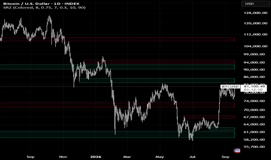
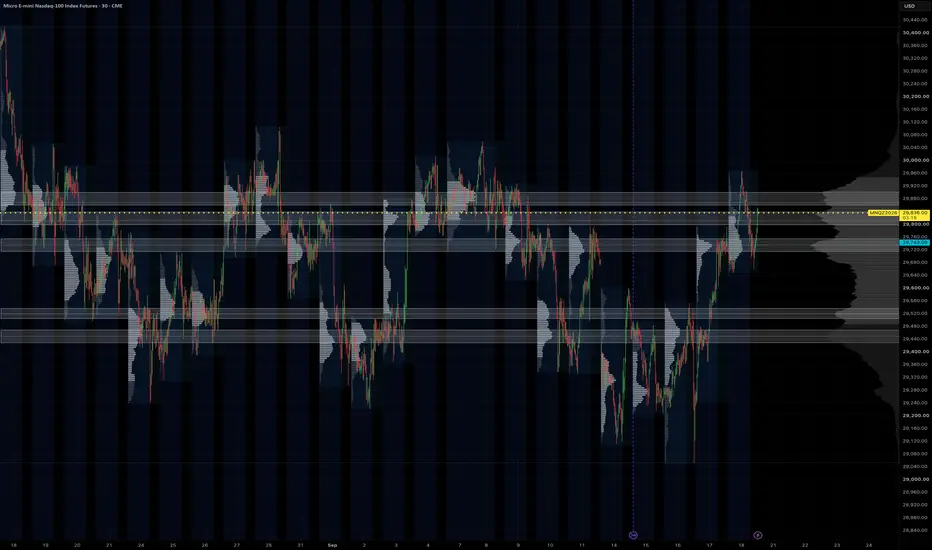
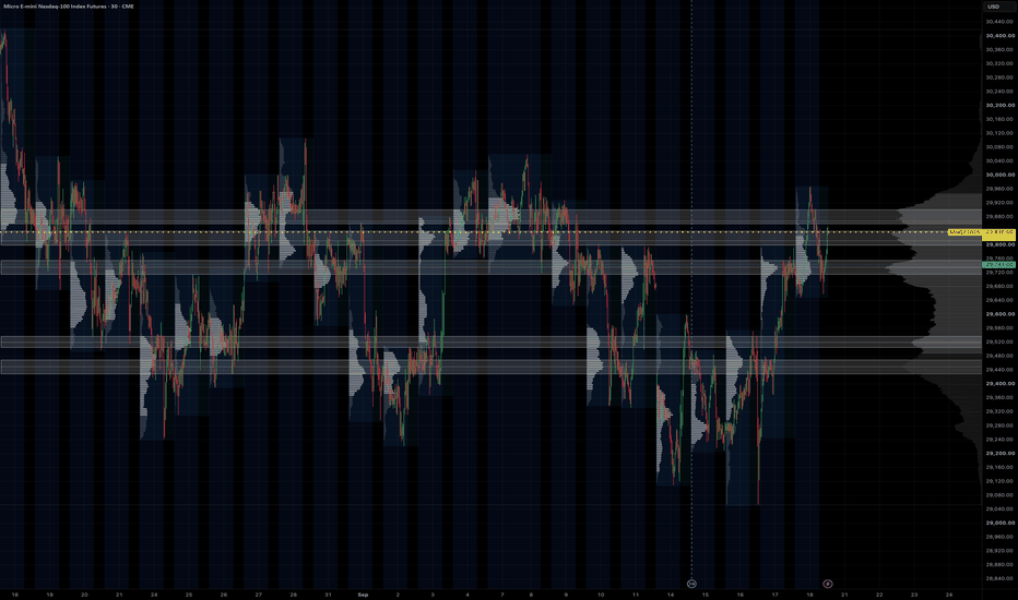
HVN ZonesHVN Zones boxes the high-volume nodes of a multi-session volume profile, the way many traders do by hand from a zoomed-out chart with a fine visible-range profile: each prominent node above and below price becomes a zone you can trade against. It draws the zones, a dotted line at each node's point of control, and a small label.
HOW IT WORKS
1. A volume profile is built over the last N Globex sessions (default 63, about three months) or over the visible range, from 1-minute intrabars where your plan allows it, otherwise from chart bars. Row size is fixed in points or automatic (range divided by 1000).
2. The histogram is smoothed with a short centred moving average.
3. A node is a row that is the tallest within a window of rows on either side and at least a set share of the tallest row in the profile.
4. Each node's zone is grown from the peak while volume stays above a floor. The default floor is prominence-based: prominence is the peak minus the higher of the troughs on either side, and the zone ends where volume has fallen 60% of the way from the peak toward that trough. This keeps a node on top of a broad dome local instead of turning the whole value area into one zone. Nodes with little prominence are dropped and zones are capped in height. The older "% of peak" rule is still available as an option.
5. Overlapping or near zones merge, a price band keeps only nodes within 2 x daily ATR(14) of the current price (or a fixed number of points, or off), and the strongest N zones by peak volume are drawn.
SETTINGS THAT MATTER
Window > Sessions: how far back the profile looks. 63 matches a three-month composite; 20 gives a tighter, more recent read.
Node detection > Zone width (%), Min prominence, Max zone height: how tall a zone gets and which nodes qualify. Lower the width for thinner boxes.
Price band: widen or narrow the multiplier to show more or fewer zones.
Node detection > Recompute every (minutes): the profile changes little intra-day, so the default is hourly. Bar Replay recomputes on every step.
Drawing > Label indent: a fixed pixel push to the right so labels sit in the chart margin at any zoom.
LIMITS
1-minute intrabars need a plan with intrabar access, and TradingView serves at most 100k of them per request, which is about 60 sessions. Longer lookbacks use chart bars for the older part. Switch "Profile source" to Chart bars on any plan.
Volume is spread evenly across the rows each bar overlaps, the same approximation TradingView's own visible-range profile makes at the bar level. It is not a tick profile.
Zones are rebuilt on each recompute from the current window, so they show the current profile, not a history of past zones.
The profile method follows the open-source volume-profile family by PtGambler (MPL-2.0). This script is an original implementation. インジケーター
Ayoub SMC AnalystAyoub SMC Analyst is a market-structure and price-action analysis indicator designed to help traders study market structure, liquidity behavior, Fair Value Gaps (FVGs), premium/discount areas, trend direction, and potential price targets from a single chart.
WHY THIS SCRIPT WAS CREATED
The purpose of Ayoub SMC Analyst is to organize important market-structure information directly on the chart without requiring multiple separate indicators.
The script focuses on structured market analysis rather than presenting guaranteed buy or sell signals. Its objective is to help traders identify important areas and build their own trading scenarios.
CORE FEATURES
• Higher High (HH)
• Higher Low (HL)
• Lower High (LH)
• Lower Low (LL)
• Bullish and Bearish Break of Structure (BOS)
• Buy-side and sell-side liquidity sweep detection
• Bullish and bearish Fair Value Gap (FVG) identification
• Premium and Discount areas
• Equilibrium level
• Major support and resistance levels
• Short-term and long-term trend direction
• Conditional bullish and bearish target levels
• Projected market scenarios
• Configurable structure sensitivity
• Optional labels and target visibility
HOW IT WORKS
The indicator uses confirmed swing highs and swing lows to evaluate market structure. It compares recent structural points to identify HH, HL, LH and LL formations.
Break of Structure conditions are detected when price crosses important structural levels.
Liquidity sweep conditions are identified when price temporarily moves beyond a structural high or low and closes back across that level.
Fair Value Gaps are identified using a three-candle price imbalance condition.
Premium and Discount areas are calculated from the most recent valid structural range, with the midpoint used as equilibrium.
Potential target levels are calculated from the current structural range. These levels are scenario-based reference points and are not guaranteed future price destinations.
HOW TO USE
1. Add the indicator to a standard candlestick chart.
2. Adjust Structure Sensitivity according to the timeframe and market.
3. Use HH, HL, LH and LL to understand the current market structure.
4. Monitor BOS and liquidity sweep markers around important structural levels.
5. Use FVG and Premium/Discount information as additional confluence.
6. Treat projected targets as analytical reference levels rather than guaranteed outcomes.
7. Combine the indicator with your own risk management and market analysis.
ORIGINALITY AND PURPOSE
Ayoub SMC Analyst is designed as a unified market-structure analysis tool with a specific focus on organizing structural levels, liquidity events, imbalance conditions, trend direction and scenario-based targets in one visual framework.
The goal is to reduce unnecessary chart clutter while keeping the main structural information visible and understandable.
LIMITATIONS
This indicator does not predict the future with certainty and does not guarantee profitable trades.
Market structure can change as new price information develops. Swing-based calculations can also change as new confirmed pivots appear.
The indicator is an analytical tool and should not be considered financial advice. Traders should independently evaluate market conditions, position sizing and risk before making any trading decision.
CHART EXAMPLES
TradingView chart examples:
インジケーター

Edo Breaker BlocksEdo Breaker Blocks — Draws Only the Order Blocks That Fail and Invert Their Role, Then Tracks Each Breaker as Active, Tested or Failed
When an important level fails, it does not disappear — it changes sides. A demand order block that is lost stops being support and starts acting as resistance; a supply order block that is taken out stops being a cap and starts acting as support. That inverted level is a breaker block, and it is one of the clearest reaction references in structure analysis: not a theoretical line, but one that has already failed in one direction and reacted in the other.
Edo Breaker Blocks maps them automatically, with one key difference from a plain order-block tool: it does not draw every order block. It keeps each candidate latent until price violates it and reacts from the opposite side; only then is the breaker zone drawn, with the inverted role. From there it tracks the zone's behavior — respected, tested or lost — all validated on closed bars so the indicator does not repaint. Everything it needs comes from the chart's own price action: the candidate zones, the violation that inverts them and the states that follow are all computed inside the indicator.
ORDER BLOCK, BREAK AND BREAKER
An order block is the last opposite candle before an impulse that breaks structure: the last bearish candle before a bullish break marks the demand zone, the last bullish candle before a bearish break marks the supply zone. The indicator stores that candidate but does not draw it. Only when price violates it — closes through it against its original role — is the polarity inversion confirmed and the breaker drawn. A demand order block lost becomes a bearish breaker (resistance); a supply order block taken out becomes a bullish breaker (support).
BULLISH AND BEARISH BREAKERS
A bullish breaker is a former resistance order block that price has taken out; it inverts into support, drawn in teal below price. A bearish breaker is a former support order block that price has lost; it inverts into resistance, drawn in red above price. Each breaker is a box over the range of the candle that originated it, extended to the right and labelled Bull Breaker or Bear Breaker, so the side and role read at a glance.
ACTIVE, TESTED AND FAILED
Each breaker lives in one of three states, evaluated on every closed bar. Active: freshly formed, thin-bordered, extending to the right. Tested: price has returned to the zone and respected it — it enters but closes on the correct side — and the border thickens while the zone stays alive. Failed: price has closed through the zone, which voids it — the box turns dashed and faded and stops extending. A bullish breaker is tested when price drops in and closes above its base, and fails when it closes below; a bearish breaker is tested when price rises in and closes below its top, and fails when it closes above. Only breakers that have not failed count in the panel, and only the most recent per side are kept, up to Max Breakers per side (6 by default).
STRUCTURE PROFILES AND IMPULSE LOOKBACK
The Structure Profile sets the swing sensitivity that defines a break: Scalper (5 bars each side) for short-term breakers on low timeframes, Swing (10 bars, the default) for the balanced 4H and daily read, and Long Term (21 bars) for the major breakers on weekly and higher horizons. The Impulse Lookback (20 by default) controls how many bars back the indicator searches for the candle that originated the impulse — how recent the order block has to be relative to the break.
INFORMATION PANEL
A compact panel under the indicator header shows the number of active bullish breakers (support), active bearish breakers (resistance) and the total of live zones, in the same teal/red color code. The count per side shows where the live references concentrate — more bull breakers mean support stacked below, more bear breakers resistance above. The panel sits in any of the four chart corners (Top Right by default), comes in three sizes (Tiny / Small / Normal) and two themes (Dark / Light), and can be hidden entirely. To keep the calculation light, it is drawn only on the last bar.
NO REPAINTING
Breakers are built on confirmed pivots and their transitions are validated on closed bars, so a zone never appears or disappears intrabar and a wick that pierces a breaker but closes back on the same side does not mark it as tested or failed. There are no higher-timeframe functions: all logic runs on the current chart timeframe. For a multi-timeframe read, apply it on several charts at once.
CONFIGURATION
The inputs are grouped by block. Structure sets the profile, the impulse lookback and the maximum breakers per side. Style exposes the bullish and bearish colors, the zone opacity, the label size and the Dark/Light theme. Panel controls panel visibility, position and size. The defaults are calibrated to work without adjustment on stocks, crypto, forex, indices and futures, on any timeframe — the inputs most users touch are the Structure Profile and the Impulse Lookback.
ALERTS
Four predefined alerts cover the life of a breaker: Bullish Breaker formed and Bearish Breaker formed fire when a new breaker is drawn; Breaker Tested fires when price returns to a zone and respects it; Breaker Failed fires when price closes through a zone and voids it. All alerts fire on bar close, consistent with the indicator's anti-repaint validation.
HOW TO READ IT
Use a breaker as a reaction zone: a bullish breaker below price is a probable support, a bearish breaker above a probable resistance, stronger than a plain level because it has already proven its inverted role. Watch the test — when price returns and respects the zone, the reaction confirms it is still alive, and a tested breaker that holds is a more solid reference than a freshly formed one. Read the failure too — a breaker closed through has lost its relevance, and recognizing it in time avoids leaning on a zone that no longer defends anything. Trade breakers in confluence with the broader structure, and combine them with order-block mapping, which marks the active blocks before they fail, and with a broader market-structure read that places everything in context.
OPEN SOURCE
Edo Breaker Blocks is published as a free open source indicator. The full Pine Script is publicly accessible on TradingView for study, adaptation and integration into any workflow. Part of the Edolab Markets free tools ecosystem available on TradingView.
This indicator is a technical analysis tool for educational and informational purposes only. It does not generate automatic buy or sell signals and should not be considered financial advice. Trading financial markets involves significant risk of capital loss. Past performance does not guarantee future results. Always use proper risk management.
インジケーター

Round Number Levels - Response and ControlRound Number Levels - Response and Control
Round Number Levels - Response and Control draws a fixed round-number grid and examines what confirmed closes do after price contacts its levels. Two shifted reference grids provide a comparison, using contacts matched by time, approach direction and pre-contact market context.
Use it to keep price levels visible and investigate whether their observed response differs from nearby, equally spaced references. Negative differences, disagreement between the references and insufficient data are all possible results. The indicator does not assume that round numbers must act as support or resistance.
GETTING STARTED
Use a standard time-based chart and check the Interval value before interpreting any statistics. The default interval is 200 minimum ticks, not 200 pips and not a universal setting for every market. This equals 0.200 when the minimum tick is 0.001, or 0.00200 when the minimum tick is 0.00001. Manual price mode lets you specify the interval directly in price units, rounded to whole minimum ticks.
Keep the Compact panel for the main comparison. Standard adds coverage information; Research exposes the detailed sample, individual references and exact-level history. Hover over panel rows and badges for definitions and counts. A Low N or Partial status is information about the available sample, not an instruction to search for settings that produce a preferred result.
For a repeatable study, set the price interval, date window and observation rules before evaluating the displayed differences. Display-only settings, including badge sizes, colors, marker limits and panel detail, do not change the research.
THE FIXED PRICE GRID
ROUND levels are integer multiples of the chosen interval, measured from price zero. The levels are defined before their reactions are observed; the script does not move them toward historical pivots or keep only levels that previously worked.
By default, cyan marks ordinary levels, yellow emphasizes every fifth interval, green marks the enclosing lower level, and pink marks the enclosing upper level. The enclosing colors take priority when a level also qualifies as a major level. The panel shows the exact enclosing prices, tick distances and position within that interval. Optional half-interval guides appear only when the interval contains an even number of ticks. These subdivisions and visual emphasis do not create additional research cohorts.
The opaque price badges use compact, bold monospace digits: 13 points for ordinary round numbers and 14 points for major or enclosing levels. Their fill follows the level color, with automatically selected black or white text. An opaque dark background is also available. Font sizes remain independently adjustable. The default text contains the price only; L/U and major-level prefixes can be restored.
Badges retain the exact level in their text even when displaced for readability. Optional connectors join them to the corresponding horizontal line. The default position is to the left of the line segment, with an additional twelve-bar horizontal gap and a small vertical offset. Badge placement does not change the line price. Very tight spacing or strong chart compression can still cause visual overlap.
Two automatic preview modes choose a 1-2-5 interval once from the first usable prior range or price context. The panel explicitly identifies PREVIEW because the choice can change with the loaded starting history. Copy its displayed interval into Manual price to fix the interval for a repeatable study.
REFERENCE A AND REFERENCE B
Reference A is shifted by 37% of the interval by default, rounded to minimum ticks. Reference B uses the exact complementary tick offset, normally close to 63%. Both references have the same spacing as ROUND. Their lines are optional and hidden by default, but research continues while they are hidden.
All three contact bands must be separate. Overlapping bands pause the comparison rather than creating indistinguishable cohorts. Shifted prices can still be round numbers at a finer scale. These are observational reference grids, not randomized placebos.
CONTACTS AND CONFIRMED OUTCOMES
A contact occurs when a candle's high-low range intersects the band around one grid level. The default half-width is 4% of the interval, with a one-tick minimum. The preceding close must be outside that band by the required clearance; the default clearance is 12% of the interval, with a minimum of one tick beyond the band.
The same bar-quality exclusion applies to all grids. If the opening gap crosses an entire band in any grid, or the candle touches more than one level band in any grid, none of the three grids admits a new contact on that bar. Already active observations continue. This avoids assigning a precise new contact to ambiguous OHLC data.
Every eligible contact is tracked, including contacts that start while earlier ones are unresolved. There is no outcome-dependent busy state or cooldown. A contact is not discarded merely because an earlier observation is taking longer to resolve.
The response distance is fixed at contact. It can be a fraction of the grid interval or a multiple of the preceding finite mean true range. The default is 20% of the interval. The threshold is at least one tick beyond the contact band and does not move with subsequent volatility.
The contact candle is excluded from outcome testing. Subsequent confirmed closes determine the result:
R, Return: the configured number of consecutive closes is at or beyond the threshold on the side from which price approached.
T, Through: the configured number of consecutive closes is at or beyond the threshold on the opposite side.
U, Unresolved: neither condition has been confirmed by the end of the full observation horizon.
Each consecutive-close counter resets when its own condition is not satisfied. The first confirmed R or T result is fixed. A confirmation on the last allowed bar takes precedence over U. Defaults are two consecutive closes within twelve bars after contact; the effective horizon is never shorter than the confirmation count.
These outcomes are not intrabar first touches, executions or trade returns. No entry, stop, target, spread, fee or position-sizing model is applied.
HOW THE MATCHED COMPARISON IS BUILT
The panel does not compare three independently truncated latest-N lists. Its main sample consists of triplets containing one ROUND contact, one A contact and one B contact.
Time is divided into fixed elapsed-time blocks anchored to the Unix epoch. The default block is 128 chart periods, equivalent to 640 elapsed minutes on a five-minute chart. Blocks are not exchange sessions and do not count only traded bars. Loading more preceding history does not move their boundaries. Weekly and monthly chart periods use the platform's seconds conversion rather than calendar-aligned week or month boundaries.
Within a block, contacts are grouped by approach side and optional prior context. The default Side + range + trend mode uses three range groups and three trend groups, separately for approaches from above and below. Side only and Side + range are also available.
Range grouping uses the preceding finite mean true range divided by the fixed interval, with default boundaries of 0.25 and 0.75. Values below 0.25 enter the low group, values from 0.25 to below 0.75 enter the middle group, and values at or above 0.75 enter the high group.
Trend grouping uses the preceding close minus the close ten bars before it. The default neutral band is plus or minus 0.5 times the preceding mean range; values on either boundary remain neutral. All context inputs come from preceding bars, not subsequent outcomes.
Inside each block and context group, the first eligible ROUND, A and B contacts are assigned together, then the second contacts, and so on. The default matching cap is the first eight contacts per grid, context group and block. Later contacts are still observed and exported, but do not enter matching. Their exclusion is counted separately.
A complete triplet must satisfy a fixed maximum spread between its earliest and latest contact times, defaulting to half a block. Failed triplets are not reassigned to different partners. Neither matching nor this time filter consults R/T/U results or resolution speed.
EVERY CONTACT RECEIVES THE SAME HORIZON
Early confirmation does not produce early inclusion in the comparison. Every observation must receive the full configured horizon before contributing, including results already known after only a few bars.
Only complete time blocks whose contacts have all had that horizon enter the panel. Blocks cut by the study dates or the beginning of usable history are excluded. The default window contains the latest twenty-four mature elapsed-time blocks. The study start is inclusive and the study end is exclusive; already admitted contacts continue to receive their horizon after the end date.
Matching gives the three cohorts identical counts by time block, approach side and context group. It does not make their price paths identical. Context groups remain broad, contact horizons can overlap, and unmeasured conditions can differ. Standard and Research show how much of the full contact population the matched sample covers.
READING THE COMPACT PANEL
The default panel has fourteen rows. The MATCHED section uses the same triplets for every main-sample percentage and difference.
N each grid shows the actual denominator: ROUND on the left and A / B on the right. All three numbers are equal. They are neither storage capacities nor counts of visible markers.
Return, Through and Unresolved show the ROUND share and the arithmetic mean of the A and B shares. U stays in the denominator. Hover over a row to see the separate A and B values and underlying counts.
R delta A / B shows ROUND's return share minus A's on the left, and ROUND's return share minus B's on the right. Values are percentage points, not percentage changes or predicted probabilities.
Mean / A-B shows the arithmetic mean of those two differences and their sign relationship. Both + means both are positive; Both - means both are negative. SPLIT means they have opposite signs. Has zero means one or both differences is exactly zero. A positive mean never hides a SPLIT. These labels describe signs, not statistical significance or confidence.
Early / Late splits the retained clock window into two contiguous halves. Each half has its own smaller matched denominator, shown in the tooltip. This is a historical period comparison, not a held-out test.
Main differences require at least thirty matched triplets, five from each approach side and three contributing blocks by default. Half-window comparisons use their own smaller guards. Below the requirements, counts and outcome shares remain visible while the affected differences are withheld. The guards prevent very small comparisons from looking definitive; they are not significance tests.
Standard has twenty-two rows and adds all mature contacts, matched coverage, over-cap contacts, contributing blocks, time spread and window coverage. Research has thirty-two rows and adds matched history at the exact enclosing levels, side counts, separate A/B outcomes, shared exclusions and reproduction details.
MARKERS, LIVE CONTEXT AND ALERTS
R/T/U markers appear on the confirmed bar when an outcome becomes known. Their time is never moved back to the contact bar. Default placement is outside the outcome candle and two preceding candles, plus a range-based margin. The vertical location is for readability, not the studied price or an execution price.
Several outcomes can resolve on one bar. The displayed badge represents the oldest contact resolving there; a plus sign, such as R+, means additional outcomes exist. The tooltip lists the R/T/U counts for that bar. Marker thinning and the maximum marker count affect drawing only.
Markers describe eligible ROUND outcomes before matching. The panel describes matched, fully mature triplets. Counting the chart markers therefore cannot reproduce the panel denominator. Optional threshold lines show only the latest unresolved ROUND contact to limit clutter; other observations continue independently.
The live reference price, enclosing levels, distances and cell shading can update during an open candle. Observation results are updated only on confirmed bars. The panel's matched sample uses closed, fully mature clock blocks, so it does not necessarily change on every new candle.
Four alert conditions are available: a newly admitted ROUND contact, one or more confirmed Return outcomes, one or more confirmed Through outcomes, and one or more Unresolved outcomes. They describe observation events rather than trade instructions. More than one outcome type can occur on the same bar, independently of which representative marker is visible. Create the required alerts in the alert dialog. Recreate existing alerts after changing research settings so that they use the intended configuration.
REPRODUCIBILITY AND NUMERIC RECORDS
Research uses a finite simple mean of tick-quantized true range rather than recursively seeded Wilder ATR. With manual spacing, the same settings and sufficient identical preceding OHLC, extra earlier history does not shift the later context calculations or epoch-based block boundaries. Data revisions, sessions, price adjustments and missing bars can still change results.
Require full start-date context pauses research unless loaded history crosses the requested start with adequate preceding context. Otherwise, the initial partial block is excluded and incomplete coverage is reported. Fixed / full describes coverage of the displayed window; it does not certify the entire requested history or statistical validity.
The RN6_ Data Window outputs retain research protocol 6001. They expose the settings, reported clock window, actual matched N, A/B differences, their mean, sign status and a non-cryptographic OHLC checksum. Equivalent records are emitted for all three grids: contact time, level in ticks, approach side, fixed threshold, result, first confirmation age, context group and ordinal.
Each record is emitted exactly H bars after contact. This permits at most one complete record per grid per bar, even when several early outcomes resolve together. Unmatched and over-cap contacts are still recorded. A negative ordinal marks a partial or date-cut block excluded from panel statistics. Pending contacts are not presented as completed records.
For recomputation, preserve the source, settings and native OHLC export, including sufficient context before the window and the following horizon. The checksum helps identify differences in included data; it is not a cryptographic signature. The optional Pine Logs recipe is a convenience for personal editor copies, not a requirement for using the published indicator.
DESIGN PURPOSE AND LIMITATIONS
The research layer is designed to test a fixed price reference rather than select levels after seeing their reactions. Its contribution is the combination of concurrent observation, shared admission rules, prior-context ordinal matching, a time-spread limit, uniform maturity, identical displayed denominators, explicit disagreement between two references, and symmetrical records for independent recomputation.
This remains observational analysis. Repeated contacts are not independent trials; matching can retain only part of the full population; the first-K limit and context boundaries affect the subset being studied. Changing the interval, period or rules after inspecting results introduces selection risk. Small, negative or inconsistent differences are legitimate findings.
The indicator is free and open-source. It places no orders, fetches no external data and requires no external service. Research is limited to standard time-based charts. Non-standard and tick charts retain the price grid without the research comparison. Neither a positive difference nor a Both + status proves a causal round-number effect, forecasts a future reversal or establishes a profitable trading strategy. インジケーター

QRB - Quarterly Range BreakoutQRB — Quarterly Break Range is a market-structure indicator designed to help traders visualize how price interacts with the previous quarter’s range.
At the beginning of each new calendar quarter, QRB automatically identifies the completed previous quarter’s:
High
Low
50% midpoint
Those three levels are then projected across the current quarter, creating a simple structural map for price.
The indicator automatically updates when a new quarter begins, so there is no need to manually redraw the levels.
The Idea Behind QRB
The concept behind QRB comes from a simple observation:
Markets often react to important historical ranges.
Intraday traders commonly use concepts such as the Opening Range, previous-day high and low, session ranges, and other reference levels to understand where price is accepting, rejecting, or breaking away from prior value.
QRB applies that same thought process to a much larger timeframe.
Instead of asking:
“Where is price relative to today's opening range?”
QRB asks:
“Where is price relative to the previous quarter?”
The previous quarter becomes the reference range, while the current quarter shows how the market responds to that range.
This allows traders to study quarterly price behavior using only three objective levels.
Understanding the Three Levels
Previous Quarter High
The previous-quarter high represents the upper boundary of the completed quarterly range.
When price approaches this level, traders may watch for:
Rejection
Consolidation
Breakout attempts
Acceptance above the range
Retests after a breakout
A sustained move above the previous-quarter high may indicate that the market is beginning to expand beyond the prior quarter's range.
Previous Quarter Midpoint
The midpoint is calculated as:
(Previous Quarter High + Previous Quarter Low) ÷ 2
This represents the 50% level of the previous quarter's range.
The midpoint can be useful as a simple measure of where price is trading relative to the prior quarter.
Price holding above the midpoint places it in the upper half of the previous quarter's range.
Price holding below the midpoint places it in the lower half.
The midpoint may also act as an important area of balance, support, resistance, or transition.
Previous Quarter Low
The previous-quarter low represents the lower boundary of the completed quarterly range.
When price approaches this area, traders may watch for:
Support
Rejection
Consolidation
Breakdown attempts
Acceptance below the range
Retests following a breakdown
A sustained move below the previous-quarter low may indicate that the market is expanding beneath the previous quarter's range.
How to Use QRB
QRB is primarily designed as a market-structure framework, not a standalone buy or sell signal.
The three quarterly levels can help answer a few simple questions:
Where is price?
Above the previous quarter
Inside the previous quarter
Below the previous quarter
Which half of the prior range is price occupying?
Above the midpoint
Below the midpoint
How is price reacting to the boundaries?
Breaking
Rejecting
Retesting
Consolidating
Accepting beyond the range
That information can then be combined with a trader's existing approach to trend, momentum, price action, support and resistance, volume, or other forms of confirmation.
Example Market Behaviors
One possible bullish sequence could look like:
Previous-quarter high is tested
→ Price breaks above it
→ Price remains above the level
→ The level is retested
→ Buyers continue pushing price higher
A possible bearish sequence could look like:
Previous-quarter midpoint fails
→ Price moves into the lower half of the range
→ Previous-quarter low breaks
→ Price remains below the range
→ Selling pressure continues
Another possible scenario is simple rejection:
Price reaches the previous-quarter high
→ Fails to gain acceptance above it
→ Moves back inside the range
→ Rotates toward the midpoint
QRB does not attempt to predict which scenario will occur.
It simply provides the structural levels needed to observe what price actually does.
Why Quarterly Ranges?
Calendar quarters are natural market periods.
Each quarter contains roughly three months of price discovery and can represent a significant amount of accumulated positioning and market activity.
Rather than treating each daily candle independently, QRB allows traders to step back and see price within a broader structural framework.
The previous quarter essentially becomes a large reference range.
The current quarter then answers the question:
Will price remain inside that range, reject its boundaries, or expand beyond it?
That is the central idea behind QRB.
Best Use
QRB was designed primarily for higher-timeframe analysis, especially the Daily chart.
It may be useful across different markets, including:
Stocks
Forex
Futures
Indices
Cryptocurrencies
Because different markets behave differently, traders should evaluate the concept independently on the instruments they trade.
Customization
QRB allows users to customize the appearance of each level, including:
Previous Quarter High color
Previous Quarter High thickness
Midpoint color
Midpoint thickness
Previous Quarter Low color
Previous Quarter Low thickness
This allows the quarterly structure to remain visible without overwhelming the chart.
The Philosophy Behind QRB
QRB is intentionally simple.
There are no complicated calculations, predictive algorithms, or large collections of indicators.
The purpose is to create a clean structural map and allow price action to provide the information.
The core idea is:
Previous quarter = reference range
Current quarter = reaction to that range
From there, the trader observes whether price accepts, rejects, breaks, retests, or rotates around those levels.
"Sometimes three well-defined levels can tell you more about market structure than twenty indicators ever could."
インジケーター

Price Action Support and resistanceShort description
A clean daily price-action indicator that identifies support/resistance-based Buy, Re-Buy, and Exit signals using repeated S/R reactions, candle confirmation, breakout/retests, and adaptive 10-day-low protection.
Full TradingView description
Price Action S/R – Buy, Re-Buy & Exit is a price-action indicator designed primarily for daily-chart swing and positional trading.
The goal is to keep the chart visually simple while allowing the underlying logic to evaluate repeated support/resistance interactions, candle confirmation, breakout/retest setups, exits, and re-entry opportunities.
Signals
B — Buy
A Buy can occur when a sufficiently established support/resistance setup produces one of the supported bullish confirmations, including:
• Support rejection
• Bullish engulfing at support
• Support reclaim
• Resistance breakout followed by a successful retest
By default, a support/resistance level requires at least 3 touches before it becomes eligible for a signal.
R-B — Re-Buy
After an Exit, the indicator remembers the original setup level for a limited period. If price makes a fresh reclaim of that level with bullish confirmation, an R-B signal can be generated.
This is intended to identify situations where an earlier position was protected by the exit logic but the original bullish setup subsequently recovers.
E — Exit
The indicator uses two stages of downside protection.
Before a qualifying resistance warning occurs, the protective level is based on the lowest low of the previous 10 completed candles at the time of entry. This level remains frozen.
A qualifying resistance warning does not automatically create an Exit. Instead, it activates rolling previous-10-day-low protection.
After that transition, a daily close below the rolling previous 10-day low can generate an E signal.
Clean chart design
Only three markers are displayed:
B = Buy
R-B = Re-Buy
E = Exit
Additional calculations remain hidden to avoid filling the chart with support/resistance labels and warning markers.
Hovering over a signal provides additional context such as the setup type, support/resistance touch count, candle type, daily volume, RVOL20, and signal price.
Support and resistance
Support and resistance are treated as zones rather than exact prices. ATR is used to provide tolerance around detected pivot levels.
Nearby pivot reactions can contribute to an existing level, while a minimum separation between reactions helps reduce repeated counting of nearby candles as independent touches.
Candle confirmation
The indicator recognizes price-action confirmations including:
• Bullish rejection
• Bearish rejection
• Bullish engulfing
• Bearish engulfing
• Support reclaim
• Failed breakout
• Breakout and retest
Volume information
Signal tooltips include the day's volume and RVOL20, which compares current volume with the 20-day average volume.
Volume is currently informational only. It is not a mandatory condition for generating a Buy signal.
Recommended use
The indicator was designed primarily around the 1-day timeframe for swing and positional analysis.
It should be used as one component of a broader analysis process rather than as a standalone prediction system. Market conditions, company fundamentals, liquidity, earnings, gaps, and risk tolerance can materially affect results.
Historical signals do not guarantee future performance.
This script is provided for educational and technical-analysis purposes only and is not financial advice.
Suggested TradingView tags
Use tags/categories around:
Support and Resistance, Price Action, Swing Trading, Breakout, Reversal, Volume, Relative Volume
Author's note
You can add this at the bottom:
Version 1.0
This is the first public release. The emphasis is intentionally on chart simplicity: B, R-B and E are displayed while the supporting calculations operate internally.
Future versions may refine support/resistance detection, confirmation quality, volume analysis and risk management based on testing and community feedback.
Code
Use the exact locked script we just finalized — the version titled:
Price Action S/R Master - B R-B E
I would only change its public-facing title:
//@version=6
indicator(
"Price Action S/R - Buy, Re-Buy & Exit ",
overlay=true,
max_labels_count=500)
Everything below that can remain exactly as in the locked version. Do not change the calculations before publishing V1.0.
What I would choose when publishing
For visibility, publish it as an open-source indicator if you're comfortable letting others inspect/copy the Pine code. If you want people to use it but don't want the source openly available, TradingView's available publication/access choices should be reviewed at publishing time.
For the chart screenshot, use a clean 1D chart showing at least one B → E → R-B sequence if you can find a good historical example. Keep the screenshot free of unrelated indicators so people immediately understand what your script does.
And don't market it with claims like “90% accurate,” “guaranteed profits,” “best buy/sell indicator,” etc. The strength of this script is that the rules can be explained transparently.
Before you click Publish
I would use this final package:
Title: Price Action S/R – Buy, Re-Buy & Exit
Visibility on chart: B / R-B / E
Timeframe: 1D primarily
Description: Use the full description above.
Screenshot: Clean daily chart demonstrating the signals.
Version: 1.0
Source: Open-source if you want this to be genuinely community-shared.
Disclaimer: Educational/technical-analysis purposes; not financial advice. インジケーター

Liquidity Heatmap & Sweep RadarLiquidity Heatmap & Sweep Radar — see where the stops are, and when they get hunted
Price is drawn to liquidity — the pools of stop orders resting above old highs and below old lows. This tool maps those pools as a colour-graded heatmap and, when price wicks through one and closes back, marks the stop-hunt in real time.
── WHAT IT DRAWS ──
• Liquidity pools — clusters of swing highs (buy-side liquidity, above price) and swing lows (sell-side liquidity, below price). Swings that sit close together merge into one pool — that's exactly how equal highs / equal lows stack stops into a bigger, more attractive target.
• Heatmap intensity — the more times a level has been touched, and the higher the volume when it formed, the hotter and more opaque its band. Faint band = minor pool; solid band = a magnet.
• Sweep Radar — when price wicks past a pool and closes back inside (a stop-hunt), an × marks it and the drained pool is cleared. Pools that price simply closes through are removed as consumed (toggle).
── READING THE DASHBOARD ──
• Buy-side above — the price of the nearest liquidity pool above current price (the next upside target/magnet).
• Sell-side below — the price of the nearest pool below current price.
• Strongest pool — the price of the single strongest pool on the chart, with its strength score in parentheses (touches + a volume bonus).
• Active pools — how many buy-side (▲) and sell-side (▼) pools are currently live.
• Distance up — how far the nearest pool above sits, in percent.
• Distance down — how far the nearest pool below sits, in percent.
── HOW TO USE IT ──
• Targets: in a move, the nearest hot band above/below is the natural draw — a logical objective, or a place price reaches before deciding.
• Sweeps: a sweep (×) marks the moment liquidity was taken — price wicked through a pool and closed back. Treat it as CONTEXT, not a standalone trade trigger: on its own a sweep is not a reliable reversal signal (see the note below). It earns its weight only in confluence with structure — e.g. a sweep that coincides with a Change of Character, or one into a higher-timeframe supply/demand zone.
• Context: stack it under a market-structure tool — the heatmap tells you where the fuel sits and when it gets taken; your structure read tells you whether that leads to a reversal or a continuation.
── ON THE SWEEP SIGNAL (tested honestly) ──
Across the top coins on 1H–1D (out-of-sample), a raw sweep — by itself, with no other filter — showed NO reliable reversal edge: after a sweep, forward returns were a coin-flip with a slight tendency to CONTINUE, not reverse. That held at every horizon tested (1–20 bars) and even for exhaustion sweeps at trend extremes and strong multi-touch pools. So this tool deliberately does not sell the sweep as a reversal signal. Its job is to map where liquidity rests and flag when it is taken — powerful CONTEXT for a discretionary or structure-based method, not an automated buy/sell trigger.
── HONEST DISCLOSURE ──
TradingView does not expose an aggregated exchange-liquidation or order-book feed to scripts, so this is a STRUCTURE + VOLUME proxy for resting liquidity — built from swing clusters and formation volume, not real liquidation data. It shows where stops most plausibly sit, not a live order book. Treated that way, it is a powerful map; treated as literal liquidation data, it is not.
── NON-REPAINTING ──
Sweeps are confirmed on bar close (barstate.isconfirmed) — an × does not appear and then vanish. Pools are anchored to confirmed swing pivots; the bands extend to the right and update their intensity on the live edge.
── SETTINGS ──
Swing length, cluster tolerance (how close swings must be to merge), max pools per side, band thickness, sweep marking, remove-on-close-through, dashboard position/size, and the buy-side / sell-side colours — all adjustable.
Free and open-source (Mozilla Public License 2.0) — the full logic is on the Pine tab.
This tool is for research and education. It is not financial advice and does not guarantee profit. Test on your own markets and manage your own risk.
インジケーター

Support Resistance Confluence Zones [AxeAlgo]Support Resistance Confluence Zones
--
What it does
This indicator automatically builds support and resistance zones the way a discretionary trader draws them by hand, as a band of price rather than a single thin line, and only after at least two separate swing points agree that the level matters. Instead of plotting every pivot high and low on the chart, it waits for pivots to cluster together within a small ATR based tolerance before drawing a zone, which removes most of the single touch noise that clutters typical support and resistance tools and leaves only levels that price has actually reacted to more than once.
Each zone is scored from 0 to 100 based on four things: how many times price has respected it, whether it aligns with a higher timeframe swing point, whether it sits near a round psychological number, and whether it formed or was retested on unusually high volume. The score is not a simple pass or fail check, it uses a curve that keeps separating heavily tested zones from each other instead of letting every well tested level cap out at the same number, so a zone tested forty times still reads as stronger than one tested ten times. The single highest scoring zone currently visible on the chart is highlighted with a brighter, thicker border and a small marker so the strongest level is identifiable at a glance without needing to read every badge or open a settings panel.
How it works
Pivot highs and lows are detected once they are confirmed a fixed number of bars to the right of the swing, so nothing is plotted based on a pivot that has not actually finished forming. When two pivots on the same side land close enough together, measured as a fraction of the current ATR, they merge into a single zone rather than being drawn as two separate lines. Later pivots that land inside an existing zone extend and reinforce that zone instead of creating a duplicate next to it, and any zones that end up overlapping each other after independently forming are automatically merged into one.
When price closes through a zone, meaning the candle actually closes beyond it rather than just wicking into it, the zone flips role instead of simply disappearing. Broken resistance becomes new support and broken support becomes new resistance, and the indicator keeps a memory of how many times the zone was tested both before and after the flip, shown directly in the badge. Zones that price has since moved far away from fade out visually in stages and are eventually removed once they pass a configurable distance threshold, which keeps the chart focused on levels that are currently relevant rather than accumulating clutter over months of history. A separate de-cluttering setting limits how many resistance levels above price and support levels below price can be displayed at once, always keeping the ones actually nearest to price rather than whichever happened to form first.
An optional dashboard reports the total number of active zones, whether price is currently inside or testing a zone, the nearest zone above price and how many ATR away it is, the nearest zone below price, the single strongest zone on the entire chart with its score, and a plain language read of the overall market structure such as being between support and resistance, above every shelf, or below every shelf.
How to use it
Turn on Auto-Tune to have the pivot detection automatically scale to your chart's timeframe, or turn it off and set the pivot length manually if you want more control. The clustering tolerance, minimum and maximum zone height, and volume threshold all use ATR multiples rather than fixed pixel or point values, so the same default settings behave sensibly whether you are looking at a low priced forex pair or a high priced cryptocurrency. Raise the minimum confluence score to display in order to hide weaker, less established zones and show only the shelves that have proven themselves repeatedly. The higher timeframe alignment boost and the round number boost can each be turned off independently if you would rather see zones scored purely on how often price has reacted to them.
The confluence boosters section lets you decide how much weight to give higher timeframe structure versus simple price reaction. If you trade lower timeframes but want levels that matter on the daily or weekly chart to stand out, keep the higher timeframe boost on. If you would rather see a purely mechanical read of what price itself has done on the current chart, you can turn it off and rely on touch count alone.
This tool is meant to provide structural context for your own analysis and to save you the time of manually marking every level by hand. A high score reflects historical respect for a level, not a prediction that price will react the same way the next time it arrives there, and no zone should be treated as a standalone entry or exit signal.
Alerts
Alerts are provided for a new zone forming, an existing zone being retested, a zone flipping from resistance to support, a zone flipping from support to resistance, and a confirmed rejection off a high confluence zone where price wicks in and closes back outside on the same candle.
Non repainting
Pivots are only plotted once confirmed a fixed number of bars after the swing that created them and never move once drawn. Zone formation, merging, retest counting, breaks, and role flips are all evaluated on confirmed candle closes only, never on an intrabar wick or an unconfirmed pivot. The only elements that update before a bar closes are purely cosmetic, such as a zone's forward extension toward the right edge of the chart and its live distance based fade, neither of which changes the underlying top and bottom of any zone or the score attached to it.
Disclaimer
This script is provided for educational and informational purposes only. It visualizes historical price structure based on past pivots and past reactions, and it does not predict future price movement in any way. Nothing in this indicator constitutes financial advice or a recommendation to buy or sell any instrument. Always use proper risk management and combine this tool with your own independent analysis before making any trading decision.
インジケーター

Auto Trendlines [ITA]🟠 OVERVIEW
Auto Trendlines draws the current rising and falling trendlines from confirmed swing points, and counts how many times price has actually come back to each one.
A line through two points is not a trendline, it is a line. Every automatic trendline tool draws one the moment two pivots exist, and a lot of what ends up on the chart is exactly that - a line connecting two arbitrary highs that price has never once returned to.
What separates the two is how many times price came back to the line and turned away from it. A line with five touches is being respected by the market. A line with none is a drawing. So the count sits on the line itself rather than being left for you to work out by eye.
🟠 CONCEPTS
* Swing Point - A high or low with a set number of bars either side that did not exceed it. The line is built from confirmed swings only, so it does not move once drawn.
* Touch - Price reaching the line, not closing through it. Measured in ATR so the same setting behaves the same way on a five dollar stock and a seven hundred dollar index.
* Touch Spacing - A minimum number of bars between touches, so that one slow approach sitting on the line for several bars is counted once rather than several times.
* Break - A close beyond the line by more than the touch tolerance. The line stops extending, turns grey, and stays on the chart with the touch count it finished on, so you can see how respected it was before it gave way.
🟠 FEATURES
🔹 Rising and falling lines built from confirmed swing points, each with its own colour
🔹 A touch count carried on the line, so a respected line and an untested one are told apart at a glance rather than by memory
🔹 Optional fading of lines under a chosen touch count, which pushes untested lines into the background and leaves the tested ones standing out
🔹 Touch tolerance measured in ATR rather than points, so one setting works across symbols and timeframes
🔹 A minimum bar spacing between touches, so a single approach is not counted several times over
🔹 Breaks marked at the bar where the close crossed, with separate alerts for each direction
🔹 Broken lines stay on the chart, greyed, with their final count. A line that held five touches and then broke is worth seeing, and it can be switched off for only the two live lines
🔹 A line price has simply walked away from, without ever breaking it, is retired rather than drawn across years of chart
🟠 HOW TO USE
Swing Lookback is the setting that decides everything else. Raise it for fewer, larger and more significant lines. Lower it for more lines that react faster and mean less.
Read the touch count before you read the line. Two touches is the minimum any line has by construction, since it is drawn through two swings. It is the third and fourth that tell you the market is paying attention to it.
Set Fade Lines Under to 3 and the chart sorts itself. Lines nobody has tested recede, and the ones price keeps returning to are the ones you see.
Touch Tolerance controls how forgiving the count is. Too low and clean touches are missed because price turned a fraction early. Too high and everything nearby counts. Half an ATR is a reasonable starting point.
A break ends the line rather than flipping it. What price does after breaking a trendline it respected four times is a different question from what it does after breaking one it never touched, and the count is still on screen when it happens.
🟠 CONCLUSION
Drawing a line between two pivots is the part every tool does. Whether that line has ever mattered is a different question, and it is answerable with a number rather than an opinion. インジケーター

Quarterly Range Breakout with TargetsQuarterly Range Breakout with Targets
Quarterly Range Breakout with Targets is a higher-timeframe market-structure indicator designed to show how price interacts with the previous quarter’s range and how far price may expand once that range begins to break.
At the start of each new calendar quarter, the indicator automatically identifies the completed previous quarter’s:
High
Low
50% midpoint
Those levels are then projected across the current quarter.
The indicator also calculates customizable Fibonacci-based expansion targets above and below the previous quarter’s range.
Each quarter remains visually independent, with its own range levels, targets, labels, and quarter divider.
The Idea Behind the Indicator
The concept is based on a simple market-structure question:
How does the current quarter behave relative to the range established during the previous quarter?
Intraday traders often use opening ranges, previous-day highs and lows, session ranges, and similar reference levels.
Quarterly Range Breakout applies that same idea to a much larger timeframe.
Instead of asking:
“Where is price relative to today’s opening range?”
the indicator asks:
“Where is price relative to the previous three months of price discovery?”
The completed quarter becomes the reference range.
The new quarter then shows whether price:
remains inside that range
rejects the boundaries
rotates around the midpoint
breaks above the high
breaks below the low
expands beyond the range
The goal is not to predict price direction.
The goal is to create a clean structural map and then observe what price actually does around those levels.
Previous Quarter Range
The indicator automatically calculates three core levels.
Previous Quarter High
This is the highest price reached during the completed quarter.
It may act as:
resistance
breakout level
retest level
support after a successful breakout
Previous Quarter Midpoint
The midpoint is calculated as:
(Previous Quarter High + Previous Quarter Low) ÷ 2
This represents the 50% point of the previous quarter’s range.
It can help identify whether price is operating in the upper or lower half of that range.
Above the midpoint, price is trading in the upper half.
Below the midpoint, price is trading in the lower half.
The midpoint may also act as an area of balance, support, resistance, or transition.
Previous Quarter Low
This is the lowest price reached during the completed quarter.
It may act as:
support
breakdown level
retest level
resistance after a successful breakdown
Quarterly Expansion Targets
The target system is based on the size of the completed previous quarter.
First, the indicator calculates:
Quarterly Range = Previous Quarter High − Previous Quarter Low
That range is then used to project expansion targets above and below the original range.
For example, a 1.618 target above the range is calculated using:
Previous Quarter Low + (Quarterly Range × 1.618)
The equivalent downside target is mirrored below the range:
Previous Quarter High − (Quarterly Range × 1.618)
This creates symmetrical expansion levels above and below the previous quarter.
The default target levels include:
1.618
2.618
3.618
4.236
Additional customizable target slots are also included.
The Fib numbers can be changed manually, allowing traders to test other expansion ratios.
Why Use Range-Based Targets?
The purpose of the target system is not to suggest that price must stop exactly at a Fibonacci number.
Instead, the targets provide a structured way to measure how far price expands relative to the range that existed before the move.
A completed quarter represents roughly three months of price discovery.
If price breaks outside that range, the previous quarter provides an objective measurement unit for evaluating the size of the expansion.
For example:
Previous quarter range = 100 points.
A move to the 1.618 level means price has traveled approximately 1.618 times the size of that previous quarterly range from the opposite side of the range.
This creates a consistent framework that can be compared across different assets and different price levels.
How to Use the Indicator
The indicator can be used as a market-structure framework rather than a standalone entry signal.
A trader might first ask:
Where is price relative to the previous quarter?
Above the high
Inside the range
Below the low
Then:
How is price behaving around the boundary?
Rejecting
Breaking
Retesting
Consolidating
Accepting outside the range
If price breaks above the previous-quarter high, the upside Fib levels can provide objective expansion areas to monitor.
If price breaks below the previous-quarter low, the downside Fib levels can provide the same type of structure.
Example Bullish Sequence
A possible bullish progression might look like:
Previous-quarter high is tested
→ Price closes above the high
→ Price holds above the range
→ Previous-quarter high is retested
→ Buyers continue higher
→ Price begins moving toward the next expansion target
The Fib targets can then act as areas where traders monitor:
slowing momentum
rejection
consolidation
profit taking
continuation through the level
Example Bearish Sequence
A bearish sequence may look like:
Previous-quarter midpoint fails
→ Price enters the lower half of the range
→ Previous-quarter low breaks
→ Price remains below the range
→ The low is retested from underneath
→ Selling continues toward lower expansion targets
Again, the targets are reference levels rather than guaranteed turning points.
Quarter-by-Quarter Structure
Each quarter is visually separated by a vertical divider.
All range levels and targets:
begin with the current quarter
remain inside that quarter
stop at the end of the quarter
When the next quarter begins, the indicator automatically calculates a completely new range based on the quarter that just finished.
This keeps historical structure clean and makes it easy to study how each quarter behaved relative to the one before it.
Customization
The indicator includes extensive visual customization.
Users can change:
Previous Quarter High color
Previous Quarter High thickness
Previous Quarter High line style
Previous Quarter Midpoint color
Previous Quarter Midpoint thickness
Previous Quarter Midpoint line style
Previous Quarter Low color
Previous Quarter Low thickness
Previous Quarter Low line style
Quarter divider color
Quarter divider thickness
Quarter divider style
Fib target colors
Fib target thickness
Fib target line style
Individual Fib numbers
Which Fib targets are displayed
Upside targets
Downside targets
Fib label visibility
Fib label size
Fib label placement
Fib label spacing
Fib labels remain inside the quarter they belong to so the chart remains visually organized.
Best Use
The indicator is designed primarily for higher-timeframe analysis, especially the Daily chart.
It can be applied to many different markets, including:
Stocks
ETFs
Futures
Forex
Indices
Cryptocurrencies
Different markets have different volatility characteristics, so traders should test the concept independently on the instruments they trade.
The Thought Process Behind Quarterly Range Breakout
The indicator is intentionally simple.
It is built around one core principle:
The previous quarter defines the range.
The current quarter reveals the reaction.
The targets measure the expansion.
Rather than filling the chart with many indicators, Quarterly Range Breakout focuses on a small number of objective price levels.
Those levels provide the structure.
Price action provides the information.
The trader decides what to do with it. インジケーター

インジケーター

QRB - Quarterly Break RangeQRB — Quarterly Break Range is a market-structure indicator designed to help traders visualize how price interacts with the previous quarter’s range.
At the beginning of each new calendar quarter, QRB automatically identifies the completed previous quarter’s:
High
Low
50% midpoint
Those three levels are then projected across the current quarter, creating a simple structural map for price.
The indicator automatically updates when a new quarter begins, so there is no need to manually redraw the levels.
The Idea Behind QRB
The concept behind QRB comes from a simple observation:
Markets often react to important historical ranges.
Intraday traders commonly use concepts such as the Opening Range, previous-day high and low, session ranges, and other reference levels to understand where price is accepting, rejecting, or breaking away from prior value.
QRB applies that same thought process to a much larger timeframe.
Instead of asking:
“Where is price relative to today's opening range?”
QRB asks:
“Where is price relative to the previous quarter?”
The previous quarter becomes the reference range, while the current quarter shows how the market responds to that range.
This allows traders to study quarterly price behavior using only three objective levels.
Understanding the Three Levels
Previous Quarter High
The previous-quarter high represents the upper boundary of the completed quarterly range.
When price approaches this level, traders may watch for:
Rejection
Consolidation
Breakout attempts
Acceptance above the range
Retests after a breakout
A sustained move above the previous-quarter high may indicate that the market is beginning to expand beyond the prior quarter's range.
Previous Quarter Midpoint
The midpoint is calculated as:
(Previous Quarter High + Previous Quarter Low) ÷ 2
This represents the 50% level of the previous quarter's range.
The midpoint can be useful as a simple measure of where price is trading relative to the prior quarter.
Price holding above the midpoint places it in the upper half of the previous quarter's range.
Price holding below the midpoint places it in the lower half.
The midpoint may also act as an important area of balance, support, resistance, or transition.
Previous Quarter Low
The previous-quarter low represents the lower boundary of the completed quarterly range.
When price approaches this area, traders may watch for:
Support
Rejection
Consolidation
Breakdown attempts
Acceptance below the range
Retests following a breakdown
A sustained move below the previous-quarter low may indicate that the market is expanding beneath the previous quarter's range.
How to Use QRB
QRB is primarily designed as a market-structure framework, not a standalone buy or sell signal.
The three quarterly levels can help answer a few simple questions:
Where is price?
Above the previous quarter
Inside the previous quarter
Below the previous quarter
Which half of the prior range is price occupying?
Above the midpoint
Below the midpoint
How is price reacting to the boundaries?
Breaking
Rejecting
Retesting
Consolidating
Accepting beyond the range
That information can then be combined with a trader's existing approach to trend, momentum, price action, support and resistance, volume, or other forms of confirmation.
Example Market Behaviors
One possible bullish sequence could look like:
Previous-quarter high is tested
→ Price breaks above it
→ Price remains above the level
→ The level is retested
→ Buyers continue pushing price higher
A possible bearish sequence could look like:
Previous-quarter midpoint fails
→ Price moves into the lower half of the range
→ Previous-quarter low breaks
→ Price remains below the range
→ Selling pressure continues
Another possible scenario is simple rejection:
Price reaches the previous-quarter high
→ Fails to gain acceptance above it
→ Moves back inside the range
→ Rotates toward the midpoint
QRB does not attempt to predict which scenario will occur.
It simply provides the structural levels needed to observe what price actually does.
Why Quarterly Ranges?
Calendar quarters are natural market periods.
Each quarter contains roughly three months of price discovery and can represent a significant amount of accumulated positioning and market activity.
Rather than treating each daily candle independently, QRB allows traders to step back and see price within a broader structural framework.
The previous quarter essentially becomes a large reference range.
The current quarter then answers the question:
Will price remain inside that range, reject its boundaries, or expand beyond it?
That is the central idea behind QRB.
Best Use
QRB was designed primarily for higher-timeframe analysis, especially the Daily chart.
It may be useful across different markets, including:
Stocks
Forex
Futures
Indices
Cryptocurrencies
Because different markets behave differently, traders should evaluate the concept independently on the instruments they trade.
Customization
QRB allows users to customize the appearance of each level, including:
Previous Quarter High color
Previous Quarter High thickness
Midpoint color
Midpoint thickness
Previous Quarter Low color
Previous Quarter Low thickness
This allows the quarterly structure to remain visible without overwhelming the chart.
The Philosophy Behind QRB
QRB is intentionally simple.
There are no complicated calculations, predictive algorithms, or large collections of indicators.
The purpose is to create a clean structural map and allow price action to provide the information.
The core idea is:
Previous quarter = reference range
Current quarter = reaction to that range
From there, the trader observes whether price accepts, rejects, breaks, retests, or rotates around those levels.
Sometimes three well-defined levels can tell you more about market structure than twenty indicators ever could. インジケーター

SATTAM | MarketMindSATTAM | MarketMind — a complete trading workspace in one overlay: a Heikin-Ashi trend engine, automatic targets and trailing stop, volume-weighted support and resistance, a multi-timeframe dashboard and a live economic calendar. Open source, with every key parameter exposed as an input.
HOW IT WORKS
MarketMind builds Heikin-Ashi candles internally and uses them to read the trend, then places every level on real price. The trend decision comes from a smoothed candle, so market noise flips it less often. Entries, targets and stops are measured on the price you actually trade.
Keep your chart on regular candles. The script calculates Heikin-Ashi itself, so switching the chart to Heikin-Ashi would smooth the data twice and distort the signals.
THE ENGINE
A SuperTrend calculated on Heikin-Ashi values with ATR(14), in three modes:
• MarketMind: uses the fast multiplier (default 3.0). The most responsive mode, with more signals and earlier flips.
• MarketMind + (default mode): uses the slow multiplier (default 4.0). Balanced, with one signal per trend leg.
• MarketMind + FILTER: the most selective mode. It signals only when price breaks the high or low of the last 120 bars in the trend direction, and never gives two signals in a row in the same direction.
Both multipliers and the breakout window can be changed in the settings.
FEATURES
① Signals : buy and sell triangles at trend flips, with optional price text.
② Confirmation signals ◆: continuation entries inside a running trend. They require a Heikin-Ashi candle with a strong body (at least 0.70 × ATR and 30% of its range) and a short tail against the move (no more than 25% of its range). The candle must be early in its colour run, and at least 6 bars must have passed since the previous confirmation.
③ Targets and stops : TP1, TP2 and TP3 default to 2, 4 and 6 × ATR, and the stop loss to 4 × ATR. A Golden Entry (GE) pullback level sits at 1 × ATR, and a trailing stop (TSL) follows the slow SuperTrend line. All multipliers are adjustable. Targets that get hit are marked ✓1, ✓2 and ✓3, and an optional box shows risk against reward.
④ Support and resistance with volume : pivot zones (10/10) with a height of 0.40 × ATR(50), up to 12 live zones at once. Each zone has a volume bar and a label. On resistance zones the label shows the selling share (for example "167.72K · 39% Sell"), and on support zones the buying share ("79.64K · 61% Buy"). The bar's length follows that share. Optional "$" markers show breaks.
⑤ Drawing tools : a MarketMind moving average (EMA 34), a linear-regression price channel (100 bars), Fibonacci levels (internal, external or both), and CHoCH and BoS structure breaks with internal (3) or external (15) pivots.
⑥ Trend candles : the whole candle (body, border and wick) is painted in your chosen trend colours.
⑦ Daily and weekly levels : previous day and previous week high and low, with optional daily and weekly dividers.
⑧ Next-candle probability : shows the expected range of the next candle.
⑨ Higher-timeframe candles : up to ten candles from any higher timeframe beside price, with an optional volume profile.
⑩ MarketMind dashboard : a table with the columns Frame, HTF, Gauge, Reading and Session. It shows trend direction on six timeframes (3m, 5m, 15m, 1h, 4h and D) plus short- and long-term averages, and FIB, VOL, RSI and $$$ readings. The four trading sessions (New York, London, Tokyo and Sydney) light up while they are open. An 8-point BULL / BEAR score with ▰▱ bars leads to a JUDGE verdict (SLIGHT, MODERATE or STRONG). There are two themes (Classic, and Dark for black backgrounds), five sizes and nine positions.
⑪ Live economic calendar : real Forex Factory events on the chart, for today or the whole week. It filters by impact (red and orange by default), supports a timezone offset, and can optionally show only the events for the symbol's currencies.
⑫ External data : blocks signals around high-impact news, adds a macro filter (DXY / US10Y), and can show a COT net-position row and a company fundamentals row (revenue, EPS, net income, debt/equity). All of these are off by default.
ALERTS
MarketMind Buy · MarketMind Sell · Confirm Buy · Confirm Sell. Each message includes the ticker and timeframe.
CREDITS
The economic calendar uses the open-source toodegrees Forex Factory libraries (MPL-2.0), with data from Pine Seeds.
This indicator is an analysis tool, not financial advice. Test any setting on your own market and timeframe before trading with it.
==============================================
SATTAM | MarketMind — أدوات تحليل كاملة في مؤشر واحد: محرّك اتجاه مبني على هايكن آشي، أهداف ووقف متحرّك يُحسبان تلقائياً، دعوم ومقاومات مع قراءة الفوليوم، لوحة لعدة أطر زمنية، وتقويم اقتصادي حيّ. مفتوح المصدر، وكل إعداداته الأساسية قابلة للتعديل.
كيف يعمل
يحسب ماركت مايند شموع هايكن آشي بنفسه ويقرأ منها الاتجاه، ثم يضع كل المستويات على السعر الحقيقي. قرار الاتجاه يأتي من شمعة مُنعَّمة، فلا يتقلّب مع كل حركة صغيرة في السوق. أما الدخول والأهداف والوقف فتُقاس على السعر الذي تتداول به فعلاً.
خلِّ الشارت على الشموع العادية. المؤشر يحسب هايكن آشي داخلياً، فلو غيّرت الشارت إلى هايكن آشي ستُنعَّم البيانات مرتين وتتشوّه الإشارات.
المحرّك
سوبرترند محسوب على قيم هايكن آشي مع ATR(14)، وله ثلاثة أوضاع:
• MarketMind: يستخدم المضاعف السريع (الافتراضي 3.0). أسرع الأوضاع، إشاراته أكثر وانقلاباته أبكر.
• MarketMind + (الوضع الافتراضي): يستخدم المضاعف البطيء (الافتراضي 4.0). متوازن، وفيه إشارة واحدة لكل موجة اتجاه.
• MarketMind + FILTER: أكثرها انتقائية. لا يعطي إشارة إلا إذا كسر السعر أعلى أو أدنى آخر 120 شمعة في اتجاه الترند، ولا يعطي إشارتين متتاليتين في نفس الاتجاه.
تقدر تغيّر المضاعفين وعدد شموع الكسر من الإعدادات.
المميّزات
① الإشارات: مثلثات شراء وبيع عند انقلاب الاتجاه، ويمكن إظهار السعر معها.
② إشارات التأكيد ◆: فرص دخول مع الاتجاه وهو مستمر. تحتاج شمعة هايكن آشي جسمها قوي (0.70 × ATR على الأقل، و30% من طولها على الأقل)، وذيلها عكس الحركة قصير (25% من طولها كحد أقصى). ولازم تكون الشمعة من أوائل سلسلة لونها، وأن تمرّ 6 شموع على الأقل منذ آخر تأكيد.
③ الأهداف والوقف: TP1 وTP2 وTP3 افتراضياً عند 2 و4 و6 × ATR، ووقف الخسارة عند 4 × ATR. مستوى الدخول الذهبي (GE) للارتداد عند 1 × ATR، والوقف المتحرّك (TSL) يلحق خط السوبرترند البطيء. كل هذه القيم قابلة للتعديل. الأهداف المتحقّقة تُعلَّم بـ ✓1 و✓2 و✓3، ويمكن إظهار صندوق يوضّح المخاطرة مقابل العائد.
④ الدعوم والمقاومات مع الفوليوم: مناطق من القمم والقيعان (10/10) ارتفاعها 0.40 × ATR(50)، وتظهر حتى 12 منطقة في نفس الوقت. لكل منطقة عمود فوليوم وليبل. في مناطق المقاومة يعرض الليبل نسبة البيع (مثل «167.72K · 39% Sell»)، وفي مناطق الدعم نسبة الشراء («79.64K · 61% Buy»). طول العمود يتبع هذه النسبة. ويمكن إظهار علامة «$» عند كسر المنطقة.
⑤ أدوات الرسم: متوسط ماركت مايند (EMA 34)، وقناة سعرية بالانحدار الخطي (100 شمعة)، ومستويات فيبوناتشي (داخلي أو خارجي أو كلاهما)، وكسر الهيكل CHoCH وBoS بقمم وقيعان داخلية (3) أو خارجية (15).
⑥ تلوين الشموع: الشمعة كاملة (الجسم والإطار والفتيل) تتلوّن بألوان الاتجاه اللي تختارها.
⑦ المستويات اليومية والأسبوعية: أعلى وأدنى سعر لليوم السابق والأسبوع السابق، مع فواصل يومية وأسبوعية اختيارية.
⑧ احتمالية الشمعة القادمة: يعرض النطاق المتوقّع للشمعة الجاية.
⑨ شموع الإطار الأعلى: حتى عشر شموع من أي إطار أكبر بجانب السعر، مع بروفايل فوليوم اختياري.
⑩ لوحة ماركت مايند: جدول بأعمدة Frame وHTF وGauge وReading وSession. يعرض اتجاه ستة أطر زمنية (3د، 5د، 15د، 1س، 4س، يومي) ومتوسطَي المدى القصير والطويل، مع قراءات FIB وVOL وRSI و$$$. الجلسات الأربع (نيويورك، لندن، طوكيو، سيدني) تضيء وقت فتحها. ومقياس BULL / BEAR من 8 نقاط بأشرطة ▰▱ يعطي حكم JUDGE (SLIGHT أو MODERATE أو STRONG). فيه ثيمان للألوان (كلاسيكي، وداكن للخلفيات السوداء)، وخمسة أحجام وتسعة مواضع.
⑪ التقويم الاقتصادي الحيّ: أحداث Forex Factory الحقيقية على الشارت، لليوم أو للأسبوع كله. تقدر تفلترها حسب الأهمية (الأحمر والبرتقالي افتراضياً)، وتضبط فرق التوقيت، وتختار عرض أخبار عملتَي الرمز فقط.
⑫ بيانات خارجية: إيقاف الإشارات وقت الأخبار القوية، وفلتر ماكرو (DXY وUS10Y)، وصف COT لصافي مراكز المضاربين، وصف لأساسيات الشركة (الإيرادات، ربحية السهم، صافي الدخل، الدين إلى حقوق الملكية). كلها مطفأة افتراضياً.
التنبيهات
MarketMind Buy · MarketMind Sell · Confirm Buy · Confirm Sell. كل تنبيه يذكر الرمز والإطار الزمني.
التقويم الاقتصادي يستخدم مكتبات toodegrees مفتوحة المصدر لأخبار Forex Factory (رخصة MPL-2.0)، وبياناتها من Pine Seeds.
هذا المؤشر أداة تحليل وليس نصيحة مالية. جرّب أي إعداد على سوقك وإطارك الزمني قبل ما تتداول به. インジケーター

インジケーター

Wick HunterWick Hunter is an open-source price-action indicator designed to identify contextually significant rejection wicks while filtering out many of the smaller or lower-quality wicks that occur during normal market noise.
The purpose of the script is not simply to mark candles with long wicks. Wick size by itself can be misleading, especially during consolidation or strong directional moves. Wick Hunter evaluates the wick together with its size, candle structure, recent volatility, prevailing trend, and surrounding liquidity context before displaying a signal.
The indicator uses three related types of wick behavior:
TREND-CONTINUATION REJECTION
In a strong directional move, Wick Hunter looks for meaningful pullback wicks that reject back in the direction of the prevailing trend. This helps prevent the script from treating every countertrend wick as a reversal.
LIQUIDITY SWEEP/RECLAIM
The script can identify wicks that trade beyond a confirmed swing level and then reclaim that level. These signals represent rejection after liquidity has been taken rather than an isolated candle pattern.
EXTREME WICK EVENTS
Exceptionally large wicks relative to ATR and recent wick behavior can qualify as significant even when they do not fit a normal continuation setup. This is intended to capture unusually aggressive rejection or displacement. The script does not detect scheduled news events; it detects the resulting price behavior.
All three setup types serve the same purpose: determining whether a wick is significant enough to deserve attention. They are not separate indicators combined for additional features.
Wick Hunter also calculates an internal Wick Quality Score . The score considers actual wick size relative to ATR, wick size relative to recent wicks, how much of the candle is occupied by the wick, the quality of the rejection close, the candle’s size relative to recent price action, and the size of the opposing wick. Signals must meet the required quality threshold before appearing.
A moderate consolidation filter is also included. When price is trading inside a compressed range, Wick Hunter suppresses many middle-of-range wick signals while still allowing meaningful rejection near the edges of the range, confirmed liquidity sweeps, and unusually extreme wicks. This filter exists specifically to reduce low-value signals during sideways price action.
SIGNAL INTERPRETATION
A green upward marker indicates a significant lower-wick rejection.
A red downward marker indicates a significant upper-wick rejection.
The accompanying “Significant Wick” label identifies the qualifying candle. Nearby text labels may be suppressed to prevent visual overlap, but valid signal arrows remain visible.
Wick Hunter can display signals on all chart timeframes, but 15-minute and higher timeframes are recommended . The filtering logic was developed with intraday and higher-timeframe price action in mind, and lower timeframes may contain more noise and more frequent short-lived wick behavior. Users can adjust the thresholds to suit different markets and timeframes.
On live candles, Wick Hunter evaluates conditions as price develops and locks a signal once its criteria are satisfied. Historical candles are evaluated using their completed OHLC data, which can result in differences between intrabar behavior and a fully reloaded historical chart.
Wick Hunter includes alert conditions for bullish and bearish Significant Wick signals.
This indicator is intended as a price-action analysis tool and should not be treated as a complete trading system by itself. Market context, execution, risk management, and independent analysis remain important.
SOURCE VISIBILITY
Open-source. The Pine Script code is publicly available so users can inspect how the indicator works. インジケーター

Sessions, Opening Levels and Day Separators=====================================================================
⚠️⚠️ PLEASE READ BEFORE USING ⚠️⚠️
⚠️ This is an EDUCATIONAL AND ANALYTICAL tool. It is not financial
advice, it is not a trading system, and it is not a signal service.
It produces no buy or sell signals of any kind.
⚠️ Every number and level this script draws is a HISTORICAL
MEASUREMENT of where price has already been. None of it is a
probability, a forecast, a prediction, or an expectation. A line at
yesterday's high tells you where yesterday's high was. It tells you
nothing whatsoever about whether price will reach it, respect it, or
reverse at it.
⚠️ Past market behaviour does not guarantee, imply or suggest future
market behaviour. Levels that held ten times can fail on the eleventh.
⚠️ You are solely responsible for every trading decision you make and
for every loss you incur. Trading leveraged instruments carries a real
risk of losing more than your deposit. If you are unsure, seek advice
from a licensed professional. Nothing here is a recommendation to buy
or sell anything.
---------------------------------------------------------------------
WHAT THIS IS
Most intraday traders end up running four or five separate indicators
just to answer four simple questions: where does today start, which
session are we in, where was yesterday's high and low, and where did
this week open? Each of those scripts adds its own indicator slot, its
own settings panel, and its own idea of when a "day" begins.
This is those four tools in one script. It draws vertical lines where
each trading day and week begins, shades the four major trading
sessions, marks the high and low of previous days, weeks and months,
and draws horizontal lines at reference opening prices. It does not
interpret any of that for you. It draws context and stops.
It is open source. Every calculation below is in the code, and you are
encouraged to read it.
---------------------------------------------------------------------
WHAT IT DRAWS
1. DAY AND WEEK VERTICAL LINES
A thin vertical line where each trading day begins and a thicker one
where each trading week begins. Where a week line is drawn, the day
line for that same moment is left out, so the two never sit on top of
each other. The weekday name is written at the TOP of the pane,
positioned midway between two consecutive day lines rather than beside
one, so it labels the day rather than the boundary. There is an
alternative "Background" mode that tints the whole bar instead of
drawing a line.
2. SESSIONS
Four shaded boxes: Asia, London, New York AM and New York PM. Each box
opens when its session opens and then grows, bar by bar, to contain
every high and low the session has made so far. The box you see is the
literal price range of that session up to that point. A large letter
is written faintly inside each box so you can tell them apart at a
glance. Default times, in New York time, are Asia 20:00-02:00, London
02:00-08:30, NY AM 08:30-11:30, NY PM 13:30-16:00. All four are fully
editable.
3. PREVIOUS HIGHS AND LOWS
Two horizontal lines per period, at the highest and lowest price
reached during a previous COMPLETED day, week or month. The line is
anchored at the start of the period it measures and extends to the
right. You can show more than one previous period, and older ones can
be faded so the most recent stands out.
4. OPENING LEVELS
Horizontal lines at reference opening prices, each with a short text
label written at the right-hand end: the 00:00 open, the 10:00 open,
today's open, this week's open, this month's open, this year's open,
and the all-time high. When two or more of these land on exactly the
same price, their labels merge into one line of text instead of
printing on top of each other.
5. WARNING BANNER
A small amber note in the bottom-right corner when something is
switched on but not being drawn. It exists because this script has
twelve independent timeframe filters, and "why is my chart empty?" is
by far the most likely thing to go wrong. Each note names the cause and
what to change. It can be switched off under General once you no longer
need it. Nothing is drawn at all when there is nothing to report.
---------------------------------------------------------------------
HOW IT IS CALCULATED
Nothing here is hidden. This is the actual method.
DAY BOUNDARY — five modes
A "trading day" is not midnight for most instruments. CME futures roll
over at 17:00 Chicago. Stocks start at the opening bell. Crypto starts
at midnight UTC. Rather than guess this from the asset type, which
gets stocks, Euronext, CBOT grains, ICE, VIX and CFD indices wrong,
the script reads it from TradingView's own session data for the
symbol.
Auto (exchange session)
timeframe.change("D") — fires exactly where TradingView starts a
new daily bar for this symbol.
Market open only
session.ismarket and (not session.ismarket or timeframe.change("D"))
then kept only on the FIRST such bar of each calendar day.
That is the transition out of the pre-market where the chart
carries one, and the trading day's own boundary where it does not.
The once-per-day rule matters: on an extended-hours chart the two
halves of that test do not always land on the same bar, and it also
stops a lunch-break reopen counting as a second trading day.
See limitation 2 below — on most symbols this mode legitimately
produces the same lines as Auto.
Midnight (exchange time) / Midnight (New York) / Custom time
For each bar, build the target instant for THAT BAR'S OWN
calendar date:
timestamp(tz, year(time,tz), month(time,tz),
dayofmonth(time,tz), HH, MM)
and fire when all three of these are true:
time >= that instant
time < that instant
time - that instant < (chart timeframe in seconds x 1000)
timestamp() is timezone- and daylight-saving-aware, so the
boundary does not slide by an hour on the two DST changeover
days each year. The third condition — the boundary must fall
INSIDE the bar that just opened — is what stops the Sunday
evening double-line: CME reopens Sunday 18:00 New York, and the
weekend gap technically straddles Sunday midnight, so without it
you would get both an 18:00 line and a midnight line the same
night.
WEEK BOUNDARY — three modes
Exchange Week timeframe.change("W")
Specific Day a day boundary whose session weekday matches the
day you choose
Follow Day Start the script watches for timeframe.change("W"),
records WHICH weekday the exchange's week opens
on, then fires on the day boundary that lands on
that weekday
The session weekday is taken from the MIDPOINT of the daily bar:
mid = time("D") + (time_close("D") - time("D")) / 2
dow = dayofweek(mid, exchange timezone)
The midpoint always falls inside the session, so a CME Wednesday
session that opens on Tuesday evening correctly counts as Wednesday.
All three modes are then de-duplicated against time("W"), so you get
at most one week line per exchange week even when a day boundary and a
daily-bar boundary disagree.
DAY NAME POSITION
The name goes midway between the separator that opens its day and the
one that closes it. The closing separator has not happened yet when the
name must be plotted, so the midpoint is predicted, and the prediction
differs by mode.
Auto mode — the separators ARE the daily-bar edges, so the daily bar
hands over both ends:
sessionMid = time("D") + (time_close("D") - time("D")) / 2
name drawn on the first bar of the day where
time + chart timeframe > sessionMid
Both values come from the session schedule, carry no lookahead, and read
the same on every bar inside the day. Written as one comparison rather
than a pair so that a midpoint landing in a gap — a lunch break, or the
hours a holiday session sits closed — is claimed by the first bar after
the gap instead of by no bar at all; a latch, reset at each day boundary,
keeps the rest of the day from claiming it too.
Every other mode — the boundary is a clock time or the opening bell, not
a daily-bar edge, so there is no end to read and the day is measured:
barsPerDay = bar_index(this separator) - bar_index(previous one)
name drawn where bar_index - lastSeparator == floor(barsPerDay / 2)
floor() rather than a plain division: an odd bar count would land on x.5
and match no bar at all, silently dropping that day's name. This estimate
still mis-centres the day after an unusually long or short one, but those
modes are immune to the merged-session case that motivated the Auto-mode
anchor, because a clock boundary falls inside a merged session and splits
it into two named days anyway.
On an ordinary day the two anchors pick the SAME bar — a 23-hour CME
session at 1 hour puts both on bar 11, a 6.5-hour equity session at 15
minutes puts both on bar 13 — so the change is visible only on the
irregular days it exists for.
SESSIONS
inSession = not na(time(chart timeframe, "HHMM-HHMM", timezone))
isNew = inSession and not inSession
On isNew, create a box with top = high, bottom = low. On every later
bar in the session:
top = max(top, high)
bottom = min(bottom, low)
right = current bar
PREVIOUS HIGHS AND LOWS
= request.security(symbol, "D" / "W" / "M",
,
lookahead = barmerge.lookahead_on)
periodChanged = t != t
When a period changes, the line pair belonging to the period that just
ENDED is given its length and its final price, taken from h and
l — the settled values of the period that has now closed. The new
period's own line pair is created zero-length, which makes it
invisible, and stays that way until that period in turn closes.
ON LOOKAHEAD, STATED PLAINLY: this script does use
barmerge.lookahead_on with a plain high and low. On historical bars
that returns the containing period's FINISHED value, which is
information from that period's own future. Nothing is ever drawn
from it. Every visible line takes its price from the offset
above, which is settled history by the time it is read, and no line
becomes visible before its period has closed. The Data Window values
use the same settled offsets. If you would rather verify this than
take my word for it, the code is open — look for the block commented
"LOOKAHEAD, stated plainly".
The consequence you WILL see: because a period's line is anchored at
the START of the period it measures, on historical bars the line
runs back across the period it summarises. That is intentional and
is how period range lines are conventionally drawn. It is not a
prediction, and the line did not exist on your chart while that
period was still forming.
FADE
color.from_gradient(i, 0, n-1, fully transparent, fully opaque)
where i is the line's position in the history, so the oldest is the
faintest.
OPENING LEVELS
00:00 level time("1", "0000-0001", timezone) becomes non-na
-> level = that bar's open
10:00 level time("1", "1000-1001", timezone) becomes non-na
-> level = that bar's open
Daily timeframe.change("D") -> open
Weekly timeframe.change("W") -> open
Monthly timeframe.change("M") -> open
Yearly timeframe.change("12M") -> open
ALL-TIME HIGH
Tracked incrementally as a running maximum of the chart's own highs,
never by scanning backwards through history. One additional request
(with lookahead OFF) runs the same running maximum on the daily
timeframe, purely to catch a peak that occurred before the chart's
loaded history begins. If that beats the chart-native high, the peak
is off screen to the left and the line simply starts as far left as
TradingView allows a drawing to anchor.
LABEL MERGE
Levels are held in a fixed array whose ORDER is the merge priority.
Every level compares its price against every lower-priority level; on
an exact match the higher-priority label absorbs the lower one's text
("00:00 + W.O") and the lower one renders an empty label. Its line is
still there, at the identical price.
---------------------------------------------------------------------
HOW IT COMPARES TO THE CLOSEST ALTERNATIVE
The closest well-known free alternative is ICT Killzones + Pivots,
which covers the same broad ground: session boxes, previous
day/week/month levels, opening prices and separators. TradingView also
ships a built-in "Session breaks" option in Chart Settings that draws
vertical session dividers for free, without using an indicator slot.
WHERE THIS SCRIPT GOES FURTHER
1. THE DAY BOUNDARY IS A REAL SETTING, NOT AN ASSUMPTION.
Five modes: the exchange's own session, the market open only,
midnight in exchange time, midnight in New York, or any clock time
in any of eleven timezones. Most session tools fix the separator to
the exchange session or to a single hardcoded hour.
2. THE WEEK LINE CAN FOLLOW THE DAY LINE.
If you set your day to start at midnight New York on a CME symbol,
most tools still put the week line at the Sunday 18:00 exchange
open, leaving it stranded between two of your day lines. "Follow
Day Start" learns which weekday opens the exchange's week and puts
the week line on the day boundary that lands on it.
3. TWELVE INDEPENDENT TIMEFRAME FILTERS, NOT ONE.
Each element has its own "Apply Below" cutoff. You can have week
lines on the 4-hour, previous-day levels down to the 12-hour,
session boxes only at 15 minutes and below, and the 00:00 level
only at 45 minutes and below — all in one saved profile, with no
switching. Comparable tools use a single global cutoff that hides
everything at once.
4. DAY NAMES ARE CENTRED ON THE DAY, NOT PINNED TO A CLOCK.
In Auto mode the position comes from the session's own midpoint, so
it is right on a half day, and right on a holiday that TradingView
folds into the neighbouring session and prints as one trading day —
the 47-hour block gets its name in the middle of 47 hours, and the
day after it is unaffected. The other modes measure the previous
day's width in bars, which is what spacing on screen actually is.
5. IT TELLS YOU WHY YOUR CHART IS EMPTY.
With twelve filters, an empty chart is the most likely failure. A
note appears bottom-right naming the cause.
6. IT HAS AN ALL-TIME HIGH LEVEL, tracked without a backward scan.
7. IT REPORTS NO STATISTICS, DELIBERATELY.
See the next section — this is a genuine trade-off, not only a
feature.
WHERE THE ALTERNATIVE IS BETTER, OR THIS ONE IS WEAKER
Read this section as carefully as the one above. If any of these
matter to you, use the other tool.
1. NO SESSION HIGH AND LOW LEVELS. ICT Killzones + Pivots stores each
session's high and low as horizontal lines and extends them
forward until price trades through them. That is the single most
used feature of that script and this one has no equivalent at all.
Here the box is the whole record, and it stops at the session end.
2. NO ALERTS. None. The alternative can alert you on session highs and
lows and on daily, weekly and monthly levels. If you need to be
notified rather than to watch, this script cannot do it.
3. ONLY TWO FIXED CLOCK LEVELS. You get 00:00 and 10:00 and you cannot
move them or add a third. The alternative lets you type in eight or
more opening times at any hour you like, with your own labels and
colours.
4. ONLY FOUR SESSIONS. Asia, London, NY AM, NY PM, and you cannot add
a fifth. The alternative has five or six configurable slots
including London Close and a regular-trading-hours slot.
5. NO STANDARD DEVIATION OR RANGE PROJECTION LEVELS. The alternative
can plot levels at multiples of a session's average, median or
standard deviation range. This script has nothing comparable.
6. NO STATISTICS TABLE AND NO HIT RATES. The alternative shows how
often each level was reached, with sample sizes. That is
information this script deliberately does not give you. I left it
out because a hit rate presented on a chart reads as a probability
and it is not one — but if you specifically want measured
historical frequencies, this script cannot provide them and the
alternative can.
7. NO SESSION MIDPOINTS.
8. CAPPED HISTORY. Previous-level counts are limited to 50 each, and
day and week separators are capped at 250 with the oldest dropped.
The alternative offers an unlimited history mode.
9. IF ALL YOU WANT IS SEPARATORS, YOU DO NOT NEED THIS SCRIPT.
TradingView's built-in "Session breaks" setting is free, uses no
indicator slot, and costs no computation. This script is only worth
a slot if you want two or more of its four modules.
---------------------------------------------------------------------
HOW TO USE IT
None of the following are recommendations, and none of them are
strategies. They are simply the ways context tools of this kind are
commonly read. Test anything you take from here yourself.
TREND AND CONTINUATION
The previous day's high and low, and the week's opening price, are the
levels most often referenced when describing whether a market is
extending or retracing. A market trading and holding above the prior
day's high is described differently from one that reached it and fell
back. Watch what happens AT the level, not the fact that price arrived
there. Suggested setup: previous day and week levels on, sessions off,
day and week lines on, on the 1-hour or 4-hour.
RANGE AND MEAN REVERSION
The session boxes give you a visible container. When the London box
and the NY AM box overlap heavily in price, the market has not gone
anywhere, and the box edges are the boundaries other participants can
see too. The 00:00 open and the daily open are frequently used as the
"middle" that a rangebound day oscillates around. Suggested setup:
all four sessions on, 00:00 and daily open on, previous-day levels on,
on the 15-minute.
SCALPING
Use the session boxes as a filter on WHEN rather than as a signal on
what. The boundary between one session box ending and the next
beginning is where participation changes hands, and thin periods
between boxes are visibly thin. Turn the day and week vertical lines
off — at 1 to 5 minutes they add clutter without adding information.
Suggested setup: sessions on, previous day on, everything else off,
on the 1-, 2- or 5-minute.
SWING
Switch to the weekly and monthly side. Previous week and previous
month highs and lows, plus the monthly and yearly opens and the
all-time high, give you the small set of levels that a multi-week
position is measured against. Set Previous Week and Previous Month
counts to 3 or 4 and turn on "Fade Older Lines" so the most recent
reads clearly. Suggested setup: previous week and month on, weekly,
monthly and yearly opens on, sessions off, on the 4-hour or daily.
MULTI-TIMEFRAME WORKFLOW
Because every element has its own "Apply Below" cutoff, you can set
this up once so that scrolling from a daily chart down to a 1-minute
chart progressively reveals more detail without you touching a
setting. That is what the twelve filters are for.
---------------------------------------------------------------------
KNOWN BEHAVIOURS AND LIMITATIONS
These are expected. They are listed so they do not look like bugs.
1. "MARKET OPEN ONLY" MATCHES "AUTO" ON MOST SYMBOLS. This mode exists to
skip the pre-market and post-market. All futures, all forex and all
crypto trade one continuous session and have neither, and a stock
chart has neither unless you switch Extended Hours on. Where there is
nothing to skip, the mode falls back to the trading day's own boundary
— which on a regular-hours stock chart is the opening bell anyway —
and a note bottom-right tells you that is what happened. To see the
mode do something different from Auto, put it on a US stock with
Extended Hours enabled: the line lands on the 09:30 open rather than
the 04:00 pre-market start.
2. THE 00:00 AND 10:00 LEVELS DO NOT APPEAR ON STOCKS. They need a
candle that OPENS at exactly that clock time, and that fails for
two separate reasons. First, the market may be shut then — every
stock is closed at midnight, so the 00:00 level can never be drawn
on one, whatever timeframe you use. These two levels are built for
markets that trade around the clock: futures, forex and crypto.
Second, the market may be open but the timeframe's bar grid steps
over the exact minute, which happens on 45-minute and 3-hour charts.
The bottom-right note distinguishes the two, because only the second
one is fixed by changing timeframe.
3. PREVIOUS-PERIOD LINES RUN BACK ACROSS THEIR OWN PERIOD. A line is
anchored at the start of the day, week or month whose high or low
it marks. On historical bars this means the line crosses the period
it summarises. It is not a prediction: the line was invisible while
that period was still forming, and only gained its length and its
final price when the period closed.
4. THE CURRENT PERIOD HAS NO LINE. Today's high and low are not drawn
until today ends. That is the point of the tool.
5. LOOKAHEAD IS USED. See the calculation section above. It is used
for period detection and for reading settled values; nothing
visible is derived from unsettled future data.
6. SATURDAY AND SUNDAY NAMES APPEAR ONLY ON CRYPTO SYMBOLS. On
weekday markets a Sunday evening reopen belongs to Monday's trading
session, so labelling it "Sunday" would be wrong. On crypto every
day is a real day and all seven names appear.
7. THE FIRST DAY ON THE CHART GETS NO NAME. Both anchors only speak for
a day whose opening separator was actually seen, and the chart's
first day is usually a partial one that began before the data did.
8. A LARGE GAP CAN SWALLOW A DAY BOUNDARY. If a holiday or weekend gap
contains the boundary instant entirely, no day line is drawn for
that day. This is deliberate: the alternative is a line at an
arbitrary point inside the gap.
9. BACKGROUND MODE IGNORES YOUR TRANSPARENCY. In "Background" draw
mode the colour swatch supplies the hue but the transparency is
forced to a fixed value. A swatch tuned to look right on a
1-pixel line renders almost opaque when it fills a whole bar.
10. DRAWINGS ARE CAPPED. TradingView allows a script 500 lines, 500
boxes and 500 labels. Day and week separators are capped at 250,
oldest dropped first, so they cannot starve the level lines. If you
request more previous levels than the remaining budget allows, a
note appears and the oldest are dropped.
11. VERY DEEP HISTORY IS TRIMMED. A drawing anchored to a bar index
can only reach about 10,000 bars back. A month is roughly 28,000
bars on a 1-minute chart, so the oldest levels are clamped rather
than allowed to throw an error, and a note says so.
12. SESSION BOXES DISAPPEAR ON VERY LONG CHARTS. TradingView deletes
the oldest box once 500 exist. On a 1-minute chart with four
sessions that is about 125 days.
13. NON-TIME-BASED CHARTS. On Renko, Range, Kagi, Point and Figure or
Line Break charts the "Apply Below" filters cannot work reliably,
because those chart types have no fixed bar duration. A note
appears. The script does not stop you.
14. DELAYED DATA. The script reads only bar data, so on a delayed feed
everything is drawn correctly but arrives late by the length of
the delay. Nothing recalculates differently and nothing breaks.
The only visible effect is that the currently-forming session box
lags real time.
15. THE SETTINGS PANEL USES INVISIBLE SPACING CHARACTERS to line the
dropdowns up into columns. This is purely cosmetic and affects
nothing the script calculates.
16. SOME LABELS USE NON-ASCII CHARACTERS by default: the yen, pound
and dollar signs on the session boxes, and bold letters on the
opening-level labels (D.O = daily open, W.O = weekly open, M.O =
monthly open, Y.O = yearly open, A.T.H = all-time high). If any
render as empty boxes on your system, type over them — every one
of those is a free-text field.
---------------------------------------------------------------------
SETTINGS REFERENCE
GENERAL
Timezone Used by the session times and the 00:00 and
10:00 levels. Handles daylight saving
automatically. Day and week lines read their own
timing from the market instead.
Show Warning The amber notes in the bottom-right corner. On by
Messages default. Turn them off once the behaviour is
familiar; turn them back on first if the chart
ever looks wrong.
DAY AND WEEK VERTICAL LINES
Enable Master switch for this section.
Apply Below Highest chart timeframe this section appears on.
Day Line On/off, plus line style, thickness and colour.
Week Line Same, for the week line. Where a week line is
drawn, that moment's day line is omitted.
Day Starts At Auto (exchange session) / Market open only /
Midnight - exchange time / Midnight - New York /
Custom time. Market open only skips the pre-market
and post-market; on markets that have neither it
matches Auto and says so on the chart.
Custom Time Hour and minute, used only in Custom time mode.
Custom Zone Which timezone that clock time is read in.
Week Starts Follow Day Start / Exchange Week / Specific Day,
plus the weekday for Specific Day.
Day Names Off / Short (Mon) / Full (Monday), plus text
colour and a manual horizontal nudge.
Draw As Lines, or Background tint of the whole bar.
SESSIONS
Enable Master switch.
Apply Below Highest chart timeframe this section appears on.
Asia / London / Each row: on/off, session times as HHMM-HHMM,
NY AM / NY PM box colour, and the letter written inside it.
Label Size Text size, and opacity of the letter (higher is
more visible).
PREVIOUS HIGHS & LOWS
Enable Master switch.
Extend Lines Right On/off, plus how many bars past the last bar.
Previous Day / Each row: on/off, colour, and how many previous
Week / Month periods to show (1 to 50).
Apply Below One per period type - three independent filters.
Line Style Style and thickness for every level here.
Fade Older Lines Older levels fade so the newest stands out.
OPENING LEVELS
Enable Master switch.
00:00 AM / 10:00 AM Each row: on/off, colour, the text written on
Daily / Weekly / the chart, and its own "apply below" timeframe.
Monthly / Yearly /
All-Time High
Line Style Style and thickness for every level here.
Text Colour Colour and size of all the labels.
Line Length How far past the last bar the lines and their
labels sit.
---------------------------------------------------------------------
ALERTS
This version has NO built-in alerts. That is a deliberate scope
decision, not an oversight: everything this script draws is context,
and context is not an event. An alert saying "a session started" fires
at a time you already knew in advance.
If you want to be notified when price reaches one of these levels, the
practical method today is a manual TradingView price alert:
1. Read the price off the level you care about - hover the line, or
open the Data Window (the icon on the right toolbar, or Alt+D on
Windows / Option+D on Mac) and read DH, DL, WH, WL, MH or ML.
2. Press Alt+A (Windows) or Option+A (Mac) to open the alert dialog.
3. In the first Condition dropdown, choose the SYMBOL, not the
indicator.
4. Set the second dropdown to Crossing.
5. Type the price you read in step 1.
6. Set Trigger to Only Once, choose your notification method, and
click Create.
This alert is on the price, not on the script, so it will not move
when the level moves. Re-create it each session.
Built-in alerts are the most requested thing this script does not
have, and they are the most likely addition to a future version.
---------------------------------------------------------------------
⚠️ FINAL REMINDER: this tool measures the past. It does not forecast
the future. Nothing it draws is a signal, a recommendation, or a
statement about what price will do next. Every trading decision, and
every consequence of it, is yours alone.
===================================================================== インジケーター
インジケーター

Swing High Low - Definition and SequenceSwing High Low - Definition and Sequence marks confirmed swing highs and lows and studies how their interpretation changes with confirmation time and price definition.
Its central question is practical: does a swing identified from a wick also exist at the same candle when using body edges or closes, and how does price behave after that first confirmation?
The script connects three observations: the same origin across progressively longer confirmation windows, its dependence on wick/body/close definitions, and the subsequent sequence of outside excursions, consecutive outside closes and inside returns. Comparison groups are fixed using information available at Stage I, rather than defined by which origins later survive Stage III.
The chart stays compact. Detailed measurements are available through table tooltips and the Data Window. This is an open-source research indicator, not an automatic entry system, a best-parameter selector or a strategy backtest.
Quick start
Use standard candles and begin with the default Confirmation bars placement. Magenta downward triangles mark high confirmations; mint upward triangles mark low confirmations. A triangle identifies the candle that confirmed an earlier extreme, not necessarily the extreme candle itself.
For the detailed research, open settings group 07, Definition and ordered-path study. Set Inspect record (0 = latest origin, 1 = latest completed) to 1. Then hover over the numeric cells on the relevant HIGH or LOW side:
Origin price: the selected origin's wick/body/close definition tests.
Origin age: its ordered post-confirmation path.
Depth / ATR: signed isolation margins and first-confirmation group statistics.
N / open: sample admission, completion, pending observations and exclusions.
An inspection offset of 0 follows the latest accepted origin, which may still be unfinished. Offsets 1, 2 and higher select successively older completed admitted records. Each inspected record identifies its own time and price. Inspection changes only these tooltip sections: the printed latest-origin values and chart markers retain their usual meanings. An unavailable offset displays no record rather than substituting another one.
Three confirmation stages
The defaults use six left-context bars and right-side windows of 3, 8 and 21 bars. Stage II is entered as five additional bars after Stage I; Stage III adds another thirteen bars. The left context remains fixed. These are not three independent symmetric pivot detectors.
Stage I accepts an origin only when its initial right window has closed and the configured conditions are satisfied. Stages II and III test that same origin after their longer right windows have elapsed. Later stages do not replace it with a nearby, more convenient extreme. Failure to reach a later stage does not retrospectively remove the Stage-I event from the observation population.
Highs and lows are processed separately. Alternating highs and lows are not forced, and no order is inferred when both sides qualify from the same candle.
Price definition selects Wicks, Bodies or Close. Wicks uses high/low; Bodies uses max(open, close) for highs and min(open, close) for lows; Close uses closing prices for both sides.
Equal-extreme selection controls ties within the specified windows. Rightmost allows equal older extremes but no equal newer extreme. Leftmost allows equal newer extremes but no equal older extreme. Strict allows no equality on either side. These rules do not merge equal prices across unlimited history.
The optional two-sided shoulder-depth filter excludes the origin candle, measures the selected-source retreat on each side, and takes the smaller retreat divided by origin ATR. Its default minimum is 0.20 ATR; zero disables this filter. Minimum same-side spacing defaults to three bars between accepted origins. ATR length defaults to 14, and research normalization uses ATR frozen at the origin rather than a later volatility value.
HH, LH and EH compare each accepted high with the preceding accepted high. HL, LL and EL do the corresponding comparison for lows. EH and EL use the configurable equality tolerance, initially one tick. This tolerance affects the classification labels, not the pivot tie rule. With no preceding accepted same-side origin, the initial classification is H or L.
Chart symbols and timing
Triangles represent Stage I, circles Stage II, and diamonds Stage III. The default presentation limits primary markers to 30 per side, later-stage symbols to six per side within the most recent 100 visible closed bars, and primary text captions to one per side. Colors, sizes, transparency, pins, captions and limits are configurable.
Hovering over a symbol provides its origin price and time, confirmation time, stage, delay, depth and normalized drift. Use the origin timestamp to associate different confirmation symbols with the same swing.
Confirmation bars is the default placement. Origin bars (backdated) places only Stage I on its earlier origin after confirmation, with a dotted trace to the confirmation candle. This is delayed historical annotation: the marker was not available on the origin candle. Later-stage symbols, event outputs and alerts are not shifted backward.
Adaptive density selects chart symbols using visible-bar spacing, not subsequent success or failure. Zooming, panning or adding bars can change which symbols are displayed and their vertical clearance. Fixed spacing and All within limits are alternatives; count, age and finite-cache limits still apply. Each of the two presentation caches holds up to 2,400 events for the selected viewport.
These display controls do not change detection, research samples or alerts. Consequently, a label can compare against an accepted origin that is not currently visible. Chart marks are not an exhaustive event ledger, and presentation recalculation should not be confused with a claim that every historical drawing remains permanently visible.
Same-origin definition tests
For every accepted origin, the definition study asks whether that exact candle is also an extreme under wick, body-edge and closing-price representations. Each representation uses its own price on the same origin candle; the study does not search for replacement pivots.
Each of the three scheduled stages tests all three price definitions against Rightmost, Leftmost and Strict: up to 27 geometry checks. These are related conditions, not 27 independent models. Strict implies both other tie rules; without relevant ties, those rules can give identical answers.
The Origin price tooltip displays W for wick, B for body edge and C for close. Within each bracket, R/L/S indicates the tie rules that pass; a dash indicates failure and a question mark indicates unavailable data. A pending stage has not reached its scheduled confirmation close.
For example, W B C describes an origin that is strictly isolated as a wick extreme, but not as a body-edge or closing-price extreme. The accompanying 0-3 count is the number of source definitions passing the currently selected tie rule, not a confidence score or reversal probability.
Later definition rows are evaluated even when the main selected-source origin fails Stage II or III. They do not promote the main detector's marker. Alternative depth filters and accepted-origin spacing are not rerun, so this is a fixed-candle geometry comparison, not three complete alternative detector histories.
Signed isolation margins
The Depth / ATR tooltip includes a separate margin for each price definition and stage:
High margin = (origin source price - highest competing source price) / origin ATR.
Low margin = (lowest competing source price - origin source price) / origin ATR.
Competitors are the fixed left context and the relevant right window, excluding the origin candle. Positive means strictly isolated, zero means tied, and negative means exceeded by another candle. Missing or nonpositive origin ATR leaves the margin unavailable.
These margins measure separation from the strongest competing extreme. They differ from the shoulder-depth filter, which measures retreat on both sides. The visible Depth / ATR number remains shoulder depth; margins are not summed into a quality score.
Ordered path after Stage I
This study observes the next 24 closed candles after Stage I by default. Its horizon is adjustable from 1 to 150. The confirmation candle is excluded.
For a high, outside means above the selected origin price and inward means downward. For a low, outside means below the origin and inward means upward. Wick excursions always use chart highs and lows, even when the main detector uses Bodies or Close.
The outside boundary is beyond the origin by max(outside ATR buffer, minimum tick buffer). Defaults are 0.05 origin ATR and one tick. A wick or close must strictly cross that boundary; equality does not qualify. The inside-return clearance defaults to 0.05 origin ATR. These distances remain fixed for the record.
The record identifies the first outside wick; the first inward excursion of the configured size from the Stage-I confirmation close, initially 1.0 origin ATR; the first run of consecutive outside closes, initially two; and the first subsequent run of closes inside the origin by the return clearance, initially one.
A nonqualifying close resets an unfinished run. An inside return must follow completion of the outside-close run on later candles; it cannot be inferred from that acceptance candle's wick. Acceptance is simply the name of a price condition, not evidence of participant intent.
Path codes have the following meanings:
0: No outside wick within the observed window.
1: Outside wick occurred, but the required outside-close run did not complete.
2: Outside-close run completed, but no subsequent required inside-return run completed.
3: Outside-close run completed and was followed by the required inside-return run.
-1 in the Data Window: Unusable path, excluded from path-group statistics.
Code 1 can include isolated outside closes: it does not mean every excursion was wick-only. Code 3 records a return milestone, not a guarantee that the final candle remains inside. Code 0 applies only to the configured observation window.
The tooltip also reports event delays, outside-close count, maximum outward distance, maximum inward movement before the first outside-wick candle, and confirmation-to-horizon close drift. The confirmation candle's own outside wick is reported separately. First means first within this post-confirmation window, not necessarily first since the swing origin.
When the first outward wick and first inward excursion occur on the same candle, their order is recorded as SAME BAR - intrabar order unknown. The complete first outside-wick candle is excluded from the pre-outside inward-movement measurement. No favorable intrabar route or executable trade fill is assumed.
Groups fixed at first confirmation
At Stage I, origins with complete definition data are assigned to either All three definitions at I or Definition-sensitive at I, using the selected tie rule. That membership remains fixed even if later definition results or main-stage retention change.
Completed usable paths are compared by group. The tooltip provides sample counts, outside-wick and outside-close-run counts, inside-return counts, outside acceptance as a percentage of the group, returns as a percentage of completed outside-close acceptances, mean return delay among records that returned, ending close drift and event-order counts.
This answers a specific research question: how did the subsequent paths of definition-consistent and definition-sensitive origins differ in the selected sample? It does not establish that either group is a profitable filter. Initial price shapes differ, the main detector already conditions the sample, and observations may be dependent. Late outside acceptance leaves less time for a return before the horizon ends. No observed return means none within that window, not none forever.
Confirmation-retention readout
Latest shows the most recent accepted origin's classification and attained stage. A clock or ellipsis indicates observation in progress; a square means the observation window ended, not that all stages passed. An attained stage is a historical fact, not a statement that the level remains unbroken now.
Origin price, Origin age and the printed Depth / ATR refer to that latest accepted origin. Age is measured in chart bars.
II / I and III / I use the same rolling sample of initial origins that completed the full Stage-III observation horizon with usable source data. The default capacity is 100 per side. Pending observations do not enter either denominator. These percentages are extreme-retention frequencies, not win rates or forecasts.
Extra III / ATR measures additional origin-to-close drift while waiting from Stage I to Stage III, restricted to origins that attained III with usable ATR. Positive means downward additional close movement for a high, or upward for a low. It can be negative. This is distinct from movement after confirmation.
N / open shows the retention sample size and its pending observations. Detailed studies have separate populations and completion times; their counts are available in the tooltip, not substituted into this visible value.
Equal-length windows after each confirmation
The post-confirmation study measures the next H closed candles after each attained stage, with H = 12 by default. Each measurement starts from that stage's confirmation close and excludes its confirmation candle.
It records signed close drift, maximum movement away from and toward the confirmation close, and whether the selected source retained the original extreme throughout that window under the selected tie rule. Distances use origin ATR. Maximum excursions use wick highs/lows, are floored at zero and do not imply an order of execution.
All stage measurements for one admitted origin enter the completed sample together at origin + Stage-III right bars + H. This common deadline applies even when later stages are absent. Missing later-stage results are not zero observations.
A separate matched comparison uses the same Stage-III-retained origins for all three stage means and reports their paired III-minus-I difference. It remains conditional on later Stage-III attainment. Earlier measurement windows can overlap the interval required to qualify Stage III. Matching origin identities and waiting for a common deadline do not remove that selection effect or demonstrate a causal benefit of waiting.
Hover HIGH or LOW for Stage-I post-confirmation statistics, II / I and III / I numeric values for later-stage statistics, and Extra III / ATR for the matched comparison. These details do not replace the printed retention values.
Worked timing and interpretation example
Number the swing origin as bar 0. With the defaults, Stage I becomes known after bar 3 closes, Stage II can become known after bar 8, and Stage III after bar 21. Each stage concerns the same origin.
The ordered path uses bars 4 through 27. Its definition/path record becomes complete after bar 27 closes: origin + max(21, 3 + 24).
The equal-length post-confirmation study uses bars 4-15 after Stage I, 9-20 after Stage II when attained, and 22-33 after Stage III when attained. Its entire record becomes available after bar 33 closes. The retention readout, definition/path record and equal-length study therefore have different deadlines: +21, +27 and +33 in this example.
For an illustrative swing-high origin at 100 with origin ATR of 2 and a tick size of 0.01, the default outside boundary is 100.10. Two consecutive post-confirmation closes strictly above 100.10 complete outside acceptance. A later close strictly below 99.90 completes the default inside return. If these events occur within the path horizon, the record reaches code 3, irrespective of whether Stage III was attained.
If that origin had W B C at Stage I, it remains in the definition-sensitive group. The later return does not retroactively improve its initial agreement. This example illustrates the rules, not a measured trading result or a recommended setup.
Sampling, missing data and historical inspection
Both detailed studies default to All accepted origins and offer their own Non-overlapping per side setting. Non-overlap admits an origin only when its Stage-I confirmation is strictly after the preceding admitted origin's common deadline on that side. Admission is decided at Stage I. A later failure or exclusion does not cause retrospective replacement with a skipped origin. Opposite-side windows may overlap; non-overlap does not prove independence.
The equal-length study excludes whole records with missing required OHLC/source data between first confirmation and common maturity, or unusable origin ATR. Its rolling capacity counts usable completed initial origins.
The definition/path study retains completed admitted records, including records whose paths are unusable. Such paths are excluded from path-group statistics, while usable definition tests can remain in their respective denominators. Unknown initial definitions cannot enter either initial-definition group. Missing or malformed required path OHLC and missing or nonpositive origin ATR do not become successful holds. Counts of pending records, exclusions and admission skips are reported separately.
The table shows the latest closed-bar state of the loaded execution, not the historical bar under the cursor. Panning changes chart presentation, not the table's statistical cutoff. Use historical Data Window outputs or Bar Replay to inspect earlier available information. Tooltip timestamps identify bar-open times in the exchange timezone; observations become available only after the relevant bar closes.
Data Window, alerts and controls
The Data Window includes six stage-price event series; optional historical post-confirmation means, held frequencies and sample sizes; individual results on their common completion candle; matched comparisons and sample accounting; and six definition/path event outputs containing origin time, initial agreement and path code for each side. Outcome timestamps identify earlier origins without moving those outcomes backward in time.
Eleven alert conditions cover the six stage confirmations, any stage confirmation, retention-horizon completion, the two side-specific post-confirmation completions, and definition/path completion. Conditions commit at bar close. A completion notification may include an unusable record and is not a successful-outcome notification. Ordered-path completion is not a real-time breach or return alert.
Detection rules, confirmation spans, price sources, depth and spacing filters, ATR length, research horizons, buffers, required close runs, sample capacities, admission policies and record inspection are editable. Presentation has separate controls for placement, density, marker budgets, ages, captions, colors, typography and table position. Research can be enabled or disabled without changing the primary detector. Hiding Data Window outputs does not disable the corresponding study calculations.
Scope and limitations
The contribution is the connected same-origin research workflow: definition sensitivity at first confirmation, progressively longer confirmation records, and subsequent paths compared under explicitly defined observation windows. Pivots, ATR, tie handling and price-path analysis are established building blocks; their number is not evidence of independent confirmation or exclusive novelty.
The script uses chart OHLC without external data requests or imported indicator libraries. It is published as open-source Pine Script v6 under the Mozilla Public License 2.0. It does not identify market participants, infer hidden orders, recommend a best stage or definition, or simulate trades, costs or portfolio returns.
Results depend on settings, available history, feed revisions and chart construction. Non-standard charts describe constructed OHLC. Finite samples, serial dependence, overlapping windows, conditional comparisons and repeated parameter exploration limit interpretation. No significance test, predictive accuracy or trading-performance claim is implied. Drawing caches and platform resource limits are finite; extreme settings can increase processing time.
Use the indicator to inspect swing definitions and confirmation behavior, with clear separation between what was known at confirmation and what was observed afterward. インジケーター

SAMS Early Morning Range LinesThis indicator maps the premarket / early-morning range (EMR) and uses that range as a reference for regular-session structure and breakout signals.
What it plots
EMR high / low (green / red): the high and low printed during the 04:00–09:30 America/New_York window. These levels persist into the regular session.
Previous-day RTH range (Rumer Box): prior regular-session high and low, with a light purple fill between them. The prior RTH range is only updated after a full RTH session has printed.
Premarket bands (RTH only): optional ±% envelopes around the EMR high and EMR low. Default is 0.03%. Use these as a buffer around the premarket extremes instead of treating the raw high/low as a single line.
Sessions are defined in Eastern time (America/New_York) so DST is handled by TradingView’s session engine.
Signals
Signals fire only after the EMR session ends and only if EMR high and low exist.
Buy: first valid break of EMR high
Sell: first valid break of EMR low
Re-Buy: after a sell, price recrosses back up through EMR low
Re-Sell: after a buy, price recrosses back down through EMR high
Only one primary buy and one primary sell are allowed per day unless a re-entry flips the state.
Signal modes
Crossover Candle — close crosses the EMR level.
First Fully Crossed — the bar’s low crosses above EMR high (buy) or the bar’s high crosses below EMR low (sell). Stricter than a close-only cross.
Open Confirmation — the cross is detected on the current bar, then confirmed on the next bar if open continues in the breakout direction relative to the prior close. Reduces same-bar fakeouts.
Default mode is Open Confirmation.
Alerts
On a confirmed signal the script fires a once-per-bar-close alert:
SAMS_EMR_BUY / SELL / RE_BUY / RE_SELL
plus ticker, interval, and close.
Create alerts from the indicator with “Any alert() function call”.
Suggested use
Use EMR high/low as the first overnight auction box. The previous-day RTH box is context for whether the open is inside, above, or below yesterday’s cash range. Bands are for traders who want a small buffer instead of a hard level. This is a level + confirmation tool, not a standalone strategy. Combine with your own risk rules, size, and higher-timeframe bias.
Notes
Works best on intraday charts that include premarket data (1–15 minute is typical). If the symbol or session settings omit 04:00–09:30 ET prints, EMR high/low will be incomplete. Past session levels and signals are not a guarantee of future results. インジケーター