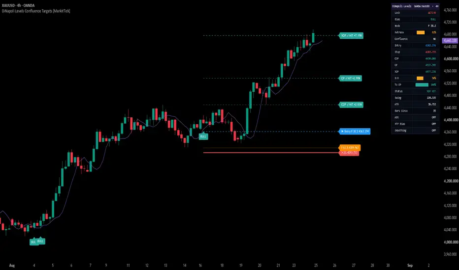
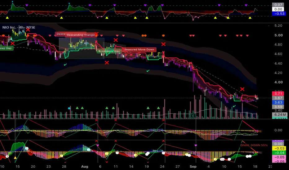
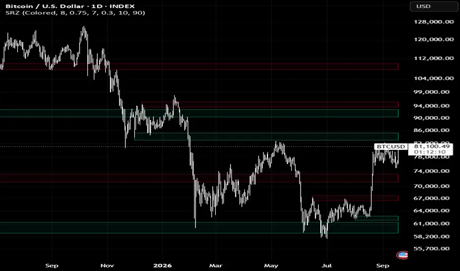
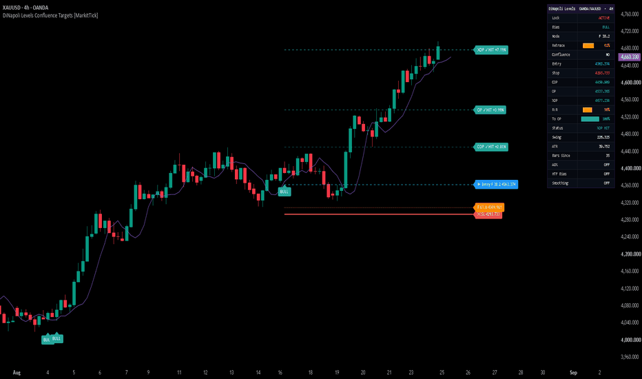
DiNapoli Levels Confluence Targets [MarkitTick]💡 This script automates the complete DiNapoli-style Fibonacci workflow on any symbol and timeframe: it locates confirmed swing pivots, measures the resulting impulse leg, selects an appropriate Fibonacci retracement entry from that leg, projects a three-tier set of Fibonacci profit objectives from the pullback point, cross-checks a second independent swing for confluence, filters everything through a displaced-average trend context, and then tracks the resulting trade in real time through on-chart levels and a live dashboard.
Rather than requiring a trader to manually draw retracement and expansion tools on every fresh swing, cross-reference two different Fibonacci grids by eye, and mentally track a displaced moving average's bias, the script performs all of that detection, labeling, and state-tracking automatically, and exposes the resulting signals through webhook-ready alert payloads for automation.
✨ Originality and Utility
This is not a rehash of a single built-in Pine tool or a simple retracement drawing utility. It implements the full, interdependent DiNapoli Levels sequence as one coherent system, where each stage consumes the output of the previous one:
Confirmed fractal pivot detection builds the swing skeleton the entire tool depends on.
The most recent three-to-five pivots are used to define both a primary swing (for entries and objectives) and a secondary, older swing (used only for confluence cross-checking).
Retracement depth of the pullback determines which of two Fibonacci entry levels is actually referenced, rather than relying on a single fixed ratio for every setup.
Profit objectives are geometric extensions of the very same swing used to derive the entry, not independent, arbitrarily chosen levels.
The displaced-average trend filter, ATR-based stop, and confluence check all read from the same pivot/swing state, so removing any one of them would break the internal logic rather than simply "simplify" the script.
Because the entry, stop, and all three objectives are all mathematically derived from the same confirmed swing, the tool gives traders a single, internally consistent read on a setup instead of several disconnected indicators layered on top of one another. The value is in the integration and automation of a documented, multi-step methodology, the live tracking of trade state once a signal fires, and the structured webhook output for downstream automation — not in inventing a new mathematical formula.
🔬 Methodology and Concepts
• Pivot and Swing Detection
Swing highs and lows are identified using a standard confirmed-fractal method: a candidate high (or low) is only accepted once it is verified to be the extreme point across a window of Pivot Left bars before it and Pivot Right bars after it. Confirmed pivots are stored in a rolling, alternating high/low sequence (capped at the eight most recent) that forms the script's live market-structure map.
• Swing Classification
The three most recent pivots are labeled, oldest to newest, A, B, and C. A bullish structure requires the sequence low → high → low (A low, B high, C low), representing an upward impulse leg from A to B followed by a pullback into C. A bearish structure is the mirror image. The distance from A to B defines the primary swing used for every subsequent calculation.
• Retracement Measurement
The pullback's depth is expressed as a percentage of the A–B swing: how far price has travelled back from B toward A by the time pivot C is confirmed. This retracement percentage drives both setup validity and entry-level selection.
• Fibonacci Retracement Entry Zone
Two retracement levels of the A–B swing are calculated, at 38.2% and 61.8%. If the confirmed pullback has already reached 61.8% or deeper, the script references the 61.8% level as the entry; otherwise it references the shallower 38.2% level. This dynamic selection reflects the idea that the appropriate entry reference depends on how deep the actual retracement has gone, rather than committing to one ratio for every swing.
• Fibonacci Objective Targets
Three profit objectives are projected from pivot C using the primary swing magnitude, following the classic three-tier DiNapoli objective-point structure:
COP (Contracted Objective Point) — C plus 0.618 times the swing.
OP (Objective Point) — C plus 1.000 times the swing.
XOP (Expanded Objective Point) — C plus 1.618 times the swing.
These represent successively less conservative price projections derived from the same impulse leg used for the entry.
• Setup Validation
A setup is only considered valid when all of the following hold: the alternating high/low pattern is intact, the retracement sits between 38.2% and the user-defined Max Retrace ceiling (filters out pullbacks that have gone too deep to be a valid retracement), the swing's magnitude is at least the Min Swing × ATR threshold (filters out insignificant, noise-driven swings), the swing direction is consistent with the claimed bias, the trend filter (if enabled) agrees, and a confluence zone exists (if Confluence Required is enabled).
• Dual-Swing Confluence Detection
A second, independent swing is measured from an older pivot (A2) to B, and the same 38.2%/61.8% retracement math is applied to it. The script then compares all four combinations of the primary and secondary retracement levels and, if the two closest levels fall within Confluence Tolerance × ATR of each other, marks the midpoint between them as a confluence zone. This reflects agreement between two independently measured Fibonacci grids rather than a single grid taken in isolation, which is the basis of the confluence concept in DiNapoli's original methodology.
• Displaced Moving Average Trend Filter
A short simple moving average (DMA Length) is calculated, and the internal trend comparison uses that average's value from DMA Displace bars earlier, effectively lagging the filter by that many bars. The same average is plotted on the chart with a forward visual offset equal to the same displacement, so the line drawn on the chart lines up with the value actually being compared against price. When enabled, only setups where price sits on the correct side of this displaced average are accepted.
• Stop and Objective Placement Logic
The stop is placed a user-defined multiple of ATR beyond pivot C, giving the stop room proportional to the instrument's own recent volatility rather than a fixed distance. All targets are recalculated fresh each time a new, valid setup fires and remain fixed for the life of that trade.
• Signal Firing and State Tracking
A new signal fires only on a confirmed (closed) bar, and only once per underlying pivot, preventing duplicate or repeated firing on the same structure. Once fired, the script tracks live high/low crosses against the stop and each objective; a stop hit takes priority over a same-bar target hit, and each hit updates the relevant level's on-chart label and color permanently for that trade. The Lock Signal input can freeze the presently tracked setup on the real-time bar so that a fresh pivot does not override an open position mid-trade.
⏱️ Confirmation Lag Notice
Because a pivot cannot be confirmed until Pivot Right bars have elapsed past it, both the pivot itself and any signal built from it only become visible on the chart after that many bars have passed — the resulting lines and labels are drawn retroactively onto a swing that has already formed. This is a structural characteristic of any confirmed-pivot Fibonacci tool rather than a flaw, but it does mean a signal never appears exactly at the live turning point; it appears with a short, deliberate confirmation delay.
The script contains no request.security() calls and references no higher-timeframe or future data, so outside of this inherent pivot-confirmation delay there is no forward-looking bias in the setup logic. Entry signals fire only on confirmed, closed bars, and once a signal and its levels are drawn they do not later shift to a different bar or disappear — they are only replaced outright when a new, opposite setup fires.
The DMA line's forward visual offset is a display convention matching the traditional presentation of a displaced moving average: the values plotted are ordinary trailing averages, simply drawn shifted to the right so the line visually tracks price with the same lag the trend filter itself uses internally. It is not a projection or forecast of future price.
🎨 Visual Guide
• Trade Level Lines and Labels
When a setup fires, five horizontal lines and their accompanying labels extend from the signal bar: the Stop (solid, thicker line), Entry (dashed), and the COP, OP and XOP objectives (dashed, drawn in progressively fuller shades of the same bullish or bearish color to reflect their increasing distance). All five lines automatically extend to the current bar while the trade remains open, and extend up to the closing bar once the trade is stopped out or reaches XOP.
• Fibonacci Node Reference Line
A dotted line marks whichever of the two retracement levels (38.2% or 61.8%) was not selected as the entry, shown for reference so the alternate level remains visible alongside the chosen one.
• Confluence Line
When a confluence zone is detected and the Confluence Line option is enabled, a dashed line marks the midpoint between the two agreeing Fibonacci levels from the primary and secondary swing grids.
• Merged Labels
When two or more levels land at the same price, their labels are merged into a single combined label (separated by a middle dot) instead of stacking overlapping duplicate labels, keeping the chart readable.
• Signal Markers
A "BULL" or "BEAR" label is plotted at the low or high of the firing bar respectively, colored to match the configured bullish or bearish color.
• Displaced Moving Average Line
The DMA is plotted in its configured color, shifted forward on the chart by the DMA Displace setting, matching the internal trend-filter reference described above.
• Live Dashboard Table
An on-chart table (position configurable to any corner) shows, row by row: symbol and timeframe, Lock status, current bias, which Fibonacci node is active, retracement depth as a ten-block progress bar with percentage, whether confluence was present, the Entry/Stop/COP/OP/XOP price levels, risk-to-reward expressed as a block bar scaled to 5R, progress toward OP as a block bar, current trade status (open, or which level was hit), the swing size, the current ATR value, and the number of bars elapsed since the last signal.
📖 How to Use
Wait for a "BULL" or "BEAR" marker and its accompanying level lines to appear; remember these will appear with the short pivot-confirmation delay described above rather than exactly at the swing extreme.
On a bullish setup, price will already be sitting in the retracement zone of the prior up-leg; the Entry line marks the DiNapoli-selected reference level, the Stop sits an ATR-buffered distance beyond the swing low, and COP/OP/XOP are staged, increasingly distant profit levels. Bearish setups mirror this on the downside.
Enable Confluence Required to restrict signals to setups where two independently measured Fibonacci grids agree — this produces fewer but more selectively filtered setups.
Leave the DMA Filter enabled to only take setups aligned with the displaced-average trend context, or disable it to see every structurally valid swing regardless of that bias.
Use Lock Signal on the real-time bar if you are already in a tracked trade and do not want a newly forming pivot to override the current levels mid-position.
Watch the dashboard's Status row and block-bar visualizations for a fast read of retracement depth, risk-to-reward, and progress toward the OP objective without needing to read exact prices.
Configure the Alerts group's action strings to match the JSON keys your webhook or automation platform expects, then use TradingView's "Any alert() function call" option to route long, short, close, objective-hit, and stop-hit events.
Treat the Stop, COP, OP and XOP levels as a structured framework for planning risk and staged exits, not as a guarantee that price will reach any particular level — always size positions according to your own risk tolerance.
⚙️ Inputs and Settings
• Core
Pivot Left / Pivot Right — number of bars required on each side of a candidate swing point before it is confirmed; larger values confirm more significant but slower-appearing swings.
Min Swing × ATR — minimum size, in ATR multiples, an A–B swing must have to be considered valid, filtering out noise-sized structures.
Max Retrace — the deepest retracement (as a fraction of the swing) still accepted as a valid pullback.
ATR Len — lookback period for the Average True Range used throughout the stop, minimum-swing, and confluence-tolerance calculations.
• Filters
DMA Filter — toggles the displaced-average trend requirement on entries.
DMA Len / DMA Displace — period and forward displacement of the trend-filter average.
Confluence Required — toggles whether a confluence zone is mandatory for a setup to fire.
Confluence Tol × ATR — maximum distance, in ATR multiples, between two Fibonacci levels for them to be treated as confluent.
• Trade Tools
Lock Signal — freezes the currently tracked setup on the real-time bar, blocking new signals from overriding it.
Stop Buffer × ATR — distance, in ATR multiples, the stop is placed beyond pivot C.
• Visuals
Fibnodes — shows or hides the unused Fibonacci reference node line.
Confluence Line — shows or hides the confluence-zone line.
Signal Markers — shows or hides the BULL/BEAR labels.
DMA Line — shows or hides the displaced moving average plot.
• Dashboard
Show Dashboard — toggles the on-chart table.
Position — selects which chart corner hosts the dashboard.
• Alerts
Long / Short Action, Close Long / Close Short Action — the "action" values sent in the JSON payload for entries and exits.
COP / OP / XOP Action, Stop Action — the "action" values sent when each objective or the stop is hit.
• Colors
Individual color controls are provided for the bullish and bearish themes, stop, entry, each of the three objectives, both Fibonacci nodes, the confluence line, the DMA line, label text, the dashboard's three-tier progress-bar shading, and the dashboard's header, background, and text colors, allowing the full visual theme to be adapted to any chart background.
🔍 Deconstruction of the Underlying Scientific and Academic Framework
The core methodology follows Joe DiNapoli's published approach from "Trading with DiNapoli Levels" (1998), which combines a displaced moving average for trend context with Fibonacci retracement levels for entry timing and a three-tier set of Fibonacci expansion objectives — the Contracted, standard, and Expanded Objective Points — for profit projection. The script's DMA filter and COP/OP/XOP target structure are direct implementations of that framework.
The use of Fibonacci ratios in price analysis traces back to the Fibonacci sequence itself (Leonardo of Pisa, 13th century) and its adoption into market analysis through Ralph Nelson Elliott's wave theory and W.D. Gann's work on proportional price relationships, later formalized by DiNapoli into a discrete, rules-based entry and objective framework.
Swing-point identification via a confirmed left/right bar window reflects the standard swing-high/swing-low definition used broadly across technical analysis, closely related to the fractal concept popularized by Bill Williams, and provides an objective, repeatable substitute for discretionary chart reading.
Average True Range, developed by J. Welles Wilder, supplies the volatility-normalized basis for the stop distance and minimum-swing filter, allowing the same input values to scale automatically across instruments and volatility regimes rather than relying on fixed point or pip distances.
The confluence-detection logic reflects the broader "cluster" or "confluence zone" concept found throughout Fibonacci-based technical analysis: treating agreement between two independently derived retracement grids as a stronger signal than either grid considered alone, a filtering approach explicitly discussed within DiNapoli's own writings on Fibonacci analysis.
⚠️ Disclaimer
All provided scripts and indicators are strictly for educational exploration and must not be interpreted as financial advice or a recommendation to execute trades. We expressly disclaim all liability for any financial losses or damages that may result, directly or indirectly, from the reliance on or application of these tools. Market participation carries inherent risk where past performance never guarantees future returns, leaving all investment decisions and due diligence solely at your own discretion. インジケーター
インジケーター
Delta Flow Ribbon [AlgoNorth]Delta Flow Ribbon
Picture two bars with the same heavy volume. In one, price travels the way that volume was leaning. In the other, it barely moves. A volume histogram draws them the same height. Delta Flow Ribbon is built to tell them apart.
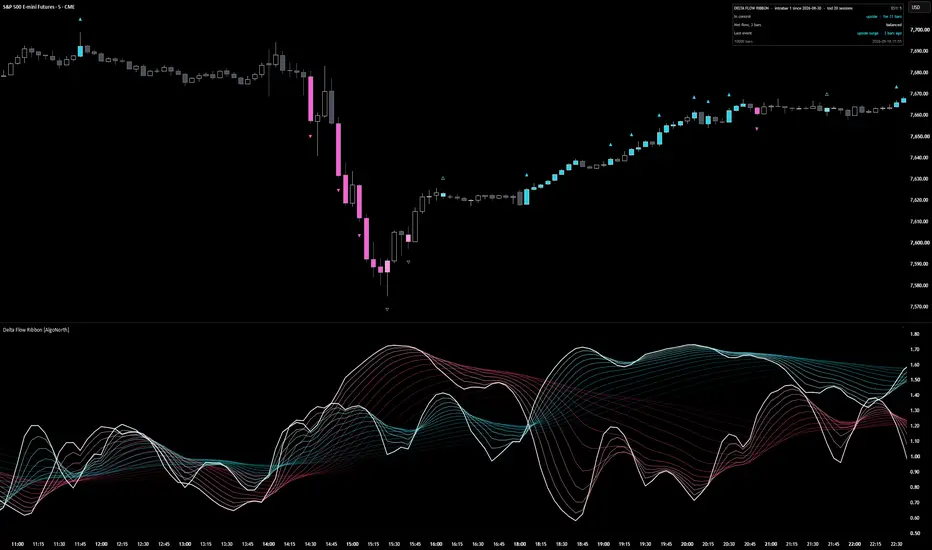
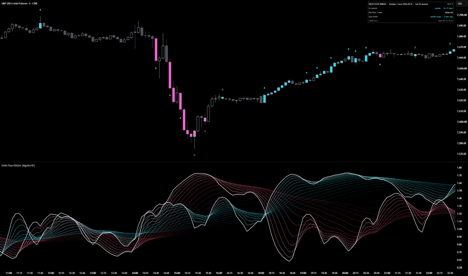
It starts with which way the volume was leaning. Two 14‑strand ribbons, blue for upside flow and pink for downside, each measured against what is normal for that exact time of day. Whichever ribbon sits on top is in control, and the fan opening or closing shows whether that control is building or fading.
The flow behind the ribbons is estimated volume delta: volume with a direction. The script looks at the 1‑minute bars inside every chart bar. Each one's volume counts as upside if it closed up, and downside if it closed down.
Then it checks whether the push worked. Candles light up where flow surges (net flow at least 2.0× normal over three bars, with price travelling with it) and where a hard push stalls (at least 1.5× normal with price travelling 0.35× or less of what that flow would usually move it). Blue for upside, pink for downside, and a lighter shade where the flow was absorbed.
It is a context tool for your own setups. It shows who is in control and when that control is being tested. It does not say what price does next.
🔶 USAGE
🔸 Start with the ribbons. Blue on top means upside flow is running ahead of downside; pink on top means downside is ahead. The bright line on top of each ribbon is its core, the quickest strand. Where the two cores cross, control has changed hands. A ribbon spread wide is flow on the move; a ribbon pulled tight is flow that has settled.
🔸 Then look up at the candles. A solid ▲ above a blue candle marks the start of an upside surge, a solid ▼ below a pink candle, the start of a downside one. A hollow △ or ▽ on a lighter candle marks absorbed flow: a heavy push went in and price barely moved. One arrow per run keeps the chart clean, and the run continues for as long as the candles stay coloured.
🔸 The candles come first and the ribbon confirms. The ribbon is smoothed over 5 to 30 bars, so its peak lands a few bars after the last coloured candle. Read the candle as the event and the ribbon as how much flow has built up behind it (the smoothing can be lowered in the settings for a quicker reaction).
🔸 The sequence worth learning: pink surge candles into a low, a light‑pink absorbed candle at the bottom, then the blue core rising up through the pink. Heavy downside flow met size, then upside flow took over. Weigh it against your own levels. It is context, not a trigger.
🔸 Price climbing while the blue ribbon slides back towards 1.0 is a move running on less flow than it started with. Price flat while a ribbon stays high is flow being soaked up. Both ribbons near 1.0 means nobody is pushing.
🔸 The panel reads the most recent bar, not the part of the chart you have scrolled to: who is in control and for how long, net flow over the last three bars, and the last event. On a live bar it says "forming now" until the bar closes. Full mode adds the raw readings, the delta source and running counts.
🔸 One thing that surprises people: the 09:30 open often shows no coloured candles at all. That is deliberate. Every bar is compared with the average for that same time of day over the last 20 sessions, so heavy flow at the open is just average for the open. A candle only colours when its flow is well above the average for its time of day.
🔶 DETAILS
🔸 Estimated delta. Each chart bar is split into its 1‑minute bars (5‑minute on charts above an hour, hourly on daily). A 1‑minute bar that closed above the previous close puts its volume into upside flow, one that closed below puts it into downside, and an unchanged close keeps the previous direction. Add them up and that is the bar's estimated delta. Where that smaller data is not available, the script places volume by where the close sits in the bar's range instead, and the panel says so.
🔸 Normal for the time of day. Volume, upside flow, downside flow and close‑to‑close travel are each averaged per time slot over the previous 20 sessions. A 5‑minute chart has 288 slots a day, and each one only ever compares itself with its own history. On charts above four hours, or until a slot has enough history, a rolling 300‑bar average takes over and the panel header shows which is in use.
🔸 The ribbons. Upside flow divided by its normal feeds the blue ribbon, downside flow divided by its normal feeds the pink. 1.0 is normal, and each side is measured up to 5×. Every ribbon is the same reading drawn at 14 smoothing lengths spaced from 5 to 30 bars, each passed through three rounds of exponential smoothing, which is what makes the fan open and close. Bars trading under 0.6× normal volume are eased back towards 1.0 so thin trade cannot throw the ribbons around.
🔸 Surge. Net flow = the 3‑bar average of delta ÷ the average one‑way flow for that time of day. A surge is net flow of at least 2.0×, with price travelling in the flow's direction.
🔸 Absorbed flow. Net flow of at least 1.5×, but the 3‑bar price change ÷ the average price change for that time of day comes to 0.35× or less of what that much flow should produce. Expected travel grows with roughly the square root of flow (exponent 0.5): four times the flow is expected to move price about twice as far, not four times. The script measures only the mismatch. Resting size on the other side is one common reason for it, not something the script can see.
🔸 Colours adapt to the chart. Put it on a white or light‑grey background and the ribbons, candles, arrows and panel darken instead of fading out.
🔶 SETTINGS
🔸 Delta: intrabar (default) or bar shape, with the intrabar timeframe on Auto or fixed at 1, 5 or 15 minutes.
🔸 Calibration: time of day (20 sessions per slot) or recent bars (300), plus the quiet threshold (0.6× normal volume).
🔸 Look: fastest strand 5, strand span 25, three smoothing passes, 14 strands, and the two ribbon colours. The defaults are smoothed on purpose. Drop the fastest strand or the passes for a twitchier ribbon.
🔸 Candles: surge at 2.0×, absorbed at 1.5× with price response 0.35×, exponent 0.5, the two candle colours, absorbed shade, arrows once per run or on every candle, arrow size, optional glow.
🔸 Alerts: control change, flow surge and absorbed flow. Pick them as named conditions, or choose "Any alert() function call" to get all three in one alert with the symbol, timeframe and readings in the message.
🔸 Scale: soft (default), log or none, with a knee for how hard extremes are squeezed. Panel: compact or full, on the price chart or in the pane, any corner.
🔶 LIMITATIONS
🔸 The delta is an estimate. It comes from 1‑minute price direction and volume, not exchange‑reported bid and ask trades, and it will differ from a true trade‑by‑trade delta.
🔸 Intrabar history runs out. Older bars beyond it use the bar‑shape fallback, and the panel shows the date the intrabar data begins.
🔸 On a 1‑minute chart there is no smaller timeframe and too few sessions inside the 10,000‑bar window, so it runs on bar shape and the recent‑bars baseline. The panel says so.
🔸 On symbols whose feed reports tick counts rather than traded size (most spot forex and CFDs), the reading is a net tick count, not a volume delta, and the panel flags it.
🔸 The script calculates the most recent 10,000 bars. Readings above 5× normal are shown as 5×.
🔸 The forming bar updates until it closes. Everything on closed bars is fixed.
🔸 Time‑of‑day calibration needs an intraday chart of four hours or less. Daily and weekly charts use the recent‑bars window.
🔶 SUMMARY
Delta Flow Ribbon turns estimated volume delta into two things you can read at a glance. The ribbons show which side is pushing and how hard for that time of day. The candles show where that push surged or was absorbed. Blue for upside, pink for downside, lighter where the flow stalled. It marks conditions, not outcomes.
インジケーター
CleanTradeQuantum_v7.2_OB_FVG_INTEGRATEDCleanTradeQuantum v7.2 is an apex-tier, multi-layered algorithmic architecture engineered for uncompromising market dominance. Transcending traditional static indicators, it operates as a highly responsive state machine, harnessing a hyper-advanced quantum trend analyse engine to continuously map market probabilities and adapt to volatile liquidity regimes with zero latency.
Core Architecture & Precision Targeting
Quantum Probability Matrix: At its core, the quantum trend analyse engine parses up to 4,096 historical data vectors per tick, synthesizing multidimensional bullish and bearish momentum probabilities. This establishes a baseline of mathematical superiority before any capital is deployed.
Institutional SMC Integration: The system aggressively hunts hidden institutional liquidity by pinpointing high-fidelity Order Blocks (OB) and Fair Value Gaps (FVG). These structural zones are routed into an elite Signal Cluster—a consensus-voting nexus that cross-verifies volume profiles, multi-timeframe momentum, and structural validity before authorizing a strike.
Guided Walk Forward Optimization (WFO): To eradicate curve-fitting and ensure maximum adaptability, the framework deploys a deterministic parameter router. It fluidly shifts its internal logic across five distinct tactical profiles (Strict Prop, Balanced, Trend, Chop Defense, and Aggressive) as the chart evolves, neutralizing shifting market conditions.
Risk Mitigation & Autonom Winning
Adaptive Error Guard Circuitry: Designed for relentless autonom winning, the system features a self-healing, localized circuit breaker. If a drawdown occurs within toxic, low-probability chop zones, the engine instantly triggers a spatial, ATR-calculated lockout, shielding capital from adversarial liquidity pockets until the regime normalizes.
Dynamic OCA Scaling & Trailing: Leveraging advanced One-Cancels-All (OCA) brackets, the engine ruthlessly secures initial partial profits at TP1. Post-TP1, it initiates a hyper-responsive, ATR-calibrated trailing stop, autonomously riding explosive trend continuations while entirely eliminating downside risk.
Prop-Firm Safeguard Protocols: Hardcoded with unyielding equity tracking, the engine enforces strict institutional funding constraints. It actively monitors live drawdowns tick-by-tick, instantly locking down execution if the portfolio approaches daily or absolute maximum drawdown thresholds. ストラテジー

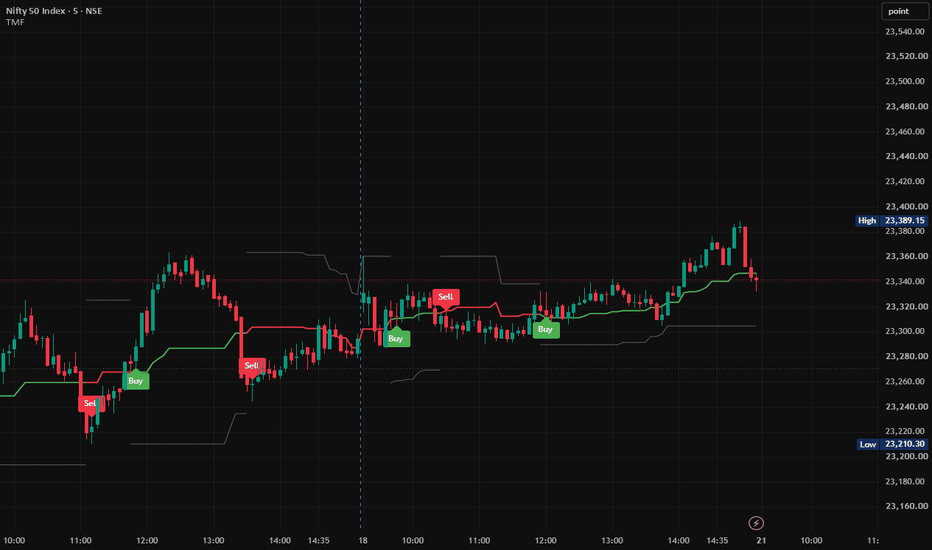
Trend My Friend🚀 Trend My Friend (TMF)
Dynamic Midrange Breakout & Multi-Candle Confirmation System
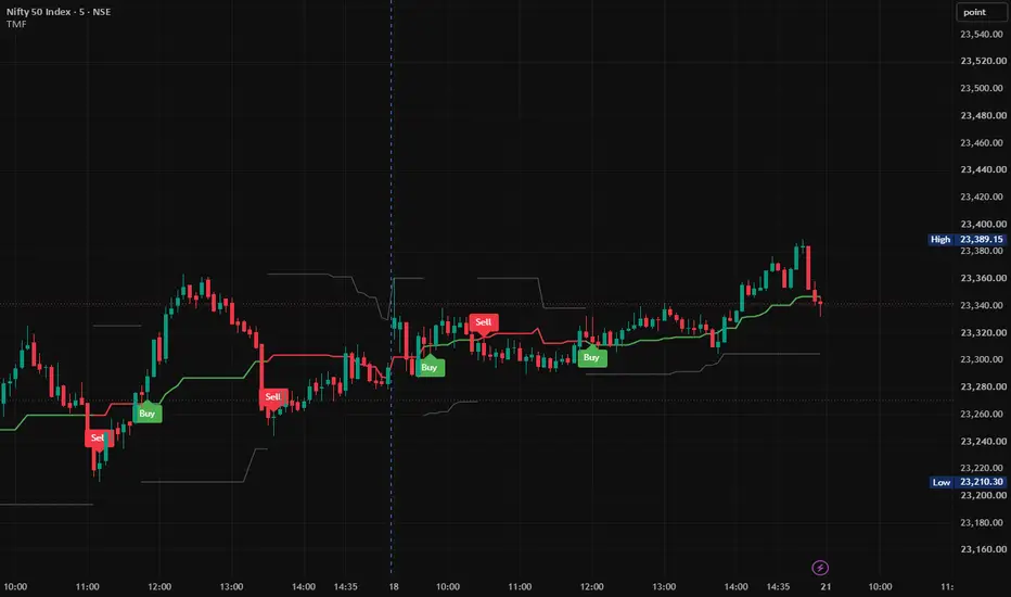
Trend My Friend (TMF) is a Pine Script® v6 trend and momentum indicator designed to identify bullish and bearish market regimes using a Dynamic Price Range, Equilibrium Midrange, and Multi-Candle Confirmation methodology.
Rather than relying on a single candle crossing the midrange, TMF evaluates consecutive candle closes relative to the dynamically calculated equilibrium level. This provides a structured framework for monitoring directional momentum, trend transitions, and dynamic market structure.
________________________________________
📊 Core Concept
TMF is built around three primary components:
Dynamic Range → Midrange Equilibrium → Multi-Candle Confirmation
The indicator continuously calculates the recent high and low of the selected lookback period, determines the midpoint between those extremes, and then evaluates consecutive candle closes around that midpoint.
This creates a simple framework for identifying whether the current market structure is developing above or below its dynamic equilibrium.
________________________________________
⚙️ How Trend My Friend Works
1. Dynamic Range Calculation
TMF first calculates the current market range using the Range Sensitivity Set.
With the default setting of 25, the indicator calculates:
• Upper Range = Highest High of the selected lookback period
• Lower Range = Lowest Low of the selected lookback period
These boundaries update dynamically as new candles are formed.
Upper Range
Represents the highest price recorded during the selected lookback period.
Lower Range
Represents the lowest price recorded during the selected lookback period.
Together, they form the indicator's dynamic structural range.
________________________________________
2. Equilibrium Midrange
After calculating the Upper Range and Lower Range, TMF calculates their midpoint:
Midrange = Lower Range + (Upper Range − Lower Range) ÷ 2
The midrange represents the central equilibrium level of the current range.
It provides the primary directional reference:
Price above Midrange → Bullish Zone
Price below Midrange → Bearish Zone
________________________________________
3. Multi-Candle Confirmation
The key feature of TMF is its Multi-Candle Confirmation mechanism.
The indicator does not confirm a directional regime simply because one candle crosses the midrange.
Instead, TMF checks the number of consecutive candles specified by the Signal Confirmation setting.
The default setting is 3 candles.
🟢 Bullish Confirmation
A bullish regime is confirmed when the required number of consecutive candles close strictly above the midrange.
For the default setting of 3:
Candle 1 → Above Midrange ✓
Candle 2 → Above Midrange ✓
Candle 3 → Above Midrange ✓
Once all required candles satisfy the condition, the bullish regime becomes active.
🔴 Bearish Confirmation
A bearish regime is confirmed when the required number of consecutive candles close strictly below the midrange.
For the default setting of 3:
Candle 1 → Below Midrange ✓
Candle 2 → Below Midrange ✓
Candle 3 → Below Midrange ✓
Once all required candles satisfy the condition, the bearish regime becomes active.
________________________________________
4. Directional Regime
Once the confirmation condition is satisfied, TMF establishes the corresponding market regime.
🟢 Bullish Regime
When the required consecutive closes are above the midrange:
• Trend state becomes Bullish
• Midrange is displayed in Green
• Lower Range becomes the active downside structural reference
• A new Buy signal can be generated
🔴 Bearish Regime
When the required consecutive closes are below the midrange:
• Trend state becomes Bearish
• Midrange is displayed in Red
• Upper Range becomes the active upside structural reference
• A new Sell signal can be generated
________________________________________
🎯 Buy & Sell Signal Generation
TMF is designed to generate signals when a new directional regime is established, rather than repeatedly printing the same signal while the regime remains active.
🟢 Buy Signal
A Buy signal is generated when the bullish regime changes from inactive to active.
Previous State → Not Bullish
Current State → Bullish
→ BUY
This means the Buy label represents the newly established bullish condition according to the indicator's confirmation rules.
🔴 Sell Signal
A Sell signal is generated when the bearish regime changes from inactive to active.
Previous State → Not Bearish
Current State → Bearish
→ SELL
Once the bearish regime remains active, TMF does not repeatedly print Sell labels on every candle.
________________________________________
📈 Visual Interpretation
TMF uses three primary structural lines:
Upper Range
Midrange — Directional Equilibrium
Lower Range
The Midrange changes color according to the confirmed directional state:
🟢 Green Midrange → Bullish Regime
🔴 Red Midrange → Bearish Regime
⚪ Gray Midrange → No Confirmed Directional Regime
The selected SL Line Color is used for the appropriate structural range boundary according to the active trend state.
________________________________________
🔄 TMF Logic — Complete Process
The complete methodology can be summarized as:
1. Highest High + Lowest Low
2. Dynamic Price Range
3. Calculate Equilibrium Midrange
4. Check Consecutive Candle Closes
5. Confirm Bullish or Bearish Regime
6. Detect New Directional Transition
7. Generate Buy / Sell Signal
8. Continue Monitoring the Dynamic Range
This creates a straightforward process for reading directional market structure.
________________________________________
🎛️ Input Parameters
Parameter Default Function
Range Sensitivity Set 25 Number of bars used to calculate the Upper and Lower Range.
Signal Confirmation 3 Number of consecutive candle closes required above or below the Midrange.
SL Line Color Gray Controls the color used for the structural range boundary.
Range Sensitivity Set
This controls the lookback period used to calculate the dynamic range.
Lower value
• More responsive to recent price movements
• Faster structural changes
• More sensitive to short-term market movement
Higher value
• Broader range
• Slower structural changes
• More focused on larger market movements
Signal Confirmation
This controls how many consecutive closes are required to establish a directional regime.
Lower value
• Earlier confirmation
• More responsive to price changes
Higher value
• Requires more sustained movement
• Later confirmation
The appropriate setting depends on the instrument, timeframe, volatility, and trading methodology.
________________________________________
🧭 Trading Framework
TMF can be incorporated into a broader trading methodology as a trend-confirmation and market-structure tool.
🟢 Bullish Framework
After a Buy signal, traders may evaluate:
• Price structure above the Midrange
• Higher highs and higher lows
• Momentum continuation
• Breakout or retest conditions
• Volume confirmation
• Broader market trend
🔴 Bearish Framework
After a Sell signal, traders may evaluate:
• Price structure below the Midrange
• Lower highs and lower lows
• Momentum continuation
• Breakdown or retest conditions
• Volume confirmation
• Broader market trend
TMF is therefore best understood as a technical confirmation tool, rather than a complete standalone trading system.
________________________________________
🛡️ Risk Management
The dynamic range boundaries can be monitored as structural reference levels when developing a risk-management plan.
Long Positions
The Lower Range can be monitored as a potential downside structural reference.
Short Positions
The Upper Range can be monitored as a potential upside structural reference.
Stop-loss placement should be determined according to the trader's individual strategy, volatility, position sizing, market structure, and risk tolerance.
________________________________________
🎯 Trade Management
TMF does not prescribe a mandatory profit-taking method.
Traders can combine TMF signals with their preferred trade-management techniques, such as:
• Fixed risk-to-reward targets
• Previous swing highs/lows
• Trailing stops
• Structural support/resistance
• Opposite TMF regime signals
• Volatility-based exits
An opposing TMF signal may also be monitored as an indication that the current directional regime has changed.
________________________________________
🌐 Suitable Markets
TMF can be applied across a variety of actively traded markets, including:
• Equities
• Index Futures
• Forex
• Cryptocurrencies
• Commodities
• Other liquid instruments
Signal behavior can vary depending on the instrument, timeframe, volatility, liquidity, and selected parameters.
________________________________________
⏱️ Timeframe Considerations
TMF can be used across multiple timeframes, including:
Intraday
• 5-Minute
• 15-Minute
• 1-Hour
Swing / Higher Timeframes
• 4-Hour
• Daily
• Weekly
There is no single parameter configuration that is optimal for every market. Traders should evaluate the settings according to their specific instrument, timeframe, and methodology.
________________________________________
🔔 TradingView Alerts
TMF includes built-in TradingView alert conditions for directional regime transitions.
TMF Long
Triggered when a new bullish regime is established.
TMF Short
Triggered when a new bearish regime is established.
These alerts can be used for chart monitoring and compatible TradingView automation workflows.
________________________________________
💡 Why Multi-Candle Confirmation?
A single candle can temporarily move above or below an important price level before quickly reversing.
TMF therefore requires consecutive candle closes for directional confirmation.
For example, with:
Signal Confirmation = 3
One isolated close above the Midrange is not enough to establish a bullish regime.
The required three consecutive closes must remain above the Midrange.
Likewise, three consecutive closes below the Midrange are required for bearish confirmation.
This makes the methodology focused on confirmed directional movement rather than a single-candle price crossing.
________________________________________
⚠️ Important Considerations
TMF is a technical-analysis and market-structure indicator. It does not predict future prices and does not guarantee profitable trades.
No indicator can completely eliminate market noise, false breakouts, or losing trades under all market conditions.
Signal behavior may differ during:
• Sideways markets
• Low-liquidity conditions
• High-volatility events
• Sharp reversals
• Gap movements
• Rapidly changing market regimes
Users should apply appropriate risk management and consider additional market-structure or confirmation techniques where appropriate.
________________________________________
🔥 Trend My Friend (TMF)
Dynamic Midrange. Multi-Candle Confirmation. Clear Market Structure.
Trend My Friend (TMF) transforms rolling price extremes into a structured visual framework for monitoring directional market regimes.
By combining a Dynamic Price Range, Equilibrium Midrange, and Multi-Candle Confirmation, TMF provides a clean way to monitor when price establishes sustained movement above or below its dynamic equilibrium.
Structured Confirmation — Dynamic Market Structure — Clear Directional Signals
________________________________________
📌 Disclaimer
This indicator is provided for analytical and educational purposes to assist with technical analysis. Past performance does not guarantee future results. Trading involves substantial risk, and users should manage risk appropriately.
インジケーター
インジケーター
インジケーター
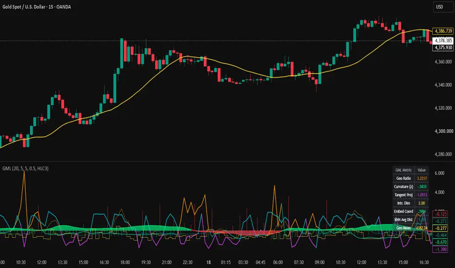
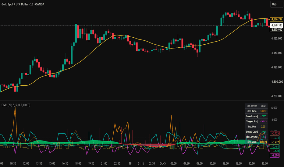
Geometry | Manifold LearningGeometry | Manifold Learning (GML) is an experimental market-structure indicator that analyzes price movement from a geometric perspective.
Traditional technical indicators often reduce market behavior to trend, momentum, volatility, or moving averages. GML takes a different approach: it treats recent price observations as points belonging to a locally evolving geometric structure, or "manifold."
The objective is not to predict future prices. Instead, the indicator attempts to describe the current structure of price movement by measuring:
• Geodesic path behavior
• Local price curvature
• Tangent projection
• Local neighborhood density using k-nearest-neighbor concepts
• Intrinsic dimensionality
• Normalized embedding direction
• Local geometric mean
These measurements are combined into a multi-component oscillator designed to help traders study whether recent price action is relatively directional, compressed, dispersed, curved, or undergoing a structural transition.
Core Concept
Financial prices do not always move efficiently from one level to another.
For example , price may begin at 100 and end at 105.
The direct displacement is only 5 points, but the actual path could have travelled:
100 → 103 → 101 → 106 → 102 → 105
The total distance travelled is substantially greater than the final displacement.
GML uses this distinction between direct displacement and travelled path as one way of describing the geometry of recent price action.
A relatively direct path may indicate more organized directional movement, while a large travelled path relative to displacement can indicate a more complex or inefficient local structure.
This concept forms the foundation of the indicator's Geodesic Ratio.
1. Geodesic Ratio
The indicator calculates two distances over the selected embedding window.
Euclidean Distance:
The absolute difference between the current price and the price at the opposite end of the observation window.
Geodesic Distance:
The cumulative absolute movement between consecutive observations within the same window.
The ratio is then calculated conceptually as:
Geodesic Ratio = Travelled Path / Direct Displacement
A larger ratio means price travelled a relatively complicated path to reach its current location.
A smaller ratio represents a more direct path.
The ratio is normalized using its historical mean and standard deviation to produce the displayed Geodesic Ratio Z-score.
Interpretation
Positive/high readings can indicate that the recent path is relatively complex or indirect.
Negative/low readings indicate that the path is relatively more linear compared with its recent behavior.
This measurement should not independently be interpreted as bullish or bearish. It describes the geometry of the path rather than its direction.
2. Local Curvature
GML estimates local curvature using first- and second-order changes in price.
The first difference measures local price movement, while the second difference measures how rapidly that movement itself is changing.
Conceptually, high curvature represents a sharper local bend in the price path.
The raw curvature measurement is normalized into a Z-score relative to its recent history.
Interpretation
Higher positive Curvature Z-scores indicate that the current local bend is unusually large compared with recent observations.
Lower readings indicate a relatively smoother local trajectory.
High curvature does NOT automatically indicate a market reversal.
It simply identifies an area where the local geometry of price has changed more sharply than normal.
The Curvature Threshold input controls how unusual curvature must become before it qualifies as a high-curvature condition within the signal logic.
3. Tangent Projection
The Tangent Projection measures the position of current price relative to a locally smoothed price structure.
The script calculates a local mean and standard deviation over the selected smoothing period and normalizes the current deviation from that local mean.
This creates a standardized representation of where price currently sits relative to its recent local structure.
General interpretation
Above zero:
Price is positioned above its local mean.
Below zero:
Price is positioned below its local mean.
Movement toward zero:
Price is returning toward its local center.
Movement away from zero:
Price is extending farther away from the local center.
The reversal logic additionally examines whether a negative tangent projection has begun recovering.
4. k-Nearest-Neighborhood Distance
The indicator compares the current price with observations inside the selected embedding window and identifies nearby observations based on absolute price distance.
The average distance of the nearest observations provides a local neighborhood-radius estimate.
This value is then normalized relative to its recent history.
Interpretation
Negative kNN Z-score:
The local neighborhood is relatively tight compared with recent conditions.
Positive kNN Z-score:
The local neighborhood is relatively dispersed.
This can be thought of as a geometric measure of local price concentration rather than a conventional volatility indicator.
The signal engine uses this information to distinguish between tighter and looser local structures.
5. Intrinsic Dimensionality
Intrinsic Dimensionality attempts to estimate how the local observations populate the surrounding price neighborhood.
The indicator compares the proportion of observations located inside:
Radius R and Radius 2R
The change in neighborhood occupancy as the radius expands provides a simplified estimate of local dimensional structure.
The result is bounded according to the configured k-nearest-neighbor setting and normalized for visualization.
Interpretation
Rather than giving a direct bullish/bearish signal, Intrinsic Dimensionality is intended as a structural diagnostic.
Changes in this value can indicate that the local organization of price observations is changing.
It is best interpreted together with the other geometric measurements rather than independently.
6. Embedding Coordinate
GML also calculates a directional coordinate from the signed movement of price relative to the total travelled geodesic distance.
The value is bounded between -1 and +1 and subsequently smoothed.
This produces the Embedding Coordinate displayed as an area plot.
General interpretation
Toward +1:
Recent movement is increasingly aligned in the positive direction.
Toward -1:
Recent movement is increasingly aligned in the negative direction.
Around zero:
Directional movement is more balanced relative to the travelled path.
The script specifically monitors transitions through -0.5 and +0.5 as components of its signal logic.
7. Geodesic Mean
The yellow Geodesic Mean displayed on the main price chart is the simple average of the selected price source across the embedding window.
It provides a price-level reference alongside the geometric measurements displayed in the oscillator pane.
It should not be interpreted as a standalone entry or exit signal.
Signal Logic
GML includes two types of visual signals.
R — Manifold Reversal
The green "R" marker represents a potential local structural reversal condition.
It requires several conditions to occur together:
• Local curvature is unusually high
• The embedding coordinate crosses upward through its lower structural region
• The local kNN neighborhood is relatively tight
• Tangent projection is still negative but recovering
The purpose of combining these conditions is to identify situations where price has experienced significant local bending while its embedded directional structure begins recovering from a negative region.
An R marker does not mean that price must reverse.
It indicates that the script's specific geometric reversal conditions have occurred simultaneously.
C — Manifold Continuation
The red "C" marker represents a potential directional continuation condition.
It requires:
• A relatively linear geodesic path
• The embedding coordinate crossing downward through its upper structural region
• A relatively loose kNN neighborhood
This combination is intended to identify a different geometric regime from the reversal condition.
The C marker should therefore be interpreted as a structural continuation condition generated by the model, not as a guaranteed short signal.
How to Read the Indicator
Instead of focusing on a single line, GML is designed to be interpreted as a collection of geometric measurements.
A practical workflow is:
Step 1 — Observe the Embedding Coordinate
Start with the green/red area plot.
Watch how the coordinate behaves around:
+0.5
0
-0.5
Movement from an extreme region toward the center can indicate a change in the directional organization of the recent path.
Step 2 — Check Curvature
Next, examine Local Curvature.
A curvature expansion indicates that price is bending more sharply than it normally has during the current observation period.
High curvature combined with a change in embedding direction can be more informative than curvature alone.
Step 3 — Examine Neighborhood Structure
Use kNN Tightness to determine whether recent observations are relatively concentrated or dispersed.
This helps distinguish different local geometric environments.
Step 4 — Check Tangent Projection
Tangent Projection helps determine where price sits relative to its recent local structure.
For example, a negative tangent projection that begins rising can indicate recovery toward the local center.
Step 5 — Examine Geodesic Behavior
Use the Geodesic Ratio Z-score to understand whether the current price path is relatively direct or unusually indirect.
This provides additional context regarding the efficiency and complexity of recent movement.
Step 6 — Use Signals as Confluence
R and C markers are intentionally generated from multiple conditions.
They are best treated as indications that a specific combination of geometric conditions has occurred rather than as automatic trade instructions.
Users can combine GML with their own analysis of:
• Market structure
• Support and resistance
• Trend direction
• Volume
• Volatility
• Risk management
How Traders Can Use GML
GML can be used in several ways.
Structural Reversal Analysis
Look for situations where curvature expands while the embedding coordinate begins recovering from an extreme region.
This can help identify areas where the geometry of recent price movement is changing.
Trend/Path Quality Analysis
The Geodesic Ratio can help distinguish relatively direct price movement from more complicated paths.
This can provide additional context when evaluating an existing trend.
Compression and Dispersion Analysis
kNN neighborhood measurements provide information about whether recent observations are relatively concentrated or dispersed.
This can help characterize the local market regime.
Confirmation Tool
GML can also be used as a secondary analytical layer alongside an existing trading methodology.
For example, a trader may first identify a setup using market structure and then examine whether GML shows a corresponding change in curvature, embedding direction, or neighborhood structure.
Inputs
Embedding Dimension (N)
Defines the number of recent observations used to construct the local geometric window.
Lower values make the measurements more sensitive to recent price changes.
Higher values analyze a broader local structure and generally produce slower-changing measurements.
Default: 20
k-Nearest Neighbors
Controls the dimensional normalization/reference used by the local-neighborhood calculations.
Default: 5
Smoothing Length
Controls smoothing of the embedding coordinate and the local window used by the tangent-related calculation.
Lower values respond more quickly.
Higher values produce smoother measurements.
Default: 5
Curvature Threshold
Controls the Z-score threshold required for curvature to qualify as unusually high within the reversal condition.
Higher values require more extreme curvature.
Default: 0.5
Price Source
Available sources include:
Close
Open
HL2
HLC3
OHLC4
Default: HLC3
Changing the source changes the price series used by the geometric calculations.
Display Controls
Individual components can be enabled or disabled from the settings:
Show Geodesic Distance
Show Local Curvature
Show Tangent Projection
Show Intrinsic Dimensionality
Show Geodesic Mean on Price Chart
Show Signals
This allows users to simplify the display and focus on the measurements relevant to their analysis.
Information Table
The table in the upper-right corner provides the current values of several important measurements:
Geo Ratio
Curvature Z-score
Tangent Projection
Intrinsic Dimension
Embedding Coordinate
kNN Average Distance
Geodesic Mean
The table is intended to provide a compact numerical view of the current geometric state.
Alerts
The indicator provides alert conditions for:
Manifold Reversal
and
Manifold Continuation
Users can create TradingView alerts from these conditions if they want to monitor when the corresponding geometric setup occurs.
An alert indicates that the defined conditions were satisfied; it does not guarantee that the subsequent market movement will follow any particular direction or magnitude.
Why This Indicator Is Different
GML is not intended to be another conventional oscillator created by combining RSI, MACD, or moving-average crossover conditions.
Its primary calculations are built around geometric characteristics of the recent price path:
• travelled path versus direct displacement
• local curvature
• local tangent/deviation
• nearest-neighborhood distances
• neighborhood scaling
• directional embedding
These measurements are combined to provide a different representation of local market structure.
The purpose is to explore how the geometry of recent price observations changes over time rather than attempting to directly forecast future prices.
Important Limitations
GML is a simplified application of geometric and manifold-inspired concepts to a one-dimensional market price series.
It should not be interpreted as a full academic manifold-learning implementation such as Isomap, locally linear embedding, diffusion maps, or another high-dimensional machine-learning algorithm.
The kNN, geodesic, curvature, dimensionality, and embedding calculations used here are purpose-built approximations designed for real-time chart analysis within Pine Script.
Market prices are noisy and non-stationary. Similar geometric conditions can lead to different outcomes under different market environments.
Signals may also occur during sideways markets, volatile periods, news events, gaps, or other abnormal conditions.
No geometric measurement can determine future market direction with certainty.
Recommended Usage
GML is best used as an analytical and confluence tool rather than as a standalone trading system.
Users should evaluate signals in the context of their own:
market structure analysis, risk tolerance, instrument, timeframe, execution method, and risk-management rules.
Different instruments and timeframes can produce substantially different geometric behavior, so users are encouraged to study the indicator across historical market conditions before incorporating it into their process.
Educational Purpose
Geometry | Manifold Learning is provided as an analytical and educational tool for studying price behavior.
It does not provide investment advice, does not guarantee trading performance, and does not predict future market outcomes.
The calculations describe mathematical properties of historical and current price observations. Any trading decision and associated risk remain the responsibility of the user. インジケーター
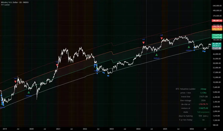
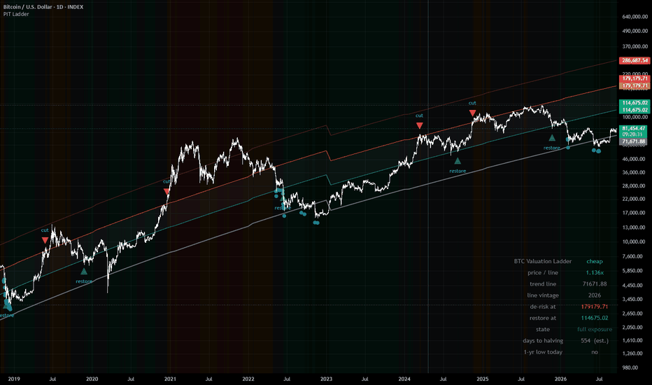
BTC Power-Law Ladder (Point-in-Time)WHAT IT DOES
Divides Bitcoin's daily close by a power-law trend line fitted to the lower edge
of its own price history, then sorts the result into five labelled rungs. The
reading answers one question: how far is price stretched above the floor that
has historically held it?
This is a risk-framing tool. It is not an entry signal and it is not advice.
THE TREND LINE
line(d) = 10^a * d^b d = days since the genesis block, 2009-01-03
The coefficients come from a quantile regression through the 1% lower quantile
of log price against log days — a line that tracks the bottom edge of the
distribution rather than its middle.
What makes this version different: the line is refit every January, and each
year is drawn with the coefficients that were available in that year. The 2016
fit uses only data through 2015-12-31. The 2020 fit uses only data through
2019-12-31. Thirteen vintages are stored, 2014 through 2026. Nothing on the
chart was fitted on the history it is being drawn over.
Most published power-law charts use a single set of constants fitted across the
entire history, then plot them back over that same history. Those charts show
you a line that knew how every cycle ended. This one does not.
Because a hard coefficient switch on January 1 would move the line — and
therefore the ratio — overnight with no price action behind it, each new vintage
is phased in over the first 21 bars of the year (adjustable). Both fits are
known on January 1, so the blend introduces no future information. The 2016
vintage sits 43% below the 2015 vintage; without the blend that single step
would jump the ratio by 77% and could trip a rung change on its own.
THE RUNGS
Fixed at 1.0x, 1.6x, 2.5x and 4.0x. These boundaries do not move when you change
the de-risk settings, because the statistics below were measured at these
specific values.
What followed each rung, 2014-01-01 to 2026-09-16 (4,642 daily closes, medians):
rung days 2-yr median positive next-yr drawdown P(dd < -50%)
below 1.0 445 9.77x 100% -30% 0%
1.0 - 1.6 1,544 4.31x 100% -30% 14%
1.6 - 2.5 1,162 2.05x 89% -49% 46%
2.5 - 4.0 764 1.60x 76% -62% 90%
above 4.0 727 0.74x 28% -72% 97%
Read the day counts as overlapping windows, not as independent observations. The
ratio's one-day autocorrelation is 0.997, so consecutive days in the same rung
are very nearly the same observation counted again.
THE DE-RISK STATE MACHINE
Optional markers for a hysteresis rule: reduce exposure when the ratio closes
above 2.5, restore when it closes below 1.6. The band between the two levels
prevents the state from flipping on noise. The machine only evaluates confirmed
closes, so what you see on the chart is what the rule would have done, not what
an intrabar wick briefly suggested.
Over the same window, with costs and exposure lagged one day:
buy and hold Sharpe 0.88 max drawdown -83.6% 101x
the rule Sharpe 1.16 max drawdown -55.9% 260x 6 round trips
Tested against 5,000 random vetoes of the same six durations at random dates:
p = 0.0022 (Sharpe), 0.0006 (drawdown), 0.0142 (terminal multiple).
WHAT THIS IS NOT — READ THIS PART
Six completed round trips is far below any reasonable evidence threshold. My assessment of this rule is "insufficient evidence — tracked, not
rejected." It is not a validated edge, and it is presented here as a framework
for thinking about risk, not as a system to trade.
One specific failure: the 2017 episode alone accounts for 57.9% of the rule's
entire gross profit. It also gave up a 67.6% rally between the cut at $2,258 and
the restore at $3,783. A track record resting on one event is a track record you
do not yet understand.
The threshold grid used for robustness testing is not independent evidence.
Adjacent thresholds fire within days of each other on a signal with 0.997
autocorrelation, so a cut at 2.4 and a cut at 2.6 trade the same six episodes.
The grid shows the result is not balanced on a knife edge; it does not multiply
the evidence.
The point-in-time refits remove coefficient hindsight, not specification
hindsight. The 2014 coefficients use only pre-2014 data — but the decision to
fit a power law to the 1% lower quantile of log-log Bitcoin history was made by
people who had already seen that history. That choice was not available in 2014.
Coefficients for 2027 and later fall back to the most recent fit and are flagged
"provisional" in the readout table. They will be replaced as new vintages become
available.
SETTINGS
Line — Real-time (the point-in-time vintages, default, starts 2014), Published
constants (the widely-quoted full-history fit, for comparison), or Custom.
January blend length — bars over which a new vintage phases in. Default 21. Set
to 1 for a hard switch.
De-risk above / Restore below — the operative rule levels. Moving them off
2.5 / 1.6 takes the rule off the tested configuration; the readout table flags
this. The rung boundaries stay fixed regardless.
Markers — rung tint, boundary lines, de-risk and restore triangles, trailing
one-year lows, halving shading, and a readout table (four corner positions).
Five alert conditions are available: crossing the de-risk level, crossing the
restore level, losing the trend line, reclaiming it, and a new trailing
one-year low.
REQUIREMENTS
Bitcoin, daily timeframe, log price scale. The trend line is defined on days
since the genesis block and is not meaningful on other timeframes or symbols;
the script will tell you so rather than silently drawing nothing.
DISCLAIMER
This indicator is a research and risk-framing tool. It is not financial advice,
not a recommendation to buy or sell any asset, and not a trading system.
Every statistic shown describes what has already happened across a single asset
over roughly twelve years containing four market cycles. Bitcoin's history is
short, its regime has changed repeatedly, and nothing about the past behaviour of
this ratio guarantees or implies anything about its future behaviour. A power-law
floor holds until it does not, and there is no mechanism that obliges it to hold
at all.
The de-risk rule shown here is explicitly rated as having insufficient evidence
by its own author. It is published so that its logic and its weaknesses are both
visible, not because it has been demonstrated to work.
Trading digital assets involves substantial risk of loss. You are responsible for
your own decisions and should consult a qualified professional regarding your
particular circumstances. インジケーター
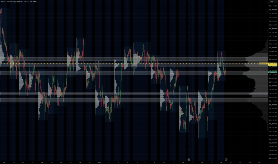
HVN ZonesHVN Zones boxes the high-volume nodes of a multi-session volume profile, the way many traders do by hand from a zoomed-out chart with a fine visible-range profile: each prominent node above and below price becomes a zone you can trade against. It draws the zones, a dotted line at each node's point of control, and a small label.
HOW IT WORKS
1. A volume profile is built over the last N Globex sessions (default 63, about three months) or over the visible range, from 1-minute intrabars where your plan allows it, otherwise from chart bars. Row size is fixed in points or automatic (range divided by 1000).
2. The histogram is smoothed with a short centred moving average.
3. A node is a row that is the tallest within a window of rows on either side and at least a set share of the tallest row in the profile.
4. Each node's zone is grown from the peak while volume stays above a floor. The default floor is prominence-based: prominence is the peak minus the higher of the troughs on either side, and the zone ends where volume has fallen 60% of the way from the peak toward that trough. This keeps a node on top of a broad dome local instead of turning the whole value area into one zone. Nodes with little prominence are dropped and zones are capped in height. The older "% of peak" rule is still available as an option.
5. Overlapping or near zones merge, a price band keeps only nodes within 2 x daily ATR(14) of the current price (or a fixed number of points, or off), and the strongest N zones by peak volume are drawn.
SETTINGS THAT MATTER
Window > Sessions: how far back the profile looks. 63 matches a three-month composite; 20 gives a tighter, more recent read.
Node detection > Zone width (%), Min prominence, Max zone height: how tall a zone gets and which nodes qualify. Lower the width for thinner boxes.
Price band: widen or narrow the multiplier to show more or fewer zones.
Node detection > Recompute every (minutes): the profile changes little intra-day, so the default is hourly. Bar Replay recomputes on every step.
Drawing > Label indent: a fixed pixel push to the right so labels sit in the chart margin at any zoom.
LIMITS
1-minute intrabars need a plan with intrabar access, and TradingView serves at most 100k of them per request, which is about 60 sessions. Longer lookbacks use chart bars for the older part. Switch "Profile source" to Chart bars on any plan.
Volume is spread evenly across the rows each bar overlaps, the same approximation TradingView's own visible-range profile makes at the bar level. It is not a tick profile.
Zones are rebuilt on each recompute from the current window, so they show the current profile, not a history of past zones.
The profile method follows the open-source volume-profile family by PtGambler (MPL-2.0). This script is an original implementation. インジケーター
Rolling Beta Drift Monitor [Pineify]Rolling Beta Drift Monitor
Overview
Tracks an asset's changing return relationship with a benchmark through rolling beta, a prior beta corridor, correlation, residual volatility, and confirmed state. It diagnoses exposure rather than predicting returns.
Problem Definition
Beta is a sample estimate, not a stable property. A moving beta can change because of covariance, low benchmark variance, unmatched sessions, or asset-specific noise. Equal betas may have different correlations. The monitor must pair observations, expose coverage, compare beta with its history, and isolate unexplained variation. Otherwise a precise coefficient may describe a fragile relationship.
Design Rationale
Log returns are scale independent. Benchmark returns use the chart timeframe, preserve gaps, disable future access, and count only with a valid asset return. This prevents forward filling but reduces cross-session coverage. Weighted moments expose missing pairs. Current beta is compared with prior estimates, excluding itself. Correlation tests coherence and residual volatility measures unexplained variation. Confirmed states use lower release thresholds to reduce chatter at the cost of delay.
Key Features
Synchronized beta and coverage gate.
Prior-only mean and one-sigma corridor.
Correlation and residual shock.
Five hysteretic states.
Optional dashboard, markers, and alerts.
How It Works
Each bar supplies asset and benchmark log returns for the same timeframe. A weight is one only when both exist. Weighted sums, squares, and cross-products over the relationship window produce means, variances, and covariance. Beta equals covariance divided by benchmark variance. Correlation scales covariance by both standard deviations. Residual variance is what the beta projection leaves; its root is shown in basis points per bar.
Output is withheld below the coverage floor or when variance is effectively zero. A second window uses prior valid beta, correlation, and residual estimates. Beta Drift Z compares current beta with its prior distribution; residual volatility is standardized likewise. At close, extreme drift enters beta-up or beta-down. Weak correlation plus residual shock, or a qualified sign change, enters decoupling. Lower releases add hysteresis. Lines develop live; states and alerts wait for close.
How Multiple Indicators Work Together
One regression supplies every component: moments determine exposure, correlation tests coherence, and residual volatility measures what beta misses. Prior standardization makes change local, coverage requires enough evidence, and hysteresis confirms state. Without correlation, weak fit resembles exposure. Without residuals, specific disturbance is hidden. Without history, drift thresholds are not comparable.
Trading Ideas and Insights
Use the monitor for portfolio and hedge context, not entries. Beta-up with firm correlation means stronger sampled benchmark sensitivity; beta-down means reduced or inverted sensitivity. Decoupling flags that a prior hedge ratio deserves review because correlation changed sign or residual noise rose. On compatible 1H–1W charts, verify coverage and assess events, liquidity, execution, and sizing separately.
Unique Aspects
Typical studies stop at rolling beta or a fixed threshold. Here one synchronized moment set drives a relationship lifecycle. Beta is judged against prior estimates; sign change requires material correlation on both sides; residual shock can reveal weak-correlation decoupling; and coverage gates each stage. Corridor opacity reports evidence quality; state color stays consistent. The contribution is this decomposition and confirmed state model, not the beta formula.
How to Use
Choose a benchmark for the exposure under review and a standard chart with a compatible calendar. Wait for WARMUP to clear. The thick line is beta; the tunnel is prior mean plus or minus one sigma; gold is correlation. Violet columns show capped residual shock; exact values stay in the dashboard and Data Window. Read confirmed transitions only after checking paired and history coverage.
Customization
Relationship Window sets covariance history; Drift Reference sets coefficient history. Minimum Coverage handles session mismatch. Beta Drift Entry controls sensitivity, while Release must be lower for hysteresis. Correlation Floor rejects tiny sign changes. Residual thresholds govern weak-correlation decoupling. Short windows vary faster; long windows retain regimes. Visual switches do not alter calculations or alerts.
Assumptions and Limitations
The method assumes comparable synchronized returns and a useful local one-factor line. Calendars, stale prices, illiquidity, actions, rolls, and benchmark choice alter estimates. Gaps are not filled. Near-zero benchmark variance is blocked, but economic relevance is not proven. Z-scores are empirical, not probabilities; references lag breaks. Residual risk is per bar, not annualized. Live visuals change; states wait for close, while inputs or loaded history can recalculate values. Causality, extra factors, costs, sizing, profitability, and execution are outside scope.
Conclusion
The monitor turns one changing coefficient into a coverage-aware diagnosis. The layers separate coherent repricing from decoupling. Review confirmed changes with independent portfolio and risk analysis.
インジケーター

Ayoub SMC AnalystAyoub SMC Analyst is a market-structure and price-action analysis indicator designed to help traders study market structure, liquidity behavior, Fair Value Gaps (FVGs), premium/discount areas, trend direction, and potential price targets from a single chart.
WHY THIS SCRIPT WAS CREATED
The purpose of Ayoub SMC Analyst is to organize important market-structure information directly on the chart without requiring multiple separate indicators.
The script focuses on structured market analysis rather than presenting guaranteed buy or sell signals. Its objective is to help traders identify important areas and build their own trading scenarios.
CORE FEATURES
• Higher High (HH)
• Higher Low (HL)
• Lower High (LH)
• Lower Low (LL)
• Bullish and Bearish Break of Structure (BOS)
• Buy-side and sell-side liquidity sweep detection
• Bullish and bearish Fair Value Gap (FVG) identification
• Premium and Discount areas
• Equilibrium level
• Major support and resistance levels
• Short-term and long-term trend direction
• Conditional bullish and bearish target levels
• Projected market scenarios
• Configurable structure sensitivity
• Optional labels and target visibility
HOW IT WORKS
The indicator uses confirmed swing highs and swing lows to evaluate market structure. It compares recent structural points to identify HH, HL, LH and LL formations.
Break of Structure conditions are detected when price crosses important structural levels.
Liquidity sweep conditions are identified when price temporarily moves beyond a structural high or low and closes back across that level.
Fair Value Gaps are identified using a three-candle price imbalance condition.
Premium and Discount areas are calculated from the most recent valid structural range, with the midpoint used as equilibrium.
Potential target levels are calculated from the current structural range. These levels are scenario-based reference points and are not guaranteed future price destinations.
HOW TO USE
1. Add the indicator to a standard candlestick chart.
2. Adjust Structure Sensitivity according to the timeframe and market.
3. Use HH, HL, LH and LL to understand the current market structure.
4. Monitor BOS and liquidity sweep markers around important structural levels.
5. Use FVG and Premium/Discount information as additional confluence.
6. Treat projected targets as analytical reference levels rather than guaranteed outcomes.
7. Combine the indicator with your own risk management and market analysis.
ORIGINALITY AND PURPOSE
Ayoub SMC Analyst is designed as a unified market-structure analysis tool with a specific focus on organizing structural levels, liquidity events, imbalance conditions, trend direction and scenario-based targets in one visual framework.
The goal is to reduce unnecessary chart clutter while keeping the main structural information visible and understandable.
LIMITATIONS
This indicator does not predict the future with certainty and does not guarantee profitable trades.
Market structure can change as new price information develops. Swing-based calculations can also change as new confirmed pivots appear.
The indicator is an analytical tool and should not be considered financial advice. Traders should independently evaluate market conditions, position sizing and risk before making any trading decision.
CHART EXAMPLES
TradingView chart examples:
インジケーター

Edo Breaker BlocksEdo Breaker Blocks — Draws Only the Order Blocks That Fail and Invert Their Role, Then Tracks Each Breaker as Active, Tested or Failed
When an important level fails, it does not disappear — it changes sides. A demand order block that is lost stops being support and starts acting as resistance; a supply order block that is taken out stops being a cap and starts acting as support. That inverted level is a breaker block, and it is one of the clearest reaction references in structure analysis: not a theoretical line, but one that has already failed in one direction and reacted in the other.
Edo Breaker Blocks maps them automatically, with one key difference from a plain order-block tool: it does not draw every order block. It keeps each candidate latent until price violates it and reacts from the opposite side; only then is the breaker zone drawn, with the inverted role. From there it tracks the zone's behavior — respected, tested or lost — all validated on closed bars so the indicator does not repaint. Everything it needs comes from the chart's own price action: the candidate zones, the violation that inverts them and the states that follow are all computed inside the indicator.
ORDER BLOCK, BREAK AND BREAKER
An order block is the last opposite candle before an impulse that breaks structure: the last bearish candle before a bullish break marks the demand zone, the last bullish candle before a bearish break marks the supply zone. The indicator stores that candidate but does not draw it. Only when price violates it — closes through it against its original role — is the polarity inversion confirmed and the breaker drawn. A demand order block lost becomes a bearish breaker (resistance); a supply order block taken out becomes a bullish breaker (support).
BULLISH AND BEARISH BREAKERS
A bullish breaker is a former resistance order block that price has taken out; it inverts into support, drawn in teal below price. A bearish breaker is a former support order block that price has lost; it inverts into resistance, drawn in red above price. Each breaker is a box over the range of the candle that originated it, extended to the right and labelled Bull Breaker or Bear Breaker, so the side and role read at a glance.
ACTIVE, TESTED AND FAILED
Each breaker lives in one of three states, evaluated on every closed bar. Active: freshly formed, thin-bordered, extending to the right. Tested: price has returned to the zone and respected it — it enters but closes on the correct side — and the border thickens while the zone stays alive. Failed: price has closed through the zone, which voids it — the box turns dashed and faded and stops extending. A bullish breaker is tested when price drops in and closes above its base, and fails when it closes below; a bearish breaker is tested when price rises in and closes below its top, and fails when it closes above. Only breakers that have not failed count in the panel, and only the most recent per side are kept, up to Max Breakers per side (6 by default).
STRUCTURE PROFILES AND IMPULSE LOOKBACK
The Structure Profile sets the swing sensitivity that defines a break: Scalper (5 bars each side) for short-term breakers on low timeframes, Swing (10 bars, the default) for the balanced 4H and daily read, and Long Term (21 bars) for the major breakers on weekly and higher horizons. The Impulse Lookback (20 by default) controls how many bars back the indicator searches for the candle that originated the impulse — how recent the order block has to be relative to the break.
INFORMATION PANEL
A compact panel under the indicator header shows the number of active bullish breakers (support), active bearish breakers (resistance) and the total of live zones, in the same teal/red color code. The count per side shows where the live references concentrate — more bull breakers mean support stacked below, more bear breakers resistance above. The panel sits in any of the four chart corners (Top Right by default), comes in three sizes (Tiny / Small / Normal) and two themes (Dark / Light), and can be hidden entirely. To keep the calculation light, it is drawn only on the last bar.
NO REPAINTING
Breakers are built on confirmed pivots and their transitions are validated on closed bars, so a zone never appears or disappears intrabar and a wick that pierces a breaker but closes back on the same side does not mark it as tested or failed. There are no higher-timeframe functions: all logic runs on the current chart timeframe. For a multi-timeframe read, apply it on several charts at once.
CONFIGURATION
The inputs are grouped by block. Structure sets the profile, the impulse lookback and the maximum breakers per side. Style exposes the bullish and bearish colors, the zone opacity, the label size and the Dark/Light theme. Panel controls panel visibility, position and size. The defaults are calibrated to work without adjustment on stocks, crypto, forex, indices and futures, on any timeframe — the inputs most users touch are the Structure Profile and the Impulse Lookback.
ALERTS
Four predefined alerts cover the life of a breaker: Bullish Breaker formed and Bearish Breaker formed fire when a new breaker is drawn; Breaker Tested fires when price returns to a zone and respects it; Breaker Failed fires when price closes through a zone and voids it. All alerts fire on bar close, consistent with the indicator's anti-repaint validation.
HOW TO READ IT
Use a breaker as a reaction zone: a bullish breaker below price is a probable support, a bearish breaker above a probable resistance, stronger than a plain level because it has already proven its inverted role. Watch the test — when price returns and respects the zone, the reaction confirms it is still alive, and a tested breaker that holds is a more solid reference than a freshly formed one. Read the failure too — a breaker closed through has lost its relevance, and recognizing it in time avoids leaning on a zone that no longer defends anything. Trade breakers in confluence with the broader structure, and combine them with order-block mapping, which marks the active blocks before they fail, and with a broader market-structure read that places everything in context.
OPEN SOURCE
Edo Breaker Blocks is published as a free open source indicator. The full Pine Script is publicly accessible on TradingView for study, adaptation and integration into any workflow. Part of the Edolab Markets free tools ecosystem available on TradingView.
This indicator is a technical analysis tool for educational and informational purposes only. It does not generate automatic buy or sell signals and should not be considered financial advice. Trading financial markets involves significant risk of capital loss. Past performance does not guarantee future results. Always use proper risk management.
インジケーター

D.vis Swing Engine - RP + RVOL + Trend## English
**D.vis Swing Engine – Relative Performance + Relative Volume + Trend**
D.vis Swing Engine is a swing trading indicator designed to identify stocks that combine positive trend structure, relative strength versus the S&P 500, and above-average trading volume.
The indicator combines several technical components into a single visual framework:
**Relative Performance (RP)** compares the stock's performance with the S&P 500, using SPY as the default benchmark. A positive RP value means the stock has outperformed the benchmark during the selected lookback period. The indicator also measures whether Relative Performance is improving or deteriorating.
**Relative Volume (RVOL)** compares the current trading volume with the stock's average volume over a selected period. An RVOL above 1.0 indicates above-average volume, while values such as 1.5x or 2.0x indicate significantly increased market participation.
The indicator classifies high relative volume on bullish candles as **Money In** and high relative volume on bearish candles as **Money Out**. These readings should be interpreted as proxies for buying and selling pressure rather than literal capital inflows or outflows.
The trend component uses:
- EMA 9
- EMA 21
- SMA 50
- SMA 200
The primary bullish trend condition requires price to trade above EMA 9 while EMA 9 is above EMA 21. SMA 50, SMA 200, and EMA 21 slope filters can optionally be enabled for more restrictive setups.
The indicator also calculates a **Setup Score from 0 to 5** based on five conditions:
1. Price is above EMA 21.
2. EMA 9 is above EMA 21.
3. Relative Performance is positive.
4. Relative Performance is rising.
5. Relative Volume exceeds the selected threshold on a bullish candle.
The dashboard classifies the setup as:
**WAIT** – insufficient conditions are aligned.
**WATCH** – most conditions are aligned and the stock may be approaching a valid setup.
**BUY 5/5** – trend, Relative Performance, and Relative Volume conditions are fully aligned.
A BUY label is displayed only when the complete bullish setup becomes valid for the first time, helping reduce repeated signals during an already established trend.
The indicator also includes a **RISK** condition designed to highlight potential distribution. This occurs when price falls below EMA 21, Relative Performance becomes negative, and strong relative volume appears on a bearish candle.
### Suggested settings for swing trading
- Benchmark: SPY
- Relative Performance Timeframe: Daily
- RP Lookback: 63 trading days
- RP Momentum Period: 5 trading days
- RVOL Average Length: 20
- RVOL Threshold: 1.5x
- SMA 50 Filter: Optional
- SMA 200 Filter: Optional
This indicator is intended as a decision-support tool and should not be used as a standalone trading system. Market structure, support and resistance, earnings, fundamental factors, risk management, and broader market conditions should also be considered.
---
## Română
**D.vis Swing Engine – Performanță Relativă + Volum Relativ + Trend**
D.vis Swing Engine este un indicator pentru swing trading conceput pentru a identifica acțiunile care combină o structură tehnică pozitivă, performanță relativă superioară față de S&P 500 și volum de tranzacționare peste medie.
Indicatorul combină mai multe componente tehnice într-un singur sistem vizual:
**Relative Performance (RP)** compară performanța acțiunii cu S&P 500, folosind implicit SPY drept benchmark. O valoare RP pozitivă înseamnă că acțiunea a performat mai bine decât benchmark-ul în perioada selectată. Indicatorul măsoară și dacă performanța relativă se îmbunătățește sau se deteriorează.
**Relative Volume (RVOL)** compară volumul curent de tranzacționare cu volumul mediu al acțiunii din perioada selectată. Un RVOL peste 1,0 indică un volum peste medie, iar valori precum 1,5x sau 2,0x indică o creștere semnificativă a participării în piață.
Indicatorul clasifică volumul relativ ridicat pe lumânări bullish drept **Money In**, iar volumul relativ ridicat pe lumânări bearish drept **Money Out**. Aceste valori trebuie interpretate ca aproximări ale presiunii de cumpărare sau vânzare, nu ca intrări sau ieșiri literale de capital.
Componenta de trend utilizează:
- EMA 9
- EMA 21
- SMA 50
- SMA 200
Condiția bullish principală cere ca prețul să fie peste EMA 9, iar EMA 9 să fie peste EMA 21. Filtrele SMA 50, SMA 200 și panta EMA 21 pot fi activate opțional pentru setup-uri mai restrictive.
Indicatorul calculează și un **Setup Score de la 0 la 5**, bazat pe cinci condiții:
1. Prețul este peste EMA 21.
2. EMA 9 este peste EMA 21.
3. Relative Performance este pozitiv.
4. Relative Performance este în creștere.
5. Relative Volume depășește pragul selectat pe o lumânare bullish.
Dashboard-ul clasifică setup-ul astfel:
**WAIT** – nu sunt îndeplinite suficiente condiții.
**WATCH** – majoritatea condițiilor sunt îndeplinite, iar acțiunea se poate apropia de un setup valid.
**BUY 5/5** – condițiile de trend, Relative Performance și Relative Volume sunt complet aliniate.
Eticheta BUY este afișată doar în momentul în care setup-ul bullish complet devine valid pentru prima dată, reducând astfel semnalele repetate în timpul unui trend deja confirmat.
Indicatorul include și o condiție **RISK**, concepută pentru a evidenția posibile perioade de distribuție. Aceasta apare atunci când prețul scade sub EMA 21, Relative Performance devine negativ, iar pe o lumânare bearish apare un volum relativ ridicat.
### Setări recomandate pentru swing trading
- Benchmark: SPY
- Timeframe Relative Performance: Daily
- RP Lookback: 63 zile de tranzacționare
- RP Momentum Period: 5 zile
- Media pentru RVOL: 20 perioade
- Prag RVOL: 1,5x
- Filtru SMA 50: Opțional
- Filtru SMA 200: Opțional
Indicatorul este conceput ca instrument de suport pentru luarea deciziilor și nu trebuie utilizat ca sistem de tranzacționare independent. Structura pieței, suporturile și rezistențele, raportările financiare, factorii fundamentali, managementul riscului și condițiile generale ale pieței trebuie analizate separat. インジケーター

COT Net Positions - Commercials vs Large SpeculatorsOverview
This indicator plots the net positioning (Long minus Short) of Commercial Traders and Large Speculators from the CFTC Commitment of Traders (COT) report, side by side, so you can see how the two groups are positioned relative to each other on the same chart.
How It Works
For each group, net position is calculated as:
Net Position = Long Positions - Short Positions
This is calculated separately for Commercials and for Large Speculators (Non-Commercials). Optionally, either series can be displayed as a percentage of total Open Interest instead of raw contracts:
Net % of Open Interest = 100 * Net Position / Open Interest
This normalization makes readings easier to compare over time and across contract-size changes (e.g. after a rollover or a change in typical position sizes), since raw contract counts alone don't account for changes in overall market participation.
COT data is requested with lookahead disabled, so this indicator does not repaint. Values only change on the bar where new CFTC data is published, regardless of chart timeframe.
Default Settings
Show Commercials: on
Show Large Speculators: on
Display Mode: Contracts (switchable to % of Open Interest)
Info table: on, top right
All adjustable in the script's Settings.
Interpretation
Commercials (often producers, processors and hedgers) and Large Speculators (large funds and managed money) are typically positioned on opposite sides of the market. Watching both net lines together shows the balance between these two groups.
A rising Commercials Net line while Large Speculators Net falls (or vice versa) reflects a shift in who is taking on more directional exposure.
The info table also shows the week-over-week change for each group and the current Open Interest.
Typical Use Cases
Compare Commercial and Large Speculator positioning on one chart
Track how net positioning shifts week to week
Normalize positioning across markets or over long histories using % of Open Interest
Combine with seasonality, price structure, trend and market regime for a fuller picture
Support commodity and futures market research
Limitations
COT data is weekly and delayed: the report reflects positions as of Tuesday and is usually published the following Friday. This indicator is not designed for intraday timing and is not a standalone trading system. Net positioning alone does not predict price direction. Both groups can remain positioned the same way for extended periods, especially in strong trending markets. Past positioning patterns do not guarantee future price behavior.
Symbol Support
Designed for futures and continuous futures charts. Some micro contracts, CFDs, broker-specific symbols or otherwise unsupported markets may not return valid COT data.
Originality
COT data retrieval uses the public TradingView "LibraryCOT" community library. The net-position calculation for both trader groups, the optional % of Open Interest normalization, the weekly change tracking, and the info table are original to this script. It complements the companion "Commercials COT Index Weekly" indicator, which shows Commercial positioning as a normalized 0-100 index rather than as raw/percentage net values.
For educational and research purposes only. This is not financial advice. インジケーター

First-Hour ImbalanceConcept
The First-Hour Imbalance is the high/low range established during the first hour of a trading session. That opening hour is where institutional order flow is heaviest — it sets the auction's initial balance. Once that range is complete, its high, low, and 50% midpoint become the session's reference levels. Price breaking and sweeping those levels is the trade signal.
The indicator automates the full lifecycle: capture → freeze → persist → signal.
Session Definitions
Four sessions, each with its own color and independent state machine:
Session Window (chart time) Color Notes
Asia 20:00 – 21:00 🟡 Yellow Tokyo open
London 02:00 – 03:00 🟢 Teal London open
NY AM 09:30 – 10:30 ET 🟠 Orange True equity open — intentionally diverges from the 08:30 start used in Liquidity Sweep PRO
NY PM 13:30 – 14:30 ET 🟣 Magenta Afternoon session
What It Draws
For each session, three horizontal lines anchored at the session's first hour and extended rightward:
Line Meaning
High IB Highest high of the first hour
50% Midpoint of the range (dashed) — the equilibrium / premium-discount divider
Low IB Lowest low of the first hour
Lines persist through the rest of the session and beyond — they don't vanish when the capture window closes. Each line is labeled at its right end.
State Machine
Each session runs its own four-state cycle:
ST_IDLE → ST_CAPTURING → ST_FROZEN → ST_DONE
ST_IDLE — outside the session window, no range yet
ST_CAPTURING — inside the first hour; high/low expanding bar by bar
ST_FROZEN — first hour closed; range locked, three lines drawn
ST_DONE — sweep detected, signal fired, lines persist to session end
Signal Logic — Definition A Sweep
The signal fires when price breaks the range boundary and then sweeps it:
SHORT signal — price wicks above High IB (liquidity grab above the range), then closes back below → Direction: SHORT
LONG signal — price wicks below Low IB, then closes back above → Direction: LONG
The sweep is the trap: stops sitting just beyond the range high/low get taken, and the reversal is the trade. A SHORT / LONG label is drawn at the signal bar.
Dashboard
A table in the top-right corner displays the live state:
Field Description
Session Currently active session (Asia / London / NY AM / NY PM)
Direction Current signal direction — SHORT, LONG, or WAIT
Last Signal Signal type — e.g. High IB Sweep
Signal Price Exact price level where the sweep occurred
Signal Time Bar time of the signal
Worked Example — London Session
Chart: HTX:BTCUSDT25U2026 · 2-minute
1. Capture (02:00 – 03:00) The first hour of London trades between:
High IB = 81,117
Low IB = 80,000
50% = 81,000 (derived)
2. Freeze (03:00) The hour closes. Range locks. Three lines draw at 81,117 / 81,000 / 80,000, extending rightward.
3. Sweep (03:08) Price wicks above 81,117 — taking out buy-side liquidity sitting above the range high — then closes back below.
4. Signal fires
Session: London
Direction: SHORT ← rendered in red
Last Signal: High IB Sweep
Signal Price: 81117.0
Signal Time: 03:08
A red SHORT label is drawn at the 03:08 bar, anchored to the High IB line.
5. Interpretation The wick above 81,117 was a liquidity grab. Price failed to hold above the range high, signalling sellers defending that level. The trade thesis: short the failed breakout, target the 50% midpoint (81,000), then the Low IB (80,000).
Reading the Levels
Scenario Interpretation
Price holds above High IB Bullish acceptance — range high becomes support; look for continuation
Price sweeps above High IB then rejects Bearish — liquidity taken, expect rotation back into range
Price holds above 50% Premium — sellers have the edge; longs need discount
Price holds below 50% Discount — buyers have the edge; shorts are chasing
Price sweeps below Low IB then reclaims Bullish — sell-side liquidity taken, expect rotation up
Price holds below Low IB Bearish acceptance — range low becomes resistance
The 50% line is the bias divider: above = premium (favour shorts), below = discount (favour longs).
Technical Notes
Pine v6, Midniteblade
max_bars_back history buffers declared on reassigned series variables (volSeries, hlc3Series, closeSeries, openSeries) — required because Pine keys history buffers to the specific series referenced, not the built-in name
Dynamic indexing inside the capture loop uses those reassigned variables, not the built-ins
max_lines_count / max_labels_count sized for four sessions × three lines × labels across the visible history
Lines anchored at the freeze bar, extended rightward, persisting through session end
Why It Works
The first hour of a session is where the day's initial auction resolves. Once that range is set, it becomes the map: the high and low are where stops cluster, and the 50% is where the market decides premium vs discount. The indicator doesn't predict direction — it marks the levels where liquidity sits, then tells you when that liquidity gets taken.
The sweep signal is the payoff: a break of the range that fails is far more informative than a break that holds. インジケーター

COT Index - Commercial Positioning (Weekly)Overview
This indicator helps futures traders identify relative Commercial Trader positioning extremes using weekly Commitment of Traders (COT) data from the CFTC.
How It Works
The script calculates Commercial Net Position each week:
Commercial Net Position = Commercial Long - Commercial Short
It then normalizes this value against its own recent history over a configurable lookback period:
COT Index = 100 * (Net Position - Lowest Net Position) / (Highest Net Position - Lowest Net Position)
This shows where current Commercial positioning stands relative to its own recent range, rather than looking at absolute long/short numbers in isolation.
The script runs its core calculation on a fixed Weekly timeframe internally, regardless of the chart timeframe it's added to — so it stays useful on daily, 4H, 1H and intraday charts while still showing correct weekly positioning context. COT data is requested with lookahead disabled, so the indicator does not repaint.
Default Settings
Lookback period: 26 weeks
Upper threshold: 75
Lower threshold: 25
Neutral midpoint: 50
All adjustable in the script's Settings.
Interpretation
A high COT Index indicates Commercial Traders are positioned relatively bullish compared to their own recent history.
A low COT Index indicates Commercial Traders are positioned relatively bearish compared to their own recent history.
Readings above the upper threshold (default 75) may indicate elevated Commercial positioning.
Readings below the lower threshold (default 25) may indicate depressed Commercial positioning.
Typical Use Cases
Identify relative Commercial positioning extremes
Add COT context to futures swing trades
Compare positioning across different futures markets
Combine COT data with seasonality, price structure, trend and market regime analysis
Support commodity research and trade planning
Limitations
COT data is weekly and delayed: the report reflects positions as of Tuesday and is usually published the following Friday. This indicator is not designed for intraday timing and is not a standalone trading system. Extreme COT readings are not automatic reversal signals. Commercial positioning can remain elevated or depressed for extended periods, especially in strong trending markets. Past positioning patterns do not guarantee future price behavior.
Symbol Support
Designed for futures and continuous futures charts. Some micro contracts, CFDs, broker-specific symbols or otherwise unsupported markets may not return valid COT data.
Originality
COT data retrieval uses the public TradingView "LibraryCOT" community library. The Commercial Net Position calculation, the lookback-based normalization into a 0-100 COT Index, the configurable thresholds, and the visualization are original to this script.
For educational and research purposes only. This is not financial advice. インジケーター

Round Number Levels - Response and ControlRound Number Levels - Response and Control
Round Number Levels - Response and Control draws a fixed round-number grid and examines what confirmed closes do after price contacts its levels. Two shifted reference grids provide a comparison, using contacts matched by time, approach direction and pre-contact market context.
Use it to keep price levels visible and investigate whether their observed response differs from nearby, equally spaced references. Negative differences, disagreement between the references and insufficient data are all possible results. The indicator does not assume that round numbers must act as support or resistance.
GETTING STARTED
Use a standard time-based chart and check the Interval value before interpreting any statistics. The default interval is 200 minimum ticks, not 200 pips and not a universal setting for every market. This equals 0.200 when the minimum tick is 0.001, or 0.00200 when the minimum tick is 0.00001. Manual price mode lets you specify the interval directly in price units, rounded to whole minimum ticks.
Keep the Compact panel for the main comparison. Standard adds coverage information; Research exposes the detailed sample, individual references and exact-level history. Hover over panel rows and badges for definitions and counts. A Low N or Partial status is information about the available sample, not an instruction to search for settings that produce a preferred result.
For a repeatable study, set the price interval, date window and observation rules before evaluating the displayed differences. Display-only settings, including badge sizes, colors, marker limits and panel detail, do not change the research.
THE FIXED PRICE GRID
ROUND levels are integer multiples of the chosen interval, measured from price zero. The levels are defined before their reactions are observed; the script does not move them toward historical pivots or keep only levels that previously worked.
By default, cyan marks ordinary levels, yellow emphasizes every fifth interval, green marks the enclosing lower level, and pink marks the enclosing upper level. The enclosing colors take priority when a level also qualifies as a major level. The panel shows the exact enclosing prices, tick distances and position within that interval. Optional half-interval guides appear only when the interval contains an even number of ticks. These subdivisions and visual emphasis do not create additional research cohorts.
The opaque price badges use compact, bold monospace digits: 13 points for ordinary round numbers and 14 points for major or enclosing levels. Their fill follows the level color, with automatically selected black or white text. An opaque dark background is also available. Font sizes remain independently adjustable. The default text contains the price only; L/U and major-level prefixes can be restored.
Badges retain the exact level in their text even when displaced for readability. Optional connectors join them to the corresponding horizontal line. The default position is to the left of the line segment, with an additional twelve-bar horizontal gap and a small vertical offset. Badge placement does not change the line price. Very tight spacing or strong chart compression can still cause visual overlap.
Two automatic preview modes choose a 1-2-5 interval once from the first usable prior range or price context. The panel explicitly identifies PREVIEW because the choice can change with the loaded starting history. Copy its displayed interval into Manual price to fix the interval for a repeatable study.
REFERENCE A AND REFERENCE B
Reference A is shifted by 37% of the interval by default, rounded to minimum ticks. Reference B uses the exact complementary tick offset, normally close to 63%. Both references have the same spacing as ROUND. Their lines are optional and hidden by default, but research continues while they are hidden.
All three contact bands must be separate. Overlapping bands pause the comparison rather than creating indistinguishable cohorts. Shifted prices can still be round numbers at a finer scale. These are observational reference grids, not randomized placebos.
CONTACTS AND CONFIRMED OUTCOMES
A contact occurs when a candle's high-low range intersects the band around one grid level. The default half-width is 4% of the interval, with a one-tick minimum. The preceding close must be outside that band by the required clearance; the default clearance is 12% of the interval, with a minimum of one tick beyond the band.
The same bar-quality exclusion applies to all grids. If the opening gap crosses an entire band in any grid, or the candle touches more than one level band in any grid, none of the three grids admits a new contact on that bar. Already active observations continue. This avoids assigning a precise new contact to ambiguous OHLC data.
Every eligible contact is tracked, including contacts that start while earlier ones are unresolved. There is no outcome-dependent busy state or cooldown. A contact is not discarded merely because an earlier observation is taking longer to resolve.
The response distance is fixed at contact. It can be a fraction of the grid interval or a multiple of the preceding finite mean true range. The default is 20% of the interval. The threshold is at least one tick beyond the contact band and does not move with subsequent volatility.
The contact candle is excluded from outcome testing. Subsequent confirmed closes determine the result:
R, Return: the configured number of consecutive closes is at or beyond the threshold on the side from which price approached.
T, Through: the configured number of consecutive closes is at or beyond the threshold on the opposite side.
U, Unresolved: neither condition has been confirmed by the end of the full observation horizon.
Each consecutive-close counter resets when its own condition is not satisfied. The first confirmed R or T result is fixed. A confirmation on the last allowed bar takes precedence over U. Defaults are two consecutive closes within twelve bars after contact; the effective horizon is never shorter than the confirmation count.
These outcomes are not intrabar first touches, executions or trade returns. No entry, stop, target, spread, fee or position-sizing model is applied.
HOW THE MATCHED COMPARISON IS BUILT
The panel does not compare three independently truncated latest-N lists. Its main sample consists of triplets containing one ROUND contact, one A contact and one B contact.
Time is divided into fixed elapsed-time blocks anchored to the Unix epoch. The default block is 128 chart periods, equivalent to 640 elapsed minutes on a five-minute chart. Blocks are not exchange sessions and do not count only traded bars. Loading more preceding history does not move their boundaries. Weekly and monthly chart periods use the platform's seconds conversion rather than calendar-aligned week or month boundaries.
Within a block, contacts are grouped by approach side and optional prior context. The default Side + range + trend mode uses three range groups and three trend groups, separately for approaches from above and below. Side only and Side + range are also available.
Range grouping uses the preceding finite mean true range divided by the fixed interval, with default boundaries of 0.25 and 0.75. Values below 0.25 enter the low group, values from 0.25 to below 0.75 enter the middle group, and values at or above 0.75 enter the high group.
Trend grouping uses the preceding close minus the close ten bars before it. The default neutral band is plus or minus 0.5 times the preceding mean range; values on either boundary remain neutral. All context inputs come from preceding bars, not subsequent outcomes.
Inside each block and context group, the first eligible ROUND, A and B contacts are assigned together, then the second contacts, and so on. The default matching cap is the first eight contacts per grid, context group and block. Later contacts are still observed and exported, but do not enter matching. Their exclusion is counted separately.
A complete triplet must satisfy a fixed maximum spread between its earliest and latest contact times, defaulting to half a block. Failed triplets are not reassigned to different partners. Neither matching nor this time filter consults R/T/U results or resolution speed.
EVERY CONTACT RECEIVES THE SAME HORIZON
Early confirmation does not produce early inclusion in the comparison. Every observation must receive the full configured horizon before contributing, including results already known after only a few bars.
Only complete time blocks whose contacts have all had that horizon enter the panel. Blocks cut by the study dates or the beginning of usable history are excluded. The default window contains the latest twenty-four mature elapsed-time blocks. The study start is inclusive and the study end is exclusive; already admitted contacts continue to receive their horizon after the end date.
Matching gives the three cohorts identical counts by time block, approach side and context group. It does not make their price paths identical. Context groups remain broad, contact horizons can overlap, and unmeasured conditions can differ. Standard and Research show how much of the full contact population the matched sample covers.
READING THE COMPACT PANEL
The default panel has fourteen rows. The MATCHED section uses the same triplets for every main-sample percentage and difference.
N each grid shows the actual denominator: ROUND on the left and A / B on the right. All three numbers are equal. They are neither storage capacities nor counts of visible markers.
Return, Through and Unresolved show the ROUND share and the arithmetic mean of the A and B shares. U stays in the denominator. Hover over a row to see the separate A and B values and underlying counts.
R delta A / B shows ROUND's return share minus A's on the left, and ROUND's return share minus B's on the right. Values are percentage points, not percentage changes or predicted probabilities.
Mean / A-B shows the arithmetic mean of those two differences and their sign relationship. Both + means both are positive; Both - means both are negative. SPLIT means they have opposite signs. Has zero means one or both differences is exactly zero. A positive mean never hides a SPLIT. These labels describe signs, not statistical significance or confidence.
Early / Late splits the retained clock window into two contiguous halves. Each half has its own smaller matched denominator, shown in the tooltip. This is a historical period comparison, not a held-out test.
Main differences require at least thirty matched triplets, five from each approach side and three contributing blocks by default. Half-window comparisons use their own smaller guards. Below the requirements, counts and outcome shares remain visible while the affected differences are withheld. The guards prevent very small comparisons from looking definitive; they are not significance tests.
Standard has twenty-two rows and adds all mature contacts, matched coverage, over-cap contacts, contributing blocks, time spread and window coverage. Research has thirty-two rows and adds matched history at the exact enclosing levels, side counts, separate A/B outcomes, shared exclusions and reproduction details.
MARKERS, LIVE CONTEXT AND ALERTS
R/T/U markers appear on the confirmed bar when an outcome becomes known. Their time is never moved back to the contact bar. Default placement is outside the outcome candle and two preceding candles, plus a range-based margin. The vertical location is for readability, not the studied price or an execution price.
Several outcomes can resolve on one bar. The displayed badge represents the oldest contact resolving there; a plus sign, such as R+, means additional outcomes exist. The tooltip lists the R/T/U counts for that bar. Marker thinning and the maximum marker count affect drawing only.
Markers describe eligible ROUND outcomes before matching. The panel describes matched, fully mature triplets. Counting the chart markers therefore cannot reproduce the panel denominator. Optional threshold lines show only the latest unresolved ROUND contact to limit clutter; other observations continue independently.
The live reference price, enclosing levels, distances and cell shading can update during an open candle. Observation results are updated only on confirmed bars. The panel's matched sample uses closed, fully mature clock blocks, so it does not necessarily change on every new candle.
Four alert conditions are available: a newly admitted ROUND contact, one or more confirmed Return outcomes, one or more confirmed Through outcomes, and one or more Unresolved outcomes. They describe observation events rather than trade instructions. More than one outcome type can occur on the same bar, independently of which representative marker is visible. Create the required alerts in the alert dialog. Recreate existing alerts after changing research settings so that they use the intended configuration.
REPRODUCIBILITY AND NUMERIC RECORDS
Research uses a finite simple mean of tick-quantized true range rather than recursively seeded Wilder ATR. With manual spacing, the same settings and sufficient identical preceding OHLC, extra earlier history does not shift the later context calculations or epoch-based block boundaries. Data revisions, sessions, price adjustments and missing bars can still change results.
Require full start-date context pauses research unless loaded history crosses the requested start with adequate preceding context. Otherwise, the initial partial block is excluded and incomplete coverage is reported. Fixed / full describes coverage of the displayed window; it does not certify the entire requested history or statistical validity.
The RN6_ Data Window outputs retain research protocol 6001. They expose the settings, reported clock window, actual matched N, A/B differences, their mean, sign status and a non-cryptographic OHLC checksum. Equivalent records are emitted for all three grids: contact time, level in ticks, approach side, fixed threshold, result, first confirmation age, context group and ordinal.
Each record is emitted exactly H bars after contact. This permits at most one complete record per grid per bar, even when several early outcomes resolve together. Unmatched and over-cap contacts are still recorded. A negative ordinal marks a partial or date-cut block excluded from panel statistics. Pending contacts are not presented as completed records.
For recomputation, preserve the source, settings and native OHLC export, including sufficient context before the window and the following horizon. The checksum helps identify differences in included data; it is not a cryptographic signature. The optional Pine Logs recipe is a convenience for personal editor copies, not a requirement for using the published indicator.
DESIGN PURPOSE AND LIMITATIONS
The research layer is designed to test a fixed price reference rather than select levels after seeing their reactions. Its contribution is the combination of concurrent observation, shared admission rules, prior-context ordinal matching, a time-spread limit, uniform maturity, identical displayed denominators, explicit disagreement between two references, and symmetrical records for independent recomputation.
This remains observational analysis. Repeated contacts are not independent trials; matching can retain only part of the full population; the first-K limit and context boundaries affect the subset being studied. Changing the interval, period or rules after inspecting results introduces selection risk. Small, negative or inconsistent differences are legitimate findings.
The indicator is free and open-source. It places no orders, fetches no external data and requires no external service. Research is limited to standard time-based charts. Non-standard and tick charts retain the price grid without the research comparison. Neither a positive difference nor a Both + status proves a causal round-number effect, forecasts a future reversal or establishes a profitable trading strategy. インジケーター

MACD Momentum StructureMACD Momentum Structure
MACD Momentum Structure transforms the traditional MACD into a visual momentum framework designed to make changes in market momentum easier to interpret.
Instead of relying only on the conventional MACD histogram and signal-line crossover, the script organizes momentum into a dynamic visual structure that highlights how momentum develops, expands, slows, and transitions.
What It Shows
Momentum Wave
A smoothed representation of MACD that makes the underlying momentum structure easier to follow.
Momentum Phases
The indicator identifies different stages of momentum development, including:
* Bullish Acceleration
* Bullish Expansion
* Bullish Deceleration
* Bearish Acceleration
* Bearish Expansion
* Bearish Deceleration
* Transition
These phases help visualize whether momentum is strengthening, continuing, weakening, or transitioning.
Momentum Turning Points
Confirmed swing points are highlighted on the momentum wave to make important changes in momentum structure easier to identify.
Momentum Flow
A visual flow element extends the current momentum direction to illustrate the potential continuation path of the current momentum structure. This is a visual aid, not a prediction or guarantee of future price movement.
Momentum Divergence
The indicator can highlight potential bullish and bearish divergence between price structure and MACD momentum, helping identify situations where price movement and underlying momentum may be developing differently.
MACD Structure
The traditional MACD, signal line, histogram, and zero-line relationship remain visible, while the additional visual structure provides greater context around those familiar signals.
How to Read It
The visual structure can be interpreted as a sequence of momentum development:
Acceleration → Expansion → Deceleration → Transition
Strong acceleration and expansion indicate increasing momentum, while deceleration can indicate that the current momentum is losing strength. A transition phase highlights a change in the relationship between momentum and its signal structure.
The purpose is not to predict the market with certainty, but to make momentum behavior more visible and easier to analyze.
Important Note
This indicator is a visual analytical tool based on MACD calculations and momentum structure. Turning points and divergence signals are confirmed using historical data and may appear with a delay.
It does not provide guaranteed future price predictions, entry signals, or trading results.
Use it together with price action, market structure, volatility, and other forms of technical analysis as part of a broader trading process.
インジケーター

Adaptive Statistical Location + Pressure Engine V1Adaptive Statistical Location + Pressure Engine — V1
ASLP describes where price sits relative to historical daily and session excursions, whether the current movement is directional or two-sided, and whether expansion is strengthening or deteriorating. When enough comparable resolved events exist, it also displays empirical first-touch outcome estimates.
Its distinguishing design combines separate upside/downside excursion distributions, independent daily/session context, non-overlapping pressure observations, and a causal event database. It keeps statistical location, movement consumption and future outcomes separate.
A high percentile describes an extended location. It does not, by itself, imply a reversal or provide a buy/sell instruction.
1. Reading the display
Teal curve: signed location relative to the selected session open.
Purple curve: signed location relative to the trading-day open.
Positive values: price is above the corresponding open; magnitude is its upper-excursion percentile.
Negative values: price is below the corresponding open; magnitude is its lower-excursion percentile. A reading of -90 means the 90th percentile of downside excursion, not the 10th percentile of a symmetric price distribution.
Zero: the corresponding open. Location is not a distance scale: a 10-point change on the pane does not mean a fixed price change.
State ribbon: green indicates expansion, darker green strong expansion, gold two-sided volatility, blue an extreme state, orange/red an exhaustion candidate, and purple reversion in progress. Gray shades represent normal, compressed or unavailable context. The ribbon's vertical position is a layout choice, not a score.
Small pane markers: circles identify extreme entries; red diamonds identify exhaustion candidates. Price-chart text and event paths are off by default.
Dashboard: Compact emphasizes location, state, pressure and the most recent event forecast. Detailed and Research expose additional diagnostics.
Curves deliberately break when their session/day reference changes or a valid estimate is unavailable. Connecting different opens would imply continuity that does not exist. The subtle daily boundary tint appears in the indicator pane.
2. What location measures
For each completed historical period, the engine stores percentage Open-to-High and Open-to-Low excursions separately. During an active period it compares the current close's displacement from that period's open with the appropriate historical distribution.
Upper location = 100 × fraction of matched historical upper excursions less than or equal to the current upward displacement.
Lower location = 100 × fraction of matched historical lower excursions less than or equal to the current downward displacement.
For example, an upper reading of 90 means the current upward displacement equals or exceeds 90% of sampled historical upper excursions. It does not mean a 90% chance of continuation or reversal. Finite-sample readings can reach 100 without imposing a price ceiling.
Movement matching uses weekday, session, completed-day volatility regime and previous completed-period state where supported, then relaxes conditioning when samples are sparse. The selected historical distributions are frozen at the start of the active period.
Default location regions
Below 25: Central.
25 to below 75: Normal.
75 to below 90: Stretch.
90 to below 95: Extreme.
95 and above: Tail.
The direction is reported separately as Upper or Lower. These are empirical descriptive regions, not fair-value estimates. Daily and session location use independent opens and distributions; a stretched session can coexist with a normal daily reading. Benchmarks are completed-period distributions, not same-minute-of-session distributions, so an early session can naturally look compressed.
3. Range, efficiency and pressure
Range percentile: ranks the active High-Low range against historical completed ranges. It measures total movement, not where the close sits.
Consumption: current range divided by historical Q50, Q75 or Q90 range. Consumption above 100% means that historical quantile has been exceeded; it does not mean price has exhausted a fixed allowance.
Directional efficiency: abs(Close-Open)/(High-Low). High values indicate net displacement accounts for much of the observed range.
Close Location Value: ((Close-Low)-(High-Close))/(High-Low). Its -1 to +1 scale identifies where the close sits inside the active range. A separate direction-adjusted close rank evaluates proximity to the movement's own extreme.
Marginal progress: over completed non-overlapping blocks, the engine divides signed close progress by incremental range, with a denominator floor of 0.05 × frozen Q50 by default. This limits instability when range barely grows. The value can exceed 1 and is not a probability.
Marginal progress is ranked against historical blocks from the same session and elapsed-age bucket. The direction must remain consistent across the block. Default blocks are 30 minutes.
Pressure categories
Strengthening: efficiency and direction-adjusted close ranks are at least the 75th percentile, marginal progress rank is at least the 50th percentile, signed progress is positive, and price extends the directional extreme.
Weakening: efficiency declines, price retreats from the directional extreme, and either marginal rank is at or below the 25th percentile or signed progress is negative.
Stable: a rated block meets neither condition.
Unrated: insufficient valid block history. This is not evidence of stable pressure.
Pressure reflects completed blocks and can remain unchanged between them. Efficiency and close ranks use completed-period benchmarks; they are descriptive comparisons, not calibrated future-outcome probabilities.
4. State and exhaustion logic
Compressed so far: range percentile is below the Central boundary. This does not predict that the completed session will remain compressed.
Directional expansion: range percentile reaches the Stretch threshold, while efficiency and directed-close ranks both reach 75.
Strong expansion: directional expansion plus strengthening pressure.
Two-sided volatility: range reaches the Stretch threshold while efficiency rank is 25 or lower.
Statistical extreme: location reaches the Extreme threshold when a higher-priority state does not apply.
Exhaustion candidate: the same direction previously expanded during this session, location remains extreme, range reaches the Stretch threshold, and pressure weakens.
Reversion in progress: after an exhaustion candidate, price crosses the session open in the opposing direction.
States follow an explicit precedence rather than displaying overlapping categories. Exhaustion requires deterioration after expansion. The separate toward-open event outcome below can occur before any cross of the session open.
5. Empirical first-touch outcomes
Eligible observations come from expansion, extreme-entry and post-expansion weakening states. Their forecasts and barriers are frozen at the confirmed entry close. Observation starts on the following candle.
With default settings, an event records which of these happens first:
Continuation first (C): price travels another 0.25 × frozen session Q50 in the event direction.
Toward-open first (R): price travels 0.35 × Q50 against that direction, capped at the distance back to the session open. R means a retracement toward the open, not necessarily a full trend reversal.
Timeout: neither barrier is reached within 120 minutes or before the source session ends, whichever comes first.
Ambiguous: both barriers are touched in the same candle and OHLC cannot establish their order. If the candle opens beyond a barrier, that known first observation is used; otherwise the event remains a separate ambiguous class.
Invalid/gapped observations can be censored and excluded from outcome training. There is one pending event across the engine at a time. Each session instance can admit each direction/family combination only once, with optional admission at completed-block checkpoints. This prevents repeatedly labeling every candle of one sustained condition.
The dashboard percentages belong to the timestamped last admitted event. They are not continuously recalculated predictions for the latest candle. Compact shows C and R; Detailed also shows Timeout and Ambiguous. The four classes sum to 100% before display rounding.
6. Samples, fallback and uncertainty
A forecast requires at least 40 resolved events in its selected bucket by default. Total learned events can be much larger than the number matching a particular state.
Core matching uses session, location and pressure, while always preserving direction, elapsed-age bucket and event family. Fallback progressively removes session, pressure and location. The optional broadest fallback also pools event families while retaining direction and age. Such estimates are explicitly labeled broad/pooled; they are not precise forecasts for one narrow state.
When at least 20 records exist in the broader parent group outside the selected bucket, estimates are shrunk toward that disjoint group's frequencies. The default prior weight is 20. Otherwise raw frequencies are used. Prior weight never increases the reported observed sample count.
Optional regime, weekday or previous-state refinement is selected only when supported by paired historical forecast errors: at least 60 evaluations and mean Brier improvement greater than 2.4 estimated standard errors. Only one additional feature is selected at a time. This is a practical screening rule, not proof that a feature will remain useful.
Reliability labels follow explicit rules:
Insufficient: fewer observations than Minimum outcome bucket n.
Low / broad fallback: location-only, family-base or pooled-family matching.
Moderate: a more specific bucket with at least 80 events and maximum raw class-wise Wilson interval width no greater than 22 percentage points.
Good (nominal): a more specific bucket with at least 160 events and maximum interval width no greater than 16 percentage points.
Low: other supported forecasts.
Research mode reports raw 95% Wilson intervals for C and R. These are nominal binomial intervals around unshrunk class frequencies, not posterior intervals around the displayed shrunk probabilities. Serial dependence and market change can make actual uncertainty larger.
7. Setup and daily/session timing
Use standard time-based candles on a positive-priced instrument. Start with 5-minute or 15-minute charts. The script accepts 1–30 minutes; pressure blocks and outcome horizons must be exact multiples of the selected timeframe.
Leave Daily reset reference at Symbol trading day to follow the data feed's daily-bar boundaries. Use Custom timezone boundary only when a different analytical day is intended. DAY START shows the active anchor and its timezone.
Configure sessions to match available trading hours. Session candles must not straddle configured boundaries. Each session's IANA timezone handles its own daylight-saving changes; changing the chart's display timezone does not redefine these sessions.
For 24/7 crypto, enable Include weekends. Defaults exclude weekends.
Wait for movement and event warm-up. Start with Compact, then use Detailed to inspect consumption and Research to inspect forecast evidence.
Default independent session windows:
Asia: 09:00–17:00, Asia/Tokyo.
London: 08:00–12:00, Europe/London.
London/NY overlap: 12:00–16:00, Europe/London.
New York: 09:00–15:00, America/New_York.
NY PM: 15:00–17:00, America/New_York; disabled by default.
These are configurable analytical windows, not universal exchange definitions. The overlap window is London-timed and does not automatically recalculate the true intersection of London and New York hours during differing DST transition weeks. Auto priority selects the highest-numbered enabled active session: NY PM, New York, overlap, London, then Asia. Independent session statistics continue to update, but event admission follows the focus session.
8. Parameter guide
Sampling: completed session/day/block caps default to 1200/500/2400. Minimum distribution n is 30. These caps bound retained records, not how much data TradingView loads. Completed-day regime mean length defaults to 10; the period-range data guard is 50%. Regime and previous-state movement conditioning are enabled.
Daily gap treatment: Observed feed permits maintenance closures inside daily aggregation. Strict contiguous rejects gaps. The default cannot distinguish planned closures from missing data; analytical sessions, pressure blocks and outcome labels still apply gap checks.
Location / pressure: Central/Stretch/Extreme/Tail boundaries default to 25/75/90/95. Pressure blocks default to 30 minutes; the marginal denominator floor is 0.05 × Q50. These thresholds are explicit model choices, not statistically optimized constants.
Outcome storage and support: retain up to 1200 resolved events; minimum bucket size 40; prior strength 20. Pooled-family fallback and completed-block checkpoint admission are enabled by default.
Outcome definition: horizon 120 minutes, continuation distance 0.25 × Q50, toward-open distance 0.35 × Q50, minimum entry displacement 0.10 × Q50. Changing these settings changes the question being estimated and rebuilds the historical labels.
Optional feature gate: enabled by default; paired evaluation window 200 and minimum evaluations 60. Turning it off uses the core/fallback model rather than forcing every optional feature into conditioning.
Probability alerts: default threshold 60%. These can fire only on a newly admitted event with sufficient empirical support.
Display: Compact, Detailed or Research; Light/Dark theme; Small/Normal/Large font. Dashboard, historical location and state ribbon are enabled by default. Price labels, nearest-level tags, active price zone and event paths are optional.
Label controls: text on price requires the master Research: allow text labels on price switch plus the relevant marker/path option. Marker cap defaults to 100; event-path retention defaults to 70. These affect drawing retention, not learning.
Historical research / audit: defaults to the last 300 eligible resolved observations. Entry-from and resolution-through timestamps filter audit inclusion, not the underlying training history. The audit table appears only in Research mode. Session-reset dots can be enabled independently.
9. Historical evaluation and alerts
Research mode compares forecasts frozen at entry with later first-touch outcomes. It reports model and broader-base Brier loss on the same supported events, Brier skill, most-likely-class accuracy, and mean predicted versus observed R frequency. Lower Brier loss is better. Zero skill means no improvement over the baseline; negative skill means worse performance. This is a forecast-quality audit, not a trading strategy backtest: it has no entries/exits, costs, slippage or portfolio P&L.
Supported historical entry forecasts, barrier prices and entry/result timestamps are available in the Data Window. Use the entry timestamp to associate an outcome with its original forecast. Unscored warm-up observations are not retroactively assigned predictions using later data.
Available alerts cover upper/lower extreme entry, strong expansion, weakening pressure, upper/lower exhaustion candidates, empirical C/R thresholds, and resolved C/R outcomes. Configure alerts for Once Per Bar Close. Statistical alerts describe observed conditions or empirical event forecasts; they are not order instructions.
10. Training and limitations
State changes use confirmed chart bars. Resolved outcomes enter training only on a later bar, never while their future outcome is unknown.
Training is reconstructed from the chart data available on each execution. There is no persistent external model, imported pretrained weights, or hidden additional intraday history.
A historical lookup buffer is different from the total number of executed chart bars. Increasing record caps cannot manufacture older candles or independent events.
Session coverage, symbol feed, chart timeframe and loaded start date affect samples and results. Some instruments cannot supply complete coverage for the default sessions.
Incomplete starting periods and invalid observations are excluded where applicable. Missing estimates remain unavailable instead of being filled with invented values.
No lower-timeframe reconstruction is used to resolve within-candle ordering. Ambiguous outcomes remain visible as their own class.
Changing parameters, chart history or feed data rebuilds the study and can change results. Confirmed-bar processing does not make the study invariant to those changes.
Adjacent events can remain dependent despite de-duplication. Small samples, feature selection and changing market structure limit inference. No predictive advantage or profitability is claimed.
Author and license
V1 is the first public release by uPaSKaL. Source code is distributed under the Mozilla Public License 2.0. インジケーター

Planting & Harvesting Seasons V1.1Overview
As a commodity trader, seasonal patterns play a big role in my analysis. This script visually overlays the typical planting and harvesting periods for key agricultural futures directly on the chart. It automatically detects the underlying commodity based on the symbol (e.g. ZC, ZW, ZS, CT) and displays color-coded zones for each seasonal window.
These zones are based on historical crop calendars and help identify when planting or harvesting typically takes place, so technical setups can be better aligned with fundamental seasonal factors.
How It Works
The script reads the chart's symbol root and matches it against a built-in table of crop development and harvest windows (month ranges) for supported futures. Two background zones are drawn:
Development (green) — the typical crop development/growing period
Harvest (red) — the typical harvest period
Labels mark the start and end of each zone as the chart crosses into or out of it. Month ranges that cross the calendar year boundary (e.g. harvest starting in one year and ending in the next) are handled correctly.
Supported Markets
Chicago Wheat (ZW), Corn (ZC), Soybeans (ZS), Rough Rice (ZR), Cotton (CT), Oats (ZO), Cocoa (CC), Coffee (KC), Sugar (SB), Orange Juice (OJ).
What This Script Does Not Do
This is a visual aid only — it does not generate buy or sell signals, does not predict price direction, and is not a standalone trading system. Crop calendars are based on typical/historical timing and can vary by growing region and year.
Limitations
Actual planting and harvest timing can shift from year to year due to weather, regional differences, and other agronomic factors. The zones shown are typical historical windows, not a forecast for the current season.
Changelog (V1.1)
Improved terminology inside the script (crop development and harvest phases)
Improved month-range handling for seasons that cross the calendar year boundary
Updated futures-relevant windows for ZC, CC, KC, SB and OJ
Feedback is always appreciated! インジケーター

Ichimoku 5 Rules BacktestICHIMOKU 5/5 BACKTEST STRATEGY
This strategy is a rule-based, long-only backtesting framework designed specifically for the 1-hour timeframe.
Its purpose is to evaluate the historical behavior of a five-condition Ichimoku-based setup under predefined risk, reward, and holding-time rules.
The strategy does not attempt to predict future prices. It is designed to test whether a clearly defined technical setup produces repeatable historical outcomes across a sufficiently large sample of trades.
HOW THE STRATEGY WORKS
A potential long setup requires all five conditions to be simultaneously satisfied and confirmed.
1. CHIKOU CONFIRMATION
Current price must be above the price from 26 bars ago.
This condition is used as a historical price-structure confirmation.
2. TENKAN / KIJUN STRUCTURE
Tenkan-sen must be above Kijun-sen.
This represents bullish short-term versus medium-term Ichimoku structure.
3. MACD MOMENTUM STRUCTURE
The strategy evaluates bullish MACD and/or Signal Line divergence or convergence using confirmed price pivot lows.
The pivot comparison can identify:
- Lower Low in price with Higher Low in momentum
- Higher Low in price with Higher Low in momentum
The MACD, Signal Line, or both can be selected through the strategy inputs.
Because pivots require right-side confirmation bars, this condition only becomes available after the relevant pivot has been confirmed.
4. KUMO BREAKOUT + PULLBACK CONDITION
Price must be above the relevant Kumo reference after having traded below or inside the cloud during the selected historical lookback period.
This condition is intended to identify a transition from weaker price structure into a confirmed position above the cloud.
5. BULLISH KUMO
Senkou Span A must be above Senkou Span B.
This represents bullish future-cloud structure.
ENTRY LOGIC
A trade is generated only when a NEW confirmed 5/5 setup appears.
If all five conditions remain true for several consecutive bars, the strategy does not repeatedly generate additional entries.
Pyramiding is disabled.
The setup is confirmed using completed bars.
Because process_orders_on_close is disabled, a confirmed signal is submitted after the signal bar closes and is normally filled according to TradingView's broker-emulator execution model on the following bar.
DEFAULT CAPITAL AND POSITION SETTINGS
Initial capital:
USD 3,000
Position size:
10% of current equity
Pyramiding:
0
The strategy is intended to simulate relatively small position exposure while separating position size from the maximum intended capital risk.
RISK MANAGEMENT
Default maximum intended risk per trade:
1% of current equity
Default target:
3.5R
The initial risk amount is calculated from current strategy equity.
The stop distance is then derived from:
Initial Risk Cash / Position Size
For a long trade:
Stop Price =
Entry Price - Risk Per Share
Target Price =
Entry Price + (Risk Per Share × Reward/Risk Multiple)
The default reward/risk multiple is 3.5R but can be modified through the strategy inputs.
TRADING COSTS
The strategy uses a fixed commission of:
USD 0.10 per executed order
Under the normal one-entry / one-exit structure:
Entry commission:
USD 0.10
Exit commission:
USD 0.10
Approximate total commission for a completed trade:
USD 0.20
The commission is fixed per order and does not vary with position value.
The TRIM marker is visual only and therefore does not generate an additional order or commission.
Slippage and bid/ask spread can vary substantially by instrument, liquidity, market conditions, and order type. They should be considered when interpreting historical results. Users should apply assumptions appropriate to the instrument being tested.
MAXIMUM HOLDING TIME
Default maximum holding period:
15 trading sessions
Default 1-hour bars per session:
7
Equivalent maximum:
105 one-hour bars
If neither the stop nor the target has been reached by the maximum holding period, the position is closed using a TIME EXIT.
Both values can be modified through the strategy inputs.
TRIM REFERENCE
The strategy includes an optional TRIM marker intended to identify when price has completed a selected percentage of the theoretical Entry-to-Target distance.
Default TRIM level:
75%
The percentage is configurable.
For example, with a 3.5R target:
75% × 3.5R = 2.625R
Therefore, under the default parameters, the TRIM reference corresponds to approximately +2.625R from the entry.
IMPORTANT:
TRIM is a visual reference only.
It does NOT:
- reduce the position
- execute a partial exit
- modify the stop
- change the profit target
- affect strategy performance
- generate additional commissions
TRIM GAP HANDLING
Two different situations are considered.
NORMAL PRICE MOVEMENT
If price trades normally through the calculated TRIM level, the TRIM label is placed at the theoretical TRIM price.
GAP ABOVE TRIM
If the market opens above the calculated TRIM level, the label is placed at the opening price of that bar.
This is intended to avoid visually marking an execution at a theoretical price that was skipped by the gap.
The marker remains informational only.
BACKTEST TABLE
The strategy includes an on-chart statistical table containing:
- Closed Trades
- Wins
- Losses
- Win Rate
- Profit Factor
- Expectancy
- Net P&L
- ROI
- Maximum Drawdown
- Average Holding Period
- Target Exits
- Stop Exits
- Time Exits
- Realized R Distribution
- Mean R
- Standard Deviation of R
REALIZED R DISTRIBUTION
Each completed trade is measured relative to its initial planned risk.
Realized R is calculated as:
Trade Profit / Initial Risk Cash
For visualization, outcomes are grouped into 0.5R distribution ranges.
The distribution includes:
<= -1.0R
-0.5R
0.0R
+0.5R
+1.0R
+1.5R
+2.0R
+2.5R
+3.0R
>= +3.5R
The distribution buckets are rounded for display purposes only.
Mean R and Standard Deviation are calculated from the actual realized R values rather than from the rounded distribution buckets.
EXPECTANCY
Mean R represents the average realized R-multiple produced by the completed trades in the historical sample.
It is displayed as the strategy's historical expectancy per trade.
A positive historical expectancy does not imply that future expectancy will remain positive.
STANDARD DEVIATION
Standard Deviation measures the dispersion of individual realized R outcomes around the historical Mean R.
It is included to provide additional context regarding the variability of strategy outcomes.
The calculation does not assume that future returns will follow a normal distribution.
SAMPLE SIZE
The strategy includes a visual sample-size classification.
LOW:
Fewer than 50 completed trades
PRELIM.:
50 to 99 completed trades
VALID:
100 or more completed trades
IMPORTANT:
The term VALID refers only to the strategy's predefined minimum sample-size threshold.
It does NOT mean that the strategy has been statistically validated, that its results are reliable in every market, or that future profitability is expected.
Sample size should always be interpreted together with timeframe, instrument, market regime, expectancy, drawdown, dispersion, and other statistical characteristics.
TIMEFRAME
This strategy is designed specifically for:
1-hour charts
The script validates the chart timeframe and is not intended to be used unchanged on other timeframes.
Testing the same logic on another timeframe may produce materially different results.
CHART TYPE
The strategy is intended for use on standard price candles.
Results obtained from synthetic or non-standard chart types may not represent executable market prices and should not be interpreted in the same way as results obtained from standard OHLC market data.
ORIGINAL PURPOSE OF THE SCRIPT
This script is not intended to reproduce a standard Ichimoku indicator.
Its purpose is to combine a specific five-condition decision framework with:
- confirmed Ichimoku structure
- pivot-based MACD momentum analysis
- explicit equity-based risk modeling
- fixed reward/risk targeting
- maximum holding-time rules
- gap-aware TRIM visualization
- realized R distribution
- expectancy analysis
- outcome dispersion
- exit-type classification
- sample-size monitoring
The strategy is primarily a research and backtesting tool for studying the historical behavior of this specific rules-based setup.
BACKTEST LIMITATIONS
Historical results are simulations and do not represent actual trading performance.
Real-world results can differ due to factors including:
- slippage
- bid/ask spread
- commissions
- liquidity
- market impact
- order type
- order priority
- partial fills
- trading halts
- gaps
- broker execution
- exchange rules
- data quality
- corporate actions
- symbol history
- market regime changes
Historical OHLC bars also do not always reveal the exact sequence in which prices moved inside each bar.
When multiple relevant price levels occur within the same historical bar, TradingView's broker emulator determines fills according to the information and execution assumptions available to the strategy.
For this reason, individual historical fills should not be interpreted as a reconstruction of actual tick-by-tick execution.
REPAINTING AND CONFIRMATION
Trade setups are based on confirmed bars.
The momentum component uses confirmed pivots. Because pivot detection requires bars to the right of the pivot, a pivot is recognized only after its confirmation period has elapsed.
This confirmation delay is part of the strategy logic and should be considered when interpreting signals.
INTERPRETING RESULTS
Historical performance should not be evaluated from a single symbol, isolated market period, or individual trade.
A more robust evaluation should consider:
- a sufficiently large trade sample
- different symbols
- different market environments
- trending and non-trending periods
- drawdown
- realized R distribution
- expectancy
- outcome dispersion
- transaction costs
- execution assumptions
Changing parameters can materially alter historical results and may introduce overfitting.
Parameters should therefore be selected based on a defined trading hypothesis rather than solely because they improve historical performance.
DISCLAIMER
This strategy is provided for educational, analytical, and research purposes only.
It is not financial advice.
It does not constitute an offer, solicitation, recommendation, or instruction to buy or sell any financial instrument.
Historical performance does not guarantee future results.
All trading and investment decisions, including position sizing and risk management, remain the sole responsibility of the user.
ストラテジー

QRB - Quarterly Range BreakoutQRB — Quarterly Break Range is a market-structure indicator designed to help traders visualize how price interacts with the previous quarter’s range.
At the beginning of each new calendar quarter, QRB automatically identifies the completed previous quarter’s:
High
Low
50% midpoint
Those three levels are then projected across the current quarter, creating a simple structural map for price.
The indicator automatically updates when a new quarter begins, so there is no need to manually redraw the levels.
The Idea Behind QRB
The concept behind QRB comes from a simple observation:
Markets often react to important historical ranges.
Intraday traders commonly use concepts such as the Opening Range, previous-day high and low, session ranges, and other reference levels to understand where price is accepting, rejecting, or breaking away from prior value.
QRB applies that same thought process to a much larger timeframe.
Instead of asking:
“Where is price relative to today's opening range?”
QRB asks:
“Where is price relative to the previous quarter?”
The previous quarter becomes the reference range, while the current quarter shows how the market responds to that range.
This allows traders to study quarterly price behavior using only three objective levels.
Understanding the Three Levels
Previous Quarter High
The previous-quarter high represents the upper boundary of the completed quarterly range.
When price approaches this level, traders may watch for:
Rejection
Consolidation
Breakout attempts
Acceptance above the range
Retests after a breakout
A sustained move above the previous-quarter high may indicate that the market is beginning to expand beyond the prior quarter's range.
Previous Quarter Midpoint
The midpoint is calculated as:
(Previous Quarter High + Previous Quarter Low) ÷ 2
This represents the 50% level of the previous quarter's range.
The midpoint can be useful as a simple measure of where price is trading relative to the prior quarter.
Price holding above the midpoint places it in the upper half of the previous quarter's range.
Price holding below the midpoint places it in the lower half.
The midpoint may also act as an important area of balance, support, resistance, or transition.
Previous Quarter Low
The previous-quarter low represents the lower boundary of the completed quarterly range.
When price approaches this area, traders may watch for:
Support
Rejection
Consolidation
Breakdown attempts
Acceptance below the range
Retests following a breakdown
A sustained move below the previous-quarter low may indicate that the market is expanding beneath the previous quarter's range.
How to Use QRB
QRB is primarily designed as a market-structure framework, not a standalone buy or sell signal.
The three quarterly levels can help answer a few simple questions:
Where is price?
Above the previous quarter
Inside the previous quarter
Below the previous quarter
Which half of the prior range is price occupying?
Above the midpoint
Below the midpoint
How is price reacting to the boundaries?
Breaking
Rejecting
Retesting
Consolidating
Accepting beyond the range
That information can then be combined with a trader's existing approach to trend, momentum, price action, support and resistance, volume, or other forms of confirmation.
Example Market Behaviors
One possible bullish sequence could look like:
Previous-quarter high is tested
→ Price breaks above it
→ Price remains above the level
→ The level is retested
→ Buyers continue pushing price higher
A possible bearish sequence could look like:
Previous-quarter midpoint fails
→ Price moves into the lower half of the range
→ Previous-quarter low breaks
→ Price remains below the range
→ Selling pressure continues
Another possible scenario is simple rejection:
Price reaches the previous-quarter high
→ Fails to gain acceptance above it
→ Moves back inside the range
→ Rotates toward the midpoint
QRB does not attempt to predict which scenario will occur.
It simply provides the structural levels needed to observe what price actually does.
Why Quarterly Ranges?
Calendar quarters are natural market periods.
Each quarter contains roughly three months of price discovery and can represent a significant amount of accumulated positioning and market activity.
Rather than treating each daily candle independently, QRB allows traders to step back and see price within a broader structural framework.
The previous quarter essentially becomes a large reference range.
The current quarter then answers the question:
Will price remain inside that range, reject its boundaries, or expand beyond it?
That is the central idea behind QRB.
Best Use
QRB was designed primarily for higher-timeframe analysis, especially the Daily chart.
It may be useful across different markets, including:
Stocks
Forex
Futures
Indices
Cryptocurrencies
Because different markets behave differently, traders should evaluate the concept independently on the instruments they trade.
Customization
QRB allows users to customize the appearance of each level, including:
Previous Quarter High color
Previous Quarter High thickness
Midpoint color
Midpoint thickness
Previous Quarter Low color
Previous Quarter Low thickness
This allows the quarterly structure to remain visible without overwhelming the chart.
The Philosophy Behind QRB
QRB is intentionally simple.
There are no complicated calculations, predictive algorithms, or large collections of indicators.
The purpose is to create a clean structural map and allow price action to provide the information.
The core idea is:
Previous quarter = reference range
Current quarter = reaction to that range
From there, the trader observes whether price accepts, rejects, breaks, retests, or rotates around those levels.
"Sometimes three well-defined levels can tell you more about market structure than twenty indicators ever could."
インジケーター