Divergence Confirmation System [JOAT]Divergence Confirmation System
Introduction
The Divergence Confirmation System (DCS) is an advanced open-source multi-oscillator divergence detection indicator that combines RSI, MFI, Stochastic, MACD, CCI, and Stochastic RSI analysis to identify high-probability divergence setups through systematic pivot comparison and multi-oscillator confirmation. This indicator reveals when price action diverges from underlying momentum across six independent oscillators, providing traders with early warning signals of potential trend reversals or continuations through rigorous confirmation requirements.
Unlike basic divergence indicators that rely on a single oscillator, DCS employs a sophisticated 6-oscillator confirmation system that detects both regular divergences (trend reversal signals) and hidden divergences (trend continuation signals) across multiple momentum indicators. The indicator requires minimum oscillator confirmation (default 2/6) to filter false signals and provides divergence strength scoring based on oscillator count, volume confirmation, and price momentum.
Why This Indicator Exists
This indicator addresses the challenge of identifying reliable divergence signals in noisy market conditions. Single-oscillator divergences often produce false signals, but when multiple independent oscillators confirm the same divergence pattern, probability of successful reversal increases significantly. DCS systematically reveals:
6-Oscillator Analysis: RSI, MFI, Stochastic, MACD, CCI, Stochastic RSI for comprehensive momentum assessment
Regular Divergence Detection: Price makes new high/low but oscillators don't confirm (reversal signal)
Hidden Divergence Detection: Price makes higher low/lower high but oscillators show opposite (continuation signal)
Multi-Oscillator Confirmation: Requires 2+ oscillators to agree before generating signal
Divergence Strength Scoring: 0-100% score based on oscillator count, volume, and momentum
Multi-Timeframe Divergence: Confirms divergences on higher timeframe for added conviction
Divergence Clustering: Detects multiple divergences in short period indicating strong reversal potential
Each component provides unique intelligence. Multiple oscillators reduce false signals, regular divergences show reversals, hidden divergences show continuations, strength scoring quantifies quality, MTF confirmation adds conviction, and clustering shows intensity.
Core Components Explained
1. Multi-Oscillator Divergence Detection System
DCS calculates six independent oscillators and detects divergences on each:
// RSI
float rsi = ta.rsi(close, rsi_period)
float rsi_high = ta.pivothigh(rsi, pivot_left, pivot_right)
float rsi_low = ta.pivotlow(rsi, pivot_left, pivot_right)
// MFI (Money Flow Index - volume-weighted RSI)
float mfi = ta.mfi(hlc3, mfi_period)
// Stochastic
float stoch_k = ta.stoch(close, high, low, stoch_period)
// MACD Histogram
= ta.macd(close, macd_fast, macd_slow, macd_signal)
// CCI (Commodity Channel Index)
float cci = ta.cci(close, 20)
// Stochastic RSI
float rsi_for_stoch = ta.rsi(close, rsi_period)
float stoch_rsi_k = ta.stoch(rsi_for_stoch, rsi_for_stoch, rsi_for_stoch, stoch_period)
Each oscillator provides independent momentum perspective. RSI shows price momentum, MFI adds volume weighting, Stochastic shows position in range, MACD shows trend momentum, CCI shows deviation from mean, and Stochastic RSI shows RSI momentum.
2. Regular Divergence Detection (Reversal Signals)
Regular bullish divergence occurs when price makes lower low but oscillator makes higher low:
f_detect_bull_regular_div(float osc_val, float osc_pivot) =>
bool detected = false
if not na(osc_pivot) and not na(price_low) and array.size(price_lows) >= 2
float curr_price = array.get(price_lows, last_idx)
float prev_price = array.get(price_lows, prev_idx)
// Price makes lower low, oscillator makes higher low
if curr_price < prev_price and osc_pivot > osc_pivot
if (bar_index - prev_bar) <= max_pivot_distance
detected := true
detected
Regular bearish divergence occurs when price makes higher high but oscillator makes lower high. These signal potential trend reversals.
3. Hidden Divergence Detection (Continuation Signals)
Hidden bullish divergence occurs when price makes higher low but oscillator makes lower low:
f_detect_bull_hidden_div(float osc_val, float osc_pivot) =>
bool detected = false
if detect_hidden and not na(osc_pivot) and not na(price_low)
float curr_price = array.get(price_lows, last_idx)
float prev_price = array.get(price_lows, prev_idx)
// Price makes higher low, oscillator makes lower low
if curr_price > prev_price and osc_pivot < osc_pivot
if (bar_index - prev_bar) <= max_pivot_distance
detected := true
detected
Hidden bearish divergence occurs when price makes lower high but oscillator makes higher high. These signal trend continuation after pullback.
4. Multi-Oscillator Confirmation Aggregation
DCS counts how many oscillators confirm each divergence type:
int bull_reg_count = (rsi_bull_reg ? 1 : 0) + (mfi_bull_reg ? 1 : 0) +
(stoch_bull_reg ? 1 : 0) + (macd_bull_reg ? 1 : 0) +
(cci_bull_reg ? 1 : 0) + (srsi_bull_reg ? 1 : 0)
bool confirmed_bull_regular = bull_reg_count >= min_oscillators
// Optional volume confirmation
float vol_avg = ta.sma(volume, 20)
bool vol_confirm = volume > vol_avg * 1.2
bool final_bull_regular = confirmed_bull_regular and
(not require_volume_confirm or vol_confirm)
Minimum oscillator requirement (default 2/6) filters false signals. Volume confirmation adds additional filter.
5. Divergence Strength Scoring System
Strength score (0-100%) calculated from multiple factors:
f_divergence_strength(int osc_count, bool vol_confirm_param, float price_momentum) =>
float score = 0.0
// Oscillator count (0-50 points)
score += osc_count * 8.33 // 6 oscillators max = 50 points
// Volume confirmation (0-25 points)
score += vol_confirm_param ? 25 : 0
// Price momentum (0-25 points)
float momentum_score = math.min(math.abs(price_momentum) * 5, 25)
score += momentum_score
math.min(score, 100)
Strength classification:
- 75-100%: Very Strong (highest probability)
- 60-74%: Strong (high probability)
- 40-59%: Moderate (medium probability)
- 0-39%: Weak (low probability)
6. Multi-Timeframe Divergence Confirmation
DCS checks for divergences on higher timeframe (default 15m):
f_get_htf_divergence(string tf) =>
= request.security(syminfo.tickerid, tf,
)
float htf_rsi_high = ta.pivothigh(htf_rsi, pivot_left, pivot_right)
float htf_rsi_low = ta.pivotlow(htf_rsi, pivot_left, pivot_right)
bool htf_bull = f_detect_bull_regular_div(htf_rsi, htf_rsi_low)
bool htf_bear = f_detect_bear_regular_div(htf_rsi, htf_rsi_high)
bool mtf_bull_confirmed = final_bull_regular and htf_bull_div
bool mtf_bear_confirmed = final_bear_regular and htf_bear_div
MTF confirmation significantly increases signal reliability.
7. Divergence Clustering Detection
Clustering identifies multiple divergences in short period:
var array div_bars = array.new_int(0)
if final_bull_regular or final_bear_regular
array.push(div_bars, bar_index)
// Count divergences in last 50 bars
int recent_div_count = 0
for i = 0 to array.size(div_bars) - 1
int div_bar = array.get(div_bars, i)
if bar_index - div_bar <= 50
recent_div_count += 1
bool in_div_cluster = recent_div_count >= 3
string cluster_intensity = recent_div_count >= 5 ? "High" :
recent_div_count >= 3 ? "Moderate" : "Low"
Clusters indicate strong reversal pressure building.
Visual Elements
Primary Oscillator Display: User-selectable (RSI/MFI/Stochastic/MACD) with gradient shadow effect
Reference Lines: 70 (overbought), 50 (midline), 30 (oversold)
Oscillator Histogram: Gradient-colored bars showing oscillator deviation from 50
Background Zones: Cyan for bullish divergence, red for bearish divergence
Divergence Labels: "BULL DIV" or "BEAR DIV" with oscillator count (e.g., "4/6")
Hidden Divergence Markers: Small "H" circles for hidden divergences
Elite Signals: Large labels for 4+ oscillator confirmation with strength >75%
MTF Confirmation: Triangle markers when higher timeframe confirms
Multi-Oscillator Confirmation: Labels showing oscillator count (e.g., "3/6 CONF")
Institutional Flow: "INST BUY/SELL" labels when delta confirms divergence
Input Parameters
Oscillator Settings:
RSI Period: RSI calculation period (default: 14)
MFI Period: MFI calculation period (default: 14)
Stochastic Period: Stochastic calculation period (default: 14)
MACD Fast: MACD fast EMA (default: 12)
MACD Slow: MACD slow EMA (default: 26)
MACD Signal: MACD signal line (default: 9)
Divergence Detection:
Pivot Left Bars: Bars to left of pivot (default: 5)
Pivot Right Bars: Bars to right of pivot (default: 2)
Detect Hidden Divergences: Toggle hidden divergence detection (default: true)
Max Pivot Distance: Maximum bars between pivots (default: 60)
Confirmation Rules:
Minimum Oscillator Confirmation: Required oscillators (default: 2/6)
Require Volume Confirmation: Toggle volume filter (default: false)
Visualization:
Show Divergence Lines: Toggle divergence line drawing (default: true)
Show Labels: Toggle divergence labels (default: true)
Primary Display: Select oscillator to display (RSI/MFI/Stochastic/MACD)
How to Use This Indicator
Step 1: Monitor Primary Oscillator
Watch selected oscillator (default RSI) for overbought/oversold conditions.
Step 2: Wait for Divergence Labels
"BULL DIV" or "BEAR DIV" labels appear when 2+ oscillators confirm divergence.
Step 3: Check Oscillator Count
Higher count = higher probability. 4/6 or better is ideal.
Step 4: Assess Divergence Strength
Tooltip shows strength percentage. >75% is very strong, >60% is strong.
Step 5: Confirm with MTF
Triangle markers indicate higher timeframe confirmation - highest probability setups.
Step 6: Watch for Elite Signals
Large "BULL DIV" or "BEAR DIV" labels with 4+ oscillators and >75% strength are highest conviction.
Best Practices
Focus on divergences with 3+ oscillator confirmation for best results
Regular divergences work best at price extremes (support/resistance)
Hidden divergences confirm trend continuation - trade with trend
MTF confirmation adds significant edge - wait when possible
Divergence clustering indicates strong reversal pressure
Volume confirmation reduces false signals but adds lag
Elite signals (4+ oscillators, >75% strength) have highest win rate
Use cooldown system (15 bars minimum) to avoid overtrading
Combine with price action - divergence shows momentum, price shows structure
Indicator Limitations
Divergence detection requires clear pivot formation - lags by pivot_right bars
Multiple oscillators can produce conflicting signals during choppy markets
Hidden divergences are less reliable than regular divergences
Strength scoring is probabilistic, not deterministic
MTF confirmation adds lag but increases reliability
Clustering detection has fixed lookback - may miss longer-term patterns
Volume confirmation may not work well on illiquid instruments
Extreme market conditions can invalidate divergence signals
Technical Implementation
Built with Pine Script v6 using:
6-oscillator system (RSI, MFI, Stochastic, MACD, CCI, Stochastic RSI)
Pivot-based divergence detection with array tracking
Regular and hidden divergence algorithms
Multi-oscillator confirmation aggregation
Divergence strength scoring (oscillator count + volume + momentum)
Multi-timeframe security requests for HTF confirmation
Divergence clustering detection (50-bar lookback)
Signal cooldown system (15 bars minimum)
Gradient visualization with dynamic coloring
Institutional flow integration (CVD delta analysis)
Elite signal filtering (4+ oscillators, >75% strength)
The code is fully open-source and can be modified to suit individual trading styles.
Originality Statement
This indicator is original in its comprehensive multi-oscillator divergence confirmation approach. While individual oscillator divergences are established concepts, this indicator is justified because:
It combines 6 independent oscillators (RSI, MFI, Stochastic, MACD, CCI, Stochastic RSI) for robust confirmation
The multi-oscillator confirmation system (2-6 required) significantly reduces false signals
Divergence strength scoring quantifies setup quality through multi-factor analysis
Multi-timeframe divergence confirmation adds conviction layer
Divergence clustering detection identifies high-probability reversal zones
Integration of institutional flow (CVD delta) with divergence analysis is unique
Elite signal filtering (4+ oscillators, >75% strength) isolates highest probability setups
Signal cooldown system prevents overtrading while maintaining signal quality
Each component contributes unique information: multiple oscillators reduce false signals, regular divergences show reversals, hidden divergences show continuations, strength scoring quantifies quality, MTF confirmation adds conviction, clustering shows intensity, and institutional flow confirms with volume. The indicator's value lies in presenting these complementary perspectives simultaneously with rigorous confirmation requirements.
Disclaimer
This indicator is provided for educational and informational purposes only. It is not financial advice. Divergence signals do not guarantee reversals. Trading involves substantial risk of loss. Past performance does not guarantee future results. Always use proper risk management and never risk more than you can afford to lose.
-Made with passion by officialjackofalltrades インジケーター

インジケーター

Parsifal.STMT.PositioningScoreParsifal.STMT.PositioningScore
Overview
STMT.PositioningScore is a composite indicator designed to capture short- to medium-term market dynamics. It synthesizes momentum, trend, flow, and oscillator signals into a single normalized score — the MT_Score — from which two practical positioning outputs are derived: POS_cons (conservative positioning) and POS_agg (aggressive positioning).
Concept
The indicator is built in three logical layers:
• Score construction — Multiple sub-modules collect and combine evidence of bullish or bearish market bias. Each module focuses on a specific dimension of market behavior (momentum, trend structure, price flow, oscillator levels, and their respective slopes). The outputs are standardized and then synthesized into short-term and medium-term swing-state scores (ST_Score and MT_Score).
• Directional derivatives — The rate of change (first derivative) and curvature (second derivative) of the MT_Score are computed and normalized. These metrics reveal whether bullish or bearish momentum is currently accelerating or decelerating.
• Positioning signals — The MT_Score together with its derivatives is used to generate:
• POS_agg: a direct, more aggressive long/flat/short positioning signal
• POS_cons: a more nuanced, conservative positioning guide featuring differentiated action states such as “add”, “hold”, and “reduce”.
Internal Modules
The ST-, MT-Scores and Positioning indicators constitute internal-modules, that utilize raw price data, recent market behavior, and classical technical indicators to evaluate the character, direction, and strength of the prevailing swing state.
ST_ and MT_Scores
The current swing state of the instrument is represented on two time horizons by two composite scores: the ST_Score (short-term) and the MT_Score (medium-term). Both are aggregated from the outputs of the sub-modules listed below and normalized to the range . Positive values reflect an overall bullish swing state; negative values reflect bearish conditions.
POS_agg and POS_cons Positioning indicators
Together with their rates of change and curvature, the ST- and MT-Scores capture not only the dominant swing direction but also its current momentum dynamics. These components form the basis for generating the two positioning indicators:
• POS_agg: an aggressive signal taking discrete values of -1 (short), 0 (neutral), and +1 (long)
• POS_cons: a conservative, graded signal (visualized through colors) that recommends more refined actions (“add”, “hold”, “reduce/exit”) depending on whether the position is long or short.
The submodules underling the ST-, MT-Scores and Positioning indicators
ST-, MT-Scores and Positioning indicators depend on a range of additional submodules:
SwingFast
Captures short-term momentum using RSI and Stochastic indicators. It generates asymmetric upside and downside swing signals based on RSI level, RSI trend relative to its EMA, Stochastic %D, and StochRSI. The module outputs a fast-oscillating swing score together with its 9-period EMA.
SwingFlow
Examines intrabar and interbar price action via open/high/low/close geometry. It quantifies overshoot (bearish pressure), undershoot (bullish pressure), directional extension, relative high/low positioning, and the overall net flow balance. Outputs consist of a smoothed flow sum, its EMA, and the slope of the flow.
SwingTrend
Constructs a trend score from standardized deviations of price from its 21-, 50-, and 200-period EMAs, pairwise EMA spreads, the TEMA–EMA spread, as well as RSI level and slope. All components are z-scored over a rolling 400-bar window, and the final result is further smoothed.
SwingScore
Integrates sign-based directional assessments of RSI level and trend, the SwingFast swing score, TEMA–EMA price direction, flow slope, and TEMA momentum — combined with z-scored price–EMA deviations and EMA slopes.
Slopes
A confirmation module that measures directional agreement by counting consistent slopes across multiple inputs: RSI EMA slope, flow slope, TEMA price slope, Stochastic slope, StochRSI slope, EMA21 and EMA50 slopes, SwingScore slope, SwingFast EMA slope, and the position of price relative to EMA5. The total count indicates the degree of short-term directional consensus.
Outputs and how to use them
MT_Score (Medium-Term Score)
The main output of the indicator, displayed as a solid amber line oscillating between -1 and +1. It represents the strength and direction of the current medium-term swing or trend. Values close to +1 or -1 indicate overheated / overextended market conditions — typically toppish near +1 and bottomish near -1.
How to read and use the MT-Score:
• A positive MT_Score indicates a bullish market state; a negative value indicates a bearish state.
• A rising line suggests strengthening bullish momentum or weakening bearish pressure; a falling line indicates the opposite.
• Historically extreme high or low values signal overbought or oversold conditions.
• Extreme readings followed by a reversal in curvature often mark the beginning of mean-reversion moves.
Positioning Outputs
POS_cons — Conservative Positioning Action (histogram)
POS_cons is a graded signal derived from the combination of the MT_Score level, its normalized slope (rate of change), and its normalized curvature. It offers actionable recommendations for managing existing positions and is visualized as a color-coded histogram that extends upward (long-position actions) or downward (short-position actions) from the zero line.
How to read and use the POS_cons
The color-coded histogram recommends the following actions:
• Upward bar, green: Add to Long Position
• Upward bar, yellow: Hold Long Position
• Upward bar, red: Reduce or Exit Long Position
• Downward bar, red: Add to Short Position
• Downward bar, yellow: Hold Short Position
• Downward bar, green: Reduce or Exit Short Position
These guidelines represent a recommended starting point. Traders may adjust them according to specific chart patterns or broader market context (using the MT_Score for refinement), although such adaptations are not detailed further here.
POS_agg — Aggressive, Direct Positioning Signal (shaded fill zones)
POS_agg is displayed as horizontal shaded fill zones at the top and bottom of the POS_cons histogram: green fills at the top for bullish positioning and red fills at the bottom for bearish positioning.
How to read and use POS_agg:
• Green fill at top of the histogram → consider a long position (enter or hold)
• No fill zone (neither top nor bottom) → neutral / no clear directional bias
• Red fill zone at the bottom of the histogram → consider a short position (enter or hold)
As with POS_cons, the MT_Score can be used to provide additional context or to fine-tune decisions based on POS_agg.
To increase signal reliability, it is recommended to combine this indicator with complementary filters — particularly those based on market structure or other non-lagging information sources.
インジケーター

Apex Momentum Wave [Pineify]Apex Momentum Wave
The Apex Momentum Wave (AMW) is a noise-filtered momentum oscillator that combines Hull Moving Average price smoothing with RSI momentum measurement and an EMA-based signal line to produce cleaner, more actionable momentum readings. Instead of applying RSI directly to raw price — which often generates noisy, whipsaw-prone signals — AMW first smooths the close price through an HMA filter to strip out short-term market noise, then measures momentum on this cleaned data. The result is a responsive yet smooth oscillator that highlights genuine momentum shifts while suppressing false signals. Buy and sell markers are further refined by a midline filter that only triggers entries when momentum is turning from a favorable position, making this indicator a practical tool for timing entries across any market and timeframe.
Key Features
HMA-smoothed RSI oscillator — applies RSI to a Hull Moving Average of price rather than raw close, dramatically reducing noise and false momentum readings.
EMA signal line with crossover detection — a trailing signal line provides clear, objective crossover-based entry triggers.
Midline-filtered buy/sell signals — BUY signals only fire when momentum crosses up below the 50 midline (turning from weakness), and SELL signals only fire when crossing down above 50 (turning from strength), filtering out low-conviction entries.
Multi-layer visual zone system — overbought/oversold zones, dynamic breach fills, and oscillator-signal cloud fills provide instant visual context of market momentum state.
Built-in alert conditions — configurable alerts for both BUY and SELL signals for hands-free monitoring.
How It Works
The indicator follows a three-stage calculation pipeline designed to extract clean momentum information from price:
Price smoothing via Hull Moving Average (HMA): The closing price is first passed through an HMA with a configurable period (default: 7). The Hull Moving Average uses a combination of weighted moving averages with a square-root-period final smoothing step, producing a curve that closely tracks price with significantly less lag than traditional SMA or EMA. This step acts as a pre-filter, removing intrabar noise and minor fluctuations before momentum is measured.
Momentum measurement via RSI: The Relative Strength Index is then calculated on the HMA-smoothed price over a configurable lookback (default: 14). Because the input price has already been cleaned by the HMA, the resulting RSI oscillator produces smoother momentum readings that more accurately reflect the underlying trend's strength, rather than reacting to every minor price tick.
Signal line via EMA: An Exponential Moving Average (default period: 9) is applied to the oscillator output, creating a trailing signal line. Crossovers between the oscillator and this signal line indicate momentum direction changes — the oscillator crossing above the signal suggests strengthening momentum, while crossing below suggests weakening momentum.
Trading Ideas and Insights
The AMW is designed to be versatile across different trading styles and market conditions. Here are practical approaches:
Momentum reversal entries: The primary use case — when a BUY triangle appears (oscillator crosses above signal below the 50 midline), it indicates momentum is shifting from bearish to bullish while still in the lower half of the range, catching the turn early. Enter long and target the midline or overbought zone. The SELL signal is the mirror for short entries.
Overbought/oversold confluence: When the oscillator enters the shaded overbought zone (above 80) or oversold zone (below 20), the market is at a momentum extreme. Wait for the oscillator to turn and cross below the signal line (in overbought) or above it (in oversold) for high-probability mean reversion trades.
Trend confirmation: Use the cloud fill between the oscillator and signal line as a trend filter. A sustained bullish (green) cloud suggests maintaining long bias; a sustained bearish (red) cloud suggests maintaining short bias. Only take signals aligned with the prevailing cloud color for higher win rates.
Divergence analysis: Compare the oscillator's peaks and troughs with price action. If price makes a higher high but the oscillator makes a lower high, bearish divergence suggests weakening momentum — and vice versa for bullish divergence. These divergences often precede significant reversals.
How Multiple Indicators Work Together
The AMW integrates three distinct technical components into a cohesive system, each serving a specific role:
Hull Moving Average (noise reduction): The HMA serves as the foundation layer, transforming noisy raw price data into a clean input signal. Its near-zero-lag property is critical — if a lagging average like SMA were used instead, the subsequent RSI calculation would inherit that lag, making the entire oscillator slow to react. HMA preserves responsiveness while eliminating the noise that causes false RSI signals.
Relative Strength Index (momentum quantification): RSI converts the smoothed price movement into a bounded 0–100 oscillator that measures the speed and magnitude of price changes. Applied to the HMA-filtered price, it produces a momentum reading that is both responsive and stable — capturing genuine momentum shifts without the jitter that plagues standard RSI on raw price.
Exponential Moving Average signal line (timing mechanism): The EMA of the oscillator creates a reference line that the oscillator oscillates around. Crossovers between the two provide objective, rule-based entry timing. The EMA's inherent smoothing prevents the signal line from reacting to every minor oscillator fluctuation, ensuring crossovers represent meaningful momentum changes rather than noise.
The synergy is sequential: HMA cleans the price → RSI measures momentum on clean data → EMA provides a timing reference for the momentum reading. Each layer builds on the previous one, and the midline filter on top adds a final directional bias check, ensuring the complete system produces signals only when multiple conditions align.
Unique Aspects
Pre-filtered RSI approach: Most oscillator indicators apply RSI (or similar) directly to raw price. AMW's innovation is the HMA pre-smoothing step, which fundamentally changes the quality of the RSI output. This two-stage approach produces a momentum oscillator that behaves more like a "true" momentum reading rather than a noisy derivative of price.
Midline directional filter: Unlike simple crossover systems that generate signals anywhere in the oscillator range, AMW restricts BUY signals to the lower half (below 50) and SELL signals to the upper half (above 50). This ensures entries occur when momentum is turning from a relatively extreme position, significantly reducing false signals during choppy, range-bound conditions.
Multi-layer visual feedback: The indicator provides four distinct visual layers — oscillator-signal cloud fill, horizontal zone lines, extreme zone background shading, and dynamic breach fills — giving traders an immediate, at-a-glance understanding of the current momentum state without needing to interpret raw numbers.
Clean sub-panel design: As a non-overlay oscillator, AMW keeps the price chart uncluttered while providing all momentum information in a dedicated panel, making it easy to combine with overlay-based indicators like moving averages or support/resistance tools.
How to Use
Add the indicator to your chart. It will appear in a separate panel below the price chart, displaying the oscillator (thick line), signal line (orange), and reference levels.
Watch for BUY triangles (green, at the bottom of the panel) — these appear when the oscillator crosses above the signal line while below the 50 midline, indicating a bullish momentum shift from a weak state.
Watch for SELL triangles (red, at the top of the panel) — these appear when the oscillator crosses below the signal line while above the 50 midline, indicating a bearish momentum shift from a strong state.
Use the cloud fill color between the oscillator and signal line to gauge the prevailing momentum direction — green for bullish, red for bearish.
Monitor the overbought (80) and oversold (20) zones. When the oscillator enters these shaded areas and the breach fill activates, the market is at a momentum extreme — be alert for potential reversals.
Set up alerts using the built-in "AMW Buy Signal" and "AMW Sell Signal" alert conditions to receive real-time notifications.
Customization
Momentum Length (default: 14): The RSI lookback period. Lower values (e.g., 8–10) make the oscillator more sensitive and responsive, suitable for scalping or lower timeframes. Higher values (e.g., 21–30) produce smoother, more stable readings for swing trading or higher timeframes.
Price Smoothing / HMA (default: 7): Controls the Hull Moving Average period applied to price before RSI calculation. Lower values preserve more price detail but allow more noise through; higher values produce a cleaner oscillator but introduce slight additional lag. Find the balance that suits your timeframe.
Signal Line Length (default: 9): The EMA period for the signal line. Shorter periods make the signal line more reactive, generating more frequent crossovers; longer periods produce fewer but potentially more reliable crossover signals.
Overbought Level (default: 80): The upper threshold for the extreme zone. Raise to 85 or 90 for fewer but more extreme overbought readings; lower to 70 or 75 for earlier warnings.
Oversold Level (default: 20): The lower threshold for the extreme zone. Lower to 10 or 15 for fewer but more extreme oversold readings; raise to 25 or 30 for earlier warnings.
All colors — bullish, bearish, and signal line — are fully customizable through the Colors & Aesthetics settings group.
Conclusion
The Apex Momentum Wave reimagines the classic RSI oscillator by introducing an HMA pre-smoothing stage that fundamentally improves signal quality. Combined with an EMA signal line for objective crossover timing and a midline directional filter that restricts entries to favorable momentum positions, AMW delivers a momentum oscillator that is both cleaner and more actionable than standard RSI implementations. Its multi-layer visual design — featuring cloud fills, zone shading, and dynamic breach highlights — provides traders with immediate, intuitive momentum context. Whether you trade stocks, forex, crypto, or futures, the Apex Momentum Wave adapts to your market and timeframe, offering a refined approach to momentum-based trading decisions. インジケーター

ストラテジー

Liquidity Absorption Detector [JOAT]Liquidity Absorption Detector
Introduction
The Liquidity Absorption Detector (LAD) is an advanced open-source multi-timeframe volume analysis indicator that identifies institutional liquidity absorption zones through VWAP deviation analysis, volume surge detection, and oscillator sigma gap confirmation. This indicator reveals when smart money is actively absorbing liquidity at extreme price deviations from VWAP across 2-minute, 5-minute, and 15-minute timeframes, providing traders with high-probability reversal zones where institutional players are positioning.
Unlike basic VWAP indicators that simply plot a mean line, LAD quantifies the statistical deviation from VWAP using three calculation methods (Price Volatility, Z-Score, Spread StDev), detects volume surges relative to historical averages, and confirms absorption through oscillator divergence analysis. The indicator aggregates signals across multiple timeframes to identify zones where 2 or more timeframes show simultaneous absorption, indicating institutional-grade conviction.
ETH chart 45m Timeframe with VOL Signals for huge institutional candlesticks
Why This Indicator Exists
This indicator addresses the challenge of identifying institutional liquidity absorption in real-time. When large players enter positions, they create detectable signatures: extreme VWAP deviations combined with volume surges and oscillator divergences. LAD systematically detects these patterns across multiple timeframes to reveal:
Multi-Timeframe VWAP Deviation: Tracks price deviation from VWAP on 2m, 5m, and 15m timeframes using adaptive thresholds
Volume Surge Detection: Identifies when volume exceeds historical average by customizable multiplier (default 2.25x)
Relative Volume Filtering: Ensures absorption occurs during meaningful volume periods (RVOL >= 0.6)
Oscillator Sigma Gap: Confirms absorption through divergence between VWAP deviation and oscillator z-scores
9-Layer Gradient Ribbon: Visualizes absorption intensity through dynamic color-coded ribbon
Institutional Dashboard: Displays real-time metrics including order flow, liquidity pressure, absorption strength, and signal quality
Each component provides unique intelligence. VWAP deviation shows price extremes, volume surge shows institutional activity, RVOL filters noise, oscillator gap confirms divergence, and timeframe alignment shows conviction. Together, they create a comprehensive institutional absorption detection system.
Core Components Explained
1. Multi-Timeframe VWAP Deviation Analysis
LAD calculates VWAP deviation across three timeframes using your selected method:
f_calculate_vwap_deviation(float price, float vwap_val, string method) =>
float result = 0.0
if method == "Price Volatility"
price_stdev = ta.stdev(price, 20)
denominator = price_stdev * 1.5
result := (price - vwap_val) / denominator
// Additional methods: Z-Score, Spread StDev
result
The indicator requests data from 2m, 5m, and 15m timeframes and applies adaptive thresholds based on volatility regime. When deviation exceeds threshold AND volume surge is detected, an absorption signal is generated.
2. Volume Surge & RVOL Filtering
Volume surge detection identifies when current volume exceeds the moving average by your specified multiplier:
f_volume_surge_detected(int lookback, float multiplier) =>
float avg_vol = ta.sma(volume, lookback)
bool surge = volume > avg_vol * multiplier
surge
RVOL (Relative Volume) filtering ensures signals occur during meaningful volume periods, eliminating low-liquidity false signals.
3. Oscillator Sigma Gap Confirmation
LAD calculates the sigma gap between VWAP deviation and oscillator z-scores (Williams %R and CVD):
float gap_willr = math.abs(dev_5m - willr_zscore)
float gap_cvd = math.abs(dev_5m - cvd_zscore)
float osc_sigma_gap = math.max(gap_willr, gap_cvd)
bool gap_confirmed = osc_sigma_gap >= gap_threshold
When oscillators diverge from VWAP deviation by 4.5+ sigma, it confirms institutional absorption is occurring despite price extremes.
4. Signal Aggregation & Confluence
LAD aggregates signals across all three timeframes:
int buy_signals = (signal_2m and dev_2m < 0 ? 1 : 0) +
(signal_5m and dev_5m < 0 ? 1 : 0) +
(signal_15m and dev_15m < 0 ? 1 : 0)
bool absorption_buy_zone = buy_signals >= 2
Absorption zones require 2+ timeframe confirmation, ensuring high-probability setups. Buy zones occur when price is below VWAP with volume surge across multiple timeframes. Sell zones occur when price is above VWAP with volume surge.
5. 9-Layer Gradient Ribbon Visualization
The gradient ribbon visualizes absorption intensity through 9 transparent layers between VWAP and the wave level:
float wave_ratio = math.min(0.65, math.abs(dev_5m) / threshold_5m)
float wave_level = current_vwap + ((close - current_vwap) * wave_ratio)
// 9 layers calculated with progressive transparency
Ribbon color indicates direction (cyan for buy absorption, magenta for sell absorption) and intensity increases with deviation magnitude.
6. Institutional Dashboard Metrics
The dashboard displays four key institutional metrics:
Order Flow: CVD z-score measuring buy/sell imbalance (threshold: 1.5)
Liquidity Pressure: Average deviation across timeframes vs threshold
Absorption Strength: Number of timeframe confirmations (2/3 or 3/3)
Signal Quality: Deviation strength relative to threshold as percentage
Additional metrics include Oscillator Gap confirmation, RVOL status, and zone classification (Buy Zone, Sell Zone, Neutral).
Showing Liquidity Sell Zone about to occur based of confluences:
Visual Elements
VWAP Line: Dynamic color (cyan for buy zones, magenta for sell zones, neutral otherwise)
Threshold Bands: 2m, 5m, and 15m deviation bands showing absorption thresholds
9-Layer Gradient Ribbon: Progressive transparency showing absorption intensity
Background Zones: Cyan for buy absorption zones, magenta for sell absorption zones
Absorption Labels: "LIQUIDITY ABSORPTION" or "LIQUIDITY DISTRIBUTION" with signal details
Extreme Labels: "EXTREME ABSORPTION/DISTRIBUTION" for highest conviction signals
Dashboard: Real-time institutional metrics in top-right corner
Input Parameters
Core Parameters:
VWAP Calculation: Session Anchored or Continuous
Deviation Method: Price Volatility, Z-Score, or Spread StDev
Volume Lookback: Period for volume average (default: 45)
Volume Surge Multiplier: Threshold for surge detection (default: 2.25x)
RVOL Threshold: Minimum relative volume (default: 0.6)
Multi-Timeframe Thresholds:
2m Threshold: Deviation threshold for 2-minute timeframe (default: 8.0)
5m Threshold: Deviation threshold for 5-minute timeframe (default: 8.0)
15m Threshold: Deviation threshold for 15-minute timeframe (default: 4.0)
Visualization:
Show Absorption Zones: Toggle background coloring
Show VWAP Line: Toggle VWAP display
Zone Transparency: Adjust background opacity (default: 85%)
Ribbon Brightness: Adjust gradient ribbon intensity (-30 to +30)
How to Use This Indicator
Step 1: Identify Absorption Zones
Watch for cyan (buy) or magenta (sell) background zones indicating 2+ timeframe confirmation of absorption.
Step 2: Check Dashboard Metrics
Verify Order Flow, Liquidity Pressure, and Absorption Strength align with the zone direction. Signal Quality >100% indicates strong deviation.
Step 3: Confirm with Oscillator Gap
Look for "CONF" status in Osc Gap row, indicating oscillator divergence confirms absorption.
Step 4: Monitor RVOL
Ensure RVOL shows "HIGH" status, confirming absorption occurs during meaningful volume.
Step 5: Use Gradient Ribbon for Intensity
Brighter, more opaque ribbon indicates stronger absorption. Ribbon direction shows whether absorption is bullish (cyan) or bearish (magenta).
Step 6: Wait for Extreme Signals
Highest probability setups occur when "EXTREME ABSORPTION" or "EXTREME DISTRIBUTION" labels appear with 2+ timeframe confirmation.
Best Practices
Use on liquid instruments (major forex pairs, large-cap stocks, major crypto) for reliable signals
Absorption zones work best as reversal signals at price extremes
Combine with higher timeframe trend analysis - absorption against trend is lower probability
RVOL filter is critical - disable only on very low timeframe charts where volume is erratic
Oscillator gap confirmation adds significant edge - wait for "CONF" status when possible
Extreme signals (3/3 timeframe confirmation) have highest win rate but occur less frequently
Use gradient ribbon intensity to gauge absorption strength - brighter = stronger
Dashboard metrics provide context - high Signal Quality (>150%) indicates extreme deviation
Settings with all features turned on and with Continous VWAP Calculation instead of default Anchored Calculation & Deviation Method Z score:
Indicator Limitations
Requires sufficient volume data - may not work well on illiquid instruments or off-market hours
Multi-timeframe analysis requires data availability on all requested timeframes
VWAP deviation thresholds may need adjustment for different instruments and volatility regimes
Absorption zones indicate institutional activity but don't guarantee immediate reversal
False signals can occur during strong trending markets where institutions continue adding to positions
Oscillator gap confirmation adds lag - early signals may not have gap confirmation yet
Gradient ribbon visualization requires sufficient price movement to display properly
Dashboard metrics are real-time snapshots and can change rapidly during volatile periods
Technical Implementation
Built with Pine Script v6 using:
Multi-timeframe security requests with proper lookahead settings
Three VWAP deviation calculation methods (Price Volatility, Z-Score, Spread StDev)
Adaptive threshold system based on volatility regime and percentile analysis
Volume surge detection with customizable lookback and multiplier
RVOL filtering to eliminate low-liquidity false signals
Oscillator sigma gap calculation using Williams %R and CVD z-scores
9-layer gradient ribbon with progressive transparency
Real-time institutional dashboard with 8 key metrics
Signal aggregation across 2m, 5m, and 15m timeframes
The code is fully open-source and can be modified to suit individual trading styles.
Originality Statement
This indicator is original in its multi-timeframe institutional absorption detection approach. While VWAP deviation and volume analysis are established concepts, this indicator is justified because:
It combines VWAP deviation analysis across three timeframes with volume surge detection and RVOL filtering
The oscillator sigma gap confirmation provides unique divergence-based validation not found in standard VWAP indicators
Adaptive threshold system adjusts for volatility regime using percentile analysis
Signal aggregation requires 2+ timeframe confirmation, significantly reducing false signals
9-layer gradient ribbon provides intuitive visualization of absorption intensity
Institutional dashboard synthesizes multiple metrics (Order Flow, Liquidity Pressure, Absorption Strength, Signal Quality) into actionable intelligence
Integration of CVD z-score and Williams %R z-score for oscillator gap calculation is unique
Each component contributes unique information: VWAP deviation shows price extremes, volume surge shows institutional activity, RVOL filters noise, oscillator gap confirms divergence, timeframe alignment shows conviction, and the dashboard synthesizes all metrics. The indicator's value lies in presenting these complementary perspectives simultaneously with a unified absorption detection system.
Disclaimer
This indicator is provided for educational and informational purposes only. It is not financial advice. Trading involves substantial risk of loss. Past performance does not guarantee future results. Always use proper risk management and never risk more than you can afford to lose.
-Made with passion by officialjackofalltrades インジケーター

Fast Moving Average Period
---
## ## 1. The Core Philosophy: Path-Accuracy
Standard indicators often suffer from "look-ahead bias" in their visual representation. **FMAP** uses a **2D Matrix** to store the historical values of 200 different MA periods simultaneously. It checks if price wicks touched a level *exactly as that level existed at that moment*.
The result? You see the **tightest** possible floor (Support) and ceiling (Resistance) that the price has not violated.
---
## ## 2. Visual Legend: Reading the Chart
The indicator lives in a separate pane (0–200 axis) to keep your main price chart clean while providing a "radar" view of market structure.
### ### Markers & Fills
| Feature | Visual | Meaning |
| --- | --- | --- |
| **Support Period** | Green Crosses ($+$) | The fastest (lowest) period acting as untouched support. |
| **Resistance Period** | Orange Circles ($\circ$) | The fastest (lowest) period acting as untouched resistance. |
| **Pullback Zone** | **Olive Fill** | $S > R$: Price is hugging resistance; support is further away (Bullish trend). |
| **Throwback Zone** | **Maroon Fill** | $R > S$: Price is hugging support; resistance is further away (Bearish trend). |
| **Flipping Zone** | **Blue Fill** | $S$ and $R$ are rapidly swapping places; high indecision. |
### ### Background States (Chaos & Squeezes)
If no MA period (from 2 to 200) is currently respected, the background highlights the "Reason for Chaos":
* **Fuchsia (Chaotic Expansion):** High volatility ( NYSE:TR > ATR$). Price is blowing through all levels. **Sit on your hands.**
* **Aqua (Slacking Squeeze):** Low volatility. Price is so flat that it's overlapping all averages. **Prepare for a breakout.**
---
## ## 3. The Energy Stretch (Momentum)
The **Green** and **Red** lines represent the "Energy" or "Elasticity" of the current move. They measure the distance from the candle's High/Low to the **previous bar's** fastest MA, scaled by NYSE:ATR $.
* **Green Energy Line:** Stretch above the support floor.
* **Red Energy Line:** Stretch below the resistance ceiling.
**Interpretation:** The higher the line, the more "stretched" the market is. If a line hits the top of the pane (near 200), the price is extremely overextended ($2.0+$ NYSE:ATR $s away from its fastest trend).
---
## ## 4. Reversion Signals (Vertical Highlights)
These are the "Snap-Back" triggers. They identify when a trend has reached a climax and is meeting a wall of opposite-side liquidity.
### ### Bullish Reversion (Green Vertical Bar)
1. **Established Stretch:** Price was already stretched between $1.2$ and $2.5$ NYSE:ATR $s above Support.
2. **Sudden Ceiling:** A new Resistance period suddenly appears.
3. **Momentum Shift:** The new Resistance stretch is $> 1.2$ NYSE:ATR $s **AND** it is at least $0.5$ NYSE:ATR $s (the Gap) stronger than the support stretch.
### ### Bearish Reversion (Red Vertical Bar)
1. **Established Stretch:** Price was stretched between $1.2$ and $2.5$ NYSE:ATR $s below Resistance.
2. **Sudden Floor:** A new Support period suddenly appears.
3. **Momentum Shift:** The new Support stretch is $> 1.2$ NYSE:ATR $s **AND** it is significantly stronger than the resistance stretch by the **Min Gap**.
---
## ## 5. Key Parameter Breakdown
To fine-tune the engine, focus on these three inputs:
* **Trailing Lookback Window:** How many bars must be "clean" (untouched) for a period to count?
* *Value 1:* Aggressive, fast-reacting.
* *Value 3-5:* Structural, filtered, more reliable for swing trades.
* **ATR Distance Visual Scale:** Set to **100** by default. This makes an NYSE:ATR $ multiple of $1.5$ appear as **150** on your Y-axis.
* **Min Reversion ATR Gap:** The "Filter." A higher value (e.g., $0.8$) ensures signals only appear on violent reversals. A lower value ($0.2$) captures smaller "micro-snaps."
---
## ## 6. Trading Strategies
### **A. The Slacker Breakout**
Wait for an **Aqua background** (market is slacking). Look for the first appearance of an **Olive fill** with a rising **Green Energy line**. This is the signature of a high-momentum trend launch.
### **B. The Climax Fade**
When a trend is extended and you see a **Green or Red Reversion Signal**, look for a price action reversal (like a pin bar or engulfing candle) on the main chart. The signal tells you the "physics" of the market have shifted; the price action confirms the entry.
### **C. The Volatility Filter**
If the background is **Fuchsia**, all trend-following logic is void. These are "stop-run" environments. Wait for the background to clear before trusting the markers again.
---
> **Pro Tip:** Use **EMA** for scalp-heavy, momentum-driven markets (Crypto/Indices) and **SMA** for slower, more structural markets (Forex/Large-cap Stocks).
インジケーター

インジケーター

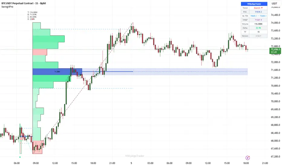
Swing Volume Profile Pro [WillyAlgoTrader]📊 Swing Volume Profile Pro is an overlay indicator that builds a true volume distribution profile for each completed swing leg — distributing each candle's volume across price bins proportionally to how much of the candle's range overlaps each bin (TPO-like allocation), then calculating the Point of Control (highest-volume price), Value Area (70% of volume around POC), buy/sell delta per bin, and swing VWAP. The result is a volume profile that maps exactly to the swing structure, not to arbitrary time intervals.
Most volume profile tools on TradingView are session-based or fixed-period — they split time into equal windows (daily, weekly, or N-bar segments) and build a profile for each. This means a single profile can contain parts of two different swing legs going in opposite directions, mixing bullish and bearish volume into one distribution. The POC and Value Area from such profiles reflect the time window, not the price structure.
This indicator solves that by anchoring each profile to the actual swing structure: a profile starts at one pivot (swing high or swing low) and ends at the next. Every bar within that swing leg contributes its volume to the bins of that specific leg. The POC tells you where the most trading occurred during that exact directional move. The Value Area shows the 70% concentration zone for that move. The delta profile shows which bins were buy-dominant vs sell-dominant within that leg. This structural anchoring makes the volume data directly relevant to the swing you're analyzing.
🧩 WHY THESE COMPONENTS WORK TOGETHER
A volume profile alone tells you where trading concentrated — but without structural context, you don't know whether that concentration happened during an impulse or a correction. A swing detector alone tells you direction changed — but without volume data, you don't know whether the reversal had participation behind it.
This indicator connects them into a single analytical unit:
Pivot detection → Swing leg identification → Candle-range volume distribution → POC/VA/VWAP/Delta calculation → Structural visualization
The swing detector (ta.pivothigh/pivotlow) defines the boundaries of each leg. The volume distribution engine allocates each candle's volume to the correct price bins based on the candle's actual range overlap (not just its close). The POC identifies the price where the market spent the most effort during that specific move. The Value Area defines the consensus price zone. The delta shows whether buyers or sellers dominated at each price level. And the swing VWAP gives the fair value for the entire move. Together, these components answer: "during this specific swing move, where did the market agree on value, and who was in control?"
🔍 WHAT MAKES IT ORIGINAL
1️⃣ Candle-range volume distribution (TPO-like allocation).
Standard volume profiles assign each candle's entire volume to a single bin (usually the close price). This creates distortion: a wide-range candle that spans 10 bins puts all its volume in one, leaving 9 bins empty. This indicator distributes volume proportionally:
For each candle, for each bin:
overlap = max(0, min(candle_high, bin_high) − max(candle_low, bin_low))
portion = overlap / candle_range
allocated_volume = candle_volume × portion
A candle spanning 5 bins distributes its volume across all 5, weighted by how much of its range falls within each bin. This produces a smooth, accurate volume distribution that reflects where the market actually traded within each candle, not just where it closed.
Additionally, each candle is classified as bullish (close ≥ open) or bearish (close < open), and its allocated volume is tracked separately in buy and sell arrays. This enables the delta profile: at every price bin, you can see whether buy or sell volume dominated.
2️⃣ Swing-anchored profiles (not time-anchored).
Profiles are built between confirmed pivot highs and pivot lows detected by ta.pivothigh(high, swingLen, swingLen) and ta.pivotlow(low, swingLen, swingLen). Each completed swing leg (from one pivot to the next) becomes its own volume profile with independent POC, Value Area, delta, and VWAP. The bins span the exact swing range (min to max price within the leg), and only bars within the leg contribute volume.
A noise filter skips swings smaller than 0.3× ATR(200) — preventing micro-swings from generating meaningless profiles.
3️⃣ Value Area calculation using the CME expansion method.
The Value Area is computed using the standard market profile algorithm: starting from the POC bin, expand alternately upward and downward, adding whichever adjacent bin has more volume, until 70% of total swing volume is captured.
In code: starting with accumulated = volume , the algorithm compares volume vs volume . If the upper bin has more volume (or equal), it expands upward and adds that volume. Otherwise, it expands downward. This continues until accumulated ≥ totalVolume × 0.70. The result is VA High (top of the uppermost included bin) and VA Low (bottom of the lowermost included bin).
This is the same expansion method used by the CME for market profile — it's not a simple percentile calculation. The VA wraps around the POC in the direction of volume concentration, which may be asymmetric.
4️⃣ POC zone with persistent extension.
The POC is not just a single line — it includes the full price bin (top and bottom boundaries) displayed as a shaded zone. This zone extends rightward from the end of the swing leg until the next profile appears, providing a forward-looking support/resistance reference. When a new swing completes, the previous POC zone is trimmed to the boundary of the new profile, and the new zone begins extending.
This means you always see the most recent POC zone extending into current price action — if price is trading within the POC zone, it's at the highest-volume price of the last completed swing. If price breaks above/below the zone, it's leaving the area of strongest volume consensus.
5️⃣ Buy/sell delta profile.
When enabled, each profile bin is colored by its buy/sell imbalance: green if buy volume ≥ sell volume, red if sell volume dominates. A bullish swing with mostly green bins confirms strong demand throughout the move. A bullish swing with red bins at the top suggests sellers are absorbing the advance — potential exhaustion. This buy/sell classification is based on candle direction (close ≥ open = buy candle), applied proportionally through the same distribution mechanism as total volume.
6️⃣ Swing VWAP per leg.
A separate VWAP is calculated for each swing leg: sum(typical_price × volume) / sum(volume), where typical_price = (high + low + close) / 3 for each bar within the leg. This gives the volume-weighted fair value for that specific move — distinct from session VWAP or rolling VWAP. If price retests a previous swing VWAP, it's returning to the average traded price of that move.
7️⃣ Dual visualization modes: histogram profile + heatmap.
Two display modes for the volume distribution:
— Profile mode (default): horizontal histogram bars extending from the swing boundary, with a polyline outline. Width proportional to volume at each bin. The highest-volume bin (POC) is highlighted.
— Heatmap mode : fills the entire swing range with color-gradient boxes. Higher volume = more opaque/saturated color. Lower volume = more transparent. This gives a density map of where volume concentrated within the swing.
Both modes support delta coloring. The profile mode includes volume text on the POC bin.
8️⃣ Real-time forming swing profile.
The indicator doesn't wait for a swing to complete — it continuously builds a profile for the current forming swing leg. As each new bar adds volume, the real-time profile updates: bins are recalculated, POC may shift, Value Area may expand. This profile is drawn in a neutral color (gray) to distinguish it from confirmed profiles. When the swing completes (next pivot confirmed), the real-time profile is replaced by the finalized historical profile in the swing's directional color.
9️⃣ Comprehensive tooltip data on swing labels.
Each swing pivot label (▲ for bullish, ▼ for bearish) contains a tooltip with complete swing statistics: total volume, buy volume, sell volume, delta percentage, POC price, Value Area range, and swing VWAP. This compresses all the analytical data into a single hover interaction — you can quickly review any historical swing's volume profile data without cluttering the chart.
⚙️ HOW IT WORKS — CALCULATION FLOW
Step 1 — Swing detection: ta.pivothigh(high, swingLen, swingLen) and ta.pivotlow(low, swingLen, swingLen) detect confirmed pivots. Pivots are confirmed swingLen bars after they form. Direction flips when a new pivot type appears (swing high → bearish direction, swing low → bullish direction).
Step 2 — Swing leg boundaries: When direction flips, the completed leg is defined from the previous pivot index to the current pivot index. The swing range (top − bottom) is divided into N bins (default 20). A noise filter requires swing range > 0.3× ATR(200).
Step 3 — Volume distribution: For each bar in the leg, the candle's volume is distributed across bins proportional to range overlap. Buy/sell arrays track bullish vs bearish candle volume separately. Typical price × volume is accumulated for VWAP.
Step 4 — POC: The bin with the highest total volume is identified. Its center price becomes POC, and its upper/lower boundaries define the POC zone.
Step 5 — Value Area: Starting from the POC bin, expand alternately toward the bin with more volume (up or down) until 70% of total swing volume is accumulated. The top of the upper boundary and bottom of the lower boundary define VA High and VA Low.
Step 6 — Visualization: Profile boxes are drawn with width proportional to volume/maxVolume × halfSpan. The polyline outline traces the profile shape. POC zone extends rightward until the next profile. VA lines span the leg. VWAP line marks the fair value.
Step 7 — Real-time update: On the last bar, the current forming swing is profiled with the same algorithm. All real-time drawings are deleted and recreated each bar (delete-before-create pattern) for clean updates.
📖 HOW TO USE
🎯 Quick start:
1. Add the indicator — profiles appear on each completed swing leg
2. The widest bar in each profile = POC (highest volume price)
3. Blue dashed lines = Value Area boundaries (70% of volume)
4. Green/red bin colors = buy vs sell dominance at each price level
5. The POC zone (shaded) extends rightward — watch how price interacts with it
👁️ Reading the chart:
— 🟢 Green profile = bullish swing leg (low → high)
— 🔴 Red profile = bearish swing leg (high → low)
— ⚫ Gray profile = current forming swing (not yet confirmed)
— 🔵 Dark blue line + shaded zone = POC (extends rightward as S/R reference)
— 🔵 Blue dashed lines = Value Area High / Low
— 🟣 Purple solid line = Swing VWAP (fair value for the leg)
— 🟢🔴 Bin colors (delta mode) = buy vs sell dominance per price level
— ▲/▼ labels at pivots = swing reversals (hover for full volume data)
📊 Key analysis patterns:
— POC at swing extreme : heavy volume at the high/low of the swing → potential exhaustion (climax volume)
— POC in middle of swing : most volume at fair value → healthy acceptance, trend likely to continue
— Wide Value Area : volume distributed broadly → uncertainty, ranging behavior
— Narrow Value Area : volume concentrated tightly → strong consensus, potential breakout energy stored
— Delta divergence : bullish swing with red bins at top → sellers absorbing the rally → watch for reversal
— Price retesting POC zone : if the extended POC zone acts as support/resistance, the volume consensus from the previous swing is holding
📊 Dashboard fields:
— Trend: current swing direction (Bullish ▲ / Bearish ▼)
— POC: point of control price for the current/last swing
— VA 70%: value area range (low — high)
— VWAP: swing VWAP price
— Volume: total volume in the swing leg
— Delta: buy vs sell imbalance percentage (positive = buy dominant)
— Timeframe and version
⚙️ KEY SETTINGS REFERENCE
⚙️ Main:
— Swing Detection Length (default 21): pivot lookback — higher = larger swings, lower = more frequent
— Profile Bins (default 20): price resolution — higher = finer detail, lower = smoother
🎨 Visual:
— Volume Profile (default On): histogram display
— Heatmap (default Off): color-gradient fill instead of histogram
— Delta Profile (default On): buy/sell coloring per bin
— ZigZag (default On): swing connector lines (Dotted/Dashed/Solid)
— POC Line (default On): point of control with extending zone
— POC Zone Fill (default On): shaded POC bin
— Value Area (default On): VA High/Low lines
— Swing VWAP (default Off): volume-weighted average per leg
— Swing Labels (default On): pivot markers with tooltip data
— Reversal Signals (default Off): confirmed swing direction change markers
— Auto / Dark / Light theme
🔧 Advanced:
— POC Width (default 2): POC line thickness
— VA Width (default 1): Value Area line thickness
🔔 Alerts
— 🟢 SWING BULLISH — ticker, price, timeframe, POC, delta %
— 🔴 SWING BEARISH — same fields
Both support plain text and JSON webhook format. Bar-close confirmed.
⚠️ IMPORTANT NOTES
— 🚫 No repainting of confirmed profiles. Historical profiles are built on barstate.isconfirmed when a swing direction flip occurs. Once drawn, they don't change. The real-time forming profile updates each bar (by design — it's a live calculation), but confirmed profiles are final.
— 📊 Volume data required. The profile, POC, Value Area, delta, and VWAP calculations all depend on volume data. On instruments without volume (some forex pairs), the profiles will be flat (all bins equal) and the analysis loses its meaning. The indicator works best on instruments with reliable volume: crypto, stocks, futures.
— 📐 The candle-range distribution is an approximation of intrabar volume distribution. True tick-level distribution would require tick data, which TradingView doesn't provide. The proportional overlap method is the best approximation available and significantly more accurate than assigning all volume to the close price.
— ⚖️ The delta classification (buy vs sell) uses candle direction (close ≥ open), not actual trade-level order flow. A bullish candle's volume is classified as "buy" and a bearish candle's as "sell." This is a standard approximation used by most volume analysis tools on candle data.
— 📏 Swing Detection Length controls profile granularity. Length 21 produces medium-term swing profiles. Length 5–10 produces many small profiles (noisy). Length 50–100 produces few large profiles (macro structure). Choose based on your trading timeframe.
— 🔄 The POC zone extends rightward until the next profile appears. If no new swing occurs for a long time, the zone keeps extending — this is by design (the last known POC remains relevant until a new volume structure forms).
— 🛠️ This is a volume analysis and structural visualization tool , not an automated trading bot. It reveals where volume concentrated within each swing — trade decisions remain yours.
— 🌐 Works on all markets with volume data. All timeframes supported. インジケーター

Smart Money Engine PROSmart Money Engine PRO — Indicator Description
Smart Money Engine PRO is an advanced price action tool designed to visualize institutional market behavior directly on the chart.
The indicator combines several core Smart Money Concepts (SMC) into a single engine to help traders better understand market structure, liquidity dynamics, and institutional trading zones.
Instead of using multiple indicators, Smart Money Engine PRO integrates key components such as Market Structure, Order Blocks, Liquidity Zones, Fair Value Gaps, Premium/Discount areas, and Liquidity Sweeps into one unified system.
This allows traders to read the market more clearly and identify potential high-probability trading areas.
1. Market Structure
The indicator automatically detects and marks the current market structure.
Key concepts include:
BOS (Break of Structure)
Indicates that the existing trend is continuing.
CHoCH (Change of Character)
Signals a potential trend reversal.
By visualizing these structure changes on the chart, traders can quickly determine whether the market is continuing a trend or transitioning into a new one.
2. Order Blocks
Smart Money Engine PRO identifies potential institutional order block zones.
These zones represent areas where large market participants may have placed significant orders.
Typical examples include:
• The last strong bullish candle before a major drop → Bearish Order Block
• The last strong bearish candle before a strong rally → Bullish Order Block
Price often revisits these areas and reacts to them, making them important levels for potential entries or reversals.
3. Liquidity Zones
Liquidity zones highlight areas where stop losses are likely concentrated.
Common liquidity areas include:
• Equal Highs
• Equal Lows
These zones are important because institutional traders often collect liquidity before initiating the real market move.
Smart Money Engine PRO helps visualize these areas so traders can better anticipate potential liquidity grabs.
4. Fair Value Gaps (FVG)
Fair Value Gaps represent areas where price moves very quickly, leaving behind a temporary imbalance in the market.
These zones often act as price inefficiencies.
In many cases, price tends to return to these areas to rebalance before continuing its move.
The indicator highlights these imbalances directly on the chart for easier identification.
5. Premium & Discount Zones
Within a defined price range, the indicator divides the market into two zones:
Premium Zone (Upper 50%)
Typically considered a potential selling area.
Discount Zone (Lower 50%)
Often considered a potential buying area.
According to Smart Money Concepts:
• Discount → Long bias
• Premium → Short bias
This helps traders align entries with institutional positioning logic.
6. Liquidity Sweeps
The indicator can also detect potential liquidity sweeps.
This occurs when:
Price breaks a recent high or low
Stops are triggered
Price quickly reverses
These events often represent fake breakouts or stop hunts, which can lead to strong moves in the opposite direction. インジケーター

Adaptive Spectral Forecast [WillyAlgoTrader]📡 Adaptive Spectral Forecast is an overlay indicator that applies Goertzel spectral analysis to decompose price into its dominant cyclical components, reconstructs them as a harmonic sum, and then extrapolates the resulting waveform forward in time to generate a visual forecast with confidence bands. Signals fire when the forecast direction changes with sufficient signal-to-noise ratio and trend alignment — projecting where price is likely to oscillate next based on the cycles detected in recent history.
This is a fundamentally different approach from trend-following or momentum-based indicators. Instead of asking "where is price going based on its direction and speed?", spectral analysis asks "what recurring cycles exist in this price data, and where do they project to next?" The Goertzel algorithm is a targeted frequency detector — it scans a range of cycle periods, measures the power (amplitude²) at each frequency, identifies the dominant peaks, computes their exact phase and amplitude via DFT projection, and recombines them into a multi-harmonic forecast that decays toward the adaptive trend as it extends into the future.
🧩 WHY THESE COMPONENTS WORK TOGETHER
Raw price is a mix of trend, cycles, and noise. Attempting to forecast raw price directly fails because trend and cycles require different extrapolation methods: trend continues linearly, cycles repeat sinusoidally, and noise should not be extrapolated at all.
This indicator solves the problem through decomposition and reassembly:
EMA trend extraction → Hann-windowed detrending → Goertzel spectral scan → SNR peak detection → DFT coefficient extraction → Harmonic recombination with decay → Trend re-addition → Confidence bands
Each stage addresses a specific challenge:
— Trend extraction separates the slow directional component so it can be extrapolated linearly (via slope), not sinusoidally
— Hann windowing reduces spectral leakage — without it, the finite data window creates false frequency peaks that contaminate the analysis
— Goertzel scanning efficiently measures power at each candidate frequency without computing a full FFT — enabling targeted, adaptive-resolution frequency detection
— SNR filtering ensures only cycles with meaningful signal strength are included — weak noise-level frequencies are discarded
— DFT coefficient extraction computes the exact amplitude and phase of each selected cycle on un-windowed data (the Hann window is only for spectral scanning, not for coefficient calculation — this preserves correct amplitudes)
— Harmonic decay causes the cyclic component to gradually fade toward the trend as the forecast extends forward — reflecting the reality that detected cycles have limited persistence
— Confidence bands widen with √(bars ahead) × ATR, showing that forecast uncertainty grows with distance
Removing any component breaks the pipeline: without detrending, the Goertzel scan detects the trend as a low-frequency "cycle". Without Hann windowing, spectral leakage creates phantom peaks. Without SNR filtering, the forecast includes noise-level harmonics that produce random oscillations. Without decay, the harmonic projection repeats forever at full amplitude (unrealistic). The full pipeline is required.
🔍 WHAT MAKES IT ORIGINAL
1️⃣ Goertzel spectral analysis for cycle detection.
The Goertzel algorithm is a single-frequency DFT that computes the power at one specific period using a recursive formula:
s0 = data + 2×cos(2π/period) × s1 − s2
After iterating through all N data points, the power is: (s1 − s2×cos(ω))² + (s2×sin(ω))², normalized by N² for cross-period comparability.
The indicator scans every integer period from Min Cycle Period (default 8) up to N/2, with an adaptive step size: every period for fast cycles (≤30 bars), step of 2 for longer cycles (reducing computation without losing resolution where it matters most). For each period, the Goertzel power is computed, producing a power spectrum — a map of which cycle lengths carry the most energy in the current price data.
This is fundamentally more targeted than an FFT. An FFT computes power at all frequencies simultaneously but at fixed resolution (determined by window size). The Goertzel approach allows scanning exactly the frequency range of interest with customizable resolution.
2️⃣ SNR-based peak detection with fallback.
From the power spectrum, the indicator identifies local peaks (frequencies where power is higher than both neighbors) and computes the Signal-to-Noise Ratio for each: SNR = peak_power / mean_power_across_all_frequencies. Only peaks with SNR ≥ Min Cycle SNR (default 2.0) are accepted as genuine cycles — the rest are considered noise-level fluctuations.
If no peaks pass the SNR filter (possible in highly random or trend-dominated price action), the algorithm falls back to the single strongest frequency. In this case, the dashboard displays "Weak*" strength and buy/sell signals are suppressed — the forecast is shown for visual reference only, but the indicator acknowledges that no reliable cyclical structure was found.
The top N peaks (sorted by power, N = Harmonics Count, default 5) are selected as the dominant cycles.
3️⃣ DFT coefficient extraction on un-windowed data.
For each selected cycle period, the indicator computes exact sine and cosine coefficients using standard DFT projection:
a = (2/N) × Σ data × sin(2π × i / period)
b = (2/N) × Σ data × cos(2π × i / period)
Critically, this computation uses the raw detrended data (without Hann windowing). The Hann window was only applied for the spectral scan (to identify which frequencies are dominant). Using windowed data for coefficient extraction would distort the amplitude of the harmonics. This two-pass approach — windowed scan for detection, raw data for coefficients — is a key design choice that preserves forecast accuracy.
4️⃣ Harmonic extrapolation with configurable decay.
The forecast is constructed by evaluating the harmonic sum at each future bar:
forecast = trend_projection + Σ (a_k × sin(ω_k × t) + b_k × cos(ω_k × t)) × decay^(t − t_base)
Where trend_projection = trend_last + trend_slope × bars_ahead (linear extrapolation of the EMA trend). The decay factor (default 0.97) causes harmonic amplitude to reduce by 3% per bar, so the cyclic component gradually fades and the forecast converges toward the trend line.
At decay = 1.0, harmonics repeat at full amplitude forever (pure cycle projection). At decay = 0.95, they fade rapidly (forecast becomes trend-only within ~20 bars). Default 0.97 provides meaningful oscillation for the first 20–30 bars before fading. The forecast line is colored by segment: green segments where the forecast is rising, red where falling. Reversal dots mark predicted peaks and troughs.
5️⃣ ATR-based confidence bands with √t scaling.
Uncertainty in the forecast grows with distance. The confidence band width is calculated as:
band_width = ATR(14) × confidence_multiplier × √(bars_ahead)
The √t scaling follows the mathematical principle that forecast variance grows linearly with time horizon (standard deviation grows with square root). The ATR provides the natural volatility scale of the instrument. At bar +1, the band is approximately ATR × multiplier. At bar +25, it's 5× wider. This gives a realistic visual envelope of where price might actually be, not just the central harmonic forecast.
6️⃣ 3-bar consensus forecast direction.
Instead of using a simple "is the next bar higher or lower?" check (which is noisy), the forecast direction is determined by majority vote over 3 bars:
The indicator evaluates the forecast at t+0, t+1, t+2, t+3 and counts upward moves: upVotes = (y1>y0 ? 1:0) + (y2>y1 ? 1:0) + (y3>y2 ? 1:0). If ≥2 of 3 transitions are upward → forecast direction is bullish. If ≤1 → bearish. This consensus approach prevents a single-bar oscillation from flipping the forecast direction.
7️⃣ Trend alignment filter for signal quality.
When enabled (default on), buy signals require the EMA trend slope to be positive, and sell signals require negative slope. This prevents the indicator from generating counter-trend signals when a cycle oscillation temporarily points against the broader trend — which is the most common source of false signals in cycle-based systems.
If the trend filter blocks a direction change, the forecast visualization still updates (you can see the cycle projection) but no signal label is emitted. Additionally, signals are suppressed when the SNR is below the minimum threshold or when the spectral scan fell back to a single non-significant frequency.
8️⃣ Adaptive trend extraction with linear extrapolation.
The trend component is extracted using an EMA with configurable smoothing (default 30 bars), applied forward using the buildTrendArray function. The trend's slope is computed via weighted linear regression over the last 5 points of the trend array — providing a stable slope estimate that isn't dominated by a single bar.
The trend is extrapolated linearly into the forecast: trend_forecast = trend_last + slope × i. This linear projection is appropriate for the short-term forecast horizon (15–55 bars) where trend curvature is typically negligible.
9️⃣ Historical fit visualization.
The reconstructed harmonic sum + trend is plotted over historical data as a polyline, showing how well the detected cycles explain the actual price movement. This serves as an immediate visual validation: if the fit tracks price well, the detected cycles are meaningful. If the fit diverges significantly, the current market regime may not have strong cyclical structure (reflected in low SNR scores in the dashboard).
The fit line is colored by trend direction (green for bullish slope, red for bearish) and decimated for performance (every 1–3 bars depending on lookback length).
🔟 Four presets with coordinated parameter scaling.
— Conservative : lookback ≥ 150, harmonics ≤ 3, forecast ≥ 40 bars — stable, long-term cycles, less overfitting risk
— Default : user settings unchanged
— Aggressive : lookback ≤ 80, harmonics +1, forecast ≤ 25 — faster adaptation, more cycles included
— Scalping : lookback ≤ 50, harmonics +2, forecast ≤ 15 — shortest window, most harmonics, very short projection
Each preset adjusts lookback (spectral window), harmonics count (complexity), and forecast length (projection horizon) as a coordinated unit. Longer lookback needs fewer harmonics (the cycles are more stable). Shorter lookback needs more harmonics (to capture the faster fluctuations within the compressed window).
⚙️ HOW IT WORKS — CALCULATION FLOW
Step 1 — Data collection: The last N bars (Analysis Lookback, default 144) of the selected price source are collected into an array, oldest first.
Step 2 — Trend extraction: An EMA with the Trend Smoothing period (default 30) is applied across the array using a forward-pass recursive formula: trend = α × price + (1−α) × trend . This produces a smooth trend array.
Step 3 — Detrending + Hann window: Each bar's trend value is subtracted from its price. The residual is multiplied by a Hann window: w = 0.5 × (1 − cos(2π×i/(N−1))). This isolates the cyclical component while minimizing spectral leakage at the data boundaries.
Step 4 — Goertzel spectral scan: For each candidate period from minPeriod to N/2 (adaptive step: 1 for periods ≤30, 2 for longer), the Goertzel algorithm computes power. The result is a power spectrum across all scanned frequencies.
Step 5 — Peak detection: Local maxima in the power spectrum are identified (power > both neighbors). Each peak's SNR is computed against the mean power. Peaks with SNR ≥ threshold are accepted. If none pass, the strongest single frequency is used as fallback (with "Weak*" marking).
Step 6 — Coefficient extraction: For the top N peaks (by power), sine and cosine coefficients are computed via DFT projection on raw (un-windowed) detrended data. This gives exact amplitude and phase for each cycle.
Step 7 — Forecast generation: The trend is extrapolated linearly using its 5-bar regression slope. Each harmonic is evaluated at future time steps with decay applied. The sum of trend + decayed harmonics produces the central forecast line. Confidence bands = ATR × multiplier × √(bars_ahead).
Step 8 — Direction and signals: 3-bar consensus determines forecast direction. Trend filter and SNR check gate signal emission. Buy/sell labels appear on bar-close confirmation.
📖 HOW TO USE
🎯 Quick start:
1. Add the indicator — the historical fit and forecast line appear on the last bar
2. The colored dotted line extending right is the forecast (green = rising, red = falling)
3. Colored dots (●) on the forecast mark predicted peaks and troughs
4. Dotted lines above and below = confidence bands (forecast uncertainty zone)
5. ▲/▼ labels = buy/sell signals when the forecast direction changes
👁️ Reading the chart:
— 🟢 Green solid line on history = harmonic fit (uptrend slope)
— 🔴 Red solid line on history = harmonic fit (downtrend slope)
— 🟢🔴 Dotted line extending right = forecast (colored by direction: green rising, red falling)
— 🔵 Upper/lower dotted lines = confidence bands (uncertainty grows with distance)
— 🟢 ● dots = predicted troughs (potential support)
— 🔴 ● dots = predicted peaks (potential resistance)
— 🟢 ▲ below bar = buy signal (forecast changed to bullish)
— 🔴 ▼ above bar = sell signal (forecast changed to bearish)
📊 Dashboard fields:
— Trend: current EMA trend direction (Bullish / Bearish / Neutral)
— Forecast: predicted direction (▲ Up / ▼ Down / — Flat)
— Signal: current state (BUY / SELL / Bullish Bias / Bearish Bias / Wait)
— Strength: cycle quality based on average SNR (Strong > 5.0 / Medium > 2.5 / Weak / Weak* = fallback)
— Dom. Cycle: dominant cycle period in bars (e.g., "34 bars")
— Cycles: how many cycles passed SNR filter vs. requested (e.g., "3 / 5")
— Timeframe, preset, version
🔧 Tuning guide:
— Forecast too noisy: reduce Harmonics Count (3), increase Min SNR (3.0+), increase Trend Smoothing
— Forecast too smooth: increase Harmonics Count (5–7), decrease Min SNR (1.5), decrease Trend Smoothing
— Cycles don't match price: increase Analysis Lookback (200+) for more stable cycle detection, or decrease for faster adaptation
— Forecast fades too fast: increase Decay Rate toward 0.99–1.0
— Forecast unrealistic long-term: decrease Decay Rate toward 0.95, reduce Forecast Bars
— Too many false signals: enable Trend Alignment Filter, increase Min SNR
— Scalping 1–5M: use Scalping preset (lookback ≤50, 7 harmonics, 15-bar forecast)
— Swing 4H–1D: use Conservative preset (lookback ≥150, 3 harmonics, 40-bar forecast)
⚙️ KEY SETTINGS REFERENCE
⚙️ Main:
— Analysis Lookback (default 144): spectral analysis window — the last N bars analyzed
— Harmonics Count (default 5): how many dominant cycles to include in the forecast
— Min Cycle Period (default 8): shortest cycle to scan for (bars)
— Preset (default Default): Conservative / Default / Aggressive / Scalping
— Trend Alignment Filter (default On): require trend-forecast agreement for signals
🔮 Forecast:
— Forecast Bars (default 55): projection length into the future
— Confidence Band Width (default 1.5× ATR): band multiplier
— Trend Smoothing (default 30): EMA period for trend component
— Harmonic Decay Rate (default 0.97): amplitude reduction per bar (1.0 = no decay)
— Min Cycle SNR (default 2.0): signal-to-noise threshold for cycle acceptance
🎨 Visual:
— Historical fit, trend line, reversal dots, confidence bands (all toggleable)
— Auto / Dark / Light theme
🔔 Alerts
— 🟢 BUY — ticker, price, timeframe, time
— 🔴 SELL — same fields
Both support plain text and JSON webhook format. Signals are bar-close confirmed, direction-locked, trend-filtered, and SNR-gated.
⚠️ IMPORTANT NOTES
— 📐 This is spectral analysis, not trend following. The indicator detects and projects recurring cycles. In markets with strong cyclical structure (commodities, forex majors, crypto with regular oscillations), it performs well. In news-driven or momentum-dominated markets with no cyclical structure, the SNR will be low and the forecast unreliable — the dashboard reflects this via the Strength reading.
— 🚫 No repainting of signals. The spectral analysis runs on barstate.islast (updating the forecast in real time on the current forming bar). Signals only fire on the next barstate.isconfirmed bar, after the forecast direction has been set. This means the forecast line itself updates in real time (by design — it's a live projection), but buy/sell signals are confirmed and do not change retroactively.
— 📊 The forecast is a projection, not a prediction. It shows where price would go if the detected cycles continue with their current amplitude and phase. Real markets introduce new information that disrupts cycles. The confidence bands reflect this growing uncertainty. Treat the forecast as a probabilistic zone, not a target.
— 🔄 "Weak*" strength means no cycles passed the SNR filter and the indicator fell back to the single strongest frequency. In this state, signals are suppressed. The forecast is still shown for visual reference but should not be trusted for trading decisions.
— ⚖️ The Hann window is applied only for spectral scanning , not for coefficient extraction. This is deliberate: the window prevents spectral leakage during frequency detection, but the un-windowed data preserves correct harmonic amplitudes for the forecast.
— 📏 The forecast extends a fixed number of bars into the future. Accuracy degrades with distance — the first 10–15 bars are typically the most reliable. The confidence bands quantify this degradation visually.
— 🛠️ This is a spectral analysis and forecasting tool , not an automated trading bot. It detects cycles, projects them forward, and generates directional signals — trade decisions remain yours.
— 🌐 Works on all markets and timeframes. Cycle periods adapt automatically to whatever timeframe you apply it on. インジケーター
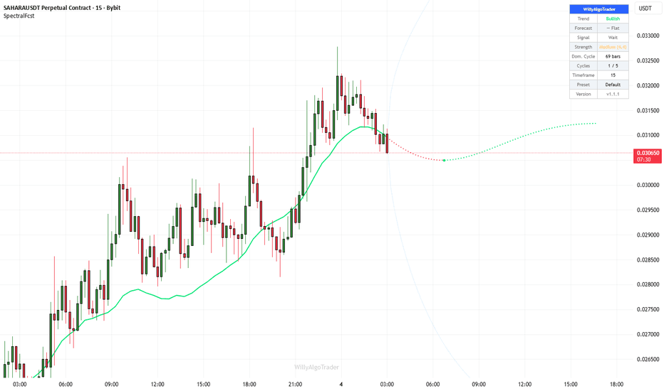
6 EMA Setup**6 EMA Setup** is a multi-moving-average indicator designed to help traders quickly read **trend direction, pullback zones, and long-term market structure** using six Exponential Moving Averages on a single chart.
The indicator comes with default EMA lengths of **9, 21, 34, 89, 200, and 500**, allowing traders to monitor both **short-term momentum** and **higher-timeframe trend alignment** in one view.
A key visual feature of this setup is that the **9 EMA and 21 EMA are displayed as solid lines**, making the fast trend and immediate momentum easy to follow, while the higher EMAs are displayed in a **dashed style** to separate broader trend structure from short-term action.
### Default EMA setup
* **EMA 9** – fast momentum
* **EMA 21** – short-term trend
* **EMA 34** – pullback/trend support zone
* **EMA 89** – medium-term structure
* **EMA 200** – major trend direction
* **EMA 500** – higher trend bias / macro structure
### Features
* 6 configurable EMA lines
* Default lengths: **9, 21, 34, 89, 200, 500**
* Individual **show/hide toggle** for each EMA
* Custom **color setting** for every EMA
* **Solid lines** for 9 and 21 EMA
* **Dashed style** for 34, 89, 200, and 500 EMA
* Adjustable **source**
* Adjustable **offset**
* Customizable dash/gap appearance for dashed EMAs
### How it helps
This indicator is useful for:
* Identifying **trend direction**
* Tracking **short-term momentum shifts**
* Spotting **pullback entries**
* Understanding **trend continuation zones**
* Filtering trades with **higher-timeframe EMA alignment**
* Visualizing whether price is trading above or below key dynamic support/resistance levels
### Common use case
Many traders use this type of EMA stack to check:
* whether **9 is above 21** for momentum strength
* whether price respects **34 or 89** during pullbacks
* whether market is above or below **200 EMA** for main trend bias
* whether the **500 EMA** supports the larger directional context
### Best for
* Trend-following traders
* Pullback traders
* Intraday traders
* Swing traders
* Multi-timeframe chart readers
If you want, I can also give you:
* a **short TradingView publish description**
* a **professional/public library description**
* a **simple beginner-friendly description**
* or a **combined description** for your **Donchian + EMA indicator**
インジケーター

インジケーター

Wirezard Wave RiderWirezard Wave Rider
🚀 Release Notes
This update introduces a major overhaul to the signal engine, moving away from unanimous consensus toward a more responsive Weighted Multi-Timeframe (MTF) approach. We’ve also integrated advanced divergence detection and Fibonacci structure tracking to better identify wave transitions.
🧠 Core Engine & Logic Upgrades
Weighted MTF Scoring: Replaces the old "unanimous consensus" logic. This significantly reduces lag at market tops and bottoms, allowing for more agile entries and exits.
VIDYA Trend Integration: The Variable Index Dynamic Average (VIDYA) is now woven into all signal tiers, MTF calculations, and divergence checks for unified trend confirmation.
Pivot-Based Structure Tracking: New swing high/low logic provides the script with "wave awareness," allowing it to identify market structure shifts in real-time.
📉 Precision Analysis Tools
Divergence Detection: Automated RSI and MACD divergence tracking to catch Wave 3/5 tops and Wave A/C bottoms.
Fibonacci Retracement Overlays: Dynamic Fib levels are now drawn from the most recent major swing, serving as both a visual guide and a signal modifier.
Dynamic RSI Thresholds: Adjusted tightRsiSell from 40 to 52, enabling much earlier detection of corrective moves.
⚡ New Signal Tiers
SELL Tier 3 (Early Divergence): A preemptive signal that fires at market tops before the trend officially flips, based on bearish divergence.
BUY Tier 2 (Correction Buy): Specifically designed to catch Wave 2, 4, or B bottoms using relaxed MTF requirements to ensure you don't miss the bounce.
🖥️ UI & Notifications
Expanded MTF Dashboard: The on-screen display now includes real-time divergence status and swing structure information.
Enhanced Alert Payloads: Standardized alert messages now include the specific Signal Tier and Divergence Data, making it easier to automate or triage notifications. インジケーター

Tectonic [The_lurker]◈ Tectonic — Market State Architecture - هندسة حالة السوق ◈
The earth beneath your chart is not solid. It shifts. It cracks. It builds pressure for weeks — then breaks in seconds.
Tectonic does not watch price. It listens to the ground underneath.
Every market sits on invisible layers of energy, control, and absorption. When these layers align, trends run smooth. When they diverge, the surface holds — but the fault lines spread silently beneath. Then comes the break.
Tectonic reads this. Every bar, it answers three questions:
→ What is the current structural state?
→ Can it hold?
→ Where are the fault lines forming?
This is not an indicator. This is a seismograph for market structure.
━━━━━━━━━━━━━━━━━━━━━━━━━━━━━━
🔬 THE THREE TECTONIC LAYERS
Most indicators see one layer — price. Tectonic sees three:
⚡ Energy (E)
The raw force driving the market. Measured by rate-of-change magnitude, normalized through percentile ranking. High energy means the ground is moving with conviction. Low energy means the surface is quiet — but quiet does not mean safe.
⚖️ Control (S)
Which side owns the momentum — buyers or sellers? This uses asymmetric windowed analysis to detect when the balance of power shifts between hands — often before price shows it. Above 60% means buyer dominance. Below 40% means seller dominance. Near 50% means a contested fault line.
🧲 Absorption (A)
How much pressure is the ground absorbing without releasing? This is the layer most traders never see. High absorption during a trend means the rock is saturated — it cannot hold more, fracture is near. High absorption during a range means compression is building — the release will be violent. The lambda parameter reads absorption differently in trends versus ranges.
These three form the tectonic field. Not price action. Not candle patterns. The actual forces moving beneath your chart.
━━━━━━━━━━━━━━━━━━━━━━━━━━━━━━
🧬 STRUCTURAL TILT (α)
Beneath the noise of individual bars, which way does the continent lean?
Alpha measures the persistent imbalance between upward and downward momentum over a long structural window. Think of it as geological tilt — the deep directional bias that survives daily turbulence.
⦿ Strong positive — the foundation tilts bullish
◉ Moderate — mild directional lean
◎ Near zero — flat terrain, no structural bias
━━━━━━━━━━━━━━━━━━━━━━━━━━━━━━
🔺 SEISMIC ACCELERATION (RA)
The tremors are increasing. Something is about to shift.
RA measures how fast the entire tectonic field is moving — Energy, Control, and Absorption all at once:
RA = percentile_rank( |delta E| + |delta S| + |delta A| )
Low RA means geological calm. High RA means seismic activity — the plates are grinding. It does not tell you which way the break will go. It tells you the break is coming.
This is what lets Tectonic detect regime shifts before they become visible on the surface.
━━━━━━━━━━━━━━━━━━━━━━━━━━━━━━
◆ PLATE ROTATION (θ, Δθ)
The tectonic plates do not just push — they rotate.
Tectonic maps the relationship between Energy and Control changes onto a circular field:
theta = atan2(delta S, delta E)
Four rotational phases. Four colors. Four meanings:
🟠 Thrust Phase (0 to 45 and 315 to 360 degrees)
The plates are pushing hard in one direction. Energy rising, control locked. This is the acceleration phase — momentum builds with clear force.
🟢 Transfer Phase (45 to 135 degrees)
The balance is shifting. One plate subducting under another. Power transferring from buyers to sellers or vice versa. The surface has not cracked yet — but the pressure point is moving.
🔵 Subsidence Phase (135 to 225 degrees)
The driving force is fading. The old plate still holds position but has no energy left. This is structural decay — the trend is sinking, not breaking.
🔴 Collapse Phase (225 to 315 degrees)
Neither plate holds. Structural chaos. No conviction from either side. This is where false signals live — and where the next regime emerges from the rubble.
When rotation accelerates rapidly (high |delta theta|), a Tectonic Reversal ⟳ triggers — the clearest warning that the plates are about to snap.
━━━━━━━━━━━━━━━━━━━━━━━━━━━━━━
🧱 ADAPTIVE STABILITY
Is the ground solid — or is it standing on a fault line?
Stability combines three destabilizing forces into one reading:
stabilityBase = 1 - (RA x 0.4 + |delta theta| / pi x 0.4 + A x 0.2)
But a reading means nothing without context. A 70% stability reading on a 3-bar-old regime is sand. The same 70% after 50 bars of persistence is bedrock. So Tectonic scales it:
stability = stabilityBase x (0.5 + maturity x 0.5)
Young formations earn half credit. Ancient formations earn full credit. This is geological thinking — old rock is stronger than fresh sediment.
Notice: Absorption is a hidden stress factor. A mature formation with high absorption looks solid but is actually saturated. Tectonic detects this. Traditional indicators see a stable market. Tectonic sees a dam about to break.
━━━━━━━━━━━━━━━━━━━━━━━━━━━━━━
⏳ FORMATION MEMORY
How old is this geological formation? And is it aging into granite — or crumbling into dust?
Two independent clocks:
Regime Age — how many bars the current state has persisted.
Plate Age — how many bars the rotational phase has stayed in the same quadrant.
When both are old together, the structure is cohesive. When they diverge — regime stable but plates rotating wildly — the surface looks calm but underground fractures are spreading.
Formation classification:
🌱 Less than 5 bars — Fresh (unproven, fragile)
📈 5 to 20 bars — Forming (gaining density)
🏛️ 20 to 50 bars — Established (reliable, load-bearing)
⏳ More than 50 bars — Ancient (powerful but brittle under new stress)
Stability trend shows whether the formation is hardening ↑, holding →, or eroding ↓.
━━━━━━━━━━━━━━━━━━━━━━━━━━━━━
🔻 FRACTURE INDEX (SPI)
This is why Tectonic exists. Everything else builds to this moment.
phaseFrag = 1 - min(phaseDuration / regimeDuration, 1)
SPI = regimeMaturity x phaseFrag x (1 - stability)
The Fracture Index detects silent cracks. Picture this:
A bullish trend has held for 60 bars. Price looks strong. RSI looks healthy. MACD looks fine. Every traditional indicator says hold.
But underground — the plates are rotating wildly inside a stable regime. Stability is dropping bar by bar. The formation has been standing so long it has become brittle.
The Fracture Index sees this. It rises quietly. At 35% — hairline cracks. At 60% — the Outlook flips to Internal Fracture. Then the break comes — fast, clean, devastating. Invisible to everyone watching the surface.
The Fracture Heatmap paints this directly on your chart. Nothing visible when pressure is low. A faint amber glow as stress builds. Deep red as the fault line reaches critical mass. You feel the earthquake coming before the ground moves.
◇ Below 35% — Stable ground. Formation is sound.
⚠️ 35 to 60% — Stress building. Micro-fractures forming.
🔻 Above 60% — Critical. The break is imminent.
━━━━━━━━━━━━━━━━━━━━━━━━━━━━━━
📋 COMMAND CENTER
Two modes for two mindsets:
Full Mode (18 rows) — for the geologist who wants every layer visible:
Structural tilt with bias, E S A with percentage and gauge, seismic acceleration, last signal details (plate color, direction, reversal status, age), current regime, formation memory with age and maturity and stability trend, adaptive stability with gauge, plate age with phase name, fracture index with gauge, and tectonic outlook.
Simple Mode (5 rows) — for the trader who needs one glance:
Regime with direction and formation age, stability with fracture warning, E S A compact, and outlook.
Switch anytime in settings under Mode.
━━━━━━━━━━━━━━━━━━━━━━━━━━━━━━
📊 TECTONIC STATES
▲ Bullish Drift — High E, Bullish S, Low A — Clean continental drift upward.
▼ Bearish Drift — High E, Bearish S, Low A — Clean continental drift downward.
⬥ Bullish Overshoot — High E, Bullish S, High A — Overextended, fracture risk.
⬥ Bearish Overshoot — High E, Bearish S, High A — Oversold, rebound risk.
◍ Silent Loading — Low E, High A, Bullish S — Deep accumulation beneath quiet surface.
◍ Silent Unloading — Low E, High A, Bearish S — Distribution masked by stillness.
◍ Compression Zone — Low E, High A, Neutral S — Maximum pressure. Breakout imminent.
◌ Dead Zone — Low E, Low A, Neutral S — No tectonic activity. Stay out.
○ Undirected Tremor — High E, Neutral S — Seismic noise without direction.
○ Transitional — Mixed readings — Plates reorganizing. Wait for clarity.
━━━━━━━━━━━━━━━━━━━━━━━━━━━━━━
🔔 SEISMIC ALERTS (6 CONDITIONS)
🔺 Seismic Acceleration — RA crosses threshold. The plates are grinding.
⚡ Force Divergence — Energy and Control moving against each other. Internal conflict.
🔥 Absorption Climax — Saturated ground with high energy and strong skew. Fracture zone.
⟳ Plate Reversal — RA spike with rapid rotation. The snap is coming.
⏳ Formation Fatigue — Ancient regime with eroding stability. End of geological era.
🔻 Fracture Alert — SPI above 60%. Silent crack detected underground.
━━━━━━━━━━━━━━━━━━━━━━━━━━━━━━
🎯 READING THE GROUND
For riding trends:
▲ or ▼ Drift + 🧱 Solid stability + ◇ No fractures + 🏛️ Established formation.
The ground beneath this trend is granite. Ride it.
For catching breaks:
⏳ Ancient formation + ↓ Eroding stability + 🔻 Rising fracture index + ⬥ Overshoot state.
When SPI crosses 60% — Internal Fracture confirms it. This is what RSI and MACD cannot feel underground.
For spotting hidden accumulation:
Low E + High A + S leaning one way = tectonic loading. The quiet surface hides massive positioning beneath. Precision entry zones.
For avoiding dead ground:
◌ Dead Zone or ○ Transitional + 🌪 Weak stability + 🌱 Fresh formation = no geological basis for a trade. Wait.
━━━━━━━━━━━━━━━━━━━━━━━━━━━━━━
⚙️ SETTINGS
🌐 Language — Arabic or English
⚙️ Structural — Core tectonic parameters (windows, smoothing, normalization)
⚡ Alerts — Thresholds for all 6 seismic conditions
📊 Quant — 12 hidden outputs for strategy integration
🎨 Visual — Colors, opacity, plate vectors, zones, fracture heatmap on/off
📋 Command Center — Full/Simple, position, size, border color
No repainting. No future data. Purely causal. Performance optimized. 12 quant outputs for automated systems.
━━━━━━━━━━━━━━━━━━━━━━━━━━━━━━
Tectonic does not predict where the market goes. It tells you what the ground is made of, how long it has been holding, and where the cracks are forming. The rest is your decision.
◈ Tectonic — هندسة حالة السوق ◈
الأرض تحت الشارت ليست صلبة. تتحرك. تتشقق. تبني ضغطاً لأسابيع — ثم تنكسر في ثوانٍ.
Tectonic لا يراقب السعر. يستمع إلى الأرض تحته.
كل سوق يقف على طبقات غير مرئية من الطاقة والسيطرة والامتصاص. عندما تتوازى هذه الطبقات، الاتجاه يسير بسلاسة. عندما تتباعد، السطح يصمد — لكن خطوط الصدع تنتشر بصمت في العمق. ثم يأتي الانكسار.
Tectonic يقرأ هذا. كل شمعة، يجيب على ثلاثة أسئلة:
→ ما الحالة البنيوية الحالية؟
→ هل تستطيع الصمود؟
→ أين تتشكّل خطوط الصدع؟
هذا ليس مؤشراً. هذا جهاز رصد زلازل لبنية السوق.
━━━━━━━━━━━━━━━━━━━━━━━━━━━━━━
🔬 الطبقات التكتونية الثلاث
أغلب المؤشرات ترى طبقة واحدة — السعر. Tectonic يرى ثلاثاً:
⚡ الطاقة (E)
القوة الخام التي تحرّك السوق. تُقاس بحجم معدل التغيّر، مُطبَّع عبر الترتيب المئوي. طاقة عالية تعني أن الأرض تتحرك بقناعة. طاقة منخفضة تعني أن السطح هادئ — لكن الهدوء لا يعني الأمان.
⚖️ السيطرة (S)
من يملك الزخم — المشترون أم البائعون؟ يستخدم تحليل نوافذ غير متماثل لكشف متى يتحوّل ميزان القوى بين الأيدي — غالباً قبل أن يُظهره السعر. فوق 60% سيطرة مشترين. تحت 40% سيطرة بائعين. قرب 50% خط صدع مُتنازع عليه.
🧲 الامتصاص (A)
كم ضغط تمتصه الأرض دون أن تُطلقه؟ هذه الطبقة التي لا يراها أغلب المتداولين. امتصاص عالٍ أثناء اتجاه يعني أن الصخر مشبع — لا يحتمل المزيد، الكسر وشيك. امتصاص عالٍ أثناء نطاق يعني أن الضغط يتراكم — الانفجار سيكون عنيفاً. معامل لامبدا يقرأ الامتصاص بشكل مختلف في الاتجاهات مقابل النطاقات.
هذه الثلاث تشكّل الحقل التكتوني. ليست حركة سعر. ليست أنماط شموع. القوى الفعلية التي تتحرك تحت الشارت.
━━━━━━━━━━━━━━━━━━━━━━━━━━━━━━
🧬 الميل البنيوي (α)
تحت ضوضاء الشموع الفردية، أي اتجاه تميل القارة؟
ألفا يقيس الاختلال المستمر بين الزخم الصاعد والهابط عبر نافذة بنيوية طويلة. فكّر فيه كميل جيولوجي — الانحياز الاتجاهي العميق الذي ينجو من الاضطرابات اليومية.
⦿ إيجابي قوي — الأساس يميل صعوداً
◉ معتدل — ميل اتجاهي خفيف
◎ قرب الصفر — أرض مسطحة، لا انحياز بنيوي
━━━━━━━━━━━━━━━━━━━━━━━━━━━━━━
🔺 التسارع الزلزالي (RA)
الهزّات تتزايد. شيء ما على وشك التحوّل.
RA يقيس سرعة تحرّك الحقل التكتوني بأكمله — الطاقة والسيطرة والامتصاص معاً:
RA = percentile_rank( |delta E| + |delta S| + |delta A| )
RA منخفض يعني هدوء جيولوجي. RA مرتفع يعني نشاط زلزالي — الصفائح تحتك. لا يخبرك إلى أين سيكون الانكسار. يخبرك أن الانكسار قادم.
هذا ما يسمح لـ Tectonic بكشف تحوّلات النظام قبل أن تظهر على السطح.
━━━━━━━━━━━━━━━━━━━━━━━━━━━━━━
◆ دوران الصفائح (θ, Δθ)
الصفائح التكتونية لا تدفع فقط — تدور.
Tectonic يُسقط العلاقة بين تغيّرات الطاقة والسيطرة على حقل دائري:
theta = atan2(delta S, delta E)
أربع مراحل دوران. أربعة ألوان. أربعة معانٍ:
🟠 مرحلة الدفع (0 إلى 45 و 315 إلى 360 درجة)
الصفائح تدفع بقوة في اتجاه واحد. الطاقة ترتفع، السيطرة محسومة. هذه مرحلة التسارع — الزخم يبني بقوة واضحة.
🟢 مرحلة التحويل (45 إلى 135 درجة)
الميزان يتحوّل. صفيحة تغوص تحت أخرى. القوة تنتقل من المشترين إلى البائعين أو العكس. السطح لم يتشقق بعد — لكن نقطة الضغط تتحرك.
🔵 مرحلة الهبوط (135 إلى 225 درجة)
القوة الدافعة تتلاشى. الصفيحة القديمة ما زالت في مكانها لكن لا طاقة لديها. هذا تآكل بنيوي — الاتجاه يغرق، لا ينكسر.
🔴 مرحلة الانهيار (225 إلى 315 درجة)
لا صفيحة تصمد. فوضى بنيوية. لا قناعة من أي طرف. هنا تعيش الإشارات الكاذبة — وهنا يولد النظام التالي من الركام.
عندما يتسارع الدوران بسرعة (|delta theta| مرتفع)، يُطلق Tectonic تحذير انعكاس صفائحي ⟳ — أوضح إنذار بأن الصفائح على وشك الانكسار.
━━━━━━━━━━━━━━━━━━━━━━━━━━━━━━
🧱 الاستقرار التكيّفي
هل الأرض صلبة — أم تقف على خط صدع؟
الاستقرار يجمع ثلاث قوى مزعزعة في قراءة واحدة:
stabilityBase = 1 - (RA x 0.4 + |delta theta| / pi x 0.4 + A x 0.2)
لكن القراءة بلا سياق لا معنى لها. استقرار 70% على نظام عمره 3 شموع هو رمل. نفس 70% بعد 50 شمعة من الاستمرارية هو صخر. لذلك Tectonic يُدرّجه:
stability = stabilityBase x (0.5 + maturity x 0.5)
التشكّلات الحديثة تحصل على نصف الأهلية. التشكّلات القديمة تحصل على كامل الأهلية. هذا تفكير جيولوجي — الصخر القديم أقوى من الرواسب الطازجة.
لاحظ: الامتصاص عامل ضغط خفي. تشكّل ناضج مع امتصاص عالٍ يبدو صلباً لكنه مشبع فعلياً. Tectonic يكشف هذا. المؤشرات التقليدية ترى سوقاً مستقراً. Tectonic يرى سداً على وشك الانهيار.
━━━━━━━━━━━━━━━━━━━━━━━━━━━━━━
⏳ ذاكرة التشكّل
كم عمر هذا التشكّل الجيولوجي؟ وهل يتقادم إلى صخر صوّاني — أم يتفتت إلى غبار؟
ساعتان مستقلتان:
عمر النظام — كم شمعة استمرت الحالة الحالية.
عمر الصفيحة — كم شمعة بقيت المرحلة الدورانية في نفس الربع.
عندما يكون كلاهما قديماً معاً، البنية متماسكة. عندما يتباعدان — نظام مستقر لكن صفائح تدور بجنون — السطح يبدو هادئاً لكن الشقوق تنتشر تحت الأرض.
تصنيف التشكّل:
🌱 أقل من 5 شموع — طازج (غير مُثبت، هش)
📈 5 إلى 20 شمعة — يتشكّل (يكتسب كثافة)
🏛️ 20 إلى 50 شمعة — مستقر (موثوق، يتحمّل الأحمال)
⏳ أكثر من 50 شمعة — قديم (قوي لكن هش تحت ضغط جديد)
اتجاه الاستقرار يُظهر هل التشكّل يتصلّب ↑ أو يصمد → أو يتآكل ↓.
━━━━━━━━━━━━━━━━━━━━━━━━━━━━━━
🔻 مؤشر الانكسار (SPI)
هذا هو سبب وجود Tectonic. كل شيء آخر يُبنى لهذه اللحظة.
phaseFrag = 1 - min(phaseDuration / regimeDuration, 1)
SPI = regimeMaturity x phaseFrag x (1 - stability)
مؤشر الانكسار يكشف الشقوق الصامتة. تخيّل هذا المشهد:
اتجاه صاعد صمد 60 شمعة. السعر يبدو قوياً. RSI يبدو صحياً. MACD يبدو جيداً. كل مؤشر تقليدي يقول استمر.
لكن تحت الأرض — الصفائح تدور بجنون داخل نظام مستقر. الاستقرار ينخفض شمعة بعد شمعة. التشكّل وقف طويلاً حتى أصبح هشاً.
مؤشر الانكسار يرى هذا. يرتفع بهدوء. عند 35% — شقوق شعرية. عند 60% — التوقع يتحوّل إلى انكسار داخلي. ثم يأتي الكسر — سريع، نظيف، مدمّر. غير مرئي لكل من يراقب السطح.
خريطة الانكسار الحرارية ترسم هذا مباشرة على الشارت. لا شيء مرئي عندما يكون الضغط منخفضاً. وهج كهرماني خافت مع تزايد الإجهاد. أحمر عميق مع وصول خط الصدع إلى الكتلة الحرجة. تشعر بالزلزال قبل أن تتحرك الأرض.
◇ أقل من 35% — أرض مستقرة. التشكّل سليم.
⚠️ 35% إلى 60% — إجهاد يتراكم. شقوق دقيقة تتشكّل.
🔻 فوق 60% — حرج. الانكسار وشيك.
━━━━━━━━━━━━━━━━━━━━━━━━━━━━━━
📋 مركز القيادة
وضعان لعقليتين مختلفتين:
الوضع الكامل (18 صفاً) — للجيولوجي الذي يريد كل طبقة مرئية:
الميل البنيوي مع الانحياز، E S A مع النسبة والمقياس، التسارع الزلزالي، تفاصيل آخر إشارة (لون الصفيحة، الاتجاه، حالة الانعكاس، العمر)، النظام الحالي، ذاكرة التشكّل مع العمر والنضج واتجاه الاستقرار، الاستقرار التكيّفي مع المقياس، عمر الصفيحة مع اسم المرحلة، مؤشر الانكسار مع المقياس، والتوقع التكتوني.
الوضع البسيط (5 صفوف) — للمتداول الذي يحتاج نظرة واحدة:
النظام مع الاتجاه وعمر التشكّل، الاستقرار مع تحذير الانكسار، E S A مختصرة، والتوقع.
التبديل في أي وقت من الإعدادات تحت الوضع.
━━━━━━━━━━━━━━━━━━━━━━━━━━━━━━
📊 الحالات التكتونية
▲ انجراف صعودي — E عالي، S صعودي، A منخفض — انجراف قاري نظيف للأعلى.
▼ انجراف هبوطي — E عالي، S هبوطي، A منخفض — انجراف قاري نظيف للأسفل.
⬥ تجاوز صعودي — E عالي، S صعودي، A عالي — تمدد مفرط، خطر انكسار.
⬥ تجاوز هبوطي — E عالي، S هبوطي، A عالي — بيع مفرط، خطر ارتداد.
◍ تحميل صامت — E منخفض، A عالي، S صعودي — تراكم عميق تحت سطح هادئ.
◍ تفريغ صامت — E منخفض، A عالي، S هبوطي — توزيع مُقنّع بالسكون.
◍ منطقة ضغط — E منخفض، A عالي، S محايد — ضغط أقصى. اختراق وشيك.
◌ منطقة ميتة — E منخفض، A منخفض، S محايد — لا نشاط تكتوني. ابتعد.
○ هزّة بلا اتجاه — E عالي، S محايد — ضوضاء زلزالية بلا اتجاه.
○ انتقالي — قراءات مختلطة — الصفائح تعيد ترتيبها. انتظر الوضوح.
━━━━━━━━━━━━━━━━━━━━━━━━━━━━━━
🔔 التنبيهات الزلزالية (6 شروط)
🔺 تسارع زلزالي — RA يتجاوز العتبة. الصفائح تحتك.
⚡ تباين القوى — الطاقة والسيطرة تتحركان ضد بعضهما. صراع داخلي.
🔥 ذروة امتصاص — أرض مشبعة مع طاقة عالية وانحراف قوي. منطقة انكسار.
⟳ انعكاس صفائحي — ارتفاع RA مع دوران سريع. الانكسار قادم.
⏳ إرهاق تشكّل — نظام قديم مع استقرار يتآكل. نهاية حقبة جيولوجية.
🔻 تنبيه انكسار — SPI فوق 60%. شق صامت مُكتشف تحت الأرض.
━━━━━━━━━━━━━━━━━━━━━━━━━━━━━━
🎯 قراءة الأرض
لركوب الاتجاهات:
▲ أو ▼ انجراف + 🧱 استقرار صلب + ◇ لا انكسارات + 🏛️ تشكّل مستقر.
الأرض تحت هذا الاتجاه صخر صوّاني. اركبه.
لاصطياد الانكسارات:
⏳ تشكّل قديم + ↓ استقرار يتآكل + 🔻 مؤشر انكسار يرتفع + ⬥ حالة تجاوز.
عندما يتجاوز SPI الـ 60% — الانكسار الداخلي يؤكده. هذا ما لا يستطيع RSI و MACD الإحساس به تحت الأرض.
لاكتشاف التراكم الخفي:
E منخفض + A عالي + S يميل لاتجاه = تحميل تكتوني. السطح الهادئ يخفي تموضعاً ضخماً في العمق. مناطق دخول دقيقة.
لتجنب الأرض الميتة:
◌ منطقة ميتة أو ○ انتقالي + 🌪 استقرار ضعيف + 🌱 تشكّل طازج = لا أساس جيولوجي للصفقة. انتظر.
━━━━━━━━━━━━━━━━━━━━━━━━━━━━━━
⚙️ الإعدادات
🌐 اللغة — عربي أو إنجليزي
⚙️ بنيوي — معاملات تكتونية أساسية (النوافذ، التنعيم، التطبيع)
⚡ التنبيهات — عتبات الشروط الزلزالية الستة
📊 الكمّي — 12 مخرج مخفي لربط الاستراتيجيات
🎨 بصري — الألوان، الشفافية، أسهم الصفائح، المناطق، خريطة الانكسار الحرارية
📋 مركز القيادة — كامل/بسيط، الموضع، الحجم، لون الإطار
لا إعادة رسم. لا بيانات مستقبلية. سببي بالكامل. أداء محسّن. 12 مخرج كمّي للأنظمة الآلية.
━━━━━━━━━━━━━━━━━━━━━━━━━━━━━━
Tectonic لا يتنبأ أين يذهب السوق. يخبرك ممّا تتكوّن الأرض، كم صمدت، وأين تتشكّل الشقوق. الباقي قرارك. インジケーター

Adaptive Quasimodo + Confluence Engine - PhenLabs📊Quasimodo Pattern (QM) Detector - PhenLabs
Recognizing reversal patterns like the Quasimodo can be challenging and time-consuming, requiring a keen eye for specific market structures. Missing a key swing point or misinterpreting a retracement can lead to missed opportunities or false signals. This indicator automates the precise identification of Quasimodo patterns, providing clear, actionable signals directly on your chart, so you can focus on execution.
🚨OVERVIEW🚨
The Quasimodo Pattern (QM) Detector is an advanced, non-repainting indicator designed to automatically spot high-probability bullish and bearish Quasimodo reversal patterns. It integrates customizable swing point detection, confluence filters (Higher Timeframe trend and volume confirmation), and precise entry, stop-loss, and take-profit calculations directly from the pattern’s structure. Get automated alerts and a real-time dashboard to enhance your pattern-based trading strategy.
🔷 WHAT IS A QUASIMODO (QM) PATTERN?
The Quasimodo pattern is a powerful reversal formation characterized by a specific sequence of price action:
Bearish QM: A Higher High (HH) is followed by a Lower Low (LL), then a Higher High (HH), and finally a Lower Low (LL). The pattern suggests a reversal from an uptrend to a downtrend, often at the level of the previous Higher High.
Bullish QM: A Lower Low (LL) is followed by a Higher High (HH), then a Lower Low (LL), and finally a Higher High (HH). This suggests a reversal from a downtrend to an uptrend, often at the level of the previous Lower Low.
It’s a cousin to the Head & Shoulders pattern but with a distinct structure focused on specific swing points.
🔶 KEY FEATURES
Automated QM Detection: Accurately identifies both bullish and bearish Quasimodo patterns as they form on any timeframe.
Customizable Swing Points: Define how swing highs and lows are detected, choosing between using wick extremes or candle bodies.
Confluence Filters: Incorporates a Higher Timeframe (HTF) Trend filter to confirm pattern alignment using a non-repainting EMA, and a Volume Confirmation filter to validate patterns with significant volume spikes at key structural points.
Dynamic Trade Planning: Automatically calculates suggested Entry, Stop Loss, and Take Profit levels based on the detected QM structure and your desired Risk-to-Reward ratio.
Non-Repainting Logic: All detected patterns and signals are permanent and do not shift or disappear on subsequent bars.
Informative Dashboard: Provides a real-time summary of HTF trend, volume confirmation, and the last detected QM.
Visual Clarity: Plots QM lines, potential entry/SL/TP zones, and clear labels for pattern identification.
Alerts: Customizable alerts for new QM patterns and when price enters the suggested entry zone.
⚙️ SETTINGS GUIDE
Pattern Recognition: Adjust settings like Use Wick As Extremes (for swing points), Swing Lookback (how many bars to scan for swings), Min Head Height/Right Shoulder Depth Factor (magnitude requirements), Strict Higher/Lower High/Low (stricter swing definitions), and Max RSL/RSH Bars (time limit for right shoulder formation).
Trade Management: Configure Entry/SL/TP Offset % to fine-tune entry, stop-loss, and take-profit levels as a percentage buffer, and set your Desired Risk:Reward ratio for calculating Take Profit.
Confluence Filters: Enable or disable Use HTF Confirmation and Use Volume Confirmation . For HTF, set HTF Timeframe and EMA Length . For Volume, adjust Volume Lookback and Multiplier .
Visual Settings: Toggles are available for showing QM lines, entry/SL/TP zones, alerts, and dashboard position.
📈 TRADING WORKFLOW
Identify: Wait for a Bullish or Bearish QM pattern to be detected and labeled on your chart.
Confirm: Check the dashboard and pattern details. Ensure the HTF trend and Volume confirmation are aligned with the pattern’s direction (e.g., Bullish QM + Bullish HTF).
Enter: Wait for price to retest the suggested entry zone. The indicator plots these zones for you.
Manage: Use the automatically calculated Stop Loss and Take Profit levels, adjusting them as needed based on market context and your risk management strategy.
Alerts: Set up alerts to be notified immediately when a QM pattern is found or when price enters an entry zone.
⚠️ RISK DISCLAIMER
Trading involves substantial risk, and past performance is not indicative of future results. The Quasimodo Pattern Detector is a tool to assist in identifying potential trade setups but does not guarantee profitability. Always conduct your own analysis and implement proper risk management.
Does it repaint?
No. This indicator is coded with non-repainting logic. Once a pattern is confirmed and a signal is generated on a closed bar, it will remain on your chart permanently. The Higher Timeframe trend filter also uses a non-repainting method. インジケーター

TX Ultra Pulse TWH## Overview
TX Ultra Pulse TWH is a normalized momentum oscillator designed to visualize trend strength and identify potential reversal points. Unlike standard oscillators that use fixed ranges (0-100), this script normalizes its output into a standardized histogram (typically fluctuating between -1.5 and +1.5), making it easier to compare volatility across different assets.
## How It Works (The Logic)
The indicator allows users to switch between 4 different calculation "Engines". Each engine processes price data differently but outputs a normalized result:
1. Composite Mode (Default & Recommended)
This mode creates a "consensus" signal by blending three classic momentum indicators to filter out noise.
Logic: It calculates the 14-period RSI, 14-period Stochastic, and 20-period CCI.
Normalization: RSI and Stochastic are centered around zero (subtracting 50). CCI is divided by 150 to match the scale.
Weighting: The formula uses a weighted average: (RSI + (Stoch * 2) + CCI) / 3. The Stochastic component is given double weight to prioritize reaction to recent price closes.
Result: A smoother oscillator that reacts to overbought/oversold conditions with less "whipsaw" than a raw RSI.
2. Deviation Mode
Logic: Calculates the percentage distance between the Close price and a Moving Average (default 20 SMA).
Scaling: The result is normalized using Standard Deviation (Z-Score concept) to fit the histogram scale.
Use Case: Best for spotting mean-reversion opportunities when price extends too far from its baseline.
3. Momentum Mode
Logic: Pure Rate-of-Change (ROC). It measures the percentage change between current close and close n periods ago.
Use Case: Ideal for identifying pure trend velocity without the smoothing lag of complex averages.
4. RS Index Mode
Logic: Comparative Relative Strength. It compares the performance of the current asset against a user-defined benchmark (e.g., SPY, BTC, or IDX:COMPOSITE) over a lookback period.
Formula: (Asset % Change - Benchmark % Change). Positive values indicate the asset is outperforming the market.
## Features & Settings
Noise Filter: A built-in EMA smoothing layer (default 15) is applied to the final calculation to reduce visual noise.
Color Grading:
Green: Positive Momentum (Bullish).
Red/Orange: Negative Momentum (Bearish).
Color Intensity: Brighter colors indicate accelerating momentum, while darker/faded colors indicate deceleration (divergence).
Dashboard: Displays the current real-time values, trend direction, and signal status directly on the chart.
## How to Use
Trend Confirmation: Use the histogram color to confirm the trend direction. Do not go Long if the histogram is Red.
Zero Cross: A crossover above 0 indicates a shift to bullish momentum. A cross below 0 indicates bearish momentum.
Divergence: If price makes a Higher High but the Pulse Histogram makes a Lower High, this indicates momentum exhaustion (Bearish Divergence).
## Disclaimer
This script is a technical analysis tool intended for educational purposes. It does not guarantee profits. Past performance is not indicative of future results. インジケーター

ZigZag Fibo Cluster (PRZ)This indicator is designed to identify high-probability Potential Reversal Zones (PRZ) by combining Multi-Timeframe (MTF) analysis with Fibonacci clusters. It focuses on filtering out market noise to find mathematically validated support and resistance levels, making it highly effective for intraday trading and sniper entries.
Core Logic & Key Features:
Dual-Layer ZigZag Architecture: The system simultaneously tracks two different ZigZag structures on the chart. It calculates a "Major" wave (default 10-5) for higher timeframes (1D, 4H, 1H) and a "Minor" wave (default 6-3) for the active lower timeframe (e.g., 20m).
Fibonacci Cluster (Kissing) Detector: Fibonacci retracements and extensions from different timeframes rarely align perfectly. This indicator continuously cross-references the active Fibo levels from the Major and Minor structures to find algorithmic overlaps.
Strict 0.1% Precision Tolerance: When a Major Fibonacci level and a Minor Fibonacci level converge within a strict 0.1% price margin, the system validates this as a "Cluster" and plots a precise "PRZ ±0.1%" label on the chart.
Visual Clarity & Chart Cleanliness: It prevents chart clutter by hiding hundreds of irrelevant Fibonacci lines. It only prints labels where the 0.1% tolerance condition is met—meaning both the macro and micro structures agree on the reversal point. Historical wave references are kept as subtle dotted lines.
Dynamic Customization: All ZigZag deviation parameters (Left/Right bars) and extended Fibonacci levels (1.272, 1.618, -0.618, etc.) can be fully customized via the settings menu to adapt to different asset volatilities.
How to Use:
When the "PRZ ±0.1%" label appears, it indicates that the current price action has reached both its macro and micro algorithmic targets. These specific zones provide asymmetric risk/reward opportunities, allowing traders to plan trend reversals, define take-profit areas, or execute counter-trend trades with extremely tight stop-loss margins. インジケーター
インジケーター

Ciera Supply and Demand xATR Exhaustion Meter (Zones) xATR Exhaustion Meter (Zones)
xATR Exhaustion Meter is a volatility-aware decision tool designed to help traders evaluate whether price is arriving at a supply or demand zone with exhaustion or momentum.
Instead of guessing whether a zone will react or break, this indicator measures how far price has traveled relative to current market volatility using ATR (Average True Range) and analyzes the quality of price arrival.
The result is a simple, real-time exhaustion assessment displayed in a clean table interface.
---
🔍 What the Indicator Does
The indicator evaluates three core components when price interacts with a manually defined supply or demand zone:
1. Volatility-Adjusted Distance (xATR)
Measures how far price has moved into a zone relative to ATR:
Large xATR approach → move may be extended
Small xATR approach → move may still have energy
This normalizes movement across all timeframes and market conditions.
---
2. Arrival Momentum Analysis
The indicator evaluates candle body strength compared to recent averages and optionally confirms momentum direction using RSI slope.
This helps determine whether price is:
accelerating into a zone, or
losing momentum before arrival.
---
3. Exhaustion Classification
When price touches a zone, the meter classifies market condition as:
EXHAUSTED (react) — move may be stretched; reaction more likely
ENERGETIC (break) — strong arrival momentum; continuation more likely
NEUTRAL — confirmation required
---
📊 Features
Works on all markets and timeframes
ATR selectable from Chart, 1H, 4H, or Daily timeframe
Manual Supply & Demand zone inputs
Wick or Close-based zone detection
Volatility-normalized xATR measurements
Clean table-only interface (no chart clutter)
Optional alerts for exhaustion or energetic arrivals
Zone visualization toggle
---
🧠 How to Use
1. Mark your supply and demand zones manually.
2. Enter zone prices into the indicator inputs.
3. Watch the Exhaustion Meter when price reaches the zone.
General interpretation:
EXHAUSTED → look for confirmation of reaction/reversal.
ENERGETIC → expect higher probability of continuation or breakout.
NEUTRAL → wait for structure confirmation.
This tool is intended to assist decision-making, not replace price action analysis.
---
⚠️ Notes
Zones are manually defined by the trader.
The indicator evaluates arrival conditions, not future direction.
Best used alongside structure, liquidity, or order flow analysis.
---
🎯 Designed For
Traders using:
Supply & Demand
Market Structure
Smart Money Concepts (SMC)
Price Action trading
Volatility-based analysis
インジケーター

Gann-Fibonacci Swing Toolkit [BigBeluga]🔵 OVERVIEW
Gann–Fibonacci Swing Toolkit is an advanced swing-based projection tool that combines classic Gann geometry with Fibonacci ratios.
The indicator automatically detects market swings, anchors them to the most recent structure, and dynamically plots either Gann Fans or Gann Boxes to visualize price–time relationships, trend angles, retracement zones, and expansion targets.
This toolkit is designed to help traders understand not only where price may react, but also how fast it should move relative to time.
🔵 HISTORICAL BACKGROUND
The foundation of this toolkit comes from two of the most influential schools of market geometry:
W.D. Gann (early 1900s) introduced the idea that markets move according to geometric and mathematical laws, where price and time must stay in balance . His work emphasized angles (such as 1×1, 1×2, 1×3) that define how much price should advance or decline per unit of time.
Fibonacci ratios , derived from the Fibonacci sequence and popularized in trading decades later, describe natural proportional relationships observed across markets, especially during corrections and expansions.
Modern technical analysis merges these ideas by applying Fibonacci ratios to Gann’s price–time framework, creating tools that measure both distance (price) and duration (time) .
The Gann–Fibonacci Swing Toolkit follows this combined philosophy by grounding all projections in real swing structure rather than static or manually drawn anchors.
🔵 CORE CONCEPT
Swing-Based Anchoring — All calculations start from confirmed swing highs and lows detected via a rolling highest/lowest lookback.
Directional Context — The tool automatically determines bullish or bearish structure and adapts all projections accordingly.
Price–Time Geometry — Gann logic is applied by projecting price movement relative to elapsed bars, not just price distance.
🔵 KEY FEATURES
SWING DETECTION LOGIC
A swing high is confirmed when price forms a local maximum and then fails to extend higher.
A swing low is confirmed when price forms a local minimum and then fails to extend lower.
The most recent completed swing becomes the anchor point for all Gann and Fibonacci calculations.
Optional ZigZag lines visually connect completed swings for structural clarity.
GANN FAN MODE
When Fibonacci Type = Fan , the indicator plots dynamic Gann fan angles from the swing anchor.
Fan Ratios — Each fan line represents a 1/x (1/1, 1/2, 1/3, etc.), defining how much price should move per unit of time.
Trend-Aware Projection
- Bullish fans project upward from swing lows.
- Bearish fans project downward from swing highs.
Fan Fill Zones — Optional shaded regions between fan levels highlight price compression and expansion areas.
GANN BOX (FIBONACCI BOX) MODE
When Fibonacci Type = Box , the indicator builds a Gann Box using Fibonacci retracement and time ratios.
Horizontal Levels — Fibonacci price retracement levels (0.236, 0.382, 0.5, 0.618, 0.786) are projected from the swing range.
Vertical Levels — Fibonacci time divisions are applied across the swing duration to estimate timing of reactions.
Inverse Mode — Flips retracement logic to project inverted expansions instead of standard pullbacks.
OTE Zone — Optional Optimal Trade Entry zone highlights the premium/discount retracement area.
Dual-Axis Structure — Combines price and time into a single geometric framework instead of treating them separately.
MAIN FRAME LOGIC
A dynamic frame is drawn between the swing anchor and current bar, scaled by trend slope.
The frame visually represents the dominant trend channel derived from swing geometry.
VISUAL ELEMENTS
Swing anchor labels mark the exact price and bar index used for calculations.
Color-coded bullish and bearish swings improve structural readability.
Labels on fan and box levels display their exact Fibonacci ratios.
🔵 HOW TO USE
Use Gann Fans to trade dynamic trend support and resistance that evolves with time.
Use Gann Boxes to identify high-probability retracement zones and timing windows.
Combine fan angles with horizontal box levels for confluence-based entries.
Disable ZigZag if you want a cleaner chart focused only on projections.
🔵 CONCLUSION
Gann–Fibonacci Swing Toolkit is a geometry-driven market structure tool that goes beyond static Fibonacci levels.
By uniting Gann’s price–time balance with Fibonacci proportionality and anchoring everything to real swing structure, the indicator provides a deeper framework for understanding trend behavior, corrective depth, and future reaction zones — all derived directly from price action itself. インジケーター

ACTApex Trend Consensus (ATC)
Overview
Apex Trend Consensus is a multi-indicator voting system designed for swing trading on trending assets, particularly crypto. Instead of relying on a single indicator, ATC combines 10 independent trend indicators into a unified consensus signal — reducing noise and false signals that plague single-indicator strategies.
How It Works
Each of the 10 indicators independently votes bullish (+1), bearish (-1), or neutral (0) on every bar. The votes are tallied into a Bull Score and Bear Score (max 10 each), and the difference determines the overall trend signal.
The 10 Indicators
Supertrend — ATR-based trend follower that adapts to volatility
ALMA Smooth — Arnaud Legoux Moving Average with reduced lag and smoothing
CTI — Correlation Trend Indicator measuring price momentum vs deviation
Sebastine Trend Catcher — Fast/slow EMA crossover system
Gunxo Trend Sniper — Dual EMA price position filter
DEMA DMI — Double EMA combined with Directional Movement Index
MM Momentum — Price position within recent range + EMA confirmation
DMI Oscillator — Smoothed directional movement differential
Trend Oscillator — Fast/slow EMA ratio measuring trend strength
Stochastic Filter — Normalized stochastic with threshold confirmation
Signal System
The score difference is classified into four levels:
DifferenceSignalAction> +3STRONG BULLBUY / HOLD+1 to +3WEAK BULLCAUTION-1 to -3WEAK BEARREDUCE< -3STRONG BEARSELL / EXIT
Signals require 2 consecutive bars of confirmation before triggering, which filters out short-lived whipsaws and keeps you in the trend longer.
Key Features
Consensus-based — No single indicator can dominate the signal. All 10 carry equal weight.
Trend persistence — Once confirmed, the trend signal holds until a new opposing confirmation appears. No flip-flopping.
Bar-close execution — Trades are processed on bar close, ensuring signals are fully confirmed before entry or exit.
Built-in dashboard — Visual overlay showing Bull Score, Bear Score, difference, current signal, and recommended action (available as a separate companion indicator).
Recommended Usage
Timeframe: Daily (1D) for swing trading
Assets: Crypto pairs, particularly BTC/USD and major alts
Style: Trend following — designed to catch big moves and stay in them
Approach: Long-only. Enters on bullish consensus, exits on bearish consensus.
Important Notes
This is a trend-following system — it will not catch exact tops or bottoms. It prioritizes staying in profitable trends over perfect timing.
Win rate is typically around 30-40%, but profitable trades significantly outweigh losing ones (profit factor ~2.4).
Best suited for assets with strong trending behavior. Less effective in choppy, range-bound markets.
Past performance does not guarantee future results. Always use proper risk management. ストラテジー
インジケーター