
1. Market Structure:
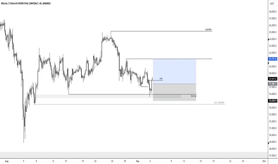
- MSS (Market Structure Shift): The chart indicates a shift in market structure (MSS) at the marked point. This typically indicates a potential change in the market's direction, possibly from bearish to bullish or vice versa.
2. Liquidity Zones:
- Liquidity: There is a horizontal line labeled "Liquidity" at a higher price level. This suggests that the trader is eyeing a potential price movement towards this area where liquidity might be resting, which could be targeted by large market players.
- Ext. Liquidity (External Liquidity): The area at the bottom (marked as "Ext. Liquidity") could represent an area of interest where sell-side liquidity might be present. This is possibly a support zone where the price may reverse after liquidity is taken.
3. Entry Zone:
- The chart highlights a gray shaded area (just above the external liquidity) as an "Entry" zone. This is where the trader plans to enter a long position, expecting the price to rise from this support level.
4. Target Zone:
- Take Profit (TP) Level: The target zone is marked with a blue rectangle, stretching to the liquidity level. This area indicates where the trader expects to exit the trade, anticipating that the price will reach this higher level of liquidity.
5. Risk-Reward Consideration:
- The trade setup suggests a favorable risk-to-reward ratio, as the entry is near a support level with the expectation of a significant price movement toward the upper liquidity area.
6. Time Frame and Context:
- The 4-hour time frame suggests this is a medium-term trade, potentially taking a few days to play out. The context of the larger downtrend (visible on the left side of the chart) implies that the trader might be looking for a corrective move upward or a reversal after a significant downtrend.
- MSS (Market Structure Shift): The chart indicates a shift in market structure (MSS) at the marked point. This typically indicates a potential change in the market's direction, possibly from bearish to bullish or vice versa.
2. Liquidity Zones:
- Liquidity: There is a horizontal line labeled "Liquidity" at a higher price level. This suggests that the trader is eyeing a potential price movement towards this area where liquidity might be resting, which could be targeted by large market players.
- Ext. Liquidity (External Liquidity): The area at the bottom (marked as "Ext. Liquidity") could represent an area of interest where sell-side liquidity might be present. This is possibly a support zone where the price may reverse after liquidity is taken.
3. Entry Zone:
- The chart highlights a gray shaded area (just above the external liquidity) as an "Entry" zone. This is where the trader plans to enter a long position, expecting the price to rise from this support level.
4. Target Zone:
- Take Profit (TP) Level: The target zone is marked with a blue rectangle, stretching to the liquidity level. This area indicates where the trader expects to exit the trade, anticipating that the price will reach this higher level of liquidity.
5. Risk-Reward Consideration:
- The trade setup suggests a favorable risk-to-reward ratio, as the entry is near a support level with the expectation of a significant price movement toward the upper liquidity area.
6. Time Frame and Context:
- The 4-hour time frame suggests this is a medium-term trade, potentially taking a few days to play out. The context of the larger downtrend (visible on the left side of the chart) implies that the trader might be looking for a corrective move upward or a reversal after a significant downtrend.

💎💎- Professional Trader
💎💎 - Discord: discord.gg/gHKNVMyEvd
💎💎 - Trading Course: liquiditysweep369.carrd.co/
💎💎 - Discord: discord.gg/gHKNVMyEvd
💎💎 - Trading Course: liquiditysweep369.carrd.co/
관련 발행물
면책사항
해당 정보와 게시물은 금융, 투자, 트레이딩 또는 기타 유형의 조언이나 권장 사항으로 간주되지 않으며, 트레이딩뷰에서 제공하거나 보증하는 것이 아닙니다. 자세한 내용은 이용 약관을 참조하세요.
💎💎- Professional Trader
💎💎 - Discord: discord.gg/gHKNVMyEvd
💎💎 - Trading Course: liquiditysweep369.carrd.co/
💎💎 - Discord: discord.gg/gHKNVMyEvd
💎💎 - Trading Course: liquiditysweep369.carrd.co/
관련 발행물
면책사항
해당 정보와 게시물은 금융, 투자, 트레이딩 또는 기타 유형의 조언이나 권장 사항으로 간주되지 않으며, 트레이딩뷰에서 제공하거나 보증하는 것이 아닙니다. 자세한 내용은 이용 약관을 참조하세요.