
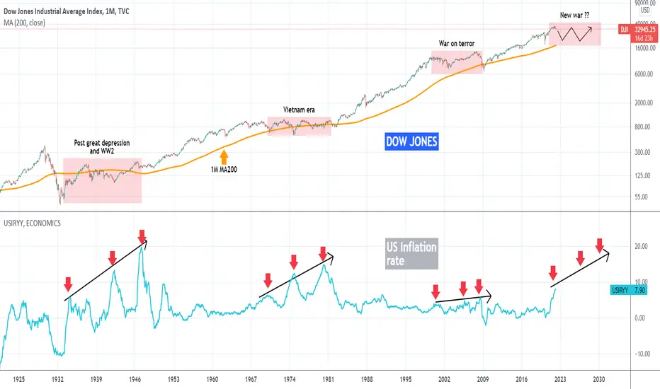
This is a long-term macro-economic chart on the 1M (monthly) time-frame, displaying Dow Jones (top chart) and the U.S. inflation rate (bottom chart). An interesting, yet alarming, correlation can be found on a decade-long horizon by comparing those two.
As you see, the three previous times that the inflation rate made a Higher Highs pattern, Dow entered a +10 year consolidation phase of very high volatility where at least once, the 1M MA200 (orange trend-line) was touched. Interestingly enough, those decades coincided with the biggest wars after WW1. If this is indeed a pattern to follow, could this mean that the new volatile decade ahead will be marked by yet another big war (the Russia - Ukraine perhaps)? Will the 1M MA200 be hit again before 2030? History certainly seems to agree.
--------------------------------------------------------------------------------------------------------
Please like, subscribe and share your ideas and charts with the community!
--------------------------------------------------------------------------------------------------------
As you see, the three previous times that the inflation rate made a Higher Highs pattern, Dow entered a +10 year consolidation phase of very high volatility where at least once, the 1M MA200 (orange trend-line) was touched. Interestingly enough, those decades coincided with the biggest wars after WW1. If this is indeed a pattern to follow, could this mean that the new volatile decade ahead will be marked by yet another big war (the Russia - Ukraine perhaps)? Will the 1M MA200 be hit again before 2030? History certainly seems to agree.
--------------------------------------------------------------------------------------------------------
Please like, subscribe and share your ideas and charts with the community!
--------------------------------------------------------------------------------------------------------

I trade Crypto, Forex, Indices & Commodities on PrimeXBT — all from one account with TradingView charts 👉 tradingshot.short.gy/PrimeXBT
I also use TradeNation for fixed spreads & zero commission 👉 tradingshot.short.gy/Tradenation
I also use TradeNation for fixed spreads & zero commission 👉 tradingshot.short.gy/Tradenation
면책사항
해당 정보와 게시물은 금융, 투자, 트레이딩 또는 기타 유형의 조언이나 권장 사항으로 간주되지 않으며, 트레이딩뷰에서 제공하거나 보증하는 것이 아닙니다. 자세한 내용은 이용 약관을 참조하세요.
I trade Crypto, Forex, Indices & Commodities on PrimeXBT — all from one account with TradingView charts 👉 tradingshot.short.gy/PrimeXBT
I also use TradeNation for fixed spreads & zero commission 👉 tradingshot.short.gy/Tradenation
I also use TradeNation for fixed spreads & zero commission 👉 tradingshot.short.gy/Tradenation
면책사항
해당 정보와 게시물은 금융, 투자, 트레이딩 또는 기타 유형의 조언이나 권장 사항으로 간주되지 않으며, 트레이딩뷰에서 제공하거나 보증하는 것이 아닙니다. 자세한 내용은 이용 약관을 참조하세요.