

Firstly, HAPPY NEW YEAR!!
In terms of the chart, people seem not to understand - candlesticks provide a whole lot of info. The majority of indicators are reflections of old price action.
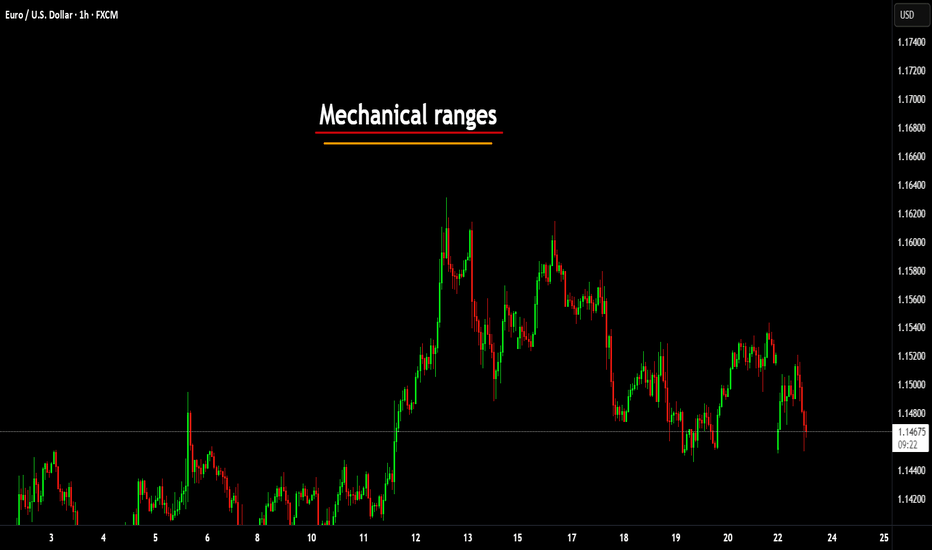
Last year I covered several posts on mechanical structures and the associated techniques. Here's one;
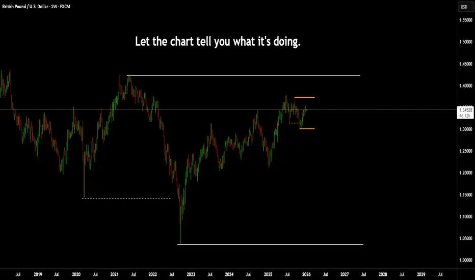
Let's give an example here using GBPUSD.
This is how you can simplify your trading.

First, identify the larger range.
There are two obvious things that stand out in this example; firstly the trend itself and secondly, the break of the structure that caused the new low.

The reason they are important is to show the momentum (orderflow), in other words, who's in control.

We could do this in several ways - the mechanical is just a simple way to allow you to repeat the same process almost on autopilot.

Once you can spot the obvious without much effort, the ranges become a lot easier and the analysis is done in under one minute.
Now I have my range, next step I can look for some rationale as to where and why a Pull Back is likely to come to.

For clarification

Just to show you, a simple way to do this is use the volume profile tool and just cover range high or low to the opposing high or low.

So why here?
Well, to understand this, there are some other interesting areas to look into, such as supply and demand (not for this post) but in simple terms, it was this supply that made the new low.
OK, so if you get this so far. Another post that might be useful for you is one of my posts from 2021 here on @TradingView. This, is a lesson on Dow Theory.
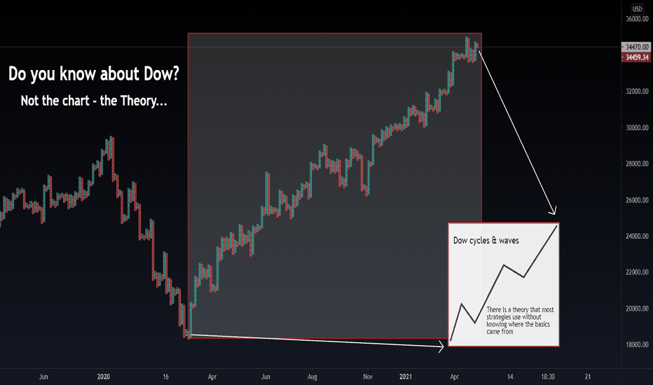
Once you understand the primary range is what was drawn, you can then shift your attention to the secondary trend.

If you remember, how we broke down the external range. You can now see an internal range formed.

If this low had been taken out - the story would be completely different. This would have given more reason for the Pullback to be over and done with.

But in the example, the low held and that means it is still in the Pullback phase. So, unless the larger range high in broken. Indicating a larger trend shift.
The logic is simple, look for changes of character on the smaller ranges and watch them fall like dominoes. Once the secondary trend switches to your favour (back down, in the example) then you have some good, high probability setups on the cards.
Happy New Year to you all, again!
2026 is going to be another AWESOME YEAR!!!
Disclaimer
This idea does not constitute as financial advice. It is for educational purposes only, our principal trader has over 25 years' experience in stocks, ETF's, and Forex. Hence each trade setup might have different hold times, entry or exit conditions, and will vary from the post/idea shared here. You can use the information from this post to make your own trading plan for the instrument discussed. Trading carries a risk; a high percentage of retail traders lose money. Please keep this in mind when entering any trade. Stay safe.
In terms of the chart, people seem not to understand - candlesticks provide a whole lot of info. The majority of indicators are reflections of old price action.
Last year I covered several posts on mechanical structures and the associated techniques. Here's one;
Let's give an example here using GBPUSD.
This is how you can simplify your trading.
First, identify the larger range.
There are two obvious things that stand out in this example; firstly the trend itself and secondly, the break of the structure that caused the new low.
The reason they are important is to show the momentum (orderflow), in other words, who's in control.
We could do this in several ways - the mechanical is just a simple way to allow you to repeat the same process almost on autopilot.
Once you can spot the obvious without much effort, the ranges become a lot easier and the analysis is done in under one minute.
Now I have my range, next step I can look for some rationale as to where and why a Pull Back is likely to come to.
For clarification
Just to show you, a simple way to do this is use the volume profile tool and just cover range high or low to the opposing high or low.
So why here?
Well, to understand this, there are some other interesting areas to look into, such as supply and demand (not for this post) but in simple terms, it was this supply that made the new low.
OK, so if you get this so far. Another post that might be useful for you is one of my posts from 2021 here on @TradingView. This, is a lesson on Dow Theory.
Once you understand the primary range is what was drawn, you can then shift your attention to the secondary trend.
If you remember, how we broke down the external range. You can now see an internal range formed.
If this low had been taken out - the story would be completely different. This would have given more reason for the Pullback to be over and done with.
But in the example, the low held and that means it is still in the Pullback phase. So, unless the larger range high in broken. Indicating a larger trend shift.
The logic is simple, look for changes of character on the smaller ranges and watch them fall like dominoes. Once the secondary trend switches to your favour (back down, in the example) then you have some good, high probability setups on the cards.
Happy New Year to you all, again!
2026 is going to be another AWESOME YEAR!!!
Disclaimer
This idea does not constitute as financial advice. It is for educational purposes only, our principal trader has over 25 years' experience in stocks, ETF's, and Forex. Hence each trade setup might have different hold times, entry or exit conditions, and will vary from the post/idea shared here. You can use the information from this post to make your own trading plan for the instrument discussed. Trading carries a risk; a high percentage of retail traders lose money. Please keep this in mind when entering any trade. Stay safe.

관련 발행물
면책사항
해당 정보와 게시물은 금융, 투자, 트레이딩 또는 기타 유형의 조언이나 권장 사항으로 간주되지 않으며, 트레이딩뷰에서 제공하거나 보증하는 것이 아닙니다. 자세한 내용은 이용 약관을 참조하세요.
관련 발행물
면책사항
해당 정보와 게시물은 금융, 투자, 트레이딩 또는 기타 유형의 조언이나 권장 사항으로 간주되지 않으며, 트레이딩뷰에서 제공하거나 보증하는 것이 아닙니다. 자세한 내용은 이용 약관을 참조하세요.