
🎤 Testing testing. 1 million, 2 million, 3 million...
That's how much volume is flowing into Bitcoin ETF (IBIT). If you multiply it a dozen thousand times. Last week we saw highest ever recorded volume on Bitcoin ETF. It's about two to three times more than the typical weekly volume.
Here's IBIT on a weekly timeframe.

945 million shares. Or about 38 billion in USD, spiking out like a monolith in an empty desert.
Who's buying? Deep pockets at Wall Street? Wrong question for reading flows. We actually don't care who, or why. We only take note that someone is buying (and someone sold), with a lot of money on the table.
Let's study how to read volume flows, what they might mean and how we can find confluence to form trading bias for them. With a real-time, practical example.
🔍 Interpreting the flows
Let's start with where the price is located. We're sitting at around $40, which served as higher timeframe resistance for 245 days in the past.
This in itself is significant. This is where you'd expect price to naturally struggle moving through. What was once resistance, is now support. But why is that?
Resistance is created by liquidity, in other words buy and sell orders sitting in an orderbook. When large amount of orders is clustered around a narrow area, overwhelming supply is created. Demand needs to exceed it in order for price to move through.
This is what we call "deep liquidity". We know there was deep liquidity hanging around the price level, because it held for 245 days despite many attempts. Supply simply exceeded demand.
Ultimately the supply gave in and buyers got through it, but this doesn't mean the level becomes irrelevant. Liquidity that is broken through leaves a "memory imprint" where it once was, for psychological and structural reasons. Trading algorithms for example take note of volume clusters like this and place bets at them.
This same level is likely to gather liquidity again in the future, and we can tell this is exactly what happened, as seen by the volume spike. The sudden burst of volume tells us liquidity (advertised orders) was realized into volume (finalized orders), suddenly and fast.
We can observe price is truly struggling to move through, meaning the same level has dense liquidity, once again.
📚 Historical case study: Apple
We can find volume spikes everywhere, but one that matches particularly well is Apple, also on weekly timeframe. Higher timeframe resistance turned into support, with high volume spike.

Here too, price found dense liquidity at the 336-day resistance and found it again on a re-test, as shown by the volume spike. What follows is a reversal, but let's again think through why.
Deep liquidity is the path of hard resistance. In other words, opposite direction is the path of least resistance. Moving price up takes less effort than moving it down.
Like a balloon under water, the harder you push it down, the more the force works against you. The natural, effortless motion is to the opposite direction, making it the higher probability one.
This is why price tends to reverse. Not for any particular reason in itself, just because it's the easy way. That's all there is to it, and from a trading perspective, that's all you need to know.
So, does this mean IBIT will reverse too? Before we get ahead of ourselves, let's stick to what we can observe now - path of hard resistance is found. This is thinking in terms of flows, not price.
Let's then look at what supporting factors we can find to get more conviction for this path of least resistance realizing into proper upside. One simple way is to find evidence of pain.
➕ Confluence from open interest
One way to look for pain trade evidence is by seeing how trading positions are forming. Many ways to do this too, but arguably one of the most accurate ones is using open interest.
Open interest tells us amount of open trading positions in terms of contracts (e.g. 1 contract = 1 unit of the asset). That doesn't tell us whether the trading position is long or short, though. We also can't easily conclude how many contracts is significant or insignificant.
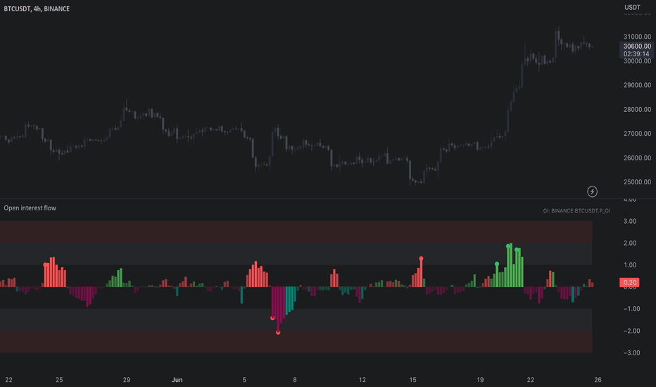
This is Open Interest Flow, one of our TradingView indicators completing that information. The indicator estimates whether open interest is from longs or shorts and how extreme the flows are, displayed in a human friendly format.

Here we have hopped on the daily chart for more detail, feeding open interest from Binance to the indicator. This tells us how Binance traders in particular are positioning. We can see green bars pointing down to a value of -1.5 or so.
This tells us long outflows (buyers closing their positions) are 1.5x higher than average, for a few days straight. This coincides in an interesting way with what we see with the volume spike - we can tell longs are exiting on actual crypto markets.
That's +1 evidence for a pain trade thesis.
🔗 Get Open Interest Flow on TradingView
Open Interest Flow is an open source indicator, available for everyone to use on TradingView. Find more information about the indicator, how it works and how to use it here:
📌 Pinning it down
Major level, outrageous volume and longs bleeding. So, what's the verdict for charts like these?
The underlying truly observable fact is that price found liquidity. A lot of it. Someone puked it and someone absorbed it. On Apple (and many other charts if you pay attention), this kind of anomaly is significant and typically precedes a reversal.
Open interest tells us longs are exiting at extreme rates, speaking of pain. Path of least resistance is to the upside and early longs got flushed out. This forms a solid foundation for expecting a reversal or at the very least a halt for the downtrend.
Given we are on a weekly timeframe, setups like this can play out over weeks. Maybe longer. But as with any type of analysis it's best to stick with what's in front of you and take it as it comes. Reacting > predicting.
Thanks for reading. May the flows be in your favor.
That's how much volume is flowing into Bitcoin ETF (IBIT). If you multiply it a dozen thousand times. Last week we saw highest ever recorded volume on Bitcoin ETF. It's about two to three times more than the typical weekly volume.
Here's IBIT on a weekly timeframe.
945 million shares. Or about 38 billion in USD, spiking out like a monolith in an empty desert.
Who's buying? Deep pockets at Wall Street? Wrong question for reading flows. We actually don't care who, or why. We only take note that someone is buying (and someone sold), with a lot of money on the table.
Let's study how to read volume flows, what they might mean and how we can find confluence to form trading bias for them. With a real-time, practical example.
🔍 Interpreting the flows
Let's start with where the price is located. We're sitting at around $40, which served as higher timeframe resistance for 245 days in the past.
This in itself is significant. This is where you'd expect price to naturally struggle moving through. What was once resistance, is now support. But why is that?
Resistance is created by liquidity, in other words buy and sell orders sitting in an orderbook. When large amount of orders is clustered around a narrow area, overwhelming supply is created. Demand needs to exceed it in order for price to move through.
This is what we call "deep liquidity". We know there was deep liquidity hanging around the price level, because it held for 245 days despite many attempts. Supply simply exceeded demand.
Ultimately the supply gave in and buyers got through it, but this doesn't mean the level becomes irrelevant. Liquidity that is broken through leaves a "memory imprint" where it once was, for psychological and structural reasons. Trading algorithms for example take note of volume clusters like this and place bets at them.
This same level is likely to gather liquidity again in the future, and we can tell this is exactly what happened, as seen by the volume spike. The sudden burst of volume tells us liquidity (advertised orders) was realized into volume (finalized orders), suddenly and fast.
We can observe price is truly struggling to move through, meaning the same level has dense liquidity, once again.
📚 Historical case study: Apple
We can find volume spikes everywhere, but one that matches particularly well is Apple, also on weekly timeframe. Higher timeframe resistance turned into support, with high volume spike.
Here too, price found dense liquidity at the 336-day resistance and found it again on a re-test, as shown by the volume spike. What follows is a reversal, but let's again think through why.
Deep liquidity is the path of hard resistance. In other words, opposite direction is the path of least resistance. Moving price up takes less effort than moving it down.
Like a balloon under water, the harder you push it down, the more the force works against you. The natural, effortless motion is to the opposite direction, making it the higher probability one.
This is why price tends to reverse. Not for any particular reason in itself, just because it's the easy way. That's all there is to it, and from a trading perspective, that's all you need to know.
So, does this mean IBIT will reverse too? Before we get ahead of ourselves, let's stick to what we can observe now - path of hard resistance is found. This is thinking in terms of flows, not price.
Let's then look at what supporting factors we can find to get more conviction for this path of least resistance realizing into proper upside. One simple way is to find evidence of pain.
➕ Confluence from open interest
One way to look for pain trade evidence is by seeing how trading positions are forming. Many ways to do this too, but arguably one of the most accurate ones is using open interest.
Open interest tells us amount of open trading positions in terms of contracts (e.g. 1 contract = 1 unit of the asset). That doesn't tell us whether the trading position is long or short, though. We also can't easily conclude how many contracts is significant or insignificant.
This is Open Interest Flow, one of our TradingView indicators completing that information. The indicator estimates whether open interest is from longs or shorts and how extreme the flows are, displayed in a human friendly format.
Here we have hopped on the daily chart for more detail, feeding open interest from Binance to the indicator. This tells us how Binance traders in particular are positioning. We can see green bars pointing down to a value of -1.5 or so.
This tells us long outflows (buyers closing their positions) are 1.5x higher than average, for a few days straight. This coincides in an interesting way with what we see with the volume spike - we can tell longs are exiting on actual crypto markets.
That's +1 evidence for a pain trade thesis.
🔗 Get Open Interest Flow on TradingView
Open Interest Flow is an open source indicator, available for everyone to use on TradingView. Find more information about the indicator, how it works and how to use it here:
📌 Pinning it down
Major level, outrageous volume and longs bleeding. So, what's the verdict for charts like these?
The underlying truly observable fact is that price found liquidity. A lot of it. Someone puked it and someone absorbed it. On Apple (and many other charts if you pay attention), this kind of anomaly is significant and typically precedes a reversal.
Open interest tells us longs are exiting at extreme rates, speaking of pain. Path of least resistance is to the upside and early longs got flushed out. This forms a solid foundation for expecting a reversal or at the very least a halt for the downtrend.
Given we are on a weekly timeframe, setups like this can play out over weeks. Maybe longer. But as with any type of analysis it's best to stick with what's in front of you and take it as it comes. Reacting > predicting.
Thanks for reading. May the flows be in your favor.

See through charts with SubFlow Terminal.
Spot trapped traders and whales, liquidity pools, unusual volume, liquidations & get statistics.
🌱 Start free trial:
flowly.tools
Spot trapped traders and whales, liquidity pools, unusual volume, liquidations & get statistics.
🌱 Start free trial:
flowly.tools
관련 발행물
면책사항
해당 정보와 게시물은 금융, 투자, 트레이딩 또는 기타 유형의 조언이나 권장 사항으로 간주되지 않으며, 트레이딩뷰에서 제공하거나 보증하는 것이 아닙니다. 자세한 내용은 이용 약관을 참조하세요.
See through charts with SubFlow Terminal.
Spot trapped traders and whales, liquidity pools, unusual volume, liquidations & get statistics.
🌱 Start free trial:
flowly.tools
Spot trapped traders and whales, liquidity pools, unusual volume, liquidations & get statistics.
🌱 Start free trial:
flowly.tools
관련 발행물
면책사항
해당 정보와 게시물은 금융, 투자, 트레이딩 또는 기타 유형의 조언이나 권장 사항으로 간주되지 않으며, 트레이딩뷰에서 제공하거나 보증하는 것이 아닙니다. 자세한 내용은 이용 약관을 참조하세요.