Gold: False Breaks, Violent Reversals and a Developing MegaphoneLast week, Gold traded mostly within a broad range, accompanied by what has increasingly become the market’s new normal: false breaks followed by violent reversals.
The most aggressive move came after the Federal Reserve’s interest-rate decision. As an initial reaction, Gold dropped approximately 1,200 pips in just 90 minutes. However, the move below support proved to be another false break. Bulls quickly absorbed the selling pressure, and Gold reversed sharply, spending the remainder of the week repeatedly testing the 4400 area.
The Megaphone Structure
Looking ahead, I expect this type of price action to continue:
- Increased volatility
- Wider swings in both directions
- Repeated false breaks above resistance and below support
- Sudden reversals precisely when the market appears ready to choose a clear direction
This behavior supports the scenario discussed in my recent educational article: Gold appears to be developing within a broadening formation, also known as a megaphone pattern.
In such a structure, volatility expands rather than contracts. The market continues to print wider highs and lower lows, trapping both buyers and sellers who enter aggressively after apparent breakouts.
The important point is that a break alone should not be treated as confirmation. In the current environment, acceptance outside the structure matters far more than the initial spike.
Swing-Trading Perspective
From a swing-trading perspective, my bias is bearish from higher prices.
In my opinion, spikes above the 4400 area should be viewed as potential selling opportunities—especially if Gold fails to hold above this zone and quickly falls back inside the broader structure.
For bears, the main downside objective is the 4250 area.
However, considering the developing megaphone formation, the path toward that target is unlikely to be clean or straightforward. Violent bullish reversals and false upside breaks should be expected along the way.
Conclusion
My base scenario it is that volatility will remain elevated and the market will continue creating false signals on both sides.
For swing traders, the better approach is to avoid chasing the initial breakout and wait for rejection, confirmation and a favorable risk-to-reward setup.
Gold may continue to look decided—right before changing direction again.  Short
Short
 Long
Long
XAU/USD 22 September 2026 Intraday AnalysisH4 Analysis:
-> Swing: Bullish.
-> Internal: Bearish.
Bias and analysis to remain the same as analysis dated 30 June 2026.
Price did not print bullish CHoCH to indicate bullish pullback phase initiation. Price instead printed a new low followed by a bullish CHoCH
Price is currently trading within and established internal range, however, I will continue to monitor price with respect to depth of pullback.
Intraday expectation:
Price to trade up to either premium of internal 50% EQ, or H4 demand zone before targeting weak internal low, currently priced at 3,942.100.
Note:
Gold remains volatile as tensions between the US, Israel, and Iran keep safe‑haven demand elevated.
Markets are reacting quickly to every headline, while uncertainty around the Fed’s easing path and shifting U.S. policy under President Trump, especially tariffs continues to fuel choppy price action.
For newer traders, the key is simple, stay flexible and manage risk carefully, as fast spikes and sudden reversals are a normal part of the current XAU/USD environment.
H4 Chart:
M15 Analysis:
-> Swing: Bearish.
-> Internal: Bullish.
Analysis and bias to remain the same as yesterday's analysis dated 21 September 2026.
Price has printed according to analysis dated 17 September 2026 whereby I mentioned, in intraday analysis, due to the narrowing of the internal range, price could potentially strong internal high and print a bullish iBOS as we are also seeing a drastic reduction in the depth of the internal range.
Price has printed a bearish CHoCH to indicate bearish pullback phase initiation.
Price is now trading within an established internal range. CHoCH positioning is denoted with a blue dotted horizontal dotted line.
Intraday expectation:
Price to trade down to either discount of internal 50% EQ, or M15 supply zone before targeting weak internal high, currently priced at 4,399.670.
Note:
Gold remains highly reactive on M15 as geopolitical risk continues to drive quick, headline‑led moves.
The tension between the US, Israel, and Iran is keeping safe‑haven demand elevated, with markets still sensitive to any sign of escalation.
At the same time, shifting US tariff policy under President Trump is adding extra uncertainty, fuelling sharp intraday swings and increasing the likelihood of sudden sentiment flips. Liquidity pockets and whipsaws remain common, making disciplined risk management essential.
Gold’s geopolitical premium is still firmly in place, and until tensions ease, short‑term volatility is likely to stay front‑loaded.
M15 Chart: Silver | One Structure, Two Possible Paths⏱️ Reading time: about 3 minutes
Following our previous Silver analyses, this time we are looking at the chart from the perspective of the previous high, allowing the relationship between the larger historical structure and the current movement to become clearer.
In this view, we have been tracking a larger corrective structure from the previous high, with the possibility of a Wave IV developing. In the lower part of the chart, a Leading Diagonal followed by a Simple Zigzag has also been identified as a structure worth monitoring.
The key point is that both current scenarios begin from the same interpretation of the previous structure. The main difference is what the market may build from here.
🟦 Scenario 1 | Bullish Case
In the bullish scenario, the structure developing from the recent low could be the beginning of a new motive wave.
The current advance could be developing as a 1–2 structure followed by Wave 3, or, at a higher degree, it could be part of a larger motive structure.
If price continues to advance with strength and then produces clean corrections proportional to the degree of each wave, the bullish structure will gradually begin to prove itself.
For us, simply reaching a higher price is not enough. What matters is whether each advance is followed by corrective behavior that matches the wave's degree and character.
If this behavior continues, the possibility of a developing Wave 3 — or a larger motive structure — becomes increasingly relevant.
⬛ Scenario 2 | Bearish Case
In the bearish scenario, the same current advance could still be part of a larger corrective structure.
In this case, the current rise may develop as a three-wave structure — for example, part of a B wave or a connecting structure within a more complex correction.
If this advance completes as a corrective three-wave structure rather than developing into a valid motive pattern, and the market then turns lower again, we could see a C wave decline that eventually completes the larger Wave IV — the structure shown on the chart as a Classic Zigzag.
🔎 What This Chart Is Telling Us
So, the difference between these two scenarios is not really about direction; it is about the character of the future structure.
In the bullish case, we expect the advances to develop into a valid motive structure.
In the bearish case, the same advance could simply be part of a larger correction, leaving another downward wave to complete the structure.
That is why there is no need to rush into changing the count.
The market has to show us the next structure.
We have studied the structure that came before; now it is up to price to show us what is actually developing from this point.
Patterns whisper. I listen.
— Mr. Nobody 🎧📊
Silver / U.S. Dollar
Sep 6
Silver 4H | The Structure Is Speaking — Elliott Wave Update
 Long
Long
Episode 08 — The Architecture Behind the Waves🎬 Mr. Nobody’s Chronicle
Season I — The History of Elliott Wave Principle
Episode 08 — The Architecture Behind the Waves
⏱️ Reading time: ~3 minutes
“When we discover the language of a pattern, the next question is: How is it built?”
In the previous episode, we reached one of the most recognizable ideas behind the Wave Principle:
Five waves in the direction of the main movement...
and three waves in the corrective direction.
But one important question remained.
Do all waves have the same character?
Does every five-wave movement develop in exactly the same way?
Or is there a deeper architecture behind this seemingly simple count?
Elliott gradually realized that waves could not be identified simply by their direction or their length.
Every wave has its own behavior and structure.
In his framework, market movements could be divided into two broad families:
Motive Waves
and
Corrective Waves.
Motive waves move in the direction of the larger trend.
Corrective waves move against it.
But here, an important point must be understood.
The fact that a motive wave appears stronger or longer is not, by itself, enough to identify it.
For example, Wave 3 is not always the longest wave.
What matters in the Wave Principle is the complete set of structural rules and relationships.
In an impulse, Wave 3 cannot be the shortest of Waves 1, 3, and 5.
But the lengths of the waves can still vary.
Sometimes Wave 1 extends.
Sometimes Wave 3.
And sometimes even Wave 5.
This is what Elliott described as an Extension.
When an extension occurs, what initially appears to be a simple five-wave movement can contain a much more complex structure within it.
A wave may appear as only one wave at a higher degree...
but when we look closer, we may discover that it is composed of a series of smaller movements.
Five movements...
containing even more structure within them.
And here, we return once again to the idea we explored in Episode 05:
A pattern within the pattern.
So, to understand a wave, we should not look only at the number of movements.
We should ask:
How is this movement built?
What is its degree?
What does its internal structure look like?
And does that structure remain consistent with the rules that apply to it?
This is where an important difference appears between the appearance of a wave and its actual structure.
Two movements may look similar at first glance...
but when we examine their internal structure, we may discover that their character is completely different.
And perhaps this is where one of the most important lessons of the Wave Principle begins to reveal itself:
The wave count tells only part of the story.
The structure tells the rest.
The deeper we go into the world of waves, the more important this becomes.
Because to understand what a structure truly is, we need to know what is allowed...
and what is not allowed.
And this is exactly where the Wave Principle begins to move beyond simple market observation...
and becomes a structural framework.
A framework in which rules protect the pattern.
But alongside the rules, there are also guidelines that help us recognize and interpret possible structures.
So now that we have a broader view of the architecture of waves...
it is time to enter a more sensitive part of the story.
The rules that prevent us from calling every structure an Elliott Wave pattern.
Because in the next episode...
we are going to ask:
What makes a pattern valid?
And what can invalidate it?
To be continued...
Narrated by Mr. Nobody 🎧📊
Research & Market Studies
Mehdi & Rana
 Education
AVAX AT CRITICAL SUPPORT — BREAKOUT NEXT?Yello, Paradisers! are #AVAXUSDT traders about to get caught off guard while price is quietly testing one of the most important short-term support zones on the chart?
💎#AVAXUSDT is currently trading around $10.80, directly inside the highlighted 1H support area around $10.66-$10.80. At the same time, price continues to respect the structure of a falling wedge, which makes this area especially important for the next directional move.
💎The broader picture remains constructive across the higher timeframes shown on the chart, with the 1W, 1D, 4H, and 1H structures still marked bullish. However, AVAX has not yet confirmed a clean breakout from the falling wedge, so patience remains essential.
💎As long as buyers continue defending the 1H support zone, AVAX has room to attempt another move toward the upper boundary of the wedge. A confirmed breakout above this descending resistance would strengthen the bullish scenario and could open the way toward the first major 1H resistance around $11.28.
💎If momentum continues from there, the larger upside area to watch is the 4H resistance zone around $11.85-$11.95. This is where price could face significantly stronger selling pressure, so it would be important to monitor how AVAX reacts if it reaches that region.
💎On the other hand, the bullish structure would become considerably weaker if AVAX loses the current support zone. The chart shows the main invalidation area around $10.38 on a candle-closing basis. A confirmed close below that level would invalidate the illustrated bullish scenario and increase the probability of deeper downside.
💎For now, AVAX is sitting exactly where impatient traders can easily get trapped. The opportunity is not in guessing the next candle, but in waiting for price to confirm whether buyers can protect support and break the falling wedge.
Paradisers, Discipline and confirmation matter far more than chasing an unconfirmed move. Strive for consistency, not quick profits, and treat the market as a businessman, not as a gambler.
MyCryptoParadise
iFeel the success🌴  Long
Long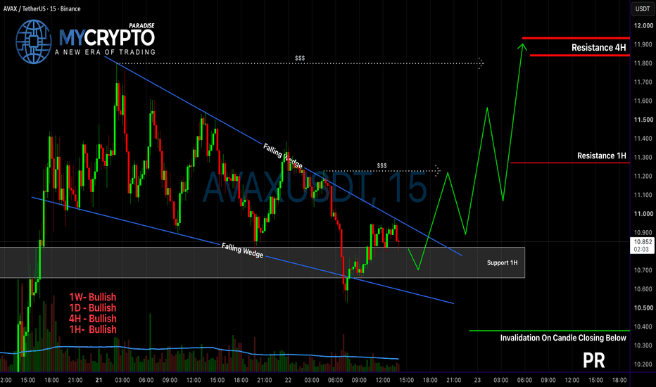
🇪🇺🇺🇸 EUR/USD 3H | When Structure Gets Complex🇪🇺🇺🇸 EUR/USD 3H | When Structure Gets Complex, the Path Is Not Always Straight 🌀
⏱️ Reading time: about 3 minutes
Following our weekly EUR/USD analysis, we are now moving closer to the 3-hour chart to examine what the current structure may be building at the lower degree.
At this stage, the bearish scenario carries more weight, and a continuation of the downward move remains one of the important structural possibilities.
Within this scenario, the current structure may be developing as a Leading Diagonal, particularly considering the internal wave subdivisions and the channels marked on the chart. If this interpretation is correct, once the bearish structure is completed, the market could enter a corrective phase before another downward wave develops.
But there is an important point here.
The market does not always move in a straight line toward the expected scenario.
If the current structure proves to be more complex than what we can see at this stage, the market may move higher once again before continuing lower.
That upward move could become part of a more complex corrective structure—for example, a sideways structure, a Double Zigzag, or even a Triple Zigzag. Therefore, another move higher, by itself, would not invalidate the bearish scenario.
For us, what matters is the internal structure of the move.
If the next upward move remains corrective and fails to develop a valid motive structure at the higher degree, it could ultimately lead to another continuation of the bearish scenario.
On the other hand, if the market develops a valid and coherent bullish structure and moves through the confirmation levels marked on the chart, then we would need to reassess the wave count.
🌍 The Bigger Picture
Alongside the technical structure, I always pay attention to the behavior of other markets as well.
At the moment, U.S. dollar strength is one factor that may be relevant to EUR/USD. The relationship between the dollar and markets such as cryptocurrencies, oil, and gas can also change over time; sometimes we see positive correlation and sometimes negative correlation. Therefore, I view these relationships mainly as clues for understanding market behavior, rather than as fixed or permanent relationships.
From my personal perspective, large market structures are not only about price. They can also reflect decisions, policies, choices, and even collective mistakes within the global economy.
The future may continue to present challenges in terms of living costs and resources, but at the same time, technological progress—especially artificial intelligence—could increase productivity and potentially improve living conditions in some areas.
I also believe, personally, that the cryptocurrency market could become one of the potential paths toward wealth creation for some people in the future. But this is simply my personal view—not a guarantee or a certain prediction.
Ultimately, as we always say:
We do not decide the future; we observe and interpret the structure the market is building in the present.
For now, the bearish continuation remains the more likely structural path in this analysis, while another upward move as part of a complex corrective structure remains entirely possible.
So, we let the market make the decision.
Structure First. Scenario Second.
Patterns whisper. I listen.
— Mr. Nobody
Euro / U.S. Dollar
4 days ago
EUR/USD — Larger Correction or the Continuation of the Bullish T
Crude Oil: Nested Structure?⏱️ Reading Time: ~3 minutes
From an Elliott Wave perspective, crude oil appears to have entered a large corrective structure following Wave (I). At this stage, the broader correction is being considered as Wave (II).
However, recent price action raises an important possibility: the market may be developing a nested structure across multiple degrees within this correction.
Bullish Scenario
Under the first scenario, the current structure may consist of a series of nested 1-2 structures across different degrees.
If this interpretation is correct, the market could complete the smaller corrective phases and then enter a higher-degree Wave Three. In that situation, what initially appears to be a relatively slow recovery could suddenly accelerate into a much stronger upside move.
This nested structure could explain the possibility that, after the recent decline, crude oil may recover with a speed and strength comparable to the decline itself and eventually develop into a broader bullish advance.
In this scenario, a break above the key bullish confirmation levels, together with continued Impulsive structure, would provide further evidence for this path.
Bearish Scenario
The second scenario remains valid.
If the current decline continues and the expected bullish structure fails to develop, this decline could first lead to the completion of the current Wave II.
If the decline extends further, another possibility is that the correction could expand into a higher degree, completing Wave (II) of the larger structure.
In that case, the current decline would no longer represent simply a short-term correction within the bullish scenario. Instead, it could become part of a much larger corrective structure, making the key invalidation and confirmation levels increasingly important.
Conclusion
At this stage, the key issue for me is not simply the speed of the move, but the structure behind that speed.
If the market is developing a nested 1-2 structure, its completion could create the foundation for a powerful and rapid bullish advance.
However, if selling pressure continues, the same decline could first complete the current Wave II and, if extended further, potentially complete a correction of one degree higher.
Therefore, both paths remain structurally relevant at this stage.
The structure that the market develops from here will determine whether this decline is preparing the next bullish acceleration or becoming part of a deeper correction.
Price comes first; the wave count comes second.
Patterns whisper. I listen.
— Mr. Nobody 🎧📊
Brent Crude Oil
5 days ago
Brent Crude Oil | Is Wave III Expanding?

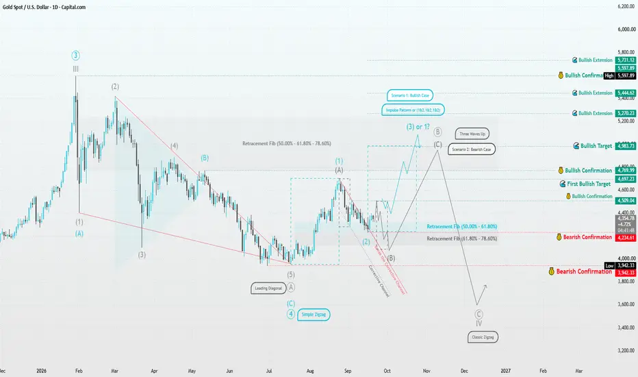
Gold | Structure Before Direction⏱️ Reading Time: ~2 minutes
In the daily timeframe, Gold’s current structure can be viewed from two perspectives. The recent move from around 3,942 may represent the beginning of a new bullish motive structure, while the current decline could potentially be Wave (2) if the 4,234–4,509 area continues to hold.
🔵 Bullish Scenario
What matters is not simply whether price rises, but whether the market develops a valid five-wave motive structure from this area. A move above 4,697, followed by 4,769, would provide stronger structural evidence for continuation toward 4,983 and potentially higher levels.
⚫ Bearish Scenario
If the next advance remains corrective and unfolds in three waves, the current rise may be only part of a larger correction. In that case, the 4,769–4,983 zone could become an area where the corrective advance ends, opening the possibility of another decline toward 4,234, 3,942, and even 3,600.
For me, the key question is not simply whether Gold is bullish or bearish.
The real question is: will the next structure be motive or corrective?
The Wave Principle allows the market itself to reveal which scenario is developing.
– Patterns whisper. I listen.
Mr. Nobody 🎧📊
Gold Spot
Sep 5
Gold’s Structural Crossroad
Long 
When the Target Is Too Close, Change the TimeframeA chart pattern can identify a possible direction. It cannot tell us whether the trade built around that direction offers enough room to justify the risk.
That distinction becomes especially important when a pattern appears technically valid, yet an important support or resistance area sits much closer than the pattern's textbook target. In that situation, the question is no longer simply, "Is the pattern bullish or bearish?" A more useful question is: "How much space does the market realistically have before it encounters meaningful opposition?"
The current daily chart of E-mini Russell 2000 Index futures (RTY) provides a useful case study because it presents both sides of that problem.
A Break Is Evidence, Not a Verdict
The chart shows a well-defined double-top formation. Two significant highs developed at similar price levels, followed by a neckline connecting the intervening low.
Price subsequently broke below that neckline. From a classical chart-pattern perspective, that event provided bearish evidence and opened the possibility of a larger reversal.
Yet something important happened next: very little.
Instead of accelerating lower after the breakdown, price began moving sideways. This does not automatically invalidate the double top, but it does mean the market has not yet delivered the follow-through that traders might normally associate with a successful bearish break.
For that reason, the current consolidation can be viewed as a Decision Zone.
A downside resolution would add evidence that the original double-top hypothesis remains active. An upside resolution, particularly if price reclaims the broken structure, would weaken or potentially invalidate that hypothesis.
The lesson is broader than this particular market: a pattern is a hypothesis. Subsequent price behavior determines whether that hypothesis continues to deserve confidence.
Pattern Failure Can Be Information Too
Technical analysis is often taught as a sequence of pattern identification, breakout and target. But there is another useful question to ask: what happens when the expected move does not occur?
Some traders interpret a failed bearish pattern as potentially bullish information. The reasoning is not that every failed double top must produce a strong advance. Rather, traders who acted on the original bearish breakdown may have to reassess their positions if price convincingly moves back through the structure that was supposed to hold.
That can change the balance between buyers and sellers.
In our current RTY example, therefore, both outcomes deserve attention.
If price exits the Decision Zone to the downside, the double top gains additional confirmation.
If price instead moves decisively higher and invalidates the bearish structure, the failed pattern may create an alternative bullish scenario.
But neither scenario should be evaluated by direction alone.
Location matters.
A Pattern Target Is Not Necessarily a Trading Target
Classical double-top analysis projects a potential target by measuring the approximate height of the pattern and extending that distance below the neckline.
In this case, that calculation produces a projected area near 2,725.1.
Mathematically, there is nothing wrong with that projection. The problem is what price would have to travel through before getting there.
The chart identifies a significant support area around 2,817.3. That support is encountered well before the classical double-top projection.
This creates an important distinction:
A pattern can have a technically valid projected target while the market structure presents a much nearer practical obstacle.
For a bearish scenario, therefore, 2,817.3 may deserve greater attention as an initial objective than assuming price will travel directly toward 2,725.1.
The same problem appears on the opposite side.
Suppose the double top fails and price breaks upward from the Decision Zone. A trader focusing only on the pattern failure might expect substantial upside continuation. Yet the chart shows resistance around 2,983.3.
Once again, the market is providing limited space before an opposing area is reached.
The setup may suggest direction. Location tells us how much room may realistically be available.
When the Target Is Too Close, Change the Timeframe
This is where multiple-timeframe analysis becomes especially useful.
A common response to an unattractive reward-to-risk relationship is to push the target farther away. But doing so does not change the market structure. It only changes the assumption.
A different approach is to preserve the realistic target and reconsider the execution timeframe.
The daily chart can remain the context chart. It tells us where the major pattern is located, whether it is confirming or failing, and where the important opposing areas sit.
Execution, however, does not necessarily need to occur on the daily timeframe.
Once the higher-timeframe scenario becomes clearer, a trader can move to an intraday timeframe and look for a more precise entry structure. A tighter technically justified invalidation point may reduce the distance between entry and stop while leaving the higher-timeframe target unchanged.
That can materially alter the reward-to-risk ratio.
The important point is that changing timeframe should not be used simply to manufacture a smaller stop. The lower timeframe still needs to provide a legitimate structure that defines where the trade hypothesis would be wrong.
If it does not, there may simply be no attractive trade.
An Illustrative Reward-to-Risk Example
Consider a purely hypothetical bearish execution after the Decision Zone resolves lower.
Suppose an intraday structure offered an entry around 2,855 with an invalidation level around 2,867. That would represent approximately 12 index points of risk. Using the nearby daily support around 2,817.3 as the objective would provide approximately 37.7 points of potential movement, or about 3.1 units of potential reward for each unit of risk.
Now consider the opposite scenario.
Suppose the double top became clearly invalidated and a lower-timeframe bullish structure subsequently offered an illustrative entry around 2,930 with an invalidation around 2,918. With the nearby daily resistance around 2,983.3 acting as the potential objective, the distance to the target would be approximately 53.3 points against 12 points of risk, or roughly 4.4 to 1.
These are not proposed entries or predictions. The intraday market would first have to produce structures that justified those levels. They simply illustrate why moving to a lower execution timeframe can change the economics of a setup without requiring the trader to assume that the market will travel beyond the nearest meaningful target.
This is the distinction between context and execution.
The higher timeframe answers: Where are we, and what scenarios matter?
The lower timeframe answers: Can this scenario be executed with a reasonable relationship between the amount placed at risk and the available price movement?
Three Contract Sizes, One Market Thesis
The same Russell 2000 analysis can now be expressed through three CME futures contract sizes.
E-mini Russell 2000 Index futures (RTY) use a $50 multiplier per index point. The minimum outright fluctuation is 0.10 index points, equal to $5 per tick.
Micro E-mini Russell 2000 Index futures (M2K) use a $5 multiplier per index point. Their 0.10-point minimum fluctuation equals $0.50 per tick.
CME Group also launched E-nano Russell 2000 Index futures (N2K) on August 24, 2026. N2K uses a $0.50 multiplier per index point and is one-tenth the size of M2K and one-hundredth the size of RTY. Its minimum outright fluctuation is 0.20 index points, equal to $0.10 per tick.
Contract size does not change the technical thesis, but it changes the dollar exposure attached to it.
Using the illustrative 12-point stop from the earlier examples, and before commissions or slippage, the price movement would correspond to approximately $600 per RTY contract, $60 per M2K contract and $6 per N2K contract.
That distinction can matter when translating a chart-based invalidation level into position sizing.
It is also important to separate trade risk from margin. A futures performance bond is collateral required to hold the position; it is not a maximum-loss figure. CME Group adjusts performance-bond requirements as market conditions change. The following margin requirements are approximate and for reference:
RTY: ~$11,000 per contract
M2K: ~$1,100 per contract
N2K: ~$110 per contract
These requirements are dynamic; the current margin information should be checked when evaluating any futures position rather than treating a historical figure as permanent.
Context First, Precision Second
This daily RTY chart does not need to tell us which scenario will occur next in order to be useful.
Its value is in defining the decision.
The double top has already provided an initial bearish signal through its neckline break. The subsequent lack of follow-through tells us that confirmation remains incomplete. A renewed move lower could strengthen the bearish case, while an upside resolution could turn the failed pattern itself into relevant information.
But in either direction, nearby market structure limits the immediately available space.
That is precisely when the timeframe distinction becomes useful.
The reusable process is:
Pattern → Confirmation or Failure → Location → Timeframe → Execution
First identify the setup. Then determine whether price is confirming or rejecting it. Next, examine where the nearest realistic opposing area is located. If that target is too close to support an acceptable reward-to-risk relationship on the context timeframe, move lower for execution rather than automatically moving the target farther away.
The daily chart provides the map.
The lower timeframe can provide the precision.
And sometimes, after both are considered, the correct conclusion is simply that the available space does not justify an execution at all.
Data Consideration
When charting futures, the data provided could be delayed. Traders working with the ticker symbols discussed in this idea may prefer to use CME Group real-time data plan on TradingView: www.tradingview.com - This consideration is particularly important for shorter-term traders, whereas it may be less critical for those focused on longer-term trading strategies.
General Disclaimer
The trade ideas presented herein are solely for illustrative purposes forming a part of a case study intended to demonstrate key principles in risk management within the context of the specific market scenarios discussed. These ideas are not to be interpreted as investment recommendations or financial advice. They do not endorse or promote any specific trading strategies, financial products, or services. The information provided is based on data believed to be reliable; however, its accuracy or completeness cannot be guaranteed. Trading in financial markets involves risks, including the potential loss of principal. Each individual should conduct their own research and consult with professional financial advisors before making any investment decisions. The author or publisher of this content bears no responsibility for any actions taken based on the information provided or for any resultant financial or other losses.  Education
USDJPY 4H: What Happens When Price Revisits Fresh DBD Supply?Market Context
On the 4-hour timeframe, USDJPY is currently trading near an identified Supply Zone .
This zone originated from a strong imbalance following a Drop-Base-Drop (DBD) structure, making the area technically relevant for studying how price behaves when it revisits a previous supply-origin region.
The zone is currently being observed as a fresh supply area , with a relatively strong leg-out and a structured basing formation.
Why This Zone Matters
A Drop-Base-Drop structure generally consists of:
• A downward price move
• A period of consolidation or basing
• Another strong downward move away from the base
The base can represent an area where a significant imbalance developed between buying and selling activity.
When price later returns to such an area, traders often study the reaction rather than assuming that the zone will automatically produce a particular outcome.
Several characteristics make this area technically interesting:
• Freshness: The zone has not been meaningfully revisited since its formation.
• Strong leg-out: Price moved away from the base with noticeable momentum.
• Basing structure: The consolidation before the move provides the structural origin of the zone.
• Multiple-timeframe context: Higher-timeframe structure can provide additional context for understanding whether this area is aligned with broader market structure.
What Could Happen on a Revisit?
One possible scenario is that price reacts around the supply area and shows renewed selling pressure. This could be reflected through rejection candles, a failure to sustain prices above the zone, or a shift in lower-timeframe structure.
Another possible scenario is that price moves through the zone instead. Sustained trading above the area could indicate that the previously identified supply is no longer producing the same reaction.
There is also the possibility of an initial reaction followed by a deeper penetration of the zone. This is one reason why observing price action around the area can be more informative than treating the zone itself as a guaranteed reaction point.
Confirmation and Invalidation
The presence of a supply zone by itself does not establish what price will do next.
Price-action confirmation remains an important part of interpreting any revisit. Depending on the market structure, traders may observe rejection, continuation, consolidation, or structural change around the area.
The zone can also become invalidated if price establishes itself beyond the relevant structure. Invalidation is therefore an important part of studying supply-and-demand zones and understanding their limitations.
Risk Management — Educational Context
From an educational perspective, risk management is about defining how much uncertainty and potential loss can be tolerated before considering any market exposure.
Concepts such as position sizing, predefined invalidation conditions, and limiting exposure are commonly discussed as ways to manage uncertainty. These are general principles and are not recommendations for this specific USDJPY setup.
Key Observation
The interesting part of this chart is not simply that USDJPY is approaching a supply zone.
The more important question is:
How does price behave when it interacts with a fresh DBD supply zone that originated from a strong imbalance?
The subsequent price action may provide useful information about whether the zone continues to act as a meaningful area of supply or whether the underlying structure is changing.
This publication is intended solely for educational and informational purposes. It reflects a technical analysis of market structure and should not be interpreted as investment advice, a recommendation, or a solicitation to buy or sell any financial instrument. Always perform your own analysis and manage risk according to your individual circumstances.  Long
Long
FET to the moon - September 2026Already this idea has been written twice, click on the little triangles on the above chart (proof of publish point) or the links below. Same destination.
The Long in Aug 2023
Most were debating an entry of 27 cents at the time over a published 19 cents for a multi dollar forecast. No words. If that's you today... don't quit the day job. You're in the wrong business.
The Short in April 2024 - after 2000%
The comments.. let’s just say the folks that left remarks “no way”, bought more at $3 and are now probably selling at 17 cents. 95% of market participants.
Want to be the 5%?
Then you're grabbing every dip the market offers you.
Why Long in September 2026?
For the same reasons as the previous long then short ideas. Questions 1 and 2. No other reason.
Master support and resistance and you’ll understand those reasons. Don’t just get "good” at it, really master the skill and you can forget every other single indicator on the platform. Nothing is more powerful.
Most folks probably believe this long Bitcoin idea @ $63k was the result of two moving averages... partly. The confidence came from observing support and resistance as was discussed in a video a couple of month ago.
Is it possible FET price action will continue dropping? Sure.
Is it probable? No... why?.. seriously?
Ww
Strong bullish divergence.
My divergence tool before you ask:
======================================================
Disclaimer
Look, I actually have to type this out because society has reached a point where we have to print "do not drink" on bottles of bleach.
This isn't financial advice. If you decide to remortgage your house and dump your kids' university fund into magic internet money because a bloke on a forum drew some little triangles on a chart... you shouldn't be allowed to manage your own trousers, let alone a trading account. Seriously. If you lose everything, do not come crying to me. I don't care.
I am simply showing you what I see. I'm pointing at the bleeding obvious. If you blindly copy this and get liquidated because you haven't got the faintest clue how a stop-loss works, that is entirely your fault for being thick. I'm not a licensed financial advisor, just someone who actually bothered to learn support and resistance while the rest of you were busy buying the top.
Trade at your own risk. Or don't. Keep being the 95% who buy high, sell low (like Tech Lead), and blame the universe. It's actually quite funny to watch. Cheers.  Long
Long

 Long
Long
Potential Breakout in Taiwan SemiTaiwan Semiconductor Manufacturing has squeezed into a tight range for months, and some traders may think a breakout is starting.
The first item on today’s chart is the series of higher lows since July. TSM has mostly stayed under $434.16, the final price on July 2. That ascending triangle is a potentially bullish continuation pattern.
Second, the foundry giant closed $0.51 above that old resistance on Friday. It was the second-highest weekly close ever. Is the triangle resolving to the upside?
Third, TSM has followed its 100-day simple moving average (SMA) higher. That may reflect a bullish long-term trend. Its push above the 50-day SMA could also be viewed as a bullish intermediate-term signal.
Next, the 8-day exponential moving average (EMA) has stayed above the 21-day EMA most of September. That could suggest the short-term trend has also turned positive.
Finally, TSM is an active underlier in the options market. (Its average daily volume of 106,000 contracts would rank 32nd in the S&P 500, were it a member.) That could help traders take positions with calls and puts.
TradeStation has, for decades, advanced the trading industry, providing access to stocks, options and futures. If you're born to trade, we could be for you. Learn more here about TradingView’s Broker of the Year!
Past performance, whether actual or indicated by historical tests of strategies, is no guarantee of future performance or success. There is a possibility that you may sustain a loss equal to or greater than your entire investment regardless of which asset class you trade (equities, options or futures); therefore, you should not invest or risk money that you cannot afford to lose. Online trading is not suitable for all investors. View the document titled Characteristics and Risks of Standardized Options at www.TradeStation.com . Before trading any asset class, customers must read the relevant risk disclosure statements on www.TradeStation.com . System access and trade placement and execution may be delayed or fail due to market volatility and volume, quote delays, system and software errors, Internet traffic, outages and other factors.
Securities and futures trading is offered to self-directed customers by TradeStation Securities, Inc., a broker-dealer registered with the Securities and Exchange Commission and a futures commission merchant licensed with the Commodity Futures Trading Commission). TradeStation Securities is a member of the Financial Industry Regulatory Authority, the National Futures Association, and a number of exchanges.
TradeStation Securities, Inc. and TradeStation Technologies, Inc. are each wholly owned subsidiaries of TradeStation Group, Inc., both operating, and providing products and services, under the TradeStation brand and trademark. When applying for, or purchasing, accounts, subscriptions, products and services, it is important that you know which company you will be dealing with. Visit www.TradeStation.com for further important information explaining what this means.