지표

Educational - Candlesticks, Structure and SMC WHAT THIS IS
An educational tool for reading candlestick and market structure patterns. It identifies what has just formed on the chart and explains it in full sentences: what it is, what to watch for, what can happen next, and the exact condition that invalidates it. A second table continuously shows the Smart Money Concepts picture.
There are no entry signals, no alerts, no webhooks and no score meant for trading decisions in this script. If you are looking for a signal system, this is not it.
WHY IT IS DIFFERENT
Most pattern detectors print a name above the candle and stop there. That is not enough to learn from, because the same hammer is not the same event at the previous day low inside a downtrend as it is in the middle of the Asian range.
Two things address this:
Trend-context sensitivity. The same shape carries the opposite meaning at the top and bottom of a trend, and the script resolves this rather than flattening it. A long lower wick with a small upper body is a hammer in a downtrend, but at the top of an uptrend it is a hanging man - a bearish warning. A long upper wick at the bottom of a downtrend is an inverted hammer, not a shooting star. Most detectors conflate these two pairs.
A grade that names what is missing. Every recognised pattern is scored on six factors: proximity to a level, alignment with structure, kill zone timing, candle quality, volatility, and higher timeframe agreement. The grade itself is secondary. The useful part is the line listing which factors failed, so the lesson is not "a hammer is bullish" but what makes a hammer valuable or worthless.
WHAT IT RECOGNISES
Structural: break of structure up and down, change of character up and down, liquidity sweeps above and below, double top and double bottom on the neckline break, ascending and descending triangles, ranges.
Candlesticks: bullish and bearish engulfing, piercing line, dark cloud cover, bullish and bearish harami, belt hold, marubozu, tweezer top and bottom, hammer, hanging man, shooting star, inverted hammer, three white soldiers, three black crows, morning star, evening star, outside bar, inside bar, spinning top, doji.
THE SMC TABLE
Updates on every bar, not only when a new pattern appears:
Premium / discount position relative to the equilibrium of the last swing range
Bullish and bearish order block with price levels and state: fresh, tested, or broken into a breaker block
The nearest unfilled fair value gap with its boundaries
Liquidity pools: equal highs or equal lows where stops accumulate
Session and kill zone
Each item comes with an explanation of the concept itself, so no external reference is needed.
LANGUAGE
All table content is available in English and Hungarian. Use the "Language / Nyelv" setting in the first input group. English is the default. Input labels are bilingual, English first, because input labels cannot be switched at runtime in Pine.
SETTINGS
Deliberately minimal. Only what affects recognition is exposed: swing sensitivity (pivot length), the ATR penetration required for a structure break, the five timeframes used for agreement, and the position and text size of the two tables. Purely cosmetic options are fixed at sensible defaults in the code.
HOW TO USE IT
Put it on a clean chart, leave the educational table on, and read it when something forms. Do not trade the pattern name. Read the grade line: if it says a level is missing, or that the higher timeframes disagree, that is the actual lesson of the bar.
LIMITATIONS - please read
Patterns are evaluated on CLOSED bars. The live bar can still change.
Only ONE pattern is explained at a time, the most significant one by the internal ordering. Several patterns can be true on the same bar.
Piercing line and dark cloud cover are simplified, gap-free variants. Forex and crypto rarely produce true opening gaps, so an open beyond the previous CLOSE is accepted instead of beyond the previous high or low. This is stated in the table itself.
Double tops, double bottoms and triangles are derived from the last two swing points only. They are hints, not fully drawn patterns.
The kill zone is the traditional 07:00-10:00 local time window in London and New York. The London window starts one hour before the London session as defined in this script; that is intentional and matches common usage.
Candlestick patterns are not predictive on their own. Without context, levels and risk management they are not usable.
This is an educational and analytical tool. It is not financial advice and it does not guarantee any result.
MI EZ (magyar)
Oktatóeszköz a gyertyaalakzatok és a piaci szerkezet olvasásához. Felismeri, mi alakult ki éppen a charton, és teljes mondatokban elmagyarázza: mi ez, mire figyelj, mi történhet ezután, és pontosan mi teszi érvénytelenné. Egy második tábla folyamatosan mutatja a Smart Money Concepts helyzetképet.
Nincs benne belépő-jelzés, riasztás, webhook vagy kereskedési döntéshez szánt pontszám. Aki jelzőrendszert keres, ne ezt töltse le.
Miben más. A legtöbb alakzat-felismerő kiír egy nevet a gyertya fölé, és ennyi. Tanuláshoz ez kevés, mert ugyanaz a kalapács a napi támaszon, csökkenő trendben nem ugyanaz az esemény, mint az ázsiai sáv közepén.
Ezt két dolog kezeli. Egyrészt a trendkontextus: ugyanaz a forma ellentétes jelentésű a trend tetején és alján, és a szkript ezt feloldja. A hosszú alsó kanócos gyertya csökkenő trendben kalapács, emelkedő trend tetején viszont akasztott ember, vagyis bearish figyelmeztetés. Csökkenő trend alján a hosszú felső kanócos gyertya fordított kalapács, nem hullócsillag. Ezt a két párost a legtöbb felismerő összemossa.
Másrészt az osztályzat, ami megnevezi, mi hiányzik. Hat tényező: szint közelsége, szerkezeti irány, kill zone, gyertyaminőség, volatilitás, magasabb idősíkok egyetértése. Nem a jegy a lényeg, hanem a sor, ami felsorolja, melyik tényező bukott meg — így nem azt tanulod meg, hogy „a kalapács bullish", hanem azt, mitől lesz egy kalapács értékes vagy értéktelen.
Felismert alakzatok. Szerkezeti: BOS fel és le, CHoCH fel és le, likviditás-lehalászás mindkét irányban, dupla csúcs és dupla alj a nyakvonal törésekor, emelkedő és csökkenő háromszög, oldalazó sáv. Gyertyaminták: vevői és eladói elnyelő, átszúró vonal, sötét felhő takaró, bikás és medve harami, övfogás, marubozu, csipesz tető és alj, kalapács, akasztott ember, hullócsillag, fordított kalapács, három katona, három varjú, hajnalcsillag, esti csillag, külső és belső gyertya, pörgettyű, doji.
SMC tábla. Prémium/diszkont helyzet, bikás és medve order block az árszintekkel és állapottal (friss, tesztelve, törött breaker), a legközelebbi kitöltetlen fair value gap, likviditási poolok, szekció és kill zone — mindegyik mellé a fogalom magyarázatával.
Nyelv. A táblák tartalma angolul és magyarul is elérhető, az első beállítás-csoportban váltható. Alapértelmezés az angol.
Korlátok. Az alakzatok záró gyertyából számolódnak. Egyszerre egy alakzatot magyaráz el, pedig több is teljesülhet ugyanazon a gyertyán. Az átszúró vonal és a sötét felhő takaró egyszerűsített, rés nélküli változat. A dupla csúcs, dupla alj és a háromszögek csak az utolsó két lengőpontból származnak. A gyertyaalakzatok önmagukban nem prediktívek.
Ez oktatási és elemzési eszköz. Nem befektetési tanács, és nem garantál eredményt. 지표

ATK/DEF HTF Analysis Combo# ATK/DEF HTF Analysis Combo
ATK/DEF HTF Analysis Combo is a Higher Timeframe market environment analysis framework designed to observe the broader market structure from a use-selected timeframe.
Instead of focusing only on the active chart, this indicator uses a selected Higher Timeframe as the primary reference environment and organizes several independent market measurements into one structured dashboard.
The objective is to provide a clearer view of the **broader market direction, trend condition, momentum condition, and volatility environment** through a Higher Timeframe perspective.
The indicator is designed as an analytical observation framework rather than a conventional single-condition indicator.
## 📊 Higher Timeframe Market Environment
The core of this indicator is the use of a use-selected Higher Timeframe.
The selected timeframe becomes the reference environment for the dashboard.
For example, the user may select:
* 4 Hour
* Daily
* Weekly
* Other supported timeframes
The indicator retrieves market data from the selected timeframe and evaluates the corresponding market conditions.
This allows the active chart to be viewed in the contet of a broader market environment.
A smaller chart can contain many local price movements while the selected Higher Timeframe may still maintin a different overall structure.
The purpose of this framework is to make that broader structure visible in a compact analytical format.
# 🧭 Four-Dimensional HTF Observation
ATK/DEF HTF Analysis Combo separates the Higher Timeframe environment into four primary dimensions:
**Direction**
**Trend**
**Momentum**
**Volatility**
These dimensions are intentionally treated as independent analytical modules.
They do not represent the same characteristic of the market.
A market can have a clear directional position while momentum is neutral.
A market can have strong trend strength while volatility is relatively low.
A market can experience elevated volatility while directional structure remains mixed.
By keeping these measurements separated, the dashboard preserves more information about the current Higher Timeframe environment.
# 🎯 1. HTF Direction
The HTF Direction module evaluates the directional position of the selected Higher Timeframe.
The calculation examines the relationship between:
* HTF closing price
* EMA 8
* EMA 21
* EMA 50
* +DI
* -DI
The relationship between price and multiple EMA levels provides the primary structural classification.
The +DI and -DI relationship is then used as an additional directional component.
The module classifies the environment into several states:
* 📈 Strong Bull
* 📈 Bullish
* ↗️ Mixed Bull
* ➡️ Neutral
* ↘️ Mixed Bear
* 📉 Bearish
* 📉 Strong Bear
A Direction Score ranging from **-100 to +100** is also displayed.
The score provides a normalized representation of the directional classification used by the module.
The Direction module is not intended to represent the entire market by itself.
It describes the directional position of the selected Higher Timeframe environment.
# 📈 2. HTF Trend
The HTF Trend module examines the strength and orientation of the broader trend structure.
It uses:
* ADX
* +DI
* -DI
ADX is used to describe the strength of the prevailing directional structure, while +DI and -DI provide the directional component.
The module produces several classifications:
* 🔥 Strong Bull
* 🔥 Strong Bear
* ⚡ Bull Trend
* ⚡ Bear Trend
* 🌊 Weak Trend
* 🌀 Range
This creates a distinction between **directional position** and **trend strength**.
The Direction module asks where the market is positioned.
The Trend module asks how strongly the directional structure is expressed.
These two measurements can therefore display different conditions at the same time.
# ⚡ 3. HTF Momentum
The HTF Momentum module uses RSI to describe the current momentum condition of the selected Higher Timeframe.
The RSI range is divided into multiple states:
* 🚀 Strong Up
* ⬆️ Accelerating
* ↗️ Bullish
* ➡️ Neutral
* ↘️ Bearish
* ⬇️ Declining
* 💀 Strong Down
The purpose of this classification is to provide a more detailed view of momentum rather than reducing the entire momentum condition to a simple positive or negative value.
The module also generates a normalized Momentum Score between **-100 and +100**.
Momentum is kept independent from Direction and Trend because these characteristics can behave differently within the same market environment.
# 📊 4. HTF Volatility
The HTF Volatility module measures the relative movement environment of the selected Higher Timeframe using ATR.
The current ATR is compared with its 50-period average:
**ATR Ratio = Current ATR / Average ATR**
The result is classified into:
* 🔥 Extreme
* ⚠️ High
* 📊 Elevated
* 📊 Normal
* 😴 Low
Volatility is treated as a **non-directional measurement**.
A high volatility condition does not represent an upward or downward direction.
It describes the relative magnitude of market movement compared with its reference volatility.
This distinction allows the dashboard to separate market activity from market direction.
# 🏆 5. HTF Composite Environment
The final HTF score combines the independent Direction, Trend and Momentum scores.
The three directional components are averaged into a normalized composite value.
The Volatility condition can then modify the composite value when volatility reaches elevated levels.
The resulting score is constrained to a range between:
**-100 and +100**
The composite value is intended to provide a compact representation of the broader Higher Timeframe environment.
It does not replace the individual modules.
Instead, it provides another layer of information that can be compared with the separate Direction, Trend, Momentum and Volatility readings.
# 🔬 Independent Module Architecture
One of the main characteristics of ATK/DEF HTF Analysis Combo is its independent-module architecture.
Rather than forcing all market conditions into one calculation from the beginning, each component is evaluated separately.
### Direction
Describes the broader directional position.
### Trend
Describes the strength and orientation of the trend structure.
### Momentum
Describes the current momentum condition.
### Volatility
Describes the relative magnitude of market movement.
### Composite Environment
Provides a consolidated numerical representation of the directional modules.
This architecture allows different market characteristics to remain visible instead of hing them inside one simplified reading.
# 🌐 Broader Market Observation
The indicator is designed specifically around the idea of observing the market from a broader timeframe perspective.
The active chart represents the immediate chart environment.
The selected Higher Timeframe represents the broader reference environment.
The dashboard connects these two perspectives by displaying the selected HTF conditions directly on the active chart.
This makes it possible to examine how the current chart exists within a larger market structure.
The indicator therefore focuses on **environmental context rather than individual candle interpretation**.
# 📐 Why Higher Timeframe Data Is Used
Higher Timeframe data can provide a different structural perspective from the active chart.
For example, price movement that appears highly directional on a smaller chart may exist inside a much broader range when viewed from a larger timeframe.
Likewise, a period of relatively quiet movement on the ative chart may occur while the broader timeframe maintns a clearly defined directional structure.
The purpose of the HTF framework is to expose this broader context through a consistent set of measurements.
# 🧩 Multiple Conditions Can Coexist
The dashboard does not require every module to produce the same classification.
Different combinations are possible.
For example:
**Bullish Direction + Weak Trend + Neutral Momentum + Low Volatility**
or:
**Mixed Direction + Strong Trend + Strong Momentum + High Volatility**
or:
**Neutral Direction + Range + Neutral Momentum + Normal Volatility**
These combinations represent different market environments.
The dashboard preserves these differences instead of reducing every situation to one basic directional label.
# 📊 Scoring System
Direction, Trend and Momentum use normalized scores to represent their respective classifications.
Directional scores use a range from **-100 to +100**.
The Volatility module uses a separate non-directional scale because volatility does not inherently describe upward or downward movement.
The Composite HTF Score is normalized to remain within **-100 to +100**.
The scores are mathematical representations of the conditions defined in the script.
They should be interpreted as descriptive measurements of the selected Higher Timeframe environment.
# ⚙️ User-Defined Timeframe Configuration
The Higher Timeframe reference is **user-configurable**.
Users are expected to select and configure the timeframe that they want the dashboard to analyze.
The indicator does not assume that one particular timeframe is appropriate for every chart or every market.
Changing the HTF Resolution changes the reference environment used by the dashboard.
This is an important part of the design because the indicator is intended to allow the user to determine which broader market context should be observed.
The selected timeframe should therefore be considered part of the user's analytical configuration.
# 🖥️ Dashboard
The dashboard provides a compact display of the five main analytical sections:
### 🎯 HTF Direction
Directional classification and normalized Direction Score.
### 📈 HTF Trend
Trend classification and ADX measurement.
### ⚡ HTF Momentum
Momentum classification and RSI measurement.
### 📊 HTF Volatility
Volatility classification and ATR Ratio.
### 🏆 HTF Final Environment
Composite Higher Timeframe score and overall environmental classification.
The selected HTF resolution is also displayed in the dashboard header.
The table can be positioned on either side of the chart according to the user's preference.
# 📏 Technical Components
The indicator uses established market-data calculations including:
* EMA 8
* EMA 21
* EMA 50
* RSI 14
* ADX 14
* +DI
* -DI
* ATR 14
* 50-period average ATR
These components are processed independently before being combined into the Higher Timeframe dashboard.
The purpose of the framework is not to introduce a single new mathematical measurement, but to organize several market characteristics into a unified Higher Timeframe observation structure.
# 🧠 Analytical Concept
ATK/DEF HTF Analysis Combo approaches market observation from a broader environmental perspective.
Instead of asking only whether price is moving upward or downward, the framework separates the market into several observable characteristics:
**Where is the market positioned?**
**How strong is the directional structure?**
**What is the current momentum condition?**
**How active is the market environment?**
**How do these independent conditions relate to one another?**
This creates a multi-dimensional representation of the selected Higher Timeframe environment.
---
# ⚠️ Important Information
ATK/DEF HTF Analysis Combo is an analytical and visualization tool based on market data and mattical calculations.
The classifications and scores are generated from the relationships defined in the scrt between price, EMA, DMI, ADX, RSI and ATR.
The displayed values represent the calculated state of the selected Higher Timeframe environment at the time of observation.
They are not intended to represent certainty, probability, guarantees, or future market outcomes.
The indicator does not provide finl advice, tre instructions, or recommendations, or capital-management guidance.
The purpose of this script is to provide a structured framework for observing the broader market environment through use-selected Higher Timeframe data.
User are responsible for selecting and configuring the timeframe parameters appropriate to their own analytical requirements.
지표

TRADLEWARE-Gaussian Channel + StochRSI BTC
TRADLEWARE - Gaussian Channel + Stochastic RSI
This strategy combines a Gaussian Channel with a Stochastic RSI filter to capture momentum continuation in trending markets on the daily timeframe.
How it works
The Gaussian Channel is a smoothed price envelope built with an IIR (infinite impulse response) filter — a mathematically elegant alternative to a simple moving average. Instead of weighting recent bars linearly, the Gaussian filter applies a bell-curve weighting that produces very smooth, low-lag output. The channel is formed by adding and subtracting a filtered measure of true range (volatility) around the central filter line.
The channel turns green when the filter is rising (uptrend) and red when it is falling (downtrend).
Entry
A long position is opened when all three conditions are true simultaneously:
The channel is green (filter rising — uptrend confirmed)
Price closes above the upper band (breakout above the channel)
Stochastic RSI %K is either above 80 (strong momentum confirming the breakout) or below 15 (oversold dip within the uptrend)
The dual Stochastic RSI threshold captures two different entry scenarios: a momentum breakout and a pullback-and-recover within an ongoing trend.
Exit
The position is closed when either:
Price closes back below the upper band (breakout has failed or the trend is cooling), or
The channel reverses from green to red (trend direction has flipped)
An optional stop-loss (on by default) is placed at the lower band and trails as the channel moves, providing a floor on losses if price drops sharply through both the upper and lower bands in the same move.
Parameters
Poles: 4 (filter smoothness — higher = smoother but more lag)
Sampling Period: 144 (slow channel, suited to daily trends)
True Range Multiplier: 1.414 (controls channel width)
Stochastic RSI overbought threshold: 80
Stochastic RSI oversold threshold: 15
Stop-loss at lower band: on by default, can be disabled
Start/End date range inputs let you restrict the backtest window without editing code
Costs modelled
0.1% commission per side, 3 ticks slippage, fills at next bar's open.
Intended assets and timeframe
Daily bars. Designed and validated on BTC/USDT. Likely applicable to other trending crypto assets; not validated on equities .
Known limitations
Underperforms in choppy or ranging markets — the upper band breakout condition generates whipsaws when price oscillates without directional conviction. The filter requires several hundred bars of history to fully converge; results on very short histories may differ from the validated backtest. The strategy trades infrequently (around 30 trades from 2018 to present on BTC/USDT), so treat any single backtest run as a small sample rather than a statistically strong result.
Credit
The Gaussian Channel filter is from the open-source "Gaussian Channel (DW)" indicator by DonovanWall. This script reuses that filter and adds the Stochastic RSI entry filter, exit rules, stop-loss, and full strategy order management on top of it.
전략

One Time FramingOTF Trend
One Time Framing is a simple idea from auction market theory (the AMD / Market Profile world) that gets overcomplicated more often than it needs to be.
A market is one time framing up when each bar makes a higher low than the one before it. That's the whole test — the highs aren't part of it. Sellers might still be winning the fight for the high, but as long as they can't push price below the previous bar's low, they're not getting control of the auction. Buyers are setting the floor, one bar at a time, and one timeframe of participant is running the show. One time framing down is the mirror image: each bar makes a lower high, and buyers can't lift price above the previous high.
What the indicator draws
A green triangle below the bar when a new upward run begins, a red triangle above the bar when a new downward run begins. Faded dots mark each bar the run continues. A small × marks the bar where the run ends.
You choose how many consecutive bars are required before it counts. The default is 2 — one higher low is enough to call it. Push it to 3 or 4 and you'll get far fewer signals, but the ones you get will have more behind them. I'd suggest 3 on daily and weekly charts, 2 on intraday.
Inside bars
An inside bar has a higher low and a lower high. On the letter of the definition, it technically qualifies as one time framing in both directions at once. So this indicator treats inside bars as neutral. They don't extend a run and they don't break one — the count simply pauses. Price is coiling, nobody is in control, and the trend picks up where it left off on the next real bar. Inside bars get their own colour so you can see them at a glance.
There's a second job inside bars do here though. Because they represent a genuine pause, a break of an inside bar's range is often the moment the trend actually turns. So when an inside bar prints, the indicator remembers its high and low. If price then breaks out of that range in the opposite direction to the current trend, that counts as a reversal and flips the trend immediately — you don't have to wait for a fresh run to build up from scratch. This tends to get you in a bar or two earlier at turning points.
That pending setup expires if nothing happens within a set number of bars (default 8), so a stale inside bar from thirty bars back can't fire off a signal that has nothing to do with current price action.
What actually triggers a new trend
In priority order, each bar:
No trend running and a fresh run qualifies → new trend, triangle prints
An inside bar range break against the existing trend → reversal, triangle prints
The current run is broken → trend ends, × prints
A trend ending and a new one starting in the other direction are deliberately kept on separate bars. You could argue for collapsing them into one, but I'd rather see the exit clearly than save a bar on the entry.
Settings
Optional bar colouring for up runs, down runs and inside bars, all colours adjustable
Optional moving average with a choice of types (EMA 21 by default) purely for context — it plays no part in the signal logic
Alerts for new bullish and bearish runs, for inside bar reversals specifically, and for a trend ending
The run depth counters are exposed in the Data Window if you want to see how deep the current run is
Things to consider
Set your alerts to Once Per Bar Close. The state of the current bar can change as its high and low extend, so anything read intrabar isn't final.
Also be aware that a large gap can satisfy "higher low" on its own without any real structure behind it. Worth knowing if you're running this over earnings on equities or any asset that gaps over a weekend or overnight.
This isn't a standalone system. One time framing tells you who's in control right now, not whether you should be in the trade. Use it for confirmation and for timing entries within a bias you've already formed elsewhere.
지표

Strong EngulfingThis indicator marks outside bars that both swept the previous
bar's extreme and closed away from it, near their own end.
How it works
A bar qualifies on the long side when all four conditions hold:
1. Its low trades below the previous bar's low.
2. It closes above the previous bar's body top.
3. Its high trades above the previous bar's high.
4. Its close lands in the top third of its own range,
measured as (high - close) / (high - low).
The short side applies the mirror of each condition.
Conditions 1 and 3 together mean the previous bar sits entirely
inside the marked bar. Condition 4 is expressed as a ratio of
the bar's own range rather than in points, so the threshold
carries the same meaning across symbols and timeframes.
What separates this from a plain engulfing
A standard engulfing pattern only compares bodies, so a bar can
qualify without ever trading below the previous low. Requiring
that sweep in condition 1 excludes bars that expanded upward
without first reaching below the previous bar's extreme. The
close-position filter in condition 4 further excludes outside
bars that gave most of their range back before the close.
Evaluation timing
All conditions are checked with barstate.isconfirmed, so marks
are placed on closed bars only and never appear intrabar and
then disappear.
Settings
- Long side / Short side: enable each direction independently.
- Arrows: show or hide the triangle markers, with a color for
each side.
- Paint the signal candle: recolors the body of the qualifying
bar. Border and wick keep the colors from the chart's own
candle settings, which Pine cannot override on the main
series.
The close-position threshold is fixed at one third and is not
exposed as an input, since it forms part of the pattern
definition rather than a tuning parameter.
Alerts
Two conditions are available, one per side, each firing on the
close of a qualifying bar.
This script is for chart analysis only and is not investment
advice. 지표

LDO-Magnet [1.1]LDO-Magnet — Naked POCs, Value Areas & Vector Candle Zones
WHAT IT DOES
Plots the two kinds of unfinished business that pull price back like a magnet, and tells you when they stack on top of each other.
NAKED POINTS OF CONTROL (NPOCs). Each UTC day, week and month gets a volume profile built from lower-timeframe data. The price with the most traded volume is that period's POC. Once the period closes, an untouched POC is "naked" — a magnet that price tends to return to. Levels are removed the moment price finally trades through them. Previous Value Areas (VAH/VAL — the range holding 70% of the period's volume) are also drawn.
VECTOR CANDLE ZONES. Candles with unusually high volume — 200%+ of the recent average (red/green vectors) or 150%+ (violet/blue vectors) — mark where market makers left a footprint. The candle body becomes a zone that stays on the chart until price trades fully back through it.
CONFLUENCE ★. When a Naked POC sits inside an active vector zone, two independent reasons for price to react coincide at one level. The NPOC's label gains a star and its line brightens: ★ — the NPOC is anywhere inside the zone ★★ — the NPOC is near the zone's 50% midpoint (strong confluence) Stars appear and disappear live as zones are created and cleared.
READING THE CHART
Levels are labelled on the right edge: dNPOC / wNPOC / mNPOC are daily, weekly and monthly Naked POCs (dotted, dashed and solid lines); pdVAH, pwVAL etc. are the previous period's Value Area edges. A star in front of any NPOC means it currently sits inside a vector zone. When two NPOCs from different timeframes nearly overlap, only the higher-timeframe one is drawn — the hidden one is still tracked and still fires alerts.
SETTINGS
Timeframes — which profile periods to plot. Daily and weekly are on by default; monthly suits higher-timeframe charts.
Levels — toggle Naked POCs, previous Value Areas and developing (live, still-forming) profiles, and cap how many levels of each timeframe stay on the chart. "Keep Touched Levels" leaves a faded line where a level was hit instead of deleting it.
Vector Zones — toggle the zones, colour them with one colour or by vector type, and set their transparency. "Highlight NPOC + zone confluence" controls the stars; the "Strong confluence band" sets how close to the zone's 50% level an NPOC must be to earn ★★ (default 15% of the zone's height).
Display — labels, prices, text size, and the overlap distance below which lower-timeframe levels are hidden.
Alerts — enables the dynamic alerts and sets the approach distance.
Appearance — colours and transparency per level family. Transparency runs 0–100: LOWER is brighter, higher is fainter. If a label seems hard to read, check you are adjusting the slider for that family (Naked POC, Value Area or developing profile) — each has its own.
ALERTS
Add an alert on the indicator and choose a condition: approach/touch per NPOC timeframe, previous VAH/VAL crosses, Value Area entries, vector zone approach/entry, and Approaching/Touching Confluence. Or select "Any alert() function call" to receive everything as detailed messages, e.g.:
ZECUSDT.P | STRONG CONFLUENCE touch | Daily NPOC 466.60 inside vector zone | current 466.85
HOW TO USE THE CONFLUENCE
The stars mark where a reaction is likely — they do not predict its direction. In practice:
Treat ★★ levels as the highest-priority magnets on the chart. Price reaching one usually does something: a rejection back the way it came, or a decisive push straight through.
Read direction from the approach. Into confluence against the prevailing trend, favour the reversal; with the trend and on strong volume, a clean break often accelerates.
First touches are the most reliable. Once a level has been tested the magnet is spent — the script removes filled NPOCs automatically.
Higher timeframe beats lower: a starred wNPOC or mNPOC outranks a starred dNPOC.
Set the Approaching Confluence alert and let the chart come to you.
NOTES
Levels are computed from lower-timeframe volume distributed across price, with UTC period boundaries, so they will not exactly match profiles drawn in your chart's local timezone. Use standard candles. Works on any symbol and timeframe with volume data.
Vector zone logic is adapted from the open-source Vector Candle Zones code by infernix and peshocore (MPL 2.0) via the public Traders_Reality_Lib library — credit to them for the PVSRA methodology. The volume-profile engine, UTC framework, overlap suppression, confluence detection and alert system are original to this script.
지표

Engulfing Overlap Zone [8 Types]Engulfing Overlap Zone
This script looks for the moment control changes hands.
An engulfing pattern forms and commits one side of the market. Later that pattern breaks. On or
around the same candle, an engulfing pattern in the OPPOSITE direction confirms. When the two
structures occupy the same price area, that shared area is where one side was trapped and the
other took over. This script finds those moments and draws only that area.
Nothing else is plotted. Ordinary engulfing patterns, and engulfing patterns that simply failed,
are used internally but never drawn, because on their own they are not what this tool is about.
WHAT MAKES THIS DIFFERENT
1. It reports a transfer of control, not a pattern.
Most pattern tools mark every occurrence they find. This one requires a three step sequence to
complete before anything appears: a pattern forms, that pattern breaks, and an opposing pattern
confirms in the same price area. Any of the three missing means nothing is drawn.
2. The zone is measured, not just marked.
Two zones can touch by a hair or sit almost perfectly on top of each other. Those are very
different situations, so the script measures how much of the zone is actually shared and states
it as a percentage. You can then hide everything below a threshold you choose.
3. Everything is sorted into eight types.
The zone carries the identity of the engulfing pattern that took over, including whether that
pattern grabbed liquidity before it confirmed. Each of the eight can be shown or hidden
independently and has its own alert.
4. The hard part is the pairing.
When a pattern breaks there is often more than one opposing pattern nearby that could be its
counterpart. Picking the right one, and rejecting the ones that only look related, is what this
script is really about. The rule used is simple to state and is described below, but it is the
piece that decides whether the output is meaningful or noise.
THE PATTERNS INVOLVED
A candle is Green when close is greater than open, Red when close is less than open, and a Doji
when close equals open. A Doji is neither. Only fully closed candles are read, and the running
candle is never used.
Regular engulfing, two candles
R Buy EG: Red Base candle, and the very next candle is Green and closes above the Base High.
R Sell EG: Green Base candle, and the very next candle is Red and closes below the Base Low.
E-Regular engulfing, three or more candles
ER Buy EG: Red Base candle followed by a run of consecutive Green candles. The run must contain
at least 2 Green candles, and confirmation happens when one of them closes above the Base High.
A single Red candle before confirmation cancels the run. Doji candles are skipped: they neither
count toward the run nor break it.
ER Sell EG: the mirror image, with a Green Base and a run of at least 2 Red candles, one of
which closes below the Base Low.
If the very first candle after the Base already closes through it, that is by definition a
Regular pattern, so E-Regular requires the second candle or later to break the level. One Base
candle can never produce both.
Type 1, the same four patterns plus a liquidity sweep
Type 1 adds one requirement: before the close breaks through one side of the Base candle, price
must have traded through the opposite side.
T1 R Buy EG: the Confirm candle's Low reaches at or below the Base Low.
T1 R Sell EG: the Confirm candle's High reaches at or above the Base High.
T1 ER Buy EG: at least one Green candle of the run reaches at or below the Base Low.
T1 ER Sell EG: at least one Red candle of the run reaches at or above the Base High.
Any candle of the run can satisfy the sweep, including the Confirm candle itself. The sweep is
always measured against the Base candle, never against another candle in the run.
HOW AN OVERLAP ZONE IS BUILT
Step 1. A pattern confirms and is tracked from then on.
Step 2. The pattern breaks. A Buy Engulfing breaks when a Red candle CLOSES below its Base Low.
A Sell Engulfing breaks when a Green candle CLOSES above its Base High. A wick through the level
is not enough; the close has to settle beyond it.
Step 3. The script looks for an engulfing pattern in the opposite direction whose confirmation
lands on the breaking candle, or as close before it as possible, and whose zone shares both time
and price with the broken one. Where several candidates exist, the one closest to the break is
taken, because that is the one that actually represents the handover.
When all three steps line up, one zone is drawn: the price range of the Base candle of the
pattern that took over, running from that Base candle to its Confirm candle.
The eight resulting types are R Buy EG Overlap, R Sell EG Overlap, ER Buy EG Overlap, ER Sell EG
Overlap and the four Type 1 versions of the same. The type always describes the pattern that
took over, because that is the zone on your chart.
OVERLAP STRENGTH
Strength is the share of the drawn zone that sits inside the price range of the broken zone.
100 percent means the whole zone is shared, which is the tightest possible confluence. A small
number means the two structures barely reach each other. The figure is appended to each label,
and Minimum Overlap Strength lets you discard anything below a level you set. That threshold
applies to the chart, the summary table and the alerts together, so what you see and what you
are notified about never disagree.
READING THE CHART
Each zone is filled in two tones, and the split is the whole point:
- The part that shares price with the broken zone is drawn in the direction colour, green for a
Buy Overlap and red for a Sell Overlap, with a solid border. This is the confluence.
- Whatever is left over is drawn in neutral yellow with no border.
So the colour split you see is the strength figure, shown rather than stated. A zone that is
almost entirely green is strong. A zone with a thin green sliver and a large yellow body is
weak, and the percentage will say so.
Each zone carries a label with its type and strength, placed below a Buy Overlap and above a
Sell Overlap so it points at its own zone.
A summary table in the corner counts what was found in the current scan window, split by Buy and
Sell. Types you have switched off are still counted, so the table always reflects what the market
printed rather than what is currently on screen. Zones rejected by the strength threshold are not
counted, because that threshold decides what qualifies as a zone at all.
SETTINGS
Scan
- Scan Length: how many closed candles are scanned backwards. The running candle is always
excluded.
- Minimum Overlap Strength: the percentage a zone must reach to qualify.
Pattern Types
- An individual switch for each of the eight types.
Zone Style
- Separate colours for the shared area and the remaining area, on both the Buy and Sell side.
Labels
- Show Labels, Show Strength in Label, Label Size, and Label Distance from Zone as a percentage
of the zone height. Increase the distance on noisy charts so labels clear the candles.
Summary Table
- Show, position and size of the corner table.
ALERTS
Eight alert conditions are available, one per type:
R Buy EG Overlap, R Sell EG Overlap, T1 R Buy EG Overlap, T1 R Sell EG Overlap, ER Buy EG
Overlap, ER Sell EG Overlap, T1 ER Buy EG Overlap, T1 ER Sell EG Overlap.
An alert fires on the candle that completes the handover. Each message carries the type, the
symbol, the timeframe and the closing price. The same messages are also sent through the alert
function, so the "Any alert() function call" alert type can deliver every zone through a single
alert.
All alerts are evaluated only after a candle has fully closed.
If you read the source, note that the chart and the alerts are two separate paths. The chart is
rebuilt by scanning history backwards on the last bar, while the alerts keep a running list of
confirmed patterns and test each closed candle against it. Two paths are used because rescanning
the whole history on every bar would be far too slow, and a running list cannot redraw the past.
Both apply exactly the same rules and the same strength threshold, so they always agree.
REPAINTING
This script does not repaint.
- Detection reads confirmed candles only. The scan starts one bar behind the latest bar, so the
candle that is still forming is never part of any calculation.
- Every alert signal is written so that it can only become true once a candle has finished. Price
moving inside an open candle cannot make a signal appear and then disappear.
- Zones are rebuilt on the last bar from confirmed history. A drawn zone does not move, change
colour, change type or change its strength figure afterwards. It only leaves the chart when it
falls outside the Scan Length window.
When you create an alert, TradingView may show a caution banner saying the indicator can repaint.
That banner appears automatically for any script that uses the built in bar state variables, no
matter how they are used, because the platform cannot check the intent behind them. This script
uses them for the opposite purpose: one of them is what restricts every signal to bar close, and
the other is what redraws the zones efficiently on the final bar. Choosing "Once Per Bar Close"
when creating the alert is still recommended.
NOTES AND LIMITATIONS
- These zones are rare by design. Three separate conditions have to line up, so long stretches
with nothing on the chart are normal and expected. If you want to see more, lower the strength
threshold before raising the scan length.
- Scan Length is capped lower than in a plain pattern scanner. Every candidate pattern has to be
followed forward for a break and then matched against opposing patterns, which is far heavier
than simply detecting a pattern. The cap keeps the script responsive on slower machines.
- A zone whose Base candle falls outside the scan window will not appear even if the handover
itself was recent. If zones seem to be missing, raise the Scan Length before changing anything
else.
- For alerts the number of patterns tracked at once is capped and the oldest are released first.
In practice patterns break or age out long before this matters.
- Detection is purely structural. It reports where control changed hands and how much the two
structures shared. It does not rank zones beyond that, measure what happened afterwards, or
produce entries, targets or stops.
- Doji candles are treated as neutral by design. They never act as a Base candle and never break
an E-Regular run. On symbols and timeframes that print many Doji candles this makes runs
slightly more tolerant than a strict same colour rule would be.
HOW TO USE IT
A zone marks an area where one side committed, was proven wrong, and was immediately replaced by
the other side. Traders commonly watch these areas for reactions when price returns to them,
particularly the shared portion, since that is the part both structures agreed on.
The strength figure is there to let you be selective. Starting at zero shows everything so you
can see how the tool behaves on your symbol and timeframe, and raising it narrows the output to
the tighter confluences.
Type 1 zones are worth separating out. There the pattern that took over first grabbed liquidity
and only then confirmed, which is a different sequence from a clean takeover.
These are reference areas, not entry signals. Use them alongside higher timeframe structure, your
own support and resistance mapping, and proper risk management.
DISCLAIMER
This indicator is a pattern detection tool. It is not financial advice and it makes no claim
about profitability. Trading involves risk. Always apply your own analysis and risk management. 지표

TJR Swing High/Low + BOSTJR Swing High/Low + BOS
Version 1.0.0
Marks swing highs, swing lows and Breaks of Structure using TJR's 2-candle method, so you can see how market structure is forming and where the trend shifts.
WHAT IT DRAWS
• Swing highs and lows: read from the stream of real candles. A colour flip from bull to bear marks a swing high at the higher of the two paired candle highs; a colour flip from bear to bull marks a swing low at the lower of the two paired candle lows. Each line sits on whichever paired candle holds the extreme, one candle wide.
• Historical swings: the current swing plus up to two previous swings per type are kept, so up to three swing high lines and three swing low lines can show at once. Older lines hold their price and restyle to a shared historical look. Two depth dropdowns, one for highs and one for lows, choose how many are shown: current only, current plus one, or current plus two.
• Break of Structure: one horizontal line at the broken swing's price, from that swing's origin to one bar past the break. Only the most recent break is shown. It is drawn solid on the break, then once the break candle plus one further candle have closed it restyles to the chosen historical style, which defaults to dotted.
HOW IT WORKS
• Doji handling: a doji, defined as a candle whose close equals its open, is ignored entirely and the real candles on either side of it are compared directly.
• Break of Structure logic: a trend state machine is driven by the current swing high and low. From a cold start a close beyond either current swing sets the trend. Once a trend is set, only the opposite swing is watched, so in a bullish trend a close below the current swing low is a bearish break, and in a bearish trend a close above the current swing high is a bullish break.
• Repaint-safe: the indicator acts only on confirmed, closed bars, so lines do not flicker or repaint on the live forming bar. It uses no external data requests, no alerts and no tables.
WHAT IT RUNS ON
Standard Japanese candlestick charts only. Heikin Ashi, Renko, Kagi, Point and Figure and Range charts are refused, because on those chart types the candle open, high, low and close are synthetic and the structure they imply would be misleading. On any of those the indicator stops with a message and draws nothing.
INPUTS
• Swing High: history depth, colour, opacity, line style and thickness.
• Swing Low: history depth, colour, opacity, line style and thickness.
• Historical Swings: colour, opacity, line style and thickness, shared by all aged tiers.
• Break of Structure: thickness and the historical style applied once the break has aged.
HOW TO USE
Add it to any standard candlestick chart. Use the swing highs and lows to see where structure is forming, and the Break of Structure line to see when a swing has been broken and the trend has shifted.
FEEDBACK
Please let me know if you experience any issues, or have feedback for improvements or additions in the comments below. Thank you, Tom 지표

MA Retest StrategyMA Retest Strategy
Overview
MA Retest Strategy is a trend-following system built around a simple but powerful idea: price rarely moves in a straight line — it pulls back to test a moving average before continuing in the direction of the trend. Instead of just plotting two moving averages and leaving you to guess, this indicator turns that pullback-and-continuation behavior into a complete, rule-based trade framework: it detects the retest, marks the exact entry, calculates a volatility-aware stop-loss and take-profit, tracks the outcome of every signal, and even scans four other symbols of your choice for the same setup in real time.
The trend direction is defined by two Exponential Moving Averages (EMA) — a fast one (default length 50) and a slow one (default length 200). Their relationship (fast above slow = uptrend, fast below slow = downtrend) is combined with a retest of the fast EMA: price must pierce through the fast EMA against the trend and then close back on the trend side. That close is the signal.
Trading Logic
Long entry conditions:
1. The fast EMA is above the slow EMA (uptrend).
2. Within the last few bars, price has pierced below the fast EMA (a genuine pullback, not just noise).
3. The current candle closes back above the fast EMA, confirming the retest is over and the trend is resuming.
When all three conditions align, the indicator plots a BUY label, and immediately draws four price levels: Entry, Stop-Loss, Take-Profit, and Breakeven, each as a line with a live price tag on the right edge for easy order placement.
Short entry conditions are the mirror image: fast EMA below slow EMA, a pierce above the fast EMA, and a close back below it.
If price is currently trading between the two moving averages (neither clearly above nor below), no new signal is evaluated — this "no man's land" filter avoids chasing signals in a choppy, undecided market.
Once a setup is triggered, it stays open (as a pending order, then as an active trade once price reaches the entry) until it's resolved by hitting the stop, hitting the target, timing out, or being invalidated by an opposite signal — only one setup per direction is ever open at a time, and an opposite signal automatically cancels whatever is currently active.
Risk Management
The stop-loss is never left to guesswork. You can choose between three calculation methods:
• Swing (High/Low): stop placed at the nearest swing low/high within a lookback window.
• ATR: stop placed at a multiple of the Average True Range from the entry price — automatically adapts to the current volatility of the instrument.
• Percent of Price: a fixed percentage distance from the entry price.
Regardless of the method chosen, a hard risk ceiling (expressed as % of price) prevents the stop from ever being placed unreasonably far away — for example because of a single abnormal wick or a bad tick in the data feed. Swing mode additionally has its own volatility-aware clamp (a maximum deviation expressed in ATR multiples), since raw swing highs/lows are the most exposed to being skewed by one outlier candle.
The take-profit is calculated as a multiple of the initial risk (an "R-multiple"), and a separate breakeven marker line shows where price would need to reach for you to consider moving your stop to entry — because in a mean-reversion-to-trend system like this, once price reaches roughly 1R in your favor, the probability of it snapping back toward the moving average (rather than continuing cleanly to the full target) increases, so protecting the trade at breakeven is a sound practice.
Dual Dashboard System
Statistics Panel — tracks every signal the indicator has generated on the current chart and breaks the results down into Take-Profit, Stop-Loss, and Breakeven outcomes (a stop hit after price already touched the breakeven level is counted separately from a "clean" stop-loss, since in practice you'd have moved your stop by then). You can filter the statistics to the full history, the last N days, or from a fixed date — ideal for quickly gauging how well the current settings are performing on a specific symbol before you commit to trading it.
Symbol Scanner — lets you monitor up to five other symbols for the exact same setup, in real time, without leaving your current chart. For each symbol it shows whether a signal is currently pending or already active, in which direction, and its entry/stop/target levels. Note: the scanner applies the same strategy settings (moving average lengths, stop method, R-multiple, etc.) that are set for the main chart — it is not independently configurable per symbol.
How to Use
1. Open the symbol and timeframe you're interested in, and check the Statistics panel — a strong win rate and consistent R:R suggest the market is currently trending cleanly enough for mean-reversion entries to work.
2. If the recent win rate is high, the market is respecting the moving average structure and the setup is worth trading. If it's dropping, the market may be entering consolidation — better to wait for a cleaner trend to re-establish.
3. Use the plotted Entry/Stop/Take-Profit/Breakeven lines and their price tags to place your actual order.
4. Once price reaches the breakeven marker, consider moving your live stop-loss to entry — this is a discretionary decision the indicator flags for you but does not automate.
5. Use the Symbol Scanner to keep an eye on other assets in your watchlist without switching charts constantly.
Settings Reference
General
• Source — the price series used to calculate both moving averages (default: Close).
Moving Average
• MA fast — length of the fast EMA (default 50).
• MA fast line width — plot thickness of the fast EMA.
• MA slow — length of the slow EMA (default 200).
• MA slow line width — plot thickness of the slow EMA.
• Bull color / Bear color — color of each MA line and of the shaded fill between them (tinted according to current trend direction).
Strategy
• MA Pierce Check Window (bars) — how many recent bars are checked to confirm price genuinely pierced the fast EMA before the retest close (default 3).
• Swing Point Lookback (bars) — lookback window used to find the nearest swing high/low for Swing-mode stops, and also used as part of the warm-up gate before the indicator starts evaluating signals (default 10).
• Take Profit, R (risk multiple) — target distance expressed as a multiple of the initial risk (default 3 = 3R).
• Max Bars in Open Setup (timeout) — if a signal doesn't resolve (neither stop nor target hit) within this many bars, it's force-closed and logged separately as a timeout rather than left open indefinitely (default 300).
• Stop Loss Calculation Method — choose between Swing (High/Low), ATR, or Percent of Price.
• ATR Length — averaging period for the ATR calculation (default 14).
• ATR Multiplier for Stop — multiplier applied to ATR when the Stop mode is set to ATR (default 1.5).
• Stop, % of Entry Price — fixed stop distance used only when the Stop mode is set to Percent of Price (default 1%).
• Max Allowed Risk, % of Price — hard ceiling on stop distance, applied regardless of the selected mode, to protect against abnormal candles or bad data ticks (default 5%).
• Also Cap Swing Stop by ATR (recommended) — an additional, volatility-adaptive safety clamp that applies only in Swing mode, tighter and more responsive than the flat percentage cap.
• Max Swing Stop Deviation, x ATR — multiplier for the clamp above (default 3).
• Move to Breakeven, R (risk multiple) — the R-distance at which the breakeven marker line is drawn (default 1 = 1R).
Visualization
• Show BUY/SELL Labels — toggle the signal labels on the chart.
• Show SL/TP/BE Price Tags on Lines — toggle the live price tags at the right edge of each level line.
• Fill Risk/Reward Zones — toggle the shaded risk/reward boxes.
• BUY Label Color / SELL Label Color — colors of the signal labels.
• Entry Line Color / Stop Loss Line Color / Take Profit Line Color / Breakeven Line Color — colors of the four level lines.
• Reward Zone Color / Risk Zone Color — colors of the shaded zones.
• Entry/SL/TP Line Width — thickness of the level lines.
Statistics
• Show Statistics Panel — toggle the on-chart stats table.
• Panel Position — corner of the chart where the table is drawn.
• Text Size — table font size.
• Statistics Period — All History, Last N Days, or From Fixed Date.
• N Days Back — used when Statistics Period is set to "Last N Days".
• Start Date — used when Statistics Period is set to "From Fixed Date".
Symbol Scanner
• Show Scanner for Other Symbols — toggle the scanner table.
• Symbol 1–5 — the five symbols to monitor.
• Scanner Timeframe — timeframe used for the scan; leave blank to match the current chart's timeframe.
• Scanner Panel Position — corner of the chart where the scanner table is drawn.
• Scanner Panel Text Size — scanner table font size.
Alerts
The indicator includes two ready-to-use alert conditions — Buy signal and Sell signal — that fire once per bar close and include the entry price, stop-loss, take-profit, and their distance in ticks directly in the alert message, so you can act on them without needing to open the chart.
Disclaimer
This indicator is a tool to assist with technical analysis and trade planning — it does not constitute financial advice, and past signal performance shown in the Statistics panel is not a guarantee of future results. Always combine it with your own risk management and market context.
Обзор
MA Retest Strategy — это трендовая система, построенная вокруг простой, но рабочей идеи: цена редко движется по прямой — она откатывается к скользящей средней для ретеста, прежде чем продолжить движение по тренду. Вместо того чтобы просто отрисовать две скользящие средние и оставить трейдера гадать, этот индикатор превращает такое поведение "откат-продолжение" в полноценную систему с чёткими правилами: он находит ретест, отмечает точный вход, рассчитывает стоп-лосс и тейк-профит с учётом волатильности, отслеживает исход каждого сигнала и даже сканирует ещё четыре выбранных вами актива на предмет такой же ситуации в реальном времени.
Направление тренда определяется двумя экспоненциальными скользящими средними (EMA) — быстрой (по умолчанию период 50) и медленной (по умолчанию период 200). Их взаимное расположение (быстрая выше медленной — восходящий тренд, быстрая ниже — нисходящий) сочетается с ретестом быстрой EMA: цена должна проколоть быструю EMA против тренда, а затем закрыться обратно на стороне тренда. Это закрытие и есть сигнал.
Логика торговли
Условия входа в лонг:
1. Быстрая EMA выше медленной EMA (восходящий тренд).
2. За последние несколько баров цена проколола быструю EMA вниз (настоящий откат, а не рыночный шум).
3. Текущая свеча закрывается обратно выше быстрой EMA, подтверждая, что ретест завершён и тренд возобновляется.
Когда все три условия совпадают, индикатор рисует ярлык BUY и сразу же размечает четыре ценовых уровня: вход, стоп-лосс, тейк-профит и безубыток — каждый в виде линии с "живым" ценником у правого края для удобной постановки ордера.
Условия входа в шорт зеркальны: быстрая EMA ниже медленной, прокол быстрой EMA вверх, и закрытие обратно ниже неё.
Если цена в данный момент находится между двумя скользящими средними (не выше и не ниже отчётливо), новый сигнал не рассматривается — этот фильтр "нейтральной зоны" не даёт индикатору гнаться за сигналами на "рваном", неопределившемся рынке.
После срабатывания сетап остаётся открытым (сначала как отложенный ордер, затем как активная сделка после достижения цены входа), пока не будет закрыт по стопу, по тейку, по тайм-ауту или отменён встречным сигналом — в каждый момент времени открыт только один сетап на направление, и встречный сигнал автоматически отменяет текущий активный.
Управление риском
Стоп-лосс никогда не рассчитывается "на глаз". Доступны три метода расчёта:
• Свинг (high/low): стоп ставится на ближайший минимум/максимум в пределах окна поиска.
• ATR: стоп ставится на расстоянии, кратном среднему истинному диапазону (ATR) от цены входа — автоматически подстраивается под текущую волатильность инструмента.
• Процент от цены: фиксированное процентное расстояние от цены входа.
Независимо от выбранного метода, жёсткий лимит риска (в % от цены) не позволяет стопу оказаться неоправданно далеко — например, из-за одиночного аномального фитиля или сбойного тика в данных биржи. У режима "Свинг" есть дополнительный, чувствительный к волатильности предохранитель (максимальное отклонение в множителях ATR), поскольку "сырые" свинг-хаи/лоу сильнее всего подвержены искажению одной нетипичной свечой.
Тейк-профит рассчитывается как кратное исходному риску значение ("R-множитель"), а отдельная линия безубытка показывает, на каком уровне цены имеет смысл задуматься о переводе стопа в точку входа — потому что в системе возврата-к-тренду вроде этой, как только цена проходит примерно 1R в вашу пользу, вероятность отката обратно к скользящей средней (вместо чистого продолжения до полного тейка) возрастает, поэтому защита сделки на безубытке — разумная практика.
Двойная система панелей
Панель статистики — отслеживает каждый сигнал, сгенерированный индикатором на текущем графике, и разбивает результаты на исходы "тейк-профит", "стоп-лосс" и "безубыток" (стоп, сработавший после того как цена уже коснулась уровня безубытка, считается отдельно от "чистого" стоп-лосса, поскольку на практике к этому моменту вы, скорее всего, уже перевели бы стоп). Статистику можно фильтровать по всей истории, последним N дням или с конкретной даты — удобно для быстрой оценки того, насколько хорошо текущие настройки работают на конкретном инструменте, прежде чем начинать торговать по нему.
Сканер монет — позволяет отслеживать до пяти других выбранных активов на предмет точно такой же ситуации в реальном времени, не покидая текущий график. По каждому активу показывается, есть ли сейчас отложенный или уже активный сигнал, в каком направлении, а также его уровни входа/стопа/тейка. Важно: сканер использует те же настройки стратегии (периоды скользящих средних, метод расчёта стопа, R-множитель и т.д.), что заданы для основного графика — отдельной настройки под каждый актив в сканере нет.
Применение
1. Откройте нужный актив и таймфрейм и посмотрите на панель статистики — высокий процент выигрышных сделок и стабильное R:R говорят о том, что рынок сейчас достаточно чисто трендовый для входов по возврату к средней.
2. Если недавний винрейт высокий, рынок соблюдает структуру скользящих средних, и сетап стоит торговать. Если он снижается, рынок может входить в фазу консолидации — лучше дождаться, пока тренд снова выровняется.
3. Используйте отрисованные линии входа/стопа/тейка/безубытка и их ценники для постановки реального ордера.
4. Когда цена достигает отметки безубытка, стоит рассмотреть перевод реального стоп-лосса в точку входа — это решение, на которое индикатор указывает, но не выполняет автоматически.
5. Используйте сканер монет, чтобы следить за другими активами из вашего вотчлиста, не переключаясь постоянно между графиками.
Описание настроек
General (Общие настройки)
• Source — ценовой ряд, по которому рассчитываются обе скользящие средние (по умолчанию — цена закрытия).
Moving Average
• MA fast — период быстрой EMA (по умолчанию 50).
• MA fast line width — толщина линии быстрой EMA.
• MA slow — период медленной EMA (по умолчанию 200).
• MA slow line width — толщина линии медленной EMA.
• Bull color / Bear color — цвет каждой линии MA и заливки между ними (окрашивается в зависимости от текущего направления тренда).
Strategy
• MA Pierce Check Window (bars) — сколько последних баров проверяется на предмет реального прокола быстрой EMA перед закрытием-ретестом (по умолчанию 3).
• Swing Point Lookback (bars) — окно поиска ближайшего свинг-хая/лоу для режима стопа "Свинг", а также используется как часть "прогрева" перед тем, как индикатор начнёт оценивать сигналы (по умолчанию 10).
• Take Profit, R (risk multiple) — целевое расстояние тейк-профита, выраженное как множитель исходного риска (по умолчанию 3 = 3R).
• Max Bars in Open Setup (timeout) — если сигнал не резолвится (не задет ни стоп, ни тейк) за это количество баров, он принудительно закрывается и учитывается отдельно как тайм-аут, а не остаётся открытым бесконечно (по умолчанию 300).
• Stop Loss Calculation Method — выбор между Свинг (high/low), ATR или Процент от цены.
• ATR Length — период усреднения для расчёта ATR (по умолчанию 14).
• ATR Multiplier for Stop — множитель ATR, применяемый, когда метод стопа — ATR (по умолчанию 1.5).
• Stop, % of Entry Price — фиксированное расстояние стопа, используется только в режиме "Процент от цены" (по умолчанию 1%).
• Max Allowed Risk, % of Price — жёсткий лимит расстояния стопа, применяется независимо от выбранного режима, для защиты от аномальных свечей или сбойных тиков в данных (по умолчанию 5%).
• Also Cap Swing Stop by ATR (recommended) — дополнительный, чувствительный к волатильности предохранитель, работающий только в режиме "Свинг", теснее и отзывчивее плоского процентного лимита.
• Max Swing Stop Deviation, x ATR — множитель для указанного выше лимита (по умолчанию 3).
• Move to Breakeven, R (risk multiple) — расстояние в R, на котором рисуется линия отметки безубытка (по умолчанию 1 = 1R).
Visualization
• Show BUY/SELL Labels — вкл/выкл ярлыков сигналов на графике.
• Show SL/TP/BE Price Tags on Lines — вкл/выкл "живых" ценников у правого края каждой линии уровня.
• Fill Risk/Reward Zones — вкл/выкл закрашенных зон риска/прибыли.
• BUY Label Color / SELL Label Color — цвета ярлыков сигналов.
• Entry Line Color / Stop Loss Line Color / Take Profit Line Color / Breakeven Line Color — цвета четырёх линий уровней.
• Reward Zone Color / Risk Zone Color — цвета закрашенных зон.
• Entry/SL/TP Line Width — толщина линий уровней.
Statistics
• Show Statistics Panel — вкл/выкл таблицы статистики на графике.
• Panel Position — угол графика, в котором рисуется таблица.
• Text Size — размер шрифта таблицы.
• Statistics Period — вся история, последние N дней или с фиксированной даты.
• N Days Back — используется, если период статистики — "последние N дней".
• Start Date — используется, если период статистики — "с фиксированной даты".
Symbol Scanner
• Show Scanner for Other Symbols — вкл/выкл таблицы сканера.
• Symbol 1–5 — пять отслеживаемых активов.
• Scanner Timeframe — таймфрейм для сканирования; оставьте пустым, чтобы использовать таймфрейм текущего графика.
• Scanner Panel Position — угол графика, в котором рисуется таблица сканера.
• Scanner Panel Text Size — размер шрифта таблицы сканера.
Алерты
Индикатор включает два готовых условия для алертов — Buy signal и Sell signal — которые срабатывают один раз на закрытии бара и содержат в тексте сообщения цену входа, стоп-лосс, тейк-профит и расстояние до них в тиках, так что действовать по ним можно, не открывая график.
Отказ от ответственности
Этот индикатор — инструмент для технического анализа и планирования сделок, он не является финансовой рекомендацией, а прошлая эффективность сигналов, показанная на панели статистики, не гарантирует результатов в будущем. Всегда сочетайте его использование с собственным управлением риском и оценкой рыночного контекста.
지표

Engulfing Failed Zone [8 Types]Engulfing Failed Zone
Most engulfing tools show you where a pattern formed. This one shows you where it broke.
The script finds confirmed engulfing patterns and then keeps watching them. When price later
closes back through the far side of the pattern's Base candle, the pattern is invalidated and
the area it occupied is drawn as a failed zone, from the Base candle to the exact candle that
broke it.
A failed pattern is not noise. It marks a level where one side committed, was proven wrong,
and left an area behind that price often reacts to again.
WHAT MAKES THIS DIFFERENT
1. It tracks invalidation, not formation.
A normal engulfing indicator stops working the moment the pattern prints. This script treats
the pattern as an open structure and follows it forward until something breaks it. Only the
broken ones are drawn, so the chart shows failures rather than signals.
2. Failure is defined by the close, not by a wick.
A candle may spike through the Base candle and recover. That is not a failure here. The
breaking candle has to CLOSE beyond the level, and it has to be the correct color: a Red
candle closing below the Base Low breaks a Buy Engulfing, a Green candle closing above the
Base High breaks a Sell Engulfing.
3. Failed zones are sorted into eight types, not two.
The failure inherits the identity of the pattern that failed. A liquidity sweep engulfing that
fails is a different event from a plain two candle engulfing that fails, and the script keeps
them separate so you can study or filter them independently.
4. Only the first failure is drawn.
Once a pattern breaks, it is done. Later candles closing through the same level are not drawn
again, which keeps the chart readable instead of stacking boxes on one level.
THE PATTERNS BEING TRACKED
A candle is Green when close is greater than open, Red when close is less than open, and a
Doji when close equals open. A Doji is neither. Only fully closed candles are read, and the
running candle is never used.
Regular engulfing (2 candles)
R Buy EG
Red Base candle, and the very next candle is Green and closes above the Base candle's High.
R Sell EG
Green Base candle, and the very next candle is Red and closes below the Base candle's Low.
E-Regular engulfing (3 or more candles)
ER Buy EG
Red Base candle followed by a run of consecutive Green candles. The run must contain at least
2 Green candles, and confirmation happens when one of them closes above the Base candle's
High. A single Red candle appearing before confirmation cancels the run. Doji candles are
skipped: they neither count toward the run nor break it.
ER Sell EG
Green Base candle followed by a run of at least 2 consecutive Red candles, one of which closes
below the Base candle's Low. A single Green candle cancels the run. Doji candles are skipped.
If the very first candle after the Base already closes through it, that is by definition a
Regular pattern, so E-Regular requires the second candle or later to break the level. One Base
candle can therefore never produce both a Regular and an E-Regular pattern.
Type 1: the same four patterns plus a liquidity sweep
Type 1 adds one requirement. Before the close breaks through one side of the Base candle,
price must have traded through the opposite side.
T1 R Buy EG
An R Buy EG where the Confirm candle's Low is at or below the Base candle's Low.
T1 R Sell EG
An R Sell EG where the Confirm candle's High is at or above the Base candle's High.
T1 ER Buy EG
An ER Buy EG where at least one Green candle in the run has a Low at or below the Base
candle's Low. Any candle of the run qualifies, including the Confirm candle itself.
T1 ER Sell EG
An ER Sell EG where at least one Red candle in the run has a High at or above the Base
candle's High. Any candle of the run qualifies, including the Confirm candle itself.
The sweep is always measured against the Base candle, never against another candle in the run.
WHAT COUNTS AS A FAILURE
After a pattern confirms, the script scans forward one candle at a time.
A Buy Engulfing fails when a Red candle closes strictly below the Base candle's Low.
A Sell Engulfing fails when a Green candle closes strictly above the Base candle's High.
The scan begins on the candle after the Confirm candle, so a pattern is never judged by its
own confirmation. The first candle that meets the condition becomes the Failure candle, and
the zone is drawn from the Base candle across to it. Nothing is drawn for patterns that are
still intact.
That gives eight failed zone types in total: R Buy EG Failed, R Sell EG Failed, ER Buy EG
Failed, ER Sell EG Failed, and the four Type 1 versions of the same.
READING THE CHART
Each failed pattern draws a rectangle covering the Base candle's full High to Low range,
stretched horizontally from the Base candle to the candle that broke it.
Colors follow the OUTCOME, not the original direction. This is worth reading twice:
- A Buy Engulfing that failed is drawn in the bearish color. The buyers committed and lost, so
the area above is now resistance, and its label sits above the zone.
- A Sell Engulfing that failed is drawn in the bullish color. The sellers committed and lost,
so the area is now support, and its label sits below the zone.
In other words the zone is colored by who is in control after the failure, which is the
information you actually trade from.
The border tells you which pattern failed:
Solid border: a Regular pattern, confirmed by the very next candle
Dashed border: an E-Regular pattern, confirmation was delayed over several candles
Thin, softened border: a plain pattern, no sweep
Thick, crisp border: Type 1, a liquidity sweep occurred before confirmation
Type 1 zones are also filled more solidly, so the stronger patterns stand out when several
zones sit close together.
A separate line marks the broken edge of the Base candle: the Low for a failed Buy Engulfing,
the High for a failed Sell Engulfing. This shows at a glance which side of the pattern gave
way, and it is the level price most often returns to.
Each zone carries a label with its pattern tag, pointing at its own zone, so it is always
clear which label belongs to which rectangle.
A summary table in the corner counts how many of each type were found in the current scan
window, split into Buy EG and Sell EG columns. The counts include types that are currently
hidden, so the table always reflects what the market actually printed rather than what is
switched on.
SETTINGS
Scan
- Scan Length: how many closed candles are scanned backwards from the latest bar. The running
candle is always excluded.
Pattern Types
- An individual on and off switch for each of the eight failed zone types.
Zone Style
- Buy EG Failed Zone and Sell EG Failed Zone: the two zone colors. Defaults follow the outcome
logic described above.
- Zone Transparency: fill transparency of a plain Regular or E-Regular failed zone.
- Type 1 Extra Opacity: how much more solid Type 1 zones are filled compared to the value
above.
- Highlight Broken Edge, and its color: marks the side of the Base candle price closed
through.
Labels
- Show Labels, Label Size, and Label Distance from Zone as a percentage of the Base candle
height. Increase the distance on noisy charts so labels clear the candles.
Summary Table
- Show, position, and size of the corner table.
ALERTS
Eight alert conditions are available, one per failed zone type:
R Buy EG Failed, R Sell EG Failed, T1 R Buy EG Failed, T1 R Sell EG Failed, ER Buy EG Failed,
ER Sell EG Failed, T1 ER Buy EG Failed, T1 ER Sell EG Failed.
An alert fires on the candle that completes the failure. Each message carries the pattern tag,
the symbol, the timeframe and the closing price. The script also sends the same messages
through the alert function, so the "Any alert() function call" alert type can deliver every
failure through a single alert.
All alerts are evaluated only after a candle has fully closed.
Internally, every confirmed engulfing is held in a list and each closed candle is checked
against that list. This is what allows a failure to be reported the moment it happens, without
rescanning the whole history on every bar.
REPAINTING
This script does not repaint.
- Detection reads confirmed candles only. The scan starts one bar behind the latest bar, so
the candle that is still forming is never part of any calculation.
- Every alert signal is written so that it can only become true once a candle has finished.
Price moving inside an open candle cannot make a signal appear and then disappear.
- Zones are rebuilt on the last bar using confirmed history. A drawn zone does not move,
change color or change type afterwards. It only leaves the chart when it falls outside the
Scan Length window.
When you create an alert, TradingView may show a caution banner saying the indicator can
repaint. That banner appears automatically for any script that uses the built in bar state
variables, no matter how they are used, because the platform cannot check the intent behind
them. This script uses them for the opposite purpose: one of them is what restricts every
signal to bar close, and the other is what redraws the zones efficiently on the final bar.
Choosing "Once Per Bar Close" when creating the alert is still recommended.
NOTES AND LIMITATIONS
- Nothing is drawn for a pattern that has not failed. An empty chart means the engulfing
patterns in that window are all still intact, which is information in itself.
- Increasing Scan Length raises the number of drawing objects. TradingView caps these at 500
boxes, 500 labels and 500 lines, and the oldest objects are dropped once a cap is reached.
The default value is chosen to stay well inside those limits on normal charts.
- A very short Scan Length can hide zones whose Base candle sits outside the window even
though the failure is recent. If failures seem to be missing, raise the Scan Length.
- For alerts, the number of patterns tracked at once is capped, and the oldest are released
first. In practice patterns fail or age out long before this matters.
- Detection is purely structural. It reports where a pattern broke and nothing more. It does
not rank failures by quality, measure what happened afterwards, or produce entries, targets
or stops.
- Doji candles are treated as neutral by design. They never act as a Base candle and never
break an E-Regular run. On symbols and timeframes that print many Doji candles this makes
runs slightly more tolerant than a strict same color rule would be.
HOW TO USE IT
A failed engulfing zone marks a level where one side of the market committed and was proven
wrong. Traders commonly watch these areas for:
- Broken supply and demand zones that price returns to and respects from the other side
- Areas where a reversal attempt was flushed out before the move continued
- Momentum shifts, since a failed reversal often precedes a strong continuation
Type 1 failed zones are worth separating out. There the pattern first grabbed liquidity, then
confirmed, and then still failed, which is a different story from a clean pattern simply being
overrun.
These zones are reference areas, not entry signals on their own. Use them alongside higher
timeframe structure, your own support and resistance mapping, and proper risk management.
DISCLAIMER
This indicator is a pattern detection tool. It is not financial advice and it makes no claim
about profitability. Trading involves risk. Always apply your own analysis and risk management. 지표

Engulfing Zone [8 Types]Engulfing Zone
A price action tool that scans closed candles for engulfing behavior and draws the exact zone
each pattern creates, from the candle that sets the level to the candle that breaks it.
Instead of treating "engulfing" as one generic signal, this script separates it into eight
distinct types and reports every pattern under exactly one of them, so what you see on the
chart is never double counted.
WHAT MAKES THIS DIFFERENT FROM A STANDARD ENGULFING INDICATOR
1. Engulfing is measured by the CLOSE, not by body overlap.
Most engulfing scripts check whether one candle's body covers the previous candle's body.
This script requires the Confirm candle to CLOSE beyond the Base candle's High or Low, wick
included. A candle that merely covers the body but closes back inside the Base range is not
accepted. This is a stricter definition and it filters out a large number of weak signals that
body based detection would report.
2. Confirmation is allowed to be delayed.
A classic engulfing pattern is strictly two candles. In real markets the reaction is often
spread over several candles: a base forms, price pushes in the opposite direction for a few
bars, and only then does a close break the base level. This script detects those extended
setups as their own category rather than ignoring them.
3. Liquidity sweeps are identified as a separate class.
Sometimes the candles that produce the engulf first trade through the far side of the Base
candle, taking out the stop orders resting there, and only then close through the opposite
side. That behavior is meaningfully different from a clean engulf, so it is detected and
labelled separately as Type 1.
THE EIGHT PATTERNS
Throughout, a candle is Green when close is greater than open, Red when close is less than
open, and a Doji when close equals open. A Doji is neither Green nor Red, and is handled
explicitly. Only fully closed candles are read. The running candle is never used.
Regular (2 candles)
R Buy EG
Base candle is Red
The very next candle is Green
That Green candle closes above the Base candle's High
R Sell EG
Base candle is Green
The very next candle is Red
That Red candle closes below the Base candle's Low
E-Regular (3 or more candles)
ER Buy EG
Base candle is Red
It is followed by a run of consecutive Green candles
The run must contain at least 2 Green candles
Confirmation happens when one of those Green candles closes above the Base candle's High
A single Red candle appearing before confirmation cancels the run entirely
Doji candles are skipped: they neither count toward the run nor break it
ER Sell EG
Base candle is Green
It is followed by a run of consecutive Red candles
The run must contain at least 2 Red candles
Confirmation happens when one of those Red candles closes below the Base candle's Low
A single Green candle appearing before confirmation cancels the run entirely
Doji candles are skipped
If the very first candle after the Base already closes through it, that is by definition a
Regular pattern, so E-Regular requires the second candle or later to be the one that breaks
the level. Regular and E-Regular can therefore never both fire from the same Base candle.
Type 1: the same four patterns plus a liquidity sweep
Type 1 adds one requirement on top of the rules above. Before the close breaks through one
side of the Base candle, price must have traded through the opposite side.
T1 R Buy EG
An R Buy EG where the Confirm candle's Low is at or below the Base candle's Low.
T1 R Sell EG
An R Sell EG where the Confirm candle's High is at or above the Base candle's High.
T1 ER Buy EG
An ER Buy EG where at least one Green candle in the run has a Low at or below the Base
candle's Low. Any candle of the run qualifies, including the Confirm candle itself.
T1 ER Sell EG
An ER Sell EG where at least one Red candle in the run has a High at or above the Base
candle's High. Any candle of the run qualifies, including the Confirm candle itself.
The sweep is always measured against the Base candle, never against another candle in the run.
HOW A PATTERN IS CLASSIFIED
Every detected pattern is reported once, under its strongest matching type.
A Regular pattern that also swept is reported as T1 R and is not additionally reported as R.
An E-Regular pattern that also swept is reported as T1 ER and is not additionally reported as
ER. This means:
One pattern produces exactly one zone on the chart, never two stacked on top of each other
The summary table counts each pattern once
Turning off a type hides only that type and never silently hides another
Because Type 1 is a stricter version of its plain counterpart, hiding the plain types and
keeping the Type 1 types visible is a straightforward way to see only the sweep driven setups.
READING THE CHART
Each detected pattern draws a rectangle covering the Base candle's full High to Low range,
stretched horizontally from the Base candle to the Confirm candle. The rectangle is styled so
that its type can be read without looking at the label:
Solid border: Regular, confirmed by the very next candle
Dashed border: E-Regular, confirmation was delayed over several candles
Thin, softened border: a plain pattern, no sweep
Thick, crisp border: Type 1, a liquidity sweep occurred
Type 1 zones are also filled more solidly than plain zones, so stronger patterns stand out
when several zones sit close together.
On a Type 1 zone, a dotted line marks the exact Base level that was raided before the break:
the Base Low on the Buy side, the Base High on the Sell side. This makes the liquidity grab
visible instead of leaving it implied.
Each zone carries a label showing its pattern tag. Labels point at their own zone, below and
pointing up for Buy patterns, above and pointing down for Sell patterns, so it is always clear
which label belongs to which rectangle.
A summary table in the corner shows how many of each type were found inside the current scan
window, split into Buy and Sell columns. The table counts every detected pattern, including
types that are currently hidden, so it always reflects what the market actually printed rather
than what is currently switched on.
SETTINGS
Scan
Scan Length: how many closed candles are scanned backwards from the latest bar.
The running candle is always excluded.
Pattern Types
An individual on and off switch for each of the eight types.
Zone Style
- Bullish Zone and Bearish Zone: the two base colors used for all Buy and all Sell zones.
- Zone Transparency: fill transparency of a plain Regular or E-Regular zone.
- Type 1 Extra Opacity: how much more solid Type 1 zones are filled compared to the value
above.
- Mark Swept Level: draw the dotted line on the raided Base level of Type 1 zones.
- Swept Level Color: color of that line.
Labels
- Show Labels, Label Size, and Label Distance from Zone as a percentage of the Base candle
height. Increase the distance on noisy charts so labels clear the candles.
Summary Table
- Show, position, and size of the corner table.
ALERTS
Eight alert conditions are available, one per pattern type:
R Buy EG, R Sell EG, T1 R Buy EG, T1 R Sell EG, ER Buy EG, ER Sell EG, T1 ER Buy EG,
T1 ER Sell EG.
Each message carries the pattern tag, the symbol, the timeframe and the closing price. The
script also sends the same messages through the alert function, so the "Any alert() function
call" alert type can be used to receive every pattern through a single alert.
All alerts are evaluated only after a candle has fully closed.
REPAINTING
This script does not repaint.
- Detection reads confirmed candles only. The zone scan starts one bar behind the latest bar,
so the candle that is still forming is never part of any calculation.
- Every alert signal is written so that it can only become true once a candle has finished.
Price moving inside an open candle cannot make a signal appear and then disappear.
- Zones are rebuilt on the last bar using confirmed history. A zone that has been drawn does
not move or change type afterwards. It only leaves the chart when it falls outside the Scan
Length window.
When you create an alert, TradingView may show a caution banner saying the indicator can
repaint. That banner appears automatically for any script that uses the built in bar state
variables, no matter how they are used, because the platform cannot check the intent behind
them. This script uses them for the opposite purpose: one of them is what restricts every
signal to bar close, and the other is what redraws the zones efficiently on the final bar.
Choosing "Once Per Bar Close" when creating the alert is still recommended.
NOTES AND LIMITATIONS
- The script draws on the last bar only. Increasing Scan Length raises the number of drawing
objects. TradingView caps these at 500 boxes, 500 labels and 500 lines, and the oldest
objects are dropped once a cap is reached. The default value is chosen to stay well inside
those limits on normal charts.
- Detection is purely structural. It reports where a pattern occurred and nothing more. It
does not rank patterns by quality, measure follow through, or produce entries, targets or
stops.
- Doji candles are treated as neutral by design. They never act as a Base candle and never
break an E-Regular run. On symbols and timeframes that print many Doji candles this makes
runs slightly more tolerant than a strict same color rule would be.
HOW TO USE IT
The zones mark where one side of the market decisively lost control of a level. They are
reference areas, not entry signals on their own. Common approaches are to watch how price
behaves when it returns to a zone, or to use zone direction as context alongside higher
timeframe structure, support and resistance levels, or trend direction.
Type 1 zones deserve particular attention, because the sweep tells you the move happened after
liquidity was taken rather than before.
DISCLAIMER
This indicator is a pattern detection tool. It is not financial advice and it makes no claim
about profitability. Trading involves risk. Always apply your own analysis and risk management. 지표

ATK/DEF Support Resistance SR Force MatrixS/R Force Matrix is a custom support and resistance analysis framework designed to stud the strength, behavior, and historic significance of pric reactio areas through a combination of volatility adjustment, swing struc analysis, liquidity measurement, and candle pressure evaluati.
Traditional support and resistance methods usually treat pric lev as fixed horizontal areas created from previous hig and lo. However, market conditions are constantly changing, and the importance of a pric lev can vary depending on volatility, histor interaction, participation intensity, and current market behavior.
S/R Force Matrix introduces a dynamic calculat approach by combining multiple independent market measurements to evalu the relative strength characteristics of support and resistance zo.
The core concept of this indicator is that a pric lev should not only be observed by its location, but also by the market inform surroud its formation and histor behavior.
ATR-Based Dynamic Power Calculation
The foundation of S/R Force Matrix is an ATR-based normalization system.
Instead of using fixed distance measurements, the indicator adapts its calcula according to current volatility conditions. ATR is used as a volatility reference to evalua the relative size and significance of historical pric movements across different market environments.
This allows the indicator to analyze pric lev with a dynamic perspective rather than treating every historical swing point equally.
Historical Swing Structure Analysis
The indicator identifies histo swing highs and swing lows as potential resistance and support areas.
Each detected pric area is evalua through historical data characteristics, including:
previous pric formation
historical interaction frequency
distance from current price
volatility-adjusted movement size
The purpose is to create a structured representation of how important pric areas develop over time.
Price Reaction Strength Matrix
S/R Force Matrix combines several measurements into a unified strength evaluati model.
The Power calcula integrates:
histori volatility conditions
volume participation
swing importance
timeframe adjustment
historical interaction behavior
This creates a matrix-based view of pricarea strength instead of displaying simple support and resistance lines.
Market Pressure Analysis
The indicator includes candle pressure analysis to observe the internal balan between upward and downward pric movement.
By analyzing candle position within the tra range, the system measures the relationship between:
closing location
candle range distribution
current pressure balance
This provides additional context about current pric behavior around important lev.
Liquidity Flow Observation
Volume activity is incorporated to analyze changes in market participation.
The Liquidity Flow component observes:
relative volume expansion
volume contraction
prie position compared with VWAP
participation intensity
The purpose is to visualize how market activity changes around pri areas rather than relying only on price levs.
Timeframe Adaptive Framework
S/R Force Matrix automa adjusts calcula based on different timeframe environments.
Different chart intervals contain different volatility characteristics and market structures. The timeframe multiplier helps maintain a more consistent analytical framework when observing various market conditions.
Difference From Traditional Support & Resistance Tools
Unlike traditional support and resistance indicators that mainly mark previous highs and lows, S/R Force Matrix focuses on the strength characteristics behind each pric area.
Traditional approaches generally answer:
"Where did price previously react?"
S/R Force Matrix focuses on:
"How significant was the histori reaction area based on multiple calculated market factors?"
By combining ATR volatility analysis, historical swing behavior, liquidity information, and candle pressure measurements, the indicator creates a broader market structure visualization.
Design Philosophy
S/R Force Matrix is created as a quantitative market behavior analysis.
The objective is to provide a structured way to observe:
dynamic support and resistance characteristics
historical pric area importance
volatility-adjusted strength
liquidity participation changes
current market pressure conditions
The indicator does not provide tra instructions, or financial advice.
It is designed to help users analyze and price behavior through a multi-factor calculat framework. 지표

ATK/DEF Support Resistance SR Power Range Overview
ATK/DEF S/R Power Range is a custom market structure analysis indicator designed to stud historical pric reaction areas through adaptive volatility measurement, swing structure analysis, volume participation, and candle pressure behavior.
Unlike traditional static support and resistance tools that rely only on horizontal price levels or manually selected zones, this indicator introduces an ATR-based adaptive calculat framework to evalua the historical significance and strength of previous market reaction points.
The purpose of this indicator is to provide a structured visualization of how histor price areas develop, how much market activity occurred around those areas, and how current price behavior interacts with previously established zones.
Core Concept
Market reaction areas are not only determined by pric location. Different historical poin may contain different levels of participation, volatility impact, and market activity.
ATK/DEF S/R Power Range combines multiple independent measurements to create a more dynamic observation model:
Swing structure identification
ATR-based volatility normalization
Historical reaction strength calculation
Volume participation analysis
Candle pressure balance measurement
These components work together to evaluate the relative strength characteristics of historical price regions.
Adaptive S/R Power Calculation
The indicator uses ATR-based normalization to adapt the calculation according to current market volatility conditions.
Instead of treating every pric movement equally, the system measures historical swing points with consideration of:
Volatility environment through ATR
Relative volume activity
Distanc from current market area
Historic importance weighting
This creates a dynamic power calculation that reflects how significant each detected swi area has been under previous market conditions.
Historical Swing Structure Analysis
The indicator identifies historical swing highs and swing lows to build a database of previous market reaction points.
Each detected area is analyzed according to:
Location of the swing point
Historical occurrence
Strength calculation
Relative importance compared with other detected zones
This allows the chart to display a structured map of historically important reaction areas rather than simple fixed horizontal levels.
Candle Pressure Analysis
In addition to price location, the indicator analyzes candle internal behavior.
The pressure module evaluates:
Closing position within the candle range
Upper and lower wick distribution
Relative dominance between upward and downward pressure
This provides additional information about the balance of market forces around current pric movement.
Power Range Visualization
Each detected region is assigned a calcula strength value.
The strength classification helps visualize different levels of historical significance:
Weak reaction areas
Moderate reaction areas
Strong historical zones
Extreme activity regions
The purpose is to display the intensity characteristics of previous pric interactions through a measurable framework.
Difference From Traditional Support & Resistance Tools
Traditional support and resistance indicators generally focus on:
Fixed horizontal levels
Simple pivot calculations
Manual zone marking
Basic swing identification
ATK/DEF S/R Power Range expands this concept by combining:
Adaptive ATR-based measurement
Historical strength weighting
Volume participation analysis
Candle pressure evaluation
Instead of viewing support and resistance only as static pric levels, this indicator trea them as dynamic market behavior areas influenced by volatility and participation.
Design Philosophy
ATK/DEF S/R Power Range was created to provide a quantitative approach to stu market structur and historical price behavior.
The indicator does not attempt to predict future movement or provide tra instructions.
Its purpose is to help users analyze:
Where significant histori reactions occurred
How strong those areas were relative to market conditions
How price behavior develops around important zones
By combining volatility, structure, volume, and pressure analysis, ATK/DEF S/R Power Range creates a broader framework for observing market interaction with histor pric areas. 지표

Linear GANN 2.0 - Adib NooraniLinear GANN 2.0 is a clean, visually unobtrusive indicator designed to automatically plot key mathematical price levels on your chart. Instead of manually drawing horizontal lines every day, this script instantly applies a massive array of predefined Gann-based numerical levels, saving you time and keeping your analysis consistent.
The Math Behind the Indicator
TradingView requires transparency in how indicators are calculated. This script does not use moving averages or volume; instead, it plots a hardcoded sequence of mathematical values inspired by Gann theory and the Square of Nine.
If you look at the underlying array, the price levels follow a distinct geometric sequence based on squares. The pattern alternates between perfect odd squares and even squares plus one:
1
5 (which is 2² + 1)
9 (which is 3²)
17 (which is 4² + 1)
25 (which is 5²)
37 (which is 6² + 1)
...and so on, scaling all the way up to accommodate high-value assets like Bitcoin or major indices.
How to Use It in Your Trading
Because these numbers act as psychological and mathematical pivot points, traders can use these lines as traditional Support and Resistance zones.
1. Trend Continuations - If the price breaks cleanly above a Gann line and retests it, that level often flips from resistance to support. The next line up becomes your logical take-profit target.
2. Reversals - Watch for exhaustion or liquidity sweeps around these exact levels. If price wicks heavily at one of these lines, it can signal a potential reversal.
Key Features
Dynamic Labels - To prevent chart clutter, the price labels are coded to constantly push to the far right edge of your screen, mimicking the native price scale.
Infinite Lines - The lines use the `extend.both` property, meaning no matter how far back or forward you scroll, your levels are always there.
Customization - Fully customizable line thickness and colors to match both dark and light themes, with a toggle to turn labels on or off.
Always use candlestick patterns or consolidation breakouts around the GANN levels to enter with good Risk : Reward 지표

Advanced Support and Resistance with Reversal [AlphaPine]Advanced Support and Resistance with Reversal | AlphaPine
I built this indicator for a simple reason: a breakout line on its own does not tell me enough. I also want to know whether price comes back, holds the level from the other side, and later loses it again.
The script starts with confirmed swing highs and lows. Those become resistance and support. It then follows each level through three possible events: breakout, retest, and failure. Nothing here predicts the next move. It is a way to keep market structure organised without redrawing the same levels by hand.
The image below shows the full level lifecycle in one view, including the symbols that appear at each stage:
How a level is created
A resistance level comes from a confirmed pivot high. A support level comes from a confirmed pivot low. If zones are enabled, the zone uses the wick range of the pivot candle rather than an arbitrary fixed width.
Pivot confirmation takes time. With Pivot Length set to 10, for example, the script needs ten bars on the right side of the pivot before the level exists. This delay is intentional.
Pivot Length controls how selective the swing detection is. A larger value usually gives fewer levels and confirms them later.
Lookback Period sets how long a level remains in the script's working history.
Maximum Levels per Type limits stored resistance and support records so the chart does not keep growing indefinitely.
Wick Dominance Filter keeps only pivot candles whose rejection wick is larger than the body and opposite wick.
Merge Nearby Active Levels removes clutter by skipping a new pivot when an active level of the same type is already nearby. Broken levels do not block a fresh one.
The merge distance uses ATR-14, so it adjusts to the instrument instead of relying on one fixed price interval.
Breakouts
The default breakout mode is Close . Resistance must close above its boundary, while support must close below it. This avoids counting every small wick through a level.
Wick mode reacts earlier. It triggers when the high or low crosses the boundary during the live candle. The recorded extreme cannot retract, but price can still close back inside the level, so Wick mode will naturally include more intrabar fakeouts.
Breakout Buffer adds an optional ATR-based distance beyond the level. Leave it at zero for the exact boundary, or raise it if very small breaks are not useful for your chart.
By default:
A resistance breakout prints an upward blue triangle below the candle.
A support breakout prints a downward orange triangle above the candle.
The marker colours are fully adjustable.
Retests and role reversals
After resistance breaks, the script waits to see whether price can retest it as support. After support breaks, it watches for the same level to act as resistance.
RS means old resistance has been confirmed as new support.
SR means old support has been confirmed as new resistance.
Reversal Confirmation controls what counts as a retest:
Close (default) requires the retest candle to touch the original zone and close back beyond the whole zone on the new-role side.
Touch accepts any later overlap with the zone. It is more sensitive and less strict.
Once confirmed, the new role stays fixed. An RS level remains tracked as support; it does not turn red merely because the latest candle happens to sit below it.
When a flip fails
A flipped level is removed when a confirmed candle closes through the far side of its zone. In other words, RS support fails below the zone and SR resistance fails above it.
If Show Reversal Failures is enabled, an ✕ marks the failure candle. The flipped line stops there, but the cross stays on the chart as a record of where the level died. That is why a failure cross can appear without a continuing line.
Breakout triangles and failure crosses use the original pivot as their Lookback anchor. This keeps their expiry on the same structural clock as the level they came from instead of giving every marker a new lifetime from its event candle.
Reading the chart
R1 is the nearest active resistance above price, followed by R2, R3, and so on.
S1 is the nearest active support below price, followed by S2, S3, and so on.
RS marks a confirmed resistance-to-support flip.
SR marks a confirmed support-to-resistance flip.
Triangles mark breakouts. Crosses mark failed flips.
A breakout marker is an event, not an entry instruction. I find the retest more useful than the first break, but how it is traded still depends on trend, execution, and risk rules outside this indicator.
Lines, zones, and historical placement
Historical Level Start decides where an original level begins:
Confirmation (default) starts it on the bar where the pivot became known in real time.
Pivot extends it back to the swing candle. This is useful for visual context, but the level was not available on that earlier candle.
Display as Zones replaces the single-price lines with the original pivot-wick range. If that level flips, the same price range is preserved; the zone is not moved to the opposite side of the price.
Colours
The Colors group separates colours by purpose, so changing a label does not force the matching line to use the same colour.
Resistance and support lines/zones.
RS and SR lines/zones.
Resistance, support, RS, and SR price labels.
Resistance and support breakout triangles.
Support and resistance failure crosses.
Zone fills and borders use transparent versions of the selected line colour so candles remain visible underneath.
Alerts
Seven alert conditions are included:
Resistance Breakout
Support Breakout
Resistance to Support Flip
Support to Resistance Flip
Flipped Support Failed
Flipped Resistance Failed
Any S/R Event
The combined alert is useful when one alert should cover every structural event. Separate conditions are available when different actions are needed for breaks, flips, or failures.
A sensible starting setup
The defaults use Close confirmation for both breakouts and retests. Start there if you prefer signals that wait for the candle to finish. Wick breakout and Touch retest are available when earlier, more sensitive reactions are more important.
If the chart feels crowded, try increasing Pivot Length, increasing Merge Distance, enabling the Wick Dominance Filter, or reducing Maximum Levels per Type. Settings should be adjusted for the instrument and timeframe rather than treated as universal values.
Important limitations
Confirmed pivots always arrive late by Pivot Length bars. That is how pivot confirmation works, not a hidden predictive signal.
Pivot historical placement back-draws a confirmed level for context. Use Confirmation placement when real-time availability matters.
Wick mode can mark a breakout that later closes back inside the level.
The current-bar drawings rebuild while the candle updates.
The script uses chart data only. It does not request higher-timeframe data or use lookahead.
It does not place orders, calculate position size, or guarantee that a level will hold.
Use it as a structure tool, then apply your own trade plan and risk management.
지표

Candlestick Edge Auto-Preset MTF Self-CalibratingCandlestick Edge only fires a candlestick pattern when it is "rightly placed" — confirmed by a higher-timeframe trend AND by where price sits in the developing volume profile. Then it does what most pattern tools don't: it forward-tests every signal and reports the MEASURED edge per pattern, so you read realized performance instead of a marketing claim.
WHY THIS IS ONE TOOL (not a bundle)
The parts answer one question about one candle: "is this pattern in a place that has historically paid, and does it beat a coin-flip here?"
PATTERN detection says WHAT printed (24 classic candlestick patterns).
HTF ALIGNMENT says whether the bigger trend agrees.
VOLUME-PROFILE POSITIONING says WHERE it printed — reversals only at value-area edges, naked POC, HVN support/resistance, or liquidity sweeps; continuations only through low-volume voids or on a value breakout.
The CALIBRATION SPINE forward-resolves each signal with a triple barrier and reports Hit% vs a matched Base% (Edge) with a Wilson confidence interval, so a placed-and-confirmed pattern can be told apart from a small-sample fluke.
One pattern substrate, one location read, one calibration spine.
MEASUREMENT (the differentiator)
Each signal opens at close with target = ±TP·ATR, stop = ∓SL·ATR, over a fixed horizon. The first barrier touched decides win/loss (same-bar tie counts as the stop — conservative). Base% is the unconditional same-barrier win-rate for that direction. Edge = Hit% − Base%; a "*" marks rows whose Wilson 95% lower bound clears the base rate. A leave-one-out row prices each filter's marginal contribution, and a footer lists only the patterns that are green AND have enough samples to trust in the current configuration.
AUTO PRESET (default on)
Candlestick edges are timeframe-specific. Auto Preset reads the chart's timeframe and switches on the pattern subset plus higher-timeframe distance that performed best for that timeframe in the author's study of NSE index futures, and forces the two filters on. Turn it OFF for full manual research mode: all 24 patterns selectable, filters and HTF distance (3x / 5x / 15x / custom) under your control. Nothing is ever removed — the preset only curates which patterns are active by default per timeframe.
HOW TO USE
Leave Auto Preset on and read the labelled signals (teal = bullish, red = bearish, each tagged with the pattern name). Open "Show scoreboard" to see measured Edge per pattern — trust the EDGE column and the "*", never a raw hit-rate. Best behaviour is on intraday timeframes (1H and below).
ORIGINALITY
Standard techniques are credited below. What is original is the combination: a location-gated pattern engine whose every signal is forward-calibrated, a timeframe-adaptive auto-preset, a leave-one-out filter attribution, and an auto-surfaced tradeable set — measured edge, not asserted.
NON-REPAINT
Signals open on confirmed bars; triple-barrier outcomes resolve on bars AFTER the trigger; all higher-timeframe / lower-timeframe / prior-day-POC requests use lookahead_off and confirmed intrabars. Pivots used by sweeps confirm first.
DATA & MARKETS
Runs on any symbol that reports volume; the developing profile needs volume to be meaningful. Defaults are tuned for intraday index futures. On the Enhanced data tier the delta read uses intrabar aggregation (richer on paid plans) and auto-falls-back to an OHLCV proxy when intrabars aren't served — safe to leave on for any plan.
CONCEPT CREDITS (methods operationalized — original Pine re-derivations)
Candlestick patterns — Nison; pattern-performance framing per Bulkowski
Market / auction profile, POC / Value Area — Steidlmayer; Dalton
Bulk Volume Classification — Easley, Lopez de Prado & O'Hara (2012)
Triple-barrier labelling — Lopez de Prado
Wilson score interval — Wilson (1927)
HONESTY / LIMITS
The profile is an ATR-binned developing session profile (not tick POC). Delta is an estimate (proxy or intrabar reconstruction), not true bid/ask. Reported edge is context measured on loaded history — not a prediction or a promise. The preset defaults were tuned on one instrument over a recent window, so treat them as a well-measured hypothesis, not proven alpha.
Educational tool. Not financial advice — you alone are responsible for your trading decisions. 지표
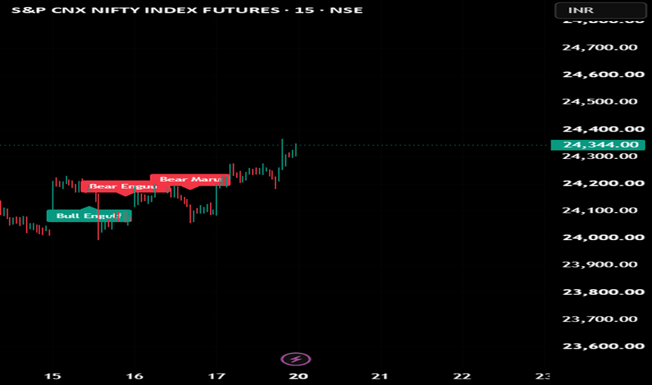
ICT Atlas - Execution ToolkitICT Atlas — Liquidity Execution Toolkit
Use best with #ICTPulse
ICT Atlas is an execution-focused visual toolkit for discretionary ICT-style futures traders. It is designed to organize session liquidity, timed intraday windows, SMT divergence, liquidity sweeps, and post-sweep market structure confirmation in one workflow.
This script is not an automated trading system and does not issue buy or sell signals. Its purpose is to help traders visually follow a sequence of conditions often used in manual execution:
1. Identify session liquidity.
2. Observe whether liquidity is swept.
3. Check for SMT divergence.
4. Wait for market structure confirmation after the sweep.
5. Use the trader’s own entry and risk model.
How it works
The script tracks Asia, London, and New York sessions using the selected timezone. At the end of each session, it records the session high and low, then extends those levels to the right side of the chart. These levels are labeled as AH/AL, LH/LL, and NYH/NYL.
Liquidity sweep detection is based on price interacting with those stored session levels. The user can choose between a simple wick-touch condition or a stricter wick-and-close-back condition. This allows the trader to decide whether a sweep should mean only that price traded through a level, or that price traded through the level and then rejected back inside it.
The SMT module compares the active chart symbol with a user-selected comparison symbol. It uses pivot highs and pivot lows to detect divergence between the two markets. A bearish SMT condition appears when one market makes a higher high while the comparison market does not confirm. A bullish SMT condition appears when one market makes a lower low while the comparison market does not confirm.
The MSS/BOS confirmation module only becomes relevant after a liquidity sweep. After a valid high-side or low-side sweep, the script waits for price to break a recent swing level within the configured expiry window. This is intended to separate simple liquidity touches from situations where structure later confirms a possible shift.
The micro-box module highlights recurring intraday timing windows from :50 to :10 using the selected timezone. During each micro window, the script tracks the high, low, and midpoint of that window, allowing traders to study reactions around specific time-based execution windows.
Main features
* Asia, London, and New York session tracking
* Previous session high and low levels
* AH/AL, LH/LL, and NYH/NYL labels
* Liquidity sweep labels
* Wick-touch or wick-and-close-back sweep modes
* SMT divergence using a comparison symbol
* Post-sweep MSS/BOS confirmation
* ICT-style micro timing boxes from :50 to :10
* Optional alerts for sweeps and structure confirmation
* Adjustable colors, line widths, lookbacks, and object limits
How to use it
ICT Atlas is best used on lower timeframes such as 1-minute, 3-minute, and 5-minute charts.
Suggested workflow:
1. Mark the latest session highs and lows.
2. Watch for a sweep of Asia, London, or New York liquidity.
3. Check whether SMT divergence is present between the chart symbol and the comparison symbol.
4. Wait for MSS/BOS confirmation after the sweep.
5. Apply your own entry model, invalidation, and risk management.
This script is intended for educational and analytical use only. It does not provide financial advice, trade recommendations, or guaranteed outcomes. Futures and financial market trading involves risk.
지표
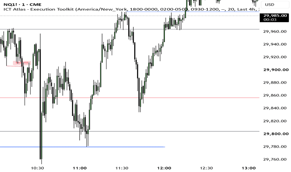
지표
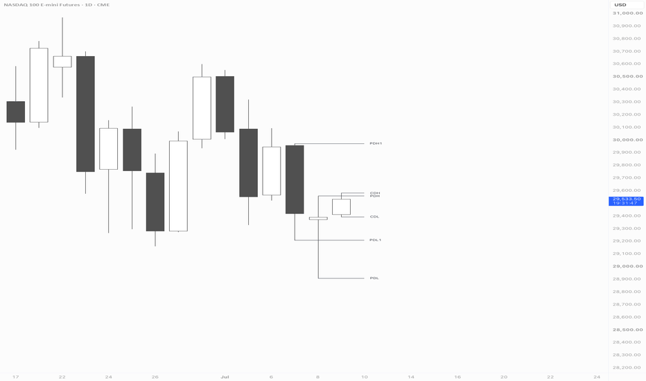
지표

지표

JJB OTT Alert RelayJJB OTT Alert Relay
A bridge indicator that exposes Optimized Trend Tracker (OTT) Buy/Sell signals as alert conditions for automated webhook notifications.
🔍 What This Does
The Optimized Trend Tracker by TradingView generates clean Buy/Sell crossover signals but doesn't expose alertcondition() natively. This relay indicator mirrors the OTT's Support and OTT lines, detects crossovers, and surfaces them as alert conditions — so you can catch signals via webhook, email, or push without watching the chart.
🟢 Buy Signal: Support line crosses above OTT line
🔴 Sell Signal: Support line crosses below OTT line
⚙️ Setup (One-Time, 60 Seconds)
1. Add both indicators to your chart:
The original Optimized Trend Tracker (Community Script)
This JJB OTT Alert Relay
2. Wire the inputs:
Open JJB OTT Alert Relay → Settings → Inputs
Set "Support Line" → #1 Optimized Trend Tracker: Support Line
Set "OTT Line" → #1 Optimized Trend Tracker: OTT
3. Verify the match:
Both indicators should show identical Support and OTT values in the Data Window. If they match, the relay is wired correctly.
🔔 Creating the Alert
Open TradingView's Alert dialog
Condition → "Any alert() function call"
Select "JJB OTT Alert Relay" as the source
Paste your webhook URL
Use this JSON message template:
{"topic":"JJB BTC OTT","title":"BTC OTT {{strategy.order.action}}","message":"OTT Signal: {{strategy.order.action}} | Price: {{close}} | Interval: {{interval}}","tags": ,"passphrase":"YOUR_WEBHOOK_PASSPHRASE"}
Replace YOUR_WEBHOOK_PASSPHRASE with your actual webhook passphrase. The {{strategy.order.action}} placeholder resolves to "buy" or "sell" on each crossover.
Set expiration (default 30 days) and create.
💡 One alert covers both signals. No need for separate buy/sell alerts.
📊 Signal Logic
Condition Signal Meaning
Support ↑ crosses above OTT 🟢 BUY Trend turning bullish
Support ↓ crosses below OTT 🔴 SELL Trend turning bearish
This is a trend-following system — signals are infrequent (typically 2-4 per quarter on daily timeframe) but high-quality. Each signal confirms a structural shift, not noise.
📌 Tips
Daily timeframe is the sweet spot — lower timeframes generate more noise
The relay mirrors the original OTT exactly — it doesn't recalculate
If you change OTT's settings, the relay picks them up automatically via the wired inputs
The plot on your chart confirms the wiring: green line = Support, blue line = OTT
🔧 Requirements
Original Optimized Trend Tracker indicator on the same chart
Basic Pine Script v5+ (TradingView)
Author: JJB | Version: 1.0 지표

지표