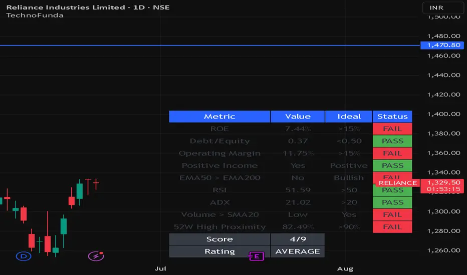
지표

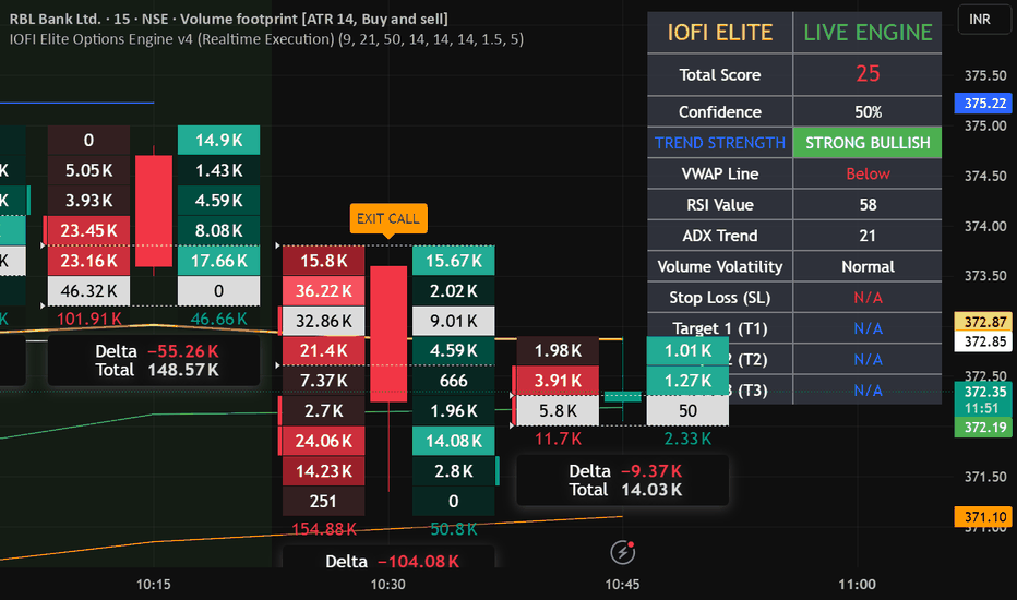
IOFI Elite Options Engine v4 (Realtime Execution)Institutional Engine is an advanced market-structure and order-flow based indicator designed to help traders identify high-probability trading opportunities in stocks, indices, futures, and options. The indicator combines multiple institutional trading concepts into a single framework, including trend detection, liquidity zones, momentum analysis, breakout validation, support and resistance mapping, and smart money activity tracking.
Key Features
✅ Institutional Trend Detection
✅ Smart Money Entry & Exit Signals
✅ Dynamic Support & Resistance Levels
✅ Liquidity Grab Identification
✅ Breakout & Reversal Confirmation
✅ Momentum Strength Analysis
✅ Intraday, Swing & Positional Trading Support
✅ Suitable for Stocks, Futures & Options Markets 지표

지표
Opening Price Level BreakoutA lightweight yet effective indicator designed for traders who need to monitor price breakouts at key historical levels — without cluttering their setup with multiple scripts.
What it does
Plots a fixed price level on the chart and fires an alert when the daily opening price breaks above it. Simple premise, high signal value: the opening price is a cleaner breakout trigger than an intraday cross, filtering out noise and false moves caused by wicks.
The problem it solves
TradingView's native alert system does not support dynamic level recalculation across a watchlist in bulk. Setting up separate scripts for 3M, 6M, and 12M highs across multiple tickers burns through your alert slots fast — especially on Essential and Plus plans where limits are tight. This indicator consolidates the logic into a single, reusable tool: one script, one alert per ticker, any level you need.
Inputs
Price Level — the exact price to monitor (e.g. the 3M, 6M, or 12M high pulled from your analysis)
Level Label — a descriptive tag for your own reference (Max 3M / Max 6M / Max 12M / Custom)
Level Color — visual customization for multi-instance use on the same chart
How to use it
Add the indicator to your chart and set the Price Level input to the historical high you want to monitor
Create an alert using the Opening Price Level Breakout condition with trigger set to Once per bar on the 1D timeframe
Repeat for each ticker in your watchlist
Done — TradingView's servers handle execution; no need to keep the any chart open!
Pro tip: You can stack multiple instances of this indicator on the same chart — one per level — each with a different color. One alert slot per instance, full multi-level coverage on a single ticker.
Note: Due to a Pine Script constraint, alertcondition only accepts constant strings in the message field. Dynamic label injection at runtime is not supported, so the level label is intentionally kept as a chart-side reference only.
breakout, alerts, opening price, historical high, watchlist, daily.
지표

Liquidity Zones + VWAP & EMA SystemLiquidity Zones + VWAP & EMA System
Educational Guide for New Traders
⚠️ IMPORTANT DISCLAIMER
This indicator is provided for educational purposes only. It is not financial advice, investment advice, or a recommendation to buy or sell any financial instrument. Trading involves substantial risk of loss and is not suitable for every investor. Past performance of any trading system or methodology is not indicative of future results. You are solely responsible for all trading decisions you make. Always consult a licensed financial advisor before making any investment decisions. The creator of this indicator accepts no liability for any losses incurred from the use of this tool.
What Is This Indicator?
The Liquidity Zones + VWAP & EMA System is a multi-layered technical analysis tool designed to help traders identify:
Where significant market orders are concentrated (Liquidity Zones)
What the current trend and momentum direction is (VWAP + EMA System)
Whether the market is bullish, bearish, or neutral (Sentiment Background)
A real-time summary of all signals (Dashboard)
This indicator combines four powerful concepts into one clean, easy-to-read tool — making it especially useful for traders who want to understand market structure without switching between multiple charts.
Part 1 — Liquidity Zones
What Are Liquidity Zones?
Liquidity zones are price areas where a large number of buy or sell orders are likely to be sitting. These zones form around swing highs and swing lows — price levels where the market has previously reversed. Institutional traders (banks, hedge funds, market makers) tend to place large orders at these levels, which is why price often reacts strongly when it returns to them.
What Does the Indicator Show?
Each zone is drawn as a colored horizontal band:
🟢 Teal/Green zone — More bullish volume was traded at this level (buyers in control)
🔴 Red zone — More bearish volume was traded at this level (sellers in control)
⚫ Gray zone — Balanced between buyers and sellers (neutral)
The Label — Bull %, Bear % and Delta (Δ)
Each zone shows three pieces of information:
Label Part What It Means R or SR = Resistance (zone above current price) / S = Support (zone below) Price The exact price level of the zone Bull % / Bear %How much of the volume at that level was buying vs sellingΔ (Delta)The difference between bull and bear volume. Positive = more buyers. Negative = more sellers.
Example: A label reading S 1.2345 — 68% Bull / 32% Bear Δ +15,230 means:
This is a Support zone at price 1.2345
68% of the volume traded here was bullish (buyers)
The delta of +15,230 confirms buyers dominated
This is considered a high-probability support zone to watch for bounces
How to Use Liquidity Zones
✅ Look for price to return to a zone — when price pulls back to a bull-dominated support zone, it may bounce upward. When price rallies into a bear-dominated resistance zone, it may reject downward.
✅ Stronger zones have a higher bull/bear % skew — a 75% bull zone is stronger than a 55% bull zone.
✅ A large positive delta at a support zone means institutions were buying heavily there — price is likely to be defended when it returns.
⚠️ Zones can break — if price closes strongly through a zone with high volume, the zone may no longer hold. Always use a stop loss.
Part 2 — VWAP (Volume Weighted Average Price)
What Is VWAP?
VWAP stands for Volume Weighted Average Price. It is the average price of an asset, weighted by how much volume was traded at each price level. It resets at the start of each session (or week/month, depending on your settings).
VWAP is one of the most widely used tools by institutional traders and market makers because it represents the true "fair value" of an asset for the day.
The Golden Rule of VWAP
Price above VWAP = Bullish. Price below VWAP = Bearish.
When price is above VWAP, it means buyers are in control and the market is trading above its fair value — a bullish sign.
When price is below VWAP, sellers are in control — a bearish sign.
VWAP Bands (±1σ and ±2σ)
The indicator also shows standard deviation bands around VWAP:
BandMeaning+1σ (upper band 1)Price is moderately extended above fair value+2σ (upper band 2)Price is significantly overextended — potential reversal zone-1σ (lower band 1)Price is moderately extended below fair value-2σ (lower band 2)Price is significantly oversold — potential reversal zone
How to use the bands:
Price touching +2σ while overbought = consider tightening stops or watching for reversal
Price touching -2σ while oversold = potential buying opportunity (with confirmation)
Price bouncing off VWAP itself = strong continuation signal in the direction of the trend
Part 3 — EMA System (Exponential Moving Averages)
What Are EMAs?
An Exponential Moving Average (EMA) is a line that shows the average price over a set number of bars, with more weight given to recent prices. EMAs help identify the direction of the trend.
This indicator uses three EMAs by default:
EMA Default Length Purpose EMA 1 (Blue)9 bars Fast — shows short-term momentum EMA 2 (Orange)21 bars Medium — shows intermediate trend EMA 3 (Purple)200 bars Slow — shows the major long-term trend
How to Read the EMAs
All three EMAs pointing up + price above all three = strong uptrend
All three EMAs pointing down + price below all three = strong downtrend
EMA 1 crossing above EMA 2 = short-term bullish signal (golden cross)
EMA 1 crossing below EMA 2 = short-term bearish signal (death cross)
Part 4 — The Trend Sentiment Background
The chart background color gives you an instant visual summary of market sentiment:
Background Color Meaning🟢 Light Green Highly Bullish — price is above EMA 1, EMA 2, AND VWAP🔴 Light Red Highly Bearish — price is below EMA 1, EMA 2, AND VWAP⬜ No Color Neutral — mixed signals, no clear directional bias
The Most Powerful Setup
When the background is green AND price is approaching a teal (bull) liquidity zone from above — this is a high-probability long setup.
When the background is red AND price is approaching a red (bear) liquidity zone from below — this is a high-probability short setup.
Part 5 — The Dashboard (Top Right Table)
The dashboard gives you a real-time summary of everything at a glance:
Row What It Shows SENTIMENT Highly Bullish / Highly Bearish / Neutral vs VWAP How far price is from VWAP as a percentage vs EMA 1/2/3Whether price is above or below each EMABAR DELTA Current bar's bull volume minus bear volume VWAP BAND Which VWAP band price is currently in SIGNAL STRONG BUY / BUY / SELL / STRONG SELL / WAIT
Complete Trading Checklist (How to Use All Parts Together)
Before entering any trade, go through this checklist:
✅ For a Long (Buy) Trade:
Sentiment background is green (price above EMA 1, EMA 2, and VWAP)
Price is at or approaching a teal (bull-dominated) liquidity zone
Zone shows high bull % and positive delta
VWAP band shows price is above VWAP but not overextended past +2σ
Dashboard shows BUY or STRONG BUY
✅ For a Short (Sell) Trade:
Sentiment background is red (price below EMA 1, EMA 2, and VWAP)
Price is at or approaching a red (bear-dominated) liquidity zone
Zone shows high bear % and negative delta
VWAP band shows price is below VWAP but not overextended past -2σ
Dashboard shows SELL or STRONG SELL
❌ Avoid Trading When:
Background has no color (neutral/mixed signals)
Price is between liquidity zones with no clear level nearby
Dashboard shows WAIT
Volume is very low (no spike, ratio below 1x average)
Recommended Settings for Different Markets
Market VWAP Anchor EMA 1EMA 2EMA 3Stocks (Day Trading)Session921200ForexSession or Week921200CryptoSession921200Swing TradingWeek2150200
Important Risk Management Rules
⚠️ Never risk more than 1-2% of your account on any single trade.
Always use a stop loss — place it just below the liquidity zone for longs, just above for shorts
Never trade against the major trend (EMA 200 direction)
Wait for confirmation — do not enter the moment price touches a zone; wait for a candle to close at or above/below the zone
The indicator does not guarantee profits — it is a tool to help identify probability, not certainty
Practice on a demo account first before using real money
Final Notes
This indicator works best when used alongside other analysis tools such as:
Support and Resistance levels
Candlestick patterns
Market Structure (Higher Highs, Higher Lows)
News and economic calendar awareness
No single indicator is 100% accurate. The goal is to stack multiple confirmations before entering a trade to improve your probability of success.
Trade safe. Manage your risk. Always keep learning.
This document is for educational purposes only and does not constitute financial advice. Trading carries significant risk of loss. 지표

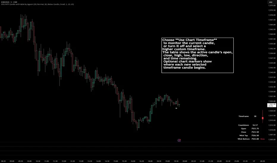
GFG MTF Candle with table by Agaam## GFG MTF Candle with table by Agaam
GFG MTF Candle with table by Agaam is a multi-timeframe candle-monitoring indicator that displays the active candle’s price information in a compact table while allowing the user to remain on a different chart timeframe.
The indicator can follow either the current chart candle or a selected higher-timeframe candle. It also includes optional chart markers that identify where each new selected timeframe candle begins.
### Information displayed in the table
The table shows:
* Selected candle timeframe
* Time remaining until the candle closes
* Candle opening price
* Current closing price
* Current candle high
* Current candle low
* Bull, Bear, or Doji status
* A compact visual representation of the candle body and wicks
“Wick Top” represents the candle’s current highest price.
“Wick Bottom” represents the candle’s current lowest price.
All price values use the symbol’s minimum tick formatting.
### Candle direction
The active candle is classified as:
* **Bull** when the current close is above the open
* **Bear** when the current close is below the open
* **Doji** when the current close equals the open
Bullish, bearish, and doji colors can be customized separately.
### Miniature candle display
The third table column contains a simplified text-based representation of the selected candle.
The visual uses:
* Solid blocks to represent the area between the open and close
* Vertical lines to represent the upper and lower wick areas
* The current Bull, Bear, or Doji color
This display is intended as a quick visual reference. It is an approximation and is not a full replacement for a standard candlestick.
### Timeframe modes
The indicator includes two operating modes.
#### Use Chart Timeframe
When enabled, the table follows the active candle on the current chart.
For example, when applied to a 5-minute chart, the table displays the current 5-minute candle.
#### Custom Timeframe
When “Use Chart Timeframe” is disabled, the table follows the selected custom timeframe.
For example:
* Chart timeframe: 1 minute
* Custom table timeframe: 15 minutes
The table will display the developing 15-minute candle while the user continues viewing the 1-minute chart.
The custom table timeframe should be equal to or higher than the chart timeframe.
### Candle countdown
The countdown displays the estimated time remaining before the selected candle closes.
Depending on the remaining duration, the timer is displayed as:
* Minutes and seconds
* Hours, minutes, and seconds
Examples:
* `4:32`
* `1:14:08`
When a valid candle-closing timestamp is unavailable, the countdown may display `--:--`.
Countdown availability can depend on the symbol, chart type, trading session, and data supplied by TradingView.
### Higher-timeframe candle markers
Optional markers can be displayed on the price chart whenever a new candle begins on the selected marker timeframe.
Examples include:
* `5` for a 5-minute candle
* `30` for a 30-minute candle
* `60` for a 60-minute candle
* `1D` for a daily candle
* `1W` for a weekly candle
* `1M` for a monthly candle
The marker identifies the first chart bar belonging to the new selected timeframe candle.
It does not represent a trading signal or show the opening-price value.
### Marker settings
Users can control:
* Whether markers are displayed
* Marker timeframe
* Marker position above or below the candle
* Marker text color
* Marker text size
* Distance from the candle in ticks
* Maximum number of markers retained on the chart
When the selected marker limit is exceeded, the oldest marker is removed first.
The marker timeframe should be equal to or higher than the chart timeframe.
### Table customization
The table can be customized through the indicator settings.
Available options include:
* Show or hide the table
* Use chart or custom timeframe
* Table text size
* Bull candle color
* Bear candle color
* Doji candle color
* Table background color
* Table text color
* Transparent table background
### Live candle behavior
The table monitors the currently developing candle.
While that candle remains open, the following values may continue changing:
* High
* Low
* Close
* Bull, Bear, or Doji status
* Miniature candle shape
* Remaining time
The opening price remains fixed after the candle begins.
Once the candle closes, its final OHLC values are complete, and the table begins monitoring the next active candle.
### Repainting information
The indicator does not intentionally use future-bar information or lookahead calculations.
However, the active candle is unfinished. Its high, low, close, direction, and candle appearance naturally update as new price data becomes available.
When a higher timeframe is selected, its values continue developing until that higher-timeframe candle closes.
This is normal live-candle behavior and should not be interpreted as a confirmed signal before the selected candle has closed.
### Suggested uses
The indicator may help with:
* Monitoring a higher-timeframe candle from a lower-timeframe chart
* Comparing the current price with the higher-timeframe open
* Tracking the developing candle high and low
* Observing whether the active candle is bullish, bearish, or neutral
* Monitoring time remaining before candle close
* Identifying where new higher-timeframe candles begin
* Supporting multi-timeframe price-action analysis
Example setup:
* Chart timeframe: 5 minutes
* Table timeframe: 30 minutes
* Marker timeframe: 30 minutes
This setup allows the user to view 5-minute price action while monitoring the developing 30-minute candle.
### Limitations
This indicator does not:
* Generate automatic buy or sell signals
* Predict future market direction
* Measure order flow
* Calculate bid-and-ask delta
* Determine institutional activity
* Provide stop-loss or take-profit levels
* Execute trades
* Backtest a trading strategy
The miniature candle display is a simplified representation and may not reproduce every proportional detail of a standard candlestick.
### Disclaimer
This indicator is intended for informational and educational purposes only.
It is not financial, investment, or trading advice. It does not guarantee profitable results or predict future price movements. Trading involves risk, including the potential loss of capital.
Users should perform their own analysis and apply appropriate risk-management practices before making trading decisions.
지표

지표

지표

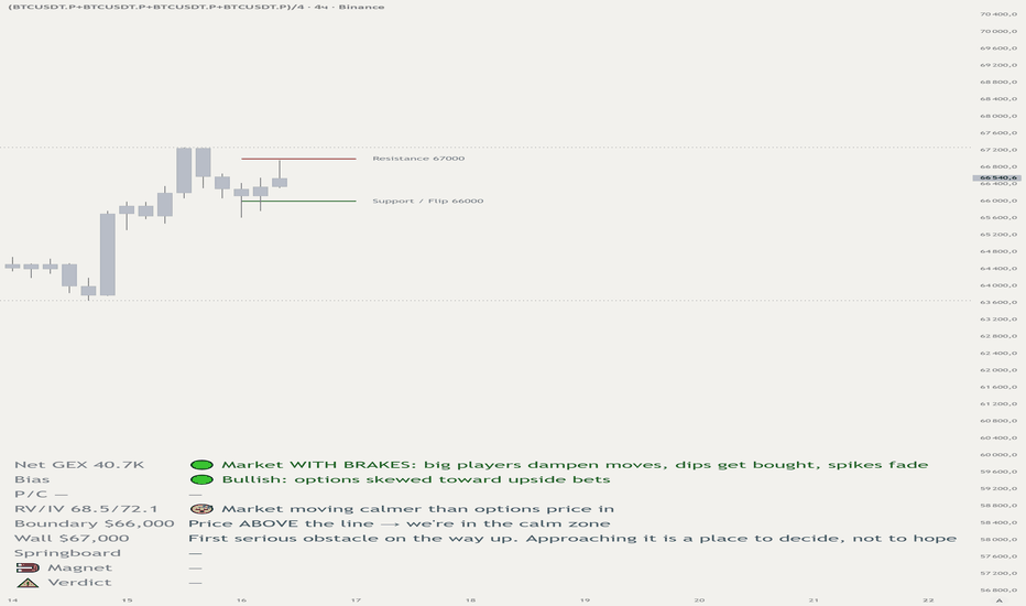
GEX Levels [SYNC & TRADE]# GEX Levels
This indicator plots key options gamma levels on your chart and turns raw dashboard numbers into a plain-language read: where the market accelerates, where it brakes, where it's being pulled, and what counts as a trigger versus wishful thinking.
Data is not pulled automatically (Pine has no access to external APIs). You paste one line of numbers — the indicator draws everything and explains it. Source code is open.
---
## What it draws on the chart
Four levels as lines on price:
- **Resistance (Call Wall)** — first serious obstacle above.
- **Support (Put Wall)** — nearest floor below.
- **Boundary (Zero-Gamma / Flip)** — the divide between the "calm" and the "sharp-move" zone.
- **Springboard (Breakout)** — the level above which the acceleration starts.
Levels at the same price merge into one label. Lines can be limited to the current day or extended across the whole chart.
---
## What's in the table (bottom panel)
Nine rows, each a separate layer of meaning:
1. **Net GEX** — the character of the move: market "with brakes" (dips get bought) or "without brakes" (sharp swings both ways).
2. **Bias** — the options skew: bullish / bearish / neutral.
3. **P/C** — put/call ratio: more downside protection bought, or more upside bets.
4. **RV/IV** — realized vs. implied volatility: market already moving stronger or calmer than priced in.
5. **Boundary** — where price sits relative to flip: in the sharp-move zone or the calm one.
6. **Wall** — the meaning of resistance as a decision point.
7. **Springboard** — the short-squeeze mechanics when price holds above.
8. **Magnet (Pin)** — where, and how strongly, price is being pulled.
9. **Verdict** — a dynamic conclusion from the current price position: upside acceleration / downside zone / between the lines.
Row colors shift with meaning (red — downside risk, green — upside, gray — neutral).
---
## Settings
- **Language / Язык** — RU or EN. Switches the whole table and the level names.
- **Day Window** — start of a new GEX day: UTC 00:00, Deribit 08:00 UTC (expiry), or MSK 00:00.
- **Style** — line width, colors, label background, price display, merging of nearby levels.
- **Info Panel** — panel visibility and text size.
## Alerts
- **Flip cross** — price crossed the gamma flip, the regime has changed → reassess your thesis.
- **New day** — a new GEX day has started → refresh the dashboard data.
---
## How to use
1. Open the cryptogamma.io dashboard for the asset you need (BTC / ETH).
2. Copy the text with the numbers.
3. Run it through the converter prompt below (any AI) → you get one line.
4. Paste the line into the **GEX data** field in the indicator settings.
5. Refresh once a day (or on the new-day alert).
### Data line format
```
res=63000; sup=60000; flip=62000; brk=64500; regime=bearish; ng=-113830; rv=54.05; iv=48.89; pinlvl=63000; pinf=low
```
Separator is `;`. A missing key or a value of `0` hides that level/field.
---
## Converter prompt (paste into any AI)
```
You are an options gamma-data parser. I'll give you text from the
cryptogamma.io dashboard for BTC or ETH. Extract the values and return
EXACTLY ONE line in this format:
res=; sup=; flip=; brk=; regime=; ng=; pcr=; rv=; iv=; pinlvl=; pinf=
Key meanings:
- res — Call Wall / nearest resistance above
- sup — Put Wall / nearest support below
- flip — Zero Gamma / Gamma Flip
- brk — Breakout level, if given
- regime — overall bias: bullish / bearish / neutral
- ng — Net GEX as a WHOLE NUMBER, no K/M, no commas (e.g. -113830)
- pcr — Put/Call ratio (number)
- rv — Realized Volatility (number)
- iv — Implied Volatility (number)
- pinlvl — Pin / Max Pain level (price)
- pinf — pin strength: low / med / high
Rules:
- If a value isn't in the text — skip that key entirely, don't write blanks.
- No spaces inside values. Separator is ';' only.
- No explanations or comments — return ONLY the line.
Dashboard text:
```
---
## Important
This indicator is an **analytical tool, not a signal**. The levels and panel show how forces are stacked in the options market at the moment of the data, but they don't predict direction and aren't a trade recommendation. Entry decisions, position sizing, and risk management are the user's responsibility.
Data must be refreshed manually: the numbers go stale with each new day and every large move.
---
*© SYNC & TRADE — @synchrotrading* 지표
지표
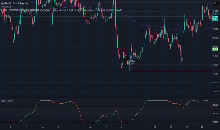
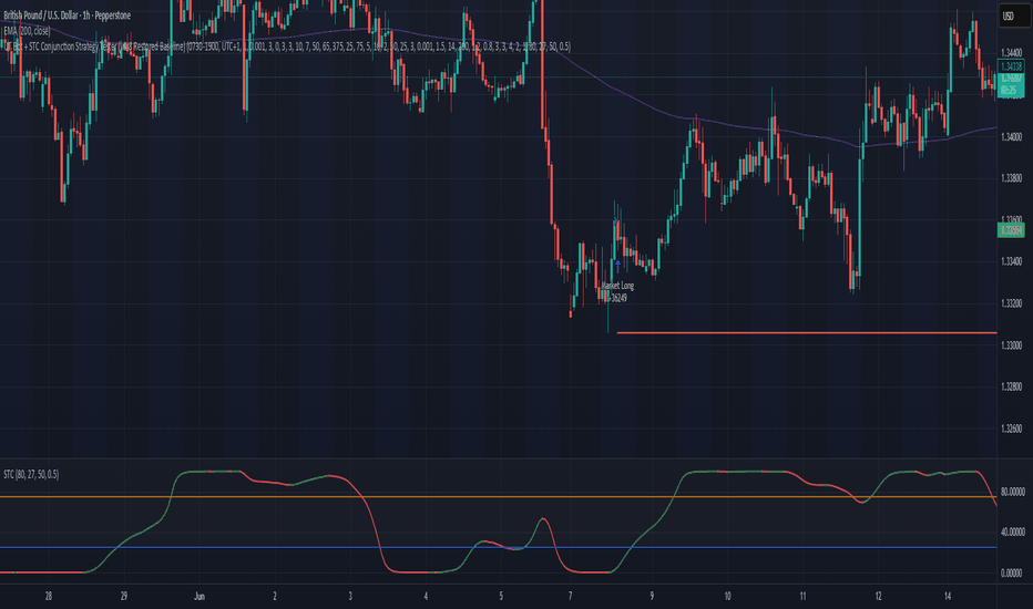
UT Bot + STC Conjunction Strategy Tester v4.8For GBPUSD 1H only
UT Bot + STC Conjunction Engine
Overview
The UT Bot + STC Conjunction Engine is a high-precision, institutional-grade intraday trading framework designed specifically for major currency pairs (optimized for GBPUSD). By marrying fast-reacting momentum tracking with a multi-layered liquidity and volatility filtering stack, this strategy aims to capture highly explosive value turnarounds while aggressively minimizing flat-market drawdowns.Rather than chasing price or trading blind indicator crossovers, the system requires a perfect alignment of momentum, structural value zones, volume intensity, candle geometry, and trend velocity before deploying capital.
Key Features & Architectural Core
Dual-Indicator Conjunction Core: Combines a hyper-tuned UT Bot Alerts trailing-stop engine with the Schaff Trend Cycle (STC). The system isolates absolute cyclical extremes, restricting Long entries to oversold floors and Short entries to overbought ceilings.
Dynamic R:R & Parameter Regime Scaling: The script automatically analyzes historical volatility by calculating a ratio between a fast and a slow Baseline ATR. Based on whether the market is in a High Volatility Breakout, Normal, or Low Volatility Compression regime, the system dynamically scales its Risk-to-Reward targets and technical swing lookbacks.
Volatility-Scaled Entry Offsets: To combat execution friction and protect against chasing fakeouts, entries utilize a dynamic pipette offset that scales directly with real-time market volatility.
The Institutional Guard Stack:
Candle Range Filters: Blocks executions on anomalous candles—filtering out low-liquidity drift (too small) and news-driven exhaustion spikes (too large) relative to a 50-period ATR.
Volume Intensity Filter: Uses a fast/slow volume oscillator breakdown to ensure institutional volume is expanding in favor of the momentum trigger.
Rejection Wick Filter: Analyzes counter-wick percentages to mathematically block entries pushing directly into overhead structural resistance or underlying support.
Trend Velocity Blocker: Measures the instantaneous mathematical slope of a baseline EMA window, instantly freezing execution if the micro-trend is moving too aggressively against the signal.
Static Weekly Circuit Breaker: An built-in risk management safeguard that monitors peak weekly equity. If the account experiences a pre-set maximum weekly drawdown percentage, the system trips its circuit breaker, flattens all risk, and blocks new entries until the start of the next trading week.
How To Use & Optimization GuideSession Control: The default settings are optimized for an intraday window (07:30 - 19:00 UTC). This captures the peak liquidity segments of both the London Open and New York morning drives while stepping aside during low-volume roll-overs.Risk Specification: Input your exact preferred risk percentage per trade (e.g., $1.0\%$). The strategy automatically calculates your structural stop-loss position based on dynamic swing highs/lows and adjusts your exact contract/lot sizing to keep cash risk perfectly constant.Trade Management: The system features a built-in Breakeven Trigger. Once a position hits a profit milestone equivalent to twice your initial structural risk, the stop-loss automatically moves to your exact execution entry price to lock in a completely risk-free ride.
Disclaimer: Past performance does not guarantee future results. This script is intended strictly for educational and backtesting purposes. Always conduct comprehensive forward-testing on a demo environment before committing live capital to any quantitative strategy. 전략
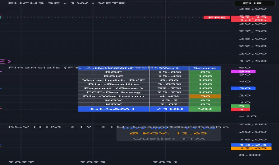
Financials on a timescaleDescription:
This indicator displays key financial metrics of a stock over time as individual lines in a separate pane. It allows you to see at a glance how a company's fundamentals have developed – without switching to the financials tab.
What the Indicator Shows
The four main metrics are displayed by default: Book Value (Equity) in blue, Total Debt in red, Net Income in green, and Total Revenue in fuchsia. An additional nine metrics can be enabled in the settings, including Gross Profit, EBITDA, Operating Income, Free Cash Flow, Operating Cash Flow, Total Assets, Total Liabilities, and Research & Development. A dotted zero line helps with orientation. The indicator uses TradingView's volume format, which automatically scales values to K, M, or B for better readability.
Settings
The reporting period can be switched between Fiscal Year (FY), Fiscal Quarter (FQ), and Trailing Twelve Months (TTM). Note that balance sheet items (Book Value, Debt, Assets, Liabilities, R&D) do not support TTM – the indicator automatically falls back to FQ for these metrics. Line width is adjustable from 1 to 5. Each metric can be individually toggled on or off, and its color can be customized.
Usage Notes
The indicator only works for stocks with available fundamental data and is most useful on the daily or weekly chart. Financial data is typically updated with a delay after earnings releases, so the most recent bar may not reflect the latest quarter until TradingView updates its database. Comparing revenue and earnings lines over multiple years can help visualize growth trends, while the relationship between equity and debt provides a quick view of the balance sheet structure.
Important Note
This indicator is for informational and educational purposes only and does not constitute investment advice or a buy/sell recommendation. Financial metrics alone should never be the sole basis for investment decisions – they should always be evaluated in the context of the business model, industry dynamics, and future outlook. Fundamental data is provided by TradingView; no guarantee is given for its accuracy or completeness.
Financials – Buchwert · Schulden · Gewinn · Umsatz
Beschreibung:
Dieser Indikator stellt die wichtigsten Fundamentalkennzahlen einer Aktie als einzelne Linien in einem eigenen Fenster dar. So lässt sich auf einen Blick erkennen, wie sich die Finanzdaten eines Unternehmens über die Zeit entwickelt haben – ohne in den Finanzdaten-Tab wechseln zu müssen.
Was der Indikator zeigt
Standardmäßig werden die vier Hauptkennzahlen dargestellt: der Buchwert (Eigenkapital) in Blau, die gesamten Schulden in Rot, der Nettogewinn in Grün und der Umsatz in Pink. Neun weitere Kennzahlen lassen sich in den Einstellungen zuschalten: Bruttogewinn, EBITDA, Operatives Ergebnis, Free Cashflow, Operativer Cashflow, Bilanzsumme (Vermögen), Verbindlichkeiten gesamt sowie Forschung & Entwicklung. Eine gepunktete Nulllinie dient der Orientierung. Der Indikator verwendet das Volumenformat von TradingView, das die Werte automatisch in K, Mio. oder Mrd. skaliert.
Einstellmöglichkeiten
Der Berichtszeitraum lässt sich zwischen Geschäftsjahr (FY), Quartal (FQ) und den letzten zwölf Monaten (TTM) umschalten. Bilanzpositionen (Buchwert, Schulden, Vermögen, Verbindlichkeiten, F&E) unterstützen kein TTM – hier wird automatisch FQ verwendet. Die Linienstärke ist von 1 bis 5 einstellbar. Jede Kennzahl kann einzeln ein- oder ausgeschaltet und farblich angepasst werden.
Hinweise zur Nutzung
Der Indikator funktioniert nur bei Aktien mit verfügbaren Fundamentaldaten und ist am sinnvollsten auf dem Tages- oder Wochenchart. Fundamentaldaten werden in der Regel mit Verzögerung nach Quartalsberichten aktualisiert, sodass der aktuellste Balken möglicherweise noch nicht das letzte Quartal widerspiegelt. Der Vergleich von Umsatz- und Gewinnlinien über mehrere Jahre kann Wachstumstrends sichtbar machen, während das Verhältnis von Eigenkapital zu Schulden einen schnellen Blick auf die Bilanzstruktur erlaubt.
Wichtiger Hinweis
Dieser Indikator dient ausschließlich Informations- und Bildungszwecken und stellt keine Anlageberatung oder Kauf-/Verkaufsempfehlung dar. Einzelne Fundamentalkennzahlen sollten niemals die alleinige Grundlage für Anlageentscheidungen sein, sondern stets im Zusammenhang mit dem Geschäftsmodell, der Branchendynamik und den Zukunftsaussichten betrachtet werden. Die Fundamentaldaten werden von TradingView bereitgestellt; für deren Richtigkeit und Vollständigkeit wird keine Gewähr übernommen. 지표

지표

전략

지표

Market Context Indicator v2# Market Context Indicator v2
Market Context Indicator v2 was built around the idea that price moves between areas of liquidity, participation, and imbalance. Instead of relying on a single signal, it combines the major pieces of market structure I use to read the trading day into one clean chart.
### Session Structure
Tracks Asia, London, and New York sessions with visual session ranges, previous session highs and lows, and individual session VWAPs. This provides context for where liquidity was created and where price may revisit.
### Opening Range
Displays the NY Opening Range high, low, and midpoint. The ORB is used to identify early session acceptance, continuation, and potential directional bias.
### Liquidity Framework
Plots key higher-timeframe liquidity levels including previous week highs/lows and previous month highs/lows, allowing important external liquidity targets to remain visible throughout the session.
### Fair Value Gaps (FVGs)
Detects bullish and bearish imbalances based on three-candle displacement. FVGs include customizable minimum size, mitigation threshold, and lifespan to focus on meaningful inefficiencies.
### Order Blocks
Highlights significant areas of previous institutional participation using volume-based pivot detection. Invalidated zones are automatically removed, leaving only active areas of interest.
### High Interest Price Levels (HIPL)
A custom concept designed to identify price levels that show repeated interaction combined with meaningful volume participation. These are areas where buyers and sellers have consistently shown interest and where reactions are more likely to occur.
### Trend & Structure
Includes an EMA 9/50 trend cloud, EMA crossover highlights, and confirmed swing highs and lows to provide additional context for momentum and structural shifts.
### Purpose
This indicator is not designed to predict every move or provide automatic buy and sell signals. Its purpose is to organize the important areas of the market into one view, allowing traders to make decisions based on confluence between liquidity, imbalance, participation, trend, and session behavior.
Built from my own trading concepts and continuously refined around how I read market structure, rather than following any single trading methodology.
지표

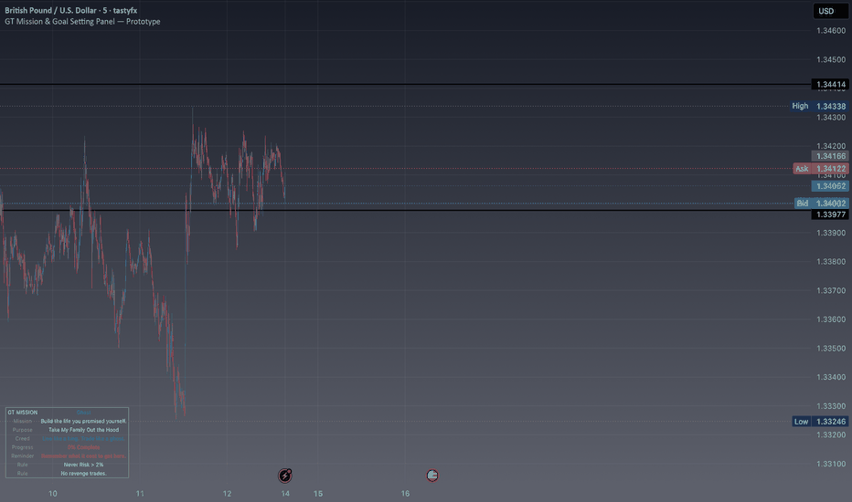
Guapoxtrades Goal Setting & Mission PanelGT Mission Panel™ - By Guapo Trades®
Purpose- Accountability Framework towards the operator mission
Overview
The GT Mission Panel™ is a trader accountability and goal-management system designed to keep your long-term objectives visible while you operate in the short-term environment of the financial markets.
Many traders spend years developing technical skills but struggle with consistency, discipline, emotional control, and maintaining focus on their larger purpose.
The GT Mission Panel™ was created to help bridge that gap.
Rather than acting as a trading signal generator, this tool serves as a daily reminder of:
Who you are
What you're building
Why you're trading
What rules you must follow
What goals still remain ahead
The objective is simple:
Keep your mission visible when emotions are trying to take control.
Core Features
Mission Statement Integration
Create a personalized mission statement that remains visible directly on your chart.
Your mission becomes part of your trading environment rather than something forgotten in a notebook.
Purpose Reminder:
Storing the deeper reason behind your journey.
Whether your objective is:
Financial freedom
Family security
Business ownership
Legacy building
Personal growth
The purpose remains visible while decisions are being made.
Personal Creed System
Display your personal trading creed directly on your charts.
Examples:
Trade like a professional.
Protect capital first.
Discipline over emotion.
Process over outcome.
Your creed becomes a constant reinforcement mechanism.
Goal Tracking Framework & Monitor progress toward major milestones.
Examples:
Emergency Fund
LLC Formation
Capital Goals
Business Expansion
Family Trust Development
Track progress while maintaining focus on long-term execution.
Progress Meter
Automatically calculates completion percentage based on completed goals.
This creates a visual representation of progress rather than relying solely on memory.
Rule Reminder Engine
Display critical trading rules directly on your chart.
Examples:
Never risk more than 2%.
No revenge trading.
Trade only high-quality setups.
Trade with a clear mind.
When discipline is most needed, your rules remain visible.
Identity Reinforcement
The GT Mission Panel™ encourages traders to align daily actions with the person they are trying to become.
Instead of focusing solely on profit and loss, traders are reminded to think in terms of:
Process
Discipline
Consistency
Character
Long-term execution
Decision Accountability Question
The panel includes a powerful self-assessment checkpoint:
"Does this trade serve the mission?"
This simple question can help prevent impulsive decisions and emotional trades.
Why GT Mission Panel™?
Most traders lose money because of:
Emotional decision making
Lack of discipline
Goal drift
Overtrading
Revenge trading
Impatience
Very few tools address the psychological side of trading.
The GT Mission Panel™ was built specifically to keep traders focused on the behaviors required for long-term success.
Best Used For
✔ New Traders
✔ Experienced Traders
✔ Goal-Oriented Individuals
✔ Accountability Systems
✔ Trading Psychology Development
✔ Risk Management Reinforcement
✔ Habit Formation
✔ Business Owners
✔ Personal Growth Frameworks
✔ Long-Term Wealth Building
Educational Purpose
The GT Mission Panel™ is not designed to predict market direction or generate trade signals.
Its purpose is to serve as a personal accountability and organizational framework that helps traders remain aligned with their long-term objectives and trading rules.
The indicator is intended to support discipline, consistency, and decision-making processes through visual reminders and goal tracking.
Visual Optimization
GT Mission Panel™ was designed primarily for dark-theme chart layouts.
Panel colors, transparency levels, and contrast settings were optimized specifically for dark backgrounds to maximize readability and reduce visual clutter.
Users utilizing light-themed charts may wish to customize the appearance through:
Settings → Panel Transparency
Additional visual settings can be adjusted to better match personal chart preferences.
Free Community Edition
The GT Mission Panel™ is provided free of charge as part of the Guapo Trades® commitment to trader development and education.
While many tools focus on finding trades, the GT Mission Panel™ focuses on helping traders become the type of person capable of consistently executing them.
About Guapo Trades®
Guapo Trades® develops professional trading tools focused on:
Market Structure
Liquidity
Probability
Risk Management
Trading Psychology
Trader Education
Transform Market Complexity Into Actionable Information.
Disclaimer- Educational Use Only
GT Mission Panel™ is provided solely for educational and informational purposes. This indicator does not provide financial advice, investment advice, trading advice, or recommendations to buy or sell any financial instrument.
This tool is intended exclusively as a personal organization, accountability, goal-setting, and educational framework.
Trading financial markets involves substantial risk and may not be suitable for all investors. Past performance does not guarantee future results.
Users remain solely responsible for their trading decisions, risk management practices, and financial outcomes.
Always perform your own independent analysis before entering any position.
© Guapo Trades® | Professional Trading Tools Built for Serious Traders 지표
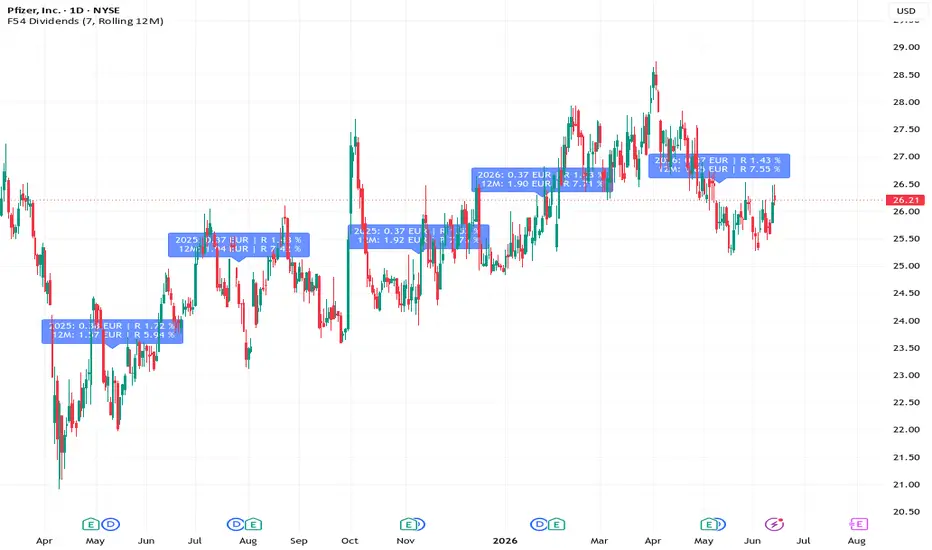
F54 DividendsF54 Dividends
Overview
F54 Dividends is an informational indicator that visualises cash dividend events for the active symbol and shows event-level plus cumulative dividend context directly on the chart.
The script is designed for analysis and transparency of dividend history. It does not place orders and does not provide trade execution logic.
Why This Indicator Is Useful
Dividend income is a core component of total return for income-oriented investors, yet TradingView's default chart view gives no direct visibility into it. This indicator bridges that gap.
Yield on cost at a glance. Each label shows the dividend ratio relative to the price at the time of the ex-dividend event, so you can immediately see how yield evolved over time as the share price changed.
Cumulative income picture. The YTD, Fixed 12M, and Rolling 12M accumulation modes let you see how much income a position has generated over a meaningful period without switching to a separate data source or spreadsheet.
Pattern recognition. Seeing dividend events overlaid on price action makes it easy to spot payout consistency, growth trends, or cuts alongside the price history that accompanied them.
Monthly vs quarterly discrimination. The script automatically detects likely monthly payers and suppresses per-event noise, showing only quarter-end summaries to keep the chart readable without losing the cumulative picture.
Period boundary awareness. New accumulation periods (calendar year or 12-month anchor) are highlighted with a distinct label colour, so resets are immediately visible rather than hidden in the data.
Together these features let you assess a symbol's income quality and consistency directly on the price chart, supporting dividend-focused screening, position review, and historical context gathering.
What The Indicator Shows
- Detects ex-dividend events from TradingView dividend data.
- Displays per-event dividend amount in EUR.
- Displays per-event dividend ratio relative to a reference close.
- Displays cumulative dividend amount and cumulative dividend ratio according to the selected accumulation mode.
- Limits visible labels to the most recent N events to keep the chart readable.
Accumulation Modes
- YTD: Resets cumulative values at the start of each calendar year.
- Fixed 12M: Uses a fixed 12-month period anchored by the current month.
- Rolling 12M: Uses a continuously rolling 365-day window.
Inputs
- Show last N labels: Controls how many recent dividend labels remain visible.
- Accumulation mode: Selects how cumulative values are calculated (YTD, Fixed 12M, Rolling 12M).
How To Read Labels
Each label includes:
- Dividend amount for the current ex-day.
- Event ratio (R) for the current ex-day.
- Cumulative amount for the selected period.
- Cumulative ratio (R) for the selected period.
- In YTD and Fixed 12M modes, the start of a new accumulation period is highlighted with a teal label.
Notes And Limitations
- Output depends on TradingView dividend data availability and symbol coverage.
- Currency display is EUR in this script configuration.
- Label visibility may vary with chart scaling and timeframe.
- In Rolling 12M mode, accumulated values are window-based and may fall when older ex-dividend events leave the 12-month window, which can be confusing if a steadily increasing total is expected.
- Past data can be revised by data providers; values are informational.
Compliance And Disclaimer
This script is for educational and informational purposes only.
It is not investment advice, not a solicitation, and not a guarantee of future results.
Always perform your own research and risk assessment before making investment decisions. 지표

Liquidity & Trend: Spot Buy/SellLiquidity & Trend: Spot Buy/Sell
A spot position tool for the daily chart. Long or cash only, no shorting, no leverage. It answers one question: should I be holding this asset right now, or sitting in cash? It does that by reading the global liquidity tide and, for alts, the asset's own price trend, then printing plain BUY and SELL signals.
The idea
Global liquidity is usually drawn as a line laid over Bitcoin, but the level of money supply next to price is noisy and the relationship drifts in and out. What holds up better is the impulse: the rate of change of liquidity, normalized. This indicator is built entirely on that impulse, and on the long-observed tendency for it to lead Bitcoin by roughly a quarter.
How it works
Global M2 is built from the M2 money supply of the US, Eurozone, Japan, China, UK and Canada, each converted to USD by its FX rate, then summed.
The impulse: Global M2 is smoothed with a 10-day average, its 90-day rate of change is taken, and that is z-scored against the trailing 365 days. That single z-line is the engine.
Regime: liquidity turns bullish when the impulse z crosses above +0.4 standard deviations and bearish below −0.4, with hysteresis in between and a 14-day confirmation before any flip commits. It is deliberately slow. It is built for cycles, not for days.
Trend leg (for alts): a dual smoothed moving average (Wilder/RMA) cross, lengths 15 and 29, on the chart's own price. It captures the asset's own momentum, which the macro data cannot see.
Minimum hold: one uniform rule for every asset. A position is held at least 2 bars before the opposite signal can fire, which removes next-day round-trip whipsaw on volatile names. It is a structural setting, identical across assets, not tuned per coin.
Three modes
Liquidity: hold when the liquidity regime is bullish. Best fit for Bitcoin, which tracks the global tide closely.
Trend (SMMA): hold when the price trend is bullish. A pure trend follower for the charted asset.
Combined (OR): hold when either liquidity or price trend is bullish, and move to cash only when both are bearish. Built for altcoins, where the macro read alone is too slow to catch asset-specific moves.
Suggested use: Liquidity mode on BTC, Combined mode on alts.
On the chart
BUY and SELL markers where the position state changes.
Background shading: green when the model says hold, red when it says cash. These signals and the shading always cover the entire chart.
The two trend SMMA lines, colored by direction (optional).
A forward projection ribbon to the right of price: it slides the recent liquidity impulse forward by the lead and paints green for a projected tailwind, red for a projected headwind. It runs on a lightly smoothed version of the raw impulse so it stays earlier than the confirmed signal without flickering. It is context only, since price itself cannot be projected, and it is not a trade trigger.
A live-state table: the active mode, current action, the liquidity state, the price-trend state, the current impulse z, the short-term impulse direction, a three-week z trail, the projected tide, the signal-health status, and days in state.
Signal-health monitor
Every liquidity relationship eventually decays, so the indicator watches its own edge. It tracks the one-year correlation between the lead-shifted impulse and price momentum, and the two-year gap between average daily returns on liquidity-bullish days versus liquidity-bearish days. If that gap stays negative for a month it flags the model as degraded. The aim is to be told when the relationship stops working, not flattered by it.
Optional backtest
A simple long-or-cash spot backtest can be switched on in the table (off by default). It shows trades, return, buy-and-hold and max drawdown, measured from a configurable start date (default 2017, the live-data era). It is a basic simulation for context, not a performance promise, and it never affects the buy/sell signals.
Alerts
BUY signal, SELL signal, liquidity impulse upturn or downturn confirmed (early context, not a trigger), and signal health degraded or recovered.
How to use it
Run it on the 1D timeframe. Read the green/red state as a position regime, not a precise top or bottom timer. The model confirms turns rather than predicting them, so it tends to be a little late to the exact low and the exact high, by design, in exchange for not whipsawing.
Settings reference
Impulse window 90 days, smoothing 10 days, z-score window 365 days.
Regime band ±0.4 standard deviations, liquidity confirmation 14 days.
Trend SMMA lengths 15 and 29.
Minimum hold 2 days (uniform anti-whipsaw).
Projection lead 91 days (about 13 weeks), projection smoothing 3 days.
Backtest off by default, with start date, start capital and a per-trade cost.
What it does not do
It does not call tops or bottoms, it does not short or use leverage, and it cannot dodge a one-day shock because the confirmation logic needs more than one bar. It is built for gradual, liquidity-driven cycles and it will sit through deep drawdowns, especially on alts. The macro data updates monthly and on a lag, so treat the liquidity read as a backdrop, not a high-frequency timer.
Originality
Most liquidity tools overlay the level of Global M2 on price. This one works off the impulse, normalizes it into a confirmed regime, fuses that with the asset's own trend for alts, projects the leading edge forward, and monitors whether the liquidity-to-price relationship is still alive. The combination, and the self-check, are the point.
For education and research only. Not financial advice and not a recommendation to buy or sell any asset. Markets are risky and you can lose money. Do your own research. 지표

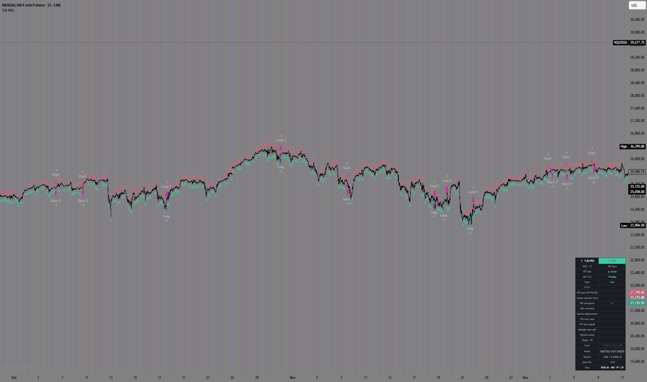
TJR v4 StrategyHere's a short publish description:
TJR PRO — Sweep → BOS→ FVG
An ICT-style strategy built on a single model: price raids liquidity, shifts market structure, then returns to the fair value gap for entry.
The model:
Sweep — a liquidity pool gets raided (PDH/PDL, PWH/PWL, Asia/London/NY session highs & lows, EQH/EQL)
MSS — market structure shifts in the opposite direction (displacement break)
FVG — price retraces into the resulting fair value gap (entry at the edge or 50% / consequent encroachment)
Filters & confluence: ADX chop filter, two-sided raid cooldown, manual news blackout, HTF bias (EMA), SMT divergence, midnight-open alignment, killzone timing — combined into an adjustable confluence score.
Risk: 1% risk-per-trade sizing (or fixed contracts), automatic stop beyond the sweep, target cascade to the nearest unswept pool with a fallback R:R.
Adaptive profiles for scalping (1–5m) and intraday (15m–1H). Includes a live info panel and on-chart trade boxes.
Educational tool — not financial advice. Backtest results do not guarantee future performance.
전략
Risk/Reward Calculator & Position Size Dashboard📝 DESCRIPTION (ENGLISH)
Risk/Reward Calculator and Position Size - Professional Dashboard
This advanced indicator helps you plan every trade with mathematical precision, automatically calculating Take Profit, Draw Down, and profits based on your capital, position size, and selected instrument.
KEY FEATURES:
🎯 Smart Take Profit Calculation
Percentage Mode: enter your desired % and the script calculates the exact price
Specific Price Mode: enter your target price and the script calculates the corresponding %
Full support for LONG and SHORT positions
💰 Dynamic Draw Down Management
Set maximum risk in dollars (e.g., $500)
Calculation automatically adapts to your position size
With size 0.01 and $500 risk = 500 points distance
With size 0.02 and $500 risk = 250 points distance
📊 Professional Dashboard
Top-right table with all crucial data
Adjustable size (Small, Normal, Large)
Shows: Capital, Size/Leverage, Value per Point, TP, Profit, DD, Entry Price
📈 Visual Chart Lines
White line: Entry Price
Solid green line: TP Long
Dotted green line: TP Short
Dotted red lines: DD Long and Short (optional)
Adjustable line length
🌍 Multi-Instrument Support
Gold (XAU - 100)
Silver (XAG - 5000)
Standard Forex (EURUSD - 100,000)
Bitcoin (BTC - 1)
Ethereum (ETH - 1)
Indices (US30/NAS100 - 1)
Custom (enter your own multiplier)
HOW TO USE:
Add the indicator to your chart
Open settings (⚙️)
Set your capital and select the instrument
Enter position size and leverage
Choose TP mode (Percentage or Specific Price)
Set Max Draw Down
Read the results in the dashboard!
PRACTICAL EXAMPLE:
Capital: $10,000
Instrument: Gold (XAU)
Size: 0.01 lots
Max DD: $500
Entry: 4218.97 (current price)
TP Mode: Specific Price → 4250
Result: Dashboard shows TP Long at 4250.00 (0.74%), profit of $31.03, DD Long at 3718.97
PERFECT FOR:
Traders who want precise calculations before entering positions
Professional risk management
Visual trade planning
Multi-timeframe analysis
Prop trading and demo accounts
____________
📝 DESCRIZIONE (ITALIANO)
Calcolatore Risk/Reward e Position Size - Dashboard Professionale
Questo indicatore avanzato ti aiuta a pianificare ogni trade con precisione matematica, calcolando automaticamente Take Profit, Draw Down e profitti in base al tuo capitale, size e strumento selezionato.
FUNZIONALITÀ PRINCIPALI:
🎯 Calcolo Take Profit Intelligente
Modalità Percentuale: inserisci la % desiderata e lo script calcola il prezzo esatto
Modalità Prezzo Specifico: inserisci il prezzo target e lo script calcola la % corrispondente
Supporto completo per posizioni LONG e SHORT
💰 Gestione Draw Down Dinamica
Imposta il rischio massimo in dollari (es. 500$)
Il calcolo si adatta automaticamente alla tua size
Con size 0.01 e rischio 500$ = 500 punti di distanza
Con size 0.02 e rischio 500$ = 250 punti di distanza
📊 Dashboard Professionale
Tabella in alto a destra con tutti i dati cruciali
Dimensione regolabile (Piccola, Normale, Grande)
Mostra: Capitale, Size/Leva, Valore per Punto, TP, Profitto, DD, Entry Price
📈 Linee Visive sul Grafico
Linea bianca: Prezzo di Entry
Linea verde continua: TP Long
Linea verde tratteggiata: TP Short
Linee rosse tratteggiate: DD Long e Short (opzionali)
Lunghezza linee regolabile
🌍 Supporto Multi-Strumento
Oro (XAU - 100)
Argento (XAG - 5000)
Forex Standard (EURUSD - 100.000)
Bitcoin (BTC - 1)
Ethereum (ETH - 1)
Indici (US30/NAS100 - 1)
Personalizzato (inserisci il tuo moltiplicatore)
COME USARLO:
Aggiungi l'indicatore al grafico
Apri le impostazioni (⚙️)
Imposta il tuo capitale e seleziona lo strumento
Inserisci la size e la leva
Scegli la modalità TP (Percentuale o Prezzo Specifico)
Imposta il Max Draw Down
Leggi i risultati nella dashboard!
ESEMPIO PRATICO:
Capitale: 10.000$
Strumento: Oro (XAU)
Size: 0.01 lotti
Max DD: 500$
Entry: 4218.97 (prezzo attuale)
TP Mode: Prezzo Specifico → 4250
Risultato: La dashboard mostra TP Long a 4250.00 (0.74%), profitto di 31.03$, DD Long a 3718.97
PERFETTO PER:
Trader che vogliono calcoli precisi prima di entrare in posizione
Gestione professionale del rischio
Pianificazione visiva dei trade
Multi-timeframe analysis
Prop trading e conti demo 지표

지표

지표