Advanced Support and Resistance with Reversal [AlphaPine]Advanced Support and Resistance with Reversal | AlphaPine
I built this indicator for a simple reason: a breakout line on its own does not tell me enough. I also want to know whether price comes back, holds the level from the other side, and later loses it again.
The script starts with confirmed swing highs and lows. Those become resistance and support. It then follows each level through three possible events: breakout, retest, and failure. Nothing here predicts the next move. It is a way to keep market structure organised without redrawing the same levels by hand.
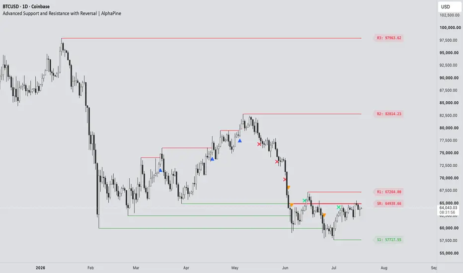
The image below shows the full level lifecycle in one view, including the symbols that appear at each stage:
How a level is created
A resistance level comes from a confirmed pivot high. A support level comes from a confirmed pivot low. If zones are enabled, the zone uses the wick range of the pivot candle rather than an arbitrary fixed width.
Pivot confirmation takes time. With Pivot Length set to 10, for example, the script needs ten bars on the right side of the pivot before the level exists. This delay is intentional.
Pivot Length controls how selective the swing detection is. A larger value usually gives fewer levels and confirms them later.
Lookback Period sets how long a level remains in the script's working history.
Maximum Levels per Type limits stored resistance and support records so the chart does not keep growing indefinitely.
Wick Dominance Filter keeps only pivot candles whose rejection wick is larger than the body and opposite wick.
Merge Nearby Active Levels removes clutter by skipping a new pivot when an active level of the same type is already nearby. Broken levels do not block a fresh one.
The merge distance uses ATR-14, so it adjusts to the instrument instead of relying on one fixed price interval.
Breakouts
The default breakout mode is Close . Resistance must close above its boundary, while support must close below it. This avoids counting every small wick through a level.
Wick mode reacts earlier. It triggers when the high or low crosses the boundary during the live candle. The recorded extreme cannot retract, but price can still close back inside the level, so Wick mode will naturally include more intrabar fakeouts.
Breakout Buffer adds an optional ATR-based distance beyond the level. Leave it at zero for the exact boundary, or raise it if very small breaks are not useful for your chart.
By default:
A resistance breakout prints an upward blue triangle below the candle.
A support breakout prints a downward orange triangle above the candle.
The marker colours are fully adjustable.
Retests and role reversals
After resistance breaks, the script waits to see whether price can retest it as support. After support breaks, it watches for the same level to act as resistance.
RS means old resistance has been confirmed as new support.
SR means old support has been confirmed as new resistance.
Reversal Confirmation controls what counts as a retest:
Close (default) requires the retest candle to touch the original zone and close back beyond the whole zone on the new-role side.
Touch accepts any later overlap with the zone. It is more sensitive and less strict.
Once confirmed, the new role stays fixed. An RS level remains tracked as support; it does not turn red merely because the latest candle happens to sit below it.
When a flip fails
A flipped level is removed when a confirmed candle closes through the far side of its zone. In other words, RS support fails below the zone and SR resistance fails above it.
If Show Reversal Failures is enabled, an ✕ marks the failure candle. The flipped line stops there, but the cross stays on the chart as a record of where the level died. That is why a failure cross can appear without a continuing line.
Breakout triangles and failure crosses use the original pivot as their Lookback anchor. This keeps their expiry on the same structural clock as the level they came from instead of giving every marker a new lifetime from its event candle.
Reading the chart
R1 is the nearest active resistance above price, followed by R2, R3, and so on.
S1 is the nearest active support below price, followed by S2, S3, and so on.
RS marks a confirmed resistance-to-support flip.
SR marks a confirmed support-to-resistance flip.
Triangles mark breakouts. Crosses mark failed flips.
A breakout marker is an event, not an entry instruction. I find the retest more useful than the first break, but how it is traded still depends on trend, execution, and risk rules outside this indicator.
Lines, zones, and historical placement
Historical Level Start decides where an original level begins:
Confirmation (default) starts it on the bar where the pivot became known in real time.
Pivot extends it back to the swing candle. This is useful for visual context, but the level was not available on that earlier candle.
Display as Zones replaces the single-price lines with the original pivot-wick range. If that level flips, the same price range is preserved; the zone is not moved to the opposite side of the price.
Colours
The Colors group separates colours by purpose, so changing a label does not force the matching line to use the same colour.
Resistance and support lines/zones.
RS and SR lines/zones.
Resistance, support, RS, and SR price labels.
Resistance and support breakout triangles.
Support and resistance failure crosses.
Zone fills and borders use transparent versions of the selected line colour so candles remain visible underneath.
Alerts
Seven alert conditions are included:
Resistance Breakout
Support Breakout
Resistance to Support Flip
Support to Resistance Flip
Flipped Support Failed
Flipped Resistance Failed
Any S/R Event
The combined alert is useful when one alert should cover every structural event. Separate conditions are available when different actions are needed for breaks, flips, or failures.
A sensible starting setup
The defaults use Close confirmation for both breakouts and retests. Start there if you prefer signals that wait for the candle to finish. Wick breakout and Touch retest are available when earlier, more sensitive reactions are more important.
If the chart feels crowded, try increasing Pivot Length, increasing Merge Distance, enabling the Wick Dominance Filter, or reducing Maximum Levels per Type. Settings should be adjusted for the instrument and timeframe rather than treated as universal values.
Important limitations
Confirmed pivots always arrive late by Pivot Length bars. That is how pivot confirmation works, not a hidden predictive signal.
Pivot historical placement back-draws a confirmed level for context. Use Confirmation placement when real-time availability matters.
Wick mode can mark a breakout that later closes back inside the level.
The current-bar drawings rebuild while the candle updates.
The script uses chart data only. It does not request higher-timeframe data or use lookahead.
It does not place orders, calculate position size, or guarantee that a level will hold.
Use it as a structure tool, then apply your own trade plan and risk management.
지표

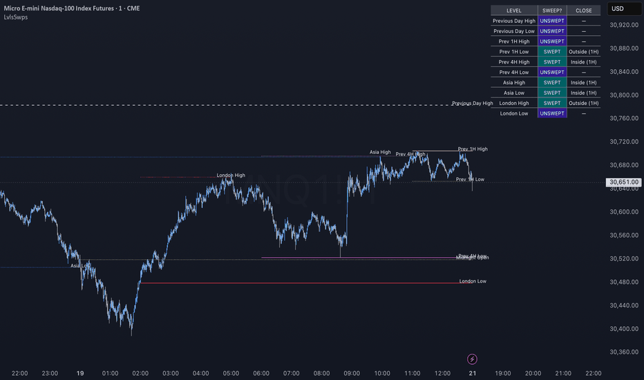
Nebbia Session Map & HTF Levels Nebbia Market Sessions & Liquidity Levels is an open-source intraday market-mapping indicator designed to combine session structure, liquidity references, higher-timeframe levels and the US Initial Balance in a single charting tool.
The script is intended primarily for traders who work on lower intraday timeframes and want a clear view of where price is trading relative to important session ranges, historical highs and lows, confirmed swing levels, opening prices and Initial Balance projections.
Market Sessions
The indicator can display the main intraday trading sessions:
Asia
London
New York AM
New York Lunch
New York PM
Each session can be enabled or disabled independently and has customizable hours, colors and transparency.
The first hour of the Asia and London sessions can also be highlighted separately, making it easier to identify their initial range and early-session price development.
Session times use timezone-aware calculations, allowing daylight-saving changes to be handled correctly when IANA timezones such as America/New_York, America/Chicago, Europe/London, Europe/Rome and Asia/Tokyo are selected.
Killzone Pivots
For every enabled killzone, the script can track the session high and low and extend them forward as potential liquidity levels.
These pivots can remain active according to three different expiration rules:
until the end of the trading day;
until the next occurrence of the same session;
until the level is mitigated.
A pivot stops extending once price trades through it.
Alerts can also be enabled for killzone pivot breaks.
Higher-Timeframe Liquidity Levels
Nebbia can display historical liquidity references from several timeframes:
past daily highs and lows;
past weekly highs and lows;
past monthly highs and lows;
two optional confirmed swing-timeframe slots.
The two swing slots are fully configurable. They may be used, for example, for:
4-hour swings;
1-hour swings;
30-minute swings;
or any other supported timeframe.
Swing highs and lows are confirmed only after the selected number of right-side bars has closed, preventing an unconfirmed pivot from being displayed prematurely.
The timeframe name is generated automatically in the label, producing references such as:
4H H
4H L
1H H
30M L
When two swing levels occur at the same price, the higher timeframe takes priority.
Level Confluence
When multiple liquidity references share the same price, Nebbia merges them instead of drawing several overlapping lines.
The hierarchy is:
Monthly → Weekly → Daily → higher swing timeframe → lower swing timeframe
The highest-priority line remains visible, while the label can report the relevant confluence.
Examples:
W LOW 09.06 / 4H L
D HIGH 16.07 / 1H H
M LOW 01.07 / W LOW 07.07
This keeps the chart readable while preserving the information contained in lower-timeframe confirmations.
Active and Mitigated Levels
Active liquidity levels are displayed using the selected active line style.
Once price trades through a level, it can be converted into a mitigated level using a separate broken-line style and transparency.
A dedicated setting allows mitigated levels to be shown or hidden completely.
This means the chart can be configured either to retain historical interaction points or to display only liquidity levels that remain untouched.
Level labels can also be enabled or disabled independently.
High labels are positioned above their level, while low labels are positioned below it.
Current Trading-Day High and Low
An optional developing mode can display the high and low of the current Chicago trading day.
These levels update throughout the session and are treated as provisional rather than as already-confirmed historical levels.
At the beginning of the next trading day, the completed daily range is transferred into the normal historical daily-level logic.
ADR5 Distance Filter
Nebbia includes an optional ADR5 filter, based on the average daily range of the five most recently completed trading days.
The ADR5 value is calculated and frozen at the beginning of each new trading day.
Only levels located within the selected ADR5 distance multiplier are displayed.
This can reduce chart clutter by hiding historical liquidity references that are too far away from current price.
For example:
1.0 displays levels within one ADR5;
1.5 displays levels within one and a half ADR5;
2.0 displays levels within two ADR5.
Opening Prices
The indicator can display the latest opening price for:
Daily Open — 00:00 Rome
Tokyo Open — 09:00 Tokyo
London Open — 08:00 London
US Cash Open — 08:30 Chicago
Each opening price has an independent visibility option, color and editable label text.
Only the latest relevant opening line is retained, preventing older opening levels from unnecessarily accumulating on the chart.
Time Markers and Separators
Optional vertical timestamps can identify:
00:00 Rome;
08:30 Chicago.
Daily, weekly and monthly separators can also be displayed independently.
Optional day-of-week labels may be placed at the top or bottom of the chart, with the possibility of hiding weekend labels.
US Initial Balance
Nebbia includes a dedicated US Initial Balance module based on the first hour of the US cash session:
08:30–09:30 America/Chicago
The Initial Balance can display:
IB High;
IB Low;
50% midpoint;
optional ×2 and ×3 extensions;
optional 50% levels between the main extensions;
a highlighted IB time window;
a tinted area between IB High and IB Low;
optional price labels;
configurable extension direction and line styles.
When lines are extended to the right, they remain active until the beginning of the next trading day’s Initial Balance rather than extending indefinitely.
The script can also calculate statistics from the previous 20 completed Initial Balance sessions.
Customization
Most visual components can be configured independently, including:
session colors and transparency;
swing timeframes and pivot sensitivity;
level colors and widths;
active and mitigated line styles;
label visibility and distance;
opening-price labels;
timestamp styles;
Initial Balance colors, widths and extensions;
timeframe visibility limits;
session-history drawing limits.
Credits
This open-source project was inspired in part by:
ICT Killzones + Pivots
by tradeforopp
Full recognition is given to the original author for the concepts and foundation that helped inspire the session and pivot components of this project.
Nebbia Market Sessions & Liquidity Levels is an independent expansion and redesign that adds higher-timeframe liquidity mapping, swing-timeframe slots, confluence management, ADR5 filtering, opening prices, timestamps and a complete US Initial Balance module.
Disclaimer
This indicator is provided for educational and analytical purposes only.
It does not constitute financial advice, investment advice or a recommendation to enter or exit any trade. Historical levels, session ranges, pivots and Initial Balance projections do not guarantee future market behavior. 지표

Auto Fibonacci ZonesAuto Fibonacci Zones is a visual Fibonacci retracement tool built around confirmed swing pivots.
The script automatically detects the most recent significant swing leg using confirmed pivot highs and pivot lows, then draws Fibonacci retracement levels from that leg. It is designed to reduce the need for manually redrawing Fibonacci levels each time a new swing structure forms.
What the script shows
- Fibonacci retracement levels from the latest confirmed swing leg
- Optional Fibonacci extension levels
- A highlighted 0.5 - 0.618 retracement zone
- A dashed anchor leg showing the selected swing
- A compact state label describing the current retracement condition
- Optional alerts for key retracement events
How it works
The script uses confirmed pivot highs and confirmed pivot lows to define the current swing leg. A new Fibonacci sheet is accepted only when the detected high-low leg is large enough relative to ATR. This helps avoid redrawing levels on very small price movements.
The main retracement levels include:
- 0
- 0.382
- 0.5
- 0.618
- 0.786
- 1
The script can also show optional extension levels:
- 1.272
- 1.618
Extensions are disabled by default because they are reference geometry only and should not be interpreted as price forecasts.
Level sets
The user can choose between three level display modes:
- Core: shows 0, 0.5, 0.618, and 1
- Major: shows the main Fibonacci levels with a cleaner chart layout
- Standard: shows the common retracement levels
Golden zone
The script highlights the area between 0.5 and 0.618. This zone is commonly watched by traders as a retracement area, but it should not be treated as a guaranteed reversal zone or standalone trading signal.
State label
The state label gives a quick reading of the current retracement condition, such as:
- Shallow retracement
- Deep retracement
- Inside 0.5 - 0.618 zone
- Near full retrace
- Full retrace exceeded
- Beyond 0 level
The state label is only a descriptive reading of where price is relative to the current Fibonacci sheet.
Old or inactive sheets
The script includes options to fade older or fully retraced Fibonacci sheets. This helps keep the chart clean when the selected swing leg is no longer fresh or has already been fully retraced.
Main settings
Swing Detection:
- Pivot strength
- Minimum leg height x ATR
Levels:
- Level set
- Show extensions
- Shade 0.5 - 0.618 zone
Display:
- Show anchor leg
- Show level labels
- Show level prices
- Show state label
- State label offset
- Fade old / invalid sheet
- Expire sheet after bars
Lines and colors:
- Level line width
- Key level line width
- Anchor leg width
- Level colors
- Golden zone color
- Extension color
- Label colors
- Transparency controls
Alerts
The script includes alert conditions for:
- Price entering the 0.5 - 0.618 zone
- Price exiting the 0.5 - 0.618 zone
- Price crossing the 0.618 level
- Price touching or exceeding the 1.0 retracement level
- Price retesting the 0 level
These alerts are descriptive chart events. They are not buy or sell signals.
Repainting and confirmation note
This script uses confirmed pivot highs and confirmed pivot lows. A pivot can only be confirmed after the selected pivot-strength bars have passed.
Because of this, Fibonacci anchors appear only after confirmation. When a newer valid swing leg is confirmed, the current Fibonacci sheet can be replaced by the new one.
This is normal confirmation delay for pivot-based tools. The script does not use lookahead, and the levels are based on confirmed swing structure.
Limitations
Fibonacci levels are visual reference levels, not predictive levels.
A price reaction near any Fibonacci level does not guarantee continuation, reversal, support, or resistance.
The selected swing leg is determined automatically by the script. In some cases, a trader may manually choose a different swing leg based on broader market context.
This indicator is intended for chart analysis, education, and visual review of retracement structure. It is not a trading system, financial advice, or a standalone buy/sell tool. 지표

ICT Killzones & Key Levels -DST- By SpartanICT Killzones & Key Levels -DST- By Spartan
This tool brings together the reference levels that ICT-style session traders build their bias around, so you are not stacking four or five separate indicators on one chart to get them. Killzone session ranges, their pivot highs and lows, Fibonacci retracements of each session's range, and the higher-timeframe opens, highs, lows, and time markers that traders use to judge context all come from the same underlying session and time data. Keeping them in one script means they stay in sync with each other and with the timeframe/timezone settings you choose, instead of drifting apart the way separately-configured indicators can.
This indicator's strongest feature is the automatic daylight saving time adjustment for each session as it uses real time zones of each session and adjusts automatically rather than having to change them each time the clock is changed anywhere
WHAT IT DOES
Killzone sessions
Draws boxes around the Asia, London, and New York killzone sessions. Each session's time range is entered in that session's own local time (UTC for Asia, Europe/London for London, America/New York for New York) and automatically adjusts for daylight saving, so you never have to manually shift the input twice a year.
Pivots
Marks each session's high and low as extending lines, with optional labels showing price. Pivots can extend until price mitigates them or continue past mitigation, and can alert you when a session high or low is broken.
Fibonacci levels (new in this version)
Each session can independently plot 0, 0.25, 0.5, 0.75, and 1 retracement levels of its own range. These update live while the session is still forming and lock in place once the session closes, so you can watch how a session's midpoint and quartiles evolve in real time rather than only seeing them after the fact. Colors automatically match each session's own color so the chart stays readable.
Midpoints
Optional midpoint line for each session's pivot range, with the choice to stop tracking once price mitigates it or keep tracking through the session.
Killzone range table
An optional table showing each session's most recent range and its rolling average over a configurable number of past sessions, so you can gauge whether the current session is expanding or contracting relative to its recent history.
Day / Week / Month tools
Optional open lines, high/low lines, and separators for the daily, weekly, and monthly timeframes, each with independent alerting on high/low breaks.
Custom opening prices and timestamps
Up to eight custom time-of-day open markers (for marking things like true day open or other reference times you track) and four vertical timestamp lines, both independently configurable.
Day-of-week labels
Optional labels marking the start of each weekday on intraday charts, with the option to hide weekend labels.
HOW TO USE IT
Turn on the sessions you trade, set the killzone range and pivot options to match how you use highs/lows and mitigation, and enable Fibonacci levels on whichever sessions you want retracement context for. The killzone range table is useful for a quick read on whether the current session is unusually wide or narrow. The Day/Week/Month and custom time tools are there if you also reference higher-timeframe opens or specific times of day, but are fully optional and off by default so the chart stays clean if you only want killzones.
CREDIT AND ORIGINALITY
The killzone box, pivot, and DST-safe session-detection logic in this script is built on tradeforopp's open-source "ICT Killzones & Pivots" indicator. This version adds session-independent live-updating Fibonacci retracement levels (not present in the original), a reorganized and more clearly labeled settings panel, and several fixes to line/label handling in the underlying session logic. Published open-source in keeping with the license of the code it builds on.
This is a level-marking and context tool, not a signal generator or a strategy. It does not predict future price movement or guarantee any outcome; it plots historical and forming session data so you can build your own read of the market around it. 지표

Classic Pattern EngineIs a chart-pattern detection tool built around confirmed swing pivots.
The script identifies selected classic chart-pattern structures and draws them directly on the chart. It is designed as a visual pattern-mapping tool, not as an automated trading system.
What the script detects
Reversal patterns:
- Double Top
- Double Bottom
- Triple Top
- Triple Bottom
- Head and Shoulders
- Inverted Head and Shoulders
Continuation / structure patterns:
- Rectangles
- Ascending Triangle
- Descending Triangle
- Symmetrical Triangle
- Rising Wedge
- Falling Wedge
- Bull Flag
- Bear Flag
- Bullish Pennant
- Bearish Pennant
How it works
The script uses confirmed pivot highs and pivot lows to build a swing structure. It then compares the most recent confirmed swings against geometric conditions such as:
- Similarity of highs or lows
- Pattern height relative to ATR
- Slope of upper and lower boundaries
- Convergence or parallel behavior
- Pattern duration
- Flag or pennant context when applicable
Each detected pattern receives a quality score. This score is based on the geometry of the pattern, such as symmetry, height, similarity of key swing points, slope behavior, and structure fit. The score is intended to help users filter weaker shapes from cleaner structures.
Entry, Stop, and Target levels
The script can display Entry, Stop, and Target reference levels for detected patterns.
These levels are geometric references derived from the detected pattern structure. They are not trade recommendations.
The script can also track the state of the detected setup:
- Pending: the pattern is detected but entry has not been triggered
- Active: entry level has been reached
- Target Hit: price reached the target reference level
- Stop Hit: price reached the stop reference level
- Expired: the setup remained unresolved beyond the selected time window
The Entry label can also show an estimated R:R value based on the distance between Entry, Stop, and Target.
Main settings
Detection:
- Pivot strength
- Equality tolerance in ATR
- Minimum pattern height
- Minimum pattern quality
- Maximum pattern length
Display:
- Show only latest pattern
- Show pattern lines
- Show entry / stop / target levels
- Show R:R in entry label
- Fade inactive levels after result
- Entry / stop / target projection length
- Pattern line width
- Entry / stop / target line width
- Entry / stop / target label size
Colors:
- Pattern colors
- Entry line color
- Stop line color
- Target line color
- Entry text color
- Stop text color
- Target text color
- Resolved / inactive level styling
How to use
Use the indicator as a visual assistant for identifying and reviewing chart-pattern structures.
A detected pattern means the required swing geometry has formed. It does not mean that the pattern will complete successfully or that price will reach the target.
Users can choose to display only the latest pattern for a clean chart, or keep more visual history by changing the display settings.
Repainting note
This script uses confirmed pivot highs and confirmed pivot lows. A pattern can only be detected after the required pivot confirmation bars have passed.
For this reason, pattern drawings may appear on earlier swing points after confirmation. This is a normal confirmation delay caused by pivot-based detection.
The script does not use lookahead. Entry, stop, target, and state labels update only as new bars develop after a pattern has been detected.
Limitations
Chart patterns are geometric interpretations of price structure. Different traders may classify the same structure differently.
The displayed Entry, Stop, Target, and R:R values are reference levels calculated from the pattern geometry. They should not be treated as financial advice, trading instructions, or guaranteed outcomes.
The indicator is intended for chart analysis, education, and visual pattern review. 지표

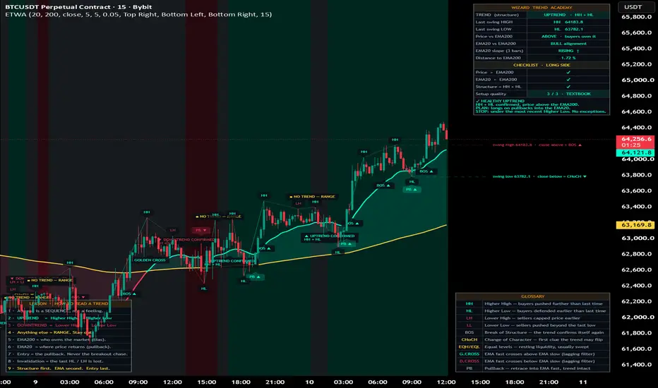
Education Trend | Wizard AcademyEducativ Trend | Wizard Academy
educativ trend is an educational trend-reading module built to teach traders how to identify real market structure, understand trend direction, avoid weak market conditions, and recognize clean pullback locations.
the tool is designed for beginners who want a clear framework, but it also gives advanced traders a structured way to read price action without relying on emotion or random candle reactions.
the main idea is simple:
a trend is not a feeling.
a trend is not only price above or below a moving average.
a trend is a sequence of swing points.
an uptrend is confirmed by:
higher high + higher low
a downtrend is confirmed by:
lower high + lower low
anything else is treated as range, transition, or unclear structure.
main features
confirmed market structure
the indicator detects confirmed swing highs and swing lows, then classifies them as:
HH = higher high
HL = higher low
LH = lower high
LL = lower low
EQH = equal high
EQL = equal low
each swing label includes educational context so the trader can understand what happened and why it matters.
trend state engine
the trend state is decided from structure only.
uptrend = HH + HL
downtrend = LH + LL
range = mixed or unclear structure
this helps traders avoid the common mistake of forcing trend trades inside a range.
ema context
the tool includes two moving averages:
fast ema
slow ema
the slow ema is used as long-term bias.
the fast ema is used as short-term fair value and pullback context.
the moving averages are not treated as the trend definition. they are used as context around the real structure.
bos and choch
the indicator marks important structure breaks:
BOS = break of structure
CHoCH = change of character
a bullish BOS shows continuation above the last confirmed swing high.
a bearish BOS shows continuation below the last confirmed swing low.
a bullish CHoCH appears when a bearish structure is damaged by a break above the last swing high.
a bearish CHoCH appears when a bullish structure is damaged by a break below the last swing low.
pullback module
the tool highlights textbook pullbacks into the fast ema when trend structure and bias agree.
a long pullback setup can appear when:
structure is bullish
price is above the slow ema
price pulls into the fast ema
price closes back above the fast ema
the candle closes bullish
a short pullback setup can appear when:
structure is bearish
price is below the slow ema
price rallies into the fast ema
price closes back below the fast ema
the candle closes bearish
this helps beginners avoid chasing breakouts and focus on better trade locations.
projected swing levels
the last confirmed swing high and swing low can be projected to the right side of the chart.
these levels show what price needs to break next.
close above the last swing high can create bullish BOS or bullish CHoCH.
close below the last swing low can create bearish BOS or bearish CHoCH.
dashboard
the live dashboard gives a quick read of the current market state.
it displays:
trend structure
last swing high
last swing low
price vs slow ema
fast ema vs slow ema
fast ema slope
distance from slow ema
checklist quality
live coaching message
the first title row uses an orange accent for a clean institutional look.
lesson card
the lesson card gives a simple nine-rule framework for reading trends.
it teaches:
structure first
ema second
entry last
do not chase breakouts
pullbacks are cleaner locations
ranges are dangerous for beginners
invalidation matters
glossary card
the glossary card explains the main structure terms directly on the chart.
it includes:
HH
HL
LH
LL
BOS
CHoCH
EQH / EQL
golden cross
death cross
PB
each panel can be moved to different chart positions, including corners and middle placements.
how to use the indicator
step 1: read the trend state
start with the dashboard.
if the dashboard says uptrend, the market has confirmed HH + HL.
if the dashboard says downtrend, the market has confirmed LH + LL.
if the dashboard says range, the highs and lows do not agree.
beginners should avoid forcing trend trades when the dashboard shows range.
step 2: check the slow ema bias
look at price versus the slow ema.
price above the slow ema shows bullish long-term context.
price below the slow ema shows bearish long-term context.
the ema does not define the trend by itself, but it helps confirm whether structure and bias agree.
step 3: check the fast ema pullback zone
the fast ema acts like short-term fair value.
in a bullish trend, price often pulls back into the fast ema before continuing.
in a bearish trend, price often rallies into the fast ema before continuing lower.
the cleanest entries usually come after a pullback, not after chasing a breakout candle.
step 4: watch the last swing levels
the projected swing high and swing low show the next important structure levels.
if price closes above the last swing high, bullish structure is strengthened or a bearish trend is damaged.
if price closes below the last swing low, bearish structure is strengthened or a bullish trend is damaged.
step 5: use bos and choch correctly
BOS is usually continuation.
CHoCH is usually the first warning that a trend may be changing.
a CHoCH is not automatically an entry. it is a warning to stop blindly trading the old trend and wait for new structure.
beginner long example
1. the dashboard shows uptrend
2. the last structure is HH + HL
3. price is above the slow ema
4. the fast ema is above the slow ema
5. price pulls back into the fast ema
6. price closes bullish above the fast ema
7. the indicator marks a pullback long
8. risk can be planned below the most recent higher low
this is a cleaner long setup than buying after a vertical breakout.
beginner short example
1. the dashboard shows downtrend
2. the last structure is LH + LL
3. price is below the slow ema
4. the fast ema is below the slow ema
5. price rallies into the fast ema
6. price closes bearish below the fast ema
7. the indicator marks a pullback short
8. risk can be planned above the most recent lower high
this is a cleaner short setup than selling after a large breakdown candle.
how to read the checklist
the checklist gives a simple structure-quality score.
3 / 3 = textbook condition
2 / 3 = partial condition
1 / 3 = weak condition
0 / 3 = avoid
a textbook condition means structure, ema bias, and alignment agree.
a partial condition means the market is not fully aligned yet.
a weak condition means the setup is not clean.
best beginner settings
fast ema: 20
slow ema: 200
swing left bars: 5
swing right bars: 5
equal high/low tolerance: 0.05 × atr
show structure labels: on
show bos / choch: on
show pullbacks: on
show dashboard: on
show lesson card: on
show glossary card: on
for faster markets
reduce swing left/right bars to 3 or 4.
this creates faster structure detection, but it can also create more noise.
for cleaner structure
increase swing left/right bars to 7, 8, or 10.
this gives fewer swings, but the structure is stronger and easier to read.
tips
do not use moving averages alone as a trend definition.
do not buy only because price is above the slow ema.
do not short only because price is below the slow ema.
wait for structure confirmation.
avoid trading in the middle of ranges.
a higher high alone does not confirm an uptrend.
a lower low alone does not confirm a downtrend.
the best long setups usually come after a higher low.
the best short setups usually come after a lower high.
BOS confirms strength.
CHoCH warns that the previous trend may be damaged.
equal highs and equal lows often act as liquidity zones.
do not chase extended candles far away from the fast ema.
wait for price to return to value.
use the most recent HL or LH as invalidation.
alerts
available alerts include:
uptrend confirmed
downtrend confirmed
trend lost / range
bullish BOS
bearish BOS
bullish CHoCH
bearish CHoCH
textbook pullback long
textbook pullback short
golden cross
death cross
for cleaner alerts, use once per bar close.
important note
this tool is built as an educational structure-reading module.
it is designed to help traders understand trend logic, market structure, pullbacks, continuation, transition, and invalidation.
always use risk management, position sizing, and confirmation from your own trading plan.
지표

TREND RIBBONtrend filter ribbon
trend filter ribbon is a market structure and trend filtering tool designed to help traders read the active direction of price with a clean ema ribbon, external structure logic, internal entry markers, htf bias filtering, and a compact live dashboard.
the tool is built to answer one simple question:
is the market bullish, bearish, or neutral?
it does not try to predict every candle. it filters the chart so the trader can avoid low-quality counter-trend decisions and focus on cleaner directional setups.
what the indicator does
the indicator combines several elements:
ema ribbon:
a multi-layer ema ribbon shows the current trend body. when the ribbon expands, the trend is stronger. when it compresses, the market is weaker or flatter.
external structure:
major swing highs and swing lows define the main market structure. when price breaks a major level, the script detects bos or choch depending on the current structure state.
internal structure:
smaller swing breaks are used as early entry markers, but only when they agree with the active master trend.
htf veto:
a higher timeframe ema filter can block counter-trend conditions. when the lower timeframe disagrees with the selected htf direction, the master trend can be held as neutral.
live structure levels:
the most important active high and low levels are drawn on the chart so the trader can see where the next structural decision may happen.
dashboard:
a compact institutional-style panel displays external trend, htf bias, master state, ribbon spread, active levels, and early long or short validity.
how to read the ribbon
bullish ribbon:
when the ribbon is bullish, the tool is showing that the active structure and trend conditions favor long setups.
bearish ribbon:
when the ribbon is bearish, the tool is showing that the active structure and trend conditions favor short setups.
neutral ribbon:
when the ribbon is neutral, the market is not clean enough or the htf filter is blocking the active direction. beginners should usually avoid trading during neutral conditions.
ribbon spread:
the ribbon spread measures the distance between the fastest and slowest ribbon ema, normalized by atr.
flat:
the ribbon is compressed. the market may be ranging or weak.
building:
the ribbon is expanding. trend strength is improving.
strong:
the ribbon is clearly expanded. the current direction has stronger momentum.
bos and choch
bos means break of structure.
a bullish bos appears when price continues higher by breaking a valid structural high during a bullish structure.
a bearish bos appears when price continues lower by breaking a valid structural low during a bearish structure.
choch means change of character.
a bullish choch appears when price breaks structure upward after a bearish phase.
a bearish choch appears when price breaks structure downward after a bullish phase.
for beginners:
bos usually means continuation.
choch usually means possible reversal.
how to use the indicator
step 1: check the master trend
start with the dashboard.
if master is bullish, focus only on long ideas.
if master is bearish, focus only on short ideas.
if master is neutral, wait.
step 2: check the htf bias
the htf line shows whether the selected higher timeframe is bullish or bearish.
when the htf agrees with the master trend, the condition is cleaner.
when the htf disagrees, the tool can hold the master trend in neutral mode.
step 3: check the ribbon spread
flat ribbon:
avoid aggressive entries.
building ribbon:
look for confirmation.
strong ribbon:
trend conditions are more active.
step 4: wait for structure
a bos can confirm continuation.
a choch can show that the previous direction may be changing.
beginners should not enter only because a label appears. the label should be combined with context, trend direction, support and resistance, and risk management.
step 5: use internal entry markers
internal entry markers are early signals that appear only in the direction of the active filtered trend.
a long marker is only valid when the master trend is bullish.
a short marker is only valid when the master trend is bearish.
beginner example
example long setup:
1. master trend is bullish
2. htf bias is bullish
3. ribbon spread is building or strong
4. price breaks structure upward
5. a long entry marker appears
6. trader looks for a logical stop below the recent swing low
7. trader targets the next resistance, previous high, or a fixed risk/reward level
example short setup:
1. master trend is bearish
2. htf bias is bearish
3. ribbon spread is building or strong
4. price breaks structure downward
5. a short entry marker appears
6. trader looks for a logical stop above the recent swing high
7. trader targets the next support, previous low, or a fixed risk/reward level
main inputs
external swing strength:
controls the strength of the major swing structure. higher values create fewer but stronger structure signals. lower values create more responsive signals.
internal swing strength:
controls the smaller internal structure used for early entry markers. lower values are faster. higher values are cleaner but slower.
break confirmation:
choose whether structure breaks are confirmed by close or wick.
close:
more conservative.
wick:
more reactive.
bos pivot strength:
controls the pivot sensitivity used for bos continuation levels.
choch pivot strength:
controls the pivot sensitivity used for choch reversal levels.
htf timeframe:
selects the higher timeframe used for directional filtering.
htf ema length:
controls the ema used for the higher timeframe bias.
base ema length:
sets the first ema in the ribbon.
ema step:
controls the spacing between each ema in the ribbon.
ribbon lines:
turns the ribbon lines on or off.
ribbon fill:
turns the fill between ribbon layers on or off.
core glow:
adds a stronger visual emphasis to the main ribbon line.
external structure labels:
shows or hides bos and choch labels.
internal entry markers:
shows or hides early long and short markers.
live structure levels:
shows or hides the active major structure levels.
background tint:
adds a light background color based on the current master trend.
dashboard:
shows or hides the live panel.
dashboard position:
lets the trader place the panel in any chart position.
alerts
the script includes alerts for:
bullish choch
bearish choch
bullish bos
bearish bos
long entry
short entry
for best results, create alerts after the indicator is added to the chart and select the alert condition that matches your trading plan.
beginner tips
do not trade every signal.
use the indicator as a filter, not as a complete trading system.
avoid trading when the dashboard shows neutral.
avoid trading when the ribbon spread is flat.
look for agreement between master trend and htf bias.
always define stop loss, target, and invalidation before entering.
combine the tool with support and resistance, liquidity levels, volume, session context, or higher timeframe analysis.
important notes
this indicator is designed for market analysis and trend filtering.
it does not guarantee profitable trades.
signals can fail during news, low liquidity, sideways markets, or high volatility conditions.
risk management remains the responsibility of the trader.
the best use of this tool is to filter direction, read structure, and avoid trading against the dominant trend.
지표

TRADERXMOM LevelsWhat it does
Plots key intraday reference levels: previous day high/low, the daily open (6pm NY futures day boundary), and high/low ranges for the Asia, London, and New York sessions, plus two fully custom session windows.
How it works
All levels are calculated from a dedicated real (non-Heikin-Ashi) OHLC data feed, so lines stay accurate to actual market price even when your chart display is set to Heikin Ashi candles. Each level tracks mitigation — once price trades through a level, it's marked as tapped, visually separating fresh levels from ones already revisited.
How to use it
Toggle any session or level independently, customize colors/line style/label size, and optionally highlight session windows with background shading. Built for session-based intraday trading on futures and other markets where NY, London, and Asia ranges matter. 지표

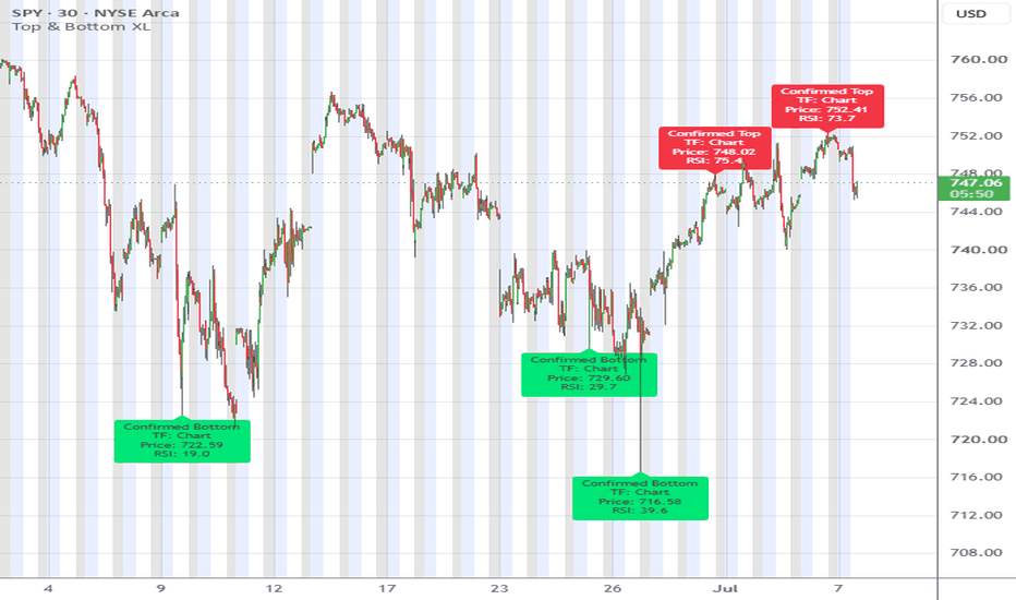
Top & Bottom Finder XL# Top & Bottom Finder XL
## User's Guide
---
# Overview
**Top & Bottom Finder XL** is a market exhaustion indicator.
Its purpose is **not** to predict every swing high and swing low.
Instead, it attempts to identify **high-probability exhaustion points** where price has become statistically extended and has a greater chance of reversing.
Unlike traditional pivot indicators, this indicator combines several independent filters:
* Structural pivots
* Momentum (RSI)
* Trend extension
* Volume
* Range expansion
Only when the selected filters agree does the indicator produce a **Confirmed Top** or **Confirmed Bottom**.
---
# How the Indicator Works
Every signal goes through the following process:
### Step 1 — Find a Pivot
The indicator first looks for a legitimate swing high or swing low using TradingView's pivot algorithm.
A pivot is not confirmed until the required number of right bars has completed.
Example:
Left = 100
Right = 5
means:
* current high must be higher than the previous 100 bars
* and remain the highest point for the next 5 bars
Only then is it officially a pivot.
---
### Step 2 — Apply RSI Filter (Optional)
Purpose:
Avoid taking pivots that occur without momentum extremes.
A top requires
RSI ≥ Top Threshold
A bottom requires
RSI ≤ Bottom Threshold
Default:
Top = 65
Bottom = 35
Disabling this filter means RSI is ignored completely.
---
### Step 3 — Apply Trend Extension Filter (Optional)
Purpose:
Avoid taking pivots that are too close to the trend.
The indicator measures:
Distance from EMA
using ATR.
Formula:
Distance =
Price − EMA
divided by ATR
Example
EMA = 100
ATR = 2
Price = 110
Distance =
10 ÷ 2
= 5 ATR
If Minimum ATR Extension = 5
the signal passes.
Otherwise it is rejected.
This filter is extremely effective at removing mediocre signals.
---
### Step 4 — Confirmation Filter
This determines whether the pivot occurred with unusually strong participation.
There are four modes.
## Off
No confirmation required.
Every pivot that passes the other filters becomes confirmed.
Produces the most signals.
---
## Volume Only
The pivot bar must have
Volume >
Average Volume × Multiplier
Default
50-bar average
Multiplier = 2
---
## Range Only
The pivot candle must have
Range >
Average Range × Multiplier
This looks for unusually large candles.
---
## Volume + Range
The strictest mode.
Requires BOTH:
* high volume
* large candle
Produces the fewest signals.
Usually the highest quality.
---
# Timeframe Settings
## Calculation Timeframe
Allows calculations on another timeframe.
Example
Chart = 15 minute
Calculation = 1 hour
Signals are calculated from hourly data but displayed on the 15-minute chart.
Leave blank to use the current chart timeframe.
---
# Pivot Settings
## Pivot Bars Left
Controls how significant the pivot must be.
Small values
More signals
Less significant
Large values
Fewer signals
More important turning points
Default
100
---
## Pivot Bars Right
Controls confirmation delay.
Larger values
Later signals
Higher confidence
Smaller values
Earlier signals
More false signals
Default
5
---
# Signal Filters
## Use RSI Filter
Enable or disable RSI completely.
---
## RSI Length
Default
14
Controls how RSI is calculated.
---
## Top RSI Threshold
Minimum RSI required for tops.
Default
65
Higher values
Fewer signals
---
## Bottom RSI Threshold
Maximum RSI allowed for bottoms.
Default
35
Lower values
Fewer signals
---
## Use Trend EMA Filter
Turns EMA distance filtering on or off.
---
## Trend EMA Length
Default
200
Long-term trend reference.
---
## ATR Length
Default
14
Used to normalize volatility.
---
## Minimum ATR Extension
Default
5 ATR
Controls how far price must stretch away from the EMA.
Higher values
Only extreme exhaustion
Lower values
More frequent signals
---
## Confirmation Mode
Options:
* Off
* Volume Only
* Range Only
* Volume + Range
Determines final confirmation.
---
## Volume / Range Average Length
Default
50
Average period used for volume and range comparisons.
---
## Volume Multiplier
Default
2
Required increase above average volume.
Example
Average volume = 100,000
Multiplier = 2
Required volume
200,000
---
## Range Expansion Multiplier
Default
0.5
Required increase above average candle range.
Higher values
Require larger candles.
---
# Display Settings
## Show Trend EMA
Displays the EMA used for trend extension.
Useful for visualizing how stretched price became.
---
## Show Watch Signals
Displays every confirmed pivot before filtering.
Watch signals represent:
"Potential reversal areas."
Confirmed signals represent:
"Filtered, higher-probability reversal areas."
---
## Color Settings
Customize:
* Watch Tops
* Watch Bottoms
* Confirmed Tops
* Confirmed Bottoms
* EMA
---
# Label Controls
These options determine what information appears inside Confirmed labels.
---
## Show Price
Displays pivot price.
Example
Price
145.32
---
## Show Pivot Settings
Displays
Left / Right
Example
100 / 5
Useful when comparing settings.
---
## Show RSI
Displays RSI at the pivot.
Example
RSI
72.5
---
## Show Volume
Displays pivot volume.
Useful when Volume confirmation is enabled.
---
## Show ATR
Displays ATR at the pivot.
Important:
This is **not** the distance from the EMA.
It simply displays the market's volatility (ATR) at the time the pivot formed.
Higher ATR means a more volatile market.
Lower ATR means a quieter market.
---
## Show EMA Distance
Displays
Distance from EMA
measured in ATRs.
Example
EMA Dist
5.82 ATR
This is arguably the most useful statistic on the label because it quantifies how extended price was when the reversal occurred.
---
## Show Confirmation Type
Displays how the confirmation filter was satisfied.
Possible values:
* Volume
* Range
* Volume + Range
* None
---
# Alerts
The indicator includes four alerts:
### Confirmed Top Found
Generated when a filtered top is confirmed.
---
### Confirmed Bottom Found
Generated when a filtered bottom is confirmed.
---
### Top Watch
Generated for every structural pivot high before filtering.
---
### Bottom Watch
Generated for every structural pivot low before filtering.
---
# Understanding Signal Timing
This is important.
The indicator **does not repaint**, but it is intentionally delayed by the **Pivot Bars Right** setting.
Example:
Right Bars = 5
A top occurring today will only be confirmed after five additional bars have closed without a higher high.
This is necessary because the indicator waits for confirmation that the pivot is truly established.
---
# Suggested Starting Settings
## Swing Trading (Daily)
* Left Bars: 100
* Right Bars: 5
* RSI: On
* EMA Filter: On
* Minimum ATR Extension: 5
* Confirmation: Volume Only
---
## Position Trading (Weekly)
* Left Bars: 150–250
* Right Bars: 5–10
* ATR Extension: 6–8
* Confirmation: Volume + Range
---
## Short-Term Trading (15–60 Minute)
* Left Bars: 30–60
* Right Bars: 3–5
* ATR Extension: 3–4
* Confirmation: Volume Only
---
# Strengths
* Adapts to market volatility using ATR.
* Filters out many insignificant pivots.
* Uses multiple independent confirmation methods.
* Supports higher-timeframe calculations on lower-timeframe charts.
* Does not repaint after pivot confirmation.
* Highly configurable for different trading styles.
---
# Current Limitations
* Signals are intentionally delayed by the selected Right Bars value.
* The indicator identifies **exhaustion points**, not trend direction.
* Strong trends can continue after a confirmed top or bottom, especially during momentum-driven markets.
* Volume confirmation may be less reliable for markets where reported volume is limited or synthetic (such as many forex CFDs).
---
# Best Use Practices
The indicator performs best when used to identify **areas of elevated reversal probability**, not as a standalone buy or sell trigger. Higher-quality setups occur when a confirmed signal aligns with higher-timeframe support or resistance, trendline breaks, divergence, or other independent forms of technical confirmation. Treat confirmed tops and bottoms as locations to focus attention rather than automatic entry points.
지표
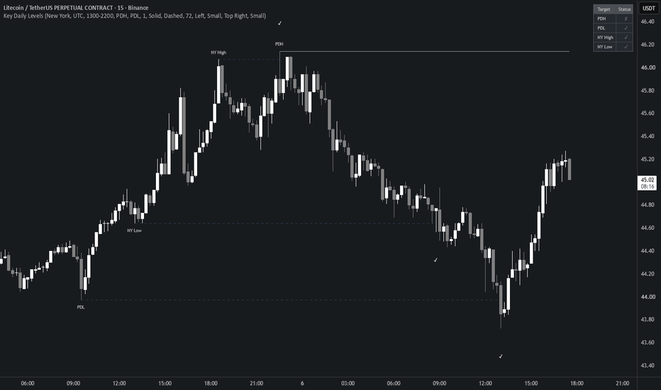
Key Daily Levels by Flip On DipKey Daily Levels marks the reference points most intraday traders watch: the previous day high and low, and the high and low of a session you choose.
Sessions cover New York, London, Tokyo and Sydney, plus a custom option for any other window. Each preset uses the session's local exchange hours and adjusts for daylight saving on its own, so the times stay correct through the year instead of drifting an hour twice a year.
When a session extreme sits at the same price as the previous day high or low, the two are combined into one line instead of being drawn twice. The label then reads something like PDH (NY High), so both are kept without doubling up on the chart.
Each level is drawn from the bar where it formed and runs until price takes it out. The line stops on the exact bar that crossed it. The wick counts, so it doesn't wait for a close. A level still holding is shown solid; once it gets taken it turns dashed and fades, and a small check is dropped on the bar that swept it. A small table in the corner lists each level and whether it has been swept.
Cross detection accounts for gaps, and the trading day is read from each symbol's own calendar rather than a fixed clock, so levels stay accurate on crypto, futures and stocks, on continuous charts and gapped ones alike.
Colors, line styles and width, label options, the sweep marker and the table are all configurable.
Open source, free to study or extend. 지표
Bedaiwi's Smart PivotsBedaiwi's Smart Pivots is a three-level market-structure indicator that classifies price turning points as Minor, Intermediate, and Major highs and lows.
HOW IT WORKS
Minor Pivots
A Minor High is confirmed when the middle bar of a three-bar formation has a high that is strictly higher than the highs immediately before and after it.
A Minor Low is confirmed when the middle bar has a low that is strictly lower than the lows immediately before and after it.
Equal highs and equal lows are not treated as Minor pivots.
Intermediate Pivots
Intermediate pivots are derived from confirmed sequences of Minor pivots.
An Intermediate High is identified when a higher Minor High is followed by a lower Minor High.
An Intermediate Low is identified when a lower Minor Low is followed by a higher Minor Low.
Major Pivots
Major pivots apply the same hierarchical logic to confirmed Intermediate pivots.
A Major High is identified when a higher Intermediate High is followed by a lower Intermediate High.
A Major Low is identified when a lower Intermediate Low is followed by a higher Intermediate Low.
SYMBOLS AND COLORS
- Red diamond: Intermediate High
- Green diamond: Intermediate Low
- Red exclamation mark: Major High
- Green exclamation mark: Major Low
Optional Minor pivots use the same High and Low color settings.
When the replacement option is enabled, an Intermediate symbol is removed and replaced with an exclamation mark if the same point is later promoted to Major status.
HISTORICAL PLOTTING AND CONFIRMATION DELAY
Pivot identification requires subsequent price information.
A Minor pivot is confirmed only after the following bar closes. Intermediate and Major pivots require additional confirmed pivot sequences, so their confirmation occurs later.
After confirmation, the indicator places the symbol on the historical bar where the relevant high or low occurred. Therefore, a symbol displayed on an earlier bar was not necessarily available in real time on that bar.
Historical placement is used only to show the actual location of the confirmed turning point. It should not be interpreted as a signal that was known on the historical pivot bar.
SETTINGS
Users can:
- Show or hide Minor pivots
- Show or hide Intermediate pivots
- Show or hide Major pivots
- Replace an Intermediate symbol when it becomes a Major pivot
- Customize High and Low pivot colors
PRACTICAL USE
Smart Pivots can help users:
- Study market structure
- Identify significant historical swing highs and lows
- Separate short-term fluctuations from higher-level price structure
- Review possible support and resistance areas
- Add context to discretionary price-action analysis
LIMITATIONS
Smart Pivots is an analytical indicator. It does not place trading orders and does not define entries, exits, stop-loss levels, profit targets, position sizing, or expected returns.
Pivot confirmation is delayed by design because later price action is required. Results may vary between symbols, timeframes, sessions, and data feeds.
The indicator does not identify final market tops or bottoms with certainty. Historical observations do not guarantee future market behavior.
This script is provided for research and educational purposes only. It is not financial or investment advice. 지표

Price Action Breakout Trend [QuantAlgo]🟢 Overview
Price Action Breakout Trend is a trend-following indicator built on structural range breakouts rather than moving average crossovers or oscillator thresholds. It tracks the highest high and lowest low of a defined lookback window to establish the levels price must decisively clear to confirm a directional shift, anchoring a trailing stop that ratchets in the trend's direction and reverses only when price breaks through it, helping traders distinguish genuine trend continuation from the shallow pullbacks that punctuate every sustained move across all timeframes and markets.
🟢 How It Works
The foundation of the indicator is the range defined by recent price extremes. On each bar it references the highest high and lowest low of the prior lookback window, excluding the current bar so the reference range is locked in before price interacts with it:
prior_high = ta.highest(high, lookback)
prior_low = ta.lowest(low, lookback)
These two levels frame the breakout boundaries. Rather than reacting to every marginal touch, the indicator lets you define what qualifies as a genuine break through the confirmation setting, which determines whether the closing price or the full bar extreme is tested against the trailing stop:
test_down = confirmation == 'Close' ? close : low
test_up = confirmation == 'Close' ? close : high
From these, a single trailing stop is maintained on the active side of the trend. While the trend holds bullish the stop ratchets upward, advancing to track the rising lookback low and never loosening, and the trend reverses the moment the tested price breaks below it:
if trend == 1
trail := math.max(trail, prior_low)
if test_down < trail
trend := -1
trail := prior_high
On that reversal the stop immediately re-anchors to the opposite extreme, flipping above price to begin trailing the new downtrend, where the mirror of this same logic ratchets the stop lower and flips the trend back to bullish once price breaks above it. Because the reversal is triggered by the same stop price has been trailing, the line is not a passive overlay but the actual decision boundary, with no separate signal calculation sitting behind it. This makes the indicator a continuous stop-and-reverse system that always holds a committed direction, retaining its bullish or bearish reading through every pullback contained within the range until price clears the trailing level.
🟢 Signal Interpretation
▶ Bullish Trend (Green): When price breaks above the trailing stop and the trend flips up, the indicator enters bullish mode with green coloring applied across the stop, gradient fill, and breakout levels. The stop sits below price and ratchets higher as the trend develops, and the reading holds through pullbacks that stay above it. The flip into green, marked by an up triangle beneath the bar, identifies a potential long/buy opportunity, with subsequent pullbacks toward the rising stop offering potential continuation entries while the trend remains intact.
▶ Bearish Trend (Red): When price breaks below the trailing stop and the trend flips down, the indicator enters bearish mode with red coloring across all visual elements. The stop sits above price and ratchets lower as the decline extends, holding bearish through rallies that fail to reclaim it. The flip into red, marked by a down triangle above the bar, identifies a potential short/sell opportunity, with rallies back toward the falling stop offering potential continuation entries on the downside.
🟢 Features
▶ Preconfigured Presets: Three parameter sets cover different trading approaches. "Default" targets swing trading on 4-hour and daily charts with a 10-bar lookback and close-based confirmation, filtering marginal breaks while staying responsive to genuine shifts. "Fast Response" shortens the lookback to 5 bars and switches to wick-based confirmation for intraday charts, where the trend needs to flip as soon as price trades beyond a recent extreme. "Smooth Trend" extends the lookback to 25 bars with close confirmation for position trading on daily and weekly timeframes, where the cost of a false flip exceeds the cost of a delayed one. Selecting a preset overrides the individual lookback and confirmation inputs.
▶ Built-in Alerts: Three alert conditions cover all directional states. "Bullish Breakout Signal" fires on the bar where the trend confirms bullish. "Bearish Breakout Signal" fires on the bar where it confirms bearish. "Any Breakout Signal" combines both into a single condition for traders who want a unified notification regardless of direction.
▶ Visual Customization: Six color presets (Classic, Aqua, Cosmic, Cyber, Neon, and Custom) apply coordinated bullish and bearish schemes across the trailing stop, gradient fill, breakout levels, markers, and optional bar and background coloring. Independent toggles control each visual layer, so the trailing stop line, the gradient fill that ramps from the stop toward price, the triangle markers printed on each flip, and the underlying breakout levels that frame the active range can each be shown or hidden without affecting the others. Bar coloring tints price candles with the active trend color at a configurable transparency, and background coloring extends the directional tint across the full chart pane. Both are disabled by default and controlled independently.
*Tips: Layer the Price Action Breakout Trend with complementary analysis rather than treating it as a standalone trading tool. Breakouts hold most reliably when backed by participation, so combine each flip with volume context, since a break on expanding volume is far more likely to sustain than one on thin flow, and read the level being cleared against market structure, as a breakout through a well-established swing high or low carries more significance than one in open space. Pairing this script with volume, open interest, CVD, market structure, and mean reversion indicators from our QuantAlgo toolkit can further validate a breakout before entry. 지표

Dynamic Speed Pivot Supertrend [ZenAlphaAlgo]Overview
The Dynamic Speed Pivot Supertrend is an advanced trend-following indicator designed to address the lag associated with pivot-based trailing stop losses. While pivot points excel at filtering noise and identifying significant trend structures, their delayed confirmation (e.g. waiting for $N$ bars to establish a pivot) can lead to late exits or entries when market velocity changes rapidly.
This script solves this problem by introducing a dynamic, momentum-based velocity factor that adaptively increases responsiveness during high-momentum moves while maintaining standard smoothing during sideways consolidation.
Credits & Attribution
The foundation of this script—calculating a Supertrend center line using weighted averages of pivot highs and lows—is based on the original work of LonesomeTheBlue (www.tradingview.com). We would like to credit them for their excellent contribution to the TradingView community.
This script modifies the original logic by introducing price velocity (ROC-based normalized speed) directly into the center line's smoothing calculation.
How it Works (Methodology)
The core feature of this indicator is Dynamic Speed Adaptive Smoothing:
Velocity Calculation: On every bar, the script computes the absolute Rate of Change (ROC) of the closing price over the specified "Speed Period (ROC)". This measures the speed of price movement.
Normalization: The current ROC is normalized against the highest ROC value found within the "Max Speed Lookback" window. This divides the current speed by the highest speed observed in the lookback window, bounding the price velocity dynamically between 0.0 (fully flat/no movement) and 1.0 (maximum acceleration).
Adaptive Smoothing: When a new pivot point is formed, the center line adjusts its position using an adaptive weighting calculation. If dynamic smoothing is enabled, the smoothing factor (Alpha) increases during high-velocity periods by selecting the maximum value between a baseline of 0.33 and the calculated normalized speed:
During High Acceleration (Alpha near 1.0) : The center line reacts instantly to the new pivot point, rapidly tightening the trailing stop.
During Consolidation (Alpha at 0.33 baseline) : The smoothing factor relaxes back to the stable baseline, preventing unnecessary whipsaws.
How to Read Visual Cues (Interpretation)
Trailing Stop Line:
Lime Green Line : Represents an active bullish trend (long). Price is trading above the trailing stop.
Red Line : Represents an active bearish trend (short). Price is trading below the trailing stop.
Stop Start Shapes (Circles) : A circle is plotted directly on the trailing stop line at the exact bar a new trend begins (the trend flip point).
Buy/Sell Shapes:
Triangle Up (below bar): Plotted on a bullish trend flip (Buy signal).
Triangle Down (above bar): Plotted on a bearish trend flip (Sell signal).
Gradient Background Fill: A transparent color band spans between the trailing stop line and the closing price. The gradient starts translucent (75% transparency) at the stop line and fades out completely (100% transparency) towards the current price, indicating the safety buffer visually.
Center Line : The gray dotted line represents the adaptive center line around which the ATR bands are calculated.
Input Parameters Guide
Pivot Point Period (default: 2) : The number of left and right bars required to confirm a pivot high or low. Larger values filter more noise but increase confirmation delay.
ATR Factor (default: 6.0) : The multiplier applied to the Average True Range (ATR) to determine the distance of the bands from the center line.
ATR Period (default: 9) : The lookback window for the ATR volatility calculation.
Use Dynamic Center Line Smoothing (default: true): Toggles between the dynamic momentum-based smoothing coefficient and the static 0.33 smoothing.
Speed Period (ROC) (default: 4) : The lookback window for the Rate of Change calculation used to determine current price speed.
Max Speed Lookback (default: 50) : The lookback window used to establish the maximum historical speed for normalization.
Display & Styling : Toggles to independently show or hide the Trailing Stop line, the Center line, the buy/sell shapes, or the background gradient fill.
Alerts
Alert Conditions : Standard alert triggers are available via the TradingView Alert Dialog for both Buy / Bullish Trend Flip and Sell / Bearish Trend Flip.
Dynamic Alert s: Script-based dynamic alerts trigger on the bar close when a trend flip occurs.
Disclaimer
This indicator is created for educational and analytical purposes only. Past performance does not guarantee future results. Trend-following indicators are subject to drawdowns during sideways/ranging market conditions. Always perform thorough backtesting and practice proper risk management. 지표

Previous Day Week Month Quarter High LowHTF Key Levels
📌 Overview
A clean, lightweight indicator that automatically plots key support and resistance levels from higher timeframes. These levels represent previous period highs and lows - areas where institutional traders and smart money often place orders.
📊 Levels Displayed
PDH / PDL - Previous Day High & Low
D2H / D2L - 2 Days Ago High & Low
PWH / PWL - Previous Week High & Low
PMH / PML - Previous Month High & Low
PQH / PQL - Previous Quarter High & Low
🎯 Why These Levels Matter
Higher timeframe highs and lows act as significant support and resistance zones. Price often reacts at these levels because:
Institutional orders cluster around these areas
They represent clear market structure points
Many traders watch and trade these levels
They serve as natural profit targets and stop loss areas
🔔 Built-in Alerts
Get notified instantly when price touches any level. Alert messages include:
Symbol name
Which level was touched (e.g., PDH, PWL)
The level price
Current price
Example alert: "🔔 XAUUSD touched PDH (Previous Day High) at 2650.50 | Price: 2650.75"
⚙️ Settings
Levels
Toggle each timeframe individually (Day, 2-Day, Week, Month, Quarter)
Customize color for each level
Alerts
Master enable/disable for all alerts
Choose to alert on Highs only, Lows only, or both
Style
Line width (1-4)
Line style (Solid, Dashed, Dotted)
Extend right - how many bars lines extend into the future
📈 Best Used On
Intraday charts (1m, 5m, 15m, 1H, 4H) - See daily and weekly levels
Daily chart - See weekly, monthly, and quarterly levels
💡 How To Use
1. Add the indicator to your chart
2. Enable the timeframes you want to see
3. Customize colors to your preference
4. Set up an alert for "Any HTF Level Touch"
5. Watch for price reactions at these key levels
🔧 Technical Notes
Daily levels only appear on intraday charts
Weekly levels appear on intraday and daily charts
Monthly and quarterly levels appear on all timeframes except monthly
Lines are automatically redrawn at the start of each new period
Labels stay at the end of lines for easy identification
📝 Changelog
v1.0 - Initial release
If you find this indicator useful, please give it a like! 👍 지표

지표

지표

지표

Triangle Pattern Scanner (Symmetric / Ascending / Descending)Triangle Pattern Scanner automatically detects and draws Symmetric,
Ascending, and Descending triangle formations on the chart in real time,
using pivot-based geometry validation to ensure only structurally sound
patterns are displayed. A multi-timeframe table shows at a glance which
triangle types are currently forming across five user-defined timeframes.
━━━━━━━━━━━━━━━━━━━━━━━━━━━━━━━━
BACKGROUND — WHY TRIANGLE PATTERNS?
━━━━━━━━━━━━━━━━━━━━━━━━━━━━━━━━
Triangle patterns are among the most widely recognized continuation and
reversal formations in technical analysis. They form when price makes a
series of pivot highs and pivot lows that converge toward a single apex
point, compressing volatility before a potential breakout in either
direction.
Identifying them manually requires drawing trendlines across multiple
pivots, verifying that price stays within the boundaries throughout the
formation, checking that the lines actually converge ahead, and
distinguishing between the three types based on the angle of each
boundary line. This indicator automates all of those steps.
━━━━━━━━━━━━━━━━━━━━━━━━━━━━━━━━
THREE PATTERN TYPES
━━━━━━━━━━━━━━━━━━━━━━━━━━━━━━━━
SYMMETRIC TRIANGLE
Both the upper trendline (connecting pivot highs) and the lower trendline
(connecting pivot lows) slope toward each other — the upper falling, the
lower rising. Neither side is horizontal. The pattern is considered neutral
until the breakout direction is confirmed. A symmetry ratio check ensures
the two slopes are reasonably balanced rather than one side being nearly
flat while the other is very steep.
ASCENDING TRIANGLE
The upper trendline is nearly horizontal (price repeatedly tests the same
resistance level) while the lower trendline slopes upward (higher lows).
The pattern is considered bullish by structure, with the expectation of
an upward breakout through the flat resistance. The angle tolerance for
the horizontal line is configurable, giving you control over how strictly
"flat" the upper line must be.
DESCENDING TRIANGLE
The lower trendline is nearly horizontal (price repeatedly tests the same
support level) while the upper trendline slopes downward (lower highs).
The pattern is considered bearish by structure, with the expectation of
a downward breakout through the flat support. The same configurable angle
tolerance applies to the lower line.
━━━━━━━━━━━━━━━━━━━━━━━━━━━━━━━━
HOW IT WORKS — TECHNICAL DETAIL
━━━━━━━━━━━━━━━━━━━━━━━━━━━━━━━━
PIVOT DETECTION
The indicator uses Pine Script's ta.pivothigh() and ta.pivotlow() to
collect recent swing highs and swing lows. The Pivot Length input controls
the symmetric left-right lookback used by both functions — a pivot high
requires the highest high compared to an equal number of bars on both
sides. Up to 8 recent pivots of each type are stored in memory for
pattern scanning.
GEOMETRY VALIDATION
For each combination of two pivot highs and two pivot lows, the indicator
calculates the slopes and intercepts of the upper and lower trendlines,
then verifies:
— Convergence: the two lines must actually meet ahead of the current
bar (apex in the future), not behind it
— Containment: every bar between the formation's start and end must
have its high below the upper trendline and its low above the lower
trendline — no violations allowed
— Slope direction: upper falling + lower rising for symmetric; upper
flat + lower rising for ascending; lower flat + upper falling for
descending
— Alternating pivots: the four pivot points (2 highs, 2 lows) must
alternate in time order (H, L, H, L or L, H, L, H) — this prevents
false formations where all highs come before all lows or vice versa
— Symmetry ratio (symmetric only): the ratio of the two slopes must
exceed a minimum threshold so neither side dominates
ANGLE NORMALIZATION
The angle calculation normalizes price change against the formation's
own height and bar count rather than using raw price differences. This
makes the angle tolerance behave consistently across different symbols,
price ranges, and timeframes — the same degree setting works on a $1
stock and a $50,000 asset alike.
DUPLICATE FILTERING
Once a valid formation is found, its starting bar position is recorded.
Any subsequent formation of the same type starting within a short
distance of an existing one is treated as a duplicate and skipped,
preventing the same structure from being drawn multiple times with
slightly different pivot combinations.
━━━━━━━━━━━━━━━━━━━━━━━━━━━━━━━━
MULTI-TIMEFRAME TABLE
━━━━━━━━━━━━━━━━━━━━━━━━━━━━━━━━
A table in the bottom-right corner runs the same pattern detection
logic across five user-defined timeframes simultaneously and displays
whether each triangle type is currently detected on each timeframe.
A ✅ marks a detected pattern; — means none found.
This gives you a fast structural overview without switching charts —
if the 1H and 4H both show an ascending triangle, that confluence may
carry more weight than a pattern on a single timeframe alone.
The MTF scan uses a sampled bar validation (checking approximately 12
evenly-spaced points within the formation rather than every bar) to
keep performance reasonable across multiple timeframes.
━━━━━━━━━━━━━━━━━━━━━━━━━━━━━━━━
HOW TO USE
━━━━━━━━━━━━━━━━━━━━━━━━━━━━━━━━
1. SET PIVOT LENGTH
Controls how significant a swing high or low must be. Lower values
(2–5) detect more frequent, shorter-term pivots. Higher values
(10–20) require more surrounding bars and detect only major structure.
2. SET LOOKBACK
Maximum bar span a formation can cover. Increase this to allow
larger, longer-term formations; decrease it to focus on recent
structure only.
3. ADJUST FLAT LINE ANGLE TOLERANCE
For ascending and descending triangles, this controls how strictly
the flat boundary must be horizontal. At 0° only perfectly
horizontal lines qualify; at 10–15° a moderate slope is allowed.
Increase if you want more patterns detected; decrease for stricter
horizontal requirement.
4. CONTROL MAX PATTERNS
Each pattern type has a separate maximum count. Set to 1 to show
only the most recent valid formation per type, or increase to see
multiple simultaneous formations.
5. SET LINE EXTENSION
How many bars beyond the formation the trendlines extend, giving
a visual projection of where the boundaries will be in the future.
6. READ THE MTF TABLE
Use the bottom-right table to check whether the same pattern type
is forming on higher timeframes, and prioritize formations that
appear on multiple timeframes.
━━━━━━━━━━━━━━━━━━━━━━━━━━━━━━━━
WHERE TO USE IT
━━━━━━━━━━━━━━━━━━━━━━━━━━━━━━━━
Works on any asset class (crypto, forex, equities, indices, commodities)
and any timeframe. Particularly useful for:
— Breakout traders who want to be positioned before a triangle resolves
— Swing traders looking for compression zones where volatility is
contracting ahead of an expansion move
— Multi-timeframe analysis where higher-timeframe triangle formations
provide context for lower-timeframe entries
— Market structure analysis where triangle patterns help define the
current phase of price action (consolidation vs. expansion)
━━━━━━━━━━━━━━━━━━━━━━━━━━━━━━━━
SETTINGS REFERENCE
━━━━━━━━━━━━━━━━━━━━━━━━━━━━━━━━
Pivot Length — symmetric lookback for swing high/low detection
Lookback — maximum bar span a formation may cover
Max Triangles (each) — maximum formations shown per pattern type
Show/Hide (each type) — toggle each pattern type independently
Line Width — visual thickness of the trendlines
Line Extension (Bars) — how far beyond the formation lines extend
Show Labels — enable/disable the formation labels on chart
Flat Line Angle Tolerance — horizontal strictness for ascending/descending
MTF Timeframes (TF 1–5) — the five timeframes scanned in the MTF table
━━━━━━━━━━━━━━━━━━━━━━━━━━━━━━━━
ORIGINALITY
━━━━━━━━━━━━━━━━━━━━━━━━━━━━━━━━
Triangle pattern detection is a known concept, but this indicator's
specific implementation combines several elements not commonly found
together: full bar-by-bar containment validation (not just endpoint
checking), alternating pivot order enforcement, normalized angle
calculation that works consistently across different assets and
timeframes, and a simultaneous five-timeframe detection table — all
within a single indicator. The flat-line angle tolerance using
formation-height normalization is the author's own approach to making
ascending and descending triangle detection robust across varied market
conditions.
━━━━━━━━━━━━━━━━━━━━━━━━━━━━━━━━
DISCLAIMER
━━━━━━━━━━━━━━━━━━━━━━━━━━━━━━━━
This indicator is intended for educational and analytical purposes only.
Triangle patterns do not guarantee a breakout in any particular
direction. Always use proper risk management and combine multiple forms
of analysis before making trading decisions. 지표

Session LevelsPlots the High/Low of the three major sessions, the previous FULL trading day's High/Low, the all-time high, and fires sweep alerts when price takes out any of these levels.
ROLLING WINDOW:
// Each session shows only the CURRENT trading day's level plus the previous
// trading day's level -- never older -- so old session lines stop piling up
// and crossing each other.
//
// WEEKLY RESET:
// A trading day starts at 18:00 ET (CME open / Asia open). At the Sunday
// 18:00 ET weekly open every session line is wiped for a clean week.
//
// HOLIDAY AWARENESS:
// The previous-day references (PDH/PDL, the rolling session "previous day",
// and the Monday RTH/Post-market refs) skip US market holidays AND early-close
// half-days (Juneteenth, July 3, Black Friday, Christmas Eve...) and pull from
// the most recent FULL session instead. Holidays are computed algorithmically
// (incl. Good Friday via computus and the NYSE Sat->Fri / Sun->Mon observed
// rules), so there is no yearly list to maintain. Example: the Mon after a
// Juneteenth Friday references Thursday.
// PDH/PDL use a CALENDAR-day (midnight) boundary by default so the prior
// evening's overnight move is NOT lumped into the day -- switch to "RTH only"
// in the inputs if you prefer the cash-session high/low. They draw as a single
// line spanning only the live reference, not a step across all history.
//
// MONDAY REFERENCES:
// Monday's "previous day" is the weekend, so it shows the last full day's
// RTH High/Low and Post-market High/Low for context. These clear Mon evening.
//
// SWEEP ALERTS (new):
// Alert conditions fire when price sweeps a session High/Low (after that
// session closes), the PDH/PDL, or makes a new all-time high. 지표

Dealing Range Equilibrium & Premium/Discount Zones (SMC)This indicator is a streamlined visualization tool designed specifically for traders utilizing Smart Money Concepts (SMC) and ICT methodologies. It automatically detects the current structural Dealing Range and divides it into logical quadrants: Premium, Discount, and Equilibrium.
Rather than manually drawing Fibonacci grids on every new structural swing, this script dynamically anchors to the most recent validated pivot points, keeping your charts clean and your focus on price action.
Underlying Logic & Calculations
The script relies on a standard pivot-detection algorithm to establish the boundaries of the dealing range:
Swing Detection: It uses standard ta.pivothigh and ta.pivotlow functions to scan for structural highs and lows based on a user-defined "Swing Lookback Period" (default is 20 bars). A pivot high is confirmed when the central candle is higher than the n candles to its left and right.
Range Anchoring: Once a new swing high or low is validated, the top or bottom variables update respectively. These horizontal levels persist forward in time until a new structural pivot breaks them.
Equilibrium Calculation: The script calculates the mathematical median of the current range by adding the active Swing High and Swing Low, then dividing by two (top + bottom) / 2.
Visuals & Practical Usage
In SMC theory, markets move from consolidation to expansion, seeking liquidity. The dealing range helps traders contextualize where price is relative to recent structure:
Premium Zone (Red Fill): The upper 50% of the dealing range. In a bearish structural environment, traders look for price to retrace into the Premium zone to identify high-probability short setups or institutional distribution.
Discount Zone (Green Fill): The lower 50% of the dealing range. In a bullish environment, traders wait for price to retrace into the Discount zone to look for long setups or institutional accumulation.
Equilibrium (Midline): The exact 50% level (fair value). Price action around this line often acts as a transition point or near-term support/resistance.
Settings
Swing Lookback Period: Controls the sensitivity of the pivot detection. A lower number (e.g., 5 or 10) will capture micro-structure and minor pullbacks, ideal for scalping. A higher number (e.g., 20 or 50) will anchor only to major macro-swings.
Show Labels: Toggles the text labels on the current price axis to keep the chart clean if desired. 지표

지표

Intraday Pivot Points [DYNA]Intraday Pivot Points draws a fresh set of horizontal price levels at the start of every trading day, calculated entirely from the previous day's high, low, and close. The central pivot anchors the day's bias -- price above it skews bullish, below it skews bearish -- and three resistance levels (R1, R2, R3) plus three support levels (S1, S2, S3) frame the typical and extreme intraday targets. Levels are computed once at session open and stay fixed all day, which makes them clean structural reference points that never repaint or shift mid-session.
Four pivot methods are built in. Classic uses the original floor-trader formula. Fibonacci offsets the levels at 38.2%, 61.8%, and 100% of yesterday's range. Woodie applies a close-weighted pivot. Camarilla produces tighter close-anchored levels often used for mean-reversion. Switch between them with one dropdown -- the rest of the indicator works the same.
Key Features
Four Pivot Methods -- Classic, Fibonacci, Woodie, Camarilla. Pick the one that matches your style: wider levels for breakouts, tighter Camarilla levels for fades.
Pivot + 6 Levels -- Central pivot plus R1/R2/R3 above and S1/S2/S3 below. Each level can be toggled independently to keep the chart clean.
Auto-Reset Each Session -- Lines are drawn fresh at the start of every new trading day from the previous day's HLC. Default view shows only today's levels for a clean chart; raise the history limit (up to 50 sessions) when you want to study past days.
Live Right-Edge Labels -- Every visible level carries a price tag that tracks the latest bar so the level name and exact price stay visible at the edge of the chart.
Configurable Visuals -- Choose line style (solid, dashed, dotted), width for pivot vs. S/R, and toggle each level. Pivot defaults to thicker than S/R for emphasis.
One-Shot Alerts -- Pivot cross (bullish or bearish), R2 reached, S2 reached. Each alert latches per session, so you get one clean signal per direction per day -- no spam from re-crosses.
No Repainting -- Yesterday's HLC is fetched with the canonical lookahead-on + bar-offset pattern. Levels stay constant throughout the session and never reference future data.
How It Works
At the start of each trading day, the indicator pulls the previous completed daily bar's high, low, and close from the chart's symbol via request.security . Those three numbers feed the chosen method's formula to produce the pivot and the six S/R levels. The levels are drawn as horizontal lines with the pivot rendered thicker by default, and a price-tag label is placed at the right edge of each visible line.
As new intraday bars arrive, the indicator extends the right edge of today's lines forward so they always reach the latest bar. When a new trading day begins, today's lines freeze at their final right-edge position and a new set of lines is created. Past sessions remain visible up to the Max Sessions to Keep limit, then are deleted automatically to stay within TradingView's drawing budget.
Three alert conditions watch for the most actionable level interactions. The first close that crosses the central pivot in either direction fires the pivot-cross alert (bullish above, bearish below). The first close at or above R2 fires the R2-reached alert; the first close at or below S2 fires the S2-reached alert. Each alert latches when it fires and resets only at the start of the next day, so you cannot get a flood of repeat triggers from price oscillating around a level.
Classic pivots on a 15-minute chart: yellow central pivot with three red resistance levels above and three green support levels below. Each level carries a live price tag at the right edge.
Settings
Pivot Method (default: Classic) selects the formula. Classic is the universal default and the widest typical-range method. Fibonacci uses 38.2%/61.8%/100% range offsets which sit between Classic and Camarilla in tightness. Woodie applies a close-weighted pivot that biases the central level toward the previous close; the S/R offsets are the same as Classic. Camarilla produces close-anchored levels with a 1.1× scaling factor and is significantly tighter than the others -- often used for mean-reversion fades inside the day's range.
Max Sessions to Keep (default: 1) limits how many trading sessions of pivot lines stay on the chart. The default of 1 shows only today's pivots, which is the cleanest live-trading view -- consecutive days often have overlapping S/R prices and stacking three or more days of labels can clutter the chart. Raise to 5-10 to study how price has been respecting recent days' levels, or up to 50 for a long historical record.
The visual section toggles each level independently ( Show R1 through Show R3 , Show S1 through Show S3 , Show Price Labels ). Line Style (Solid / Dashed / Dotted) and the two width inputs ( Pivot Line Width , S/R Line Width ) control appearance. The three alert toggles enable or disable the pivot-cross, R2-reach, and S2-reach alerts individually.
Alerts
Bullish Pivot Cross -- Fires on the first close above the central pivot in a session. "Intraday Pivot Points : Price crossed above the central pivot."
Bearish Pivot Cross -- Fires on the first close below the central pivot in a session. "Intraday Pivot Points : Price crossed below the central pivot."
R2 Reached -- Fires on the first close at or above R2 in a session. "Intraday Pivot Points : Price reached R2 -- extreme upside target."
S2 Reached -- Fires on the first close at or below S2 in a session. "Intraday Pivot Points : Price reached S2 -- extreme downside target."
To configure: open TradingView's Alerts panel, choose "Intraday Pivot Points " from the condition dropdown, pick the desired alert type, and select your notification channel.
Best Practices
Use intraday timeframes (1m, 5m, 15m, 1h). Pivot points are a daily-anchored intraday tool; on daily charts each bar shows its own pivots which is rarely useful.
Match the method to the regime. On wide-range trending days Classic and Woodie give the most usable structure. On tight-range chop, Camarilla's narrower levels produce cleaner fade entries.
Watch the pivot first, the S/R levels second. The single most important level on any session is whether price holds above or below the central pivot. R/S are secondary.
Look for confluence. A pivot level that aligns with a moving average, VWAP, or a previous-day swing is much more reliable than the level on its own.
R2/S2 reaches tend to be relatively uncommon on Classic pivots. When price does reach them, the move is already extended -- many traders treat that as a spot to study for a fade rather than a chase.
Default Max Sessions to Keep is 1 (only today's pivots) -- the cleanest view for live trading. Raise to 5-10 to back-study recent prior pivots, or up to 50 for long historical context.
Part of the DYNA Ecosystem
Intraday Pivot Points is a free indicator built with the same design standards as the DYNA premium suite. For complete trade management with automatic stop loss, break-even, trailing stops, and multi-target systems, explore the full DYNA indicator collection.
Disclaimer
This indicator is a technical analysis and educational tool only -- it is not financial advice and makes no guarantee of any outcome. Past performance does not predict future results. Always do your own research and use proper position sizing and risk management.
Created by Varun Nidhi · varunnidhi.com
A free DYNA indicator — self-contained, no repainting.
지표

EdgeHunter Levels & SweepsEdgeHunter Levels + Sweeps is a multi-timeframe reference level tracker that draws the key highs and lows traders use for context, monitors each level for sweeps in real time using 1-minute resolution, tracks whether a higher timeframe close has reclaimed back inside a swept level, and fires alerts at each stage. All levels, sweep states, and reclaim status are summarised in a live on-chart table.
Levels Tracked
The indicator draws and monitors the following levels simultaneously:
Previous Day High and Low — sourced from the daily timeframe, updated each new session
Previous 1-Hour High and Low — sourced from the 60-minute timeframe, updated each new hour
Previous 4-Hour High and Low — sourced from the 4-hour timeframe, updated each new 4-hour close
Asia Session High and Low — built from a configurable Asia session window (default 20:00–00:00 NY time)
London Session High and Low — built from a configurable London session window (default 02:00–05:00 NY time)
Midnight Open — the opening price of the 00:00 candle in the configured timezone, tracked as a reference level for the trading day
Previous Day Volume Profile Levels — manually entered VAH, VAL, and POC from an external volume profile tool
Each level is drawn from its originating bar and extends forward until swept, at which point the line stops extending and its style switches to dotted to visually indicate it has been taken.
Sweep Detection
All sweep detection runs internally against 1-minute data, regardless of the timeframe the chart is set to. A level is marked swept the moment any 1-minute bar's high crosses above a high level or low crosses below a low level. This ensures sweeps are caught without waiting for a higher timeframe candle to close.
Reclaim Tracking
After a level is swept, the indicator continues monitoring whether price has closed back inside — on a user-selected higher timeframe (configurable, e.g., 1-hour). Each level carries one of three states at any time: Unswept, Outside (swept and the HTF close confirmed outside), or Inside (swept and the HTF close confirmed back inside the level). This reclaim state is what many traders consider confirmation that the sweep was a liquidity grab rather than a genuine directional break.
Status Table
A live table displays every tracked level with its name, current sweep status (SWEPT / UNSWEPT), and current close status relative to the chosen HTF. The table background colour changes to indicate swept levels at a glance. The table position, text size, and colour scheme are fully configurable.
Label Anti-Stacking
When multiple levels are close together in price, labels are automatically staggered vertically to prevent overlap. A configurable minimum separation and step size control how aggressively labels are pushed apart. This keeps the chart readable even when session highs and lows cluster in a narrow range.
Alerts
Three categories of alerts are available:
Level Swept (1m) — fires when any tracked level is crossed using 1-minute precision, naming the level and price
HTF Closed Inside — fires when a previously swept level is reclaimed on the chosen HTF close, indicating a potential false break
VP Level Touch — fires when price touches the manually entered VAH, VAL, or POC, on a per-level or combined basis
All alerts use once per bar close to prevent repeated firing and include the level name and price in the message. 지표