지표

Volume Delta Suite [vault]Volume Delta Suite
Volume Delta Suite is a tool for reading buy and sell pressure from lower-timeframe volume data, showing the real imbalance between buyers and sellers instead of raw volume alone.
How it works
The script pulls data from a selected lower timeframe (LTF Timeframe) using request.security_lower_tf and classifies every intrabar candle as buying (close >= open) or selling (close < open). The volume from each of those intrabar candles is summed separately on the buy side and the sell side. The difference between these two sums (buy volume minus sell volume) becomes the Volume Delta for the current chart bar. This approach gives a more accurate picture of market aggression than standard volume, since it shows which side was actually initiating trades during that period.
Volume Delta is then accumulated over time into CVD (Cumulative Volume Delta), a tool for tracking the longer-term buy/sell pressure trend and spotting divergences against price, for example when price prints a new high while CVD fails to confirm it.
Display modes
- Volume: standard volume shown as columns
- Volume Delta: buy volume minus sell volume, selectable as columns or candles
- CVD (Cumulative Volume Delta): the running total of delta over time, selectable as columns or candles
Delta Spike Detection
A three-tier system for flagging abnormal delta readings, based on the ratio of the current delta to its average over the last N bars (Relative Length). Each of the three thresholds (default 1.5x, 2.5x, 3.5x) has its own independent up and down color, so weak, moderate, and extreme impulses are visually distinguishable at a glance. The calculation mode (Threshold Calculation Type) can be switched between RELATIVE, which measures against the average absolute delta, and ABSOLUTE, which measures standard deviation against the SMA of delta.
Additional settings
- Color Bars: colors the price bars on the main chart according to the current delta spike level
- LTF Timeframe: the lower timeframe used to reconstruct buy/sell microstructure
- Z Length, SMA Length, Relative Length: the statistical parameters used for smoothing and setting the spike thresholds
- Full color customization for positive and negative values, and for each of the three spike tiers
- Built-in Dark, Light, and Custom theme presets
How to use it
Volume Delta and CVD are best used to confirm or question price action. A strong price move accompanied by a strong delta in the same direction shows genuine participation behind the move. A price move on weak or opposing delta can point to exhaustion, absorption, or a low-conviction push that is more likely to fail. Watching CVD against price over a session or a trend leg is a simple way to spot when the move is losing the support of actual buying or selling volume, even while price keeps climbing or falling.
This is not a buy/sell signal generator. It is a volume-flow read intended to be combined with your own structure, levels, and risk management.
지표

Smart Entry Zones [StrixEDGE]█ OVERVIEW
StrixEDGE Smart Entry Zones is a multi-layered trend-following indicator that generates clearly defined trade setups with automatic Entry, Take Profit (TP 1–3), and Stop Loss (SL) levels — all plotted directly on the chart with exact prices and percentage targets.
The indicator is built on three independent analytical layers that work together to assess both timing and conviction:
• Supertrend — determines trend direction and triggers trade levels on each confirmed flip
• Fisher Transform — identifies overbought/oversold extremes for timing quality
• Chaikin Money Flow (CMF) — confirms whether volume supports the directional move
Trade levels appear the moment the Supertrend changes direction. The Fisher Transform and CMF score the quality of each setup on a scale of 1/3 to 3/3 conditions, so you always know how much confirmation backs the signal.
█ HOW IT WORKS
When the Supertrend flips from bearish to bullish, the indicator draws a LONG setup:
• Entry — at the close of the flip candle
• TP 1, TP 2, TP 3 — calculated as multiples of the risk (SL distance), based on your chosen Risk:Reward ratios
• SL — placed below entry at a distance of ATR × your chosen multiplier
When the Supertrend flips from bullish to bearish, a SHORT setup is drawn with the same structure, mirrored.
Each level displays the exact price and the percentage distance from entry (e.g., +4.12%, −2.27%), so you can instantly assess the reward-to-risk profile of every trade.
█ LIVE HIT DETECTION
The indicator tracks price in real time against active levels:
• ✓ appears on the chart when price reaches TP 1, TP 2, or TP 3
• ✕ appears when price hits the Stop Loss
• Once SL is hit, the trade is considered closed — no further TP checks
• Hit status is also reflected in the data table (✓ or ✕ next to each level)
This gives you a clear visual record of how each setup performed without leaving the chart.
█ THE THREE CONFIRMATION LAYERS
1. Supertrend (Direction)
Uses ATR-based dynamic support/resistance to define the prevailing trend. A flip in direction is the primary trigger for new trade levels. Configurable via ATR Period and Multiplier.
2. Fisher Transform (Timing)
A manually calculated oscillator that normalizes price position within its recent range and applies a logarithmic transformation to amplify extremes. When the Fisher value crosses its signal line at overbought or oversold levels, it confirms favorable entry timing. The threshold is adjustable.
3. Chaikin Money Flow (Volume)
Measures the accumulation/distribution pressure over a configurable period. Positive CMF above the threshold confirms buying pressure (for longs); negative CMF below the threshold confirms selling pressure (for shorts).
The Conditions counter in the data table shows how many of the three layers support the current setup (1/3, 2/3, or 3/3). A 3/3 reading means trend, timing, and volume are all aligned — the highest-conviction scenario.
█ SETTINGS
Core Parameters:
• Supertrend ATR Period (default: 10) — lookback for trend calculation
• Supertrend Multiplier (default: 3.0) — band width; lower = more signals, higher = fewer but stronger
• Fisher Transform Lookback (default: 10) — normalization window
• Fisher Extreme Threshold (default: 1.0) — defines overbought/oversold boundary
• CMF Period (default: 20) — volume pressure measurement window
• Minimum CMF Threshold (default: 0.05) — minimum reading for volume confirmation
Trade Levels:
• ATR Period for Levels (default: 14) — ATR used to calculate TP/SL distances
• SL Distance in ATR multiples (default: 1.5×) — how far the stop is placed
• TP1 / TP2 / TP3 Risk:Reward (defaults: 1.0 / 2.0 / 3.0) — each TP as a multiple of the SL distance
• Line Length in bars (default: 30) — how far the level lines extend on chart
• Show Trade Levels — toggle lines and labels on/off
Table Settings:
• Size (Tiny to Huge) and Position (any corner) — fully customizable
• Show/Hide toggle
█ DATA TABLE
A dark-header Style A panel displays all key metrics at a glance:
• Trend direction and current Fisher/CMF readings
• Conditions score (1/3, 2/3, or 3/3)
• Active trade direction (LONG ▲ or SHORT ▼)
• Entry price, TP 1–3 with percentage targets, and SL with percentage risk
• Live hit status: ✓ next to reached TPs, ✕ next to triggered SL
█ NOTES
• No repainting — all signals are based on confirmed bar closes. The Supertrend flip and Fisher Transform are calculated on closed data only.
• The Fisher Transform is manually implemented (not a built-in function) to ensure full transparency and consistency.
• This indicator is an analytical tool, not financial advice. Always use proper risk management and confirm setups with your own analysis.
█ ALERTS
Two built-in alert conditions:
• Supertrend Long — fires when Supertrend flips bullish
• Supertrend Short — fires when Supertrend flips bearish
Set alerts on any timeframe to receive notifications when new trade setups appear. 지표

CandelaCharts - Value Area Reversals📝 Overview
The CandelaCharts - Value Area Reversals indicator is a powerful tool designed to identify high-probability institutional reversals around key volume nodes. By generating a rolling session Volume Profile and tracking the Value Area High (VAH) and Value Area Low (VAL), this script highlights moments where price aggressively rejects the boundaries of fair value with anomalous volume.
This tool introduces Dynamic CISD (Change In State of Delivery) tracking, automatically anchoring to the true swing point of a reversal and projecting institutional support/resistance levels until formally confirmed by price action.
📦 Features
Session Volume Profiles : Highly customizable rolling profiles. Choose between classic stepped Histograms or a beautifully smoothed Curved aesthetic that accurately maps volume distribution.
Value Area Reversals : Automatically detects when price dips outside of the established Value Area (VA) and aggressively reclaims it. Signals are filtered by volume—only firing when the reversal candle exceeds the volume of the last N similar-type candles.
Dynamic CISD Tracking : When a reversal signal fires, the script actively tracks price to find the absolute lowest/highest swing point of the manipulation leg. It then maps the body of that swing as a Change in State of Delivery (CISD) level, drawing a projection line until price formally breaks and confirms the shift in delivery.
Volume Spike Candles : Optionally colors individual candles on the chart that exhibit significant volume spikes relative to their recent peers, providing immediate visual context for momentum shifts.
⚙️ Settings
Volume Profile : Configure the timeframe used to define a session (e.g., Daily), the number of horizontal bins, the Value Area percentage (default 70%), and the aesthetic style (Curved vs Histogram).
Change In State Of Delivery : Toggle the CISD tracking system, customize the line style and colors for bullish and bearish CISD projections.
Signals : Enable or disable the VA Reclaim signals, and adjust the lookback window used to qualify a volume spike.
Style : Full color control over up/down volume nodes, VAH/VAL/POC levels, and signal markers.
⚡️ Showcase
Volume Profile - Curved Style
Volume Profile - Histogram Style
CISD
🚨 Alerts
The indicator includes native, ready-to-use alert conditions for:
Bullish / Bearish VA Reclaims : Fires the moment a volume-backed reversal back into the Value Area is detected.
Bullish / Bearish CISD Confirmation : Fires the exact moment price action structurally confirms the swing by breaking the dynamic CISD level.
⚠️ Disclaimer
Trading involves significant risk, and many participants may incur losses. The content on this site is not intended as financial advice and should not be interpreted as such. Decisions to buy, sell, hold, or trade securities, commodities, or other financial instruments carry inherent risks and are best made with guidance from qualified financial professionals. Past performance is not indicative of future results.
지표

Reaction Weighted Support Resistance [Pineify]Reaction Weighted Support Resistance
Overview
Builds ATR-scaled support and resistance zones from confirmed swing pivots. Opacity encodes decayed completed reactions and bounded relative-volume context. It organizes chart evidence without forecasting price or performance.
Problem Definition
A common baseline draws one line per pivot and adds strength for every return. It scores shallow drift and decisive rejection equally, while old tests can dominate after conditions change. The map becomes crowded, and counts do not explain what happened after contact. The required invariant is a bounded set of areas weighted by subsequent displacement, participation context, and recency without assuming repetition.
Design Rationale
Confirmed pivots replace immediate extrema; zones begin at confirmation, not at the earlier swing bar. ATR width replaces fixed ticks, but geometry is frozen from known volatility. Nearby same-side zones merge only under a height cap. Touch count was rejected: entry opens a finite window, favorable movement is normalized by touch-time ATR, and bounded volume adjusts credibility without claiming directional flow. Decay fades stale reactions. The tradeoff is lag in exchange for auditable path memory.
Key Features
Confirmed pivot zones with ATR geometry.
Completed reaction scoring, volume context, and half-life decay.
Width-limited merging and bounded zone capacity.
Close invalidation, strength opacity, optional visuals, dashboard, and alerts.
How It Works
The engine reads chart OHLC, ATR, and average volume. Confirmed pivot lows create support and highs create resistance. Width is a fraction of pivot-time ATR; signals are not shifted backward.
A same-side candidate merges only below the height limit. Its center is score-weighted, so weak evidence cannot freely drag an established zone. Otherwise it is added; capacity removes the weakest.
A completed entry after cooldown stores ATR and bounded volume credibility, then tracks the best favorable extreme. Support measures upward displacement; resistance measures downward displacement. The result is floored at zero, ATR-normalized, capped, and volume-weighted. Missing volume uses a neutral fallback.
Each completed bar applies half-life decay; a saturating transform maps score to opacity. A close beyond the zone and ATR buffer invalidates it. Warm-up needs ATR, optional volume average, and pivot confirmation. Unclosed bars do not mutate state or fire alerts.
How Multiple Indicators Work Together
The components form one chain: pivots supply location, ATR supplies scale, the path window separates reaction from touch, volume changes confidence, decay tests recency, and invalidation bounds life. Without the window this becomes touch counting; without decay old history dominates; without ATR markets lose comparable units. The boxes expose the combined state rather than stacking unrelated signals.
Trading Ideas and Insights
Compare areas instead of assuming they will hold. Opaque support means prior completed visits produced larger, more recent upward reactions under this model; resistance is symmetric. Observe approach, overlap, departure, and confirmed failure. Entry alerts focus review above the strength threshold, while invalidation ends stored context. They do not define direction, size, execution, return, or reversal probability.
Unique Aspects
Each touch creates a bounded episode whose later displacement, touch-time volatility, volume credibility, and age update one state. Merging is score-weighted and width-limited. Teal and rose encode role, opacity encodes strength, amber marks failure, and the dashboard exposes scores and evaluated touches. This is an independent implementation; retrieved descriptions defined only the baseline, and no source code was reused.
How to Use
Choose pivot lengths for the intended swing horizon.
Set width and merge limits so boxes remain useful areas.
Read opacity with score and evaluated touches; faint zones have little evidence.
Use alerts as review prompts with separate execution and risk rules.
Review several market regimes before using the context.
Customization
Short pivot windows create more candidates; long windows are selective and slower. Width and merge controls set geometry. The evaluation window favors immediate or slower reactions. Half-life controls memory, not signal speed. The invalidation buffer sets tolerated close penetration. Volume length changes its baseline; alert strength changes qualification. Secondary markers, bar colors, and dashboard can be disabled.
Assumptions and Limitations
Pivots are delayed. ATR gaps can distort geometry. Forex or synthetic feeds may supply tick volume or no usable series, so fallback removes participation discrimination. Favorable extremes summarize path outcome, not order flow, causality, liquidity, or execution. Results depend on settings; capacity can evict weak areas. Close invalidation can lag gaps, while intrabar penetration is insufficient. The model does not predict bounces, trade, model costs, or establish profitability. Non-standard and illiquid charts need separate review.
Conclusion
Prominence depends on completed, volatility-normalized reactions, bounded volume context, and recency. Evidence fades, geometry stays controlled, and confirmed invalidation ends the zone. Historical reaction remains inspectable context, not certainty.
지표

Precision Volume Profile [AxeAlgo]OVERVIEW
Precision Volume Profile is a native Pine Script volume
profile tool: it rebuilds a full price-by-volume histogram for whatever
range you anchor it to — the visible chart, a fixed bar count, the
current day, week, month, or a custom trading session — and derives the
Point of Control (POC), Value Area High/Low (VAH/VAL), a Prior Period
Value Area with open-type and POC-migration classification, and a
session VWAP with standard-deviation bands, all from the same underlying
bar history.
This is the classic Market Profile / Volume Profile toolkit used to
judge where the market has actually traded the most volume — not just
where price is right now — and how today's activity compares to the
period before it. Everything here runs natively on your own chart data;
there are no external requests, no repainting of confirmed history, and
no hidden calculations.
This script is free and open-source, published so the full methodology
described below is verifiable directly in the source code.
============================================================
HOW IT WORKS
============================================================
Volume Profile Histogram
----------------------------
For the selected range, price is divided into rows (automatically sized
to the range, or set manually) and every historical bar's volume is
distributed across the rows its high-low span touches. Each bar's
volume is split into an estimated buy side and sell side based on where
that bar's close sits between its low and high — a bar that closed near
its high is treated as more buy-weighted, one that closed near its low
as more sell-weighted. The row with the most total volume becomes the
POC; rows are colored on a gradient between two configurable colors
based on that estimated buy/sell split, with opacity scaled to each
row's relative strength versus the POC.
Value Area
----------------------------
The Value Area is expanded outward from the POC two rows at a time —
comparing the volume of the next pair of rows above versus the next
pair below and adding whichever pair holds more volume — until the
accumulated volume reaches the configured Value Area percentage (70% by
default, the standard Market Profile convention). This is the same
textbook two-row-pair expansion method used for both the live profile
and the Prior Period snapshot below, so the two stay directly
comparable.
Anchor Modes
----------------------------
Six ways to define what range the profile is built from: Visible Range
(whatever's currently on screen), Fixed Bars (a set lookback), Day,
Week, Month, or a fully custom Session (configurable start/end time and
timezone, e.g. 0930-1600 for US regular trading hours). A dotted
vertical line marks exactly where the current profile's lookback
begins whenever that boundary isn't simply the edge of your screen.
Prior Period Value Area, Open Type & POC Migration
----------------------------------------------------
At each period boundary (Day or Week, configurable), the script
snapshots the period that just closed: its Value Area is drawn as a
dashed box extending forward, today's open is classified as Above,
Below, or Inside that prior value, and the new POC is compared against
the previous one to report whether it's migrating up, down, or holding
flat. This is the standard "open-type" read used to gauge whether a
session is likely to be rotational or trending.
Session VWAP & Standard Deviation Bands
------------------------------------------
A running volume-weighted average price with up to two configurable
standard-deviation bands on each side, calculated with the same
volume-weighted variance formula as TradingView's own VWAP tool. It can
reset either at calendar midnight or at your custom session's open
time — the same session window used by the Session anchor mode above,
so the two can be kept in sync.
Stats Panel
----------------------------
An optional on-chart table summarizing the active anchor mode, bar/row
count, POC, VAH/VAL, Value Area width, estimated buy/sell split and
delta, total volume, open type, POC migration, and current VWAP —
everything the script computes, in one place, without needing to
hover over individual lines.
Alerts
----------------------------
Two alert conditions: price crossing the POC, and price entering or
exiting the Value Area.
============================================================
ACCURACY NOTE — HOW BUY/SELL VOLUME IS ESTIMATED
============================================================
Pine Script does not have access to real trade-by-trade tape or
bid/ask data on standard bars, so no volume profile indicator can
measure "true" buy versus sell volume directly. This script — like
essentially every volume profile tool on TradingView — estimates it
from each bar's own OHLC: where the close sits between the low and the
high. This is a widely used, reasonable proxy, but it is an estimate,
not measured order flow. Treat the buy/sell split and Delta reading as
directional context, not a precise execution metric.
============================================================
HOW TO USE IT
============================================================
Add the indicator, pick an Anchor mode that matches how you trade
(Visible Range for manual exploration, Day/Week/Session for a
consistent recurring reference), and set the Value Area percentage if
you want something other than the 70% default. Every input has an
in-editor tooltip explaining exactly what it changes. The Prior Period
panel rows (Open Type, POC Migration) are most useful checked once at
the start of a session; the POC/VAH/VAL lines and histogram are
intended as a persistent reference for the rest of the period.
============================================================
REPAINTING & REAL-TIME BEHAVIOR
============================================================
The profile, its lines, and the stats panel are only (re)computed on
the most recent bar (barstate.islast) — not on every historical bar —
for performance, and are cleared and redrawn from scratch each time
they update. In Visible Range or Fixed Bars mode this means the profile
legitimately changes as you scroll, zoom, or as new bars form — that's
the tool responding to a different input range, not repainting of a
fixed historical value. In Day/Week/Month/Session mode, once a period
has closed its POC, VAH, and VAL are fixed and do not change on
subsequent reloads; only the currently forming period's profile updates
live as new bars print. The Prior Period Value Area snapshot is
computed once, at the moment its period closes, and is never
recalculated afterward.
============================================================
LIMITATIONS — PLEASE READ
============================================================
- Buy/sell volume is an OHLC-based estimate, not real tape data (see
the Accuracy Note above).
- The Value Area expansion is a discrete two-row-pair algorithm; on
very coarse row counts it can land a percentage point or two away
from the exact target rather than hitting it precisely.
- "Max Bars Stored" caps how much history is kept in memory for
performance; extremely long Fixed Bars or Visible Range lookbacks on
very low timeframes can exceed it and get truncated.
- The custom Session anchor and VWAP session-open reset depend on the
Session Time and Timezone inputs actually matching your instrument's
real trading session — mismatched inputs will produce a
technically-correct but practically meaningless boundary.
- This is a discretionary analysis tool intended to support your own
read of the market, not a mechanical, guaranteed-signal system.
============================================================
RISK DISCLAIMER
============================================================
This script is provided for educational and informational purposes
only. It is not financial advice, and it is not a recommendation to buy
or sell any security or instrument. Trading and investing involve
substantial risk of loss and are not suitable for every investor. Past
performance is not indicative of future results. Always do your own
research and consider consulting a licensed financial advisor before
making trading decisions. Use this indicator, and any alerts it
generates, entirely at your own risk.
============================================================
ORIGINALITY
============================================================
This is original work: the row-building and Value Area expansion
algorithms, the Prior Period snapshot and open-type/migration logic,
the session-anchor handling, and the visual design are all written
from scratch for this script. It is published free and open-source so
the full methodology described above is verifiable directly in the
source code.
지표

Footprint Delta Auction Map [BullByte]Footprint Delta Auction Map is an Auction-Market-Theory analytical framework that measures directional pressure through a 3-Tier Delta Engine (TradingView native volume footprint, lower-timeframe intrabar reconstruction, and single-bar OHLCV proxy), qualifies it against candle conviction and multi-source level confluence (POC, VAH, VAL, session H/L, prior day H/L, weekly H/L, round numbers), classifies the current session as a Trend, Balance or Neutral Day using an Initial Balance regime detector, and only then marks a directional scenario on the chart with a fully sized reference-level map (Entry, Reaction, Extension, Invalidation).
It is designed for discretionary traders who want a single, transparent framework that brings order flow, price structure, key reference levels and session regime into one auditable qualification process.
---
1. WHAT THIS SCRIPT IS
On each confirmed bar with the required data available, the framework evaluates four complementary questions before a directional scenario can qualify:
Q1 - Is there directional pressure right now?
Measured through a 3-tier delta engine (see Section 4). Normalized to a bounded -100 to +100 Unified Auction Pressure reading.
Q2 - Is the candle itself convincing?
Measured through body-to-range ratio and range-to-ATR ratio. A high pressure reading on a doji inside a compressed range does not qualify.
Q3 - Is this happening at a location the market has already respected?
Measured through a weighted Confluence Ladder that scores proximity to POC, VAH, VAL, session high/low, prior day high/low, weekly high/low, and configurable round numbers.
Q4 - What is today's session character?
Measured through an Initial Balance (IB) day-type classifier (Trend / Balance / Neutral Day) that adjusts the qualification threshold and Extension sizing.
Only when all four align, a higher-timeframe EMA trend agrees, and the current session's IB is fully formed does the script mark a directional scenario and draw a full reference-level map on the chart.
---
2. WHAT PROBLEM IT SOLVES
The framework is designed to bring several normally separate forms of market context into one qualification process.
This script is built on the design premise that directional pressure, candle structure, location and session context each answer a different question about the same market event. Rather than treating any one measurement as a standalone trigger, the framework requires these conditions to agree before it marks a directional scenario. The intent is to provide more context around each signal and make the qualification process auditable, not to claim any specific rate of success.
Concretely, it helps with:
- Deliberate selectivity. A three-criterion gate (Pressure, Candle, Confluence) plus a composite score threshold plus HTF alignment plus IB regime plus cooldown means signals are intentionally infrequent and situational.
- Instrument-adaptive sizing. For sizing purposes, the script automatically derives an instrument-specific volatility band from the symbol's own historical ATR-as-percent-of-price distribution, reducing the need to manually retune the basic Sizing Unit for each market.
- Full transparency. A dashboard and a debug panel show which data tier is active, what the composite score is, which qualification criteria passed, what the session regime is, and where the current scenario stands.
- Session-aware context. An Initial Balance day-type verdict (Trend / Balance / Neutral) recalibrates how demanding the signal threshold is and how far Extension targets project.
---
3. HOW THE FRAMEWORK WORKS
Each layer answers a specific question from auction market theory, and the layers are structured in dependency order:
Delta / Auction Pressure - describes what the directional pressure reading says about the current auction. Sourced from TradingView's native volume footprint when available (Tier 3), from lower-timeframe intrabar reconstruction when not (Tier 2), or from a single-bar OHLCV pressure proxy as a universal fallback (Tier 1). Each tier is normalized independently to a common bounded -100 to +100 scale.
Candle Conviction - did the bar actually travel and close with intent. Prevents a strong pressure reading on a wick-heavy doji from qualifying.
Level Confluence - is this happening at a price the market has already marked as significant. Uses a triangular decay proximity kernel across POC, VAH/VAL, session H/L, prior day H/L, weekly H/L and round numbers, with pre-defined relative weights. When native footprint data is active, the true volume-profile references receive the highest weights; when footprint data is unavailable, their proxy weights are reduced so the ladder does not treat session-derived references as genuine volume-profile levels.
IB Regime Classifier - what kind of day is this. Compares today's Initial Balance range against a rolling historical median of prior sessions (today's IB is never included in its own median). Wider than median → Trend Day (raise threshold, widen Extension). Narrower than median → Balance Day (lower threshold, compress Extension). Otherwise Neutral.
HTF EMA Filter - does the larger timeframe agree with the direction. Uses confirmed previous higher-timeframe EMA slope only (non-repainting pattern with barmerge.lookahead_on on a offset).
Each contributes information the others cannot. Removing any one of them changes what the signal means , not just how many signals fire. That dependency structure is what distinguishes this framework from an aggregation of unrelated indicators.
This is not a mashup of separate published indicators or unrelated indicator modules combined for convenience; it is a single framework in which each measurement was selected and integrated for a specific role in the qualification process.
---
4. THE THREE DATA TIERS
The three-tier architecture allows the script to use native footprint data when available and progressively simpler pressure estimates when it is not. The active tier is always shown on the dashboard so the user knows exactly what data is currently feeding the score.
Tier 3 - Native TradingView Footprint (requires Premium or Ultimate plan and footprint-supported symbol)
Uses request.footprint() . TradingView categorizes lower-timeframe volume via intrabar price action to produce buy volume, sell volume and delta. This is the only tier in this script that uses native footprint data. Not raw exchange bid/ask tick data.
Tier 2 - Intrabar Reconstruction (default, no special plan required)
Uses request.security_lower_tf() to decompose each bar into its lower-timeframe sub-bars, then applies the close-in-range volume heuristic to each sub-bar before summing. A lower-timeframe refinement of the single-bar OHLCV pressure estimate that can better distinguish intrabar two-sided movement than a single-OHLC read alone. This is an auction pressure estimate, not native footprint data.
Tier 1 - OHLCV Proxy (universal fallback)
buyPressure = (close − low) / range × volume
sellPressure = (high − close) / range × volume
A single-bar pressure proxy. Used when native footprint data is not active and lower-timeframe reconstruction is unavailable, disabled, or returns no usable intrabar data. Coarsest estimate.
All three tiers are normalized onto a common bounded -100 to +100 scale before entering the composite score. Same scale does not mean identical statistical distribution: Tier 3 footprint delta and Tier 1 OHLCV pressure have different underlying measurement characteristics. The normalization ensures the score is internally self-consistent per tier.
---
5. COMPOSITE SCORE AND QUALIFICATION
When the required calculation data is available, the framework produces a Composite Score between 0 and 100:
Composite Score = Fingerprint Score × 0.60 + Ladder Score × 0.40
Fingerprint Score (60% weight) combines three sub-components on the current bar:
- Auction Pressure conviction - up to 40 points, based on absolute normalized pressure
- Candle body and range structure - up to 35 points (20 points body ratio, 15 points range-to-ATR ratio)
- Volume/pressure balance magnitude - up to 25 points, using the active tier's available pressure representation
Ladder Score (40% weight) provides location context. Each active reference level is scored using a triangular proximity kernel: score = 1 − (distance / tolerance) when distance is within tolerance; otherwise the score is zero. Levels are then weighted using predefined relative weights. When native footprint data is active, the genuine volume-profile references receive the highest weights; when footprint data is unavailable, those reference weights are reduced because the script uses session-derived proxies rather than true volume-profile levels.
The 60/40 weighting reflects the design choice to give greater influence to pressure, candle structure and volume/pressure balance than to location. Location confirms; pressure and structure trigger.
Signal qualification requires all of the following simultaneously:
- Composite Score at or above the effective threshold (default 58, adjusted ±5 by IB day-type)
- Auction Pressure absolute value at or above Criterion 1 minimum (default 35)
- Candle body ratio at or above Criterion 2 minimum (default 0.50)
- Number of level-confluence hits at or above Criterion 3 minimum (default 2)
- HTF EMA slope aligned with signal direction (if HTF filter is enabled)
- Current session's Initial Balance is fully formed and historical IB sample exists
- Current bar's direction (close vs open) aligns with pressure direction
- No active scenario, and cooldown not in effect
---
6. IB REGIME AND HTF CONTEXT
Initial Balance regime detector. The first N bars of each session define today's IB range. That range is compared to the rolling median of prior sessions' IB ranges (today is never included in its own median). If today's IB is 1.25x or wider than the historical median, the classifier labels the session Trend Day, raises the qualification threshold by 5 points, and sets the IB Extension scalar to 1.15x. If today's IB is 0.75x or narrower, it labels Balance Day, lowers the qualification threshold by 5 points, and sets the IB Extension scalar to 0.85x. Otherwise, the session is classified as Neutral Day. The final Extension multiplier is also affected by the volatility scalar and the minimum effective-multiplier floor described in Section 7. This is a heuristic regime signal, not a factual market classification.
The IB layer adjusts only the qualification threshold and the Extension multiplier. It does not change the 60/40 composite weights. Signals are also suppressed until the current session's IB has formed and at least three completed historical IB samples exist.
HTF EMA trend filter. The higher-timeframe EMA slope is evaluated on the confirmed previous HTF bar ( offset with barmerge.lookahead_on ), which is the documented non-repainting pattern for confirmed HTF references. The HTF resolution is validated to be strictly higher than the chart timeframe before the request is made; if not, the script halts with an explicit error rather than silently misbehaving.
---
7. ENTRY / REACTION / EXTENSION / INVALIDATION
When a scenario qualifies, four reference levels are placed on the chart, all sized as multiples of a shared Sizing Unit (not raw ATR).
The Sizing Unit is a percentile-bounded percentage of price. Its min–max band is, by default, auto-derived from this instrument's own historical ATR-as-percent-of-price distribution (10th and 90th percentiles). This means the sizing base scales naturally with the instrument's own volatility character.
Then:
- Entry = signal bar close
- Reaction = Entry ± k1 × Sizing Unit (default k1 = 1.5)
- Extension = Entry ± effective k2 × Sizing Unit, where effective k2 is the larger of (k1 + 0.5) and (k2 base × IB scalar × volatility regime scalar) when Dynamic Extension Sizing is enabled. When dynamic sizing is disabled, the effective multiplier is the larger of (k1 + 0.5) and k2 base (default k2 base = 2.5)
- Invalidation = Entry ± k3 × Sizing Unit (default k3 = 1.5)
Extension scaling combines two factors:
- IB scalar: 1.15x on Trend Day, 0.85x on Balance Day, 1.00x on Neutral Day
- Volatility regime scalar: current ATR divided by baseline ATR, clamped between 0.8x and 1.6x so a single volatility spike cannot produce a runaway Extension
Same-bar resolution disclosure: When a single bar touches both Extension and Invalidation, OHLC data alone cannot establish which was reached first. The script uses a deterministic proximity convention (the level closer to the prior bar's close is assumed to have been reached first). This is a documented convention, not an observation of intrabar order.
---
8. DASHBOARD AND CHART INTERPRETATION
Directional badge on the signal bar
- Bullish-direction badge for LONG scenarios and Bearish-direction badge for SHORT scenarios; the default colors are green and red and are user-configurable.
- Header line: ▲ LONG or ▼ SHORT
- Second line: "FP Delta N" when Tier 3 is active, "Pressure N" when Tier 1 or Tier 2 is active. N is the absolute normalized Auction Pressure reading (0–100), not a percentage of volume.
- Third line: "near " - the highest-weighted level in proximity
- Fourth line: Session character (Trend Day / Balance Day / Neutral Day)
Four horizontal reference lines
- Entry (neutral color, adaptive to chart theme)
- Reaction (orange)
- Extension (purple)
- Invalidation (red)
Right-edge price tags - each of the four levels has a floating tag on the right edge of the chart showing its exact price. Tags are automatically separated vertically to reduce overlap among the four reference-level labels.
Reference level plots
- Prior Day High / Low (orange) - shown in the recent-bars segment
- Weekly High / Low (blue) - shown in the recent-bars segment
- IB High / Low (yellow, dashed)
- Session Reference (purple, dotted) - represents the footprint POC when Tier 3 is active and a session-derived reference when using Tier 1/2
Scenario lifecycle
- Pending - scenario is live; right-edge tags follow the current bar
- Reaction Zone Reached - an alert fires on the first qualifying post-signal touch of the Reaction level; Reaction does not end the scenario.
- Resolved-Extension - Extension reached first; scenario ends, right-edge tags removed, historical lines frozen
- Resolved-Invalidation - Invalidation reached first; same treatment
Main Dashboard (default: Top Right)
- Data Engine - Footprint (Tick), Intrabar (LTF Recon.), or Proxy (Single-Bar)
- Session Character - Trend Day, Balance Day, or Neutral Day
- Composite Score - current bar's score out of 100
- Score Requirement - effective threshold after IB adjustment
- Qualification Criteria - pass/fail status for Pressure, Candle, and Confluence
- Active Scenario - "None" if flat, or "Long/Short - Active (awaiting resolution)" if in progress
- Cooldown - visible only when active
- Reference Sizing (Inv : Ext) - the ratio currently applied
Debug Dashboard (default: Bottom Right, can be turned off)
- Fingerprint Score (60% wt.)
- Ladder Score (40% wt.) - score plus number of levels in proximity
- Nearest Level - the highest-weighted level currently in proximity
- Footprint Delta / Auction Pressure - the normalized -100 to +100 reading, labeled by active tier
- Extension Sizing Factor - the current volatility scalar and IB scalar
- Active Data Tier - full name of the tier plus (for Tier 2) number of intrabars in the current reconstruction
---
9. ILLUSTRATIVE SIGNAL WALKTHROUGH
The following description is illustrative and is included only to demonstrate how the scoring workflow is interpreted. It is not a historical performance result and does not represent past or future outcomes.
Consider a 15-minute chart of a liquid instrument during a session that has been classified as a Trend Day.
Setup context:
- Session Character: Trend Day (today's IB is wider than the historical median)
- Effective Score Requirement: raised by the IB adjustment
- HTF (1H) EMA slope: rising
- Data Engine: Intrabar (LTF Recon.) - user is on a plan without native footprint access
Bar N (signal bar):
- Bar closes with a strong upward body (body/range ratio comfortably above the 0.50 minimum)
- Intrabar reconstruction shows aggregated buy-side pressure over sell-side, producing a Unified Auction Pressure reading well above the Pressure minimum
- Price is trading close to the Prior Day High and near a Round Number, both within Level Tolerance
- Ladder Score registers multiple levels in proximity
- The Composite Score exceeds the effective Trend-Day threshold; Pressure, Candle and Confluence criteria all pass; HTF direction agrees; session is ready
- Signal qualifies. A bullish-direction LONG badge appears with text similar to:
- ▲ LONG
- Pressure (value)
- near Prior Day High
- Trend Day
Level map plotted from the Entry close:
- Entry = close of bar N
- Reaction = Entry + k1 × Sizing Unit (orange)
- Extension = Entry + effective k2 × Sizing Unit, scaled by Trend-Day and volatility factors (purple)
- Invalidation = Entry − k3 × Sizing Unit (red)
- Dashboard "Active Scenario" changes to: Long - Active (awaiting resolution)
Subsequent bars: As price advances into the Reaction Zone, an alert fires ("Reaction Zone reached"). The scenario stays active - Reaction is a first-touch alert, not a resolution. If price then reaches the Extension level, the scenario resolves as Resolved-Extension: right-edge tags are removed, the four reference lines freeze at the resolution bar, the "Active Scenario" cell returns to "None", and a cooldown period begins during which no new signals can fire. If instead price reached the Invalidation level first, the scenario would resolve as Resolved-Invalidation with the same freeze and cooldown behavior. In the rare case where a single bar touches both Extension and Invalidation, the proximity-based tie-breaking convention (Section 7) determines the resolved outcome.
Note on FVGs and Order Blocks: This script does not natively detect Fair Value Gaps or Order Blocks. Traders who use dedicated FVG/OB analysis can treat those structures as external chart context and compare them with the reference-level map produced by this script. For example, a trader may observe a signal near a Prior Day Low or VAL while independently identifying a bullish Order Block or FVG at the same area. The FVG/OB structure is not generated or validated by this script.
Real Chart Example with explanation
Example 1: A short scenario was marked on Gold when Tier‑2 intrabar-reconstructed Auction Pressure hit 98 on a bearish, high-conviction candle sitting inside confluence tolerance of the Prior Day Low pushing the Composite Score above the 58 threshold under a Neutral Day regime. Footprint (Tier 3) was OFF for this example, so the pressure reading came from OHLCV-based intrabar reconstruction, not native footprint delta. Entry locked at that bar's close (4,363.94); price stalled near PDL for ~30 minutes, then broke down through the Reaction level (4,357.72) and into the Extension zone (4,355.12), with the current bar's intrabar low (4,352.76) already trading beyond Extension, though the scenario still shows "Active" since resolution only confirms on bar close.
Example 2: A long scenario was marked on QQQ when native Footprint (Tier 3) delta hit +66 on a bullish candle confluent with POC, under a Balance Day regime that lowered the qualification threshold by 5 (58 → 53) because today's Initial Balance was narrower than the historical median. Entry locked at 729.35; price consolidated near Entry for roughly an hour, then broke out through Reaction (730.25) toward Extension (730.55), with the Balance Day IB scalar (0.85x) compressing the Extension distance compared to a Trend Day setup. Unlike the earlier Gold example, this signal used genuine tick-based footprint data rather than OHLCV reconstruction.
---
10. SETTINGS
Recommended usage:
Designed primarily for intraday analysis on 5m, 15m, 30m and 1H charts, with the exact usefulness depending on the instrument's session structure and liquidity. Works on liquid crypto pairs, index futures and CFDs, liquid FX pairs, and large-cap equities during regular session hours.
Timeframe defaults:
- On 5m–15m charts : default HTF = 60 (1H), Intrabar Reconstruction = 1m
- On 30m–1H charts : consider raising HTF to 240 (4H)
- On 1m charts: leaving Intrabar Reconstruction at the default "1" causes the lower-timeframe request to fall back to Tier 1 because the requested resolution is not lower than the chart timeframe.
- Do not set Intrabar Reconstruction to a seconds-based resolution on 5m or higher charts - this can exceed TradingView's intrabar request cap
Not recommended for very illiquid instruments, daily or higher timeframes (IB is intraday by design), or symbols with no volume data.
Settings you may want to change frequently:
- Composite Score Requirement (default 58) - raise for more selective signals, lower for more frequent
- HTF Resolution (default 60) - align with your own top-down analysis
- Cooldown Period (default 20 bars) - longer for swing style, shorter for scalping
Settings you may want to tune per market:
- Round Number Step - choose a positive price interval appropriate to the instrument
- IB Window (bars from session open) - on a 15-minute chart, the default 6-bar IB window represents 90 minutes; adjust to match the session structure you want to analyze
These settings are intended as general-purpose defaults and usually do not need frequent adjustment:
- All ATR-related inputs (Length, Outlier Filter, Floor)
- Pressure Normalization Lookback
- Sizing Regime Lookback
- Auto Sizing Band Lookback
- Level Tolerance % - controls how close price must be to a reference level for that level to contribute to confluence; the default is 1.2%; users may adjust it to suit the instrument and timeframe
Advanced toggles:
- Enable Footprint Engine (Tier 3) - leave OFF unless you have Premium/Ultimate and your symbol supports footprint data
- Enable Intrabar Reconstruction (Tier 2) - leave ON by default; with the default 1-minute resolution it falls back to Tier 1 on a 1-minute chart because the requested timeframe is not lower than the chart timeframe
- Use Dynamic Extension Sizing - leave ON for auto-scaled Extension by IB and volatility regime
- Auto-Derive Sizing Band - leave ON to get instrument-appropriate SL/TP sizing automatically
- Require Next-Bar Confirmation - turn ON for fewer, more selective signals at the cost of one bar of lag
---
11. ALERTS
Five alert conditions are available in the TradingView alert dialog:
- FDAM - Long Scenario Marked
- FDAM - Short Scenario Marked
- FDAM - Reaction Zone Reached
- FDAM - Extension Zone Reached
- FDAM - Invalidation Level Reached
The script also uses alert() calls for dynamic messages. Those programmatic alerts are issued once per confirmed bar close. The alertcondition() entries are selectable in the TradingView alert dialog; the script raises those conditions only on confirmed bars, while the selected alert frequency is configured in TradingView.
The dynamic alert() messages for Long and Short scenarios include the direction, active-tier pressure reading, nearest qualifying level, and session character (for example: "▲ LONG - Pressure 64 near Prior Day High (Trend Day)").
---
12. LIMITATIONS
- This is a discretionary analytical indicator rather than a built-in strategy backtest. It does not calculate audited P&L, win rate or historical strategy performance.
- The 3-tier delta engine is not equally precise across tiers. Tier 3 uses native TradingView footprint data. Tier 2 uses lower-timeframe OHLCV reconstruction. Tier 1 uses a single-bar OHLCV proxy. Each is normalized to the same -100 to +100 scale, but same scale does not mean same statistical distribution. The dashboard always shows which tier is active.
- The IB day-type classifier is a heuristic, not a factual market classification. "Session" is defined by whatever session context the chart symbol reports via session.isfirstbar - this varies across equities, futures, crypto and FX. The classifier labels a session based on IB-to-historical-median ratio thresholds; it does not identify participant intent.
- The confluence ladder weights are pre-defined analytical weights, not statistically derived reliability scores. They reflect the relative significance of level types in auction market theory as designed by the author.
- Same-bar Extension/Invalidation resolution uses a deterministic proximity convention based on distance from the prior bar's close. OHLC data alone cannot establish actual intrabar sequence. This is disclosed on-chart via the resolution status and in this description.
- Signals are intentionally suppressed until the current IB is formed and at least three completed historical IB samples are available.
- Footprint mode (Tier 3) may behave inconsistently during Bar Replay because of TradingView's footprint data caching. The script displays an on-chart notice when Footprint mode is enabled and recommends disabling it for replay testing.
---
13. DISCLAIMER
This script is a technical analysis tool built for educational and informational purposes only. It does not constitute financial advice, investment advice, trading advice, or a recommendation to buy or sell any security or instrument. Nothing produced by this script - signals, scores, zones, or labels - should be interpreted as a guarantee of future price behavior. Markets are probabilistic, not deterministic; past patterns in auction structure, delta, or volatility regime do not guarantee repeat outcomes. Trading leveraged instruments (crypto, futures, indices) carries substantial risk of loss. You are solely responsible for your own trading decisions, position sizing, and risk management. The author assumes no liability for losses incurred through the use of this script.
Users on plans that do not support volume-footprint data should leave the Footprint Engine toggle OFF. With Footprint mode disabled, the script uses Tier 2 when a usable lower-timeframe reconstruction is available and Tier 1 otherwise.
Published as open-source under the Mozilla Public License 2.0.
- BullByte 지표

HTF Auction Candle (Zeiierman)█ Overview
HTF Auction Candle (Zeiierman) is a multi-timeframe auction profiling indicator that reconstructs the currently forming Higher Timeframe candle and analyzes the lower-timeframe activity developing inside it.
Rather than viewing the Higher Timeframe candle only as a single OHLC structure, the indicator breaks its full high-to-low range into individual price cells. It estimates how buying and selling activity is distributed across those levels.
Battle Bubbles provide an additional view of the auction by showing which side is winning across broader price segments and the relative strength of each battle.
█ HTF Auction Structure
The center of the indicator displays the reconstructed Higher Timeframe candle.
⚪ Buy and sell activity is displayed on opposite sides of the candle:
• Sell activity extends to the left.
• Buy activity extends to the right.
The width of each profile section represents the estimated amount of activity concentrated at that price level. Wider areas therefore highlight prices where greater participation occurred during the developing Higher Timeframe auction.
⚪ When Delta Dominance is enabled, each price cell also compares estimated buying and selling activity.
• Positive Delta extends to the right.
• Negative Delta extends to the left.
• Larger Delta cells represent stronger directional imbalance.
⚪ Battle Bubbles summarize buyer-versus-seller control across 20 equal sections of the Higher Timeframe range.
• Green bubbles indicate a buyer win.
• Red bubbles indicate a seller win.
• Larger bubbles represent stronger battles with greater participation.
Together, the Volume Wings, Delta Dominance, and Battle Bubbles provide different views of participation, imbalance, and directional control inside the developing Higher Timeframe candle.
█ How It Works
⚪ Higher Timeframe Reconstruction
The indicator reconstructs the selected Higher Timeframe candle using its live open, high, low, and current close. The high and low are also linked back to the chart bars where those extremes first formed.
⚪ Lower Timeframe Sampling
The internal auction is built from Lower Timeframe candles, using their open, high, low, close, and volume. The selected Lower Timeframe must remain below the Higher Timeframe and cannot exceed the chart timeframe.
⚪ Buy and Sell Volume Estimation
Each Lower Timeframe candle’s volume is divided into estimated buy and sell activity using its close position, candle direction, and wick structure.
buyVolume = volume × buyShare
sellVolume = volume - buyVolume
A stronger bullish structure receives a larger estimated buy share, while a stronger bearish structure receives a larger sell share. This is an estimation model and does not use true bid and ask transaction data.
⚪ Price Cell Distribution
The Higher Timeframe range is divided into Price Cells, with each Lower Timeframe candle contributing activity only to the cells touched by its range.
Buy and sell volume is weighted toward separate directional areas, while Cell Concentration controls how tightly that activity is distributed.
⚪ Volume Wings
Estimated sell activity forms the left profile and buy activity forms the right profile. Wider sections indicate greater participation at that price level.
⚪ Delta Dominance
Delta measures the difference between estimated buy and sell activity inside each Price Cell.
delta = buyVolume - sellVolume
• Positive Delta indicates stronger estimated buying.
• Negative Delta indicates stronger estimated selling.
• Wider Delta areas represent stronger imbalance.
⚪ Battle Bubbles
The Higher Timeframe range is divided into 20 equal Battle segments.
Each segment combines estimated volume Delta with directional Lower Timeframe win consistency to determine buyer or seller control.
• Green bubbles indicate buyer control.
• Red bubbles indicate seller control.
• Larger bubbles represent stronger battles with greater participation.
Bubble size is normalized against the strongest Battle segment in the current Higher Timeframe candle.
⚪ Higher Timeframe Delta
The indicator also calculates estimated Delta across the entire Higher Timeframe candle.
Delta % = 100 × (Buy Volume - Sell Volume) / Total Volume
Positive values indicate overall buying dominance, while negative values indicate selling dominance.
█ How to Use
⚪ Analyze the Developing Higher Timeframe Candle
Use the reconstructed candle to monitor a Higher Timeframe auction without leaving the current chart timeframe.
Instead of waiting for the Higher Timeframe candle to close, traders can observe how its structure and internal participation are developing in realtime.
This can be useful when monitoring larger timeframe candles from lower execution timeframes.
⚪ Identify High-Participation Areas
Wide sections of the Volume Wings show price levels where more estimated activity has accumulated.
These areas can highlight important zones of acceptance, consolidation, support, resistance, or repeated participation within the current Higher Timeframe candle. Narrow profile areas show prices where relatively less activity occurred.
⚪ Use the Control Price
The Control Price identifies the price cell with the highest combined estimated activity.
Traders can use it as a reference for where the current Higher Timeframe auction has concentrated the greatest participation.
Price holding around the Control Price can suggest continued acceptance, while movement away from it can help highlight changes in the developing auction.
⚪ Read Delta Across the Range
Delta Dominance shows which side is stronger at individual price levels.
• Positive Delta highlights areas of stronger estimated buying activity.
• Negative Delta highlights areas of stronger estimated selling activity.
• Large Delta cells highlight stronger directional imbalance.
This can help reveal whether buying or selling pressure is concentrated near specific parts of the Higher Timeframe candle.
For example, strong positive Delta near the upper portion of the range can show aggressive bullish participation, while strong negative Delta near the highs can indicate selling pressure developing into higher prices.
⚪ Read the Battle Bubbles
Battle Bubbles provide a simplified view of which side is winning across different parts of the Higher Timeframe range.
Clusters of larger buyer or seller bubbles can highlight areas where directional control is especially strong, while smaller bubbles indicate weaker or less significant battles.
They can be used alongside the Volume Wings and Delta Dominance to distinguish broad directional control from the more detailed activity occurring inside individual price cells.
█ Settings
Higher Timeframe: Selects the Higher Timeframe candle used for the live auction. It must be greater than the chart timeframe.
Auto LTF: Automatically selects a suitable Lower Timeframe used to build the internal auction.
Manual LTF: Selects the Lower Timeframe manually when Auto LTF is disabled. It must remain below the Higher Timeframe and no higher than the chart timeframe.
Price Cells: Controls how many price levels divide the Higher Timeframe range. More cells provide finer profile and Delta resolution.
Cell Concentration: Controls how tightly estimated buy and sell activity is distributed around each Lower Timeframe candle's directional activity centers.
LTF Sample Capacity: Sets the maximum number of Lower Timeframe samples retained before older samples are compressed to maintain performance.
-----------------
Disclaimer
The content provided in my scripts, indicators, ideas, algorithms, and systems is for educational and informational purposes only. It does not constitute financial advice, investment recommendations, or a solicitation to buy or sell any financial instruments. I will not accept liability for any loss or damage, including without limitation any loss of profit, which may arise directly or indirectly from the use of or reliance on such information.
All investments involve risk, and the past performance of a security, industry, sector, market, financial product, trading strategy, backtest, or individual's trading does not guarantee future results or returns. Investors are fully responsible for any investment decisions they make. Such decisions should be based solely on an evaluation of their financial circumstances, investment objectives, risk tolerance, and liquidity needs.
지표

Volume DNA [StrixEDGE]📊 WHAT IT DOES
StrixEDGE Volume DNA produces a single score from 0-100 that reveals whether the current price movement has genuine volume support. It synthesizes four independent volume metrics — OBV slope, Chaikin Money Flow, Relative Volume, and Volume-Price Alignment — into one easy-to-read composite. Think of it as a health check for any price move.
🔬 WHY IT'S DIFFERENT
Individual volume indicators each tell part of the story. OBV shows cumulative flow. CMF shows bounded pressure. RVOL shows participation levels. None alone gives the full picture. Volume DNA combines all four with equal weighting into a normalized 0-100 score — something no existing public indicator does. The optional breakdown mode lets you see exactly which component is driving the overall score.
⚙️ HOW IT WORKS
Four components, each scored 0-25 points:
• OBV Slope (0-25): Linear regression slope of On-Balance Volume, normalized by ATR. Rising OBV = accumulation = high score.
• CMF Score (0-25): Chaikin Money Flow mapped to 0-25 range. Positive CMF = buying pressure.
• RVOL Score (0-25): Current volume vs 20-period average. Above-average volume = higher conviction.
• Volume-Price Alignment (0-25): Are price and volume moving together? Rising price + rising volume = healthy. Rising price + falling volume = dangerous divergence.
The composite is smoothed with a 3-period EMA to reduce noise.
📈 HOW TO USE
• Score 80-100 (GREEN): Price move is well-supported — hold positions, trail stops
• Score 60-80: Adequate support — normal trading
• Score 40-60 (YELLOW): Mixed signals — reduce position size, tighten stops
• Score 20-40 (ORANGE): Weak support — avoid new entries in move direction
• Score 0-20 (RED): Critical — the move is unsupported and likely to reverse
• Enable "Show Breakdown" to identify which specific component is weak
🎛️ INPUTS & DEFAULTS
OBV Regression: 14 | CMF Period: 20 | RVOL Baseline: 20
Price Alignment LB: 5 | Smoothing: 3 | Breakdown: OFF
═══════════════════════════════════════════════════════
🔧 CUSTOMIZATION
All parameters are fully adjustable through the indicator settings panel. Inputs are grouped logically:
• ⚙️ Core Parameters — main calculation settings
• 📊 Table Settings — table size (Tiny to Huge), position (4 corners), visibility toggle
• 🎨 Visual Settings — colors, show/hide elements
• 🔔 Alert Settings — threshold values for notifications
📊 DATA TABLE
A built-in data table displays all key metrics in real-time. Adjust the table size from Tiny to Huge to match your chart layout. Position it in any corner. Toggle visibility on/off.
🔔 ALERTS
Pre-built alert conditions for all major signals. Set up alerts via TradingView's alert dialog — select this indicator and choose from the available conditions.
⏱️ RECOMMENDED TIMEFRAMES
Works on all timeframes. Recommended: 1H, 4H, Daily for best signal quality. Lower timeframes produce more signals but with higher noise. Weekly/Monthly for position trading context.
✅ COMPLIANCE
• No repainting — all signals based on confirmed bar close data
• No future data references
• Open-source code — verify the logic yourself
⚠️ DISCLAIMER
This indicator is a technical analysis tool, not financial advice. It does not predict future price movements. Past patterns and signals do not guarantee future results. Trading involves substantial risk of loss. Always use proper risk management, including stop losses and appropriate position sizing. Never risk more than you can afford to lose. 지표

Swing Anchored VWAP Deviation [Pineify]Swing Anchored VWAP Deviation
Overview
Swing Anchored VWAP Deviation maps volume-weighted equilibrium after a swing. Its line, field, marker, and dashboard encode origin, dispersion, zone, and volume status.
Problem Definition
Session VWAP resets by time even when the boundary is unrelated to a contextual swing. Manual anchors require hindsight; naive pivot automation can reset on small zigzags or imply knowledge before confirmation. Fixed-width bands also equate distances across tight and dispersed auctions. The invariant needed is a confirmed anchor, statistics beginning at the real swing without an early signal, and distance scaled by post-anchor volume.
Design Rationale
Confirmed left/right pivots provide structural origins. ATR-scaled distance from the latest opposing pivot filters small candidates; zero disables the gate. After acceptance, a finite replay covers pivot through confirmation, retaining the real statistical origin while delaying visible state until it is knowable. Online weighted moments reduce cancellation versus squared-price sums. Backward plots were rejected as misleading, and reset bars cannot trigger crosses caused only by the new frame.
Key Features
Confirmed swing anchors with an ATR prominence gate.
Online volume-weighted mean, variance, and nested bands.
Stable zone colors with optional markers, bar colors, wash, and dashboard.
Close-confirmed crosses and outer entries that ignore reset bars.
How It Works
HLC3 is the default source. On each closed bar, pivots use left/right windows. Distance from the latest opposing pivot is divided by ATR at the pivot bar; if both types confirm, the larger score wins.
Acceptance clears state and processes pivot through confirmation in order. Valid volume weights each sample. Online updates produce total weight, mean, and second moment; deviation is the square root of moment divided by weight. Later bars extend state once. Missing volume has zero weight, with no fallback.
Bands are AVWAP plus or minus selected deviation multiples. Close-to-AVWAP distance divided by deviation supplies sigma; a one-tick floor prevents zero division. Cyan/blue means positive deviation, orange/pink negative, and gray equilibrium. Low anchors are cyan and highs amber. Markers are placed on the swing after confirmation; bands start or jump at confirmation and never backfill.
How Multiple Indicators Work Together
This is one causal chain, not unrelated signals. Pivot confirmation defines origin; the ATR gate decides replacement; volume weights define equilibrium; weighted variance normalizes distance; and zone state drives visuals and alerts. Without confirmation there is hindsight ambiguity, without the gate there is reset noise, without volume equilibrium changes meaning, and without dispersion raw distances are incomparable.
Trading Ideas and Insights
Treat AVWAP as context for post-swing acceptance or rejection, not an entry command. Sustained closes on one side show where value is forming. An outer visit is large relative to volume-weighted dispersion, but does not choose continuation over mean reversion. Compare it with structure, liquidity, and holding period. Alerts are observation prompts, not orders or performance claims.
Unique Aspects
The contribution is confirmation-to-origin replay. Common automation either starts at the later confirmation bar or draws pivot history where the pivot was unknowable. This state includes genuine pivot-to-confirmation observations, yet changes visuals and alerts only after confirmation. Online weighted moments keep center and dispersion together; the opposing-swing gate limits trivial resets; reset suppression separates price movement from a changed frame.
How to Use
Begin with liquid stocks, futures, or crypto on roughly 15-minute to daily charts. Require Volume Weight ACTIVE in the dashboard. Read AVWAP as current equilibrium, the inner field as ordinary variation, and outer fields as larger normalized displacement. H or L marks the source swing but appears only after the right window completes. Configure each cross and outer-entry alert separately.
Customization
Left and Right Bars set swing scale and confirmation delay; larger values usually mean fewer, later anchors. Minimum Opposing Swing Distance filters in ATR units: raising it extends anchor life, while zero accepts all candidates. Source selects the weighted sample. Inner choices are 0.5, 1.0, and 1.5; outer choices are 2.0, 2.5, and 3.0. Field, markers, extreme wash, bar colors, and dashboard are independent switches, leaving AVWAP readable alone.
Assumptions and Limitations
Pivots arrive after Right Bars; marker location is not discovery time. The realtime bar can change AVWAP, variance, bands, colors, and dashboard, while anchors and alerts require a close. Volume must be reliable: absent, synthetic, delayed, or inconsistent data can remove output or distort the center. Results are path- and parameter-dependent because each anchor replaces the prior distribution. ATR gating can miss small turns or admit noisy large ones. Deviation is descriptive, not a probability guarantee, especially for skewed data. The script does not infer orders, profitability, or future price.
Conclusion
This indicator connects confirmed structure with volume-weighted distance while keeping timing auditable. Statistics originate at the swing, become visible only after confirmation, and expose volume, latency, reset, and realtime limits.
지표

Order Flow Profiler (Zeiierman)█ Overview
Order Flow Profiler (Zeiierman) is a price-based volume profiling indicator that estimates how buying and selling activity is distributed across different price levels within a selected chart window.
Rather than displaying only total volume, the indicator divides the selected auction range into individual price cells and estimates how much buying and selling activity occurred inside each area.
Each candle’s volume is separated into estimated buy and sell participation using its close position, candle body direction, and wick structure. That activity is then distributed across the price levels the candle touched.
The result is a two-sided Order Flow Profile that helps visualize where buyers and sellers were most active, where one side dominated, and where significant pressure imbalances developed.
⚪ Order Flow Profile
The profile is divided around a central spine.
Sell activity extends to the left while buy activity extends to the right.
The width of each profile row represents the estimated amount of activity occurring at that price level. Larger profile sections therefore highlight prices where more participation was concentrated.
When Delta Dominance is enabled, the indicator also compares estimated buy and sell activity inside each individual price row.
• Positive Delta extends to the right and highlights prices where buying activity is stronger.
• Negative Delta extends to the left and highlights prices where selling activity is stronger.
• Larger and more prominent Delta cells indicate a stronger imbalance between both sides.
This allows the profile to show both where activity occurred and which side dominated at each price level.
█ How It Works
⚪ Buy and Sell Volume Estimation
Each candle’s volume is divided into estimated buy and sell activity using its close position, body direction, and wick structure.
buyVolume = volume × buyShare
sellVolume = volume - buyVolume
⚪ Price Cell Distribution
The profile range is divided into Price Cells, and each candle’s estimated buy and sell volume is distributed across the prices it traded through.
Cell Concentration controls how tightly that activity is focused around its estimated buy and sell centers.
⚪ Control Price
The Control Price is the price cell with the highest combined buy and sell activity.
Its color shows which side is dominant at that level.
⚪ Acceptance Area
Starting from the Control Price, the indicator expands through neighboring cells until the selected percentage of total profile activity is included.
This produces the Upper Acceptance Level and Lower Acceptance Level shown in the Data Window.
⚪ Delta Dominance
Delta measures the difference between estimated buy and sell activity at each price cell.
delta = buyVolume - sellVolume
• Positive Delta shows buy dominance.
• Negative Delta shows sell dominance.
Stronger imbalances create larger Delta cells.
⚪ Pressure Detection
Pressure Flags detect significant diagonal imbalances between neighboring price cells.
Buy Pressure compares buying activity with sell activity below, while Sell Pressure compares selling activity with buy activity above.
▲ indicates Buy Pressure.
▼ indicates Sell Pressure.
⚪ Active Profile Readout
The live profile is divided into broader price segments that compare total buy and sell activity within each area.
• BUY x MORE shows buyer dominance.
• SELL x MORE shows seller dominance.
• BALANCED shows no meaningful directional advantage.
This provides a faster summary of directional activity across the profile.
⚪ Historical Profiles
Historical Profiles preserve earlier profile snapshots, including the profile wings, Delta, Control Price, range caps, and Pressure Flags.
This allows traders to compare how the auction structure changes over time.
█ How to Use
⚪ Identify High-Volume Areas
Wide sections of the profile show price levels where activity was higher. These areas can help highlight important zones of participation, support, resistance, or consolidation.
⚪ Use the Control Price
The Control Price marks the price level with the highest combined buy and sell activity.
Traders can use it as a key reference level for acceptance, rejection, or potential mean reversion.
⚪ Read Buy and Sell Dominance
The profile wings, Delta cells, and Active Profile Readout help show which side is stronger at different price levels.
• Buy dominance can support bullish continuation or absorption.
• Sell dominance can support bearish continuation or rejection.
• Balanced areas show more even participation between both sides.
⚪ Compare Historical Profiles
Historical Profiles help show how the auction changes over time.
A rising Control Price and stronger buy activity can suggest improving bullish participation, while a falling Control Price and stronger sell activity can suggest increasing bearish participation.
The profile is most useful when combined with price structure, trend, support and resistance, and the surrounding market context.
█ Settings
Lookback Bars: Sets how many chart candles are used to build the profile.
Price Cells: Controls the number of price levels used inside the profile.
Cell Concentration: Controls how tightly estimated buy and sell activity is distributed around each candle’s activity centers.
Pressure Ratio %: Sets how strong a buy or sell imbalance must be before a Pressure Flag can appear.
Historical Profiles: Enables previous profile snapshots on the chart.
Snapshot Every Bars: Sets how often historical profiles are created.
Active Profile Readout: Enables the segmented BUY, SELL, and BALANCED summary beside the live profile.
Segments: Controls how many price sections are used in the Active Profile Readout.
Balanced Below x: Sets how close buy and sell activity must be for a segment to display BALANCED.
Delta Dominance: Shows which side dominates at each individual price cell.
Pressure Flags: Enables buy and sell pressure markers.
Wing Width: Controls the maximum width of the buy and sell profile wings.
-----------------
Disclaimer
The content provided in my scripts, indicators, ideas, algorithms, and systems is for educational and informational purposes only. It does not constitute financial advice, investment recommendations, or a solicitation to buy or sell any financial instruments. I will not accept liability for any loss or damage, including without limitation any loss of profit, which may arise directly or indirectly from the use of or reliance on such information.
All investments involve risk, and the past performance of a security, industry, sector, market, financial product, trading strategy, backtest, or individual's trading does not guarantee future results or returns. Investors are fully responsible for any investment decisions they make. Such decisions should be based solely on an evaluation of their financial circumstances, investment objectives, risk tolerance, and liquidity needs.
지표

Volume with AlertVolume with Alert
DESCRIPTION
Volume with Alert is a lightweight volume indicator built to make abnormal volume spikes easy to spot and to trigger alerts automatically. It plots volume as colored columns, adds an optional volume moving average for visual context, and highlights any bar whose volume meets or exceeds a threshold you define — no manual line-watching required.
WHAT IT'S MADE OF
- Volume histogram: standard up/down colored volume bars.
- Threshold line: a dashed horizontal line at the volume level you set, so you can see at a glance how far current volume is from your alert level.
- Volume moving average: a simple moving average of volume, plotted purely for visual reference — it does not affect the alert.
- Highlight color: any bar with volume greater than or equal to your threshold turns yellow, instantly flagging high-volume bars on the chart.
INPUTS
- "Alert when volume is ≥ to": set your own fixed volume threshold, in the instrument's native volume units. Any bar reaching this value is highlighted and can trigger an alert.
- "Volume moving average length (visual only)": the number of bars used to calculate the moving average line. Purely visual — adjust it to smooth or tighten the average as you like.
HOW TO SET AN ALERT
1. Add the indicator to your chart and set your threshold in the settings.
2. Right-click the chart (or press Alt+A) and choose "Add alert."
3. Under "Condition," select "Vol Alert," then choose "Volume exceeds threshold."
4. Choose "Once Per Bar" to be notified in real time as the bar forms, or "Once Per Bar Close" to wait until the bar closes before alerting.
5. Customize the alert message if needed and save.
NOTES
- The threshold is a fixed value, so tune it per instrument and timeframe — volume scales vary a lot between forex, futures, and stocks.
- The moving average is informational only; it does not gate or influence the alert condition. 지표

Relative VolumeDESCRIPTION
Relative Volume (RVOL) is an intraday volume analysis indicator designed to show how the current bar's volume compares with the typical volume recorded during the same time of day over a selected number of previous trading days.
Instead of comparing volume with a simple moving average, this indicator maintains a separate volume history for each intraday time slot. This helps account for the natural changes in trading volume throughout the trading session.
The indicator calculates:
RVOL = Current Volume ÷ Average Volume for the Same Time Slot
An RVOL value of 1.0 means the current volume is approximately equal to its historical average for that time of day.
Values above 1.0 indicate higher-than-usual participation, while values below 1.0 indicate lower-than-usual activity.
USER INPUTS :
1️⃣ CALCULATION
Lookback (Trading Days)
Defines how many previous trading days are used to calculate the average volume for each intraday time slot.
Default: 30 Trading Days
Range: 1–250 Trading Days
Plot Mode
Choose how the volume information is displayed:
• Volume — Displays actual volume columns along with the historical time-slot average.
• RVOL Ratio — Displays the Relative Volume ratio, where 1.0 represents the historical average.
2️⃣ RVOL TIERS
🩶 Dead Below
Defines the RVOL level below which volume is considered extremely low or "dead."
Default: 0.5
🟠 High Above
Defines the RVOL level at which volume is considered significantly higher than its historical average.
Default: 1.5
🔴 Extreme Above
Defines the RVOL level at which volume is considered extremely high compared with its historical average.
Default: 2.5
3️⃣ DISPLAY
Color Mode
• Tiers — Uses predefined volume categories.
• Gradient — Uses a continuous color gradient based on the RVOL value.
Palette
• Neon
• Muted
• Native
• Custom
The Custom option allows users to define their own cool, hot, neutral, and baseline colors.
4️⃣ EFFECTS
Glow on Extreme Columns
Adds a visual glow around extreme-volume columns to make major volume spikes easier to identify.
Color Price Bars
Optionally colors significant high-volume candles directly on the price chart.
It is designed as a volume analysis and confirmation tool that can be used alongside a trading strategy. Traders can use changes in RVOL to identify periods of increasing or decreasing market participation and combine this information with their own entry and exit methodology.
WHY IT IS UNIQUE:
The main advantage of this indicator is that it does not simply compare current volume with a generic volume moving average.
Instead, it compares the current bar with the historical average volume of the same time-of-day slot.
For example, if the current candle is at 10:30 AM, its volume is compared with the historical 10:30 AM volume from the selected number of previous trading days.
This approach helps account for the natural intraday volume profile, where some parts of the trading session normally have much higher volume than others.
The indicator also provides multiple RVOL tiers:
🩶 DEAD — Very low participation
🔵 BELOW AVG — Below historical average
🟢 ABOVE AVG — Above historical average
🟠 HIGH — Strong volume activity
🔴 EXTREME — Exceptional volume activity
Extreme volume can also receive a visual glow, making unusual volume spikes immediately visible on the chart.
The indicator also excludes the current candle from the historical average calculation, helping prevent the current volume from influencing the benchmark against which it is being compared.
HOW USER CAN BENEFIT FROM IT :
This indicator can help traders quickly identify when market participation is significantly different from normal.
Possible uses include:
• Identifying unusual volume spikes.
• Confirming breakouts with increased market participation.
• Identifying periods of unusually low activity.
• Detecting when market participation starts increasing.
• Using RVOL as a confirmation tool alongside price-action strategies.
• Identifying potentially important candles during intraday trading.
• Filtering trades when volume is significantly below normal.
• Comparing current volume with a more relevant time-of-day benchmark.
• Using the RVOL Ratio mode to quickly understand whether current volume is normal, below average, high, or extreme.
The indicator is intended to complement a trading methodology rather than act as a standalone buy or sell signal.
Users should combine RVOL with price action, market structure, volatility, and their own risk-management rules when making trading decisions.
ALERTS :
The indicator provides three alert conditions:
RVOL ≥ 1.0
Triggers when relative volume crosses above its time-of-day average.
RVOL ≥ High
Triggers when RVOL crosses above the user-defined High threshold.
RVOL ≥ Extreme
Triggers when RVOL crosses above the user-defined Extreme threshold.
DISCLAIMER :
This indicator is an analytical tool and does not guarantee profitable trading results.
High relative volume does not necessarily mean that price will move in a particular direction. Volume should be interpreted together with price action and market conditions.
This script is provided for educational and informational purposes only and should not be considered investment, financial, or trading advice.
지표

Volume Pro - RVOL States + MAVolume Pro is an enhanced volume indicator designed to provide greater visual control and make abnormal trading activity easier to identify than with the standard TradingView Volume indicator.
The indicator displays trading volume for each chart bar while comparing current volume against a configurable historical average. Volume bars are automatically classified into different relative-volume states, allowing unusually high participation to stand out immediately.
Key Features:
Displays volume synchronized with each price candle.
Adjustable volume-bar width for improved spacing and chart readability.
Configurable colors for normal up-volume and normal down-volume bars.
Identifies High Relative Volume when volume exceeds a configurable multiple of average volume, such as 2×.
Identifies Extreme Relative Volume when volume exceeds a higher configurable threshold, such as 3× or 5×.
Relative Volume (RVOL) is calculated by dividing the current bar's volume by the average volume over the selected lookback period.
Configurable RVOL lookback period, with 20 bars as the default.
Configurable High and Extreme RVOL thresholds.
Displays a configurable moving-average line across volume bars to provide a visual baseline for current versus typical volume.
Supports SMA, EMA, WMA, and RMA volume moving averages.
Adjustable moving-average length, color, and line width.
Adjustable volume-bar colors and transparency.
Default Volume Classification:
Normal Up Volume: Volume below 2× average with positive price direction.
Normal Down Volume: Volume below 2× average with negative price direction.
High Relative Volume: Volume at or above 2× average but below 3× average.
Extreme Relative Volume: Volume at or above 3× average.
For example, if average volume is 500,000 shares, a 1,250,000-share bar represents 2.5× relative volume and is classified as High Relative Volume. A 2,000,000-share bar represents 4× relative volume and is classified as Extreme Relative Volume.
The indicator is intended to make changes in market participation easier to recognize visually, including volume expansion associated with momentum, breakouts, reversals, increased selling pressure, and other significant price movements.
All major settings are configurable so the indicator can be adapted to different securities, chart timeframes, trading styles, and market conditions.
Note: Relative-volume measurements in this indicator compare each bar's volume with a moving average of recent chart-bar volume. This is different from time-of-day normalized RVOL, which compares a bar with corresponding time periods from previous trading sessions. Volume and RVOL should be evaluated together with price action and other market information rather than used as standalone buy or sell signals. 지표

Trade Wzrd - Tide [Rampage Series]✨ TRADE WZRD - TIDE ✨
Every price level has an owner. Not a metaphor - a measurement.
Tide splits the range's volume row by row into buy mass and sell mass , finds the levels one side owns outright, and draws them as living lines on the chart - with a graveyard of the levels that came before.
⚡ THE RAMPAGE SERIES ⚡
Tide is a release in the Rampage Series - a growing family of volume-and-levels tools built by Trade Wzrd. Every Rampage script ships with the same built-in automation layer: signals don't just paint, they speak. One alert, one webhook, and every entry, exit and fill fires a plain-text order string.
⚡ THE OWNERSHIP ZONES (THE HERO) ✨
Every bar's volume is divided by who won the close - bars that closed high are buyers' mass, bars that closed low are sellers' mass - then spread across the price rows it touched. When one side owns 65%+ of everything traded at a row (your threshold), that row is a SHELF. Tide paints the two that matter right now as ownership ZONES : the highest buyer shelf below price as a soft cyan field, the lowest seller shelf above it in red - the exact band one side owns, a glow bed under a bright edge, and the ownership printed right inside the zone: "78% OWNED BY BUYERS" . A tag at the right edge carries the price and the percentage; hover it for who owns it, since when, and exactly where it dies. A zone stays alive until price closes clean through it - then it dies where it fell, no ghost, because a failed level is just a line.
⚡ THE FOSSILS (THE HISTORY) ✨
When a shelf is replaced - not broken, just handed off to the next level - it fades into a fossil: a dotted ghost in its owner's color, frozen at the bar it was born. Fossils stay on the chart until the market mitigates them: price trades through a ghost and it's erased. What's left is the archaeology of the setup - every level that used to matter, still standing where it stood, until the market itself takes it down. Cap the graveyard or turn it off in the Fossils group.
⚡ THE POOLS (THE LIQUIDITY) ✨
Equal highs and equal lows are not coincidences - they're where the stops rest. Tide clusters swings within a tolerance you set into liquidity POOLS, and draws them as gold levels: the exact price, the touch count that built them (×3 = three equal highs worth of stops), dashed while the liquidity rests. Then the raid comes: a wick through the pool that closes back = the sweep. The chart stamps it in gold, the pool marks itself TAKEN in dots, and it dies honestly when price consumes it or time forgets it. And here's the fusion: a fresh sweep near a shelf fuels the defense - conviction rises, and the chip's hover tells you exactly why: "the sell stops are already taken." The dashboard's POOLS row names the nearest pool each side with its touches and distance in ATR.
⚡ THE CROWN & THE CENTER ✨
The dashed white line is the Point of Control - the row where the most mass traded in the range, price tagged at its end. The optional volume-center line is the 50/50 magnet every defense aims for. The full ownership numbers - undertow, POC, shelf count, balance - live on the dashboard, one glance away.
⚡ THE DEFENSE (THE SIGNAL) ✨
Price returns to a shelf and the owners defend it: a dip into a buyer shelf that closes back above = BUY · DEF. A poke into a seller shelf that closes back below = SELL · DEF. One defense per shelf per touch - a fired shelf releases only when price escapes it cleanly, so fresh touches can defend again but wick-spam cannot. Stops frame the shelf's far edge: if price trades through the shelf, the defense failed, honestly. Targets default to the VOLUME CENTER - the 50/50 magnet of the range's mass - capped at 3R with an R-multiple fallback.
⚡ THE UNDERTOW ✨
Beneath the rows, one number: the range's net delta. BULL +18% means the mass leans long; BEAR -12% means it leans short; BALANCED means the tide is slack. It's the dashboard's top row because it's the context every defense swims in.
⚡ CONVICTION & THE DATABASE ✨
Every defense carries one compact number - CONVICTION. Underneath: this chart's own live database, defenses bucketed by the shelf's dominance (owned / dominated / ruled) . That tier win rate is the base - then the score bends with the scenario: how owned the shelf is, balance alignment (defending from the side of value), kinetic fuel, absorption. Fused into one grade from 5 to 95. Hover any chip: the shelf's exact price band, who owns it and by how much, the tier's win rate and sample depth, balance, undertow, fuel. Nothing hidden.
⚡ THE SCHEDULE ✨
Every closed trade is filed by session - Asia, London, New York, off hours - and the dashboard learns which hours the defenses hold on this chart, with this logic. When the schedule has enough receipts, BEST SESSION names the shift.
⚡ BUILT-IN AUTOMATION ⚡
One alert ("Any alert() function call") + your webhook URL, and Tide speaks Trade Wzrd order strings:
⚡ Entries with SL/TP prices attached
⚡ Optional opposite-signal close prepended to new entries
⚡ TP/SL-hit close alerts that mirror the on-chart trade box
The same readable comma syntax drives automation across 7+ platforms - percent-risk or fixed-volume sizing, magic numbers, order comments. No lock-in: plain text, any endpoint.
✨ HOW TO READ IT ✨
⚡ Cyan zone below price = the band buyers own, defending longs - ownership % printed inside, price + % on the edge tag
⚡ Red zone above price = the band sellers own, defending shorts - same receipts
⚡ A zone that vanishes without a ghost = it broke: price closed clean through it. Failed levels leave no fossils
⚡ Dotted colored ghosts = fossils: shelves that handed the job off, standing until the market mitigates them
⚡ Gold dashed levels = liquidity pools: equal highs/lows where stops rest - tag shows price × touches
⚡ Gold POOL ×3 stamps = the raid: stops swept and rejected; the pool goes dotted TAKEN until it dies
⚡ A defense firing right after a sweep = the strongest setup Tide knows - conviction gets the fuel, hover says why
⚡ Dashed white line = the Point of Control, price tagged - where the most mass traded in the range
⚡ BUY · DEF 68 / SELL · DEF 71 chips = a shelf defended itself - the number is conviction
⚡ Gold diamonds = absorption: climax volume, no progress - someone ate the book right there
⚡ Dashboard: undertow, POC, shelf count, who's defending, database, best session, record, fuel
⚡ HOW TO USE ⚡
⚡ Drop it on any liquid symbol with volume, 15m to 4H - ownership maps everywhere
⚡ Let it run. The database and the session schedule start empty - they grow teeth from this chart's own history
⚡ Watch the tiers: if ruled shelves (90%+ ownership) earn more than owned ones, raise Shelf Dominance and let the weak ones go
⚡ Set Min Win Probability once the tiers have samples - cold tiers filter themselves out
⚡ Turn on Balance Alignment to defend only from the side of value
⚡ Wire one alert when you're ready to automate
✨ LIMITATIONS ✨
⚡ Buy/sell mass is estimated from where each bar closed inside its range - a proven approximation, not exchange order-flow. On symbols without volume, the profile, undertow and conviction stand down
⚡ Conviction starts from this chart's own history , tiered - a sample, not a promise. Small samples lie confidently; the hover tells you when a tier is young
⚡ The database resets when you change symbols, timeframes, or core settings - every context earns its own track record
⚡ Shelves defend best in rotation; in runaway breakouts price doesn't come back to defend anything - that's what the trade box's stop is for
Rift maps WHERE the volume traded. Tide knows WHO OWNS EVERY PRICE - and watches them defend it. Null Range knows WHERE THE VOLUME NETS TO NOTHING.
Educational shell. Not financial advice. Not a signal service.
지표

LTF Volume Microburst Bubbles (Zeiierman)█ Overview
LTF Volume Microburst Bubbles (Zeiierman) is a lower-timeframe volume indicator designed to identify short bursts of unusually strong buying or selling activity occurring inside each chart candle.
Rather than analyzing only the total volume of the chart candle, the indicator looks inside the candle using lower-timeframe data and searches for individual volume spikes.
A lower-timeframe candle qualifies as a Microburst when it combines:
• Significantly elevated volume relative to its normal baseline.
• Sufficient directional candle body strength.
These qualifying spikes are combined into a directional Microburst Score that helps show whether bullish or bearish activity is dominating inside the candle.
⚪ Volume Microbursts
The indicator compares each lower-timeframe candle against an EMA-based volume baseline.
A qualifying Microburst requires:
• Lower-timeframe volume above the selected Spike Threshold.
• Candle body efficiency above the minimum requirement.
• Activity occurring inside an enabled trading session when session filtering is used.
The stronger and more concentrated the activity becomes, the larger the resulting Microburst Score.
█ How It Works
⚪ Lower-Timeframe Volume Detection
The script automatically selects a practical lower timeframe or allows the user to choose one manually.
Each lower-timeframe candle is compared with its normal volume baseline.
ratio = volume / volumeBaseline
A volume spike must exceed the selected Spike Threshold before it can contribute to a Microburst.
⚪ Directional Efficiency
Volume alone is not enough.
The lower-timeframe candle must also show sufficient directional movement relative to its full range. This helps filter out high-volume candles dominated by wicks or indecision.
⚪ Microburst Score
Qualifying spikes are separated into bullish and bearish activity.
The indicator measures the balance between both sides and combines it with the concentration and strength of the detected volume bursts.
• Positive scores indicate bullish dominance.
• Negative scores indicate bearish dominance.
When the score reaches the selected Signal Threshold, a bullish or bearish Microburst signal is generated.
█ How to Use
⚪ Identify Aggressive Participation
Microburst bubbles highlight candles where lower-timeframe activity suddenly expands above normal conditions.
Large bubbles can help traders quickly identify areas where unusually strong participation entered the market.
⚪ Microbursts for Trend Continuation
A strong bullish or bearish Microburst can confirm that aggressive participation is entering in the direction of the prevailing move. In these situations, the Microburst can help confirm that directional participation is supporting the existing move.
Bullish continuation signals may appear when:
• Price is already trending higher.
• A pullback ends, and bullish Microburst activity expands.
• Price breaks through resistance with strong bullish lower-timeframe participation.
Bearish continuation signals may appear when:
• Price is already trending lower.
• A retracement ends, and bearish Microburst activity expands.
• Price breaks through support with strong bearish lower-timeframe participation.
⚪ Microbursts for Potential Reversals
Strong Microbursts can also appear near the end of an extended move, where unusually aggressive participation may signal a potential reversal.
For example, a strong bullish Microburst appearing after a sharp decline may indicate aggressive buying entering near a low.
Likewise, a strong bearish Microburst appearing after an extended rally may indicate aggressive selling entering near a high.
Potential reversal signals become more relevant when they appear around:
• Previous swing highs or lows.
• Support and resistance levels.
• Liquidity sweeps.
• Extended directional moves.
• Failed breakouts or breakdowns.
The Microburst itself does not determine whether price will continue or reverse. Its context relative to market structure helps determine how the signal should be interpreted.
█ Settings
Auto Lower Timeframe: Automatically selects a practical lower timeframe for Microburst detection.
Manual Lower Timeframe: Sets the lower timeframe used when automatic selection is disabled.
Volume Baseline: Controls the EMA length used to determine normal lower-timeframe volume.
Spike Threshold: Sets how far above the volume baseline a lower-timeframe candle must trade before qualifying as a spike.
Min Body Efficiency: Controls how directional a lower-timeframe candle must be before it can qualify.
Signal Threshold: Sets the Microburst Score required for bullish and bearish signals.
Session Time Zone: Controls how enabled trading session times are interpreted.
Sydney / Tokyo / London / New York: Enables or disables Microburst detection during each trading session.
New Level Cooldown: Controls how many bars must pass before another same-direction level can form.
Max Level Age: Sets how long first-burst levels may remain on the chart.
-----------------
Disclaimer
The content provided in my scripts, indicators, ideas, algorithms, and systems is for educational and informational purposes only. It does not constitute financial advice, investment recommendations, or a solicitation to buy or sell any financial instruments. I will not accept liability for any loss or damage, including without limitation any loss of profit, which may arise directly or indirectly from the use of or reliance on such information.
All investments involve risk, and the past performance of a security, industry, sector, market, financial product, trading strategy, backtest, or individual's trading does not guarantee future results or returns. Investors are fully responsible for any investment decisions they make. Such decisions should be based solely on an evaluation of their financial circumstances, investment objectives, risk tolerance, and liquidity needs.
지표
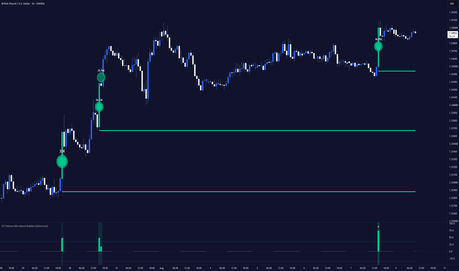
Trade Wzrd - Null Range [Rampage Series]✨ TRADE WZRD - NULL RANGE
Every range has two middles. The one price draws - the midpoint - and the one VOLUME draws: the exact price where everything traded inside the range nets to nothing. Half the participation above, half below. The balance point where the tug-of-war reads null .
Null Range plots that line, builds a channel out of volume's own deviation, and fades the pokes that venture beyond it - out where participation thins to nothing. Not a promise - a receipt.
⚡ THE RAMPAGE SERIES ⚡
Null Range is a release in the Rampage Series - a growing family of volume-and-levels tools built by Trade Wzrd. Every Rampage script ships with the same built-in automation layer: signals don't just paint, they speak. One alert, one webhook, and every entry, exit and fill fires a plain-text order string.
✨ THE NULL RANGE ✨
The dealing range's volume is distributed across a hundred invisible bins, and the 50/50 split becomes a single glowing line. Not a midpoint. Not an average. The price where the crowd's money actually nets to zero. And the line itself is the regime read: it runs CYAN when volume's center of mass sits in the cheap half, RED when it sits in the expensive half. Its right-edge tag carries VOL CENTER - the exact percentage. Hover it for the full story.
⚡ THE VOLUME CHANNEL ⚡
The same bins yield volume's standard deviation - so Null Range draws the channel where participation actually lives: two glowing sigma walls around the line with graded fills, and nothing else. ~95% of traded volume lives inside. Price beyond the wall is price out where volume goes null - extended, exhausted, and ripe for the trap.
✨ KINETIC FUEL ✨
Under the structure, a fuel strip burns: volume times speed, candle by candle, normalized against recent history. Bull fuel hangs off the discount wall in cyan, bear fuel off the premium wall in red - spike squares mark the bars that moved real mass, and WALL SLAM diamonds stamp the bars where that mass physically hit a wall. When a trap springs off a slam, the whole crowd pushed - and still failed.
⚡ THE MARGIN PROFILE ⚡
In the right margin, the range's own bins draw themselves quietly - spanning exactly wall to wall, because that's where the volume that matters lives. Every row is tinted by who owned that price: cyan where buyers dominated, red where sellers did. The Point of Control is ringed in gold. Width, offset, delta coloring - all yours. It's the same engine as the line, laid on its side.
✨ FLOW HEAT ✨
No labels. No lines. Just heat. When price sinks while buy pressure quietly rises, the tape washes faint cyan - someone is loading into weakness. When price rises while sell pressure builds, it washes faint red - someone is unloading into strength. The disagreement between pressure and price, painted as weather. The dashboard's FLOW HEAT row names the shift when it's live.
✨ THE FILTERS ✨
Trade only what the database believes in. Min Win Probability skips signals from cold buckets (once they have enough samples to judge - TRACKING signals always pass). Max Extension skips blow-off pokes. Balance Alignment demands volume's center be on your side. Every active filter shows on the dashboard's FILTERS row, so you always know what the engine is allowed to take.
✨ THE TRAP ✨
The signal: price pokes beyond the two-sigma wall - out into the null - and closes back inside within the trap window. The fakeout. Fade it back toward the line - the default target IS the null range itself, because mean-reversion trades deserve mean-reversion targets. Premium traps short from above, discount traps long from below. EQ Reclaim mode (decisive crosses back through the line, 0.2 ATR minimum, no whipsaw) is there for continuation players.
⚡ THE CONVICTION SCORE ⚡
Here is where Null Range stops asking for trust. Every signal carries one compact number - CONVICTION - that no single ingredient could give you. Underneath it sits this chart's own live database: traps bucketed by how deep the extension ran (0–0.25, 0.25–0.5, 0.5–1.0, 1.0+ ATR beyond the wall), reclaims bucketed by whether volume's center was on their side. That historical win rate is the base - then the score bends with the scenario: volume's center on your side or against you, a tidy poke or a blow-off, a spike bar or thin air. History + balance + depth + fuel, fused into one grade from 5 to 95. Early on, before the buckets earn their samples, the score runs on structure alone - and says so.
And the hover is REACTIVE . Point at any signal and the verdict breaks the score into its parts: the conviction line, thin-sample warnings when a bucket is young, hot/cold bucket verdicts, depth-risk notes on blow-off extensions, balance alignment with the crowd's cost basis, and a fuel read on the participation behind the poke. Same model, different situation, different answer.
✨ THE RECEIPTS ✨
Signals stay on the chart as compact conviction chips - ▲ T 72, ▼ R 64 - one glance, one grade. Every closed trade stamps ✓ TP HIT or ✗ SL HIT exactly where it died. The dashboard tracks the VOL CENTER and PRICE POS gauges, the regime word, EQ/POC/channel width, the last signal with its conviction, the FLOW HEAT state, the database total, and a 10-dot streak row. The trade box carries entry, dashed stop, solid target with live R:R - and the conviction rides inside the entry tag.
⚡ YOURS TO SHAPE ⚡
Every visible piece answers to you: walls on or off, the line gradient or solid, EQ and POC tags toggleable, POC width, profile width and offset, delta colors or one solid tone, fuel strip, slam markers, flow heat, channel fills. The defaults are the house look - the knobs are all yours.
⚡ BUILT-IN AUTOMATION ⚡
One alert ("Any alert() function call") + your webhook URL, and Null Range speaks TradeWzrd order strings:
⚡ Entries with SL/TP prices attached
⚡ Optional opposite-signal close prepended to new entries
⚡ TP/SL-hit close alerts that mirror the on-chart trade box
The same readable comma syntax drives automation across 7+ platforms - percent-risk or fixed-volume sizing, magic numbers, order comments. No lock-in: plain text, any endpoint.
✨ HOW TO READ IT ✨
⚡ One glowing line = where the range's volume nets to null. Cyan = volume built low, red = volume built high
⚡ The graded channel = where ~95% of the volume lives. Price outside the wall = out in the null, extended
⚡ Fuel candles below/above the walls = kinetic energy per bar; squares = spike bars; diamonds = wall slams, mass meeting structure
⚡ Faint cyan/red wash behind the tape = flow heat: pressure and price disagreeing
⚡ The quiet profile in the margin, wall to wall = who owns each price: cyan rows buyers, red rows sellers, gold ring POC
⚡ ▲ T / ▼ T chips = the trap just failed - the number is conviction: this chart's track record bent by balance, depth and fuel. Hover for the breakdown
⚡ ▲ R / ▼ R chips = decisive reclaims of the line, same conviction engine
⚡ Dashboard: gauges, regime, FILTERS row, FLOW HEAT row, DATABASE row (trap and reclaim rates separately), streak dots
⚡ HOW TO USE ⚡
⚡ Drop it on any liquid symbol, 5m to 4H - tuned defaults for XAUUSD 15m
⚡ Let it run. The database is empty at first - conviction runs on structure alone until the buckets earn their samples
⚡ Compare buckets: if shallow traps earn 70% and deep ones earn 40%, you know exactly which pokes to take
⚡ Wire one alert when you're ready to automate
✨ LIMITATIONS ✨
⚡ Conviction starts from this chart's own history, bucketed - a sample, not a promise. Small samples lie confidently; the hover tells you when a bucket is young
⚡ The database resets when you change symbols, timeframes, or core settings - every context earns its own track record
⚡ Traps fade extensions - in a runaway trend, the outer wall keeps getting hit and the trap window is the honest filter
⚡ On symbols without volume data, the line falls back to midpoint and sigma to range/4
✨ CREDITS ✨
Kinetic fuel concept inspired by "Kinetic Momentum Vectors" by BigBeluga (CC BY-NC-SA 4.0). Concept only and Null Range's fuel is re-engineered from zero: volume times speed, burning off our own volume-channel walls. No code or geometry shared with the original.
Rift maps WHERE the volume traded. Null Range knows WHERE THE VOLUME NETS TO NOTHING - and what fading the void has been worth.
Educational shell. Not financial advice. Not a signal service. 지표

OBV+OBV+
OBV+ tracks On Balance Volume against a moving average of itself and turns
that relationship into a directional state, then gates entries behind a
statistical trend test and manages the trade with a chandelier stop that only
ever moves in your favor.
HOW THE STATE WORKS
The indicator plots OBV with a configurable moving average (EMA, SMA, WMA,
RMA, or HMA). The distance between the two is ranked as a percentile against
its own recent history, so a strong OBV move is defined relative to what this
symbol has actually been doing rather than by a fixed number that means
something different on every chart. When that strength clears your threshold,
the state turns bullish or bearish and stays there until a qualifying move
flips it the other way. A minimum bar spacing keeps the state from
oscillating.
HOW ENTRIES WORK
A state flip on its own does not open a trade. The flip arms an entry window,
and within that window a linear regression on price must independently confirm
that a trend exists in the same direction, measured by the t statistic of the
regression slope. If the trend test agrees, the trade opens. If the window
closes without confirmation, the flip expires and prints a small gray circle
so you can see exactly which signals were passed over. The next entry then
waits for a fresh flip.
Price bars are colored by the gate rather than by raw OBV, so bars show green
or red only where both conditions are satisfied and gray everywhere else. You
can see at a glance which parts of the chart the indicator considers
tradeable.
HOW EXITS WORK
The stop arms immediately on the entry bar, placed beyond that bar's range so
a wide entry candle cannot take you out on the next bar. From there it trails
from the highest high reached since entry (or lowest low when short) at a
configurable ATR multiple, and it is hard clamped so it can only tighten. In a
long it never moves down. It tightens as volatility contracts and holds its
ground when volatility expands. The stop line is drawn directly on price
alongside entry triangles and exit crosses.
The trailing stop is the only exit by default. Opposite states are ignored
while a position is open, so a brief counter signal that does not reach your
stop leaves the trade running. If you would rather have state changes close
and reverse the position, there is a switch for it.
INPUTS
MA type and length, strength lookback and minimum percentile, minimum bars
between flips, regression lookback, minimum absolute t statistic, confirmation
window length, ATR length and chandelier multiple, plus a flip reverses
position toggle. Display options cover the fill, the trail, trade markers, and
bar coloring, with configurable bull, bear, and neutral colors. An optional
pane mode swaps OBV for the signed strength percentile with the threshold
lines drawn, which makes it easy to see which moves clear the bar.
ALERTS
Separate alert conditions for long entry, short entry, and exit, plus a single
combined alert carrying the ticker, timeframe, strength percentile, t
statistic, and current stop level.
NOTES
Because the signal is built from volume, results depend on the volume series
your data feed provides, and the same symbol can behave differently across
exchanges. Signals evaluate on bar close. Settings are deliberately open
ended: a low strength percentile with a short regression lookback produces
frequent, permissive signals, while raising the percentile and the t threshold
narrows it toward fewer and more selective ones. This is for informational purposes
only and isn't meant as financial advice. 지표

Rogue VP ProRogue VP Pro is an advanced Previous Day Volume Profile indicator built for traders who rely on volume-based market structure to identify high-probability trading opportunities.
The indicator generates a detailed volume profile from the previous trading session and projects the most important price levels onto the current session, providing a clear framework for identifying support, resistance, acceptance, rejection, and potential liquidity areas.
Designed for intraday traders, Rogue VP Pro offers extensive customization while remaining lightweight and easy to read.
Features:
Previous Day Volume Profile
High-resolution volume profile with configurable calculation and rendering density.
Displays the previous session's volume distribution directly on the current trading day.
Supports:
Regular Trading Hours (RTH)
Previous Overnight Session
All Sessions
Automatically calculates and plots:
• Point of Control (POC)
• Value Area High (VAH)
• Value Area Low (VAL)
Optional labels display the exact price of each level.
Value Area Deviations
Project customizable deviation levels above and below the Value Area, allowing traders to identify potential extension targets and exhaustion zones.
Default deviation levels include:
• ±0.25 VA
• ±1.0 VA
• ±2.0 VA
Volume Nodes
Automatically identifies:
• High Volume Nodes (HVNs) – areas of heavy participation
• Low Volume Nodes (LVNs) – potential rejection or low-liquidity zones
Detection sensitivity and filtering thresholds are fully customizable.
Volume Surge Highlights
Identify unusually high-volume bars during Regular Trading Hours.
Bars exceeding a user-defined multiple of average volume are highlighted, making it easy to spot institutional participation and momentum events.
EMA Overlay
Includes an optional Exponential Moving Average for additional trend confirmation and trade confluence.
Customizable Appearance
Customize nearly every aspect of the indicator, including:
• Profile colors
• Value Area colors
• Node colors
• Deviation colors
• Line widths
• Label visibility
• Profile placement (left or right)
• Profile width and rendering resolution
Alerts
Create TradingView alerts whenever price touches one of the key Previous Day Volume Profile levels:
• POC
• VAH
• VAL
Alerts are limited to Regular Trading Hours for more relevant intraday notifications.
Ideal For
• Futures traders
• Index traders
• Options traders
• Scalpers
• Day traders
• Volume Profile enthusiasts
• Price Action traders
How It Can Be Used
Many traders use previous session volume information to:
• Identify high-probability support and resistance
• Monitor acceptance versus rejection around key value areas
• Locate potential breakout and reversal zones
• Trade rotations back toward the Point of Control
• Find confluence with other technical tools and market structure
Rogue VP Pro provides these important reference levels in a clean, highly configurable format, allowing traders to integrate volume profile analysis into virtually any trading strategy.
Disclaimer: This indicator is intended as a market analysis tool and should be used alongside sound risk management and your own trading plan. 지표

LDO-Magnet [1.1]LDO-Magnet — Naked POCs, Value Areas & Vector Candle Zones
WHAT IT DOES
Plots the two kinds of unfinished business that pull price back like a magnet, and tells you when they stack on top of each other.
NAKED POINTS OF CONTROL (NPOCs). Each UTC day, week and month gets a volume profile built from lower-timeframe data. The price with the most traded volume is that period's POC. Once the period closes, an untouched POC is "naked" — a magnet that price tends to return to. Levels are removed the moment price finally trades through them. Previous Value Areas (VAH/VAL — the range holding 70% of the period's volume) are also drawn.
VECTOR CANDLE ZONES. Candles with unusually high volume — 200%+ of the recent average (red/green vectors) or 150%+ (violet/blue vectors) — mark where market makers left a footprint. The candle body becomes a zone that stays on the chart until price trades fully back through it.
CONFLUENCE ★. When a Naked POC sits inside an active vector zone, two independent reasons for price to react coincide at one level. The NPOC's label gains a star and its line brightens: ★ — the NPOC is anywhere inside the zone ★★ — the NPOC is near the zone's 50% midpoint (strong confluence) Stars appear and disappear live as zones are created and cleared.
READING THE CHART
Levels are labelled on the right edge: dNPOC / wNPOC / mNPOC are daily, weekly and monthly Naked POCs (dotted, dashed and solid lines); pdVAH, pwVAL etc. are the previous period's Value Area edges. A star in front of any NPOC means it currently sits inside a vector zone. When two NPOCs from different timeframes nearly overlap, only the higher-timeframe one is drawn — the hidden one is still tracked and still fires alerts.
SETTINGS
Timeframes — which profile periods to plot. Daily and weekly are on by default; monthly suits higher-timeframe charts.
Levels — toggle Naked POCs, previous Value Areas and developing (live, still-forming) profiles, and cap how many levels of each timeframe stay on the chart. "Keep Touched Levels" leaves a faded line where a level was hit instead of deleting it.
Vector Zones — toggle the zones, colour them with one colour or by vector type, and set their transparency. "Highlight NPOC + zone confluence" controls the stars; the "Strong confluence band" sets how close to the zone's 50% level an NPOC must be to earn ★★ (default 15% of the zone's height).
Display — labels, prices, text size, and the overlap distance below which lower-timeframe levels are hidden.
Alerts — enables the dynamic alerts and sets the approach distance.
Appearance — colours and transparency per level family. Transparency runs 0–100: LOWER is brighter, higher is fainter. If a label seems hard to read, check you are adjusting the slider for that family (Naked POC, Value Area or developing profile) — each has its own.
ALERTS
Add an alert on the indicator and choose a condition: approach/touch per NPOC timeframe, previous VAH/VAL crosses, Value Area entries, vector zone approach/entry, and Approaching/Touching Confluence. Or select "Any alert() function call" to receive everything as detailed messages, e.g.:
ZECUSDT.P | STRONG CONFLUENCE touch | Daily NPOC 466.60 inside vector zone | current 466.85
HOW TO USE THE CONFLUENCE
The stars mark where a reaction is likely — they do not predict its direction. In practice:
Treat ★★ levels as the highest-priority magnets on the chart. Price reaching one usually does something: a rejection back the way it came, or a decisive push straight through.
Read direction from the approach. Into confluence against the prevailing trend, favour the reversal; with the trend and on strong volume, a clean break often accelerates.
First touches are the most reliable. Once a level has been tested the magnet is spent — the script removes filled NPOCs automatically.
Higher timeframe beats lower: a starred wNPOC or mNPOC outranks a starred dNPOC.
Set the Approaching Confluence alert and let the chart come to you.
NOTES
Levels are computed from lower-timeframe volume distributed across price, with UTC period boundaries, so they will not exactly match profiles drawn in your chart's local timezone. Use standard candles. Works on any symbol and timeframe with volume data.
Vector zone logic is adapted from the open-source Vector Candle Zones code by infernix and peshocore (MPL 2.0) via the public Traders_Reality_Lib library — credit to them for the PVSRA methodology. The volume-profile engine, UTC framework, overlap suppression, confluence detection and alert system are original to this script.
지표

Volume DNA: Heatmap [BigBeluga]🔵 OVERVIEW
The Volume DNA: Heatmap is an advanced technical indicator created by BigBeluga to decode institutional volume and price action dynamics using market microstructure principles. Traditional volume indicators often look at volume in isolation, failing to account for the efficiency or inefficiency of price movement. In order to provide a solution to this problem, this indicator combines rolling volume Z-scores with high-low price spread Z-scores, classifying every single bar into distinct institutional signatures—such as Absorption, Effort, Exhaustion, and Stagnation.
The indicator aims to visualize institutional accumulation, distribution, and exhaustion points directly on the chart. The core element of its calculation involves tracking volume and spread deviations against rolling means defined as:
volZ = (volume - volMean) / volStd
spreadZ = (spread - spreadMean) / spreadStd
where volMean and spreadMean are moving averages over lookback lengths volLengthInput and spreadLengthInput , and volStd and spreadStd represent standard deviations. Higher values of volThreshInput and spreadThreshInput allow the indicator to filter out random market noise and isolate major institutional footprints.
🔵 FEATURES
The system utilizes a multi-layered matrix structure to provide actionable market intelligence:
1 — DNA Engine & Classification Matrix
Absorption ( ABS ): Triggered by high volume and narrow spread via highVol and narrowSpread , signaling institutional limit orders absorbing market flow.
Effort Bullish / Bearish ( EFF+ / EFF- ): Triggered by high volume and wide spread via highVol and wideSpread , signaling aggressive buying or selling pressure driving trend continuation.
Exhaustion ( EXH ) & Stagnation ( STG ): Tracks low volume relative to price spreads to identify thin liquidity moves or equilibrium consolidation phases.
2 — Visual Enhancements & Ghost Glows
Ghost Glow Effect: Renders a semi-transparent wider candle behind classified DNA bars using plotcandle(showGlowBar ? bodymax + glowExpand : na, ...) to visually distinguish key events from normal price action.
Liquidity Clouds: Draws transparent box zones over Absorption bars extending cloudExtendInput bars to the right, marking where institutional limit orders may be resting.
3 — Real-Time Barcode Tape & Statistics Tables
DNA Barcode Tape: Displays a vertical heatmap table on the chart showing the DNA type and volume of the last tapeRowsInput bars as a real-time institutional activity tape.
Stats Panel Table: Summarizes current bar status, Volume Z-Scores via str.tostring(volZ, "#.##") , and Spread Z-Scores for instant quantitative feedback.
🔵 HOW TO USE
Apart from the basic visualization of institutional volume signatures, this tool can also act in alternative ways to support decision-making:
Spot Institutional Absorption: Look for ABS candles and their accompanying Liquidity Cloud zones to identify potential support or resistance levels where large market participants are absorbing flow.
Ride Trend Continuations via Effort: Monitor EFF+ and EFF- signal shapes (where size and color intensity scale with volume Z-scores) to confirm aggressive momentum driving price in the direction of the breakout.
Anticipate Reversals with Exhaustion: Watch for EXH signals where price moves on thin liquidity, signaling that a current trend may be running out of fuel and nearing a pullback or reversal.
🔵 NOTES
Why this implementation is unique:
It merges volume and price spread analytics using statistical Z-scores rather than arbitrary thresholds, offering an objective look at market efficiency.
The multi-table interface provides both historical sequencing (Barcode Tape) and real-time metric tracking without crowding the main price action view.
The script is fully optimized for Pine Script version 6, utilizing high-performance array management (`var array dnaHistory = array.new(tapeRowsInput, 0)`) for smooth execution across extensive historical data.
Note: The indicator relies on rolling standard deviation calculations; initial chart loads require enough bars to populate the lookback window accurately.
지표

Volume Profile XL**Volume Profile XL — Overview**
Volume Profile XL shows *where* trading activity concentrated across price, rather than just when it happened. It divides price into horizontal bins and draws a sideways histogram: the longer a row, the more volume traded at that price. This reveals the levels the market accepted (heavy rows) and the levels it passed through quickly (thin rows), plus three key reference prices — the POC and the Value Area boundaries.
**The two ways it can display**
- **Per Day (Historical)** — the default. It draws a separate profile over each of the last several periods, sitting on top of that period's candles. This lets you see how accepted price shifted from one day to the next.
- **Combined** — one single profile built from a fixed number of recent bars, drawn off to one side of price. This gives a clean, current read of fair value across the recent move without splitting it by day.
**The three reference markers on every profile**
- **POC (Point of Control)** — the single price with the most volume; the profile's center of gravity.
- **VAH / VAL (Value Area High / Low)** — the top and bottom of the price band containing the chosen percentage of volume. Price inside this band is "in balance"; price leaving it signals the market is exploring new territory.
---
**Mode settings (top of the panel)**
- **Profile Mode** — switches between Per Day and Combined, as described above.
- **Split Up/Down Volume** — when on, each row is colored in two parts, showing how much of that level's volume came from up-closing versus down-closing bars, so you can read buying vs. selling pressure within a level. When off, each row is a single color based on whichever side dominated. Turning it off also halves the drawing load, which lets you display roughly twice as many days at the same detail — the main lever when you want more history on screen.
**Calculation settings**
- **Number of Rows** — how finely price is sliced. More rows means more detail but, in Per Day mode, fewer days fit on screen at once. Fewer rows means a coarser profile but more history.
- **Value Area %** — the share of volume the Value Area captures. Seventy percent is the long-standing market convention; raising or lowering it widens or narrows the VAH–VAL band.
**Per Day (Historical) settings**
- **Period** — whether each profile covers a Day, a Week, or a Month.
- **Historical Lookback (Days)** — how many periods back to draw. If you request more than the screen can hold, it automatically shows as many as fit rather than erroring.
- **Profile Width (% of period)** — how much of each period's horizontal space the widest row fills. Lower values make slimmer, less overlapping profiles; higher values make bolder ones.
**Combined settings**
- **Lookback Bars** — how many recent bars feed the single combined profile.
- **Placement** — draws the profile to the Left or Right of current price.
- **Max Profile Width** — the on-screen length of the busiest row; controls the overall size of the histogram.
- **Gap From Price** — spacing between the profile and the candles.
**Colors & Lines settings**
- **Up Volume / Down Volume** — the two histogram colors.
- **Show POC** and **POC Color / POC Line Style** — toggle the Point of Control line and set its color and style (Solid, Dashed, or Dotted).
- **Show Value Area** and **VA Color / VA Line Style** — toggle the Value Area lines and set their color and style.
- **Label Size** — the size of the POC, VAH, and VAL price tags, from Tiny to Huge.
---
**How to use it in practice**
- **Read the shape first.** Fat rows are magnets where price tends to stall; thin rows and gaps are fast zones price tends to slice through.
- **Watch behavior at the edges.** Price stalling at VAH or VAL and turning back suggests balance and a move toward the POC. Price pushing through an edge and *holding* there suggests acceptance and a possible trend in that direction.
- **Compare day to day (Per Day mode).** Overlapping value areas across days point to a sideways, balancing market; value areas stepping steadily up or down point to a trend. Where today opens relative to yesterday's Value Area is one of the most useful tells for whether the session is likely to rotate or run.
- **Use Combined for the big picture.** When you want one clean map of the current support and resistance shelves rather than a day-by-day breakdown, switch to Combined and place it on whichever side keeps your price action clear.
**A note on the data**
The profile is built from each bar's price range and volume, which is the standard approach for this kind of tool on this platform. It's a close approximation of the true volume-at-price distribution, not a tick-by-tick reconstruction, so treat the levels as high-quality reference points rather than exact measurements. 지표

Echo Vector PVSRA Volume### Credits and licence
The starting point for the relative-volume and volume-spread classification framework was the open-source “Traders Reality PVSRA Volume Suite,” originally created by infernix with library integration by peshocore, under the Mozilla Public License 2.0.
This derivative is independently named and does not use the Traders Reality or Pattern Watchers names as its branding.
The imported library calculation has been replaced with script-level calculations. This implementation adds configurable volume tiers, price-extension filters, volume divergence, optional divergence lines, extreme-volume event detection, body-recovery measurements, expanded alerts, and simplified historical outcome tables.
### Overview
Echo Volume Structure is a volume-analysis indicator that classifies candles according to:
* reported volume;
* candle direction;
* candle range;
* volume multiplied by candle range;
* body size;
* price extension from a configurable EMA.
The classifications are displayed as colour-coded volume columns in a separate pane.
Users can optionally apply the same classification colours to the candles on the main price chart.
The script also includes:
* regular bullish and bearish volume divergence;
* divergence markers and configurable lines;
* extreme-volume event diamonds;
* body-recovery tracking;
* simplified divergence target/stop outcomes;
* recovery statistics;
* configurable alerts.
The indicator identifies when its mathematical conditions are present. It does not establish why the activity occurred and does not predict what price will do afterward.
### Data source
By default, the indicator uses OHLC and volume data from the active chart symbol and timeframe.
The requested values include:
* open;
* high;
* low;
* close;
* volume.
The data is requested with lookahead disabled.
### Symbol override
Users can optionally analyze data from a different symbol instead of the active chart symbol.
The override can also contain a combination of compatible feeds, such as multiple exchange symbols added together.
Adding several data feeds can increase processing requirements.
When symbol override is enabled, users should confirm that the selected source is meaningfully related to the active chart.
Differences in exchange activity, trading hours, price scale, market structure, and volume reporting can cause the classifications to differ from those produced by the chart symbol.
### Volume-spread calculation
The script calculates a volume-spread value by multiplying candle volume by the candle’s high-to-low range.
This allows the classification process to consider both:
* the amount of reported volume;
* the price range produced during that volume.
A candle may qualify for an elevated classification because its volume is unusually high, its volume-spread value is unusually large, or it meets a combination of volume, body-size, and price-extension conditions.
### Candle-classification hierarchy
The script applies a fixed priority hierarchy.
When a candle qualifies for more than one classification, the highest active tier determines its colour.
The hierarchy from highest to lowest is:
1. Echo Peak Up or Echo Valley Down;
2. Ultra Up or Ultra Down;
3. Echo Surge Up or Echo Surge Down;
4. Echo Pulse Up or Echo Pulse Down;
5. Normal Up or Normal Down.
The classifications are internal analytical categories. They are not measurements of trade quality and do not guarantee reversal or continuation.
### Default colour key
The default candle classifications and colours are:
* Echo Peak Up — bright green;
* Echo Valley Down — bright red;
* Ultra Up — dark green;
* Ultra Down — dark red;
* Echo Surge Up — lime green;
* Echo Surge Down — light red;
* Echo Pulse Up — blue;
* Echo Pulse Down — fuchsia;
* Normal Up — light grey;
* Normal Down — dark grey;
* Extreme Volume Event — yellow diamond;
* Bullish Volume Divergence — turquoise upward triangle;
* Bearish Volume Divergence — coral-red downward triangle.
All classification, divergence, and line colours can be adjusted in the indicator settings.
### Echo Peak Up — bright green
An Echo Peak Up candle is bright green by default.
It requires:
* an up candle;
* volume at or above the selected multiple of the longer-term average volume;
* a candle body above the selected multiple of its average body size;
* price above the selected EMA by more than the configured standard-deviation distance.
The longer-term volume, body, EMA, and deviation settings are independently configurable.
Echo Peak Up identifies an unusually large bullish candle occurring while price is extended above its recent mean.
It may be examined as possible climactic or blow-off activity, but it does not prove that a market top has formed.
Price may continue rising after an Echo Peak Up candle.
### Echo Valley Down — bright red
An Echo Valley Down candle is bright red by default.
It requires:
* a down candle;
* volume at or above the selected multiple of the longer-term average volume;
* a candle body above the selected multiple of its average body size;
* price below the selected EMA by more than the configured standard-deviation distance.
Echo Valley Down identifies an unusually large bearish candle occurring while price is extended below its recent mean.
It may be examined as possible climactic or exhaustion activity, but it does not prove that a market bottom has formed.
Price may continue falling after an Echo Valley Down candle.
### Ultra Up — dark green
An Ultra Up candle is dark green by default.
It occurs when:
* the candle closes above its open;
* volume reaches the selected Ultra multiple of the longer-term average;
* the candle does not meet all the additional body-size and price-extension requirements of Echo Peak Up.
Ultra Up identifies exceptionally high reported volume on an up candle relative to the selected baseline.
It does not determine whether the activity represents accumulation, distribution, continuation, short covering, or reversal.
### Ultra Down — dark red
An Ultra Down candle is dark red by default.
It occurs when:
* the candle closes at or below its open;
* volume reaches the selected Ultra multiple of the longer-term average;
* the candle does not meet all the additional body-size and price-extension requirements of Echo Valley Down.
Ultra Down identifies exceptionally high reported volume on a down candle relative to the selected baseline.
It does not determine whether the activity represents accumulation, distribution, liquidation, continuation, or reversal.
### Echo Surge Up — lime green
An Echo Surge Up candle is lime green by default.
It is an up candle that meets at least one of the following conditions:
* volume reaches the selected Surge multiple of the recent average volume;
* the candle’s volume-spread value reaches or exceeds the highest previous volume-spread value within the selected lookback.
The candle must not already qualify for Echo Peak Up or Ultra Up.
Echo Surge Up identifies elevated volume or volume-spread activity on an up candle.
It is not an automatic bullish entry signal and does not guarantee that price will continue rising.
### Echo Surge Down — light red
An Echo Surge Down candle is light red by default.
It is a down candle that meets at least one of the following conditions:
* volume reaches the selected Surge multiple of the recent average volume;
* the candle’s volume-spread value reaches or exceeds the highest previous volume-spread value within the selected lookback.
The candle must not already qualify for Echo Valley Down or Ultra Down.
Echo Surge Down identifies elevated volume or volume-spread activity on a down candle.
It is not an automatic bearish entry signal and does not guarantee that price will continue falling.
### Echo Pulse Up — blue
An Echo Pulse Up candle is blue by default.
It occurs when:
* the candle closes above its open;
* volume reaches the selected Pulse multiple of the recent average;
* the candle does not qualify for Echo Peak Up, Ultra Up, or Echo Surge Up.
Echo Pulse Up represents moderately elevated volume on an up candle relative to the selected lookback.
It does not guarantee that upward movement will continue.
### Echo Pulse Down — fuchsia
An Echo Pulse Down candle is fuchsia by default.
It occurs when:
* the candle closes at or below its open;
* volume reaches the selected Pulse multiple of the recent average;
* the candle does not qualify for Echo Valley Down, Ultra Down, or Echo Surge Down.
Echo Pulse Down represents moderately elevated volume on a down candle relative to the selected lookback.
It does not guarantee that downward movement will continue.
### Normal Up — light grey
A Normal Up candle is light grey by default.
It closes above its open but does not meet any enabled elevated-volume classification.
A normal classification does not mean that the candle is unimportant. It means only that the selected relative-volume and volume-spread thresholds were not reached.
### Normal Down — dark grey
A Normal Down candle is dark grey by default.
It closes at or below its open but does not meet any enabled elevated-volume classification.
A normal classification does not mean that the candle is unimportant. It means only that the selected relative-volume and volume-spread thresholds were not reached.
### How to interpret the colours
The colour describes the candle’s direction and the relative-volume tier detected by the script.
For example:
* bright green identifies Echo Peak Up;
* bright red identifies Echo Valley Down;
* dark green identifies Ultra Up;
* dark red identifies Ultra Down;
* lime green identifies Echo Surge Up;
* light red identifies Echo Surge Down;
* blue identifies Echo Pulse Up;
* fuchsia identifies Echo Pulse Down;
* light grey identifies Normal Up;
* dark grey identifies Normal Down.
The colour should be interpreted together with price location and market structure.
An elevated-volume up candle near resistance may have a different context from the same classification during a breakout.
An elevated-volume down candle near support may have a different context from the same classification during an established decline.
The colour identifies the configured mathematical condition. It does not identify the intent of market participants and is not an instruction to buy or sell.
### How to use the indicator
Apply the indicator to a liquid symbol with usable volume data.
A practical workflow is:
1. Review the broader price trend and market structure.
2. Observe the normal volume behaviour of the selected symbol and timeframe.
3. Identify where elevated-volume colours appear relative to support, resistance, breakouts, failed breakouts, and extended price movement.
4. Compare the direction of each classified candle with subsequent price behaviour.
5. Note whether the event is isolated or part of a sequence of elevated-volume candles.
6. Review any bullish or bearish divergence marker while accounting for its pivot-confirmation delay.
7. Inspect yellow extreme-volume diamonds and whether price later crosses their recovery level.
8. Use the historical tables only as simplified chart-based measurements.
9. Test alerts on the intended symbol and timeframe.
10. Combine the indicator with independent price, volatility, liquidity, and risk analysis.
Do not treat an individual colour, triangle, diamond, ratio, or alert as an automatic trade instruction.
### Example use of an Echo Peak Up candle
When a bright-green Echo Peak Up candle appears, consider:
* whether price is already extended above its recent mean;
* whether the candle appears near established resistance;
* whether the candle closes strongly or leaves a large wick;
* whether subsequent candles continue higher or fail to maintain progress;
* whether similar high-volume activity appeared earlier;
* whether a bearish divergence is also present.
The condition identifies unusual volume, body size, and price extension. It does not prove a reversal.
### Example use of an Echo Valley Down candle
When a bright-red Echo Valley Down candle appears, consider:
* whether price is already extended below its recent mean;
* whether the candle appears near established support;
* whether the candle closes strongly or leaves a large wick;
* whether subsequent candles continue lower or recover;
* whether similar high-volume activity appeared earlier;
* whether a bullish divergence is also present.
The condition identifies unusual volume, body size, and price extension. It does not prove a reversal.
### Example use of Surge and Pulse candles
Echo Surge and Echo Pulse candles identify lower relative-volume tiers than Echo Peak, Echo Valley, and Ultra candles.
A sequence of lime-green or blue up candles during a breakout can show repeated elevated activity.
A sequence of light-red or fuchsia down candles during a decline can show repeated elevated activity.
The same colours near failed breakouts or important support and resistance may have a different context.
The classifications describe relative volume and direction, not future price outcomes.
### Main-chart candle colouring
When main-chart candle colouring is enabled, the script applies the classification colour to the corresponding candles on the price chart.
When disabled, the original price-chart colours remain unchanged while the classified volume columns continue to appear in the indicator pane.
### Background preset
The Dark Background and Light Background options adjust the table text colour for visibility.
The preset does not change the candle-classification colour palette.
Individual candle and line colours can be changed separately.
### Volume moving average
An optional simple moving average can be displayed over the volume columns.
The moving-average period is configurable.
The visible moving average provides an additional reference for current volume, but it is separate from some of the internal classification averages.
Changing the visible moving-average period does not automatically change the internal Peak, Valley, Ultra, Surge, or Pulse thresholds.
### Regular volume divergence
The divergence module compares confirmed pivots in price with confirmed pivots in volume.
It identifies two regular divergence conditions:
* bullish volume divergence;
* bearish volume divergence.
The conditions show structural disagreement between price pivots and volume pivots.
They do not guarantee that price will reverse.
### Bullish volume divergence — turquoise upward triangle
A turquoise upward triangle marks a confirmed bullish volume divergence.
The condition requires:
* price to form a lower confirmed low;
* volume to form a higher confirmed low.
This means price reached a lower pivot while the volume pivot did not form a corresponding lower low.
Users may examine the condition together with:
* nearby support;
* reduced downward progress;
* candle structure;
* broader trend;
* subsequent volume classifications.
Price can continue lower after bullish volume divergence is confirmed.
### Bearish volume divergence — coral-red downward triangle
A coral-red downward triangle marks a confirmed bearish volume divergence.
The condition requires:
* price to form a higher confirmed high;
* volume to form a lower confirmed high.
This means price reached a higher pivot while the volume pivot did not form a corresponding higher high.
Users may examine the condition together with:
* nearby resistance;
* reduced upward progress;
* candle structure;
* broader trend;
* subsequent volume classifications.
Price can continue higher after bearish volume divergence is confirmed.
### Divergence pivot strength
The Divergence Pivot Strength setting is applied to both the left and right sides of each pivot.
Higher values generally produce:
* fewer pivots;
* broader pivot structures;
* later confirmation;
* fewer divergence markers.
Lower values generally produce:
* more pivots;
* narrower structures;
* earlier confirmation;
* greater sensitivity to short-term noise.
There is no universal pivot value that is suitable for every symbol and timeframe.
### Divergence confirmation delay
A divergence is not known on the exact historical pivot bar.
The script must wait for the selected number of right-side bars before the pivot can be confirmed.
Once confirmed, the triangle is displayed on the earlier pivot bar.
For example, a pivot strength of 5 requires five later bars before confirmation.
The marker therefore appears earlier on the historical chart than the time at which the condition became available.
### Divergence lines in the indicator pane
Optional panel lines connect the previous and current volume pivots associated with the divergence structure.
Users can configure:
* bullish line colour;
* bearish line colour;
* line width;
* solid, dashed, or dotted style.
These lines help users inspect the change in volume pivots.
They do not project future movement.
### Divergence lines on the price chart
Optional price-chart lines provide a visual reference between price points associated with the volume-pivot locations.
Users can configure their colour, width, and style independently from the panel lines.
These lines are visual aids and should not be interpreted as projected support, resistance, or a forecast of future price movement.
### Extreme Volume Event — yellow diamond
A yellow diamond identifies an Extreme Volume Event.
The condition requires a combination of:
* an already elevated-volume classification;
* volume at least four times the rolling average of recent qualifying elevated-volume candles;
* the highest volume within the recent 50-bar period;
* a candle range above the recent average range.
The rolling event-volume average becomes available only after the script has collected 30 qualifying elevated-volume observations.
The diamond identifies an unusually large volume-and-range event under the selected rules.
It does not prove:
* manipulation;
* institutional activity;
* accumulation;
* distribution;
* liquidation;
* an imminent reversal.
### Extreme-event recovery level
When an Extreme Volume Event occurs, the script calculates a configurable level inside the candle’s body.
At the default 50% setting, the recovery level is the midpoint between the candle’s open and close.
It is not the midpoint of the full high-to-low candle range.
A recovery is counted when closing price crosses the body-based level within the selected recovery lookback.
A wick touching the level without a qualifying close-to-close crossing does not count as a recovery.
A recorded recovery does not guarantee continued movement beyond the level.
### Recovery lookback
The Recovery Lookback setting controls how many bars are allowed for price to cross the active recovery level.
If the level is not crossed within the selected number of bars, that event is no longer tracked as unresolved.
The script tracks only one unresolved recovery event at a time.
If a new yellow-diamond event appears before the earlier event is resolved, the active recovery level is replaced by the newer event.
### Historical divergence outcome table
The left table displays:
* Wins;
* Losses;
* Ratio.
When no earlier hypothetical outcome is active, a confirmed bullish or bearish divergence creates a new measurement.
The script records the confirmation-bar closing price and calculates:
* a fixed percentage target;
* a fixed percentage stop.
For a bullish divergence:
* the target is above the recorded close;
* the stop is below the recorded close.
For a bearish divergence:
* the target is below the recorded close;
* the stop is above the recorded close.
The script records which threshold is detected first.
Only one hypothetical divergence outcome is tracked at a time.
A new divergence is ignored while an earlier outcome remains unresolved.
### Same-bar target and stop behaviour
The target is checked before the stop.
If both the target and stop are reached during the same chart bar, the script records the case as a win.
The script does not reconstruct the lower-timeframe path within that candle, so it cannot determine which level was actually reached first.
This is a material limitation of the table.
### Meaning of the win ratio
The displayed ratio is the number of recorded wins divided by the total number of recorded wins and losses.
It is a simplified historical chart measurement.
It is not equivalent to TradingView Strategy Tester results and does not model:
* commissions;
* slippage;
* spread;
* realistic order execution;
* position sizing;
* portfolio equity;
* liquidity;
* overlapping trades;
* all intrabar sequencing possibilities.
The ratio depends on:
* the symbol;
* timeframe;
* available chart history;
* divergence pivot strength;
* target percentage;
* stop percentage.
The displayed results do not imply future performance.
### Extreme-event recovery table
The right table displays:
* Recovered;
* Ratio.
Recovered is the number of yellow-diamond events for which closing price crossed the configured body-recovery level within the selected lookback.
The ratio is the number of recovered events divided by the total number of detected yellow-diamond events.
This is a simplified event measurement.
It is not:
* a reversal probability;
* an accuracy score;
* a trading win rate;
* evidence that future events will behave similarly.
### Alerts
Alerts are available for:
* any elevated-volume candle;
* Echo Peak Up;
* Echo Valley Down;
* Ultra Up or Ultra Down;
* Echo Surge Up or Echo Surge Down;
* Echo Pulse Up or Echo Pulse Down;
* bullish volume divergence;
* bearish volume divergence.
The general elevated-volume alert activates when any non-normal classification is detected.
### Current-bar behaviour
Volume, high, low, and close can continue changing while the current chart candle remains open.
As a result, candle classifications may appear, change tier, change colour, or disappear before the candle closes.
Extreme Volume Event conditions may also change while the current candle remains open.
Pivot divergence requires right-side confirmation, but the confirmation bar itself may still be open when the condition first becomes true.
Users seeking stable alerts should generally configure TradingView alerts for bar-close execution.
### Suggested starting settings
A practical starting process is:
1. Begin with the default settings on a liquid symbol.
2. Observe how frequently each colour appears.
3. Review the relationship between elevated-volume candles and nearby price structure.
4. Keep the default volume multiples until several historical examples have been inspected.
5. Enable chart-candle colouring only if it improves readability.
6. Enable the volume moving average for additional context.
7. Review divergence triangles while accounting for their confirmation delay.
8. Treat yellow diamonds as extreme-volume markers rather than proof of manipulation.
9. Treat both tables as simplified research measurements.
10. Test alerts before relying on them.
### Adjusting the volume tiers
Increase a tier’s volume multiple to make that classification less frequent.
Decrease the multiple to make it more frequent.
Changing the Echo Peak and Echo Valley body, EMA, or deviation settings affects how strictly the script defines price extension and candle size.
More restrictive values generally produce fewer classifications.
Less restrictive values generally produce more classifications.
Settings should be reviewed separately for each market and timeframe.
### What this implementation adds
Compared with the referenced open-source starting framework, this implementation adds or replaces:
* script-level volume calculations;
* script-level volume-spread calculations;
* configurable multi-tier candle classifications;
* longer-term extreme-volume thresholds;
* candle-body filters;
* EMA-extension filters;
* standard-deviation extension measurements;
* independently configurable classification colours;
* dark- and light-background table presets;
* optional main-chart candle colouring;
* regular price-versus-volume divergence;
* configurable divergence markers and lines;
* optional price-chart divergence references;
* Extreme Volume Event diamonds;
* body-based recovery measurements;
* recovery statistics;
* simplified divergence target/stop outcomes;
* expanded alert conditions.
These modules are combined to study relative volume, price response, divergence, and subsequent recovery within one indicator.
### Limitations
* Reported volume differs between exchanges, brokers, markets, and symbols.
* Some markets provide tick volume rather than centralized transaction volume.
* Combined or overridden data feeds can produce different results from the active chart.
* The classification tiers depend on configurable averages, lookbacks, and thresholds.
* An elevated-volume candle does not reveal the identity or intent of market participants.
* Echo Peak Up does not confirm a market top.
* Echo Valley Down does not confirm a market bottom.
* Ultra, Surge, and Pulse classifications are relative-volume categories, not trade-quality grades.
* Candle classifications may change before the current candle closes.
* Pivot divergence is delayed by the selected right-side confirmation length.
* Confirmed divergence markers are displayed on earlier pivot bars.
* Price-chart divergence lines are visual references and not projections.
* Extreme volume does not prove manipulation.
* Extreme-event detection requires sufficient qualifying historical samples.
* The recovery calculation uses body-based levels and closing-price crossings.
* Only one unresolved recovery event is tracked at a time.
* The historical tables are simplified measurements and not full strategy backtests.
* Only one unresolved divergence outcome is tracked at a time.
* Same-bar target and stop sequencing is not reconstructed.
* The outcome tracker checks the target before the stop.
* The indicator does not account for commissions, slippage, spread, liquidity, position sizing, or realistic execution.
* The indicator should not be used as the sole basis for a trading decision.
This indicator is an analytical tool and does not provide financial advice or guaranteed trading outcomes.
지표


