OPEN-SOURCE SCRIPT
Telah dikemas kini GCGrid Psych Levels NomadaScalper
# GCGrid, Psych Levels (NomadaScalper)
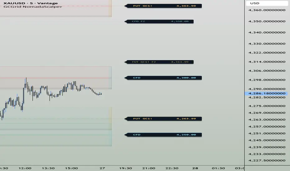
**Dual absolute grid of psychological levels for gold: every $100 and every $250, drawn as reaction zones instead of single lines.**
## What this is
Gold trades in the thousands, and round prices carry real weight up there. Whole hundreds like 4,100 or 4,300, and the bigger quarter thousand steps like 4,250 or 4,500, are the numbers people keep in their heads, park orders around and quote to each other. GCGrid draws that map for you and then stays out of the way.
Everything on the chart is absolute. A level is a multiple of 100 or a multiple of 250, and that is the whole definition. Nothing comes from a lookback window, a pivot search, a moving average or a fitted parameter. The consequence matters more than it sounds: the same levels appear on the 1 minute and on the daily, on any broker feed, on any date range, and they never shift after a candle closes.
I built this because I got tired of redrawing the same hundreds by hand every session, and because I wanted the two scales visible at once without the chart turning into a ladder of identical lines.
## How the grid is built
The script takes the current close and walks outward in both directions on each grid. You choose how many levels you want above and below price for each layer, up to four on each side, so the chart only ever shows the neighbourhood you are actually trading in.
Each level is drawn as a band rather than a line. You set the half width in points, so a half width of 5 on the $100 grid means 4,300 is shown as a zone from 4,295 to 4,305. Price rarely turns exactly on a round number, it turns near it, and a band says that honestly where a hairline pretends otherwise. If you still want the exact price marked, the centreline option puts a solid hairline at the level itself inside the band.
There is an opacity hierarchy so the chart reads at a glance. The nearest level on each side is drawn strongest and outer levels fade as they get further away. The $250 layer uses a wider, fainter body with a sharper edge, since a major level should announce itself by its boundary rather than by its mass, and it is painted underneath the $100 layer so the two never fight.
Every multiple of 500 belongs to both grids at the same time. By default those confluent levels are drawn once, as the wider $250 band, and flagged with a gold star chip so you can see instantly that two scales agree there. You can switch that off and have both bands drawn nested if you prefer to see the structure literally.
FastZone is the last piece of geometry: a dashed line at the 50 percent midpoint between consecutive $100 levels. It is purely a display layer and it never feeds anything else in the script. It exists because the halfway point of a hundred is where a lot of intraday rotation dies.
## The reaction markers
This is the part I spent the most time on, and the part where I wanted no ambiguity at all.
A marker is classified by the **direction of approach**, not by where the candle closes. If the previous bar closed above a zone and the current bar reaches down into it, that is marked as a Possible Support test. If the previous bar closed below a zone and the current bar reaches up into it, that is a Possible Resistance test. Falling into a level makes it support, rising into it makes it resistance. That is the whole rule, and there is nothing to tune inside it.
Three design choices keep it honest:
Markers are evaluated on confirmed bars only. Nothing appears and vanishes while a candle is still forming, and nothing repaints when you reload the chart.
The marker fires on arrival, on the first closed bar that reaches the zone from that side. One marker per level per episode, and that level only becomes eligible again once price moves more than half a grid step away from it.
The marker stays on the chart even if price later slices straight through. It flags that a test happened. It says nothing about whether the test held, and the script does not measure, store or imply any success rate anywhere.
Marker distance from the zone edge is scaled by ATR(14), so the labels sit off the candles whether you are on a 1 minute chart or a weekly one. You can show arrows, labels, both, or cap how many recent events stay visible.
## The dashboard
A compact panel that answers the questions you would otherwise squint at the chart for: which layers are active and how many levels each is showing, how many confluent levels are currently in view, the nearest level above and below the close with the signed distance in dollars to each, and the full span of what is currently drawn. Position and size are configurable, and it can be switched off entirely.
## How I use it
As context, not as a trigger. The grid tells me where the obvious prices are before the session starts, the bands tell me how much room a level realistically deserves, the star tells me which levels have two scales behind them, and the markers give me a clean record of which levels price has already come to test today and from which side. What I do with that information is a separate decision that this script does not make for me.
A practical note on scope: the 100 and 250 steps are fixed constants, chosen for gold, where price sits in the four figure range. On instruments priced very differently those steps will not be meaningful, and they are deliberately not user editable because making them editable would turn a specific idea into a generic round number tool.
## Settings summary
**Grid $100:** levels above, levels below, band half width, level labels.
**Grid $250:** on or off, levels above, levels below, band half width, level labels, duplicate removal for confluent levels.
**Level styling:** centreline inside the bands.
**Reaction markers:** on or off, style (arrow plus label, label only, arrow only), how many recent events to keep, show the level price in the marker text, marker gap as a multiple of ATR, and whether the $250 layer is marked as well.
**FastZone:** show the 50 percent midpoints, show their labels.
**Colors:** resistance, support and FastZone tints, all tuned for a light chart background by default.
**UI:** dashboard on or off, panel position, panel size.
## Credits and disclaimer
Original work by NomadaScalper. This is the public evolution of my private Key100 and KeyPoint250 scripts, merged into a single dual grid engine with the approach based marker logic added. Written in Pine Script v6.
This indicator is a charting and context tool. It does not produce buy or sell signals, it does not claim or measure any win rate, and it is not financial advice. Anything you trade is your own decision and your own risk.
**Dual absolute grid of psychological levels for gold: every $100 and every $250, drawn as reaction zones instead of single lines.**
## What this is
Gold trades in the thousands, and round prices carry real weight up there. Whole hundreds like 4,100 or 4,300, and the bigger quarter thousand steps like 4,250 or 4,500, are the numbers people keep in their heads, park orders around and quote to each other. GCGrid draws that map for you and then stays out of the way.
Everything on the chart is absolute. A level is a multiple of 100 or a multiple of 250, and that is the whole definition. Nothing comes from a lookback window, a pivot search, a moving average or a fitted parameter. The consequence matters more than it sounds: the same levels appear on the 1 minute and on the daily, on any broker feed, on any date range, and they never shift after a candle closes.
I built this because I got tired of redrawing the same hundreds by hand every session, and because I wanted the two scales visible at once without the chart turning into a ladder of identical lines.
## How the grid is built
The script takes the current close and walks outward in both directions on each grid. You choose how many levels you want above and below price for each layer, up to four on each side, so the chart only ever shows the neighbourhood you are actually trading in.
Each level is drawn as a band rather than a line. You set the half width in points, so a half width of 5 on the $100 grid means 4,300 is shown as a zone from 4,295 to 4,305. Price rarely turns exactly on a round number, it turns near it, and a band says that honestly where a hairline pretends otherwise. If you still want the exact price marked, the centreline option puts a solid hairline at the level itself inside the band.
There is an opacity hierarchy so the chart reads at a glance. The nearest level on each side is drawn strongest and outer levels fade as they get further away. The $250 layer uses a wider, fainter body with a sharper edge, since a major level should announce itself by its boundary rather than by its mass, and it is painted underneath the $100 layer so the two never fight.
Every multiple of 500 belongs to both grids at the same time. By default those confluent levels are drawn once, as the wider $250 band, and flagged with a gold star chip so you can see instantly that two scales agree there. You can switch that off and have both bands drawn nested if you prefer to see the structure literally.
FastZone is the last piece of geometry: a dashed line at the 50 percent midpoint between consecutive $100 levels. It is purely a display layer and it never feeds anything else in the script. It exists because the halfway point of a hundred is where a lot of intraday rotation dies.
## The reaction markers
This is the part I spent the most time on, and the part where I wanted no ambiguity at all.
A marker is classified by the **direction of approach**, not by where the candle closes. If the previous bar closed above a zone and the current bar reaches down into it, that is marked as a Possible Support test. If the previous bar closed below a zone and the current bar reaches up into it, that is a Possible Resistance test. Falling into a level makes it support, rising into it makes it resistance. That is the whole rule, and there is nothing to tune inside it.
Three design choices keep it honest:
Markers are evaluated on confirmed bars only. Nothing appears and vanishes while a candle is still forming, and nothing repaints when you reload the chart.
The marker fires on arrival, on the first closed bar that reaches the zone from that side. One marker per level per episode, and that level only becomes eligible again once price moves more than half a grid step away from it.
The marker stays on the chart even if price later slices straight through. It flags that a test happened. It says nothing about whether the test held, and the script does not measure, store or imply any success rate anywhere.
Marker distance from the zone edge is scaled by ATR(14), so the labels sit off the candles whether you are on a 1 minute chart or a weekly one. You can show arrows, labels, both, or cap how many recent events stay visible.
## The dashboard
A compact panel that answers the questions you would otherwise squint at the chart for: which layers are active and how many levels each is showing, how many confluent levels are currently in view, the nearest level above and below the close with the signed distance in dollars to each, and the full span of what is currently drawn. Position and size are configurable, and it can be switched off entirely.
## How I use it
As context, not as a trigger. The grid tells me where the obvious prices are before the session starts, the bands tell me how much room a level realistically deserves, the star tells me which levels have two scales behind them, and the markers give me a clean record of which levels price has already come to test today and from which side. What I do with that information is a separate decision that this script does not make for me.
A practical note on scope: the 100 and 250 steps are fixed constants, chosen for gold, where price sits in the four figure range. On instruments priced very differently those steps will not be meaningful, and they are deliberately not user editable because making them editable would turn a specific idea into a generic round number tool.
## Settings summary
**Grid $100:** levels above, levels below, band half width, level labels.
**Grid $250:** on or off, levels above, levels below, band half width, level labels, duplicate removal for confluent levels.
**Level styling:** centreline inside the bands.
**Reaction markers:** on or off, style (arrow plus label, label only, arrow only), how many recent events to keep, show the level price in the marker text, marker gap as a multiple of ATR, and whether the $250 layer is marked as well.
**FastZone:** show the 50 percent midpoints, show their labels.
**Colors:** resistance, support and FastZone tints, all tuned for a light chart background by default.
**UI:** dashboard on or off, panel position, panel size.
## Credits and disclaimer
Original work by NomadaScalper. This is the public evolution of my private Key100 and KeyPoint250 scripts, merged into a single dual grid engine with the approach based marker logic added. Written in Pine Script v6.
This indicator is a charting and context tool. It does not produce buy or sell signals, it does not claim or measure any win rate, and it is not financial advice. Anything you trade is your own decision and your own risk.
Nota Keluaran
updateNota Keluaran
updateNota Keluaran
updateSkrip sumber terbuka
Dalam semangat TradingView sebenar, pencipta skrip ini telah menjadikannya sumber terbuka, jadi pedagang boleh menilai dan mengesahkan kefungsiannya. Terima kasih kepada penulis! Walaupuan anda boleh menggunakan secara percuma, ingat bahawa penerbitan semula kod ini tertakluk kepada Peraturan Dalaman.

Statistical trading tools · Access:
Penafian
Maklumat dan penerbitan adalah tidak bertujuan, dan tidak membentuk, nasihat atau cadangan kewangan, pelaburan, dagangan atau jenis lain yang diberikan atau disahkan oleh TradingView. Baca lebih dalam Terma Penggunaan.
Skrip sumber terbuka
Dalam semangat TradingView sebenar, pencipta skrip ini telah menjadikannya sumber terbuka, jadi pedagang boleh menilai dan mengesahkan kefungsiannya. Terima kasih kepada penulis! Walaupuan anda boleh menggunakan secara percuma, ingat bahawa penerbitan semula kod ini tertakluk kepada Peraturan Dalaman.
Statistical trading tools · Access:
Penafian
Maklumat dan penerbitan adalah tidak bertujuan, dan tidak membentuk, nasihat atau cadangan kewangan, pelaburan, dagangan atau jenis lain yang diberikan atau disahkan oleh TradingView. Baca lebih dalam Terma Penggunaan.