RSI Volume LadderA long-only pyramiding strategy that scales into corrections using RSI oversold conditions confirmed by above-average volume. Each subsequent entry requires a meaningful price drop from the previous fill, with an asymmetric exit structure: Take Profit anchored to the average entry, Stop Loss anchored to the lowest fill. Built for traders who want to systematically dollar-cost into pullbacks within an uptrend, with clearly defined risk per pyramid stack.
━━━━━━━━━━━━━━━━━━━━━━━━━━━━━━━━━━━━━
ORIGINALITY — WHAT MAKES THIS DIFFERENT
━━━━━━━━━━━━━━━━━━━━━━━━━━━━━━━━━━━━━
Five specific mechanics that, in this combination, distinguish this script from other averaging-down systems published on TradingView:
- ASYMMETRIC EXIT ANCHORING
Take Profit is calculated from the average entry price of the pyramid — so winners run from the averaged-down cost basis. Stop Loss is calculated from the LOWEST entry price among all open positions — so the absolute worst-case loss is bounded by your deepest fill, not your average. This asymmetry is the key to making pyramiding viable: averaging works for you on the upside without inflating downside risk.
- PRICE-DROP GATE FOR EACH PYRAMID LEG
Every subsequent entry requires both a fresh RSI + volume signal AND a configurable minimum price drop from the previous fill (default 1.5%). This prevents stacking three positions within a tight range during a slow grind down — pyramiding only triggers on meaningful pullbacks, forcing real averaging instead of cosmetic averaging.
- ASYMMETRIC COOLDOWN ON EXIT
After a Stop Loss, the strategy waits N bars (default 3) before allowing new entries — blocks the "catch the falling knife" pattern where RSI stays oversold for many bars during a cascade. After a Take Profit, cooldown is configurable separately and defaults to 0, because a successful exit signals continued mean-reversion behavior worth participating in.
- ENTRY-TIMING SAFETY
Exit detection runs at the top of the bar evaluation, BEFORE the entry check. This means a Stop Loss hit on a bar cannot trigger a new entry on the same bar — even if RSI is still deeply oversold and volume is elevated. The cooldown counter is set before the entry logic ever sees the bar, eliminating a subtle but realistic execution problem in pyramiding systems.
- VISUAL EXIT CLASSIFICATION
When the position closes, the script automatically classifies the exit as TP or SL by measuring distance from actual fill price to each pre-set level, and renders a fuchsia or red cross at the exit price. No look-ahead, no estimation — the classification uses the closed trade's recorded exit price.
━━━━━━━━━━━━━━━━━━━━━━━━━━━━━━━━━━━━━
CREDITS & FOUNDATIONS
━━━━━━━━━━━━━━━━━━━━━━━━━━━━━━━━━━━━━
This script builds on established methodologies with original Pine v5 implementation of every layer:
- RSI — Wilder, 1978 (standard implementation via ta.rsi)
- Volume confirmation — classical technical analysis
- Pyramiding / scaling-in — standard portfolio management technique (Tharp, Elder)
- Dollar-cost averaging principles — long-standing investment methodology
ALL CODE in this script was written from scratch. No code has been copied from other public or private scripts. The five mechanics listed under ORIGINALITY above are original combinations and implementations.
━━━━━━━━━━━━━━━━━━━━━━━━━━━━━━━━━━━━━
HOW THE STRATEGY WORKS
━━━━━━━━━━━━━━━━━━━━━━━━━━━━━━━━━━━━━
ENTRY CONDITIONS (all must be true):
- RSI below the configurable oversold threshold (default 30)
- Volume above SMA × configurable multiplier (default 1.5× of SMA20)
- For pyramiding: price must be at least X% below the last fill (default 1.5%)
- Cooldown not active from the previous exit
- Open positions count below the pyramiding cap (default 3)
PYRAMID BUILDING:
Up to 3 long positions can be opened. Each new entry independently re-checks all conditions — the RSI + volume signal must reappear, AND the price drop gate must be satisfied. Position size per entry is fixed (default 5% of equity), so a full three-position stack uses approximately 15% of equity.
EXIT LOGIC:
Both legs run as an OCO (one-cancels-other) bracket:
Take Profit = average entry × (1 + tpPercent / 100), default +4%
Stop Loss = lowest entry × (1 − slPercent / 100), default −3%
All positions close together when either level is hit. The TP/SL levels update on every bar as the pyramid grows — average shifts on each new fill, lowest fill anchors deeper if a new low is hit.
COOLDOWN MECHANISM:
On exit, the strategy records the bar index and exit type. While bar_index − lastExitBar ≤ requiredCooldown , new entries are blocked. The required cooldown differs by exit type (default 3 bars after SL, 0 bars after TP), reflecting that an SL exit often happens during continuing weakness, while a TP exit signals healthy mean reversion.
━━━━━━━━━━━━━━━━━━━━━━━━━━━━━━━━━━━━━
VISUALIZATION
━━━━━━━━━━━━━━━━━━━━━━━━━━━━━━━━━━━━━
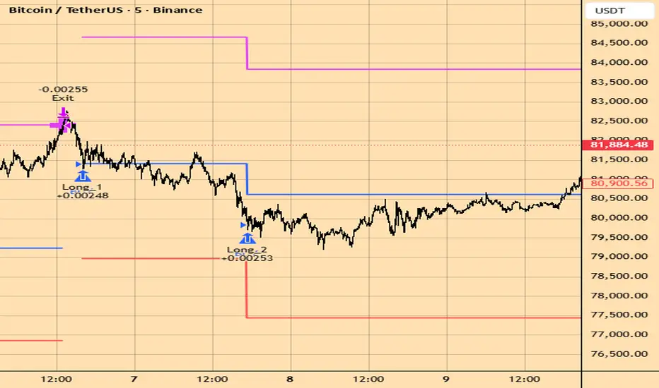
ENTRY ARROWS — blue triangles below each fill, labeled Long_1 / Long_2 / Long_3 with the order price
AVERAGE ENTRY LINE — blue, updates as the pyramid grows (staircase pattern)
TAKE PROFIT LINE — fuchsia, updates with the average
STOP LOSS LINE — red, anchored to the lowest fill (steps down only if a deeper entry occurs)
EXIT CROSS — fuchsia at TP hit, red at SL hit, placed at the actual exit price
The line style is plot.style_linebr , which connects within an open position and breaks cleanly between positions — making each pyramid cycle visually self-contained on the chart.
━━━━━━━━━━━━━━━━━━━━━━━━━━━━━━━━━━━━━
HOW TO USE IT
━━━━━━━━━━━━━━━━━━━━━━━━━━━━━━━━━━━━━
This is a complete entry + exit strategy, but it is NOT a turn-it-on-and-walk-away system. Use it as a framework to test and adapt to your specific instrument:
- Load on a liquid asset with mean-reverting behavior in an uptrend. The strategy was developed on crypto majors (BTC, ETH) and major equity indices.
Start with the default parameters and run the Strategy Tester on at least 6 months of history.
- Pay attention to:
• Net Profit and Max Drawdown ratio
• Average loss vs. average win
• Whether losing streaks cluster during specific market regimes
Tune to your instrument's volatility:
• Higher-volatility assets (alt-coins, small caps) → increase dropPercent (2-3%), increase slPercent (4-6%)
• Lower-volatility assets (BTC, indices) → decrease dropPercent (1-1.5%), tighter slPercent (2-3%)
• Higher timeframes (1h, 4h) → wider TP/SL to match bar range
- Consider adding an external trend filter for your live use. The strategy will pyramid into any oversold reading regardless of higher-timeframe context. Adding an EMA200 filter (only enter if price > EMA200) materially changes the risk profile on instruments prone to extended downtrends.
- Treat the strategy output as a structured framework for your dip-buying process, not as a guaranteed system. Combine with your own market analysis, position sizing, and broader risk management.
━━━━━━━━━━━━━━━━━━━━━━━━━━━━━━━━━━━━━
INPUTS WORTH KNOWING
━━━━━━━━━━━━━━━━━━━━━━━━━━━━━━━━━━━━━
RSI Length (default 14) and Oversold threshold (default 30) — standard RSI configuration. Lower threshold = fewer, deeper-oversold entries.
Volume SMA length (default 20) and Multiplier (default 1.5×) — volume confirmation strength. Higher multiplier = only enter on standout volume spikes, fewer entries.
Min drop between pyramid entries (default 1.5%) — prevents tight clustering. Higher = waits for deeper pullbacks before adding.
Max pyramid positions (default 3) — caps the stack. Note: pyramiding=3 is also set in the strategy() header.
Take Profit % from average (default 4%) — anchored to running average entry price.
Stop Loss % from lowest fill (default 3%) — anchored to the deepest entry, shared across all open positions.
Cooldown after SL (default 3 bars) — blocks the falling-knife pattern after a stop-out.
Cooldown after TP (default 0 bars) — re-enter immediately after a successful exit.
━━━━━━━━━━━━━━━━━━━━━━━━━━━━━━━━━━━━━
REALISTIC EXPECTATIONS
━━━━━━━━━━━━━━━━━━━━━━━━━━━━━━━━━━━━━
Pyramiding into corrections is a well-known approach with well-known limitations. The strategy works best when:
The underlying asset has a structural uptrend
Volatility produces regular pullbacks of meaningful depth
The market is not in a sustained bear regime
What this strategy provides:
A disciplined framework for scaling into pullbacks instead of single-shot entries
Asymmetric exit anchoring that lets winners run from the averaged cost basis
Built-in protection against catching the falling knife via cooldown
Transparent visualization of each pyramid leg, exit, and risk level
What it does NOT provide:
Protection from prolonged bear trends (averaging down into a structural decline is the dominant failure mode of this entire strategy family)
A guaranteed profitable system
A signal generator for assets that don't mean-revert
A replacement for your own market analysis, position sizing, or higher-timeframe context
Treat the output as ONE structured input in your trading process. The biggest risk to your account using a pyramiding strategy is mis-applying it to a downtrending asset — always confirm regime alignment before going live.
━━━━━━━━━━━━━━━━━━━━━━━━━━━━━━━━━━━━━
TECHNICAL NOTES & DISCLOSURES
━━━━━━━━━━━━━━━━━━━━━━━━━━━━━━━━━━━━━
NO REPAINT . Uses process_orders_on_close=true — all orders execute on confirmed bar close. No request.security() calls, no lookahead_on, no barmerge.lookahead_on.
REALISTIC EXECUTION . Default commission 0.05% per trade (typical crypto exchange taker fee). Position sizing in % of equity, not fixed contracts. Initial capital 10,000.
DATA USED : only standard Pine inputs — open, high, low, close, volume. Indicators: RSI, SMA of volume. No external feeds, no security() calls, no synthetic data.
PERFORMANCE : max_labels_count=500. Pyramiding capped at 3. No unbounded growth of internal objects.
ASSETS : developed on crypto majors and tested across 5m, 15m timeframes. Works on equities and forex but parameters were tuned on crypto and may need adjustment for assets with different intraday behavior.
EDUCATIONAL AND ANALYTICAL TOOL . Intended for traders who understand pyramiding mechanics and the inherent risk of averaging-down strategies, and who want a structured framework to test on their own instruments.
OPEN SOURCE . Read the code, learn from it, fork it. Feedback and bug reports welcome in the comments.
Check my profile for other published scripts. Strategi

Penunjuk

Penunjuk

Penunjuk

Penunjuk

Penunjuk
Penunjuk

Penunjuk

Strategi

Crypto Market Breadth Risk Planner [AGPro Series]Crypto Market Breadth Risk Planner
🧠 Core Idea
Is the crypto market showing broad risk-on participation, weakening rotation, or a risk-off breadth environment?
📌 Overview / What it does
Crypto Market Breadth Risk Planner is a chart-first market breadth tool built to evaluate whether a selected crypto basket is participating broadly or weakening internally.
Instead of reading only the active chart symbol, the script reviews a configurable basket of major crypto pairs. It measures how many symbols are trading above their trend baseline, how many have positive momentum, how many have rising trend structure, and how much volatility stress is present across the basket.
The script produces a 0-100 Breadth Risk Score, a colored breadth risk corridor on the active chart, event labels, right-side tags, alerts, and a compact AG Pro panel. It does not predict price direction, automate execution, or claim that breadth alone is enough to trade.
🎯 Purpose & Design Philosophy
This script was built because single-chart analysis can look strong while the broader crypto market is quietly weakening, or look weak while breadth is beginning to rotate back into strength.
The purpose is to help traders read market participation before treating an individual setup as clean. Strong setups usually have a better context when the broader basket is aligned, while weaker breadth can warn that a chart may be more exposed to false follow-through.
The design supports traders who want broader market context without opening ten charts manually. It turns cross-market participation into a simple decision-support layer that can be read directly on the current chart.
⚡ Why This Script Is Different
Most crypto tools focus on the active symbol, a single benchmark, a simple correlation reading, or a raw relative-strength line.
This script does NOT act as a benchmark correlation meter, a relative-strength rotation map, a volume spike detector, or a generic trend dashboard.
Instead, it evaluates breadth across a user-defined crypto basket and converts that participation into a risk-readiness framework. The goal is not to say which coin to buy or sell. The goal is to show whether the broader crypto environment is supportive, mixed, stressed, or risk-off.
⚙️ Methodology
1. Context Detection
The script requests data from a configurable crypto basket and evaluates each symbol on the selected breadth timeframe.
2. Reference Mapping
Each symbol is compared against its own trend baseline, momentum reading, trend slope, and ATR-based volatility stress condition.
3. Reaction Evaluation
The script combines trend participation, momentum participation, slope confirmation, and volatility stress into a single Breadth Risk Score.
4. Visual Output
The final output includes a colored breadth risk corridor, centered corridor text, event labels, right-side tags, optional bar coloring, alerts, and an AG Pro panel.
🗺️ How to Read the Chart
Zones:
The breadth risk corridor is a visual context zone around price. Its color reflects the current breadth regime rather than a direct support or resistance level.
Labels:
Labels mark important breadth state transitions such as Risk-On, Rotation Watch, Risk-Off, Stress Review, and Cooling.
Colors:
Teal represents broad constructive participation.
Pink represents risk-off breadth or weak participation.
Gold represents stress or caution.
Indigo represents improving rotation or transitional breadth.
Panel:
The panel summarizes breadth participation, Breadth Risk Score, momentum, stress, regime, and action state.
🚦 Signals & States
• Risk-On Ready → Broad participation and momentum are strong enough to support risk-on review.
• Rotation Watch → Breadth is improving, but not yet strong enough for full risk-on classification.
• Stress Review → Volatility stress is elevated while breadth quality remains weak.
• Risk-Off → Basket participation is weak or deteriorating.
• Cooling → Stress is easing while breadth quality begins to improve.
• Wait Breadth → No strong breadth regime is currently active.
🔔 Alerts Logic
Alerts can trigger when the basket shifts into Risk-On, Rotation Watch, Risk-Off, Stress Review, or Cooling.
Alerts are attention markers only. They highlight changes in the breadth model. They are not trade instructions, automated entries, or guaranteed market calls.
🧩 Confluence Logic
The context becomes stronger when multiple breadth layers align together.
For example, a high Breadth Risk Score with many symbols above their trend baselines, positive momentum participation, rising trend slopes, and low stress suggests a cleaner risk-on environment than a rally led by only one or two symbols.
Likewise, weak participation combined with elevated stress can warn that individual bullish setups may need stricter review.
📊 When to Use
• Crypto market context review
• BTC, ETH, altcoin, and sector-style crypto watchlists
• 1H, 4H, and 1D market participation analysis
• Before treating individual setups as risk-on
• When the trader wants to know whether the broader crypto basket supports the active chart
⚠️ When NOT to Use
• Markets where selected symbols have unreliable data
• Very small or illiquid crypto pairs with distorted candles
• Situations where the basket does not match the user's trading universe
• Low-timeframe scalping where external-symbol breadth may be too slow
• News-driven events where correlation and breadth can change abruptly
🎛️ Key Inputs
• Crypto Basket Symbols → define the assets used in the breadth model
• Breadth Timeframe → controls whether the basket is evaluated on chart timeframe, 1H, 4H, or 1D
• Trend Baseline Length → controls the EMA reference used for participation
• Momentum Length → controls the ROC window used for positive or negative participation
• ATR Stress Threshold → controls when basket volatility begins to count as stress
• Minimum Risk-On Score → controls how selective the risk-on state should be
• Visual Settings → control corridor, labels, right-side tags, panel location, theme, and font size
🖥️ Interface & Visual Design
The interface is designed to make broad crypto participation readable without turning the chart into a large dashboard.
The corridor gives a fast visual state directly on the chart. The panel provides the structured readout. Labels mark only important transitions, while cooldown and memory controls keep historical events from overwhelming the chart.
The visual intent is premium, clean, and publication-friendly.
🧪 Practical Usage Workflow
1. Read the panel to identify the current breadth regime.
2. Check the Breadth Risk Score and participation percentage.
3. Review whether momentum and stress support or conflict with the active chart setup.
4. Use the corridor color as a market-context layer, not as a direct entry zone.
5. Combine breadth context with price structure, volatility, liquidity, and personal risk rules.
🔍 Interpretation Guidelines
A strong score means the selected crypto basket is broadly aligned according to the script's rules.
A Rotation Watch state means breadth is improving, but the market has not fully confirmed broad risk-on participation.
A Stress Review state means volatility pressure is elevated while breadth remains weak or mixed.
A Risk-Off state means the selected basket is not supporting broad participation under the current settings.
🚫 What This Script Is NOT
This script is not a prediction engine.
This script is not financial advice.
This script is not an automated trading system.
This script does not place orders.
This script does not guarantee market direction, continuation, reversal, or profitability.
⚠️ Limitations & Transparency
This script depends on the selected symbols, selected timeframe, and TradingView data availability.
Different baskets can produce different breadth readings. A BTC-heavy basket may behave differently from an altcoin-heavy basket. External symbol data may also load differently depending on market, exchange, and TradingView availability.
The script should be interpreted as market context, not as a standalone execution model.
🧠 Market Context Notes
Crypto often moves through participation waves. Sometimes BTC leads while altcoins lag. Sometimes the whole market rotates together. Sometimes volatility rises while breadth deteriorates, creating a more fragile environment.
This script is designed to make that internal participation easier to observe directly from the active chart.
🧾 Use Case Examples
Example 1:
BTC is breaking higher, but the panel shows weak breadth and high stress. The trader may decide that the move needs extra confirmation before treating it as broad risk-on.
Example 2:
ETH is consolidating, but the basket shifts into Rotation Watch with improving momentum. The trader can monitor whether the active chart begins to align with the broader rotation.
Example 3:
The basket prints Risk-Off while an individual altcoin setup looks technically clean. The script warns that the broader market backdrop is not supportive under the current model.
🧱 System Philosophy
AGPro Series tools are built as decision-support frameworks, not signal vending machines.
This script follows that philosophy by turning broad market participation into a structured context layer: define the basket, score the breadth, map the state, and show the next action clearly.
🔐 Non-Promise Statement
This script does not promise certainty.
It does not promise that a risk-on breadth state will produce gains, or that a risk-off state will produce losses. It only organizes participation context so the user can evaluate the broader market with more clarity.
📉 Risk Disclosure
Trading involves risk.
Market conditions can change quickly, and breadth models can fail or become less useful during sudden volatility, exchange-specific moves, or news-driven repricing. Users remain responsible for their own decisions, execution, and risk management.
This script is for educational and analytical purposes only. It does not provide financial advice.
📚 Educational Note
Use this tool to study how crypto breadth changes before, during, and after major market moves.
Its strongest value comes from comparing the active chart with the broader basket context rather than reading any single label in isolation.
Penunjuk

Penunjuk

Penunjuk

Raschke 3/10 Oscillator + ADXThe histogram uses four shades — bright teal when bull momentum is building, faded teal when it's fading, bright red when bear momentum is building, faded red when it's fading. This alone tells you the story at a glance.
The fast line (3-10 EMA) changes color based on four states: solid teal = above signal AND positive (strongest bull), faded teal = above signal but still negative (recovering), faded red = below signal but still positive (weakening), solid red = below signal AND negative (strongest bear).
The ADX background does the heavy lifting — green tint fills the pane when ADX ≥ 25 (trending, trust the crosses), red tint when ADX ≤ 20 (choppy, fade extremes instead). The info table in the top-right corner shows live ADX value, DI+/DI−, and current state label.
The four signal shapes plotted:
ShapeMeaning▲ solid tealBull cross — fast crossed above signal▼ solid redBear cross — fast crossed below signal● small tealBull hook — continuation without recrossing● small redBear hook — continuation without recrossing✕ orangeBearish divergence warning✕ blueBullish divergence warning
Linda Raschke's rule baked in: The high-conviction alert fires only when a cross happens AND ADX is already in trending territory — that's the confirmation she requires before trusting a directional entry. All 9 alert conditions are pre-wired and ready to activate from the TradingView Alerts menu.
the 3/10 oscillator, four-shade histogram, ADX background zones, the info table, all signal shapes, and all 10 alert condition Penunjuk

Penunjuk
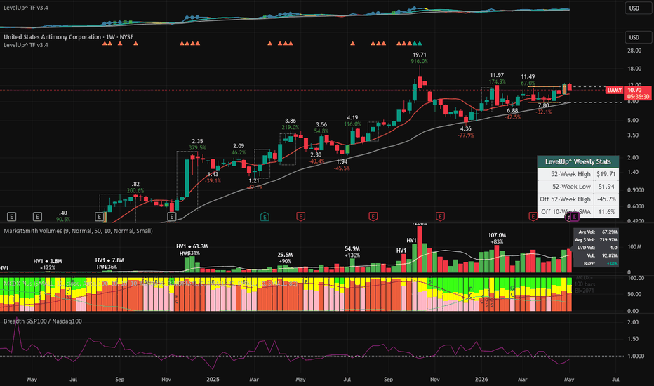
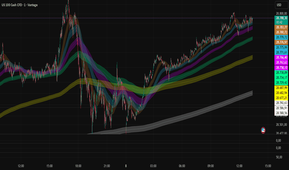
MTF Flow Liquidity Bands PROMTF Flow Liquidity Bands PRO is a smooth multi-timeframe liquidity and flow visualization system designed to map market structure, trend pressure, volatility expansion, and dynamic liquidity zones directly on the price chart.
Unlike traditional EMA channels, Bollinger Bands, or Keltner Channels, this indicator creates organic “breathing” liquidity envelopes that adapt to momentum, volatility flow, and multi-timeframe market structure.
The system was specifically designed for fast-moving markets such as:
NASDAQ / US100
BTCUSD
XAUUSD
major Forex pairs
but it can also be used on most liquid assets.
Core Concept
The indicator models the market as a dynamic liquidity flow system rather than a simple moving average trend.
It combines:
smoothed EMA structure
flow expansion
volatility pressure
multi-timeframe liquidity curves
adaptive envelopes
to create smooth institutional-style market zones.
The result is:
no stair-stepping
no rigid channels
no aggressive EMA noise
Instead, the bands behave like flowing liquidity tunnels.
What The Indicator Shows
The system displays multiple stacked liquidity bands:
Chart TF → local microstructure
x5 → intraday flow
x15 → session trend structure
H1 → dominant trend body
H4 → macro directional flow
D1 → institutional equilibrium / market magnet
Each timeframe acts like a dynamic liquidity layer.
Smaller timeframes react faster.
Higher timeframes react slower and smoother.
How The Bands Work
Each band consists of:
Basis Line
Upper Liquidity Band
Lower Liquidity Band
The bands expand and contract dynamically depending on:
momentum
volatility
flow pressure
trend acceleration
The system does NOT use fixed volatility calculations like Bollinger Bands.
Instead, it measures:
the distance between fast and slow smoothed flows
directional pressure
volatility curvature
This creates organic market envelopes that “breathe” with price action.
What The Colors Mean
Each timeframe has its own color.
Color intensity and transparency help visualize:
active trend flow
weakening momentum
liquidity compression
expansion phases
When bands become tighter:
market compression increases
breakout probability rises
When bands expand:
momentum and volatility increase
trend continuation becomes more likely
How To Trade It
1. Trend Alignment
The strongest trends occur when:
Chart TF
x5
x15
H1
all point in the same direction.
This creates full liquidity alignment.
Example:
all bands rising
all bands stacked upward
price holding above band midlines
→ strong bullish trend environment.
2. Liquidity Compression
When bands tighten and compress:
volatility is decreasing
energy is building
Compression often appears before:
breakouts
NY session expansions
trend acceleration
Tight stacked bands usually indicate:
low volatility equilibrium
upcoming expansion phase
3. Expansion Trading
When bands rapidly widen:
volatility expands
liquidity imbalance appears
directional momentum increases
This is often the best phase for:
trend continuation trades
momentum scalps
breakout entries
Especially on NASDAQ and BTC.
4. Mean Reversion
Price often overextends beyond local bands while still remaining inside higher timeframe bands.
Example:
price aggressively breaks Chart TF band
but H1/H4 bands remain intact
This frequently leads to:
pullbacks
liquidity reversion
trend resets
Higher timeframe bands act like liquidity magnets.
5. Daily Band (D1)
The D1 band is not intended for precise entries.
It acts as:
institutional equilibrium
macro liquidity zone
long-term magnet field
When price reaches extreme distance from the D1 structure:
probability of exhaustion increases
reversals become more likely
Best Use Cases
This system works exceptionally well for:
NASDAQ scalping
BTC momentum trading
Gold trend trading
intraday liquidity analysis
It is especially effective in:
trending markets
momentum environments
volatility expansion phases
Recommended Trading Style
Best suited for:
scalping
intraday trading
momentum trading
trend continuation
liquidity-based execution
Less suitable for:
illiquid assets
extremely choppy low-volume markets
Key Advantages
Smooth non-stepped curves
Organic liquidity structure
Multi-timeframe flow visualization
Dynamic volatility adaptation
Excellent trend clarity
Strong compression/expansion detection
Institutional-style market behavior
Important Notes
This indicator is NOT:
a signal generator
a predictive AI system
an orderflow tool
a volume profile
It is a market structure and liquidity flow framework designed to help traders:
understand trend pressure
identify volatility states
visualize liquidity expansion
trade with higher timeframe flow alignment
rather than against it. Penunjuk
Penunjuk

Traffic Light - Semaforo V3 - Araldo62🇬🇧 English Description (Primary)
Title: Session Light V3 - Araldo62: Multi-Timeframe Trend Filter & Signal Generator
Description:
🚀 Stop Chasing Noise. Start Trading High-Probability Setups.
Session Light V3 - Araldo62 is an advanced multi-timeframe indicator designed for day traders and swing traders who value quality over quantity. Unlike standard oscillators that generate constant noise, Session Light V3 filters out low-probability moves, offering you a panoramic view of the asset's health and providing only the strongest, most reliable signals.
🎯 Core Philosophy: Fewer Signals, Higher Impact This indicator is built on the principle that less is more. It waits for the perfect alignment between the hourly trend (H1) and the 15-minute momentum (M15).
Why? To avoid fake-outs and choppy markets.
Result: You get fewer signals, but when they appear, they represent high-confidence setups with superior Risk/Reward ratios.
🧠 How It Works: The 3 Market States The indicator uses a visual sidebar to tell you exactly what the market is doing before you enter a trade:
🔴 CONFLICT (Red Zone): H1 and M15 are moving in opposite directions.
Action: DO NOT TRADE. The market is confused. Signals are filtered out to protect your capital.
🟡 ELASTIC STRETCHED (Yellow Zone): The distance between SMA 20 and SMA 35 is significant (> 0.5%).
Action: HIGH ATTENTION. The "elastic" is stretched. This often precedes a powerful breakout or a sharp mean reversion.
🟢 ALIGNED (No Zone/Green): H1 and M15 are moving in harmony.
Action: EXECUTE. This is the ideal environment. Buy/Sell signals are active and highly reliable.
✨ Key Features:
Multi-Timeframe Analysis: Combines H1 trend direction with M15 entry triggers.
Smart Filtering: Automatically hides signals during "Conflict" phases.
Visual Clarity: Color-coded sidebars (Red/Yellow/None) for instant market context.
Session Awareness: Vertical lines mark major session opens (Tokyo, London, NY) to align trades with volume spikes.
Dashboard: Real-time stats on RSI, ADX, and Trend Alignment.
📈 Ideal For:
Traders tired of over-trading and false breakouts.
Those who want a clear "Go/No-Go" signal based on trend alignment.
Day trading and Swing trading on M15/H1 timeframes.
⚠️ Disclaimer: Trading involves risk. This indicator is a tool to assist in decision-making, not a guarantee of profit. Always use proper risk management and stop-loss orders. Past performance does not guarantee future results.
🇮🇹 Italian Description (Secondary)
Titolo: Session Light V3 - Araldo62: Filtro Trend Multi-Timeframe e Generatore di Segnali
Descrizione:
🚀 Smetti di inseguire il "Rumore". Inizia a tradare setup ad alta probabilità.
Session Light V3 - Araldo62 è un indicatore avanzato multi-timeframe progettato per i day trader e gli swing trader che danno priorità alla qualità rispetto alla quantità. A differenza degli oscillatori standard che generano continui falsi segnali, Session Light V3 filtra i movimenti a bassa probabilità, offrendoti una visione panoramica della salute dell'asset e fornendo solo i segnali più forti e affidabili.
🎯 Filosofia di Base: Pochi Segnali, Alto Impatto Questo indicatore si basa sul principio che meno è meglio. Attende l'allineamento perfetto tra il trend orario (H1) e il momentum a 15 minuti (M15).
Perché? Per evitare falsi breakout e mercati laterali (choppy).
Risultato: Ricevi meno segnali, ma quando appaiono, rappresentano setup ad alta fiducia con un rapporto Rischio/Rendimento superiore.
🧠 Come Funziona: I 3 Stati del Mercato L'indicatore utilizza una barra laterale visiva per dirti esattamente cosa sta facendo il mercato prima di entrare in trade:
🔴 CONFLICT (Zona Rossa): H1 e M15 si muovono in direzioni opposte.
Azione: NON OPERARE. Il mercato è confuso. I segnali vengono filtrati per proteggere il tuo capitale.
🟡 ELASTIC STRETCHED (Zona Gialla): La distanza tra la SMA 20 e la SMA 35 è significativa (> 0.5%).
Azione: ALTA ATTENZIONE. L'"elastico" è teso. Spesso questo precede un breakout potente o una forte correzione (mean reversion).
🟢 ALIGNED (Nessuna Zona / Verde): H1 e M15 si muovono in armonia.
Azione: ESEGUI. Questo è l'ambiente ideale. I segnali di Acquisto/Vendita sono attivi e altamente affidabili.
✨ Caratteristiche Principali:
Analisi Multi-Timeframe: Combina la direzione del trend H1 con i trigger di ingresso M15.
Filtro Intelligente: Nasconde automaticamente i segnali durante le fasi di "Conflict".
Chiarezza Visiva: Barre laterali codificate a colori (Rosso/Giallo/Nessuno) per un contesto di mercato immediato.
Consapevolezza delle Sessioni: Linee verticali segnano l'apertura delle sessioni principali (Tokyo, Londra, NY) per allineare i trade ai picchi di volume.
Dashboard: Statistiche in tempo reale su RSI, ADX e Allineamento del Trend.
📈 Ideale Per:
Trader stanchi dell'over-trading e dei falsi breakout.
Chi cerca un chiaro segnale "Go/No-Go" basato sull'allineamento del trend.
Day trading e Swing trading sui timeframes M15/H1.
⚠️ Disclaimer: Il trading comporta dei rischi. Questo indicatore è uno strumento per assistere nel processo decisionale, non una garanzia di profitto. Utilizza sempre una corretta gestione del rischio e ordini stop-loss. I risultati passati non garantiscono quelli futuri. Penunjuk

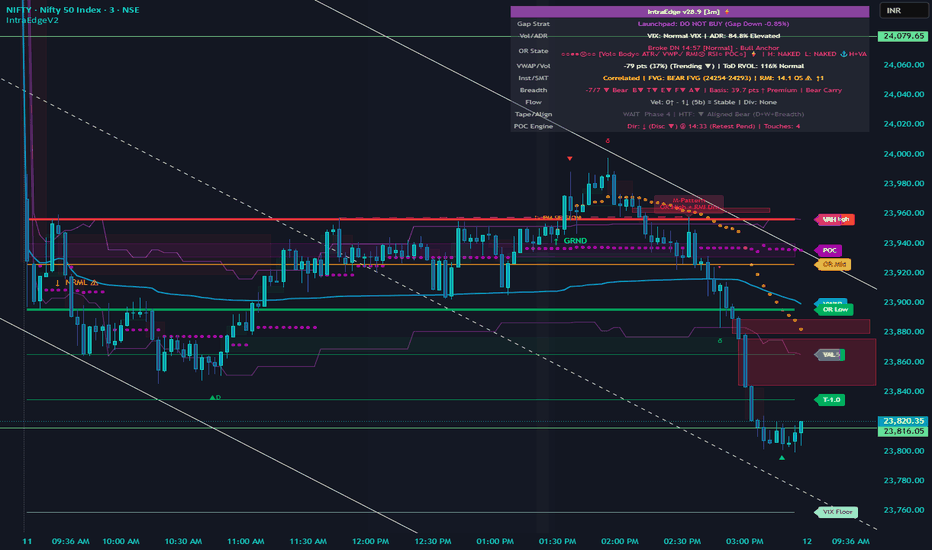
IntraEdgeV2 for Nifty, Sensex, BankNifty, Options Trading
**IntraEdge Institutional Suite**
*NSE F&O Intraday Engine — Built for Nifty, BankNifty, FinNifty, MidCapNifty, Index Options, Stock Options, and NSE Equities*
IntraEdge is a comprehensive intraday decision support system built specifically for NSE F&O traders. It synthesises institutional order flow, opening range mechanics, sector breadth, volume profile, and macro context into a single indicator, automatically adapting its engine and visuals based on the instrument you load it on.
---
**AUTO-MODE DETECTION**
Switch charts and the indicator reconfigures itself. It reads the instrument type and ticker to automatically select the correct operating mode: Nifty Index / Futures, BankNifty, FinNifty, MidCapNifty, Index Options, Stocks, or Stock Options. Override manually if needed.
---
**TIMEFRAME ROUTING: 4-TIER ARCHITECTURE**
The indicator morphs based on timeframe. On 1m to 15m charts you get the full execution engine. On 30m to 1H you get the imbalance map and doji radar. On 2H to 4H you get gravity magnets. On Daily and above you get the macro matrix. Maths always runs globally; only the visuals change per tier.
---
**CORE EXECUTION ENGINE (Intraday 1m to 15m)**
**Opening Range (OR)**
Plots OR high and low from the 9:15 to 9:30 auction. Tracks first break direction, retest, trap, and quality score. The OR close RMI is latched at exactly the 9:30 bar for session-level conviction bias. OR boxes auto-hide on historical days.
**Confluence Zone: P1**
Scans 9 institutional levels at OR set time (VWAP, VAH/VAL, PDH/PDL, PrevVWAP, weekly bands, FVG, nPOC) and scores the proximity of OR high and low to each. Colocation tags (⚓) flag where OR levels stack with Value Area or PrevVWAP, the highest-probability institutional clusters.
**OR Level Scoring: P2**
Every confirmed touch of the OR high or low is scored across volume, body close, ATR relative size, VWAP position, and RMI momentum. Scores appear as labels on the chart. High-conviction touches (score 7 or above) trigger a dedicated alert.
**Activity Filter: P3**
Detects chop regimes using range compression, VWAP adherence, and volume conditions. When active, the tape locks to WAIT and an alert fires so you know to stop trading the current setup.
**Pre-OR Sweep: P5**
Detects PDH, PDL, or PrevVWAP sweeps in the 9:15 to 9:29 window before the OR sets. Biases the OR break direction against the swept level and displays the result in the HUD.
**Opening Candle Character: P6**
Classifies the first candle's body-to-range ratio and close position to identify institutional intent at the open.
---
**VWAP ENGINE**
Custom expanding-variance VWAP with +/-1 sigma and +/-2 sigma bands. Previous day VWAP computed from scratch and latched at session end. VWAP velocity and acceleration detection. Reclaim, reject, and retest signals with alert. VWAP zone classification displayed in HUD: Value Area / Trending / Exhausted.
**Session Volume Profile (SVP)**
Native integration via the SessionVolumeProfile library. Displays today's POC, VAH, and VAL in real time. Prior session POC (nPOC) used as a gravity magnet throughout the day. SVP warmup warning displayed on first session load.
---
**INSTITUTIONAL ORDER FLOW**
**Synthetic CVD (Cumulative Volume Delta)**
Reconstructs buyer vs seller pressure from candle structure without tick data. Divergence detection: price pivot high with CVD falling signals distribution (delta label above bar). Price pivot low with CVD rising signals accumulation (delta label below bar).
**RMI Oscillator**
14-period Relative Momentum Index, momentum length 3. Used internally across five systems: OR break score, gap trap override, tape confirmation, exhaustion colouring, and the divergence engine.
**RMI Regular Divergence**
Regular Bearish Divergence: price makes a higher high while RMI makes a lower high from an overbought zone. Distribution exhaustion signal, marked with a down arrow (▼D) above the bar.
Regular Bullish Divergence: price makes a lower low while RMI makes a higher low from an oversold zone. Accumulation exhaustion signal, marked with an up arrow (▲D) below the bar.
Fires on the confirmed bar where the RMI slope flips direction. Edge trigger only, no re-firing.
**SMT / RS-RW Divergence**
Structural divergence detection between Nifty and BankNifty across PDH, PDL, and VWAP levels. Includes magnitude Z-Score engine to grade divergence strength. Macro SMT (multi-day structural) tracked separately from intraday SMT. Correlation breakdown threshold configurable.
**Sequenced Trap: Fuel and Spark**
Detects the two-step institutional trap: sweep of a key level (Fuel) followed by a break failure (Spark). Requires both events within a configurable window to confirm. Separate alerts for trap detected and OR break trap.
---
**SECTOR BREADTH ENGINE: P10**
Monitors 10 NSE sector indices (Nifty Bank, IT, Auto, FMCG, Pharma, Metal, Energy, Realty, Infra, Media) against their individual VWAPs in real time. Breadth score, velocity state (Strong In / Neutral / Strong Out), and divergence from price displayed in the HUD Flow and Breadth rows. Three alerts: breadth divergence, velocity spike, HTF breadth confirmation.
**Basis / Carry Engine: P12**
Tracks Nifty futures basis (spot vs futures spread) as a proxy for institutional positioning bias. Carry direction and tight session flags displayed in the Breadth HUD row.
---
**EXPIRY STATE MACHINE: F4**
Four-phase expiry model: Normal, Pin Risk, Gamma, Final Hour. Automatically activates on expiry day (weekly or monthly, configurable). Displays expiry phase in the HUD header and fires transition alerts when the phase changes. Max-pain structural estimate alert when the level is established.
---
**LIQUIDITY ENGINE**
5-minute sweep detection on session high and low. 15-minute and 30-minute HTF sweep detection with separate pools for top and bottom sweeps. Higher Low and Lower High structure formation alerts. HTF sweep status displayed in HUD Tape row.
---
**FVG ENGINE: 1H Imbalance Map**
Detects Fair Value Gaps on the 1H timeframe and maps them as zones on lower timeframe charts. Active FVG direction (Bull / Bear / None) displayed in HUD Inst row. FVG proximity included in P1 confluence scoring.
**Doji Radar**
Advanced doji detection across configurable body/range thresholds. Active on hourly prep and execution tiers.
**M/W Pattern Detection (Double Top / Double Bottom)**
Two-bar swing structure engine tracking higher highs, higher lows, lower highs, lower lows. Double bottom (W) and double top (M) confirmations with labels and dedicated alerts. Recent M/W confirmation shown in HUD Tape row.
---
**MACRO CONTEXT**
**VIX Expected Move Bands**
Daily VIX ceiling and floor computed from India VIX. Weekly VIX bands for expiry boundary reference. ADR (Average Daily Range) used-percentage displayed in HUD and alerted at 90% exhaustion.
**Gap Classification**
Eight gap types: Gap-and-Go, Gap Fill, Flat Open, Gap Trap Bull/Bear, Gap Magnet, Gap Reversal. Gap strategy and percentage displayed in HUD Gap Strat row. Gap trap detection feeds directly into the tape exclusion rules.
**Daily EMA 21 and Weekly VWAP**
Macro bias reference. EMA 21 slope and position displayed in HUD macro context. Weekly VWAP displayed on applicable timeframes.
**Time-of-Day RVOL**
25-epoch intraday volume matrix using 5-bar windows across the session. Compares current bar volume to the historical average for that exact time of day. Anomaly detection with configurable threshold.
---
**HUD: 8-ROW CONSOLIDATED STATUS TABLE**
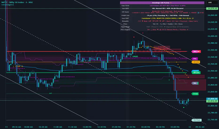
Live top-right table updating on every confirmed bar:
- **Gap Strat:** gap type, classification, gap percentage
- **Vol/ADR:** VIX regime, ADR used percentage
- **OR State:** break/retest/trap status, P1 confluence tags, colocation anchors
- **VWAP/Vol:** VWAP distance, zone classification, ToD RVOL
- **Inst/SMT:** SMT status, active FVG direction, RMI value with streak counter
- **Breadth:** sector breadth score, basis/carry, tight session flag
- **Flow:** breadth velocity, breadth divergence state
- **Tape/Align:** tape signal, exclusion reason, HTF breadth, recent M/W confirmation
On HTF charts (Daily and above), the HUD switches to a 6-row macro matrix showing macro bias, weekly VWAP, VIX range, ADR, 1H FVG, and nPOC. Auto-hides on Options and Stock charts to keep the chart clean.
---
**ALERTS: 23 CONDITIONS**
Trap Detected · OR Breakout · OR Retest · VWAP Interaction · Liquidity Sweep · Higher Low at Level · Lower High at Level · W-Pattern · M-Pattern · Breadth Divergence · Breadth Velocity Spike · OR Level High-Conviction Touch · Pre-OR Sweep · Activity Filter Activated · ADR Exhausted · VIX Band Touch · SMT / RS-RW Signal · Delta Divergence · Sequenced Trap · Expiry Phase Transition · Max-Pain Strike Set · RMI Regular Bear Divergence · RMI Regular Bull Divergence
All alerts are edge-triggered on confirmed bars. No intrabar spam.
---
**RECOMMENDED USAGE**
Best used on 3m or 5m charts for Nifty and BankNifty F&O intraday trading. Works on 1m for scalping and 15m for session-level context. Apply to the spot index (NIFTY, BANKNIFTY) or the front-month futures contract; auto-detection handles both. For options CE/PE premium charts, switch to a 1m or 3m options contract, and the engine decouples gap and VWAP calculations to the underlying automatically.
*Author: Murali Kumar ( x.com/@geekz) * Penunjuk
Strategi

Penunjuk

Penunjuk
Penunjuk

Penunjuk