Leader NASDAQ (Shape Matcher & MTF Bias) (LACERDA)The Leader NASDAQ is an advanced, real-time correlation dashboard designed for index traders who want to track the global macro ecosystem and identify which assets are currently driving the NASDAQ's price action.
Instead of just showing absolute percentage changes, this script utilizes a sophisticated "Shape Matcher" (Cumulative Deviation) algorithm. At the exact opening of each major global liquidity session (Asia, London, and New York), the script anchors the opening price of the NASDAQ and your custom watchlist to 0%. Minute by minute, it calculates the cumulative deviation between the NASDAQ's intraday performance curve and every tracked asset's curve.
The dashboard actively filters and displays the Top 2 "Leaders" for each active session—meaning it isolates the specific assets whose intraday price action most perfectly correlates with the NASDAQ at that exact moment.
✨ Key Features:
Three-Session Tracking: Automatically segmented into Asia (Pacific liquidity), London (European macro), and New York (Core volume) sessions.
Shape-Matching Logic: Finds the "gravitational pull" of the market. If NVIDIA or TSMC is dictating the Nasdaq's movement, the script will mathematically identify them as the session leaders by having the lowest cumulative error.
Live Trend Indicators: Quick-glance visual cues next to each leader. A Green circle (🟢) means the asset is currently trading above its session open (bullish pull), while a Red circle (🔴) indicates it's dragging below its open (bearish pull).
Highly Customizable: You can input up to 8 assets for Asia, 8 for London, and 9 for New York via the indicator settings. Perfect for monitoring the "Magnificent Seven", key semiconductors (like ASML, TSMC), and global indices (DAX, Nikkei 225, KOSPI).
Non-Intrusive HUD: A sleek, borderless table overlay that can be positioned anywhere on your chart (Top Right, Bottom Left, etc.) without cluttering your technical analysis.
How to Use:
Apply the indicator to your chart (optimally a NASDAQ/MNQ chart).
Open the Indicator Settings (⚙️).
Type in your favorite market-driving tickers for each session (e.g., AAPL, NVDA, NI225, FDAX1!, USDJPY).
Watch the dashboard dynamically update to show you where the smart money and heavy correlation currently reside! Penunjuk

Leader NASDAQ (Shape Matcher) NY,ASIA,LondonThe Leader NASDAQ is an advanced, real-time correlation dashboard designed for index traders who want to track the global macro ecosystem and identify which assets are currently driving the NASDAQ's price action.
Instead of just showing absolute percentage changes, this script utilizes a sophisticated "Shape Matcher" (Cumulative Deviation) algorithm. At the exact opening of each major global liquidity session (Asia, London, and New York), the script anchors the opening price of the NASDAQ and your custom watchlist to 0%. Minute by minute, it calculates the cumulative deviation between the NASDAQ's intraday performance curve and every tracked asset's curve.
The dashboard actively filters and displays the Top 2 "Leaders" for each active session—meaning it isolates the specific assets whose intraday price action most perfectly correlates with the NASDAQ at that exact moment.
✨ Key Features:
Three-Session Tracking: Automatically segmented into Asia (Pacific liquidity), London (European macro), and New York (Core volume) sessions.
Shape-Matching Logic: Finds the "gravitational pull" of the market. If NVIDIA or TSMC is dictating the Nasdaq's movement, the script will mathematically identify them as the session leaders by having the lowest cumulative error.
Live Trend Indicators: Quick-glance visual cues next to each leader. A Green circle (🟢) means the asset is currently trading above its session open (bullish pull), while a Red circle (🔴) indicates it's dragging below its open (bearish pull).
Highly Customizable: You can input up to 8 assets for Asia, 8 for London, and 9 for New York via the indicator settings. Perfect for monitoring the "Magnificent Seven", key semiconductors (like ASML, TSMC), and global indices (DAX, Nikkei 225, KOSPI).
Non-Intrusive HUD: A sleek, borderless table overlay that can be positioned anywhere on your chart (Top Right, Bottom Left, etc.) without cluttering your technical analysis.
How to Use:
Apply the indicator to your chart (optimally a NASDAQ/MNQ chart).
Open the Indicator Settings (⚙️).
Type in your favorite market-driving tickers for each session (e.g., AAPL, NVDA, NI225, FDAX1!, USDJPY).
Watch the dashboard dynamically update to show you where the smart money and heavy correlation currently reside! Penunjuk

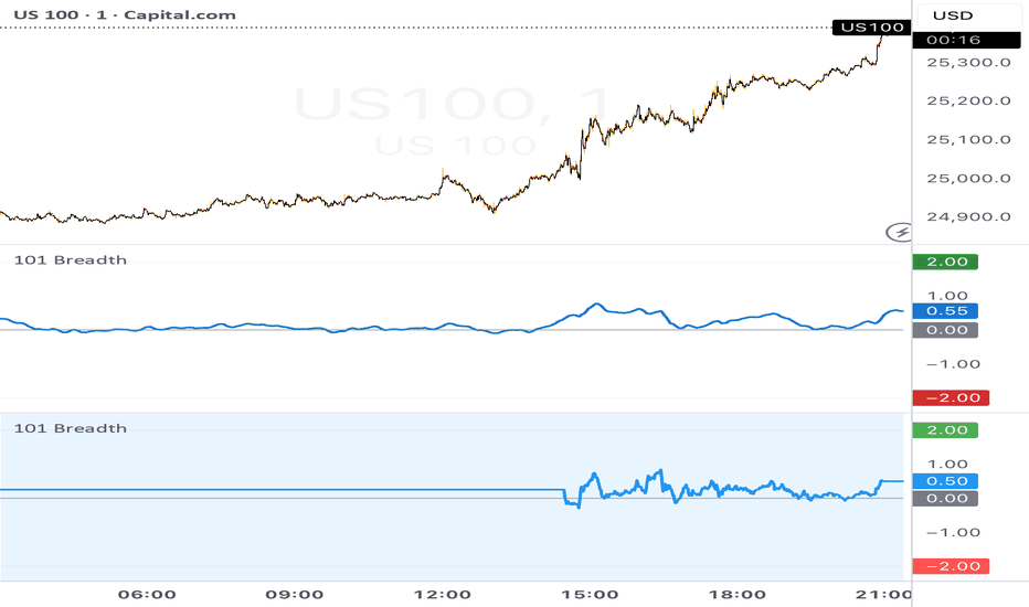
DAX Breadth [AM]DAX Breadth — Publication Description
TradingView Pine Script Library
---
Title
DAX Breadth
Tagline
The breadth data DAX traders never had — until now.
---
Full Description
The Problem
If you trade the DAX40 intraday, you already know this frustration: breadth data simply does not exist for European indices on retail platforms. NYSE traders have TICK, ADD, VOLD and TRIN available as standard symbols. DAX traders have nothing equivalent. There is no XETR:TICK. There is no XETR:ADD. The Deutsche Börse publishes no aggregated breadth feed accessible to retail platforms.
This indicator solves that problem from the ground up.
---
What It Does
DAX Breadth reconstructs five institutional-grade breadth metrics for the DAX40 by individually scanning all 40 Xetra components on every bar using `request.security()` calls. It creates data that does not otherwise exist on TradingView.
This is not a mashup of existing indicators. It is a full reconstruction of breadth internals from raw component data.
---
The Five Metrics
TICK
Net advancing minus declining components on each bar. A reading of +25 means 32 stocks up, 7 down. Mirrors NYSE TICK methodology applied to the DAX40 universe. Reacts instantly — your fastest breadth signal.
CUMT (Cumulative TICK)
Running sum of TICK readings since the Xetra session open (09:00 CET), resetting daily. A rising CUMT throughout the session confirms sustained buying pressure. A falling CUMT despite a rising DAX price flags a breadth divergence — one of the most powerful signals in this indicator.
UVOL% (Up-Volume Ratio)
Volume of all advancing components as a percentage of total DAX40 volume. This is the critical institutional participation metric. A narrow rally driven by SAP or Siemens alone will show moderate TICK but low UVOL%. Readings above 75% confirm broad institutional buying. Below 30% on a rising index is a red flag.
ADV% (Advancing Percentage)
Raw count of advancing stocks as a percentage of the 40 components. Simple, fast, and useful for immediate visual confirmation of breadth width.
A/D Thrust (EMA-smoothed)
Advance/decline ratio smoothed with a configurable EMA (default 5 bars). Slower than TICK and ADV% by design — it filters noise and confirms the sustained directional bias of the session. Read it last, alongside CUMT.
---
The Dashboard
Each metric is displayed in a compact floating table with five columns:
INT VALUE TIER TRD ROC
Metric name Current reading Strength tier Direction arrow Rate of change
TIER classifies each metric into five levels using adaptive thresholds that widen during the first 15 bars of the session (early-session noise reduction):
+2 Strong Bull — dark green
+1 Bull — light green
0 Neutral — grey
−1 Bear — red
−2 Strong Bear — dark red
TRD shows the directional change vs the previous bar (↑ ↓ →).
ROC shows the delta vs N bars ago (configurable, default 5). All ROC values use a consistent delta format with explicit +/− sign so momentum direction is immediately readable.
---
Composite Score & Conclusion Block
Below the separator, three summary rows provide the analytical conclusion:
COMP — A weighted composite of all five metrics on a scale of −100 to +100.
Weights: UVOL% 30% · A/D 25% · TICK 20% · ADV% 15% · CUMT 10%
Includes its own ROC value and direction arrow.
Labels: Strong (≥50) · Moderate (≥25) · Weak (<25)
BIAS — Session directional bias derived from the composite score:
Bullish · Mild Bull · Neutral · Mild Bear · Bearish
MODE — Operating mode:
NORMAL — standard session conditions
NO_EDGE — composite score too low to confirm direction
90PCT_DAY — rare extreme breadth event (≥90% or ≤10% advancing) signalling high-probability trend continuation for the remainder of the session
---
How to Use It in Your Trading
Confirmation tool, not a signal generator.
Use DAX Breadth to confirm or challenge what you see on price. Before entering a long setup, check: Is UVOL% above 60%? Is CUMT rising? Is ADV% above 55%? If breadth contradicts the price setup, reduce size or skip the trade.
Divergence detection.
The most actionable signal: DAX index making new session highs while CUMT is declining. This breadth divergence frequently precedes sharp reversals. Watch it closely during the 10:00–11:00 CET window.
Opening Range context.
At 09:15 CET, after the Opening Range has formed, read the initial TICK and CUMT direction. A CUMT already moving strongly in one direction within the first 15 minutes is a high-conviction session bias signal.
90PCT_DAY awareness.
When MODE switches to 90PCT_DAY, the historical edge for trend continuation is significant. These sessions occur 2–5 times per quarter. On these days, fade setups should be avoided and trend-following setups sized up.
---
Technical Notes
Timeframe: Designed for 1-minute and 5-minute charts during the Xetra session (09:00–17:30 CET / Europe/Berlin timezone). Do not use on higher timeframes — CUMT accumulation becomes meaningless outside intraday context.
Data source: 39 XETR-listed components + Covestro (FWB:1COV, post-ADNOC acquisition). All other 39 components use Xetra primary listing data.
Session reset: CUMT resets automatically at 09:00 CET each trading day.
Adaptive tiers: Tier thresholds widen automatically during the first 15 bars of each session to prevent false extreme readings during the volatile open.
Overlay indicator: Renders as a floating table on the price chart. No separate pane required.
---
Settings
Setting Default Description
Table Position Right Top Floating table placement
Text Size Normal Tiny / Small / Normal
A/D EMA Smoothing 5 bars EMA length for A/D Thrust
ROC Lookback 5 bars Bars back for rate of change
---
Why This Is Different
Most breadth indicators available for European indices either:
(a) rely on pre-existing index breadth feeds that don't exist for DAX, or
(b) use price-only proxies that approximate breadth without volume confirmation.
DAX Breadth reconstructs five distinct breadth dimensions — including volume-weighted participation — from raw component data on every bar. The result is an institutional-grade breadth dashboard that did not previously exist for DAX40 intraday traders on any retail platform.
---
Designed and built for professional DAX40 intraday trading.
Optimised for use on 1M and 5M XETR:DAX charts during the Xetra session. Penunjuk

Penunjuk

Penunjuk
Penunjuk

Penunjuk

Penunjuk

Penunjuk

Penunjuk

Penunjuk

Divergence Stack Scanner [AGPro Series]Divergence Stack Scanner
🔹 Overview
Divergence Stack Scanner scans five independent momentum and volume oscillators simultaneously — RSI, MACD Histogram, CCI, MFI, and OBV — and grades every confirmed pivot by how many of them show regular divergence at the same time. The result is a 0 to 5 STACK score that isolates rare, high-conviction reversal zones which single-divergence tools simply cannot surface.
Most divergence indicators track one oscillator at a time. Strong reversals, however, tend to leave fingerprints across momentum and volume at once. This tool quantifies that confluence in a single, objective number you can act on.
🔸 Unique Edge
What separates this script from the crowded divergence space:
1. Five-oscillator confluence in one engine — not one divergence, five divergences graded together.
2. Strict versus Window classification — a 5/5 STRICT stack (all five on the exact same pivot) is marked with a star flash, while a 5/5 WINDOW stack (all five within a small bar tolerance) is tagged separately. The distinction matters because strict stacks are statistically rarer and sharper.
3. Pressure Zones — a rectangular, SR-style zone is drawn forward from each qualifying pivot, so the reversal level stays visible long after the signal fires.
4. Rolling win-rate panel — the last N decided signals are evaluated N bars forward, and the win percentage is displayed live on the panel.
5. Per-oscillator live state — you see at a glance which oscillators are already in divergence and how long ago they triggered.
🔹 Methodology
Pivots are detected using the standard TradingView pivot method with a configurable lookback (default 5 bars each side, confirmed, non-repainting).
When a pivot is confirmed, the script compares the current pivot price and oscillator value to the previous same-direction pivot:
- Regular bullish divergence: price prints a lower low while the oscillator prints a higher low.
- Regular bearish divergence: price prints a higher high while the oscillator prints a lower high.
This comparison runs independently for RSI, MACD Histogram, CCI, MFI, and OBV. Each oscillator stores the bar index of its most recent divergence. The stack engine then counts how many oscillators have fired within a tolerance window of the current pivot:
- Strict stack (window = 0): all counted oscillators fired on the exact same pivot bar.
- Window stack (window = 1 to N bars): oscillators fired within N bars of each other.
Pressure zones are drawn only when the stack meets a configurable minimum (default 4/5). Zone height is ATR-scaled so it stays proportional across instruments and timeframes. A proximity filter prevents label clutter: once a label is drawn in a given direction, a new label in the same direction within a short window is only drawn if its stack level is strictly higher.
🔸 Signals & Alerts
On-chart signals:
- ★ N/5 STACK label (filled color) — strict same-bar stack at level N.
- N/5 NEAR label (lighter color) — window stack (near-miss of strict).
- Pressure zone rectangle — drawn forward from the pivot for qualifying stacks.
Alerts available:
- 5/5 Strict Stack (bull and bear, separate) — the rarest and sharpest signal.
- Minimum Stack threshold — fires whenever the stack reaches your configured minimum level.
All alerts use alert.freq_once_per_bar_close and include ticker plus timeframe in the message.
🔹 Key Inputs
Core Engine:
- Pivot Lookback — bars each side to confirm a pivot (default 5).
- RSI, MACD, CCI, MFI lengths — standard defaults, all configurable.
Stack Configuration:
- Minimum Stack Level — display threshold (default 3/5).
- Window Tolerance — bar tolerance for near-stacks (default 3).
- Win-Rate Lookback — number of recent signals used for rolling win rate (default 20).
- Win Evaluation Bars — forward bars to decide win or loss (default 10).
Pressure Zones:
- Minimum Stack for Zone (default 4/5) — keeps the chart premium and uncluttered.
- Zone Extend and Height (ATR%) — tune the visual footprint to your taste.
- Max Active Zones — oldest zones are automatically trimmed.
Panel and Theme:
- Location (6 anchors), Dark or Light theme, font size presets.
- Fully brand-consistent AGPro color palette built in.
🔸 How to Use
- Treat 5/5 STRICT stacks as the headline signal. They are rare by construction and typically appear at genuine inflection points.
- Use 4/5 stacks as early-warning context around support, resistance, or higher-timeframe levels.
- Read the per-oscillator live state on the panel. When RSI, MACD, CCI, MFI are all in the same direction and OBV is the last holdout, a full stack is often imminent.
- Pressure zones work well as re-entry or invalidation levels after the initial signal fires.
- The rolling win rate is a sanity check for the current asset and timeframe — if it degrades meaningfully, raise the minimum stack level or widen the pivot lookback.
🔹 Limitations and Transparency
- This is a confluence tool, not a standalone trading system. Divergence by nature can persist in strong trends before any reversal.
- The engine is pivot-based and therefore delayed by the pivot lookback. Labels appear on the bar the pivot is confirmed, not on the pivot itself.
- Win rate is computed on the last N decided signals on the current chart. It is not a backtest, it is an evolving statistic and it does not include slippage, spread, or position sizing.
- Window stacks are lower-confidence than strict stacks by design. The visual distinction is intentional.
- Session-based "Today's Max" uses calendar-day rollover.
🔸 Risk Disclosure
This indicator is a technical analysis tool for research and education. It is not financial advice, not a signal service, and not a trading strategy. Past patterns do not guarantee future behavior. You are solely responsible for your trading decisions, risk management, and position sizing. Always combine any indicator with independent analysis, higher-timeframe context, and strict risk controls.
🔹 Technical Notes
- Pine Script v6, overlay indicator.
- Fully non-repainting. All divergences are evaluated only on confirmed pivots.
- Drawing objects (labels, boxes) are capped to avoid resource overruns.
- MPL 2.0 licensed — open source. Penunjuk

Penunjuk

Penunjuk

Moon VWAPMoon VWAP (MAVWAP) overlays anchored VWAP (AVWAP) segments that reset on calendar-based anchors you choose—primarily every New Moon (and optionally Full Moon), plus optional anchors for Mercury retrograde start, Venus retrograde start, Total Lunar Eclipse (TLE), Total Solar Eclipse (TSE), and a regime-flip anchor derived from your scripted eclipse rules.
What you get
Lunar markers: New Moon and Full Moon events (UTC), with styling options including August New Moon emphasis and optional ±day background tint around New Moons.
Retrograde context: Mercury (and optional Venus) retrograde start/end markers, optional in-span shading, optional shadow shading, and optional “open at Rx start” reference.
Eclipse markers: Total (and optional partial) lunar/solar eclipse marks.
Optional regime backdrop: Background tinting for a lunar-cycle vs solar-cycle interpretation (user-configurable rules in the inputs).
AVWAP suite: Separate toggles/colors for VWAP segments anchored to the events above—useful for tracking how price behaves from each anchor forward.
How to use
Pick which anchors matter for your process (most users start with New Moon AVWAP).
Choose marker style (emoji-only vs vertical lines) for a cleaner chart.
If something looks off vs your reference almanac, confirm the underlying UTC tables against your preferred astronomical source—this tool is for visual context, not a guarantee of timing precision on every feed.
Disclaimer: For education and research only. Not financial advice. Past performance does not guarantee future results. Astronomical/astrological cycle overlays are discretionary; verify critical dates independently. Penunjuk

RizA_Ultra_PusuRizA_Ultra_Pusu: The Ultimate SMC & Trend Intelligence Terminal
RizA_Ultra_Pusu is a comprehensive trading solution designed for traders who follow Smart Money Concepts (SMC), Institutional Order Flow, and Multi-Timeframe Trend Analysis. It consolidates essential high-tier tools into a single, optimized script to clean up your charts while providing deep market insights.
🔑 Key Modules
1. Smart Order Blocks (OB) & Breakers
The script identifies high-probability supply and demand zones where institutional movement originates.
Dynamic Tracking: Automatically draws Bullish and Bearish OBs.
Mitigation Logic: Zones extend until hit by price.
Breaker Blocks: If an OB is violated with momentum, it instantly transforms into a Breaker Block (S/R Flip), signaling a potential trend continuation or reversal.
2. Liquidity Swings with Intrabar Precision
Finding pivots is easy, but finding meaningful liquidity is hard.
Volume Metrics: Displays the accumulated volume at swing highs and lows.
Precision Mode: Uses lower timeframe data to pinpoint exactly where the "money" is sitting (Wick Extremity vs. Full Range).
Crossovers: Visual alerts when liquidity is "swept" or "cleared."
3. Multi-Timeframe (MTF) Trend Ribbon
Don't get lost in the noise of a single timeframe.
Normal & MTF SMAs: Tracks trends from higher timeframes (e.g., 5m, 30m) directly on your current chart.
Trend Clouds: Beautifully shaded ribbons (Bullish Green / Bearish Red) that help you stay on the right side of the market trend.
4. Killzone & Session Terminal
In trading, Time is as important as Price.
Major Sessions: Automatically highlights Asia, London, NY AM, and NY PM sessions.
Session Highs/Lows: Tracks the most important levels of the day.
Countdown Timer: A sleek on-chart dashboard showing the exact time remaining until the next session open/close.
📈 How to Trade with RizA_Ultra_Pusu
The Setup: Look for price to sweep a Liquidity Swing level (dashed line) during a major Killzone (e.g., London Open).
The Confirmation: Wait for a Market Structure Shift and the formation of a new Order Block.
The Filter: Ensure the MTF Trend Ribbon aligns with your trade direction for a higher probability of success.
⚙️ Professional Settings
Drawing Limit: Keep your chart clean by limiting the number of historical session boxes.
Custom GMT Offset: Compatible with all global markets (Forex, Crypto, BIST, NAS100).
Volume Filtering: Filter out insignificant pivots by setting a minimum volume threshold.
⚠️ Disclaimer: This tool is designed for decision support and technical analysis. It is not a financial advice "signal" bot. Always apply strict risk management. Penunjuk

Cross-Asset Correlation & Cointegration Intelligence [NikaQuant]
**Cross-Asset Correlation & Cointegration Intelligence**
Track your chart symbol against up to six comparison symbols. The script
renders **three synchronized panels** that tell you, in plain numbers:
- How coupled the basket is **right now**
- Which pairs are genuinely tradeable (and the **expected mean-reversion time**)
- How much **gross exposure** you should carry given the current regime
## What It Does
- **Intelligence Dashboard** — per-symbol grid: correlation, beta, R²,
z-score, percentile, stability, lead/lag, spread z, quality score,
hedge size, stress-vs-normal correlation delta, signal verdict
- **N×N Correlation Matrix** — full 6×6 pairwise heatmap
- **Action Center** — regime timer, flip probability, risk-budget advisor,
top-5 ranked trades, top-3 cointegrated pair setups, trade playbook
## Why It Is Original
Unlike standard correlation heatmap scripts that display a single Pearson
value per pair, this script builds a composite intelligence layer across
**three independent axes** that no retail correlation indicator combines:
**1. Asymmetric (Conditional) Correlation**
Splits history into **normal-volatility** and **stress-volatility** regimes
using an ATR-median split on the base symbol, and reports the two
correlations side by side. This exposes the *"diversification fails when
you need it"* amplification that an averaged Pearson value hides — a
documented pattern in every crisis since 1998.
**2. Cointegration + Half-Life**
For all 15 unique pairs, runs an **Engle-Granger two-step** (log-regression
then AR(1) on the residual spread) to flag which spreads are genuinely
mean-reverting. Cointegrated pairs carry an **Ornstein-Uhlenbeck half-life**
t½ = −ln(2) / ln(1 + φ) — the expected mean-reversion time in bars.
*Correlation tells you direction; cointegration tells you whether the
spread will revert.*
**3. Regime Persistence + Flip Probability**
Tracks four states (Crisis / Coupled / Mixed / Decoupled) in a **4×4 Markov
transition counter**, stores per-regime dwell times, and converts them into
flip-probability estimates for the next 10 and 30 bars. You see not just
*"we are in X"* but *"X has lasted 47 bars, historical average is 62 bars,
probability of flip in 30 bars is 55%."*
## Composite Modules
- **Crisis Clock (0–100)** — composite of average absolute correlation,
cross-sectional dispersion collapse, and tail-dependence count
- **Market Brain** — union-find clustering on positive pairwise
correlations, auto-groups symbols that move as one
- **Dispersion Trade Detector** — fires when average correlation drops
>2σ while realized volatility rises
- **Hedge Desk** — converts OLS beta into a **dollar hedge notional**
given your base position size
- **Effective-N** — correlation-adjusted diversification count (six
symbols at ρ=1.0 gives effective N = 1)
- **Risk Budget Advisor** — regime + effective-N → suggested gross
exposure percentage
- **Setup Quality Score** — composite of |corr| × R² × stability,
adjusted for regime, clock, and break
- **Action List** — scans every symbol and every pair, scores each
candidate, ranks them, surfaces the top five with type, target, score,
direction, suggested size, rationale
## Per-Symbol Metrics
- Rolling Pearson correlation across **three lookbacks** (short, medium,
long) — three-block glyph reveals timeframe divergence
- **OLS beta** from log returns, **R²** as variance explained
- **Z-score** of current correlation vs its own 200-bar distribution
- **Percentile rank** of current correlation in its own history
- **Stability** from rolling stdev of the correlation itself
- **Optimal-lag scanner** across {−5, −3, −1, 0, +1, +3, +5} offsets
- **Spread z-score** of the price ratio for pairs signaling
- **Asymmetric Δ** = ρ_stress − ρ_normal (positive = hedge fails under stress)
## How To Use It
- **Scan the Quality column first.** Anything at or above 60 with a
TRACK++ or HEDGE++ signal is a high-confidence setup.
- **Cross-check AsymΔ.** Values above +0.3 mean that "hedge" is expected
to fail under stress — avoid relying on it in a crisis.
- **Use Hedge column values** as the dollar notional to short or long
against your base position to neutralize beta.
- **Read the matrix** like a portfolio risk report. Clusters of dark-green
tiles = diversification is breaking down. Red tiles = inverse pairs.
- **In the Action Center**, start at the Risk Budget line, then work
top-down through the Action List. Cointegrated pairs marked with a
check-mark prefix show expected mean-reversion time in bars.
**Recommended timeframes:** intraday or daily charts with at least 250
bars of history across all six symbols.
**Recommended markets:** anywhere the base asset has meaningful
relationships with a benchmark basket — equity indexes vs sector ETFs,
crypto majors vs index proxies, FX vs rates and commodities.
**Avoid using when:** fewer than three symbols resolve to valid data;
during the first 250 bars after chart load; or on a symbol with gapped
or illiquid history that creates artificial correlation jumps.
## Alerts
Regime Break · Dispersion Trade Setup · New Cointegrated Pair ·
High-Quality Setup · Imminent Regime Flip · Crisis Regime Entered ·
Asymmetric Correlation Amplification · Risk Budget Reduced · Clock
Stressed/Critical · Strong Positive/Negative Correlation Crossovers
## Key Settings
- **Comparison Symbols 1–6** — the basket (autocomplete from any TV ticker)
- **Medium-Term Correlation Period** (50) — primary correlation lookback
- **Short / Long Lookbacks** (20 / 200) — timeframe-divergence glyph
- **Historical Baseline** (200) — z-score, percentile, stability, regime
dwell times, and asymmetric-correlation ATR split
- **Strong Correlation** (0.70) — threshold for strong-signal eligibility
- **Regime-Break |Z|** (2.00) — flags correlations breaking their range
- **Pairs-Trade |Spread Z|** (2.00) — pairs-trade setup threshold
- **Min R² for Trust** (0.25), **Min Stability** (0.50) — quality gates
- **Cluster Threshold** (0.60) — Market Brain grouping
- **Crisis Clock** — Stressed (60), Critical (80) thresholds
- **Base Position Size** (10,000) — drives Hedge Desk and Action sizing
- **Min Action Quality** (60) — filters the Action List
- **Risk Budget per regime** — Crisis 50%, Coupled 75%, Mixed 90%,
Decoupled 100% (all user-tunable)
- **Display** — position each of three tables independently; Compact or
Pro column density; full palette customization
## Notes
**No repainting.** All correlations, betas, and regime computations use
confirmed bars only. Regime transition counters and dwell-time arrays
update only when a bar confirms.
**Data integrity.** Six external symbol requests are made with
non-forward-looking data fetches, well within TradingView's request limit.
**Methods.** Asymmetric correlation uses log returns with indicator
weights from an ATR-median volatility split on the base asset.
Cointegration is Engle-Granger two-step: log-regression residual, then
AR(1) test. A pair is flagged as cointegrated when the AR(1) coefficient
is sufficiently negative to indicate mean-reversion. Half-life uses the
standard Ornstein-Uhlenbeck solution t½ = −ln(2) / ln(1 + φ).
**Warm-up.** The first ~250 bars after chart load are a warm-up period.
Several metrics will display "—" until enough history accumulates.
**Originality.** All calculations, signal logic, clustering,
cointegration testing, and table rendering are original. No third-party
code is reused.
Penunjuk

Structure OSMake an indicator that OVERVIEW
Structure OS is a price action structure indicator that maps swing highs, swing lows, and structural breaks using a candle pullback confirmation system no lagging indicators, no arbitrary lookback periods.
The indicator runs two independent structure detection engines simultaneously (swing and internal), both using the same confirmation logic but at different structural scopes. A multi-timeframe dashboard provides directional bias and structure state across higher timeframes.
HOW THIS DIFFERS FROM EXISTING OPEN-SOURCE STRUCTURE SCRIPTS
Most publicly available market structure indicators identify swing points using ta.pivothigh() and ta.pivotlow() - fixed-period lookback functions that define a swing high as "the highest point over N bars." This approach produces a flat list of pivot points with no validation that a genuine reversal attempt occurred at those levels.
Structure OS uses a fundamentally different detection method: Instead of a lookback window, the indicator tracks price in real time and requires a sequence of three consecutive opposing candles
each closing beyond the previous one's body - before confirming a swing point. If price exceeds the tracking extreme before three candles complete, the count resets to zero and restarts.
This distinction matters because the same raw price data produces different structural maps depending on which method is used. A fixed-lookback pivot may confirm a swing high that the pullback confirmation method rejects (because the pullback lacked three consecutive candles), and vice versa. Different swing points mean different BOS and CHOCH events, which means entirely different trade signals.
SWING STRUCTURE ENGINE
When price makes a move, the indicator begins tracking a candidate swing point.
Confirmation requires:
Three consecutive opposing candles (bearish candles to confirm a high, bullish to confirm a low) Each candle in the sequence must close beyond the previous one's low (for bearish) or high (for bullish) If price makes a new extreme before three candles complete, the candidate resets and the count starts over
Once two swing points are confirmed, a trading range is established between the swing high and swing low. A candle close beyond the range boundary triggers:
BOS (Break of Structure) - close beyond the swing level in the direction of the current trend. CHOCH (Change of Character) close beyond the swing level against the prevailing trend. Signals reversal.
Confirms continuation.
Wicks through a level do not qualify. Only a candle close beyond the structural level triggers a break event.
Unconfirmed candidate levels are shown as dotted lines so traders can see where a potential swing point is forming before the three-candle count completes.
INTERNAL STRUCTURE ENGINE
Internal structure uses the same
three-candle confirmation logic but is scoped exclusively within the current confirmed swing high and swing low.
It activates only after a new swing point is established. It resets completely when a new swing BOS or CHOCH occurs. It cannot detect or plot structure outside the active swing boundaries.
This separation ensures that pullbacks within a swing range are tracked independently from swing-level reversals. Internal BOS and CHOCH events are labeled as IBOS and iCHOCH respectively, drawn with dashed lines to visually distinguish them from swing structure.
MULTI-TIMEFRAME
DASHBOARD
The on-chart dashboard has two sections:
Directional Bias - Compares the previous candle's close against prior period highs and lows on Weekly and Daily timeframes. Classifies bias as Bullish, Bearish, or neutral based on whether close exceeded the previous period's high or low, or whether a sweep occurred (high/low broken but close returned inside).
Market Structure - Runs the same swing detection engine on H4, 15M, and 1M via request.security(). Reports current bias direction and structure stage (Shift, Confirmed Shift, Expansion, or Continuation) for each timeframe. Only displays timeframes that are higher than thecurrent chart.
SESSION MAPPING
Configurable session highlighting for Asia, London, and New York.
Each session draws a box from session open to close, tracking the high and low in real time. A "Current Week Only" toggle keeps the chart clean by removing older session boxes. All session times, colours, and toggles are independently configurable.
FEATURES
Swing Structure - BOS and CHOCH detection with HH/HL/LH/LL swing labels
Internal Structure - Same 3-candle
logic running inside the current swing range, with independent display settings
Current Range Display - Horizontal lines marking the active swing high and swing low. Solid when confirmed, dotted while tracking Close-Only Break Validation Wicks do not trigger breaks at swing or internal level
Pullback Confirmation - Three
consecutive opposing candles
required. Count resets if price
makes a new extreme
Multi-Timeframe Dashboard
Directional bias (Weekly/Daily) and
market structure state
(H4/15M/1M)
Optional H4 Swing Level Overlay Plots H4 swing high/low as horizontal lines on lower timeframe chartsDirectional bias (Weekly/Daily) and market structure state
(H4/15M/1M)
Optional H4 Swing Level Overlay Plots H4 swing high/low as horizontal lines on lower timeframe charts
Session Mapping - Asia, London, New York with tracked highs/lows Bar Colouring - Optional candle colouring by current swing bias Full Customisation - Independent colour, label size, and BOS/CHOCH toggle settings for both swing and internal structure. Penunjuk

Penunjuk

BTC Potential EnergyBTC Potential Energy is a macro-cycle oscillator that tracks how much "dry powder" is sitting in Tether (USDT) relative to its structural baseline — and translates that into a 0–100 potential energy score for Bitcoin. The core idea is simple: when investors are parking abnormal amounts of capital in stablecoins, that capital isn't gone — it's coiled. The higher the stablecoin accumulation above its own historical trend, the greater the potential for a violent rotation back into Bitcoin when sentiment shifts.
The indicator displays as a sub-pane oscillator beneath your BTC chart and is designed primarily for use on the Weekly or Daily timeframe , where macro cycle analysis is most meaningful.
The Concept: Stablecoins as a Coiled Spring
In crypto markets, Tether Dominance (USDT.D) is the percentage of total crypto market cap held in USDT. It rises when investors flee risk — selling Bitcoin and altcoins into stablecoins — and falls when investors deploy that capital back into the market.
This creates a physics-like analogy:
Compression phase — USDT.D rises as capital moves to safety. Like compressing a spring, potential energy builds.
Release phase — USDT.D begins to fall. The spring releases. Capital rotates into BTC, historically preceding or coinciding with the early stages of bull runs.
The further above normal USDT.D is, and the more abruptly it starts declining, the more powerful that rotation tends to be.
The Problem With Naive USDT.D Analysis
The most obvious approach — ranking the raw USDT.D value over history — fails in practice. Why? Because the stablecoin market has grown enormously since 2017. USDT.D in 2021 was structurally higher in absolute percentage terms than in 2018, simply because more stablecoins exist and are used as a base layer across DeFi and centralised exchanges. This secular uptrend means that if you rank raw USDT.D, the indicator reads "high energy" throughout the 2021 bull market — precisely when energy was already deployed and Bitcoin was already running. That is the opposite of useful.
The Solution: Detrended Potential Energy
BTC Potential Energy solves this by ranking the deviation of USDT.D from its own long-term moving average , not the raw level itself. This strips out the structural growth of the stablecoin market and isolates only the anomalous accumulation — the excess fear-driven or cycle-driven flight to safety that goes beyond what the baseline trend would predict.
Step 1 — Establish the Baseline
A long Simple Moving Average (default: 100 bars) is computed on USDT.D. On the weekly chart, this represents approximately 2 years — roughly one full Bitcoin market cycle. This MA acts as the "expected" or structural level of stablecoin dominance for any given period. It rises gradually over time as the stablecoin ecosystem matures, automatically adjusting the baseline to the era.
Step 2 — Compute the Deviation
The deviation is calculated as:
Deviation = USDT.D − Baseline MA
A positive deviation means USDT.D is elevated above its own trend — investors are accumulating stablecoins beyond what the baseline predicts. This is abnormal stablecoin hoarding, and it represents genuine potential energy.
A negative deviation means USDT.D is below trend — capital has already been deployed into risk assets. Energy has been discharged.
Step 3 — Percentile Rank the Deviation
The current deviation is ranked as a percentile against all deviation values in a rolling lookback window (default: 200 bars). This produces the final Potential Energy score on a 0–100 scale:
100 = The current stablecoin accumulation anomaly is the most extreme it has been in the entire lookback window. Maximum coiled energy.
50 = Deviation is average. Neutral state.
0 = USDT.D is at its most suppressed relative to trend. Capital is fully deployed. Energy is discharged.
This approach is robust across all market eras and does not require re-calibration as the stablecoin ecosystem grows.
The Four Energy States
The indicator identifies one of four states on every bar, displayed in the live info table and used to determine histogram colour.
ACCUMULATING (Blue)
PE is below 40. USDT.D is near or below its structural baseline. Capital is deployed or neutral. The market is in an active risk-on phase or the bear market has not yet produced meaningful stablecoin accumulation. No elevated potential energy.
BUILDING (Amber)
PE is between 40 and the Charge Threshold, and is rising. Stablecoin accumulation is growing above the baseline. Investors are beginning to retreat from risk. Potential energy is loading. Worth monitoring but not yet at an actionable level.
CHARGED (Orange/Red)
PE is above the Charge Threshold (default: 65). USDT.D is historically elevated relative to its own trend. A significant amount of capital is sitting in stablecoins beyond what the baseline predicts. The spring is fully coiled. Bitcoin's potential energy is at its most loaded.
RELEASING (Green)
PE is above the Charge Threshold AND USDT.D deviation has been declining for N consecutive bars (default: 3). This is the critical state — energy that was compressed is now actively unwinding. Capital is rotating out of stablecoins. Historically, this condition — high stablecoin accumulation followed by a structural reversal — has preceded or coincided with meaningful Bitcoin bull moves.
Release Signal Logic
The release signal is intentionally conservative. Two conditions must be met simultaneously:
1. Armed: The Potential Energy score must be at or above the Charge Threshold. The spring must actually be compressed before a "release" means anything. A declining USDT.D from a low base is not a release — it's just noise.
2. Declining: USDT.D deviation must have been falling for at least N consecutive bars (configurable). This filters out single-bar blips and requires a structural turn, not just a one-week dip.
When both conditions are met, the histogram turns green for the duration of the release phase, and an alert can be triggered on the first bar the signal fires.
Visual Guide
Histogram colour
Deep Blue → Sky Blue: Low energy (PE 0–50), capital deployed
Gold: Moderate energy (PE 50–threshold), building phase
Amber/Orange: High energy (PE above threshold), fully charged
Green: Release phase active — deviation unwinding from a high base
Background glow: Subtly tints the pane background to reflect the current energy state — deep blue at low energy, warming to amber and orange as energy builds.
Dashed orange line: The Charge Threshold. PE crossing above this line arms the release detector.
Dotted grey line: The 50 midpoint. PE above 50 means the deviation is in the upper half of its historical range.
Fast MA (blue) / Slow MA (pink): Moving averages of the USDT.D deviation, projected into the 0–100 PE space. When fast crosses above slow, deviation is accelerating upward — energy building faster. When fast crosses below slow from above the threshold, it can precede a release signal.
Info Table (top right):
Energy Level — Current PE score out of 100
USDT.D — Raw live Tether Dominance reading
Baseline — The long MA value, the structural floor
Deviation — How many percentage points USDT.D is above or below baseline (+ is elevated, − is deployed)
State — Current energy state in plain text
Trend MA — The baseline length setting in use
Settings Reference
Percentile Lookback (default: 200)
The rolling window used to rank the current deviation. Longer lookbacks give more historical context but are slower to respond to structural shifts. 200 bars on the weekly is approximately 4 years — long enough to capture a full bull/bear cycle.
Trend Baseline MA (default: 100)
The most important parameter. This defines the structural floor. On the weekly chart, 100 bars is roughly 2 years — approximately one Bitcoin market cycle. Shorter values (e.g. 52 bars = 1 year) make the baseline more responsive, which can be useful on the daily chart. Longer values (130–150 bars) create a smoother, slower-moving baseline that irons out mid-cycle noise.
Signal Smoothing (default: 3)
EMA applied to raw USDT.D before any calculations. Reduces candle-to-candle noise in the source data. Higher values produce a cleaner but more lagged signal.
Charge Threshold (default: 65)
The PE level that must be reached before the release detector is armed. Raising this to 70–80 produces fewer, higher-conviction signals. Lowering it to 55–60 will trigger signals more frequently but with potentially lower reliability.
Consecutive Bars Declining (default: 3)
The number of consecutive bars that the deviation must be falling before a release is confirmed. Increasing this requires a more sustained reversal and reduces false positives. On the weekly chart, 3 bars is already meaningful — that is 3 weeks of sustained stablecoin outflows.
Fast MA / Slow MA Length (defaults: 14 / 50)
Moving averages of the deviation plotted in PE space. The crossover of fast above slow while PE is below threshold is worth watching as early warning of building energy. A crossover of fast below slow from above the threshold can precede a release signal.
Recommended Usage
Timeframe: Weekly or Daily. This is a macro cycle indicator. Do not use it to time intraday entries — it is not designed for that.
Combine with price structure: The release signal is most powerful when it aligns with Bitcoin reclaiming a key level, a breakout of a multi-month range, or a bullish divergence on a momentum indicator. The Potential Energy score tells you the setup is primed — price action confirmation tells you it is firing.
Watch the Deviation column: The live table shows the raw deviation in percentage points. A deviation of +1.5% means USDT.D is 1.5 percentage points above its 2-year average — that is a meaningful anomaly. Watching this number decline from a peak as the state transitions from CHARGED to RELEASING gives an intuitive real-time read of the rotation.
Baseline MA tuning: On the weekly chart, start with the default 100. On the daily chart, consider reducing the Trend Baseline MA to around 52 bars to keep the baseline responsive to faster-moving daily USDT.D data.
Alerts
Three alert conditions are available:
BTC PE — Energy Release: Fires on the first bar the release condition is met. The most actionable alert. USDT.D deviation is actively unwinding from an elevated zone.
BTC PE — Fully Charged: Fires when PE crosses above the Charge Threshold from below. Signals that potential energy has entered the high zone.
BTC PE — Energy Exiting High Zone: Fires when PE crosses below the Charge Threshold from above. Useful as a heads-up that the setup may be resolving.
Notes
This indicator uses request.security("CRYPTOCAP:USDT.D") to pull Tether Dominance data sourced from CoinMarketCap's crypto market cap feed via TradingView.
This indicator is a research and analysis tool. It does not constitute financial advice. Past correlations between Tether Dominance behaviour and Bitcoin price movements do not guarantee future results. Always combine macro oscillator readings with your own price analysis, risk management framework, and market context. Penunjuk

Penunjuk

Penunjuk

Penunjuk