Tether PrinterTether Printer — Stablecoin Mint/Burn Histogram
Tether Printer tracks changes in USDT market cap and displays them as a histogram. Green bars mean Tether minted new USDT — fresh liquidity entering the crypto ecosystem. Red bars mean USDT was burned or redeemed — capital leaving. The height of each bar shows the size of the print. When the printer runs hot, crypto tends to follow.
The logic is simple. The indicator pulls the USDT market cap via CRYPTOCAP:USDT and calculates the bar-over-bar change. A positive delta means more USDT exists now than it did one bar ago — that's a mint. A negative delta means supply contracted — that's a burn. No complicated math, no lagging signals, just raw supply changes visualized as a histogram.
A gold SMA line smooths the noise to reveal the trend. When the SMA is above zero and rising, Tether is net printing over time — a tailwind for crypto prices. When the SMA dips below zero, net redemptions are underway and liquidity is draining. The SMA length is configurable (default 14 periods) so you can tune it to your preferred timeframe.
The configurable threshold lets you filter for significant prints only. Set it to 100M on a daily chart and only mints or burns above $100 million will appear at full brightness — everything below gets dimmed. Triangle markers flag significant events so they're visible at a glance even when scrolling through history. Set it to zero to see every change.
The info table in the corner shows the current state at a glance: whether the last bar was a MINT or BURN and the dollar amount, current market cap, SMA trend value, consecutive mint or burn streak count, and net flow over the last 30 bars. A 12-bar mint streak with +3.8B net 30-day flow tells a very different story than a 5-bar burn streak with negative net flow.
The indicator is not limited to USDT. Change the ticker input to CRYPTOCAP:USDC to track Circle's stablecoin, or CRYPTOCAP:FDUSD for First Digital. Any stablecoin with a market cap ticker on TradingView works.
Four alert conditions are included: significant mint, significant burn, any mint, and any burn. Set up alerts on a daily chart and you'll get notified the moment Tether fires up the printer.
Best used on a daily or 4-hour chart overlaid below BTC. When the histogram goes green and stays green, pay attention — the money printer is telling you something the price chart hasn't shown yet. Penunjuk

Penunjuk

P/E Evaluation Snapshot The Quick P/E Evaluation indicator is designed to help investors quickly assess whether a stock is trading at a premium or discount relative to its historical valuation using the Price-to-Earnings (P/E) ratio. Instead of relying on raw P/E values, this tool applies statistical normalization and smoothing techniques to create a dynamic valuation framework that adapts to each stock’s historical behavior.
⚙️ Key Features & Components:
(1) Smoothed P/E Calculation
Uses a Median Filter combined with EMA smoothing to reduce noise and eliminate extreme fluctuations caused by unstable earnings.
(2) Dynamic Valuation Bands
Automatically constructs:
Mean P/E (12-month baseline)
+1 Standard Deviation (overvaluation zone)
-1 Standard Deviation (undervaluation zone)
(3) Multi-Timeframe Perspective
Tracks:
- 3M P/E (short-term sentiment)
- 6M P/E (mid-term trend)
- 12M P/E (long-term anchor)
(4) Integrated Valuation Table
Displays a structured overview including current valuation, historical benchmarks, and instant classification: Undervalued / Fair / Overvalued
🧠 How to Use:
Undervalued Zone (P/E < -1SD)
→ Potential accumulation zone, especially when earnings quality is stable
Fair Value Zone
→ Neutral range, suitable for holding or trend-following strategies
Overvalued Zone (P/E > +1SD)
→ Caution zone; consider profit-taking or reassessing expectations
💡 Best used in combination with: Earnings growth, margin trends, and sector-relative valuation
⚠️ Limitations:
Most effective for: FMCG, manufacturing & production, consumer goods, and non-financial businesses with relatively stable earnings
Should NOT be used for: Financial companies (banks, insurance, securities), companies with highly volatile or negative earnings, and early-stage growth businesses where profits are not yet stable
----------------------------------------------------------------
Chỉ báo Quick P/E Evaluation được thiết kế nhằm giúp nhà đầu tư nhanh chóng đánh giá liệu một cổ phiếu đang được giao dịch ở mức premium hay discount so với định giá lịch sử của nó thông qua chỉ số Price-to-Earnings (P/E). Thay vì chỉ dựa vào P/E thô, công cụ này áp dụng các phương pháp chuẩn hóa thống kê và làm mượt dữ liệu để xây dựng một khung định giá động, thích ứng với hành vi lịch sử của từng cổ phiếu.
⚙️ Các tính năng & thành phần chính:
(1) Làm mượt P/E
Sử dụng Median Filter kết hợp EMA để giảm nhiễu và loại bỏ các biến động cực đoan do lợi nhuận không ổn định gây ra.
(2) Dải định giá động
Tự động xây dựng:
Mean P/E (mốc trung bình 12 tháng)
+1 Độ lệch chuẩn (vùng định giá cao)
-1 Độ lệch chuẩn (vùng định giá thấp)
(3) Góc nhìn đa khung thời gian
Theo dõi:
- P/E 3 tháng (tâm lý ngắn hạn)
- P/E 6 tháng (xu hướng trung hạn)
- P/E 12 tháng (mốc tham chiếu dài hạn)
(4) Bảng định giá tích hợp
Hiển thị tổng quan gồm: định giá hiện tại, các mốc lịch sử và phân loại nhanh: Undervalued / Fair / Overvalued
🧠 Cách sử dụng:
Vùng định giá thấp (P/E < -1SD)
→ Có thể là vùng tích lũy tiềm năng, đặc biệt khi chất lượng lợi nhuận ổn định
Vùng giá trị hợp lý
→ Vùng trung tính, phù hợp để nắm giữ hoặc theo xu hướng
Vùng định giá cao (P/E > +1SD)
→ Vùng cần thận trọng; cân nhắc chốt lời hoặc đánh giá lại kỳ vọng
💡 Nên sử dụng kết hợp với: Tăng trưởng lợi nhuận, xu hướng biên lợi nhuận và định giá tương đối theo ngành
⚠️ Hạn chế:
Phù hợp nhất với: FMCG, sản xuất & chế biến, hàng tiêu dùng và các doanh nghiệp phi tài chính có lợi nhuận tương đối ổn định
Không nên sử dụng cho: Các doanh nghiệp tài chính (ngân hàng, bảo hiểm, chứng khoán), các công ty có lợi nhuận biến động mạnh hoặc âm, và các doanh nghiệp tăng trưởng giai đoạn đầu khi lợi nhuận chưa ổn định Penunjuk

DNSE Quick P/B Evaluation Indicator Chỉ báo Quick P/B Evaluation được thiết kế nhằm hỗ trợ nhà đầu tư nhanh chóng đánh giá liệu một cổ phiếu đang được giao dịch ở mức premium hay discount so với định giá lịch sử của nó thông qua chỉ số Price-to-Book (P/B). Thay vì chỉ nhìn vào P/B một cách riêng lẻ, công cụ này áp dụng các phương pháp chuẩn hóa thống kê và làm mượt dữ liệu để xây dựng một khung định giá động, thích ứng với hành vi lịch sử của từng cổ phiếu.
⚙️ Các tính năng & thành phần chính:
(1) Làm mượt P/B
Sử dụng Median Filter kết hợp EMA để loại bỏ nhiễu và các giá trị ngoại lai thường gặp trong dữ liệu tài chính.
(2) Dải định giá động
Tự động xây dựng:
Mean P/B (mốc trung bình 12 tháng)
+1 Độ lệch chuẩn (vùng định giá cao)
-1 Độ lệch chuẩn (vùng định giá thấp)
(3) Góc nhìn đa khung thời gian
Theo dõi:
- P/B 3 tháng (tâm lý ngắn hạn)
- P/B 6 tháng (xu hướng trung hạn)
- P/B 12 tháng (mốc tham chiếu dài hạn)
(4) Bảng định giá tích hợp
Hiển thị tổng quan gồm: định giá hiện tại, các mốc lịch sử và phân loại nhanh: Undervalued / Fair / Overvalued
🧠 Cách sử dụng:
Vùng định giá thấp (P/B < -1SD)
→ Có thể là vùng tích lũy tiềm năng, đặc biệt khi được hỗ trợ bởi yếu tố cơ bản
Vùng giá trị hợp lý
→ Vùng trung tính, phù hợp để nắm giữ hoặc theo xu hướng
Vùng định giá cao (P/B > +1SD)
→ Vùng cần thận trọng; cân nhắc chốt lời hoặc đánh giá lại
💡 Nên sử dụng kết hợp với: ROE, triển vọng tăng trưởng và định giá tương đối theo ngành
⚠️ Hạn chế:
Phù hợp nhất với: Các doanh nghiệp tài chính (ngân hàng, bảo hiểm, chứng khoán) và các doanh nghiệp có tài sản lớn như bất động sản, hạ tầng, tiện ích
Không nên sử dụng cho: Các doanh nghiệp asset-light hoặc dựa nhiều vào tài sản vô hình (ví dụ: công nghệ, thương hiệu), các công ty tăng trưởng cao nơi giá trị phụ thuộc vào lợi nhuận tương lai, và các doanh nghiệp có giá trị sổ sách bị bóp méo hoặc không đáng tin cậy
-------------------------------------------------------------
The Quick P/B Evaluation indicator is designed to help traders and investors quickly assess whether a stock is trading at a premium or discount relative to its historical valuation using the Price-to-Book (P/B) ratio. Instead of looking at raw P/B in isolation, this tool applies statistical normalization and smoothing techniques to create a dynamic valuation framework that adapts to each stock’s historical behavior.
⚙️ Key Features & Components:
(1) Smoothed P/B Calculation
Uses median filtering + EMA smoothing to eliminate noise and outliers commonly seen in financial data.
(2) Dynamic Valuation Bands
Automatically constructs Mean P/B (12M baseline)
+1 Standard Deviation (Overvaluation zone)
-1 Standard Deviation (Undervaluation zone)
(3) Multi-Timeframe Context
Tracks:
- 3M P/B (short-term sentiment)
- 6M P/B (mid-term trend)
- 12M P/B (long-term anchor)
(4) Integrated Valuation Table
A structured dashboard showing: Current valuation, Historical benchmarks and Instant classification: Undervalued / Fair / Overvalued
🧠 How to Use:
Undervalued Zone (P/B < -1SD)
→ Potential accumulation zone, especially if supported by fundamentals
Fair Value Zone
→ Neutral range, useful for trend-following or holding positions
Overvalued Zone (P/B > +1SD)
→ Caution zone; consider profit-taking or re-evaluation
💡 Best used in combination with: ROE, Growth outlook and Sector-relative valuation
⚠️ Limitations:
Most effective for: Financial sector companies (banks, insurance, securities) and asset-heavy businesses such as real estate, infrastructure, and utilities
Should Not Be used for: Asset-light or intangible-driven businesses (e.g. tech, brand-heavy companies), high-growth companies where value is driven more by future earnings than current assets, and firms with distorted or unreliable book values Penunjuk

Penunjuk

Aaryan EPS/ SalesAaryan EPS/ Sales
A comprehensive earnings and sales overlay that puts fundamental data directly on your price chart — quarterly results at a glance without leaving the chart window.
What it shows
The indicator displays two data tables and result-day labels on the chart:
Yearly Table shows EPS, year-over-year EPS growth, Sales (in Cr), year-over-year Sales growth, OPM%, PE, ROE, and EV/EBITDA for up to N years. Market cap is displayed in the header.
Quarterly Table shows EPS with QoQ growth and Sales with QoQ growth for up to N quarters. Stripped down to essentials — no price clutter.
Result Day Labels an arrow label is placed on the candle where quarterly results were declared. You choose what the label displays by ticking any combination of: EPS absolute value, EPS YoY growth %, and Sales YoY growth %. Multiple selections appear together separated by a pipe (e.g. "Mar-25: EPS:12.3 | E:+25% | S:+18%").
Customizable Settings
Everything is configurable from the settings panel:
- Toggle yearly table, quarterly table, and labels independently on or off
- Choose positive/negative growth colors (not locked to green/red)
- Set number of years and quarters to display
- Position each table anywhere on the chart (top/middle/bottom, left/center/right)
- Pick label size, color, and placement (above or below bar)
- Select which data points appear on result labels (multi-select checkboxes)
- Dark/light theme support
Data Source
All financial data is pulled from TradingView's built-in financial functions using FactSet earnings timestamps for accurate result-day detection. Sales figures are displayed in crores.
--- Penunjuk

Session VWAP Reaction Engine [AGPro Series]Session VWAP Reaction Engine
Session VWAP Reaction Engine builds the active intraday session VWAP as a reaction anchor and classifies confirmed price behaviour around it into three clear event types — Reclaim, Bounce, and Reject — each validated by a configurable confirmation window, a minimum prior-side bar filter, and an optional VWAP slope alignment filter. A volatility-scaled reaction corridor, compact reaction zones, a session box, and a minimal right-side bias panel turn raw session flow into a clean, publication-ready read on acceptance, rejection, and continuation.
🔷 OVERVIEW
Most session VWAP tools simply plot the line. Session VWAP Reaction Engine goes further: it reads how price behaves around the line inside a selected session window (Asia, London, New York, or Custom) and labels that behaviour using three structural event classes:
• Reclaim — a confirmed cross and acceptance on the new side of session VWAP, after price has spent a minimum number of bars on the opposite side.
• Bounce — a test of the reaction corridor edge that closes back on the prevailing side, with body-range and slope alignment quality checks feeding a Strong / Clean / Weak strength read.
• Reject — a wick into session VWAP that fails to accept on the other side, resolving as pressure against the crossing attempt.
Each confirmed event paints a compact rectangular reaction zone, a single label near the zone, and updates a right-side bias panel so the current session's story is always readable at a glance.
🟦 WHAT MAKES IT DIFFERENT
▸ Event classification, not just a line. Reclaim, Bounce, and Reject are treated as distinct structural events — each with its own confirmation path and visual signature — instead of blending into a single "crossed VWAP" signal.
▸ Corridor-based reaction detection. Bounce and Reject use a volatility-scaled ATR corridor around session VWAP rather than a single-pixel touch, which matches how VWAP is typically tested in real intraday flow.
▸ Slope-aware trend filter. Optional VWAP slope alignment biases bounce events toward the prevailing session direction and filters out counter-flow reactions that tend to fail.
▸ Reaction Strength read. Bounces are classified Strong / Clean / Weak using body-to-range ratio, close location in range, and slope alignment — turning every bounce into a quality-graded event.
▸ Active-Only and Publish Focus visual modes. The chart stays clean by surfacing only the latest session and the latest confirmed reaction, with older structure fading or removed. Ideal for decision-making and presentation.
🟣 METHODOLOGY
1) Session anchor. The selected session (Asia / London / New York / Custom) resets a cumulative PV / V VWAP on every new session bar, giving a fresh reaction reference for that window.
2) Prior-side filter. Before any Reclaim or opposite-side reaction can qualify, price must have spent a minimum configurable number of bars on one side of session VWAP. This isolates structural interactions and rejects chop.
3) Reclaim confirmation. A raw cross must be followed by N consecutive confirmed closes on the new side (default 2) before the Reclaim is validated and painted.
4) Corridor reactions. A volatility-scaled corridor (ATR × user multiplier) around session VWAP defines where Bounce and Reject qualify. Bounces require a corridor-edge test plus a close back on the prevailing side with body confirmation; Rejects require a wick into session VWAP that closes on the originating side.
5) Bias and state synthesis. Live Bias (Bullish / Bearish Acceptance or Pressure, or Neutral Rotation) is derived from close position relative to VWAP and corridor. Reaction State reflects the latest confirmed event (Bullish Acceptance, Bearish Acceptance, Bounce Support, Bounce Resistance, Reject Pressure, Reject Lift).
6) Post-session context. After the session ends, the last session VWAP and corridor stay on the chart for a configurable number of bars so recent structure remains visible without polluting older history.
🟢 SIGNALS & ALERTS
Eight alertcondition hooks are provided, all bar-close confirmable:
• Bullish Session VWAP Reclaim Confirmed
• Bearish Session VWAP Reclaim Confirmed
• Bullish Session VWAP Bounce Confirmed
• Bearish Session VWAP Bounce Confirmed
• Bullish Session VWAP Reject Confirmed
• Bearish Session VWAP Reject Confirmed
• Reaction State Shifted Bullish
• Reaction State Shifted Bearish
A "Confirmed Alerts Only" toggle restricts firing to barstate.isconfirmed so alerts will not repaint before close.
🟡 KEY INPUTS
Session Engine
• Selected Session — Asia / London / New York / Custom
• Custom Session — HHmm-HHmm format (used when Custom is selected)
• Session Timezone — Exchange / UTC / London / New York / Singapore
Reaction Engine
• Reclaim Confirm Bars — number of confirmed closes required after a cross (default 2)
• Minimum Prior Side Bars — whipsaw filter on the opposite side before qualifying (default 2)
• Reaction Corridor Width (ATR) — half-width of the ATR corridor around VWAP (default 0.20)
• Reaction Zone Length (Bars) — how far a confirmed zone extends right (default 14)
• Use VWAP Slope Alignment — trend filter for bounce events (default on)
• VWAP Slope Lookback — slope estimation window (default 3)
• Post-Session Context Bars — how long last session structure stays visible (default 18)
Visual Story
• Active-Only Mode, Publish Focus Mode, Show Previous Reaction Ghost
• Show Session Box, Show VWAP Reaction Corridor, Show Confirmed Reaction Zone
• Show Reaction Label, Show Session VWAP, Show Right-Edge SVWAP Tag
• Visible History Bars (default 700), Label Font Size (default Normal)
Panel
• Show Bias Panel (top-right), Panel Font Size (default Normal)
Alerts
• Confirmed Alerts Only (default on)
🟠 HOW TO USE
1) Apply to any intraday timeframe (1m–4h). Session VWAP requires intraday data to anchor the session reference.
2) Choose the session that best fits your market focus — New York for US equities and US-hours crypto, London for FX and European hours, Asia for Asian-session flow, or a Custom window.
3) Watch the corridor as the session develops. Bounce and Reject events inside the corridor describe how the session is defending or failing the VWAP reference.
4) Use Reclaim events as session-context shifts — combine with your own structure (HTF trend, S/R, order flow) rather than treating them as standalone entries.
5) Read the right-side Bias Panel for a compact summary: Session Status, Bias, Last Reaction, Reaction Strength, Signal Age, Reaction State, and Latest Line status.
6) For screenshots and presentation use, keep Publish Focus Mode and Active-Only Mode enabled — older sessions fade and only the latest structure remains dominant.
🟤 LIMITATIONS & TRANSPARENCY
• Intraday-only. Session VWAP is meaningful only on intraday timeframes; on daily and higher, the indicator will remain idle.
• Session VWAP resets at the start of each selected session. Reactions are evaluated within that window only.
• Confirmed events use bar-close logic. Intra-bar touches of the corridor are not counted as events until the bar closes.
• Volume-dependent. Session VWAP uses symbol volume. On symbols without meaningful volume, VWAP accuracy will be limited.
• The Reaction Corridor is a volatility-scaled visual and detection band, not a support/resistance guarantee.
⚠️ RISK DISCLOSURE
This indicator is an analytical and visualisation tool. It is not a trading strategy, does not generate buy/sell recommendations, does not predict future price direction, and does not guarantee any specific outcome. All signals, zones, and panel readings describe past and current price behaviour around session VWAP, not forecasts.
Markets carry risk of loss. Always use independent risk management, position sizing, and your own trading plan. Past behaviour of any signal does not imply future performance.
Penunjuk

Value Migration Bands [AGPro Series]Value Migration Bands
Value Migration Bands is a chart-first value migration engine that visualizes where the market's accepted-value region has been drifting over time. Instead of a single moving average, it builds a three-layer band (upper / middle / lower) from a rolling percentile window of typical price, then classifies the current environment as Rising, Flat, or Falling Value using an ATR-normalized slope of the migration midline. The result is a scale-invariant, regime-aware view of how "fair value" migrates across trending and ranging conditions — on crypto, equities, indices, forex and futures alike.
🔷 OVERVIEW
Most band-style indicators build their envelope from volatility (Bollinger, Keltner, Donchian). Value Migration Bands is built from acceptance — the region where price has actually spent its time during the lookback, captured as a percentile window of typical price (hlc3). The outer bands mark the edges of that accepted-value region. The midline marks its core. When the whole region drifts upward, the market is accepting higher prices (Rising Value). When it drifts downward, lower prices are being accepted (Falling Value). When it stays level, participants are agreeing on a stable range (Flat Value).
This reframes the classic "trend vs range" question in terms of value migration, which is a cleaner structural signal than price slope alone. You see not just where price is going, but where the market's center of gravity is going.
🔶 UNIQUE EDGE
Value Migration Bands is distinct from moving-average envelopes, volatility bands and standard channels in several structural ways:
• Percentile-based construction — the band is a percentile window of typical price, not a standard deviation or ATR multiple. This directly captures acceptance, not dispersion.
• Three-state migration classification — Rising / Flat / Falling Value, driven by an ATR-normalized slope of the midline. The classification is scale-invariant, so the same sensitivity works across BTC, SPX, EURUSD, gold and small-cap equities without retuning.
• Regime-aware event markers — Reclaim and Lost markers are filtered by the current regime. Reclaim events are suppressed when the market is in Falling Value; Lost events are suppressed in Rising Value. You only see the events that matter for the active regime.
• Strict Value Filter — during extreme compression, the indicator refuses to classify a regime until the band is meaningfully wide relative to ATR. This prevents false regime flags in low-volatility micro-bands.
• Distance + cooldown gating — new event markers require a minimum ATR distance from the previous event and a minimum bar spacing, producing a clean chart even on long histories.
🔷 METHODOLOGY
Band construction:
1. Typical price (hlc3) is sampled across a configurable lookback window (Band Length).
2. Two percentiles are computed — a lower percentile and an upper percentile, selected by the Band Width Mode (Tight, Balanced, Wide).
3. The midline is the mean of those two percentiles.
4. Light EMA smoothing (adaptive to Band Length) stabilizes the visual without adding structural lag.
Regime classification:
1. The midline slope is measured over a rolling window (adaptive to Band Length).
2. The slope is normalized by ATR(14) to make the threshold scale-invariant.
3. A user-controlled Migration Slope Sensitivity divides the normalized slope into Rising / Flat / Falling bands.
4. A 2-bar confirmation layer prevents rapid regime flipping during transitions.
Event detection:
• Reclaim — price re-enters the band from below after previously being lost.
• Lost — price falls out of the band after previously being inside.
Both pass a regime gate, an ATR-distance gate and a bar-cooldown gate before being plotted or alerted.
🔶 SIGNALS & ALERTS
Four built-in alert conditions:
• Value Band Shifted Up — fires when the confirmed regime transitions into Rising Value.
• Value Band Shifted Down — fires when the confirmed regime transitions into Falling Value.
• Band Reclaimed — fires when price re-enters the accepted-value region (regime-gated).
• Band Lost — fires when price falls out of the accepted-value region (regime-gated).
Alerts and on-chart markers share identical gating, so the alert log and the chart stay in sync.
🔷 KEY INPUTS
Band Engine:
• Band Length (default 100) — lookback for the percentile window.
• Band Width Mode — Tight, Balanced, Wide. Selects the percentile pair.
• Strict Value Filter — requires a minimum band width vs ATR before classifying a regime.
• Migration Slope Sensitivity (default 0.5) — threshold between Rising / Flat / Falling.
Visuals:
• Show Midline, Show Band Fill, Active State Label, Show Reclaim / Lost Markers, Show Info Panel.
• Panel Location — six options (Top / Middle / Bottom × Right / Left).
• Panel Font Size and Label Font Size — default Normal.
Colors:
• Rising Value Color, Falling Value Color, Flat Value Color.
• Band Fill Opacity.
Alerts:
• Individual toggles for the four alert conditions above.
🔶 HOW TO USE
Structural reading:
• Rising Value — treat Reclaim events as continuation confirmations, not counter-trend signals. Expect pullbacks to the midline to be bought.
• Falling Value — treat Lost events as continuation confirmations. Expect rallies back to the midline to be sold.
• Flat Value — neither regime is active. The band can be used as a range reference; directional events are suppressed because they do not carry regime confirmation.
Location reading:
• Inside Band — price is trading within the accepted-value region. This is the default state.
• Above Band — price is trading above accepted value. In Rising Value, this is constructive; in Falling Value, it is a rally to be evaluated.
• Below Band — price is trading below accepted value. In Falling Value, this is the dominant state; in Rising Value, it is a dip.
Timeframe guidance:
• 1H–4H — best balance for swing use with the default Band Length of 100.
• 15m–1H — reduce Band Length to 40–60 for intraday use.
• Daily — Band Length 100 gives a structural multi-month migration view.
Pairing suggestions:
• Higher-timeframe VMB for bias, lower-timeframe execution tools for entry.
• Combining with volume-based or anchored-VWAP tools can confirm whether value migration is participation-backed.
🔷 LIMITATIONS & TRANSPARENCY
• This is an analytical visualization tool, not a strategy. It does not backtest, does not place orders and does not generate buy / sell recommendations.
• Regime classification is based on historical midline slope. Like all rolling measures, it is a lagging read of structure — it describes what has been happening, not what will happen.
• During abrupt regime changes, the 2-bar confirmation layer introduces a small delay by design, trading reactivity for stability.
• Percentile bands are descriptive of past acceptance. Future acceptance may differ, especially around news events, regime breaks and illiquid sessions.
• The Strict Value Filter can force a Flat reading during extreme compression even when a visual direction appears present; this is intentional and protects against false regime flags.
🔶 RISK DISCLOSURE
This indicator is published for educational and analytical purposes. It is not financial advice, not a trading recommendation and not a guarantee of performance. Trading and investing involve substantial risk, including the risk of total loss. Past behaviour of any instrument does not guarantee future results. Users are solely responsible for their own decisions and should perform their own due diligence, including independent risk management and position sizing.
Published as open-source under the Mozilla Public License 2.0. Feedback, questions and discussion are welcome in the comments.
Penunjuk

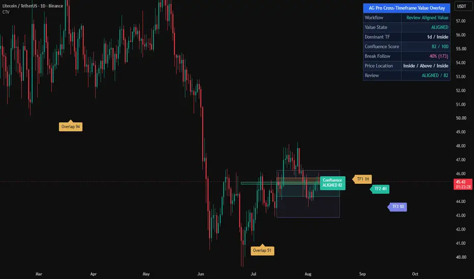
Cross-Timeframe Value Overlay [AGPro Series]Cross-Timeframe Value Overlay
🔷 Overview
Cross-Timeframe Value Overlay projects up to three independent rolling value
bands — one per selected higher timeframe — onto a single chart. Each band
marks the region where price has been accepted on that timeframe over a
configurable lookback window, built from a volume-weighted or mean-based
anchor surrounded by an ATR envelope. A built-in state engine then classifies
the relationship between bands in real time as ALIGNED, OVERLAP, CONFLICT or
NEUTRAL, so multi-timeframe context becomes readable in a single glance.
🔷 What Makes This Different
Most multi-timeframe scripts stack indicators or draw fixed HTF pivots. This
tool builds a *rolling* value envelope on each timeframe and then compares
them structurally rather than numerically.
• Three independent MTF value bands on one chart, each with its own lookback
context and ATR-sized width.
• Dedicated state engine with four discrete regimes — ALIGNED / OVERLAP /
CONFLICT / NEUTRAL — based on pairwise band geometry, not on raw price.
• Dynamic z-order rendering that automatically draws the slowest timeframe
behind faster ones, and an opacity hierarchy that keeps the slowest band
lightest and the fastest band darkest. Larger structures frame smaller
ones instead of obscuring them.
• Rank-based label placement that prevents collisions when bands overlap in
price, so labels remain readable even during OVERLAP or ALIGNED states.
• Box width adaptively capped so a Daily band cannot swallow a 1H chart.
• Dominant-TF tracking that always reports the highest enabled timeframe and
the price position relative to its band.
🔷 Methodology
For each enabled timeframe the script computes:
• Anchor = VWAP (volume-weighted HLC3) over the rolling window, or HLC3 SMA
when volume data is unreliable.
• Half = ATR(window) multiplied by the configured band-width factor.
• Band = .
Values are requested with lookahead disabled, so historical band positions
reflect only data that was available at the time.
The state engine then evaluates:
• Pairwise overlap — do any two bands share a price region?
• Alignment — are all enabled band centers clustered within a strictness
threshold (Loose 1.2 ATR / Standard 0.8 ATR / Strict 0.4 ATR) of their
mean?
• Disjoint count — how many pairs are fully separated?
These three checks map deterministically to one of four states on every bar.
🔷 Signals and Alerts
Three built-in alert conditions cover the most useful MTF transitions:
• Value Overlap Detected — a new pairwise overlap forms between any two
enabled timeframes.
• Higher-Timeframe Value Lost — price leaves the dominant HTF value band
after being inside it on the previous bar.
• Cross-Timeframe Conflict — the state engine transitions into CONFLICT,
indicating that at least one enabled pair of bands has become fully
disjoint.
All alerts are wired as alertcondition() entries so they can be combined
with the standard TradingView alert workflow.
🔷 Key Inputs
• Timeframes — enable/disable up to three HTFs and pick any resolution for
each (defaults 1H / 4H / Daily).
• Rolling Window — 10 to 500 bars for the anchor and ATR.
• Band Width — 0.25 to 3.0 ATR half-width.
• Anchor Method — VWAP + ATR or HLC3 MA + ATR.
• Alignment Strictness — Loose, Standard or Strict threshold for the state
engine.
• Show Only Overlapping Bands — hides isolated bands to keep confluence
zones visible.
• Visuals — per-TF color, base opacity, right-edge label toggle, label font
size.
• Panel — position, font size and master visibility switch.
🔷 How to Use
• Read the state first. ALIGNED = all enabled timeframes agree on a common
value region; OVERLAP = partial confluence; CONFLICT = disjoint
timeframes; NEUTRAL = fewer than two active bands or indeterminate.
• Read the Dominant row to see which timeframe currently carries the most
structural weight.
• Read the per-TF rows to locate price as Above / Inside / Below each band.
• Combine the three in a single pass: for example, price Above a dominant
HTF band while the state is CONFLICT is a very different context from
price Inside an ALIGNED stack.
• Pair with your existing entry framework (breakout, mean-reversion, order
flow, trend-following) — this tool is a context layer, not an entry
signal generator.
🔷 Limitations and Transparency
• Box-based rendering is capped at three concurrent bands by design to keep
the chart readable.
• All values are computed with lookahead disabled. Bands update when the
corresponding HTF bar closes, which is the expected behavior for any MTF
tool.
• Volume-weighted anchoring depends on the quality of the instrument's
volume feed; on markets with unreliable volume, switch to the HLC3 MA
method.
• This script is an analytical overlay. It is not a strategy, does not
produce buy/sell signals, and makes no forecasting claim.
🔷 Risk Disclosure
Trading involves substantial risk. This indicator is provided for research
and educational purposes only and does not constitute financial advice.
Past market behavior does not guarantee future results. Always perform your
own due diligence and use proper risk management.
Open-source under Mozilla Public License 2.0. Penunjuk

Value Shift Ladder [AGPro Series]Value Shift Ladder
🔹 Overview
Value Shift Ladder is a market-structure mapping tool that extracts the most volume-accepted price shelves from a rolling lookback window and arranges them, in creation order, as the rungs of a ladder. Each rung is a volume-weighted zone where the market has recently spent the most time and traded the most contracts. The script then tracks how price interacts with every rung through a full Held → Broken → Reclaimed lifecycle and summarizes the entire chain into one readable ladder state: Rising, Falling, Mixed, Broken, Reclaiming, Building, or Neutral.
The goal is not to predict direction and not to produce buy or sell signals. The goal is to give the chart reader a continuously updated answer to one question: where is the market's current fair-value region, how is that region moving over time, and which prior value shelves are still relevant versus which have been abandoned. This makes the tool useful as a structural reference for volume-profile readers, auction-theory traders, and anyone who builds a bias from accepted-value migration rather than from trend lines or moving averages.
🔸 Unique Edge
Most volume-based tools either draw a single static profile snapshot, or plot every candidate level and leave the reader to filter. Value Shift Ladder does three things differently:
Multi-shelf chronological ladder. Instead of producing one value band, the script maintains a ranked set of up to eight volume-accepted shelves and arranges them in the order they were first registered. This preserves the migration history of accepted value instead of collapsing it into one average.
Proximity-gated visualization. Only shelves within a configurable ATR distance from current price are drawn on the chart, counted in the panel, and fed into the ladder direction state. Distant historical shelves exist in memory but do not clutter the chart or bias the readout — the ladder always reflects the value structure that is actually relevant to the current bar.
Adaptive, confidence-aware breaks. A shelf is not broken on a single close outside its band. Young shelves are strongly protected (3.0 × ATR), maturing shelves require a medium distance (1.5 × ATR), and fully-aged shelves use the user-defined break distance. Shelves that have been re-confirmed multiple times gain a 2× confidence multiplier on top of that, preventing established value regions from being lost to a single volatility spike.
🔸 Methodology
1) Volume Profile Construction
The script divides the rolling lookback window into equal price bins and distributes each bar's volume across every bin it touches, proportional to range coverage. Zero-range bars are assigned to their single bin. This produces a volume-weighted histogram of the lookback period.
2) Shelf Extraction
The top-K bins by volume are selected iteratively. After each pick, the chosen bin and its ATR-neighborhood are zeroed out before the next pick, enforcing a minimum separation between shelves and preventing a single high-volume cluster from dominating every rung. Each surviving bin becomes a shelf, anchored at its bin-center price.
3) Shelf Merging and Confidence
On every refresh, newly extracted shelves are checked against existing ones. If a new shelf falls within the ATR separation of an existing non-broken shelf, the existing shelf's volume is refreshed and its confidence score is incremented. Otherwise a new shelf is registered. Confidence is capped at ten and used downstream to scale break tolerance.
4) Lifecycle State Machine
Each shelf carries one of three states — Held, Broken, or Reclaimed. Held flips to Broken when price closes beyond an adaptive break distance for three recent bars. Broken flips to Reclaimed when price dwells back inside the band for a user-defined number of bars. Reclaimed auto-promotes to Held once the shelf has stabilized past a short age threshold.
5) Ladder Direction
Proximity-filtered active shelves are sorted by creation order. The last one, two, or three rungs are compared to produce a single state: Rising if the sequence is monotonically higher, Falling if lower, Mixed if non-monotonic, plus transient overrides for Broken, Reclaiming, Building, or Neutral conditions.
6) Pruning
Stale broken shelves expire after a timeframe-aware window. A hard cap of ten active shelves is enforced, with broken shelves removed first when the cap is hit.
🔹 Signals and Alerts
The script provides four deterministic state-change alerts, all tied to closed-bar transitions:
— New Ladder Step Formed: fires when a new volume-accepted shelf is first registered.
— Ladder Step Held: fires when an existing shelf is re-confirmed by the rolling profile.
— Ladder Step Broken: fires when a held shelf transitions to broken.
— Ladder Step Reclaimed: fires when a broken shelf transitions back to reclaimed.
These alerts describe structural state changes inside the indicator logic. They are not trade signals and do not imply expected profitability, win rate, or directional certainty.
🔸 Key Inputs
— Profile Mode (Auto / Manual): Auto derives lookback and refresh from the chart timeframe. Manual exposes both for full control.
— Manual Lookback (bars): Size of the rolling window used to build the profile.
— Manual Refresh Interval (bars): How often the profile is rebuilt.
— Profile Resolution (bins): Number of price bins the range is divided into.
— Target Shelf Count: Maximum number of shelves kept active.
— Min Volume Ratio: Minimum fraction of the top-bin volume a bin must hold to qualify as a shelf.
— Min Shelf Separation (ATR): Minimum ATR distance between two shelves.
— Break Distance (ATR): Fully-aged break tolerance.
— Reclaim Dwell Bars: Bars needed inside the band to flip Broken to Reclaimed.
— Max Visible Distance (ATR): Proximity gate for drawing and counting shelves.
— Display options: panel position, panel font size, on-chart label size, alerts toggle.
🔹 How to Use
Value Shift Ladder is designed as a structural reference rather than a signal engine. Typical reading workflows include:
— Bias framing. Read the Ladder state first. Rising or Falling indicates a one-sided migration of accepted value; Mixed indicates balance; Broken or Reclaiming highlights an active transition.
— Dominant reference. The Dominant row in the panel highlights the nearest held or reclaimed shelf within two ATR of price. Use it as the closest structural reference for scenario planning, not as an execution level.
— Proximity discipline. Because shelves more than the configured ATR distance away are not drawn, the ladder always reflects value structure that is currently relevant. When no shelves are visible, the market is between value regions — a context in which mean-reversion assumptions weaken.
— Confluence. The tool is designed to be combined with independent confirmation such as session structure, higher-timeframe bias, or volume analysis. It is not meant to stand alone as a decision source.
🔸 Limitations and Transparency
— Volume profile quality depends on the instrument's volume reporting. On symbols with unreliable or synthetic volume, shelf placement may drift.
— The profile is recomputed on the close of refresh bars. Intrabar readings on the current bar can change until the bar closes; state transitions evaluate the last three bars for breaks and the reclaim-dwell window for reclaims, so fresh transitions can flip until those bars close.
— On extremely illiquid sessions or instruments with frequent volatility spikes, the adaptive-break logic can delay transitions by design. This is a tradeoff in favor of stability.
— Past structural behavior at a shelf does not guarantee future behavior. The tool does not forecast direction and is not a trading strategy.
🔹 Risk Disclosure
This script is a structural visualization tool provided for educational and analytical purposes. It is not financial advice, not a trading strategy, and not a signal service. All trading involves risk of loss. Past market behavior is not indicative of future results. Users are fully responsible for their own trading decisions and for independently verifying the tool's behavior on their chosen instruments and timeframes before relying on it for any purpose. Penunjuk

Penunjuk

Penunjuk

Penunjuk

Silver Bullet Window Map [AGPro Series]Silver Bullet Window Map
🔹 Overview
Silver Bullet Window Map is a precision time-based tool that maps the three classic ICT "Silver Bullet" kill zones — compact 1-hour windows where institutional order flow is statistically concentrated — and automatically detects Fair Value Gap (FVG) imbalances formed inside each window. Instead of cluttering the chart with session-wide structures, the script isolates only the high-probability time periods ICT scalpers actually trade, rendering each window as a clean vertical zone with a live countdown, pulse highlight on the active window, and a lifecycle S/R zone for every FVG that prints during the window.
🔸 Unique Edge
Most Silver Bullet scripts either draw static colored backgrounds with no analytical value, or detect FVGs across the entire session and overwhelm the chart. This script does neither. It enforces a strict discipline: FVGs are only drawn if they form INSIDE an active Silver Bullet window. Outside-window price action is deliberately ignored. The result is a chart where every marked imbalance carries ICT-legitimate timing context — not noise. Each FVG becomes a horizontal lifecycle zone (bull or bear) that extends forward in time and is dimmed automatically when mitigated, giving you both a real-time map and a historical window-quality record in one view.
🔹 Methodology
The indicator evaluates the current bar's hour and minute in a user-selectable timezone (New York default, per ICT standard) and identifies three windows: London (03:00–04:00), AM (10:00–11:00), and PM (14:00–15:00). During each window, a three-bar FVG check is performed on confirmed bars: a bullish FVG requires the current bar's low to exceed the high two bars back; a bearish FVG requires the current bar's high to fall below the low two bars back. Gaps are filtered by a user-tunable ATR(14) multiplier to reject insignificant imbalances. Valid FVGs are rendered as time-anchored rectangular zones that extend a configurable number of bars into the future and are marked as mitigated the moment price revisits the opposite side of the gap.
A built-in timeframe guard disables rendering on timeframes of 1 hour and above, because Silver Bullet windows are exactly 1 hour long and cannot be resolved by bars equal to or larger than the window itself. On HTF charts, the panel displays a clean warning message instead of a broken visual.
🔸 Signals & Alerts
Four alert conditions are available: London window open, AM window open, PM window open, and window close. The script is designed for discretionary use — it does not issue buy/sell signals. Its purpose is to put the trader inside the correct time context with the correct structural references, and to let the trader read price action within that context.
🔹 Key Inputs
• Timezone: New York / London / UTC / Exchange
• Historical window depth: 1–30 days
• Individual toggles and custom colors for each of the three windows
• Active-window pulse effect (on/off)
• FVG detection (on/off), minimum size as ATR multiple, zone extension in bars
• Mitigation behavior: dim inactive zones or remove them
• Panel position, theme (Dark/Light), and font size
• Window labels and FVG labels: independently toggleable, font size configurable
🔸 How to Use
Best deployed on 1m–30m intraday charts where the 1-hour windows are visually meaningful. The AM window (10:00–11:00 NY) is historically the most actionable for US equities, indices, and major FX pairs. Wait for a window to open — the background lights up, the panel shows ● LIVE, and the window label appears above the opening candle. Look for a displacement candle creating an FVG inside the window. Use the FVG zone as a retest entry reference with risk defined beyond the gap. The panel's countdown and per-window FVG tally help you gauge window quality in real time. At the end of each day, the L / AM / PM tally shows which window produced the most imbalances — a quick read on session character.
🔹 Limitations & Transparency
This indicator does not predict direction. It does not backtest or display historical win rates — such figures on a time-window tool would be statistically misleading without an execution model. FVG detection uses the standard 3-bar definition; alternative definitions (implied fair value, BPR, inversion FVGs, etc.) are not covered by design. The tool is timezone-sensitive: if your data feed's timestamps drift from the selected timezone's DST boundaries, window alignment can shift by one bar around DST transitions. On timeframes equal to or greater than 1 hour, the script deliberately disables all rendering to avoid producing a misleading visual.
🔸 Risk Disclosure
This script is provided for educational and analytical purposes only. It does not constitute financial advice. Trading leveraged instruments carries substantial risk of loss. Past price behavior around kill zones does not guarantee future results. Use proper risk management and position sizing at all times. Penunjuk

Penunjuk

Penunjuk

COT Week BoxCOT Week Box — visualize weekly positioning shifts from the CFTC Commitments of Traders report directly on your price chart.
═══════════════════════════════════════
WHAT IT DOES
═══════════════════════════════════════
Every week on Friday, the CFTC publishes updated positioning data reflecting what traders did between the previous Wednesday and Tuesday. This indicator takes that weekly change in net positioning and draws a colored rectangle spanning exactly that Wed→Tue price window on your chart.
The result: you can instantly see which weeks had unusually large positioning shifts, what the price did during those weeks, and which side of the market was driving the flow.
═══════════════════════════════════════
HOW TO READ THE COLORS
═══════════════════════════════════════
GREEN — Net positioning increased. Traders added more longs than shorts on balance.
RED — Net positioning decreased. Traders added more shorts than longs on balance.
YELLOW — Net positioning increased, but the move was driven mostly by shorts covering (closing losing positions) rather than fresh buying. Often a sign of short squeeze dynamics.
BLUE — Net positioning decreased, but the move was driven mostly by longs liquidating (closing winning or losing positions) rather than fresh shorting. Often a sign of profit-taking or capitulation.
The opacity of each box scales with how extreme the week was: faint boxes are borderline, bold boxes are true outliers.
═══════════════════════════════════════
INPUTS
═══════════════════════════════════════
Group — choose which participant group to analyze: Commercials (hedgers), Non-Commercials (large speculators / funds), Non-Reportables (small traders), or All (sum of all groups).
Weekly move threshold (%) — only draw boxes for weeks where the absolute change in net positioning ranks above this percentile. Default 85 shows the top 15% of weeks. Increase to 95 or 99 to isolate only the most extreme weeks.
Reduction dominance threshold (%) — controls when BLUE/YELLOW colors trigger instead of RED/GREEN. Higher values require cleaner one-sided flow to flag a reduction-dominated week.
Lookback (weeks) — historical window for percentile calculation. Default 156 weeks (≈ 3 years).
═══════════════════════════════════════
SUPPORTED INSTRUMENTS
═══════════════════════════════════════
The indicator automatically maps the chart symbol to the correct CFTC report code. Supported markets include:
Metals: Gold, Silver, Copper, Platinum, Palladium
Energy: WTI Crude, Brent, Natural Gas, RBOB Gasoline, Heating Oil
FX: DXY, EUR, GBP, JPY, CAD, AUD, NZD, CHF, MXN
Indices: S&P 500, Nasdaq 100, Dow, Russell 2000, VIX
Softs: Coffee, Cocoa, Sugar, Cotton, Orange Juice
Grains: Corn, Wheat, Soybeans, Soybean Meal, Soybean Oil, Oats, Rough Rice
Meats: Live Cattle, Feeder Cattle, Lean Hogs
Works on the daily (D1) timeframe only.
═══════════════════════════════════════
USAGE TIPS
═══════════════════════════════════════
Settings -> pin to scale -> pin to right scale (may be needed if rectangles aren't bind to candles)
Start with Group = "Commercial" on commodity charts — commercial hedgers often signal turning points when their positioning reaches extremes.
On index futures and FX, try Group = "Non-Commercial" to follow large speculator flow.
A cluster of BLUE boxes near a price high, or YELLOW boxes near a price low, can indicate exhaustion of the dominant side.
Combine with your existing technical analysis — COT data works best as a confirmation tool, not a standalone signal.
═══════════════════════════════════════
NOTES
═══════════════════════════════════════
Data source: CFTC Legacy report, futures-only.
Boxes are drawn after the Friday release, covering the prior Wed→Tue reporting week.
The indicator requires a full week of bars (Wed through Tue) to draw a box.
If your instrument isn't in the supported list, the indicator will display "Instrument not mapped" — a premium version with manual CFTC code override is available separately. Penunjuk

Unicorn Model Detector [AGPro Series]Unicorn Model Detector
Overview
The Unicorn Model Detector identifies one of the most discussed setups in Inner Circle Trader (ICT) and Smart Money Concepts literature: the Unicorn Model. A Unicorn forms when a Breaker Block and a Fair Value Gap (FVG) overlap inside the same price zone — a pocket where prior swing liquidity has been swept and an unfilled imbalance still exists at the retest. The detector scans for these overlaps, tracks every occurrence through its full lifecycle, and reports aggregate statistics in a compact on-chart panel. It is a detection and bookkeeping tool, not a trading strategy.
Unique Edge
Most breaker and FVG scripts publish either zones in isolation or require the user to eyeball the overlap. This detector does the overlap match automatically and only draws a zone when both conditions are present on the same chart area with the same directional bias. A strict causality rule is enforced — the Breaker must form first (after liquidity sweep) and the FVG must appear during or after the retest, which matches the true ICT Unicorn definition. A pairing that consumes a given breaker and FVG is removed from future candidate pools, so the chart never stacks redundant zones from the same source structure. A Loose overlap mode is also provided for users who prefer an ATR-based proximity interpretation instead of strict geometric intersection.
Methodology
1. Swing pivots are detected with a configurable left/right length using ta.pivothigh and ta.pivotlow.
2. When a confirmed pivot forms, the body range of the pivot bar is stored as the potential Breaker source zone.
3. A Breaker Block is registered when price closes through the previous-bar swing level in the opposite direction.
4. A Fair Value Gap is registered when a 3-bar formation produces an unfilled imbalance (low > high for bullish, high < low for bearish) and the gap exceeds a user-defined ATR multiple.
5. A Unicorn is spawned when a same-direction Breaker zone and FVG zone overlap vertically AND the FVG formed at or after the Breaker (causality check).
6. A configurable cooldown prevents consecutive spawns from clustering, improving signal hygiene.
7. The overlap rectangle becomes the tracked zone. Zone mid is the reference entry, the stop is placed 0.4 times the zone height beyond the structure boundary, and the target is projected at the user-defined R-multiple.
Signals & Alerts
Four independent alert conditions are exposed:
- New Unicorn Detected — a fresh bullish or bearish Unicorn has just formed.
- Unicorn Triggered — price has entered the overlap zone of a pending Unicorn.
- Target Hit — a triggered Unicorn has reached its R-multiple target.
- Stop Hit — a triggered Unicorn has been invalidated at its stop level.
All alerts fire once per bar close and include the ticker and timeframe in the payload.
Key Inputs
- Swing Pivot Length (default 7) — left/right length used for pivot confirmation.
- Breaker Lookback (default 80 bars) — maximum age for a broken swing to remain a valid Breaker.
- FVG Minimum Size (default 0.25 x ATR) — noise filter for 3-bar imbalances.
- Overlap Mode (Strict / Loose) — geometric intersection vs ATR-tolerance match.
- Reward-to-Risk Target (default 2.0) — multiple used to project the target level.
- Max Active Pending Unicorns (default 3) — chart-cleanliness cap.
- Cooldown After Signal (default 30 bars) — minimum spacing between consecutive spawns.
- Invalidate on Close Through Zone (default off) — optional tighter invalidation rule.
- Visual controls — show/hide per lifecycle state, label size, zone opacity, max recent labels.
- Panel controls — show/hide, location (6 positions), theme (Dark/Light), text size.
How to Use
1. Add the indicator to any timeframe; higher timeframes (1H, 4H, 1D) tend to produce structurally more meaningful Unicorns.
2. Watch for a new Unicorn zone to appear. Pending zones are drawn in the directional state color with a bold border; triggered ones switch to the indigo accent color; TP / SL / Expired zones fade to their respective colors with a thinner border.
3. Each zone carries a tethered flag label outside the price axis — Bullish labels below, Bearish labels above — so they never overlap candles.
4. The panel reports running counts of pending and active Unicorns, historical win rate, average R per setup, and total completed.
5. Use the displayed entry / target / stop reference lines as a structural map for your own analysis. The tool does not place orders and does not recommend position sizing.
6. Combine with higher-timeframe bias (trend, session context, HTF structure) before acting on any zone.
Limitations & Transparency
- The detector is a structural scanner, not a forecasting engine. It reports what has formed, not what will happen.
- Swing detection depends on pivot length; shorter lengths generate more noise, longer lengths miss smaller structures.
- Statistics are calculated on-chart from historical bars loaded by TradingView and will vary with timeframe, symbol and data range.
- Realtime behaviour: zones are drawn on confirmed events (bar close for breaks, 3-bar-complete for FVGs). Some invalidations are evaluated intrabar on wick touches of the stop level.
- The script is open-source under Mozilla Public License 2.0. Users are encouraged to inspect and adapt the methodology.
Risk Disclosure
This indicator is provided for educational and analytical purposes only. It is not financial advice, a trading signal service, or a strategy. Past structural patterns do not guarantee future outcomes. Trading involves substantial risk of loss; readers are solely responsible for their own decisions and risk management. Penunjuk

Penunjuk

NQ/MNQ CT Scalper**NQ/MNQ Counter-Trend Scalper**
Mean-reversion scalper built for NQ/MNQ 1-minute charts. Fades overextended moves against the prevailing trend using six entry paths: FADE (pure exhaustion), DIV (delta/RSI divergence), TRAP (liquidity sweep rejection), AGG (aggressive flow reversal), ABSORB (institutional absorption), and VRZ (volume range zone retest).
Every trade-management value — TP targets, SL placement, entry thresholds, exit sensitivity — scales dynamically across 8 factors: session window, regime (AER), ADX, Hurst exponent, volume profile, footprint delta, VWAP slope, and HTF alignment. No static thresholds in the execution chain.
Entries require the trend to exist (aerDowntrend/aerUptrend) but be overextended beyond dynamic EMA/VWAP distance thresholds. A momentum confluence system penalizes entries when squeeze momentum is strong and accelerating against the fade, with additional penalties in thin-liquidity sessions (Asia, PreMkt, London, Lunch).
Smart exit system scores 15 patterns per side detecting trend resumption — CHoCH, structure breaks, SMT divergence, squeeze flip, regime change, absorption, delta reversal, and more. Exit threshold adjusts by session, regime, ADX direction, and Hurst persistence. Exits are blocked on the entry bar to prevent same-candle kills.
Designed to run alongside the NQ/MNQ Super Scalper (trend-following). Penunjuk

Penunjuk

BTC Valuation Cycle [Alpha Extract]A sophisticated multi-metric Bitcoin valuation framework that synthesizes on-chain analytics including SOPR, MVRV, Price-to-Realized, and Mayer Multiple into a unified 0-100 cycle oscillator with six-tier zone classification for market cycle identification. Utilizing logistic transformation with configurable weighting and z-score normalization, this indicator delivers institutional-grade Bitcoin-specific valuation assessment with pivot-based extreme detection and comprehensive alert system. The system's weighted composite architecture combined with adaptive curve intensity enables precise calibration of cycle sensitivity while maintaining statistical validity across Bitcoin's multi-year market cycles.
🔶 Advanced Multi-Metric Synthesis Engine
Implements sophisticated composite calculation combining four distinct Bitcoin valuation metrics with configurable weighting and normalization framework. The system retrieves SOPR (Spent Output Profit Ratio), MVRV (Market Value to Realized Value), Price-to-Realized ratio, and Mayer Multiple from on-chain sources, applies z-score normalization to each metric over configurable periods, transforms via logistic function for 0-100 scaling, and generates weighted average creating unified cycle score.
// Component Score Calculation
SOPR_Centered = SOPR - 1.0
SOPR_Z = z_score(SOPR_Centered, Normalization_Length)
SOPR_Score = logistic_100(SOPR_Z, Curve_Intensity)
Price_to_Realized_Z = z_score(Price / Realized_Price, Normalization_Length)
PR_Score = logistic_100(Price_to_Realized_Z, Curve_Intensity)
MVRV_Z = z_score(Market_Cap / Realized_Cap, Normalization_Length)
MVRV_Score = logistic_100(MVRV_Z, Curve_Intensity)
Mayer_Z = z_score(Mayer_Multiple, Normalization_Length)
Mayer_Score = logistic_100(Mayer_Z, Curve_Intensity)
// Weighted Composite
Cycle = (SOPR_Score × W_SOPR + PR_Score × W_PR + MVRV_Score × W_MVRV + Mayer_Score × W_Mayer) / (W_SOPR + W_PR + W_MVRV + W_Mayer)
🔶 Understanding Bitcoin Valuation Metrics
SOPR (Spent Output Profit Ratio) measures the degree of profit for coins moved on-chain, calculated as value sold divided by value paid. Values above 1.0 indicate profitable selling (distribution), below 1.0 indicate loss-taking (capitulation). The system centers SOPR around 1.0 for normalization.
MVRV (Market Value to Realized Value) compares current market cap to realized cap (aggregate cost basis). High MVRV signals overvaluation as price exceeds average acquisition cost; low
MVRV suggests undervaluation. The system offers Ratio mode (raw MVRV), Z-Score mode (statistical deviation), or Blend mode (average of both).
Price-to-Realized Ratio directly compares current BTC price to realized price (realized cap divided by circulating supply), providing cleaner valuation signal than MVRV by removing market cap distortions.
Mayer Multiple measures price relative to 200-day moving average. Values above 2.4 historically mark tops; values near or below 1.0 mark bottoms. The system normalizes this classic technical indicator alongside on-chain metrics.
🔶 Logistic Transformation Framework
Features sophisticated logistic function application converting unbounded z-scores into bounded 0-100 range with configurable curve intensity controlling sensitivity. The system applies formula: 100 / (1 + exp(-z × k)) where z is z-score and k is curve intensity (default 0.90), creates S-curve transformation preserving relative relationships while preventing extreme outliers, and enables smooth gradient visualization across entire cycle range.
🔶 Six-Tier Cycle Zone Classification
Implements comprehensive market cycle framework dividing 0-100 range into six distinct zones with configurable thresholds representing Bitcoin's characteristic bubble and bust patterns. The system defines Bottom Extreme (default <10, accumulation zone), Cold Zone (10-25, early recovery), Lower Mid (25-40, neutral to bullish), Upper Mid (40-60, bullish), Hot Zone (60-75, late bull market), and Top Extreme (>75, euphoria/distribution) with dynamic color coding.
🔶 Pivot-Based Extreme Detection System
Provides intelligent local extreme identification using pivot high/low detection with zone threshold filtering and visual capsule markers. The system detects pivot highs above Hot Zone threshold and pivot lows below Cold Zone threshold using configurable left/right bars, creates horizontal capsule visualizations at exact extreme values with color-coded centers (red for tops, cyan for bottoms), and maintains rolling array limited to maximum capsule count for clean chart presentation.
🔶 MVRV Calculation Mode Selection
Offers three distinct MVRV calculation approaches optimizing for different market conditions and analytical preferences. Ratio mode uses raw Market Cap / Realized Cap for direct valuation comparison, Z-Score mode applies statistical normalization emphasizing deviations from historical mean, and Blend mode (default) averages both approaches balancing absolute valuation with statistical context for robust signal generation.
🔶 Configurable Metric Weighting System
Features flexible weight allocation enabling traders to emphasize preferred metrics or disable unreliable components during specific market regimes. The system accepts 0.0-N weight values for each metric (default 1.0 all equal), automatically handles missing data by excluding NA metrics from composite, recalculates weighted average dynamically, and enables custom cycle calibration based on trader's confidence in different on-chain signals.
🔶 Confirmed HTF Data Integration
Implements rigorous anti-repaint methodology using confirmed higher-timeframe values with offset preventing live bar distortion. The system retrieves all on-chain metrics from daily timeframe with 1-bar offset ensuring only completed daily candle data influences cycle score, applies identical offset to Mayer Multiple calculation, and maintains signal stability across real-time updates preventing false extreme alerts.
🔶 Comprehensive Alert Framework
Provides five distinct alert conditions covering critical cycle events and threshold breaches with descriptive messages. The system triggers Top Extreme alert on crossover above top threshold (default 90), Bottom Extreme alert on crossunder below bottom threshold (default 10), Hot Rejection alert when cycle falls from Hot Zone, Cold Reclaim alert when cycle rises from Cold Zone, and Mayer Threshold breach alert for traditional technical confirmation.
🔶 Gradient Zone Visualization Architecture
Creates intuitive color-coded area plot with six distinct color zones reflecting current cycle position through visual spectrum from cyan (extreme bottom) through purple/orange to red (extreme top). The system applies dynamic zone coloring to both area fill and cycle value display, implements configurable area transparency (default opaque), and maintains consistent color scheme across oscillator pane, table values, and capsule markers.
🔶 Real-Time Diagnostics System
Features comprehensive data availability monitoring with missing metric labels and detailed value table showing all component metrics. The system detects NA values in SOPR, Realized Price, MVRV, or Mayer Multiple, displays warning label listing unavailable metrics, and provides table overlay showing current values for Cycle score, all four components, MVRV-Z, Mayer MA, and threshold with color-coded formatting.
🔶 Performance Optimization Framework
Employs efficient calculation methods with null-safe division functions, optimized array management for capsule storage, and conditional plotting minimizing unnecessary rendering. The system includes streamlined weighted average calculation skipping NA metrics, smart capsule cleanup maintaining maximum limit through oldest-first deletion, and minimal recalculation overhead through var declarations and confirmed bar logic.
This indicator delivers sophisticated Bitcoin-specific valuation analysis through multi-metric on-chain synthesis unavailable in traditional technical indicators. By combining SOPR (profit/loss behavior), MVRV (cost basis valuation), Price-to-Realized (pure valuation), and Mayer Multiple (technical context) into unified cycle framework with statistical normalization, it provides comprehensive market cycle assessment grounded in blockchain fundamentals. The six-tier zone system maps directly to Bitcoin's characteristic 4-year halving cycles with Bottom Extreme zones historically marking generational buying opportunities and Top Extreme zones marking distribution phases. Perfect for long-term Bitcoin investors seeking data-driven cycle timing, position sizing based on valuation extremes (increase allocation in Cold/Bottom zones, reduce in Hot/Top zones), and objective framework for navigating Bitcoin's volatile multi-year cycles with alerts providing advance warning of major cycle transitions requiring portfolio reassessment. Penunjuk

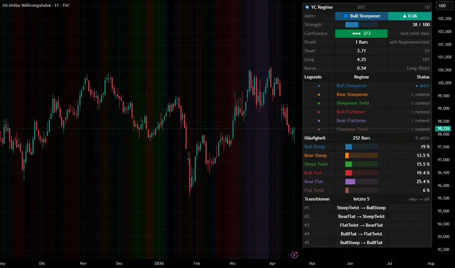
Yield Curve Regime Yield Curve Regime – Pro Edition
=== WHAT IT DOES ===
This indicator classifies the U.S. Treasury yield curve into six canonical
regimes by comparing the current behavior of a short-maturity yield
(default 2Y) and a long-maturity yield (default 10Y) against their values
N bars ago. It paints the chart background (or bar color) with the
regime color and renders a modular on-chart dashboard showing the active
regime, a curve-delta trend arrow, live yield snapshots, a quantitative
strength score, multi-horizon confluence, dwell-time, rolling regime
frequencies, and a transition log.
=== WHY IT IS DIFFERENT ===
Most public yield-curve scripts plot the 10Y-2Y spread or flag a single
inversion event. This script decomposes every curve move into the two
dimensions that actually matter for fixed-income interpretation:
1) Curve direction : did the spread steepen or flatten?
2) Yield direction : did short and long yields rise or fall?
Crossing these dimensions produces six distinct regimes, each with a
different macro meaning. A +10 bp move in the 2s10s spread can be a
"Bull Steepener" (Fed easing – risk-on friendly) or a "Bear Steepener"
(inflation / term-premium driven – risk-off friendly). Flagging only
the spread hides that distinction; the six-regime framework exposes it.
On top of that six-regime base, this indicator adds four analytical
layers that, to the best of our knowledge, are not combined in any
existing public yield-curve script:
• A Z-score-based Strength score (0–100) that quantifies *how
convincing* each regime is instead of treating it as a binary flag.
Calibrated so |Z| = 2.0 (the 95 % confidence band) maps to 100.
• A Multi-Horizon Confluence score (0/3, 1/3, 2/3, 3/3) computed by
running the same regime detection on three independent offsets
(fast / mid / slow) and measuring agreement across horizons.
• A Dwell-Time counter plus a rolling history of the last N regime
transitions, so the viewer can see not just the current regime
but its persistence and transition path.
• A rolling Regime-Frequency statistic showing what percentage of
the last freqLen bars each regime occupied, rendered as an inline
bar and a precise percentage in a dedicated dashboard block.
These are genuine additions to the calculation – not cosmetics.
All of them are visualized in the on-chart dashboard so the reader
can consume the extra information at a glance.
=== THE SIX REGIMES (core logic) ===
Let curve = longRate - shortRate, compared against its value "offset"
bars ago. A regime fires when all three conditions hold simultaneously:
Bull Steepener : curve widens, short falls, long falls
(short falls faster – classic early easing cycle)
Bear Steepener : curve widens, short rises, long rises
(long rises faster – inflation / term premium / supply)
Steepener Twist : curve widens, short falls, long rises
(reflation pivot / policy-vs-inflation divergence)
Bull Flattener : curve narrows, short falls, long falls
(long falls faster – flight to quality / recession bid)
Bear Flattener : curve narrows, short rises, long rises
(short rises faster – aggressive Fed tightening)
Flattener Twist : curve narrows, short rises, long falls
(stagflation signal / tightening into weakness)
Exactly one regime fires per bar (the six conditions are mutually
exclusive by construction). When none triggers, the background stays
clean.
=== HOW TO READ THE DASHBOARD ===
• Header row – ticker + timeframe context.
• Active row – the regime currently firing, tinted in its own
color, with a ▲ / ▼ / ▬ arrow showing the signed
change of the curve over the fast offset window.
• Strength bar – █-fill from 0 to 100 plus the exact score.
• Confluence row – ●●● / ●●○ / ●○○ / ○○○ plus score 0/3 … 3/3.
• Dwell row – bars elapsed inside the current regime.
• Yields block – live short, long, and curve values.
• Legend block – every enabled regime with a colored dot and a
live "● aktiv" / "○ ruhend" status.
• Frequency block – each regime's share of the last freqLen bars,
shown as a 10-step bar plus exact percentage.
• Transitions – a log of the most recent regime changes
(newest first).
• Background/bars – tinted in the active regime's color, optionally
dimmed when Strength is low.
=== HOW TO READ THE ANALYTICAL LAYERS ===
• Strength bar (█████░░░░░ 65 / 100) – the farther right it fills,
the more statistically significant the regime move is relative to
its rolling volatility. Calibrated so a Z-aggregate of 2.0 (roughly
the 95 % band of a normal distribution) maps to a score of 100.
• Confluence (●●○ 2/3) – how many of the three horizons confirm the
fast-horizon regime. 3/3 is a strong multi-timeframe signal; 1/3 is
fast-only; 0/3 means no active regime on any horizon.
• Dwell – bars elapsed inside the current regime. Useful for spotting
exhausted vs. freshly-started regimes.
• Frequency – every regime's rolling share of the freqLen window,
letting you see at a glance which regime has dominated the current
macro cycle.
• Transitions – a compact log of the most recent regime changes.
=== SETTINGS (all inputs are grouped and collapsible) ===
• Symbols & Offset – pick any two yield tickers plus three lookback
windows (fast / mid / slow) for confluence.
• Detection – rolling window for frequency statistics,
maximum stored transitions.
• Display – background vs. bar coloring, transparency,
optional strength-coupled transparency.
• Regime selection– enable/disable any subset of the six regimes.
• Color palette – fully user-overridable regime colors.
• Dashboard – master toggle, compact mode (active regime only),
independent per-section toggles for header,
active+strength, confluence, dwell, yields,
legend, frequency, and transitions, plus
configurable position and text size.
=== HOW TO USE IT ===
• As a macro / risk-regime filter on SPX, NDX, DXY, TLT, HYG, BTC,
gold or any risk-sensitive instrument: the regime in force often
explains why cross-asset correlations are behaving the way they are.
• To disambiguate yield-curve headlines: a "curve is steepening"
print means something very different if it is a Bull Steepener vs.
a Bear Steepener; this indicator answers that question at a glance.
• To study historical regime transitions: switch background mode on
and scroll back through past cycles to see how regimes clustered
around recessions, pivots, and inflation shocks.
• The offset inputs let you tune sensitivity: 1 bar for intraday
regime nowcasting, 5–20 bars for swing and macro framing.
=== NOTES & LIMITATIONS ===
• Defaults to US02Y and US10Y but accepts any two yield symbols –
not hard-coded to U.S. Treasuries; works on Bund, Gilt, JGB curves
if the data is available on your plan.
• Regimes are evaluated on bar-close comparisons and can flip
intrabar on lower timeframes; use daily or weekly for stable macro
readings.
• The Strength score relies on rolling standard deviations over a
50-bar window. On low-liquidity / low-frequency data the σ estimate
can be unstable for the first 50 bars after loading.
• Multi-Horizon Confluence runs the raw regime detection on mid and
slow offsets, so slower horizons can confirm a faster signal even
when their Δcurve is small – this is by design, not a bug.
• The Steepener Twist and Flattener Twist cases are structurally
rarer than the four main regimes and often mark transitions rather
than trends – treat them as context, not as standalone signals.
• This is an analytical / visual tool, not a buy/sell system. It does
not generate entries, exits, or forecasts.
Penunjuk