Flops - OrderblocksDescription
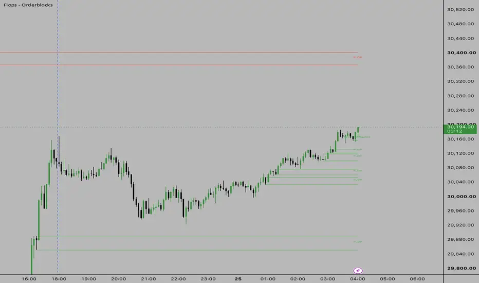
The Advanced Flops - Orderblock indicator is a sophisticated, algorithmic supply and demand tracking system. It dynamically identifies trend-following institutional structures by detecting "Flops" (often known as Orderblocks) in real-time, visualizing exact areas where momentum aggressively shifted.
Instead of relying on a rigid, single-candle definition, this engine operates on a multi-timeframe perspective natively. It simultaneously evaluates 1-Candle, 2-Candle, and 3-Candle breakout logic on every single bar to validate structural breaks and paint flawless institutional supply/demand zones on your chart.
🎯 How It Works: The 1, 2, 3 Logic
The engine evaluates the market looking for a sequence of momentum candles that break structure against the previous opposing candle. By running the 1, 2, and 3-candle logic simultaneously, the script guarantees it catches both immediate V-shape reversals (1-candle) and slower, grinding structural breaks (3-candle) without drawing overlapping or duplicated zones.
Bullish ( Flops - Orderblock ): Formed when the price forcefully breaks the high of the last bearish candle. This indicates newly created demand.
Bearish ( Flops - Orderblock ): Formed when the price forcefully breaks the low of the last bullish candle. This indicates newly created supply.
✨ Key Features
Simultaneous Multi-Candle Logic: Runs three independent sequence checkers at the exact same time to ensure no valid Orderblock is ever missed.
Dynamic Mitigation Engine: Active zones project forward indefinitely into future price action until they are touched or closed through (customizable).
Single Mitigated Memory: A sleek visual feature that automatically deletes old, invalidated zones. It keeps only the absolute last mitigated zone on your chart to show you the most recent point of failure, without cluttering your screen with historical noise.
Trend Deactivation: The script understands market structure. If the dominant trend fully flips (e.g., from Bullish to Bearish based on a 3-candle sequence), all opposing active ( Flops - Orderblock ) zones are immediately deactivated and labeled as "Trend Flip", preventing you from taking trades against a confirmed structural shift.
Boundary Customization: Choose exactly how you want your Orderblock zones measured—either wick-to-wick (High/Low) or body-to-body (Open/Close).
⚙️ Settings
Flop Boundary: Define zones using full Wicks or strictly Candle Bodies.
Mitigation Mode: Choose whether a zone is invalidated the moment a wick "Touches" it, or only when a candle "Closes" fully through the zone.
Show Only Last Mitigated Flop: Keep your charts clean by automatically erasing old mitigated lines and only leaving the single most recent mitigated Orderblock on the chart.
Deactivate on Trend Flip: Automatically invalidate all active supply zones if the macro trend shifts bullish (and vice versa).
Full Visual Control: Customize colors, line widths, line styles (solid, dashed, dotted), and label visibility to fit your exact chart aesthetic. Penunjuk

Minimal Sessions LiquiditiesDescription
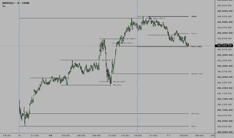
The Session Liquidities indicator is an advanced, automated toolkit for traders who rely on time-based liquidity sweeps and daily structural levels. It automatically highlights the high and low price points for the most actively traded sessions in the market and tracks them dynamically.
Instead of manually drawing horizontal rays across your chart every day, this script does the heavy lifting by identifying the highs and lows of six distinct timeframes (all strictly mapped to Eastern Time / New York Time) and carrying them forward until they are interacted with.
🕒 Sessions Tracked
The engine tracks liquidity boundaries for the following key windows:
Asian Session (AS): 20:00 - 00:00 ET
London Session (LN): 02:00 - 05:00 ET
New York AM Session (NY AM): 09:30 - 11:30 ET
New York Lunch Session (NY LN): 12:00 - 13:00 ET
New York PM Session (NY PM): 13:30 - 16:30 ET
Current Day (CD): 18:00 - 16:55 ET
✨ Key Features
Dynamic Liquidity Extensions: Once a session closes, its high and low lines are automatically extended forward into future price action, acting as pristine liquidity magnets.
Stop When Swept: An optional setting allows you to stop drawing the liquidity line exactly on the candle where the price eventually sweeps (crosses) it. This prevents your chart from being cluttered by old, invalidated liquidity levels.
Previous Day (PD) Memory: The script remembers historical session data. When a new day begins, the script automatically re-labels the previous day's untouched levels to "PD" (e.g., PD AS H for Previous Day Asian High), or D-2 for older levels.
Smart Overlap Merging: It's very common for two sessions to share the exact same high or low. To keep your charts incredibly sleek, the engine actively scans for overlapping labels. If two liquidity pools rest at the exact same tick, it merges their labels into a single comma-separated text (e.g., Current Day High, AS L) and removes the redundant visual clutter.
Customizable Lookback: Control exactly how many historical days of liquidity you want to track (up to 40 days) to match your trading style without overwhelming your screen.
⚙️ Settings
Sessions to Show: Toggle any of the 6 individual sessions on or off.
Session Colors: Fully customize the color of the lines and labels for each specific session.
Lookback Limit: Adjust how many historical periods are kept on the chart (1 = Current Only, 2 = Current + Previous Day).
Stop Lines When Swept: Toggle whether the line should extend indefinitely or terminate upon contact with price.
Label Size: Change the typography size (defaults to Tiny for a professional, unobtrusive aesthetic). Penunjuk

Penunjuk

Penunjuk
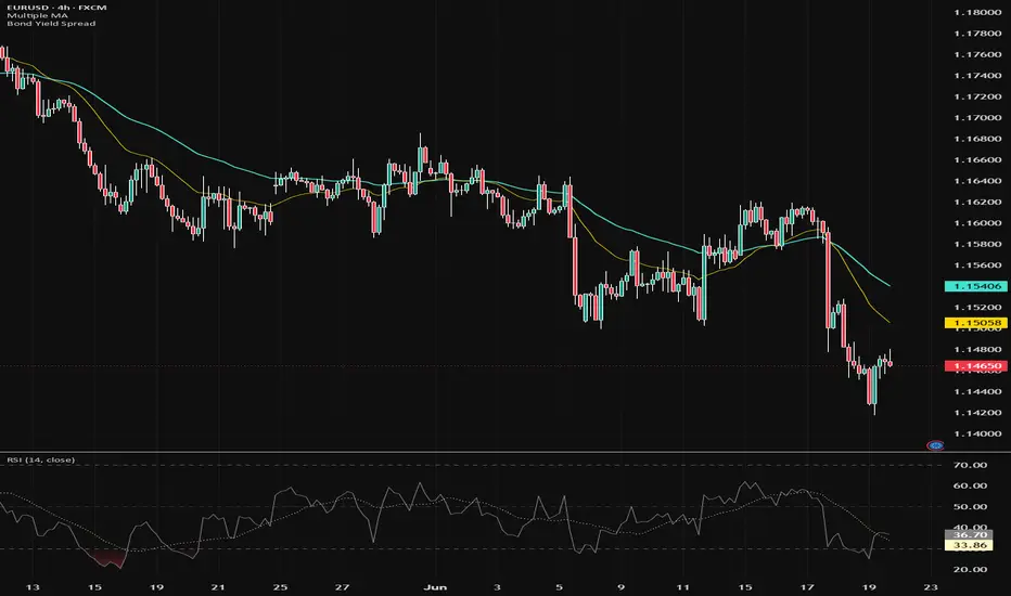
Liquidity Void Zone Map [ZOM]Liquidity Void Zone Map is a clean imbalance and fair-value-gap style zone mapper built to highlight where displacement left thin liquidity behind.
What it shows:
- Bull and bear liquidity void bands built from three-candle imbalance geometry
- Capped zone height so the bands stay readable instead of becoming huge slabs
- Active, tapped, and broken-state tracking
- Reclaim/rejection retest marks when price revisits a void with directional confirmation
- A compact dashboard showing active bull/bear zones, tapped count, broken count, state, and best quality score
How I use it:
The bands are context, not standalone entries. I look for price to return into a void, then watch the reclaim/rejection behavior around the band while considering trend, volatility, and broader market structure. It is designed for ES/NQ/crypto/forex intraday structure reads, but it can be adapted to other liquid markets.
Open-source script. Educational tool only; not financial advice. Penunjuk

Penunjuk

Penunjuk

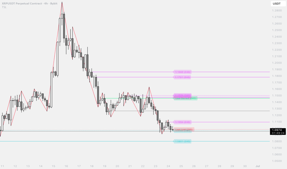
Trend Structure & Untested LevelsTrend Structure & Tested Levels
Draws the swing trend as a zigzag, turns every swing into a support/resistance level, and tracks whether price has closed through it ("tested") or not ("untested").
Overview
A market-structure tool. It connects confirmed swing highs and lows into a clean zigzag trend line, then projects a horizontal level from each swing. Every level is classified by state — untested until a candle closes through it, after which the most recent break in each direction is flagged as Last Gained or Last Lost. The result is an at-a-glance map of the active structure and which levels are still in play.
What it does
Swing trend (zigzag). Connects confirmed pivot highs/lows into a trend line. A live, provisional leg always runs from the last confirmed pivot to the current price, so the structure reaches the current bar.
Automatic levels. Each swing high/low becomes a horizontal level — highs above price act as resistance, lows below price as support.
Tested vs untested. A level stays untested until a candle closes through it; a wick touch alone does not count.
Last Gained / Last Lost. The most recent resistance price closed above is tagged Last Gained (bullish break of structure); the most recent support price closed below is tagged Last Lost (bearish break).
Multi-timeframe
Levels — and the zigzag, in follow mode — can be drawn from the chart timeframe or any higher timeframe (e.g. D / W / M), labelled with a suffix such as (W). Higher-timeframe pivots are read without repainting forward-filled values and are anchored at the real pivot time, so an HTF level sits where it actually formed and runs horizontally across the whole chart.
Key settings
Pivot length — the master sensitivity control. Lower = a finer zigzag and more, smaller levels; higher = only the major structure.
Swing source — wicks (high/low) or candle bodies (open/close) to ignore wick spikes.
Zigzag follows levels timeframe — keep trend line and levels on one structure, or decouple the zigzag onto the chart timeframe.
Independent colours, line styles, widths, and a per-side cap on untested levels.
Notes
This is a visualisation of structure, not a signal or strategy — it says nothing about profitability; validate separately.
Repainting. Swings confirm pivot length bars after the fact, and the live leg moves with price until a new pivot confirms.
Not financial advice. Penunjuk
Penunjuk

Penunjuk
Penunjuk

Penunjuk

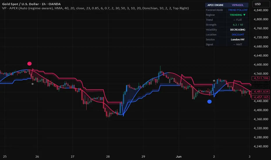
APEX Trend & Signal Engine [Viprasol]APEX Trend & Signal Engine — Regime-Aware Dual-Mode Toolkit
═══════════════════════════════════════════════════════════
THE PROBLEM IT SOLVES
═══════════════════════════════════════════════════════════
The single most expensive mistake in trading is using the wrong style for the
conditions — trend-following a sideways range (death by a thousand whipsaws), or
mean-reverting a strong trend (fighting a freight train). Most indicators apply ONE
style blindly and let you find out the hard way.
APEX reads the market REGIME first, tells you which style fits right now, and only
fires signals that match. When the market is trending it trend-follows; when it's
ranging it mean-reverts. Same tool, opposite logic, applied at the right time.
═══════════════════════════════════════════════════════════
HOW THE FOUR PILLARS WORK TOGETHER
═══════════════════════════════════════════════════════════
Every trade decision rests on four questions, and APEX answers each:
1. BIAS — long or short? A multi-factor Trend Midline (your choice of 8 MA types)
colored by a consensus of price position, slope, and directional movement.
2. REGIME — trend or range? ADX + Kaufman Efficiency Ratio classify the regime and
pick the favored mode (trend-follow vs mean-revert). This is the engine's core.
3. LOCATION — where is fair value? A premium/discount model: longs are only allowed
in discount (below equilibrium), shorts only in premium (above). Better entries,
better risk-reward.
4. SIGNAL + FILTER — the trigger, gated by regime, location, and trend-cloud
confluence, so low-quality signals are filtered out.
═══════════════════════════════════════════════════════════
SIGNALS
═══════════════════════════════════════════════════════════
• In a TRENDING regime: momentum entries in the trend direction (baseline reclaim with
rising/falling slope and directional-movement agreement).
• In a RANGING regime: mean-reversion entries when price tags an extreme band and
reverts.
• A colored dot marks a confluent signal; a gray ✕ marks a signal that LACKS confluence
(a hint to exit the opposite position rather than enter).
• Take-profit markers flag when price reaches an ATR-based target after a signal.
═══════════════════════════════════════════════════════════
FOUR OPTIONAL OVERLAYS
═══════════════════════════════════════════════════════════
• TREND MIDLINE — an MA baseline colored by multi-factor consensus (blue long / red
short / gray neutral-exhaustion), filled to price.
• ADAPTIVE ZONE — a Supertrend rendered as a dynamic support/resistance ZONE (support
beneath price in uptrends, resistance above in downtrends) rather than flip signals.
• TREND CLOUD — a modified Ichimoku Kumo (Donchian, EMA, or HMA engine) for trend
context; bullish above, bearish below.
• EXTREME ZONES — multi-band standard-deviation gradient zones marking where price is
statistically stretched and prone to revert (mean-reversion).
Each is independently toggleable so you keep the chart as clean as you like.
═══════════════════════════════════════════════════════════
5-STATE CANDLE COLORING & DASHBOARD
═══════════════════════════════════════════════════════════
Candles paint in five states from a 0-10 trend-strength score: strong buy, buy,
neutral, sell, strong sell (strong states solid, weaker states faded).
The dashboard reports, at a glance: Favored Mode (trend-follow / mean-revert), Regime
(trending/ranging + bias), Trend (increasing/decreasing), Strength (0-10), Volatility
(increasing/decreasing), Location (premium/discount), Session (Tokyo/London/NY/Void),
and the current Signal.
═══════════════════════════════════════════════════════════
HOW TO USE
═══════════════════════════════════════════════════════════
1. Leave Mode on "Auto" and read the dashboard's Favored Mode — trade with the regime.
2. Take colored signals that agree with the trend; treat gray ✕ marks as exit cues.
3. Respect Location — favor longs in discount, shorts in premium.
4. Use the Adaptive Zone / Extreme Zones as entry and target reference levels.
5. Tune Trend/Fast lengths and the ADX threshold to your market and timeframe.
═══════════════════════════════════════════════════════════
HONEST LIMITATIONS — PLEASE READ
═══════════════════════════════════════════════════════════
• No indicator predicts the future. APEX organizes context and signals; it does not
guarantee outcomes. Confirm on closed bars.
• Regime classification has a transition lag — the first bars of a new trend or range
can be mislabeled. The favored-mode readout is guidance, not gospel.
• Session hours are set in UTC and adjustable; verify they match your instrument.
• Volume-dependent and synthetic-feed instruments may read differently.
• Take-profit markers use a simple ATR target on one tracked signal — they are a
reference, not a backtest. This is a decision-support tool, not financial advice.
═══════════════════════════════════════════════════════════
CREDITS & ORIGINALITY
═══════════════════════════════════════════════════════════
This is an original toolkit built from public-domain technical-analysis methods,
implemented from their published formulas: Supertrend (Olivier Seban), Ichimoku Kinko
Hyo (Goichi Hosoda), Bollinger Bands / %B (John Bollinger), ADX/DMI (J. Welles Wilder),
Efficiency Ratio (Perry Kaufman), and the premium/discount equilibrium concept. The
regime-aware dual-mode architecture, the confluence/location gating, the strength model,
the overlays' construction, and all code are original Viprasol work. No third-party Pine
code is reused and no proprietary algorithms are included.
Penunjuk

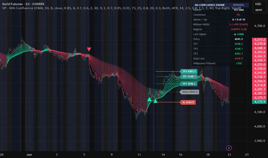
MA Confluence Engine [Viprasol]MA Confluence Engine — 15-MA Consensus Ribbon
═══════════════════════════════════════════════════════════
ONE CROSSOVER IS AN OPINION. FIFTEEN MAs AGREEING IS A TREND.
═══════════════════════════════════════════════════════════
A single moving-average crossover whipsaws constantly — two lines tangle in chop and
fire signal after signal that goes nowhere. MA Confluence Engine replaces that one
fragile opinion with the agreement of a 15-MA ribbon. It only signals when most of the
ribbon agrees on direction, stands aside when the ribbon squeezes together (a
compressed ribbon IS chop), and on every signal it draws a complete trade plan:
Entry, TP1, TP2, TP3 and Stop Loss.
═══════════════════════════════════════════════════════════
HOW THE CONSENSUS WORKS
═══════════════════════════════════════════════════════════
The engine builds a ribbon of 15 moving averages, spaced from a fast base length
upward (e.g. 10, 18, 26 … 122). Every bar it measures two things across all 15:
• How many is price trading ABOVE?
• How many are SLOPING UP?
These combine into a single CONSENSUS SCORE from 0 to 100:
100% = price above all 15 MAs AND all 15 rising (a fully stacked uptrend)
0% = price below all 15 AND all 15 falling (a fully stacked downtrend)
50% = mixed — the ribbon disagrees
A long signal fires only when consensus rises through your bullish threshold
(default 75%), a short when it falls through the bearish threshold (default 25%).
Half-hearted moves where the ribbon disagrees never trigger.
═══════════════════════════════════════════════════════════
THE TRADE PLAN — DRAWN ON THE LAST SIGNAL
═══════════════════════════════════════════════════════════
The moment a signal fires, the engine projects five levels forward and labels each
with its price:
• ENTRY — at the signal close
• STOP LOSS — your risk distance away (ATR or %); this distance defines 1R
• TP1 / TP2 / TP3 — at your chosen R-multiples of that risk (default 1R / 2R / 3R)
Only the most recent signal's plan is shown, so the chart stays clean. The dashboard
mirrors the exact prices, and every alert carries the full plan (Entry/SL/TP1/TP2/TP3)
so it's ready for journaling or automation.
═══════════════════════════════════════════════════════════
THE RIBBON IS ITS OWN CHOP FILTER
═══════════════════════════════════════════════════════════
When a market chops, moving averages of every length collapse onto each other — the
ribbon goes flat and thin. The engine measures RIBBON WIDTH (the spread of the 15 MAs,
normalized by ATR) and skips signals whenever the ribbon is compressed below your
threshold. A second Kaufman Efficiency-Ratio gate confirms price is actually trending.
Filtered crosses are drawn faintly (✕) and counted, so you SEE what was avoided.
═══════════════════════════════════════════════════════════
21 VERIFIED, LICENSE-CLEAN MOVING AVERAGES
═══════════════════════════════════════════════════════════
Build the ribbon from any one of:
SMA, EMA, WMA, RMA, VWMA, DEMA, TEMA, HMA, ALMA, T3, McGinley, ZLEMA, KAMA, FRAMA,
VIDYA, SuperSmoother, Gaussian, Laguerre, Kalman, LSMA, Median.
Each is implemented from its published formula and credited to its author. Jurik's JMA
is deliberately excluded — it is a proprietary, trademarked product whose every
open-source "version" is an unlicensed reverse-engineering.
═══════════════════════════════════════════════════════════
DASHBOARD
═══════════════════════════════════════════════════════════
• Live consensus score, with price-above and sloping-up counts (x of 15)
• Ribbon width + chop state, trend-regime efficiency reading
• Last signal direction and the full Entry / TP1 / TP2 / TP3 / SL prices
• Whipsaws filtered
═══════════════════════════════════════════════════════════
FEATURES
═══════════════════════════════════════════════════════════
• 15-MA ribbon colored by consensus (red → green) or simple bull/bear, with fill
• Entry/TP1/TP2/TP3/SL level lines + labels on the latest signal
• Choppy-regime background shading + faint markers on filtered crosses
• Direction filter (Both / Longs / Shorts)
• Stop in ATR or %, take-profits as R-multiples
• Alerts for long, short, and chop — signal alerts include the full trade plan
• Full MA sub-parameter control (ALMA, T3, KAMA, Gaussian, Laguerre, Kalman, VIDYA, McGinley)
═══════════════════════════════════════════════════════════
HOW TO USE
═══════════════════════════════════════════════════════════
1. Choose an MA type, base length, and spacing for the ribbon.
2. Wait for a signal — it only fires when the ribbon fans out and aligns (consensus
through your threshold) in a trending regime.
3. Use the drawn Entry / SL / TP1 / TP2 / TP3 as your trade plan; scale out at the TPs.
4. Raise the consensus thresholds and ribbon-width minimum to make signals stricter
(fewer, cleaner) — the whipsaw-filtered count shows the filter working.
═══════════════════════════════════════════════════════════
HONEST LIMITATIONS — PLEASE READ
═══════════════════════════════════════════════════════════
• Signals are evaluated on bar close; act on confirmed bars to avoid intrabar flicker.
• A consensus system enters LATER than a single fast crossover — it trades fewer,
higher-quality moves and will sit out fast reversals. That trade-off is the point.
• The TP/SL levels are a risk framework, not a prediction — markets do not owe you 3R.
• Volume MAs (VWMA) and the regime math need reliable data; some synthetic forex/CFD
feeds are less meaningful.
• This is a decision-support tool, not financial advice. Trade at your own risk.
═══════════════════════════════════════════════════════════
CREDITS & ORIGINALITY
═══════════════════════════════════════════════════════════
MA methods credited to their authors: Wilder (RMA), Mulloy (DEMA/TEMA), Hull (HMA),
Legoux & Kouzis-Loukas (ALMA), Tillson (T3), McGinley, Kaufman (KAMA/Efficiency Ratio),
Ehlers (ZLEMA, SuperSmoother, Gaussian, Laguerre, FRAMA), Chande (VIDYA), Kálmán
(Kalman). All formulas are public-domain / published methods. Every line of Pine — the
MA dispatcher, the 15-MA consensus engine, the ribbon chop filter, the trade-plan
projection, and the visualization — is original Viprasol work written from the
published formulas. No third-party Pine code is reused; no proprietary algorithms included.
Penunjuk

Penunjuk

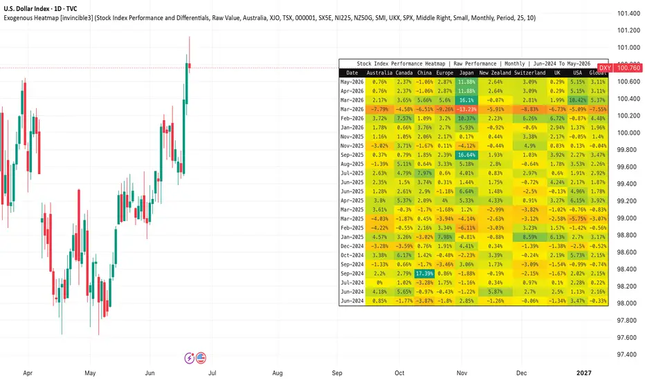
Exogenous Heatmap [invincible3]Exogenous Heatmap
The Exogenous Heatmap is a multi-country macro and market-performance dashboard designed to help traders and investors monitor external economic forces that may influence currencies, equities, commodities, and broader risk sentiment.
Instead of focusing only on price action from the current chart, this indicator visualizes key exogenous variables across major economies in a clean historical heatmap format. Users can compare countries by interest rates, GDP growth, balance of trade, foreign exchange reserves, and major stock index performance.
The indicator supports two calculation modes:
1. Raw Value
Displays the actual macroeconomic value or stock index performance for each country.
2. Differential vs Base
Compares each country against a selected base country. This is useful for identifying relative macro strength or weakness. For example, if the base country is set to the USA, the indicator shows how Australia, Japan, the UK, Europe, China, and other countries compare against the United States.
The heatmap includes the following datasets:
Interest Rates and Differentials
Displays policy interest rates or interest-rate differentials between countries. This is especially useful for forex analysis because higher relative interest rates can influence capital flows and currency strength.
GDP and Differentials
Displays GDP year-over-year growth or GDP growth differentials. This helps identify which economies are expanding faster or slower relative to the selected base country.
Balance of Trade and Differentials
Displays trade balance data. A stronger trade surplus may indicate external demand strength, while a deficit may reflect import pressure or weaker export competitiveness.
Reserves and Differentials
Displays foreign exchange reserve levels. This can help assess external liquidity strength and a country’s ability to manage currency or balance-of-payment stress.
Stock Index Performance and Differentials
Displays the performance of major stock indexes from leading economies. This adds a global risk-on/risk-off component to the indicator. Strong equity index performance may reflect improving investor sentiment, while weak performance may signal risk aversion.
The default stock index symbols include:
Australia: ASX 200
Canada: TSX Composite
China: Shanghai Composite
Europe: Euro Stoxx 50
Japan: Nikkei 225
New Zealand: NZX 50
Switzerland: SMI
United Kingdom: FTSE 100
United States: S&P 500
Users can manually change these symbols from the settings panel if they prefer alternative benchmarks.
Example 1: Interest Rate Differential
Suppose the selected dataset is Interest Rates and Differentials and the base country is set to USA .
If:
USA interest rate = 5.50%
Japan interest rate = 0.50%
Then Japan’s differential versus the USA is:
0.50% - 5.50% = -5.00 pp
This means Japan’s policy rate is 5.00 percentage points lower than the USA. In the heatmap, this would appear as a negative differential and would be colored toward the negative side of the gradient.
Example 2: Stock Index Performance Differential
Suppose the selected dataset is Stock Index Performance and Differentials and the timeframe is set to Monthly .
If:
USA S&P 500 monthly return = +4.20%
Japan Nikkei 225 monthly return = +2.10%
Then Japan’s stock index performance differential versus the USA is:
2.10% - 4.20% = -2.10 pp
This means Japan’s equity market underperformed the USA by 2.10 percentage points during that monthly period.
Example 3: Raw Stock Index Performance
If the calculation mode is set to Raw Value , the indicator displays each country’s own index return for the selected period.
For example:
USA: +4.20%
Japan: +2.10%
UK: -1.30%
Europe: +0.80%
This allows users to quickly identify which regions are leading or lagging in global equity performance.
Color Interpretation
Positive values are shown using the positive color gradient.
Negative values are shown using the negative color gradient.
Neutral or near-zero values are shown near the neutral color.
The indicator includes both automatic and manual color scaling. Auto Scale adjusts the heatmap based on the strongest visible value, while Manual Scale lets the user set a fixed range for more consistent comparisons.
How Traders Can Use It
Forex traders can use interest-rate and GDP differentials to evaluate relative currency strength.
Macro traders can use trade balance and reserve data to identify external economic pressure or resilience.
Equity and index traders can use global stock index performance to track international risk sentiment.
Commodity traders can use the dashboard as a macro backdrop because global growth, rates, and risk appetite often influence commodity demand and capital flows.
Important Notes
For percentage-based datasets such as interest rates, GDP growth, and stock index returns, differential values are displayed in percentage points, abbreviated as “pp.”
For balance of trade and reserves, raw values may often be more meaningful than differentials because countries may report values in different scales or currencies.
This indicator is designed as a macro and risk-sentiment visualization tool. It should be used together with technical analysis, fundamental analysis, and proper risk management.
Penunjuk

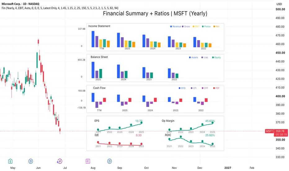
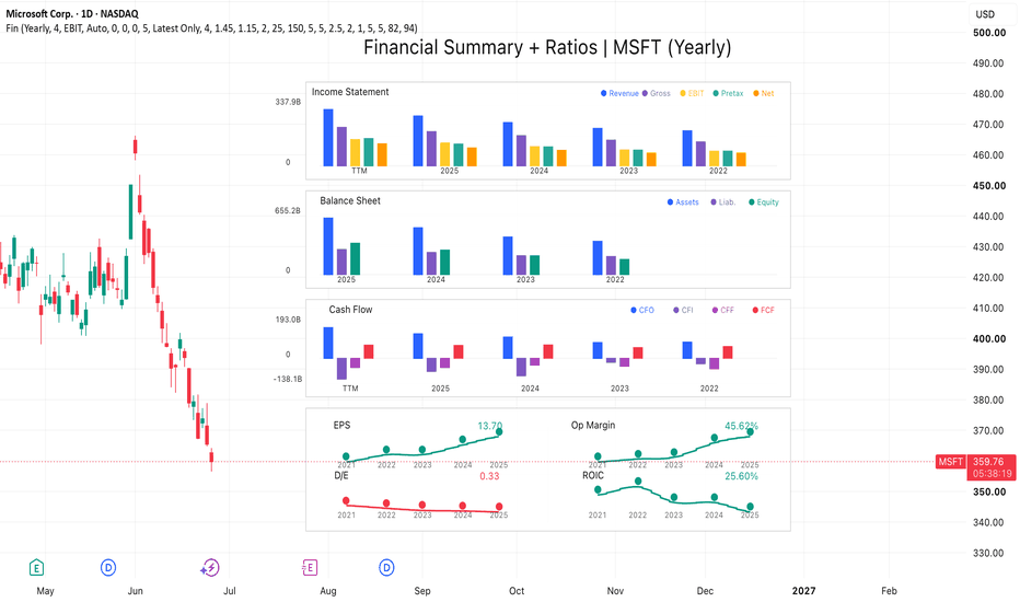
Stocks: Financial Summary [invincible3]Stocks: Financial Summary
Stocks: Financial Summary is a compact fundamental dashboard designed to visualize a company’s key financial statements directly on the TradingView chart.
The indicator displays three major financial sections:
Income Statement
Revenue, Gross Profit, EBIT or Operating Income, Pretax Income, and Net Income.
Balance Sheet
Total Assets, Total Liabilities, and Shareholders’ Equity.
Cash Flow
Cash Flow from Operations, Cash Flow from Investing, Cash Flow from Financing, and Free Cash Flow.
The dashboard is drawn on the right side of the chart using a clean multi-panel bar-chart layout. It allows traders and investors to quickly compare historical yearly or quarterly financial data without leaving the price chart.
Key Features
* Supports Yearly and Quarterly financial views.
* Optional TTM display for Income Statement and Cash Flow.
* Visual comparison of historical financial periods.
* Auto unit formatting: Raw, K, M, B, and T.
* Customizable dashboard position, spacing, bar width, colors, and transparency.
* Right-side layout designed to keep the price chart readable.
* Uses actual TradingView financial data through `request.financial()`.
* Includes manual fiscal year and quarter override options when exchange reporting labels need adjustment.
This tool is designed for fundamental analysis, long-term stock screening, and quick financial statement comparison. It can help users visually inspect whether a company’s revenue, profitability, assets, liabilities, cash flow, and free cash flow are improving or weakening over time.
This indicator is for educational and informational purposes only. It is not financial advice.
Penunjuk
Penunjuk

Penunjuk

Penunjuk
Penunjuk

Penunjuk

Auction Regime Atlas v1.0 # 🧭 Auction Regime Atlas v1.0
Auction Regime Atlas is a Pine Script v6 overlay indicator designed to visualize market acceptance, value migration, rejected auction areas, and contextual auction regimes directly on the chart.
❌ It is not a buy/sell signal tool.
❌ It is not a strategy.
❌ It is not an orderflow or liquidation-data replacement.
🎯 The goal is to help traders understand where price has been accepted, where value is forming, where price has moved away from value, and whether the current market context is balanced, transitional, displaced, or low quality.
---
## 💡 Core Idea
Markets often rotate around accepted value before moving into new auction areas.
Auction Regime Atlas maps that process by combining:
* price acceptance over a lookback window
* volume participation
* candle efficiency
* wick/rejection behavior
* higher-timeframe context
* regime classification
* distance from current value
📊 The result is a compact visual framework for understanding auction context without flooding the chart with signals.
---
## 🚀 Main Features
### 1. 🎯 Core Value Band
The Core Value Band highlights the price area where recent market activity shows the strongest acceptance.
It is calculated from a price-bin acceptance model using:
* time spent near price
* volume concentration
* close location
* wick/rejection behavior
⚠️ This band is meant as auction context, not as a mechanical support or resistance level.
---
### 2. 📏 Acceptance Edges
Upper and lower acceptance edges define the boundaries of the current accepted value area.
These edges help identify whether price is:
* inside accepted value
* above value
* below value
* far away from value
---
### 3. 🔄 Auction Regime
The dashboard shows a simplified auction regime state.
Current v1.0 regime states include:
* Neutral
* Balance
* Migration Up
* Migration Down
* Failed Auction
🛡️ The regime engine uses confirmed-bar logic and cooldown handling to avoid excessive state flipping.
---
### 4. 🌍 HTF Context
The indicator includes a higher-timeframe context layer based on confirmed higher-timeframe data.
ℹ️ This is used only as context and does not create entry or exit signals.
---
### 5. 📍 Location Awareness
The Location field shows where current price is relative to the accepted value area:
* Inside Value
* Above Value
* Below Value
* Away From Value
* No Value
When price is far away from the value zone, the visual relevance of the Core Band is reduced so the zone does not appear like an active trade signal.
---
### 6. 🎨 Visual Modes
Auction Regime Atlas includes three modes:
#### 🎯 Focus Mode
A clean minimal view for live chart reading.
Shows:
* Core Value Band
* Acceptance Edges
* compact dashboard
* no debug rows
#### ⚖️ Balanced Mode
Adds additional context zones while keeping the chart clean.
Shows:
* Core Value Band
* Acceptance Edges
* transitional/rejection context
* vacuum/context areas where applicable
#### 🔬 Research Mode
Adds validation and diagnostic rows for development, review, and deeper inspection.
Shows:
* object count
* validation status
* pending state information
* alert condition status
---
## 📋 Dashboard Fields
The compact dashboard includes:
* Mode
* Regime
* HTF Context
* Core Value Band
* Acceptance Score
* Location
* Activity
* Context Quality
🔬 Research Mode can additionally show:
* Validation Status
* Object Count
* State Debug
* Alert Debug
---
## 🔔 Alerts
The indicator includes four confirmed-bar alert conditions:
* New Auction Regime
* Value Migration Started
* Acceptance Edge Broken
* Failed Auction Detected
⚠️ Alerts are context alerts only.
They are not trade entry or exit instructions.
---
## 🛠️ Suggested Use
Auction Regime Atlas is best used as a context layer.
Useful questions:
* Is price currently inside accepted value?
* Is price moving away from value?
* Is the market balanced or transitioning?
* Did price leave value without building new acceptance?
* Is the current move happening near or far away from accepted value?
* Does higher-timeframe context support or contradict the current auction?
✅ Recommended starting use:
* Focus Mode for clean chart reading
* Balanced Mode for broader context
* Research Mode only for diagnostics and validation
---
## 📖 Practical Workflow
A simple way to interpret auction conditions is to combine Regime, Location Awareness, and HTF Context into a structured process.
### 1️⃣ Step 1: Start With HTF Context
First identify the higher-timeframe backdrop shown in the dashboard.
Ask:
* Is the higher timeframe supportive of directional movement?
* Is it balanced or already migrating?
* Does it align with the current chart or create conflict?
🌍 HTF Context provides the broader auction environment in which lower-timeframe activity is occurring.
### 2️⃣ Step 2: Check Current Location
Next evaluate where price is relative to accepted value.
* Inside Value suggests ongoing acceptance and rotational behavior.
* Above Value or Below Value suggests price is testing outside accepted value.
* Away From Value suggests displacement from the current auction area.
* No Value suggests acceptance has not yet formed clearly.
📍 Location helps determine whether price is interacting with value or operating away from it.
### 3️⃣ Step 3: Read the Active Regime
Then assess the current Auction Regime state.
* Balance implies acceptance and rotational trade around value.
* Migration Up or Migration Down implies value is attempting to relocate.
* Failed Auction suggests an attempted move has not established acceptance.
* Neutral indicates limited directional auction information.
🔄 The regime describes the current phase of the auction process rather than predicting the next move.
### 4️⃣ Step 4: Compare Regime and Location
The most useful information often comes from the relationship between regime and location.
Examples:
* Balance + Inside Value often reflects stable acceptance.
* Migration Up + Above Value may indicate value expansion higher.
* Migration Down + Below Value may indicate value expansion lower.
* Failed Auction + Away From Value may indicate rejection of a recent auction attempt.
📊 This comparison helps identify whether price behavior is consistent with the current auction state.
### 5️⃣ Step 5: Evaluate Market State Transitions
Watch for changes between regimes while monitoring location relative to value.
Common transitions include:
* Balance → Migration Up
* Balance → Migration Down
* Migration → Failed Auction
* Failed Auction → Balance
🔍 A transition becomes more meaningful when it is supported by location changes and aligned with HTF Context.
### 6️⃣ Step 6: Build a Contextual Narrative
Rather than treating any single field as a signal, combine all three layers:
1. Determine the higher-timeframe backdrop.
2. Identify where price is relative to value.
3. Assess the active auction regime.
4. Monitor whether the relationship between those factors is strengthening or weakening.
🧠 This workflow helps traders interpret whether the market is accepting value, rejecting value, migrating toward a new value area, or transitioning between auction states.
---
## 📈 Recommended Markets and Timeframes
The indicator is designed for liquid markets, especially:
* crypto perpetuals
* major crypto spot markets
* liquid index or futures markets
* high-volume intraday instruments
⏱️ Suggested timeframes:
* 5m
* 15m
* 1h for higher timeframe context
---
## ⚠️ Important Limitations
Auction Regime Atlas does not use true orderflow, footprint, delta, liquidation, or exchange-level positioning data.
All calculations are based on OHLCV data available in Pine Script.
❌ The indicator does not predict price direction.
❌ It does not guarantee reversals, continuations, or breakouts.
❌ It does not provide financial advice.
📌 The visual zones should be interpreted as auction context, not as automatic trade levels.
---
## 🛡️ Non-Repainting Design
The indicator is designed with confirmed-bar logic and non-repainting higher-timeframe requests.
Higher-timeframe context uses confirmed data and avoids lookahead behavior.
🔧 Visuals are updated with a stable object lifecycle to reduce flicker and avoid uncontrolled object creation.
---
## 📝 Release Notes — v1.0
🎉 Initial public release.
✅ Included:
* Acceptance Map Engine
* Core Value Band
* Acceptance Edges
* Minimal Auction Regime Engine
* HTF Context
* Location Awareness
* Focus / Balanced / Research modes
* Compact dashboard
* Confirmed-bar alerts
* Validation diagnostics in Research Mode
* Controlled object budget
* Non-repainting architecture
❌ Not included:
* strategy mode
* backtesting
* buy/sell signals
* automated entries or exits
* orderflow claims
* delta claims
* liquidation data
* machine learning
* multi-symbol logic
Penunjuk