Penunjuk

Stoch RSI Super BUY only indicator (SRS)Overview
The Stoch RSI Super Strategy (SRS) Combined is a comprehensive, multi-layered momentum and trend-following indicator. It is designed to identify high-probability exhaustion zones, track price divergence, and validate potential entries using price action breakouts and dynamic Moving Average (MA) trend filtering.
Instead of generating basic crossover signals, this indicator operates on a "state-tracking" logic system. It requires a specific sequence of momentum shifts before generating an actionable breakout line and subsequent buy signal, reducing false entries in choppy markets.
How It Works (Under the Hood)
The script is built on three primary components:
Smoothed Stochastic RSI (%K): The script calculates a standard RSI, applies a Stochastic oscillator to that RSI, and then smooths it to create the %K line.
State-Tracking Logic: The indicator looks for a specific sequence of events:
Phase 1 (Overbought Setup): The %K must cross above the 80 level while the RSI is concurrently at or above 70. This plots a small Green Circle, indicating the market has reached extreme momentum.
Phase 2 (Oversold Trigger): After Phase 1 is validated, the indicator waits for the %K line to cross below the 20 level. When this happens, a Red Circle is plotted, and the corresponding price candle is colored black.
Price Action Breakout & Trend Filter: Once the black candle is established, a horizontal breakout line is drawn at its High. For a long signal to trigger, the closing price must break above this horizontal line AND close above the 21-period Simple Moving Average (SMA).
Divergence Detection: The script records the low price and %K value at each "Red Circle" event. If a new setup forms with a lower price but a higher %K value, the script flags a Bullish Divergence ("D" label).
Core Features
Dynamic MA 21: Plotted directly on the main chart, this Moving Average changes color (Green/Red) based on whether the current close is above or below it, providing an immediate visual cue for the baseline trend.
Smart Breakout Line: A dynamic horizontal line that tracks the high of the setup candle. It colors red while waiting for a breakout and locks to green once the price successfully closes above it.
Exit Logic: Once a trade is active, the script tracks the %K line. An exit signal (Red Downward Triangle) is generated when %K pushes back above 70 and subsequently crosses under it, signaling fading bullish momentum.
Built-in Alerts: Fully configured alertconditions for when the breakout line is generated and when a validated buy signal occurs.
How to Use This Indicator
Monitoring: Watch for the sequence to unfold in the sub-pane. A Green Circle followed by a Red Circle means the setup is actively being monitored.
Entry Validation: Do not enter blindly on the Red Circle. Wait for the price to close above the dynamic horizontal line and the 21 SMA. If the Buy label includes a "D", it indicates the setup is backed by hidden bullish divergence, adding confluence.
Trade Management: Use the dynamic 21 SMA as a potential trailing dynamic support, or utilize the built-in exit triangle as a signal to scale out or close the position.
Disclaimer: This script is for educational and analytical purposes only. It is highly recommended to use this indicator in conjunction with broader market structure analysis, support/resistance levels, and strict risk management. Past performance is not indicative of future results. Penunjuk

Penunjuk

Penunjuk

Penunjuk

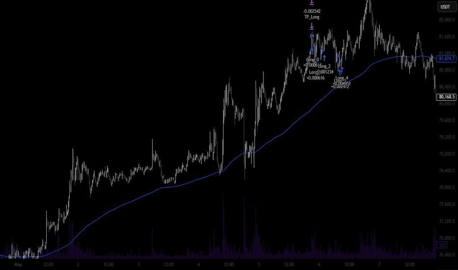
Trend Structure Scale-In👋 What's up traders,
Decided to finally share this one after a lot of testing, tweaking, and more chart staring than I'd like to admit.
Trend Mitigation Scale-In Pro is built around a simple idea: trade with the trend, wait for quality pullbacks, and let probabilities do the heavy lifting.
The strategy combines:
• EMA200 trend filtering
• Pivot structure detection
• Engulfing candle confirmation
• Mitigation-based entries
• Controlled scale-ins on pullbacks
• Fixed basket take-profit management
The goal isn't to catch every move. It's to stay aligned with the bigger trend and focus on higher-quality setups while keeping execution simple.
Like every strategy, it's not perfect and should always be tested thoroughly before being used on a live account.
I'm constantly building, testing, and improving new ideas, so feedback is always appreciated.
If you find it useful, a ⭐ Favorite, 👍 Like, or 🚀 Boost helps more than you think and motivates me to keep sharing.
Wishing everyone green charts and disciplined trading. 🏆
Good luck out there.
— Tomukasss
Strategi

Adaptive MTF Trend Fusion [AlgoPro]Adaptive MTF Trend Fusion is an advanced multi-timeframe trend modeling system. It is engineered to combine multi-timeframe moving average structure, multi-timeframe VWAP-based price weighting, volatility-adjusted trend bands, and adaptive visual confirmation into one clean decision framework.
Rather than relying on a single moving average, fixed trendline, or static channel, this tool creates a dynamic fusion midline by blending multiple timeframe calculations together. The result is a smoother, more context-aware trend anchor that adapts to market structure, volatility, and directional pressure across different chart environments.
🔵 SYSTEM ARCHITECTURE & CORE TREND ENGINE
Multi-Timeframe Fusion Engine
Adaptive Timeframe Mapping: The system can automatically select lower, middle, or higher timeframe combinations based on the chart you are viewing. This allows the indicator to build a broader trend model without requiring manual timeframe adjustments every time you switch charts.
Auto Higher / Auto Middle / Auto Lower Modes: Traders can choose whether the fusion engine should lean into higher-timeframe confirmation, balanced multi-timeframe structure, or lower-timeframe responsiveness. Manual mode is also available for full custom timeframe selection.
Confirmed Higher-Timeframe Logic: Higher-timeframe values are handled with confirmation logic to help prevent future-leak behavior and keep the model grounded in completed higher-timeframe data.
Advanced Moving Average Fusion Core
Selectable Smoothing Models: The moving-average engine supports multiple smoothing types, including SMA, EMA, WMA, HMA, RMA, VWMA, DEMA, TEMA, THMA, and JMA. This allows the trader to tune the fusion line from slower institutional-style trend tracking to faster adaptive response.
Weighted Calculation Control: The moving average component can be enabled, disabled, or weighted independently. This lets traders decide how much influence the selected moving average structure should have in the final fusion midline.
Multi-Timeframe MA Blending: The script calculates the selected moving average across three chosen timeframes, then blends those values into a single adaptive trend anchor.
VWAP-Based Price Alignment Engine
Rolling VWAP Support: The VWAP engine can use a rolling VWAP calculation over a user-defined length, helping the system identify price positioning relative to recent volume-weighted value.
Daily VWAP Support: A daily-reset VWAP mode is also included for traders who prefer a session/day-based value anchor.
Weighted VWAP Influence: The VWAP component can be enabled, disabled, or weighted separately from the moving-average component. This allows the final fusion line to lean more toward volume-weighted value, moving-average structure, or a balanced blend of both.
Volatility-Scaled Trend Confirmation Bands
ATR-Based Volatility Framework: The fusion midline is surrounded by volatility-adjusted upper and lower confirmation thresholds. These bands expand and contract with market volatility, helping reduce false flips during noisy conditions.
Trend Confirmation Candles: A trend state does not flip immediately from a single cross. The system requires a user-defined number of confirming candles above or below the volatility structure before locking into a bullish or bearish state.
Directional State Machine: Once a bullish or bearish condition is confirmed, the indicator maintains that structural state until the opposite side earns confirmation. This helps traders avoid reacting to every minor pullback or midline test.
🔵 VISUAL TREND STRUCTURE & MARKET INTERPRETATION
Adaptive Fusion Band
Fusion Band Around the Midline: A separate internal band is plotted around the fusion midline to help define the core trend zone. This acts as a visual center-of-gravity area for the current market structure.
Dynamic Color Behavior: The fusion band shifts color based on price position and trend state. When price is interacting with the band, the color can remain more neutral. As price pushes away from the band, the visual structure becomes stronger in the active trend color.
Clean Trend Zone Visualization: The band is designed to make trend structure easy to read without overwhelming the chart. It gives traders a clear view of whether price is compressing near the midline or expanding away from it.
Volatility Gradient Fill
Trend Expansion Visualization: When price is moving in the direction of the confirmed trend, the script creates a gradient fill between price and the active volatility buffer.
Volume-Based Brightness: The gradient fill responds to volume pressure. Stronger directional volume can make the fill appear more active, while weaker volume pressure fades the visual intensity.
Directional Market Context: This helps traders quickly identify whether a move has supportive pressure behind it or whether price is simply drifting away from the midline without strong participation.
Trend Flip Signals
Confirmed Bullish Flip Signals: When the system confirms a bullish transition, a clean signal marker is printed near the lower volatility structure.
Confirmed Bearish Flip Signals: When the system confirms a bearish transition, a clean signal marker is printed near the upper volatility structure.
Glow-Based Signal Styling: The signal markers are designed with layered glow circles to make important trend shifts visible without cluttering the chart.
Midline Retest Signals
Bullish Retest Logic: During a bullish trend, if price pulls below the fusion midline and then crosses back above it, the script can print a bullish retest marker.
Bearish Retest Logic: During a bearish trend, if price pushes above the fusion midline and then crosses back below it, the script can print a bearish retest marker.
Continuation Setup Assistance: These retest markers are designed to help identify possible trend continuation opportunities after a pullback into the fusion structure.
🔵 SYSTEMATIC TRADING INTERPRETATION
Trend Following Bias: Use the confirmed market state as the primary directional bias. Bullish states favor long-side planning, while bearish states favor short-side planning.
Midline Pullback Continuations: During a confirmed trend, watch for price to pull back toward or through the fusion midline. A retest signal can help identify when price is attempting to reclaim trend direction.
Volatility Buffer Confirmation: Strong trend flips occur only when price closes beyond the volatility structure for the required number of confirming candles. This helps filter weak crosses and reduce premature entries.
Trend Strength Expansion: A rising trend strength value means price is moving farther away from the midline. This can indicate strong momentum, but it can also warn that price is becoming extended depending on market context.
Volume Pressure Confirmation: Use the volume pressure reading to determine whether the current move is being supported by directional participation. Strong trend state plus matching volume pressure can suggest better continuation quality.
Fusion Band Compression: When price is hovering near the fusion band, the market may be compressing, ranging, or preparing for a larger directional move. When price expands away from the band, the system helps visualize directional strength.
🔵 INTERFACE CONFIGURATION & PARAMETERS
Multi-Timeframe Controls: Choose Auto Higher, Auto Middle, Auto Lower, or Manual mode depending on whether you want broader confirmation, balanced structure, lower-timeframe responsiveness, or full custom control.
Moving Average Settings: Select from multiple moving average types and adjust the moving average length to control how responsive or smooth the fusion engine becomes.
VWAP Settings: Choose between Rolling VWAP and Daily VWAP, then adjust the rolling length when using the rolling mode.
Volatility Settings: Tune the ATR length, volatility multiplier, smoothing, and confirmation candle count to adjust how strict or responsive the trend engine should be.
Fusion Band Settings: Control the internal band visibility, width, and multiplier to fit your preferred chart style.
Visual Settings: Customize bull, bear, and neutral colors, signal sizes, dashboard position, dashboard size, and chart display options.
Adaptive MTF Trend Fusion transforms a standard chart into a multi-timeframe trend modeling dashboard. By combining moving average structure, VWAP value, volatility confirmation, trend strength, and volume pressure into one unified system, it gives traders a cleaner way to read market direction, trend health, and pullback continuation opportunities. Penunjuk

Penunjuk

Strategi
Melissa 2-Candle EMA Wick Break Indicator**Melissa 2-Candle EMA Wick Break Indicator**
The Melissa 2-Candle EMA Wick Break Indicator is designed to identify simple momentum-based continuation entries after price crosses an Exponential Moving Average.
The indicator looks for a two-candle confirmation pattern using two candles of the same colour. For a bullish setup, two green candles must form while price moves from at or below the EMA to closing above it. For a bearish setup, two red candles must form while price moves from at or above the EMA to closing below it.
Once the two-candle setup is confirmed, the indicator does not trigger an entry immediately. Instead, it waits for price to break the wick of the second candle. A long entry signal appears when price breaks above the second candle’s high, and a short entry signal appears when price breaks below the second candle’s low.
The indicator also plots the EMA, setup markers, pending wick-break levels, entry signals, and optional stop loss and take profit reference levels. The default trade example is based on 10 contracts with a $300 target, but these values can be adjusted in the settings.
This tool is intended to help traders visually identify cleaner EMA crossover opportunities with confirmation, rather than entering on the first touch or break of the moving average.
Penunjuk

Penunjuk

Penunjuk

Penunjuk

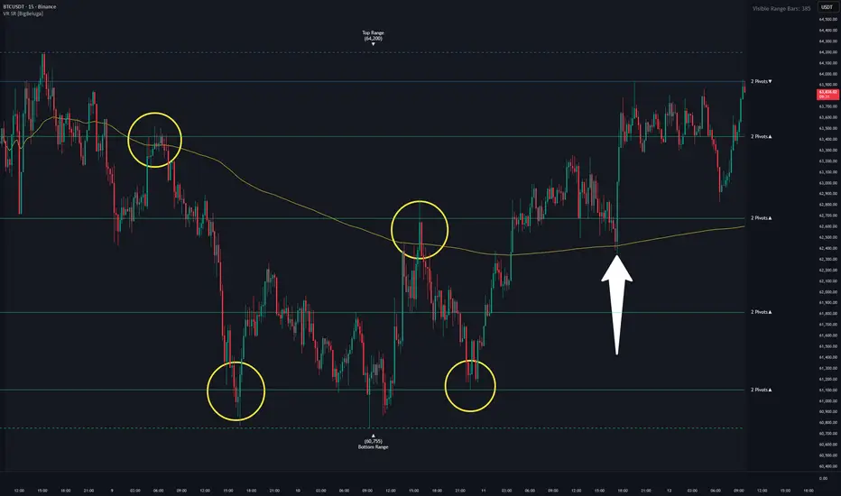
Visible Range Support and Resistance [BigBeluga]🔵 OVERVIEW
Visible Range Support and Resistance is a dynamic support/resistance tool that analyzes price structure only within the visible range of your chart. It detects key levels based on clustered pivots inside a binned vertical range and highlights zones where price has historically reacted. The tool adjusts in real-time as you pan or zoom, offering adaptive precision at any scale.
🔵 CONCEPTS
Pivot Clustering: Price highs/lows are collected into horizontal "bins" across the visible chart range. If multiple pivots align within a bin, that area is marked as a potential support or resistance zone.
Visible Range Only: Calculations are limited strictly to the bars currently visible on the chart. Zooming or panning changes the result.
Bin System: The visible high-to-low range is divided into 100 horizontal zones (bins) to group pivots and detect confluence.
Multi-Threshold Detection: Users can enable two separate S/R detection levels with different pivot count thresholds for more nuanced signals. The more pivot points a level has, the thicker and richer the color.
Directional Context: Labels include arrows (▲ or ▼) to show whether the current price is above (support) or below (resistance) each zone.
Range Boundaries: The top and bottom of the visible range are marked with dashed lines and labeled as Top Range and Bottom Range .
🔵 FEATURES
Detects S/R zones based on the number of pivots found within each price bin.
100 horizontal bins divide the visible price range, allowing high resolution detection.
Only uses data from visible bars—zooming out recalculates the indicator for more data.
Customizable number of pivot confirmations (e.g., 2, 3, 4, 5) before a level is shown.
5 Pivots
Dual-level detection lets you show stronger and weaker zones separately.
Automatically colors support (green) and resistance (blue) with dynamic intensity.
Labels show pivot count and direction (support/resistance).
Automatic cleanup of overlapping levels for visual clarity.
Dashed top/bottom range markers help define the visible scope.
Session SMA calculates from the visible range start (from the chart edge)
Visible range bars count
🔵 HOW TO USE
Zoom in for precise intra-range support and resistance zones based on current structure.
Zoom out to load more pivot data and identify long-term levels.
Use the pivot threshold (e.g., 3 or 4) to control signal strength—higher = stronger levels.
Watch for price reactions or breakouts around high-pivot zones to identify key areas.
Combine with trend, volume, or order flow tools to confirm the relevance of each S/R zone.
Adjust line and label colors for better contrast with your chart theme.
🔵 CONCLUSION
Visible Range Support and Resistance is a smart, range-sensitive tool for mapping meaningful horizontal levels. By scanning only what you see on the screen, it provides an adaptive edge to traders focused on real-time price action. Whether you’re scalping short-term zones or zooming out for macro structure, this tool flexes with your view to keep the most relevant levels front and center. Penunjuk

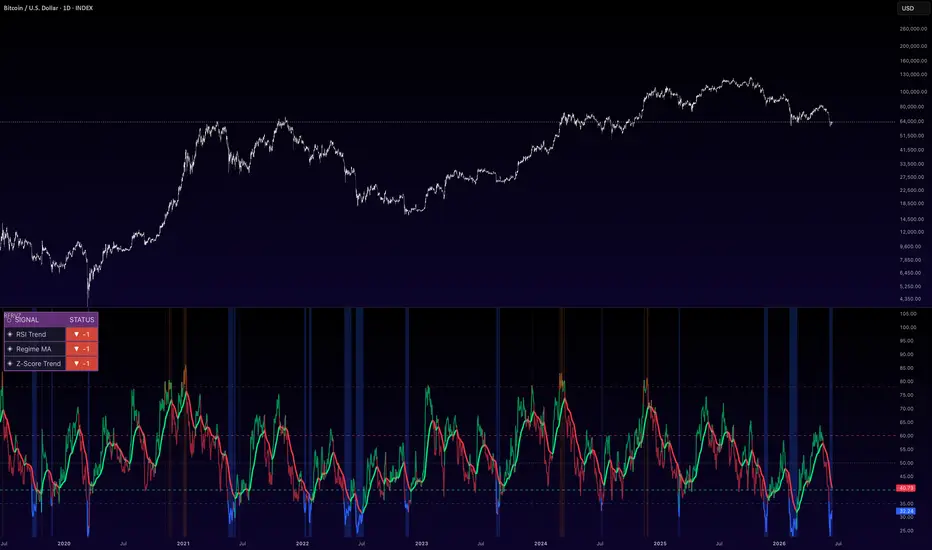
Helios v3 Live Regime Signal ToolHelios v3 — User Guide
Introduction
Helios v3 is a daily-timeframe market regime classifier and signal tool for TradingView. It tells you three things at a glance: what regime an asset is in (five states from Strong Bull to Strong Bear), whether a systematic entry or exit signal has fired, and — just as importantly — when a signal has been deliberately blocked because conditions make it a bad trade.
The core is a four-component trend score: MACD posture, the spread between the close-average and open-average, raw momentum, and position relative to a long moving average. Each component votes +1, 0, or −1, producing a score from −4 to +4 that maps to the regime. On top of that core, v3 adds two confirmation components the original lacked — volume participation (OBV trend) and relative strength against Bitcoin — and two protective gates: a realised-volatility cap that suppresses signals in conditions where trend-following historically fails, and an extension gate that refuses to buy parabolas or sell capitulation lows.
The philosophy: the regime tells you what the market is doing; the signals tell you when the system would act; the gates tell you when acting would be chasing. Transitions matter more than states — a slip from Strong Bull to Moderate Bull is information before any signal fires.
This is a decision-support tool, not financial advice. It describes price behavior; position sizing, risk, and the final call remain yours.
Installation
Open TradingView and load any chart, then set the timeframe to Daily (the tool is designed and calibrated for daily bars; volatility math assumes them).
Open the Pine Editor (bottom panel).
Delete any placeholder code, paste the entire contents of chameleon_v3_live.pine, and click Save (name it anything).
Click Add to chart. You should see colored bars, a regime label top-right, and the dashboard bottom-left.
To create alerts: click the three dots on the indicator name → Add alert, then pick a condition from the dropdown (see Alerts section below).
Choosing the right settings
Step 1 — Pick the volatility profile
Open the indicator settings and set Volatility Profile. This single dropdown switches all core parameters (MACD lengths, SMA, momentum lookback, confirmation days) and the volatility cap together:
Profile
90D Vol range
Vol cap
Typical assets
LV
under 50%
60%
S&P 500, Nasdaq, blue-chip stocks, major indices, BTC in calm regimes
MV
50–70%
80%
BTC and ETH in normal conditions, large-cap growth stocks
HV
71–90%
100%
Mid-cap cryptos (SOL-tier), volatile tech stocks, leveraged ETFs
SHV
over 90%
130%
Small-cap cryptos, meme coins, new listings, stocks in parabolic phases
You don't need to guess: the dashboard's 90D Vol row shows the asset's current volatility and prints ✓ Suitable or ✗ Use telling you which profile to switch to. Check it whenever you load a new asset, and re-check holdings every few weeks — volatility regimes drift, and an asset that was MV six months ago may be HV now.
Rule of thumb by asset class: indices and megacap equities → LV. Bitcoin and Ethereum → start with MV, follow the dashboard. Altcoins → HV or SHV, follow the dashboard. Anything freshly listed or in a mania phase → SHV.
Step 2 — Set the relative-strength benchmark (alts and stocks)
The RS benchmark input defaults to BINANCE:BTCUSDT, which is correct for altcoins: it asks "is this coin actually outperforming Bitcoin, or just riding its beta?" On a Bitcoin chart the component switches itself off automatically and the score range adapts.
For equities, change the benchmark to something meaningful — SP:SPX or NASDAQ:NDX — so the component measures strength against the relevant index instead of against Bitcoin. If you'd rather not use relative strength at all, untick Use Relative Strength vs benchmark.
Step 3 — Leave the gates alone (at first)
The defaults — buys blocked above z = 2.5, sells blocked below z = −2.5, auto vol cap on — are sensible starting values. Run the tool for a few weeks before adjusting anything. If you later find the vol gate too strict on a specific asset, untick Auto vol cap by profile and set a manual cap; that is the intended escape hatch, but use it knowingly — the gate exists because trend signals taken in extreme volatility have historically been the worst ones.
Reading the chart day to day
Bar colors = live regime. Bright green (Strong Bull, score +3 to +4), light green (Moderate Bull, +1 to +2), yellow (Neutral, 0), light red (Moderate Bear, −1 to −2), bright red (Strong Bear, −3 to −4). The top-right box states the regime in words.
Watch transitions, not states. Promotion into bright green is a confirmed breakout. Bright green fading to light green means the trend is losing a component — open the dashboard and see which one. Yellow rolling to light red to bright red is a regime change in progress. Climbing out of bright red suggests bear exhaustion and a possible base.
The dashboard is the diagnosis panel. It shows each component's current vote (MACD / Spread / Momentum / SMA, then Volume and Relative Strength), the total score against its maximum, the confirmation streak progress, the extension z-score, the vol gate status, your position state, and what size a signal would carry if it fired right now. The most useful daily habit: when a regime weakens, check whether volume (OBV) confirmed the move or diverged from it. Price-up with OBV voting −1 is a hollow rally; price flat with OBV voting +1 is quiet accumulation.
Triangles are signals:
Solid green triangle "FULL" — buy signal at full conviction: score at least +5 and price not extended (z below 1.5).
Lighter green triangle "HALF" — valid buy, but either the score is at the minimum threshold or price is somewhat extended. The system suggests half size.
Solid red triangle "SELL" — exit signal: score collapsed to −4 or worse for the required confirmation days.
Grey hollow triangle "BLK" — a blocked signal. Score and streak fully qualified, but a gate refused it: either realised vol is above the cap, or price is too extended (buys above z 2.5, sells below z −2.5). Blocked buys are worth tracking — when the same setup later fires at lower extension, it is typically the highest-quality entry the system produces.
Signal mechanics, for reference: a buy requires the extended score (core four components plus volume plus relative strength) to hold at +4 or better for the confirmation period — 2 consecutive days on LV/MV, 3 on HV/SHV — with the vol gate open and extension acceptable. Sells mirror this at −4. The system tracks one position state (long or flat) and will not repeat signals while in a position.
Alerts
Five alert conditions are available from the alert dialog:
BUY (full size) — highest-conviction entries.
BUY (half size) — valid but qualified entries.
SELL — confirmed regime breakdown exit.
Signal blocked — conditions met but gated; useful as a "watch this asset" ping.
Regime change — fires on any of the five-state transitions; the best low-noise alert for assets you hold but aren't actively trading.
A practical configuration: regime-change alerts on every core holding, plus buy/sell alerts on the handful of assets you'd actually trade systematically.
Honest limitations
The tool is a trend follower; it will always be late at exact tops and bottoms by design, and it loses money in choppy sideways ranges through whipsaw — the confirmation days and gates reduce this but cannot eliminate it. The volatility cap means some assets in extreme conditions produce no signals at all; that silence is itself the message. Backtested statistics on systems like this rest on a small number of historical trades, so treat any past-performance figure as descriptive, not predictive. And no indicator knows about news, unlocks, earnings, or liquidity events — the regime score is an input to judgment, not a replacement for it.
Penunjuk

Aegis Kinetic Trend Matrix [wjdtks255]Aegis Kinetic Trend Matrix
■ OVERVIEW
The Aegis Kinetic Trend Matrix is a professional-grade trend-following framework designed to unify macroeconomic bias filters, micro-execution entry triggers, and volatility boundaries into a single, cohesive candle-overlay system.
By integrating three robust open-source concepts—CM_EMA Trend Bars, HalfTrend, and the Nadaraya-Watson Envelope (NWE)—this system provides traders with a multi-layered filtration process to capture structural market swings with precision.
■ KEY FEATURES
CM_EMA Trend Bars: Dynamically shifts candlestick colors based on a 34-period EMA algorithm to isolate core macro direction and eliminate market noise.
HalfTrend Execution Spine: High-precision trailing anchor that tracks micro-trend pivots, offering distinct, instant BUY and SELL execution labels.
Nadaraya-Watson Envelope: Uses non-parametric kernel regression bounds to highlight overextended pricing and filter volatility exhaustion zones at major structural extremes.
■ 개요 (Korean)
Aegis Kinetic Trend Matrix는 거시적 추세 필터링, 미세 타점 포착, 그리고 변동성의 한계 구간을 단 하나의 캔들 오버레이 시스템으로 결합한 하이브리드 트레이딩 프레임워크입니다.
CM_EMA 트렌드 바, 하프트렌드(HalfTrend), 나다라야-왓슨 엔벨로프(NWE) 시스템을 유기적으로 결합하여, 거친 시장 소음을 여과하고 구조적 변곡점을 정밀하게 잡아내도록 설계되었습니다.
■ 핵심 기능
CM_EMA 트렌드 바: 34선 기준 가격 배열에 따라 캔들 색상을 직관적으로 변경하여 시장의 대추세 방향성을 명확히 정의합니다.
하프트렌드 실행 축: 단기적인 마이크로 추세 전환을 정밀하게 추적하며, 즉각적인 BUY/SELL 진입 라벨을 제공합니다.
Nadaraya-Watson 엔벨로프: 커널 회귀 분석 기반의 동적 밴드를 통해 가격의 과도한 이격을 감지하고 추세적 극한 구간의 반전 포인트를 필터링합니다.
■ Credits & Acknowledgments
This indicator is a combined integration based on public domain open-source works. Special credits and gratitude go to the original authors of CM_EMA, HalfTrend, and Nadaraya-Watson Envelope (AlexGrozav) for sharing their invaluable source code with the global community. Penunjuk

Penunjuk

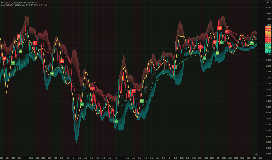
Aegis SMRT Hybrid Spectrum System [wjdtks255]🛡️ Aegis SMRT Hybrid Spectrum System
■ OVERVIEW**
The Aegis SMRT Hybrid Spectrum System is a professional-grade all-in-one trading framework designed for high-clarity market analysis. By consolidating three powerful consensus tools—SMRT Volatility Bands, Chandelier Exit, and Zero Lag LSMA (ZLSMA)—into a single, highly optimized Pine Script v6 architecture, it completely eliminates chart clutter and reduces dynamic calculation lag.
This system provides a multi-layered approach to trend identification, dynamic trailing stops, and responsive momentum tracking simultaneously.
---
■ KEY FEATURES
1. SMRT Volatility Layers: Utilizes a 3-tier standard deviation ribbon centered on a core EMA to capture overextended market conditions and volatility expansions.
2. Chandelier Trailing Exit: Tracks systemic trend direction changes and provides objective trailing stop-loss coordinates with dynamic background state coloring.
3. ZLSMA Momentum Spine: A zero-lag least squares moving average (rendered in bold yellow) that offers ultra-responsive price tracking, helping traders isolate the true trend direction without mathematical delay.
---
■ 개요 (Korean)
Aegis SMRT Hybrid Spectrum System은 차트의 시각적 명확성과 분석의 정밀도를 극대화하기 위해 설계된 올인원 트레이딩 프레임워크입니다. 검증된 세 가지 메커니즘인 SMRT 변동성 밴드, 샹들리에 출구(Chandelier Exit), 제로랙 LSMA(ZLSMA)를 단 하나의 초경량화 스크립트로 통합하여 차트의 복잡함을 없애고 연산 효율을 높였습니다.
■ 핵심 기능
1. SMRT 변동성 레이어**: 중심 EMA를 기준으로 한 3단계 표준편차 리본을 통해 시장의 과매수/과매도 구간 및 변동성 확장을 포착합니다.
2. 샹들리에 트레일링 엑싯: 추세의 구조적 전환을 추적하고, 동적인 배경색 전환을 통해 객관적인 익절/손절 기준선을 제시합니다.
3. ZLSMA 모멘텀 라인: 반응성이 극대화된 노란색 제로랙 최소제곱이동평균선이 수학적 시차(Lag) 없이 실제 가격 추세의 중심축을 잡아줍니다.
---
■ Credits & Acknowledgments
This script is a modified integration based on public open-source concepts. Respect and credits go to the original creators of SMRT Algo, Chandelier Exit (Everget), and ZLSMA. Penunjuk
S&R Zones + PSY Levels, Pivot & EMA by LazyhackerPSY · S&R Zones · Pivot & EMA
What This Script Does & Why It's One Indicator
This tool is purpose-built for Nifty and BankNifty intraday traders who need a single, clean overlay covering the five most critical price-context layers: psychological levels, dynamic support/resistance zones, previous day levels, EMAs, and pivot points. Each component is chosen because it answers a specific question at the same moment:
Where are the big round-number magnets? → PSY Levels
Where has price historically reversed and is that zone still valid? → S&R Zones
What are the key reference prices from yesterday? → PDH / PDL / PDC
What is the current momentum structure? → EMA stack
What are the mathematically derived support/resistance targets for today? → Pivot Points + Fibonacci
Having these on separate indicators produces cluttered, difficult-to-read charts and requires switching between settings panels. This script integrates them with a unified settings panel and consistent visual design.
How Each Component Works
S&R Zones (Dynamic, Auto-Flipping)
Uses ta.pivothigh() and ta.pivotlow() with a configurable lookback period to identify confirmed swing highs and lows. Each pivot is drawn as a price zone (a box) rather than a line, because price rarely reacts to exact levels — zones are more realistic. Two filters prevent noise:
Zone Width (%): merges nearby pivots so overlapping zones don't clutter the chart.
Min Pivot Strength (%): requires the price to have moved a minimum % away from the pivot, ensuring only significant reversals qualify.
Zones automatically flip when price closes through them: a broken support becomes resistance (turns red) and vice versa (turns green). Zones being actively tested turn gray.
🔢 PSY (Psychological) Levels
Draws equidistant horizontal bands at psychologically significant round numbers:
BankNifty: Major levels at every 500 points, minor at every 250 points.
Nifty: Major levels at every 100 points, minor at every 50 points.
The anchor (Base Level) and number of levels above/below are fully configurable. Zone width for each level type is independently adjustable. These levels act as price magnets and are among the most reliable intraday reference points for Indian index derivatives.
📅 Previous Day High / Low / Close (PDH / PDL / PDC)
Fetches the prior session's high, low, and close using request.security() with high , low , close — properly offset expressions that carry no lookahead bias. These three levels are widely watched by institutional and retail participants and often act as the first intraday support/resistance.
📈 EMA Stack (Chart + Higher Timeframe)
Chart EMAs: Two EMAs computed directly on the current chart timeframe (default 9 and 15). Used for immediate momentum and crossover signals.
HTF EMAs: Two EMAs computed on a higher timeframe (default 5-minute, configurable). These smooth out lower-timeframe noise and show the broader intraday trend direction. When price is above both HTF EMAs, the bias is long; below both, the bias is short.
HTF data uses barmerge.gaps_off without lookahead_on to ensure values only step at each completed HTF bar with no future data leakage.
🌀 Fibonacci Intraday Levels
Tracks the session high and low within a configurable session window (default 09:15–15:30 IST) and draws two intraday Fibonacci retracement levels:
50%: The midpoint of the day's range — a natural mean-reversion target.
61.8%: The golden ratio retracement — the most widely respected Fibonacci level.
These update dynamically as the day's range expands. They are most useful for identifying pullback entry zones within a trending day.
🔵 Pivot Points
Calculates standard pivot point levels (P, R1–R5, S1–S5) using TradingView's built-in ta.pivot_point_levels(). Supports six calculation methods: Traditional, Fibonacci, Woodie, Classic, DM, and Camarilla. The anchor timeframe auto-selects based on chart timeframe (Daily pivots for intraday, Weekly for daily charts, etc.) but is manually overridable. Up to 5 historical pivot periods can be displayed simultaneously.
The pivot request.security() call uses timeframe.change() as the trigger — a safe offset pattern that prevents lookahead bias on historical bars.
How to Use
Set your instrument (Nifty or BankNifty) and PSY anchor base level to match current market price range.
On a 1–5 minute chart, all five components will activate with sensible defaults.
Use PSY levels + Pivots as your primary S/R map for the session.
Use S&R Zones to identify zones with historical significance and watch for flip behavior.
Use PDH/PDL/PDC as the first intraday breakout or rejection reference.
Use EMA stack for momentum bias — enter in the direction the chart EMAs are sloping when price is on the correct side of HTF EMAs.
Use Fibonacci levels for intraday pullback targets once the day's range is established (typically after the first 30–60 minutes).
Notes
Designed primarily for NSE index derivatives (Nifty, BankNifty) on intraday timeframes (1m–15m).
All components are independently toggleable.
No repainting: S&R zones are drawn at confirmed pivot bars (lookback bars in the past); Fibonacci and EMAs are real-time but non-predictive; pivot levels use closed HTF bars only.
Penunjuk

Penunjuk

EMA Crossover Strategy [15M]EMA Crossover Strategy — Stats Panel + Pip/$ Tracking + Chop Filter
A clean, rules-based EMA crossover strategy built for XAUUSD (Gold) on the 15-minute timeframe, with multi-timeframe signal confirmation, dynamic risk/reward boxes, and a full live stats panel.
🔧 How It Works
Signals are generated when the Fast EMA (5) crosses the Slow EMA (13) on the higher timeframe. The stop loss is placed at the EMA intersection point, and the take profit is calculated automatically using your chosen Risk:Reward ratio (default 2:1).
📊 Features
✅ Multi-timeframe EMA crossover detection (no repainting)
✅ Dynamic SL placed at EMA intersection — not a fixed pip distance
✅ Automatic TP calculated from your RR ratio
✅ Visual Risk/Reward boxes anchored by time (stay pinned when scrolling/zooming)
✅ VWAP filter — only takes longs above VWAP, shorts below
✅ ADX chop filter — avoids sideways markets below your ADX threshold
✅ EMA separation filter — skips signals when EMAs are too close together
✅ Stats panel (bottom left) — total trades, win rate, net RR, pips captured/lost, net $/oz
✅ Active trade panel (top right) — live entry, SL, TP, risk in pips and price
✅ JSON alerts for webhook/bot integration
✅ TP ✓ and SL ✗ hit labels on chart
⚙️ Inputs
SettingDefaultDescriptionHigher Timeframe15MHTF for EMA signalsFast EMA5Fast EMA lengthSlow EMA13Slow EMA lengthRR Ratio2.0Risk:Reward multiplierVWAP FilterOnTrend direction filterADX FilterOnChop/sideways filterADX Threshold20Minimum ADX for a valid signalEMA Sep FilterOnMinimum EMA gap filterPip Size0.1Set to 0.1 for XAUUSD (OANDA)
📌 Notes
Built and optimised for XAUUSD on OANDA — adjust pip size for other brokers or instruments
Uses barmerge.lookahead_off to prevent repainting
Drawings are anchored by time (xloc.bar_time) so they stay correctly positioned when scrolling or changing zoom
Alerts fire in JSON format — ready for webhook or bot automation
⚠️ Disclaimer
This script is for educational and informational purposes only. Past performance is not indicative of future results. Always manage your own risk. Penunjuk

Penunjuk

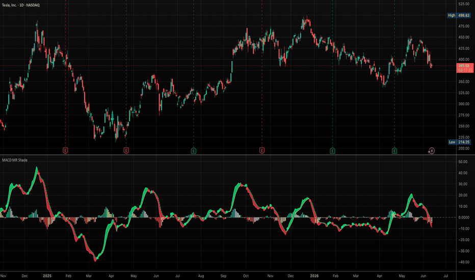
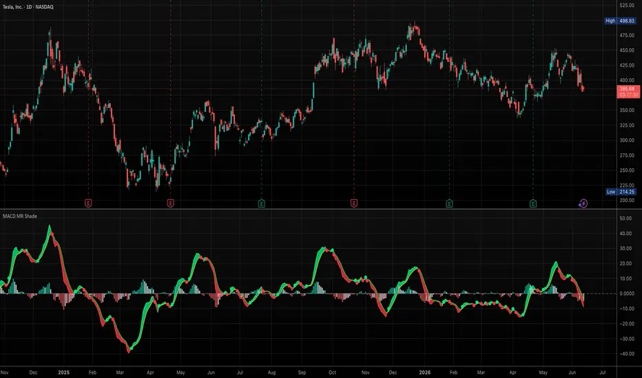
MACD Mean Reversion ShadingMACD Mean Reversion Shading
This indicator is a visual MACD tool designed to make MACD/signal-line momentum shifts easier to read at a glance.
Unlike a standard MACD display that only plots the MACD line, signal line, and histogram, this version emphasizes the relationship between the MACD and signal line by coloring the MACD line, plotting optional crossover dots, and shading the space between the MACD and signal line.
The purpose is to help traders quickly identify potential mean-reversion momentum turns after extended moves, especially when MACD begins crossing back toward the signal line.
How it works
The indicator calculates MACD using customizable EMA lengths. The default settings are:
Fast EMA: 8
Slow EMA: 21
Signal EMA: 5
These faster settings are designed to be more responsive than the traditional 12/26/9 MACD.
When the MACD line is above the signal line, the indicator colors the MACD line green and shades the area between the two lines green. When the MACD line is below the signal line, the MACD line turns red and the shaded area turns red.
Optional dots mark MACD/signal-line crossovers:
Green dot: MACD crosses above the signal line
Red dot: MACD crosses below the signal line
The histogram can be displayed using either two-color or four-color logic. The four-color mode distinguishes between rising/falling momentum above and below the zero line.
Multi-timeframe option
The script can calculate MACD using the current chart timeframe or an alternate user-selected timeframe. This allows traders to view higher- or lower-timeframe MACD behavior while staying on the current chart.
How to use it
This script is not intended to be a standalone buy/sell system. It is designed as a visual momentum and mean-reversion aid.
Potential uses include:
Spotting MACD/signal-line turns after extended directional moves
Identifying when bearish momentum is weakening
Identifying when bullish momentum is strengthening
Comparing MACD momentum across different chart timeframes
Using the shaded MACD/signal area as a quick visual trend/momentum filter
A green shaded region suggests MACD is above its signal line. A red shaded region suggests MACD is below its signal line. Traders should combine this with price structure, support/resistance, trend, volume, and broader market context.
Original contribution
The main contribution of this script is its visual treatment of MACD/signal-line interaction: dynamic line coloring, shaded MACD/signal spread, crossover dots, four-color histogram behavior, and optional multi-timeframe calculation in one configurable tool. Penunjuk