Volume Pressure ZonesThe Volume Pressure Zones indicator identifies areas of concentrated buying and selling pressure by analyzing intra-bar price action and volume.
Rather than relying purely on price structure, this script estimates the internal volume pressure behind price movements. It splits the volume of each candle into Buy and Sell components based on where the candle closes relative to its high-low range.
How it Works:
Pressure Calculation: The script tracks the cumulative Buy and Sell volumes over a specified lookback period (default 6) and compares them against the average volume.
Zone Projection: When the concentrated pressure exceeds a user-defined threshold (default 1.3), it projects a visual zone forward.
Buy Zones (White): Represent areas of concentrated buying pressure, potentially acting as support.
Sell Zones (Black): Represent areas of concentrated selling pressure, potentially acting as resistance.
Overlap Prevention: To maintain a clean and readable chart, the script prevents new boxes of the same type from overlapping. A new zone is drawn only after the previous zone's extension period has fully elapsed.
Settings:
Pressure Threshold: Adjusts the sensitivity of zone creation. A higher value requires a stronger concentration of volume to draw a box.
Zone Extension: Determines how many bars forward the support/resistance box is projected.
Moving Average (Optional): An optional EMA is included with slope-based color coding for trend context. This is hidden by default to keep the chart clean.
This indicator does not predict future price movements but provides a visual mapping of where significant volume pressure has recently occurred. It is best used alongside other contextual market analysis.
How to Use (Trading Strategies & Applications):
1. The Pullback & Retest Strategy
These zones represent areas where significant capital was committed. Rather than entering a trade immediately as the zone forms, wait for the initial move to play out and look for a pullback to the zone.
Bullish Setup: Wait for a White (Buy) zone to form and price to move higher. When the price retraces back into this white zone, look for bullish rejection (e.g., a pin bar or engulfing candle) to enter long.
Bearish Setup: Wait for a Black (Sell) zone to form and price to drop. Sell on the retracement back into the black zone, using it as a resistance ceiling.
2. Trend Alignment (Using the Optional MA)
To avoid trading against the dominant momentum, use the built-in Moving Average (or your own preferred trend filter) to select high-probability zones.
Enable the Moving Average in the settings.
If the price is trading above a rising MA, prioritize White (Buy) zones for long entries and ignore black zones.
If the price is trading below a falling MA, prioritize Black (Sell) zones for short entries and ignore white zones.
3. Dynamic Risk Management (Stop Loss & Take Profit)
The zones provide logical, volume-backed levels for managing your risk and targeting profits.
Stop Loss Placement: When taking a long position from a support area, place your stop loss just below the bottom edge of the current White (Buy) zone.
Take Profit Placement: If you are in a long position, use the nearest developing or existing Black (Sell) zone as a realistic take-profit target, as it represents historical selling pressure.
4. Breakout Validation
When the price approaches a previously established pressure zone, observe how volume and price behave. If the price easily breaks through a thick Black (Sell) zone with strong momentum, it indicates that the buyers have fully absorbed the historical selling pressure. This invalidated resistance zone often flips to become future support.
Disclaimer: Like all technical indicators, Volume Pressure Zones should not be used in isolation. It works best when combined with broader market structure analysis, price action, and proper risk management. Penunjuk

Penunjuk

Currency Strength Meter - Relative Strength📊 Currency Strength Meter (CSM) — Relative Currency Strength
Description
The Currency Strength Meter measures the relative strength of 8 major currencies (USD, EUR, GBP, CHF, CAD, AUD, JPY, NZD) in real time, calculated from 26 Forex pairs.
Instead of looking at pairs in isolation, the CSM aggregates each currency's behavior across every pair it appears in, generating a score from 0 to 9 that reflects how strong or weak that currency currently is on the selected timeframe.
How it works
For each of the 26 pairs, the indicator calculates where the closing price sits within the high/low range of the last N candles — a calculation similar to a stochastic oscillator.
That value is converted into a score from 0 to 9 (0 = extremely weak, 9 = extremely strong).
The base currency of the pair receives the calculated score, while the quote currency receives the complementary value (9 − score).
Each currency's final strength is the average of all scores it received across the pairs it's part of.
An optional smoothing filter (with triangular weighting) reduces noise by giving more weight to recent candles.
Key features
📈 8 strength lines plotted on the panel, one per currency
📋 Real-time ranking table, sorting currencies from strongest to weakest
🔲 Mini visual histogram (block bars) showing each currency's intensity
🟢🔴 Configurable reference zones (strong limit and weak limit)
▲▼ Buy/Sell signals when the chart's base currency is strong and the quote currency is weak (or vice versa)
🔶 "Market imbalance" alert, triggered when one currency crosses into the strong zone and another crosses into the weak zone — a hint of a strong trend forming
🔔 Ready-to-use alertconditions for setting up TradingView alerts
Settings
Timeframe used for calculation (independent of the chart's timeframe)
Number of candles analyzed
Smoothing and triangular weighting (on/off)
Upper and lower thresholds for signals
Panel position and display options
How to use
This indicator works best as a confirmation and market-context tool, not as a standalone entry system. Combine the strength/weakness signals with your own technical analysis (price action, support/resistance, other indicators) before making entry decisions.
⚠️ This indicator is an analysis tool and does not constitute investment advice. Always manage your own risk. Penunjuk

Tech Leadership Map+ [Herman]Tech Leadership Map
Tech Leadership Map is a relative-market leadership indicator designed to show whether technology-focused market activity is currently leading, lagging, or moving without a clear advantage relative to the broader US equity market.
The indicator does not generate traditional buy or sell signals. Instead, it provides an additional market-context layer that can help traders evaluate whether current market participation supports or conflicts with the directional move they are analyzing.
It includes two selectable and independent leadership models:
* **Price**
* **Volume Pressure**
Both models convert several measurements into a standardized four-component composite score.
---
Why Tech Leadership Matters
Technology shares represent an important component of US equity index activity, particularly for Nasdaq-related instruments.
When technology is outperforming the broader market, Nasdaq-focused markets may be receiving stronger relative participation. When technology is underperforming, broader-market strength may not be confirmed by technology leadership.
This indicator attempts to make that relationship easier to observe directly on the chart.
It should be treated as a **relative-market context tool**, not as a standalone forecasting system.
---
Leadership States
The indicator evaluates four separate components.
Each component contributes:
**+1** = favors the selected technology leader
**0** = neutral / unavailable confirmation
**-1** = favors the benchmark
The resulting Composite Score can therefore range from:
**+4 to -4**
The default classification is:
** GREEN — Tech Leading**
Composite Score of +2 or higher.
Technology-oriented activity is showing stronger relative leadership than the selected benchmark.
** YELLOW — No Clear Edge**
Composite Score between -1 and +1.
The measurements are mixed and neither side has sufficient agreement to establish a clear leadership state.
** RED — Tech Lagging**
Composite Score of -2 or lower.
Technology-oriented activity is showing weaker relative leadership than the selected benchmark.
These colors describe the current relative-leadership condition. They do not represent predictions of future price direction.
---
# 1. PRICE MODE
The default Price model compares:
**QQQ — Price Leader**
with
**SPY — Price Benchmark**
Both symbols can be changed in the indicator settings.
The model evaluates four components.
### 1. Performance From RTH Open
The indicator measures the percentage performance of QQQ and SPY from the beginning of the configured US Regular Trading Hours session.
It then compares those performances.
If QQQ has performed better from the RTH open, the component favors the leader.
If SPY has performed better, it favors the benchmark.
---
### 2. Relative-Strength Ratio Slope
The indicator calculates the relative-strength relationship:
**QQQ / SPY**
The logarithm of this ratio is evaluated using a linear-regression slope.
A rising relative-strength relationship indicates improving technology leadership.
A falling relationship indicates weakening technology leadership relative to the benchmark.
---
### 3. Short-Term Momentum Difference
The model compares short-term rate-of-change momentum between the leader and benchmark.
By default, this component uses a 5-bar momentum comparison.
This allows the indicator to identify situations where both markets may be moving in the same direction while one is accelerating more strongly than the other.
---
### 4. Correlation-Break Confirmation
QQQ and SPY normally exhibit a relatively high degree of correlation.
The indicator measures correlation between their logarithmic returns.
When correlation falls below the model's internal threshold, the short-term momentum difference receives an additional confirmation vote.
The purpose of this component is to emphasize periods where relative movement becomes more meaningful because the two markets are no longer behaving as closely together.
---
# 2. VOLUME PRESSURE MODE
Volume Pressure provides an alternative model that does **not use QQQ/SPY price movement to determine leadership**.
The default market-internal sources are:
**NASDAQ: VOLDQ**
versus
**Broad Market / NYSE: VOLD**
These represent net up-volume minus down-volume market internals.
The symbols are editable because VOLDQ and VOLD represent different market universes and should not be interpreted as literal constituent-by-constituent equivalents of QQQ and SPY.
---
## Normalization
NASDAQ and broad-market internal series can operate on substantially different numerical scales.
For that reason, the indicator first normalizes each series independently before comparing them.
This prevents the raw numerical magnitude of one internal from automatically dominating the comparison.
---
## Volume Pressure Components
The model then evaluates four measurements.
### 1. Pressure Level
Compares the current normalized leader pressure with the normalized benchmark pressure.
---
### 2. Fast Pressure
Applies short-term smoothing to both normalized internal series and compares their relative position.
This helps reduce some bar-to-bar noise while preserving short-term changes in leadership.
---
### 3. Pressure Momentum
Measures the change in normalized internal pressure over the selected momentum lookback.
This identifies which market internal is currently improving or deteriorating faster.
---
### 4. Pressure Impulse
Each normalized internal is compared with its own slower baseline.
The difference between those impulses determines which market is showing the stronger deviation from its recent baseline.
---
# Chart Display
The default visualization uses colored dots placed along the chart.
The colors correspond directly to the current leadership state:
**Green = Tech Leading**
**Yellow = No Clear Edge**
**Red = Tech Lagging**
Optional chart-bar coloring can also be enabled.
By default, leadership dots are displayed only during the configured US Regular Trading Hours session:
**09:30–16:00 New York time**
This behavior can be changed in the settings.
---
# Statistics Table
The optional statistics table provides additional information about the active model.
Depending on the selected source, it displays:
* active leadership source
* current leadership state
* Composite Score
* individual component votes
* correlation in Price mode
* normalized internal gap in Volume Pressure mode
The table is intended to make the calculation transparent rather than displaying only the final color.
---
# How to Use It
The indicator is primarily intended as a **confirmation and market-context tool**.
For example, when analyzing a Nasdaq-related market, a trader may compare the current directional setup with the technology leadership state.
A bullish market setup occurring while technology is leading represents a different relative-market environment from the same setup occurring while technology is lagging.
Similarly, a bearish setup occurring while technology leadership is weakening may provide different contextual information from one occurring during strong technology leadership.
The indicator does not determine whether a trade should be entered. Entry, exit, risk management, market structure, liquidity, volatility, news conditions, and other factors remain separate trading decisions.
---
# Alerts
Three state-change alerts are available:
* Technology leadership becomes positive
* Technology leadership becomes negative
* Leadership becomes mixed
Alerts trigger when the composite state transitions into the corresponding condition.
---
# Repainting / Realtime Behavior
The indicator is designed without future-data references.
All external symbol requests use `lookahead_off`, and the script does not reference future bars or negative offsets.
However, values on the **currently forming realtime bar can change until that bar closes**, because the underlying markets and market internals are still updating.
Historical completed bars represent the final calculated state for those completed chart bars.
Users who require confirmed information should therefore evaluate the state after the relevant bar has closed.
---
# Data Availability
The indicator depends on external TradingView symbols.
Price mode requires valid data for the selected Price Leader and Price Benchmark.
Volume Pressure mode requires valid data for the selected market-internal symbols.
Availability of individual symbols can vary depending on TradingView data access, exchange coverage, account configuration, or symbol availability.
If the required data is unavailable, the indicator reports that state rather than attempting to substitute another source automatically.
---
# Originality
Tech Leadership Map combines two distinct approaches to relative-market analysis inside one standardized leadership framework.
Rather than displaying QQQ/SPY relative strength or market internals as isolated raw series, the indicator evaluates several independent characteristics of leadership and converts them into a transparent four-vote Composite Score.
The Price model evaluates:
* session-relative performance
* relative-strength trend
* relative momentum
* correlation-based confirmation
The Volume Pressure model independently evaluates:
* normalized internal pressure
* smoothed pressure leadership
* internal momentum
* pressure impulse
Both engines produce the same standardized leadership states, allowing users to compare price-based leadership with non-price market-internal participation using a consistent visual framework.
The complete Pine Script source code is published openly so users can inspect the calculations and understand exactly how each state is derived.
---
## Important Notes
This indicator is an analytical tool and is not intended to provide investment advice or guarantee future market performance.
Leadership describes a relative condition between the selected markets or market internals. It should not be interpreted as a prediction that the charted instrument must rise or fall.
Users should evaluate the indicator together with their own analysis, trading methodology, and risk-management process. Penunjuk

LTF BPR (Balanced Price Range) [D4A]LTF BPR (Balanced Price Range)
Why working on my other BPR script: HTF BPR , I thought it would be interesting to have BPR script that shows BPR from lower timeframe and hence this script was created. The logic is simply the same as in higher timeframe BPR script, with a few differences:
- the main one is to simplify the drawings, this script only draws average line from lower timeframe BPR. The main reason for this is that otherwise you can have too many BPR drawings which overlap and make it look very busy on the chart. From my experience the average line from LTF BPR is a reasonable level which the price usually interacts with. Once candles close beyond this line, the BPR won't hold in most cases.
- the average line is only drawn where the BPR formed and is not extended to avoid having too many lines on the chart.
- another difference is that there are no side markers or labels like in the HTF script
Who is this script for
- students who follow ICT methodology
- scalper traders who want to see where price has already been balanced on lower timeframe
Since two scripts are very similar in what they do, the large part of script description is taken from the other script and only modified where appropriate.
Introduction to BPR Concept
Balanced Price Range (BPR) is especially important ICT methodology, as it helps to navigate institutional order flow. It pinpoints price zones where opposing market inefficiencies intersect, leaving pools of resting liquidity and unexecuted orders. This indicator automates the identification of these overlapping structures across any asset class while using data from lower timeframe (the script pulls data using pine function request.security_lower_tf)
What is BPR
A Balanced Price Range - frequently referred to as a double Fair Value Gap occurs when a bullish FVG and a bearish FVG directly overlap. Because both buyers and sellers created imbalances across the exact same price window, these overlapping zones become high-probability reaction areas. In algorithmic price delivery, BPRs serve as primary rebalancing targets where the market seeks liquidity before expanding or reversing.
What is FVG
FVG or Fair Value Gap is a three-candle formation where the middle candle moves so aggressively creating displacement that it leaves a gap between the wick of the prior candle and the wick of the following candle.
Trading Lower Timeframe BPRs
BPR entries remain one of the most underrated setup models in ICT trading. This script should help to pinpoint areas which may be important levels where the price is going to reverse from after seeking to re-balance and/or to give opportunity for Smart Money to re-enter the market. While using the script, one can easily observe that price very often reverses, which is seen as wicking out to/from these areas. With some experience you can learn how to use this information to make advantage of knowing which levels have been balanced and are not likely to be reversed to while the trend continues in the opposite direction.
The Underlying Mechanics
- Single Inefficiencies: A standard Fair Value Gap represents one-sided delivery—a rapid displacement where either buyers or sellers were largely absent.
- Dual Inefficiencies: A BPR represents a corridor that price aggressively skipped twice — once going up without sellers, and second time going down without buyers.
- Algorithmic Repricing: When price returns to a BPR, the delivery algorithm is repricing an area of double inefficiency. Because both buy-side and sell-side resting orders line up inside this narrow range, retests typically trigger decisive expansion away from the zone.
SETTINGS:
- Show LTF BPRs - enable displaying of BPR zones on lower timeframe
- Looback - how many previous bars are used to find BPRs
- Auto Lower timeframe (one step down) - when enabled, the script works using data from the previous lower timeframe below the chart's timeframe, eg. when on 1m chart, the script uses 15sec data, 5m chart -> 1m data and so on.
- Manual HTF - when the previous option is not enabled, you can select manualy any lower timeframe (it won't work with current timeframe or higher timeframe)
- Max BPR Length (LTF bars) - max distance between two opposing FVGs which are part of the same BPR
- Stop drawing BPR after X Candles - BPR is removed from the chart after this many bars
- Volume Imbalance Included - include volume imbalance as part of FVG which is part of BPR
- FVG Size Filter (x LTF ATR) - limit the size of LTF FVG that is used to create valid BPR. Use 0 to ignore this limit.
- Bull/Bear Average Line - BPR decoration settings
- Mitigated BPR - select what happens when BPR is fully mitigated (the price closes through it).
-----------------
Disclaimer
The content provided in this script is for educational and informational purposes only. It does not constitute financial advice, investment recommendations, or a solicitation to buy or sell any financial instruments. I will not accept liability for any loss or damage, including without limitation any loss of profit, which may arise directly or indirectly from the use of or reliance on such information.
All investments involve risk, and the past performance of a security, industry, sector, market, financial product, trading strategy, backtest, or individual's trading does not guarantee future results or returns. Investors are fully responsible for any investment decisions they make. Such decisions should be based solely on an evaluation of their financial circumstances, investment objectives, risk tolerance, and liquidity needs. Penunjuk

The Distilled LRLRLow-resistance runs — where price has nothing to trade against.
WHAT IT MARKS
Liquidity is not spread evenly across a chart. In some places swings pile up at
one price and leave a shelf of orders behind them; in others they ladder away
from each other and leave almost nothing at any single level. This script marks
the second kind — a low-resistance run.
A run is two adjacent swings stepping the SAME way: highs stepping down, or lows
stepping up. Nothing is stacked at one price across that stretch, which is why
price tends to travel through it quickly rather than grinding.
HOW IT IS BUILT
1. SWINGS. A fine fractal, not a structural one. A staggered run is a
candle-level object — read off a slow swing chain it does not exist at all.
Pivot strength is yours to set; the default of 2 bars either side is the
scale the pattern actually lives on.
2. THE PAIR MUST BE ADJACENT. The run is the swing and the one immediately
before it. Pairing across a whole store of pivots will happily draw a
diagonal spanning days, which describes nothing local.
3. THE LEAN IS THE OBJECT — AND IT IS SIGNED. This is the part that decides
whether the tool is useful or actively misleading. A rise leans on its RISING
LOWS; a fall leans on its FALLING HIGHS. Those are the sides with nothing
stacked, and they are the sides price travels through. The test here is
therefore signed: for highs it asks whether the newer high is LOWER than the
one before it, for lows whether the newer low is HIGHER. An unsigned test —
comparing the absolute distance between the two swings — accepts both leans,
and roughly half of what it draws then ladders AGAINST the move it claims to
describe. That distinction is easy to miss and it is the difference between a
map and noise.
4. A SIZE BAND. The step between the two swings is measured in ATR, with a
floor and a ceiling. Below the floor the two swings are effectively one; above
the ceiling they are not a staggered run at all, they are two separate legs.
5. SPENT WHEN DELIVERED INTO. Price reaching the outer end of the ladder has
taken the thin ground the run described. At that point the run is history, not
information, and it is removed — or greyed and kept as a record, your choice.
6. A PER-SIDE CAP. Rising-low runs and falling-high runs are capped separately.
A single shared cap lets a busy stretch of ladders on one side push every one
of the other side's off the chart, which is a display fault that reads exactly
like the engine having stopped working.
HOW TO USE IT
Read it as a MAP, not a trigger. It answers one question — is the ground in
front of this move thin or is it stacked? — and nothing else.
Common uses:
· Targets. A run in front of a trade is ground price can cover quickly. A stack
of equal levels is not.
· Stop placement. Putting a stop inside a run puts it where price has the least
to slow it down.
· Context for a break. A break heading into a run and a break heading into a
shelf are different trades, whatever the break itself looks like.
WHAT IT DOES NOT DO
It does not score, rank, grade or signal. There is no entry, no target, no
direction call and no statistic attached to any drawing on the chart. It marks
a structural condition; what price does on arrival is a separate question and
this script does not claim to answer it.
It is also descriptive by construction: a run is drawn once both of its swings
have confirmed, which means the pattern is complete before it appears. That is
deliberate — a "forming" run is just a guess about the next pivot.
SETTINGS
Pivot strength · how many bars either side define a swing. Larger finds fewer
and bigger runs; it does not make them better.
Pivots remembered · how far back the store reaches.
Step at least / at most (× ATR) · the size band described above.
Remove a run once it is delivered into · on removes it, off greys it and keeps it.
Runs kept per side · the per-side cap.
Colours, width, label · presentation only.
An alert fires when a run is delivered into.
Penunjuk

HTF Candle BoxHTF Candle Box
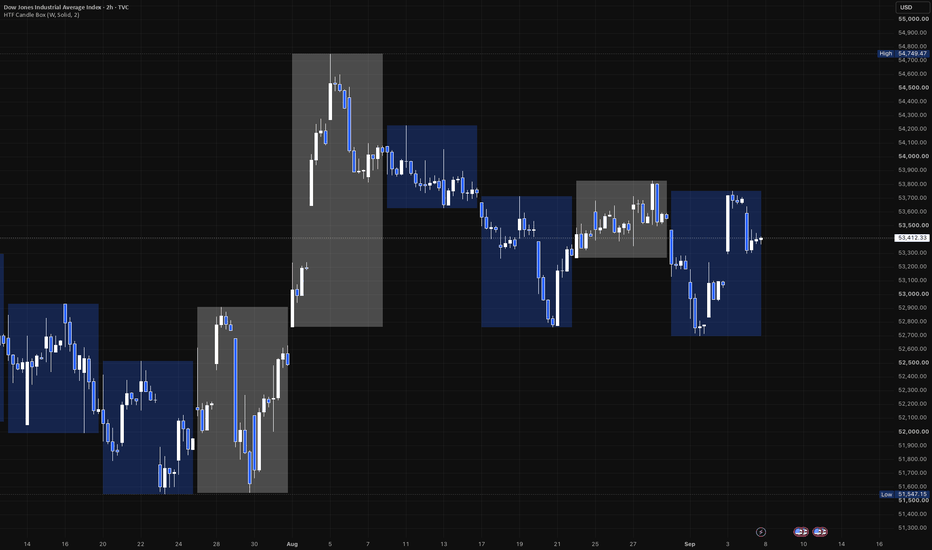
Wraps every higher-timeframe (HTF) period into a single box drawn directly on your current chart - a way to see the weekly (or monthly, or any coarser) range and direction without leaving your intraday or daily view.
What it draws
Each box spans one HTF period:
- Top / bottom track that period's running high and low, growing live bar by bar as the period develops.
- Fill color reflects direction, like a candle: bullish (close at/above the period's open) or bearish (close below it) - using your two chosen colors. The still-forming box updates its color live too, so it can flip as price crosses back over the period's open, settling once the period actually closes.
- Border is optional - off by default, toggle it on and set its own color, style (solid/dashed/dotted), and width.
Settings
- Higher Timeframe - any timeframe coarser than your chart's own (defaults to Weekly). The indicator automatically skips itself if your chart is already at or coarser than the chosen HTF, since there'd be nothing meaningful to group.
- Bull / Bear Color - one row, two swatches. Each color's own opacity slider (in the picker itself) controls fill strength - no separate transparency setting needed.
- Show Border / Border Color / Border Style / Border Width - fully optional outline layer.
Use it for
Keeping higher-timeframe structure (this week's range so far, last week's completed range, etc.) visible while trading a lower timeframe, without switching charts or adding a second pane. Penunjuk
MarketMaulers CISDMarketMaulers CISD marks the level where delivery changed state: the open of the run that raided a level and then failed to hold it. It runs on the chart timeframe and on up to two higher timeframes at once, and it draws one line per setup rather than a lane of candles, because the level is the whole product.
Potential · Confirmed · Invalidated
FROM ZERO: WHAT A CISD IS
Read it as a three-candle story.
C1 is the candle whose high or low is worth taking. C2 is the candle that takes it and closes back inside. C3 is the candle that opens afterwards, where the reclaim either gets proven or does not.
The CISD LEVEL is not C1's extreme and it is not C2's close. It is the OPEN of the consecutive same-direction run that did the raiding. That run is a sequence of candles all closing the same way, and its open is where the move that swept began. When price closes back through that open, the run that swept is now the run that failed. Delivery has changed state. That is the entire concept, and everything below is about identifying that one price honestly.
THE TIMEFRAME NAMES A GRANULARITY, NOT A CANDLE
This is the part most implementations get wrong, and it is the difference between a tool that fires several times an hour and one that marks something.
A CISD timeframe names the resolution you are confirming on. Its C1 and C2 candles come from one fractal step ABOVE it:
1m from 15m · 3m from 30m · 5m from 1H · 15m from 4H · 1h from 1D · 4h from 1W · 1D from 1M
So a 5m CISD is a 1H C1 and C2, confirmed on 5m closes. Hunting "the current 5m candle sweeps the previous 5m candle" is a different and much noisier thing that happens several times an hour and means little.
Two consequences follow, and both are visible.
• A CISD only draws when your chart timeframe is at or BELOW its own granularity. From a 15m chart a 5m CISD stays hidden, because the chart cannot resolve the closes that confirm it.
• A slot confirms at ITS OWN granularity. On a 5m chart the 15m slot waits for a 15m close, not a 5m one. Set a slot to CHART and the chart timeframe becomes the granularity, with its C2 still pairing one step up.
THE TWO-SIDED SWEEP RULE
A candle that takes BOTH sides of the prior candle is indecisive. It swept the highs and the lows, so there is no side it committed to and no direction to deliver in. No C2, no setup, either way. This gates everything and it is on by default.
MAULER MODE is the single exception and it is off by default. If that two-sided candle CLOSED beyond one of C1's extremes then it was decisive after all, and the setup stands. It loosens the strictest gate in the model, so it is worth turning on deliberately rather than leaving on.
WHERE THE LEVEL COMES FROM, AND WHY IT MOVES
The anchor is the open of the first candle of the current same-direction run. Only an opposite-close candle resets it. Wicks, extremes and dojis are transparent to it, and a run can span a candle boundary, because delivery often starts inside the previous candle.
Two rules keep that anchor honest.
• A RATCHET. Any candle opening beyond the current anchor drags the anchor to its own open. A rally pulls a dead anchor up with it, so a shallow wick past the extreme can never capture a stale run from hours ago. The anchor always sits at the origin of the CURRENT move.
• RE-ANCHORING TO THE FINAL SWEEP. When price sweeps, pulls back, then sweeps again further, the level moves to that last leg. The anchor is structural, a run open, so a bare noise wick past the extreme re-captures the same value. Only a genuine pullback and resweep shifts the mark.
WHAT POTENTIAL MEANS, AND THE ONE CASE THAT SURPRISES PEOPLE
Potential means one thing only: price has not closed through the level yet. It is not a statement about which candle the close belonged to.
So when the C2's own sealing close is already through the level, the CISD is CONFIRMED at that seal and draws that way immediately. There is no waiting for a later candle to say what has already happened.
That test runs at the seal and never in the middle of C2, because the level re-anchors every time price sweeps a new extreme inside the candle. A bar confirming against the level as it stood an hour ago would be confirming against a level that no longer exists.
INVALIDATION
A hunt dies when price takes the C2's own extreme before the level is reclaimed. That is a raw trade through it, not a close, because a trade is a trade at any resolution and the setup does not survive the manipulation extreme being taken back.
Failed levels are removed by default, which keeps every line on the chart a setup that is still live or one that actually worked. Turn on Keep failed and they stay as dotted, faded history with an invalidation tag, which is the honest picture when you are reviewing rather than trading.
WHY IT DOES NOT REPAINT
There is no security call anywhere in this script. The engine accumulates its own higher-timeframe candles from the bars it runs on rather than requesting them, so there is no lookahead idiom to get wrong and no repaint surface at all.
Confirmation reads the previous, always-complete bar, and only on a bar where the slot's own timeframe has rolled, which is what makes a 15m slot confirm on 15m closes rather than on whatever the chart happens to be. Every state change is judged on closed data.
THE TABLE
Three rows, one per slot, bull state and bear state. It reports what happened LAST rather than what has ever happened, so a side that confirmed and was later invalidated reads as invalidated. A readout that cannot go backwards is not a readout.
Deliberately independent of what draws. Most people run one slot on the chart and want the state of the other two without adding lines to the price pane.
ALERTS
CISD armed (potential) · CISD confirmed · CISD invalidated
Messages carry the slot timeframe, the direction, the event and the level price, so what arrives is a level you can act on rather than a notification that something happened somewhere. Create one alert on this indicator with the condition set to Any alert() function call and it carries every enabled event for every slot at once.
An optional killzone filter quiets alerts outside three editable windows. It touches alerts only. Outside your windows the chart is identical: setups still arm, confirm, draw and invalidate on exactly the same rules, you do not get pinged for them.
MADE TO FIT YOUR CHART
Three slots each with their own bull and bear colour. Potential and confirmed lines have separate style and width. Labels on or off with three text sizes. Three right-extension modes, including freezing a confirmed level at the bar it confirmed, which is the honest history: the level did its job there. Keep failed on or off, with a budget for how many finished levels stay per side. Table position, text size, and a toggle per section.
The kept-level budget goes to 250 a side, and the tooltip is blunt about what that means. TradingView caps a script at 500 lines and 500 labels total. Past roughly 80 a side with more than one slot on, the platform ceiling decides what you see rather than this number does. It is a budget, not a promise.
HOW TRADERS ACTUALLY USE IT
Start with one slot and leave the other two off. The default pair, 5m and 15m, is two different fractals on one chart, and running both before you have read either one on its own is how a clean idea turns into noise.
Leave Draw potential off at first. With it off, every line on your chart is a CISD that actually confirmed. Turn it on when you want to see the setups the tool was watching that never paid, which is a different and slower kind of study.
The invalidation alert is the underrated one. Knowing a level died is a stand-down, and stand-downs are cheaper than entries.
WHAT THIS TOOL IS NOT
It marks a level and reports what happened to it. It does not project targets, it does not size a position, it does not stack or merge zones, and it does not tell you the setup was good. Those are layers on top of a CISD rather than part of one, and this file marks the CISD.
Works on any market and any timeframe.
Display only. This marks a level and reports what happened to it, it does not fire buy/sell signals and it does not forecast. Educational tool, not financial advice.
Published open-source. The fractal pair table, the two-sided sweep gate, the delivery-run anchor and its ratchet, the re-anchor-to-final-sweep capture, the seal confirm, the per-slot granularity gate and the alert transport are all readable in the source. Everything above explains what it marks and how it decides what to mark; the code is there so you can check that the description is accurate rather than take it on faith. Read it, fork it, argue with the constants.
Penunjuk

Penunjuk

Penunjuk

EMA Speed Oscillator + RSI
Title: EMA Speed Oscillator + RSI
Description:
The Core Philosophy: Fixing RSI's Biggest Flaw
The Relative Strength Index (RSI) is arguably one of the most popular oscillators in technical analysis. However, it has a massive functional blind spot: During strong, aggressive trends, the RSI can remain in "overbought" or "oversold" territories for extended periods.
Many traders get trapped trying to catch a falling knife just because the RSI is below 30, or they prematurely short a massive bull rally because the RSI is above 70.
The Solution: You need a true momentum filter to confirm the RSI. That is exactly what this indicator does. By merging the standard RSI with the velocity (Speed) of an Exponential Moving Average (EMA) in a single pane, this tool filters out the "noise" and fakeouts of the RSI. You no longer have to guess if an oversold RSI is a true reversal or just a trap in a strong downtrend.
How It Works Under the Hood
This indicator calculates the percentage rate of change (velocity) of a chosen EMA over a specific lookback period.
Instead of plotting the RSI on a separate 0-100 scale (which would create a visual mess when mixed with momentum percentages), the RSI is custom-scaled to flawlessly match the EMA Speed's visual range. This allows you to monitor exactly how price momentum and relative strength are interacting at any given second.
How to Trade Using This Indicator
Instead of printing rigid, lagging "Buy/Sell" labels, this indicator provides pure, readable momentum context so you can make informed decisions.
🟢 Bullish Reversal Setup (Long)
The Setup: Wait for the Scaled RSI (Orange line) to drop into or below the Oversold zone (Green dotted line).
The Trap Avoidance: Do NOT buy immediately. The downtrend might still be strong.
The Trigger: Wait for the EMA Speed (Colored line) to turn Green and aggressively cross ABOVE the Zero Line. This confirms that the true momentum has shifted bullish, validating the RSI reversal.
🔴 Bearish Reversal Setup (Short)
The Setup: Wait for the Scaled RSI (Orange line) to push into or above the Overbought zone (Red dotted line).
The Trap Avoidance: Do NOT short immediately. The bull trend might just be resting.
The Trigger: Wait for the EMA Speed to turn Red and aggressively cross BELOW the Zero Line. This confirms the sellers have taken control of the momentum.
Key Features Breakdown
EMA Speed Oscillator: Measures the true acceleration of the trend. Green line indicates positive momentum, Red line indicates negative momentum.
Perfectly Scaled RSI: The orange RSI line dynamically adapts to the EMA speed scale, preventing visual clutter while allowing precise crossover comparisons.
The Squeeze Zone (Purple Background): When the EMA Speed falls extremely close to the zero line, momentum is dead. The indicator paints the background Purple to warn you of a flat, choppy, or consolidating market. Rule of thumb: Avoid taking reversal trades inside the Purple Zone. Wait for a volatility breakout.
Live Status Dashboard: A sleek table in the top-right corner displays real-time EMA Speed %, standard RSI values, and current trend status (Rising, Falling, or Flat) at a single glance.
Default & Recommended Settings
The script is optimized by default for high-sensitivity, short-to-medium term momentum tracking:
EMA Period: 6
Lookback Period: 13 (Measures how much the EMA has moved compared to 13 bars ago)
Note: You can freely adjust these in the settings to suit higher timeframes (like 1D or 1W) for swing trading.
Disclaimer: This script is for educational and analytical purposes only. No indicator guarantees 100% accuracy. Always use this tool in conjunction with overall market structure, price action, and proper risk management. Penunjuk

VIKING + AXE & SHIELD## VIKING + AXE & SHIELD — What This Indicator Does
**VIKING + AXE & SHIELD was built so you only need one TradingView indicator on your chart.**
Instead of stacking separate indicators for moving averages, RSI, Accumulation/Distribution, OBV, CMF, ADX, relative volume, relative strength, support/resistance and other context, this script combines them into **one overlay indicator and one compact information panel**. The goal is to keep the chart clean while still showing trend, momentum, volume, money flow, relative strength and important price levels in one place.
The indicator automatically works from the **timeframe you are currently viewing**. For example, if the chart is on 1H, the RSI and A/D calculations are based on hourly bars. On Daily, they use daily bars. On Weekly, they use weekly bars.
### Moving averages
VIKING plots four commonly used trend averages directly on the price chart:
* **9 EMA**
* **21 EMA**
* **50 SMA**
* **200 SMA**
The 9 and 21 EMAs are intended to show shorter-term trend and momentum, while the 50 and 200 SMAs provide broader trend structure. Their current prices are also printed beside the averages so you can immediately see where they are without moving the cursor over them.
Internally, the script also examines the relationship between these moving averages and price. It can recognize conditions such as bullish or bearish MA stacking, price reclaiming or losing moving averages, golden/death-cross conditions, and developing trend structures. Those calculations are kept in the script even though they are not all printed in the VIKING panel.
### AXE & SHIELD support and resistance
AXE & SHIELD is the support/resistance part of the system.
Rather than simply drawing every recent high and low, it detects pivot-based price zones and tracks how those zones behave after they are created. Zone width is adjusted using ATR, and nearby pivots can be merged into the same area rather than creating a cluttered chart full of almost-identical levels.
The script evaluates support and resistance using several ideas, including:
* how well price closes relative to the zone,
* how deeply price penetrates it,
* how strongly price reacts away from it,
* how many times the zone has already been tested,
* and whether the zone has actually broken.
This creates an internal **zone survival score** rather than assuming every support or resistance level has equal strength. The score itself is intentionally kept internal so the chart remains simple.
Support levels are shown in the selected support color and resistance in the selected resistance color. Provisional/unconfirmed levels can be shown with a dotted appearance, and the script can mark zones that have been swept.
The nearest support and nearest resistance are also exported to TradingView's data window/status line if enabled.
---
# The VIKING information panel
The panel condenses several indicators into a small area instead of requiring separate lower chart panes. It includes:
**ADX / 52W High**
**P-RVOL / RS**
**OBV / ADR%**
**CMF / Average Volume**
**RSI full readout**
**A/D Pressure full readout**
The panel position and text size are adjustable. Strong, caution and weak/broken conditions are color coded so the information can be scanned quickly.
## ADX — trend strength
ADX answers a simple question:
**How strong is the current trend?**
The script uses a 14-period DMI/ADX calculation.
* Above **25** = Strong
* Below **20** = Choppy
* Between 20 and 25 = Building
It also compares ADX with three bars ago and adds arrows to show whether trend strength is increasing or decreasing.
Example:
`ADX 30.6 Strong ↑`
means a relatively strong trend whose strength is still increasing.
Important: **ADX does not tell you whether the trend is bullish or bearish.** It measures the strength of the trend.
## 52W Hi — distance from the 52-week high
The panel calculates the highest price over approximately 252 bars and shows how far the current price is from that high as a percentage.
Example:
`52W Hi -8.2%`
means price is currently about 8.2% below its 52-week high.
This provides quick context about whether a stock is trading near leadership territory or well below previous highs.
## P-RVOL — projected relative volume
P-RVOL is more sophisticated than simply comparing today's volume with yesterday's volume.
The script builds a historical intraday volume curve using previous sessions. By default, it uses:
* the previous **20 sessions**,
* a **15-minute calculation timeframe**,
* and regular NYSE hours of **9:30 AM–4:00 PM New York time**.
It looks at how much volume normally occurs by the current point in the trading session and projects what the full day's volume may look like.
Example:
`P-RVOL 1.50x`
roughly means the current trading pace is projecting toward about **1.5 times normal session volume**.
The arrows show whether projected relative volume itself is increasing or decreasing.
This makes P-RVOL especially useful early in the trading day because you do not have to wait until the closing bell to know whether participation appears unusually strong.
## RS — relative strength
The RS rating measures the stock's performance relative to the S&P 500.
The calculation gives more weight to recent performance while also considering longer periods, using approximately:
* 63 trading days,
* 126 days,
* 189 days,
* 252 days.
The stock's performance is compared against SPX over those same periods.
The result is converted into an RS-style rating, and an arrow indicates whether relative strength is improving or deteriorating.
Example:
`RS 83 ↑`
means the stock is showing relatively strong performance and its relative-strength trend is improving.
## OBV — buying and selling pressure
On-Balance Volume looks at volume together with whether price closed higher or lower.
VIKING does not clutter the panel with OBV's huge raw cumulative number. Instead it examines the **five-bar change** and converts it into an easy description:
* Strong Buying ↑
* Buying ↑
* Strong Selling ↓
* Selling ↓
* Neutral →
That gives the useful information from OBV without needing an OBV pane.
## ADR% — average daily range
ADR% shows the stock's average trading range as a percentage over the previous 20 bars.
Higher ADR stocks generally make larger percentage moves, while lower ADR stocks generally move less.
For example:
`ADR% 4.94%`
means the stock has recently been moving through an average daily range of roughly 4.94%.
This gives a fast way to judge how volatile or active a stock normally is.
## CMF — Chaikin Money Flow
CMF measures where price closes within each candle's range and weights that behavior by volume over 20 periods.
Positive CMF generally indicates buying pressure, while negative CMF indicates selling pressure.
VIKING calculates both the current CMF value and its recent direction.
A reading such as:
`CMF +0.20`
suggests positive money flow.
A negative reading suggests the opposite.
## Average Volume and liquidity label
VIKING calculates average volume over 50 bars and adds a simple liquidity classification:
* **Liquid** = average volume above 500,000
* **Thin** = above 100,000
* **Avoid** = below 100,000
This is meant as a quick screening aid, not a universal definition of liquidity.
---
# RSI without needing an RSI pane
One of the main purposes of VIKING is to provide enough numerical information about RSI that a separate RSI pane is unnecessary.
The readout looks like:
`RSI 37.2 | Δ5 +1.9 | Dist -1.9 | Acc3 +9.3`
It contains four pieces of information.
### RSI
The first number is standard **RSI(14)**.
The script also calculates a **14-period SMA of RSI** as its baseline.
A simplified way to think about the current reading:
* above 60 = stronger momentum
* 40–60 = middle/transition area
* below 40 = weaker momentum
These same thresholds control the panel's RSI color.
### Δ5
`Δ5` means:
**How much has RSI changed over the previous five bars?**
Example:
`Δ5 +7.0`
means RSI is seven points higher than five candles ago.
`Δ5 -7.0`
means RSI is seven points lower.
Because it is based on bars, the meaning automatically changes with your chart:
* 1H chart = five hours
* Daily chart = five trading days
* Weekly chart = five weeks
This makes the same indicator useful across multiple timeframes.
### Dist
`Dist` is the distance between current RSI and its 14-period RSI moving-average baseline.
Example:
`RSI 55 | Dist +7`
means RSI is seven points above its recent baseline.
`RSI 55 | Dist -4`
means RSI may still be above 50, but it is actually below its recent RSI trend.
That distinction helps identify whether momentum is strengthening or weakening instead of relying only on the absolute RSI number.
### Acc3
`Acc3` measures **three-bar acceleration**.
The script compares RSI's move over the latest three bars with its move over the previous three bars.
This is useful because a single bad candle does not automatically destroy an otherwise improving momentum trend.
For example:
`RSI 42 | Δ5 +5 | Dist +3 | Acc3 +7`
can be read as:
RSI is still relatively low, but it has improved over five bars, moved above its recent baseline, and the recent three-bar move is stronger than the three bars before it.
So rather than simply knowing **where RSI is**, VIKING also tells you:
**where it came from, where it sits relative to its trend, and whether that movement is gaining or losing strength.**
---
# A/D Pressure without needing an Accumulation/Distribution pane
Standard Accumulation/Distribution is cumulative. Raw values can become extremely large and are difficult to compare between different stocks.
VIKING therefore converts A/D into a normalized **A/D Pressure** reading instead of displaying the raw cumulative number.
It examines the change in A/D over 20 bars and divides that change by the total volume over the same period. The result is converted to a scale capped between approximately **-100 and +100**.
The readout looks like:
`A/D -11 | Δ5 -5 | Dist -9 | Acc3 +6`
### A/D
The first number is the current normalized pressure.
Broadly:
* positive = accumulation pressure
* negative = distribution pressure
* near zero = relatively balanced
The panel colors stronger positive readings at +20 or higher and stronger negative readings at -20 or lower.
### A/D Δ5
This tells you how much normalized A/D pressure has changed over five bars.
`Δ5 +10`
means accumulation/distribution behavior has improved by 10 points over five candles.
`Δ5 -10`
means it has deteriorated.
### A/D Dist
A/D Pressure has its own **20-period moving-average baseline**.
`Dist` tells you how far current pressure is above or below that normal path.
Positive Dist means current A/D pressure is stronger than its recent baseline.
Negative Dist means it is weaker.
### A/D Acc3
Acc3 uses the same concept as RSI.
It compares the change in A/D Pressure during the latest three bars with the previous three bars.
This creates some very useful combinations.
For example:
`A/D -11 | Δ5 -5 | Dist -9 | Acc3 +6`
means:
**A/D is still negative, it is still worse than five bars ago, and it remains below its baseline — but the most recent three-bar behavior is improving.**
In other words:
**The condition is still weak, but it may be starting to turn.**
That is much more informative than simply displaying a raw A/D value.
---
# Stage and long-term trend context
The script also contains daily calculations involving the **200-day and 220-day moving averages**.
It checks whether price is moving above the 200-day average while the long-term average is flat or improving, including cases where price gaps completely above the prior 200-day average.
These calculations are designed to provide longer-term stage/trend context directly on the chart rather than adding another separate study.
---
# How to read the indicator as a whole
VIKING is not intended to make a trading decision from one number.
Its purpose is to let several independent pieces of evidence confirm or disagree with each other.
For example, a strong setup might show something like:
```text
ADX 31 Strong ↑
P-RVOL 1.45x ↑
OBV Strong Buying ↑
CMF +0.18
RS 82 ↑
52W Hi -4.2%
RSI 58.4 | Δ5 +7.2 | Dist +5.1 | Acc3 +4.0
A/D +28 | Δ5 +12 | Dist +9 | Acc3 +7
```
That would tell you:
**Trend strength is increasing, volume participation is elevated, OBV and CMF show buying pressure, the stock is relatively strong, it is close to its 52-week high, momentum is improving, and accumulation pressure is strengthening.**
The opposite combination would warn that multiple parts of the market structure are deteriorating.
The important idea is that **no individual reading needs to be treated as a buy or sell signal. VIKING is a compact market-context system.**
## Why it was built
Most TradingView layouts become crowded when you add:
RSI + A/D + OBV + CMF + ADX + relative volume + moving averages + support/resistance + relative strength.
VIKING + AXE & SHIELD is designed to replace that stack with **one indicator**.
Price stays as the main focus.
The moving averages and important support/resistance levels stay directly on the chart, while indicators that would normally require separate panes are converted into compact numerical or descriptive readings in the VIKING panel.
That gives you more chart space while still preserving information about:
**trend, momentum, participation, accumulation/distribution, money flow, volatility, relative strength and market structure.**
That is the core purpose of the script.
Penunjuk

Intraday Master ProIntraday Master Pro is a high-precision trading script engineered to identify high-probability intraday opportunities by filtering momentum, volume, and multi-timeframe alignment into automated trade setups.
Key Features
Multi-Timeframe Trend Dashboard: Real-time alignment checks across the 1m, 5m, and 15m timeframes.
Dynamic Trend Flow Band: Visual volatility channels indicating overall market bias.
Precision Entry Signals: Volume-filtered entries based on EMA crossovers and RSI constraints.
Automated Risk Management: Dynamic Stop Loss (SL) and 3 Take Profit targets (TP1, TP2, TP3) anchored directly to active signal bars.
Setup Rating Score (1–100): Real-time setup scoring algorithm based on multi-timeframe concordance and volume strength.
How It Works
1. High-Precision Signals & Entry Conditions
The indicator issues BUY or SELL labels only when multiple conditions align:
Trend & Momentum: Fast and Slow EMA crossovers filtered by RSI.
Volume Confirmation: Spikes exceeding 1.25x the 20-period volume average.
Cooldown Guard: Built-in bar cooldown filters to prevent whipsaws during choppy consolidated markets.
2. Multi-Timeframe Dashboard & Setup Rating
Located on the right side of your chart, the dashboard updates live:
1m / 5m / 15m Trend Status: Green (BULL) or Red (BEAR) depending on price position relative to core moving averages.
Setup Rating (1 to 100): A live score grading the quality of the current setup.
80–100 (Green): High-confluence setup across all timeframes and volume.
60–79 (Orange): Moderate setup; proceed with standard risk.
Below 60 (Gray): Low confluence or weak trend.
3. Dynamic Stop Loss & Take Profit Levels
When a valid signal triggers, the indicator projects extended level lines onto your chart:
SL (Orange Line): Calculated dynamically using ATR based on recent market volatility.
TP1 (1.5x R:R): Partial profits / initial target.
TP2 (2.8x R:R): Main target.
TP3 (4.5x R:R): Extended runner target for strong trending days.
How to Use Intraday Master Pro
Wait for a Signal: Look for a clear BUY or SELL label on the chart.
Check Confluence: Glance at the Dashboard. Look for Setup Ratings of 80/100 or higher and alignment across 1m, 5m, and 15m timeframes for maximum statistical edge.
Set Orders: Place your Stop Loss at the SL line and split your position across TP1, TP2, and TP3.
Manage Risk: Once price reaches TP1, consider moving your Stop Loss to entry (Breakeven) to lock in a risk-free trade while riding the position to TP2 and TP3.
Settings & Configuration
Risk Management Inputs: Adjust Core Sensitivity or Volatility Factor to widen or tighten stop-loss distances based on the asset’s volatility.
Visuals: Toggle the Dashboard or Flow Band visibility on/off and customize accent colors to fit dark or light charts.
Disclaimer
The Intraday Master Pro indicator is designed strictly for educational and informational purposes and does not constitute financial, investment, or trading advice. Past performance is not indicative of future results. Trading equities, options, forex, and cryptocurrencies involves significant financial risk and can result in the loss of your capital. Always practice proper risk management and consult a licensed financial advisor before executing trades. Penunjuk

Intraday Master ProHere is a comprehensive customer-facing explanation and guide for your Intraday Master Pro indicator, written in clear, professional English, complete with a concise legal disclaimer at the end.
Welcome to Intraday Master Pro
Intraday Master Pro is a high-precision trading script engineered to identify high-probability intraday opportunities by filtering momentum, volume, and multi-timeframe alignment into automated trade setups.
Key Features
Multi-Timeframe Trend Dashboard: Real-time alignment checks across the 1m, 5m, and 15m timeframes.
Dynamic Trend Flow Band: Visual volatility channels indicating overall market bias.
Precision Entry Signals: Volume-filtered entries based on EMA crossovers and RSI constraints.
Automated Risk Management: Dynamic Stop Loss (SL) and 3 Take Profit targets (TP1, TP2, TP3) anchored directly to active signal bars.
Setup Rating Score (1–100): Real-time setup scoring algorithm based on multi-timeframe concordance and volume strength.
How It Works
1. High-Precision Signals & Entry Conditions
The indicator issues BUY or SELL labels only when multiple conditions align:
Trend & Momentum: Fast and Slow EMA crossovers filtered by RSI.
Volume Confirmation: Spikes exceeding 1.25x the 20-period volume average.
Cooldown Guard: Built-in bar cooldown filters to prevent whipsaws during choppy consolidated markets.
2. Multi-Timeframe Dashboard & Setup Rating
Located on the right side of your chart, the dashboard updates live:
1m / 5m / 15m Trend Status: Green (BULL) or Red (BEAR) depending on price position relative to core moving averages.
Setup Rating (1 to 100): A live score grading the quality of the current setup.
80–100 (Green): High-confluence setup across all timeframes and volume.
60–79 (Orange): Moderate setup; proceed with standard risk.
Below 60 (Gray): Low confluence or weak trend.
3. Dynamic Stop Loss & Take Profit Levels
When a valid signal triggers, the indicator projects extended level lines onto your chart:
SL (Orange Line): Calculated dynamically using ATR based on recent market volatility.
TP1 (1.5x R:R): Partial profits / initial target.
TP2 (2.8x R:R): Main target.
TP3 (4.5x R:R): Extended runner target for strong trending days.
How to Use Intraday Master Pro
Wait for a Signal: Look for a clear BUY or SELL label on the chart.
Check Confluence: Glance at the Dashboard. Look for Setup Ratings of 80/100 or higher and alignment across 1m, 5m, and 15m timeframes for maximum statistical edge.
Set Orders: Place your Stop Loss at the SL line and split your position across TP1, TP2, and TP3.
Manage Risk: Once price reaches TP1, consider moving your Stop Loss to entry (Breakeven) to lock in a risk-free trade while riding the position to TP2 and TP3.
Settings & Configuration
Risk Management Inputs: Adjust Core Sensitivity or Volatility Factor to widen or tighten stop-loss distances based on the asset’s volatility.
Visuals: Toggle the Dashboard or Flow Band visibility on/off and customize accent colors to fit dark or light charts.
Disclaimer
The Intraday Master Pro indicator is designed strictly for educational and informational purposes and does not constitute financial, investment, or trading advice. Past performance is not indicative of future results. Trading equities, options, forex, and cryptocurrencies involves significant financial risk and can result in the loss of your capital. Always practice proper risk management and consult a licensed financial advisor before executing trades. Penunjuk

MTF Range Flip HTF Market Structure BiasWhat this does
This is an intraday strategy for index futures that combines a range-flip entry model on the
chart timeframe with a market-structure bias taken from a higher timeframe. It only takes
trades in the direction the higher timeframe is trending, and only when price has pulled back
into the discount half of the higher-timeframe range.
The range flip
A "range" here is defined by price action rather than a fixed window. When a candle closes
beyond the current range's high or low, that close is treated as meaningful — a new range is
built around that candle, and the old one is discarded. Each of these events is a flip.
Flips are tracked on two timeframes at once. The chart timeframe supplies the entry trigger;
the higher timeframe supplies the range whose midline governs location.
Bias — higher-timeframe market structure
The strategy only takes longs when higher-timeframe structure is bullish and shorts when it
is bearish. Two structure definitions are available:
BOS — a higher-timeframe close beyond the last confirmed swing point
HH-HL sequence — successive higher highs and higher lows, or the bearish mirror
Swing points are confirmed with a configurable pivot length, so structure is only ever read
from bars that have already closed.
Location — the midline rule
By default the strategy buys weakness inside strength: a long needs price below the
higher-timeframe range midline, a short needs price above it. This keeps entries on the
pullback side rather than chasing extension. A breakout variant is available if you prefer
the opposite behaviour.
Entry, stop and target
Entry — a chart-timeframe range flip that agrees with bias and location, inside the
session window.
Stop — the most recent confirmed swing pivot beyond the entry, plus a tick buffer. The
stop is frozen at the moment of the fill, so later swings never move it. Alternative
references (the flip candle's own range, or the previous range) are selectable, and optional
minimum and maximum stop widths are available.
Target — a multiple of the stop distance, set separately for each side. The default is
1.5R on longs and 0.5R on shorts, reflecting that in testing the two sides did not behave
symmetrically. An optional breakeven rule can be armed at a chosen R multiple and applied to
one side or both.
Depth-based position sizing
Depth measures where an entry sits inside the higher-timeframe range, normalised to range
width — 0.50 is the midline, 0.00 is the range edge, and a negative value means price is
beyond the edge while the higher timeframe has not yet flipped.
When enabled, entries deeper than the threshold receive a larger multiplier. The idea is that
not every pullback is equal, and the deepest ones can be treated differently from shallow
ones. Sizing can be applied to longs, shorts, or both.
A separate depth gate can block entries outright unless they are deep enough — useful for
isolating whether depth is what separates good entries from poor ones on your instrument.
Optional filters
Volatility regime — requires daily ATR to sit above a chosen percentile of its own
recent history. This model needs range expansion to reach its targets, and this stands it
aside in quiet conditions. Off by default.
VWAP — session or weekly anchored. Can require price above or below VWAP, or simply
block entries more than N ATR away from it without imposing a direction. Off by default.
Regime switch — an optional daily or weekly structure read that can restrict trading to
one side. Off by default.
Session windows — a general entry window plus a separate, later window for shorts.
On-chart panel
A live table reports bias state, current range, position, stop widths for both sides, filter
status, and a signal funnel showing how many flips were blocked by each filter. It also
reports average R — overall, split by side, and split by depth bucket. Net profit on a
structural-stop strategy is influenced by how wide the stops happened to be, so average R is
the more honest read on whether a change actually improved entry quality.
Default settings used for the published results
Instrument and timeframe: NQ1!, 5-minute chart, higher timeframe 60-minute
Initial capital: 100,000 USD
Order size: 2 contracts, fixed quantity
Pyramiding: 0 — one position at a time, no scaling in
Commission: 2.25 USD per contract
Slippage: 1 tick
Bar detalization: High (~40 ticks per bar) — set this in Properties
Script execution: on bar close
Notes and limitations
Backtested results are hypothetical and do not represent actual trading. Past performance
does not guarantee future results, and no strategy performs the same across all market
conditions.
Set bar detalization to High. With coarse detalization the backtester has to guess the
order of touches inside a bar, which flatters any strategy whose stop and target can both sit
inside the same candle.
Volatility lookback. If you enable the volatility filter, the "ranked vs last N bars"
value must be smaller than the number of daily bars your chart can supply. A one-year chart
holds roughly 250 trading days, so a 252 setting will return no data. The panel prints an
explicit warning if this happens rather than silently passing every trade.
Sizing multipliers use whole contracts. With a base size of 2 and a 2x multiplier you get
4 contracts; fractional results are rounded and floored at 1.
Sample size. The stricter filters and gates cut trade count quickly. If a configuration
leaves you with only a few dozen trades, treat the result as indicative rather than
conclusive regardless of how good it looks.
Defaults are a starting point, not a recommendation. Test on your own instrument, timeframe
and cost assumptions before drawing conclusions.
This script is published for educational purposes. It is not financial advice. Strategi

Penunjuk

Multi-Timeframe Trend & AlignmentComprehensive Technical Overview: Multi-Timeframe Trend & Alignment Pro
This custom script is an institutional-grade technical analysis dashboard designed for professional traders who demand multi-timeframe confirmation, structural alignment, and real-time performance tracking directly on their chart canvas. By unifying multiple Exponential Moving Averages (EMAs), Simple Moving Averages (SMAs), HTF (Higher Timeframe) momentum oscillators, and performance metrics into a single dynamic interface, the script eliminates chart clutter and provides an immediate read on market structure.
Key Architectural Features
Dual Moving Average Suite: Supports up to 10 customizable EMAs and 10 customizable SMAs, allowing traders to track short-term scalping triggers alongside long-term structural baselines simultaneously.
Dynamic Table Matrix: Automatically aggregates active moving averages, sorts them by price value in real time, calculates distance metrics (points and percentage from current price), and dynamically adjusts background coloring based on structural alignment.
Multi-Timeframe (MTF) Intelligence: Incorporates robust higher-timeframe metrics via request.security, evaluating trend health across EMAs, MACD, ADX trend strength, SuperTrend direction, and RSI without repainting issues.
Performance Percentage Tracking: Automatically computes and displays Day-to-Day (DTD), Week-to-Week (WTD), Month-to-Month (MTD), Year-to-Date (YTD), and 1-Year rolling performance benchmarks.
Clean Visual Management: Features native price scale label projections and conditional toggle controls to ensure a distraction-free trading workspace.
Input Customization Guide
Global Settings
Source: The price source used for all moving average calculations (default is close).
HTF Trend Timeframe: Selects the reference timeframe for higher-timeframe trend context (e.g., Daily, 4-Hour, Weekly).
EMA / SMA Settings
Show / Length / Width / Color: Inline controls to toggle individual averages on/off, adjust lookback lengths, set line thickness (1–4), and assign distinct color profiles.
Display Controls
Show Alignment Table: Toggles the real-time on-screen data matrix.
Show Performance %: Appends DTD, WTD, MTD, YTD, and 1-Yr return metrics to the summary table.
Show HTF Trend Metrics: Appends higher-timeframe technical indicators (MACD, ADX, SuperTrend, RSI) to the dashboard.
Trading Strategies & Practical Applications
Trend Stack Confluence: When shorter-length moving averages cleanly stack above longer-length averages while price holds above key HTF baselines, the table shifts to a bullish-aligned background, signaling institutional accumulation.
Mean Reversion & Distance Tracking: Use the Dist (Pts / %) column in the real-time table to gauge overextension. Extreme percentage deviations from core moving averages (like the 50 or 200 period lines) often highlight prime mean-reversion entries or profit-taking zones.
Multi-Timeframe Filter: Pair the primary chart execution with the embedded HTF metrics. Taking long setups only when the HTF EMA stack and SuperTrend register as bullish ensures alignment with dominant macro order flow. Penunjuk

AMD Structure Map [AxeAlgo]AMD Structure Map
============================================
------------------------------------------------------------
WHAT THIS SCRIPT DOES
------------------------------------------------------------
AMD Structure Map automatically detects the Accumulation → Manipulation →
Distribution cycle on any chart, in real time, and draws each phase as its
own labeled zone directly on the candles — so the market's own three-act
structure is visible as it forms, instead of something you have to
eyeball yourself after the fact.
This is a pattern-recognition and structure-labeling tool. It identifies
and visualizes market structure per the AMD model. It does not predict
future price direction, it does not generate buy or sell signals, and
nothing it draws should be treated as a trading recommendation.
------------------------------------------------------------
BACKGROUND — WHAT "AMD" MEANS
------------------------------------------------------------
AMD is a way of reading price action as three sequential acts:
Accumulation is a period where price contracts into a range while orders
build on both sides of the market. Manipulation is a deliberate-looking
move beyond that range — far enough, and on enough volume, to run the
stop-losses and breakout orders sitting just outside it — that then fails
and closes back inside. Distribution is the real, sustained move that
follows, expanding in the opposite direction of that failed move.
The core idea is that the Manipulation phase exists to create liquidity:
a move beyond an obvious range draws in breakout traders and triggers
stops on the other side, providing the volume needed for the real
directional move that follows. Whether or not you subscribe to that
interpretation, the three-part sequence — range, false break, real break
— is a recurring, observable structure across most liquid markets and
timeframes, and this script exists to detect it mechanically and
consistently rather than by eye.
------------------------------------------------------------
HOW EACH PHASE IS DETECTED
------------------------------------------------------------
ACCUMULATION is flagged by genuine volatility contraction: a fast-length
ATR reading meaningfully below its own slow-length ATR baseline, averaged
over a short recent window rather than judged off a single bar, combined
with a minimum range width relative to current volatility. This rules out
both a lone quiet tick being mistaken for real compression and micro-noise
ranges being mistaken for a real base. Once contraction is confirmed, the
zone locks to the highest high and lowest low of the seed window and does
not move afterward.
MANIPULATION is a liquidity sweep: a wick that pierces beyond the
Accumulation range by a minimum distance, on volume above this specific
cycle's own frozen baseline (measured from its own seed window, not a
constantly-rolling average that would otherwise get distorted by the
sweep's own volume spike), that closes back inside the range within a
short window of bars. It does not have to reverse on the exact same bar
it pierced — it is given a handful of bars to do so, since real liquidity
sweeps do not always resolve instantly. The moment a sweep confirms, the
script labels the zone with an Expected Direction: opposite the side that
was swept, since that is what the AMD model itself defines Distribution to
be. If price later sweeps the OPPOSITE side too, before the range
resolves, that second sweep supersedes the first and the call flips —
capped at one such re-arm, since a range swept a third time no longer
looks like a clean setup.
DISTRIBUTION is a confirmed break — by distance and by volume, both judged
against that same frozen baseline — in the direction the Manipulation
phase called. Only at that point is the cycle logged as complete. A break
in the SAME direction as the earlier sweep is logged separately and
honestly as "Manipulation Failed," since the expected reversal did not
occur — the script does not force an incomplete or contradictory sequence
into the AMD narrative just because a Manipulation event happened
somewhere in the range's history.
------------------------------------------------------------
ON THE EXPECTED DIRECTION LABEL
------------------------------------------------------------
The "Expected Direction" shown on the Manipulation zone is a direct
restatement of the AMD model's own definition, not an independent
forecast: Distribution is, by definition, the move opposite the side that
got swept. It carries no probability estimate, is not back-tested, and is
not a trade instruction. It is confirmed or denied by the same real
price-and-volume break logic used everywhere else in the script — nothing
is assumed true until price actually does it.
------------------------------------------------------------
WHAT YOU SEE ON THE CHART
------------------------------------------------------------
Each phase is drawn as its own colored zone box with a label. The
Accumulation zone appears the moment contraction confirms. The
Manipulation zone appears the moment a sweep confirms, labeled with the
Expected Direction. The Distribution zone appears ONLY once the break
genuinely confirms in that expected direction — it is sized to the
Accumulation range's own width rather than to whatever the breakout bar's
own volatility happened to produce, then grows to track the real move for
a limited window before freezing in place, so it always reads as a
proportionate rectangle rather than an arbitrary spike or a box that
keeps expanding indefinitely.
A cycle that does not complete — a Manipulation that failed to lead to a
real Distribution break, or a breakout with no Manipulation ever detected
beforehand — is marked with a single small flag rather than a full zone
box, since nothing pattern-like actually happened there. A small signal
also marks the exact first candle a genuine Distribution phase begins on.
An optional session-window highlight is available for traders who want to
see which cycles are forming inside a specific trading session.
------------------------------------------------------------
DASHBOARD
------------------------------------------------------------
A compact corner table shows the current phase and its status, the
current Expected Direction, an optional higher-timeframe bias reading
(a simple moving-average slope check on a timeframe you choose, shown
purely as background context and never used to filter or alter
detection), and a running Follow-Through Rate.
The Follow-Through Rate is a historical tally, going back to when the
chart loaded, of how often this chart's own past Manipulation calls
actually went on to confirm into a real Distribution break versus failing
or the range simply expiring. It is not a win rate, not the result of a
back-tested strategy, and not a claim about the cycle currently forming.
The percentage is intentionally hidden until a minimum number of cycles
have been observed, so a small handful of outcomes is never presented as
a statistically meaningful rate.
------------------------------------------------------------
INPUTS
------------------------------------------------------------
A single Detection Sensitivity dial (Loose / Normal / Strict) governs
every underlying threshold at once — the seed window length, the required
depth of volatility contraction, the sweep depth and volume requirements,
and the breakout distance and volume requirements. Loose finds more
cycles at looser quality; Strict finds fewer, higher-conviction cycles
only.
Beyond that, every visual element can be toggled or recolored
independently: the zone boxes, the phase labels, the Expected Direction
label, the Distribution start signal, the Follow-Through Rate row, the
higher-timeframe bias row, the session highlight, and the on-chart legend.
A "completed cycles only" mode is also available, which hides everything
while a cycle is still forming and only draws it — retroactively, all at
once — if and when it actually completes the full sequence.
------------------------------------------------------------
CALCULATION AND REPAINT BEHAVIOR
------------------------------------------------------------
All detection logic runs exclusively on confirmed, closed bars. Nothing is
decided from an intrabar wick on the currently forming candle. A sweep
candidate's return window is evaluated bar by bar as it actually happens,
never by looking ahead. A confirmed Manipulation call can be superseded
later within the same range by the one-time re-arm described above, but
only by an equally real, fully confirmed opposite-side sweep — never
speculatively, and never by revising a call that has already led to a
resolved outcome. Once a range resolves, or a zone's phase has finished,
its boundaries are not redrawn or repainted. Higher-timeframe data is
requested with lookahead explicitly disabled, so historical bars never
change; only the still-forming higher-timeframe candle can naturally
update until it itself closes, which is standard behavior for any
multi-timeframe context reading and is not repainting in the sense of
historical values changing after the fact.
------------------------------------------------------------
LIMITATIONS
------------------------------------------------------------
This script is a structure-labeling tool, not a trading system. It has no
concept of risk management, position sizing, or trade execution, and it
does not account for spread, slippage, commissions, or liquidity
conditions specific to any individual broker or exchange. Detection
quality depends heavily on the instrument, timeframe, and chosen
sensitivity setting — a setting well suited to one market or timeframe may
under- or over-detect on another, and some manual tuning of the
sensitivity dial is expected. Past detected cycles, and the Follow-Through
Rate built from them, describe what has already happened on this specific
chart and are not a guarantee of how future cycles on the same chart, or
on any other chart, will behave.
------------------------------------------------------------
DISCLAIMER
------------------------------------------------------------
This script detects and labels historical and current market structure
per the AMD model only. Nothing it displays is a probability of future
price direction, a guarantee, or a buy or sell instruction — a
Manipulation event describes a liquidity sweep that has already happened,
not a prediction of what comes next, and a Distribution zone is only ever
drawn once the corresponding break has already confirmed. The Expected
Direction label is a restatement of the pattern's own definition, not a
forecast. The Follow-Through Rate is a tally of what has already happened
to this chart's own past Manipulation calls, typically a modest sample
size, and should not be read as a win rate or as investment advice.
Trading involves substantial risk of loss and is not suitable for every
investor. Nothing in this script or its description constitutes financial,
investment, or trading advice, and past structure detected by this
script is not indicative of future results. Use at your own discretion
and risk.
Penunjuk

Penunjuk

Sector Rotation - Leadership Persistence [Dots3Red]🔄 SECTOR ROTATION - LEADERSHIP PERSISTENCE
At any given time, some sectors are leading and others are lagging behind — traders call this rotation. This tool draws all eleven US sectors on one chart, normalized from the same starting point, so leadership and lag are visible at a glance instead of pieced together from eleven separate tabs.
✨ WHY THIS MATTERS
This script adds a question that few answer: once a sector takes the lead, how long does that lead typically last before another sector overtakes it? And right now, given how long the current leader has already held the top spot, what are the odds it's still leading a bit further down the road?
📊 Avg Leadership: 14 bars (n=8)
📊 Leader Persists: 58% (n=8)
That's measured directly from this chart's own rotation history — not a general rule about how sectors "should" behave.
⚙️ HOW IT WORKS
🔄 Eleven sectors, one normalized view — all eleven SPDR Select Sector ETFs (Technology, Financials, Energy, Health Care, Industrials, Discretionary, Staples, Utilities, Materials, Real Estate, Communication Services) are plotted as cumulative percentage return from a common anchor point. Every line starts at zero and diverges from there, so the spread between the best and worst performer is the actual visual story.
⚓ Anchor options — Week, Month, or Quarter. All lines reset to zero at the start of each new period. Month is the standard window for rotation analysis, since it's long enough to show a real trend without being so long that early leadership becomes irrelevant.
👑 Leadership tracking — the sector with the highest normalized return at any moment is the current leader, marked with a star in both the end-of-chart label and the dashboard legend. Every time leadership changes hands, the duration the previous leader held the top spot is recorded, building a running average across every changeover this chart has produced.
🎯 Persistence grading — separately, each new leader is checked again a set number of bars later: is it still leading? The running percentage is a direct, honest answer to "once a sector takes over, how often does that lead actually hold up," specific to this chart's own history.
📋 Ranked dashboard legend — all eleven sectors, sorted by current performance, with each one's actual line color and live return percentage. This solves a real limitation of on-chart labels at the far right edge, which can get compressed or pushed off-screen depending on how the chart is sized — the dashboard legend is always fully readable regardless of zoom or pane width.
🧭 HOW TO USE
1️⃣ Read the spread, not just the top line. A wide gap between the leader and the rest signals strong rotation conviction; a tight cluster near zero signals an indecisive, rotation-less market.
2️⃣ Check "Led Since" alongside "Avg Leadership." If the current leader has already held the top spot longer than the historical average changeover duration, that's context worth noting — not a signal to act on, but a useful piece of the picture.
3️⃣ Use the persistence percentage to calibrate expectations, not to predict. "58% (n=8)" is a real but still-developing sample; treat it with more confidence once the changeover count grows.
4️⃣ Use the ranked legend as a quick market-breadth check. Seeing whether the top of the ranking is dominated by cyclical sectors (Discretionary, Industrials, Financials) versus defensive ones (Staples, Utilities, Real Estate) is itself a useful read on broad market risk appetite.
5️⃣ Match the anchor to your own time horizon. Week for a fast, tactical view; Month for the standard rotation window; Quarter for a slower, more structural read on which sectors have been dominant over a longer stretch.
🛠️ SETTINGS
⚓ Anchoring
• Rotation Anchor — Week / Month / Quarter
• Leadership Check Window — how many bars ahead a new leader is graded for persistence
🖥️ Dashboard
• Show/hide, position — current leader, leadership duration, average leadership length, persistence odds, changeover count, and the full ranked sector legend
📝 NOTES
This tool covers the eleven US SPDR Select Sector ETFs specifically — it does not cover international markets or custom sector groupings. Leadership and persistence statistics accumulate from when the indicator is added to the chart and become more meaningful as more changeovers occur; early on, expect small sample sizes.
⚠️ DISCLAIMER
This is an analytical and visualization tool. It does not generate trade signals and does not constitute financial advice. Historical leadership duration and persistence rates do not guarantee how sector rotation will behave going forward. Penunjuk

Volatility RegimeVolatility Regime
OVERVIEW
This indicator classifies the current market into one of three volatility regimes — Low, Medium, or High — and displays them in a separate panel below the price chart. Rather than measuring volatility in absolute terms, it evaluates how current volatility compares to its own recent history, so the classification adapts automatically to any instrument and timeframe without needing manual recalibration.
METHODOLOGY
Volatility is calculated as the standard deviation of logarithmic returns over a user-defined lookback period. That value is then compared to its own distribution over a longer historical window using a percentile rank calculation. The result is a 0-100 reading showing where current volatility stands relative to its own recent history, rather than relying on a fixed, one-size-fits-all threshold that would behave differently across instruments.
COMPONENTS
- Volatility Percentile Rank line: plots the 0-100 percentile reading of current volatility, colored according to the active regime.
- Threshold lines: two dashed horizontal lines mark the Low and High volatility thresholds (default 33 and 66), both adjustable.
- Panel background shading: the background of the indicator panel is tinted according to the active regime for quick visual reference.
- Regime label: a label on the most recent bar displays the current regime as text (LOW / MEDIUM / HIGH).
REGIMES
- Low Volatility Regime: percentile rank at or below the low threshold. Current volatility is compressed relative to its recent history.
- Medium Volatility Regime: percentile rank between the two thresholds. A transitional or average volatility state.
- High Volatility Regime: percentile rank at or above the high threshold. Current volatility is expanded relative to its recent history.
PURPOSE
This tool adds volatility context to trading decisions rather than generating direct buy or sell signals. Market behavior tends to differ meaningfully across volatility regimes, and being aware of the active regime can help with position sizing, stop placement, and identifying which type of setups are more likely to be relevant at a given time.
HOW TO USE IT
- Check the current regime shown in the panel before evaluating a setup on the main chart.
- Consider adjusting position size and stop-loss distance according to the active regime — wider stops and smaller size are generally more appropriate in high volatility conditions, and the opposite in low volatility conditions.
- A prolonged Low Volatility Regime can indicate the market is compressing and may be approaching an expansion phase.
- Volatility Length, Percentile Rank Lookback, and both threshold levels are adjustable in the settings to fit different instruments and timeframes.
NOTES
This indicator is a contextual tool intended to support discretionary or systematic analysis. It does not predict market direction and should be used alongside a broader trading methodology and proper risk management. Penunjuk

ERL x IRL PO3 (M1D)ERL x IRL PO3
Tracks one ICT sequence from start to finish: a dealing range on a higher timeframe, one side of it raided, a market structure shift on the chart, and then the PD arrays the reversal leaves behind, counted one by one into a grade. It draws the sequence as it happens and reports where you are in it. It is not a signal generator: nothing fires, and the entry is left to you.
What it does
1 · Dealing range.
The range is found on a higher timeframe — 4H by default; 1H, 6H, Daily and Weekly are options — and followed at chart scope, so every level is anchored on the chart bar that actually printed it. It forms once, from the highest and lowest swings inside the lookback, and then it holds: sweeps, internal swings and lower highs inside it do not touch it. Both sides draw as soon as it exists — the buyside and sellside liquidity, each labelled as the external range liquidity it is, extending to the right edge. It rebuilds only after a close through a side, judged on the range timeframe's candles with the same allowance the sweep uses: the broken side stays in grey, marked broken; the last swing before the breaking leg becomes the new far side; and the new near side forms on price as a dotted line until the range timeframe confirms a swing there, then locks. The thirds are available as dotted lines, and the console names where price sits in them.
2 · Sweep.
A wick through one side is the raid. The level belongs to the range timeframe, so the reclaim is judged there: price may close beyond the level on the chart, but not for longer than a set number of range candles, one by default. Reclaim inside that and it is a sweep; stay beyond it and it is a break. On the raid the swept side freezes as a dotted, spent line with a Sweep tag on the outside of the level — below a sellside raid, above a buyside one — and the other side is now the draw, and says so. A sweep must cross the level from inside: price sitting beyond a level after a break is never re-read as a fresh raid. An optional failed push at the far side can be required first.
3 · Market structure shift. The gate. After the sweep, the latest chart swing inside the range is the structure to break. The shift confirms on a close through it that is also back inside the swept level, and the leg from the sweep extreme to that close has to clear a displacement floor — the V — or the script keeps waiting rather than calling a grind a shift. The reference swing draws as a short solid line to the break bar, labelled MSS at the swing on its outside; it stops at the break so it is never mistaken for a level. Nothing internal is drawn before this point. An optional New York session window — RTH, the AM killzone or the PM session — restricts which shifts count; it is off by default so the whole chart can be scanned, and on for live alerts it keeps them to the session you trade.
4 · PD arrays and grade. Once the shift confirms, six candidates are counted as they form, each once:
— the displacement gap, +FVG or −FVG, with its consequent encroachment; — the volume imbalance; — the suspension block, drawn with a hard border and its midline; — the inversion gap, an opposite-direction gap the leg closed through; — the breaker; — the optimal trade entry band, 0.62 to 0.79 of the leg.
Absorption keeps one leg from counting twice: a suspension block replaces the gap and the imbalance of its own triplet, and a gap absorbs an imbalance on either of its seams. The OTE is measured the way it is drawn by hand: from the leg's own low or high — the extreme between just before the raid and the shift, not the sweep wick alone — to the first two-candle swing after the shift, a high the next candle does not exceed or a low it does not undercut. It fires when that swing confirms, not on a touch, and a dotted grey diagonal from the leg's start to its end shows the range being measured. By default the band stays at that first swing; a setting lets it follow higher swings until price has traded into it. The band is blackish grey, because it is a measurement rather than a directional array. The breaker uses the failed-block reading shared with the Unicorn Model and the Confluence Engine: an order block exists only where a displacement candle against the setup, with a real body, closed through the last chart swing and left a gap around it, and the block is the run of opposite-close candles immediately before it, wick to wick. It becomes the breaker only when a close passes back through it — the block fails and flips in place, the way a gap inverts. A block price never closed through is an order block and never a breaker. The grade is a count: three arrays for A, four for A+, both inputs. It rides on the draw's own label at the right edge — BSL · ERL · 15m A+ — so no grade tag sits inside price. When the setup ends, taken or retired, the draw line stops dotted and the grade moves to the target's swing, one ATR clear of the line, so it reads as history without sitting on price. An array a close trades through is removed from the chart; the count stands, because the array did form.
5 · Three assets, one draw. On NQ, ES and YM, micros included, the peers are read against the same range. The console reports whether each has taken the draw, names the laggard — the one still to move is the trade — and, when the chart is the laggard, watches for a catch-up gap on a 1H or 30m confirmation timeframe. A SMT is read on the bar it forms: when the chart sweeps a level and a peer holds its own, a solid line runs from the range swing to the sweep extreme — the chart's lower low against the peer's higher low — and the Sweep tag names the peer that held: Sweep · SMT YM. If every peer later takes its level the line is removed and the tag reverts, because the divergence failed.
6 · PO3 candle.
The live candle of the range timeframe, drawn beside price as a proper candle with a hard border and wicks, offset to the right so it clears the level labels, with its open, high, low and close carried back as lines and tagged. A PO3 price that sits on a live range level merges into that level's label, so nothing stacks. Hidden when the chart is not below the range timeframe.
7 · Console. Two named columns, all in ink. Under the chart timeframe: the verdict and grade; the range and where price sits in it; the draw with its distance and the risk-to-reward from the nearest array; Sweep · MSS · OTE as three ticks. Under the two peers: the draw check; which peers have taken the draw, with any SMT; the catch-up gap when the chart lags; the last completed setup; the range candle's countdown and range. Silent rows are dropped.
Visual grammar
Purple marks bullish arrays, magenta bearish; liquidity, structure and text are black, and the consequent encroachment is dotted grey. A live level is solid; a spent one is dotted. Gaps fill at a light opacity you set; blocks carry a hard border. Every label sits in clear air by construction, not by luck: a level's name sits at the swing that made the level, on its outside — above a high, below a low — where nothing has traded; the Sweep tag at the raid's wick, the same way; the MSS at its reference swing; the OTE bold in the middle of its band; the live range names and every zone caption at the right edge past the last candle. The OTE band is blackish grey. Arrays price has closed through are removed, not faded, and the last five setups per direction stay on the chart as history.
Method & repainting
Every detection path — the range swings, the sweep and its reclaim, the shift, every array, the breaker search and the peer reads — evaluates on closed bars only. The range timeframe is followed at chart scope with no security call, so a range level is fixed to the bar that printed it and never moves. The peers and the catch-up timeframe are read from completed candles with a non-repainting call; the peers are also read on the chart timeframe, on closed bars, so a SMT resolves on the bar it forms. Swings confirm a set number of bars after they print; that is a fixed delay, not a revision.
Two things update live. The console reads current price, and the PO3 candle is the forming candle of the range timeframe, rebuilt on every tick and never left as history.
Settings
Range timeframe, swing strength, lookback and minimum size; the reclaim allowance, sweep expiry, setup retirement and how many setups to keep; the displacement floor; the session window; the gap height floor, OTE band, breaker drawing mode and order-block body; the grade thresholds and minimum risk-to-reward; the peer cross-check and catch-up timeframe; every drawn element individually; the PO3 candle; label size, right offset and fill opacities. Eight alerts: bullish and bearish shift, grade A, grade A+, and the catch-up gap.
Disclaimer
This is a decision-support tool for discretionary ICT trading. It is not financial advice, and no market's past behaviour is indicative of future results. Penunjuk

Penunjuk


