Penunjuk

Penunjuk

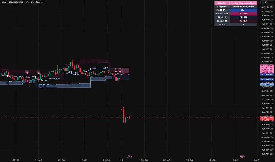
Stochastic Potential Zones
Stochastic Potential Zones
Most indicators try to tell you where price is.
This one tries to tell you where price is most likely to settle.
That is the whole point.
The math comes from stochastic stability and risk dominance.
In simple terms, a system can have two stable outcomes, but one of them is usually easier to reach and easier to defend. Over time, that easier state tends to dominate.
This script applies that exact idea to price.
The indicator builds two structural basins from recent pivots:
the bull basin forms around the latest meaningful swing low
the bear basin forms around the latest meaningful swing high
Those are not random zones. They are the two structural areas the market is most likely to coordinate around.
Then the script asks the important question:
Which side is easier for the market to coordinate around right now?
To answer that, each side gets a resistance score.
Bull resistance rises when:
price is still far from the bullish basin
short-term trend is leaning down
the current candle impulse is working against buyers
higher timeframes are not supportive
Bear resistance rises for the opposite reasons.
Volume can reduce that resistance.
That matters because if price is already pushing into a basin with participation behind it, the market has an easier time committing to that side.
So the script is not just checking location. It is checking how difficult it is for the market to “choose” each side.
Once those resistance scores are calculated, they are converted into stochastic potential:
lower resistance = higher potential
higher resistance = lower potential
That gives you two live readings:
Bull Pot
Bear Pot
These are the core outputs of the model.
From there, the indicator defines the current state:
if Bull Pot clearly exceeds Bear Pot, the market is in a Bull Convention
if Bear Pot clearly exceeds Bull Pot, the market is in a Bear Convention
if neither side has enough advantage, the market is Contested
This is where the indicator becomes practical.
It stops being a mathematical idea and becomes a market map.
The silver line is the separatrix.
That is the decision boundary between the two structural states.
It is the line that says: above here, the bullish basin has the easier path; below here, the bearish basin has the easier path; around here, the market is still arguing.
That is one of the most important visuals in the script.
The small flip markers show when the dominant basin changes.
These are not “buy” and “sell” buttons.
They are structural state changes.
That is a big difference.
A flip tells you the easier convention has changed. What you do with that information still depends on price action, context, and execution.
So how do you actually use it?
Use the basins as structural context.
Use the separatrix as a live decision boundary.
Use the table to see whether one side is genuinely dominant or whether the market is still contested.
And use the flip markers as confirmation that the structural preference has changed, not as a signal to trade blindly.
If i was to try and sum it up In one sentence:
Stochastic Potential Zones shows which structural side of the market is currently easier to sustain, and where the live boundary between those competing states sits.
Advice to myself for the future to become better:
I would love to hear your thoughts and opinions on this indicator. I tried going into detail through images on how the indicator may look like in certain states.
I know i used the bar replay and obviously cherry-picked certain conditions. However, it is just to give you an example of how the indicator would look like in real market time. Penunjuk

Realtime Non-Repaint PathName:
Realtime Non-Repaint Path
Searchable Name:
Realtime Non-Repaint Path
Technical name:
Realtime Non-Repaint Percentage-Reversal Path
Short title:
RT NR Path
Summary
Realtime Non-Repaint Path is a standalone path-visualization and path-state script designed to show live non-repainting directional path structure and a simplified hidden path reveal. It uses a percentage-reversal path model to classify live path direction, maintain a live anchor/candidate structure, draw a live eased path, rebuild a simplified hidden path from reversal pivots, and display state labels, alerts, and a compact status table. Its strongest advantages are live path clarity, non-repainting state transitions on closed bars, simpler path interpretation, and visual structure that can complement entry-focused scripts. Its main known weakness is that it is not a full trading engine: it does not perform full pivot confirmation, trade management, advanced filtering, replay-state reconstruction, or broader regime/stat handling.
This script is best understood as a path-focused operational visualization and state-classification script rather than a complete trading engine. It is designed to be useful on its own while remaining simple enough to inspect, test, and modify.
How it works
The script begins with a simple percentage-reversal path model. It tracks a live anchor price, a live candidate extreme, and a current live path direction. When price moves far enough away from the current anchor by the user-defined reversal percentage, a live directional path is established. As long as price continues making new extremes in that direction, the live candidate continues updating. When price reverses enough from that candidate extreme by the same percentage threshold, the live path flips and a new anchor/candidate cycle begins.
The displayed live path is not drawn as a raw straight jump between points. Instead, it is eased between the current live anchor and live candidate so that the path remains visually readable while still staying tied to the current live state model. Because the live state is updated bar by bar using only information available so far, the live path is intended to function as a non-repainting path-state view on closed bars rather than as a hindsight-only reconstruction.
In addition to the live path, the script can also reveal a simplified hidden path. That hidden path is rebuilt from percentage-reversal pivots over a user-defined recent history window. It detects reversal pivots using the same percentage-reversal logic and then draws an eased pivot-to-pivot hidden path across the selected history range. This keeps the script path-focused, visually useful, and easier to interpret.
The script also displays optional confirmed turn labels, a last-bar live state label, path-up/path-down alerts, background coloring based on current path direction, and a compact status table showing the current live state, anchor, candidate, and percentage distances. These features make it useful as a visual path-state companion script rather than as a full signal-and-execution engine.
Path model note
This script’s path model is based on percentage reversal. That makes it intentionally simpler and easier to understand, but it also means it does not attempt to replicate the broader complexity of a full trading engine. The hidden path shown here should be interpreted as a simplified path reveal, not as a complete trade-selection or execution model.
Features
Live non-repainting path state machine
User-defined percentage reversal threshold
Live anchor and candidate path structure
Eased live path display
Simplified hidden path reveal over recent history
Confirmed path turn labels
Last-bar live state label
Background coloring by live path direction
Path-up and path-down alerts
Compact status table with anchor/candidate/path-distance information
Strengths
Path Clarity edge — provides a cleaner live view of path direction than raw candles alone.
Non-Repainting State edge — live path direction and flips are based on the current bar-by-bar percentage-reversal model rather than hindsight-only reconstruction.
Simplicity edge — simpler structure makes it easier to inspect, test, and modify.
Companion Script edge — pairs naturally with entry-oriented scripts by showing whether path direction is currently up, down, or neutral.
Visual Structure edge — live path, hidden path, labels, background, and status table make path structure easier to read quickly.
Interpretability edge — the script is straightforward enough to be useful as both a live visual aid and a path-study tool.
Weaknesses
Not a full trading engine weakness — does not include full trade management, entry/exit handling, or execution logic.
No advanced filtering weakness — does not include broader filtering or replay/stat reconstruction layers.
Threshold sensitivity weakness — path behavior depends heavily on the user-selected reversal percentage, so different settings can materially change the path and turn structure.
Path-state, not profit-state weakness — path direction does not guarantee profitable entries or strong follow-through.
Simplified hidden path weakness — the hidden path is intentionally simplified and should not be mistaken for a complete internal market model.
No regime/stat engine weakness — does not contain broader regime scoring, detailed replay diagnostics, or a larger state/stat engine.
Who it’s for
This script is best suited for traders and TradingView users who want a simpler live path script, users interested in non-repainting path direction on closed bars, users who want a visual companion to entry-focused scripts, users who want to inspect market path structure with less complexity than a full trading engine, and users interested in learning from or modifying a smaller path-focused script. It is especially suited for users who want a practical path/state layer rather than a complete trading engine.
Who it’s not for
This script is not best suited for:
users looking for a complete pre-built trading engine
users expecting advanced pre-entry classification
users expecting full entry/exit/trade management
users looking for advanced regime, replay, and state/stat reconstruction
users expecting this script by itself to solve the false-pivot or follow-through problem
users looking for a complete trade-selection and execution workflow rather than a smaller standalone path script
Known limitations
Realtime Non-Repaint Path is much better at showing live path direction and simplified path structure than it is at acting as a complete trading system. The live path is driven by a percentage-reversal state machine and the hidden path is rebuilt from simplified percentage-reversal pivots with eased pivot-to-pivot connections. Because of that, it should be viewed primarily as a path/state visualization and classification script, not as a complete trade-selection or execution engine. Different reversal-percentage settings can also materially change how often the path flips and how sensitive the script is to movement.
Final note
This is a standalone path script, not a guaranteed predictive system and not a full operational trading engine. Its strengths are concentrated in live path visibility, simplified hidden path structure, non-repainting state handling on closed bars, and quick visual interpretation. It is best used as a path-focused companion or as a simpler standalone script for studying live path behavior rather than as a substitute for a more complete engine. Penunjuk

Statistical Zone Engine [JOAT]Statistical Zone Engine
Introduction
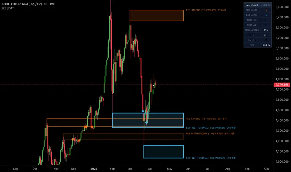
Statistical Zone Engine is an open-source overlay indicator that builds pivot-cluster support and resistance zones with walk-forward statistical scoring. Each zone is backed by a full expected value computation: the indicator counts historical touches and bounces from the zone's price range over a configurable lookback, computes a win rate, and derives an EV score in units of R. Zones are tiered into four strength categories — Weak, Moderate, Strong, and Institutional — based on their live touch count, with border thickness and fill opacity scaling proportionally to the EV and tier. Labels display R:R, win rate, EV, and touch count, all updated live each bar.
The core problem this indicator solves is that conventional support and resistance drawing tools are entirely qualitative — the trader decides what is significant by eye. The SZE replaces that subjective judgment with a quantitative framework: zone strength is computed from actual price behavior over the lookback window, not from the visual prominence of the swing. A zone that has been tested eight times with seven bounces carries an objectively different statistical weight from one that was tested twice with one bounce, and the SZE communicates that difference through its tier system, border rendering, and live EV label. Cluster merging prevents adjacent pivots at nearly the same price from spawning overlapping zones that would misrepresent true strength.
Core Concepts
1. Pivot Cluster Zones
The indicator uses ta.pivothigh and ta.pivotlow with a configurable swing length. When a new pivot high is confirmed and no existing resistance zone is within ATR * clusterTol of the pivot price, a new zone is created. The cluster merge check prevents nearby pivots from generating duplicate zones at the same structural level — if a zone already exists within the tolerance radius, no new zone is spawned. This means zones represent genuinely distinct price levels, not just the most recent pivot above an existing zone.
2. Walk-Forward Expected Value Computation
For each new zone, the indicator scans the prior lookback bars and counts every bar where the high-low range overlapped with the zone. For each touch, it checks whether the close exited the far side of the zone — if so, it counts as a bounce. Win rate = bounces / touches. EV = winRate * tpRR - (1 - winRate) * slRR. A positive EV means the zone has historically resolved in the bounce direction more often than not, weighted by the configured R:R ratio.
3. Four-Tier Strength System
Zone tier is determined by live touch count:
Weak: 1-2 touches — thin border (width 1), low opacity fill
Moderate: 3 touches — medium border (width 1), moderate opacity fill
Strong: 4-5 touches — thicker border (width 2), more opaque fill
Institutional: 6+ touches — widest border (width 3), most opaque fill
Both the border width and the border transparency scale with tier, producing a visual system where the most historically significant zones dominate the chart. The fill opacity also scales with EV — zones with positive EV are more opaque, zones with negative EV are more transparent.
4. Live Label Updates
Each zone carries a label at its right edge displaying: type (RES/SUP), tier name, touch count, win rate percentage, and EV in R units. The label is recalculated and updated every bar when price is inside the zone, ensuring the statistics reflect current behavior. The label text color also scales with tier — more significant zones use brighter text.
5. Sweep Detection
When price closes fully through a zone boundary — above the top for resistance, below the bottom for support — the zone is marked as mitigated. If volume exceeds 1.4x the SMA(20) at the mitigation bar, a BREAK label fires above or below the zone. The total sweep count accumulates in the dashboard. After a break, zone fill fades to near-transparent, clearly communicating that the level has been closed through.
Features
Pivot-Cluster Zone Detection: Swing-pivot based zone creation with ATR-cluster merge deduplication — nearby pivots do not spawn overlapping zones
Walk-Forward EV Computation: Historical touch/bounce counting over configurable lookback produces win rate and R-unit EV scores for each zone
Four-Tier Strength System: Weak / Moderate / Strong / Institutional tiers based on touch count — border width and opacity scale with tier
EV-Scaled Fill Opacity: Positive EV zones are more opaque, negative EV zones are more transparent — fill intensity communicates statistical quality
Live Label Updates: Type, tier, touch count, win rate %, and EV in R units update every bar when price is inside the zone
Sweep Detection with Volume Filter: BREAK label fires on zone close-through when volume exceeds 1.4x SMA(20)
Post-Break Zone Fade: Broken zones fade visually, clearly delineating active versus mitigated levels
Proximity Markers: Diamond plotchar fires when price first enters a zone neighborhood
Min Touches Filter: Only zones with at least the configured minimum historical touches are displayed, eliminating freshly-formed single-touch zones
Zone Trim Management: Oldest zones are removed when arrays exceed the maximum zone count, keeping memory bounded
9-Row Dashboard: Active resistance and support zone counts, near-zone states, total sweep count, TP and SL R:R ratios, ATR
4 Alertconditions: Zone entry for resistance and support, new zone creation for both sides
Input Parameters
Zone Detection:
Swing Length: Pivot confirmation lookback period — higher values detect fewer, more significant pivots (default 10)
Cluster ATR Tolerance: Pivots within ATR * this of an existing zone are merged rather than spawning a new zone (default 0.4)
Zone ATR Width: Half the zone height as an ATR multiple — controls vertical thickness (default 0.35)
Max Active Zones: Maximum concurrent zones per direction before oldest are trimmed (default 12)
Min Touches To Show: Minimum historical touches required to display a zone (default 2)
Statistics:
EV Lookback (bars): Historical bar window for touch/bounce counting (default 200)
TP R:R Ratio: Take-profit distance in R units used for EV calculation (default 2.0)
SL R:R Ratio: Stop-loss distance in R units used for EV calculation (default 1.0)
Visuals:
Toggles for zone labels, sweep labels, and dashboard
Resistance Color (default orange #f97316), Support Color (default sky blue #38bdf8)
How to Use This Indicator
Primary Setup — Statistical Zone Entry:
Look for Institutional or Strong zones with positive EV — these are the levels with the longest bounce history weighted by your R:R parameters. When price enters a zone, the live label shows the current win rate. Enter at the zone edge with a stop beyond the far edge and a target at your TP R:R ratio from entry.
EV as a Selection Filter:
Multiple zones may be on the chart simultaneously. Prioritize zones with positive EV labels (e.g., EV: 1.25R) over zones with negative EV. A zone with 4 touches and 75% win rate at 2R:1R produces an EV of +1.25R per trade — objectively worth trading. A zone with 3 touches and 33% win rate at the same R:R produces EV of -0.33R — not worth trading regardless of how prominent it looks.
Using the Sweep Count:
The total sweep count on the dashboard accumulates every time a zone break is detected with high-volume momentum. Rising sweep counts in one direction indicate the market is consistently breaking through levels on that side — a sign of trending pressure rather than range behavior. Adjust bias accordingly.
Cluster Merge and Fresh Zones:
When a new pivot forms near an existing zone and is merged rather than spawning a new zone, the existing zone's historical statistics remain unchanged. A fresh zone with no historical data will show EV close to 0 — treat these as unproven until more touches accumulate.
Indicator Limitations
EV computation scans up to the full lookback on every qualifying pivot — on very long lookback settings and active pivot instruments, this can increase calculation time
The walk-forward EV uses the same zone size (ATR * width at creation time) for historical counting. If ATR changes significantly between creation time and the historical scan, the touch count may include bars where the equivalent zone boundaries would have been different
Cluster merging uses the current ATR at detection time. In periods of sharply rising or falling ATR, two zones that appear to merge at one ATR level may have been distinct at a different level, potentially underrepresenting zone density
The touch count displayed on the label is the live count updated each bar. The historical bounce count used for EV is computed at creation time and is not re-scanned dynamically — the label win rate reflects creation-time statistics
The minimum touches filter removes zones with fewer historical touches than the threshold. On fresh instruments or small lookbacks, most zones may be filtered out, especially on less-traded timeframes
Originality Statement
This indicator is original in its walk-forward EV scoring framework, four-tier visual strength system driven by live touch counts, and the cluster merging deduplication approach. The publication is justified because:
Walk-forward EV computation in R units provides a quantitative quality signal not found in standard support/resistance tools — each zone is backed by a historically derived expected value, enabling objective zone selection
The four-tier visual system (border width and opacity scaling with tier and EV) embeds the statistical quality directly into the zone appearance, eliminating the need to read labels to gauge significance
ATR-cluster merge deduplication prevents pivot-dense markets from generating overlapping zones at the same structural level, producing a cleaner, more meaningful map than raw pivot-based zone tools
Live label updates during zone interaction show the evolving win rate and EV as each new touch is counted, providing real-time statistical feedback not present in static zone indicators
The post-break fade combined with the total sweep count dashboard provides a structural memory of how many levels have been invalidated, enabling a directional bias gauge derived from zone lifecycle data
Disclaimer
This indicator is provided for educational and informational purposes only and does not constitute financial advice or a recommendation to buy or sell any financial instrument. Past performance of any pattern or signal does not guarantee future results. All trading involves substantial risk. Always use proper risk management and conduct your own independent analysis.
— Made with passion by officialjackofalltrades
Penunjuk

Penunjuk

MTF Pivot Lines (1H / Daily / Weekly)This indicator displays pivot-based support and resistance lines from three higher timeframes — 1-Hour, Daily, and Weekly — directly on your chart, regardless of the timeframe you are currently viewing.
─── FEATURES ───
【 Multi-Timeframe Pivot Lines 】
Draws the most recent pivot high (resistance) and pivot low (support) from the 1H, Daily, and Weekly timeframes as persistent horizontal lines that extend across the entire chart.
【 Wick-Body Zone Fill 】
Optionally fills the range between the wick tip and the candle body at each pivot point, creating a visual zone that highlights the area where price is most likely to react.
【 Full Timeframe Control 】
Each timeframe (1H / Daily / Weekly) can be toggled on or off independently. Unlike typical MTF indicators, this script allows you to display the current timeframe's pivot lines as well — useful when you want all three levels visible simultaneously.
─── HOW TO USE ───
1. Enable the timeframes you want to monitor (1H, Daily, Weekly).
2. When price approaches a pivot line, watch for candlestick reactions as potential support or resistance.
3. Confluence of lines from multiple timeframes (e.g., 1H pivot aligns with Daily pivot) indicates a stronger level.
4. Adjust "Pivot Left Bars" to control how many bars must pass before a pivot is confirmed.
─── NOTES ───
• This indicator is for analytical purposes only and does not constitute financial advice.
• Past performance of any setup is not indicative of future results.
• Designed to complement the "Dow Theory and Price Action" indicator.
━━━━━━━━━━━━━━━━━━━━━━━━━━━━━━
【日本語説明】
現在表示している時間足に関わらず、1時間足・日足・週足の3つの上位時間足からピボット高値・安値ラインをチャート上に直接表示するインジケーターです。
─── 機能 ───
【 マルチタイムフレーム・ピボットライン 】
1時間足・日足・週足それぞれの直近ピボット高値(レジスタンス)とピボット安値(サポート)を、チャート全体に延長する水平ラインとして描画します。
【 ヒゲ-ボディゾーン表示 】
各ピボットのヒゲ先端とボディ端の間をゾーンとして塗りつぶすオプションです。価格が反応しやすいエリアを視覚的に把握できます。
【 時間足の個別制御 】
1H・日足・週足のそれぞれをON/OFFで個別に切り替えられます。一般的なMTFインジケーターと異なり、現在表示中の時間足のラインも表示可能なため、3つのレベルを同時に確認したい場面でも柔軟に対応できます。
─── 使い方 ───
1. 監視したい時間足(1H・日足・週足)をONにする。
2. 価格がピボットラインに近づいたとき、ローソク足の反応をサポート・レジスタンスの根拠として確認する。
3. 複数時間足のラインが重なる箇所(例:1Hピボットと日足ピボットが一致)は、特に強いレベルとして注目する。
4. 「Pivot Left Bars」を調整してピボット確定までのバー数を変更できる。
─── 注意事項 ───
• 本インジケーターは分析補助ツールであり、投資助言ではありません。
• 過去のパフォーマンスは将来の結果を保証するものではありません。
• 「Dow Theory and Price Action」インジケーターと組み合わせての使用を推奨します。
Penunjuk

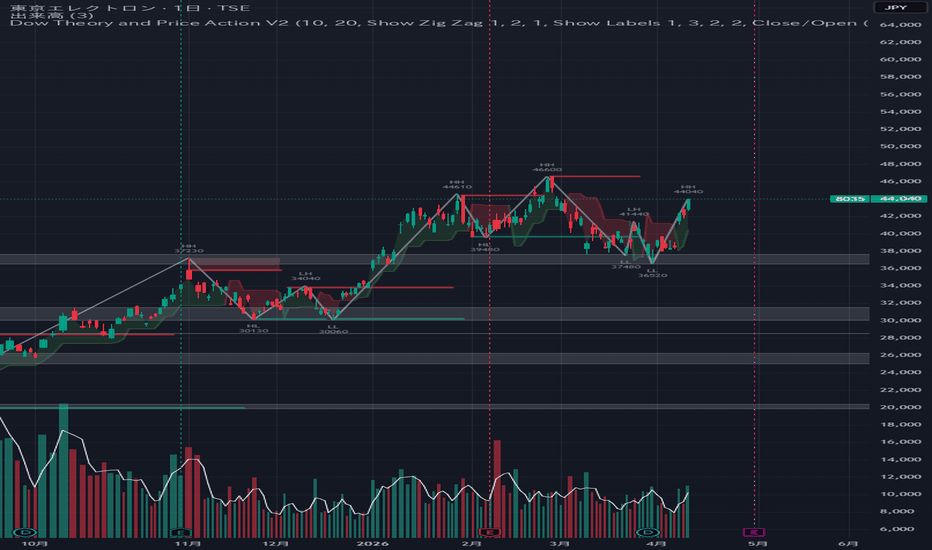
Dow Theory and Price Action V2This indicator is the successor to "T-DOW-FLOW: Final Edition". The trend visualization has been redesigned in a Supertrend style, making it cleaner and easier to read, along with various other refinements.
This indicator integrates multiple analytical tools based on Dow Theory and price action concepts, designed to help traders identify trend direction, key support/resistance levels, and multi-timeframe structure.
─── COMPONENTS ───
【 Dow Theory Trailing Line 】
An ATR-based trailing line driven by ZigZag 1 swing structure. The line rises during uptrends and falls during downtrends, helping visualize the current trend phase according to Dow Theory (Higher Highs / Higher Lows = uptrend; Lower Highs / Lower Lows = downtrend).
【 ZigZag (1 & 2) with HH/LH/HL/LL Labels 】
Two independent ZigZag oscillators with configurable periods. Each swing point is automatically labeled as Higher High (HH), Lower High (LH), Higher Low (HL), or Lower Low (LL) to make Dow Theory structure immediately readable on the chart.
【 SR Type 1 – Pivot Lines & Zones 】
Detects pivot highs and lows on the current timeframe and draws horizontal support/resistance lines. Optionally displays a "Wick-Body Zone" — the range between the wick tip and candle body at each pivot — to highlight the precise supply/demand area.
【 SR Type 2 – Auto Channel Zones 】
Automatically clusters nearby pivot points into support/resistance channels. Strength scoring and filtering parameters allow you to display only the most significant zones and reduce chart noise.
─── HOW TO USE ───
1. Observe the Dow Trailing Line color and position to determine the current trend.
2. Use HH/HL labels to confirm an uptrend, and LH/LL to confirm a downtrend.
3. Look for price reactions at SR Type 1 pivot lines and Type 2 channel zones as potential entry or exit areas.
4. Adjust Left Bars / Right Bars to control pivot sensitivity to your trading style.
─── NOTES ───
• This indicator is for analytical purposes only and does not constitute financial advice.
• Past performance of any setup is not indicative of future results.
• Best used in combination with other confluence factors and proper risk management.
━━━━━━━━━━━━━━━━━━━━━━━━━━━━━━
【日本語説明】
以前公開した「T-DOW-FLOW:Final Edition」の後継インジケーターです。トレンドを表す雲がスーパートレンド風のデザインに刷新され、より視認性が向上しました。その他、細かい調整も加えています。
ダウ理論とプライスアクションに基づく複数の分析ツールを統合したインジケーターです。トレンド方向の把握、主要なサポート・レジスタンスレベルの特定、価格構造の分析をサポートします。
─── 構成要素 ───
【 ダウ理論トレイリングライン 】
ZigZag 1のスイング構造を基にしたATRトレイリングラインです。上昇トレンド中は切り上がり、下降トレンド中は切り下がることで、ダウ理論に基づくトレンドフェーズを視覚的に表現します(HH・HL=上昇トレンド、LH・LL=下降トレンド)。
【 ZigZag(1・2)+ HH/LH/HL/LL ラベル 】
設定可能な2本の独立したZigZagに、各スイング高値・安値を自動でラベリングします。HH(高値切り上げ)・LH(高値切り下げ)・HL(安値切り上げ)・LL(安値切り下げ)を一目で把握できます。
【 SR Type 1 – ピボットライン&ゾーン 】
現在の時間足でピボット高値・安値を検出し、水平なサポート・レジスタンスラインを描画します。各ピボットのヒゲ先端とボディ端の間にゾーンを表示するオプション(ヒゲ-ボディゾーン)で、より精密な需給エリアを確認できます。
【 SR Type 2 – 自動チャンネルゾーン 】
近接するピボット群を自動的にクラスタリングし、サポート・レジスタンスチャンネルとして表示します。強度スコアとフィルタリングパラメーターにより、重要度の高いゾーンだけを絞り込めます。
─── 使い方 ───
1. ダウトレイリングラインの色と位置でトレンド方向を確認する。
2. HH・HLラベルで上昇トレンドを、LH・LLラベルで下降トレンドを確認する。
3. SR Type 1のピボットライン・Type 2のゾーン付近での価格反応を、エントリー・エグジットの根拠として活用する。
4. Left Bars・Right Barsを調整してピボット感度を自分のトレードスタイルに合わせる。
─── 注意事項 ───
• 本インジケーターは分析補助ツールであり、投資助言ではありません。
• 過去のパフォーマンスは将来の結果を保証するものではありません。
• 他の根拠・リスク管理と組み合わせてご利用ください。
Penunjuk
Penunjuk

Price to Volume ChangePrice to Volume Change — All-Positive Ratio Lollipop Chart
A separate-pane indicator that measures the ratio between price change and volume change on consecutive completed bars. All values are positive — the ratio always shows how many times more the dominant side changed. Color indicates WHICH side is dominant (green = price, red = volume) and WHETHER price and volume agree on direction (bright = confirmed, dim = divergence).
What Makes This Original
All-positive scale — Unlike indicators that use positive/negative values, this chart plots the ratio as always >= 1 with the 1:1 line as the center. A reading of 3 means the dominant side changed 3x more. No zero line, no negative values — the chart is cleaner and easier to read at a glance.
Color encodes two dimensions — The hue (green vs red) shows which side is dominant: green = price moved more, red = volume moved more. The brightness shows direction agreement: bright = price and volume moved the same way (confirmed), dim = they diverged (warning). Four combinations give four distinct visual signals.
Lollipop chart with gradient intensity — Thin histogram stems with circle tips. Stronger ratios produce brighter, more saturated colors. Extreme ratios visually pop while moderate ones fade.
Completed bars only — All calculations compare the two most recently completed bars ( vs ). The current forming bar is excluded, so the display never flickers.
How to Read It
Bar height (ratio):
At 1 (white center line) — Equal change. Price and volume moved proportionally.
Above 1 — One side moved disproportionately more than the other. A reading of 3 means 3x more.
Above threshold (orange dashed) — Extreme disproportion. Default threshold is 3x.
Bar color (which side is dominant):
Green — Price dominant. Price changed proportionally more than volume.
Red — Volume dominant. Volume changed proportionally more than price.
Bar brightness (direction agreement):
Bright green — Price dominant + confirmed (price and volume moved same direction)
Dim green — Price dominant + divergence (price and volume moved opposite directions)
Bright red — Volume dominant + confirmed
Dim red/maroon — Volume dominant + divergence
How to Use
For breakout confirmation: A breakout with bright red bars (volume dominant + confirmed) means heavy volume participation driving the move — strong signal. A breakout with dim green bars (price dominant + divergence) means price is moving without volume support — suspect.
For accumulation/distribution: Tall bright red bars with small price changes indicate large volume activity with minimal price impact — potential institutional positioning.
For reversal warning: A shift from green to red bars (volume taking over from price as the dominant force) during a trend can signal exhaustion or a change in character.
For average context: The yellow MA line shows the average ratio. Bars above the MA indicate above-average disproportion between price and volume.
Details Table
An optional table shows the last completed bar's data:
Price Change % — percentage move in price
Volume Change % — percentage move in volume
Ratio — displayed as "3.2:1" (price dominant) or "1:2.5" (volume dominant)
Dominant — PRICE (green) or VOLUME (red)
Direction — Confirmed (green) or Divergence (red) or Flat (gray)
Important Notes
This indicator is designed for the 1-day (daily) timeframe. It requires volume data and will not produce meaningful results on assets without native volume (e.g., SPX index, some forex pairs). All calculations use completed bars only. Extreme ratios are capped at a configurable maximum (default 10) for chart readability. When either price or volume change is near zero (less than 0.01%), the ratio is displayed as n/a.
Recommended Timeframe: Daily (1D)
Default Parameters
Max Ratio Cap: 10.0
Ratio MA: SMA, Length 14
Threshold Line: 3.0
Details Table: Enabled, Top Right
Penunjuk

Price Volatility GaugePrice Volatility Gauge
A price-derived volatility indicator that measures realized price range behavior and presents it in four distinct modes. Unlike implied volatility indicators that require options data, PriceVol works on any asset by analyzing price action alone — making it universally applicable to stocks, indices, forex, crypto, and commodities.
What Makes This Original
This indicator introduces a novel approach to measuring volatility:
Standard deviation-adjusted price range — The core PriceVol calculation measures the distance between the highest adjusted price and the lowest adjusted price over a configurable lookback, where the adjustment uses standard deviation multiples (1x, 2x, 3x) applied to both the source and the low series.
Asymmetric skew measurement — The Volatility Skew Index mode computes the difference between upside and downside volatility by averaging the 1x, 2x, and 3x standard deviation adjustments separately for each direction. A positive skew indicates greater upside volatility; a negative skew indicates greater downside volatility.
Four display modes in one tool — A single indicator that can show raw volatility, ranked volatility, percentile volatility, or directional skew, eliminating the need for multiple separate indicators.
How It Works
PriceVol Raw:
Calculates the percentage range between the highest source price and the current low over the lookback period. This gives a raw measure of realized price range as a percentage.
PriceVol Rank:
Normalizes the raw PriceVol value against its own historical range over a longer lookback (default 252 bars). A reading of 80 means current volatility is in the upper 80th percentile of its historical range. Similar concept to IV Rank but derived entirely from price.
PriceVol Percentile:
Uses ta.percentrank() to calculate what percentage of historical readings fall below the current value. Provides a statistical percentile measure of current volatility relative to history.
Volatility Skew Index:
Computes the difference between upside-adjusted and downside-adjusted PriceVol values across three standard deviation multiples. Positive values indicate upside volatility dominance; negative values indicate downside dominance.
Color Coding
For Rank and Percentile modes:
Orange — Above 50 (inside high volatility regime). Markets are volatile; premiums are elevated.
Aqua — Below 50 (outside high volatility regime). Markets are calmer; premiums are lower.
Colors are configurable in settings.
Usage
For options traders: Use PriceVol Rank or Percentile as a proxy for implied volatility regime. Sell premium when the gauge is orange (high volatility), buy premium when aqua (low volatility).
For directional traders: The Volatility Skew Index reveals whether recent price action has been more volatile to the upside or downside, which can inform directional bias.
For risk management: PriceVol Raw provides a simple measure of recent price range that can be used to size positions or set stops relative to current market conditions.
Important Notes
This indicator measures realized price volatility using standard deviation adjustments. It is not implied volatility from the options market. The terms "Rank" and "Percentile" refer to the statistical ranking of the price-derived volatility measure against its own history — not options IV Rank or IV Percentile. This distinction is important for traders who use both price and options data.
Default Parameters
Source: Close
Display Mode: PriceVol Rank
PriceVol Length: 22
Rank/Percentile Length: 252
Inside High Volatility Color: Orange (above 50)
Outside High Volatility Color: Aqua (below 50)
Recommended Lookback Lengths
9 — Short-term (roughly 2 weeks)
22 — Medium-term (roughly 1 month, default)
66 — Quarterly
132 — Semi-annual
252 — Annual
Penunjuk

Penunjuk

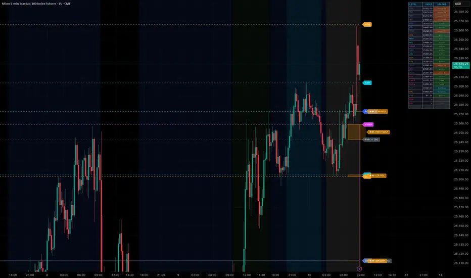
Key Levels Lite by ProDeskTradesKey Levels Lite plots the four most important institutional price reference levels used by
professional traders, with real-time sweep tracking for each.
Levels plotted:
- PDH / PDL — Previous Day High & Low. Locked at the prior RTH session close. Most-watched daily
reference for institutional order flow.
- ORH / ORL — Opening Range High & Low. Formed during the first 15 minutes of RTH (9:30–9:45 AM ET).
Breakouts and rejections from the OR are a primary intraday setup.
- IBH / IBL — Initial Balance High & Low. Formed during the first 60 minutes of RTH (9:30–10:30 AM
ET). Wider range used to gauge session direction and extension targets.
- VWAP — Volume Weighted Average Price. Calculated from RTH open. Used by institutions as a benchmark
for execution quality and intraday bias.
How it works:
Each level is tracked bar-by-bar. When price closes beyond a level, it is marked as swept and the
sweep count increments. Lines change color on sweep so you can immediately see which levels have been
taken vs. which remain untested. During the OR and IB build windows, levels show a "building" status
until the session window closes and the level locks.
Live legend table shows each level's current price and status — active, building, or swept Nx —
updated on every bar.
Settings:
- Show/hide each level independently
- Line style: Solid, Dashed, or Dotted
- Line width: 1–4
- Table position: Top Right, Top Left, Bottom Right, Bottom Left
- Session times are configurable for non-US instruments
Best used on 1m, 5m, and 15m timeframes. Optimized for US equity index futures (ES, NQ, RTY, YM) and
their micros.
Not financial advice. Trading involves substantial risk of loss. Penunjuk

AG Pro Equal High / Equal Low Sweep Engine [AGPro Series]AG Pro Equal High / Equal Low Sweep Engine
Overview / What it does
AG Pro Equal High / Equal Low Sweep Engine is a price-action overlay designed to detect equal highs (EQH) and equal lows (EQL), track the liquidity pools that form around those levels, and highlight sweep events when price briefly trades through them and then closes back with confirmation. The script focuses on one specific market behavior: clustered highs and lows that tend to attract liquidity, followed by rejection-style sweeps that can mark failed continuation attempts, trap conditions, or local reaction points.
Instead of treating every wick through a prior level as equally important, the script separates untouched pools from already swept pools, applies a configurable tolerance model for defining EQH/EQL structures, and adds close-based confirmation logic so users can filter out weaker events. Short liquidity lines, band-style zones, trap labels, and a compact summary panel are used to keep the information visible without turning the chart into a large box-based map.
This tool is built for traders who want a structured view of repeated highs/lows and the liquidity behavior around them. It is not intended to label every possible swing event on the chart. Its purpose is narrower and more deliberate: identify equal-high / equal-low liquidity pools, monitor whether they remain intact or get swept, and display the sweep in a visually organized way.
Unique Edge
The main distinction of this script is that it does not attempt to map all forms of stop runs or all types of liquidity events. It concentrates specifically on EQH/EQL liquidity pools and the sweep lifecycle around those pools. That narrower scope allows the chart objects to remain more readable while still showing useful structure.
The script also distinguishes between untouched and swept states. This matters because a fresh liquidity pool and a previously swept pool do not represent the same chart condition. Untouched pools can still act as active draw-on-liquidity zones, while swept pools become part of recent context and may be interpreted differently depending on the user's framework.
A second differentiator is the combination of equal-pool detection, close confirmation, and optional quality scoring. Equal highs and equal lows are first identified using pivot logic and a user-defined tolerance percentage. Then, when price trades through the pool, the script can require either any wick, a reclaim close, or a stronger rejection close before confirming the sweep. An optional quality bonus can further weight events when relative volume and rejection characteristics are more supportive.
The visual model is also intentionally selective. Instead of using large generalized rectangles across the whole chart, the script uses shorter liquidity lines and band zones tied directly to the detected pool. This keeps the visuals anchored to the detected structure rather than creating broad areas that may overstate precision.
Methodology
1) Equal High / Equal Low Detection
The script uses pivot highs and pivot lows to build candidate swing points. When two highs or two lows form within the user-defined tolerance threshold and within the required bar spacing, they are treated as an equal-high or equal-low liquidity pool. Multiple nearby pools can optionally be merged into a cleaner combined structure.
2) Liquidity Pool Lifecycle
Once a pool is created, it is tracked as active until one of two things happens: it is swept by price, or it expires after its configured lifetime. The script maintains state so pools can be shown as untouched, swept, or removed when they are no longer relevant.
3) Sweep Confirmation
A sweep is not limited to price piercing the level. The script can require:
- Any Wick: any trade-through qualifies.
- Reclaim Close: price must close back through the level after the sweep.
- Strong Rejection: a stricter close-position filter is applied.
This helps users decide how sensitive or selective they want the engine to be.
4) Quality Logic
When enabled, the script calculates a quality score using rejection characteristics, close position, relative volume behavior, pool freshness, and pivot clustering. This is not a predictive score or a probability model. It is a contextual ranking layer intended to help compare sweeps on the same chart.
5) Visual Presentation
The script can draw:
- short horizontal liquidity lines
- band-style EQH/EQL zones
- optional reaction boxes after selected sweeps
- trap labels on confirmed events
- a summary panel showing current pool and sweep status
Signals & Alerts
The script includes alert conditions for:
- new EQH pool detected
- new EQL pool detected
- EQH sweep confirmed
- EQL sweep confirmed
- any sweep confirmed
These alerts are event-based and depend on the current settings used for confirmation and filtering. If stricter filters are selected, the number of confirmed events will naturally decrease.
Key Inputs
Pivot Strength
Controls how swing highs and lows are confirmed. Higher values usually produce fewer, more structurally significant pools.
EQH / EQL Tolerance %
Defines how close two highs or lows must be to qualify as equal. Lower values make the script stricter. Higher values allow broader matching.
Min / Max Bars Between Pivots
Controls the acceptable spacing between the two pivots that define a pool.
Sweep Close Filter
Lets the user choose between wick-only behavior and more selective reclaim/rejection confirmation.
Quality Bonus
Adds an optional scoring bonus when the sweep also shows stronger contextual characteristics.
Liquidity Line / Zone Length
Controls how far the liquidity structures extend on the chart.
Panel and Visual Settings
Allow the user to tune panel position, label size, color theme, and display density for different chart styles and timeframes.
Limitations & Transparency
This script identifies equal highs and equal lows using pivot-based rules and a configurable tolerance model. Because of that, results depend on the chosen settings, the symbol, the timeframe, and the chart's volatility profile.
A confirmed sweep should not be interpreted as a guaranteed reversal or a complete trade setup by itself. In some market conditions, price can sweep a pool and continue in the same direction. In other conditions, a sweep may mark only a short-lived reaction. The script highlights structural events; it does not forecast outcome.
The quality score is a contextual ranking aid, not a performance promise, win-rate estimate, or statistical edge claim. Different users may prefer different thresholds depending on market regime and execution model.
Band zones and reaction areas are visual approximations derived from the detected pool and post-sweep behavior. They are designed to improve chart readability, not to define exact institutional order blocks or guaranteed execution zones.
Risk Disclosure
This script is an analytical charting tool for studying equal-high / equal-low liquidity behavior and sweep confirmation. It does not provide financial advice, investment advice, or trade recommendations. All trading decisions remain the user's responsibility.
Like any technical tool, it should be used with broader market context, risk management, and independent judgment. No indicator can eliminate uncertainty, and past chart behavior does not guarantee future results.
Penunjuk

Penunjuk

AG Pro Stop Hunt Map Engine [AGPro Series]AG Pro Stop Hunt Map Engine
Overview / What it does
AG Pro Stop Hunt Map Engine is a price-action overlay designed to map potential trap zones after liquidity sweeps. The script focuses on moments where price briefly moves beyond an important reference level, rejects that move, and then closes back through the swept area. In practical terms, this helps traders visualize where a failed breakout or failed breakdown may have left trapped positioning behind.
The engine can work with pivot-based liquidity references, previous day high / previous day low references, or both at the same time. This makes it useful for traders who want a structured way to monitor classic stop-hunt behavior without relying on a single interpretation of liquidity. Instead of treating every wick beyond a level as meaningful, the script applies reclaim logic and filtering rules so that only sweeps with stronger reversal characteristics are highlighted.
The core goal is not to predict every reversal. The goal is to organize sweep events into a readable map: where the sweep happened, which side may be trapped, which zones remain active, and which levels are still relevant as price moves forward. That is why the script is built as a map engine rather than a simple marker tool.
This publication is especially suited to traders who study rejection structure, failed continuation, stop runs, and liquidity-driven reversals. It can be used as a visual context layer inside a broader workflow that may already include structure, trend, momentum, or higher-timeframe bias analysis.
Unique Edge
Many liquidity-sweep tools only mark a wick beyond a prior level and stop there. This script takes a more selective approach. It requires a reclaim condition, supports wick-to-body quality filtering, allows optional fake-sweep filtering, and maintains the resulting event as an actionable mapped zone rather than a one-bar marker.
Its main differentiation is the emphasis on post-sweep structure. Once a sweep qualifies, the script builds and extends a zone so the trader can continue monitoring that area after the original event. This provides a cleaner framework for seeing whether the market is respecting that trap region, moving away from it, or invalidating it.
Another important distinction is the visual hierarchy. The script is designed to separate nearest relevant zones from older or weaker context. This helps keep the chart readable while still preserving useful background information. Instead of cluttering the screen with every historical event at equal importance, the engine highlights what is currently closest and most relevant.
Methodology
The script first defines the liquidity source. Users can choose pivot highs and lows, previous day high and previous day low, or a combined mode that monitors both.
For a bullish trap scenario, price must sweep below a valid downside reference and then reclaim it according to the selected conditions. For a bearish trap scenario, price must sweep above a valid upside reference and then reclaim it. This creates two independent directional engines: one for bullish recovery after downside liquidity is taken, and one for bearish rejection after upside liquidity is taken.
The detection logic is built around several layers:
1. Sweep source selection
The engine checks whether price has moved beyond a chosen pivot or previous-day level.
2. Wick / body filter
The script can require a minimum wick-to-body relationship so that weak or low-conviction candles are filtered out.
3. Reclaim close requirement
The user can require price to close back through the swept level before the event is accepted.
4. Fake sweep filter
An optional penetration filter limits how deep price can move beyond the level before the event is treated as lower quality.
5. Zone persistence
Qualified sweep-and-reclaim events are not left as isolated markers. They are stored and extended forward as zones so the trader can monitor their ongoing relevance.
6. Nearest-zone emphasis
The display engine highlights the nearest bull and bear trap zones so current context is easier to read.
The result is a framework that treats sweep events as evolving market context rather than isolated historical dots.
Signals & Alerts
The script identifies two primary event types:
Bull Trap Reclaim
This appears when price sweeps below a valid reference level and then closes back above it, suggesting that downside liquidity may have been taken and rejected.
Bear Trap Reclaim
This appears when price sweeps above a valid reference level and then closes back below it, suggesting that upside liquidity may have been taken and rejected.
Visual elements can include:
- Sweep zones
- Trap labels
- Right-edge state tags
- Nearest-zone emphasis
- Origin markers on qualifying sweep bars
- A summary panel showing current state and nearest bull / bear trap information
Alert conditions are included for:
- Bullish trap reclaim events
- Bearish trap reclaim events
These alerts are event-based. They identify when a qualifying reclaim occurs according to the active settings.
Key Inputs
Sweep Source
Choose whether the engine uses pivots, previous day levels, or both.
Pivot Strength
Controls how strict the pivot reference detection should be.
Require Reclaim Close
Requires price to close back through the swept level before a zone is created.
Min Wick / Body Ratio
Filters low-quality sweeps by requiring stronger rejection candles.
Use Fake Sweep Filter
Enables an additional penetration-depth filter to reduce weaker events.
Max Penetration (ATR Multiple)
Sets the maximum allowed overshoot beyond the swept level when fake-sweep filtering is enabled.
Chart Mode
Allows a cleaner publish-style view or a more detailed analysis-style view.
Label Mode
Controls how aggressively labels are shown on the chart.
Highlight Nearest Bull / Bear Zones
Emphasizes the closest active zones for faster visual interpretation.
Summary Panel
Shows the current trap state, active bull and bear zone counts, nearest trap levels, and the last detected events.
Limitations & Transparency
This script is not a prediction engine and does not guarantee reversals. A sweep-and-reclaim event can still fail, especially in strong directional environments where price continues expanding after a temporary rejection.
Reference choice matters. Pivot-based detection and previous-day level detection describe different types of liquidity behavior. Depending on the instrument, timeframe, and volatility regime, one source may be more relevant than the other.
Filtering also changes behavior significantly. Tight wick/body requirements or stricter fake-sweep settings will reduce signal frequency. Looser settings will create more events but may also admit weaker structures.
Zones are contextual tools, not standalone trade instructions. Many traders may still want to combine the script with higher-timeframe structure, trend bias, volatility context, or execution rules before making decisions.
As with any chart overlay, visual cleanliness depends on timeframe, market conditions, and user configuration. Different settings may be appropriate for intraday charts versus higher-timeframe swing charts.
Risk Disclosure
This script is for chart analysis and market structure visualization only. It does not provide financial advice, trade recommendations, or guaranteed outcomes. Markets can remain irrational longer than a trap setup appears logical, and any liquidity sweep signal can fail.
Always apply independent judgment, position sizing discipline, and risk management. No single indicator should be used in isolation for live trading decisions.
Penunjuk

Penunjuk

AG Pro Auto Supply & Demand Zones [AGPro Series]AG Pro Auto Supply & Demand Zones
Overview / What it does
AG Pro Auto Supply & Demand Zones is an overlay that automatically detects supply and demand areas by combining compact base structures with directional displacement. The script is designed to help traders track where price left an area with enough urgency to justify keeping that zone on the chart for future reference, while also showing how that zone evolves over time.
Instead of plotting every possible reaction area, the script applies a structured lifecycle model. A newly created zone begins as Fresh, can transition to Tested after a qualifying retest, and can later become Expired when it no longer meets the active criteria selected by the user. This state-based approach makes the chart easier to interpret because zones are not treated as static drawings. They are continuously re-evaluated as price interacts with them.
The script also distinguishes between proximal and distal boundaries so users can see both the near edge and the full depth of each zone. A built-in active-zone limit helps keep the chart under control, and older zones gradually fade through time-based opacity reduction. This allows recent and decision-relevant areas to remain visually stronger while historical context becomes lighter.
A light higher-timeframe overlay is included for users who want broader context without turning the chart into a dense multi-timeframe map. The goal is not to overwhelm the screen with background structure, but to add a subtle layer of alignment when higher-timeframe supply or demand remains relevant to the current price area.
Unique Edge
The distinctive feature of this script is that it does not stop at zone creation. It manages the full visual and logical lifecycle of a zone. Fresh, Tested, and Expired states are tracked in an explicit way, which makes the output more practical than a simple box-drawing tool.
A second differentiator is the same-side merge logic. When a newly detected zone forms too close to an existing zone on the same side, the script can refresh or merge that area instead of stacking nearly identical layers on top of one another. This helps reduce redundancy and produces a cleaner, more readable structure map.
Another important edge is the visibility architecture. Users can choose between All, Balanced Focus, and Smart Focus modes. This allows the chart to stay informative without becoming overloaded. Nearest active zones can be emphasized, distant context can be softened, and labels can be kept minimal, balanced, or fully expanded depending on the preferred workflow.
Methodology
The script uses a base-plus-displacement framework.
1. Base detection
A candidate zone begins with a compact base cluster. The script evaluates the total base range relative to ATR and can also apply a clean-wick filter so that noisy or overly volatile bases are filtered out.
2. Displacement confirmation
After the base, the script looks for directional expansion. The displacement candle must satisfy body-size conditions relative to ATR and must close with sufficient directional conviction. This is intended to avoid weak breaks that do not clearly separate from the base.
3. Zone construction
For demand zones, the script builds the area using the base body high as the proximal reference and the base low as the distal boundary. For supply zones, it uses the base body low as the proximal reference and the base high as the distal boundary. This gives the user both the near decision line and the full zone range.
4. Lifecycle tracking
A zone is initially Fresh. Once price revisits it under the selected confirmation mode, it can become Tested. If retests exceed the permitted limit, or if the user enables distal close-break invalidation, the zone can transition to Expired.
5. Zone maintenance
The script can merge overlapping same-side zones, cap the total number of active zones, reduce opacity as zones age, and selectively hide distant context based on the selected visibility profile.
6. Light higher-timeframe context
When enabled, the script projects a restrained higher-timeframe supply and demand layer onto the current chart. This is intended as context, not as a replacement for the active zones detected on the chart timeframe.
Signals & Alerts
This script includes alert support for key state events:
- New Demand Zone
- New Supply Zone
- Fresh Demand Touched
- Fresh Supply Touched
- Demand Zone Expired
- Supply Zone Expired
These alerts are designed to follow the script's zone-state logic rather than subjective interpretation. Users can enable or disable zone-creation alerts, fresh-touch alerts, and expiration alerts independently.
Key Inputs
Detection
Base Bars controls how many candles are used to form the base.
Base Range ATR Factor defines how compact the base must remain relative to ATR.
Max Single Base Candle ATR Factor limits oversized candles inside the base.
Displacement Body ATR Factor controls the minimum strength required for displacement.
Displacement Close Location checks whether the displacement candle closes with directional commitment.
Use Clean Base Wick Filter helps reduce noisy base formations.
Zone Management
Merge Nearby Same-Side Zones helps avoid repeated stacking of almost identical zones.
Minimum Same-Side Separation ATR defines how close a new zone can be to an existing same-side zone before merge logic becomes relevant.
Minimum Zone Overlap Ratio requires stronger overlap before two nearby zones are treated as one structure.
Lifecycle
Max Active Zones limits how many active zones remain on the chart.
Max Tests Before Expire controls how many qualified retests a zone can absorb before it expires.
Test Confirmation offers Touch, Penetration, and Close Inside modes.
Min Test Penetration Ratio refines how deep price must move into a zone when Penetration mode is selected.
Expire On Distal Close Break can invalidate a zone when price closes beyond the distal boundary.
Visuals
Show Proximal Line and Show Distal Line let users control boundary visibility.
Zone Visibility allows All, Balanced Focus, or Smart Focus workflows.
Keep Nearest Active Zones Per Side helps preserve immediate context.
Highlight Nearest Zones strengthens the most decision-relevant zones.
Label Mode, Label Size, Label Right Offset Bars, and Label Spacing ATR control how zone labels are displayed.
Light MTF View
Enable Light MTF View activates higher-timeframe context.
MTF Timeframe selects the higher timeframe.
MTF Fill Transparency and MTF Context Bars help keep the overlay subtle.
Panel
The summary panel can be shown or hidden.
Panel Theme, Panel Location, and Panel Font Size allow adaptation to different chart layouts and visual preferences.
How to use it
Many users will treat this script as a context and reaction map rather than as a standalone entry model.
A common workflow is:
- identify the nearest active demand and supply zones,
- check whether the zone is Fresh or already Tested,
- observe whether current price is approaching the proximal boundary or already trading deeper inside the zone,
- use the light higher-timeframe layer for context,
- then combine the zone information with personal confirmation tools such as structure, momentum, candle behavior, or risk rules.
Fresh zones may be more interesting when they align with trend context or with a relevant higher-timeframe area. Tested zones can still matter, but their interpretation should usually be more selective because the zone has already been revisited.
Limitations & Transparency
This script detects supply and demand zones through a rules-based base and displacement model. It does not claim to identify every meaningful reaction area on a chart, and it does not attempt to label institutional intent, order flow, or smart-money behavior as a certainty.
The quality of a zone depends on the selected settings, the volatility profile of the market, and the timeframe being analyzed. A more permissive configuration will naturally surface more zones, while a stricter configuration will produce a cleaner but narrower map. No single setting profile is optimal for every instrument.
The higher-timeframe overlay is intentionally lightweight. It is designed to provide context, not to replace full top-down analysis. Likewise, a Fresh or Tested label should not be treated as a guarantee of reaction. It is simply the script's state classification based on the selected confirmation logic.
This tool is best understood as a structured charting aid. It helps organize zone detection, lifecycle tracking, and visual prioritization. It does not remove the need for trade selection, confirmation, execution discipline, or risk management.
Risk Disclosure
This indicator is for chart analysis and educational use only. It does not provide financial advice, investment recommendations, or guaranteed outcomes. Markets can move through supply and demand zones without reacting, can partially react and fail, or can produce false confirmations. Always test settings carefully, evaluate the script in the context of your own process, and use proper risk management before making trading decisions.
Penunjuk

Strategi

Key Levels - ChartDNAKey Levels - ChartDNA, plots the most important price levels across all major timeframes:
• 4H, Daily, Monday Range, Weekly, Monthly, Quarterly, Yearly, and FX sessions (London, New York, Tokyo) — directly on your chart.
What makes this different:
• Touch Detection — when price wicks through a level, the line disappears and only the label remains (in a configurable grey colour), so you always know which levels are still untagged and which have already been tested.
• Glow Effect — a semi-transparent halo renders behind each active line for instant visual clarity on busy charts.
• Clean label positioning — labels sit at the right end of each line with a user-adjustable offset, never overlapping the line itself.
All levels, colours, line styles, widths, and label sizes are fully configurable. Open-source. Based on original work by @sbtnc.
Fallow for more! Penunjuk

AG Pro Engulfing Candle Quality [AGPro Series]AG Pro Engulfing Candle Quality
Overview / What it does
AG Pro Engulfing Candle Quality is a price action overlay designed to detect bullish and bearish engulfing candles and then grade them through a structured quality framework instead of treating every engulfing event as equally important.
Rather than marking all engulfing candles with the same visual weight, this script evaluates whether the candle shows characteristics that may make the event more meaningful in context. The goal is to reduce low-value pattern noise and help the user focus on engulfing candles that display stronger internal structure and better surrounding conditions.
The script can color qualifying candles, display score labels directly on the chart, add optional background emphasis, and summarize recent signal state through an information panel. This makes it suitable for traders who want a cleaner way to review engulfing behavior without turning the chart into a generic pattern map.
In practical use, the script is not intended to predict direction on its own. It is designed as a filtering and chart-reading aid for users who already work with structure, liquidity, support/resistance, trend context, or discretionary execution rules.
Unique Edge
Many engulfing tools stop at pattern detection. This script takes a different approach by treating engulfing candles as a quality event rather than a binary event.
Its core difference is the scoring model. Each qualifying candle is evaluated through a multi-factor framework that can include relative volume behavior, body-to-range efficiency, prior directional context, engulf strength, and optional support/resistance proximity. This creates a 1-10 quality score that helps separate weaker engulfing events from stronger ones.
The result is a more selective workflow:
- detect the pattern,
- evaluate the candle quality,
- display only the events that meet the user’s threshold,
- and keep the chart focused on higher-interest formations.
This makes the script different from simple engulfing markers, basic candlestick libraries, or broad pattern collections. Its purpose is not to label everything. Its purpose is to rank and filter.
Methodology
The script identifies bullish and bearish engulfing conditions using configurable detection logic. Users can choose a stricter close-based interpretation or a broader wick-based interpretation depending on how selective they want the pattern engine to be.
Once an engulfing candle is detected, the script evaluates the event with a weighted quality framework. The conceptual components include:
1. Relative volume
The candle is compared against a moving average of volume. A candle that forms with stronger-than-normal participation can receive a higher quality contribution than one forming on ordinary or weak activity.
2. Body efficiency
The candle body is evaluated relative to the full range. A larger, more decisive body may indicate stronger commitment than a candle with excessive wick noise and a relatively small real body.
3. Prior directional context
The script reviews recent directional pressure over a user-defined lookback window. This helps distinguish engulfing candles that appear after a more meaningful opposing move from those that form in flatter or less informative conditions.
4. Engulf strength
The script can incorporate how convincingly the current candle overtakes the prior candle structure, adding another layer beyond simple pattern recognition.
5. Optional support/resistance proximity
Users can enable an additional contextual bonus when the engulfing event forms near pivot-derived support or resistance areas.
These components are normalized into a score from 1 to 10. The score is then used for chart display, filtering, and alerts. This means the script is not simply asking whether an engulfing candle exists. It is asking whether the engulfing candle appears to have enough internal and contextual quality to deserve attention.
Signals & Alerts
The script can display:
- bullish engulfing events,
- bearish engulfing events,
- candle coloring for qualified signals,
- optional score labels,
- optional background highlights,
- and a chart panel summarizing recent signal state.
Alerts are deterministic and based on confirmed rule conditions inside the script. Users can create alerts for:
- bullish engulfing events,
- bearish engulfing events,
- high-quality bullish engulfing events,
- high-quality bearish engulfing events,
- or any engulfing event that meets the selected minimum score threshold.
As with any chart tool, users should understand that alerts reflect the script’s rules, not an outcome guarantee. An alert means the selected condition has been satisfied according to the methodology. It does not imply that the next market move will be favorable.
Key Inputs
The script includes several controls so users can adapt the tool to different symbols and timeframes.
Important inputs include:
- minimum score required for display,
- label cooldown to reduce visual clustering,
- trend-strength lookback,
- strict close-based or broader wick-based engulf logic,
- bullish and bearish visibility toggles,
- optional support/resistance bonus,
- support/resistance pivot length,
- ATR-based proximity setting,
- scoring weights for volume, body efficiency, trend context, and engulf strength,
- volume average threshold,
- body/range threshold,
- color controls for bullish, bearish, and score states,
- label size,
- background highlight toggle,
- candle-coloring toggle,
- score label visibility,
- panel visibility, position, font size, and theme,
- and minimum score required for alerts.
These inputs allow the user to keep the script conservative and selective, or make it more permissive when reviewing more active charts.
Limitations & Transparency
This script is a rule-based visual analysis tool. It does not know future price action, and it does not confirm trade quality on its own.
Several points are important:
- An engulfing candle is still a local pattern. It can fail, especially in noisy or low-liquidity environments.
- Strong scores do not guarantee continuation or reversal.
- The support/resistance context is approximate and derived from pivot logic, not from a universal market map.
- Volume behavior can vary across markets and data feeds.
- Different timeframes can produce very different signal density and quality distribution.
- The script is designed for confirmation and filtering, not for fully automated decision-making.
Users should treat the score as a structured quality estimate, not as a promise. In many workflows, the script is most useful when combined with broader context such as market structure, trend bias, higher-timeframe levels, session behavior, or risk management rules.
Risk Disclosure
This script is provided for chart analysis and educational use. It is not financial advice, not an execution system, and not a guarantee of performance.
All trading and investing involve risk. Market conditions can change quickly, and any pattern, score, or alert can fail. Users are responsible for their own analysis, entries, exits, and risk controls.
Use the script as a decision-support tool, not as a substitute for judgment.
Penunjuk

AG Pro Premium Discount Zone Engine [AGPro Series]AG Pro Premium Discount Zone Engine
Overview / What it does
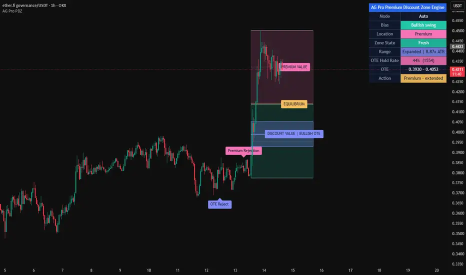
AG Pro Premium Discount Zone Engine is a dealing-range and retracement context overlay built to map relative value inside a selected swing. Instead of treating price as a sequence of isolated candles, the script frames current price location against an active high-low range and highlights where price is trading relative to equilibrium, premium, discount, and the OTE area.
The core purpose of this tool is organizational. It is designed to help traders read where price is positioned inside a live swing and how price reacts when it moves into higher-value or lower-value retracement zones. This is especially useful when a chart is moving inside a pullback, when trend continuation is being evaluated, or when users want to distinguish between shallow retracements and deeper repricing within an existing range.
The script supports multiple ways to define the active range. Users can work with an automatically detected swing, a higher-timeframe dealing range, or a manual-lite anchor mode based on bar offsets. Once a valid range is identified, the script projects premium and discount territory, marks the 50% equilibrium, and highlights the OTE area using the 61.8, 70.5, and 78.6 retracement levels.
The output is intentionally visual, structured, and restrained. Premium and discount zones are shown as clean value blocks. The OTE area is treated as the main focus zone rather than a minor detail. The panel summarizes the active bias, current location, zone state, equilibrium level, and OTE boundaries so that users can read the chart quickly without relying on aggressive signal language.
Unique Edge
What makes this script different is that it is not built as a market-structure detector, imbalance mapper, liquidity event scanner, or order-block locator. Its job is narrower and more specific: it organizes relative price location inside a defined dealing range.
That distinction matters. Many overlays attempt to explain everything on the chart at once. This script does not. It does not try to label breaks of structure, detect fair value gaps, mark liquidity sweeps, or classify institutional zones. Instead, it answers a more focused question: where is price trading inside the current swing, and how is it behaving as it enters or leaves important retracement territory?
This also separates the script from other AG Pro tools. Some AG Pro overlays are built around structure transitions, some around imbalance behavior, some around reaction quality, and some around event detection. AG Pro Premium Discount Zone Engine is built around valuation context. It does not compete with those tools directly. It complements them by adding a relative-value map around a selected range.
Another difference is the zone-state logic. The script does not stop at drawing premium and discount blocks. It also tracks how price interacts with the OTE area and classifies that interaction using a simple state model such as Fresh, First tap, Retested, Rejected, Accepted, and Invalidated. This creates a more contextual read than a static retracement overlay.
Methodology
The script begins by identifying an active swing range. In Auto Swing mode, it uses pivot-based range detection. In HTF Swing mode, it builds the range from a higher-timeframe high-low window. In Manual-Lite Swing mode, it uses bar-offset anchors to let the user define a practical swing reference without requiring manual drawing tools.
Once the active range is available, the script calculates the internal value map:
- Swing High
- Swing Low
- 50% Equilibrium
- Premium territory above equilibrium
- Discount territory below equilibrium
- OTE zone using 61.8, 70.5, and 78.6 retracement levels
The script then monitors how price behaves around those levels. This produces context states rather than directional promises. For example, price entering the OTE area is not treated the same as price rejecting from it, accepting beyond it, or invalidating the active range. These are intentionally different events because they describe different chart conditions.
The equilibrium level is included as a centerline reference, while the OTE band is given stronger visual emphasis. This helps distinguish broad valuation territory from the narrower retracement pocket that many users monitor more closely.
Signals & Alerts
The signals in this script are event-based and deterministic. They are not designed as standalone trade instructions. They are designed to describe interaction with the active range.
Available event logic includes:
- OTE Test
- OTE Reject
- OTE Accept
- Discount Reaction
- Premium Rejection
- Equilibrium Cross
- Range Invalidated
- OTE Failure
These events are intended to provide chart context. For example, an OTE Test simply means price entered the active OTE zone. A Premium Rejection means price traded into the premium side and closed back below the local premium threshold used by the script. A Discount Reaction means price interacted with the discount side and responded upward under the script's rules. These are context events, not guarantees of continuation.
Alerts follow the same philosophy. They are defined in a rules-based way so users can monitor range interaction without needing to watch the chart continuously. The alert layer is most useful when the script is used as a location filter inside a broader workflow.
Key Inputs
Swing mode
Lets the user choose between Auto Swing, HTF Swing, and Manual-Lite Swing depending on whether the goal is reactive automation, higher-timeframe framing, or a more controlled local range definition.
Auto pivot length
Controls how sensitive the pivot-based swing detection is in Auto mode.
HTF timeframe and HTF lookback
Used to define the broader dealing range in higher-timeframe mode.
Manual high bars back / manual low bars back
Used to create a manual-lite range by referencing earlier bars as anchors.
Render bars back / render bars forward
Controls how far the active range projection extends on the chart.
Zone opacity and theme
Used to refine the visual balance between premium, discount, and OTE areas.
Label controls
Used to reduce visual noise by controlling label cooldown, label render window, and maximum visible labels.
Panel controls
Allow the user to reposition the panel and adjust its text size to fit different chart layouts.
Limitations & Transparency
This script does not predict direction. It does not forecast reversals. It does not decide whether a chart should trend, break, or fail. It maps relative value inside a selected range and reports interaction events inside that framework.
The quality of the output depends on the quality of the active swing. If the selected or detected range is not meaningful for the user's workflow, the valuation map will also be less meaningful. This is especially important in highly compressed, extremely noisy, or structurally unclear conditions.
Auto Swing mode is practical, but like any automated swing model, it depends on pivot confirmation and may update as newer pivots become available. HTF mode provides broader context but may feel less reactive on smaller charts. Manual-Lite mode gives more control but still depends on the user choosing sensible anchor distances.
OTE logic is range-relative. It does not incorporate unrelated concepts such as order blocks, liquidity pools, fair value gaps, session models, or external structure classifications unless the user combines those ideas manually in a separate workflow.
This script is best understood as a valuation-context overlay. It is not a complete strategy, not a full decision engine, and not a substitute for risk management.
How this differs from other AG Pro scripts
AG Pro Premium Discount Zone Engine is intentionally not a structure-break tool, not a CHoCH/BOS detector, not a liquidity sweep scanner, not an FVG engine, and not an order-block mapper.
Its role inside the AG Pro family is to answer a different question:
Where is price trading inside the active dealing range, and what is the quality of its interaction with that value map?
That makes it particularly useful for users who already understand direction from another process and want cleaner execution context. In other words, some tools focus on structural change, some focus on imbalance, and some focus on reaction events. This one focuses on valuation location.
Risk Disclosure
This script is for chart analysis and educational use only. It does not provide financial advice, investment advice, or guaranteed trade signals. Any use of this tool should be combined with independent analysis, risk controls, position management, and market-specific judgment.
The presence of an alert, label, premium zone, discount zone, or OTE interaction does not imply that price must react in a specific way. Markets can continue, reverse, compress, or invalidate a range without warning. Users should treat this script as a context tool, not as a promise of outcome.
Penunjuk

Institutional Smart Money Footprint (Volume Anomalies) by:EduardMost retail traders rely on moving averages and lagging oscillators, completely missing the fact that the market is governed by liquidity sweeps and algorithmic volume anomalies, I developed this stripped-down version of our institutional footprint tracker to map where the "Smart Money" is aggressively stepping in.
This engine doesn't just look at price action, it cross-validates extreme spread expansions with 150%+ volume surges to plot high-probability Demand and Supply blocks directly on your chart. When a whale moves, they leave a mathematical footprint. This algorithm highlights it.
If you are a discretionary trader, use these zones as hard exhaustion/reversal levels, if you are running a prop firm or need to translate complex logic like this into a fully automated, low-latency execution bot, my team specializes in custom algorithmic architecture (Pine Script, Python, and C#), feel free to study the open-source code or reach out directly for custom B2B engineering. Penunjuk