Reversal Scalper 2.0- Adib NooraniReversal Scalper - Smoothed Stoch & ATR Trend Filter
Hey everyone, I originally put this script together to help me scalp XAUUSD and Indian equities on lower timeframes, specifically to solve a problem I was having with standard momentum oscillators.
We all know the main issue with using a regular Stochastic for scalping: it’s great for spotting exhaustion, but when a strong trend kicks in, the oscillator just stays pegged in the overbought or oversold zones. If you try to trade those reversal signals blindly, you just get run over by the trend.
To fix this, I created a mashup that combines a smoothed Stochastic with a custom ATR-based structural trend ribbon. The whole point of combining these two indicators is to use the ATR bands to define the actual market structure, and only take the Stochastic reversal signals when the trend filter confirms that the push is actually exhausted.
How the math works:
First, the bottom oscillator (what I call the Reversal Strength Meter) is based on a standard 8-period Stochastic. But to cut out the erratic noise you usually get on the 1m or 5m charts, I ran it through a 5-period Simple Moving Average. It gives a much cleaner read on momentum.
Second, the background trend filter uses a long-term ATR (100-period, halved) multiplied by a deviation factor (default is 3). The script looks back at recent swing highs and lows to project a volatility channel. I linked this channel to the bar colors so you don't need to look at messy lines on your chart.
How to trade with it:
If the price breaks hard outside the ATR channel, the candles change color (white for a strong push up, black for a strong push down). When you see this, it means the trend is expanding—do not look for reversals, even if the Stochastic is at an extreme.
For Longs: Wait for a strong downward push that turns the candles black. Let the smoothed Stochastic dip below the 20 level. You only enter long when the candles go back to their normal color (showing the structural selling pressure has stopped) AND the stochastic crosses firmly back up above 20.
For Shorts: Wait for a bullish push that turns the candles white. Let the stochastic ride up above 80. Your short trigger is when the candles return to normal and the stochastic crosses back down below 80.
I left the inputs open so you can adjust the Stochastic lengths and the ATR deviation factor depending on what timeframe or asset you are trading. Hope this helps you guys filter out the fake outs. Penunjuk

Kurdistani BITCOIN POWER LAWKurdistani Bitcoin Power Law
The Kurdistani Bitcoin Power Law is a long-term macro analysis tool for Bitcoin ( CRYPTOCAP:BTC $), built entirely in **Pine Script v6**. It models Bitcoin's historical growth trajectory over time using a log-log power-law relationship, treating time not as a linear metric, but as an exponential driver of value.
This script maps out Bitcoin's structural "Fair Value" alongside its cyclical boundaries, providing long-term investors with clear macroeconomic floors, ceilings, accumulation zones, and historical touch-points.
---
🔬 The Math Behind the Model
Unlike standard exponential models that eventually experience unrealistic vertical explosions, a power law models a diminishing growth rate over time.
The indicator calculates elapsed days since Bitcoin's Genesis Block (January 3, 2009) and uses the following regression formula to establish the center fair value band:
$$P(t) = 8.31 \times 10^{-17} \times t^{5.48}$$
Where $t$ represents the total number of days elapsed since the genesis block. This model boasts an incredibly high historical correlation coefficient ($R^2 = 0.9976$).
---
🎨 Visual Breakdown & Color Map
The chart overlays a structured channel designed for high visual clarity, utilizing a custom dark theme interface:
Center Line (Pure Red): The fundamental **Fair Value** anchor of the Power Law model.
Upper Band (Pure Yellow): Represents a **+10% deviation** above the fair value corridor, acting as a historical resistance zone during expansion phases.
Lower Band (Pure Green): Represents a **-10% deviation** below the fair value corridor, acting as the structural macro support floor.
Holographic Line (Glow White Dotted): Projects the model's current fair value coordinate smoothly across the active price bars.
Glow Shading: Dynamic, semi-transparent background color fills between the bands to visually isolate overvalued or undervalued territories easily.
---
⚙️ Configurable Inputs & Features
The script features a highly customizable input menu divided into functional groups:
🌐 Language Localizer: Fully multi-lingual interface supporting **English**, **Persian (فارسی)**, and **Kurdish (کوردی)** across the HUD table layout.
🌀 Toggle Visibility: Independent control switches to show or hide the Main Power Law line, Upper Band, Lower Band, Holographic Dotted Line, and Channel Glow Fills.
🔮 Custom Macro Targets: Allows you to input custom price expectations for key future cyclical milestones (**2026E**, **2030E**, and **2035E**) directly into the on-screen display panel.
🟢 Dynamic Buy Zone Percentage: Define custom deep-value accumulation triggers (Default is **18% below the lower band**).
📜 Historical Touch Tracker: Automates historical data tracking by searching through historical bars to identify and display exactly when Bitcoin hit its ultimate cycle floors.
---
📈 How to Use the Indicator for Trading & Investment
1. Identifying the Macro Buy Zone
When Bitcoin’s market price drops below the defined lower band offset percentage, the chart background dynamically shifts to a soft green shade. Historically, these moments represent generational accumulation phases (e.g., the absolute bottoms of macro bear markets).
2. Fair Value Tracking (The Mean Reversion Anchor)
The center red line acts as a strong gravity anchor. During bull market bubbles, price overextends aggressively above it; during capitulations, it snaps below it. Long-term positions can be assessed relative to whether the current price is trading at a premium or a discount to this red value line.
3. The On-Screen HUD Table
Positioned cleanly in the top-right corner of your screen, the Head-Up Display (HUD) table keeps you constantly updated on:
* The raw underlying power-law formula.
* The live asset **Fair Value** adjusted to the current day.
* Your personalized macro target projections for upcoming years.
* An integrated ledger highlighting exactly which **Cycle Touch Years** marked historical bottoms alongside their precise historical dollar-value floors.
4. Automated Alert System
The script comes equipped with an integrated alert condition trigger. You can set a native TradingView server alert for the event `🟢 Bitcoin BUY ZONE` to notify your desktop or mobile device the exact moment Bitcoin drops into the structural deep-value buying zone.
---
💻 Source Code Overview
The code leverages the latest **Pine Script v6** performance upgrades, introducing modern array mechanics to track cycle anomalies efficiently without slowing down chart rendering engines, capping maximum visual line, label, and box memory footprints safely at 500 units each. Penunjuk

Session Seasonality Deviation [MarkitTick]💡 A highly advanced analytical framework meticulously engineered to quantify, measure, and visualize volatility anomalies within specific, localized trading windows. By programmatically isolating price action strictly to predefined market hours—such as the London or New York opens—this tool establishes an objective statistical baseline of expected market movement based exclusively on historical day-of-the-week performance data. Rather than relying on lagging continuous averages, this mathematical model detects the precise moment a market transitions from baseline activity into statistically significant expansion or compression, providing an objective lens through which to view true price dynamics.
● ✨ Originality and Utility
Traditional volatility metrics and bands typically analyze continuous price data streams, inadvertently blending distinct, structurally different trading periods into a single, homogenized moving average. This generalized approach inherently degrades the accuracy of volatility forecasting. The core utility of the SSD indicator lies in its targeted isolation of distinct market sessions, mathematically acknowledging the reality that a Tuesday London session behaves with entirely different liquidity parameters than a Friday New York session.
By creating an isolated historical distribution for each specific day of the week, this tool offers a highly accurate, predictive baseline for expected volatility that adapts to the calendar. Furthermore, the integration of structural price action filters ensures that these statistical anomalies are always correlated with actual market mechanics, elevating the tool beyond simple moving average bands and providing a robust, multidimensional analysis of market intent.
● 🔬 Methodology and Concepts
This script operates on a sophisticated confluence of statistical profiling and structural market analysis, creating an unyielding logic engine designed to filter market noise.
Time-Series Stratification: The underlying logic initiates by isolating raw price data exclusively within a user-defined temporal window. It captures the extreme upper and lower boundaries of this session, establishing the true operational range and discarding irrelevant data from inactive hours.
Day-of-Week (DOW) Seasonality Profiling: Rather than utilizing a generic rolling lookback of consecutive calendar days, the algorithmic engine stores and categorizes historical session ranges based on the specific day of the week. It builds an independent, localized statistical distribution for each day, calculating the mean average range and the variance of those specific historical instances.
Standardized Deviation (Z-Score) Engine: The primary mathematical trigger relies on a rigorous Z-Score calculation. It compares the current session's confirmed range against the historical DOW average, divided by the established standard deviation. This quantifies exactly how far the current volatility deviates from the empirical historical norm.
Structural Confluence and Market Character: To prevent the system from acting on anomalous volatility that lacks definitive directional intent, the logic engine requires a structural confirmation. It evaluates recent high and low boundaries, demanding that the closing price breaches these structural bounds to validate the statistical signal and confirm a genuine shift in market character.
● 🎨 Visual Guide
The visual interface is precision-engineered for rapid cognitive interpretation of complex statistical states, designed to relay critical data without cluttering the charting canvas.
Dynamic Heatmap Candles: The primary price action is overlaid with a responsive heatmap. Candlesticks are colored dynamically to reflect the internal bias of the active session, providing an immediate visual cue of the dominant buying or selling pressure.
Average Range Bounds: Subtle, non-intrusive bracketing lines are plotted symmetrically around the session open, projecting the historical average range. This creates a visual baseline for expected session expansion, allowing the user to see when price escapes the statistical norm.
Actionable Trade Levels: Upon the generation of a confirmed signal, the tool plots projected Entry, Stop Loss, and multiple Take Profit coordinates. Chart labels are meticulously configured to display raw value strings without percentage signs, ensuring a clean, distraction-free presentation of critical price levels.
Analytical Heads-Up Dashboard: A sophisticated data table is rendered on the chart, centralizing key real-time metrics. It details the active session, current directional bias, real-time Z-Score, Sample Size validity, and structural state. The dashboard is explicitly designed to display a matching, comprehensive evaluation of both long and short transaction outcomes, ensuring a perfectly balanced view of all potential market trajectories.
● 📖 How to Use
Interpreting the output of this tool requires a methodical, step-by-step approach, focusing heavily on the intersection of statistical deviation and structural shifts.
Monitor the on-chart dashboard for the Z-Score to definitively exceed the user-defined deviation threshold, which serves as the primary indicator of a statistically significant expansion in volatility.
Verify the directional bias of the current session using the Heatmap Candles and ensure this localized momentum aligns with the broader, macro market structure.
Wait for a confirmed structural breach signal that perfectly matches the directional bias of the initial statistical deviation, ensuring momentum is backed by actual price displacement.
Utilize the automatically plotted Trade Action Levels for strict risk management. The Stop Loss is dynamically calculated based on historical variance, and Take Profit levels offer scaled, mathematically logical target zones.
Exercise extreme caution and avoid executing signals during periods of severe price compression, or when the dashboard indicates that the sample size of historical data is insufficient to form a mathematically reliable statistical distribution.
● ⚙️ Inputs and Settings
The configuration panel is categorized logically to allow for the precise, modular tuning of both the statistical engine and the visual outputs.
Core Settings: Select the target session (Asia, London, New York) and define the lookback period for the seasonality model. Adjust the precise Deviation Threshold (Z-Score limit) to control the strictness and sensitivity of the generated signals.
Filters: Toggle specific confirmation layers, including the minimum required historical sample size, minimum expansion criteria, and specific structural requirements necessary to validate a move.
Trade Tools: Calibrate the multiplier values for the dynamically calculated Stop Loss and Take Profit levels, allowing the user to seamlessly align the tool with their individual risk parameters and payout models.
Visuals and Dashboard: Customize the display properties of the heatmap candles, the average range bands, and the spatial positioning of the analytical dashboard to suit personal workspace preferences.
● 🔍 Deconstruction of the Underlying Scientific and Academic Framework
The theoretical foundation of this analytical tool is deeply rooted in advanced Quantitative Finance, specifically drawing upon the established principles of Volatility Clustering and the Day-of-the-Week Anomaly. Academic literature frequently notes that financial markets exhibit leptokurtic distributions, wherein volatility is not a constant force but rather clusters densely in specific, predictable temporal windows. By employing a variance measurement technique akin to Standardized Moments, the script effectively normalizes session volatility.
This process allows the underlying algorithm to objectively classify current price action relative to an empirical baseline, entirely removing subjective human bias from the equation. Furthermore, the integration of structural pivot analysis introduces a deterministic filter to an otherwise probabilistic model. This synthesis ensures that statistical outliers are only deemed actionable when they are accompanied by a verifiable, measurable shift in the underlying supply and demand equilibrium.
⚠️ Disclaimer
All provided scripts and indicators are strictly for educational exploration and must not be interpreted as financial advice or a recommendation to execute trades. We expressly disclaim all liability for any financial losses or damages that may result, directly or indirectly, from the reliance on or application of these tools. Market participation carries inherent risk where past performance never guarantees future returns, leaving all investment decisions and due diligence solely at your own discretion. Penunjuk

Quantum Trend Matrix Pro AIQuantum Trend Matrix Pro AI
Quantum Trend Matrix Pro AI is a professional trend intelligence indicator developed by Forex_Market_Insights to help traders identify, measure, and understand market trends with greater confidence. Instead of relying on a single moving average or a basic crossover, this indicator combines multiple analytical engines into one complete trading framework that evaluates trend direction, trend quality, momentum strength, volatility conditions, market compression, breakout potential, and higher-timeframe confirmation.
The objective of this indicator is not simply to tell traders whether the market is bullish or bearish, but to provide a complete picture of the current market environment. It continuously analyzes price behavior and converts complex market information into an easy-to-read dashboard, intelligent scoring system, adaptive signals, and visual trend structure.
Whether you trade Forex, Gold, Indices, Crypto, Commodities, or Stocks, Quantum Trend Matrix Pro AI is designed to simplify market analysis while providing institutional-style trend confirmation and professional-grade visualization.
Why This Indicator Was Created
Many traditional EMA indicators only generate crossover signals without considering the quality of the trend. These signals often produce false entries during sideways markets because they ignore trend strength, momentum, volatility, and higher-timeframe confirmation.
Quantum Trend Matrix Pro AI was developed to solve these problems by introducing a multi-layer analytical framework.
Instead of asking only:
"Did the EMAs cross?"
this indicator asks much more important questions:
Is the trend actually strong?
Is momentum increasing or weakening?
Is the market preparing for a breakout?
Is volatility expanding or contracting?
Are higher timeframes supporting the trend?
Is the current trend mature or just beginning?
Is the market trending or simply ranging?
Only after evaluating these conditions does the indicator calculate the overall market bias and generate intelligent signals.
The goal is to reduce unnecessary trades while improving decision quality.
Core Philosophy
Every trend passes through different stages:
Trend Formation
Trend Confirmation
Trend Expansion
Trend Continuation
Trend Exhaustion
Trend Reversal
Most indicators only recognize one or two of these stages.
Quantum Trend Matrix Pro AI continuously monitors every stage and provides real-time information about where the market currently stands within the complete trend cycle.
Triple EMA Quantum Ribbon
The foundation of the indicator is a three-layer EMA system consisting of:
• Fast EMA
• Medium EMA
• Slow EMA
These moving averages work together to build a dynamic trend ribbon.
Instead of displaying three simple lines, the ribbon visually represents:
Trend direction
Trend strength
Trend alignment
Market structure
Ribbon expansion
Ribbon compression
When all EMAs align in the same direction, the market is considered healthy and trending.
When EMAs begin compressing together, the indicator recognizes weakening momentum and possible consolidation.
Dynamic Ribbon Coloring
The ribbon automatically changes appearance depending on market conditions.
Bullish trends display a green gradient.
Bearish trends display a red gradient.
Neutral markets gradually lose color intensity.
This allows traders to identify trend strength visually without studying numerical values.
Smart Trend Score (0–100)
One of the most powerful features is the Smart Trend Score.
Instead of simply showing bullish or bearish conditions, the indicator calculates a complete trend confidence score between 0 and 100.
The score is generated by combining multiple independent analytical models including:
EMA Alignment
EMA Slopes
Trend Persistence
Price Position
Momentum
Ribbon Spread
Market Stability
Volatility Context
The final score represents the overall quality of the current trend.
Higher scores indicate stronger bullish conditions.
Lower scores indicate stronger bearish conditions.
Values near the center suggest uncertainty or ranging markets.
This allows traders to judge trend quality instead of reacting only to moving average crosses.
Trend Grade Classification
The numerical score is converted into an easy-to-understand Trend Grade.
Possible grades include:
Very Weak
Weak
Moderate
Strong
Very Strong
Extreme
This classification helps traders quickly understand the current market condition without interpreting raw numbers.
Momentum Intelligence Engine
Momentum is one of the biggest drivers of market movement.
Quantum Trend Matrix Pro AI continuously measures whether momentum is:
Expanding
Contracting
Accelerating
Decelerating
Shifting
Becoming Exhausted
Rather than relying on traditional oscillators alone, momentum is evaluated alongside trend alignment and volatility.
This provides much more reliable confirmation.
EMA Spread Analytics
The indicator measures the distance between all three EMAs.
This spread reflects the health of the current trend.
A widening ribbon usually indicates:
Increasing trend strength
Healthy momentum
Strong directional movement
A narrowing ribbon often indicates:
Weakening trend
Consolidation
Possible reversal
Market compression
This information is displayed both visually and inside the dashboard.
Squeeze & Compression Engine
Markets alternate between periods of expansion and contraction.
The Squeeze Engine detects when volatility contracts and the ribbon becomes compressed.
During these periods the dashboard identifies:
Active Compression
Compression Start
Compression End
Breakout Ready
Expansion Phase
This helps traders prepare before major price movements occur rather than reacting after the breakout.
Multi-Timeframe Trend Matrix
One of the most valuable features is the Multi-Timeframe Matrix.
The indicator simultaneously evaluates multiple higher timeframes.
By default it analyzes:
15 Minutes
1 Hour
4 Hour
Daily
For every timeframe it displays:
Trend Direction
EMA Spread
Trend Grade
This enables traders to determine whether the current chart is aligned with the broader market.
Trading in the direction of higher timeframes generally increases the probability of successful trades.
Intelligent Signal Engine
Instead of generating basic crossover alerts, Quantum Trend Matrix Pro AI produces adaptive signals based on several confirmation layers.
Signal categories include:
Strong Buy
Buy
Weak Buy
Strong Sell
Sell
Weak Sell
Trend Continuation
Trend Reversal
Every signal is filtered using multiple analytical conditions before appearing on the chart.
This significantly reduces low-quality signals during sideways markets.
Premium Dashboard
The integrated dashboard summarizes all important market information in one location.
It displays:
Current Trend
Trend Score
Market Zone
Squeeze Status
Trend Grade
Trend Quality
Multi-Timeframe Analysis
Bias Direction
EMA Spread
Momentum State
Number of Trend Bars
The dashboard is designed to eliminate the need for multiple separate indicators.
Trend Background
The chart background automatically changes according to the dominant market condition.
This provides instant visual awareness without distracting from price action.
Alert System
The indicator includes multiple alert conditions for automated trading workflows.
Alerts include:
EMA Cross Up
EMA Cross Down
Trend Changes
Momentum Shift
Trend Score Threshold
Compression Start
Expansion Phase
Buy Signals
Sell Signals
Trend Reversals
Strong Trend Detection
These alerts allow traders to monitor opportunities without continuously watching the charts.
Non-Repainting Design
Quantum Trend Matrix Pro AI has been designed with non-repainting principles.
Signals are generated using confirmed candle data, and multi-timeframe calculations use confirmed higher-timeframe values. This helps ensure that historical signals remain consistent after candles close.
Who Can Use This Indicator?
Quantum Trend Matrix Pro AI is suitable for:
Forex Traders
Gold Traders
Crypto Traders
Stock Traders
Index Traders
Swing Traders
Intraday Traders
Day Traders
Position Traders
Primary Objectives
This indicator was developed to help traders:
Identify high-quality trends.
Measure trend strength objectively.
Filter weak EMA crossover signals.
Detect compression before breakouts.
Confirm trends across multiple timeframes.
Improve trade confidence through quantitative scoring.
Reduce emotional decision-making.
Simplify complex market analysis into one integrated tool.
Important Disclaimer
This indicator is designed exclusively for educational, analytical, and research purposes. It does not constitute financial advice, investment recommendations, or guaranteed trading performance. Financial markets involve substantial risk, and all trading decisions remain the sole responsibility of the user. Always perform independent analysis and apply sound risk management before entering any trade.
Verification & Clarification
This indicator is an original research and software development project created exclusively by Forex_Market_Insights. Every algorithm, calculation, mathematical model, trend engine, momentum engine, scoring methodology, visualization technique, dashboard component, signal generation process, alert framework, user interface, configurable setting, optimization method, and overall analytical workflow has been independently designed, programmed, tested, and refined specifically for this project.
While the indicator incorporates widely recognized technical analysis concepts such as Exponential Moving Averages (EMA), trend alignment, momentum evaluation, volatility analysis, multi-timeframe confirmation, crossover detection, statistical weighting, and trend-strength assessment, the complete implementation represents an independent and original development by Forex_Market_Insights. The architecture, calculation sequence, feature integration, dashboard design, signal logic, scoring framework, filtering methods, and visual presentation are unique to this indicator.
No proprietary source code, copyrighted implementation, protected trading system, premium indicator, private algorithm, confidential software, or restricted intellectual property belonging to any third party has been copied, reverse-engineered, redistributed, or incorporated into the development of this project. All calculations have been independently programmed in Pine Script using publicly known market principles combined with original analytical techniques and custom software engineering.
This publication has been created solely for educational, analytical, and research purposes. It should not be interpreted as financial advice, investment guidance, portfolio management, or a guarantee of profitable trading results. Trading and investing involve substantial financial risk, and users are responsible for conducting their own market analysis and applying appropriate risk management before making any trading decisions.
By publishing this script, Forex_Market_Insights confirms that Quantum Trend Matrix Pro AI represents an independently developed software project produced through original research, independent programming, extensive testing, continuous optimization, and ongoing refinement. To the best of the author's knowledge, this publication complies with TradingView's Script Publishing Rules and House Rules regarding originality, independent development, and responsible script publication. Penunjuk

SBP Price Response EngineSBP Price Response Engine is a rule-based analytical indicator that evaluates how price responds to confirmed market reference levels. Rather than attempting to predict future direction or continuously follow trends, the indicator studies completed price interaction around established reference areas and identifies qualified bullish or bearish response observations after objective confirmation.
The methodology is based on the concept that significant price movements are often preceded by measurable interactions with previously confirmed price references. Instead of treating every touch of a level as equally meaningful, the indicator evaluates the quality of the interaction before displaying a BUY or SALE observation.
Methodology
The analytical workflow begins by building dynamic price references from confirmed pivot recurrence. Nearby confirmed pivots are merged into evolving reference zones, allowing the indicator to develop market memory that adapts as additional confirmations occur. References mature over time as they receive additional confirmation while automatically discarding stale levels that no longer remain relevant.
Each completed bar is then evaluated against these active references using several independent response models. Rather than relying on a single condition, the indicator measures different categories of observable market behaviour, including:
Controlled rejection after limited penetration
Closing acceptance beyond a reference
Timely recovery following an accepted break
Decisive directional displacement
Repeated pressure release near active references
Delayed break confirmation using short-term reference memory
Confirmed pivot-response events
Every response family is evaluated independently before contributing to the final analytical decision. The qualification process considers multiple objective measurements, including:
Candle body structure
Upper and lower wick characteristics
Closing location within the candle
ATR-normalized penetration and displacement
Reference maturity
Local price expansion
Optional relative-volume participation
Each response receives an internally calculated quality score. Only observations satisfying their respective qualification requirements become eligible for the final signal-routing process.
Signal Routing
All qualified response families are processed through a unified decision engine rather than operating as independent indicators. The routing process combines the qualified analytical observations into a single BUY or SALE output while enforcing signal alternation and a minimum spacing between consecutive observations. This helps reduce repeated indications during persistent directional movement while maintaining continuous internal analysis of every completed bar.
Visual Output
The indicator can display:
Dynamic upper and lower price reference lines
Qualified BUY observations
Qualified SALE observations
Confirmed pivot-response observations
Alert conditions for all supported analytical event families
The visual output is intentionally designed to remain uncluttered while presenting only qualified analytical observations.
Inputs
Users can adjust several analytical parameters, including:
Reference confirmation depth
Reference clustering tolerance
Minimum reference confirmations
Maximum reference age
Penetration requirements
Recovery requirements
Acceptance confirmation
Recovery window
Minimum response quality
Optional relative-volume participation
Display of reference lines and observations
These settings allow users to adapt the analytical sensitivity without altering the underlying methodology.
Notes
SBP Price Response Engine is an analytical indicator, not a trading strategy. It does not place trades, calculate position sizing, manage portfolio risk, estimate profitability, or predict future price movement. All observations are generated from completed market data according to predefined analytical rules.
Like any technical analysis tool, the indicator should be used alongside independent market analysis, risk management, and appropriate trading discipline. Penunjuk

Move Strength IndexOverview
An accurate relative-volume indicator with a genuinely clear signal:
column height shows the relative-volume multiple, color intensity
separately highlights which of those bars are actually unusual for that
specific symbol, and a distinct compression color flags the specific
case where heavy volume produces almost no range — a classic
effort-without-result signature that often precedes a sharp move.
How it's calculated
Relative volume is current volume divided by a smoothed (RMA) average of
the *prior* bars — the still-forming bar is excluded from its own
baseline (a common flaw in naive relative-volume scripts, which quietly
dampens real spikes), and the smoothed baseline decays gradually rather
than using a fixed rolling window, avoiding the "step" artifact that
occurs when an old outlier bar abruptly exits a fixed-length SMA window.
Color intensity is driven by the bar's percentile rank against its own
trailing history (default 100 bars), not a fixed multiple — a fixed
brightness cutoff only produces contrast if the symbol regularly reaches
that multiple, whereas percentile rank self-calibrates so the loudest
days for any given symbol are always vivid and quiet days are always
dim.
Direction is close vs. open — the same test used to color the candles on
the price chart itself, so MSI's green/red always agrees with what the
candle next to it shows.
A bar is recolored yellow (compression) when its volume ranks high
(top percentile, same threshold used for alerts) but its high-low range
is unusually narrow relative to ATR — heavy participation that isn't
moving price, which typically means one side is being absorbed at that
level. The live, still-forming bar is dimmed by default, since its
partial volume will always understate true relative volume until the
bar closes.
How to use it
Column height is the relative-volume multiple directly — a bar at 2.0
traded at twice its recent baseline volume. Brightness tells you whether
that reading is actually unusual for this symbol; a tall but dull column
means the symbol just runs volatile volume normally, while a vivid
column is a genuine standout. Green/red tells you which side controlled
the bar. A yellow bar is the one to watch closely — high volume with
nothing to show for it in price, often the setup before a breakout or
breakdown. Alerts fire separately for strong buying, strong selling, and
compression. On a symbol with no real volume data, the script raises a
clear error instead of rendering a blank pane. Penunjuk

S&R + Trends | Polytrends Method (gracefultrading)SUPPORT & RESISTANCE + TRENDS | POLYTRENDS METHOD
Maps market structure automatically: every trend is detected, classified, and turned into support/resistance levels that know their own state. Built around the polytrends method of reading structure through trends and progression. This is my own independent, open-source interpretation of the framework, coded from scratch based on publicly available material. For educational purposes only — not financial advice.
TRENDS AND CONTAINMENT
Every pivot is compared against the previous pivot in the same direction. A swing that pushes past the prior trend is a valid continuation and draws in the trend colour. A swing that fails to exceed it — a lower high on the way up and or a lower low on the way down — is a containment trend, drawn in its own colour and style.
The current in-progress leg draws dashed, so you always see the swing being built. Pivot detection reacts to wick pullbacks, close-breaks of the prior candle, structural breaks, and same-bar reversals — not fixed-length lookbacks.
LEVELS WITH STATE
Each trend leaves a level at the candle body, committed only after the next opposite pivot confirms it. Every label shows the level's current state at a glance:
G — gained
SG — support gained
L — lost
RL — resistance lost
State updates bar by bar as price closes through or reclaims a level. An optional break/test offset (in ticks or percent) means a level only counts as gained, lost, or tested once price clears it by your buffer.
PAIRED STRUCTURE
Levels come from trends and draws in colour-matched pairs from a 12-colour set, each pair originating from the same piece of structure.
Tested levels draw in a different line style from untested ones and can be hidden entirely; when hidden, you choose whether each pair still shows its tested partner so pairs stay intact. At high relevance settings, clustered tested levels within a tick distance thin down to the strongest one.
POLYBOUNDS
Experimental.
A corner readout that reduces the chart to the two prices that matter:
▲ hold above — the key gained level below price. Bulls are in control while price holds above it.
▼ hold below — the key lost level above price. Bears are in control while price holds below it.
Each line is coloured to match its pair on the chart, and the box only quotes levels that are actually drawn. A Trend Day row (1H and below) reads whether the session is shaping up bullish, bearish, or rangebound based on where price sits against the bounds.
SETTINGS
Levels above/below counts. A relevance dial controlling how deep into history levels are pulled from (50 bars to full history). Independent colours, styles, and widths for trends, containment trends, and levels. Configurable label background and twelve pair colours. A right-offset so all level rays align cleanly ahead of price.
HOW TO READ IT
The market is always in progression — always attempting either a new high or a new low. Every swing this indicator draws is one attempt in that sequence, and every level is the footprint it leaves behind.
Progression rule: in an uptrend, price should not lose the previous swing low if it intends to go higher — losing it shifts probability toward the opposite objective. Mirror logic in a downtrend. Watch the level states: a support flipping from SG to L is that shift happening in real time.
Containment is the early warning. A containment trend (lower high in an uptrend, higher low in a downtrend) means the progression is failing before any level has broken. Trend weakness is the warning; level failure is the confirmation.
Levels mark accepted value. They're built from candle bodies, not wicks — the goal is to see where the market accepted or rejected value, which is why the break/test offset exists to filter wick noise.
Untested levels react first. Fresh levels are the highest-priority reaction zones; tested levels remain valid structure and become targets when price is nearer to them. The pair colours show you which structure each level came from.
Timeframes nest. Higher-timeframe levels are destinations; lower-timeframe levels are the navigation between them. Significant trends typically start from higher-timeframe pivots — the biggest swings on your chart usually trace back to them. RTH-formed levels tend to carry the most weight.
Works on any symbol and timeframe; the Trend Day readout is built for intraday. This is a tool for reading structure, not a signal service — nothing replaces risk management. Penunjuk

TEWMA Adaptive Channel - [JTCAPITAL]TEWMA Adaptive Channel - is a modified way to use Weighted Moving Averages (WMA), Triple Exponential Moving Averages (TEMA), and Average True Range (ATR) for adaptive Trend-Following.
Instead of relying solely on a moving average to estimate trend direction, the indicator combines multiple layers of smoothing with volatility-adjusted boundaries to distinguish between ordinary price fluctuations and genuine momentum expansions. By requiring price to exceed an adaptive volatility threshold before establishing directional bias, the indicator aims to filter insignificant market noise while remaining responsive to meaningful changes in trend.
The result is an adaptive channel that not only reflects the current trend structure but also highlights moments where volatility expands enough to suggest the beginning or continuation of directional movement.
The indicator works by calculating in the following steps:
Source Selection
The script begins by selecting a price source. By default this is the closing price, although any TradingView supported source can be used, including Open, High, Low, HL2, HLC3, OHLC4 or any custom input.
Every calculation within the indicator originates from this selected source, allowing traders to tailor the responsiveness of the channel to their preferred price representation.
Weighted Moving Average Pre-Smoothing
Before calculating the final trend estimate, the selected source is first smoothed using a Weighted Moving Average (WMA).
Unlike a Simple Moving Average, which treats every observation equally, the WMA assigns progressively larger weights to more recent price data. This allows the average to respond faster to changing market conditions while still filtering a significant portion of short-term market noise.
The indicator calculates two independent WMAs:
• A primary WMA using the selected Length.
• A secondary WMA whose Length is automatically determined by multiplying the primary Length by the selected Multiplier.
Using two separate smoothing horizons allows the indicator to simultaneously observe both intermediate and broader market structure.
Triple Exponential Moving Average Processing
Each Weighted Moving Average is then processed using a Triple Exponential Moving Average (TEMA).
The purpose of TEMA is to dramatically reduce the lag normally associated with moving averages while maintaining smooth trend estimation.
Rather than simply averaging prices multiple times, TEMA mathematically combines several exponential averages in a way that removes much of the delay introduced by conventional smoothing techniques.
The result is two independent TEWMAs:
• A faster trend estimate.
• A slower trend estimate.
Each provides a different perspective on the underlying market direction.
Adaptive Trend Estimation
Instead of selecting either the fast or slow trend estimate individually, the script averages both together.
This creates the final TEWMA centerline.
Combining two smoothing horizons provides several advantages:
• Faster reaction than relying solely on a long-period average.
• Less sensitivity than relying only on a short-period average.
• Better stability during consolidations.
• Smoother representation of sustained directional movement.
The centerline therefore serves as the primary estimate of the underlying market trend.
Average True Range (ATR) Calculation
While the trend estimate is being constructed, the script also calculates the Average True Range (ATR).
ATR measures current market volatility by evaluating the True Range over the selected ATR Length.
Unlike indicators that only observe closing prices, ATR incorporates:
• Current High
• Current Low
• Previous Close
This enables volatility to be measured even when markets gap between candles.
Higher ATR values indicate expanding volatility, while lower values indicate quieter market conditions.
Adaptive Channel Construction
The ATR is multiplied by the selected Multiplier and added to both sides of the TEWMA centerline.
Upper Channel:
TEWMA + ATR × Multiplier
Lower Channel:
TEWMA − ATR × Multiplier
Unlike fixed-width envelopes, these boundaries continuously adapt to changing market conditions.
During volatile periods the channel naturally expands.
During quieter periods it contracts.
This adaptive behavior allows the indicator to maintain consistent sensitivity across different market environments.
Trend Confirmation Logic
Rather than determining trend direction simply by whether price is above or below the moving average, the indicator waits for price to demonstrate sufficient strength to move beyond the adaptive volatility envelope.
A close above the Upper Adaptive Channel confirms bullish momentum.
A close below the Lower Adaptive Channel confirms bearish momentum.
Once one of these conditions has been established, that directional bias remains active until price proves enough strength to invalidate it by exceeding the opposite side of the channel.
Because the trend state is preserved during ordinary pullbacks inside the channel, the indicator produces a much smoother representation of prevailing market direction and avoids unnecessary fluctuations caused by short-term noise.
Momentum Expansion Detection
Whenever price closes beyond either adaptive boundary, the corresponding channel immediately changes color.
These colored channel boundaries are not intended to signal overbought or oversold conditions.
Instead, they highlight moments where price has travelled beyond its statistically expected volatility range.
Such events frequently occur during:
• Breakout candles
• Strong trend continuation
• Volatility expansion
• Momentum acceleration
• Periods of increased market participation
Because the adaptive bands are volatility-adjusted, these highlighted moments naturally become rarer during quiet markets while remaining meaningful during highly active conditions.
Buy and Sell Conditions:
This indicator is designed as an adaptive trend-following framework rather than a fixed signal generator.
Instead of producing mechanical Buy and Sell arrows, it continuously evaluates whether market momentum is strong enough to establish or maintain a directional trend.
Bullish market conditions are identified when price successfully closes above the Upper Adaptive Channel. This indicates that buying pressure has expanded beyond recent normal volatility and confirms bullish directional strength. Once confirmed, the TEWMA centerline represents this bullish market bias until sufficient bearish momentum develops.
Bearish market conditions are identified when price closes below the Lower Adaptive Channel. This reflects selling pressure strong enough to exceed recent market volatility and establishes a bearish directional bias that remains active until the opposite condition occurs.
Because ordinary pullbacks inside the adaptive channel do not immediately alter the prevailing trend, the indicator naturally filters much of the short-term market noise that frequently causes false directional changes in conventional moving average systems.
Additional confirmation can always be incorporated using tools such as RSI, MACD, ADX, Volume, Higher Timeframe analysis, Price Action, or Market Structure depending on individual trading style.
Features and Parameters:
Source
Selects the price series used throughout every calculation.
Length
Determines the primary smoothing period used for the first Weighted Moving Average and TEMA calculation.
Multiplier
Controls two adaptive mechanisms simultaneously:
Determines the secondary smoothing period.
Determines the width of the ATR channel.
Automatic Dual-Length Trend Estimation
Creates a second smoothing period automatically by multiplying the primary Length with the selected Multiplier, allowing the indicator to blend both intermediate and longer-term market structure.
ATR Length
Determines the sensitivity of volatility measurements.
Adaptive Volatility Channel
Expands automatically during volatile markets.
Contracts automatically during quieter markets.
Persistent Trend Detection
Maintains the prevailing directional bias until an opposing volatility-confirmed breakout occurs, reducing unnecessary trend reversals during temporary retracements.
Momentum Expansion Visualization
Highlights periods where price exceeds its adaptive volatility envelope, drawing attention to moments of exceptional directional strength.
Specifications:
Weighted Moving Average (WMA)
The Weighted Moving Average is a price smoothing technique that places progressively greater emphasis on the most recent observations while still incorporating historical price data.
Compared to a Simple Moving Average, this produces a faster response to changing market conditions without sacrificing the overall stability of the trend estimate.
Within this indicator, the WMA serves as the initial smoothing stage before the more advanced Triple Exponential calculations are performed.
Triple Exponential Moving Average (TEMA)
The Triple Exponential Moving Average was specifically developed to minimize one of the largest weaknesses of traditional moving averages: lag.
Rather than simply averaging prices repeatedly, TEMA combines multiple exponential calculations in a mathematical way that significantly reduces delay while maintaining smooth trend estimation.
This allows the indicator to remain responsive during changing market conditions without becoming excessively sensitive to short-term fluctuations.
Dual Adaptive Trend Estimation
One of the defining characteristics of this indicator is that it does not rely upon a single smoothing horizon.
Instead, it combines both a faster and slower TEWMA into one balanced trend estimate.
This provides a centerline capable of reacting to developing market conditions while still filtering much of the erratic behavior commonly associated with shorter moving averages.
The result is a smoother and more reliable representation of the prevailing market direction.
Average True Range (ATR)
Average True Range is one of the most widely recognized volatility measurements in technical analysis.
Rather than measuring whether price is bullish or bearish, ATR measures the magnitude of price movement.
By incorporating both intraday movement and overnight price gaps, ATR provides a realistic estimate of current market volatility that continuously adapts as conditions change.
Adaptive Volatility Channels
The upper and lower channel boundaries are constructed by adding and subtracting an ATR-based volatility measurement from the TEWMA centerline.
Unlike static envelopes, these bands constantly adjust their width according to prevailing market conditions.
This allows the channel to remain proportionate regardless of whether markets are experiencing low-volatility consolidation or high-volatility expansion.
Trend Confirmation
The indicator uses the adaptive channel as a confirmation mechanism rather than allowing minor fluctuations around the moving average to dictate trend direction.
By requiring price to exceed the adaptive volatility threshold before establishing a directional bias, the indicator focuses on movements that demonstrate sufficient conviction to stand out from normal market behavior.
This approach significantly reduces frequent directional changes during ranging markets while preserving responsiveness during genuine trend development.
Momentum Expansion
When price moves beyond either adaptive channel boundary, it has exceeded what recent volatility would generally consider normal price behavior.
These moments often coincide with expanding participation, increasing momentum and stronger directional conviction.
Rather than predicting reversals or guaranteeing continuation, the adaptive channel simply highlights that the market is currently experiencing an unusually energetic price movement relative to its recent volatility profile.
Persistent Trend Representation
The TEWMA centerline serves as a continuously updated representation of the prevailing market bias.
Because the underlying trend state only changes after price has demonstrated sufficient strength to exceed the adaptive channel in the opposite direction, temporary retracements and ordinary market noise have less influence on the overall trend indication.
This allows traders to focus on the broader directional structure instead of reacting to every short-lived fluctuation.
Combining Trend and Volatility
One of the primary strengths of this indicator lies in the combination of adaptive smoothing with adaptive volatility.
The TEWMA centerline estimates the underlying direction of the market, while the ATR channel continuously evaluates whether price movement possesses enough momentum to confirm that direction.
By combining these two independent measurements, the indicator delivers a framework that simultaneously monitors trend, volatility, momentum, and market structure, making it particularly effective across a wide variety of market conditions while remaining intuitive to interpret. Penunjuk

TrendGrade Buy Sell SignalsTrendGrade — Buy & Sell Signals (MTF Confirmed)
What it does
TrendGrade is a signal-grading system built on top of a Supertrend trigger. Instead of treating every Supertrend flip as an equal trade opportunity, it classifies each buy signal by quality using trend-strength analysis (XTL), higher-timeframe confirmation, and a transparent rule-based priority score. It is designed primarily for intraday swing timeframes (e.g., 2H) with 4H confirmation and an optional Daily veto.
How it works
1. Base trigger — Supertrend
The entry engine is the classic ATR-based Supertrend (default ATR 14, multiplier 2.0). A buy setup appears when the trend flips from bearish to bullish; a sell setup appears on the opposite flip.
2. Signal grading — XTL (eXpert Trend Locator)
XTL is based on Tom Joseph's statistical concept for separating directional moves from random market noise, implemented here via a Double-CCI-style calculation with a selectable moving-average engine (28 MA types, default VWMA-26 on HLC3) and a fixed threshold (default 37).
XTL above the threshold = BULL environment
XTL below the negative threshold = BEAR environment
Otherwise = NEUTRAL
Optional bar coloring paints candles by XTL state (bull / neutral / bear).
3. Multi-timeframe confirmation (anti-repaint)
4H confirmation: close above the 4H EMA-21, EMA slope flat or rising, plus an optional RSI(14) momentum check (RSI > 50 or rising).
Daily veto (optional): if the Daily close is below its EMA-21 AND the EMA slope is down (strong downtrend), all buy signals are blocked. Blocked signals are still shown on the chart as an orange × for transparency.
By default only closed higher-timeframe bars are used (`lookahead_off` + confirmed-bar indexing), so MTF confirmation does not repaint. This can be disabled for faster (but mutable) live-bar confirmation.
4. Signal classes
STRONG BUY — Supertrend flip + XTL BULL + 4H confirmation (lime label)
BUY — Supertrend flip without full confirmation (green label)
SELL — Supertrend flip down, only fired if a valid buy occurred first (simple position tracking, so sells are not orphaned)
Filtered/blocked raw signals are plotted as gray circles or orange × marks so you can always see what was suppressed and why.
5. Optional EMA-89 filter
Buy signals can additionally be required to close above EMA-89 (with an adjustable % tolerance). Off by default.
6. Priority score (0–100)
Each signal gets a transparent, rule-based score from RSI, MFI, relative volume, EMA ribbon alignment (5/8/13/34/55/89/200), Parabolic SAR position and CMF. This is a simple checklist score — it is NOT a statistical probability.
7. Alerts & webhook automation
Standard `alertcondition()` alerts for Strong Buy / Buy / Sell / trend change.
A structured JSON alert (via `alert()`) designed for webhook automation (e.g., Make.com / n8n): symbol, timeframe, price, ATR-based Target-1/Target-2, Supertrend stop, R:R ratio, priority score, XTL state, 4H/Daily MTF status, RSI/MFI/CMF, relative volume, EMA support/resistance map, and flags such as "volume spike" (relative volume ≥ 3×) and "strong money inflow" (CMF ≥ 0.15).
Optional early intrabar alert: fires before bar close once a configurable percentage of the bar has elapsed (default 60%), clearly tagged `early_mode=1`. Early alerts can be invalidated before the bar closes (repaint risk is explicitly flagged); the confirmed bar-close alert is always sent separately.
Settings overview
Supertrend: ATR period, multiplier, source, ATR method
XTL: length, MA type (28 options), source, threshold, traditional/modern CCI formula
MTF: confirmation timeframe (default 4H), veto timeframe (default 1D), EMA length, slope lookback, momentum check, closed-bar mode
EMA-89 filter, EMA ribbon display, Parabolic SAR display
Targets: ATR multiples for Target-1 / Target-2 (used in alert messages)
Oscillators/volume lengths and attention thresholds (used in alert messages)
Early-signal toggle and minimum bar progress
Repainting notes
Confirmed signals are evaluated on bar close.
MTF data uses `lookahead_off` and, by default, the last closed higher-timeframe bar, so confirmation status does not change retroactively (at the cost of up to one higher-timeframe bar of delay).
The optional early intrabar alert is intentionally repainting by nature and is clearly labeled as a pre-warning; the final confirmation is always sent at bar close.
Credits
XTL (eXpert Trend Locator) concept by Tom Joseph — a statistical market evaluation distinguishing directional trends from random noise.
XTL implementation adapted from the public "Double CCI" approach on TradingView.
Supertrend logic based on the widely used ATR-based community implementation.
Moving-average library includes public implementations credited in-code to @everget (JMA), @DonovanWall (FRAMA, COVWMA), @allanster (VAMA), @RedKTrader (RSS_WMA), @Duyck (ADX MA) and @glaz (RSI EMA).
Disclaimer
This indicator is for educational and informational purposes only. It is not financial advice and past signal behavior does not guarantee future results. Always do your own research and manage risk appropriately. Penunjuk

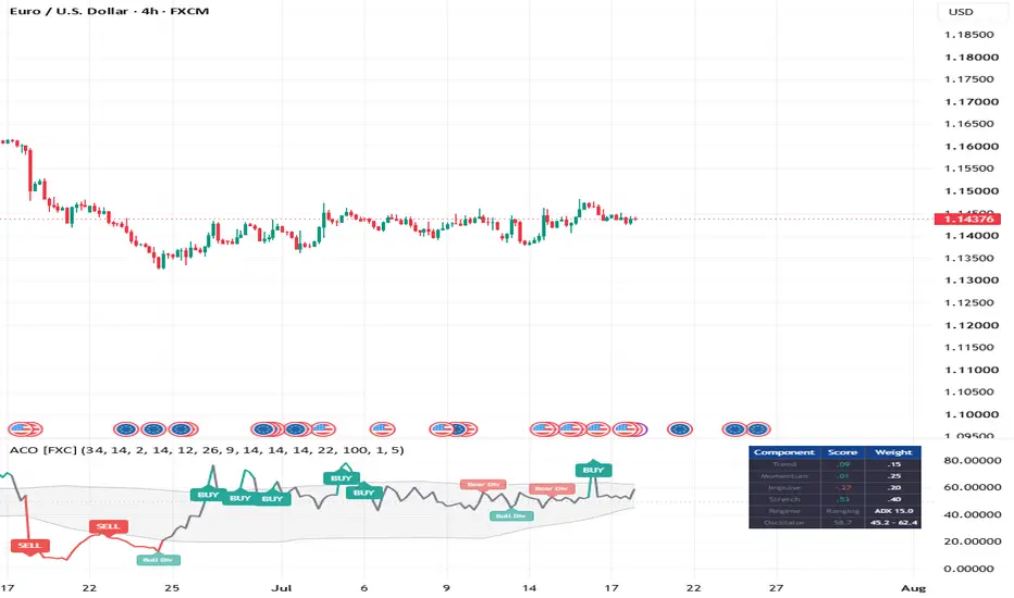
Adaptive Confluence Oscillator [ForexCracked]🔵 OVERVIEW
The Adaptive Confluence Oscillator scores four independent read-outs of the market on a continuous scale, weights them according to the current market regime, and plots the result as a single 0 to 100 line. Instead of asking "do my indicators agree, yes or no," it asks "how strongly does each one agree, and which of them should I be listening to right now."
It has no fixed overbought or oversold levels. The bands are calculated from the oscillator's own recent behaviour, so they widen when the market gets volatile and tighten when it goes quiet.
Signals confirm on candle close and do not repaint.
🔵 WHY THIS IS BUILT THE WAY IT IS
Most multi-indicator tools take a vote. RSI is oversold or it is not. That throws away most of the information: an RSI of 29 and an RSI of 12 are not the same signal, but a vote counts them identically. It also treats every indicator as equally relevant at all times, which is plainly false. Stochastic exhaustion means one thing in a strong trend and the opposite thing in a range.
This oscillator fixes both problems. Every component returns a continuous score, and the market regime decides how much each score is worth.
🔵 THE FOUR COMPONENTS (each scored from -1 to +1)
• Trend: how far price sits from its baseline EMA, measured in ATR units rather than in price. Distance matters, not just which side of the line you are on. Because it is measured in ATR, it reads the same on gold as it does on EURUSD.
• Momentum: RSI recentred around 50, so it contributes proportionally instead of flipping at a threshold.
• Impulse: the MACD histogram converted to a z-score against its own rolling deviation. This makes MACD comparable across symbols and timeframes without ever re-tuning it, which raw MACD values are not.
• Stretch: the Stochastic, recentred. This is the component that changes behaviour with regime (see below).
🔵 THE REGIME SWITCH (the part that makes it adaptive)
ADX decides whether the market is trending or ranging, and that changes two things.
First, the weights re-balance:
• Trending: Trend 0.35, Momentum 0.25, Impulse 0.30, Stretch 0.10
• Ranging: Trend 0.15, Momentum 0.25, Impulse 0.20, Stretch 0.40
Second, and more importantly, the Stretch component flips sign. In a trend, a stretched Stochastic confirms the move and pushes the score further in that direction. In a range, the same reading argues for a fade and pushes the score the other way. This is the behaviour a discretionary trader applies without thinking about it, and it is what a fixed vote cannot express.
🔵 ADAPTIVE BANDS
There are no 70/30 lines here. The upper and lower bands are the rolling mean of the oscillator plus and minus a multiple of its own standard deviation. A reading of 68 can be an extreme in a quiet market and completely unremarkable in a volatile one, and the bands reflect that.
• BUY: the score crosses above the upper adaptive band
• SELL: the score crosses below the lower adaptive band
🔵 DIVERGENCE
The script finds pivots on the score itself and compares them against price at those same bars. When price makes a higher high but the score makes a lower high, that is marked as a bearish divergence, and the mirror case as bullish. Divergences are labelled and have their own alerts. Because a divergence is anchored to a confirmed pivot, it prints a few bars after that pivot forms and never moves once printed.
🔵 THE DASHBOARD
The panel shows each component's live score, its current weight, the detected regime with the ADX value, and the oscillator against its adaptive bands. You can see exactly which component is driving the reading and why, rather than trusting a black box.
🔵 SETTINGS
• Baseline EMA 34, ATR 14, Trend Span 2.0 x ATR
• RSI 14, MACD 12/26/9, Stochastic 14
• ADX 14, trending above 22
• Band lookback 100, band width 1.0 x standard deviation
🔵 HOW TO USE
• Take signals where the dashboard regime agrees with the direction. A BUY in a trending regime is a continuation. A BUY in a ranging regime is a fade off the bottom of the range.
• Treat a divergence as a warning to tighten or take partials, not as a standalone entry.
• Raise the band width above 1.0 for fewer and stronger signals, lower it for more.
• Widen Trend Span on noisy symbols so ordinary volatility does not read as trend.
⚠️ DISCLAIMER
This is an analysis tool, not a prediction. A confluence score is a measure of agreement, and indicators can agree and still be wrong. Results depend on market conditions, settings, and your own execution and risk management. Shared for educational and research purposes. Not financial advice. Penunjuk

Currency Strength Meter [ForexCracked]🔵 OVERVIEW
A currency strength meter that ranks the eight major currencies against each other in real time, and then tells you the one thing you actually opened it for: which pair to trade right now.
It reads all 28 major crosses, so every currency is measured across all seven of its pairs, not just against the dollar.
🔵 WHAT MAKES THIS ONE DIFFERENT
Almost every strength meter measures each pair's percent change and averages it. That has a flaw nobody talks about: a 40 pip move in a quiet pair and a 40 pip move in a violent one are treated as the same event, when they are not remotely the same event.
This meter measures every move in ATR units instead. A currency only scores highly if it has moved far relative to how far that pair normally moves. Quiet pairs stop being drowned out by naturally volatile ones, and the ranking stops flattering whichever currency happens to be paired with the wildest counterpart that week.
🔵 WHAT IT SHOWS
• A live ranking of USD, EUR, GBP, JPY, CHF, AUD, NZD and CAD, strongest to weakest
• Each currency's strength in ATR units, so the numbers mean something rather than being an index
• Whether each currency is strengthening or weakening against its own recent reading, not just where it sits
• The Best Pair line: long the strongest currency, short the weakest
• The Spread: the distance between strongest and weakest
🔵 THE SPREAD (read this one first)
The spread is the gap between the strongest and the weakest currency. It answers a question most traders skip: is anything actually happening?
A wide spread means currencies are genuinely diverging and a strength-based trade has something to work with. A narrow spread means everything is drifting together, the ranking is mostly noise, and the best trade is usually no trade. Check the spread before you trust the ranking.
🔵 HOW TO USE
• Read the spread. If it is small, the ranking is not telling you much, so wait.
• Take the Best Pair as a starting point, not an entry. It tells you where the divergence is, not when to get in.
• Prefer a currency that is both highly ranked and still strengthening over one that is highly ranked and already fading, since the second one has usually made its move.
• Confirm the pair on the chart with your own entry method. A strength meter frames the trade. It does not time it.
• Lengthen the Lookback for swing trading and shorten it for intraday.
🔵 SETTINGS
• Strength Lookback: how many bars back the move is measured over (default 24)
• ATR Length: the volatility yardstick every move is divided by (default 14)
• Symbol Prefix: leave blank on most charts. If the pairs do not load, set it to your data provider, for example OANDA: or FX:
• Show Ranking Table: toggles the strongest-to-weakest table in the top right (default on)
• Plot Strength Lines: toggles the eight strength curves in the pane (default on)
⚠️ DISCLAIMER
Relative strength tells you which currencies are moving and which are not. It does not tell you when to enter, and strong currencies reverse. Results depend on market conditions, settings, and your own execution and risk management. Shared for educational and research purposes. Not financial advice. Penunjuk

LIQS and FIBS Scalp SystemOverview
The "LIQS and FIBS Scalp System" is an advanced Smart Money Concepts (SMC) and Price Action indicator designed for traders seeking high-probability scalping and day trading setups. Instead of relying on lagging indicators, this system dynamically maps critical liquidity sweeps, structure shifts, and optimal trade entry zones based entirely on pure price action.
Key Features
HTF Market Structure Bias (No EMA Lag):
The core of the system determines the main trend bias by tracking the most recent Break of Structure (BOS) or Change of Character (CHoCH) on your selected Higher Timeframe (HTF). If the HTF just broke a swing high, your bias is firmly Bullish. If it broke a swing low, your bias is Bearish. This ensures you are always trading in alignment with true institutional market structure, not a delayed moving average.
HTF Sweeps & Reversals:
Automatically identifies liquidity sweeps at Higher Timeframe highs and lows. It monitors price action around these key historical pivot levels and highlights potential reversal pinbars right at the sweep zones.
LTF BOS & CHoCH Logic:
Detects micro Break of Structure (BOS) and Change of Character (CHoCH) patterns to spot short-term momentum shifts in real-time, helping you catch the very beginning of a new leg.
Deep Fibonacci Setups & Runner Targets:
Following a valid CHoCH, the indicator automatically draws Fibonacci retracement zones (0.318 - 0.618) representing optimal entry points. It dynamically projects logical Stop Loss zones and extends up to Target 6 for runners to capture massive long-term trends:
Target 1 & Target 2 for short-term scalps.
Target 3 & Target 4 (3.618 - 4.236 extensions) for day trades.
Target 5 & Target 6 (5.618 - 6.854 extensions) to hold your runners and ride extreme trend continuation.
A-Plus Setup Filter & VWAP:
To protect you from fake breakouts and low-probability trades, the system validates every entry.
Pro-trend setups that align with both the HTF Structure Bias and the VWAP are highlighted with colored entry and target boxes.
Counter-trend or low-probability setups are visually muted (grayed out) so you can easily ignore them.
Built-in alerts notify you only when a micro CHoCH perfectly aligns with the HTF trend direction!
How to Use
Wait for price to sweep an HTF liquidity level, watch for a valid CHoCH in the opposite direction, and set your limit orders inside the highlighted 0.318 - 0.618 Fibonacci reaction box. Trust the colored boxes (A-Plus setups) and ignore the gray ones. Take partial profits at T1 and T2, then leave runners for the deeper T3 to T6 targets!
Disclaimer
This script is provided for educational and informational purposes only and does not constitute financial advice. Trading in financial markets involves a high degree of risk and may not be suitable for all investors. Past performance is not indicative of future results. Always conduct your own research, use strict risk management, and perform thorough backtesting before trading with real funds. Penunjuk

KST Cross SwitchThe Know Sure Thing (KST) oscillator is a powerful momentum indicator, but its constantly fluctuating lines can sometimes make it difficult to determine the definitive market state at a glance.
This script transforms the traditional KST indicator into a clean, 3-stage State Machine tracker. Instead of staring at curved lines, this indicator locks the current market condition into three absolute levels: 100 for Bullish, 0 for Bearish, and 50 for Neutral.
When a strong bullish crossover occurs, the indicator locks to 100 with a lime green background. When a bearish crossunder happens, it locks to 0 with a maroon red background.
The core feature of this script is the Neutral Zone Threshold. In choppy or consolidating markets, KST lines often cross back and forth repeatedly, causing false signals. To solve this, the script checks the absolute distance between the KST line and the Signal line. If they are too close and moving sideways within your defined threshold, the indicator automatically resets to 50 with a neutral yellow/grey background. This helps you avoid overtrading during low-volatility squeeze periods.
You can fully customize the four different Rate of Change (ROC) lengths and their moving averages, as well as the signal line length. The Neutral Zone Threshold can also be finely tuned depending on the asset and timeframe you are trading. Penunjuk

Market Regime LensMarket Regime Lens
Market Regime Lens reads the market on four independent axes and gives you one honest sentence about the current tape. It is a context descriptor, not a signal — it never tells you which way to trade. It tells you whether the tape is readable, how it moves, how long things take, and how risk is arriving.
WHY FOUR AXES, ONE COMPONENT EACH
Most multi-indicator tools stack measures that secretly say the same thing — three complexity metrics agreeing is not confirmation, it is autocorrelation. This tool deliberately uses one component per independent axis, so each number tells you something the others cannot.
STRUCTURE — Complexity-Entropy plane. Bandt-Pompe permutation entropy paired with Martin-Plastino-Rosso statistical complexity, classifying the tape as structured, mixed, or noise. Thresholds are adaptive by default: the reading is ranked against the instrument's own recent range, so it self-calibrates to any market and timeframe instead of relying on absolute cutoffs that break when you change the window.
PERSISTENCE — Anomalous-diffusion exponent. Fitted from mean-squared-displacement scaling across lags: alpha above 1 means super-diffusive (trending), alpha near 1 is a random walk, alpha below 1 is sub-diffusive (mean-reverting). This describes the character of the motion, not its direction.
TIME — First passage and null odds. Expected bars to reach the target versus the stop under a driftless diffusion, plus the null barrier probability P = b/(a+b) — what a coin flip gives you at your chosen reward-to-risk. At 1.5R that is 40%. That is the breakeven any setup must clear, stated plainly.
TAIL — Extremal index. Measures whether extreme moves cluster (theta below 1) or arrive independently. Clustered tails mean gap risk shows up in bursts, which matters for stop placement.
ON THE CHART
The main line is the diffusion exponent, colored by state and filled against the alpha = 1 random-walk baseline, so deviation from randomness is visible at a glance. Faint guides mark the trending and reverting thresholds. Background tint shows the structure class. The panel adapts to your chart theme and colors each row by meaning — including green or amber on the null-odds row depending on whether your chosen R gives better-than-even odds.
PAIRS WITH RISK & LEVELS COCKPIT
Optionally wire the target and stop sources to the Cockpit's exported levels, and the timing and null-probability rows use your real trade levels instead of internal ATR references.
WORKS ON ANY MARKET AND TIMEFRAME
All lookbacks are in bars with no session, expiry, or clock anchors. Non-repainting: everything uses the current bar's data and confirms at close.
LIMITATIONS
Not a signal and not investment advice — no axis forecasts direction. Permutation entropy and complexity require a window much larger than d factorial; at dimension 4 use at least 300 bars, since short windows are undersampling-biased and pin to a constant. Adaptive thresholds classify relative to the instrument's own recent range, so "structured" means structured for this market lately, not in any absolute sense. First-passage times and the null probability assume driftless diffusion with constant volatility — a deliberate null baseline, not a forecast. The extremal index needs enough exceedances; too short a window pins it at 1.00.
CREDITS
Original implementation. Bandt and Pompe permutation entropy; Martin-Plastino-Rosso and Lopez-Ruiz statistical complexity via Jensen-Shannon divergence; anomalous-diffusion MSD scaling; Ferro-Segers runs estimator for the extremal index; first-passage-time and gambler's-ruin barrier theory. Penunjuk

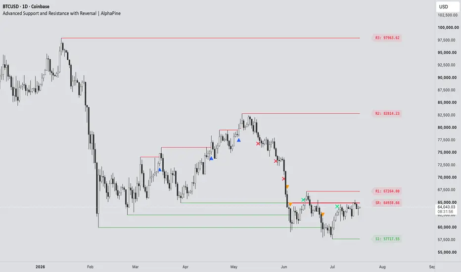
Advanced Support and Resistance with Reversal [AlphaPine]Advanced Support and Resistance with Reversal | AlphaPine
I built this indicator for a simple reason: a breakout line on its own does not tell me enough. I also want to know whether price comes back, holds the level from the other side, and later loses it again.
The script starts with confirmed swing highs and lows. Those become resistance and support. It then follows each level through three possible events: breakout, retest, and failure. Nothing here predicts the next move. It is a way to keep market structure organised without redrawing the same levels by hand.
The image below shows the full level lifecycle in one view, including the symbols that appear at each stage:
How a level is created
A resistance level comes from a confirmed pivot high. A support level comes from a confirmed pivot low. If zones are enabled, the zone uses the wick range of the pivot candle rather than an arbitrary fixed width.
Pivot confirmation takes time. With Pivot Length set to 10, for example, the script needs ten bars on the right side of the pivot before the level exists. This delay is intentional.
Pivot Length controls how selective the swing detection is. A larger value usually gives fewer levels and confirms them later.
Lookback Period sets how long a level remains in the script's working history.
Maximum Levels per Type limits stored resistance and support records so the chart does not keep growing indefinitely.
Wick Dominance Filter keeps only pivot candles whose rejection wick is larger than the body and opposite wick.
Merge Nearby Active Levels removes clutter by skipping a new pivot when an active level of the same type is already nearby. Broken levels do not block a fresh one.
The merge distance uses ATR-14, so it adjusts to the instrument instead of relying on one fixed price interval.
Breakouts
The default breakout mode is Close . Resistance must close above its boundary, while support must close below it. This avoids counting every small wick through a level.
Wick mode reacts earlier. It triggers when the high or low crosses the boundary during the live candle. The recorded extreme cannot retract, but price can still close back inside the level, so Wick mode will naturally include more intrabar fakeouts.
Breakout Buffer adds an optional ATR-based distance beyond the level. Leave it at zero for the exact boundary, or raise it if very small breaks are not useful for your chart.
By default:
A resistance breakout prints an upward blue triangle below the candle.
A support breakout prints a downward orange triangle above the candle.
The marker colours are fully adjustable.
Retests and role reversals
After resistance breaks, the script waits to see whether price can retest it as support. After support breaks, it watches for the same level to act as resistance.
RS means old resistance has been confirmed as new support.
SR means old support has been confirmed as new resistance.
Reversal Confirmation controls what counts as a retest:
Close (default) requires the retest candle to touch the original zone and close back beyond the whole zone on the new-role side.
Touch accepts any later overlap with the zone. It is more sensitive and less strict.
Once confirmed, the new role stays fixed. An RS level remains tracked as support; it does not turn red merely because the latest candle happens to sit below it.
When a flip fails
A flipped level is removed when a confirmed candle closes through the far side of its zone. In other words, RS support fails below the zone and SR resistance fails above it.
If Show Reversal Failures is enabled, an ✕ marks the failure candle. The flipped line stops there, but the cross stays on the chart as a record of where the level died. That is why a failure cross can appear without a continuing line.
Breakout triangles and failure crosses use the original pivot as their Lookback anchor. This keeps their expiry on the same structural clock as the level they came from instead of giving every marker a new lifetime from its event candle.
Reading the chart
R1 is the nearest active resistance above price, followed by R2, R3, and so on.
S1 is the nearest active support below price, followed by S2, S3, and so on.
RS marks a confirmed resistance-to-support flip.
SR marks a confirmed support-to-resistance flip.
Triangles mark breakouts. Crosses mark failed flips.
A breakout marker is an event, not an entry instruction. I find the retest more useful than the first break, but how it is traded still depends on trend, execution, and risk rules outside this indicator.
Lines, zones, and historical placement
Historical Level Start decides where an original level begins:
Confirmation (default) starts it on the bar where the pivot became known in real time.
Pivot extends it back to the swing candle. This is useful for visual context, but the level was not available on that earlier candle.
Display as Zones replaces the single-price lines with the original pivot-wick range. If that level flips, the same price range is preserved; the zone is not moved to the opposite side of the price.
Colours
The Colors group separates colours by purpose, so changing a label does not force the matching line to use the same colour.
Resistance and support lines/zones.
RS and SR lines/zones.
Resistance, support, RS, and SR price labels.
Resistance and support breakout triangles.
Support and resistance failure crosses.
Zone fills and borders use transparent versions of the selected line colour so candles remain visible underneath.
Alerts
Seven alert conditions are included:
Resistance Breakout
Support Breakout
Resistance to Support Flip
Support to Resistance Flip
Flipped Support Failed
Flipped Resistance Failed
Any S/R Event
The combined alert is useful when one alert should cover every structural event. Separate conditions are available when different actions are needed for breaks, flips, or failures.
A sensible starting setup
The defaults use Close confirmation for both breakouts and retests. Start there if you prefer signals that wait for the candle to finish. Wick breakout and Touch retest are available when earlier, more sensitive reactions are more important.
If the chart feels crowded, try increasing Pivot Length, increasing Merge Distance, enabling the Wick Dominance Filter, or reducing Maximum Levels per Type. Settings should be adjusted for the instrument and timeframe rather than treated as universal values.
Important limitations
Confirmed pivots always arrive late by Pivot Length bars. That is how pivot confirmation works, not a hidden predictive signal.
Pivot historical placement back-draws a confirmed level for context. Use Confirmation placement when real-time availability matters.
Wick mode can mark a breakout that later closes back inside the level.
The current-bar drawings rebuild while the candle updates.
The script uses chart data only. It does not request higher-timeframe data or use lookahead.
It does not place orders, calculate position size, or guarantee that a level will hold.
Use it as a structure tool, then apply your own trade plan and risk management.
Penunjuk

Penunjuk

Penunjuk

Fractal Memory Strategy [Jayadev Rana]Fractal Memory Strategy trades the same engine as the Fractal Memory Projection indicator: it looks for the historical episode most similar to current price action, and only takes trend flips that agree with how that episode played out. Exits scale out at three volatility-adaptive targets.
HOW IT DECIDES
An ATR trailing stop tracks the trend. When it flips, the last 30 closes are converted to normalized log returns and compared against past windows by mean squared distance. The bars that followed the best analog give a net direction; the flip is only traded when the analog direction agrees (the filter can be disabled). Orders are processed on bar close, so no lookahead is involved. For visual context the strategy also draws the 50-candle ghost projection beyond the last bar - it is display-only and never affects order logic.
ENTRIES AND EXITS
On a confirmed bullish flip with agreement the strategy closes any short and enters long; the mirror applies to shorts. One unit of risk R equals ATR times (1.2 plus the ATR percentile rank over 200 bars), so targets and stops widen in volatile regimes and tighten in quiet ones. Position exits: one third at 1R, one third at 2R, the remainder at 3R, with a stop at 1.5R (all adjustable). Direction can be restricted to long-only or short-only.
PROPERTIES USED IN THE PUBLISHED BACKTEST
10,000 initial capital, 10 percent of equity per trade, 0.01 percent commission per order, 2 ticks slippage, no pyramiding, orders on close. These are deliberately conservative; adjust them to match your own broker before drawing any conclusion.
PANEL
Match similarity, volatility regime, forecast direction, closed trade count and win rate.
NOTES
The analog projection is a statistical reference, not a prediction, and past behaviour does not guarantee anything about the future. Results vary by symbol and timeframe; test on your own market with realistic costs before considering any live use. This is an educational tool, not financial advice. Strategi

Penunjuk

Astro Bias Dashboard 🧭 ASTRO BIAS DASHBOARD
A one-glance morning dashboard that combines five classical astronomical cycles into a single daily bias score — and then checks that bias against live price action before suggesting anything.
━━━ HOW IT WORKS ━━━
The script computes real astronomical values using mean-longitude formulas (J2000 epoch):
- Moon phase — waxing or waning, with illumination percent
- Sun-Moon angle — harmony (trine/sextile), tension (square/opposition), or neutral
- Mercury retrograde — approximated from the 115.88-day synodic cycle
- Eclipse season — Sun's proximity to the lunar nodes
- Planetary hour (hora) — Chaldean sequence from a user-set sunrise time
The first four factors are captured once at the start of each session and stay FIXED for the whole day (score out of 4). This is deliberate: a daily bias that flickers intrabar is useless. Only the hora row updates hourly, because it is a timing tool by design — and it is intentionally excluded from the score.
The dashboard then adds a live reality check: price versus EMA 50. A final Verdict row compares the fixed astro bias with the live trend:
- ALIGNED — astro bias and price agree
- CONFLICT — price is moving against the bias. Price always wins; the dashboard tells you to stand aside.
━━━ HOW TO USE ━━━
1. Check the dashboard once at market open — the bias is fixed for the day.
2. Trade only in the Verdict row's direction. On CONFLICT, reduce size or stay flat.
3. Use the hora row for entry timing: benefic horas (Moon, Mercury, Venus, Jupiter) are preferred entry windows.
4. Combine with your own levels and setups — this is a context filter, not an entry signal.
Alerts included: daily bias bullish/caution, hora change, astro-price conflict, astro-price alignment.
━━━ SETTINGS ━━━
Sunrise hour, dashboard position (8 placements), text size, EMA 50 plot toggle and color, trade-plan rows toggle.
━━━ NOTES & ORIGINALITY ━━━
All astronomical values are computed from scratch inside Pine using mean-longitude approximations — no external data, no libraries, no reused code. Accuracy is well within the tolerance needed for cycle-timing work, though exact panchang timings may differ by a few hours.
This tool treats astronomical cycles strictly as a timing reference. It does not predict market direction, and nothing here is financial advice. Always confirm with price action and manage risk. Penunjuk

Fractal Memory Projection [Jayadev Rana]Fractal Memory Projection searches price history for the moment that most resembles the present, then shows what happened next - drawn on your chart as 50 lighter ghost candles ahead of the current bar - together with trend-flip BUY and SELL signals and volatility-adaptive targets.
HOW THE FORECAST WORKS
The last 30 closes are converted to normalized log returns (the pattern window). The script scans up to 750 past bars and scores every historical window of the same length by mean squared distance, so the comparison is about the shape of movement, not price level. The bars that followed the best match are replayed forward from the current close, rescaled by the ratio of current ATR to ATR at the match, and drawn as 50 semi-transparent ghost candles beyond the last bar. The panel reports the match similarity, how many bars ago it occurred, and the net forecast direction.
The projection is a statistical analog - a look at how the most similar past episode unfolded - not a prediction or a guarantee. It is display-only and never affects historical values, so nothing repaints.
BUY AND SELL SIGNALS
An ATR trailing stop tracks the trend. When it flips direction, a BUY or SELL label prints - by default only when the ghost-candle forecast agrees with the flip direction (toggle available). Alerts are included for both signals.
VOLATILITY-ADAPTIVE TARGETS
Target spacing is not fixed. A unit of risk R equals ATR multiplied by (0.8 + ATR percentile rank over 200 bars), so quiet markets produce tighter targets and volatile markets produce wider ones. Each signal sets TP1, TP2 and TP3 at 1R, 2R and 3R and a stop loss at 1.2R (adjustable). Only the most recent trade's levels are kept on the chart to stay clean.
PANEL
Match quality percent, bars since the match, volatility regime (Low, Normal, High), forecast direction, and current trend side.
SETTINGS
Pattern window, scan depth, forecast length, ghost candle colors, ATR length, trail multiplier, forecast-agreement filter, stop multiplier, and panel position are all configurable.
NOTES
Works on any symbol and timeframe with enough history (at least scan depth plus forecast length bars). This is an analysis tool, not financial advice. Test on your own data and manage risk before trading. Penunjuk

Previous Day Pivot Path - Intraday Support ResistancePrevious Day Pivot Path - Intraday Support Resistance
Overview
Previous Day Pivot Path is an intraday reference-level study built from the confirmed OHLC values of the previous selected trading day. It plots the current day's central pivot and support/resistance levels, then records the first chart bar in which each level is reached and assigns a compact arrival rank.
The script is intended for traders and researchers who want to identify the current day's mathematically derived reference levels without converting them into buy/sell instructions. It does not predict whether a level will hold or break, and it does not present win-rate, profitability, or performance claims.
What makes this implementation different
1. First-arrival path instead of static lines only
Each tracked level begins the day as pending. When the selected price source first reaches it, the script records an arrival rank and can place a numbered badge at the corresponding time.
If more than one previously unreached level is reached in the same chart bar, those levels receive the same rank. OHLC bars do not reveal the true tick-by-tick order inside that bar, so the script deliberately avoids inventing an intrabar sequence that the available data cannot prove.
2. Reached-level fading and next-level focus
Reached levels can fade automatically. The nearest unreached level can receive stronger line emphasis and an optional translucent focus halo. After all displayed levels have been reached, the focus can fall back to the nearest level or remain inactive.
This visual hierarchy separates completed parts of the day's path from levels that remain unvisited, while preserving the exact horizontal prices.
3. Confirmed previous-day data
All daily formula inputs are requested from the last completed daily bar. Open time, close time, open, high, low, and close are all offset by one daily bar before they are used. The current developing daily high, low, or close is never used in the pivot formulas.
The script also checks that the completed daily session is chronologically aligned with the selected intraday source day before it initializes new levels or arrival events.
4. Source-session freshness protection
Three OHLC source modes are available:
- Automatic: uses chart-context OHLC on standard candles and standard-symbol OHLC on non-standard charts.
- Chart context: preserves the chart's ticker modifiers, session, adjustment, and chart-type context.
- Standard symbol: removes non-standard ticker modifiers and uses standard market OHLC.
When the selected standard source has no bar aligned with the current chart timestamp, the script does not reuse an old forward-filled OHLC value. Arrival events pause, and existing drawings remain fixed at the last valid source bar until aligned data becomes available again.
5. Session-aware day handling
The script uses a trading-day key suitable for markets whose sessions cross midnight. This prevents a simple calendar-date change from being treated as the session boundary on many overnight Forex and futures markets.
If the first loaded dataset begins after the selected source day's opening bar, the earlier first-arrival sequence is unknowable. For that one partial day, arrival tracking and open-dependent features are conservatively bypassed rather than reconstructed from incomplete history.
6. Time-anchored persistent drawings
Persistent lines, boxes, right-edge labels, and arrival badges use UNIX-time coordinates. This avoids relying on very old bar_index coordinates on dense second charts and keeps historical drawings independent of the number of bars elapsed since their creation.
7. Multiple formula families plus an editable research mode
The script includes:
- Traditional
- Classic
- Fibonacci
- Camarilla
- Custom research
The custom mode lets users select the pivot center and edit three previous-range multipliers. The multipliers are sorted from smallest to largest before assignment to R1/S1, R2/S2, and R3/S3.
8. Price-grid and duplicate-level controls
Calculated levels can remain raw, round to the nearest minimum tick, or round outward so resistance is rounded upward and support downward. When rounding produces the same price for multiple logical levels, the script can merge them into one line and one badge with a combined code such as P/R1.
9. Researchable arrival definitions
Users can define a first arrival with:
- Wick range
- Candle body range
- Confirmed close crossing
Optional tolerance can be exact, a number of ticks, or a percentage of the previous-day range. Gap crossings can be counted or ignored. Arrival ranking can follow only displayed levels, the selected depth, or all levels produced by the formula.
10. Deliberate chart hygiene
The default presentation prioritizes P, R1/S1, and then outer levels through width, line style, transparency, and optional reached-level fading. Right-edge labels support automatic text contrast and horizontal lane staggering when prices are close.
Optional context references include:
- Central Pivot Range (CPR)
- Previous-day high and low (PDH/PDL)
- Previous-day close (PDC)
- Current selected-source day open
- Opening bracket between the nearest displayed levels above and below the day open
- Compact session brief
All context elements can be disabled independently.
Formula reference
Let O, H, L, and C be the confirmed previous selected daily bar, and let Range = H - L.
Traditional
P = (H + L + C) / 3
R1 = 2P - L
S1 = 2P - H
R2 = P + Range
S2 = P - Range
R3 = H + 2(P - L)
S3 = L - 2(H - P)
Classic
P = (H + L + C) / 3
R1 = 2P - L
S1 = 2P - H
R2 = P + Range
S2 = P - Range
R3 = P + 2Range
S3 = P - 2Range
Fibonacci
P = (H + L + C) / 3
R1/S1 = P +/- 0.382 x Range
R2/S2 = P +/- 0.618 x Range
R3/S3 = P +/- 1.000 x Range
Camarilla
P = (H + L + C) / 3
R1/S1 = C +/- 1.1 x Range / 12
R2/S2 = C +/- 1.1 x Range / 6
R3/S3 = C +/- 1.1 x Range / 4
Custom research
The center can be HLC3, HLCC4, OHLC4, midpoint, or previous close. Three editable multipliers are applied symmetrically to the previous-day range after being sorted from smallest to largest.
Arrival timing
Confirmed bar
This is the reproducible default. An arrival is recorded only after the chart bar is confirmed.
Live bar
Live timing is available for wick arrivals. Intrabar-persistent state latches a wick touch across realtime updates of the open bar. Because all levels first reached inside the same chart bar share one rank, the script does not claim a tick-level order that bar data cannot establish.
Body and close-cross modes automatically use confirmed bars to avoid transient open-bar signals.
Non-standard charts
Heikin-Ashi, Renko, Kagi, Line Break, Point & Figure, and Range bars can be synthetic or approximate. Automatic mode uses standard-symbol OHLC for the level and event source on non-standard charts, but arrival events are paused by default. Users can explicitly allow them for research after accepting the chart-type limitation.
The script is designed for time-based intraday charts. Tick charts and daily-or-higher charts are intentionally rejected with a visible notice rather than processed with ambiguous session assumptions.
Language and user interface
English is the default dynamic chart language. Selecting 日本語 changes dynamic labels, tooltips, safety notices, session-brief text, and language-aware alert() messages. Input names remain short bilingual labels so both English and Japanese users can configure the study.
Key Japanese UI translations:
未到達 = Pending
到達 = Reached
確定足 = Confirmed bar
ライブ・ヒゲ保持 = Live wick latch
前日値幅 = Prior range
次の未到達 = Next unreached
準備完了 = Ready
ソース足なし = Source bar unavailable
日次データ整合待ち = Aligning daily data
合成足イベント停止 = Synthetic events paused
International level codes such as P, R1, S1, PDH, and PDL remain unchanged in both languages.
Alerts
Neutral alert conditions are available for:
- Any pivot's first arrival
- P, R1, S1, R2, S2, R3, and S3 first arrivals
- Confirmed close crossing above or below P
An optional language-aware alert() call can include the reached level codes, shared rank, symbol, timeframe, and selected calculation method. Alerts describe observable level events only; they are not trade recommendations.
Suggested workflow
1. Use a standard candlestick intraday chart for the most direct interpretation.
2. Keep Automatic, Traditional, Nearest tick, Confirmed bar, and Wick for the conservative defaults.
3. Select the desired level depth and optional previous-day references.
4. Enable live timing only when intrabar wick monitoring is required.
5. Create alerts from the neutral first-arrival or confirmed P-cross conditions as needed.
6. Use Market Replay and several symbols/session types before relying on customized settings.
Important limitations
- A previous-day pivot is a mathematical reference, not a prediction that price will reverse or continue.
- Data vendors can revise historical bars, and exchange session definitions can differ across instruments.
- Standard-symbol mode can intentionally have no aligned bar outside its selected session. In that case, events pause instead of carrying stale OHLC forward.
- The first loaded partial source day cannot provide a complete earlier arrival sequence.
- A chart bar cannot prove the order of multiple level touches inside that bar; those first touches share one rank.
- Live wick tracking reacts to realtime updates. Reloaded historical bars contain finalized OHLC, not the original tick stream.
- Synthetic chart bars may not represent executable market prices. Arrival tracking on such charts is disabled by default.
- The study does not provide entries, exits, position sizing, stop placement, or performance statistics.
日本語説明
概要
Previous Day Pivot Pathは、選択したデータソースの確定済み前日OHLCから、当日のP・R・Sを自動計算して描画する日中足向けインジケーターです。
単に水平線を表示するだけではなく、各水準へ当日初めて到達したチャート足を記録し、到達順を番号で表示できます。売買推奨、勝率、収益性、将来予測を提示するものではなく、当日の数理的な節目と到達経路を研究するためのツールです。
主な特徴
初回到達経路
各水準は当日開始時に未到達状態となり、選択した価格ソースが初めて到達すると順位を記録します。同じチャート足の中で複数水準へ初回到達した場合、その足の内部順序はOHLCだけでは証明できないため、すべて同順位とします。
確定前日OHLC
日足リクエストでは、時刻・始値・高値・安値・終値のすべてを1本前へオフセットして使用します。形成中の日足高安や終値はピボット計算に使いません。
ソース欠損時の安全処理
標準銘柄ソースに現在時刻と一致する足がない場合、過去のOHLCを現在足へ持ち越して判定しません。到達イベントを停止し、既存描画を最終有効ソース足で固定します。
夜間市場を考慮した日付管理
Forexや先物など、セッションが日付をまたぐ市場に対応するため、単純なカレンダー日ではなく取引日キーを使用します。
秒足で古くなった描画への耐性
長期間保持する線、ボックス、到達バッジ、右端ラベルはUNIX時刻座標で管理します。高密度な秒足でも、古いbar_index座標による制限へ近づきにくい設計です。
5種類の計算方式
Traditional、Classic、Fibonacci、Camarilla、Custom researchを選択できます。Custom researchでは中心値と3つの前日値幅倍率を変更できます。
到達判定の研究性
ヒゲ、実体、確定終値通過から選択でき、許容幅は厳密一致、ティック数、前日値幅比率から設定できます。ギャップ通過を到達扱いにするかも切替可能です。
視認性
到達済み水準のフェード、最寄り未到達水準の強調、フォーカスハロー、自動文字コントラスト、近接ラベルの横方向段組みを実装しています。
CPR、前日高安、前日終値、当日始値、始値ブラケット、セッション概要は個別に表示・非表示を変更できます。
推奨初期設定
OHLC source Automatic
Pivot method Traditional
Level rounding Nearest tick
Arrival timing Confirmed bar
Arrival basis Wick
Touch tolerance Exact
Arrival universe Displayed levels
Synthetic chart events Off
Auto-stagger labels On
Auto contrast On
Focus halo On
ライブ中のヒゲ到達を監視するときだけ、Arrival timingをLive barへ変更してください。実体・終値通過は安全のため確定足判定になります。
言語切替
Language / 言語でEnglishまたは日本語を選択できます。日本語へ切り替えると、チャート上の動的ラベル、ツールチップ、安全性メッセージ、セッション概要、言語連動alert()が日本語になります。
P、R1、S1、PDH、PDLなどの国際共通コードは両言語で同じ表記です。
重要な注意事項
- ピボットは数理的な参照水準であり、反転やブレイクを保証しません。
- 読み込み初日が選択ソースの日中途中から始まる場合、それ以前の到達順は復元できないため、その日だけ経路追跡を停止します。
- 1本の足内で複数水準へ触れた正確な順序はOHLCから判定できないため、同順位になります。
- 標準銘柄ソースのセッション外では、古い価格を流用せず到達判定を停止します。
- Heikin-Ashi、Renko、Kagiなどの合成足では、到達イベントを既定で停止しています。
- Live barのヒゲ到達はリアルタイム更新に反応します。再読み込み後の履歴足には最終OHLCが残り、当時のティック列そのものは残りません。
- 本インジケーターはエントリー、決済、ストップ、ロット、成績表を提供しません。 Penunjuk

Penunjuk