Sweep & Reverse | Liquidity Sweep Reversal StrategyThis strategy trades the liquidity-sweep reversal pattern: price wicks through a prior swing high or low — clearing out the stops resting there — then closes back inside the range, suggesting the move beyond that level was a stop-hunt rather than a genuine breakout.
How it works:
Confirmed swing highs and lows (via pivot detection) are stored as watched levels.
A sweep triggers when a bar wicks past a level but closes back on the other side.
Longs enter on swept lows, shorts on swept highs. The stop sits just beyond the sweeping wick (with an ATR buffer); the target is set from your chosen reward:risk ratio.
Levels expire if left untouched for too long, and new levels too close to an existing one (relative to ATR) are skipped to keep zones from cluttering.
Features:
Optional volume-spike filter — only counts sweeps backed by above-average volume
Optional rejection-wick filter — requires the sweeping wick to be meaningfully larger than the bar's body, filtering out weak/low-conviction sweeps
Optional next-bar confirmation — waits one bar past the sweep and only enters if price actually continues in the reversal direction, reducing whipsaw entries
Optional session window filter (defaults to the London/NY overlap, the highest-liquidity window)
Adjustable stop distance, minimum stop size, and reward:risk ratio
Breakeven stop management once a trade moves partway to target
Long/short can be toggled independently
Every trade's entry/SL/TP lines persist on the chart after the trade closes (auto-expiring after a configurable number of bars), so past trades stay visible for review
Styled performance dashboard: trade count, win rate, net profit, live position state
Warnings:
This is fundamentally a mean-reversion pattern. In strongly trending markets, sweeps frequently continue rather than reverse — no combination of filters here eliminates that risk.
Backtest results are sensitive to pivot length, stop distance, and which filters are enabled. A high win rate on a small number of trades is not statistically meaningful — test across multiple instruments and timeframes, and evaluate profit factor and max drawdown alongside net profit, not net profit alone.
Past performance in a backtest, including this one, does not guarantee future results. This is not financial advice. Strategi

TIS_SwingOVERVIEW
TIS_Swing detects swing highs and swing lows and, unlike most pivot tools, publishes the last confirmed level as a continuous value that other scripts can read.
Standard pivot indicators return a number only on the bar where the pivot is confirmed and nothing on every other bar. That is fine for drawing a dot on the chart, but it makes the level unusable for comparison: on any given bar you cannot ask whether the current price is above the last confirmed swing high, because on that bar the pivot series holds no value. TIS_Swing keeps the level alive between pivots, so that question can be answered on every bar, by you visually or by another script through the source dropdown.
HOW IT WORKS
A bar qualifies as a swing high when its high is greater than or equal to the highs of the bars that follow it, and strictly greater than the highs of the bars that precede it. The number of bars checked on each side is set by Strength Left and Strength Right. Swing lows use the mirrored rule. The comparison on the right side is inclusive, so a candidate that ties with a later bar still qualifies; this produces slightly more pivots than a strictly greater definition, and is intentional.
A pivot can only be confirmed once the bars to its right exist, so a pivot is always confirmed Strength Right bars after it forms. It is never confirmed earlier and it is never revised afterwards, so nothing repaints.
Once a pivot is confirmed, its price becomes the current level for that side and stays there until the next pivot on the same side replaces it. When the series trades through the level, the level is marked as broken. What happens next depends on Remove Broken Pivot Lines:
- ON, the default: the visible level is dropped and no level is shown until a new pivot forms. This is the familiar behaviour of most pivot tools.
- OFF: the visible level stays where it was until a new pivot replaces it, so a broken level remains on screen as a reference.
Either way, a second pair of values keeps the last level regardless of the setting. Those are the plots marked (persistent), and they exist so that comparisons are always possible.
WHAT YOU CAN DO WITH IT
Market structure on price. With the level available on every bar, a higher high is simply the current price trading above the last confirmed swing high, and a lower low is the mirror. You can read it off the chart or compute it in your own script by selecting Last Swing High (persistent) as a source and comparing it against the close.
Divergence on an oscillator. Turn on Use Other Source, point it at a stochastic, an RSI or any other plotted series, and move the script to its own pane. The pivots are then detected on the oscillator instead of on price. A higher swing low on the oscillator while price is still making lower lows is a classic divergence, and here it is visible as a stepped level moving up while price moves down.
Breakout timing. With Remove Broken Pivot Lines on, the moment the level disappears is the moment the last swing was taken out. That transition is also available as an alert.
PARAMETERS
Parameters
- Strength Left: bars to the left of the candidate that must be lower for a high, or higher for a low. Default 5.
- Strength Right: bars to the right required to confirm the pivot. Also the confirmation delay, in bars. Default 2.
- Remove Broken Pivot Lines: drop the visible level once it is broken. Default on. Does not affect the (persistent) plots.
- Use Other Source: detect pivots on another plotted series instead of the bar highs and lows. Both sides then use the selected series.
- Source: the series used when Use Other Source is on.
Visual Settings
- Show Levels: opacity of the stepped level lines.
- Show Persistent Levels: opacity of the thin lines that always keep the last level. Off by default to keep the chart clean.
- Show Pivot Markers: diamonds drawn on the confirmed pivot bars.
- Extend to the Right: horizontal line projected forward from the last pivot on each side.
- Swing High Color, Swing Low Color, Line Width, Extension Line Style.
The Show options change opacity only. The four series are always published, so another script can read them even when they are not visible on the chart.
OUTPUTS
Four values are available in the source dropdown of any other indicator or strategy:
- Last Swing High and Last Swing Low: the level as shown, honouring Remove Broken Pivot Lines.
- Last Swing High (persistent) and Last Swing Low (persistent): the last confirmed level, kept regardless of that setting.
Four alerts are available: New Swing High, New Swing Low, Swing High Broken, Swing Low Broken.
LIMITATIONS
- A pivot is confirmed Strength Right bars after the bar that forms it. On the chart this looks like a delay, and it is one. It is inherent to any pivot definition that requires confirmation from the right, and it is the price of not repainting.
- These levels are reference points, not entry signals. Nothing here tells you which way to trade.
- With Remove Broken Pivot Lines on, the level is dropped on the same bar as the break. A comparison such as close above Last Swing High will therefore never be true, because the value is already gone by the time it would be. Use the (persistent) plots for that comparison, or detect the break as the transition of the visible plot to no value.
- Before the first pivot on a side is confirmed, that side publishes no value.
- Pine fixes the pane at compile time, so with a non-price source the script has to be moved to its own pane manually.
- Larger Strength values give fewer and more significant levels but a longer confirmation delay. There is no setting that avoids that trade-off. Penunjuk

B8 UltimateB8 Ultimate
An Open Price Range indicator that automatically identifies the High/Low of a reference hour and extends this range over a configurable duration.
Features:
Up to 5 configurable symbols.
Zones are displayed only on their corresponding symbol.
Independent reference time for each symbol, in 30-minute increments.
Independent time zone for each symbol, with automatic Daylight Saving Time (DST) handling.
Rectangle duration and color configurable for each symbol.
Optional first-hour marker.
Configurable number of historical zones.
IG DAX and CAC preconfigured, with 3 additional free slots.
Behatsla’ha
Notes:
Uses 1H data for XX:00 reference times and aggregates 2 × 30-minute candles for XX:30.
Rectangle border width and transparency are configurable globally.
Rectangle fill can be enabled or disabled.
The optional first-hour marker automatically adapts to the chart timeframe.
The first-hour marker is displayed only on timeframes below 1H.
For XX:30 reference times on a 1H chart, the rectangle starts at the opening of the 1H candle containing XX:30. Example: 14:30 → displayed from 14:00.
The rectangle end is recalculated from this visual starting point. With a 24-hour duration: 14:00 → 14:00 the following day, preventing overlapping zones.
The High/Low is always calculated from the actual reference hour.
Short legend name: B8.
==========================================================================
Français :
B8 Ultimate
Indicateur de type "open price range" permettant de matérialiser automatiquement le High/Low d’une heure de référence et de prolonger cette zone sur une durée configurable.
Fonctionnalités :
Jusqu’à 5 actifs configurables.
Affichage uniquement sur l’actif correspondant.
Heure de référence configurable par actif, par pas de 30 minutes.
Fuseau horaire indépendant par actif, avec gestion automatique des changements d’heure.
Durée et couleur du rectangle configurables par actif.
Marqueur optionnel de la première heure
Nombre de zones historiques configurable.
DAX et CAC IG préconfigurés, avec 3 emplacements supplémentaires libres.
Behatsla’ha
Notes :
Calcul en 1H pour XX:00 et agrégation de 2 × 30 min pour XX:30.
Épaisseur et transparence du rectangle configurables globalement.
Option pour afficher ou masquer le remplissage du rectangle.
Marqueur optionnel de la première heure, adapté automatiquement à l’unité de temps affichée.
Le marqueur est affiché uniquement sur les timeframes inférieurs à 1H.
Pour XX:30 sur un graphique 1H, le rectangle commence à l’ouverture de la bougie 1H contenant XX:30. Exemple : 14:30 → affichage à partir de 14:00.
La fin est recalculée depuis ce début visuel. Avec une durée de 24 h : 14:00 → 14:00 le lendemain, afin d’éviter le chevauchement des rectangles.
Le High/Low est calculé sur l’heure réelle de référence.
Nom court dans la légende : B8. Penunjuk

Market Maker BoxMarket Maker Box draws the last completed candle’s high and low as a live trading box, then colors that box for the candle that is forming now.
The idea is simple: market structure from the previous candle becomes the range you scalp this candle. Green means the forming candle is leaning up. Purple means it is leaning down. No color means chop — stand down.
Built for 5m and 15m charts so price prints inside the box, not beside it.
The boxes
Turn on the timeframes you want. They all run the same engine.
4H — on by default. Prior 4-hour high/low over the current 4-hour window.
Daily — prior day high/low over today.
9-day — prior 9-day high/low over the current 9-day window.
When a window closes, that box dies and a new one starts from the candle that just completed. The box grows with printed bars and stops a few candles past price so the live bar is readable.
How to read it
Color Meaning Destination
Neon green
Forming candle leaning bullish
Upper half — median to high
Neon purple
Forming candle leaning bearish
Lower half — low to median
Orange / TF tint
Chop. No call.
No shade
The shaded half is where price is predicted to go on that candle, not where you blindly click.
Labels show the level and how far price is from it, in percent.
Optional fibs (0.236 / 0.382 / 0.618 / 0.786) draw on every box you have turned on.
The lean
Trend first. A dip does not flip a green box purple.
EMA stack and slope on that box timeframe
The two candles before the box
A higher-timeframe completed body (daily helps 4H, 9-day helps daily)
Live candle can confirm the trend
Live candle cannot reverse the color unless a sweep-and-reclaim prints late in the window
ADX chop gate — no color in a dead tape
Color must hold a few chart bars before it paints
Stack the boxes. A green 4H inside a green daily is the clean scalp. Mixed colors means wait.
How to use it
Green box, price in the lower quarter → look long toward the median, then the high
Purple box, price in the upper quarter → look short toward the median, then the low
Price already in the destination half → you are late; wait for a pullback or the next box
Narrow grey box → range is too thin; fees eat the trade
Box-timeframe closes outside the range → the box is dead. That is continuation, not a fade
The box is the map. Your entry is still a reclaim, a rejection, or a limit at the level.
Defaults that stay clean
4H box on. Daily and 9-day off. Median on. Extra fibs off. Destination shade on. Break stamps off.
Add daily and 9-day when you want higher-timeframe context. Leave them off when you only want the session range.
Alerts
Off by default. Optional:
Price taps the box high or low
Confirmed 4H lean flips to bull or bear
What this is not
Not a signal bot. Not a guarantee the forming candle closes that color. Not financial advice.
The box tells you where you are and which way this window is leaning. You still pick the trigger and the size.
Pine v6 · © SRUS · Education and research only. Penunjuk

Penunjuk

Penunjuk

FVG AtlasFVG Atlas — Multi-Timeframe Gap Mapping
FVG Atlas maps Fair Value Gaps across up to four timeframe layers, helping you see nearby zones, overlapping imbalances, and how price interacts with them.
Designed around a clean 1-minute NQ workflow, its timeframes, filters, and display settings are adjustable for other charts.
Features
Multi-timeframe FVGs: Track bullish and bearish gaps with independent colors and invalidation rules for each layer.
Focus mode: Display nearby zones while hidden records continue tracking fills, reactions, and statistics.
50% midpoint: Show consequent encroachment and emphasize it once reached.
Origin markers: Retain a small outline where an invalidated FVG originally formed.
BPR and confluence: Highlight opposing-gap overlaps within a layer and overlapping FVGs across distinct timeframes.
Session labels: Identify gaps formed during your configured regular-session window or outside it.
Nearest-gap panel: Show the distance in points to the closest active bullish and bearish FVG.
Third-candle classification: Describe confirmed FVG formation as Expansion, Inside, Opposing, or Neutral.
First-touch reactions: Mark confirmed rejections and provide hover details identifying the contributing zones.
Optional tools: Volume Imbalances, Opening Gaps, inverse FVGs, formation grading, and configurable lifecycle alerts.
How gaps are tracked
A bullish FVG forms when candle 3’s low is above candle 1’s high. A bearish FVG uses the opposite relationship.
Choose when a zone retires: first touch, midpoint reached, full wick penetration, or a confirmed chart close at or beyond its far edge. Invalidation and complete filling are tracked separately.
Live mode displays developing gaps that can change or disappear. Confirmation is processed when the next candle of that timeframe begins, so session breaks can delay confirmation. Higher-timeframe candles are assembled from chart data.
Reading the signals
Third-candle classifications describe formation behavior; they do not predict continuation or a fill.
Rejection triangles mark price touching a confirmed zone and subsequently closing back outside its near edge within the configured window. They represent observed reactions, not buy/sell instructions.
The dashboard reports detected zones, active records, invalidation statistics, and completed first-touch reactions. These are descriptive statistics—not strategy win rates.
Customization
Adjust minimum gap size, timeframe layers, drawing lookback, Focus limits, session hours, labels, colors, and alerts. Drawing and record limits keep the display manageable. Session labels use a configurable clock window rather than an exchange holiday calendar.
For alerts, enable the desired events in settings and create a TradingView alert using “Any alert() function call.” Penunjuk

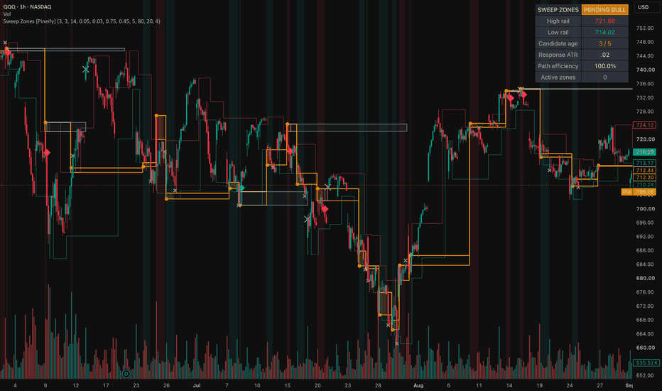
Liquidity Sweep Confirmation Zones [Pineify]Liquidity Sweep Confirmation Zones
Overview
This overlay separates a wick beyond known swing liquidity from a response that earns a zone. It shows rails, a candidate bridge, confirmed boxes, retest wear, and a dashboard.
Problem Definition
A basic sweep rule labels every wick beyond a prior high or low. It cannot separate rejection from a breakout near the level, and it ignores later response. Permanent lines remain prominent after failure. Back-plotting a pivot also hides that right-side bars were required to confirm it. The task is to find a closed-bar pierce and reclaim at a level already known, then require timely departure before creating support or resistance.
Design Rationale
Confirmed pivots provide structure that existed before the sweep. Each rail is armed once to stop repeated events. ATR scaling replaces raw ticks across price levels, while the sweep freezes its rail, extreme, close, and ATR so later bars cannot rewrite the test. A limited window rejects delayed movement. Net displacement alone was rejected because a choppy path can eventually travel as far; efficiency also measures progress versus total close travel. This can omit real reversals, but accepted events are easier to audit. Dual-rail sweeps are ignored as directionally ambiguous.
Key Features
One-shot confirmed swing rails.
ATR-scaled pierce and reclaim gates.
Frozen response, path efficiency, and age.
Zones beginning at confirmation, with retest wear and bounded life.
Closed-bar candidate, confirmation, and invalidation alerts.
How It Works
ATR is calculated while a pivot waits for its right-side bars; its rail appears only when confirmed. A later closed bar becomes a candidate when its wick pierces one armed rail by the required ATR fraction and its close reclaims it by the chosen distance. That rail is consumed, while a dual-rail reclaim is ignored.
The candidate freezes direction, rail, extreme, reclaim close, and ATR. Later bars accumulate close travel. Response is directional progress divided by frozen ATR, and efficiency divides positive response by total travel. Both thresholds must pass on the reclaimed side before timeout. Closing through the extreme also fails the candidate.
Confirmation creates a green support or red resistance box on that bar. Each new entry counts as a retest and increases transparency. Bullish zones invalidate below their extreme; bearish zones invalidate above it. Age stops extension, storage removes the oldest excess box, and warm-up shows no rail until ATR and a pivot exist.
How Multiple Indicators Work Together
The stages form one causal chain. Pivots supply pre-existing levels; ATR supplies scale; reclaim establishes rejection; displacement tests follow-through; efficiency rejects wandering paths; the time window links response to sweep. The box preserves that frozen evidence for retest and invalidation. Removing a stage changes the question, so the components are not an arbitrary mashup.
Trading Ideas and Insights
A circle records rejection, not completed follow-through. The amber bridge shows the pending interval while response develops. Green means a downside sweep received efficient upward confirmation; red means the inverse. Fading records more separate retests and can suggest wear for review. These states organize rejection, confirmation, retest, and failure, but do not define entries, targets, returns, or size.
Unique Aspects
The contribution separates event knowledge from outcome. A rail begins only when confirmed, a sweep consumes it once, and its facts are frozen. Promotion needs ATR-scaled progress plus path efficiency within a fixed window. The box starts at promotion, so history does not imply earlier confirmation. Retests count only new entries, not every bar inside. This is an auditable state sequence rather than a renamed pivot marker.
How to Use
Choose pivots for the intended structure horizon.
Watch armed rails; a circle marks a closed-bar pierce and reclaim.
Read bridge, response ATR, efficiency, and age while pending.
Treat a diamond and new box as confirmation on that bar; then monitor retests and failure.
Use Once Per Bar Close alerts with separate execution and risk rules.
Customization
Larger pivots select broader but later structure. Higher pierce or reclaim values filter shallow probes. Raising displacement or efficiency requires cleaner response but reduces events; longer windows weaken temporal linkage. Zone life sets the horizon, maximum zones bounds objects, and maximum retests changes wear shading only. Visual layers hide independently. Defaults are not universal optima.
Assumptions and Limitations
Confirmed pivots are assumed useful liquidity references and ATR an adequate scale. Pivot delay leaves recent structure unavailable. Only one candidate is tracked, and dual-rail sweeps are rejected. Bar-based efficiency cannot reveal intrabar order, actual liquidity, stops, or intent. Gaps, fast trends, thin markets, and poor settings can break interpretation. Closed bars drive state, but setting or data revisions can recalculate history. The script does not detect actual stop hunts, predict reversals, measure profitability, or decide whether to trade a zone.
Conclusion
The overlay turns a known swing, closed-bar reclaim, and bounded efficient response into a staged record. No zone exists before follow-through qualifies it; delay, wear, expiry, and failure stay visible.
Penunjuk
Trading ATR Framework# Trading ATR Framework
**Trading ATR Framework** is a rule-based volatility and market-location tool designed primarily for intraday futures trading.
The purpose of the indicator is not to generate automatic buy or sell signals. Instead, it provides a structured way to measure how far the current market has moved relative to its recent daily volatility and to identify predefined volatility expansion zones.
## Core Concept
The framework uses two main reference values:
1. **Previous Daily Close**
The previous completed trading day's close is used as the default reference price.
2. **Daily ATR(14)**
The indicator calculates the Average True Range over the last 14 completed daily bars. ATR measures the average daily price range and is used as a volatility reference.
From these two values, the indicator projects symmetrical volatility levels above and below the reference price.
The calculated levels are:
* +25% ATR
* +50% ATR
* +75% ATR
* +100% ATR
* -25% ATR
* -50% ATR
* -75% ATR
* -100% ATR
For example, if the previous daily close is 20,000 and the completed Daily ATR(14) is 400 points, the +25% ATR level would be:
**20,000 + (400 × 0.25) = 20,100**
The -50% ATR level would be:
**20,000 - (400 × 0.50) = 19,800**
This creates a standardized volatility map around the previous session's closing price.
## Why I Created This Framework
Many intraday traders evaluate price levels without considering how far the market has already travelled relative to its normal daily volatility.
This framework combines:
* previous-session price anchoring,
* completed Daily ATR volatility,
* fractional ATR expansion levels,
* tick-size normalization,
* directional location,
* and risk-to-reward calculations
into one visual framework.
The goal is to make market location more objective.
Instead of simply asking whether price is bullish or bearish, traders can evaluate questions such as:
* Is price still close to the previous daily close?
* Has the market already expanded 50% of its normal daily ATR?
* Is price approaching a 75% or 100% ATR expansion?
* Is a potential entry occurring early or late within the current volatility expansion?
* Does the available distance to the next relevant level justify the risk?
## Directional Context
The indicator also displays the current position of price relative to the ATR framework.
Price trading above the reference close indicates positive expansion, while price trading below the reference close indicates negative expansion.
This directional information is intended as **market context**, not as an automatic trend or trade signal.
A market trading above +50% ATR, for example, is in a very different volatility location than a market trading only +10% above the previous close.
The trader can use this information together with market structure to determine whether the market is:
* expanding,
* consolidating,
* approaching an extended volatility area,
* or returning toward its reference price.
## How to Use the Indicator
A typical workflow is:
**1. Identify market direction and structure**
Evaluate the broader session structure, previous highs and lows, trend direction, consolidation areas, or other structural references.
**2. Check the current ATR position**
Determine where price is currently located relative to the previous daily close and the projected ATR levels.
**3. Evaluate volatility expansion**
Consider whether the market is still in an early expansion area such as 25% ATR or has already reached a more extended area such as 75% or 100% ATR.
**4. Look for confirmation**
ATR levels are not intended to be traded mechanically.
They can be combined with tools such as:
* price action,
* support and resistance,
* volume,
* volume profile,
* order flow,
* footprint charts,
* delta,
* liquidity,
* session highs and lows,
* or other trader-defined confirmation methods.
**5. Evaluate risk-to-reward**
The built-in risk-to-reward tool can be used to compare the intended stop distance with a target based on a 2.5R reward-to-risk relationship.
## Tick-Size Normalization
ATR calculations can produce prices that do not correspond exactly to the minimum tick size of a futures contract.
The indicator therefore rounds calculated ATR levels to the instrument's valid tick size.
This makes the projected levels easier to use with futures contracts such as:
* NQ / MNQ
* GC / MGC
* CL / MCL
The framework can also be applied to other instruments where ATR-based volatility mapping is useful.
## Manual Reference Mode
By default, the framework uses the automatically calculated previous daily close and Daily ATR(14).
Optional manual inputs allow traders to override:
* the reference/settlement price,
* and the ATR value.
This can be useful when a trader wants to work with an exchange settlement value, an externally calculated ATR value, or another manually defined session reference.
## Risk-to-Reward Calculator
The indicator includes a simple **2.5R risk-to-reward calculation**.
This feature is intended to help traders evaluate whether sufficient price space exists between a potential entry, stop level, and target.
It is a planning tool and does not automatically determine whether a trade should be taken.
## Alerts
Alerts can be configured for important ATR level crossings.
This allows traders to monitor when price enters or crosses predefined volatility expansion zones without continuously watching the chart.
## Intended Markets
The framework was primarily developed for intraday futures markets, especially:
**Nasdaq**
NQ / MNQ
**Gold**
GC / MGC
**Crude Oil**
CL / MCL
However, because the calculations are based on price and ATR rather than instrument-specific signals, the framework can also be applied to other liquid markets.
## Important Interpretation
ATR measures volatility, not direction.
Reaching +75% ATR does not automatically mean price should reverse.
Likewise, reaching -100% ATR does not automatically mean a market should be bought.
Strong directional markets can continue beyond a full Daily ATR.
The ATR levels should therefore be interpreted as **volatility and decision zones rather than standalone entry signals**.
The framework is designed to answer:
**"Where is the market currently trading relative to its normal daily volatility?"**
The final trading decision remains dependent on market structure, confirmation, execution rules, and risk management.
Penunjuk

Coinbase Premium Barometer by tf1803 COINBASE PREMIUM — BAROMETER
WHAT IT DOES
This indicator measures the price difference between Coinbase — the regulated
US exchange where buyers pay in actual dollars — and an offshore reference
exchange quoted in USDT (Binance by default). That spread is a proxy for where
demand is coming from.
Above zero → Coinbase is more expensive. US buyers are paying up.
Below zero → Coinbase is cheaper. Selling pressure sits on the US side.
It is a context tool, not an entry signal. Its value lies in whether the spread
confirms or contradicts what price is doing.
HOW IT IS CALCULATED
Premium (USD) = Coinbase price − reference price
Premium (percent) = (Coinbase price − reference price) / reference price × 100
Both exchanges are requested on the timeframe of your chart, with no lookahead.
An optional USDT depeg adjustment converts the reference price into real dollars
via USDT/USD before comparing. This removes the portion of the spread that only
exists because the stablecoin itself is trading off its peg — useful during
periods of stablecoin stress, when a raw spread overstates the actual demand
imbalance.
FEATURES
- Absolute USD or percentage display
- Any symbol pair — works for ETH, SOL or anything listed on both venues
- Optional USDT depeg correction
- Signal moving average (EMA or SMA) to read the trend rather than the noise
- Extreme detection, either adaptive (standard deviation bands) or fixed
thresholds, with background shading
- Automatic trendlines connecting the last two pivot highs and pivot lows of
the premium itself, extended right — shows when a premium regime is losing
momentum before the zero line is crossed
- Markers at every zero crossing
- Info box with the current value, the signal MA and a Z-score
- Six alert conditions: zero crossings in both directions, signal MA crossings,
and entries into either extreme
HOW TO USE IT
Add it to a daily chart first. The daily is where the reading is cleanest; on
low timeframes the spread becomes noisy and the EMA smoothing input (try 5)
becomes necessary.
Then watch the relationship, not the number:
- Price rising while the premium stays negative — the move is not carried by US
spot demand. Weaker than it looks.
- Price rising with the premium turning positive — demand and price agree.
- Premium making higher lows while price chops sideways — accumulation building
under the surface. The automatic trendlines are there to make exactly this
visible.
- Extremes in either direction tend to mean-revert. They mark exhaustion more
often than continuation.
NOTES AND LIMITATIONS
Single spikes are noise. The signal is in the trend over days and weeks.
Part of any spread is structural rather than informational: USDT can trade off
its dollar peg, and the two venues differ in fees, liquidity and depth. The
depeg option addresses the first of these; the others remain.
The indicator reads the same on every chart it is applied to, because it pulls
both legs from the symbols set in the inputs rather than from the chart symbol.
This is a market-structure tool for context. It is not financial advice and
makes no claim about future prices.
COINBASE PREMIUM — BAROMETER
WAS ER MACHT
Der Indikator misst die Preisdifferenz zwischen Coinbase — der regulierten
US-Börse, an der in echten Dollar gekauft wird — und einer Offshore-Referenzbörse
in USDT (voreingestellt Binance). Diese Differenz ist ein Näherungsmaß dafür,
woher die Nachfrage gerade kommt.
Über null → Coinbase ist teurer. US-Käufer zahlen auf.
Unter null → Coinbase ist günstiger. Der Verkaufsdruck sitzt in den USA.
Es ist ein Kontextwerkzeug, kein Einstiegssignal. Der Wert liegt darin, ob die
Differenz bestätigt oder widerspricht, was der Preis tut.
BERECHNUNG
Premium (USD) = Coinbase-Preis − Referenzpreis
Premium (Prozent) = (Coinbase-Preis − Referenzpreis) / Referenzpreis × 100
Beide Börsen werden auf der Zeiteinheit des Charts abgefragt, ohne Lookahead.
Optional lässt sich der USDT-Depeg herausrechnen: Der Referenzpreis wird über
USDT/USD in echte Dollar umgerechnet, bevor verglichen wird. Das entfernt den
Anteil der Differenz, der nur daher kommt, dass der Stablecoin selbst von seiner
Bindung abweicht.
FUNKTIONEN
- Anzeige in absoluten USD oder in Prozent
- Beliebiges Symbolpaar — funktioniert für ETH, SOL und alles, was an beiden
Börsen gelistet ist
- Optionale USDT-Depeg-Korrektur
- Signal-MA (EMA oder SMA), um den Trend statt des Rauschens zu lesen
- Extremerkennung wahlweise adaptiv (Standardabweichungsbänder) oder über feste
Schwellen, mit Hintergrundfärbung
- Automatische Trendlinien auf dem Premium selbst, gezogen zwischen den letzten
beiden Pivot-Hochs bzw. -Tiefs und nach rechts verlängert — macht sichtbar,
wenn eine Phase ausläuft, bevor die Nulllinie gekreuzt wird
- Markierungen an jedem Nulldurchgang
- Info-Box mit aktuellem Wert, Signal-MA und Z-Score
- Sechs Alarmbedingungen: Nulldurchgänge in beide Richtungen, MA-Kreuzungen und
das Erreichen beider Extrembereiche
ANWENDUNG
Zuerst auf dem Tageschart. Dort ist die Ablesung am saubersten; auf kleinen
Zeiteinheiten wird die Differenz verrauscht, dann ist die EMA-Glättung nötig
(Startwert 5).
Dann auf das Verhältnis achten, nicht auf die Zahl:
- Preis steigt, Premium bleibt negativ — die Bewegung wird nicht von US-Spot-
Nachfrage getragen. Schwächer, als sie aussieht.
- Preis steigt und das Premium dreht ins Positive — Nachfrage und Preis stimmen
überein.
- Premium bildet höhere Tiefs, während der Preis seitwärts läuft — darunter baut
sich etwas auf. Genau dafür sind die automatischen Trendlinien da.
- Extreme in beide Richtungen neigen zur Rückkehr zum Mittel. Sie markieren
häufiger Erschöpfung als Fortsetzung.
HINWEISE UND GRENZEN
Einzelne Ausschläge sind Rauschen. Die Aussage liegt im Verlauf über Tage bis
Wochen.
Ein Teil jeder Differenz ist strukturell und nicht informativ: USDT kann von der
Dollarbindung abweichen, und die beiden Börsen unterscheiden sich in Gebühren,
Liquidität und Markttiefe. Die Depeg-Option adressiert den ersten Punkt, die
übrigen bleiben.
Der Indikator zeigt auf jedem Chart dasselbe, weil er beide Seiten aus den in
den Einstellungen gesetzten Symbolen zieht und nicht aus dem Chartsymbol.
Ein Werkzeug zur Marktstruktur-Einordnung. Keine Anlageberatung und keine
Aussage über künftige Kurse.
Penunjuk

LINK Above $12.20: Is $15 Back on the Table?Hey traders! 👋
After that solid push higher, LINK is now pulling back into the breakout zone, so $12.00–$12.20 is back on my radar. This was the area that kept a lid on price through most of August and I still see it as the key zone for keeping the bullish structure alive.
I’m definitely not the guy who wants to jump on a moving train just because everyone else is buying. 😄 My plan is simple and emotionless: close above $12.20, then checks three things before entering: price above the long-term SMA 200, RSI 14 above 50, and a bullish MACD 12/26/9.
This filter keeps us away from fake breakouts that lack real momentum.
For the trade itself, my preferred entry zone is $12.20–$12.30 after confirmation. With the strategy’s default settings, the SL is 1.5% below entry, which puts it around $12.02–$12.12, while the mechanical TP is 3% above entry, around $12.57–$12.67. These levels are calculated automatically from the actual entry price rather than being fixed on the chart.
📈 Where could LINK go next?
If LINK gets back above $12.20 and keeps the momentum going, $13.67 is the next level I’m watching closely. Above that, we have $14, and if buyers can push through that area cleanly, the bigger $15–$15.50 zone starts looking pretty interesting.
What about support?
🟢 $12.00 - key psychological support
🟢 $11.50 - first lower support
🟢 $11.00 - next support zone
🟢 $10.70 - deeper technical support
The beauty of this setup? No guessing tops or bottoms. We just wait for buyers to show up, let RSI and MACD confirm and execute.
So, what would you do here? 👀 Take the breakout above $12.20, or wait for LINK to clear $13.67 before getting involved? Drop your setup in the comments.
Disclaimer: Trading crypto involves substantial risk, and this is only my personal read of LINK’s market structure, not financial advice. I always define invalidation before entering, size positions carefully, and accept that price can do something different from my base case.
Strategi

Penunjuk

Liquidity Absorption Engine [StrixEDGE]TRADINGVIEW TITLE
Liquidity Absorption Engine Liquidity
DESCRIPTION
StrixEDGE Liquidity Absorption Engine is Engine #01 in the StrixEDGE indicator framework. It is a liquidity-focused market-state tool designed to identify changes in directional quality, liquidity behavior, volatility structure and confirmation strength without relying on a single conventional oscillator.
WHAT THIS INDICATOR IS DESIGNED TO DO
Scores wick absorption, sweep rejection and directional flow to identify defended liquidity zones.
Rather than treating one input as a complete signal, StrixEDGE combines the engine's dedicated core logic with an optional DNA layer. The final result is normalized into a 0–100 Strix Score so the same framework can be read consistently across different symbols and timeframes.
HOW TO READ THE STRIX SCORE
• Above 72: bullish state / long-side trigger zone.
• Below 28: bearish state / short-side trigger zone.
• Around 50: balanced or neutral state.
• A signal is generated on a transition into a trigger zone, not on every bar that remains inside it.
SIGNAL & POSITION FRAMEWORK
When a valid state transition is detected, the overlay version can create a structured trade plan containing:
• Entry
• DCA level
• TP1
• TP2
• TP3
• Stop Loss
Each projected level includes its percentage distance from Entry. When a level is reached, the same chart label is updated with a ✓ marker. TP and SL outcome tracking is mutually controlled so the dashboard does not report contradictory terminal results for the same setup.
PROFESSIONAL DASHBOARD
The built-in StrixEDGE dashboard summarizes the active market state in a compact TradingView table, including:
• Engine and category
• Strix Score and directional bias
• Signal / market regime
• Flow pressure and trend quality
• Relative volume and ATR volatility
• Structure / VWAP context
• Active position and signal age
• Entry, DCA, TP1, TP2, TP3 and SL
• Hit status for each projected level
COMBINATION PROFILE
• CORE BALANCE
• Active DNA modules: 3
• Lookback: 24
• Smoothing: 5
• Signal threshold: 72
ENGINE DNA
• Wick Absorption Pressure — Compares upper/lower wick asymmetry and amplifies it when relative volume is elevated.
• Liquidity Sweep Rejection — Detects previous-range stop sweeps that close back inside the broken boundary.
• Normalized Flow Acceleration — Smooths ATR-normalized return × relative volume to estimate directional flow.
MARKET / STYLE PROFILE
• Market focus: Crypto
• Intended style: Swing
• Core engine: #01 Liquidity Absorption Engine
• Category: Liquidity
NON-REPAINT / DATA HANDLING
By default, signals require a confirmed chart-bar close. This reduces intrabar signal fluctuation and makes historical signal placement more stable.
ALERTS
The generated script includes alert conditions for:
• Long state shift
• Short state shift
• DCA reached
• TP1 reached
• TP2 reached
• TP3 reached
• Stop Loss reached
HOW I USE IT
StrixEDGE is designed as a market-state and trade-structure tool rather than a standalone prediction system. Stronger setups generally occur when the Strix Score, market regime, flow pressure, structure and volatility context agree instead of relying on the trigger alone.
LIMITATIONS
No indicator can predict future price movement with certainty. Signals can fail during sudden news events, illiquid conditions, gaps, abnormal volatility, regime transitions or unreliable volume. DCA, TP and SL levels are systematic projections derived from the active setup and should not be interpreted as guaranteed outcomes.
Users should validate the indicator on the symbol, exchange and timeframe they trade, and should apply independent position sizing and risk management. Historical behavior does not guarantee future performance.
ORIGINALITY
StrixEDGE Engine #01 is built from generic price, volume, volatility, structure and confirmed-context primitives arranged in a dedicated engine formula and optional DNA layer. It is not intended to reproduce or rename a specific community indicator.
DISCLAIMER
For research and educational purposes only. This indicator is not financial advice and does not guarantee profitability. Penunjuk

MarketCraft FX - Liquidity Matrix V1.1MARKETCRAFT FX – LIQUIDITY MATRIX V1.1
The MarketCraft FX Liquidity Matrix is a free liquidity-mapping indicator designed to identify areas where buy-side and sell-side liquidity may be resting.
Rather than displaying every minor swing, the indicator evaluates confirmed pivot structure, relative volume and displacement away from the level. Qualified liquidity zones are then displayed clearly on the chart, helping traders identify potential targets, reaction areas and liquidity events.
KEY FEATURES
• Buy-Side Liquidity (BSL) zones above confirmed swing highs
• Sell-Side Liquidity (SSL) zones below confirmed swing lows
• Dual structural and relative-volume detection
• PRIMARY, STRONG and MAJOR zone classifications
• ATR-based zone depth
• Optional dynamic zone sizing
• Nearby-level merging to reduce chart clutter
• Zones extend automatically beyond current price action
• Separate liquidity-sweep and close-through identification
• Nearest BSL and SSL displayed in a compact dashboard
• Configurable colours, transparency and display limits
• Alerts for approaches, sweeps and candle close-through events
• Suitable for light and dark chart backgrounds
HOW THE LIQUIDITY ENGINE WORKS
A liquidity zone begins with a confirmed swing high or swing low.
The indicator then evaluates the quality of that swing using two independent qualification paths:
1. Structural displacement away from the swing
2. Relative volume surrounding the liquidity origin
This dual-detection method allows a meaningful structural level to qualify even when market volume is relatively quiet. It can also identify volume-backed liquidity that may not produce an unusually large immediate displacement.
ZONE CLASSIFICATIONS
PRIMARY
A confirmed liquidity-bearing swing that meets the minimum qualification requirements.
STRONG
A higher-quality level supported by additional displacement, relative volume or price-action confirmation.
MAJOR
A high-scoring liquidity level with multiple supporting factors. These zones represent the strongest levels identified by the engine.
READING THE ZONES
BSL zones appear above price and represent areas where liquidity may be resting beyond previous highs.
SSL zones appear below price and represent areas where liquidity may be resting beyond previous lows.
Each active zone extends beyond current price action by the selected number of bars. The default extension is 20 bars.
The zone remains live and continues moving forward until its outer boundary is reached.
ZONE STATES
FRESH
The liquidity zone has been created and has not yet been approached or swept.
APPROACHING
Price has moved within the selected ATR distance of an active liquidity zone.
LIQUIDITY SWEPT
Price has wicked through the outer boundary of the zone. The zone stops extending at the sweep candle and changes to a dashed historical level.
CLOSE-THROUGH
A candle has closed beyond the outer boundary. This is separated from a wick-only sweep because it may indicate acceptance beyond the liquidity zone rather than an immediate rejection.
COMPACT DASHBOARD
The dashboard displays:
• Current draw on liquidity
• Nearest active BSL
• Nearest active SSL
• Strength of each nearest zone
• Number of retained zones
• Latest liquidity event
IMPORTANT SETTINGS
Minimum Zone Grade controls the overall quality of zones displayed.
Dual Structural + Volume Detection allows zones to qualify through either displacement or relative volume.
Swing Length and Confirmation Bars control how significant a swing must be before it is confirmed.
Base Zone Depth controls zone thickness using ATR.
Merge Nearby Levels combines levels forming within the selected ATR distance.
Extend Past Current Price controls how far active zones project beyond the latest candle.
Retain Swept Zones determines whether completed liquidity events remain visible for historical analysis.
TRADING APPLICATION
The indicator can be used to help identify:
• Potential draws on liquidity
• Areas above highs or below lows where stops may be resting
• Potential reaction points
• Liquidity sweeps
• Failed sweeps and close-through events
• Confluence with market structure, order blocks, supply and demand, Fibonacci levels or higher-timeframe analysis
Liquidity zones should not be treated as automatic entry signals. A zone identifies an area of interest; traders should use their own confirmation process before making a trading decision.
MARKETCRAFT FX
Craft Your Edge. Master the Market.
This indicator is an original MarketCraft FX development created as a free educational and chart-analysis tool.
DISCLAIMER
This indicator is provided for educational and informational purposes only. It does not constitute financial advice, investment advice or a recommendation to buy or sell any financial instrument.
No indicator can predict future market movements or guarantee profitable results. Liquidity zones may fail, price may trade through them, and historical performance does not guarantee future performance.
Always conduct your own analysis and use appropriate risk management.
Penunjuk

MACD Matrix [Quantum Algo]MACD Matrix
═══════════════════════════════════════════════
🔶 OVERVIEW
MACD Matrix reads the Moving Average Convergence Divergence as a complete momentum system rather than a single line and histogram. It classifies momentum into four quadrants instead of one sign, aligns four timeframes into a live matrix with a scored consensus, detects histogram divergence and draws it on both the oscillator and the price candles, tracks histogram compression before expansion, and paints a momentum river through price so the entire reading lives on the chart — not only in the pane below it.
The result is a MACD you can read from the candles alone: the river's color tells you the quadrant, the aura tells you whether momentum is expanding or fading, gold beacons mark full multi-timeframe alignment, and every signal carries its own historical record on the exact symbol you are trading.
═══════════════════════════════════════════════
🔶 WHAT IS MACD?
The Moving Average Convergence Divergence, created by Gerald Appel, measures momentum as the distance between a fast and a slow exponential moving average. A signal line smooths that distance, and the histogram — introduced by Thomas Aspray — shows the gap between the two. MACD above zero means the fast average leads the slow one (bullish regime); the histogram rising means momentum is accelerating.
═══════════════════════════════════════════════
🔶 WHAT ARE THE FOUR MACD QUADRANTS?
Most traders read MACD as bullish or bearish. It actually has four distinct states, and the difference between them is where the money is:
— Expanding ▲: above zero and the histogram rising — momentum accelerating in an uptrend.
— Fading ▲: above zero and the histogram falling — the uptrend losing thrust, the earliest warning.
— Expanding ▼: below zero and the histogram falling — momentum accelerating in a downtrend.
— Fading ▼: below zero and the histogram rising — the downtrend losing thrust, the earliest turn.
MACD Matrix names the quadrant on every bar, colors the river and the aura by it, and stamps it into every signal's tooltip.
═══════════════════════════════════════════════
🔶 WHY IS THIS ORIGINAL?
1. The quadrant engine. Four momentum phases instead of two, made visible on the price chart through the momentum river and aura, so fading momentum is caught before the sign ever flips.
2. The timeframe matrix. Four configurable timeframes, each read as side-of-zero × expanding-or-fading, with a consensus score. A gold beacon prints on price the moment all four align with expanding momentum — a threshold event, not a vague "trend agreement."
3. Dual-canvas divergence. Histogram divergences are drawn as connectors in the pane AND as dashed twins across the corresponding price pivots on the chart, so the divergence is visible exactly where you trade it.
4. The histogram squeeze. Histogram amplitude is ranked inside its own recent history; when it compresses below a low percentile the momentum is coiled, marked with gold dots, and the expansion out of the coil fires a directional release signal — a compression concept almost never applied to MACD.
5. Signal families with per-symbol records. Zero-line crosses, early signal crosses on the correct side of zero, divergences and squeeze releases are tracked as separate families, each with ten-bar outcome statistics shrunk toward neutral at small samples and a Wilson lower bound — quoted in every tooltip and on the dashboard.
═══════════════════════════════════════════════
🔶 HOW IT WORKS
— MACD, signal and histogram are computed from configurable lengths; the quadrant is derived from the sign of MACD and the direction of the histogram.
— Four higher-timeframe MACD states are requested without lookahead and scored into the matrix.
— Histogram pivots are compared against price pivots to detect regular divergences, drawn on both canvases.
— Histogram amplitude is ranked against its own history for the squeeze; a mature coil that expands fires a release.
— Every signal family feeds its own first-in-first-out outcome samples; statistics are reported with sample counts.
Signals are evaluated on confirmed bars and do not repaint. Higher-timeframe matrix rows finalize when their own bar closes, as with any multi-timeframe reading. All drawings are capped.
═══════════════════════════════════════════════
🔶 HOW TO USE IT
— Trade the quadrant, not the sign: Expanding phases favor continuation entries; Fading phases favor taking profit or tightening risk, and they precede most zero-line crosses.
— Use the matrix as a filter: a 4/4 beacon is the highest-conviction environment; a divided matrix (2/4) warns that timeframes disagree.
— Divergence on the candles: when the dashed price line and the pane connector appear together, you have a momentum-versus-price disagreement located precisely on structure.
— Watch the coil: a long squeeze followed by a release is the setup for expansion; the R family record tells you how reliably releases have followed through here.
— Works on all markets and timeframes; configure the four matrix timeframes to match your trading horizon.
═══════════════════════════════════════════════
🔶 SETTINGS
— MACD: fast, slow and signal lengths.
— Timeframe Matrix: four timeframes.
— Signals & Squeeze: divergence pivot length, squeeze window and percentile, cooldown, signal visibility.
— Statistics: sample cap, minimum samples, shrinkage strength, Wilson z-score.
— Visuals and dashboard: river and aura toggles, river length, full color and position control.
═══════════════════════════════════════════════
🔶 ALERTS
— Matrix Aligned Bullish / Bearish — all four timeframes aligned with expanding momentum.
— Zero-Line Cross — MACD crossed zero.
— Histogram Divergence — a divergence printed.
— Squeeze Release — the histogram expanded out of its coil.
═══════════════════════════════════════════════
🔶 FAQ
Q: Does it repaint?
A: Signals are evaluated on confirmed bars and never change once printed. The higher-timeframe rows of the matrix update while their own bar is open and finalize at its close — this is inherent to any multi-timeframe reading, and no lookahead is used.
Q: How is this different from a standard MACD?
A: A standard MACD shows one line, one signal and one histogram in a pane. This tool adds the quadrant classification, the four-timeframe matrix and beacons, divergence drawn on the price chart itself, the histogram squeeze, the momentum river and aura on price, and per-family statistics.
Q: What does the momentum river represent?
A: A short exponential average of price colored by the current MACD quadrant. Its purpose is purely to carry the momentum reading onto the candles — bright when momentum expands, dimmed when it fades — so you can read momentum without looking away from price.
Q: What do the family percentages mean?
A: The share of past signals in that family after which price had moved favorably ten bars later, on the current symbol and timeframe, shrunk toward fifty percent at small samples. They describe history — they are not predictions.
Q: Which settings should I change first?
A: The four matrix timeframes, so the matrix reflects your own trading horizons. The MACD lengths follow the classic 12, 26, 9 defaults.
═══════════════════════════════════════════════
🔶 CREDITS
The Moving Average Convergence Divergence is by Gerald Appel; the MACD histogram is by Thomas Aspray (1986). The Wilson score interval is by Edwin B. Wilson (1927). The quadrant engine, timeframe matrix and beacon logic, dual-canvas divergence rendering, histogram squeeze, per-symbol statistics and all code in this script are original work — no third-party or open-source script code was reused.
═══════════════════════════════════════════════
🔶 LIMITATIONS
— MACD is a lagging momentum measure; the quadrant engine reduces but cannot eliminate lag.
— Divergences can extend before resolving; the family record exists to quantify this on your chart.
— Statistics describe the current chart's history only; past frequencies never guarantee future outcomes.
═══════════════════════════════════════════════
🔶 DISCLAIMER
This indicator is a research and charting tool provided for educational purposes. It is not financial advice, and nothing it displays is a recommendation to buy or sell any asset. Trading involves substantial risk of loss. Always do your own analysis and manage risk responsibly. Penunjuk

Penunjuk

Penunjuk

Consolidation Breakout with Volume Confirmation [Daily]What this does
This indicator detects consolidation zones on price charts and flags breakouts confirmed by volume — in both directions (bullish breakouts and bearish breakdowns).
Methodology
Scans a flexible lookback window (10–30 bars, adjustable) for the tightest qualifying price range, so it captures both short flags and multi-week bases without needing separate settings for each.
A zone is drawn once a window's high-low range falls under a configurable tightness threshold (default 8%).
Zones where average volume during consolidation is below its own 50-bar baseline are marked in green ("volume dry-up") as a soft indicator of higher conviction — this is informational, not a hard filter.
A breakout fires on a close beyond the zone boundary, confirmed by volume at least 1.5x (configurable) the zone's average — symmetric logic for both long breakouts and short breakdowns.
A cooldown period after each breakout reduces false re-triggering during choppy conditions.
Each breakout label also tags candle quality (strong/weak close within the bar's range) and whether the move gapped through the zone or ground through it intraday — additional price-action context alongside the volume read.
Timeframe
Designed and tested on the Daily timeframe. All settings (lookback, cooldown, volume baseline) are counted in bars, so they do not scale automatically across timeframes — a 5-bar cooldown means 5 trading days on Daily, but a very different real-world duration on 4H, Weekly, or other timeframes. If you use this on a different timeframe, re-tune the inputs rather than relying on the defaults.
Alerts
Built-in alert conditions for both bullish breakouts and bearish breakdowns — set once per chart to get notified without watching live.
Disclaimer
This is a screening/context tool, not a standalone buy/sell signal. All thresholds are adjustable in settings — test and tune them for the instruments you trade. Always confirm with your own analysis and risk management. Not financial advice. Penunjuk

Market Structure BOS/CHoCH + Break Follow-Through [ForexCracked]🔵 OVERVIEW
Most market structure indicators stop at the break. This one keeps counting after it.
It draws the structure the way you already read it: confirmed swing highs and lows tagged HH, HL, LH and LL, a solid line at the level that would flip the current structure, and a BOS or CHoCH label the moment a bar closes through a swing. Then it does the part most structure tools stop short of. For every break it watches what price did next, files the outcome, and prints the counted result on the chart with the sample size next to it.
So the label on a break does not just say BOS. It says BOS, and that on this chart breaks like this one reached 1 ATR beyond the level before snapping back 116 times out of the last 200.
🔵 THE ANSWER IS THERE BEFORE THE BREAK
The two live levels, the last confirmed swing high and swing low that price has not yet closed through, are drawn as blocks at the right edge of the chart, teal above price and pink below. Each block is captioned with the break it would be under the current structure (BOS or CHoCH), the price, the distance, and what breaks of that kind did here: "BOS above 1.08420 · 12p · 1.0 ATR reached 116/200 (58%) · typical run to 1.08790".
The block's height is not decoration. It is the measured median run after breaks of that class on this symbol, so the top of the teal block is a price that breaks like this one typically reached. Medians print from eight samples and percentages from the minimum n. Below that the block falls back to the follow-through distance and its caption reads "finish line at" instead of "typical run to". A block never draws thinner than the minimum block height, and when that floor is what sets its height the caption reads "run floor at".
🔵 HOW A BREAK IS MEASURED
A break is a bar that closes through a live swing level. It is a BOS if it goes with the current structure and a CHoCH if it goes against it and flips it.
From the next bar the script runs a race with two finish lines the same distance from the level: 1 ATR beyond it in the break direction, and 1 ATR back through it on the other side. ATR is frozen at the break bar so later volatility cannot move the finish lines. Whichever is touched first decides the outcome: reached, or snapped back. If one bar touches both lines it is filed as snapped back, the conservative reading. If neither is touched within 30 bars the outcome is filed as neither. Nothing is estimated and nothing is fitted. Every figure is a count of price events on the chart in front of you, over the last 200 filed breaks of that class, and the n printed beside it is the real count.
Wick-only breaks, where a bar trades through a level but closes back inside, are measured with the same race in their own class. They are never drawn as events (the level's block border turns dashed once it has been wicked), but their number sits on the level's caption, so "should I wait for the close" gets an answer from your own symbol instead of a rule of thumb.
🔵 THE RUN BOX
After each close break a box is drawn from the level in the direction of the break. Its height is the median run for that class, its width the median bars it took to reach the finish line, and its caption prints the far edge as a price. The box then records what this particular break did: the border thickens when the finish line is reached, the box hollows and its border goes dashed when the break snaps back, and it fades if neither happens. The last few breaks stay on the chart as filled or hollow shapes, so the recent record is visible without reading a single number.
The break label itself is frozen at the moment of the break. It shows what the tool said at the time, never a hindsight figure. Only the outcome is added to it afterwards.
🔵 THE SWINGS
Swings are confirmed by price, not by counting bars. A swing high is confirmed the first time a bar closes a set number of ATR below it, and a close through the previous swing confirms the swing in between. There is no lookback length to tune and the same setting reads the same on gold, indices, crypto and forex. Tags land on the swing bar when the swing confirms, so they appear a few bars after the extreme printed. That is confirmation lag, not repainting. No tag, break line or break label is ever moved; only the outcome text is added to a label later. The two right-edge blocks and the panel are redrawn every bar by design, so their height follows the current ATR.
🔵 WHAT IS ON THE CHART
• HH, HL, LH and LL tags on confirmed swings (the first swing of each side is tagged H or L)
• A dashed border on a block means that level has already been wicked without a close through it
• A solid structure line at the level that would flip the current structure, teal under price while bullish and pink above it while bearish, with the dealing range shaded between it and the other live level
• A block at each live level, projected into the space right of price, captioned with the break type, the price, the distance and the counted result for breaks like it
• A line from each broken swing to the bar that closed through it, with a BOS or CHoCH label carrying the count as it stood at that moment
• A run box after each break, filled or hollow depending on what the break did
• A compact panel restating the structure, the two levels, the class counts and the last break
🔵 WHAT THIS IS NOT
This script draws no entries, no stops, no targets and no arrows. It has no order blocks, no fair value gaps, no sessions and no higher timeframe calls. It does not tell you to trade a break. It does not map liquidity pools, equal highs and lows or session extremes, does not count how often price reaches them, and does not mark sweeps or reversals. It is the structure map with the follow-through counted, so you can see on your own symbol whether the breaks you are reading have tended to carry on or to come straight back.
🔵 HOW TO USE
• Read the two blocks first. The block above is the level a close must clear and what happened after closes like that; the block below is the level a close must lose. The prices are printed.
• Treat the follow-through percentage as a base rate for this class on this chart, not as a forecast for this break. One hundred and sixteen out of 200 is a description of the past.
• Use the class split. If close breaks on your chart reach 1 ATR far more often than wick-only breaks, waiting for the close is worth its cost here. If the two numbers are close, it is not.
• Watch the run box after a break rather than the label. A box that hollows out is a break that snapped back, and the structure line will tell you where the next flip sits.
• Lower the swing setting to 1.0 ATR to see internal structure, raise it to 2.0 or more on choppy symbols so only real pullbacks count as swings.
🔵 SETTINGS
• Swing confirmation (x ATR): the close distance from the running extreme that confirms a swing (default 1.5)
• Follow-through distance (x ATR): the two finish lines, the same distance either way from the level (default 1.0)
• Outcome window (bars): how long the race runs before the outcome is filed as neither (default 30)
• Breaks kept per class: the rolling window every count is taken over (default 200), and the minimum n before a percentage prints (default 20)
• Chart: break lines to keep, run boxes to keep, minimum block height, how far the blocks project right, the dashboard and its position, colours
• Works on any symbol and any timeframe. Charts with little history print n below the minimum until the numbers fill in
🔵 ALERTS
• Bullish BOS, bearish BOS, bullish CHoCH, bearish CHoCH, each on the closing bar
• Wick-only break: price traded through a structure level and closed back inside
• Break reached its follow-through distance
• Break snapped back
• Price within a quarter of an ATR of a live structure level
The engine is close-based, so set alerts to fire once per bar close.
⚠️ DISCLAIMER
BOS and CHoCH are community terms for market structure. This is independent work and is not affiliated with or endorsed by any educator or course.
The percentages are counted descriptions of what happened after past breaks on this chart, not predictions. A class that reached its follow-through distance 70 times in 100 can snap back today. Samples vary by symbol and timeframe, and small samples are unreliable by nature, which is why every figure carries its n and prints nothing below the minimum. Nothing here is a trade signal. Results depend on market conditions, settings, and your own execution and risk management. Shared for educational and research purposes. Not financial advice. Penunjuk

Mbedaiwi - Market Structure and Price Action mbedaiwi - Market Structure & Price Action
Overview
This Pine Script v6 overlay brings market structure, liquidity events, order blocks, volume estimates, price imbalances, and chart-pattern candidates into one configurable workspace. It helps users examine where price has broken structure, where earlier zones remain active, and how several observations align on the same chart.
The indicator is intended for discretionary analysis and chart study. It is not an automated execution system or a backtested TradingView strategy.
Purpose and benefits
Compare short-term internal structure with broader swing structure.
Organize potential reaction areas using order blocks, imbalances, liquidity levels, and range bands.
Compare the volume associated with visible order blocks through an overlay or a separate right-side display.
Select the modules and labels needed for a particular workflow, reducing chart clutter.
Use alerts to monitor defined events without continuously watching the chart.
The integration follows a practical sequence: establish structure, locate relevant areas, observe price interaction, and optionally evaluate a rule-based setup. The components provide context for one another; agreement between them does not establish a probability of success.
1. Market structure
Internal and swing structure can be configured separately. The script supports SMC leg-transition detection and symmetric pivot detection, with adjustable lengths.
BOS: a break classified as continuation of the current structural direction.
CHoCH: a break against the previous structural direction.
CHoCH+: a CHoCH supported by an intervening higher low for a bullish change, or lower high for a bearish change, under this script's pivot and sequence rules.
HH, HL, LH, and LL: higher highs, higher lows, lower highs, and lower lows.
Strong/Weak High-Low: structural classifications based on the current directional state, not forecasts of whether a level will hold.
Each structure selector offers All, BOS, CHoCH (All), CHoCH, CHoCH+, and None. CHoCH (All) includes both ordinary and supported changes; CHoCH and CHoCH+ select their respective classifications. The separate Show BOS and Show CHoCH switches also affect visibility.
Historical and Present display modes, candle coloring, label sizes, and colored or monochrome themes provide additional control.
2. Order blocks and volume display
The script includes independent swing-break, volume-pivot, and legacy structure-break order-block engines. Available controls include zone boundaries, mitigation rules, retained-zone counts, overlap suppression, midlines, and breaker display.
Volume information can appear on the price-chart overlay, in a right-side chart, or in both locations. Users can choose the volume accumulation interval, including the interval between a broken pivot and its break, an origin window, or an origin-based interval.
How to read the volume numbers
The displayed volume belongs to the selected calculation interval. The percentage is that block's share of the summed volume of currently displayed non-breaker blocks. Changing visible blocks, filters, or retention settings can therefore change the percentages. They are not win rates or percentages of the instrument's entire trading volume.
Internal buy/sell activity is an OHLCV-based estimate. Close-location mode allocates volume according to the close's position within each candle's range; candle-direction mode allocates it according to candle direction. These estimates do not measure actual bid/ask transactions, institutional orders, or order-book liquidity. Volume-dependent outputs rely on the data supplied for the symbol.
3. Liquidity tools
Equal Highs and Equal Lows use an adjustable ATR-based tolerance. Liquidity Grabs identify excursions beyond tracked levels followed by a return inside those levels, subject to the detection rules.
Grabs are displayed as hollow frames around the relevant candle wick: blue for bullish lower-wick grabs and red for bearish upper-wick grabs by default. Optional text can be enabled. Detection sensitivity and retained history are adjustable.
Live previews can change or disappear before the candle closes. Liquidity Grab alerts require a confirmed bar. Separate trendline tools and trendline-break alerts are also available.
4. Price imbalances
The imbalance selector displays one of five types:
FVG: a three-candle gap between the first and third candles' price ranges.
Inverse FVG: a tracked FVG that is breached and reclassified in the opposite direction.
Double FVG: an overlapping area between a new FVG and a tracked opposite-direction FVG.
Volume Imbalance: a gap between adjacent candle bodies while their wick ranges overlap. Despite the name, this detection is price-based.
Opening Gap: a gap between adjacent candle ranges.
Controls include source timeframe, volatility threshold, extension, mitigation method, and maximum retained zones. The imbalance timeframe must be the chart timeframe or higher. Higher-timeframe imbalance detection uses completed source candles, so it becomes available after source-bar confirmation.
To hide only the FVG/type text while retaining the shaded zones, disable Show Imbalance Type on Zones. Re-enable it at any time from Inputs.
5. Premium, equilibrium, and discount
Optional bands divide a selected Swing, Internal, or Impulse range into upper, middle, and lower reference areas. Band width and colors are adjustable. These areas describe relative position within the selected range; they do not measure fundamental fair value or guarantee a reversal.
6. Chart-pattern candidates
The pattern module classifies recent pivot geometry and can display pattern boundaries, shaded zones, and a Detected Pattern table. Candidate types include triangles, wedges, broadening wedges, double tops/bottoms, and head-and-shoulders formations.
Pattern drawings are separate from the trendline module. Detection depends on pivot length, available history, and tolerance settings. In this release, a displayed pattern can remain after price has moved outside its boundaries until the detection state updates. Treat the pattern name as a geometric candidate, not confirmation that a formation remains valid or that a breakout will succeed.
7. Additional context and optional setup planning
Optional Fibonacci retracements, an OTE region, extension levels, and previous daily/weekly/monthly/quarterly highs and lows provide additional reference points.
The optional setup layer combines structural events with configurable checks such as liquidity sweeps, order-block or imbalance interaction, displacement, higher-timeframe direction, EMA alignment, volume, and RSI. Score and Strict modes control how these conditions are evaluated.
When enabled, the trade layer can display a hypothetical entry, stop, and up to three targets using configurable zone, structure, ATR, or risk-multiple methods. These are rule-based planning levels, not executed orders or verified performance results. The default mbedaiwi profile suppresses the trade layer.
How to use
Add the indicator to a standard candlestick chart and choose an analysis profile. The default mbedaiwi profile uses internal length 5, swing length 50, and close-based structural breaks. Select Custom or enable Override profile lengths when you want the manual lengths to take effect.
Choose the internal and swing events you want to see. Start with structure and a small number of zones before enabling additional modules.
Enable order-block metrics if you want volume comparisons. Select the accumulation method and overlay/side-chart layout appropriate for your analysis.
Enable Liquidity Grabs and select detection sensitivity. Distinguish a live preview from a completed event.
Choose an imbalance type and its mitigation method. Add premium/discount bands or prior-period levels if they help define context.
Enable Patterns only when studying pivot-based formations, and check the actual candles against the displayed boundaries.
Use Clean chart mode, individual visibility switches, label sizes, and zone-count controls to manage clutter. The Show tables switch controls on-chart tables.
If using the optional setup layer, choose a compatible profile, review all filters and risk settings, and evaluate its behavior before relying on the planning levels.
Reading entries, stops, targets, and exits
Use the indicator as a sequence of observations: structural direction, an area to monitor, confirmation, and a predefined risk/target plan. A BOS, CHoCH, or Liquidity Grab on its own is not an automatic instruction to buy or sell.
Step 1 - Read the structural context
Start with Swing Structure for the broader context, then use Internal Structure to examine shorter movements. Higher highs and higher lows describe an upward structure; lower highs and lower lows describe a downward structure. A bullish BOS is classified as continuation, while a bullish CHoCH marks a potential change from the preceding bearish structure. CHoCH+ adds the script's supporting pivot-sequence condition; it does not guarantee a reversal.
An internal bullish change can occur while swing structure remains bearish. Always identify which structure level produced the label. Pivot confirmations can arrive after the turning point and be drawn back at the earlier pivot bar.
Step 2 - Identify an area to monitor
A bullish order block, bullish FVG, discount band, previous low, or Equal Lows can provide a reference area for studying a possible bullish reaction. Price entering an area only establishes an interaction; it does not confirm that a rebound has started. Order-block volume percentages are calculated volume shares, not probabilities that the area will hold.
Step 3 - Observe confirmation
The following is an illustrative manual reading sequence, not the mandatory algorithm behind every setup generated by the script:
Price reaches a previously identified reference area.
Price moves below a tracked low and closes back above it, producing a confirmed bullish Liquidity Grab if the detection conditions are met.
Price subsequently breaks an internal structural level upward, producing a bullish CHoCH or CHoCH+ under the script's rules.
The user evaluates the completed confirmation candle or a later retest of the broken level, together with the broader structure and the planned invalidation level.
A retest may never occur, and confirmation can still fail. Do not assume that a marker anchored to an earlier candle was available in real time on that candle.
Step 4 - Understand the optional planning layer
The planning layer displays hypothetical levels when its setup conditions are satisfied:
Entry method: Market, Fibonacci, or Zone determines the entry-reference calculation.
Stop method: Structure, ATR, or Zone determines the stop-reference calculation. The selected invalidation level defines where the planned idea no longer applies.
Target method: Risk multiple, Smart money, or Hybrid determines how target references are calculated.
TP1, TP2, and TP3: up to three target references, according to the selected method.
Move stop to breakeven after TP1: updates the hypothetical stop to the entry reference after the first-target condition is met.
These are chart calculations. They do not send orders to a broker, establish actual fills, or move a real stop order.
To make this layer available, choose a profile such as Custom, enable Show trade layer (entry / SL / TP), and disable Structure only. The default mbedaiwi profile suppresses the trade layer. Enabling the display does not guarantee that levels appear immediately: the selected signal conditions and filters must also be satisfied.
Step 5 - Read risk multiples: a numerical example
Consider a hypothetical entry at 100 and a stop at 98. The distance between them is 2 per share, so 1R equals 2. In Risk multiple target mode:
Entry reference: 100.
Stop reference: 98.
1R target: 102.
2R target: 104.
3R target: 106.
This example explains arithmetic only. It is not a trade recommendation, a prediction, or a result produced by a backtest. It excludes fees and slippage. A real fill can differ from the plotted reference, and an actual exit can differ from the stop price. If the hypothetical breakeven option is enabled, a qualifying TP1 event changes the plotted stop reference to 100; this does not guarantee a cost-free exit in actual trading.
Step 6 - Interpret exits and changes in structure
A TP reached alert means that the script's target condition has been met. A Stop-loss reached alert means that its stop condition has been met. Neither confirms that a broker executed an order.
A bearish CHoCH during an upward move provides information about a structural change. It does not automatically mean that the planning layer closed a position, nor that every internal change requires the same response. Target exits, invalidation exits, and any discretionary response to opposing structure should be defined before acting on a setup. The script does not automatically carry out partial sales or discretionary exits described by a user's plan.
Manual analysis versus calculated setups
The manual sequence above explains how the visual components can be read together. The optional planning layer instead evaluates its configured rules, filters, and calculation methods. It does not necessarily require that exact sequence. Neither workflow supplies verified profitability or guarantees that a displayed setup will succeed.
Alerts
Available conditions cover internal and swing BOS/CHoCH/CHoCH+, liquidity grabs and sweeps, equal highs/lows, imbalance formation, zone interactions, order-block breaks, trendline breaks, detected patterns, and optional setup/target/stop events.
Select this indicator in TradingView's Create Alert dialog, then choose the event. Use Once Per Bar Close when you want close-confirmed notifications. General CHoCH alerts also include supported changes; separate CHoCH+ conditions are available. Some touch conditions can remain true across consecutive bars, so they should not be interpreted as one notification per zone for its entire lifetime.
Timing, historical drawings, and limitations
Pivot-based features require later bars to confirm earlier turning points. Labels and zones may be anchored back to those earlier bars, although the information was not available at that time.
Live candles and enabled previews can change before close. This indicator is not presented as universally non-repainting.
Zone removal depends on mitigation, age, overlap, and retention settings. Older drawings can disappear as new observations replace them.
Results depend on the symbol, timeframe, session, available history, and settings. Different indicators can use different definitions and produce different results.
The confluence score is a rule-based score, not a calibrated probability. Volume percentages and Strong/Weak labels are not measures of signal accuracy.
The planning layer does not provide a broker execution model, Strategy Tester results, or verified profitability. No accuracy, return, or future-performance claim is made.
Source acknowledgment
The hierarchical pivot-detection logic used in the Liquidity Grabs module is adapted from LuxAlgo's open-source "Pure Price Action Liquidity Sweeps", licensed under CC BY-NC-SA 4.0. Modifications include wick-frame rendering, display controls, and alert handling. Credit for the adapted source logic belongs to LuxAlgo.
This acknowledgment concerns the identified open-source component and does not imply access to LuxAlgo's closed-source Price Action Concepts indicator. This publication is not affiliated with or endorsed by LuxAlgo.
Intended use
For educational chart analysis and discretionary decision support. Users remain responsible for validating the settings, interpreting signals, and managing risk. No displayed zone, pattern, or setup guarantees a particular market outcome.
Penunjuk

Penunjuk

ORB+VWAP NY BounceORB + VWAP Bounce — opening-range break with a resting VWAP retest
An intraday entry model for the 1-minute chart on index futures. It
combines an opening-range breakout filter with a mean-reversion entry,
and it only ever takes one trade per session.
THE IDEA IN ONE SENTENCE
The opening range breaks; a resting LIMIT order then waits at the
session VWAP and fills the moment price retests it in the direction of
that break.
HOW IT WORKS
Each session runs through three phases.
1. RANGE — the script records the high and low of the opening-range
window (09:30–10:00 New York by default). Nothing is armed until
this window closes.
2. BREAK — when price closes beyond that high or low, the side of the
break sets the direction for the rest of the day. Broke up = long
only. Broke down = short only. This is the only thing that decides
direction.
3. RETEST — from the start of the entry window, a limit order rests on
the session VWAP, anchored at the RTH open. A long fills on the
pullback down to it; a short fills on the rally up to it.
WHY THE ENTRY IS A RESTING LIMIT, NOT A MARKET ORDER
This is the part worth understanding before using it.
A buy limit can only rest BELOW the market, and a sell limit only
ABOVE it. So "price is on the correct side of VWAP" is not something
the script has to check — it is inherent to the order type itself. A
long only exists if price is above the VWAP and pulls back into it; a
short only exists if price is below and rallies into it.
That is why there is no separate trend filter or bias input in this
script: there would be nothing left for it to decide. The break sets
direction, the order type enforces location.
The trade-off is real and you should know it: a resting limit fills at
a known price but is not guaranteed to fill at all. Days where price
breaks and never returns to the VWAP simply produce no trade. The
script is designed to sit out far more often than it trades.
SETTINGS
Session / Time — timezone, the RTH session that defines the trading
day, the opening-range window, the entry window, and a forced flat
time. No position is ever carried overnight.
Entry Logic — direction (long only / short only / both), which VWAP
anchor the limit rests on (RTH open or Globex open), an optional tick
offset so the limit sits a hair on the approach side, and the maximum
number of trades per day.
Filters / Seasonality — day-of-week switches, month exclusions, and
separate gates for the short side only (a time cut-off, weak months,
and a weekday block). All of these are OFF or neutral by default. They
exist so you can test whether your own instrument and session show
asymmetries, not because any particular setting is recommended.
Setup Quality — an optional gate on the size of the opening range,
measured either in points or as a multiple of the previous day's ATR.
The ATR mode is self-scaling, so one setting holds across changing
volatility regimes. OFF by default.
Stop / Target — the stop can be a fixed tick distance, a multiple of
the daily ATR, the VWAP line itself, the opposite side of the opening
range, or a retest swing. Targets can be an R multiple, a multiple of
the range, a fixed tick distance, or none at all.
Trailing Stop — optional, by R multiple or by points, with a
configurable activation threshold. There is a switch to remove the
fixed target once the trail is active, so a runner is not capped.
Risk Management — position size derived from a fixed dollar risk and
the actual stop distance, or a fixed contract count. Note that the
derived size is a step function: contracts = floor(risk / (stop
distance x point value)). Small changes in risk can leave the contract
count unchanged, and then jump it by a whole contract.
WHAT ELSE IS ON THE CHART
A Market Positioning table compares price against five VWAPs (session,
overnight, previous session, high-of-day, low-of-day) plus the opening
range, for the chart symbol and two correlated tickers you choose. It
also reports the opening-range size in points and in ATR multiples,
and the daily ATR itself.
There is an optional risk:reward box drawn on each entry, and an
optional prop-firm tracker that reports balance, distance to a
trailing drawdown line, worst margin reached, and a consistency
measure.
Every order carries a JSON alert_message suitable for automation
platforms that parse webhook payloads.
BACKTESTING NOTES — PLEASE READ
Two Properties settings change results substantially on this script,
and both default to values that flatter it:
- Limit order execution. Every entry here is a limit order resting on
the VWAP. The "Requested price" setting assumes a fill the moment
price grazes the line without trading through it, which is
optimistic for a resting order. Use "Standard".
- Bar detalization. Set it to High. On a 1-minute chart with intrabar
stop and target logic, the default resolution is too coarse.
Also apply realistic commission and slippage for your instrument
before drawing any conclusion.
LIMITATIONS
This script takes at most one trade per session and requires both a
range break and a retest, so it trades infrequently. On any given
instrument the sample it produces over a few years may be small enough
that ordinary variance dominates. Treat any backtest of it as a
description of one particular past, not as an expectation.
Seasonal and day-of-week filters are especially easy to overfit: with
a handful of trades per month, apparent patterns appear by chance.
They ship neutral for that reason. If you turn them on, check that the
effect holds in every year of your sample independently, not just in
the total.
Defaults are a starting point for the instrument and session they were
written around. They are not tuned for yours.
Nothing here is financial advice. Strategi

Relative Strength Screener [TradingFinder] RS Rotation Matrix🔵 Introduction
There are times when several markets or symbols move higher at the same time, but that does not mean they are showing the same level of strength. An asset may rise and appear strong at first glance, while its benchmark has performed even better over the same period. In that situation, simply knowing which symbol is moving higher is not enough. The more important question is which asset is actually outperforming the market and which one is beginning to lose relative strength.
This is where Relative Strength analysis becomes useful. Instead of evaluating each symbol independently, a group of assets can be compared against the same benchmark to identify where relative strength is concentrated. This approach can be applied to stocks, indices, funds, currencies, commodities, cryptocurrencies, or any other comparable group of symbols.
Alongside Relative Strength, Relative Momentum adds another important layer because a current leader may still look strong while its relative momentum is starting to weaken, while a weaker symbol may already be entering an improving phase.
The Relative Strength Screener is designed to make these changes easier to identify. It compares multiple symbols against a common benchmark, ranks them using Relative Strength and Relative Momentum, and organizes the results inside a Ranking Dashboard. At the same time, the Rotation Matrix classifies each symbol as Leading, Improving, Weakening, or Lagging, making it easier to distinguish current leaders, emerging strength, weakening leadership, and persistent relative weakness.
This structure helps traders understand where relative strength is currently concentrated and where that strength may be moving next without manually reviewing a large number of charts. The purpose of the screener is not to generate direct Buy or Sell signals. Its main role is to support asset selection, Market Leadership analysis, Market Rotation analysis, and the creation of a more focused watchlist for further technical analysis.
🔵 How to Use
After adding the Relative Strength Screener to the chart, the first step is to define the group of assets that will be compared with one another. This group, or universe, should ideally contain instruments that make sense to evaluate within the same context. For example, users can compare stocks from the same industry, different market indices, funds, commodities, currencies, cryptocurrencies, or any other group of related assets. The indicator supports between 2 and 10 active symbols, and all Relative Strength and Relative Momentum calculations are based on this selected universe.
By default, the screener includes 10 sector funds from the US stock market and uses AMEX:SPY as the Benchmark. This setup provides a practical example of Sector Rotation analysis. AMEX:XLK represents Technology, AMEX:XLF represents Financials, AMEX:XLE represents Energy, AMEX:XLV represents Health Care, and AMEX:XLY represents Consumer Discretionary. The remaining symbols are AMEX:XLP for Consumer Staples, AMEX:XLI for Industrials, AMEX:XLB for Materials, AMEX:XLU for Utilities, and AMEX:XLRE for Real Estate.
These default symbols are only an example universe. The Relative Strength Screener is not limited to sector funds or the US market. Users can replace every symbol and the Benchmark to build a universe that matches their own analysis.
For example, several stocks from the same industry can be compared against a sector index, global equity indices can be compared against a broader market benchmark, or a group of cryptocurrencies can be evaluated relative to a selected crypto market reference. The important point is that all selected instruments should belong to a meaningful comparison framework.
🟣 Benchmark and Scan Timeframe
The Benchmark is the reference point for all Relative Strength calculations. With the default settings, SPY serves as this reference. This means the screener does not simply measure whether a symbol has risen or fallen. Instead, it evaluates how that symbol performed relative to SPY.
For example, an asset may gain 3 percent during the selected period and appear strong when viewed independently. However, if the Benchmark gains 5 percent over the same period, the asset has still underperformed the broader market. This distinction separates Absolute Performance from Relative Performance and helps identify assets that are truly gaining leadership rather than simply moving in the same direction as the market.
The Scan Timeframe determines the timeframe used by the ranking engine. If the Scan Timeframe is set to Daily, for example, the Performance Length and Momentum Length are calculated using daily scan bars. When the Scan Timeframe is equal to or higher than the chart timeframe, the screener uses confirmed scan data. When the Scan Timeframe is lower than the chart timeframe, the indicator uses the latest available intrabar information to create the current snapshot.
The current data mode is displayed directly in the Ranking Dashboard. If lower timeframe data is unavailable or incomplete, the screener displays a visible NO DATA or LIMITED DATA message rather than presenting a potentially misleading ranking.
🟣 Relative Strength and Relative Momentum
The core model of the screener is built around two measurements : Relative Strength and Relative Momentum.
Relative Strength measures how each symbol has performed compared with the Benchmark over the selected Performance Length. A positive Relative Return means the symbol has outperformed the Benchmark, while a negative value means the symbol has underperformed it. This information is displayed directly in the vs Benchmark column.
For example, if the dashboard shows 0.80% ahead, the symbol has delivered approximately 0.80 percent more relative performance than the Benchmark over the selected period. If the table shows 0.45% behind, the symbol has underperformed the Benchmark by approximately 0.45 percent on a relative basis.
Relative Strength describes the current position of an asset, but that alone does not show whether the situation is improving or deteriorating. This is why the indicator also calculates Relative Momentum. Relative Momentum measures how Relative Return has changed compared with its value a specified number of scan bars earlier.
A symbol can therefore remain ahead of the Benchmark while its Relative Momentum becomes negative. In this case, the asset is still an outperformer, but its previous advantage is beginning to fade. In the opposite situation, a symbol may still be behind the Benchmark while Relative Momentum becomes positive. This can be an early sign that its previous weakness is starting to reverse.
🟣 Ranking Dashboard
The Ranking Dashboard is the main analytical component of the Relative Strength Screener. It ranks the selected symbols using a combination of Relative Strength and Relative Momentum, while also showing the evidence behind each position.
The purpose of the table is not simply to tell the user which symbol ranks first or last. It is designed to answer several more useful questions. Which assets deserve further attention? Which leaders are maintaining their strength? Which symbols are improving? Which leaders are beginning to fade? And how persistent has the current relative strength been?
🟣 Rank
The Rank column shows the current position of each valid symbol within the selected universe.
If a symbol displays 1 of 10, it currently has the highest Composite Score among the 10 valid symbols. A reading of 6 of 10 means that five other assets currently have a higher score.
Rank is useful for quickly identifying the strongest members of the universe, but it should not be interpreted in isolation. Ranking is relative to the selected symbols. A symbol can rank first and still be underperforming the Benchmark if the entire universe is weak.
For this reason, Rank should normally be analyzed together with the vs Benchmark column.
🟣 Takeaway and Evidence
The Takeaway / Evidence column converts several underlying calculations into a more readable conclusion. Instead of requiring the user to interpret Relative Return, Momentum, Rank, Rank Change, and Persistence separately, the screener combines these conditions into descriptive states.
Sustained Leadership indicates that the symbol is ahead of the Benchmark, its Relative Momentum is not negative, it is ranked inside the top group, and it has maintained that position for the required Leadership Confirmation period. This condition represents established relative leadership and can identify assets that deserve further technical analysis.
Outperforming, Fading appears when the symbol is still ahead of the Benchmark but its Relative Momentum has turned negative. The asset remains relatively strong, but its advantage is shrinking. This can provide an early warning that an existing market leader is losing strength.
Climbing the Ranks indicates positive Relative Momentum together with an improvement in Rank. A symbol that moves from Rank 8 to Rank 6 and then to Rank 4 is progressively strengthening compared with the other members of the universe.
Recovering, Still Behind describes a symbol that continues to underperform the Benchmark but is showing positive Relative Momentum and improving Rank. This is not confirmed leadership. Instead, it represents an early recovery phase that may justify placing the asset on a watchlist.
Behind, No Recovery indicates that the symbol is behind the Benchmark and is not showing meaningful improvement in either Momentum or Rank. In a Relative Strength based selection process, these assets would normally receive lower priority.
Mixed Evidence is displayed when the available signals do not point in the same direction. Momentum may be improving while Rank remains weak, or other confirmation conditions may not yet be satisfied. The indicator intentionally keeps the conclusion neutral in these situations rather than forcing a stronger interpretation.
If one or more symbols in the universe lack valid data, the dashboard can display Incomplete Comparison. If the individual symbol itself does not have enough valid history, the result becomes Insufficient Data. Since Percentile and Rank calculations depend on cross sectional comparison, the indicator avoids producing strong conclusions when the available universe is incomplete.
🟣 vs Benchmark
The vs Benchmark column shows the actual relative performance of each symbol against the selected Benchmark.
An ahead value means the asset has outperformed the Benchmark over the configured Performance Length. A behind value means it has underperformed.
This column is especially important because it prevents a high Rank from being mistaken for genuine market outperformance. A symbol may rank first among the selected assets while still showing 0.20% behind. In that case, it is the strongest member of the selected universe, but it has not yet outperformed the Benchmark itself.
🟣 Score
The Score column combines Strength Percentile and Momentum Percentile into a single comparison score.
With the default settings, 65 percent of the score is assigned to Strength and 35 percent is assigned to Momentum. A higher score means the symbol has a stronger combination of Relative Strength and Relative Momentum compared with the other members of the universe.
The score is not a probability measurement. A value of 90 does not mean there is a 90 percent probability of a profitable trade, a 90 percent win rate, or a 90 percent probability that the asset will rise. It is simply a relative comparison metric used to rank the selected symbols.
🟣 Top Group Streak
The Top Group Streak shows how long a symbol has remained inside the strongest portion of the selected universe.
The top group is defined using the top quartile. In a universe of 10 symbols, this generally corresponds to the top three ranked assets.
If a symbol displays 8 scans, it means that the asset has remained in the top group for eight consecutive ranking checks. This helps distinguish a temporary jump in Rank from more persistent market leadership.
Top Group Streak does not count how many consecutive times a symbol has outperformed the Benchmark. It only measures persistence inside the top ranking group.
🟣 Rank Change
The Rank Change column shows how the position of a symbol has changed since the previous completed ranking check.
A value such as ↑ 2 places means the symbol improved by two ranking positions. A value of ↓ 2 places means it dropped by two positions. Unchanged means the ranking remained the same.
Current Rank shows where the asset is now, while Rank Change helps show the direction in which it is moving.
For example, a symbol currently ranked fifth may have improved from Rank 9 over the previous scans. This can indicate strengthening relative performance. Another symbol may still hold Rank 3 but may have fallen from Rank 1, suggesting that its leadership is beginning to deteriorate.
🟣 Rotation Matrix
The Rotation Matrix provides a faster and more visual summary of the entire universe. While the Ranking Dashboard shows detailed numerical evidence for every symbol, the Rotation Matrix focuses on the relationship between Strength and Momentum.
The matrix compares Strength Percentile and Momentum Percentile using the 50th percentile as the default boundary. Every valid symbol is then classified as Leading, Improving, Weakening, or Lagging.
A symbol in the Leading state has both Strength and Momentum in the stronger half of the universe. These assets represent the current relative leaders. If a symbol remains in Leading for several scans and the Ranking Dashboard also confirms Benchmark outperformance and a strong Top Group Streak, the evidence for persistent leadership becomes stronger.
An Improving symbol still has Strength in the weaker half of the universe, but its Momentum has moved into the stronger half. This state is particularly useful for identifying Emerging Leadership. The asset is not yet a confirmed leader, but its Relative Performance has started to improve.
One of the most important positive rotation sequences is : Lagging → Improving → Leading
This progression shows an asset moving from relative weakness into improving momentum and eventually into relative leadership.
A Weakening symbol still has above median Strength but below median Momentum. The asset remains relatively strong, but the quality of that strength is deteriorating.
A Leader moving into Weakening may be showing the first signs of losing its previous advantage.
If the deterioration continues, the sequence may become : Leading → Weakening → Lagging
However, a Weakening symbol can also return to Leading if Momentum recovers. For this reason, Weakening should be treated as a change in relative conditions rather than an automatic Sell signal.
A Lagging symbol has both Strength and Momentum in the weaker half of the universe. These assets usually receive lower priority in a Relative Strength selection process. However, movement out of Lagging can be important. A transition from Lagging to Improving can be the first indication that the relative trend is beginning to change.
🟣 Combining the Ranking Dashboard and Rotation Matrix
The most useful way to analyze the indicator is to read the Rotation Matrix and Ranking Dashboard together.
The Rotation Matrix provides the first overview. It shows where Relative Strength is concentrated and which assets are currently Leading, Improving, Weakening, or Lagging. The Ranking Dashboard then provides the numerical evidence needed to understand the quality of each state.
For example, if a symbol appears in Leading, the trader can check the Dashboard to determine whether it is actually ahead of the Benchmark, how high it ranks, how strong its Score is, how long it has remained in the top group, and whether its Rank is improving or deteriorating.
Two symbols can both appear in Leading while having very different profiles. One may be ahead of the Benchmark, ranked first, and have a long Top Group Streak. Another may have only recently entered the stronger half of the universe and have little persistence. The Rotation Matrix places both in the same broad state, while the Ranking Dashboard explains the difference between them.
The same principle applies to Improving. A symbol may be improving while still remaining behind the Benchmark. Another may already have crossed into relative outperformance. Rank Change can then show whether the improvement in Momentum is also beginning to affect its broader ranking.
For Weakening assets, the combination of negative Relative Momentum, declining Rank, and lower persistence can provide stronger evidence that leadership is deteriorating. If Rank remains stable and Momentum weakness is temporary, the condition may simply represent a short pause in relative strength.
It is important to understand that the Dashboard conclusions and Rotation Matrix do not use identical logic. The Rotation Matrix is based only on Strength Percentile and Momentum Percentile. The Dashboard also considers Relative Return, Relative Momentum, Rank Change, and Persistence.
For this reason, a symbol can appear as Improving in the Rotation Matrix while its Dashboard conclusion still shows Mixed Evidence. These outputs are not contradictory. They describe different dimensions of the same relative strength analysis.
🟣 Practical Workflow
A practical workflow begins by selecting a meaningful universe and an appropriate Benchmark. The Scan Timeframe, Performance Length, and Momentum Length can then be adjusted according to the intended analysis horizon.
The Rotation Matrix can first be used to identify current leaders, emerging strength, weakening leadership, and persistent laggards. The Ranking Dashboard can then be used to verify Benchmark Relative Performance, Rank, Score, Rank Change, and leadership persistence.
Symbols in Leading can be examined for current market leadership. Improving assets can be monitored for emerging Relative Strength. Weakening can help identify existing leaders that are beginning to lose Momentum, while Lagging identifies the weaker part of the selected universe.
The strongest or most interesting candidates can then be moved into a focused watchlist for further analysis of Price Structure, Trend, Liquidity, Entry Conditions, and Risk Management.
🔵 Settings
Number of Symbols : Determines how many symbols are included in the Relative Strength Screener. Users can select between 2 and 10 symbols. Only the first selected number of symbol inputs will be included in the Ranking Dashboard and Rotation Matrix.
Symbol 1 to Symbol 10 : Defines the assets used in the Relative Strength comparison. Each symbol can be replaced with any preferred stock, index, fund, currency, commodity, cryptocurrency, or other supported TradingView symbol. For more meaningful results, the selected symbols should belong to a logically comparable market universe.
Benchmark : Defines the reference asset used for all Relative Strength calculations. Each selected symbol is compared with this Benchmark to determine whether it is outperforming or underperforming the reference market. The default Benchmark is SPY.
Scan Timeframe : Determines the timeframe used by the Relative Strength ranking engine. The Scan Timeframe can be higher than, equal to, or lower than the chart timeframe. Higher and equal timeframe calculations use confirmed data, while lower timeframe settings use the latest available intrabar data.
Performance Length : Defines the number of Scan Timeframe bars used to calculate Benchmark Relative Performance. Higher values measure Relative Strength over a longer period, while lower values make the calculation more responsive to recent performance changes.
Momentum Length : Determines the period used to measure changes in Relative Performance. It compares the current Relative Return with its previous value to identify whether Relative Strength is improving or deteriorating.
Momentum Weight % : Defines how much influence Relative Momentum has on the final Score. The remaining percentage is automatically assigned to Relative Strength. For example, the default value of 35 percent creates a Score based on 35 percent Momentum and 65 percent Strength.
Leadership Confirmation : Defines how many consecutive Top Group checks are required before a symbol can be classified as having Sustained Leadership. Higher values require longer persistence before leadership is confirmed.
Symbol : Selects the asset displayed in the Relative Performance Oscillator. The selected symbol should be one of the active screener symbols. If another symbol is selected, Symbol 1 is used automatically.
Performance Length : Determines the lookback period used to calculate the selected symbol's performance relative to the Benchmark in the oscillator. Unlike the Ranking Dashboard, this setting is calculated using chart timeframe bars.
Smoothing : Defines the smoothing period applied to the Relative Performance line. Higher values create a smoother oscillator with less short term fluctuation, while lower values make the line more responsive.
Signal Length : Determines the EMA period used for the oscillator Signal Line. The relationship between the Relative Performance line and its Signal Line can be used to evaluate short term acceleration or deceleration in relative performance.
Show Signal : Enables or disables the oscillator Signal Line and the Relative Acceleration ribbon.
Show Last Value : Enables or disables the label showing the selected Symbol and Benchmark pair together with the latest Relative Performance value.
Send Alerts : Enables or disables the Relative Strength event engine. When enabled, alerts can be generated for Leader Group entries, Rotation State changes, Leadership Loss, and Leadership Confirmation events.
Leader Rank : Defines the Top N ranking group used for Leader Entry and Leadership Loss alerts. For example, when this value is set to 3, a symbol entering the Top 3 can trigger a Leader Entry event, while leaving the Top 3 can trigger a Leadership Loss event.
Show Ranking Table : Shows or hides the Relative Strength Ranking Dashboard on the chart.
Ranking Table Size : Adjusts the visual size of the Ranking Dashboard. Available options include Tiny, Small, Normal, and Large.
Ranking Table Position : Determines where the Ranking Dashboard appears on the chart. Users can select from nine positions using Top, Middle, or Bottom combined with Left, Center, or Right.
Show Rotation Matrix : Shows or hides the Rotation Matrix on the chart.
Matrix Table Size: Adjusts the visual size of the Rotation Matrix. Available options include Tiny, Small, Normal, and Large.
Matrix Table Position : Determines where the Rotation Matrix appears on the chart. Users can select from nine available positions. A different position from the Ranking Dashboard should be selected when both tables are enabled to prevent overlap.
🔵 Conclusion
Markets rarely move in a perfectly uniform way. While one group of assets is gaining leadership, another may be losing momentum, and somewhere else a previously weak symbol may already be starting to recover. Looking at price alone can make these shifts difficult to recognize, especially when several assets are moving in the same direction at the same time.
The Relative Strength Screener is built to make that rotation easier to see. By comparing a selected group of symbols against a common Benchmark, the indicator helps reveal which assets are truly outperforming, which ones are improving, and which current leaders are beginning to fade. The Ranking Dashboard adds the numerical evidence behind that comparison, while the Rotation Matrix turns the same market into a clearer picture of Leading, Improving, Weakening, and Lagging assets.
The goal is not to replace chart analysis or generate an automatic Buy or Sell signal. The value of the screener comes earlier in the decision process, when the trader is still asking which symbols deserve attention in the first place. Once the stronger, improving, or weakening assets have been identified, the next step is to return to the chart and evaluate Price Structure, Trend, Liquidity, Entry Conditions, and Risk Management.
Penunjuk


