
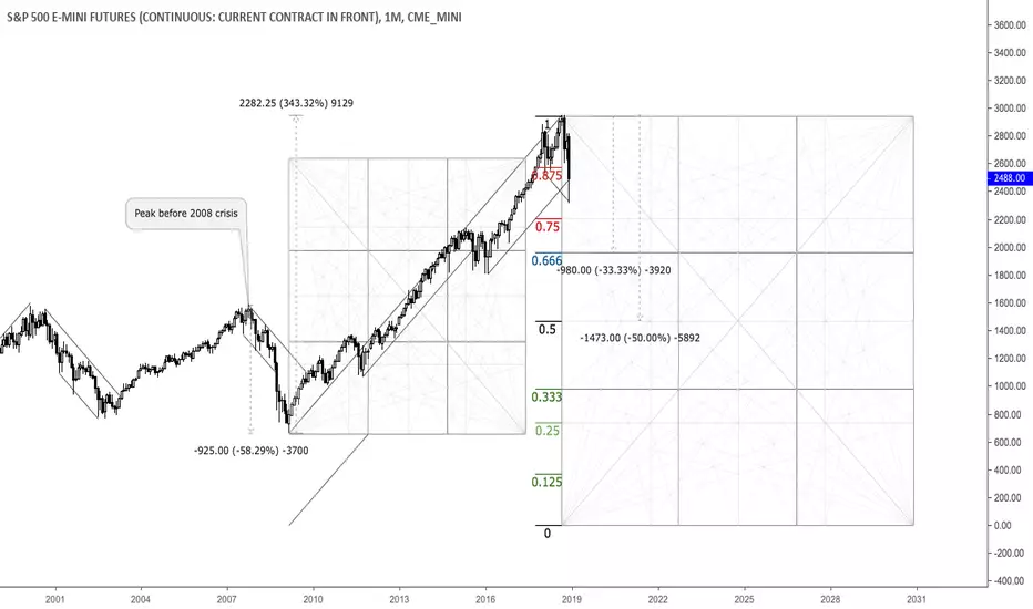
This is a monthly chart that shows important relationships in terms of price and time. As we can see, through the 2008 crisis the market plunged almost 60% and saw around 350% increase thereafter, painting an all-time high in September 2018. Currently, the 10-year-cycle is seemingly done and another big selloff in the equity market appears to be zooming. The 25%, 33.33% and 50% areas from the all-time high are potential targets and reversal zones. Selling into strength seems reasonable here.

Wyłączenie odpowiedzialności
Informacje i publikacje nie stanowią i nie powinny być traktowane jako porady finansowe, inwestycyjne, tradingowe ani jakiekolwiek inne rekomendacje dostarczane lub zatwierdzone przez TradingView. Więcej informacji znajduje się w Warunkach użytkowania.
Wyłączenie odpowiedzialności
Informacje i publikacje nie stanowią i nie powinny być traktowane jako porady finansowe, inwestycyjne, tradingowe ani jakiekolwiek inne rekomendacje dostarczane lub zatwierdzone przez TradingView. Więcej informacji znajduje się w Warunkach użytkowania.