Ayoub SMC AnalystAyoub SMC Analyst is a market-structure and price-action analysis indicator designed to help traders study market structure, liquidity behavior, Fair Value Gaps (FVGs), premium/discount areas, trend direction, and potential price targets from a single chart.
WHY THIS SCRIPT WAS CREATED
The purpose of Ayoub SMC Analyst is to organize important market-structure information directly on the chart without requiring multiple separate indicators.
The script focuses on structured market analysis rather than presenting guaranteed buy or sell signals. Its objective is to help traders identify important areas and build their own trading scenarios.
CORE FEATURES
• Higher High (HH)
• Higher Low (HL)
• Lower High (LH)
• Lower Low (LL)
• Bullish and Bearish Break of Structure (BOS)
• Buy-side and sell-side liquidity sweep detection
• Bullish and bearish Fair Value Gap (FVG) identification
• Premium and Discount areas
• Equilibrium level
• Major support and resistance levels
• Short-term and long-term trend direction
• Conditional bullish and bearish target levels
• Projected market scenarios
• Configurable structure sensitivity
• Optional labels and target visibility
HOW IT WORKS
The indicator uses confirmed swing highs and swing lows to evaluate market structure. It compares recent structural points to identify HH, HL, LH and LL formations.
Break of Structure conditions are detected when price crosses important structural levels.
Liquidity sweep conditions are identified when price temporarily moves beyond a structural high or low and closes back across that level.
Fair Value Gaps are identified using a three-candle price imbalance condition.
Premium and Discount areas are calculated from the most recent valid structural range, with the midpoint used as equilibrium.
Potential target levels are calculated from the current structural range. These levels are scenario-based reference points and are not guaranteed future price destinations.
HOW TO USE
1. Add the indicator to a standard candlestick chart.
2. Adjust Structure Sensitivity according to the timeframe and market.
3. Use HH, HL, LH and LL to understand the current market structure.
4. Monitor BOS and liquidity sweep markers around important structural levels.
5. Use FVG and Premium/Discount information as additional confluence.
6. Treat projected targets as analytical reference levels rather than guaranteed outcomes.
7. Combine the indicator with your own risk management and market analysis.
ORIGINALITY AND PURPOSE
Ayoub SMC Analyst is designed as a unified market-structure analysis tool with a specific focus on organizing structural levels, liquidity events, imbalance conditions, trend direction and scenario-based targets in one visual framework.
The goal is to reduce unnecessary chart clutter while keeping the main structural information visible and understandable.
LIMITATIONS
This indicator does not predict the future with certainty and does not guarantee profitable trades.
Market structure can change as new price information develops. Swing-based calculations can also change as new confirmed pivots appear.
The indicator is an analytical tool and should not be considered financial advice. Traders should independently evaluate market conditions, position sizing and risk before making any trading decision.
CHART EXAMPLES
TradingView chart examples:
Wskaźnik

Wskaźnik

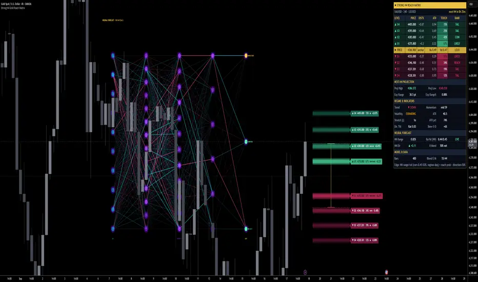
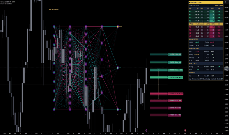
Strong H4 Gold Reach Matrix | ProjectSyndicateStrong H4 Reach Matrix Gold answers the one question a discretionary gold trader asks before every H4 bar: where is the next candle likely to trade, and with what odds? It is not a restyled oscillator with an arrow bolted on. It projects the next H4 candle as eight distinct price levels — four above, four below — each carrying a calibrated touch probability, placed by a live volatility-scaled excursion model, cross-checked against the raw empirical behaviour of your own chart, and sharpened by a genuine neural network whose weights were trained offline on XAUUSD H4 and whose forward pass runs live on every bar. The whole network is drawn on the chart as an inspectable diagram, and the projection freezes at each close so it never repaints. You are shown the odds, the model that produced them, and the assumptions behind them — not a single line that quietly redraws as the bar plays out.
⚠️ Gold H4 Only!!! networks was trained on gold H4 data.
🎯 Reach Engine — the core idea. For each new H4 bar the script asks how far price is likely to stretch from the last close, up and down, and converts that into probabilities. The excursion of a bar beyond the prior close, measured in ATR, follows an approximately exponential survival law: the chance of reaching a distance of k·ATR is close to e^(−k/θ), where θ is the typical (mean) ATR-excursion estimated live from a rolling window. Invert it — k = −θ·ln(p) — and any target probability p maps to a precise distance. Four upside and four downside probability targets therefore become eight price levels, each an honest "odds of touching this in the next bar" rather than a round-number guess.
📊 Empirical Survival Cross-Check. A pure model can be elegant and still wrong for the instrument in front of you, so the engine never trusts the formula alone. On every bar it walks the last N completed bars and directly counts how often price actually reached each of the eight thresholds — the raw empirical survival curve of your chart — and blends that with the smooth exponential tail (55/45 by default, fully adjustable from pure-empirical to pure-model). The displayed percentage is this blended, calibrated figure, not the target you dialled in.
🧠 Neural Core. Sitting on top of the statistical engine is a real multi-layer perceptron — 10 inputs, three hidden layers of 14, 12 and 6 tanh neurons, and three linear outputs, for 398 trained weights and 35 biases. It was trained offline by backpropagation on XAUUSD H4 history; the learned matrices are embedded directly in the script, and the on-chart forward pass — weighted sums, biases and tanh activations, layer by layer — reproduces the trained model exactly. Nothing is trained on your chart, so the mapping is fixed and deterministic. Its lifecycle each bar is FEATURE ▸ STANDARDISE ▸ FORWARD ▸ APPLY: the network predicts the next bar's range, its up/down split and its direction, and those outputs feed straight back into the projection — the range forecast sharpens θ (and therefore the spacing of all eight levels and the expected-range box), the split skews the up-vs-down odds, and the direction feeds the secondary tilt.
🔢 Feature Anatomy. The fingerprint is ten causal, percentage-based ingredients read only from completed bars: 5-bar momentum, stochastic range position (14), RSI(14), 5-bar average range %, 5-bar average body %, a short-vs-medium momentum acceleration, ATR %, the ATR(14)/ATR(50) volatility-regime ratio, distance from the EMA(20) expressed in ATR units, and a volume ratio. Working in ratio and percentage space rather than raw price is what lets a single learned mapping run on a market that travelled from the 2,000s into the 4,000s without the price level itself swamping the signal.
📐 Fixed Standardisation — deliberately, not by accident. Each feature is standardised against baked-in training statistics rather than a rolling window. This is a considered choice: the forecastable part of next-bar behaviour lives in the level of volatility, and rolling z-scoring silently erases exactly that level. Standardising against the training distribution preserves it, so the network can actually respond to whether the market is calm or violent right now.
🧊 Frozen at the Close — non-repaint by default. Every input is read from candles that have already closed, and the projection is anchored to the last completed H4 close. The eight levels, their probabilities, the expected-range box and the network's outputs are computed once when the bar opens and stay fixed until it closes — no sliding lines, no intrabar drift, no numbers that quietly improve as the session plays out. A "Live price (intrabar)" anchor is available for those who explicitly want a conditional, moving read.
🧭 No-Lookahead. Every network feature is lagged to the last closed bar and every excursion statistic is causal, so the value printed on any historical bar is identical whether or not the bars after it exist. On-chart machine learning most often fails here; this is built to avoid it.
🧱 Structural Snap + Minimum Spacing. Levels can optionally seat themselves on nearby swing-pivot liquidity or round numbers when one lies within tolerance, so they sit where price actually reacts rather than at arbitrary decimals — and probabilities recompute from the snapped distance. A hard minimum-spacing floor then guarantees the eight levels never glue together near the anchor or after snapping; each is separated from its neighbour by a set fraction of ATR, so every level is distinct and every probability is meaningful.
🧭 Directional Tilt — secondary by design. A small continuation tilt from trend (EMA20/50), momentum (RSI), short-horizon velocity and the network's own direction output shifts the up-vs-down odds. It is deliberately mild and clearly labelled: next-bar direction on gold is close to a coin flip, and the tool treats it that way rather than dressing it up as a signal.
🕸️ Live Network Map. The model is not a black box. The full network is drawn on the chart — an input column tagged with each feature, three hidden columns and an output column carrying RANGE, UP-SHARE and DIRECTION — with every node shaded by its live activation and every connection coloured by weight sign and brightened by the signal actually passing through it. Placement is deterministic (a bars-back offset that drops it cleanly into view, or out past the projection), so it renders exactly where you put it and never wanders off-screen.
📋 Dashboard. A compact panel reports, in real time: symbol/timeframe and lock state, the anchor close, the full 4×4 ladder (price, distance %, distance in ATR, calibrated touch %, and a PRIME/LIKELY/COIN/REACH/TAIL rank per level), the projected High/Low/expected range, a regime read (trend, momentum, volatility state, ATR percentile, stretch, tilt), and a dedicated Neural Forecast block showing the network's range output, its θ contribution, its direction call and the blend weight — with a standing one-line note on where the edge actually is.
🎚️ Controls. The history window and volatility length, the four probability bands, the minimum spacing, the empirical/model blend, the tilt weights, the snap behaviour, the network blend weights, and every visual element — beams, labels, projected candle, the network map's placement, size, connector style and theme, and the dashboard — are all adjustable. None of them change the trained model; they change how you read it.
🎯 Why this is different. Most "AI" indicators restyle an oscillator; most that claim a neural network never show one. This runs an actual trained MLP, draws it live, standardises its inputs so there is no lookahead, freezes each projection at the close so it cannot repaint, cross-checks its probabilities against your own chart's realised behaviour, and states plainly where its edge is and is not.
🚀 Where to use it. The model and calibration were built specifically for XAUUSD on the H4 timeframe, and that is where it is designed to run; the dashboard flags any mismatch. The first bars of a chart are a warm-up while the causal windows fill, after which the projection and dashboard come alive.
🎯 How to trade it
Apply it to XAUUSD H4 and let the windows warm up until the dashboard reads a live projection.
At each new H4 candle, read the eight levels and their calibrated touch probabilities — locked at the open, they will not move. Treat the PRIME/LIKELY levels as high-odds reach zones and the COIN/REACH/TAIL levels as progressively lower-odds stretches.
Use the expected-range box and projected High/Low as context for where the bar may reach — a reference for targets, fades and stop placement — not as an automatic entry.
Glance at the network map and the Neural Forecast block to see whether the model reads the coming bar as expansion or contraction, and whether volatility is being sharpened up or down.
Combine it with your own structure, levels and risk. It describes a likely next-bar envelope with odds; it is not an entry-and-exit system on its own.
⚠️ Important. This is a decision-support tool, not a standalone buy/sell system, and it makes no performance guarantees. Its honest edges are reach probability and volatility, not direction. In leakage-free testing the calibrated bands held up out-of-sample — target reach rates of roughly 85 / 65 / 45 / 25 % realised at about 83–87 / 64–70 / 44–49 / 23–25 % — and next-bar range correlates with current volatility at around 0.57. That range signal is real but regime-dependent: it is strong in trending/clustered-volatility periods and can fall close to zero in quiet stretches (in recent-quarter testing it did exactly that), and the network's out-of-sample range correlation of roughly 0.44 reflects the same regime dependence. Next-bar direction is treated as a coin flip because that is what it is — the up/down split stays near-symmetric and the tilt is a small adjustment, never a signal. The model is fixed and pre-trained, so bars inside its training period are in-sample by nature; genuine out-of-sample behaviour is what you see going forward. It is deliberately a modest network — larger nets overfit this much H4 data and test worse. Always let the candle open so the projection is frozen, and test it on your own data before trading it live.
Wskaźnik
Session High / Low Strength **Session High / Low Strength PRO** is a session-based market structure indicator designed to automatically track the High and Low of multiple trading sessions while also calculating how strong each level is.
The indicator can be fully customized for different markets, time zones, and trading styles. Each session can have its own name, trading hours, and color.
### Main Features
• Tracks the **Session High and Session Low** automatically
• Supports up to **4 fully customizable sessions**
• Custom **From / To session times**
• Adjustable **UTC / GMT timezone**
• Works with Asia, London, New York, custom sessions, or any other time window
• Automatically extends completed session levels
• Optional strength labels
• Live dashboard displaying session levels and strength
• Customizable line styles, colors, and widths
### High / Low Strength Score
Each Session High and Session Low receives a **Strength Score from 0 to 100**.
The score combines several different factors instead of relying on only one measurement.
**Level Touches**
The indicator tracks how often price interacts with the Session High or Low. Multiple reactions around the same price can indicate that the level is being respected by the market.
**Wick Rejection**
Long rejection wicks around the Session High or Low can indicate aggressive rejection of that price area.
**Relative Volume**
Volume around each level is compared with average market volume. Higher relative volume during a test can indicate stronger participation around the level.
**Close Away Strength**
The indicator measures how strongly price closes away from the Session High or Low after interacting with it. A stronger move away from the level can indicate stronger rejection.
### Strength Classification
The final score is classified as:
**0–24:** VERY WEAK
**25–39:** WEAK
**40–54:** MODERATE
**55–69:** STRONG
**70–84:** VERY STRONG
**85–100:** EXTREME
The weight of each strength component can be adjusted individually in the settings.
### Session Configuration
Every session can be configured independently.
Example:
**Asia Session**
00:00 – 08:00
**London Session**
07:00 – 16:00
**New York Session**
13:30 – 20:00
**Custom Session**
Any user-defined trading period
These are only example times. All session times can be changed directly in the indicator settings.
### Time Zone Support
The indicator supports customizable time zones, allowing the same session logic to be used regardless of the chart's exchange timezone.
Examples:
GMT+0
GMT+1
GMT+2
GMT-4
GMT-5
You can also use supported timezone names such as:
Europe/London
America/New_York
This makes the indicator useful for traders who work with specific session windows across different global markets.
### Extended Session Levels
When a session finishes, its High and Low can automatically extend to the right side of the chart.
This allows previous session levels to act as potential:
• Support
• Resistance
• Liquidity targets
• Breakout levels
• Reversal areas
• BOS / CHoCH confirmation zones
When the same session starts again, the previous session levels stop extending and the new session begins calculating its own High and Low.
### Dashboard
The built-in dashboard shows:
• Session name
• Session High
• High Strength Score
• Session Low
• Low Strength Score
• Strength classification
This makes it possible to quickly compare the most important session levels without manually checking every line on the chart.
### Trading Applications
The indicator can be used together with:
• BOS / CHoCH
• Market Structure Shift
• Liquidity Sweeps
• Breakout & Retest strategies
• Support and Resistance
• Volume Profile
• Session trading
• Reversal setups
• Trend continuation setups
For example, a Session High with a high strength score may represent a more significant liquidity or resistance area than a Session High that formed with very little volume and no meaningful rejection.
### Important
The Strength Score should not be interpreted as a prediction that a level will definitely hold.
A strong level can still break.
The score is designed to provide additional context about how the level was formed and how strongly the market previously reacted around that area.
It is best used together with price action, market structure, volume, and proper risk management.
Wskaźnik

ICT Session FVGs [50% Mitigated]This TradingView Pine Script (Version 5) is an overlay indicator designed for traders who use **Inner Circle Trader (ICT)** concepts. It automatically detects and highlights **Fair Value Gaps (FVGs)** that form during specific trading sessions (Killzones) and tracks them until price "mitigates" (fills) them to the 50% level.
Here is a breakdown of exactly how the script works under the hood:
### 1. User Inputs & Constraints
* **Session Toggles:** You can choose to highlight FVGs formed during the **Asia Killzone** (8:00 PM - 12:00 AM EST) and/or the **London Killzone** (2:00 AM - 5:00 AM EST).
* **Performance Lookback:** It only scans for and draws FVGs over the last X days (default is 5). Limiting historical data prevents the chart from lagging.
* **Visuals:** Allows customization of colors for Bullish (green) and Bearish (red) gaps.
### 2. Time Logic Filtering
The script hardcodes the timezone to `America/New_York` (EST). It checks every candle on the chart to see if it falls within the specified Asia or London time windows. If a candle is outside these windows (or outside the 5-day lookback limit), the script will ignore any FVGs that form.
### 3. FVG Detection (The 3-Bar Pattern)
When the active time zones are met, the script looks for the classic 3-candle FVG pattern using an array of custom data objects (`type FVG`):
* **Bullish FVG:** It triggers if the current candle's `low` is higher than the `high` of two candles ago. This leaves an empty gap where only buyers were present.
* **Bearish FVG:** It triggers if the current candle's `high` is lower than the `low` of two candles ago, leaving a gap where only sellers were present.
When a gap is found, the script calculates the exact top, bottom, and **midpoint (50% level)** of the gap, draws a colored box starting from the gap candle, and saves all this data into an array to be tracked.
### 4. Mitigation & 12 PM Cutoff Logic
This is the most dynamic part of the script. On every new candle, the script loops through all previously drawn, active FVGs to see what price is doing to them:
* **The 50% Mitigation Rule:** The script considers a gap "mitigated" (resolved) only when the price pierces the **50% midline** of the box.
* If a bullish gap's midline is hit by a candle's low, or a bearish gap's midline is hit by a candle's high, the gap is marked `mitigated = true`.
* The script then permanently locks the right side of the box to that specific candle, showing exactly where the gap was filled.
* **The Time Cutoff Rule:** If a gap has *not* been mitigated, the script will extend the box to the right so it stays visible on the chart. **However**, it stops extending unmitigated boxes at **12:00 PM (Noon) NY time**. It resumes extending them at 8:00 PM. This mimics the ICT concept of disregarding morning session unmitigated zones once the lunch hour hits. Wskaźnik

Edo Breaker BlocksEdo Breaker Blocks — Draws Only the Order Blocks That Fail and Invert Their Role, Then Tracks Each Breaker as Active, Tested or Failed
When an important level fails, it does not disappear — it changes sides. A demand order block that is lost stops being support and starts acting as resistance; a supply order block that is taken out stops being a cap and starts acting as support. That inverted level is a breaker block, and it is one of the clearest reaction references in structure analysis: not a theoretical line, but one that has already failed in one direction and reacted in the other.
Edo Breaker Blocks maps them automatically, with one key difference from a plain order-block tool: it does not draw every order block. It keeps each candidate latent until price violates it and reacts from the opposite side; only then is the breaker zone drawn, with the inverted role. From there it tracks the zone's behavior — respected, tested or lost — all validated on closed bars so the indicator does not repaint. Everything it needs comes from the chart's own price action: the candidate zones, the violation that inverts them and the states that follow are all computed inside the indicator.
ORDER BLOCK, BREAK AND BREAKER
An order block is the last opposite candle before an impulse that breaks structure: the last bearish candle before a bullish break marks the demand zone, the last bullish candle before a bearish break marks the supply zone. The indicator stores that candidate but does not draw it. Only when price violates it — closes through it against its original role — is the polarity inversion confirmed and the breaker drawn. A demand order block lost becomes a bearish breaker (resistance); a supply order block taken out becomes a bullish breaker (support).
BULLISH AND BEARISH BREAKERS
A bullish breaker is a former resistance order block that price has taken out; it inverts into support, drawn in teal below price. A bearish breaker is a former support order block that price has lost; it inverts into resistance, drawn in red above price. Each breaker is a box over the range of the candle that originated it, extended to the right and labelled Bull Breaker or Bear Breaker, so the side and role read at a glance.
ACTIVE, TESTED AND FAILED
Each breaker lives in one of three states, evaluated on every closed bar. Active: freshly formed, thin-bordered, extending to the right. Tested: price has returned to the zone and respected it — it enters but closes on the correct side — and the border thickens while the zone stays alive. Failed: price has closed through the zone, which voids it — the box turns dashed and faded and stops extending. A bullish breaker is tested when price drops in and closes above its base, and fails when it closes below; a bearish breaker is tested when price rises in and closes below its top, and fails when it closes above. Only breakers that have not failed count in the panel, and only the most recent per side are kept, up to Max Breakers per side (6 by default).
STRUCTURE PROFILES AND IMPULSE LOOKBACK
The Structure Profile sets the swing sensitivity that defines a break: Scalper (5 bars each side) for short-term breakers on low timeframes, Swing (10 bars, the default) for the balanced 4H and daily read, and Long Term (21 bars) for the major breakers on weekly and higher horizons. The Impulse Lookback (20 by default) controls how many bars back the indicator searches for the candle that originated the impulse — how recent the order block has to be relative to the break.
INFORMATION PANEL
A compact panel under the indicator header shows the number of active bullish breakers (support), active bearish breakers (resistance) and the total of live zones, in the same teal/red color code. The count per side shows where the live references concentrate — more bull breakers mean support stacked below, more bear breakers resistance above. The panel sits in any of the four chart corners (Top Right by default), comes in three sizes (Tiny / Small / Normal) and two themes (Dark / Light), and can be hidden entirely. To keep the calculation light, it is drawn only on the last bar.
NO REPAINTING
Breakers are built on confirmed pivots and their transitions are validated on closed bars, so a zone never appears or disappears intrabar and a wick that pierces a breaker but closes back on the same side does not mark it as tested or failed. There are no higher-timeframe functions: all logic runs on the current chart timeframe. For a multi-timeframe read, apply it on several charts at once.
CONFIGURATION
The inputs are grouped by block. Structure sets the profile, the impulse lookback and the maximum breakers per side. Style exposes the bullish and bearish colors, the zone opacity, the label size and the Dark/Light theme. Panel controls panel visibility, position and size. The defaults are calibrated to work without adjustment on stocks, crypto, forex, indices and futures, on any timeframe — the inputs most users touch are the Structure Profile and the Impulse Lookback.
ALERTS
Four predefined alerts cover the life of a breaker: Bullish Breaker formed and Bearish Breaker formed fire when a new breaker is drawn; Breaker Tested fires when price returns to a zone and respects it; Breaker Failed fires when price closes through a zone and voids it. All alerts fire on bar close, consistent with the indicator's anti-repaint validation.
HOW TO READ IT
Use a breaker as a reaction zone: a bullish breaker below price is a probable support, a bearish breaker above a probable resistance, stronger than a plain level because it has already proven its inverted role. Watch the test — when price returns and respects the zone, the reaction confirms it is still alive, and a tested breaker that holds is a more solid reference than a freshly formed one. Read the failure too — a breaker closed through has lost its relevance, and recognizing it in time avoids leaning on a zone that no longer defends anything. Trade breakers in confluence with the broader structure, and combine them with order-block mapping, which marks the active blocks before they fail, and with a broader market-structure read that places everything in context.
OPEN SOURCE
Edo Breaker Blocks is published as a free open source indicator. The full Pine Script is publicly accessible on TradingView for study, adaptation and integration into any workflow. Part of the Edolab Markets free tools ecosystem available on TradingView.
This indicator is a technical analysis tool for educational and informational purposes only. It does not generate automatic buy or sell signals and should not be considered financial advice. Trading financial markets involves significant risk of capital loss. Past performance does not guarantee future results. Always use proper risk management.
Wskaźnik

D.vis Swing Engine - RP + RVOL + Trend## English
**D.vis Swing Engine – Relative Performance + Relative Volume + Trend**
D.vis Swing Engine is a swing trading indicator designed to identify stocks that combine positive trend structure, relative strength versus the S&P 500, and above-average trading volume.
The indicator combines several technical components into a single visual framework:
**Relative Performance (RP)** compares the stock's performance with the S&P 500, using SPY as the default benchmark. A positive RP value means the stock has outperformed the benchmark during the selected lookback period. The indicator also measures whether Relative Performance is improving or deteriorating.
**Relative Volume (RVOL)** compares the current trading volume with the stock's average volume over a selected period. An RVOL above 1.0 indicates above-average volume, while values such as 1.5x or 2.0x indicate significantly increased market participation.
The indicator classifies high relative volume on bullish candles as **Money In** and high relative volume on bearish candles as **Money Out**. These readings should be interpreted as proxies for buying and selling pressure rather than literal capital inflows or outflows.
The trend component uses:
- EMA 9
- EMA 21
- SMA 50
- SMA 200
The primary bullish trend condition requires price to trade above EMA 9 while EMA 9 is above EMA 21. SMA 50, SMA 200, and EMA 21 slope filters can optionally be enabled for more restrictive setups.
The indicator also calculates a **Setup Score from 0 to 5** based on five conditions:
1. Price is above EMA 21.
2. EMA 9 is above EMA 21.
3. Relative Performance is positive.
4. Relative Performance is rising.
5. Relative Volume exceeds the selected threshold on a bullish candle.
The dashboard classifies the setup as:
**WAIT** – insufficient conditions are aligned.
**WATCH** – most conditions are aligned and the stock may be approaching a valid setup.
**BUY 5/5** – trend, Relative Performance, and Relative Volume conditions are fully aligned.
A BUY label is displayed only when the complete bullish setup becomes valid for the first time, helping reduce repeated signals during an already established trend.
The indicator also includes a **RISK** condition designed to highlight potential distribution. This occurs when price falls below EMA 21, Relative Performance becomes negative, and strong relative volume appears on a bearish candle.
### Suggested settings for swing trading
- Benchmark: SPY
- Relative Performance Timeframe: Daily
- RP Lookback: 63 trading days
- RP Momentum Period: 5 trading days
- RVOL Average Length: 20
- RVOL Threshold: 1.5x
- SMA 50 Filter: Optional
- SMA 200 Filter: Optional
This indicator is intended as a decision-support tool and should not be used as a standalone trading system. Market structure, support and resistance, earnings, fundamental factors, risk management, and broader market conditions should also be considered.
---
## Română
**D.vis Swing Engine – Performanță Relativă + Volum Relativ + Trend**
D.vis Swing Engine este un indicator pentru swing trading conceput pentru a identifica acțiunile care combină o structură tehnică pozitivă, performanță relativă superioară față de S&P 500 și volum de tranzacționare peste medie.
Indicatorul combină mai multe componente tehnice într-un singur sistem vizual:
**Relative Performance (RP)** compară performanța acțiunii cu S&P 500, folosind implicit SPY drept benchmark. O valoare RP pozitivă înseamnă că acțiunea a performat mai bine decât benchmark-ul în perioada selectată. Indicatorul măsoară și dacă performanța relativă se îmbunătățește sau se deteriorează.
**Relative Volume (RVOL)** compară volumul curent de tranzacționare cu volumul mediu al acțiunii din perioada selectată. Un RVOL peste 1,0 indică un volum peste medie, iar valori precum 1,5x sau 2,0x indică o creștere semnificativă a participării în piață.
Indicatorul clasifică volumul relativ ridicat pe lumânări bullish drept **Money In**, iar volumul relativ ridicat pe lumânări bearish drept **Money Out**. Aceste valori trebuie interpretate ca aproximări ale presiunii de cumpărare sau vânzare, nu ca intrări sau ieșiri literale de capital.
Componenta de trend utilizează:
- EMA 9
- EMA 21
- SMA 50
- SMA 200
Condiția bullish principală cere ca prețul să fie peste EMA 9, iar EMA 9 să fie peste EMA 21. Filtrele SMA 50, SMA 200 și panta EMA 21 pot fi activate opțional pentru setup-uri mai restrictive.
Indicatorul calculează și un **Setup Score de la 0 la 5**, bazat pe cinci condiții:
1. Prețul este peste EMA 21.
2. EMA 9 este peste EMA 21.
3. Relative Performance este pozitiv.
4. Relative Performance este în creștere.
5. Relative Volume depășește pragul selectat pe o lumânare bullish.
Dashboard-ul clasifică setup-ul astfel:
**WAIT** – nu sunt îndeplinite suficiente condiții.
**WATCH** – majoritatea condițiilor sunt îndeplinite, iar acțiunea se poate apropia de un setup valid.
**BUY 5/5** – condițiile de trend, Relative Performance și Relative Volume sunt complet aliniate.
Eticheta BUY este afișată doar în momentul în care setup-ul bullish complet devine valid pentru prima dată, reducând astfel semnalele repetate în timpul unui trend deja confirmat.
Indicatorul include și o condiție **RISK**, concepută pentru a evidenția posibile perioade de distribuție. Aceasta apare atunci când prețul scade sub EMA 21, Relative Performance devine negativ, iar pe o lumânare bearish apare un volum relativ ridicat.
### Setări recomandate pentru swing trading
- Benchmark: SPY
- Timeframe Relative Performance: Daily
- RP Lookback: 63 zile de tranzacționare
- RP Momentum Period: 5 zile
- Media pentru RVOL: 20 perioade
- Prag RVOL: 1,5x
- Filtru SMA 50: Opțional
- Filtru SMA 200: Opțional
Indicatorul este conceput ca instrument de suport pentru luarea deciziilor și nu trebuie utilizat ca sistem de tranzacționare independent. Structura pieței, suporturile și rezistențele, raportările financiare, factorii fundamentali, managementul riscului și condițiile generale ale pieței trebuie analizate separat. Wskaźnik

Unmitigated Gaps by Midniteblade4H Unmitigated Gaps — Build Summary
A Pine Script indicator that finds and draws unmitigated Fair Value Gaps (FVGs) on the 4H timeframe, from any chart timeframe you're viewing.
What it does
An FVG is a three-candle imbalance — a move so fast that price left a gap no two-way auction filled. The script looks for two kinds:
Bullish FVG — candle 3's low is above candle 1's high (l3 > h1). Price skipped up; the gap sits below.
Bearish FVG — candle 3's high is below candle 1's low (h3 < l1). Price skipped down; the gap sits above.
Each gap is drawn as a box and stays on the chart until price trades back through it ("mitigated"). The info table reports live counts, the nearest gap above/below price, and the stored 4H period data.
The three bugs we hit — and why each mattered
1. max_bars_back rejected built-in series. The script needed deep history for dynamic indexing. Pine refused max_bars_back(volume, 5000) because volume, close, open, hlc3 are built-ins — the parameter needs a user-declared series. Fix: assign each to a variable first, then declare.
2. The history buffer was keyed to the wrong variable. This is the subtle one. We declared history on the new variables — but the loop still indexed volume , close directly. Pine sizes its buffer for the exact series you reference, so the declarations did nothing and the runtime error came back. Fix: swap every dynamic index in the loop to the declared variables.
Lesson: declaring max_bars_back on a variable only helps if that variable is what you actually index. The declaration follows the reference, not the value.
3. The live test compared a bar against itself. The ongoing check read candle 3 from the n-1 slot while also treating the live bar as a separate candle — but those were the same bar. It could never detect a new gap. Fix: compare the newest stored period against the two before it, so all three candles are genuinely distinct.
Lesson: when a test returns zero forever, check whether its inputs are actually independent before assuming the market is quiet. A debug row showing the raw stored values is what exposed this.
Debug technique worth stealing
We added a table row printing the last three stored htfH/htfL pairs — . That single row let us verify the array was storing sane values and cross-check them against the table's own "Cur/Prev period" rows. When the numbers matched, the storage was proven correct; when the live test still failed, the bug had to be in the comparison logic.
Print your raw inputs, not just your outputs. An output of 0 tells you nothing. The inputs tell you why.
Takeaway
Three separate bugs, each hidden behind the last. The first fix looked like it worked until the second surfaced; the second looked complete until the third appeared. Debugging in sequence — fix, re-run, read the new error — is what got there. Skipping verification after a fix would have left all three in place. Wskaźnik

JoulTrades - ICT PDH/PDL EighthsOVERVIEW
This indicator marks the previous day's high (PDH) and low (PDL) and grades the range between them in eighths, the way ICT (Inner Circle Trader) teaches traders to grade a range: quadrants, octants and a black equilibrium line. It is a level-marking tool for study and chart preparation. It does not generate signals, entries or bias.
WHAT IT DRAWS
- PDH and PDL, extended to the right with labels and price-axis tags.
- Seven graded levels between them: 0.125, 0.25, 0.375, 0.5, 0.625, 0.75 and 0.875.
- The 0.5 level (equilibrium, also called consequent encroachment or CE) in black. Every other level uses one grey, so the midpoint stands out.
- Optional: the previous week's high and low as dashed lines.
HOW IT WORKS
- The range is always measured from the low to the high, whatever the trend. The levels do not move when the market turns.
- Each level is PDL + fraction x (PDH - PDL).
- No separate 0 and 1 lines are drawn, because PDH and PDL already sit there. A range's own edge is not drawn twice.
- The previous day is final once it has closed, so its levels do not repaint. The lines are redrawn on the latest bar only so they stay attached to the current price area and do not pile up on the chart.
- It works on every intraday timeframe and on the daily. Nothing is drawn on weekly or monthly charts.
WHAT COUNTS AS "PREVIOUS DAY"
Traders use two definitions, and they can give different prices:
- Full day (default): the daily candle. On CME futures that is 18:00 to 17:00 New York time, including the overnight session.
- RTH session only: the regular trading hours set in the settings (default 09:30-16:00 New York). The labels change to "RTH PDH" and "RTH PDL" so a screenshot always shows which one is in use.
On charts above 30 minutes, the RTH range is read from 30-minute data so the session edges are exact.
NUMBERING
- ICT ladder (default): 0 is the low and 1 is the high, so 0.875 is the highest octant, next to PDH.
- TradingView fib: matches the built-in fib retracement tool drawn from low to high, which puts 0 at the high.
The prices are identical in both modes. Only the numbers attached to them change. Pick the one that matches the way you read levels.
LABELS
Labels can show the number, the ICT name, or both:
0.875 highest octant, 0.75 upper quadrant, 0.625 second octant, 0.5 CE, 0.375 lower octant, 0.25 lower quadrant, 0.125 lowest octant.
Hover over any label for a short explanation of that level. This is meant to help newer traders learn the vocabulary while they look at the chart.
HOW TO READ IT
- Above 0.5, price is in the premium half of yesterday's range. Below 0.5, it is in the discount half.
- ICT treats quadrants and octants as reference levels that price can be drawn to, not as decoration.
- PDH and PDL are where resting liquidity is commonly assumed to sit until price trades through them.
- A level carries more information when it lines up with a level from a different range, for example an opening gap or a key open landing on the same price.
Use these levels as a map for your own analysis. They are not trade signals on their own.
SETTINGS
- Range: previous day definition, RTH session and timezone, eighths on or off.
- Labels: numbering, label text, price in labels, label size, label distance from price.
- Style: level colour, equilibrium colour, line widths. The defaults are grey #636363 levels, a black equilibrium, and thicker PDH/PDL lines.
- Previous week: high and low on or off, and their colour.
LIMITATIONS
- The default RTH session fits US index futures and US stocks. For other markets, set the session and timezone to match.
- Full day follows the chart's own daily session. On symbols that trade around the clock, "previous day" is whatever the exchange defines as the daily candle.
- RTH mode on the daily chart depends on the 30-minute history TradingView loads for your plan.
- These are reference levels. The indicator makes no claim about how often price reacts at any of them. Test them on your own market and timeframe before relying on them.
This script is open source and published for educational purposes. It is not financial advice.
Wskaźnik

Smart AVWAPs## Smart AVWAPs
Smart AVWAPs is a multi-anchored VWAP indicator designed for swing traders who want to identify areas where several important volume-weighted price levels converge.
Instead of anchoring VWAPs to every minor swing, the indicator automatically creates AVWAPs from selected high-importance events:
* High relative volume swing highs and lows
* Earnings gaps
* 52-week highs and lows
* Major reversal candles with elevated volume
The indicator keeps the most recent active AVWAPs on the chart, making it easier to visually identify price zones where multiple anchored VWAPs overlap or compress.
### How to Use
AVWAP convergence can highlight areas where participants anchored to different market events have similar volume-weighted cost bases.
For swing trading, these areas can be monitored as potential support, resistance, consolidation, or breakout zones.
A typical workflow is:
1. Look for several AVWAPs converging within a narrow price range.
2. Observe how price behaves around the convergence area.
3. Wait for confirmation such as a strong breakout, reclaim, increased relative volume, or successful retest.
4. Use broader trend, market structure, and risk management before taking a position.
AVWAP convergence itself is not intended to be an automatic buy or sell signal.
### Inputs
**Active AVWAPs**
Controls the maximum number of recent AVWAP anchors displayed.
**Pivot Left / Right**
Controls the sensitivity of swing-high and swing-low detection.
**Minimum RVOL**
Requires a swing or reversal candle to have elevated volume relative to its recent average.
**Earnings Gap %**
Defines the minimum price gap required for an earnings event to create an anchor.
**Reversal ATR**
Controls how large a reversal candle must be relative to ATR before it qualifies as a significant anchor.
### Intended Use
The indicator is primarily designed for daily-chart swing trading, but the settings can be adjusted for other timeframes and trading styles.
It is best used as a visual confluence tool rather than as a standalone trading system.
For research and educational purposes only. This indicator does not provide financial advice or guarantee future mar
Wskaźnik

Wskaźnik

TrendLock | Multi-Timeframe Supertrend Donchian BreakoutStrategy Explanation
TrendLock combines three independent confirmations before it will ever open a trade: a primary Supertrend for local trend direction, a higher-timeframe Supertrend that must agree before entries are allowed, and a Donchian channel breakout that times the actual entry once both trend layers align. A volume-spike filter adds a final check that real participation is behind the move, not just drift.
The idea is simple: most Supertrend scripts fire on every local flip and get chopped up in ranges. TrendLock only engages when the bigger picture and the immediate price action are both pointing the same way, and only pulls the trigger on a genuine breakout — not just a trend-line touch.
Exits are ATR-based (stop and target sized off current volatility, not fixed percentages), with an optional early exit if the primary Supertrend flips against the position.
Features
Dual-timeframe Supertrend agreement filter (toggle on/off)
Donchian channel breakout entry trigger, plotted with a shaded channel
Volume-spike confirmation filter
ATR-based stop loss and take profit
Optional trend-flip exit independent of the stop/target
Long-only, short-only, or both-direction modes
Background tint shows HTF/LTF agreement at a glance
Built-in alert conditions for long and short signals
Tips
Pick an HTF meaningfully above your trading timeframe (e.g. 15m chart → 4H filter, 1H chart → 1D filter). Too close and the filter does nothing; too far and setups become rare.
Test the HTF filter on and off separately — it should reduce trade count and whipsaws, not just trade count.
Donchian lookback and ATR lengths interact: a longer Donchian window means fewer, larger breakouts, so widen your ATR stop/target multipliers accordingly.
Try disabling the volume filter on lower-liquidity assets, where volume data can be noisy or unreliable.
Backtest across several unrelated symbols and timeframes using the same input values — if it only works on one chart, the settings are likely overfit rather than a real edge.
Warnings
This is a backtesting and research tool, not financial advice — past performance in the Strategy Tester does not predict future results.
request.security calls for the HTF Supertrend can behave differently between the visible chart and actual live execution; always forward-test on a paper account before risking real capital.
Breakout strategies are prone to false starts in choppy markets even with trend filters — expect a real losing-streak tail in the backtest, not just the equity curve's best stretch.
Commission, slippage, and order-fill assumptions in the Strategy Tester are approximations; verify against your actual broker/exchange fee schedule before sizing a live position.
The HTF filter and volume filter are optional and default to specific settings — review every input before deploying, don't assume the defaults suit your instrument or timeframe.
Strategia

COT Net Positions - Commercials vs Large SpeculatorsOverview
This indicator plots the net positioning (Long minus Short) of Commercial Traders and Large Speculators from the CFTC Commitment of Traders (COT) report, side by side, so you can see how the two groups are positioned relative to each other on the same chart.
How It Works
For each group, net position is calculated as:
Net Position = Long Positions - Short Positions
This is calculated separately for Commercials and for Large Speculators (Non-Commercials). Optionally, either series can be displayed as a percentage of total Open Interest instead of raw contracts:
Net % of Open Interest = 100 * Net Position / Open Interest
This normalization makes readings easier to compare over time and across contract-size changes (e.g. after a rollover or a change in typical position sizes), since raw contract counts alone don't account for changes in overall market participation.
COT data is requested with lookahead disabled, so this indicator does not repaint. Values only change on the bar where new CFTC data is published, regardless of chart timeframe.
Default Settings
Show Commercials: on
Show Large Speculators: on
Display Mode: Contracts (switchable to % of Open Interest)
Info table: on, top right
All adjustable in the script's Settings.
Interpretation
Commercials (often producers, processors and hedgers) and Large Speculators (large funds and managed money) are typically positioned on opposite sides of the market. Watching both net lines together shows the balance between these two groups.
A rising Commercials Net line while Large Speculators Net falls (or vice versa) reflects a shift in who is taking on more directional exposure.
The info table also shows the week-over-week change for each group and the current Open Interest.
Typical Use Cases
Compare Commercial and Large Speculator positioning on one chart
Track how net positioning shifts week to week
Normalize positioning across markets or over long histories using % of Open Interest
Combine with seasonality, price structure, trend and market regime for a fuller picture
Support commodity and futures market research
Limitations
COT data is weekly and delayed: the report reflects positions as of Tuesday and is usually published the following Friday. This indicator is not designed for intraday timing and is not a standalone trading system. Net positioning alone does not predict price direction. Both groups can remain positioned the same way for extended periods, especially in strong trending markets. Past positioning patterns do not guarantee future price behavior.
Symbol Support
Designed for futures and continuous futures charts. Some micro contracts, CFDs, broker-specific symbols or otherwise unsupported markets may not return valid COT data.
Originality
COT data retrieval uses the public TradingView "LibraryCOT" community library. The net-position calculation for both trader groups, the optional % of Open Interest normalization, the weekly change tracking, and the info table are original to this script. It complements the companion "Commercials COT Index Weekly" indicator, which shows Commercial positioning as a normalized 0-100 index rather than as raw/percentage net values.
For educational and research purposes only. This is not financial advice. Wskaźnik

Strategia

Round Number Levels - Response and ControlRound Number Levels - Response and Control
Round Number Levels - Response and Control draws a fixed round-number grid and examines what confirmed closes do after price contacts its levels. Two shifted reference grids provide a comparison, using contacts matched by time, approach direction and pre-contact market context.
Use it to keep price levels visible and investigate whether their observed response differs from nearby, equally spaced references. Negative differences, disagreement between the references and insufficient data are all possible results. The indicator does not assume that round numbers must act as support or resistance.
GETTING STARTED
Use a standard time-based chart and check the Interval value before interpreting any statistics. The default interval is 200 minimum ticks, not 200 pips and not a universal setting for every market. This equals 0.200 when the minimum tick is 0.001, or 0.00200 when the minimum tick is 0.00001. Manual price mode lets you specify the interval directly in price units, rounded to whole minimum ticks.
Keep the Compact panel for the main comparison. Standard adds coverage information; Research exposes the detailed sample, individual references and exact-level history. Hover over panel rows and badges for definitions and counts. A Low N or Partial status is information about the available sample, not an instruction to search for settings that produce a preferred result.
For a repeatable study, set the price interval, date window and observation rules before evaluating the displayed differences. Display-only settings, including badge sizes, colors, marker limits and panel detail, do not change the research.
THE FIXED PRICE GRID
ROUND levels are integer multiples of the chosen interval, measured from price zero. The levels are defined before their reactions are observed; the script does not move them toward historical pivots or keep only levels that previously worked.
By default, cyan marks ordinary levels, yellow emphasizes every fifth interval, green marks the enclosing lower level, and pink marks the enclosing upper level. The enclosing colors take priority when a level also qualifies as a major level. The panel shows the exact enclosing prices, tick distances and position within that interval. Optional half-interval guides appear only when the interval contains an even number of ticks. These subdivisions and visual emphasis do not create additional research cohorts.
The opaque price badges use compact, bold monospace digits: 13 points for ordinary round numbers and 14 points for major or enclosing levels. Their fill follows the level color, with automatically selected black or white text. An opaque dark background is also available. Font sizes remain independently adjustable. The default text contains the price only; L/U and major-level prefixes can be restored.
Badges retain the exact level in their text even when displaced for readability. Optional connectors join them to the corresponding horizontal line. The default position is to the left of the line segment, with an additional twelve-bar horizontal gap and a small vertical offset. Badge placement does not change the line price. Very tight spacing or strong chart compression can still cause visual overlap.
Two automatic preview modes choose a 1-2-5 interval once from the first usable prior range or price context. The panel explicitly identifies PREVIEW because the choice can change with the loaded starting history. Copy its displayed interval into Manual price to fix the interval for a repeatable study.
REFERENCE A AND REFERENCE B
Reference A is shifted by 37% of the interval by default, rounded to minimum ticks. Reference B uses the exact complementary tick offset, normally close to 63%. Both references have the same spacing as ROUND. Their lines are optional and hidden by default, but research continues while they are hidden.
All three contact bands must be separate. Overlapping bands pause the comparison rather than creating indistinguishable cohorts. Shifted prices can still be round numbers at a finer scale. These are observational reference grids, not randomized placebos.
CONTACTS AND CONFIRMED OUTCOMES
A contact occurs when a candle's high-low range intersects the band around one grid level. The default half-width is 4% of the interval, with a one-tick minimum. The preceding close must be outside that band by the required clearance; the default clearance is 12% of the interval, with a minimum of one tick beyond the band.
The same bar-quality exclusion applies to all grids. If the opening gap crosses an entire band in any grid, or the candle touches more than one level band in any grid, none of the three grids admits a new contact on that bar. Already active observations continue. This avoids assigning a precise new contact to ambiguous OHLC data.
Every eligible contact is tracked, including contacts that start while earlier ones are unresolved. There is no outcome-dependent busy state or cooldown. A contact is not discarded merely because an earlier observation is taking longer to resolve.
The response distance is fixed at contact. It can be a fraction of the grid interval or a multiple of the preceding finite mean true range. The default is 20% of the interval. The threshold is at least one tick beyond the contact band and does not move with subsequent volatility.
The contact candle is excluded from outcome testing. Subsequent confirmed closes determine the result:
R, Return: the configured number of consecutive closes is at or beyond the threshold on the side from which price approached.
T, Through: the configured number of consecutive closes is at or beyond the threshold on the opposite side.
U, Unresolved: neither condition has been confirmed by the end of the full observation horizon.
Each consecutive-close counter resets when its own condition is not satisfied. The first confirmed R or T result is fixed. A confirmation on the last allowed bar takes precedence over U. Defaults are two consecutive closes within twelve bars after contact; the effective horizon is never shorter than the confirmation count.
These outcomes are not intrabar first touches, executions or trade returns. No entry, stop, target, spread, fee or position-sizing model is applied.
HOW THE MATCHED COMPARISON IS BUILT
The panel does not compare three independently truncated latest-N lists. Its main sample consists of triplets containing one ROUND contact, one A contact and one B contact.
Time is divided into fixed elapsed-time blocks anchored to the Unix epoch. The default block is 128 chart periods, equivalent to 640 elapsed minutes on a five-minute chart. Blocks are not exchange sessions and do not count only traded bars. Loading more preceding history does not move their boundaries. Weekly and monthly chart periods use the platform's seconds conversion rather than calendar-aligned week or month boundaries.
Within a block, contacts are grouped by approach side and optional prior context. The default Side + range + trend mode uses three range groups and three trend groups, separately for approaches from above and below. Side only and Side + range are also available.
Range grouping uses the preceding finite mean true range divided by the fixed interval, with default boundaries of 0.25 and 0.75. Values below 0.25 enter the low group, values from 0.25 to below 0.75 enter the middle group, and values at or above 0.75 enter the high group.
Trend grouping uses the preceding close minus the close ten bars before it. The default neutral band is plus or minus 0.5 times the preceding mean range; values on either boundary remain neutral. All context inputs come from preceding bars, not subsequent outcomes.
Inside each block and context group, the first eligible ROUND, A and B contacts are assigned together, then the second contacts, and so on. The default matching cap is the first eight contacts per grid, context group and block. Later contacts are still observed and exported, but do not enter matching. Their exclusion is counted separately.
A complete triplet must satisfy a fixed maximum spread between its earliest and latest contact times, defaulting to half a block. Failed triplets are not reassigned to different partners. Neither matching nor this time filter consults R/T/U results or resolution speed.
EVERY CONTACT RECEIVES THE SAME HORIZON
Early confirmation does not produce early inclusion in the comparison. Every observation must receive the full configured horizon before contributing, including results already known after only a few bars.
Only complete time blocks whose contacts have all had that horizon enter the panel. Blocks cut by the study dates or the beginning of usable history are excluded. The default window contains the latest twenty-four mature elapsed-time blocks. The study start is inclusive and the study end is exclusive; already admitted contacts continue to receive their horizon after the end date.
Matching gives the three cohorts identical counts by time block, approach side and context group. It does not make their price paths identical. Context groups remain broad, contact horizons can overlap, and unmeasured conditions can differ. Standard and Research show how much of the full contact population the matched sample covers.
READING THE COMPACT PANEL
The default panel has fourteen rows. The MATCHED section uses the same triplets for every main-sample percentage and difference.
N each grid shows the actual denominator: ROUND on the left and A / B on the right. All three numbers are equal. They are neither storage capacities nor counts of visible markers.
Return, Through and Unresolved show the ROUND share and the arithmetic mean of the A and B shares. U stays in the denominator. Hover over a row to see the separate A and B values and underlying counts.
R delta A / B shows ROUND's return share minus A's on the left, and ROUND's return share minus B's on the right. Values are percentage points, not percentage changes or predicted probabilities.
Mean / A-B shows the arithmetic mean of those two differences and their sign relationship. Both + means both are positive; Both - means both are negative. SPLIT means they have opposite signs. Has zero means one or both differences is exactly zero. A positive mean never hides a SPLIT. These labels describe signs, not statistical significance or confidence.
Early / Late splits the retained clock window into two contiguous halves. Each half has its own smaller matched denominator, shown in the tooltip. This is a historical period comparison, not a held-out test.
Main differences require at least thirty matched triplets, five from each approach side and three contributing blocks by default. Half-window comparisons use their own smaller guards. Below the requirements, counts and outcome shares remain visible while the affected differences are withheld. The guards prevent very small comparisons from looking definitive; they are not significance tests.
Standard has twenty-two rows and adds all mature contacts, matched coverage, over-cap contacts, contributing blocks, time spread and window coverage. Research has thirty-two rows and adds matched history at the exact enclosing levels, side counts, separate A/B outcomes, shared exclusions and reproduction details.
MARKERS, LIVE CONTEXT AND ALERTS
R/T/U markers appear on the confirmed bar when an outcome becomes known. Their time is never moved back to the contact bar. Default placement is outside the outcome candle and two preceding candles, plus a range-based margin. The vertical location is for readability, not the studied price or an execution price.
Several outcomes can resolve on one bar. The displayed badge represents the oldest contact resolving there; a plus sign, such as R+, means additional outcomes exist. The tooltip lists the R/T/U counts for that bar. Marker thinning and the maximum marker count affect drawing only.
Markers describe eligible ROUND outcomes before matching. The panel describes matched, fully mature triplets. Counting the chart markers therefore cannot reproduce the panel denominator. Optional threshold lines show only the latest unresolved ROUND contact to limit clutter; other observations continue independently.
The live reference price, enclosing levels, distances and cell shading can update during an open candle. Observation results are updated only on confirmed bars. The panel's matched sample uses closed, fully mature clock blocks, so it does not necessarily change on every new candle.
Four alert conditions are available: a newly admitted ROUND contact, one or more confirmed Return outcomes, one or more confirmed Through outcomes, and one or more Unresolved outcomes. They describe observation events rather than trade instructions. More than one outcome type can occur on the same bar, independently of which representative marker is visible. Create the required alerts in the alert dialog. Recreate existing alerts after changing research settings so that they use the intended configuration.
REPRODUCIBILITY AND NUMERIC RECORDS
Research uses a finite simple mean of tick-quantized true range rather than recursively seeded Wilder ATR. With manual spacing, the same settings and sufficient identical preceding OHLC, extra earlier history does not shift the later context calculations or epoch-based block boundaries. Data revisions, sessions, price adjustments and missing bars can still change results.
Require full start-date context pauses research unless loaded history crosses the requested start with adequate preceding context. Otherwise, the initial partial block is excluded and incomplete coverage is reported. Fixed / full describes coverage of the displayed window; it does not certify the entire requested history or statistical validity.
The RN6_ Data Window outputs retain research protocol 6001. They expose the settings, reported clock window, actual matched N, A/B differences, their mean, sign status and a non-cryptographic OHLC checksum. Equivalent records are emitted for all three grids: contact time, level in ticks, approach side, fixed threshold, result, first confirmation age, context group and ordinal.
Each record is emitted exactly H bars after contact. This permits at most one complete record per grid per bar, even when several early outcomes resolve together. Unmatched and over-cap contacts are still recorded. A negative ordinal marks a partial or date-cut block excluded from panel statistics. Pending contacts are not presented as completed records.
For recomputation, preserve the source, settings and native OHLC export, including sufficient context before the window and the following horizon. The checksum helps identify differences in included data; it is not a cryptographic signature. The optional Pine Logs recipe is a convenience for personal editor copies, not a requirement for using the published indicator.
DESIGN PURPOSE AND LIMITATIONS
The research layer is designed to test a fixed price reference rather than select levels after seeing their reactions. Its contribution is the combination of concurrent observation, shared admission rules, prior-context ordinal matching, a time-spread limit, uniform maturity, identical displayed denominators, explicit disagreement between two references, and symmetrical records for independent recomputation.
This remains observational analysis. Repeated contacts are not independent trials; matching can retain only part of the full population; the first-K limit and context boundaries affect the subset being studied. Changing the interval, period or rules after inspecting results introduces selection risk. Small, negative or inconsistent differences are legitimate findings.
The indicator is free and open-source. It places no orders, fetches no external data and requires no external service. Research is limited to standard time-based charts. Non-standard and tick charts retain the price grid without the research comparison. Neither a positive difference nor a Both + status proves a causal round-number effect, forecasts a future reversal or establishes a profitable trading strategy. Wskaźnik

High Tight Flag [DJYYLAB]OVERVIEW
Finds high tight flags: a stock doubles within a few weeks, then pauses in a tight range just under the high. The indicator draws the pole and the flag and keeps track of what happens after each one forms: a breakout, a quick drop back under the top, invalidation, or no breakout in time. All thresholds are listed below, so every result can be checked by hand.
Everything is calculated on closed bars. A flag shows up on the bar where it is first confirmed, and its box then grows with each new bar until the flag ends.
HOW IT WORKS
1. Pole
- The pole top is the highest point of the whole pattern: no bar from the pole low up to it reaches it, and nothing after it trades above it until the breakout.
- The pole low is the lowest low of the 40 bars before the pole top.
- From the pole low to the pole top: a gain of at least 100%, taking 3 to 40 bars (40 bars is 8 weeks on a daily chart). The 3-bar minimum keeps out jumps of a day or two.
- Volume surges in the pole: the biggest pole bar has at least 1.3x the average volume of the 5 bars before the pole (skipped when the chart has fewer than 5 bars before it).
2. Flag
- Every bar after the pole top. The flag is 10 to 25 bars long.
- The flag low stays within 25% of the pole top.
- Volume dries up: the flag's average volume is at most 0.75x the pole's.
- No rule on the flag's shape. It can drift down, move sideways or narrow.
The flag forms on the first bar where all of the above is true, at the earliest 10 bars after the pole top.
3. After it forms (breakout level = pole top)
- Breakout: the first bar that trades above the pole top. The breakout price is the pole top, or the open if the bar opened above it.
- Back below in 5 bars: after a breakout, a close at or under the pole top within 5 bars.
- Invalidated: trading more than 25% under the pole top before a breakout.
- Expired: more than 25 flag bars without a breakout.
- A bar that trades both above the top and more than 25% under it counts on the side nearer to its open.
ON THE CHART
- The pole: a line from the pole low to the pole top.
- The flag: a box from the pole top level down to the flag low, from the pole top to the latest bar. It ends on the breakout bar. The bottom of the box moves down when the flag makes a new low, so the flag's candles always stay inside it.
- Purple = waiting, green label = broke out, orange label = back below in 5 bars, grey = invalidated or expired (the box is cut on that bar).
- On a breakout: a triangle under the bar and a dotted measured move. The measured move is half the pole height added to the flag low.
- Hover the "High Tight Flag" label for the pole dates, prices, length and gain, the flag length, depth and volume, the result, the breakout price and its volume against the 50-bar average, the measured move, and the move 5, 10 and 20 bars after the breakout.
- Alerts: "High tight flag formed", "Near the top" (close within 3% under the pole top), "High tight flag breakout" (price trades above the pole top).
SETTINGS AND TIMEFRAMES
- Pole length, pole gain, pole volume, flag length, flag depth, flag volume, the failure window and the number of flags kept on the chart (6 by default, up to 20) can all be changed.
- Works on any timeframe. Lengths are in bars, so on a weekly chart the pole can take up to 40 weeks.
- Volume rules are skipped on symbols without volume.
- On stocks, keep dividend adjustment (ADJ) on so ex-dividend gaps don't look like price moves.
ORIGINALITY
Written from scratch, no code taken from other scripts. The breakout level is the highest point of the pattern, not a sloping line over the flag, and the flag has to hold within 25% of that high for 10 to 25 bars. Every flag is followed after it forms, and the box always holds the flag's candles.
------------------------------------------------------------
日本語
概要
ハイ・タイト・フラッグ(数週間で株価がおよそ2倍になり、その高値のすぐ下で狭い範囲の横ばいになる形)を検出するインジケーターです。ポールとフラッグを描き、形成後にどうなったか(ブレイク、すぐにポールの頂上の下へ戻った、失効、期限切れ)まで追いかけます。しきい値はすべて下に書いてあるので、結果を自分で確かめられます。
計算はすべて確定足で行います。フラッグは初めて確定した足に表示され、その後はフラッグが終わるまで新しい足ごとに箱が伸びていきます。
判定ルール
1. ポール
- ポールの頂上はパターン全体の最高値です。ポールの安値から頂上までの間にこれに届く足はなく、頂上のあとブレイクまでこれを上回る足もありません。
- ポールの安値は、頂上より前の40本の中の最安値です。
- ポールの安値から頂上まで100%以上の上昇で、かかる本数は3〜40本(日足なら40本で8週間)。3本以上とするのは、1〜2日の急騰を除くためです。
- ポールで出来高が増えること:ポール内で最大の出来高が、ポールが始まる前の5本の平均の1.3倍以上(その前に5本ない場合はこの条件を使いません)。
2. フラッグ
- ポールの頂上のあとのすべての足。長さは10〜25本。
- フラッグの安値はポールの頂上から25%以内。
- 出来高が細ること:フラッグの平均出来高がポールの平均の0.75倍以下。
- 形の条件はありません。下向き、横ばい、収束のどれでもかまいません。
すべてを満たした最初の足でフラッグが形成されます(早くてもポールの頂上の10本後)。
3. 形成後(ブレイクの水準=ポールの頂上)
- ブレイク:ポールの頂上を初めて上回った足。ブレイク価格はポールの頂上(その足が頂上より上で寄り付いた場合は始値)。
- 5本以内に戻る:ブレイク後5本以内に終値がポールの頂上以下になる。
- 失効:ブレイク前にポールの頂上から25%を超えて下げる。
- 期限切れ:フラッグが25本を超えてもブレイクしない。
- 1本の足が頂上の上と25%下の両方に届いた場合は、始値に近い側として数えます。
チャート表示
- ポール:安値から頂上までの1本の線。
- フラッグ:ポールの頂上の水準からフラッグの安値までの箱。頂上から最新の足まで伸び、ブレイクした足で終わります。フラッグが安値を更新すると箱の下辺も下がるので、フラッグのローソク足は常に箱の中に収まります。
- 紫=ブレイク待ち、緑のラベル=ブレイク、オレンジのラベル=5本以内に戻る、グレー=失効または期限切れ(箱はその足で切れます)。
- ブレイク時:足の下に三角と、点線の値幅目標。値幅目標はポールの高さの半分をフラッグの安値に足したものです。
- 「High Tight Flag」ラベルにカーソルを合わせると、ポールの日付・価格・本数・上昇率、フラッグの本数・深さ・出来高、結果、ブレイク価格とその出来高(直前50本の平均との比)、値幅目標、ブレイク後5・10・20本の値動きが表示されます。
- アラート:「High tight flag formed」「Near the top」(終値がポールの頂上の下3%以内)「High tight flag breakout」(ポールの頂上を上回る)。
設定と時間足
- ポールの本数・上昇率・出来高、フラッグの本数・深さ・出来高、「5本以内に戻る」の本数、チャートに残すフラッグの数(初期値6、最大20)は変更できます。
- どの時間足でも使えます。長さは本数なので、週足ならポールは最大40週になります。
- 出来高のない銘柄では出来高のルールは使いません。
- 株式では配当調整(ADJ)をオンにしてください。権利落ちの窓が値動きに見えるのを防げます。
独自性
他のスクリプトのコードは使わず、一から書いています。ブレイクの水準はフラッグの上の斜めの線ではなくパターンの最高値で、フラッグはその高値から25%以内で10〜25本持ちこたえる必要があります。形成後の経過まで追いかけ、箱は常にフラッグのローソク足を収めます。 Wskaźnik

Open Space (PAID HTF)this indicator marks out two things at once: open space boxes on your selected timeframe, and fair value gaps one timeframe below it.
the idea is simple. higher timeframe open space shows you where price has room to move. the lower timeframe fair value gaps show you the imbalances inside that space. you get the bigger picture and the finer detail on the same chart without having to flip back and forth.
how the timeframe pairing works
you pick one timeframe. the indicator handles the rest.
1 month open space → 1 week fair value gaps
1 week → 1 day
1 day → 4 hour
4 hour → 2 hour
2 hour → 1 hour
1 hour → 15 min
so if you select 4 hour, you get 4 hour open space and 2 hour fair value gaps together. there's an override in settings if you want to break the pairing, but it runs on auto by default.
no overlapping boxes
overlapping boxes on the same layer get merged into one. if a fair value gap sits fully inside an open space box, it gets dropped since it doesn't add anything there. partial overlaps get trimmed so you only see the part that matters. the chart stays clean.
price anchored
every box is locked to actual price values and actual bar times. zoom in, zoom out, drag the chart around, the levels stay where they belong.
settings
separate color, opacity, and border controls for each layer so you can tell open space from fair value gaps at a glance. timeframe selector with auto pairing or manual override.
how i use it
levels first, entries second. these boxes are where i mark my zones, not where i take blind entries. i want price to react at the level and confirm before i do anything. open space tells me where there's room. the fair value gaps tell me where the imbalance sits inside it. confirmation still comes from structure and the actual reaction at the level.
this is not a signal indicator. it doesn't tell you to buy or sell. it marks levels so you can build your own plan around them. Wskaźnik

First-Hour ImbalanceConcept
The First-Hour Imbalance is the high/low range established during the first hour of a trading session. That opening hour is where institutional order flow is heaviest — it sets the auction's initial balance. Once that range is complete, its high, low, and 50% midpoint become the session's reference levels. Price breaking and sweeping those levels is the trade signal.
The indicator automates the full lifecycle: capture → freeze → persist → signal.
Session Definitions
Four sessions, each with its own color and independent state machine:
Session Window (chart time) Color Notes
Asia 20:00 – 21:00 🟡 Yellow Tokyo open
London 02:00 – 03:00 🟢 Teal London open
NY AM 09:30 – 10:30 ET 🟠 Orange True equity open — intentionally diverges from the 08:30 start used in Liquidity Sweep PRO
NY PM 13:30 – 14:30 ET 🟣 Magenta Afternoon session
What It Draws
For each session, three horizontal lines anchored at the session's first hour and extended rightward:
Line Meaning
High IB Highest high of the first hour
50% Midpoint of the range (dashed) — the equilibrium / premium-discount divider
Low IB Lowest low of the first hour
Lines persist through the rest of the session and beyond — they don't vanish when the capture window closes. Each line is labeled at its right end.
State Machine
Each session runs its own four-state cycle:
ST_IDLE → ST_CAPTURING → ST_FROZEN → ST_DONE
ST_IDLE — outside the session window, no range yet
ST_CAPTURING — inside the first hour; high/low expanding bar by bar
ST_FROZEN — first hour closed; range locked, three lines drawn
ST_DONE — sweep detected, signal fired, lines persist to session end
Signal Logic — Definition A Sweep
The signal fires when price breaks the range boundary and then sweeps it:
SHORT signal — price wicks above High IB (liquidity grab above the range), then closes back below → Direction: SHORT
LONG signal — price wicks below Low IB, then closes back above → Direction: LONG
The sweep is the trap: stops sitting just beyond the range high/low get taken, and the reversal is the trade. A SHORT / LONG label is drawn at the signal bar.
Dashboard
A table in the top-right corner displays the live state:
Field Description
Session Currently active session (Asia / London / NY AM / NY PM)
Direction Current signal direction — SHORT, LONG, or WAIT
Last Signal Signal type — e.g. High IB Sweep
Signal Price Exact price level where the sweep occurred
Signal Time Bar time of the signal
Worked Example — London Session
Chart: HTX:BTCUSDT25U2026 · 2-minute
1. Capture (02:00 – 03:00) The first hour of London trades between:
High IB = 81,117
Low IB = 80,000
50% = 81,000 (derived)
2. Freeze (03:00) The hour closes. Range locks. Three lines draw at 81,117 / 81,000 / 80,000, extending rightward.
3. Sweep (03:08) Price wicks above 81,117 — taking out buy-side liquidity sitting above the range high — then closes back below.
4. Signal fires
Session: London
Direction: SHORT ← rendered in red
Last Signal: High IB Sweep
Signal Price: 81117.0
Signal Time: 03:08
A red SHORT label is drawn at the 03:08 bar, anchored to the High IB line.
5. Interpretation The wick above 81,117 was a liquidity grab. Price failed to hold above the range high, signalling sellers defending that level. The trade thesis: short the failed breakout, target the 50% midpoint (81,000), then the Low IB (80,000).
Reading the Levels
Scenario Interpretation
Price holds above High IB Bullish acceptance — range high becomes support; look for continuation
Price sweeps above High IB then rejects Bearish — liquidity taken, expect rotation back into range
Price holds above 50% Premium — sellers have the edge; longs need discount
Price holds below 50% Discount — buyers have the edge; shorts are chasing
Price sweeps below Low IB then reclaims Bullish — sell-side liquidity taken, expect rotation up
Price holds below Low IB Bearish acceptance — range low becomes resistance
The 50% line is the bias divider: above = premium (favour shorts), below = discount (favour longs).
Technical Notes
Pine v6, Midniteblade
max_bars_back history buffers declared on reassigned series variables (volSeries, hlc3Series, closeSeries, openSeries) — required because Pine keys history buffers to the specific series referenced, not the built-in name
Dynamic indexing inside the capture loop uses those reassigned variables, not the built-ins
max_lines_count / max_labels_count sized for four sessions × three lines × labels across the visible history
Lines anchored at the freeze bar, extended rightward, persisting through session end
Why It Works
The first hour of a session is where the day's initial auction resolves. Once that range is set, it becomes the map: the high and low are where stops cluster, and the 50% is where the market decides premium vs discount. The indicator doesn't predict direction — it marks the levels where liquidity sits, then tells you when that liquidity gets taken.
The sweep signal is the payoff: a break of the range that fails is far more informative than a break that holds. Wskaźnik

COT Index - Commercial Positioning (Weekly)Overview
This indicator helps futures traders identify relative Commercial Trader positioning extremes using weekly Commitment of Traders (COT) data from the CFTC.
How It Works
The script calculates Commercial Net Position each week:
Commercial Net Position = Commercial Long - Commercial Short
It then normalizes this value against its own recent history over a configurable lookback period:
COT Index = 100 * (Net Position - Lowest Net Position) / (Highest Net Position - Lowest Net Position)
This shows where current Commercial positioning stands relative to its own recent range, rather than looking at absolute long/short numbers in isolation.
The script runs its core calculation on a fixed Weekly timeframe internally, regardless of the chart timeframe it's added to — so it stays useful on daily, 4H, 1H and intraday charts while still showing correct weekly positioning context. COT data is requested with lookahead disabled, so the indicator does not repaint.
Default Settings
Lookback period: 26 weeks
Upper threshold: 75
Lower threshold: 25
Neutral midpoint: 50
All adjustable in the script's Settings.
Interpretation
A high COT Index indicates Commercial Traders are positioned relatively bullish compared to their own recent history.
A low COT Index indicates Commercial Traders are positioned relatively bearish compared to their own recent history.
Readings above the upper threshold (default 75) may indicate elevated Commercial positioning.
Readings below the lower threshold (default 25) may indicate depressed Commercial positioning.
Typical Use Cases
Identify relative Commercial positioning extremes
Add COT context to futures swing trades
Compare positioning across different futures markets
Combine COT data with seasonality, price structure, trend and market regime analysis
Support commodity research and trade planning
Limitations
COT data is weekly and delayed: the report reflects positions as of Tuesday and is usually published the following Friday. This indicator is not designed for intraday timing and is not a standalone trading system. Extreme COT readings are not automatic reversal signals. Commercial positioning can remain elevated or depressed for extended periods, especially in strong trending markets. Past positioning patterns do not guarantee future price behavior.
Symbol Support
Designed for futures and continuous futures charts. Some micro contracts, CFDs, broker-specific symbols or otherwise unsupported markets may not return valid COT data.
Originality
COT data retrieval uses the public TradingView "LibraryCOT" community library. The Commercial Net Position calculation, the lookback-based normalization into a 0-100 COT Index, the configurable thresholds, and the visualization are original to this script.
For educational and research purposes only. This is not financial advice. Wskaźnik

Volatility# Volatility — Body vs. Wick Decomposition
**Every standard volatility tool collapses a candle into one number. That number throws away the
only thing you actually needed to know: whether the range was earned or rejected.**
ATR tells you a bar was 12 points. It cannot tell you whether that was a 12-point body driving t
hrough offers, or a 1-point body with 11 points of wick where price went there and got slammed b
ack. Those two bars have identical ATR. They are opposite trades.
This indicator refuses to average them together.
---
## What it does
**Two independent histograms, volume-style.**
- **Bodies** plot up from zero — the portion of the range that *held*. Committed movement. What
actually printed a close somewhere new.
- **Wicks** plot down from zero — the portion that was *rejected*. Price went, and price came ba
ck. Failed exploration.
Each histogram has its own rolling average and its own spike threshold. A wick spike and a body
spike are different events, and the indicator scores them separately instead of blending them in
to one meaningless mean.
That separation is the whole idea. Range is not a single quantity — it is two opposing forces th
at happen to share a bar.
---
## How to read it
**Tall bodies, short wicks** — trend. The range is being converted into progress. Continuation s
etups work, mean-reversion gets ru
**Short bodies, long wicks** — a fut nobody keeps it. Fades work, brea
kouts fail. This is the state that looks identical to a trend on ATR and costs people money.
**Both compressing** — a coil. Genuine low volatility, not just quiet direction. Expansion pendi
ng.
**Wick spike with no body spike** e tried, got rejected, and the tape
told you so in real time.
**Body share of range** (in the readout) is the single cleanest number here. High share = convic
tion. Low share = indecision. Watc
Split the wick histogram into **upich side* is doing the rejecting. A
run of long upper wicks under a flat high is supply, plainly drawn.
---
## The average candle
On the price pane, the indicator draws a single synthetic candle built from the lookback: averag
e body, average upper wick, averagd separately and drawn to scale.
Crucially, the body is the **net s− open`, not the absolute average. T
his matters more than it sounds:
- In a **trend**, the moves don't cancel — you get a tall body pointing the way the market is ac
tually going.
- In **consolidation**, up and down bars cancel each other out and the body **collapses to a stu
b**, with the wicks left standing
An absolute average can't do that. body in pure chop, because it has d
iscarded the sign. Here, the shape of the average candle *is* the market regime — you read it th
e same way you read any candle, be
Switch to `Body represents: Absolulassic reading where body + wicks eq
uals the average range.
---
## Settings
**Average over** — `Candles` for a fixed bar count (default 50), or `Time` for a clock window co
nverted to bars on your timeframe.urrent leg; long windows describe th
e session's character. A very long window on a fast chart will read flat by design, because that
is the truth about a long window.
**Layout** — `Mirrored` for two ind a zero line, or `Stacked` for one
range column with the body solid inside it, preserving body + wick = range.
**Color mode** — `Above/below average` (default), `Up/down candle` for classic direction tinting
, or `Flat`.
**Spike threshold** — multiple of drawn as a step line on both.
**Avg candle** — position, width, r the body reads net or absolute.
Every color is exposed.
---
## Honest limitations
- Mirrored mode auto-scales to whiwicks routinely dwarf bodies on your
instrument, the body histogram will look compressed — use Stacked.
- The average candle is anchored iight of price, so it drifts closer a
s you zoom out. Adjust the offset.
- Wicks are measured to the extrem will distort a short lookback. That
is a feature when you want to see it and a nuisance when you don't.
---
## Why bother
Volatility is not one number. It is a *composition*. A market can be loud and going nowhere, or
quiet and going somewhere, and thet distinguish those cases because th
e information is destroyed before it reaches you.
This puts the composition back on the chart. Wskaźnik

MACD Momentum StructureMACD Momentum Structure
MACD Momentum Structure transforms the traditional MACD into a visual momentum framework designed to make changes in market momentum easier to interpret.
Instead of relying only on the conventional MACD histogram and signal-line crossover, the script organizes momentum into a dynamic visual structure that highlights how momentum develops, expands, slows, and transitions.
What It Shows
Momentum Wave
A smoothed representation of MACD that makes the underlying momentum structure easier to follow.
Momentum Phases
The indicator identifies different stages of momentum development, including:
* Bullish Acceleration
* Bullish Expansion
* Bullish Deceleration
* Bearish Acceleration
* Bearish Expansion
* Bearish Deceleration
* Transition
These phases help visualize whether momentum is strengthening, continuing, weakening, or transitioning.
Momentum Turning Points
Confirmed swing points are highlighted on the momentum wave to make important changes in momentum structure easier to identify.
Momentum Flow
A visual flow element extends the current momentum direction to illustrate the potential continuation path of the current momentum structure. This is a visual aid, not a prediction or guarantee of future price movement.
Momentum Divergence
The indicator can highlight potential bullish and bearish divergence between price structure and MACD momentum, helping identify situations where price movement and underlying momentum may be developing differently.
MACD Structure
The traditional MACD, signal line, histogram, and zero-line relationship remain visible, while the additional visual structure provides greater context around those familiar signals.
How to Read It
The visual structure can be interpreted as a sequence of momentum development:
Acceleration → Expansion → Deceleration → Transition
Strong acceleration and expansion indicate increasing momentum, while deceleration can indicate that the current momentum is losing strength. A transition phase highlights a change in the relationship between momentum and its signal structure.
The purpose is not to predict the market with certainty, but to make momentum behavior more visible and easier to analyze.
Important Note
This indicator is a visual analytical tool based on MACD calculations and momentum structure. Turning points and divergence signals are confirmed using historical data and may appear with a delay.
It does not provide guaranteed future price predictions, entry signals, or trading results.
Use it together with price action, market structure, volatility, and other forms of technical analysis as part of a broader trading process.
Wskaźnik

Crypto Directional Score Oscillator [FibonacciFlux]A causal OHLCV direction score for crypto with a fixed-coefficient mode and two Bayesian-regime modes - published with measurements showing that the default mode ranks outcomes only weakly, that its percentages are not probabilities, and that the two Bayesian modes do not rank outcomes at all.
This plots an Up score and a Down score from 0 to 100 against a threshold. Neither is a chance of anything. It was saved as "Crypto Directional Probability Oscillator" and renamed before publishing, because the measurements below show the number is not a probability.
🔶 USAGE
In Fixed mode the oscillator blends five features of the current bar - trend, momentum, mean reversion, volume-weighted close location and path efficiency - into a logistic score from 0 to 100; the Bayesian modes add a volatility-regime input. Markers print where the score crosses a threshold. Read it as a compact summary of which features dominate right now. Do not read it as a forecast: its best measured ranking ability is an AUC of 0.55, before any trading cost, and its markers do not beat chance.
🔹 Reading the pane
Up score, teal, and Down score, red, are mirror images: the Down score is 100 minus the Up score. They are one number drawn twice.
The grey guides sit at the threshold, at 50, and at 100 minus the threshold.
A marker prints on a confirmed bar when either line crosses up through the threshold. Every marker sits on the upper guide, bearish ones included, because a bearish marker is the red Down score crossing up through it; nothing prints at the lower guide. C means efficiency is at or above the Trend Regime Threshold and trend agrees in sign; R is every other crossing.
The table, bottom right: the active mode; what the number is and its measured AUC range; in the Bayesian modes the dominant regime and its posterior; in Bayesian + Adaptive the number of scored samples each expert holds (weights apply from 12); and a warning when volume is missing or the timeframe is outside 1h-4h.
In the Bayesian modes the Data Window also lists the four regime posteriors (Bull, Bear, Range, Stress) in percent.
🔹 The modes have opposite signs
A HIGH Fixed reading means price below its fast EMA with negative momentum - a dip-buy read. A high reading in either Bayesian mode means an established uptrend above it - a continuation read. Across all four symbol-timeframe pairs, the Up score correlates +0.51 to +0.60 with mean reversion and -0.09 to +0.02 with trend in Fixed, against -0.46 to -0.41 and +0.78 to +0.81 in both Bayesian modes. Switching the dropdown reverses what a high number means.
🔹 Warm-up and repainting
Fixed needs 55 bars and the Bayesian modes 64 - about 2.3 and 2.7 days on 1h, 9 and 11 days on 4h. Adaptive weights go live after roughly 150-160 bars; the exact count depends on where the chart's history starts, because adaptation samples every eighth bar by timestamp. The lines move while a bar is open. The regime filter, the adaptation and every marker update on confirmed bars only, so historical markers do not repaint.
🔶 DETAILS
🔹 The mechanism
Fixed mode, every coefficient asserted rather than estimated:
logit = 1.6 * (eff * (0.55*trend + 0.30*momentum) + (1 - eff) * 0.65*meanRev + 0.25*flow)
pUp = 1 / (1 + exp(-logit))
The Bayesian modes run a four-state filter (Bull, Bear, Range, Stress) with Student-t likelihoods and gate four expert logits by the posterior. Two constants flip the sign, and only together: the gate gives mean reversion 0.05 of the weight under a Bull or Bear posterior (0.55 under Range), and a 0.90 * (pBull - pBear) term adds a directional-state signal driven mostly by trend. Changing either alone leaves the mean-reversion correlation at -0.21 to -0.29; changing both turns it to +0.44 to +0.49. None of the roughly 80 constants in the file was fitted to data.
🔹 Measured result
Binance BTCUSDT and ETHUSDT, 1h (21,567 bars per symbol) and 4h (5,392 per symbol), 2024-04-01 to 2026-09-16. The code attaches no forward horizon to the score, so outcomes were scored at 1, 8 and 24 bars: 12 cells per mode. Nulls are circular shifts of the outcome series, seeded, with the observed statistic pooled into the draws.
Fixed ranks outcomes, weakly. AUC 0.509 to 0.550, above 0.5 in 12 of 12 cells, significant in 8 (400 draws), family-wise p 0.027 - but the 12 cells are not independent: they share three overlapping horizons and two nested timeframes, and BTCUSDT and ETHUSDT log returns correlate 0.82. Uneven: 6 of 6 ETHUSDT cells, 2 of 3 BTCUSDT 1h, 0 of 3 BTCUSDT 4h (p 0.24-0.63).
Its percentages overstate that by roughly 4 to 24 times. At 8 bars the top Fixed decile (mean printed 63.0-63.7) rose 50.7-52.5% of the time; the bottom decile (36.9-37.5) rose 44.1-49.5%. A printed spread of about 26 points is a realized spread of 1.1 to 6.8, an overstatement of 3.9x, 4.5x, 9.7x and 23.8x in the four cells. Brier skill against always predicting the base rate is negative in 11 of 12 Fixed cells (-0.004 to -0.021; one cell +0.003).
The Bayesian modes do not rank outcomes. AUC 0.467 to 0.505 across 24 cells, none significant (smallest p 0.095), family-wise p 0.91, Brier skill -0.156 to -0.205. Their extreme tails lean the wrong way - the top decile rose less often than the bottom in 24 of 24 cells, mean -0.062 - but the ranking as a whole is not detectably inverted.
The markers do not separate from chance. 138 tests (144 marker-type x horizon x symbol x timeframe x mode combinations, less 6 with fewer than 5 events): 13 reach p <= 0.05 where 6.9 are expected, family-wise p 0.120. The two strongest are the same marker with opposite signs, both Bayesian + Adaptive one bar ahead: bearish continuation +54.89bp on BTCUSDT 4h, -72.52bp on ETHUSDT 4h.
🔹 Known limits
Between 28% and 42% of the threshold slider does nothing in Fixed mode. Neither Fixed line can exceed 85.32 (logit bound 1.760), and the larger of the two peaked at 75.5 to 80.5, so 14, 15, 10 and 12 of the 36 positions printed no marker in 2.4 years on BTCUSDT 1h, BTCUSDT 4h, ETHUSDT 1h and ETHUSDT 4h. Both Bayesian modes reach about 93. At 0.70 on BTCUSDT 1h: 97 markers in Fixed, 574 in Bayesian Regime, 619 in Bayesian + Adaptive.
The Stress state is almost unused: dominant on 0.1% to 0.3% of bars, median posterior 0.004. Moving Stress Sensitivity from 0.5 to 2.0 changes the Up score by 0.34 to 0.40 points on average.
Adaptation moves the Up score by 1.1 to 1.3 points on average and at most 19, and leaves the Bayesian tail pattern in place in 12 of 12 cells.
Two instruments, two timeframes, no transaction costs.
🔹 How the numbers were checked
The model was reimplemented outside Pine and compared with the chart's Data Window: 271 values over 14 bars - Fixed and Bayesian Regime on BTCUSDT 4h (2026-06-13 to 2026-08-19), Bayesian + Adaptive on BTCUSDT 1h (2026-09-10 to 2026-09-15). Fixed and Bayesian Regime agree to 4.9e-9. The largest adaptive difference, 0.004 points of the Up score on one bar, is volume: TradingView's BINANCE feed showed 349.12 where Binance's API reports 363.19, and flow is the only input that reads it.
Three reviews of the draft changed its conclusions, and the corrections are recorded because each wrong version looked finished. The draft said the score did not discriminate at all and that the Bayesian modes rank outcomes in reverse; a re-test found Fixed does rank weakly and the reversal is confined to the tails. The marker family-wise p was first 0.0010 (each null draw was compared against a set containing itself), then 0.0605 (observed and null p on different grids), and is 0.120 with the pooled estimator. The two estimator errors both made the markers look better than they are; the first-draft error ran the other way and understated Fixed.
🔶 SETTINGS
🔹 Model Mode
Model Mode - Fixed, Bayesian Regime, or Bayesian + Adaptive; the modes have opposite signs (default: Fixed)
🔹 Features and Signals - used by every mode
Fast EMA - trend and mean-reversion anchor (default: 21, range 5-80)
Slow EMA - trend reference (default: 55, range 20-200)
Momentum Horizon - bars in the normalized return (default: 8, range 2-30)
Normalization Length - return deviation and volume average (default: 20, range 10-100)
Efficiency Length - bars in the path-efficiency ratio (default: 20, range 5-100)
Signal Threshold - marker level; prints nothing in Fixed from 0.76-0.81 upward (default: 0.70, range 0.55-0.90)
Trend Regime Threshold - efficiency needed to label a crossing C rather than R (default: 0.35, range 0.10-0.80)
🔹 Bayesian Regime
Trend-State Persistence - probability a trend state carries to the next bar (default: 0.90, range 0.70-0.98)
Student-t Degrees of Freedom - tail weight of the likelihoods (default: 5, range 3-15)
Stress Sensitivity - Bayesian modes only; lowers the volatility level at which Stress engages; nearly inert (default: 1.0, range 0.5-2.0)
🔹 Optional Adaptation
Outcome Horizon - Bayesian + Adaptive only; bars before an expert's call is scored, and the sampling cadence (default: 8, range 2-24)
Matured Observations - Bayesian + Adaptive only; scored samples kept per expert; at least 12 before weights apply (default: 48, range 12-120)
Greediness - how sharply lower loss raises an expert's weight (default: 2.0, range 0.25-6.0)
Minimum Expert Weight - floor on an expert's raw score before the four weights are normalized, so the realized minimum weight is higher than this: 0.10 to 0.17 in the measured data (default: 0.05, range 0.01-0.20)
🔹 Two-Color Style
Up / Bullish - colour of the Up score line and the bullish markers (default: #14B8A6)
Down / Bearish - colour of the Down score line and the bearish markers (default: #F43F5E)
Line Width - width of both score lines (default: 2, range 1-4)
Open source under the Mozilla Public License 2.0. Nothing here is a forecast, a signal service, or a claim of profitability. Wskaźnik

Galaxy ThemeGalaxy Theme — a purely cosmetic starfield overlay.
WHAT IT DOES
Draws a 10x10 grid of star glyphs across the chart using a fully transparent
table, so your candles, drawings and other indicators remain completely
visible underneath. There is no calculation, no signal, and no market data
involved — it is decoration only.
HOW IT WORKS
A table is created with a 100% transparent background and no borders. Each
cell is populated with a star character at varying sizes and opacities to
give a sense of depth. Because it uses a table rather than plotted objects,
it never interferes with price scaling, and it costs effectively nothing in
runtime.
HOW TO USE IT
Add it to any chart on any timeframe. It pairs well with dark chart themes.
If you use other table-based indicators (HUDs, dashboards), place those in a
different screen corner so the two don't overlap.
NOTES
This script produces no buy or sell signals and makes no claim about market
direction. It is a visual theme only.
DISCLAIMER
For educational and decorative purposes only. Nothing here is financial
advice, a recommendation, or a solicitation to trade. Trading carries risk
of loss. Wskaźnik