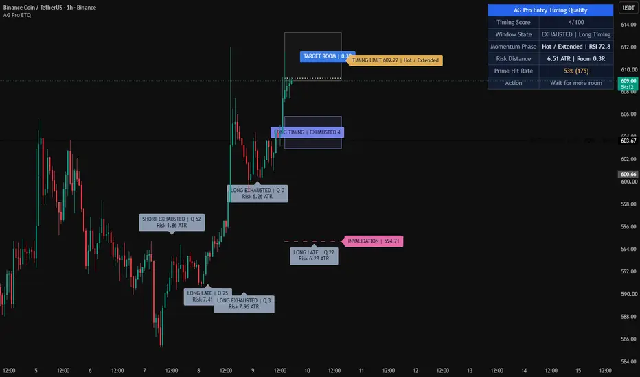
Wskaźnik
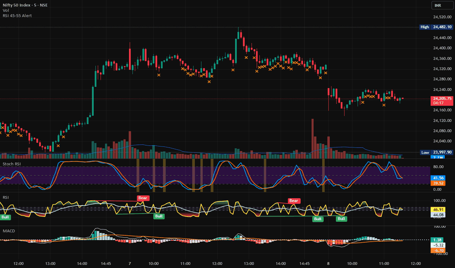
Wskaźnik
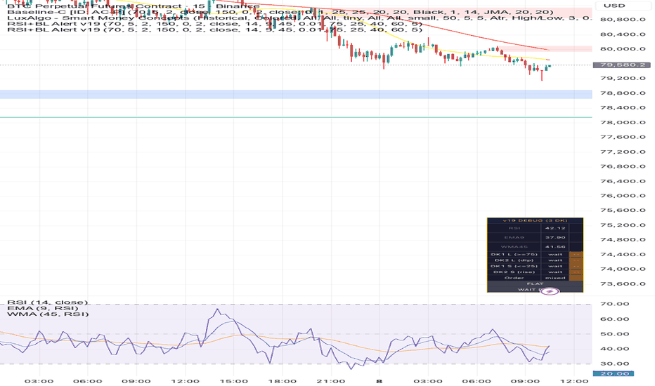
[3Commas] Triple RSI DCA Long - Risk Adjusted Averaging Strategy🔷 What it does:
This strategy executes a long-only Dollar-Cost-Averaging approach driven by three independent RSI signals layered across two timeframes. It opens a base order on a 5-minute RSI exit-from-oversold confirmation, layers a martingale-scaled safety order ladder triggered by a 30-minute RSI signal in combination with a faster 5-minute short-period RSI signal, and exits the entire position on a percentage-based take profit measured from the average entry. The architecture is designed for risk-first deployment - capturing partial upside of trending moves while maintaining a structurally bounded drawdown profile.
Base Order entry: RSI(14) on 5m crosses above 30 (oversold-exit confirmation)
Safety Order trigger: RSI(14) on 30m OR RSI(7) on 5m crosses above 30, coinciding with a structural deviation from base price
Martingale ladder: 3 safety orders, volume scale 1.9×, price step 1.0% with deviation coefficient 1.65
Take Profit: configurable percentage from average entry (default 1.3%)
🔷 Who is it for:
DCA-style traders who prefer averaged-in entries over single-shot directional bets.
Risk-conscious participants who want a smoother equity curve than passive holding.
Bot operators who automate execution through webhook integration with a DCA Bot.
Cross-instrument testers who want a single signal framework portable across crypto, perpetuals, and tokenized equities.
🔷 How does it work:
Long Entry: A base order opens when RSI(14, 5m) crosses above 30, signaling exit from a short-term oversold regime. The crossover is a single-shot confirmation per cycle to prevent re-entries during unconfirmed bottoming.
Short Entry: Not used - strategy is long-only by design.
Exit Management: The full position closes when price reaches Average Entry × (1 + Take Profit %). The strategy carries no stop loss; invalidation is replaced by the depth of the safety order ladder, which absorbs a structural pullback of up to 5.37% from base before the ladder is fully consumed.
🔷 Why it's unique:
Multi-timeframe RSI stack - three independent RSI conditions across 5m and 30m act as a regime filter, reducing false entries during trendless chop and isolating only confirmed oversold-exit conditions. Different lookback lengths (RSI(14) and RSI(7)) on the same 5m timeframe capture both medium-term and short-term momentum exhaustion, while the 30m RSI(14) provides higher-timeframe trend-context confirmation for safety orders.
Structural averaging architecture - safety orders trigger only at predefined cumulative deviations from base price (−1.00%, −2.65%, −5.37%), not at fixed time intervals. This aligns re-entries with structurally significant price levels rather than arbitrary clock-based steps, preserving capital efficiency on shallow pullbacks.
Bot Integration - all entries and exits expose alert events with webhook-ready JSON payloads, enabling automated execution through a connected DCA Bot. The strategy publishes the signal, the bot handles position management on the exchange autonomously across multiple pairs.
🔷 Considerations Before Using the Indicator:
Market & Timeframe: Designed and tested on a 3-minute base chart with the multi-RSI signal stack pulling from 5m and 30m. Best suited to liquid, volatile instruments with sufficient intraday range to populate all three RSI conditions - perpetual contracts, tokenized equities, and major altcoins. Not recommended for low-volatility, sideways-only assets where RSI rarely cycles through oversold zones.
Limitations: The strategy carries no stop loss. In sustained downtrends extending beyond the deepest safety order (−5.37% from base), the position holds unrealized loss until either the average is recovered or the deal is manually closed. Consider adding a regime filter (e.g., long-term moving average) for deployment in non-trending or bearish markets.
Backtesting & Demo Testing: Always run extended backtests across multiple market regimes — uptrend, downtrend, and ranging — before deploying real capital. Demo-trade for at least one month to observe behavior in conditions not represented in historical data. Past performance is not indicative of future results.
Parameter Adjustments: Default commission and slippage values are calibrated for typical perpetual venues. Adjust commission_value to match your exchange (e.g., 0.05 for OKX Perpetual, 0.055 for Bybit Perpetual, 0.04 for Binance USD-M Futures, 0.10 for Binance Spot, 0.40 for Kraken Spot). Slippage of 5 ticks accounts for typical taker execution on liquid pairs — reduce for very tight markets, increase for thin altcoin order books. Take profit, safety order step, and volume scale should be tuned per instrument volatility profile (see preset section below).
🔷 STRATEGY PROPERTIES
Symbol: OKX:COINUSDT.P (Perpetual Swap on tokenized Coinbase Global stock).
Timeframe: 3m chart with multi-timeframe signal stack (5m / 30m).
Test Period: Feb 26, 2026 - May 7, 2026 (instrument's full available history since listing on OKX).
Initial Capital: 200 USDT.
Order Size per Trade: Base Order 20.075 USDT, Safety Orders 15.075 / 28.64 / 54.42 USDT (martingale ×1.9). Maximum cumulative position notional ≈ 118.21 USDT. Observed Max Drawdown 5.55% - well within the ≤10% threshold.
Commission: OKX taker 0.05% - matches exchange schedule for the tested venue.
Slippage: 5 ticks - accounts for typical taker execution on liquid perpetual contracts.
Margin for Long and Short Positions: 100% (1× leverage assumed; no margin amplification applied).
Indicator Settings: Default Configuration.
Base Order Volume: 20.075 USDT
Safety Order (1st): 15.075 USDT
Max Safety Orders: 3
Volume Scale: 1.9
Price Step (1st SO): 1.0%
Step Scale: 1.65
Take Profit: 1.3% from average entry
Entry Signal: RSI(14, 5m) crossover above 30
SO Signal: RSI(14, 30m) OR RSI(7, 5m) crossover above 30
Strategy: Long Only.
🔷 STRATEGY RESULTS
⚠️ Remember, past results do not guarantee future performance.
Net Profit: +26.56 USDT (+13.28%)
Max Drawdown: 11.84 USDT (5.55%)
Total Closed Trades: 104
Percent Profitable: 73.08% (76 / 104)
Profit Factor: 3.911
Average Trade:
Average # Bars in Trades:
Benchmarking versus Buy & Hold over the same period:
Strategy: Max +13.43% / Current +13.43% / Min −0.66%
Buy & Hold: Max +16.83% / Current +10.66% / Min −7.54%
The strategy captured higher current return than passive holding while drawing down ~11× less at the worst point of the period - reflecting the risk-first design intent.
🔷 RECOMMENDED PRESETS FOR OTHER INSTRUMENTS
These tuning starting points are derived from comparable backtests on adjacent instruments. Always re-validate on your own venue and capital before live deployment.
COINUSDT.P (OKX Perpetual — current default):
Take Profit: 1.3% | SO Step: 1.0% | Step Scale: 1.65 | Volume Scale: 1.9
Entry: RSI(14, 5m) > 30 | SO: RSI(14, 30m) OR RSI(7, 5m) > 30
Reference period: Feb 2026 — May 2026 | Trades: 104 | Max DD: 5.55% | PF: 3.91
General tuning notes:
Higher-volatility instruments (low-cap altcoins, fresh listings): widen SO step to 1.3–1.5%, raise Step Scale to 1.8–2.0.
Lower-volatility instruments (BTC, ETH on major venues): tighten SO step to 0.6–0.8%, lower TP to 0.8–1.2%.
Ranging or accumulation regimes: lower TP (0.8–1.2%) for higher trade frequency.
Trending regimes: raise TP (2.0–3.0%) to capture larger structural moves.
🔷 How to Use It:
🔸 Adjust Settings: Set Base Order and Safety Order sizes proportional to your capital. The default 20 / 15-USDT structure is calibrated for a 200-USDT test account; scale linearly to your equity. Use the preset table above as a starting point for the instrument you intend to trade, then refine on your own backtest.
🔸 Results Review: Verify Maximum Drawdown stays within your personal risk budget. The strategy is configured to remain below 10% on tested instruments, but extended history may shift this profile. Re-test on your own venue using venue-specific commission and slippage. Demo-trade for at least one month before any live deployment.
🔸 Create alerts to trigger the DCA Bot: Two alert conditions are exposed by the script - "Deal Entry" fires on each new base order, and "Deal TP" fires when the take profit target is hit. Configure both alerts in TradingView with webhook URLs pointing to your DCA Bot's deal-start and close-deal endpoints. Once configured, the strategy publishes the signal and the bot handles execution on the exchange autonomously.
🔷 INDICATOR SETTINGS
Base Order Volume (USD) - Notional value of the initial entry per cycle.
Safety Order Volume (1st, USD) - Notional value of the first averaging-down order; subsequent SOs scale by Volume Scale.
Max Safety Orders - Total number of averaging steps available per deal.
Volume Scale (martingale) - Size multiplier applied to each successive safety order.
Price Step % (1st SO) - Percentage deviation from base price that triggers the first safety order.
Step Scale (martingale) - Multiplier applied to each successive deviation step.
Take Profit % (from AVG) - Profit target percentage measured from average entry price.
Entry RSI Length / Threshold / Timeframe - Parameters for the base order RSI signal.
SO Sig 1 — RSI Length / Threshold / Timeframe - Parameters for the first safety order trigger.
SO Sig 2 — RSI Length / Threshold / Timeframe - Parameters for the second safety order trigger (OR-combined with the first).
Limit by date window? - Toggle to constrain backtest to a specific date range.
From / To - Date range bounds applied when the window filter is enabled.
👨🏻💻💭 We hope this tool helps enhance your trading. Your feedback is invaluable, so feel free to share any suggestions for improvements or new features you'd like to see implemented.
__
The information and publications within the 3Commas TradingView account are not meant to be and do not constitute financial, investment, trading, or other types of advice or recommendations supplied or endorsed by 3Commas and any of the parties acting on behalf of 3Commas, including its employees, contractors, ambassadors, etc. Strategia
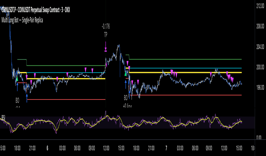
Wskaźnik
Strategia

RSI + TSI Normalized v4 ============================================================================
RSI + TSI Normalized v4 — Script Overview
============================================================================
── English ─────────────────────────────────────────────────────────────────
PURPOSE
This indicator unifies RSI and TSI (True Strength Index) into a single
oscillator pane by normalizing both to a common ±50 scale centered on zero.
It then derives a weighted composite line from four components (RSI, RSI-MA,
TSI, TSI Signal) and draws an adaptive linear regression channel on that
composite — similar to the Adaptive Trend Finder concept, but applied to
momentum space rather than price.
CORE COMPONENTS
1. RSI (Normalized) — standard RSI shifted so that 50 → 0
2. RSI-MA (EMA of RSI) — smoothed RSI, drawable with user-defined offset
3. TSI — double-smoothed momentum, normalized to ±50
4. TSI Signal (EMA of TSI)— smoothed TSI, drawable with user-defined offset
5. Composite Line — weighted average of (1)–(4), scaled by a
user coefficient (0.5–1.5)
6. Regression Channel — straight-line linear regression on the composite,
with ±σ deviation bands, R² color coding,
and optional history overlay
OFFSET SYSTEM
RSI-MA and TSI Signal can each be shifted left or right (±20 bars).
All crossover detections between offset lines and non-offset lines
(composite, RSI, TSI) use a "visual crossover" algorithm that compares
values at the same *drawing* X-coordinate, not the same bar_index.
This ensures markers appear exactly where lines visually intersect.
CROSSOVER SIGNALS
③ RSI × RSI-MA — basic RSI momentum cross (hidden by default)
④ RSI × TSI — inter-indicator cross (hidden by default)
TSI Signal × RSI — diamond markers (hidden by default)
RSIMA × TSI Signal — offset-aware cross (hidden by default)
⑤ RSIMA × Composite — triangle markers, shown by default
⑥ TSI Signal × Composite — circle markers, shown by default
REGRESSION CHANNEL
Computed via manual least-squares on the composite over a configurable
lookback period. Recalculated every N bars. R² is displayed as a label
at the channel's right edge. Channel color intensity adapts to R²:
high R² = vivid blue/teal (strong trend), low R² = gray (noisy).
Past channels are preserved as dotted gray lines for trend history.
DASHBOARD TABLE
Top-right table shows real-time values: RSI, RSI-MA, TSI, TSI Signal,
MA–Signal spread, offset settings, composite value, and R².
ALERTS
JSON-formatted alertconditions for all crossover types, ready for
webhook integration.
── 日本語 ──────────────────────────────────────────────────────────────────
目的
RSI と TSI(True Strength Index)を共通の ±50 スケールに正規化し、
1つのオシレーターペインに統合するインジケーター。
4つの構成要素(RSI, RSI-MA, TSI, TSI Signal)の加重平均から合成値を算出し、
その合成値に対して Adaptive Trend Finder 風の直線回帰チャネルを描画する。
価格ではなく「モメンタム空間」にチャネル分析を適用するのが特徴。
主要コンポーネント
1. RSI(正規化) — 標準RSIを50=0基準にシフト
2. RSI-MA(RSIのEMA) — 平滑化RSI。ユーザー指定のオフセットで左右シフト可能
3. TSI — 二重平滑化モメンタム。±50に正規化
4. TSI Signal(TSIのEMA)— 平滑化TSI。ユーザー指定のオフセットで左右シフト可能
5. 合成値ライン — (1)〜(4)の加重平均 × ユーザー係数(0.5〜1.5)
6. 回帰チャネル — 合成値に対する直線回帰。±σ偏差バンド、
R²に応じた色変化、過去チャネルの履歴表示
オフセットシステム
RSI-MA と TSI Signal はそれぞれ ±20本の描画シフトが可能。
オフセット付きラインと非オフセットライン(合成値等)のクロス判定は、
「描画上の同じX座標」でのY値を比較する方式を採用。
マーカーは視覚的な交差点に正確に表示される。
クロスシグナル
③ RSI × RSI-MA — RSIモメンタムの基本クロス(デフォルト非表示)
④ RSI × TSI — 異種指標間クロス(デフォルト非表示)
TSI Signal × RSI — ダイヤモンドマーカー(デフォルト非表示)
RSIMA × TSI Signal — オフセット対応クロス(デフォルト非表示)
⑤ RSIMA × 合成値 — 三角マーカー(デフォルト表示)
⑥ TSI Signal × 合成値 — 丸マーカー(デフォルト表示)
回帰チャネル
合成値に対して最小二乗法で傾き・切片を算出し、line.new()で直線描画。
N本ごとに再計算。R²をチャネル右端にラベル表示。
R²が高い=鮮やかな青/緑(明確なトレンド)、低い=灰色(ノイズ)。
過去チャネルは灰色ドット線で残り、トレンド推移を確認可能。
ダッシュボードテーブル
右上にリアルタイム値を表示: RSI, RSI-MA, TSI, TSI Signal,
MA-Signal差, オフセット設定, 合成値, R²。
アラート
全クロスタイプのJSON形式alertconditionを搭載。Webhook連携対応。
Wskaźnik

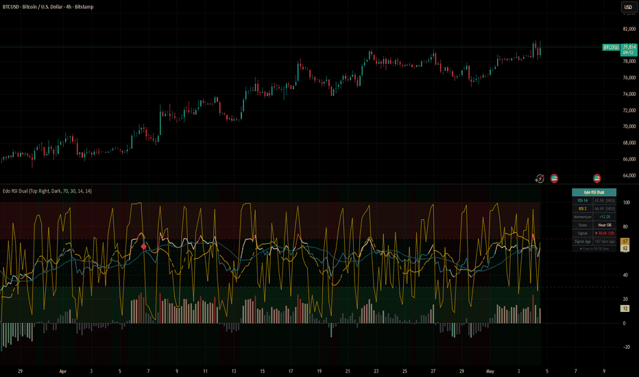
Edo RSI DualEdo RSI Dual — Five-Zone RSI System with Filtered Diamond Crosses, Momentum Histogram and Real-Time Dashboard
The classic Wilder RSI is one of the most widely used oscillators in technical analysis, but its traditional binary reading — overbought versus oversold — leaves out a large part of the information the oscillator actually contains. An RSI at 65 is not the same as an RSI at 75, and a cross inside the neutral zone does not carry the same significance as a cross in extreme territory.
Edo RSI Dual was built to address that. It coordinates two RSI readings of opposite nature on the same panel, splits the structural RSI into a five-zone dynamic colour scheme, filters cross signals by zone, and condenses the full reading into a real-time dashboard. The result is an oscillator that keeps the familiarity of the classic RSI but adds a contextual layer that makes every cross, every zone and every histogram bar interpretable within a coloured map.
THE TWO LAYERS
RSI 14 — Structural layer
The standard 14-period Wilder RSI. Width 2. Coloured dynamically according to the zone it currently sits in (five different shades). Acts as the structural momentum reference and defines the bias of the market on the analysed timeframe.
RSI 2 — Reactive layer
The 2-period Connors RSI. Width 1. Fixed gold colour. Sweeps the 0–100 range with rapid jumps and reaches extremes in very few bars. Its purpose is not to be read in isolation but to interact with the structural RSI 14 to produce filtered crosses.
Both lines share the standard RSI 0–100 axis, but their behaviour is radically different: the RSI 14 moves smoothly while the RSI 2 oscillates with sharp jumps. That tempo difference is what makes their crosses meaningful.
THE FIVE-ZONE COLOR SYSTEM
Edo RSI Dual splits the 0–100 RSI 14 range into five colour bands. Each band has a specific reading and colour, and the line transitions colour in real time as it moves between zones.
— RSI 14 ≥ Overbought Level → Dark red — Stretched bullish momentum
— 60 ≤ RSI 14 < OB → Light red — Approaching overbought
— 40 < RSI 14 < 60 → Dark teal — Neutral
— OS < RSI 14 ≤ 40 → Light green — Approaching oversold
— RSI 14 ≤ Oversold Level → Dark green — Stretched bearish momentum
The colour scheme is contrarian to the directional bias: overbought is painted red (potential sell zone) and oversold green (potential buy zone). This convention is consistent across the indicator: RSI 14 line, momentum histogram, dashboard state row and signal filters.
The transition between zones is one of the key visual elements. By colour alone, you can tell at a glance which segment of the range the oscillator currently sits in without having to read the numeric value.
MOMENTUM HISTOGRAM (RSI 14 vs 50)
The histogram is calculated as RSI 14 − 50. Above zero means the RSI sits above its centerline (predominant bullish strength); below zero means the opposite.
The histogram inherits the same five-zone palette as the RSI 14 line. Bars are painted in solid red when the RSI 14 is in overbought, faded red when near OB, grey in the neutral zone, faded green near OS and solid green in oversold. This turns the histogram into a simultaneous double reading: direction (side of the zero line) and zone (palette).
SLOW LINES
Two dashed slow lines act as a smoothing reference layer over the main RSI lines:
— Slow RSI 14 — SMA of the RSI 14, default period 14, drawn in faded teal and dashed style.
— Slow RSI 2 — SMA of the RSI 2, default period 14, drawn in faded gold and dashed style.
The slow lines do not generate signals on their own. They provide a visual reference of the average bias of each oscillator: when the RSI 14 main line sits above its slow line, structural momentum is in an expansive phase; below, it is contractive. The same applies to the RSI 2 with the caveat that its volatility makes the reading less stable.
DIAMOND SIGNALS — FILTERED CROSSES
The signal system is built on a strict premise: a cross between RSI 2 and RSI 14 is only relevant when it occurs inside an extreme zone. All other crosses are ignored.
◆ Bull Diamond — Gold
Plotted when:
— The RSI 2 crosses above the RSI 14 (bullish cross)
— The RSI 14 sits in the oversold zone (RSI 14 ≤ Oversold Level)
◆ Bear Diamond — Crimson
Plotted when:
— The RSI 2 crosses below the RSI 14 (bearish cross)
— The RSI 14 sits in the overbought zone (RSI 14 ≥ Overbought Level)
The diamond is drawn at the RSI 2 value on the cross bar, inside the corresponding extreme zone. Every signal is recorded in the dashboard with its type and the number of bars since it appeared, allowing recent signals to be distinguished from older ones that may have lost contextual validity.
BACKGROUND BIAS AND MIDLINE
Background bias colours the panel background according to the RSI 14 position relative to the 50 line. Faint green when RSI 14 is above 50 (active bullish bias), faint red when below (active bearish bias). The colour transparency is high so it does not interfere with line and histogram readability.
The 50 midline is drawn as a horizontal grey dotted line and serves both as the visual reference of the histogram axis and as the bias threshold.
OB/OS ZONES
The extreme zones are defined by two configurable parameters: Overbought Level (default 70) and Oversold Level (default 30). Each level is drawn as a dashed horizontal line in red and green respectively, and the area between each level and the panel edge is filled with a faded shade of the corresponding colour. The fill bands serve two purposes: they visually frame the extreme zones and act as the validation area for the Diamond Signals.
REAL-TIME DASHBOARD
The dashboard condenses the full reading of the indicator into a compact panel that updates bar by bar. Eight rows:
— Edo RSI Dual — Header
— RSI 14 — Numeric value with state
— RSI 2 — Numeric value with state (internal thresholds 90/10)
— Momentum — RSI 14 − 50 difference with sign
— State — Zone label (Overbought, Near OB, Neutral, Near OS, Oversold)
— Signal — Last detected Diamond signal (◆ BULL OS, ◆ BEAR OB, or —)
— Signal Age — Bars since the last signal. Highlighted in green if ≤ 3 bars
— Footer — "◆ Cross in OB/OS Zone"
Position is configurable in any of the four corners. Theme switches between Dark and Light.
ALERTS
Three configurable alert conditions:
— Bull Cross ◆ (OS) — RSI 2 bullish cross over RSI 14 inside the oversold zone
— Bear Cross ◆ (OB) — RSI 2 bearish cross under RSI 14 inside the overbought zone
— Momentum Zero Cross — RSI 14 crosses the 50 midline (directional bias change)
The first two correspond directly to the Diamond Signals. The third captures any change of momentum sign relative to the midline regardless of whether a Diamond is triggered.
CONFIGURATION
— Display: independent toggles for RSI 14, RSI 2, slow lines, momentum histogram, OB/OS zones, background bias, midline, Diamond signals and dashboard
— Levels: Overbought (range 50–95, default 70) and Oversold (range 5–50, default 30)
— Slow Lines: independent SMA periods for RSI 14 and RSI 2 (range 2–50, default 14)
— Dashboard: position (Top Right / Top Left / Bottom Right / Bottom Left) and theme (Dark / Light)
HOW TO READ IT
A clean reading follows three steps.
1 — Read the zone first
The RSI 14 colour tells you immediately where the oscillator stands. Red shades mean stretched bullish momentum, green shades mean stretched bearish momentum. Neutral teal means there is no extreme bias to act on.
2 — Watch the RSI 2 inside the extreme zones
When the RSI 14 enters overbought or oversold, the RSI 2 becomes the trigger. Crosses between the two lines outside extreme zones are filtered out — they will not produce a Diamond. Inside the extreme zones, a cross is meaningful and the indicator marks it visibly.
3 — Use the dashboard for context
State and Signal Age give you the current zone and how long ago the last signal fired. A recent signal (≤ 3 bars) carries fresh contextual relevance; an older signal may have already been consumed by price.
OPEN SOURCE
Edo RSI Dual is published as a free open source indicator. The full Pine Script is publicly accessible on TradingView for study, adaptation and integration into any workflow. Part of the Edolab Markets free tools ecosystem alongside Edo EMA Core Cross, Edo Sentiment Map, Edo SuperTrend Core, Edo TRIX Core Cross, Edo Multi Stoch and Edo ZigZag Auto Fib SR.
This indicator is a technical analysis tool for educational and informational purposes only. It does not generate automatic buy or sell signals and should not be considered financial advice. Trading financial markets involves significant risk of capital loss. Past performance does not guarantee future results. Always use proper risk management. Wskaźnik
Aura RSP Matrix [Pineify] Pineify - Aura RSP Matrix - Relative Strength Phase Momentum
Aura RSP Matrix compares the chart symbol with a benchmark and classifies it into four relative-strength phases: Leading, Weakening, Lagging, and Improving. It shows whether relative performance is gaining or fading.
Key Features
Benchmark-relative RS Ratio and RS Momentum centered around 100.
Phase coloring for the oscillator, bars, markers, and dashboard.
Leading and Lagging labels fire only on the first bar of a new phase.
How It Works
The script requests the benchmark close on the timeframe, divides chart close by benchmark close, then normalizes the result with a WMA . This creates RS Ratio, where values above 100 show relative strength above its recent baseline.
RS Momentum compares RS Ratio with its own WMA baseline. Both series are smoothed with an EMA before phase detection. Smoothing reduces one-bar noise but adds lag.
How the Components Work Together
RS Ratio shows whether the symbol is strong or weak versus the benchmark. RS Momentum shows whether that position is improving or fading. Leading means both are above 100; Weakening means strength remains above 100 while momentum slips; Lagging means both are below 100; Improving means momentum turns up before RS Ratio confirms.
Trading Ideas and Insights
Use Leading as confluence for bullish setups, not as an automatic entry.
Watch Weakening after strong runs; it may show fading follow-through.
Use Improving to find names recovering against a benchmark.
Treat Lagging as a caution filter when stronger alternatives exist.
Signals are phase-change markers, not performance guarantees. In choppy markets the matrix can rotate around 100, and live bars may change until close.
Unique Aspects
Two-stage WMA normalization separates relative strength from relative momentum.
One four-state matrix keeps labels, bars, oscillator color, and dashboard status aligned.
The benchmark input supports market, sector, crypto pair, or cross-asset comparison.
How to Use
Add the indicator and choose a benchmark for your trading universe.
Read the phase from bar color, oscillator color, and dashboard.
Combine phases with price structure, volume, and higher-timeframe context.
Customization
Calculation Window (default: 20) - WMA normalization period. Higher is smoother; lower is faster.
Benchmark Ticker (default: SPX) - Relative strength comparison symbol.
Smoothing Factor (default: 3) - EMA smoothing after RS calculations.
Phase Colors and Toggles - Adjust colors, labels, and bar coloring.
Conclusion
Aura RSP Matrix is a relative strength context tool for rotation, watchlist filtering, and benchmark-relative trade selection. Use it with price action and risk controls, not as a standalone forecasting system. Wskaźnik

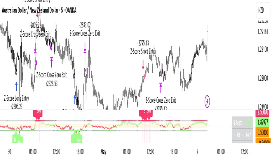
Z-Score Mean Reversion ProZ-Score Mean Reversion Pro is a Strategy designed to identify high-probability mean reversion setups by combining statistical Z-Score extremes with RSI momentum confirmation, Bollinger Band volatility filtering, and EMA trend alignment. It provides clean buy/sell signals, visual trade zones, dashboard data, and alert outputs to assist in short-term reversal trading, intraday setups, and swing mean reversion trades.
🔑 FEATURES
Z-Score Mean Reversion Engine: Detects statistically stretched price moves and highlights potential reversal zones when price deviates too far from its rolling mean.
Multi-Layer Signal Confirmation: Combines RSI exhaustion, Bollinger Band Width volatility checks, and EMA trend filtering to reduce false signals and improve trade quality.
Built-In Risk Management: Includes ATR-based stop loss and take profit logic, plus optional mean reversion exits when price returns toward equilibrium.
⚠️ NOTES & DISCLAIMERS
This script works best on 5m, 15m, 1H, and 4H charts across Forex, Crypto, Indices, and liquid Stocks.
Best suited for mean reversion traders looking to capture exhaustion moves and short-term reversals.
ATR exits are ideal for structured risk management, while Z-Score exits are better for pure statistical reversion setups.
Always use risk management (Stop Loss).
This script is for educational and research purposes only. Always forward test before using live capital.
Strategia

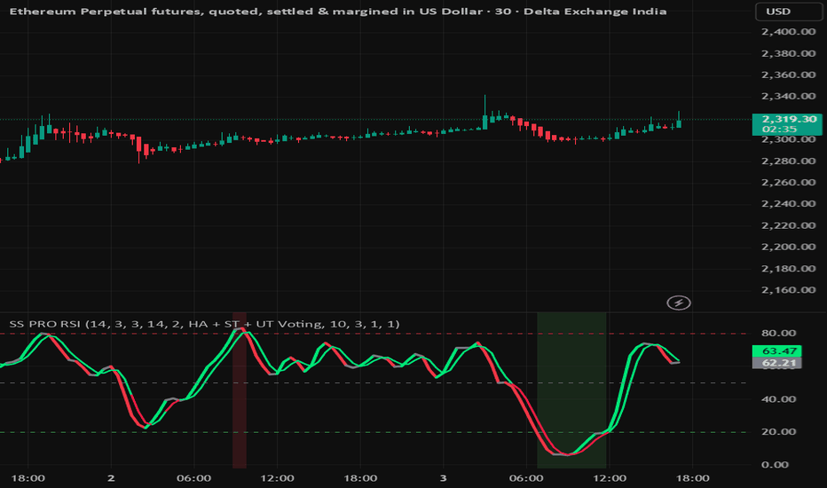
smart Stochastic Embedded RSI with HA, Supertrend & UT Bot Short Description
Advanced Stochastic + Embedded RSI with Heiken Ashi, Supertrend & UT Bot voting system for cleaner momentum detection and reduced fake signals. Designed for scalpers, intraday and swing traders.
Full Publish Description
SS PRO RSI is a smart momentum oscillator built to reduce noise and filter weak signals by combining multiple confirmations into a single streamlined indicator.
This indicator merges:
Smart Stochastic
Embedded Stochastic RSI
Heiken Ashi trend logic
Supertrend confirmation
UT Bot filtering
Momentum-based coloring
Buy/Sell trigger system
Instead of relying on a basic stochastic crossover alone, the script uses a voting system between multiple trend filters to improve signal quality and reduce fake reversals during choppy markets.
Features
✔ Embedded Stochastic RSI mode
✔ Heiken Ashi trend confirmation
✔ Supertrend filter integration
✔ UT Bot confirmation logic
✔ Bull/Bear momentum coloring
✔ Dynamic trigger color modes
✔ Oversold & Overbought zones
✔ Cleaner buy/sell signals
✔ Adjustable sensitivity settings
✔ Designed for low-noise trading
Best Usage
Intraday trading
Swing trading
Index options
Crypto
Forex
Trend continuation setups
Recommended Timeframes
1H → Balanced signals
4H → Strong low-noise confirmations
15m → Faster entries with moderate noise
Suggested Settings (Low Noise)
K Length: 14
K Smoothing: 5
D Length: 5
RSI Length: 21
Momentum Sensitivity: 1.5
Important
⚠️ Disclaimer
This indicator is intended for educational and informational purposes only and should not be considered financial advice. Trading involves risk, and no indicator can guarantee profits or eliminate losses.
The signals generated by this script are based on technical analysis logic, momentum behavior, and multiple confirmation filters including Heiken Ashi, Supertrend, and UT Bot voting systems. Market conditions can change rapidly, and false signals may still occur.
Always use proper risk management, confirm trades with your own analysis, and test strategies before using them in live markets.
The creator of this script is not responsible for any financial losses or trading decisions made using this indicator.
Wskaźnik
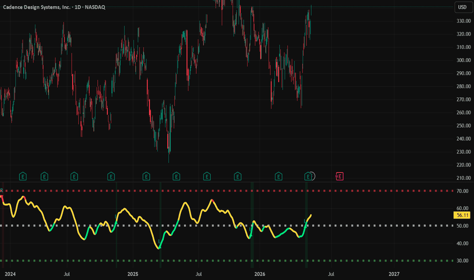
IND002 - Multi-Timeframe RSI Percentile MapIND002 - Multi-Timeframe RSI Percentile Map shows whether RSI momentum is historically low, historically high, improving, neutral or weakening across several timeframes.
It helps traders use multi-timeframe RSI context before deciding whether a setup is worth considering.
========================================================================
✨ Follow my profile to stay updated on future indicators and improvements
========================================================================
==================================================
WARNING
==================================================
This indicator does not predict the future and does not provide guaranteed entries.
A low percentile can show that momentum is historically depressed, but price can still continue lower. A high percentile can show that momentum is historically stretched, but price can still continue higher.
Use this as momentum context together with trend, structure, support/resistance, volume, divergence, and risk management.
==================================================
(1) OVERVIEW AND PURPOSE
==================================================
IND002 combines RSI readings from four selected timeframes into one smoother combined RSI line. By default, it uses Monthly, Weekly, Daily, and 4H RSI, but the user can change the timeframes and weights in the settings.
The main purpose is not only to show RSI. The main purpose is to show where the current combined RSI stands compared with its own recent history.
This is done with percentile ranking.
What percentile means
Percentile shows whether the current combined RSI is low, normal, or high compared with its own historical values.
Percentile 5 - combined RSI is very low compared with recent history.
Percentile 20 - combined RSI is in a lower historical area.
Percentile 50 - combined RSI is near its normal middle range.
Percentile 80 - combined RSI is in a higher historical area.
Percentile 95 - combined RSI is very stretched compared with recent history.
A low percentile is not automatically a buy signal. It means RSI is low compared with its own history. A high percentile is not automatically a sell signal. It means RSI is stretched compared with its own history.
The useful reading comes from combining:
percentile level
RSI direction
multi-timeframe alignment
price structure
Color meaning
🟩 Green - combined RSI is in a lower percentile area and slope is turning up.
🟨 Yellow - momentum is neutral, mixed, or not clear enough.
🟥 Red - combined RSI is in a higher percentile area and slope is turning down.
The main idea: do not read RSI only as 30 / 50 / 70. Read where RSI is compared with its own history and whether it is starting to turn.
==================================================
(2) HOW TO USE IT PROPERLY
==================================================
The indicator should be used differently depending on the trading style. It is not one fixed entry rule for every trader.
Simple use
Check the combined RSI color first.
🟩 Green = momentum is recovering from a historically lower area.
🟨 Yellow = momentum is neutral or unclear; wait for better context.
🟥 Red = momentum is weakening from a historically higher area.
Confirm the reading with price structure, support/resistance, trend, volume, or divergence.
Use alerts only as monitoring tools, not as trade instructions.
Long-term investing use
For long-term investing, give more attention to Monthly, Weekly, and Daily context.
A more useful long-term reading usually appears when:
combined RSI is in a lower percentile area
the line turns 🟩 green
higher timeframes stop weakening
price is near important support or a long-term value area
market structure starts stabilizing
This does not confirm the exact bottom. It only means multi-timeframe momentum is becoming more constructive compared with its own history.
Swing trading use
For swing trading, a low percentile alone is usually not enough. The trader usually wants evidence that momentum is recovering and that price structure confirms the idea.
A more useful swing reading usually appears when:
combined RSI was low or below normal
the line turns 🟩 green
RSI starts moving back toward the middle area
Daily and 4H RSI begin to agree
price confirms with support reaction, reclaim, breakout, or trend continuation
For swing trading, Daily and 4H can be weighted more, while Weekly remains useful for context.
Advanced use
Enable the four timeframe RSI curves when you want to compare alignment, divergence, or conflict between timeframes.
If price makes a lower low but combined RSI or higher-timeframe RSI improves, this can support a bullish divergence reading.
If price makes a higher high but RSI weakens, this can support a bearish divergence reading.
If Monthly, Weekly, Daily, and 4H RSI improve together, momentum confirmation is broader.
If only 4H improves while Weekly and Monthly remain weak, the move may only be short-term.
Setup markers and alerts
🟩 Long-Side Setup - lower percentile area, RSI slope turning up, and optional ADX filter confirmed.
🟥 Risk-Off Setup - upper percentile area, RSI slope turning down, and optional ADX filter confirmed.
Alerts describe chart conditions only. They are not trade instructions.
Best use: let IND002 show multi-timeframe momentum context, then confirm with your own price-action method before making a decision.
==================================================
(3) SETTINGS, SUMMARY AND DISCLAIMER
==================================================
Important settings
RSI period - lower is faster, higher is smoother.
Timeframes A-D - choose the four RSI timeframes.
Weights - higher weight gives that timeframe more influence.
Percentile lookback days - higher is broader context, lower adapts faster.
Lower threshold - default 20, defines lower-percentile recovery area.
Upper threshold - default 80, defines upper-percentile risk-off area.
ADX threshold - filters setup markers by trend strength.
Show four timeframe RSI curves - helps compare alignment and divergence.
This script may receive future refinements if useful improvements are added to the model, settings, or explanation.
If you want to stay updated on future script releases or improvements to this indicator, you can check my profile for new public publications and updates.
Summary
IND002 combines RSI from four timeframes and ranks the result against its own historical range.
It helps users understand whether momentum is 🟩 improving, 🟨 neutral, or 🟥 weakening.
The script is most useful as multi-timeframe momentum context, not as a standalone trading system.
Disclaimer
This script is a public open-source indicator for educational and informational use.
It is not financial advice, investment advice, or a recommendation to buy or sell any asset.
The script identifies momentum and percentile conditions only. It does not guarantee profitable trades, signal accuracy, or future performance.
Users should always apply their own analysis, position sizing, and risk management before making any trading decision.
Wskaźnik
Wskaźnik
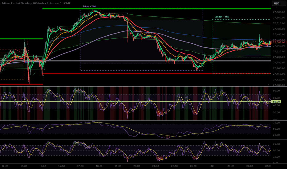
Wskaźnik

Wskaźnik
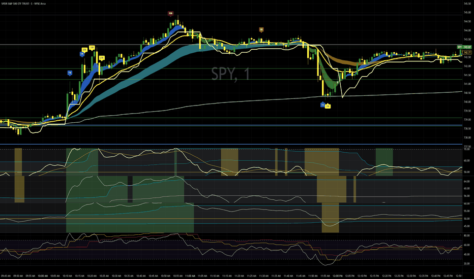
IND001 - Tide Flow Structure Map==================================================
WARNING
==================================================
This indicator is designed to read trend structure. It is not designed to act on every drop only because price reaches a lower or red area.
The correct use is to first check whether the market still has a supportive structure. The indicator works best when price action is stable, liquid, and structured. It is less suitable for very risky, illiquid, speculative, or erratic instruments.
The script does not predict the future. It helps the user read whether current market conditions are supportive, neutral, weakening, or risk-off.
==================================================
(1) INTRODUCTION
==================================================
IND001 - Tide Flow Structure Map is a public open-source trend-structure indicator.
The idea behind Tide Flow is simple: markets often move in phases. Some phases are healthy and structured, while others are weak, noisy, or damaged. This indicator was built to help users read those phases more clearly by combining trend direction, active flow, structure, volatility, trend strength, and optional asset-quality checks.
It is not meant to be a simple signal tool. It is meant to help the user understand the current market condition first.
==================================================
(2) OVERVIEW
==================================================
Tide Flow is mainly a structure-reading and trend-following tool. It is designed to work best when the market shows clear continuation behavior and enough stability for the curves to reflect real structure.
The main question is:
Is the current movement still healthy and structured, or is the structure starting to weaken?
Instead of using one simple signal, the indicator combines several layers of information:
main trend direction
active trend flow
upper and lower price structure
volatility
trend strength
higher-timeframe confirmation
RSI extension control
optional asset-quality filtering
Quick color key
🟨 Yellow - main trend environment
🟦 Blue - active trend flow
🟩 Green - upper structure and strength
🟥 Red - lower structure and risk
--------------------------------------------------
WHERE TIDE FLOW FITS BEST
--------------------------------------------------
Best trading styles
Swing trading - usually the best fit, because structure is clearer on higher timeframes.
Intraday / day trading - can work well on liquid and cleanly trending assets.
Position trading - suitable for following broader structure on higher timeframes.
Less suitable trading style
Scalping - usually the weakest fit, because very low timeframes often contain more noise and false shifts.
Timeframe guidance
Best fit: 1H, 4H, Daily
Good fit: 15m, Weekly
Use with caution: 5m and lower
Best asset types
liquid stocks
major crypto assets
index-related instruments
assets with stable trend structure
markets with clear continuation behavior
Less suitable asset types
very low-liquidity assets
small speculative instruments
thin or manipulated markets
assets with frequent abnormal spikes or unstable gaps
sideways markets with weak structure
Practical summary
Best overall use: swing trading
Good use: day trading on liquid trending assets
Weakest use: scalping on very low timeframes
==================================================
(3) MOST IMPORTANT: HOW TO USE IT PROPERLY
==================================================
The correct way to use this indicator is to read the market structure first, then use the table, background colors, and alerts only as extra confirmation.
Simple workflow
🟨 Start with the yellow curve.
Check whether price is above or below the main trend. If price is below the yellow curve, the broader structure is weaker and long-side ideas need more caution.
🟦 Then check the blue curve.
The blue curve shows the active trend flow. A rising or stable blue curve is healthier. A falling blue curve means the active flow is weakening.
🟩 Then check the green curve.
The green curve shows upper structure and strength. Price moving toward or above the green curve can show stronger expansion, but chasing too far above it can create poor risk-reward.
🟥 Then check the red curve.
The red curve shows lower structure and risk. Price moving close to or below the red curve means the structure is weakening or breaking.
Only after that, check the table and background colors.
The table and BG colors are helpers. They should support the structure reading, not replace it.
Use alerts only for monitoring.
An alert means a chart condition has appeared. It is not a trade instruction and does not guarantee a result.
Correct use
Use it when the market is liquid, structured, and trending clearly.
Use it to separate supportive structure from weak or risk-off structure.
Use it to avoid acting too early when price is below the main trend.
Use it with your own risk management and position sizing.
Incorrect use
Do not use it as a simple green-buy / red-sell system.
Do not act only because the table shows a stronger state.
Do not act only because the background color changes.
Do not act only because price touches the red or lower area.
Do not expect the script to predict future price movement.
The most important rule is: read the curves first. The helpers come second.
==================================================
(4) CURVES
==================================================
The indicator is built around four main curves. Each curve represents a different layer of market structure.
🟨 Yellow curve - Main trend
The yellow curve represents the broader trend environment.
Price above yellow: the broader trend condition is more supportive.
Price below yellow: the broader trend is weaker or damaged.
🟦 Blue curve - Active trend flow
The blue curve represents the active movement inside the main trend.
Price above blue: active flow is stronger.
Price around blue: the market is testing the flow.
Price below blue: the active flow is weakening.
🟩 Green curve - Upper structure
The green curve represents the upper part of recent smoothed price structure.
Price below green: price is still building inside structure.
Price at or above green: strength or expansion is increasing.
🟥 Red curve - Lower structure
The red curve represents the lower part of recent smoothed price structure.
Price above red: lower structure is still holding.
Price near red: structure is becoming weaker.
Price below red: lower structure is breaking.
==================================================
(5) LOGICAL SEQUENCE
==================================================
The indicator should be read in order. Each curve gives a different part of the full picture.
Correct reading order
🟨 Yellow curve - defines the broader environment
🟦 Blue curve - defines the active flow
🟩 Green curve - shows strength and expansion
🟥 Red curve - shows weakness and risk
What is normal
A healthier bullish structure usually develops in a stable way:
price is above the yellow curve
blue curve is flat-to-rising or rising
price respects the blue curve during pullbacks
price moves toward or above the green curve
red curve remains clearly below price
This suggests that the market structure is still functioning in a supportive way.
What is not normal
A weaker or damaged structure usually looks different:
price falls below the yellow curve
blue curve starts to flatten or decline
price cannot recover toward the green curve
price moves too close to the red curve or breaks below it
This suggests that the tide flow is no longer healthy and the market should be treated with caution.
==================================================
(6) EXAMPLE 1: CLEAN PULLBACK IN TREND
==================================================
Price is above the yellow curve, so the broader environment is still supportive. The blue curve is rising, showing that the active flow is healthy. Price pulls back toward the blue curve, respects it, and then continues toward the green curve.
Main reading
above yellow = supportive environment
blue rising = healthy active flow
pullback to blue = controlled movement
This is a structured use case because the idea is based on trend behavior, not on chasing price.
==================================================
(7) EXAMPLE 2: BREAKOUT AFTER BUILDING
==================================================
Price remains above the yellow curve and spends time moving between the blue and green curves. This shows that the market is building structure. Later, price moves above the green curve with stronger behavior.
Main reading
above yellow = supportive condition
movement between blue and green = structure building
move above green = expansion
This is a better-quality setup because the move happens after structure has already developed.
==================================================
(8) EXAMPLE 3: RECLAIM OF THE BLUE CURVE
==================================================
Price briefly moves below the blue curve but remains above the yellow curve. Soon after, price moves back above the blue curve and continues higher.
Main reading
above yellow = broader trend still valid
temporary move below blue = short-term weakness
reclaim of blue = active flow improves again
This is useful because the main structure did not break and the active flow was restored.
==================================================
(9) EXAMPLE 4: AVOIDING A WEAK CONDITION
==================================================
Price moves below the yellow curve. This means the broader trend environment is no longer supportive. A small bounce may appear, but the structure is still weak.
Main reading
below yellow = weak environment
small bounce = not enough confirmation
structure still weak = caution
This helps the user avoid acting too early in a damaged structure.
==================================================
(10) EXAMPLE 5: SIDEWAYS MARKET
==================================================
Price moves around the blue curve with no clear direction. The blue curve is flat, and price does not clearly move toward the green curve or break structure with strength.
Main reading
flat blue = weak active flow
sideways movement = unclear structure
no clean expansion = lower-quality condition
This is a situation where patience is usually better than forcing a trade idea.
==================================================
(11) OPTIONAL HELPERS: BG COLORS, TABLE, SETUP / RISK USE
==================================================
The indicator includes helper tools to make the chart easier to read. These tools are not the full system by themselves. The main reading still comes from the four structure curves.
--------------------------------------------------
1. BG COLORS - VISUAL HELP FOR IMPROVING CONDITIONS
--------------------------------------------------
Background colors can appear when the indicator detects improving structure after a weaker phase.
They can help the user notice:
improving recovery conditions
strengthening active flow
a transition from weaker structure to healthier structure
They should not be used as standalone entry signals.
BG colors are not:
direct trade instructions
standalone entry signals
a replacement for reading the curves
a guarantee that price will continue
Correct use: first read the yellow, blue, green, and red curves. Then use background colors as extra visual context only.
--------------------------------------------------
2) TABLE - QUICK SUMMARY OF CURRENT CONDITION
--------------------------------------------------
The table gives a compact summary of the current market state. It helps organize the most important checks in one place.
The table can show:
current state
direction
higher-timeframe trend
trend condition
ADX strength
ATR condition
structure zone
asset quality
quality data
quality explanation
The table is useful because it shows whether the current move is supported by more than one condition. It should still be treated as a summary panel, not as a replacement for chart reading.
--------------------------------------------------
3) SETUP / RISK USE - EXTRA CONFIRMATION ONLY
--------------------------------------------------
The indicator is first a structure-reading tool. The table, background colors, and alerts can support the reading, but they should not replace it.
A stronger long-side condition may be present when:
price is above the yellow curve
the blue curve is healthy or rising
price respects structure instead of breaking it
price moves toward or above the green curve
the table supports the stronger condition
background colors show improving structure
A weaker or risk-off condition may be present when:
price falls below the yellow curve
the blue curve weakens or turns down
price fails to recover toward the green curve
price moves close to or below the red curve
the table no longer supports the stronger condition
Simple summary
the curves explain the structure
the background colors show visual improvement
the table summarizes the internal checks
alerts help with monitoring
When these parts agree, the reading is stronger. When they disagree, the user should be more careful.
==================================================
(12) HOW EVERYTHING IS CALCULATED
==================================================
This section explains the internal logic in simple terms.
How the curves are calculated
Yellow curve: an EMA of price using the main trend length.
Blue curve: a faster EMA of price.
Green curve: recent highest highs over a lookback period, then smoothed.
Red curve: recent lowest lows over a lookback period, then smoothed.
How the main conditions are calculated
ATR checks whether volatility is active enough.
ADX checks whether trend strength is acceptable.
Higher-timeframe filter checks whether broader direction supports the trend.
RSI helps avoid overly extended long-side conditions.
The active-flow check uses the slope of the blue curve to detect weakness.
How asset quality is calculated
The optional asset-quality guard uses:
market cap
20-day average dollar volume
60-day average dollar volume
price level
These values are combined into a quality score and grouped into a quality rank. The purpose is to help avoid instruments with weak liquidity, weak size, or unstable trading conditions.
In practice, the indicator combines:
trend structure
active flow
volatility
trend strength
higher-timeframe confirmation
asset quality
liquidity quality
The purpose is not to predict the future exactly. The purpose is to judge whether current market conditions are supportive enough.
==================================================
(13) 10 POINTS: WHAT IS WRONG WHEN USING TIDE FLOW
==================================================
Using it like a simple signal tool
The indicator is not meant to be a simple green-buy / red-sell system.
Acting below the yellow curve without caution
When price is below the yellow curve, the broader environment is weaker.
Ignoring the blue curve
If the blue curve is flat or falling, the active flow is weak.
Treating every dip as an opportunity
A drop in price alone is not a valid reason to act.
Chasing price too far above the green curve
Late entries after large expansion can create poor risk-reward.
Ignoring the red curve
When price gets close to or below the red curve, structure is weakening.
Using it in sideways markets without caution
The indicator works best when the market has structure and direction.
Skipping the reading sequence
The correct order is yellow first, blue second, green third, red last.
Expecting prediction instead of interpretation
The indicator helps interpret condition. It does not predict future price.
Using it without patience
Better readings usually come when structure is clear and supportive.
==================================================
(14) ALERTCONDITION
==================================================
The indicator includes alert conditions so users can monitor important chart events.
Alerts can be used for conditions such as:
main gates becoming aligned
price moving above the upper structure curve
a long-side setup forming
recovery conditions appearing
asset quality warning
price crossing below important structure levels
price confirming below the active risk line
Alerts are only monitoring tools. They are not trade instructions, performance claims, or guarantees of future results.
==================================================
(15) SUMMARY TO USE
==================================================
Use Tide Flow as a trend-following and structure-reading indicator, not as a simple buy or sell signal tool.
Simple reading process
🟨 Start with the yellow curve to check the broader environment.
🟦 Use the blue curve to confirm active trend flow.
🟩 Use the green curve to identify strength or expansion.
🟥 Use the red curve to monitor weakness and risk.
Use the table and background colors only as helpers.
Use alerts only for monitoring chart conditions.
Avoid forcing trades in weak, sideways, illiquid, or unstable markets.
Use your own risk management and analysis.
The indicator is most useful when the market is structured, liquid, and trending clearly.
==================================================
DISCLAIMER
==================================================
This script is a public open-source indicator for educational and informational use.
It is not financial advice, investment advice, or a recommendation to buy or sell any asset.
The indicator does not guarantee profitable trades, signal accuracy, or future performance. It can produce false or late signals, especially in sideways, illiquid, volatile, or news-driven markets.
Users should always apply their own analysis, position sizing, and risk management before making any trading decision.
==================================================
PINE NOTE
==================================================
// Public open-source indicator
// Alerts identify chart conditions only
// No future performance is guaranteed
Wskaźnik

RSI & MACD MTF Station [v2c_cha]Overview
The RSI & MACD MTF Heatmap Station is a comprehensive, all-in-one momentum and trend analysis tool designed to eliminate chart clutter. Traditionally, traders relying on Multi-Timeframe (MTF) analysis must either split their screens into multiple layouts or flood their indicator panels with overlapping "spaghetti" lines. This indicator solves that problem by consolidating the Relative Strength Index (RSI) and Moving Average Convergence Divergence (MACD) across 9 different timeframes into a single, compact visual Heatmap.
Core Concepts & Calculations
This indicator relies on the standard mathematical formulas for RSI (default 14 periods) and MACD (default 12, 26, 9). However, its core value lies in how it processes and displays this data:
Non-Repainting MTF Data: All higher-timeframe data is fetched using barmerge.lookahead_off and barmerge.gaps_off to ensure strict compliance with non-repainting rules. What you see on historical bars is exactly what would have printed in real-time.
Visual Anchoring: To display both the current RSI and current MACD lines harmoniously in the same pane without skewing the scale, the MACD line is mathematically anchored to the RSI's 50-level (neutral line).
How to Read the Heatmap Dashboard
The dashboard is a 9-column by 3-row matrix located in the corner of your screen, covering timeframes from 1-minute to 1-Month.
Row 1 (RSI - Extreme Momentum): This row measures whether an asset is mathematically overbought or oversold.
🔴 Red (RSI >= 70): Overbought. The asset is extended to the upside in this specific timeframe.
🟢 Green (RSI <= 30): Oversold. The asset is extended to the downside.
⚫ Dark Gray (31-69): Neutral. The asset is flowing within normal momentum boundaries.
Row 2 (MACD - Trend Direction): This row measures the overarching trend control based on the MACD main line crossing the Zero line.
🟢 Green (MACD > 0): Bullish trend control.
🔴 Red (MACD < 0): Bearish trend control.
Practical Trading Application (Top-Down Analysis)
This tool excels at spotting high-probability continuation setups by aligning the macro-trend with micro-momentum pullbacks.
Example Setup (The Buy Dip): A trader observing a 5-minute chart looks at the dashboard. The MACD row shows Green for the 1H and 4H timeframes, indicating a strong macro bullish trend. However, the RSI row shows Green (< 30) for the 5m and 15m timeframes. This tells the trader that while the macro trend is up, there is short-term panic/oversold conditions. This alignment provides a mathematical, rules-based area to look for long entries (buying the dip) in the direction of the macro trend.
Key Features & Customization
Fully Customizable: You can change the lengths and smoothing periods for both the RSI and MACD.
Dashboard Positioning: Move the heatmap to any corner of the screen to fit your layout.
Decluttered Charting: By default, only the current timeframe's RSI and MACD lines are plotted, while all MTF data is neatly organized inside the heatmap.
Disclaimer: This indicator is for educational and analytical purposes only. It does not provide financial advice or guarantee profitable trades. Always combine momentum and trend indicators with proper risk management and price action analysis. Wskaźnik

RSI MTF Dashboard + RSI/ATR-Based Volatility ZonesRSI MTF (multi-timeframe) Dashboard + RSI/ATR-Based Volatility Zones is a multi-timeframe RSI alignment dashboard built to connect RSI structure, timeframe agreement, and chart-side price context into one organized workflow. Instead of treating RSI as a single value on one timeframe, this script reads RSI across a full stack of timeframes and organizes that information into a compact table, a chart-side Stack Trend, an ATR-based envelope, a bottom-pinned bias strip, optional RSI-colored candles, and localized Bull/Bear pressure markers. The goal is to make it easier to see whether the broader RSI timeframe stack is supporting price, resisting price, mixed, or transitioning.
At the center of the script is the MTF RSI table. The table can display timeframe rows from 1 minute through monthly, with each row showing:
➡️ Current RSI
➡️ Current RSI vs Previous RSI
➡️ RSI SMA 20
➡️ RSI SMA 50
➡️ SMA slope arrows
➡️ Live bar timer information
➡️Lower-timeframe and higher-timeframe RSI averages
RSI is often more useful when read as a set of relationships instead of one isolated number. A single RSI value can show strength or weakness, but RSI in relation to its prior value, RSI SMA 20, RSI SMA 50, and higher timeframe context gives a cleaner view of whether momentum is building, fading, rotating, or staying aligned.
The chart-side MTF RSI Stack Trend is where the table becomes more than just a dashboard.
Each enabled timeframe row contributes to a full-stack RSI bias score using four relationships:
➡️ Current RSI regime
➡️ Current RSI vs Previous RSI
➡️ Current RSI vs RSI SMA 20
➡️ Current RSI vs RSI SMA 50
Those scores are combined into one MTF Stack Bias reading. When the stack leans bullish, the Stack Trend can project below price like a support-style trail. When the stack leans bearish, it can project above price like a resistance-style trail. When the stack is mixed or transitioning, the trail can fall back into a neutral state. That gives the chart one clean read of the broader RSI stack instead of forcing the user to mentally combine every row in the table.
The MTF Stack ATR Envelope expands that idea into a broader volatility zone. The envelope is built around the Stack Trend system and can reference the chart Stack Trend, a higher-timeframe Stack Trend, or the midpoint between both. This creates a volatility-adjusted zone around the broader RSI stack context.
The practical use is to help answer questions like:
➡️ Is price stretched away from the active RSI stack trail?
➡️ Is price trading inside the broader stack envelope?
➡️ Is the chart trail aligned with the higher-timeframe trail?
➡️ Is the stack acting more like support, resistance, or transition?
The MTF Stack Bias Trend Strip gives another view of the same engine. Instead of projecting the stack onto price, the strip shows the raw MTF Stack Bias as a compact gradient along the bottom of the chart.
This makes it easier to see when the broader stack is:
➡️ strengthening bullish
➡️ strengthening bearish
➡️ fading back toward neutral
➡️ chopping through mixed conditions
➡️ transitioning from one regime to another
The color behavior is intentionally visual. Stronger bullish readings can push toward yellow/orange, stronger bearish readings can push toward purple/extreme purple, and mixed readings stay closer to neutral.
The optional RSI Trend Candle Overlay brings the RSI color engine directly onto the main chart. Price candles still keep normal OHLC structure, but their body, wick, and border colors can reflect the current chart-timeframe RSI state. This makes it easier to see RSI strength, weakness, stretch, or neutrality without constantly checking a separate pane.
The Bull/Bear markers add a more localized pressure layer. These markers use a Price Action-style adaptive overbought/oversold engine built from a short Wilder-style high/low channel and adaptive trigger levels. They can be shown as raw pressure markers or filtered so bullish markers only appear during bullish stack regimes and bearish markers only appear during bearish stack regimes.
A practical way to read the script:
➡️ If the table rows are broadly bullish, RSI is above its moving-average references, and the Stack Trend is holding below price, the RSI timeframe stack is generally supporting the move.
➡️ If the table rows are broadly bearish, RSI is below its moving-average references, and the Stack Trend is pressing above price, the RSI timeframe stack is generally acting more like resistance.
➡️ If the table rows disagree, the trend strip fades toward neutral, or price is moving back through the envelope, the market may be transitioning or losing clean RSI alignment.
➡️ If the Bull/Bear markers agree with the active Stack Trend regime, they may help highlight localized pressure in the same direction as the broader RSI stack.
➡️ If the markers, candles, table, trail, and trend strip disagree, that disagreement can be useful information by itself because it often points to chop, cooling momentum, or a less directional environment.
The value of RSI MTF Table + ATR Envelope Trend is organization. It takes RSI behavior across multiple timeframes and turns it into a connected chart-side framework: table detail, stack bias, trail behavior, volatility zones, candle context, trend strip pressure, and localized markers. While this script is not meant to be a standalone buy/sell signal machine, it certainly has the necessary components and features to be just that once you learn its behavior over multiple timeframes. Used alongside oscillator, pressure, pivot-structure, and divergence tools, this script can also serve as a higher-level RSI alignment dashboard. The table and trend strip help answer whether the broader RSI stack is supporting, resisting, mixed, or transitioning, while companion tools can provide more detailed oscillator-side structure, pressure, pivots, and divergence context.
Attribution: this script uses SimpleCryptoLife library helpers for timeframe formatting and higher-timeframe stabilization. Some color-engine concepts, compact transparency-helper style, tiered RSI-style trend-color mapping, and PA-style overbought/oversold triangle concepts were inspired by ideas from SimpleCryptoLife’s open-source Price Action Trend work.
💥Chart examples💥
➖Bullish structure expectation➖
For this setup to continue developing, I want to see price reclaim the purple chart Stack Trend first, then begin working back toward the blue HTF Stack Trend.
The key idea is progression:
Price is still trading below both Stack Trend references, so the broader RSI stack is not fully supportive yet. A stronger bullish shift would start with price reclaiming the faster chart-side Stack Trend, then holding above it while the HTF Stack Trend begins to flatten or move underneath price.
What I’m watching:
• Price reclaiming the purple Stack Trend
• Purple Stack Trend turning back into support
• Yellow Stack Trend / envelope behavior improving underneath price
• Blue HTF Stack Trend flattening or moving below price
• Price holding above the prior local structure zone
Until that happens, rallies into the purple/blue Stack Trend area are still tests of resistance, not confirmed bullish structure.
➖Follow up to the above chart (Bullish structure follow-through)➖
This is the progression we wanted to see from the prior setup. Earlier, price was still below both the chart Stack Trend and the HTF Stack Trend, so the bullish structure was only an expectation — not confirmation yet. Now price has started to work back into the Stack Trend zone. The short-term RSI rows are strengthening, the bottom Stack Bias strip is shifting back into warmer pressure, and price is pushing into the same area that previously needed to be reclaimed.
The key improvement:
Price is no longer simply fading below the Stack Trend structure. It is actively testing the trail/envelope area from underneath and beginning to show the early signs of a bullish reclaim attempt.
What still matters next:
Price needs to hold above the faster chart-side Stack Trend and continue working toward the blue HTF Stack Trend. If that area flips from resistance into support, the bullish structure becomes much cleaner.
Until then, this is a bullish attempt in progress — stronger than the prior chart, but still needing confirmation above the broader HTF Stack Trend zone.
➖Repeated Stack Trend failure pattern➖
Price repeatedly loses the faster yellow/chart Stack Trend, then attempts to recover back into the purple/blue Stack Trend zone.
When price cannot reclaim that upper Stack Trend structure, the purple trail begins acting like resistance and price fades back underneath it.
The key read is progression: yellow weakness first, then failed reclaim into purple/blue resistance, followed by bearish continuation if price cannot push back above the broader Stack Trend stack.
➖Bullish Stack Trend support structure➖
This is the stronger version of the bullish reclaim pattern. Price first works above the faster chart Stack Trend, then the trail begins holding underneath price instead of acting as resistance. As the move expands, the broader blue HTF Stack Trend also lifts below price, giving the rally higher-timeframe support.
The key read:
Yellow/chart Stack Trend supports first, then the HTF Stack Trend confirms underneath. When price holds above both, the RSI stack structure shifts from recovery attempt into stronger bullish continuation.
➖Bearish Stack Trend rejection➖
Price attempted to recover back into the chart Stack Trend, but the broader blue HTF Stack Trend stayed overhead the entire time.
That kept the move capped. Once price failed to reclaim and hold above the purple trail, the Stack Trend structure shifted back into resistance and price faded lower.
The key read:
A bounce into the chart trail is not enough by itself. If the HTF Stack Trend remains above price, the broader RSI stack can still act like overhead resistance.
➖MTF Stack Bias Trend Strip➖
Yellow/orange shows stronger bullish stack pressure, purple shows stronger bearish stack pressure, and muted/gray transition areas show the stack moving through mixed conditions.
The key read:
The strip gives a quick visual summary of the broader RSI environment underneath price — making it easier to see when the market is trading with bullish pressure, bearish pressure, or shifting between regimes.
Wskaźnik
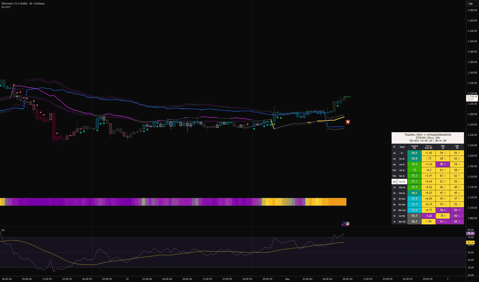
Wskaźnik
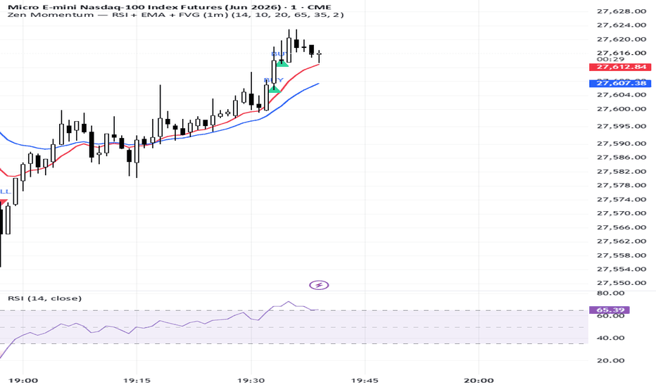
MACD + RSI + MFI + A/D by Ismael█ OVERVIEW
A 4-in-1 oscillator panel combining MACD, RSI with Bollinger Bands and
custom Buy/Sell signals, Money Flow Index (MFI), and Accumulation/Distribution.
Each module can be toggled on/off independently from a single "Toggle
Indicators" group, so the user can display only what they need instead of
loading four separate scripts.
═══════════════════════════════════════════════════════════════════════
█ ORIGINALITY
This script does not invent new math — it integrates four well-known
built-in indicators into a single pane and adds three conveniences:
- A unified toggle system to show/hide each indicator on demand.
- A custom RSI signal layer based on Bollinger Band breakouts of the
RSI itself, combined with the classic overbought/oversold zones.
- An A/D module that replicates the configuration style of the
MetaTrader 5 implementation (Tick/Real volume option and configurable
horizontal levels).
═══════════════════════════════════════════════════════════════════════
█ WHAT IT INCLUDES
▪ MACD (default: ON)
Standard MACD with configurable fast/slow lengths, signal smoothing,
and choice of SMA or EMA for both the oscillator and signal line.
Includes alerts for histogram polarity changes.
▪ RSI with Bollinger Bands and Buy/Sell signals (default: ON)
Classic RSI with optional smoothing MA (SMA, EMA, WMA, VWMA, SMMA,
or SMA + Bollinger Bands). When "SMA + Bollinger Bands" is selected:
- Buy signal: RSI closes below its lower Bollinger Band AND below 30.
- Sell signal: RSI closes above its upper Bollinger Band AND above 70.
Signals are plotted as arrows and include alert conditions.
▪ MFI (default: OFF)
Standard Money Flow Index with 80/50/20 horizontal levels.
▪ Accumulation/Distribution (default: OFF)
Classic cumulative A/D line. Configurable like the MT5 version:
- Volume mode: Real or Tick (1 per bar, useful for FX).
- 3 user-defined horizontal levels with individual visibility/color.
- Color and line width.
Includes alerts for crossovers against its own SMA(20).
═══════════════════════════════════════════════════════════════════════
█ HOW TO USE
1. Activate from "Toggle Indicators" only the modules you need.
2. RSI Buy/Sell signals are intended as confluence — not standalone
entries. They mark statistically rare conditions (extreme RSI combined
with a Bollinger Band breakout on the RSI) and should be confirmed
with price action, structure, or trend context.
3. MACD histogram polarity alerts can be paired with RSI signals.
4. The A/D line is most useful when watched for divergences against price,
not for its absolute value.
═══════════════════════════════════════════════════════════════════════
█ LIMITATIONS
- The A/D line uses cumulative values that produce very large numbers.
When combined with MACD/RSI/MFI in the same pane, auto-scale will
compress the smaller-range indicators. Workaround: right-click the
A/D plot → "Pin to scale" → assign it to a separate scale.
- "Tick" volume here is approximated as 1 per bar; Pine Script does not
expose the tick-volume data used by MetaTrader 5. For instruments with
reliable real volume, use "Real".
- RSI Buy/Sell signals only fire when the smoothing MA type is set to
"SMA + Bollinger Bands". Other MA types disable the signal layer.
- This is an aggregator/utility script. It does not predict market
direction and is not a complete trading system.
═══════════════════════════════════════════════════════════════════════
█ DISCLAIMER
This script is shared for educational purposes only and is not financial
advice. Indicator signals do not guarantee future results. Always perform
your own analysis and apply proper risk management.
═══════════════════════════════════════════════════════════════════════
█ DESCRIPCIÓN (Español)
Panel de osciladores 4-en-1 que combina MACD, RSI con Bandas de Bollinger
y señales de compra/venta, MFI y Acumulación/Distribución. Cada módulo se
activa o desactiva de forma independiente desde el grupo "Toggle
Indicators".
Incluye:
- MACD estándar con alertas de cambio de polaridad del histograma.
- RSI con MA opcional (SMA, EMA, WMA, VWMA, SMMA o SMA+BB). Cuando
se elige "SMA + Bandas de Bollinger", aparecen señales:
- Compra: RSI por debajo de la banda inferior Y menor a 30.
- Venta: RSI por encima de la banda superior Y mayor a 70.
- MFI estándar con niveles 80/50/20.
- Acumulación/Distribución estilo MT5: volumen Real/Tick, 3 niveles
horizontales configurables, color y grosor ajustables, alertas de
cruce contra su SMA(20).
Las señales del RSI son herramientas de confluencia, no entradas
automáticas. La línea A/D se interpreta principalmente por divergencias
con el precio, no por su valor absoluto. Al activar A/D junto con los
demás osciladores, conviene moverla a una escala separada (clic derecho
sobre la línea → "Fijar a escala" → escala nueva).
Este script tiene fines educativos. No constituye asesoría financiera.
█ HOW TO USE
The RSI Buy/Sell signals (with their attached alerts) are the main
actionable element of this script and can be used to anticipate potential
entries — long on Buy signals, short on Sell signals. They fire under
statistically rare conditions (RSI breaking out of its own Bollinger Band
envelope while also being in extreme oversold/overbought territory),
which often precede a reversion or a meaningful move.
However, these signals should NOT be taken as standalone entries. They
work best as an early-warning system that must be confirmed before
acting on them. Recommended workflow:
1. RSI Buy/Sell signal fires → set alert and prepare the trade idea.
2. Look at the MACD for confirmation:
- For a Buy: histogram should be turning from falling to rising,
or MACD line crossing above Signal.
- For a Sell: histogram turning from rising to falling, or MACD
line crossing below Signal.
3. Check the MFI (if enabled): values pulling back from oversold (<20)
on Buys, or pulling back from overbought (>80) on Sells, add
confluence by confirming a money-flow shift.
4. Check the A/D line for divergences with price:
- Bullish divergence (price makes lower low, A/D makes higher low)
strongly supports a Buy signal.
- Bearish divergence (price makes higher high, A/D makes lower
high) strongly supports a Sell signal.
Divergences on RSI itself against price work the same way and are
one of the most reliable confirmation tools in this panel.
5. Always combine with price-action context: trend direction on higher
timeframes, key support/resistance, and your own risk management.
In short: the RSI signals are designed to ANTICIPATE trades, not to
trigger them automatically. The other modules (MACD, MFI, A/D) and
divergence analysis exist to filter the false positives and validate
the ones worth taking.
═══════════════════════════════════════════════════════════════════════
█ CÓMO USAR (Español)
Las señales de Compra/Venta del RSI (con sus alertas configuradas) son
el elemento principal accionable de este script y pueden usarse para
anticipar entradas — largos en señales de Compra, cortos en señales de
Venta. Se activan en condiciones estadísticamente poco frecuentes
(el RSI rompe su propia envolvente de Bandas de Bollinger mientras
está en zona de sobreventa o sobrecompra extrema), que suelen preceder
una reversión o un movimiento significativo.
Sin embargo, NO deben tomarse como entradas automáticas. Funcionan
mejor como un sistema de alerta temprana que debe confirmarse antes
de operar. Flujo recomendado:
1. Se dispara la señal del RSI → preparar la idea de trade.
2. Confirmar con MACD:
- Compra: histograma pasando de bajista a alcista, o cruce
del MACD por encima de la Signal.
- Venta: histograma pasando de alcista a bajista, o cruce
del MACD por debajo de la Signal.
3. Confirmar con MFI (si está activo): valores saliendo de
sobreventa (<20) en Compras o saliendo de sobrecompra (>80)
en Ventas indican un cambio en el flujo de dinero.
4. Buscar divergencias en la línea A/D contra el precio:
- Divergencia alcista (precio hace mínimo más bajo, A/D hace
mínimo más alto) refuerza una señal de Compra.
- Divergencia bajista (precio hace máximo más alto, A/D hace
máximo más bajo) refuerza una señal de Venta.
Las divergencias del propio RSI contra el precio funcionan igual
y son una de las confirmaciones más fiables de este panel.
5. Siempre combinar con contexto de price action: tendencia en
temporalidades superiores, soportes/resistencias clave y gestión
de riesgo propia.
En resumen: las señales del RSI están diseñadas para ANTICIPAR
trades, no para dispararlos automáticamente. Los otros módulos
(MACD, MFI, A/D) y el análisis de divergencias existen para filtrar
los falsos positivos y validar las entradas que realmente valen
la pena. Wskaźnik
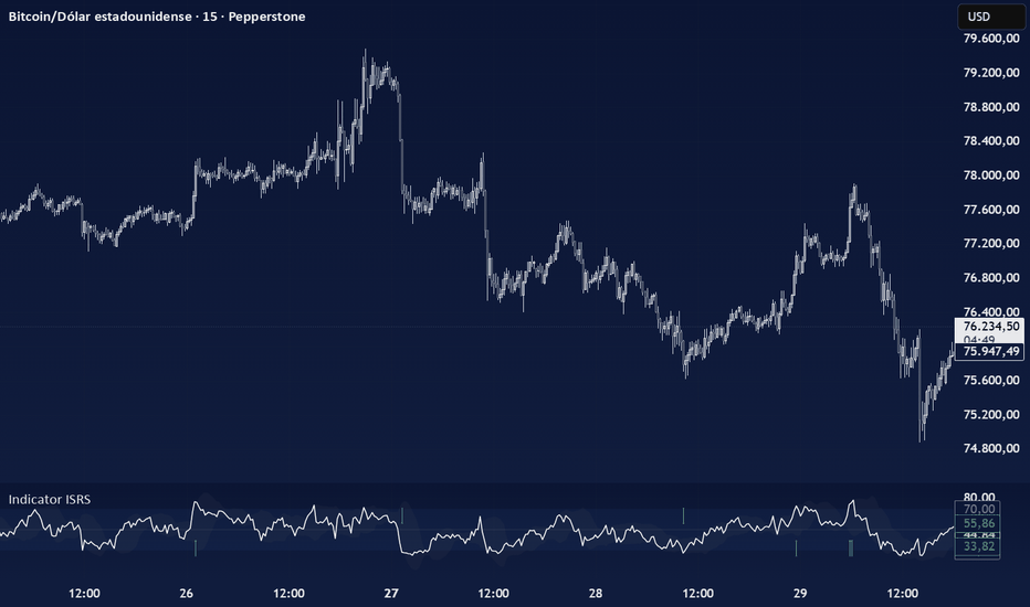
RSI + Pressure Trend ProRSI + Pressure Trend Pro is an RSI-based momentum and pressure framework designed to make RSI easier to read as a complete system instead of a single oscillator line. At its core, the script combines classic RSI behavior, synthetic RSI candles, higher-timeframe context, volume-weighted RSI, pressure normalization, crossover layers, and a chart-side pressure trail into one connected workflow. My goal is to create a script that organizes RSI strength, weakness, compression, expansion, and price confirmation into a cleaner visual structure.
Most RSI tools focus on the 70 / 30 zones or simple moving-average crosses. Those are useful, but RSI often becomes more meaningful when it is read through several relationships at once:
➡️ Where is RSI 14 relative to its recent range?
➡️ Is fast RSI confirming or separating from the slower RSI structure?
➡️ Is RSI pressing into an upper or lower pressure zone?
➡️ Is volume-weighted RSI supporting the move?
➡️ Is the current RSI pressure regime being confirmed by price?
That price-confirmation piece is one of the main ideas behind this script.
The RSI Pressure Oscillator is built from several RSI-derived components that are normalized into a 0–100 pressure scale. The composite blends raw RSI level, recent RSI range position, RSI trend spread, short-term velocity, RSI band position, and volume-weighted RSI participation. The result is a pressure line that behaves like an RSI-style oscillator, but with more context than raw RSI alone.
The script then takes that pressure read and connects it back to the main chart through the RSI Pressure Trail. This trail is built from a volatility-adjusted price structure using ATR and a smoothed price basis. In other words, the oscillator pane is not isolated from price. The pressure regime must also be checked against where price is trading relative to the active trail.
That is why the pressure colors are price-confirmed. When RSI pressure is bullish and price is holding the bullish trail, the pressure color can stay active. When RSI pressure is bearish and price is respecting the bearish trail, the bearish pressure color can stay active. When pressure is mixed, neutral, or not being confirmed cleanly by price, the system can fall back into a more neutral read. That makes the script less about “RSI crossed a level” and more about asking: Is price confirming the current RSI pressure regime?
This script includes several visual layers built around that same idea:
🔹The synthetic RSI candles are included to make RSI movement easier to read bar by bar. Instead of viewing RSI only as a line, the script converts RSI 14 into candle-style movement inside the oscillator pane. The previous RSI value becomes the synthetic open, the current RSI value becomes the synthetic close, and the candle body shows the directional movement between those two points. This helps show when RSI is expanding, contracting, stalling, or changing direction more visually than a line alone.
🔹The RSI Candle Pressure Envelope adds another layer around those synthetic RSI candles. When RSI presses into the selected upper or lower trigger zones, the envelope fill turns on. This helps highlight moments where RSI is not just moving, but pressing into a stronger upper or lower momentum area.
🔹The lookback high/low boxes serve a different purpose. They highlight the recent RSI high zone and low zone inside the selected lookback window. This gives the oscillator pane a simple structure reference so traders can quickly see whether current RSI is pushing back into a recent high-pressure area, falling into a recent low-pressure area, or moving somewhere in between.
🔹The crossover layers are there to help separate short-term movement from broader RSI structure.
🔹The RSI Pressure Composite crossover layer is calculated from the pressure oscillator itself, not directly from raw RSI. This can help show when the pressure engine is beginning to rotate.
🔹The adaptive RSI moving-average layer is based on RSI 14 and can automatically adjust its fast/slow lengths depending on the chart timeframe. This gives the script a more flexible trend-context layer across different chart speeds.
🔹The standalone RSI 20/50 crossover layer gives a slower RSI trend reference. By default, it works like a broader momentum structure guide using RSI SMA 20 and RSI SMA 50.
A practical way to read the script:
➡️ When RSI 14, RSI 5, and the pressure oscillator are rising together, short-term and core RSI momentum are generally aligned.
➡️ When the pressure oscillator is above the bullish regime zone and price is holding the chart-side pressure trail, RSI pressure is being confirmed by price.
➡️ When the pressure oscillator is below the bearish regime zone and price is respecting the bearish trail, downside RSI pressure is being confirmed by price.
➡️ When the pressure oscillator is in the middle zone, or when price is not confirming the pressure trail cleanly, the market may be transitioning, cooling, or moving through a less directional phase.
➡️ When the RSI 20/50 layer agrees with the faster pressure behavior, the broader RSI structure may be supporting the active move.
➡️ When the faster layers disagree with the slower layers, that often points to a transition area rather than a clean trend read.
The chart-side tools are included so the oscillator pane and price pane stay visually connected. The optional RSI-colored candles keep normal OHLC price structure, but color the body, wick, and border using the RSI color engine. The RSI Pressure Trail projects the active RSI pressure regime back onto price as a support/resistance-style guide.
That combination gives the script two views of the same idea: the pane shows RSI structure and pressure behavior. The chart shows whether price is confirming that pressure behavior.
Bar Replay is especially useful with this script. Watching the system build one candle at a time makes it easier to see when RSI begins to expand, when synthetic RSI candles press into an envelope zone, when the pressure oscillator changes regime, when the crossover layers rotate, and how the chart-side pressure trail responds as price confirms or rejects the oscillator-side read.
This is not meant to be a standalone buy/sell signal machine. RSI works best when it is read with context. Structure, support and resistance, volume, trend, higher-timeframe levels, volatility, and broader market conditions still matter.
The value of RSI + Pressure Trend is that it gives RSI a more organized pressure framework. Instead of treating RSI as one line with two fixed levels, the script builds a connected view of RSI movement, RSI structure, pressure expansion, crossover behavior, volume participation, and price confirmation.
The goal is to help traders read when RSI pressure is building, when it is fading, when price is confirming it, and when the oscillator and chart may be starting to disagree.
The following charts show the different components of the script:
➖Optional Companion Workflow➖
RSI + Pressure Trend focuses on momentum pressure, regime shifts, and price-confirmed RSI behavior. When used with RSI Pivot Structure + Divergence Hunter Pro, traders can compare where RSI pressure is building against where RSI pivots, divergence, and structure are forming.
➖RSI Views Across Price + Oscillator Pane➖
This view shows how the script connects RSI behavior across the chart and oscillator pane.
Price candles keep real OHLC structure while using the RSI 14 color engine. Below, RSI 5 and RSI 14 show fast-vs-broader momentum alignment, while synthetic RSI 14 candles convert the RSI line into candle-style movement for a cleaner bar-by-bar read.
➖Adaptive RSI vs SMA 20/50 Structure➖
This view compares two RSI 14 structure layers. The adaptive EMA crossover responds faster to RSI momentum shifts, while the SMA 20/50 layer gives a slower baseline for broader RSI structure. Used together, they help separate short-term RSI improvement from larger momentum confirmation. When the faster adaptive layer turns before the SMA 20/50 structure, it can highlight early transition behavior before the broader RSI trend fully responds.
➖RSI 14 + HTF RSI + Volume-Weighted RSI➖
This view layers three RSI references for broader context. RSI 14 shows the active momentum path, HTF RSI shows the higher-timeframe backdrop, and Volume-Weighted RSI shows whether RSI movement is being supported by stronger volume participation.
➖RSI Pressure + Adaptive MAs➖
This view shows the RSI Pressure Oscillator with its adaptive pressure moving averages.
On the 15-minute timeframe, Auto mode uses the EMA 13 / EMA 34 pressure pair. The pressure line shows the active RSI pressure condition, while the MA fill smooths that movement into broader structure. When the faster pressure MA leads above the slower MA, pressure is improving. When it remains below, pressure is still leaning weaker.
➖RSI Lookback High/Low Zones➖
These boxes mark the recent RSI 14 high and low zones inside the selected lookback window.
The upper zone highlights where RSI recently reached stronger pressure. The lower zone highlights where RSI recently reached weaker pressure.
Together, they help frame RSI structure visually:
upper zone = recent RSI resistance / pressure high
lower zone = recent RSI support / pressure low
➖RSI Pressure Envelopes➖
The pressure envelopes highlight when RSI 14 presses into stronger upper or lower momentum zones. When RSI pushes into the upper trigger area, the upper envelope appears. When RSI falls into the lower trigger area, the lower envelope appears. This helps make RSI extremes easier to spot without relying only on the 70 / 30 guide levels.
Wskaźnik
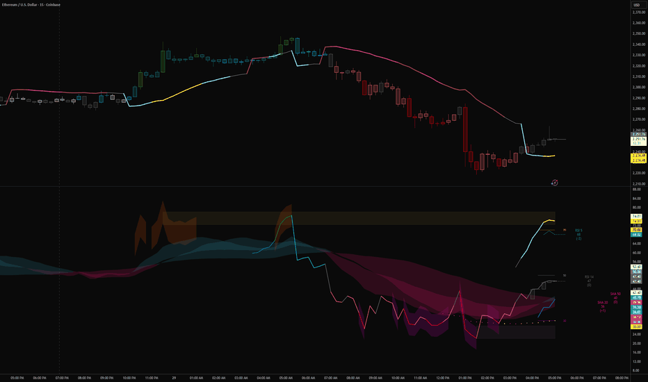
Wskaźnik
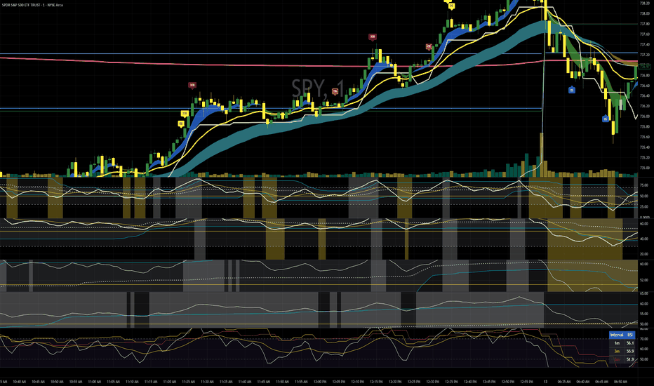
Wskaźnik
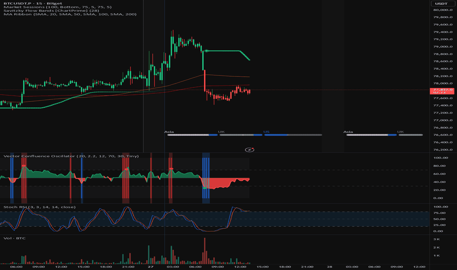
Entry Timing Quality [AGPro Series]Entry Timing Quality
🧠 Core Idea
Is the current setup timing early, improving, in-window, late, or already exhausted?
📌 Overview / What it does
Entry Timing Quality is a chart-first execution timing tool built to evaluate when a setup deserves attention from a timing perspective.
The script produces a 0-100 Timing Score, a timing window, an invalidation rail, target-side room context, early / improving / prime / late / exhausted state labels, a momentum clock marker, alert conditions, and a clean AGPro panel.
It does not predict price direction, automate execution, print directional commands, or replace a trader's own setup model. Its purpose is to organize timing quality after a setup thesis already exists.
🎯 Purpose & Design Philosophy
This script was built for traders who already see a possible setup but need a cleaner way to judge whether the timing is too early, becoming actionable, already extended, or no longer fresh.
The gap it fills is specific: many tools show entries, signals, levels, or broad readiness states, but they do not isolate the timing phase of a setup.
The design supports a disciplined execution-review mindset: timing first, risk context second, action only after independent confirmation.
⚡ Why This Script Is Different
Most tools focus on printing entries, highlighting generic signals, or building full trade plans.
This script does NOT act as a full Entry Execution Readiness system, Position Planner, Reward Room Analyzer, or directional signal indicator.
Instead, it answers a narrower timing question: is the setup still early, improving into a better timing window, in a prime timing phase, late, exhausted, or structurally invalidated?
⚙️ Methodology
1. Context Detection
The script detects the active timing side automatically from trend structure, or lets the user force long-side or short-side timing review.
2. Reference Mapping
It maps a timing window around the active trigger reference, an invalidation rail from recent structure, a late timing rail, and target-side reference room.
3. Reaction Evaluation
The model scores trigger proximity, candle efficiency, pullback maturity, momentum reset, volatility expansion, risk distance, and target-side room.
4. Visual Output
The chart displays the active timing window, target-side room context, invalidation rail, late timing rail, momentum clock marker, event labels, alerts, and the AGPro panel.
🗺️ How to Read the Chart
Zones = the timing window and target-side room context.
Invalidation rail = the structural level that weakens or resets the current timing read.
Late timing rail = the area where timing may become extended rather than fresh.
Labels = compact markers for Early, Improving, Prime, Late, Exhausted, and Invalidated states.
Colors = teal for stronger long-side timing context, pink for short-side or invalidation context, amber for early or late caution, and indigo for improving timing.
Panel = the fast decision cockpit showing Timing Score, Window State, Momentum Phase, Risk Distance, and Action.
🚦 Signals & States
• PRIME -> timing score and confirmation conditions align inside or near the active timing window.
• IMPROVING -> timing is building but has not reached the Prime threshold.
• EARLY -> the setup exists, but timing still needs cleaner proximity, reset, or candle quality.
• LATE -> price has stretched away from the timing window and may be less fresh.
• EXHAUSTED -> extension, pullback damage, or momentum heat suggests the timing phase needs reset.
• INVALIDATED -> price closed beyond the structural invalidation rail.
🔔 Alerts Logic
Prime Timing alerts trigger when the state upgrades into Prime Timing.
Improving Timing alerts trigger when the setup moves into an active monitoring state.
Late / Exhausted alerts trigger when the timing phase becomes stretched or no longer fresh.
Invalidation alerts trigger when price closes beyond the active invalidation rail.
Alerts are attention markers. They are not trading instructions.
🧩 Confluence Logic
Timing quality improves when trigger proximity, candle efficiency, pullback maturity, momentum reset, stable volatility, trend support, and target-side room align.
The score is intentionally multi-factor so a single candle or a single trend condition cannot dominate the timing read.
📊 When to Use
• Pullback timing reviews
• Trend continuation setups that need timing discipline
• Breakout continuation setups after a reset
• Execution-review workflows where a setup thesis already exists
• Charts where the user wants to avoid chasing late movement
⚠️ When NOT to Use
• Very low-liquidity symbols
• Extremely noisy sideways markets
• News-shock volatility spikes
• Charts where no independent setup thesis exists
• Situations where exact broker-level execution rules are required
🎛️ Key Inputs
• Timing Side -> Auto, Long Timing, or Short Timing review mode.
• Sensitivity -> adjusts how early or selective the timing model becomes.
• Timing Lookback -> affects structure references, pullback maturity, risk distance, and target-side room.
• Minimum Prime Timing Score -> sets the threshold required for Prime Timing.
• Confirmation Mode -> controls how much candle, trend, and momentum confirmation is required.
• Label Cooldown / Max Visible Labels -> controls label density and chart cleanliness.
• Visual settings -> control timing window, momentum clock marker, label offsets, and font sizes.
• Panel settings -> control panel visibility, location, theme, and font size.
🖥️ Interface & Visual Design
The panel follows the AGPro public-release standard with one merged blue header row containing only the script name.
The chart is designed to feel active but not crowded. It uses one timing window, one invalidation rail, one late rail, target-side room context, a compact momentum clock marker, and controlled event labels.
Label and panel font sizes are adjustable, with Normal as the default.
🧪 Practical Usage Workflow
1. Read the panel Timing Score and Window State.
2. Check whether price is inside, near, late beyond, or away from the timing window.
3. Review the Momentum Phase to see whether timing is resetting, expanding, hot, or cooling.
4. Compare Risk Distance with target-side room context.
5. Treat Prime Timing as a review state, not as an automatic execution command.
🔍 Interpretation Guidelines
A high Timing Score means the modeled timing conditions are cleaner than usual according to the script's rules.
An Improving state can be useful because it shows timing is building but not yet fully aligned.
A Late or Exhausted state does not mean price must reverse. It means the timing read is no longer fresh and should be reviewed with extra caution.
The best interpretation comes from reading score, state, momentum phase, risk distance, and invalidation together.
🚫 What This Script Is NOT
• Not a prediction engine
• Not financial advice
• Not auto trading
• Not guaranteed signals
• Not a full position-sizing planner
• Not a directional command system
• Not a full reward-room or target-planning tool
⚠️ Limitations & Transparency
The model is rule-based and depends on recent structure, ATR, moving-average context, candle behavior, and RSI-based momentum reset.
Different timeframes can produce different timing windows and invalidation rails.
Fast volatility expansion can move a setup from Improving to Late quickly.
No rule-based tool can know future price behavior, order-book conditions, spreads, or a user's execution plan.
🧠 Market Context Notes
Timing is most useful when read together with broader market structure, liquidity, trend condition, volatility, and session context.
A setup can have good direction but poor timing.
A setup can also have a clean timing window but poor broader context.
🧾 Use Case Examples
When price pulls back near the timing window, momentum resets, candle quality improves, and risk distance remains controlled, the state may move from Early to Improving or Prime.
When price stretches far beyond the late rail while momentum becomes hot, the script may mark Late or Exhausted rather than encouraging the user to chase.
When price closes beyond the invalidation rail, the active timing read is marked as Invalidated.
🧱 System Philosophy
AGPro tools are designed to convert visible chart information into structured decision context.
This script follows that philosophy by separating timing quality from generic signals, full trade planning, or prediction language.
🔐 Non-Promise Statement
No script can provide certainty.
No timing score can guarantee a future outcome.
This tool organizes visible timing conditions so users can perform a more structured review.
📉 Risk Disclosure
Trading involves risk.
Users are responsible for their own analysis, execution, risk management, and decisions.
This script is for educational and analytical purposes only and does not provide financial advice.
📚 Educational Note
Use the script to study how timing improves, becomes prime, stretches late, exhausts, or invalidates around a structured execution window.
Wskaźnik