Wskaźnik
Wsparcie i Opór

Gridbot Ping Pong🏓 Gridbot Ping Pong is a dynamic grid bot indicator that generates buy and sell signals as price oscillates between automatically calculated support and resistance levels. The grid adapts to trending markets through adjustable tilt and anchor parameters, which control the grid slope and shift resistance respectively. Entry signals trigger when price touches grid levels, while take profit and stop signals manage position exits. Unlike traditional grid bots that require horizontal ranges, this indicator maintains its oscillation zone as price trends by tilting and shifting the grid structure to follow momentum. The grid bot approach aims to accumulate gains through frequent touches across multiple grid levels rather than seeking large directional moves. Like a ping pong ball in motion, price oscillates between grid levels — each touch generates a signal.
⚡ THEORY & CONCEPTS ⚡
Grid trading is a systematic approach that places buy and sell orders at predetermined price intervals, creating a grid of orders above and below a set price level. In ranging markets, this method capitalizes on natural price oscillations by buying at lower grid levels and selling at higher ones. Each completed round trip between levels represents a captured opportunity, and the frequency of these oscillations determines the grid's effectiveness. Traditional grid bots excel when price remains within the defined range, methodically accumulating gains as price bounces between levels.
However, traditional grid structures face significant challenges when markets begin to trend. Fixed horizontal levels that performed well during consolidation become liabilities during directional moves. An uptrend leaves buy orders unfilled while sell orders trigger prematurely, and a downtrend creates the opposite problem. Extended trends can result in accumulated positions at increasingly unfavorable prices, with no mechanism to adapt to the new market reality. The static nature of traditional grids assumes markets will return to the mean, yet sustained breakouts regularly invalidate this assumption.
Gridbot Ping Pong addresses these limitations through dynamic grid adaptation. The tilt parameter angles the grid in the direction of the prevailing trend, aligning support and resistance levels with market momentum rather than fighting against it. The anchor parameter creates buffer zones beyond the outer grid boundaries, requiring price to demonstrate conviction before triggering a grid shift. When price breaks through these buffers, the entire grid recenters to the new price level. This combination of tilting grids and controlled shifting allows the indicator to maintain grid trading mechanics while acknowledging that markets trend.
The grid adapts through a downtrend and early reversal. Entry signals (▲▼), take profit signals (△▽), and grid shifts demonstrate the ping pong sequence as price oscillates between levels.
The grid structure consists of five levels: two potential support levels below, a center base price, and two potential resistance levels above. These levels are calculated as percentage intervals from a dynamic base price, with the spacing parameter determining the distance between each level. Trend direction is derived from consecutive grid shifts, where multiple shifts in the same direction confirm momentum. The grid restricts entries to the trend direction — buy signals in uptrends, sell signals in downtrends — while counter-trend signals convert to exits when appropriate.
Full market cycle demonstrating grid adaptation through rally, reversal, decline, and recovery. Buy signals dominate during uptrends, sell signals during downtrends, with take profits at boundaries throughout. Two stop signals mark the trend reversals.
Tilt
The tilt mechanic introduces slope to the grid structure based on trend direction and momentum. When consecutive shifts occur in the same direction, the tilt increases, creating a steeper grid that tracks with the trend. As the trend progresses, support levels rise with it — buy signals trigger on pullbacks to these rising levels rather than static levels abandoned by price. Similarly, resistance levels fall during downtrends, keeping sell signals relevant to current price action. If the trend reverses and shifts occur in the opposite direction, the tilt resets and begins building in the new direction. The tilt strength parameter controls how aggressively the grid slopes, with higher values producing steeper angles. Negative tilt values invert this relationship, angling the grid against the prevailing momentum rather than with it. This counter-trend configuration positions support levels lower during uptrends and resistance levels higher during downtrends, favoring mean reversion entries that anticipate pullbacks rather than continuation.
Negative tilt applied during an uptrend. Despite the bullish price action from late November through December, the grids slope downward, positioning buy signals at deeper support levels. Take profit signals appear at resistance as price reaches the upper grid boundaries before pulling back. The counter-trend configuration captures oscillations within the rising market rather than chasing momentum.
Anchor
The anchor mechanic provides resistance to grid shifting. Buffer zones extend beyond the outer grid boundaries, requiring price to demonstrate conviction before triggering a shift. Higher anchor values create larger buffers, requiring more significant price movement. As consecutive shifts confirm a trend, the pro-trend buffer shrinks, allowing the grid to follow momentum with increasing ease. This lets the indicator commit to established trends while resisting premature shifts during consolidations. Tilt and anchor work in complementary tension: tilt rewards momentum by angling the grid, while anchor resists excessive shifting by requiring price conviction to recenter. When price breaks through these buffers, the entire grid recenters to the new price level and play continues on a fresh table.
Steady uptrend with minimal tilt. The flat grid segments demonstrate that shifting alone keeps the grid aligned with price action. Buy signals (▲) and take profit signals (▽) alternate as price bounces between levels, accumulating gains through repetition across the entire move.
Sustained uptrend from June through September. The grid follows the trend with increasing ease as consecutive shifts reduce the pro-trend buffer. The October consolidation eventually triggers a downward shift and stop signal, but the system adapts to the renewed uptrend in November with fresh entry signals.
Signal Generation
The indicator generates three signal types. Entry signals (▲▼) trigger when price reaches a grid level in the direction of the trend, initiating a new position. Take profit signals (△▽) trigger when price reaches a grid level against the trend direction while a position is held, capturing gains as the rally continues. Stop signals (⦿) trigger when a grid shift occurs while holding a position adverse to the new shift direction. The ball goes off the table.
Trend reversal from bearish to bullish. The grid follows the downtrend through November with consecutive sell signals. A stop signal (⦿) triggers at the bottom as the grid shifts adversely against the held position. The system resets and adapts to the emerging uptrend in December, generating fresh buy signals as the new direction establishes.
Trigger Options
The signal trigger determines what price data the indicator uses to detect grid touches, balancing responsiveness against confirmation.
Auto : The default setting, using wick-based detection for pro-trend signals and close-based detection for counter-trend signals. This balances responsiveness when entering with the trend against confirmation when signaling against it.
Wick Touch : Generates signals in real-time when the high or low touches a grid level, providing the fastest response to price interaction.
Wick Reverse : Requires the wick to cross through the grid level from the previous bar, confirming the touch before signaling.
SWMA : Uses a Symmetrically Weighted Moving Average as the trigger source, generating signals only when the smoothed price crosses grid levels.
Close : Uses the bar's closing price as the trigger source, providing confirmed signals after each bar completes.
Symmetrically Weighted Moving Average (SWMA) trigger during a trend reversal. The smoothed price line filters intrabar noise, generating signals only when the SWMA crosses grid levels rather than reacting to wick touches. The grid follows the downtrend through November, resets at the bottom, and adapts to the emerging uptrend in December.
Signal Safeguards
The indicator includes built-in protections to reduce overtrading and mitigate risk, keeping the ball in play longer:
Boundary Protection : New entries are blocked at the outermost grid levels where breakout risk is highest. Exits remain permitted at these boundaries.
Signal Spacing : Signals maintain one-level separation from the most recent signal, preventing clusters of entries at similar prices.
Trend Alignment : When conflicting conditions arise, signals align with the prevailing trend direction rather than fighting momentum.
Automatic Profit Taking : Counter-trend interactions convert to take profit signals when a position is held, capturing gains rather than reversing exposure.
Adverse Shift Stops : When the grid shifts against a held position, a stop signal triggers to exit before further adverse movement.
Cautious Breakout Entries : On the first shift in a new direction, entries are restricted to favorable grid levels until the trend confirms through consecutive shifts.
Shift Resistance : Counter-trend shifts always require full buffer conviction, while pro-trend shifts become easier only after the trend is confirmed.
🛠️ CONFIGURATION & SETTINGS 🛠️
Core Parameters
SPACING (%) : Sets the percentage distance between grid levels. Higher values create wider grids with more room between signals, lower values create tighter grids with more frequent signal opportunities.
TRIGGER : Selects the price source for signal detection. See Trigger Options above.
TILT : Controls the grid slope factor in the trend direction.
ANCHOR : Controls resistance to grid shifting.
Visual Settings
GRIDS : Sets the colors for support (lower) and resistance (upper) grid levels.
FILL : Sets the gradient fill colors between the price line and outer grid boundaries.
SWMA : Sets the color of the Symmetrically Weighted Moving Average line.
🏓 PLAYING GRIDBOT PING PONG 🏓
⚪The objective is not to predict where price will go, but to be present at each level when it arrives.
⚪Each touch at a boundary counts. Gains accumulate through repetition, not single swings.
⚪The rally continues until it doesn't. When the ball goes off the table, the game resets.
⚪The grid creates boundaries where price bounces back and forth. The table is set — the ball does the work.
⚪Price oscillates between defined levels. The grid is the table. Everything else is just ping pong.
Tennis is a form of ping pong. In fact, tennis is ping pong played while standing on the table. In fact, all racquet games are nothing but derivatives of ping pong. — George Carlin
⚠️ DISCLAIMER ⚠️
The Gridbot Ping Pong indicator is a visual analysis tool designed to illustrate grid trading concepts and serve as a framework for understanding grid bot mechanics. While the indicator generates entry, exit, and stop signals, no guarantee is made regarding the profitability of these signals. Like all technical indicators, the grid levels and signals generated by this tool may appear to align with favorable trading opportunities in hindsight. However, these signals are not intended as standalone recommendations for trading decisions. This indicator is intended for educational and analytical purposes, complementing other tools and methods of market analysis.
🧠 BEYOND THE CODE 🧠
Gridbot Ping Pong is part of the Grid Bot Series, building on the concepts introduced in the Grid Bot Simulator , Grid Bot Auto , and Grid Bot Parabolic indicators. While those tools established the foundation for grid-based analysis, this indicator introduces dynamic tilt and anchor mechanics that adapt to trending market conditions.
This indicator shares the same educational philosophy as the Fibonacci Time-Price Zones and the Fibonacci Geometry Series - providing frameworks for understanding market concepts through visualization and experimentation rather than black-box signals.
The Gridbot Ping Pong indicator, like other xxattaxx indicators , is designed to encourage both education and community engagement. Feedback and insights are invaluable to refining and enhancing this tool. We look forward to the creative applications, observations, and discussions this indicator inspires within the trading community.
Wskaźnik

Supply and Demand Zones [Clean v6]Overview
The Supply and Demand Zones indicator is an automated market structure tool designed to identify high-probability Points of Interest (POI) on any asset or timeframe. Built using Pine Script v6, this script focuses on clarity and performance, providing traders with a clutter-free view of where institutional buying and selling pressure has previously occurred.
Unlike crowded indicators that overwhelm the chart, this script dynamically manages zones—drawing new ones as structure forms and automatically removing invalid zones as price breaks through them.
Key Features
Automated Zone Detection: Automatically identifies Supply (Resistance) and Demand (Support) zones based on Swing Highs and Swing Lows.
Dynamic Zone Management: Active zones extend to the right until price interacts with them.
Break of Structure (BOS) Logic: When price violates a zone (closes beyond the invalidation level), the zone is automatically removed and marked as "Broken" to keep the chart clean.
Zig Zag Structure: Includes an optional Zig Zag overlay to visualize market flow, Higher Highs, and Lower Lows.
ATR-Based Sizing: Zone width is calculated using the Average True Range (ATR), ensuring zones adapt to the asset's current volatility.
Pine Script v6: Optimized using the latest array and method functions for speed and stability.
How It Works
Zone Creation: The script looks for Pivot Highs and Lows based on your defined Swing Length.
Supply Zones: Created at Swing Highs.
Demand Zones: Created at Swing Lows.
Zone Width: The height of the box is determined by the ATR multiplied by your Zone Width setting. This ensures the zone covers the "wick" area or the volatility range of the pivot.
Invalidation: If the price closes past the outer edge of a zone (the top of a Supply zone or bottom of a Demand zone), the script detects a break, removes the filled box, and leaves a subtle trace of the broken structure.
How to Use
Trend Following: Use the Zig Zag lines to identify the trend direction. Look for Long entries in Demand zones during an uptrend, and Short entries in Supply zones during a downtrend.
Reversals: Watch for price to react at older, unfilled zones (POIs) that align with major support/resistance levels.
Stop Loss Placement: The outer edge of the zone acts as a natural invalidation point. If price closes beyond it, the setup is typically invalidated.
Settings Guide
Swing Length: Determines the sensitivity of the pivot detection. Lower numbers find more local zones (scalping); higher numbers find major structural zones (swing trading).
Max Zones to Keep: Limits the number of historic zones displayed to prevent chart clutter.
Zone Width (ATR): Adjusts how thick the zones are. Increase this value if you want to capture wider wicks.
Visual Settings: Fully customizable colors for Supply, Demand, Borders, and Zig Zag lines.
Disclaimer
This tool is for informational and educational purposes only. It visualizes past price action and does not guarantee future performance. Always manage your risk appropriately.
Wskaźnik

THE ELVINATORTHE ELVINATOR is my trend-following momentum indicator built on the 20 EMA, 50 EMA, and 200 EMA, designed for trading **XAUUSD during the New York session (9:30–17:00 NY time), Monday through Friday**.
**How to trade it:**
* **Trend filter:** Only take **longs above the 200 EMA** and **shorts below the 200 EMA**. This keeps trades aligned with Gold’s dominant direction.
* **Long setups:** A **20 EMA cross above the 50 EMA** signals bullish momentum. Best entries come after a pullback into the 20–50 EMA zone followed by strong continuation candles.
* **Short setups:** A **20 EMA cross below the 50 EMA** signals bearish momentum. Look for pullbacks into the EMA zone and rejection before continuation lower.
* **Timing:** Focus on NY open and high-volume moves. Avoid choppy conditions and late-session exhaustion.
* **Risk & exits:** Place stops beyond recent swings or EMA structure. Targets can be prior highs/lows or scaled with trend continuation.
THE ELVINATOR is built for **structure, patience, and disciplined execution**, allowing traders to capitalize on Gold’s volatility without chasing noise.
Wskaźnik

As Good As It Gets Pivot ArrowsAs Good As It Gets Pivot Arrows
Description
- As Good As It Gets Pivot Arrows is a clean, high-precision pivot detection indicator that plots bright green upward triangles for confirmed pivot lows (buy signals) and red downward triangles for confirmed pivot highs (sell signals), and comes with customizable pivot length. Additionally, it optionally displays white dots for double-top/double-bottom pivots within a user-defined percentage tolerance.
Key Features
- Exact replication of TOS pivot high/low triangles (12-arrow style)
- Customizable pivot length (default 7)
- Option to ignore the last unconfirmed bar
- Toggle triangles and/or pivot dots independently
- Double-top/bottom detection with adjustable % tolerance (0.1% default)
- Clean visual signals with no repainting on confirmed pivots
What Makes It Unique
- This script delivers the pivot arrow behavior (including brighter lime-green buy triangles) that many traders love, with added flexibility: individual toggles for triangles/dots, double-top/bottom detection, and full customization. Unlike generic pivot indicators, it has precise confirmation logic while remaining fast and non-repainting on closed bars.
How to Use and Trade With It
- Adjust "Pivot Length" to suit your timeframe (7–14 common)
- Enable/disable triangles or dots as preferred
- Fine-tune "% Tolerance" for double-top/bottom sensitivity
Trading Signals
- Green upward triangle below bar: Confirmed pivot low → potential LONG entry or support
- Red downward triangle above bar: Confirmed pivot high → potential SHORT entry or - resistance
- White dots: Double-top (above) or double-bottom (below) within tolerance → higher-probability reversal zones
Best Practice
- Use triangles for primary swing entries/exits
- Combine with volume, trend filters, or support/resistance for confirmation
- Works on any timeframe; shorter lengths for intraday scalping, longer for positional trading
Wskaźnik

Gann VooDoo LinesGann VooDoo Lines Indicator
Description
- Gann VooDoo Lines is a precise overlay indicator that applies W.D. Gann's Square of 9 mathematics to generate static horizontal support and resistance levels from a single manual anchor price. It calculates 8 key vibrational degrees (45°, 90°, 135°, 180°, 225°, 270°, 315°, 360°) both upward (resistance) and downward (support), delivering clean, timeframe-independent price zones.
Key Features
- Manual anchor price input for complete control
- Individual toggles for each of the 8 degrees
- "Both (Support + Resistance)" mode to display levels in both directions simultaneously
- Extend lines left/right or both
- Dynamic right-side labels that follow the latest bar
- Price values automatically displayed on the right price scale for all visible lines (including anchor)
- Customizable resistance, support, and anchor colors
What Makes It Unique (Compared to Other Gann Scripts)
- Unlike most Gann indicators on TradingView (which typically focus on sloping angles/fans, auto-detected swings, or limited degrees), Gann VooDoo Lines uses pure static Square of 9 horizontal levels with full individual toggles for all 8 degrees and a dedicated "Both" mode — allowing you to view support and resistance simultaneously without overlap or clutter. The combination of per-degree toggles, dynamic right-side labels, and clean price scale integration (no duplicates or repainting) sets it apart from generic Gann tools that often lack this granular control and visual clarity.
How to Use and Trade With It
- Set the anchor properly — this is the most critical step:
- Choose a major significant price extreme (all-time high/low, major swing high/low, or key psychological level).
- For higher timeframes (daily/weekly): use long-term extremes (e.g., all-time low/high) for "master" levels that influence price over months/years.
- For lower timeframes/intraday: use recent session extremes (today's open, previous close, or recent swing high/low) and update the anchor as needed for fresh levels.
- Experiment: test different anchors and observe which produces the most reactions.
Trading approach:
- Watch for price reactions (reversals, bounces, accelerations) at the lines — especially confluence with multiple degrees or right-side labels.
- Use in "Both" mode for full support/resistance picture.
- Combine with price action (candlestick patterns, volume) for entries/exits.
- Toggle off unused degrees to declutter the chart.
Wskaźnik

VWATR Stop-Loss BandsPurpose
The script provides an adaptive stop‑loss framework built from VWATR, it anchors protective levels to price extremes and scales them with both volatility and volume. The objective is to create stop‑loss zones that reflect real market intensity rather than arbitrary fixed distances.
How it works
The script computes true range, multiplies it by volume, and smooths both the volume‑weighted range and raw volume using the selected moving average, their ratio forms VWATR, a volatility measure normalized by traded volume. It then calculates the standard deviation of VWATR to capture volatility‑of‑volatility. Stop‑loss levels are constructed by offsetting the low and high by one VWATR, with additional layers created by adding or subtracting one to five standard deviations. The plots use strong colors for core levels and progressively lighter tones for outer layers, establishing a clear visual hierarchy.
Rationale
This structure gives the trader stop‑loss levels that adapt to changing market conditions, expanding during high‑energy phases and contracting during quiet periods, which reduces premature stop‑outs and aligns risk with actual volatility. The standard deviation layers provide a graded map of volatility stress, allowing the user to assess how far price must travel to breach increasingly extreme thresholds. The result is a stop‑loss system that is both reactive and context‑aware, offering more informed decision‑making than static offsets.
Wskaźnik

Dimensional Support ResistanceDimensional Support Resistance
Overview
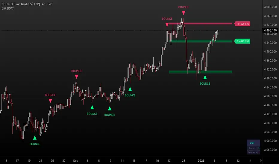
Dimensional Support Resistance is an open-source overlay indicator that automatically detects and displays clean, non-overlapping support and resistance levels using pivot-based analysis with intelligent filtering. It identifies significant swing highs and lows, filters them by minimum distance to prevent visual clutter, and provides volume-confirmed bounce signals.
What This Indicator Does
The indicator calculates and displays:
Dynamic Pivot Levels - Automatically detected swing highs and lows based on configurable pivot strength
Distance Filtering - Ensures levels are spaced apart by a minimum percentage to prevent overlap
S/R Zones - Visual zones around each level showing the price area of significance
Bounce Detection - Identifies when price reverses at support or resistance levels
Volume Confirmation - Strong signals require above-average volume for confirmation
How It Works
Pivot detection scans for swing highs and lows using a configurable strength parameter. A pivot low requires the low to be lower than all surrounding bars within the strength period.
Signal Generation
The indicator generates bounce signals using TradingView's built-in pivot detection combined with candle reversal confirmation:
Support Bounce: Pivot low forms with bullish close (close > open)
Resistance Bounce: Pivot high forms with bearish close (close < open)
Strong Bounce: Bounce occurs with volume 1.5x above 20-period average
A cooldown period of 15 bars prevents signal spam.
Dashboard Panel
A compact dashboard displays:
Support - Count of active support levels
Resistance - Count of active resistance levels
Dashboard position is configurable (Top Left, Top Right, Bottom Left, Bottom Right).
Visual Elements
Support Lines - Green horizontal lines at support levels
Resistance Lines - Red horizontal lines at resistance levels
S/R Zones - Semi-transparent boxes around levels showing zone width
Price Labels - S: and R: labels showing exact price of nearest levels
BOUNCE Markers - Triangle shapes with text when price bounces at a level
STRONG Markers - Label shapes when bounce occurs with high volume
Input Parameters
Lookback Period (default: 100) - Historical bars to scan for pivots
Pivot Strength (default: 8) - Bars on each side required for valid pivot (higher = fewer but stronger levels)
Max Levels Each Side (default: 2) - Maximum support and resistance levels displayed
Zone Width % (default: 0.15) - Width of zones around each level as percentage of price
Min Distance Between Levels % (default: 1.0) - Minimum spacing between levels to prevent overlap
Show S/R Zones (default: true) - Toggle zone visualization
Show Bounce Signals (default: true) - Toggle signal markers
Support Color (default: #00ff88) - Color for support elements
Resistance Color (default: #ff3366) - Color for resistance elements
Suggested Use Cases
Identify key support and resistance levels for entry and exit planning
Use bounce signals as potential reversal confirmation
Combine with other indicators for confluence-based trading decisions
Monitor strong signals for high-probability setups with volume confirmation
Timeframe Recommendations
Works on all timeframes. Higher timeframes (4H, Daily) provide more significant levels with fewer signals. Lower timeframes show more granular structure but may produce more noise.
Limitations
Pivot detection requires lookback bars, so very recent pivots may not be immediately visible
Bounce signals are based on pivot formation and may lag by the pivot strength period
Levels are recalculated on each bar, so they may shift as new pivots form
Open-Source and Disclaimer
This script is published as open-source under the Mozilla Public License 2.0 for educational purposes. It does not constitute financial advice. Past performance does not guarantee future results. Always use proper risk management and conduct your own analysis before trading.
- Made with passion by officialjackofalltrades
Wskaźnik
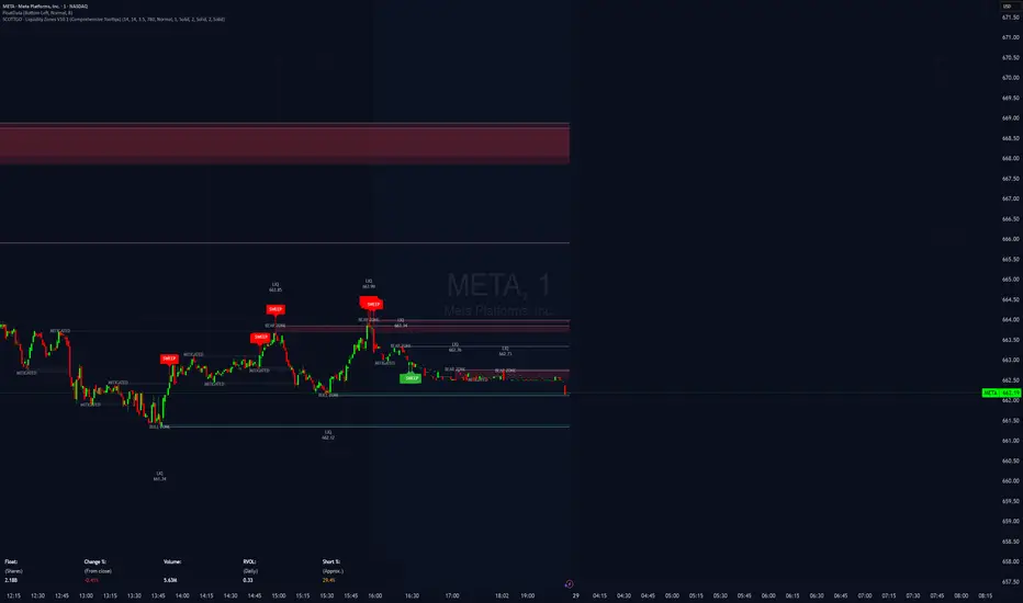
SCOTTGO - Liquidity Zones (Sweeps + Tethers)
SCOTTGO - Liquidity Zones is a high-performance technical analysis tool designed to identify and track Institutional Liquidity Zones, Price Sweeps, and Pivot Levels with a clean, professional-grade interface.
Key Features
Dynamic Liquidity Zones: Automatically identifies Bullish and Bearish zones based on customizable pivot lookbacks.
Identify Liquidity Sweeps: Detects when price "pokes" through a zone but fails to close beyond it, marking the event with a distinct label and a visual tether line.
Active Tracking: Zones and LIQ lines track price in real-time until they are mitigated (broken by a candle close), at which point they visually "deactivate" to reduce clutter.
Professional UI: Features a compact, single-row styling menu (Color, Thickness, and Line Style) that mirrors TradingView’s native design.
Visual Elements
LIQ Lines: Solid or dashed lines tracking the exact pivot price within active zones.
Sweep Tethers: Vertical lines connecting the candle extreme to the "SWEEP" label for precise visual confirmation.
Detailed Tooltips: Hover over LIQ labels or Sweep tags to view specific price data and zone context.
Zone Titles: Clearly labeled "BULL ZONE" and "BEAR ZONE" tags with independent font size controls.
How to Use
Core Logic: Adjust the Pivot Lookback to define the strength of the levels you want to track.
Styling: Use the Inputs Tab for compact, specialized styling of Lines, Borders, and Sweeps.
Analysis: Look for "Sweeps" at zone boundaries as potential signs of reversal or stop-running.
Wskaźnik
LTF Distribution Analyzer█ OVERVIEW
LTF Distribution Analyzer reveals the hidden price distribution and order flow within each candle by sampling lower timeframe data. It visualizes where prices concentrated, how volume was distributed between buyers and sellers, and identifies divergences between price action and actual market participation.
Unlike traditional candlesticks showing only OHLC, this indicator exposes the statistical structure of price movement using quartile-based visualization combined with delta analysis.
█ CONCEPTS
The indicator is built on two core concepts:
1 — Statistical Price Distribution
Each candle contains many lower timeframe bars. By analyzing these bars, we calculate:
• Q1 (25th percentile) - 25% of prices traded below this level
• Q3 (75th percentile) - 75% of prices traded below this level
• Median - The middle price value
• IQR (Interquartile Range) - The Q3-Q1 spread containing 50% of all prices
2 — Volume Delta Analysis
Delta measures buying vs selling pressure:
• Delta = Buy Volume − Sell Volume
• Positive delta = More aggressive buying
• Negative delta = More aggressive selling
• Delta Ratio normalizes this as a percentage
█ HOW IT WORKS
The indicator fetches lower timeframe data using request.security_lower_tf() and processes it to create a statistical summary:
Step 1: Timeframe Calculation
• Auto mode: Chart timeframe ÷ Auto Divisor = LTF
• Example: 1H chart ÷ 1000 = ~3.6 second sampling
• Manual mode: User-specified timeframe
Step 2: Data Collection
• Collects all close prices from LTF bars within current candle
• Aggregates volume by candle direction (bullish/bearish)
Step 3: Statistical Analysis
• Calculates quartiles (Q1, Q3), median, and boundaries
• Identifies outliers using 1.5× and 3× IQR fences
• Finds Volume POC (price with highest volume)
Step 4: Delta Calculation
• Sums buy volume (from bullish LTF bars)
• Sums sell volume (from bearish LTF bars)
• Computes delta ratio for color determination
█ VISUAL ELEMENTS
┌─────────────────────────────────────────┐
│ ▲ Extreme outlier (3× IQR) │
│ △ Mild outlier (1.5× IQR) │
│ ─ Upper whisker cap │
│ ┊ Whisker line (dashed) │
│ ▄ IQR Box (Q1 to Q3 range) │
│ ━ Volume POC (highest volume) │
│ ● Median (green=bull, red=bear) │
│ ┊ Whisker line (dashed) │
│ ─ Lower whisker cap │
│ ▽ Mild outlier │
│ ▼ Extreme outlier │
└─────────────────────────────────────────┘
█ COLOR SYSTEM
Colors indicate the relationship between candle direction and order flow:
🟢 TEAL (Positive Flow)
Bullish candle + Positive delta
→ Strong buying confirmation
→ Trend continuation signal
🔴 RED (Negative Flow)
Bearish candle + Negative delta
→ Strong selling confirmation
→ Trend continuation signal
🟠 ORANGE (Mixed Signal A)
Bullish candle + Negative delta
→ Price up but sellers dominated
→ Potential weakness/reversal warning
🔵 BLUE (Mixed Signal B)
Bearish candle + Positive delta
→ Price down but buyers dominated
→ Potential accumulation/reversal signal
█ SETTINGS
Timeframe Settings
• LTF Mode — Auto or Manual selection
• Manual Timeframe — Specific LTF when in Manual mode
• Auto Divisor — Higher = finer granularity (default: 1000)
• Allow Sub-Minute — Requires Premium subscription
Visual Style
• Positive/Negative Flow colors — Customize the 4 flow colors
• Box Transparency — Opacity of the quartile box (0-100%)
Statistics Display
• Show Statistics Panel — Toggle on-chart stats table
• Show Timeframe Badge — Toggle LTF indicator badge
• Panel Position — Choose corner placement
• Panel Size — Text size selection
█ HOW TO USE
1. Divergence Detection
Look for color mismatches:
• Orange bars in uptrend = weakness, potential reversal
• Blue bars in downtrend = strength, potential reversal
• Multiple consecutive divergent bars strengthen signal
• Wait for confirmation before entry
2. Volume POC Trading
• POC marks where most volume traded
• POC clusters at similar levels = strong S/R zone
• Price often returns to POC before continuing
• Use POC for entry/exit targeting
3. Trend Confirmation
• Consecutive teal = strong uptrend
• Consecutive red = strong downtrend
• Median position shows intrabar momentum
• Wide boxes indicate high volatility
4. Outlier Analysis
• Extreme markers (▲▼) often mark stop hunts
• Consider fading extremes at key levels
• Mild markers (△▽) = areas to watch
█ RECOMMENDED SETTINGS
For different chart timeframes:
│ Chart TF │ Auto Divisor │ Resulting LTF │
├──────────┼──────────────┼───────────────┤
│ 15M │ 1500 │ ~1M │
│ 1H │ 1000 │ ~3-4s │
│ 4H │ 600 │ ~24s │
│ Daily │ 500 │ ~2-3M │
Tip: Check the TF badge to confirm active sampling timeframe.
█ BEST PRACTICES
Do:
✓ Use "Bars" chart style for cleanest display
✓ Combine with support/resistance analysis
✓ Wait for confirmation bars
✓ Note POC clusters across multiple bars
✓ Adjust divisor based on your timeframe
Avoid:
✗ Trading single bar signals alone
✗ Using during low volume periods
✗ Trading immediately after news releases
✗ Ignoring overall market context
█ LIMITATIONS
• Requires adequate market liquidity for reliable signals
• Sub-minute timeframes need Premium subscription
• Historical data depth depends on TradingView's data availability
• Delta calculation assumes volume direction matches candle direction
█ NOTES
This indicator works best on liquid markets (forex majors, major indices, popular stocks/crypto) where volume data is meaningful.
The gray dotted vertical line marks where LTF data becomes available - bars before this line won't display the indicator.
For questions or suggestions, leave a comment below.
Wskaźnik

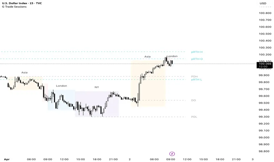
G Trade SessionsWe built this indicator because we was tired of guessing when major markets open and close. It draws simple boxes around each trading session so you can instantly see where the action is.
What it does:
Shows you the four key sessions — Asia, Frankfurt, London, and New York — as transparent boxes right on your chart. Each box marks the high and low of that session, which is super useful for spotting support/resistance levels.
Why I like it:
No clutter — boxes are subtle and don't get in the way
Labels switch from black to white automatically depending on your chart theme (dark or light)
Sessions don't overlap, so the chart stays clean
You can turn off any session you don't care about
Hope you find it useful!
Wskaźnik
Dynamic Support Resistance Zones======================================================================
TRADINGVIEW PUBLICATION - DYNAMIC SUPPORT RESISTANCE ZONES
======================================================================
TITLE: Dynamic Support Resistance Zones
SHORT TITLE: SR Zones
--------------------------------------------------------------------------------
DESCRIPTION (Copy below for TradingView publication)
--------------------------------------------------------------------------------
The Dynamic Support Resistance Zones indicator identifies key price levels where potential reversals may occur by analyzing candlestick behavior and volume dynamics together.
▶ CONCEPT AND METHODOLOGY
This indicator detects support and resistance levels through a specific combination of three market conditions occurring simultaneously:
1. Candlestick Body Expansion: The current candle's body (distance between open and close) must be larger than the previous candle's body. This signals increased price commitment from market participants.
2. Direction Reversal: The current candle must close in the opposite direction of the previous candle. A bullish candle following a bearish candle suggests potential support formation, while a bearish candle following a bullish candle suggests potential resistance formation.
3. Volume Contraction: The current candle must have lower volume than the previous candle. This condition filters out high-volume breakout moves and focuses on exhaustion patterns where price reverses on decreasing participation.
When all three conditions align, the indicator marks the opening price of the previous candle as a significant level.
▶ HOW LEVELS ARE CLASSIFIED
Support Zones (Green Lines): Form when a bullish reversal candle appears with an expanded body on declining volume. These represent areas where buying pressure overcame selling pressure.
Resistance Zones (Red Lines): Form when a bearish reversal candle appears with an expanded body on declining volume. These represent areas where selling pressure overcame buying pressure.
▶ DYNAMIC LEVEL MANAGEMENT
The indicator continuously monitors each level and updates its status:
- Active Levels (Solid Lines): Levels that have not been broken by a closing price. These extend forward automatically as new bars form.
- Broken Levels (Dashed Lines): When price closes beyond a level, it converts to a dashed line. These broken levels remain visible for potential retest scenarios.
- Level Removal: Broken support levels are removed if price closes back above them. Broken resistance levels are removed if price closes back below them. This keeps the chart clean and focused on relevant levels.
▶ TRADING APPLICATIONS
Reversal Trading: Look for price approaching active support or resistance levels for potential bounce trades.
Breakout Confirmation: When a solid level converts to dashed, it confirms a breakout. The dashed level then becomes a potential retest zone.
Trend Analysis: Multiple support levels stacking below price suggests bullish structure. Multiple resistance levels above price suggests bearish structure.
Risk Management: Active levels provide logical areas for stop-loss placement just beyond the identified zones.
▶ WHY THIS COMBINATION WORKS
The three-filter approach (body expansion + direction change + volume decline) identifies exhaustion reversals rather than continuation patterns. Large body candles show conviction, direction change shows momentum shift, and lower volume suggests the prior move is losing steam rather than breaking out with strength.
▶ SETTINGS
This indicator uses fixed detection logic with no adjustable parameters to maintain consistency. The colors are preset: green for support zones and red for resistance zones.
▶ BEST PRACTICES
- Works on all timeframes but higher timeframes typically produce more reliable levels
- Combine with trend analysis for directional bias
- Not all levels will hold; use proper risk management
- More effective in ranging or mean-reverting conditions than strong trending markets
--------------------------------------------------------------------------------
TAGS (for TradingView)
--------------------------------------------------------------------------------
support, resistance, reversal, volume, candlestick, levels, zones, price-action
--------------------------------------------------------------------------------
CATEGORY
--------------------------------------------------------------------------------
Support and Resistance
======================================================================
Wskaźnik

KTBB Intel: Multi-Timeframe ContextKabroda Intel
This is the official structural companion tool for the Kabroda System. While the "BattleBox Command" script handles specific intraday execution levels, this Kabroda Intel utility visualizes Multi-Timeframe Market Structure to provide broader context.
How It Works (Technical Logic): This script automates the analysis of higher-timeframe structure using standard Pivot High/Low logic, preventing the need for traders to manually switch timeframes.
Scanning: It utilizes request.security() to scan the user-defined Primary (default: 4H) and Secondary (default: 1H) timeframes.
Calculation: It identifies significant structural pivots using ta.pivothigh and ta.pivotlow functions with a customizable lookback period.
Data Integrity: It uses barmerge.lookahead_on with specific index offsets to ensure the data is non-repainting and represents confirmed closed-candle structure only.
Key Features:
Macro Context: Projects 4-Hour Supply & Demand zones directly onto your 5m or 15m execution chart.
Intraday Structure: Highlights 1-Hour breakdown/breakout levels that often act as "speed bumps" for intraday trends.
Zone Visualization:
Red Zones: 4H Supply / Major Resistance.
Green Zones: 4H Demand / Major Support.
Orange/Blue Zones: 1H Intraday Pivots.
Usage Guide:
Step 1: Add this indicator to your chart.
Step 2: Ensure it is running alongside the Kabroda BattleBox Command script.
Step 3: Use these zones as "Caution Areas." Do not execute trades directly into a Red 4H Zone, even if your lower timeframe triggers suggest a breakout. Context overrides execution.
Disclaimer: This tool is for structural analysis only. It identifies historical pivot points and projects them forward as potential areas of interest.
Wskaźnik

Kabroda BattleBox Command [Renderer]Kabroda BattleBox Command
This is a specialized visualization utility designed to render pre-calculated institutional price levels on your chart. It is intended for traders who utilize the Kabroda Daily Calibration method to define their intraday execution framework.
How it Works: This script does not calculate levels internally. Instead, it serves as a "renderer" for external data.
Input: The user inputs a comma-separated data string (generated daily via their Kabroda Dashboard calibration) into the settings.
Parsing: The script parses this string to extract 6 key price coordinates: Daily Resistance, Breakout Trigger, Breakdown Trigger, Daily Support, and the 30-minute Opening Range High/Low.
Visualizing: It projects these levels forward in time for the current trading session.
Key Features:
Execution Levels: Plots specific Breakout and Breakdown triggers derived from the opening 30-minute volatility.
Liquidity Sessions: Automatically highlights key global trading hours (London Open, NY AM, NY PM, Tokyo, Sydney) based on New York Time, helping traders visualize volume injection points.
Imbalance Zones (Optional): Identifies and highlights market imbalances created by aggressive buying or selling, which often act as magnets for price re-tests.
Usage Guide:
Step 1: Obtain your daily data string.
Step 2: Open Indicator Settings -> "Daily Calibration".
Step 3: Paste the string into the "Paste Data String" field.
Step 4: The script will instantly render the day's battle map.
Disclaimer: This tool is a visualization aid. It requires valid external data to function. Without the daily input string, the chart will remain blank.
Wskaźnik

Session Levels (3of3)This system is designed to strip away market noise and highlight the areas where institutional capital is actually active.
Most retail traders fail because they treat every price movement with equal importance. They often enter trades in the "middle of nowhere" or get trapped by "fakeouts" at standard support/resistance levels.
This tool solves:
Context Blindness: It defines the "playing field" by marking institutional session boundaries (Asia, London, NY), so you know exactly where liquidity resides.
Computation Lag: Standard Volume Profiles often slow down a chart. Our Optimized VPC provides the "Magnet" price without the lag.
Indecision: By requiring a Market Structure Shift (MSS) alongside a Fair Value Gap (FVG), it removes the guesswork of "Is this a reversal or a continuation?"
Why It Is Unique:
Unlike standard indicators that look at a single data point (like just price or just volume), this is a Holistic System.
Auto-Mitigation: Most FVG indicators clutter your screen with old boxes. This tool automatically deletes zones once price "fills" them, keeping your focus on live opportunities.
Institutional "Sweep" Logic: It specifically tracks if price has "stolen" the liquidity from a previous session before issuing a signal.
The "Vegas" Filter: It uses the 144 EMA (Vegas Floor) as a high-probability institutional trend filter, ensuring you aren't fighting the primary trend.
When testing this, track one specific stat: "Did price hit the VPC after the MSS?" You will likely find that even when the trade doesn't reach the far PRZ targets, it reaches the VPC Magnet over 70% of the time. Focusing on that "snap-back" to the orange line is the secret to a high win rate with this tool.
Wskaźnik

Fractal Swing Levels📊 Fractal Swing Levels — Indicator Description
Fractal Swing Levels is a lightweight, visual indicator that plots historical swing high and swing low reference levels using Williams Fractal logic. The indicator helps traders visually identify areas where price previously formed confirmed pivots. These levels can be used as contextual reference zones when analyzing price structure and market behavior.
🔍 What the Indicator Does
Detects confirmed swing highs and swing lows using a configurable fractal length. Draws horizontal levels at those swing points. Extends the levels to the right for ongoing visual reference. Limits the number of displayed levels to keep the chart clean
🎨 Visual Elements
Red lines represent historical swing high levels
Green lines represent historical swing low levels
These lines are drawn only after fractal confirmation and represent past price structure, not future projections.
⚙️ Settings Explained
Fractal Length : Controls how significant a swing must be to qualify as a level.
Higher values → fewer, more prominent levels
Lower values → more frequent levels
Max Levels Per Side : Limits how many swing high and swing low levels are displayed at one time, helping reduce chart clutter.
📈 How to Use
Use the levels as visual reference points for structure analysis. Combine with trend tools, moving averages, or other technical indicators. Useful across intraday, swing, and positional timeframes. This indicator is best used as a contextual aid, not as a standalone decision tool.
⚠️ Important Notes
This is a visual analysis tool only. It does not generate buy or sell signals. It does not predict future price movement. Levels are based solely on confirmed historical price data
🎯 Summary
Fractal Swing Levels provides a clean and minimal way to visualize historical swing structure on the chart, helping traders better understand where price has previously reacted.
Wskaźnik

Supply & Demand Zones (Volume-Based)📌 Supply & Demand Zones (Volume-Based) — Indicator Description
Overview
This indicator visually highlights potential supply and demand price zones using historical candle structure combined with relative volume behavior.The zones are intended to help users observe areas of increased market activity where price has previously reacted. This tool is designed for visual analysis only.
How the Zones Are Identified
Demand zones are highlighted when price shows a strong bullish reaction following a bearish candle.Supply zones are highlighted when price shows a strong bearish reaction following a bullish candle.Relative volume is used as context, not as a predictive input, to classify zones into higher or lower activity levels.Zones automatically invalidate when price structurally breaks them.
About the Percentage Display
The percentage shown on a zone represents normalized relative volume strength at the time the zone was formed.This value is not a probability, not a success rate, and not a performance metric.It should not be interpreted as a prediction or trading signal.Percentages are displayed only for active zones and are removed once a zone is invalidated.
How This Indicator Is Intended to Be Used
As a visual reference tool for identifying historical supply and demand areas.As a contextual overlay alongside other forms of technical analysis.To observe how price behaves when revisiting previously active zones.This indicator does not suggest trade direction, entry timing, or exit levels.
Important Notes & Limitations
All zones are derived from historical price and volume data.Market conditions change, and historical zones may lose relevance over time.No trading decisions should be made based solely on this indicator.Users are encouraged to apply their own analysis and risk management.
Disclaimer
This indicator is provided for educational and informational purposes only.It does not constitute trading, investment, or financial advice.The author assumes no responsibility for decisions made using this tool.
Wskaźnik

Custom Psych Levels V1.0 Theo SignalDesigned for Index Traders (US30, NAS100, SPX, etc.)
This script is especially effective on indices such as US30, where price reacts strongly to round numbers and psychological zones. By default, levels adapt to index volatility and scale, making them ideal for:
intraday bias
pullback reactions
breakout continuation
mean reversion back to balance
Key Features
Rolling 5-Level Structure: Always centered on current price, no chart clutter.
Market- Aware Magnitude: Automatically adjusts spacing for indices, forex, and crypto.
Higher- Timeframe Anchoring: Optionally anchor levels to 1H, 4H, or Daily closes while trading lower timeframes like 5m.
Session & Daily Resets: Re-anchor levels at New York session open or new trading day.
Center Line Emphasis: Highlight the equilibrium level with custom color, thickness, and style for balance or decision-making.
Clean Professional Display: Only relevant levels near price are shown.
Trading Use Cases
This indicator is best used as a framework, not a signal generator. It excels when combined with:
momentum confirmation
liquidity sweeps
volume expansion
break-and-retest structures
session highs/lows
Traders can use the center line as balance, outer levels as reaction or target zones, and band shifts as confirmation of expanding price acceptance.
Wskaźnik

Box Theory [Interactive Zones] PyraTimeThis script combines Nicholas Darvas’s "Box Theory" with modern Supply and Demand (Premium/Discount) concepts. It automatically identifies the most recent Swing High and Swing Low to delineate the current trading range.
The purpose of this tool is to visualize market structure and help traders identify when price is relatively expensive (Premium) or cheap (Discount) within a defined range.
Visual Guide: What You Are Seeing
The Box: Represents the active trading range defined by the most recent significant Swing High and Swing Low.
Red Zone (Premium): The top 25% of the range. Mathematically, prices here are considered "expensive" relative to the current structure.
Green Zone (Discount): The bottom 25% of the range. Prices here are considered "cheap" relative to the current structure.
Grey Zone (Equilibrium): The middle 50% of the range. This is the area of fair value where price often consolidates.
Dashed Line (EQ): The exact 50% midpoint of the range.
Tutorial: How to Trade Using This Indicator
Method 1: Mean Reversion (Range Trading) This method applies when the market is moving sideways.
Identify Structure: Wait for a box to form.
Wait for Extremes: Do not trade when price is in the middle (Grey/White area). Wait for price to enter the Red or Green zones.
Entry Trigger:
Shorts: When price enters the Red Zone, look for a rejection (wicks leaving the zone) or a lower timeframe breakdown. Target the EQ (Midline) as your first take profit.
Longs: When price enters the Green Zone, look for support formation. Target the EQ (Midline) as your first take profit.
Method 2: Trend Continuation (Breakouts) This method applies when the market is trending strongly.
Breakout: Monitor the alerts. A close outside the box indicates a potential shift in market structure.
Retest: After a breakout up, the old "Red Zone" (Resistance) often flips to become new Support. Wait for price to pull back to the top of the old box before entering.
Configuration Guide (Settings)
Pivot Left/Right Bars (Sensitivity):
Default (20/20): Best for Swing Trading. It filters out market noise and only draws boxes based on major structural points.
Lower (5/5): Best for Scalping. It will create smaller, more frequent boxes but increases the risk of false signals.
Zone Percentage:
Default (25%): Standard deviation for Supply/Demand zones.
Alternative (15%): Use this for "sniping" entries at the absolute extremes of the range.
Multi-Timeframe (MTF):
Enable "Use Higher Timeframe" to see Daily or Weekly ranges while trading on lower timeframes (like the 15m or 1H). This helps keep your intraday trades aligned with the major trend.
Technical Note on "Lag" This indicator uses Pivots to draw the box. A pivot is only confirmed after a certain number of bars have passed (the "Pivot Right Bars" setting).
Example: If "Pivot Right Bars" is set to 20, the box will update 20 bars after the actual high or low occurred. This is necessary to confirm that the point was indeed a Swing High/Low. Do not treat the box lines as predictive; they are reactive to confirmed structure.
Wskaźnik

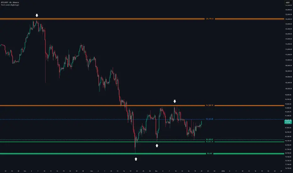
Pivot Levels [BigBeluga]🔵 OVERVIEW
The Pivot Levels indicator automatically detects and draws key market pivot levels across multiple sensitivity settings. Each pivot level represents a significant local high or low in price structure, acting as potential zones of support and resistance. Traders can visualize short-, medium-, and long-term pivot layers simultaneously, helping to identify where price may react, reverse, or break out.
🔵 CONCEPTS
Different pivot lengths provide multi-length sensitivity on the same timeframe — shorter lengths detect local micro-swings, while longer lengths capture broader swing structure within the current chart.
ATR-based color logic marks active, bullish, or bearish pivot zones dynamically.
Lines can extend to the right or both sides to track reactions over time.
🔵 FEATURES
Detects up to four custom pivot levels simultaneously.
Each pivot level has independent settings for length , style , and extension mode .
Auto-colors each pivot as support (green), resistance (orange), or active zone (blue).
Displays dual-width line layers: a solid base and a transparent overlay for visual depth.
Dynamic price labels show exact pivot levels for clarity.
Fully customizable line styles: dashed (--), solid (-), or dotted (..).
Extends lines to the right for future reaction tracking or both directions for structure alignment.
🔵 HOW TO USE
Enable or disable pivot levels (1–4) to control how many layers of structure you want visible.
Use shorter pivot lengths for intraday turning points and longer ones for macro structure.
Watch for multiple pivot lines clustering in the same region — these often mark strong reversal zones.
Observe color changes: green = support, orange = resistance, blue = active neutral zone.
Combine with price action or volume analysis to confirm reactions near major pivots.
🔵 CONCLUSION
The Pivot Levels indicator provides a clean, multi-layered visualization of market structure.
By tracking pivots of varying lengths, traders can easily identify overlapping support and resistance regions, gauge breakout strength, and align trades with the dominant structural zones visible across multiple time horizons.
Wskaźnik
Malama's Pre-Market BoxThis script is a comprehensive Pre-Market range visualizer designed to replace older, single-candle analysis tools. It automatically highlights the full pre-market session (04:00–09:30 EST) and extends key support/resistance levels into the regular trading day.
Why this script was created (Evolution from previous versions): This is a complete architectural rewrite of the older "Malama's KAYCAP Pre-Market Box."
Old Logic: The previous version focused on isolating a single, specific 1-minute candle (e.g., exactly 4:00 AM) to determine levels.
New Logic: This version tracks the entire pre-market session range. It dynamically updates the True High and True Low as the pre-market develops, providing a much more accurate support/resistance zone for the open.
Visual Overhaul: Instead of static plots, this version uses Pine Script v6 box and line objects to draw a clean, shading-customizable range that automatically extends rightward until the trading session ends.
How it works:
Session Tracking: The script monitors the user-defined session (default 04:00-09:30).
Dynamic Box: As price moves during pre-market, a box is drawn covering the highest high and lowest low of that period.
Level Extension: At 09:30 (Market Open), the script locks the High and Low values. It then projects two horizontal lines (Resistance and Support) across the chart for the rest of the day.
Breakout Detection: If the price closes outside these levels during regular hours, the script can optionally trigger Alerts and plot "BREAK" labels on the chart.
Settings:
Time Settings: Customizable session string (default captures standard US Pre-Market).
Visuals: Fully adjustable box colors, border transparency, and line width.
Signals: Toggle breakout labels on/off.
Alerts Included:
Bullish Breakout: Triggers when price crosses and closes above the Pre-Market High.
Bearish Breakdown: Triggers when price crosses and closes below the Pre-Market Low.
Wskaźnik

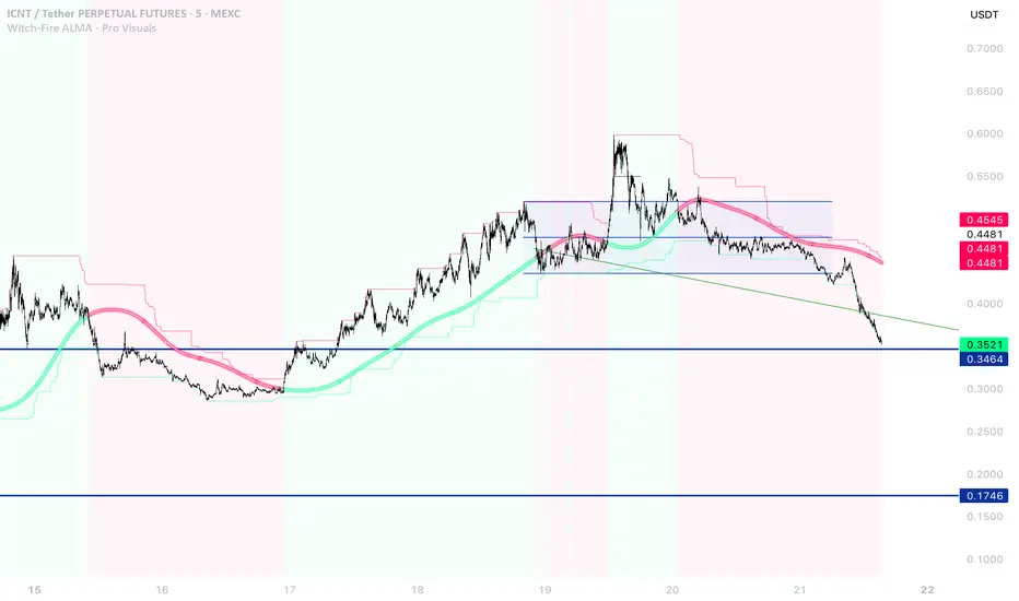
Witch-Fire ALMA signals: Dynamic Liquidity & Trend GlowThe Witch-Fire ALMA is a high-precision trend bias and liquidity mapping tool designed for price action traders and Smart Money practitioners. Unlike traditional indicators that clutter your chart with lagging signals, this script provides a "clean-yet-powerful" visual anchor to help you stay on the right side of the market while identifying key Points of Interest (POIs).
At its core, the script utilizes an optimized Arnaud Legoux Moving Average (ALMA). Known for its superior ability to balance smoothness and responsiveness, the ALMA effectively filters out market noise and "whipsaws" that often plague standard EMAs.
Key Features:
The Witch-Fire Glow: A neon-styled ALMA line that shifts between Bullish Green and Bearish Red. The white core provides surgical precision for price intersection, while the outer glow visualizes the strength and dominance of the current trend.
Scaled Liquidity Levels: Automatically maps Buy Side Liquidity (BSL) and Sell Side Liquidity (SSL). These levels are dynamic—they scale proportionally with your ALMA settings. This ensures that the liquidity zones you see are always relevant to the trend cycle you are analyzing.
Strategic Bias Background: A subtle background tint provides an instant psychological filter. Only look for Longs in the green zone and Shorts in the red zone to maintain a high-probability strike rate.
How to Trade with Witch-Fire:
Identify the Bias: Look at the Fire ALMA. If the "fire" is red and the price is below the line, your bias is strictly bearish.
Watch the Sweeps: Wait for the price to "sweep" (pierce with a wick) the horizontal SSL (Green) or BSL (Red) lines.
Execution: Look for a strong rejection candle (long wick, small body) at these levels that closes back towards the ALMA line.
Best Used On: 15m, 1H, and 4H timeframes. Works exceptionally well for Crypto, Forex, and Indices.
Wskaźnik
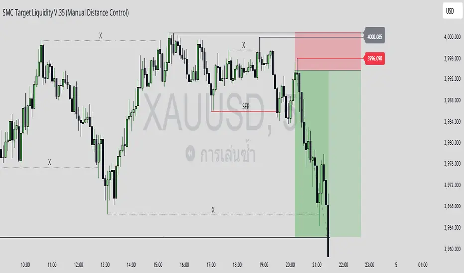
ICT Liquidity Sweep/Swing Fail Pattern V.1# ICT Liquidity Sweep/Swing Fail Pattern V.1
## Indicator Description & User Guide
---
## 📊 Indicator Overview
**Name:** ICT Liquidity Sweep/Swing Fail Pattern V.1
**Type:** Support/Resistance & Liquidity Detection
**Trading Style:** ICT Concepts (Inner Circle Trader)
**Best Timeframes:** 1M, 5M, 15M, 1H
---
## 🎯 Core Features
### 1. **Support & Resistance Lines**
- Automatically draws key swing high and swing low levels
- Based on significant pivot points in price structure
- Updates dynamically as new swings form
### 2. **"X" Mark - Liquidity Sweep**
- **Symbol:** X marker on chart
- **Meaning:** Indicates a liquidity sweep (stop hunt)
- **What it shows:** Price briefly moved beyond a key level to trigger stops, then reversed
- **Trading significance:** High-probability reversal zones after liquidity is taken
### 3. **"SFP" Label - Swing Failure Pattern**
- **Symbol:** SFP text label
- **Meaning:** Swing Failure Pattern detected
- **What it shows:** Price attempted to make a new high/low but failed and reversed sharply
- **Trading significance:** Strong reversal signal - smart money rejecting the level
---
## 📈 How to Use This Indicator
### Entry Setup Strategy:
#### **For SHORT Trades (Sell):**
1. Wait for **SFP** to appear at a swing high
2. Look for **X marker** confirming liquidity sweep above the high
3. **Entry Zone (Red Box):** Enter SHORT positions when price returns to this zone
4. **Stop Loss:** Place above the red zone (above the swept high)
5. **Take Profit (Green Box):** Target the green zone below
#### **For LONG Trades (Buy):**
1. Wait for **SFP** to appear at a swing low
2. Look for **X marker** confirming liquidity sweep below the low
3. **Entry Zone (Green Box):** Enter LONG positions when price returns to this zone
4. **Stop Loss:** Place below the green zone (below the swept low)
5. **Take Profit (Red Box):** Target the red zone above
---
## 🎨 Color Coding System
| Color | Zone Type | Usage |
|-------|-----------|-------|
| 🔴 **Red Box** | Stop Loss / Supply Zone | Place SL here for LONG trades / Entry zone for SHORT trades |
| 🟢 **Green Box** | Take Profit / Demand Zone | Target zone for LONG trades / Place SL here for SHORT trades |
| ❌ **X Mark** | Liquidity Sweep Point | Stop hunt occurred - reversal likely |
| 📝 **SFP Label** | Swing Failure Pattern | Failed breakout - strong reversal signal |
---
## 💡 Trading Examples
### Example 1: SHORT Trade (As shown in your chart)
```
1. SFP appears at swing high (Red zone around 4,000)
2. X marker confirms liquidity sweep above the high
3. Entry: SHORT when price re-enters red zone
4. Stop Loss: Above red zone (e.g., 4,002)
5. Take Profit: Green zone below (3,964-3,972)
6. Risk:Reward = 1:3+
```
### Example 2: LONG Trade
```
1. SFP appears at swing low (Green zone)
2. X marker confirms liquidity sweep below the low
3. Entry: LONG when price re-enters green zone
4. Stop Loss: Below green zone
5. Take Profit: Previous red zone above
6. Risk:Reward = 1:2 minimum
```
---
## ⚠️ Important Trading Rules
### ✅ DO:
- Wait for BOTH SFP and X marker confirmation
- Enter on price returning to the zone (not on first touch)
- Use proper position sizing (1-2% risk per trade)
- Combine with market structure analysis
- Look for confluences (orderblocks, fair value gaps)
### ❌ DON'T:
- Trade against the higher timeframe trend
- Enter without confirmation signals
- Ignore the colored zones for SL/TP placement
- Overtrade - wait for quality setups
- Move stop loss to breakeven too early
---
## 🔧 Indicator Settings (Typical)
**Adjustable Parameters:**
- Swing Length: Number of bars to identify swing points
- Show/Hide X markers
- Show/Hide SFP labels
- Zone opacity and colors
- Line thickness
---
## 📚 ICT Concepts Explained
### **Liquidity Sweep:**
Smart money intentionally pushes price beyond key levels to trigger retail stop losses, then reverses to their intended direction. The X marker identifies these moments.
### **Swing Failure Pattern (SFP):**
Price attempts to make a new high/low but lacks follow-through, indicating weak momentum and likely reversal. Similar to a "false breakout" but more specific to swing structures.
### **Supply & Demand Zones:**
- **Red zones** = Areas where selling pressure overwhelmed buyers
- **Green zones** = Areas where buying pressure overwhelmed sellers
- These zones act as magnets for price to return and react
---
## 🎓 Best Practices
1. **Confluence is Key:**
- Combine with daily/weekly bias
- Check for orderblocks nearby
- Look for imbalances (FVG)
2. **Session Timing:**
- Best during London/New York sessions
- Avoid low liquidity periods
3. **Risk Management:**
- Never risk more than 1-2% per trade
- Use proper lot sizing
- Take partial profits at key levels
4. **Timeframe Correlation:**
- Check higher timeframe for bias
- Enter on lower timeframe for precision
- Exit based on higher timeframe targets
---
## 📞 Support & Updates
**Version:** 1.0
**Compatibility:** TradingView Pine Script v5
**Updates:** Regular improvements based on ICT methodology
---
## ⚡ Quick Reference Card
| Signal | Action | SL Placement | TP Target |
|--------|--------|--------------|-----------|
| SFP + X at High | SHORT at Red Zone | Above Red | Green Zone |
| SFP + X at Low | LONG at Green Zone | Below Green | Red Zone |
**Remember:** The indicator shows you WHERE to trade, but YOU decide WHEN based on confirmation and market context.
---
*Disclaimer: This indicator is a tool for technical analysis. Always use proper risk management and never trade with money you cannot afford to lose.*
Wskaźnik