Vortex Trend Crossover [RC Tools]RC Tools — Vortex Trend Crossover
────────────────────────────────────────────────────────────────────
█ OVERVIEW
Most directional-movement tools measure how far price has moved from a fixed baseline. The Vortex Indicator, developed by Etienne Botes and Douglas Siepman, asks a more specific question: how far did today's price action "reach" away from where it just was, in each direction? That reach, summed over a window and compared between up and down, is what drives this tool's crossover signal.
█ WHAT IT DOES
Computes two oscillating lines, VI+ and VI-, from how far each bar's high and low reach past the prior bar's opposite extreme, and classifies each confirmed bar as Bullish or Bearish based on which line is currently dominant. Colours the chart background accordingly, plots both the smoothed and raw VI+/VI- lines in a dedicated pane against the 1.0 baseline, and shows a table with the live (intrabar) and confirmed vote side by side, plus how long price has been in the current state.
█ THE THEORY BEHIND IT
Most directional tools compare price to itself over time (a moving average) or measure the net displacement of directional movement (DMI). Vortex instead asks how far each bar reaches beyond where the market just was, using the opposite extreme of the prior bar as the reference point: today's high against yesterday's low for upward reach, today's low against yesterday's high for downward reach. Normalising both by the true range and summing over a window produces two lines, VI+ and VI-, that oscillate around a baseline of 1.0. When VI+ is meaningfully above VI-, upward reach has been dominating; when VI- takes over, downward reach has. The crossover between the two lines is the signal.
█ HOW IT IS CALCULATED
1. VM+ = |high − low | (today's high vs. yesterday's low — upward reach). VM− = |low − high | (today's low vs. yesterday's high — downward reach).
2. TR = true range for the bar.
3. Sum VM+, VM−, and TR separately over the VI Length window, then divide: VI+ = ΣVM+ / ΣTR, VI− = ΣVM− / ΣTR.
4. Optionally smooth VI+ and VI− (the raw sums are noisy bar-to-bar by construction).
5. When smoothed VI+ crosses above smoothed VI−, the state flips to Bullish. When it crosses below, the state flips to Bearish. Between crossovers, the classification holds.
Classification occurs ONLY on confirmed bar close — the plotted VI+/VI-, the background colour and the table all update together, so nothing here can disagree mid-bar or flip back and forth as the current bar forms.
█ SETTINGS & CONFIGURATION
• VI Length (default 14) — the summation window for VI+ and VI-
• Smoothing Length and Type (default 5-period EMA) — reduces the raw VI+/VI- sums' bar-to-bar noise before the crossover check
• Table visibility, position and colours are fully configurable; the main-chart background painting can be toggled off if you only want the statistics pane
█ HOW TO USE IT
Use it as a directional-pressure filter alongside your existing tools, not as a standalone entry signal. Because it's a crossover system, it tends to behave like other crossover tools — reliable in trending conditions, prone to whipsaw when the two lines sit close together in a range. The Live row can still change until the bar closes; only the Confirmed row is safe to treat as settled.
Works on any asset and timeframe with sufficient history for the VI Length window.
█ LIMITATIONS
• Vortex is a DIRECTIONAL-PRESSURE oscillator, not a magnitude or overbought/oversold measure. Any use of it as a precision reversal forecast is a misuse.
• Like any crossover-based system, it can whipsaw when VI+ and VI- sit close together in choppy, range-bound conditions.
• The summation window resets its frame of reference every VI Length bars; a short length reacts fast but is noisier, a long length is smoother but slower to reflect a genuine change.
• Smoothing trades responsiveness for fewer false crossovers — there is no setting that eliminates whipsaw entirely.
• This script does NOT repaint. All classification updates on confirmed bar close only.
█ DISCLAIMER
For educational and informational purposes only. Nothing here is financial advice. Past behaviour of any directional state does not indicate future results. Trade at your own risk.
Wskaźnik

Price Action Support and resistanceShort description
A clean daily price-action indicator that identifies support/resistance-based Buy, Re-Buy, and Exit signals using repeated S/R reactions, candle confirmation, breakout/retests, and adaptive 10-day-low protection.
Full TradingView description
Price Action S/R – Buy, Re-Buy & Exit is a price-action indicator designed primarily for daily-chart swing and positional trading.
The goal is to keep the chart visually simple while allowing the underlying logic to evaluate repeated support/resistance interactions, candle confirmation, breakout/retest setups, exits, and re-entry opportunities.
Signals
B — Buy
A Buy can occur when a sufficiently established support/resistance setup produces one of the supported bullish confirmations, including:
• Support rejection
• Bullish engulfing at support
• Support reclaim
• Resistance breakout followed by a successful retest
By default, a support/resistance level requires at least 3 touches before it becomes eligible for a signal.
R-B — Re-Buy
After an Exit, the indicator remembers the original setup level for a limited period. If price makes a fresh reclaim of that level with bullish confirmation, an R-B signal can be generated.
This is intended to identify situations where an earlier position was protected by the exit logic but the original bullish setup subsequently recovers.
E — Exit
The indicator uses two stages of downside protection.
Before a qualifying resistance warning occurs, the protective level is based on the lowest low of the previous 10 completed candles at the time of entry. This level remains frozen.
A qualifying resistance warning does not automatically create an Exit. Instead, it activates rolling previous-10-day-low protection.
After that transition, a daily close below the rolling previous 10-day low can generate an E signal.
Clean chart design
Only three markers are displayed:
B = Buy
R-B = Re-Buy
E = Exit
Additional calculations remain hidden to avoid filling the chart with support/resistance labels and warning markers.
Hovering over a signal provides additional context such as the setup type, support/resistance touch count, candle type, daily volume, RVOL20, and signal price.
Support and resistance
Support and resistance are treated as zones rather than exact prices. ATR is used to provide tolerance around detected pivot levels.
Nearby pivot reactions can contribute to an existing level, while a minimum separation between reactions helps reduce repeated counting of nearby candles as independent touches.
Candle confirmation
The indicator recognizes price-action confirmations including:
• Bullish rejection
• Bearish rejection
• Bullish engulfing
• Bearish engulfing
• Support reclaim
• Failed breakout
• Breakout and retest
Volume information
Signal tooltips include the day's volume and RVOL20, which compares current volume with the 20-day average volume.
Volume is currently informational only. It is not a mandatory condition for generating a Buy signal.
Recommended use
The indicator was designed primarily around the 1-day timeframe for swing and positional analysis.
It should be used as one component of a broader analysis process rather than as a standalone prediction system. Market conditions, company fundamentals, liquidity, earnings, gaps, and risk tolerance can materially affect results.
Historical signals do not guarantee future performance.
This script is provided for educational and technical-analysis purposes only and is not financial advice.
Suggested TradingView tags
Use tags/categories around:
Support and Resistance, Price Action, Swing Trading, Breakout, Reversal, Volume, Relative Volume
Author's note
You can add this at the bottom:
Version 1.0
This is the first public release. The emphasis is intentionally on chart simplicity: B, R-B and E are displayed while the supporting calculations operate internally.
Future versions may refine support/resistance detection, confirmation quality, volume analysis and risk management based on testing and community feedback.
Code
Use the exact locked script we just finalized — the version titled:
Price Action S/R Master - B R-B E
I would only change its public-facing title:
//@version=6
indicator(
"Price Action S/R - Buy, Re-Buy & Exit ",
overlay=true,
max_labels_count=500)
Everything below that can remain exactly as in the locked version. Do not change the calculations before publishing V1.0.
What I would choose when publishing
For visibility, publish it as an open-source indicator if you're comfortable letting others inspect/copy the Pine code. If you want people to use it but don't want the source openly available, TradingView's available publication/access choices should be reviewed at publishing time.
For the chart screenshot, use a clean 1D chart showing at least one B → E → R-B sequence if you can find a good historical example. Keep the screenshot free of unrelated indicators so people immediately understand what your script does.
And don't market it with claims like “90% accurate,” “guaranteed profits,” “best buy/sell indicator,” etc. The strength of this script is that the rules can be explained transparently.
Before you click Publish
I would use this final package:
Title: Price Action S/R – Buy, Re-Buy & Exit
Visibility on chart: B / R-B / E
Timeframe: 1D primarily
Description: Use the full description above.
Screenshot: Clean daily chart demonstrating the signals.
Version: 1.0
Source: Open-source if you want this to be genuinely community-shared.
Disclaimer: Educational/technical-analysis purposes; not financial advice. Wskaźnik

Liquidity Heatmap & Sweep RadarLiquidity Heatmap & Sweep Radar — see where the stops are, and when they get hunted
Price is drawn to liquidity — the pools of stop orders resting above old highs and below old lows. This tool maps those pools as a colour-graded heatmap and, when price wicks through one and closes back, marks the stop-hunt in real time.
── WHAT IT DRAWS ──
• Liquidity pools — clusters of swing highs (buy-side liquidity, above price) and swing lows (sell-side liquidity, below price). Swings that sit close together merge into one pool — that's exactly how equal highs / equal lows stack stops into a bigger, more attractive target.
• Heatmap intensity — the more times a level has been touched, and the higher the volume when it formed, the hotter and more opaque its band. Faint band = minor pool; solid band = a magnet.
• Sweep Radar — when price wicks past a pool and closes back inside (a stop-hunt), an × marks it and the drained pool is cleared. Pools that price simply closes through are removed as consumed (toggle).
── READING THE DASHBOARD ──
• Buy-side above — the price of the nearest liquidity pool above current price (the next upside target/magnet).
• Sell-side below — the price of the nearest pool below current price.
• Strongest pool — the price of the single strongest pool on the chart, with its strength score in parentheses (touches + a volume bonus).
• Active pools — how many buy-side (▲) and sell-side (▼) pools are currently live.
• Distance up — how far the nearest pool above sits, in percent.
• Distance down — how far the nearest pool below sits, in percent.
── HOW TO USE IT ──
• Targets: in a move, the nearest hot band above/below is the natural draw — a logical objective, or a place price reaches before deciding.
• Sweeps: a sweep (×) marks the moment liquidity was taken — price wicked through a pool and closed back. Treat it as CONTEXT, not a standalone trade trigger: on its own a sweep is not a reliable reversal signal (see the note below). It earns its weight only in confluence with structure — e.g. a sweep that coincides with a Change of Character, or one into a higher-timeframe supply/demand zone.
• Context: stack it under a market-structure tool — the heatmap tells you where the fuel sits and when it gets taken; your structure read tells you whether that leads to a reversal or a continuation.
── ON THE SWEEP SIGNAL (tested honestly) ──
Across the top coins on 1H–1D (out-of-sample), a raw sweep — by itself, with no other filter — showed NO reliable reversal edge: after a sweep, forward returns were a coin-flip with a slight tendency to CONTINUE, not reverse. That held at every horizon tested (1–20 bars) and even for exhaustion sweeps at trend extremes and strong multi-touch pools. So this tool deliberately does not sell the sweep as a reversal signal. Its job is to map where liquidity rests and flag when it is taken — powerful CONTEXT for a discretionary or structure-based method, not an automated buy/sell trigger.
── HONEST DISCLOSURE ──
TradingView does not expose an aggregated exchange-liquidation or order-book feed to scripts, so this is a STRUCTURE + VOLUME proxy for resting liquidity — built from swing clusters and formation volume, not real liquidation data. It shows where stops most plausibly sit, not a live order book. Treated that way, it is a powerful map; treated as literal liquidation data, it is not.
── NON-REPAINTING ──
Sweeps are confirmed on bar close (barstate.isconfirmed) — an × does not appear and then vanish. Pools are anchored to confirmed swing pivots; the bands extend to the right and update their intensity on the live edge.
── SETTINGS ──
Swing length, cluster tolerance (how close swings must be to merge), max pools per side, band thickness, sweep marking, remove-on-close-through, dashboard position/size, and the buy-side / sell-side colours — all adjustable.
Free and open-source (Mozilla Public License 2.0) — the full logic is on the Pine tab.
This tool is for research and education. It is not financial advice and does not guarantee profit. Test on your own markets and manage your own risk.
Wskaźnik

Market Regime EngineKnow the market you're in before you trade it — adaptive k-means volatility + a trend/range read that tells you whether to trend-follow, fade, or stand aside.
The same setup that prints money in a trend gets chopped to pieces in a range. Market Regime Engine reads the environment first — is price TRENDING or RANGING, and is volatility LOW, NORMAL or HIGH — then tells you which playbook fits: trend-follow, fade the range, or stand aside in the chop.
── TWO HONEST, ADAPTIVE READS ──
• Volatility (self-learning) — a genuine k-means clustering (k = 3) of ATR over a rolling window. The model continually re-learns the market's own low / normal / high volatility buckets instead of using fixed thresholds, so it adapts to each symbol and timeframe. No black box, no "AI" hand-waving — just clustering you can read in the code.
• Behaviour — the Kaufman Efficiency Ratio: how much of the recent range was actual directional progress versus back-and-forth noise. Above your threshold = TRENDING, below = RANGING.
Direction (▲/▼) comes from price versus a bias EMA, so a trend is labelled TRENDING ▲ or TRENDING ▼.
── WHAT YOU SEE ──
The background (and optionally the candles) colour by regime — green up-trend, red down-trend, blue range. A label marks each regime change. Everything is confirmed on close.
── READING THE DASHBOARD ──
• Regime — the current state: TRENDING ▲, TRENDING ▼ or RANGING.
• Confidence — 0–100 conviction. For a trend it rises the further the efficiency ratio is above your threshold; for a range it rises the further below. It measures how cleanly price fits the state, not a win rate.
• Volatility — Low / Normal / High, from the k-means cluster the current ATR falls into.
• Efficiency — the raw efficiency ratio as a percent, with your threshold beside it.
• Bias — whether price is above or below the bias EMA.
• Play — the suggested approach for this regime: "Trend-follow pullbacks", "Fade the range", or "Stand aside — chop" (ranging + high volatility).
── HOW TO USE IT ──
Use it as a filter on top of your own system:
• TRENDING → take trend-following entries (pullbacks, breakouts); avoid fading.
• RANGING + Low/Normal vol → mean-reversion at the range edges works best.
• RANGING + High vol → the danger zone; expect whipsaw, size down or stand aside.
It pairs naturally with structure/SMC or momentum tools — let the regime decide which of your setups to trust right now.
── NON-REPAINTING ──
The efficiency ratio, the volatility cluster and the regime are all evaluated on closed bars (barstate.isconfirmed), so a regime label does not repaint after the fact.
── SETTINGS ──
Trend/range window, trend threshold, bias EMA, and the volatility training window (how many bars the k-means model learns from) are all adjustable, along with background/candle colouring, the regime-change labels, dashboard position/size and every colour. The defaults (efficiency window 20, trend threshold 0.35, bias EMA 100, training window 150) were chosen from out-of-sample testing across the major coins on 1H–1D — the settings where a TRENDING call carried the strongest forward directional edge.
── A NOTE ON HONESTY ──
"k-means" here is a real, transparent clustering of volatility — deliberately simple and readable, not a predictive machine-learning oracle. It classifies the current environment; it does not forecast price.
Free and open-source (Mozilla Public License 2.0) — the full logic is on the Pine tab.
This tool is for research and education. It is not financial advice and does not guarantee profit. Test on your own markets and manage your own risk.
Wskaźnik

PipSchool What it does
PipSchool marks the London and New York trading sessions on the chart and overlays three moving averages with a trend-bias reading, so a beginner can see when the market is active and which way it is leaning from a single script instead of loading four separate ones.
Sessions
London and New York toggle on and off independently.
Two display modes: background shading across the full session, or a filled box bounded by the session's high and low. Switch with the Activate High/Low View checkbox.
Session highs and lows build live — the first bar of a session resets the level, and every bar after that extends the running high or low. No repainting of closed bars.
Session times are editable. Defaults are 03:00–12:00 for London and 08:00–17:00 for New York, anchored to the America/New_York timezone, so they hold through daylight-saving shifts without manual adjustment.
Moving averages
EMA 9 and EMA 21 — short-term momentum and the faster of the two crossover signals.
SMA 200 — the longer-term trend filter.
Each has its own Length, Source and Offset inputs plus an on/off switch, and its own colour, width and line style in the Style tab.
Trend bias label
A small on-chart panel reads the moving averages and summarises the picture in plain language: price above or below the SMA 200, the current EMA 9 / EMA 21 relationship, and a combined structure read — Bullish structure, Bearish structure, or Mixed structure — coloured green, red or grey.
How to use it
Use the sessions to decide when you look for trades. The London and New York windows carry most of the day's volume, and a session high or low is a natural reference for a stop or a break level. Use the moving averages to decide which direction you look. The bias label is a summary of what the MAs already show — it is a structure read, not an entry signal, and there are deliberately no buy/sell arrows.
Notes
The SMA 200 needs 200 bars of history before it plots, so it will be blank at the left edge of short intraday charts. That is expected.
Wskaźnik

Support Resistance Confluence Zones [AxeAlgo]Support Resistance Confluence Zones
--
What it does
This indicator automatically builds support and resistance zones the way a discretionary trader draws them by hand, as a band of price rather than a single thin line, and only after at least two separate swing points agree that the level matters. Instead of plotting every pivot high and low on the chart, it waits for pivots to cluster together within a small ATR based tolerance before drawing a zone, which removes most of the single touch noise that clutters typical support and resistance tools and leaves only levels that price has actually reacted to more than once.
Each zone is scored from 0 to 100 based on four things: how many times price has respected it, whether it aligns with a higher timeframe swing point, whether it sits near a round psychological number, and whether it formed or was retested on unusually high volume. The score is not a simple pass or fail check, it uses a curve that keeps separating heavily tested zones from each other instead of letting every well tested level cap out at the same number, so a zone tested forty times still reads as stronger than one tested ten times. The single highest scoring zone currently visible on the chart is highlighted with a brighter, thicker border and a small marker so the strongest level is identifiable at a glance without needing to read every badge or open a settings panel.
How it works
Pivot highs and lows are detected once they are confirmed a fixed number of bars to the right of the swing, so nothing is plotted based on a pivot that has not actually finished forming. When two pivots on the same side land close enough together, measured as a fraction of the current ATR, they merge into a single zone rather than being drawn as two separate lines. Later pivots that land inside an existing zone extend and reinforce that zone instead of creating a duplicate next to it, and any zones that end up overlapping each other after independently forming are automatically merged into one.
When price closes through a zone, meaning the candle actually closes beyond it rather than just wicking into it, the zone flips role instead of simply disappearing. Broken resistance becomes new support and broken support becomes new resistance, and the indicator keeps a memory of how many times the zone was tested both before and after the flip, shown directly in the badge. Zones that price has since moved far away from fade out visually in stages and are eventually removed once they pass a configurable distance threshold, which keeps the chart focused on levels that are currently relevant rather than accumulating clutter over months of history. A separate de-cluttering setting limits how many resistance levels above price and support levels below price can be displayed at once, always keeping the ones actually nearest to price rather than whichever happened to form first.
An optional dashboard reports the total number of active zones, whether price is currently inside or testing a zone, the nearest zone above price and how many ATR away it is, the nearest zone below price, the single strongest zone on the entire chart with its score, and a plain language read of the overall market structure such as being between support and resistance, above every shelf, or below every shelf.
How to use it
Turn on Auto-Tune to have the pivot detection automatically scale to your chart's timeframe, or turn it off and set the pivot length manually if you want more control. The clustering tolerance, minimum and maximum zone height, and volume threshold all use ATR multiples rather than fixed pixel or point values, so the same default settings behave sensibly whether you are looking at a low priced forex pair or a high priced cryptocurrency. Raise the minimum confluence score to display in order to hide weaker, less established zones and show only the shelves that have proven themselves repeatedly. The higher timeframe alignment boost and the round number boost can each be turned off independently if you would rather see zones scored purely on how often price has reacted to them.
The confluence boosters section lets you decide how much weight to give higher timeframe structure versus simple price reaction. If you trade lower timeframes but want levels that matter on the daily or weekly chart to stand out, keep the higher timeframe boost on. If you would rather see a purely mechanical read of what price itself has done on the current chart, you can turn it off and rely on touch count alone.
This tool is meant to provide structural context for your own analysis and to save you the time of manually marking every level by hand. A high score reflects historical respect for a level, not a prediction that price will react the same way the next time it arrives there, and no zone should be treated as a standalone entry or exit signal.
Alerts
Alerts are provided for a new zone forming, an existing zone being retested, a zone flipping from resistance to support, a zone flipping from support to resistance, and a confirmed rejection off a high confluence zone where price wicks in and closes back outside on the same candle.
Non repainting
Pivots are only plotted once confirmed a fixed number of bars after the swing that created them and never move once drawn. Zone formation, merging, retest counting, breaks, and role flips are all evaluated on confirmed candle closes only, never on an intrabar wick or an unconfirmed pivot. The only elements that update before a bar closes are purely cosmetic, such as a zone's forward extension toward the right edge of the chart and its live distance based fade, neither of which changes the underlying top and bottom of any zone or the score attached to it.
Disclaimer
This script is provided for educational and informational purposes only. It visualizes historical price structure based on past pivots and past reactions, and it does not predict future price movement in any way. Nothing in this indicator constitutes financial advice or a recommendation to buy or sell any instrument. Always use proper risk management and combine this tool with your own independent analysis before making any trading decision.
Wskaźnik

PipSchoolWhat it does
PipSchool marks the London and New York trading sessions on the chart and overlays three moving averages with a trend-bias reading, so a beginner can see when the market is active and which way it is leaning from a single script instead of loading four separate ones.
Sessions
London and New York toggle on and off independently.
Two display modes: background shading across the full session, or a filled box bounded by the session's high and low. Switch with the Activate High/Low View checkbox.
Session highs and lows build live — the first bar of a session resets the level, and every bar after that extends the running high or low. No repainting of closed bars.
Session times are editable. Defaults are 03:00–12:00 for London and 08:00–17:00 for New York, anchored to the America/New_York timezone, so they hold through daylight-saving shifts without manual adjustment.
Moving averages
EMA 9 and EMA 21 — short-term momentum and the faster of the two crossover signals.
SMA 200 — the longer-term trend filter.
Each has its own Length, Source and Offset inputs plus an on/off switch, and its own colour, width and line style in the Style tab.
Trend bias label
A small on-chart panel reads the moving averages and summarises the picture in plain language: price above or below the SMA 200, the current EMA 9 / EMA 21 relationship, and a combined structure read — Bullish structure, Bearish structure, or Mixed structure — coloured green, red or grey.
How to use it
Use the sessions to decide when you look for trades. The London and New York windows carry most of the day's volume, and a session high or low is a natural reference for a stop or a break level. Use the moving averages to decide which direction you look. The bias label is a summary of what the MAs already show — it is a structure read, not an entry signal, and there are deliberately no buy/sell arrows.
Notes
The SMA 200 needs 200 bars of history before it plots, so it will be blank at the left edge of short intraday charts. That is expected.
Open-source. Read the code, change the defaults, build on it.
Wskaźnik

Wskaźnik

ICT Setup 05 [TradingFinder] Liquidity Sweep & OB Retest🔵 Introduction
Liquidity sweeps are one of those things traders see all the time, but they are easy to misread when viewed on their own. Price can run above a previous high or below a previous low, grab liquidity, and still continue in the same direction. What matters is what happens after the sweep. This indicator was built around that idea, using Liquidity Sweeps, CHoCH, Order Blocks, and OB Retests as parts of one complete setup instead of treating them as separate signals.
The setup starts from the New York Opening Range. Its high and low act as important liquidity references, and the indicator watches for price to sweep either Buy-Side Liquidity (BSL) or Sell-Side Liquidity (SSL).
After that sweep, it waits for a clear change in structure before considering the move valid. This helps separate a simple liquidity grab from a more meaningful shift in market direction.
Once a CHoCH is confirmed, the script identifies the relevant Demand or Supply Order Block and waits for price to come back into that area. The BUY or SELL signal does not appear just because an Order Block exists. Price first has to retest the zone and then show a directional reaction back out of it.
In practice, the full idea is simple :
Liquidity Sweep
CHoCH
Order Block
Retest
Reaction.
The indicator also marks Imbalance / Fair Value Gap (FVG) areas that appear after the structural shift. These zones are there to give more context to the move and make displacement easier to read, while the actual trading signal still comes from the Order Block retest and reaction. The result is a cleaner way to follow an ICT-style setup without having to manually connect every Liquidity Sweep, CHoCH, Order Block, Imbalance, and Retest on the chart.
🔵 How to Use
This indicator is designed to be read as a sequence, not as a collection of independent signals. The Liquidity Sweep, CHoCH, Order Block, Imbalance, and BUY/SELL marker are all showing different stages of the same setup. The main idea is to first see liquidity taken from one side of the New York Opening Range, then wait for price structure to shift, and only after that look for a reaction from the Order Block.
The indicator tracks the New York Opening Range from 08:00 to 09:30 New York time and then looks for setups during the 09:30 to 17:00 trading session. The Opening Range high acts as the Buy-Side Liquidity reference, while the Opening Range low acts as the Sell-Side Liquidity reference. A sweep by itself is not considered an entry. The setup only develops further if price confirms a structural change after that liquidity event.
🟣 Buy Setup
The bullish setup is the mirror image of the bearish sequence. It begins when price trades below the low of the New York Opening Range and takes Sell-Side Liquidity (SSL). The Opening Range low is treated as the liquidity reference, and when price moves below it, the SSL sweep is marked on the chart. Again, this sweep should not be read as a BUY signal by itself. It only tells the trader that liquidity below the range has been taken and that a potential bullish setup can now develop.
After the SSL sweep, the indicator starts looking for the opposite reaction in structure. It searches backward for a bullish candle body and uses the surrounding opening prices to define the bullish structural confirmation level. This level becomes the point price must reclaim before the liquidity sweep is treated as part of a valid bullish reversal sequence.
The bullish CHoCH is confirmed when price closes above that calculated structure level within the active life of the setup. Once this happens, the indicator marks the structural change on the chart. The important idea here is that the BUY setup does not assume that every move below the Opening Range low is a reversal. Price must first show that buyers have regained enough control to break the relevant structure.
After the bullish CHoCH, the indicator identifies and refines a Demand Order Block connected to the move. This becomes the main area to watch for the next stage of the setup. Instead of chasing price immediately after the structure break, the logic waits to see whether price returns to the Demand Order Block.
When price comes back into the Demand Order Block, the indicator records the retest. At this point, there is still no automatic BUY signal. A retest is only meaningful if price can actually respond from the zone.
The bullish confirmation requires price to print a bullish candle, close above the upper boundary of the Demand Order Block, and finish strongly enough within the candle's own range. This means the reaction needs to show that price has not simply touched the zone but has actually moved back out of it with bullish intent. As with the bearish side, Signal Mode controls how strict this confirmation needs to be.
The complete bullish sequence can therefore be read as :
SSL Sweep
Bullish CHoCH
Demand Order Block
OB Retest
Bullish Reaction
BUY
The Demand Order Block is invalidated if price closes below its lower boundary before the required reaction appears. The reaction also has a limited confirmation window after the first retest, so the script does not keep waiting indefinitely for a late bullish candle after price has already spent too much time around the zone.
A bullish Imbalance / FVG may also appear after the CHoCH when price creates sufficient displacement and leaves an inefficiency between candles. This can provide useful visual context for the strength of the bullish move, especially when the Imbalance and Demand Order Block are located close to each other. However, the Imbalance should be treated as additional context rather than a mandatory entry condition. The BUY signal itself is generated from the confirmed reaction after the Demand Order Block retest.
The easiest way to read the indicator is therefore to avoid starting from the BUY or SELL marker. Start from the liquidity event and follow the setup forward. When the Sweep, CHoCH, Order Block, Retest, and reaction all belong to the same sequence, the chart becomes much easier to understand and the final signal has clear structural context behind it.
🟣 Sell Setup
A bearish setup starts when price trades above the high of the New York Opening Range. This area is treated as Buy-Side Liquidity (BSL) because stops and breakout orders often accumulate above an established high. When price moves above this level, the indicator marks the BSL sweep on the chart. Importantly, the script is looking for the first side of the Opening Range to be taken. If both sides have already been swept, that event is not treated in the same way as the initial one-sided liquidity sweep.
The BSL sweep is only the beginning of the setup. Price moving above the Opening Range high does not automatically mean that a reversal is coming, and the indicator does not issue a SELL signal at this point. Instead, it starts looking for evidence that the bullish move has lost control and that bearish order flow is beginning to appear.
After the BSL sweep, the script searches backward through recent candles to locate the structural reference used for bearish confirmation. In the current logic, it looks for a bearish candle body and builds the confirmation level from the nearby opening prices around that structure. This level is then monitored as the point price must break to confirm the shift.
The next important event is the CHoCH. For the bearish setup, price must close below the calculated bearish structure level while the setup is still valid. When that happens, the indicator marks the CHoCH on the chart.
This is the point where the setup moves from a simple liquidity sweep into a confirmed bearish structural shift. If price does not confirm the break within the allowed life of the setup, the armed condition expires instead of remaining active indefinitely.
Once the bearish CHoCH is confirmed, the indicator identifies the relevant Supply Order Block associated with that move. The Order Block is refined before being displayed, so the highlighted zone represents the area the script considers most relevant for a potential bearish reaction rather than simply marking an entire candle without refinement.
From this point, the trader is no longer waiting for another structure break. The focus shifts to the Order Block Retest. The Supply Order Block remains active while price stays within its validity conditions. If price later returns into the block, the indicator records that first interaction as the retest.
A touch of the Order Block alone still does not produce a SELL signal. This distinction is important because price can enter an Order Block, remain inside it, or continue through it without producing a meaningful reaction. The script therefore waits for a bearish response after the retest.
For a bearish signal, price must produce a bearish candle and close back below the lower boundary of the Supply Order Block. The candle must also close sufficiently toward the lower portion of its own range. This additional close-location requirement is used to avoid treating weak or indecisive candles as confirmed bearish reactions. The exact strictness changes with the selected Signal Mode. When these conditions are satisfied, the indicator prints the SELL marker.
At that stage, the full bearish sequence has been completed :
BSL Sweep
Bearish CHoCH
Supply Order Block
OB Retest
Bearish Reaction
SELL
The Order Block can also become invalid before producing a signal. For a Supply Order Block, a close above the top of the zone invalidates it. The block also has a maximum lifetime of 1000 bars from its origin, so very old zones are not allowed to remain active indefinitely and generate late signals far away from the original setup.
The chart may also show a bearish Imbalance after the CHoCH. This happens when the move creates the required three-candle Fair Value Gap structure together with sufficient displacement. The Imbalance can help visually confirm that the structural shift was accompanied by aggressive price movement, but it is not required for the SELL marker itself. The actual signal is still based on the Supply Order Block retest and the bearish reaction from that zone.
🔵 Settings
Signal Mode : Controls how selective the setup is. More Signals uses wider confirmation windows and looser reaction requirements to capture more setups. Balanced provides a middle ground between signal frequency and confirmation quality. High Quality applies stricter confirmation conditions, shorter setup windows, stronger displacement requirements, and cancels an active setup when the opposite side of the Opening Range is swept.
Show Pattern : Shows or hides the structural elements of the setup, including the BSL/SSL liquidity levels and CHoCH markers. Turning it off keeps the underlying logic active while reducing visual information on the chart.
Show Signals : Shows or hides the BUY and SELL markers generated after a confirmed Order Block retest and reaction. The signal logic itself remains active even when the markers are hidden.
Order Block : Changes the colors used for bullish Demand Order Blocks and bearish Supply Order Blocks. These zones represent the refined areas monitored for a potential price retest and reaction.
Imbalance : Controls the colors of bullish and bearish Imbalance areas. These zones are displayed as additional context after the structural shift and do not directly control the BUY or SELL signal.
Show Opening Range : Displays the New York Opening Range high and low on the chart. These levels are calculated from the 08:00–09:30 New York session and are used as the main liquidity references for the setup.
Alert : Enables or disables automatic BUY and SELL alerts generated by the indicator. When enabled, the script can notify the trader when a confirmed bullish or bearish signal is completed.
🔵 Conclusion
The ICT Setup 05 Liquidity Sweep & OB Retest indicator is built to connect several ICT and Smart Money Concepts into one readable sequence. Instead of treating a Liquidity Sweep, CHoCH, Order Block, Imbalance, and Retest as separate events, it shows how they can develop together around the New York Opening Range and form a complete setup from liquidity grab to reaction.
Its main purpose is to make the structure behind BUY and SELL signals easier to read directly on the chart. By waiting for a Liquidity Sweep, structural confirmation, a refined Order Block, and then a valid retest and reaction, the indicator helps traders focus on context rather than isolated signals. Imbalance zones add another layer of visual information, while the final signal remains centered on the confirmed Order Block reaction.
Wskaźnik

Adaptive Market Acceptance ProfileAdaptive Market Acceptance Profile
The Adaptive Market Acceptance Profile is a price-behavior framework designed to visualize where the market has demonstrated sustained acceptance across a configurable historical window.
Rather than measuring activity only through raw volume concentration, the profile studies how consistently price occupies, revisits, and retains individual price regions. The result is a spatial map separating stronger acceptance areas from transitional and lower-retention regions.
At the center of the framework is the Acceptance Core — the price region carrying the strongest combined acceptance evidence within the active profile.
The engine also tracks whether this core structure is migrating higher, migrating lower, or remaining relatively stable.
🔶 MARKET ACCEPTANCE
Markets do not interact with every price equally.
Some regions are visited briefly before price moves away. Other regions repeatedly attract price, retain closes, and remain involved in market activity across the observation window.
The indicator organizes these differences into an adaptive horizontal profile.
Instead of asking only:
“Where did activity occur?”
the framework asks:
“Where has price demonstrated sustained acceptance?”
This distinction allows the profile to describe the structure of price acceptance rather than functioning as a conventional volume-at-price display.
🔹 Acceptance Profile
The visible horizontal profile divides the observed price range into adaptive price regions.
Each region is evaluated using multiple components of price behavior, including:
Occupancy — how consistently price interacts with the region.
Retention — the degree to which price remains associated with the region rather than immediately moving away.
Revisits — repeated interaction with previously occupied price areas.
These components are combined into a relative acceptance measurement.
Longer and more prominent profile rows represent areas carrying stronger acceptance evidence within the current observation window.
The profile is therefore comparative: it describes how acceptance is distributed across the analyzed range rather than assigning a probability to an individual level.
🔹 Acceptance Core
The Acceptance Core identifies the strongest acceptance concentration detected by the engine.
It acts as the principal structural reference of the profile and is highlighted separately from surrounding regions.
The Acceptance Core should not automatically be interpreted as support, resistance, a price target, or an expected reversal point.
Instead, it answers a different question:
Where has the strongest sustained price acceptance developed within the observed structure?
Current price can move significantly away from the Acceptance Core while the historical acceptance structure remains valid.
🔹 Acceptance Migration
Acceptance is not necessarily stationary.
As new market information enters the observation window, the dominant acceptance structure can gradually relocate.
The engine therefore monitors the evolution of the Acceptance Core and classifies its migration as:
MIGRATING HIGHER — acceptance structure is progressively developing at higher prices.
MIGRATING LOWER — acceptance structure is progressively developing at lower prices.
STABLE — displacement of the dominant acceptance structure is limited.
Migration describes the movement of observed acceptance. It is not a directional forecast.
🔹 Retention Context
The indicator evaluates how effectively price remains associated with its accepted regions.
Retention is summarized into contextual states such as:
HIGH
MODERATE
LOW
Higher retention indicates that price has demonstrated stronger persistence around the active acceptance structure.
Lower retention indicates weaker persistence or a more transitional environment.
These classifications describe observed market behavior and should not be interpreted as trade signals.
🔹 Revisit Evidence
Repeated interaction can provide additional information about whether a price region remains structurally relevant.
The Revisits measurement summarizes this behavior relative to the current profile environment.
A region repeatedly involved in price interaction can accumulate different acceptance characteristics from a region visited only briefly.
Revisit evidence is evaluated together with occupancy and retention rather than being treated as an independent signal.
🔶 ADAPTIVE VISUAL FRAMEWORK
The profile uses a controlled visual hierarchy designed to keep the underlying chart readable.
Stronger acceptance regions receive greater visual emphasis, while weaker or low-relevance regions are progressively reduced.
A relevance gate also suppresses distant regions when their evidence is insufficient to justify prominent display.
Strong historical acceptance can remain visible when its evidence remains meaningful.
This prevents the profile from simply following current price while also limiting unnecessary historical clutter.
The Acceptance Core remains the primary visual reference.
🔶 MARKET STATE DASHBOARD
The compact dashboard summarizes the active profile through five components:
STATE — current acceptance condition.
RETENTION — persistence of price within the active structure.
REVISITS — relative repeated interaction.
MIGRATION — movement of the dominant acceptance structure.
ACCEPTANCE CORE — price of the strongest detected acceptance concentration.
The dashboard is intended to summarize the profile—not replace interpretation of the underlying chart.
🔶 METHODOLOGY
The engine follows the analytical sequence:
Price Distribution → Occupancy → Retention → Revisit Evidence → Relative Acceptance → Acceptance Core → Core Migration
The observed price range is divided into multiple regions.
Historical price interaction is then evaluated within those regions and converted into relative acceptance evidence.
The strongest qualifying concentration becomes the active Acceptance Core.
As the observation window evolves, changes in that dominant region are used to evaluate Acceptance Migration.
Because the framework is adaptive, its profile can change as older observations leave the calculation window and new market behavior enters it.
🔶 HOW TO INTERPRET THE PROFILE
The indicator is designed for contextual analysis rather than mechanical entries.
For example, traders can study whether:
price is operating inside or outside its strongest accepted region;
acceptance is becoming concentrated or fragmented;
the dominant acceptance structure is migrating;
current price has separated significantly from the established Acceptance Core;
or a previously important acceptance region continues to retain structural relevance.
These observations can then be combined with independent market-structure, volatility, trend, execution, and risk-management analysis.
🔶 SETTINGS
Lookback / Observation Window
Controls how much historical price behavior contributes to the active acceptance structure.
Profile Rows
Controls the vertical resolution used to divide the analyzed price range.
More rows provide greater spatial granularity, while fewer rows create a broader structural representation.
Profile Width
Controls the maximum horizontal footprint of the acceptance profile.
Relevance Filtering
Controls how aggressively weaker or distant acceptance regions are visually suppressed.
Visual settings allow the profile, Acceptance Core, text, and dashboard to remain readable across different chart themes.
🔶 CONFIRMATION & LIMITATIONS
Adaptive Market Acceptance Profile is derived from historical chart information.
It does not display exchange order-book liquidity and should not be interpreted as a Level II/order-flow representation.
Acceptance is an internally calculated behavioral measurement rather than a probability of future price movement.
The Acceptance Core does not guarantee support, resistance, reversal, continuation, or future return to that price.
Migration describes changes in historical acceptance structure; it does not predict market direction.
Results can vary with instrument, timeframe, observation length, volatility regime, and available market data.
The indicator does not provide automated buy or sell recommendations.
🔶 ORIGINALITY
Adaptive Market Acceptance Profile was independently developed as a behavioral price-acceptance framework.
Its central objective is to measure and visualize persistent acceptance across price regions, rather than reproduce a conventional volume profile or represent exchange-level order flow.
The combination of occupancy, retention, revisit evidence, adaptive relevance filtering, Acceptance Core identification, and Acceptance Migration creates the indicator's analytical framework.
The visual profile is used as a spatial representation of that framework rather than as a conventional volume-at-price histogram.
Release Notes — v1.2
Initial public release
Adaptive acceptance distribution across price regions.
Occupancy, retention, and revisit-based acceptance framework.
Acceptance Core identification.
Higher / Lower / Stable Acceptance Migration.
Adaptive relevance filtering for distant low-information regions.
Controlled profile hierarchy for reduced chart clutter.
Compact market-state dashboard.
Cross-market visual validation performed across equities, metals, cryptocurrency, and FX. Wskaźnik

Wskaźnik

Auto Trendlines [ITA]🟠 OVERVIEW
Auto Trendlines draws the current rising and falling trendlines from confirmed swing points, and counts how many times price has actually come back to each one.
A line through two points is not a trendline, it is a line. Every automatic trendline tool draws one the moment two pivots exist, and a lot of what ends up on the chart is exactly that - a line connecting two arbitrary highs that price has never once returned to.
What separates the two is how many times price came back to the line and turned away from it. A line with five touches is being respected by the market. A line with none is a drawing. So the count sits on the line itself rather than being left for you to work out by eye.
🟠 CONCEPTS
* Swing Point - A high or low with a set number of bars either side that did not exceed it. The line is built from confirmed swings only, so it does not move once drawn.
* Touch - Price reaching the line, not closing through it. Measured in ATR so the same setting behaves the same way on a five dollar stock and a seven hundred dollar index.
* Touch Spacing - A minimum number of bars between touches, so that one slow approach sitting on the line for several bars is counted once rather than several times.
* Break - A close beyond the line by more than the touch tolerance. The line stops extending, turns grey, and stays on the chart with the touch count it finished on, so you can see how respected it was before it gave way.
🟠 FEATURES
🔹 Rising and falling lines built from confirmed swing points, each with its own colour
🔹 A touch count carried on the line, so a respected line and an untested one are told apart at a glance rather than by memory
🔹 Optional fading of lines under a chosen touch count, which pushes untested lines into the background and leaves the tested ones standing out
🔹 Touch tolerance measured in ATR rather than points, so one setting works across symbols and timeframes
🔹 A minimum bar spacing between touches, so a single approach is not counted several times over
🔹 Breaks marked at the bar where the close crossed, with separate alerts for each direction
🔹 Broken lines stay on the chart, greyed, with their final count. A line that held five touches and then broke is worth seeing, and it can be switched off for only the two live lines
🔹 A line price has simply walked away from, without ever breaking it, is retired rather than drawn across years of chart
🟠 HOW TO USE
Swing Lookback is the setting that decides everything else. Raise it for fewer, larger and more significant lines. Lower it for more lines that react faster and mean less.
Read the touch count before you read the line. Two touches is the minimum any line has by construction, since it is drawn through two swings. It is the third and fourth that tell you the market is paying attention to it.
Set Fade Lines Under to 3 and the chart sorts itself. Lines nobody has tested recede, and the ones price keeps returning to are the ones you see.
Touch Tolerance controls how forgiving the count is. Too low and clean touches are missed because price turned a fraction early. Too high and everything nearby counts. Half an ATR is a reasonable starting point.
A break ends the line rather than flipping it. What price does after breaking a trendline it respected four times is a different question from what it does after breaking one it never touched, and the count is still on screen when it happens.
🟠 CONCLUSION
Drawing a line between two pivots is the part every tool does. Whether that line has ever mattered is a different question, and it is answerable with a number rather than an opinion. Wskaźnik

Wskaźnik

Trend & Pullback %Trend & Pullback %
This indicator breaks price action into a simple sequence of legs — trend moves and pullbacks — and labels the percentage size of each one directly on the chart, so you can see at a glance how far the market ran before it corrected, and how far it corrected before resuming.
How it works
The script tracks consecutive candle direction to identify when a trend leg (green candles) is building and when it flips into a pullback leg (red candles).
When direction reverses, the leg that just ended is closed out and labeled with its % move — measured from where that leg started to its extreme (the high for a trend leg, the low for a pullback).
Each new leg always starts exactly where the previous one finished, so a pullback is measured from the prior trend's top, and the next trend leg is measured from that pullback's bottom — giving you a continuous, non-overlapping read of the swing structure.
A live label on the current bar shows the running % of whatever leg is still forming.
Separately, whenever N consecutive same-colored candles occur (default: 5, adjustable), a "Run" label shows the total % move across just that streak — useful for spotting momentum bursts independent of the broader swing.
Inputs
Consecutive candle count for run labels
Toggle leg labels, run labels, and the live running-% label
Minimum leg % filter (hides small/noisy legs)
Custom colors for trend vs. pullback legs
Notes
Works on any symbol and timeframe.
This is a visual/analytical tool for reading trend and pullback structure, not a buy/sell signal generator — use it alongside your own strategy and risk management. Wskaźnik

Wskaźnik

Forward Move Profile [AlgoNorth]Forward Move Profile
🔶 Where does price usually end up 30 bars from now?
Forward Move Profile answers that from the chart's own history. It takes every past bar (up to 20,000 of them), measures where price closed 30 bars later in units of the 14-period ATR, and stacks those outcomes into a 3D profile beside the last candle. Around it sit a path fan with 20%, 50% and 80% bands, and four ghost profiles spaced 30 bars apart. It also runs a race: from every past bar, it checks whether price reached 1 ATR above or 1 ATR below first, and how long that took.
It is a context tool, not a standalone trading indicator. It shows what a normal move looks like on the chart in front of you and gives your own setups a second opinion.
🔶 USAGE
🔸 The profile
Each row is a price band. The longer the row, the more past samples finished there. The gold row is the most common outcome, with its size written inside. By default, rows above the current price are green and rows below are red.
🔸 Percentile labels
P90, Median and P10 mark the outcome lines. About 8 in 10 past samples ended between P10 and P90. A target inside that range is an ordinary move for this chart. A target beyond it needs something unusual to happen.
🔸 The path fan
The fan runs from the last candle to the profile. The centre line is the median outcome, and the shaded bands show how far outcomes spread around it. A fan that leans one way shows past moves drifted that way. A wide fan shows outcomes were spread out.
🔸 Ghost profiles
The faded profiles further back show what the tool looked like at earlier bars. The gold dot on each marks where price actually closed 30 bars later. Scroll back to see how often price landed in the busy middle of the profile and how often it ran to the edges.
🔸 The race
The table shows how often each level was hit first and the average number of bars each side took. If the down level is usually hit first, or reached faster, drops on this chart have tended to arrive quicker than rallies.
🔸 The table
It lists past samples, how many ended higher or lower, the average move each way, P90 / median / P10, the size of P10 against P90, which level was touched first, average bars to first touch, current ATR and last bar time.
🔶 DETAILS
🔸 Every sample is measured in ATRs at the bar it started on, then drawn using the current ATR. Calm and volatile periods end up on the same scale.
🔸 The profile range fits itself so almost every past sample is drawn. You can set a fixed range instead; samples beyond it are counted in the table as outside range.
🔸 "Size of P10 ÷ size of P90" above 1 means the typical large drop was bigger than the typical large rise. The row shows "–" when P90 is zero or below.
🔸 Units are picked automatically: ticks on futures, pips on forex, percent on crypto and points on everything else.
🔸 The profile appears once 30 past samples are collected.
🔸 Four alerts: median outcome turned positive, median outcome turned negative, up level now touched first more often, down level now touched first more often.
🔶 SETTINGS
🔸 Model: horizon, ATR length, max samples and race distance.
🔸 Profile: range, row count, width, gap from the fan and units.
🔸 Look: colour palette (Green / Red, Aurora or Heat), most common row highlight and colour, 3D depth, top edge highlight, path fan, number and spacing of ghost profiles, and percentile labels.
🔸 Table: show or hide, chart corner and text size.
🔶 LIMITATIONS
🔸 The profile is built entirely from past moves on this symbol and timeframe. It shows the likely spread of outcomes if price keeps behaving the way it has, and it can be caught out when conditions change: news, a new volatility regime or a sudden trend.
🔸 Samples next to each other share most of their bars, so the sample count is larger than the number of truly separate moves.
🔸 Ghost profiles use the ATR of their own bar, so they look taller after volatile stretches and shorter after quiet ones.
🔸 Pip units assume a 5-digit forex quote.
🔶 SUMMARY
Forward Move Profile turns the chart's history into a picture of where price usually finishes 30 bars later: a 3D profile, the paths leading to it, ghosts showing how earlier profiles played out, and a race between the up and down levels. Use it next to your own analysis to judge whether a move you're planning is ordinary or a stretch.
Wskaźnik

Wskaźnik

Linear Regression Channel Fit AuditLinear Regression Channel Fit Audit
Overview
Linear Regression Channel Fit Audit is a price-chart overlay for studying statistical slope and the behavior of a rolling regression channel. It separates three questions: how well a line fits its own historical window, how the next observation compares with the model available before it arrived, and what happens when an earlier model is kept unchanged through several later observations.
The practical question is simple: did price fit the channel that was available beforehand, or did updating the channel make it appear to fit?
The script combines a current ordinary least-squares channel, a previous-model reference, refit attribution, historical as-of inspection, and scheduled frozen-channel studies. It is a descriptive model-diagnostics indicator, not a trading strategy, probability forecast, or source of entry and exit instructions.
What distinguishes the approach
Regression lines, residual bands, R-squared and historical channels are established tools. The contribution here is their use in a connected comparison of model updates and subsequent observations.
The same observation is evaluated before and after refitting. Movement of the fitted center is separated into removal of the oldest observation and addition of the newest. Changes in containment are examined separately through center movement and width changes. Earlier models are also retained on a predetermined schedule, allowing endpoint containment to be distinguished from containment throughout the observed path. Matched comparisons then show how a fixed model differs from an updating model and how shifting the starting level affects extrapolation errors.
These components address one problem: a rolling channel can change its apparent relationship with price because the model itself has moved or widened. They do not vote on a combined trade score or choose a supposedly best model.
Getting started
Use standard time-based candles and a price-valued Source. The default Source is close, the regression length is 120 bars, and the width is twice the residual standard error. Snapshot updates default to Confirmed close.
Start with the Model panel. Read the slope and in-window fit, then compare Prior/Now. Use Refit research to examine the effect of updating the model, Horizon research for one-step and H-step endpoint checks, and Frozen paths for complete fixed-model observation sequences.
Historical frozen paths are enabled by default. Four recent paths are retained for display. Each evaluates 24 later Source values, followed by a 24-bar gap, so scheduled origins are 48 bars apart. Drawing retention and numerical sample retention are separate controls.
Chart guide
The solid upper and lower boundaries are cyan and pink by default. The solid center is colored according to rising, falling or approximately flat normalized slope. Optional dotted inner guides and transparent shading help locate price within the selected width. These colors describe geometry, not trade direction.
OLS identifies the fitted center. +1w and -1w identify the selected upper and lower boundaries, where w means one channel half-width, not necessarily one standard deviation. The dashed EXT segment continues the current slope and width geometrically. It is not an uncertainty interval and is not used in any audit statistic.
The short amber reference uses the preceding model and its preceding width. Its endpoint at the displayed observation is the one-step reference. Optional historical reference traces connect those successive one-step centers and boundaries; they are not one permanently fixed channel.
Thin dashed channels identified by F1, F2 and similar labels are scheduled frozen paths. They retain their origin model rather than being refitted with later prices. A dotted vertical line marks the origin. Optional amber connectors show the first observed exit and the distance from the fixed center at the latest evaluated observation.
The Forward only setting shows the observed forward portion. Fit + forward additionally restores the original fitted training segment as faint dotted lines. That training segment became available at its origin, not at each older bar through which it is drawn.
Small event symbols have no filled background:
! means a transition outside the respective previous-model envelope, including a direct switch from one outside side to the other.
↺ means refit inclusion has appeared: outside the previous envelope but inside after refitting.
= means a transition inside the respective previous-model envelope again.
An optional letter mode uses O, R and I. These are state transitions, not buy/sell signals. Each observation uses its own preceding model; an inside-again event does not prove that price crossed back through one unchanged boundary.
Symbols are offset outside nearby candle wicks for readability. Their vertical placement is not an event or execution price. When conditions coincide, refit inclusion takes drawing priority. Marker spacing, count and display-window filters can hide glyphs without removing observations or suppressing the corresponding alert conditions.
Regression and residual width
The script fits a straight line to N consecutive Source observations using equally spaced bar positions. It works in source-price units, not log price or elapsed calendar time. For each observation, its residual is its Source value minus the fitted value at the same position in that window.
Three half-width methods are available:
Residual standard error: multiplier * sqrt(SSE / (N - 2)).
Mean absolute residual: multiplier * mean(abs(residual)).
Residual percentile: the nearest-rank percentile of absolute residuals from the fitted window.
SSE is the sum of squared fitted residuals. The percentile method does not use the multiplier. Mean absolute residual is not median absolute deviation. A configurable minimum width in symbol ticks, together with a small numerical floor, prevents a zero denominator on flat or nearly exact-line data. The floor can dominate such samples.
These are descriptive residual envelopes. A selected percentile measures the fitting sample; it does not specify a future coverage probability. None of the methods constructs a confidence interval or prediction interval.
Model panel
Slope is the fitted price change over the selected measurement span divided by the current half-width. The default span is 20 bars. Arrows and the flat threshold use this normalized value. Changing the width method or multiplier can therefore change the normalized slope and its flat classification. It is not an on-screen angle or annualized return.
R-squared measures in-window fit relative to variation around the sample mean. The five-segment meter is a coarse visual representation of that number. Constant data display n/a. High R-squared does not establish useful future prediction.
In/Next compares current fitted-window containment with realized one-step containment over the audit sample. These are different samples. Amber highlights the configured coverage gap after enough valid observations are available; it is not a significance test.
Prior/Now shows the signed Source distance before and after refitting. Prior uses the old half-width; Now uses the new half-width. Values beyond +1 or -1 are outside the respective envelope. Do not subtract these readings as raw price distances because their denominators differ.
Add/Drop reports the center-update components explained below. State refers to the previous envelope, except REFIT IN, which explicitly identifies inclusion after updating. Audit shows the valid observation count. A check mark means the sample is full, not that the model passed a performance test.
Detailed mode also shows one-step error skill, residual persistence, older/recent half-window slopes, width change and the number of refit-included observations. Residual persistence is the sum of adjacent residual products divided by SSE, not a significance test. The two half-window slopes use a common full-channel width; with odd lengths the older half contains one extra observation.
Add/Drop: why the center changed
The previous and current N-observation windows share N - 1 observations. All three models below are evaluated at the current observation's time coordinate:
Previous center: the preceding N-observation model extended by one bar.
Common center: the model fitted to the N - 1 shared observations.
Current center: the newly fitted N-observation model.
Drop = Common center - Previous center.
Add = Current center - Common center.
Add + Drop = Current center - Previous center.
The defined update order removes the oldest observation first and then adds the newest. The calculation uses the least-squares endpoint leverage identity to obtain the addition term without fitting another model on every bar.
Both displayed components are signed shifts in prior half-widths, not percentages. Opposite signs indicate offsetting effects. This is an attribution of a model update, not an explanation of the economic cause of a price movement.
Refit research: center versus width
Before/After compares exactly the same confirmed observations against their respective prior and refitted envelopes. In/Out n counts outside-to-inside and inside-to-outside observations. Their difference accounts for the change in matched containment:
After coverage - Before coverage = (Included observations - Excluded observations) / Paired observations.
The After result includes each observation in its own fit and is not an out-of-sample forecast.
Containment margin is half-width minus the absolute distance from the center. Its change is split into:
Center contribution = abs(old residual) - abs(new residual).
Width contribution = new half-width - old half-width.
Both displayed contributions are divided by the prior half-width, and their sum equals the normalized margin change.
For outside-to-inside observations, the Cause field tests two alternative geometries: new center with old width, and old center with new width.
CENTER: only the center change alone is sufficient.
WIDTH: only the width change alone is sufficient.
JOINT: neither change alone is sufficient; both are needed.
EITHER: either change alone is sufficient.
The four classification counts sum to the included count. These are geometric comparisons, not evidence of price reversal or economic causality. For example, WIDTH can identify a point accommodated by a wider envelope without needing the center to move.
One-step and H-step endpoint research
At observation t, the one-step reference is the center fitted at t-1 plus that model's slope. Its width is the width fitted at t-1. The observation at t is not included in that reference.
The second reference uses the model fitted H bars earlier, extended by H bars while keeping its origin width. H defaults to 5 and is selectable from 2 to 50. Results enter the statistics only when their endpoint has been reached and confirmed. This endpoint test does not require all intermediate observations to remain inside; the Frozen paths study addresses that separate question.
Each horizon reports realized containment and an error-skill comparison with holding its origin Source value unchanged:
Skill (%) = 100 * (1 - Model squared-error sum / Unchanged-source squared-error sum).
Model and baseline use identical eligible observations at that horizon. Positive values mean lower squared error than that baseline; negative values mean higher squared error. A zero baseline error produces n/a. Scores are not returns, win rates or significance levels. The two horizons can have different valid counts and are not necessarily identical samples across horizons.
The page also reports H-step mean absolute error in source-price units, the matching baseline error, mean absolute error normalized by origin width, and upper/lower endpoint misses. Successive horizon tests can overlap and are dependent.
Scheduled frozen paths
A path saves the fitted center, slope, width and Source value at its origin. It then evaluates the next L confirmed Source values without changing those saved parameters:
Fixed center at age k = Origin fitted center + Origin slope * k.
Fixed boundaries = Fixed center at age k +/- Origin half-width.
The origin observation itself is not one of the L tested outcomes. A path is extended only through observations already reached. It is not reset or discarded when price exits. Historical line colors do not change retrospectively to label the whole path as successful or unsuccessful.
Origins follow a bar-count schedule beginning at the first loaded confirmed close at or after Path schedule anchor. They recur every L plus Gap bars. Price behavior does not choose the scheduled times. An invalid origin fit is skipped, not moved to a more favorable observation. Skipped origins are reported in the sample tooltip.
With a zero gap, a path finishes before the next starts on the same close. Tested outcome segments do not overlap, although training windows can overlap and market observations remain dependent.
At maturity, the result label is:
ALL: all L sampled Source values were inside.
BACK: the final Source value was inside after at least one earlier sampled exit.
OUT: the final Source value was outside.
DATA: the path contained missing Source observations and is excluded from valid-result denominators.
A fraction such as 8/24 indicates an unfinished path. It is not counted as success or failure. ALL is about sampled Source values at confirmed bars, not an intrabar high/low test. With close as Source, a wick can exceed a boundary while the sampled close remains inside.
The first-exit connector marks the first observed outside Source value, not an intrabar crossing or order fill. Maximum distance is the largest sampled absolute distance from the fixed center divided by origin width.
For a simple example, a path that exits at age 6 and finishes inside at age 24 is BACK, not ALL. Looking only at the final observation would miss that distinction.
Frozen paths panel and matched comparisons
End/All reports final-observation containment and every-observation containment over the same valid completed paths. Back/Exit reports paths ending inside after an exit and paths with any sampled exit. End count equals All count plus Back count.
First exit is the average first-exit age among exited, valid, completed paths only. Paths without an exit and unfinished paths are not assigned zero-time exits. This conditional average is not a survival estimate.
F/A skill compares two centers against one common unchanged-origin-Source baseline over the same complete paths:
F: origin fitted center + origin slope * k.
A: origin Source + the same origin slope * k.
A changes the starting level, not the slope. The comparison helps inspect the effect of initial fitted-center displacement. It does not prove that the slope is useful or select a winning model. Scores use pooled squared errors across all included observations, not an average of individual path percentages.
Roll/Fix compares updating one-step envelopes with the saved fixed envelope on the same eligible observations within valid completed paths. It reports the percentage inside only the updating envelope and the percentage inside only the fixed envelope. Both-inside and both-outside counts are also available in the tooltip, along with matched error comparisons.
Both references exclude the observation being tested, but the updating model has intermediate information that the fixed model does not. Their widths may also differ. This comparison measures the effect of updating; it is not a contest between models with equal information.
Paired gives the number of matched observations. Done/Open gives the valid completed-path count and current unfinished age. Missing-data slots are separately disclosed and remain part of slot retention. The drawing cap never changes the numerical sample.
As-of research and sample scope
Set View to As-of research, choose Research start and As-of cutoff, and select the relevant panel page. The main channel and snapshot represent the last available confirmed bar whose close time is inside that interval. The header or its tooltip identifies the actual selected close in the exchange timezone.
Training can use earlier observations, but test origins must be calculated inside the admitted interval. One-step and H-step results therefore need their respective earlier origin models. The script does not invent those initial tests. A frozen path still unfinished at the cutoff remains unfinished.
Rolling audit uses the last K chart bars for the ordinary audit metrics. Selected interval aggregates valid tests admitted throughout the interval. Frozen-path statistics have a separate completed-slot sample: Latest and Rolling research retain up to the configured number of completed slots; Selected interval uses all completed slots. Actual counts, not requested maxima, determine the denominators.
As-of mode does not scroll the chart or hide later candles. It reconstructs the model at the selected time, but it is not a blind replay environment. Alerts are disabled in this mode. Later loaded timestamps can place optional annotations; later Source prices do not enter the selected model or its statistics. Without those timestamps, annotation spacing beyond loaded data uses a nominal bar duration and can differ around session gaps or irregular periods.
Schedule reproducibility and workload
If the path anchor is at or before the beginning of loaded history, the Frozen paths header displays PHASE*. The schedule may then change when additional earlier bars load. For reproducible comparisons, place the anchor within loaded history with earlier bars available, and retain the same symbol, timeframe, settings and research interval.
The default calculation budget is 600 bars, configurable from 100 to 4,000. Latest view adds audit/horizon warm-up to the recent fitted range. Frozen-path origins and retained results are bounded by the recent path range; chronological path IDs are local identifiers, not permanent IDs across recalculations.
In research, the budget is a hard limit on admitted interval bars. RANGE > CAP blocks the main research display rather than silently presenting an earlier endpoint as the selected result. Earlier traces or numeric records can remain partial and must not be read as complete interval results. Narrow the dates or raise the budget. START > END, NO ELIGIBLE BAR and WARM-UP / DATA identify other unavailable states.
Larger windows and percentile sorting increase processing cost. Drawing caps are independent of statistical caps. Up to 12 paths can be retained visually. Defaults are starting points, not optimized parameters.
Numeric history and alerts
Numeric history page selects Model, Refit research, Horizon research or Frozen paths independently of the visible panel; Match panel follows that panel. Outputs are paged rather than exposing every metric simultaneously. Titles use M, R, H and F to identify page-specific meanings, and a numeric page ID accompanies the values. Record that page and the settings when comparing exports. The settings tooltip lists the field mapping.
Common fields include Source, the inclusion-cause code and additive event flags. Cause codes are 0 for none, 1 CENTER, 2 WIDTH, 3 JOINT and 4 EITHER. Event bits are 1 outside, 2 inside again, 4 refit inclusion, 8 refit exclusion, 16 coverage gap, 32 half-window disagreement, 64 path start, 128 path completion and 256 first path exit. Coexisting bits are added. Numeric events are not thinned by marker spacing.
Historical records describe the observation where they were calculated; they do not repeat the frozen as-of panel into later bars. On a zero-gap finish/start close, path step fields describe the finishing path while event flags can identify both events.
Six confirmed-close alert conditions are available in Latest view: Outside prior channel; Inside prior channel again; Refit inclusion appeared; Refit exclusion appeared; Coverage gap appeared; and Half-window slopes disagree. Path start/completion/exit flags are research records, not additional standalone alert conditions. Configure alerts through the chart interface; the indicator does not create them automatically.
Updates and limitations
Confirmed close holds the main snapshot on the last confirmed bar during an open bar. Live preview permits that snapshot to change intrabar. Audit totals, path evaluation, event records and alerts still use confirmed closes.
The current fitted historical segment redraws as its window changes. Restored training segments also use information available at their origin, not at every earlier point. Do not treat those lines as contemporaneous historical signals or describe the entire indicator as non-repainting. Frozen parameters remain fixed within a path for unchanged inputs and data, but changing settings, loaded history, the schedule phase or the data feed can change the reconstructed study. An external Source can introduce its own repainting or revisions.
No volume data, imported libraries, external requests or higher-timeframe series are required. ATR is used only to separate labels from candle wicks. Bar counts are not elapsed calendar time. Non-standard or synthetic charts can change the meaning of prices and time; use standard time-based charts for the described interpretation.
Wide envelopes can achieve high containment without useful directional information. High in-window fit can coexist with weak future error scores. Retained samples can be small, and missing-data exclusions can affect representativeness. No confidence level, calibrated future probability, statistical significance, economic causality or trading profitability is established by these readings.
The script is free and open-source under the Mozilla Public License 2.0. Users can inspect the calculations and modify the research settings. It does not place orders, simulate a trading strategy or guarantee outcomes. Wskaźnik

Quarterly Range Breakout with TargetsQuarterly Range Breakout with Targets
Quarterly Range Breakout with Targets is a higher-timeframe market-structure indicator designed to show how price interacts with the previous quarter’s range and how far price may expand once that range begins to break.
At the start of each new calendar quarter, the indicator automatically identifies the completed previous quarter’s:
High
Low
50% midpoint
Those levels are then projected across the current quarter.
The indicator also calculates customizable Fibonacci-based expansion targets above and below the previous quarter’s range.
Each quarter remains visually independent, with its own range levels, targets, labels, and quarter divider.
The Idea Behind the Indicator
The concept is based on a simple market-structure question:
How does the current quarter behave relative to the range established during the previous quarter?
Intraday traders often use opening ranges, previous-day highs and lows, session ranges, and similar reference levels.
Quarterly Range Breakout applies that same idea to a much larger timeframe.
Instead of asking:
“Where is price relative to today’s opening range?”
the indicator asks:
“Where is price relative to the previous three months of price discovery?”
The completed quarter becomes the reference range.
The new quarter then shows whether price:
remains inside that range
rejects the boundaries
rotates around the midpoint
breaks above the high
breaks below the low
expands beyond the range
The goal is not to predict price direction.
The goal is to create a clean structural map and then observe what price actually does around those levels.
Previous Quarter Range
The indicator automatically calculates three core levels.
Previous Quarter High
This is the highest price reached during the completed quarter.
It may act as:
resistance
breakout level
retest level
support after a successful breakout
Previous Quarter Midpoint
The midpoint is calculated as:
(Previous Quarter High + Previous Quarter Low) ÷ 2
This represents the 50% point of the previous quarter’s range.
It can help identify whether price is operating in the upper or lower half of that range.
Above the midpoint, price is trading in the upper half.
Below the midpoint, price is trading in the lower half.
The midpoint may also act as an area of balance, support, resistance, or transition.
Previous Quarter Low
This is the lowest price reached during the completed quarter.
It may act as:
support
breakdown level
retest level
resistance after a successful breakdown
Quarterly Expansion Targets
The target system is based on the size of the completed previous quarter.
First, the indicator calculates:
Quarterly Range = Previous Quarter High − Previous Quarter Low
That range is then used to project expansion targets above and below the original range.
For example, a 1.618 target above the range is calculated using:
Previous Quarter Low + (Quarterly Range × 1.618)
The equivalent downside target is mirrored below the range:
Previous Quarter High − (Quarterly Range × 1.618)
This creates symmetrical expansion levels above and below the previous quarter.
The default target levels include:
1.618
2.618
3.618
4.236
Additional customizable target slots are also included.
The Fib numbers can be changed manually, allowing traders to test other expansion ratios.
Why Use Range-Based Targets?
The purpose of the target system is not to suggest that price must stop exactly at a Fibonacci number.
Instead, the targets provide a structured way to measure how far price expands relative to the range that existed before the move.
A completed quarter represents roughly three months of price discovery.
If price breaks outside that range, the previous quarter provides an objective measurement unit for evaluating the size of the expansion.
For example:
Previous quarter range = 100 points.
A move to the 1.618 level means price has traveled approximately 1.618 times the size of that previous quarterly range from the opposite side of the range.
This creates a consistent framework that can be compared across different assets and different price levels.
How to Use the Indicator
The indicator can be used as a market-structure framework rather than a standalone entry signal.
A trader might first ask:
Where is price relative to the previous quarter?
Above the high
Inside the range
Below the low
Then:
How is price behaving around the boundary?
Rejecting
Breaking
Retesting
Consolidating
Accepting outside the range
If price breaks above the previous-quarter high, the upside Fib levels can provide objective expansion areas to monitor.
If price breaks below the previous-quarter low, the downside Fib levels can provide the same type of structure.
Example Bullish Sequence
A possible bullish progression might look like:
Previous-quarter high is tested
→ Price closes above the high
→ Price holds above the range
→ Previous-quarter high is retested
→ Buyers continue higher
→ Price begins moving toward the next expansion target
The Fib targets can then act as areas where traders monitor:
slowing momentum
rejection
consolidation
profit taking
continuation through the level
Example Bearish Sequence
A bearish sequence may look like:
Previous-quarter midpoint fails
→ Price enters the lower half of the range
→ Previous-quarter low breaks
→ Price remains below the range
→ The low is retested from underneath
→ Selling continues toward lower expansion targets
Again, the targets are reference levels rather than guaranteed turning points.
Quarter-by-Quarter Structure
Each quarter is visually separated by a vertical divider.
All range levels and targets:
begin with the current quarter
remain inside that quarter
stop at the end of the quarter
When the next quarter begins, the indicator automatically calculates a completely new range based on the quarter that just finished.
This keeps historical structure clean and makes it easy to study how each quarter behaved relative to the one before it.
Customization
The indicator includes extensive visual customization.
Users can change:
Previous Quarter High color
Previous Quarter High thickness
Previous Quarter High line style
Previous Quarter Midpoint color
Previous Quarter Midpoint thickness
Previous Quarter Midpoint line style
Previous Quarter Low color
Previous Quarter Low thickness
Previous Quarter Low line style
Quarter divider color
Quarter divider thickness
Quarter divider style
Fib target colors
Fib target thickness
Fib target line style
Individual Fib numbers
Which Fib targets are displayed
Upside targets
Downside targets
Fib label visibility
Fib label size
Fib label placement
Fib label spacing
Fib labels remain inside the quarter they belong to so the chart remains visually organized.
Best Use
The indicator is designed primarily for higher-timeframe analysis, especially the Daily chart.
It can be applied to many different markets, including:
Stocks
ETFs
Futures
Forex
Indices
Cryptocurrencies
Different markets have different volatility characteristics, so traders should test the concept independently on the instruments they trade.
The Thought Process Behind Quarterly Range Breakout
The indicator is intentionally simple.
It is built around one core principle:
The previous quarter defines the range.
The current quarter reveals the reaction.
The targets measure the expansion.
Rather than filling the chart with many indicators, Quarterly Range Breakout focuses on a small number of objective price levels.
Those levels provide the structure.
Price action provides the information.
The trader decides what to do with it. Wskaźnik

Wskaźnik

Fib Grid Bias & BreakoutBuilds a supply/demand grid from the overnight session rather than from swing structure. The idea is that the 18:00–00:00 ET window is where the market sets its reference range for the next day — the levels that matter are the ones institutions established overnight, not the ones a swing detector happens to pick up.
The three phases.
Building — from 18:00 ET, the indicator tracks the running high and low of every bar in the window. The range expands as the night goes.
Freeze — at midnight ET the range locks. Those two prices become the anchor for the whole next session.
Hold — through the following day, the frozen range is projected forward as a level grid.
Weekends. Friday 18:00 through Sunday 18:00 the grid stays blank. Carrying Friday's levels into a Sunday open is worse than having none — the gap invalidates them.
Thin-range padding. If the overnight range is too narrow to be useful (a quiet holiday session, say), the indicator pads it symmetrically to a minimum span around the midpoint. This keeps the grid from collapsing into a single line.
Reload robustness. If you load the chart mid-session — after the freeze has already happened — the indicator scans back through history to recover the overnight range instead of falling back to swing levels. Without this, a reload during the day would silently give you a different grid than the one you had open overnight.
Reading the row. The status line tells you which state you're in: Building, Frozen, or blank (weekend). If it says Frozen and the levels sit near the overnight range, it's working.
Example for students
Scenario. It's 18:00 ET on a Tuesday. ES is trading at some price P.
18:00–00:00 — Building. Price drifts between P − 8 and P + 11. The indicator's running high is P + 11, running low is P − 8. The row reads Building.
00:00 — Freeze. The range locks at P − 8 / P + 11. A 19-point range. The row flips to Frozen.
Wednesday session — Hold. The grid projects P − 8 and P + 11 forward. Price opens at P − 2, rallies to P + 9 — stalls just under the frozen high. That stall is the tradeable information: the overnight high is acting as resistance.
Why this beats a swing detector. A swing-based indicator would have drawn resistance at whatever the last local peak happened to be — maybe P + 6, maybe P + 14, depending on the lookback. The overnight anchor gives you one specific, non-arbitrary number that every participant watching the same session can see. That's what makes it a level rather than a line.
The teaching point. Levels aren't magic prices — they're places where a shared reference exists. The overnight range is shared because everyone watched the same window. That's the whole thesis. Wskaźnik

Colored TMA Trend Signals [josseliani]This is a very simple indicator for beginners in trading, based on the popular Triangular Moving Average.
I wanted to keep it simple: minimal settings, clear visuals, and easy-to-understand trade logic.
TMA color-change signals are popular, but there is one thing I wanted to improve. Sometimes, by the time TMA changes direction, price has already moved quite far away from the average. The turn is there, but entering is already uncomfortable: price is stretched, and the potential stop becomes too large.
So I added a simple candle-close confirmation engine instead of using every color change as an entry.
→ THE TMA
TMA is a Triangular Moving Average, calculated here using two consecutive simple moving averages of the same length.
Green → TMA is rising.
Red → TMA is falling.
A basic standard-deviation channel surrounds it. Optional EMA smoothing can be applied to the price source.
Small triangles mark confirmed changes between rising and falling TMA direction. They show the turn itself; BUY/SELL uses a separate confirmation.
→ BUY/SELL CONFIRMATION
For BUY, the indicator counts consecutive candle closes above the selected level. For SELL, it counts consecutive closes below it.
The default is three candles, with TMA as the confirmation level.
You can also select Bands:
• BUY → closes above the upper band.
• SELL → closes below the lower band.
Each close is compared with the level calculated on that candle.
The important detail is that the candle counters run independently of the TMA color change.
Confirmation is checked exactly on the selected Nth close — the third close by default. If the direction and signal-limit conditions do not allow a signal then, that confirmation is not reused on later candles.
The sequence must reset and form again.
For example, if price has already closed above TMA for more than three consecutive candles before TMA turns green, the earlier confirmation is not reused. Price must first close at or below TMA, then form three consecutive closes above it again.
If TMA turns green on the third close, BUY can appear together with the triangle. SELL follows the same logic in the opposite direction.
This was my simple way of skipping some entries where the move had already started before TMA turned. The script does not measure the distance from price to TMA, so a fresh confirmation can still appear far from the average.
→ ONE SIGNAL PER COLOR
With the default settings:
• A confirmed turn to green unlocks one BUY and blocks SELL.
• A confirmed turn to red unlocks one SELL and blocks BUY.
The first eligible confirmation produces the signal.
After BUY, another BUY is blocked until TMA turns red and then green again. After SELL, another SELL is blocked until it turns green and then red again.
A color section can also have no signal if the conditions are not met.
Disabling One Trade Per Color allows further signals after new confirmation sequences form. Its directional restrictions remain active while it is enabled, even if Only With TMA Trend is disabled.
→ HOW I USE IT
For me, the small triangle is simply information: TMA has changed direction.
BUY/SELL is a separate trade signal.
I made this mainly for people who are just starting to work with the market and do not want to immediately dive into complicated strategies and lots of settings.
It is basically ordinary trading with a moving average, just visualized a little more conveniently.
You can leave the default settings and watch the TMA direction and the confirmed BUY/SELL signals.
This is not a complete trading system. The trader still decides whether an entry makes sense at the current price and determines the stop, target, position size and risk management.
→ INPUTS
• Half Length → TMA smoothing length. Default: 12. The double-SMA calculation has an effective length of 2 × Half Length − 1, or 23 by default.
• Price Source → selects the calculation price. The default Weighted Price is (High + Low + 2 × Close) / 4.
• Band Deviation → standard-deviation multiplier controlling channel width. Default: 2.0. Standard deviation uses the selected source and the effective TMA length.
• Use Source Smoothing → optional EMA smoothing before calculating TMA and the channel. Disabled by default.
• Smoothing Period → optional EMA length. Default: 12.
• Show Bands → shows or hides the channel.
• Show TMA Color-Change Signals → shows or hides the triangles without disabling their alerts.
• TMA Line Width → adjusts line thickness.
• Show BUY/SELL Labels → shows or hides trade labels without disabling trade calculations or alerts.
• Break Level → selects TMA or Bands for confirmation.
• Confirm Bars → required consecutive closes, from 1 to 10. Default: 3. Confirmation is checked exactly on the selected Nth close.
• Only With TMA Trend → allows BUY only while TMA is rising and SELL only while it is falling. Enabled by default.
• One Trade Per Color → applies the directional signal limits explained above. Enabled by default.
Label spacing uses ATR and the candle range. It is only visual and does not change the signal candle or trading logic.
→ WHAT I ADDED AND WHY
TMA and standard-deviation bands are established calculations. My addition is the confirmation and signal-handling logic around them:
• Separate markers for TMA turns and BUY/SELL confirmations.
• Candle-close counters independent of color changes.
• Confirmation checked on the exact Nth close, without reusing a blocked confirmation later.
• One eligible signal per matching color turn.
• A choice of TMA or bands as confirmation levels.
• Separate alerts independent of marker visibility.
The purpose is to distinguish a moving-average turn from a confirmed price sequence while keeping the visual presentation and trading logic simple.
→ ALERTS
• TMA Bullish Color Change
• TMA Bearish Color Change
• Any TMA Color Change
• Trade Long
• Trade Short
• Any Trade Signal
All signal conditions require a closed candle. Select Once Per Bar Close when creating alerts.
→ CONFIRMATION AND LIMITATIONS
Triangles and BUY/SELL signals appear on the confirmation candle after it closes. They are not shifted into the past. The first established TMA direction does not produce a turn triangle, and unchanged TMA values preserve the last direction for turn detection.
The line, its color and the channel can change while the current candle is open. The calculation uses no future bars or higher-timeframe requests.
TMA and candle confirmation introduce delay. Signals can arrive late, sideways markets can produce unsuccessful signals, and a sequence reset does not guarantee an entry close to TMA.
Use standard time-based candles. This is an indicator, not a backtested strategy; it does not calculate trade results or a verified win rate.
Wskaźnik
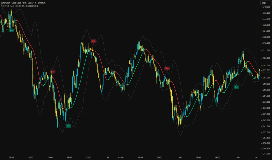
QRB - Quarterly Break RangeQRB — Quarterly Break Range is a market-structure indicator designed to help traders visualize how price interacts with the previous quarter’s range.
At the beginning of each new calendar quarter, QRB automatically identifies the completed previous quarter’s:
High
Low
50% midpoint
Those three levels are then projected across the current quarter, creating a simple structural map for price.
The indicator automatically updates when a new quarter begins, so there is no need to manually redraw the levels.
The Idea Behind QRB
The concept behind QRB comes from a simple observation:
Markets often react to important historical ranges.
Intraday traders commonly use concepts such as the Opening Range, previous-day high and low, session ranges, and other reference levels to understand where price is accepting, rejecting, or breaking away from prior value.
QRB applies that same thought process to a much larger timeframe.
Instead of asking:
“Where is price relative to today's opening range?”
QRB asks:
“Where is price relative to the previous quarter?”
The previous quarter becomes the reference range, while the current quarter shows how the market responds to that range.
This allows traders to study quarterly price behavior using only three objective levels.
Understanding the Three Levels
Previous Quarter High
The previous-quarter high represents the upper boundary of the completed quarterly range.
When price approaches this level, traders may watch for:
Rejection
Consolidation
Breakout attempts
Acceptance above the range
Retests after a breakout
A sustained move above the previous-quarter high may indicate that the market is beginning to expand beyond the prior quarter's range.
Previous Quarter Midpoint
The midpoint is calculated as:
(Previous Quarter High + Previous Quarter Low) ÷ 2
This represents the 50% level of the previous quarter's range.
The midpoint can be useful as a simple measure of where price is trading relative to the prior quarter.
Price holding above the midpoint places it in the upper half of the previous quarter's range.
Price holding below the midpoint places it in the lower half.
The midpoint may also act as an important area of balance, support, resistance, or transition.
Previous Quarter Low
The previous-quarter low represents the lower boundary of the completed quarterly range.
When price approaches this area, traders may watch for:
Support
Rejection
Consolidation
Breakdown attempts
Acceptance below the range
Retests following a breakdown
A sustained move below the previous-quarter low may indicate that the market is expanding beneath the previous quarter's range.
How to Use QRB
QRB is primarily designed as a market-structure framework, not a standalone buy or sell signal.
The three quarterly levels can help answer a few simple questions:
Where is price?
Above the previous quarter
Inside the previous quarter
Below the previous quarter
Which half of the prior range is price occupying?
Above the midpoint
Below the midpoint
How is price reacting to the boundaries?
Breaking
Rejecting
Retesting
Consolidating
Accepting beyond the range
That information can then be combined with a trader's existing approach to trend, momentum, price action, support and resistance, volume, or other forms of confirmation.
Example Market Behaviors
One possible bullish sequence could look like:
Previous-quarter high is tested
→ Price breaks above it
→ Price remains above the level
→ The level is retested
→ Buyers continue pushing price higher
A possible bearish sequence could look like:
Previous-quarter midpoint fails
→ Price moves into the lower half of the range
→ Previous-quarter low breaks
→ Price remains below the range
→ Selling pressure continues
Another possible scenario is simple rejection:
Price reaches the previous-quarter high
→ Fails to gain acceptance above it
→ Moves back inside the range
→ Rotates toward the midpoint
QRB does not attempt to predict which scenario will occur.
It simply provides the structural levels needed to observe what price actually does.
Why Quarterly Ranges?
Calendar quarters are natural market periods.
Each quarter contains roughly three months of price discovery and can represent a significant amount of accumulated positioning and market activity.
Rather than treating each daily candle independently, QRB allows traders to step back and see price within a broader structural framework.
The previous quarter essentially becomes a large reference range.
The current quarter then answers the question:
Will price remain inside that range, reject its boundaries, or expand beyond it?
That is the central idea behind QRB.
Best Use
QRB was designed primarily for higher-timeframe analysis, especially the Daily chart.
It may be useful across different markets, including:
Stocks
Forex
Futures
Indices
Cryptocurrencies
Because different markets behave differently, traders should evaluate the concept independently on the instruments they trade.
Customization
QRB allows users to customize the appearance of each level, including:
Previous Quarter High color
Previous Quarter High thickness
Midpoint color
Midpoint thickness
Previous Quarter Low color
Previous Quarter Low thickness
This allows the quarterly structure to remain visible without overwhelming the chart.
The Philosophy Behind QRB
QRB is intentionally simple.
There are no complicated calculations, predictive algorithms, or large collections of indicators.
The purpose is to create a clean structural map and allow price action to provide the information.
The core idea is:
Previous quarter = reference range
Current quarter = reaction to that range
From there, the trader observes whether price accepts, rejects, breaks, retests, or rotates around those levels.
Sometimes three well-defined levels can tell you more about market structure than twenty indicators ever could. Wskaźnik


