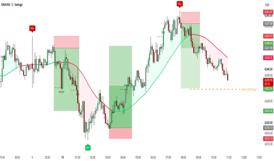
SMC Liquidity Sweep Swing High/Low [JPT]🔷 OVERVIEW
Liquidity Sweep Reversal Engine is a price-action indicator designed to identify potential reversal setups after price sweeps confirmed swing highs or swing lows and rejects the liquidity level.
The indicator combines swing structure, liquidity sweep detection, rejection candles, trend confirmation, displacement, and optional volume analysis to filter potential LONG and SHORT setups.
After a confirmed signal, the indicator automatically provides a trade plan with:
• Entry level
• Stop Loss
• TP1 / TP2 / TP3
• Risk-Reward levels
• Signal score
🔷 CONCEPTS
Liquidity Sweep Detection
The indicator tracks confirmed swing highs and lows as potential liquidity areas.
• Buy-side liquidity sweep → price takes a previous swing high and rejects below it → SHORT bias.
• Sell-side liquidity sweep → price takes a previous swing low and rejects above it → LONG bias.
Rejection Confirmation
A sweep can be filtered using:
• Close back through the liquidity level
• Rejection wick
• Minimum wick percentage
• Candle direction
Trend Confirmation
An optional EMA filter helps align signals with the current market direction.
Displacement
The indicator can require a minimum candle-body size relative to ATR to help filter weak price movements.
Volume Filter
Optional relative-volume confirmation can be enabled to identify sweeps occurring with increased market participation.
🔷 FEATURES
1. Swing Liquidity Detection
• Automatic swing high/low detection
• Buy-side and sell-side liquidity levels
2. Liquidity Sweeps
• High sweep detection
• Low sweep detection
• Rejection confirmation
3. Signal Filtering
• EMA trend filter
• Displacement filter
• Optional volume filter
• Signal score from 1–5
4. Trade Management
• Automatic Entry
• ATR-based Stop Loss
• TP1 / TP2 / TP3
• Custom Risk-Reward ratios
5. Visuals
• Liquidity lines
• Swing labels
• LONG / SHORT labels
• Entry / SL / TP levels
6. Alerts
• LONG signal
• SHORT signal
• TP1 / TP2 / TP3
• Stop Loss
🔷 APPLICATIONS
1. Liquidity Sweep Reversals
Identify potential reversal opportunities after price takes liquidity above a swing high or below a swing low.
2. Market Structure Mapping
Use confirmed swing levels to visualize important liquidity areas and potential reaction zones.
3. Signal Filtering
The optional trend, displacement, volume, and score filters can help reduce weaker setups.
4. Trade Planning
The built-in Entry, Stop Loss, and multiple Take Profit levels provide a structured framework for evaluating trades.
🔷 NOTES
• Lower pivot settings generate more signals and may produce more noise.
• Higher pivot settings identify larger structural liquidity levels.
• Liquidity sweeps do not guarantee reversals.
• Signal confirmation occurs on the closed candle.
• Always evaluate signals within the broader market structure and apply appropriate risk management. Wskaźnik

Multi-Period VWAP (7D / 30D / 90D)This indicator plots three rolling Volume-Weighted Average Price (VWAP) lines calculated over trailing 7-day, 30-day, and 90-day windows, giving you a read on where price sits relative to volume-weighted "fair value" across short, medium, and long-term horizons.
Unlike a standard anchored VWAP that resets to zero at a fixed point (session, week, month), these lines are true rolling averages — they continuously reflect the most recent N days of trading and shift smoothly bar to bar, making them useful for spotting mean-reversion zones, confluence with order blocks/key levels, and gauging trend strength when the shorter VWAP is stacked above or below the longer ones.
Features:
- Adjustable lookback lengths for all three periods (defaults: 7 / 30 / 90 days)
- Toggle each VWAP on/off independently
- Customizable colors per line
- Choice of price source (HLC3, Close, or OHLC4)
- Optional "confirmed bars only" mode to prevent the lines from repainting as the current day's volume accumulates
- Live value labels on the last bar for each active VWAP
Built with crypto's 24/7 markets in mind, so the daily boundaries used for the rolling calculation aren't disrupted by traditional session gaps. Wskaźnik

Supply & Demand Zones - Zone Forge [AFD]
Two zones on your chart. One came from a four-bar coil that price left in a single decisive candle. The other took twenty bars to go nowhere and slid out the bottom. Your indicator drew them identically.
That difference is measurable at the moment each zone forms - how tight the base was, how hard price left it - and it is measurable from the same two numbers the tool already had to compute in order to find the zone at all. Almost every zone tool computes them on the way past and throws them away.
Zone Forge keeps them. Every zone is scored on how it was constructed, and the score is painted rather than printed: a well-built zone carries more glow and deeper fill, a marginal one recedes into the background. No letter, no number, nothing to decode. The chart sorts itself.
Why it matters
A supply or demand zone is a fussy construction pretending to be a simple one. It needs a short, tight cluster of bars - the base - that price then left decisively in one direction. Both halves are measurable, and the ratio between them separates a coil that broke from a range that drifted. This describes how an area formed, and says nothing about what price does next.
At a glance
Four patterns, each switchable - rally-base-drop and drop-base-drop become supply; drop-base-rally and rally-base-rally become demand. Turn off the ones you do not trade.
A grade on every zone - built from two ratios the engine already computes, tiered Strong, Standard and Weak, and shown as vividness rather than as a label.
A one-way lifecycle - Fresh, Tested, Broken. A broken zone never returns to fresh, and a tested zone steps further back with each additional test.
Detection in one click - Scalp, Intraday or Swing set base length, tightness and departure strength together. Custom exposes all three.
Measured against your chart's own volatility - base height and departure distance are both in ATR(14) units, so one setting means the same thing on a $4 stock and a $400 one.
Nine colour themes - Signature, Neon, Muted, Mono, Terminal, Midnight, Ocean, Ember, and Paper for light charts, plus Custom. Three appearance presets over the top - Signature, Clean and Minimal - plus a Custom that leaves every control acting on its own.
Four alert conditions - new demand zone, new supply zone, zone tested, zone broken, as four separate entries in the alert dialog rather than one.
Three Data Window values for screening - distance to the nearest demand zone, distance to the nearest supply zone, and whether price is inside one.
How a zone is built
A base is a run of bars whose whole height fits inside Base tightness x ATR(14). A departure is a bar that CLOSES beyond that base by at least Departure strength x ATR(14) - the close, never the high or the low, so a spike that closes back inside draws nothing.
Both halves must be complete. A zone is created from a finished base and a finished departure, and appears on the bar that closes the departure, not before.
Two rules that change what you see:
A tight run LONGER than Base max length is rejected as a range. It is not trimmed to its last few bars and admitted anyway.
The departure is measured against the PREVIOUS bar's ATR, so the departure bar's own range cannot inflate the threshold it has to clear.
The grade, stated plainly
grade score = (departure distance / required distance) / max(base height / height limit, 0.50)
A zone that cleared the departure requirement by 3x off a base using half its allowed height scores well above one that cleared it by 1.1x off a base that used all of it. Only just qualifying on both counts scores 1.0x.
Weak, Standard and Strong are fixed thresholds on that score, and the tier is decided on the bar that creates the zone.
The score is computed once and is never recomputed. A zone already on your chart does not restyle itself later.
Grade emphasis sets how far apart the three tiers LOOK, from nearly identical to a wide visual split. It changes appearance only, never which tier a zone is in.
The tiers describe construction. They are not a ranking of what is likely to happen at a zone, and no tier is presented as the one to trade.
The lifecycle
Fresh - price has not come back yet. Brightest.
Tested - price traded into the zone and it held. The fill and glow step back, and each further test steps them back again up to a fixed limit, so an area that has been worked repeatedly recedes on its own rather than vanishing.
Broken - price closed through it. Hidden by default, because showing them roughly triples what is on the chart.
You choose what counts as each. Break rule is close-through or wick-through; Test rule is wick-touch or close-inside. Break beats test on the same bar, and the lifecycle only ever runs one way - a broken zone never becomes fresh again.
Flip broken zones, off by default, draws a fresh zone of the OPPOSITE type at the same levels when a zone breaks. The broken zone stays broken - this creates a new zone rather than reversing an old one, so nothing already on your chart changes what it claims to be. One generation only.
How it differs from a standard zone tool
The grade is a consequence of the construction, not a bolt-on - a swing-pivot band inflated by a fixed ATR width has no tightness to measure, and a fair-value gap has no base at all. Only something that finds a consolidation and THEN measures the move away from it has the two numbers to divide.
Strength is the visual language - the ranking is carried by glow and fill depth, so the chart is read at a glance instead of decoded. No letter appears on the box unless you ask for one.
The chart is kept bounded on purpose - a cap per side, a maximum age, broken zones hidden, and an overlap rule that will not admit a new zone sitting on top of a live one.
A theme system, not a colour picker - nine curated palettes, one of them built for a light chart, and three appearance presets over the top.
Nothing about the grade is hidden - the score is one division, the two thresholds it divides are the same ones detection already applied, and every constant is a named value in source you can read. A trust signal, not the pitch: what you are here for is the zones.
The visuals
Layered glow, not a flat rectangle - concentric halo boxes off a single Glow intensity control, with a floor so no layer is ever invisible. Glow spread sets how far the halo reaches.
Fill, border and edges are independent - each carries its own colour, width and style, and each can be switched off. Border off leaves the fill and the glow; fill off leaves an outline.
Emphasise nearest zone - thickens the border of the zone closest to price on each side.
50% line - the midpoint mitigation level, off by default, with its own colour and style.
Labels - Type, Type + age, Type + grade, Type + touches or Age; four positions, four sizes, a bar offset; worded Supply/Demand, the full pattern name or the trade shorthand. Every label carries a hover breakdown: pattern, span, state, age and grade.
Zone count table - a small optional panel counting what is on the chart.
Master opacity - fades every colour together in one control, without touching any individual setting.
Alerts
New demand zone
New supply zone
Zone tested
Zone broken
Create these from TradingView's alert dialog. How often an alert re-fires while its condition holds is set in that dialog, not in the script. A running alert keeps the inputs, symbol and timeframe it was created with - recreate it after changing any of them.
How to use it
Pick a detection style first - Scalp, Intraday or Swing. It is the only setting that changes WHAT gets found; everything else changes how what was found looks.
Works best on a 5-minute chart or lower - a zone needs a completed base and a completed departure to print, and that pattern completes far more often per session on a fast chart than a slow one, so a 5-minute-or-lower timeframe gives you more zones to read.
Read the fresh zones first - they are the brightest, and they are the areas price has not returned to.
Read the grade as build quality - a Strong zone came from a tight base and a decisive departure, a Weak one only just cleared both tests. Both are drawn, because knowing which is which is the point.
Watch a zone dim - each test steps it further back. A zone tested three times looks like what it is.
Set the look once - Preset gives you the vivid default, a clean one and a minimal one in a click, or Custom to set everything yourself; Colour theme gives nine palettes; Master opacity fades the lot. Then leave it alone.
Hover anything unclear - all 63 inputs carry a tooltip, and every zone label carries a breakdown.
What it deliberately does not do
It reads the open, high, low, close and volume of the chart you have open, and nothing else. There are no request.security() calls, no other symbol, no higher-timeframe import, and no options or order-book data of any kind.
So it does not know about order flow, dealer positioning, or where anyone's orders actually are. Supply and demand here name where a price move ORIGINATED. They do not name a measured book, and the words that would imply otherwise are kept out of every string this script ships.
It draws no entries, exits, targets or arrows, and makes no accuracy, reliability, profitability, probability or future-result claim of any kind. The grade describes an area built from bars that have already printed: a construction score establishes neither future direction nor the quality of any trade. Educational chart context only - not financial advice.
Data, timeframes and what to check yourself
Zones are created from confirmed bars only - a completed base and a completed departure. Once created, a zone's geometry does not move: its top, bottom and left edge are fixed, and only its lifecycle state changes, one way, on closed bars. Confirm it with the bar-replay tool on your own symbol and timeframe before relying on it - a description of mechanism is not that check, and nothing here claims to be.
The three Data Window values read the live close - the two distances and the inside-zone flag. They create, test, break and prune nothing.
The zone count is bounded by Pine's drawing limits - the source declares budgets of 500 boxes, 500 lines and 100 labels, and every glow layer, edge line and label spends from them. Max zones per side and Max zone age are the controls that keep you inside.
Standard time-based candles - on Heikin Ashi, Renko or Range the engine measures those synthetic values rather than traded prices, so the bases it finds are not the bases on your price chart.
Base tightness is not a strictness dial - the zone count peaks in the middle of its range and falls away at both ends, which is why the range stops where it does. Loosening it past the peak draws FEWER zones, not more.
Detection needs history - ATR(14) must exist before anything can be measured against it, so the opening bars of a chart produce nothing.
Originality and credit
Supply and demand zones are old ground. What is new is that the construction is measured, and the measurement is what you see: base tightness and departure distance resolved into one score, that score frozen on the bar that creates the zone, and the ranking expressed as glow and fill depth rather than as a label to decode.
Open source under the Mozilla Public License 2.0. (c) Auction Foundry.
Wskaźnik

SMC Institutional Clean Wave & Structure PROSMC Institutional Clean Wave & Structure PRO
SMC Institutional Clean Wave & Structure PRO is a refined technical analysis indicator engineered to provide institutional order flow insights, precise market structure tracking, and uncluttered visual clarity on both light and dark trading themes. It replaces unnecessary chart noise with clean dynamic trend wave fills, smart consolidation candle color detection, and confirmed structure shifts.
Key Features Overview
1. Dynamic Single Trend Wave & Background Fill
Provides a smooth continuous structural trend wave. Renders vibrant green during bullish expansion phases and solid red during bearish contraction phases with a soft, unobtrusive background fill.
2. Smart Consolidation Candle Engine
Automatically highlights price action state. Bullish candles render in bright green, bearish candles in red, while tight consolidation or inside bar candles dynamically shift to a distinct grayish-white color to quickly highlight market compression.
3. Clean Market Structure Shifts (BOS & CHoCH)
Tracks key market structure breakouts. Identifies initial trend reversals as Change of Character (CHoCH) and structural extensions as Break of Structure (BOS), rendered with centered non-overlapping labels.
4. Confirmed Major Swing BUY & SELL Badges
Highlights major institutional high and low pivots with confirmed BUY and SELL badges. Pivot sensitivity and badge styling can be customized independently.
5. Target Standard Deviation Level (-2.5 SD)
Calculates real-time structural volatility and projects a dynamic -2.5 Standard Deviation Target line to help anticipate key potential market reaction levels.
Settings Overview
Trend Wave Settings
- Show Trend Wave Line: Toggle wave line and fill display.
- Colors & Opacity: Adjust trend line colors and background opacity.
Candle Engine Settings
- Enable Smart Candle Color Engine: Toggle adaptive candle colors.
- Custom Colors: Define unique colors for bullish, bearish, and inside bars.
Structure Settings
- Show BOS & CHoCH Shifts: Toggle structure labels.
- Structure Sensitivity: Fine-tune pivot detection rules for cleaner charts.
Signal Badges
- Show Confirmed BUY / SELL Badges: Toggle buy and sell markers.
- Signal Swing Sensitivity: Adjust lookback periods for pivot signals.
Standard Deviation Settings
- Show -2.5 SD Target Line: Toggle volatility target line.
- Custom Style: Adjust line thickness, color, and line style options.
Disclaimer
This script is built strictly for educational, analytical, and charting enhancement purposes. It does not offer financial advice or guaranteed trading results. Practice strict risk management.
Wskaźnik

HTF Candle & Key LevelsHTF Candle & Key Levels Overlay
A clean, clear TradingView indicator for analyzing Higher Timeframe (HTF) market structure and price action. It projects key percentage levels and Fibonacci ratios from the higher timeframe candle directly across your chart background, while displaying the active HTF candle neatly on the right margin—keeping your main chart completely unobstructed.
Key Features:
Flexible HTF Selection: Track Daily, 4-Hour, 1-Hour, or other timeframe candles on your lower-timeframe execution charts (e.g., 1m, 5m, 15m) to maintain full context of the broader price range.
Selectable Key & Fibonacci Levels: Easily toggle crucial range points and Fibonacci retracements—such as 0% (Low), 40%, 50% (Midpoint), 60%, 61.8%, 78.6%, and 100% (High)—complete with optional real-time price and percentage labels.
Right Candle: Renders the body and wicks of the current HTF candle off to the right side of active price action, ensuring your execution chart remains clean.
Full Customization: Adjust line styles (Solid, Dashed, Dotted), line thickness, colors, and candle parameters to fit your visual preference. Wskaźnik

[SkuldX] SFP Swing Failure PatternSkuldX Swing Failure Pattern — Institutional Liquidity Sweep Detector
by SkuldX Trading Systems
What is it?
SkuldX Swing Failure Pattern automatically detects one of the most powerful reversal setups in Smart Money and ICT trading. The Swing Failure Pattern occurs when price sweeps beyond a key swing level — triggering stop-loss orders clustered there — but then closes back within the previous range. This signals that institutional participants have absorbed the available liquidity and are now positioning in the opposite direction.
Unlike random false breakouts, the SFP has a precise structure: a meaningful wick beyond a swing high or low, a close that returns inside the range, and a visible rejection zone where the liquidity grab occurred. SkuldX SFP identifies all three automatically and displays them directly on the chart.
The mechanics
Every swing high and swing low acts as a magnet for stop-loss orders. Retail traders who are long place their stops just below swing lows. Retail traders who are short place their stops just above swing highs. Institutional participants know exactly where this liquidity sits.
An SFP forms when price is deliberately pushed beyond one of these levels to trigger those orders — collecting the liquidity — and then immediately reverses. The result is a candle with a long wick beyond the level and a close that returns inside the prior range. This is not a random failure. It is a deliberate liquidity grab followed by institutional repositioning in the opposite direction.
Two pattern types
🔴 Bearish SFP — price sweeps above a previous swing high with a wick but closes below it. The failed attempt to break higher signals that sellers have absorbed the bullish liquidity and are now in control. Expect a move downward.
🟢 Bullish SFP — price sweeps below a previous swing low with a wick but closes above it. The failed breakdown signals that buyers have absorbed the bearish liquidity and are now driving price higher.
What you see on the chart
Each detected SFP displays three visual elements simultaneously:
Label — appears above or below the candle with the signal direction and the exact price of the swept level. Instantly identifies the pattern without manual analysis.
Dashed line — marks the swing level that was breached. Extends from the beginning of the lookback window to the right, showing which structural level triggered the sweep. This level often acts as support or resistance in subsequent price action.
Rejection zone (box) — shaded area between the wick extreme and the swept level. This is the liquidity grab zone — the price range where stop orders were triggered and institutional positions were built. The size of this zone reflects how aggressively price was pushed beyond the level before reversing.
Quality filters
Two independent filters prevent low-quality signals from appearing on the chart.
Min Wick Size % of candle — requires the rejection wick to be at least a specified percentage of the total candle range. A small wick relative to the candle body suggests weak rejection. Default 0.5%. Increase to 2–3% on noisy instruments to require a more decisive rejection.
Min Breach Size % of level — requires the wick to extend at least a specified percentage beyond the swing level. A sweep that barely ticks beyond the level carries less significance than one that pushes meaningfully through it. Default 0.05%. Increase to 0.1–0.2% for stricter confirmation.
Both filters can be set to zero to show all detected patterns without filtering.
Settings reference
Swing Lookback (bars) — defines how many bars back to search for the swing high or low that gets swept. Default 10. Lower values find more local patterns, higher values require more significant swing levels. On 15m charts, 10 bars covers approximately 2.5 hours of price history.
Min Wick Size % of candle — minimum upper or lower wick as a percentage of the total candle range
Min Breach Size % of level — minimum distance the wick must extend beyond the swing level
Show Bullish / Bearish SFP — independent toggles for each direction
Show Labels — toggles the signal label above or below the candle
Show Level Line — toggles the dashed line at the swept swing level
Show Rejection Zone — toggles the shaded box between the wick and the level
Zone Extend — how many bars to the right the zone and line extend
Label Size — tiny, small, or normal
Bullish / Bearish Color — independent color control for each direction
Zone Transparency — opacity of the rejection zone fill
Line Width — thickness of the swept level line
Data Window
Hovering over any bar shows binary flags for Bullish SFP and Bearish SFP detection, the current swing high and swing low values used as reference levels, the upper and lower wick percentages, and the breach percentage of the swept level. These values are useful for calibrating the quality filters to your specific instrument and timeframe.
How to use it in practice
Entry timing — the SFP signal fires on the bar where the rejection occurs. The most aggressive entry is at the close of that candle. A more conservative approach is to wait for the next candle to confirm continuation in the reversal direction before entering.
Stop placement — place the stop-loss beyond the wick extreme, outside the rejection zone. The wick tip represents the furthest point of institutional manipulation — price returning beyond it invalidates the pattern.
Take-profit targets — common targets are the opposite swing extreme, a session High or Low from the current day, or the next significant structural level. The swept swing level itself often acts as resistance or support on the retest.
Timeframe selection — SFP signals are most reliable on 15m and above. On very low timeframes the pattern appears frequently but with lower conviction. On 1h and 4h the signals are rarer but carry significantly more institutional weight.
Confluence — the highest-probability SFP setups occur when the swept level coincides with a session boundary. A bearish SFP that sweeps the Asian High during London session is a classic institutional liquidity grab setup. A bullish SFP at Asian Low during the NY Overlap is one of the strongest intraday reversal signals available.
Volume context — a sweep accompanied by above-average volume confirms institutional participation. A low-volume sweep may indicate a thin market move rather than a deliberate liquidity grab.
Common mistakes to avoid
Entering immediately on the wick without waiting for the candle to close. The pattern is only valid after the close confirms the rejection — a candle that is still forming may yet close beyond the level as a genuine breakout.
Trading every SFP signal regardless of context. The pattern is significantly more reliable when it sweeps a level that has been respected multiple times previously, when it occurs during a high-liquidity session window, and when it aligns with the broader directional bias.
Using too small a lookback. A swing high from 3 bars ago carries far less liquidity than one from 10–15 bars ago. Increase the lookback if signals feel too frequent or structurally insignificant.
Built for SkuldX ecosystem
SkuldX Swing Failure Pattern is designed to work alongside the full SkuldX indicator suite. The most reliable SFP setups emerge when multiple layers of context align simultaneously:
A bullish SFP at the Asian Low after the Asian session closes — detected by SkuldX Trading Sessions — suggests institutional accumulation before London or NY drives price higher
A bearish SFP at the Asian High during London session with ADR Used % above 80% — from SkuldX ADR Levels — indicates both a liquidity sweep and statistical range exhaustion at the same level
An SFP confirmed by a Bullish Trend or Bearish Trend reading in SkuldX OI Delta adds institutional conviction — new positions opening in the reversal direction confirm the sweep was not random
An SFP that forms at a level already flagged by SkuldX Level Patterns as a multi-touch support or resistance zone carries significantly more weight than one at a fresh untested level
Each indicator in the suite adds an independent dimension of confirmation. Using them together reduces noise and improves the quality of setups without adding complexity to the decision process.
Wskaźnik

MACD Momentum Phase & Acceleration ObservatoryMACD Momentum Phase & Acceleration Observatory is a current-chart momentum research indicator that extends the familiar MACD line, Signal line, and Histogram into a structured view of separation, expansion, contraction, equilibrium, relative magnitude, and crossover-cycle behavior.
The script is designed for users who want to study how MACD momentum changes rather than rely only on a line crossover. It is a descriptive context tool. It does not generate Buy or Sell instructions, predict future price movement, estimate win rate, or manage risk.
WHAT IT SHOWS
- A configurable MACD line, Signal line, and state-colored Histogram.
- Five descriptive momentum phases.
- A noise-aware expansion and contraction model.
- An adaptive Near Equilibrium state with separate entry and exit boundaries.
- Three display scales: Raw MACD, Percent of Slow Average, and ATR Units.
- A robust rolling Histogram magnitude score.
- A subdued-to-reactivated magnitude sequence.
- Cross-cycle peak retention.
- MACD path efficiency.
- A compact or detailed context readout.
- Optional factual event markers and alert conditions.
WHY THIS IS MORE THAN A STANDARD MACD
A standard MACD primarily shows the relationship between a fast moving average, a slow moving average, and a smoothed Signal line. This script keeps that familiar structure, but its main contribution is a coordinated lifecycle model built around the MACD Histogram.
The distinguishing design consists of:
- separating the raw analytical engine from display normalization;
- classifying the Histogram into five momentum phases;
- filtering small expansion/contraction changes with an adaptive noise deadband;
- reducing equilibrium-boundary flapping with entry/exit hysteresis;
- measuring relative Histogram magnitude with rank-based methods;
- tracking reactivation after a sustained subdued sequence;
- measuring how much Histogram separation remains inside the active crossover cycle; and
- measuring whether the MACD path has been direct or rotational over a selected lookback.
These components are designed to describe different parts of one MACD separation lifecycle. They are not independent indicators combined without a shared purpose.
CORE MACD ENGINE
The raw calculations are:
Raw MACD = Fast Moving Average - Slow Moving Average
Raw Signal = Moving Average of Raw MACD
Raw Histogram = Raw MACD - Raw Signal
The Fast, Slow, and Signal calculations can each use one of the following moving-average methods:
- EMA
- SMA
- RMA
- WMA
- HMA
The source and all lengths are configurable. Fast Length must remain lower than Slow Length. If the configuration is invalid or the selected scale is unavailable, the context readout reports the condition instead of presenting a normal Ready state.
RAW ANALYTICAL CORE AND DISPLAY SCALE
The analytical state is calculated from the raw MACD structure. Display normalization is handled separately.
Available display modes are:
Raw MACD
Shows the MACD components in their native chart-price units.
Percent of Slow Average
Divides MACD, Signal, and Histogram by one percent of the absolute Slow Average value.
ATR Units
Divides MACD, Signal, and Histogram by the current ATR value using the selected ATR length.
The same positive divisor is applied to all three displayed components on each bar. More importantly, crossover events, zero crossings, phase classification, magnitude scoring, path efficiency, and cycle retention are calculated from the raw series. Changing the display mode therefore changes the visual unit, but it does not rewrite the underlying analytical event history.
FIVE-STATE MOMENTUM PHASE MODEL
The Histogram is classified into five descriptive states:
Positive Expansion
The raw Histogram is above zero and its absolute magnitude is expanding beyond the adaptive noise deadband.
Positive Contraction
The raw Histogram is above zero and its absolute magnitude is contracting.
Negative Expansion
The raw Histogram is below zero and its absolute magnitude is expanding.
Negative Contraction
The raw Histogram is below zero and its absolute magnitude is contracting.
Near Equilibrium
The absolute raw Histogram is inside the adaptive equilibrium boundary.
Expansion and contraction are based on the smoothed one-bar change in absolute Histogram magnitude. The script also estimates ordinary recent one-bar magnitude movement. That estimate creates an adaptive deadband. When the current magnitude change is too small to distinguish clearly from recent noise, the prior motion state is retained instead of forcing another Expansion/Contraction switch.
ADAPTIVE EQUILIBRIUM WITH HYSTERESIS
The equilibrium entry boundary is calculated from an EMA of the absolute raw Histogram multiplied by the Equilibrium Band Multiplier.
Once Near Equilibrium is active, the exit boundary is wider than the entry boundary:
Exit Boundary = Entry Boundary x Equilibrium Exit Hysteresis
Using separate entry and exit boundaries reduces rapid state changes when the Histogram repeatedly moves just above and below one threshold.
HISTOGRAM ACCELERATION
Histogram Acceleration is the smoothed one-bar change of the Histogram. The detailed readout can display the current value and direction. Optional acceleration-turn markers and alerts identify factual zero crossings in the raw acceleration measure.
The acceleration value shown in the readout follows the selected display unit. The five-state phase model remains based on the raw Histogram structure.
ROBUST HISTOGRAM MAGNITUDE SCORE
The Magnitude field measures the current absolute raw Histogram relative to its own recent history. It is bounded from 0 to 100 and offers three methods:
Percent Rank
Ranks the current absolute Histogram among observations in the selected lookback. This method is less dominated by one isolated extreme value.
Range Rank
Locates the current absolute Histogram between the rolling minimum and rolling maximum.
Hybrid Rank
Combines 65 percent Percent Rank with 35 percent Range Rank. This is the default method.
The score is classified as:
- Subdued
- Typical
- Extended
These labels describe relative recent magnitude only. They are not probabilities, confidence levels, overbought/oversold signals, or forecasts.
MAGNITUDE REACTIVATION
Magnitude Reactivation is a stateful sequence, not a directional trade signal.
The sequence works as follows:
1. The Magnitude score remains at or below the Subdued threshold for at least the selected Minimum Subdued Bars.
2. The reactivation condition becomes armed.
3. A reactivation event is recorded when the score reaches the Magnitude Reactivation threshold.
The default visual marker is a small yellow dot at the top of the pane. It indicates that relative Histogram magnitude has re-emerged after a sustained subdued sequence. It does not specify bullish or bearish direction.
CROSS-CYCLE PEAK RETENTION
A cross cycle begins whenever the raw MACD line crosses the raw Signal line.
During the active cycle, the script records the largest absolute raw Histogram magnitude. Cross-Cycle Peak Retention is calculated as:
Current Absolute Histogram / Active-Cycle Peak Absolute Histogram x 100
A value near 100 means the current separation is near the largest separation recorded in that crossover cycle. A lower value means more of that cycle's peak separation has contracted. This measurement is descriptive and does not determine whether price will continue or reverse.
MACD PATH EFFICIENCY
MACD Path Efficiency compares the net displacement of the raw MACD line with the total distance traveled by the raw MACD line over the selected lookback:
Absolute Net MACD Displacement / Sum of Absolute One-Bar MACD Changes x 100
A higher value describes a more direct MACD path. A lower value describes a more rotational or back-and-forth path. It is not a measure of profitability, trend quality, or future reliability.
CONTEXT READOUT
The Context Readout can be disabled or shown in Compact or Detailed mode.
Compact mode shows:
- Phase
- Location relative to zero
- Histogram value
- Magnitude score and state
- Configuration status
Detailed mode additionally shows:
- Histogram Acceleration
- Phase Age
- Bars in the active cross cycle and Peak Retention
- MACD Path Efficiency
- Confirmed or Live bar status
The table position, text size, header size, background, border, and row presentation are configurable.
VISUAL DESIGN
The default palette separates the line family from the Histogram family:
- MACD line: ice white
- Signal line: electric blue
- Positive Expansion: bright green
- Positive Contraction: teal
- Negative Expansion: magenta
- Negative Contraction: orange
- Near Equilibrium: vivid purple
- Magnitude Reactivation: yellow
The Histogram uses a depth layer and a narrower core layer. The MACD and Signal lines can use optional glow and separation fill. The adaptive equilibrium band, zero guide, phase rail, and background tint can be enabled or disabled independently.
EVENT MARKERS AND ALERTS
Default factual markers are:
- a small upward arrow at the pane bottom when MACD crosses above Signal;
- a small downward arrow at the pane top when MACD crosses below Signal; and
- a small yellow dot at the pane top when Magnitude Reactivation occurs.
Optional markers are available for:
- Histogram Acceleration turning positive or negative; and
- MACD crossing above or below zero.
Alert conditions are available for the same events and for each phase transition. These events describe calculated state changes. They are not trade-entry or trade-exit recommendations.
REALTIME AND CONFIRMED-BAR BEHAVIOR
Confirmed Bars Only is enabled by default.
With the default setting:
- markers and alert conditions trigger after the chart bar closes;
- stateful Magnitude Reactivation updates are committed on confirmed realtime bars; and
- the committed cross-cycle peak is updated on confirmed realtime bars.
The MACD lines, Histogram, phase display, and context readout can still change while the current bar is forming because their inputs change with live price. This is normal realtime behavior. Users who disable Confirmed Bars Only intentionally allow intrabar events, which can change before the bar closes.
The script uses the current chart timeframe only. It does not request another symbol or timeframe, use lookahead, access future data, or apply a future plot offset.
HOW TO USE THE INDICATOR
1. Start with Location and Phase.
Location shows whether raw MACD is above or below zero. Phase shows whether Histogram magnitude is expanding, contracting, or near equilibrium.
2. Add Magnitude context.
Use Subdued, Typical, and Extended as rolling relative-magnitude descriptions. Do not interpret them as probabilities.
3. Observe reactivation after subdued conditions.
A yellow dot identifies a transition from a sustained subdued sequence to a higher relative magnitude. Read its direction from the Histogram sign and phase, not from the dot itself.
4. Use Detailed mode for lifecycle context.
Phase Age shows duration. Cross-Cycle Peak Retention shows how much separation remains relative to the active cycle peak. Path Efficiency shows whether the MACD path has been direct or rotational.
5. Select a suitable display unit.
Raw MACD preserves native units. Percent of Slow Average and ATR Units can make the pane easier to read on symbols with different price or volatility scales. Analytical states remain based on raw MACD.
DEFAULT CONFIGURATION
The default core uses 12-period EMA, 26-period EMA, and a 9-period EMA Signal line with Close as the source.
The default research settings use:
- Raw MACD display
- 3-bar acceleration smoothing
- 8-bar phase-noise estimation
- 0.25 phase-noise multiplier
- 34-bar adaptive equilibrium basis
- 0.28 equilibrium entry multiplier
- 1.25 equilibrium exit hysteresis
- 120-bar Hybrid Magnitude Rank
- 20 / 35 / 80 Subdued, Reactivation, and Extended thresholds
- 3 Minimum Subdued Bars
- 20-bar MACD Path Efficiency
- Compact Context Readout
- Confirmed Bars Only enabled
The defaults are general starting points, not optimized settings for a specific symbol or timeframe.
LIMITATIONS
- MACD is derived from moving averages and therefore contains lag.
- Expansion, contraction, equilibrium, magnitude, retention, and efficiency describe the current and historical calculation state; they do not forecast price.
- Results depend on the selected source, moving-average methods, lengths, smoothing, lookbacks, and thresholds.
- Rank-based measurements are relative to a rolling window and can change as old observations leave that window.
- Frequent MACD/Signal crossings create shorter cross cycles and can make Peak Retention change quickly.
- Low-liquidity symbols, gaps, abrupt price changes, and very short timeframes can produce rapid state transitions.
- The open bar remains fluid until it closes.
- The script does not include position sizing, stop placement, targets, backtesting, or risk management.
Use the indicator as one transparent source of momentum context alongside independent price analysis and risk controls. Wskaźnik

Price Action Compass [Artillery]Price Action Compass is a price-action checklist indicator that enforces five classic price-action entry rules as one system. It classifies the market as UPTREND, DOWNTREND or TRADING RANGE and only prints a signal when every rule for the current mode agrees, so the chart itself enforces a disciplined process instead of leaving each condition to memory.
WHAT IT DOES
1) Trend Rule - trend is defined by fast/slow EMA structure plus EMA slope over a lookback, so signals only ever point with the trend.
2) No Counter-Trend Rule - long setups are blocked in a downtrend and short setups are blocked in an uptrend.
3) Trading Range Rule - when the range height over the lookback stays under an ATR-based cap, the script switches to range mode and only looks for fades at the edges: buys in the lower edge zone, sells in the upper edge zone.
4) Second-Entry Rule - in trend mode the script counts pullback entries against the EMA and, by default, only signals the second entry (a pullback attempt that failed once and then resumed). First attempts are skipped as the statistically weakest.
5) Signal Bar Rule - the entry bar itself must qualify: a minimum body-to-range ratio, a close in the top portion of the bar for buys (bottom for sells), and a maximum bar size in ATR terms so entries are not taken on climactic bars.
WHY THESE FIVE TOGETHER
Each rule alone is a well-known discretionary filter. The point of combining them is that they form a single state machine: the mode decides which rules apply, the entry counter tracks setup quality within that mode, and the signal-bar test validates the exact bar you would enter on. Removing any one of them changes the behaviour of the whole, which is why they are published as one tool rather than separate scripts.
The five-rule framework is the classic price-action methodology taught by Al Brooks, in the summarized form popularised by Thomas Wade. The concept credit belongs to them; all code in this script is original, written from scratch using only Pine built-ins, with no third-party or reused open-source code.
WHAT YOU SEE ON THE CHART
- BUY / SELL labels on qualifying bars (tagged "2nd" when the second-entry rule produced them)
- Signal-bar highlighting on bars that pass Rule 5
- The fast/slow EMA pair with a shaded structure zone between them
- Projected stop and target zones for the most recent signal, based on the SL buffer and R:R inputs (drawn for reference, not as advice)
- A compact dashboard showing Mode, entry counts in each direction, current signal-bar quality, the active signal state, session signal count and the configured R:R
INPUTS
Direction (Both / Long Only / Short Only), Trend (fast EMA, slow EMA, slope lookback), Trading Range (lookback, max height as ATR multiple, edge zone percent), High-Probability Setup (require 2nd entries), Signal Bar (min body/range, close strength, max size in ATR), Risk (stop buffer in ticks, R:R target) and Visuals (label sizes, dashboard position, five colour themes). Defaults were chosen for liquid intraday futures on 1-15 minute charts, but every threshold is exposed so the tool can be tuned to any symbol or timeframe.
ALERTS
Three alert conditions are included: BUY signal, SELL signal, and Any signal.
BEHAVIOUR NOTES
Signals are evaluated on the live bar and confirmed at bar close, so a forming signal can appear and disappear until its bar closes. The script uses no higher-timeframe requests and no lookahead. It draws up to 500 labels/lines/boxes, so very dense charts recycle the oldest drawings first.
This is an educational and analytical tool for studying price action. It does not predict future results and it is not financial advice. Wskaźnik

Kyokutan-Ashi◈ Description
The Kyokutan-Ashi is a unique indicator designed to visualize the exact price deviation (noise) that standard Heikin-Ashi (HA) calculations normally smooth out and hide. By completely stripping away the trend component, it isolates pure market volatility and overextension.
◈ The Math Behind It (Why this calculation & Expected Output)
The core logic subtracts the Heikin-Ashi values from standard Japanese candlestick values. The purpose of this calculation is to extract the pure "difference" (noise) between the actual price and the smoothed trend, and then reconstruct it based on a chosen anchor point.
【 Calculation Example 】
Current actual candle: open = 100, high = 105, low = 95, close = 102
Previous HA candle: haOpen = 98, haClose = 100
Settings: Anchor Point = "Open", Multiplier = 1.0
haClose = (100 + 105 + 95 + 102) / 4.0 = 100.5
haOpen = (98 + 100) / 2.0 = 99
Subtract HA from standard values to isolate the noise.
rawOpen = 100 - 99 = 1
rawClose = 102 - 100.5 = 1.5
Add the isolated noise to the baseline (Anchor = Open: 100).
antiOpen = 100 + 1 = 101
antiClose = 100 + 1.5 = 101.5
【 Actual Output 】
A small bullish candle from 101 to 101.5 is plotted on the chart. Although the actual price moved from 100 to 102, removing the trend component reveals that the "pure overextension" (deviation) is only 0.5.
◈ Key Features
Pure Deviation Visualization: Shows only how far the actual price is stretching away from the Heikin-Ashi smoothed price.
Anchor & Base Settings: Choose where to project the deviation (Open, Close, or HL2).
Deviation Multiplier: Scale the noise up or down to easily spot extreme market extensions.
Chart-Type Independent: Built with robust data handling. Even if you change your main chart view to Heikin-Ashi, Renko, or Kagi, Kyokutan-Ashi always forcefully retrieves standard raw price data in the background to guarantee accurate deviation calculations.
◈ Why Use It
Use it in combination with other charts or indicators to extract your own unique noise and trading edges. When Kyokutan-Ashi prints unusually large candles, it signals that the actual price is violently snapping away from the smoothed trend — often indicating exhaustion, potential mean-reversion, or hidden volatility.
◈ Author's Note
While Kyokutan-Ashi was developed independently to address the loss of actual price data in Heikin-Ashi, I later discovered "BERLIN Candles" by lejmer. He had already recognized this critical issue and beautifully engineered a hybrid solution long before I did. I want to express my deepest respect for his foresight and pioneering work in tackling this specific problem.
Wskaźnik

Market Regime - Trend or RangeWHAT IT DOES
Market Regime — Trend or Range answers one question at a glance: is the current market TRENDING or RANGING? It combines three established, independent regime measures and requires a 2-of-3 majority vote before declaring a verdict, so a single noisy reading cannot flip the classification.
WHY THESE THREE COMPONENTS WORK TOGETHER
Each component measures a different aspect of market character, so their agreement is meaningful rather than redundant:
1) ADX (Wilder) measures directional strength. Vote: Trend above the ADX Trend Threshold (default 25), Range below the ADX Range Threshold (default 20), otherwise neutral.
2) Kaufman Efficiency Ratio measures how efficiently price travels: net change over the lookback divided by the sum of absolute bar-to-bar changes (default length 20). A high ratio means price moved directionally; a low ratio means it churned. Vote: Trend above 0.50, Range below 0.30.
3) Choppiness Index measures sideways versus directional behavior using the log ratio of summed true range to the total high-low range of the lookback (default length 14). Vote: Trend below 38.2, Range above 61.8.
The votes are summed into a score from -3 to +3. TREND requires +2 or more, RANGE requires -2 or less, anything else is MIXED. This 2-of-3 design is the purpose of the combination: ADX alone lags turns, the Efficiency Ratio alone is jumpy, and Choppiness alone ignores direction. Requiring agreement between at least two independent measures filters each one's weakness instead of merely displaying three indicators side by side. The script also derives a 0-100 strength meter by averaging normalized ADX, normalized Efficiency Ratio and inverted Choppiness.
WHAT APPEARS ON THE CHART
- Optional background tint: teal while TREND, orange while RANGE, none while MIXED.
- A dashboard table (corner selectable) showing the verdict, each component's current value with its own vote mark (up arrow = trend vote, down arrow = range vote, dot = neutral), the strength meter, the raw vote score, and a Playbook line that reads Trend tools, Fade tools, or Stand aside.
INPUTS AND DEFAULTS
ADX Length (14), ADX Trend Threshold (25), ADX Range Threshold (20), Efficiency Ratio Length (20), ER Trend Threshold (0.50), ER Range Threshold (0.30), Choppiness Length (14), plus visual toggles for the background tint and the dashboard position. Defaults are the classic reference values for each measure, not optimized settings.
HOW TO USE IT
Read it on your trading timeframe for the live regime, and optionally on a higher timeframe for the session's broader character. On TREND verdicts, continuation methods are generally more appropriate; on RANGE verdicts, mean-reversion and fade methods; on MIXED, caution or smaller size. It works on any symbol and timeframe and makes no claim of special performance on any market.
ALERTS
Two alert conditions are included and fire when the composite verdict changes: "Switched to TREND" and "Switched to RANGE".
BEHAVIOR AND LIMITATIONS
- All calculations run on the chart timeframe with no higher-timeframe requests, so nothing repaints from other timeframes. Values on the live bar update until that bar closes, then are fixed.
- A regime classifier describes current conditions. It does not predict future price and it is not a signal generator.
- Thresholds are configurable; changing them changes how strict each vote is.
This is an informational analysis tool for chart study, not financial advice. Past market behavior does not guarantee future results. Always apply your own risk management. Wskaźnik

TRADION Gaussian Trend EngineTRADION Gaussian Trend Engine
OVERVIEW
TRADION Gaussian Trend Engine is a multi-factor trend analysis framework designed to evaluate market direction, trend strength, momentum alignment and volatility within a unified model.
The indicator is built around an independently implemented multi-pole Gaussian cascade. Instead of using Gaussian direction alone as a trading signal, the engine evaluates several additional dimensions of market behavior before qualifying a directional transition.
The framework combines:
• Configurable multi-pole Gaussian smoothing
• ATR-normalized Gaussian slope
• Price displacement from the Gaussian baseline
• RSI momentum analysis
• Rate of Change (ROC)
• A composite 0–100 Trend Strength Score
• Volatility-adaptive trend ribbons
• Three-level BUY / SELL classification
• Confirmed-bar signal generation
• Dedicated TradingView alerts
The design objective is selective trend qualification rather than generating a signal on every minor directional fluctuation.
────────────────────────────
GAUSSIAN TREND ENGINE
────────────────────────────
The core of the indicator is a configurable multi-pole Gaussian cascade.
The user can control two primary parameters:
Gaussian Period:
Controls the smoothing horizon of the filter.
Gaussian Poles:
Controls the number of sequential Gaussian smoothing stages used by the engine, from 1 to 6.
Each additional pole applies another stage of Gaussian smoothing to the previous output.
This architecture provides a configurable balance between responsiveness and noise reduction.
The final output of the selected pole becomes the Gaussian trend baseline used by the rest of the engine.
────────────────────────────
TREND DIRECTION
────────────────────────────
Directional state is determined from the slope of the Gaussian baseline.
When the current Gaussian value is above its previous value, the engine identifies a bullish directional state.
When the current Gaussian value is below its previous value, the engine identifies a bearish directional state.
The Gaussian line changes dynamically:
Green = Bullish Gaussian direction
Red = Bearish Gaussian direction
An unchanged Gaussian value preserves the previous directional state.
────────────────────────────
VOLATILITY NORMALIZATION
────────────────────────────
Raw price movement has different significance across instruments and volatility regimes.
For this reason, ATR is used as a normalization reference within the engine.
Two important measurements are normalized relative to ATR:
• Gaussian slope magnitude
• Distance between price and the Gaussian baseline
This allows the strength model to evaluate movement relative to current market volatility rather than relying only on absolute price changes.
────────────────────────────
TREND STRENGTH SCORE
────────────────────────────
TRADION Gaussian Trend Engine calculates a composite Trend Strength Score ranging from 0 to 100.
The score combines four normalized components:
1. Gaussian Slope Strength — 40%
2. Price Distance from Gaussian — 20%
3. RSI Momentum Intensity — 25%
4. ROC Magnitude — 15%
Gaussian Slope Strength measures the magnitude of directional movement in the Gaussian baseline relative to ATR.
Price Distance measures the absolute displacement of price from the Gaussian baseline relative to ATR.
RSI Momentum Intensity measures the distance of RSI from its neutral 50 level.
ROC Magnitude measures the absolute velocity of price movement.
Each component is normalized before being incorporated into the final weighted score.
The result is a single 0–100 metric designed to describe the degree of agreement between trend movement, price expansion and momentum.
────────────────────────────
MOMENTUM CONFIRMATION
────────────────────────────
Momentum confirmation can be enabled or disabled by the user.
For bullish confirmation, the default model requires:
• RSI above 50 plus the selected Neutral Zone
• Positive ROC
For bearish confirmation, it requires:
• RSI below 50 minus the selected Neutral Zone
• Negative ROC
This layer prevents every Gaussian slope change from automatically qualifying as a BUY or SELL event.
The RSI Neutral Zone is configurable, allowing the user to control how much momentum separation is required around the RSI 50 equilibrium level.
────────────────────────────
DIRECTIONAL QUALIFICATION
────────────────────────────
A qualified bullish setup requires:
• Rising Gaussian direction
• Price above the Gaussian baseline
• Valid bullish momentum when momentum confirmation is enabled
• Trend Strength above the configured minimum threshold
A qualified bearish setup requires:
• Falling Gaussian direction
• Price below the Gaussian baseline
• Valid bearish momentum when momentum confirmation is enabled
• Trend Strength above the configured minimum threshold
This means that Gaussian direction, price structure, momentum and trend strength are evaluated together before a directional event is accepted.
────────────────────────────
THREE-LEVEL SIGNAL CLASSIFICATION
────────────────────────────
Qualified transitions are classified according to their Trend Strength Score.
Bullish classifications:
BUY
STRONG BUY
EXTREME BUY
Bearish classifications:
SELL
STRONG SELL
EXTREME SELL
The default thresholds are:
Minimum Signal Strength: 25
Strong Signal Threshold: 55
Extreme Signal Threshold: 75
These thresholds are fully configurable.
A standard signal represents a qualified directional transition below the Strong threshold.
A STRONG signal represents a transition whose Trend Strength reaches the Strong threshold.
An EXTREME signal represents a transition whose Trend Strength reaches the highest configured classification threshold.
These labels describe the strength of the conditions detected by the model. They are not predictions of future returns.
────────────────────────────
CONFIRMED-BAR SIGNAL ENGINE
────────────────────────────
Signal generation uses confirmed-bar logic.
A new directional signal is accepted only when the current chart bar is confirmed.
This prevents temporary intrabar conditions from being treated as completed signals before the candle closes.
The engine also maintains directional signal state.
Once a bullish signal has been generated, another bullish signal is not repeatedly produced while the signal state remains bullish.
A new bullish event becomes possible after the engine has transitioned through the opposite qualified state, and vice versa.
This creates cleaner transition-based signal behavior.
────────────────────────────
VOLATILITY-ADAPTIVE TREND RIBBON
────────────────────────────
The trend ribbon provides a visual representation of directional state and adaptive market conditions.
Its base width is calculated using ATR.
The final ribbon width also incorporates the current Trend Strength Score.
As calculated trend strength increases, the ribbon can expand according to the user-defined Trend Strength Width Effect.
During bullish states, the ribbon is positioned below the Gaussian baseline.
During bearish states, the ribbon is positioned above the Gaussian baseline.
The ribbon consists of multiple visual layers, creating a clear distinction between the Gaussian baseline and the outer volatility-adjusted trend zone.
This makes direction and changes in trend intensity easier to interpret directly from the chart.
────────────────────────────
VISUAL INTERPRETATION
────────────────────────────
GREEN GAUSSIAN / GREEN RIBBON
The Gaussian baseline is rising and the engine is operating in a bullish directional regime.
RED GAUSSIAN / RED RIBBON
The Gaussian baseline is falling and the engine is operating in a bearish directional regime.
BUY / SELL
A new directional setup has passed the minimum qualification requirements.
STRONG BUY / STRONG SELL
A qualified transition has reached the configured Strong Trend Strength threshold.
EXTREME BUY / EXTREME SELL
A qualified transition has reached the configured Extreme Trend Strength threshold.
────────────────────────────
USER CONTROLS
────────────────────────────
Gaussian Engine:
• Source
• Gaussian Period
• Gaussian Poles
Momentum Confirmation:
• Enable / Disable Momentum Confirmation
• RSI Period
• ROC Period
• RSI Neutral Zone
Trend Strength:
• ATR Period
• Gaussian Slope Sensitivity
• Price Distance Sensitivity
• Minimum Signal Strength
• Strong Signal Threshold
• Extreme Signal Threshold
Adaptive Trend Ribbon:
• Show / Hide Adaptive Trend Ribbon
• Ribbon ATR Width
• Trend Strength Width Effect
Visual Settings:
• Show Trading Signals
• Color Price Bars
• Show Gaussian Trend Line
────────────────────────────
ALERTS
────────────────────────────
Six dedicated TradingView alert conditions are included:
• TRADION BUY
• TRADION STRONG BUY
• TRADION EXTREME BUY
• TRADION SELL
• TRADION STRONG SELL
• TRADION EXTREME SELL
This allows each signal classification to be monitored independently.
────────────────────────────
PRACTICAL USE
────────────────────────────
TRADION Gaussian Trend Engine can be used as:
• A directional trend filter
• A trend-strength visualization tool
• A momentum-confirmed transition detector
• A volatility-adaptive trend framework
• A confirmation layer for discretionary analysis
• An alert-based trend monitoring system
Because sensitivity depends on the selected parameters, instrument and timeframe, users should evaluate settings according to their own methodology.
Higher sensitivity may detect directional changes earlier but can increase exposure to market noise.
Greater smoothing and higher qualification thresholds can reduce signal frequency but may identify transitions later.
────────────────────────────
DESIGN PHILOSOPHY
────────────────────────────
The central idea behind TRADION Gaussian Trend Engine is that trend direction alone provides incomplete information.
A rising filter does not necessarily represent a strong trend.
For this reason, the engine evaluates four questions:
1. What direction is the Gaussian structure moving?
2. How significant is that movement relative to volatility?
3. Is price positioned consistently with that direction?
4. Does momentum support the directional structure?
The Trend Strength model then measures the degree of alignment between these components.
This creates a unified framework for analyzing direction, momentum, volatility and trend intensity rather than treating each component as an isolated indicator.
────────────────────────────
IMPORTANT NOTES
────────────────────────────
TRADION Gaussian Trend Engine is an analytical indicator, not a strategy and not a prediction system.
BUY, STRONG BUY, EXTREME BUY, SELL, STRONG SELL and EXTREME SELL labels represent mathematical classifications produced by the indicator's current conditions.
They do not guarantee future price direction, profitability or trade outcomes.
Signals are confirmed at bar close, but confirmed-bar processing does not eliminate normal market risk or signal lag.
Users should independently evaluate the indicator and apply appropriate risk management.
For research and educational purposes. Wskaźnik

Manual Zone & Level PlotterDraws price zones and horizontal levels from a short text input, so you can keep a manually-defined map of the market on your chart without re-drawing it by hand every day.
WHY
Many traders keep a small set of levels and zones they care about (a directional target area, one or two areas where they wait for entries, and the nearest support/resistance). Re-drawing them by hand on every timeframe and every device is tedious and error-prone. This script keeps that map in two short text fields, so it survives timeframe changes, chart reloads and switching devices.
HOW IT WORKS
You type (or paste) two strings in the settings.
Zones field (settings: "Zones") - groups separated by ";", items separated by ","
G = primary zone, O = secondary zone, X = marker levels.
A range like 4371.83-4400 is drawn as a box; a single number is drawn as a line.
Example: G4371.83-4400;O4325-4350;X4350
Levels field (settings: "Levels") - R = levels above, S = levels below
Example: R4350,4400;S4325,4311.89
Everything is drawn with extend on both sides, so the zones stay visible wherever you scroll. Optional price tags can be turned off. Box transparency and line width are adjustable. Malformed numbers are skipped instead of breaking the whole drawing.
NOTES
- The script contains no signals, no alerts, no buy/sell logic and no automatic level detection. It only draws what you type. All numbers come from you.
- Nothing is repainted: the drawing is rebuilt on the last bar from your input only.
- Works on any symbol and timeframe.
This is a drawing utility for personal chart notes. It is not investment advice and it does not tell you when to buy or sell. Trading involves risk; make your own decisions. Wskaźnik

Wskaźnik

ATK / DEF MTF Analysis Chameleon Combo SessionATK / DEF MTF Analysis Chameleon Combo Session is a multi-timeframe market observation and visualization tool designed to examine the broader market environment through several independent analytical dimensions.
Unlike traditional single-indicator analysis, this framework combines **MTF Process, MTF Radar, Test Depth Matrix, MTF Direction, and an independent Chameleon MA** into one structured dashboard.
### Core Components
**MTF Process**
Observes changes in higher-timeframe ADX and RSI conditions and classifies the current market process into different states, from accelerating conditions to sideways or declining conditions.
**MTF Radar**
Combines ADX, RSI, and relative ATR to describe the current level of market activity and volatility.
**Test Depth Matrix**
Divides the selected MTF price range into five relative zones:
* Deep Water
* Mid Water
* Shallow Water
* Shallows
* Dry Zone
This provides a visual representation of where the observed market environment is positioned within its selected range.
**MTF Direction**
Uses EMA structure together with DI+ / DI− relationships to classify the directional condition of the selected timeframe.
**Chameleon MA**
The Chameleon component is independently configured and is **not tied to the MTF timeframe setting**. Its moving-average line changes visual state according to its position within the Test Depth Matrix, creating a dynamic zone-based visual layer.
**MTF Final Result**
Combines the independent MTF Process, Radar, Test Depth, and Direction classifications into a normalized composite score for observing the overall market state.
### Multi-Level Market Observation
The framework separates the market into different analytical levels rather than relying on a single indicator reading.
It allows the user to observe:
**Direction → Process → Activity → Depth → Chameleon State → Composite Market State**
The purpose is to provide a broader contextual view of market conditions and how different analytical dimensions interact with each other.
### User Configuration
The indicator is intentionally configurable.
Users must define their own:
* MTF Timeframe
* Chameleon MA Period
* Test Depth Zone Period
* Display settings
The Chameleon parameters are independent from the MTF configuration, allowing the two analytical layers to be adjusted separately.
Different parameter settings can produce different market classifications, so there is no single configuration intended for all symbols or market conditions.
### Important
This indicator is designed **only for market observation, analysis, and visualization**.
It does not provide tadn recommendations, ent or eit instructions, fiial advice, or forts.
The displayed scores and classifications are mathtical representations based on market data and use-selected parameters.
The indicator does not determine what action should be taken.
Use are responsible for selecting and configuring the relevant parameters for their own analysis.
Wskaźnik

Momentum Run & Fall Radar PRO════════════════════════════════════════════
MOMENTUM RUN & FALL RADAR PRO
Version 2.1 – Responsive Dashboard
Beschreibung, Handhabung und Interpretation
DE-DE / EN-US
════════════════════════════════════════════
============================================================
DE-DE
============================================================
INHALTSVERZEICHNIS
01. Überblick
02. Neuerungen in Version 2.1
03. Verwendete Faktoren
04. EMA-Farben und Trendstruktur
05. Bull Score und Bear Score
06. Bullische Signalstufen
07. Bärische Signalstufen
08. „Fehlt Bull“ und „Fehlt Bear“
09. RSI
10. MACD
11. DMI / ADX
12. Relatives Volumen
13. Relative Stärke
14. Multi-Timeframe-Analyse
15. Widerstand und Support
16. ATR
17. RSI-Divergenzen
18. Retest
19. Dashboard-Modi: Desktop, Mobile und Minimal
20. Dashboard-Einstellungen
21. Empfohlene Verwendung und Zeitrahmen
22. Typischer bullischer Ablauf
23. Confirmed Mode und laufende Kerzen
24. Alarme
25. Statuszeile und kompakte Darstellung
26. Wichtiger Hinweis
━━━━━━━━━━━━━━━━━━━━━━━━━━━━━━━━━━━━━━━━━━━
01. ÜBERBLICK
━━━━━━━━━━━━━━━━━━━━━━━━━━━━━━━━━━━━━━━━━━━
Der Momentum Run & Fall Radar PRO ist ein kombinierter technischer
Analyseindikator zur frühzeitigen Erkennung von Momentum-Aufbau,
Trendwechseln, Breakouts, Breakdowns und zunehmender Trendstärke.
Anstatt einzelne Indikatoren getrennt voneinander zu betrachten,
führt der Radar mehrere technische Faktoren zu einem Bull Score und
Bear Score von jeweils 0 bis 100 Punkten zusammen.
Damit lässt sich schneller erkennen, ob sich ein Aufwärts- oder
Abwärtstrend vorbereitet, ob ein Breakout oder Breakdown näher rückt,
ob eine Bewegung bereits bestätigt wurde oder ob bestehendes Momentum
an Stärke verliert.
Der Indikator eignet sich besonders für volatile Aktien und
Momentum-Titel, kann aber grundsätzlich auch für andere liquide
Aktien, ETFs und Märkte eingesetzt werden.
━━━━━━━━━━━━━━━━━━━━━━━━━━━━━━━━━━━━━━━━━━━
02. NEUERUNGEN IN VERSION 2.1
━━━━━━━━━━━━━━━━━━━━━━━━━━━━━━━━━━━━━━━━━━━
Version 2.1 verbessert vor allem die Darstellung auf unterschiedlichen
Geräten.
Neu hinzugekommen sind:
• Desktop-Dashboard für große Bildschirme
• Mobile-Dashboard für Smartphone und Tablet
• Minimal-Dashboard für möglichst viel freien Chartbereich
• frei wählbare Dashboard-Position
• einstellbare Dashboard-Textgröße
• Dashboard-Sprache DE oder EN
• kompakter Indikatorname „Radar PRO“ in der Statuszeile
• Input-Werte werden nicht mehr in der Statuszeile angezeigt
• EMA-, Support-, Widerstands- und BB-Werte werden aus der
Statuszeile ausgeblendet
• vollständige Erklärung der Relative-Stärke-Auswertung
Die grundlegende Analyse- und Scorelogik bleibt erhalten. Die
Hauptänderungen betreffen Bedienbarkeit und Darstellung.
━━━━━━━━━━━━━━━━━━━━━━━━━━━━━━━━━━━━━━━━━━━
03. VERWENDETE FAKTOREN
━━━━━━━━━━━━━━━━━━━━━━━━━━━━━━━━━━━━━━━━━━━
Der Radar berücksichtigt unter anderem:
• EMA 9
• EMA 21
• EMA 50
• EMA 200
• EMA-Trend und EMA-Steigung
• frische EMA-Crossovers
• RSI 14 und RSI-Richtung
• MACD 12/26/9 und Histogramm-Entwicklung
• DMI / ADX
• relatives Handelsvolumen
• ATR
• 20-Kerzen-Breakouts und Breakdowns
• Support- und Widerstandsbereiche
• Bollinger-Band-Squeeze
• RSI-Divergenzen
• Breakout-Retests
• Relative Stärke gegenüber einer Benchmark
• Multi-Timeframe-Analyse über 4H, 1D und 1W
━━━━━━━━━━━━━━━━━━━━━━━━━━━━━━━━━━━━━━━━━━━
04. EMA-FARBEN UND TRENDSTRUKTUR
━━━━━━━━━━━━━━━━━━━━━━━━━━━━━━━━━━━━━━━━━━━
Türkis = EMA 9
Gelb = EMA 21
Orange = EMA 50
Lila = EMA 200
Eine vollständig bullische Trendstruktur sieht beispielsweise so aus:
Kurs > EMA 9 > EMA 21 > EMA 50 > EMA 200
Eine vollständig bärische Struktur entsprechend umgekehrt.
Für die Früherkennung ist besonders interessant, wenn EMA 9 und EMA 21
nach oben drehen und EMA 9 die EMA 21 von unten kreuzt.
━━━━━━━━━━━━━━━━━━━━━━━━━━━━━━━━━━━━━━━━━━━
05. BULL SCORE UND BEAR SCORE
━━━━━━━━━━━━━━━━━━━━━━━━━━━━━━━━━━━━━━━━━━━
Bull Score = technische Stärke einer möglichen Aufwärtsbewegung.
Bear Score = technischer Abwärtsdruck.
Orientierung:
• 0–44 = kein klares Signal
• 45–54 = WATCH / Beobachtungsphase
• 55–64 = EARLY BULL bzw. EARLY BEAR
• 65–74 = BULL SETUP bzw. BEAR WARNING
• 75–84 = starke Bewegung / RUN- oder FALL-Bereich
• 85–100 = sehr starke technische Bestätigung
Wichtiger als ein einzelner Wert ist häufig die Entwicklung.
Beispiel:
45 → 54 → 61 → 69 → 77
Das zeigt, dass immer mehr technische Faktoren gleichzeitig bullisch
werden.
━━━━━━━━━━━━━━━━━━━━━━━━━━━━━━━━━━━━━━━━━━━
06. BULLISCHE SIGNALSTUFEN
━━━━━━━━━━━━━━━━━━━━━━━━━━━━━━━━━━━━━━━━━━━
WATCH
Erste positive Faktoren sind vorhanden.
EARLY BULL
Frühes bullisches Signal. Mehrere Faktoren beginnen sich positiv
auszurichten.
BULL SETUP
Der bullische Aufbau ist weiter fortgeschritten.
BREAKOUT
Ein relevanter Widerstand wurde überschritten.
RUN
Bestätigter bullischer Ausbruch mit ausreichend hohem Score,
Breakout und erhöhtem Handelsvolumen.
STRONG RUN
Sehr starke technische Bestätigung mit hohem Score, starkem Volumen
und ausgeprägter Trendstärke.
━━━━━━━━━━━━━━━━━━━━━━━━━━━━━━━━━━━━━━━━━━━
07. BÄRISCHE SIGNALSTUFEN
━━━━━━━━━━━━━━━━━━━━━━━━━━━━━━━━━━━━━━━━━━━
CAUTION / WATCH
Erste Verschlechterungen werden sichtbar.
EARLY BEAR
Frühe Anzeichen zunehmenden Abwärtsmomentums.
BEAR WARNING
Mehrere negative Faktoren bestätigen sich gleichzeitig.
BREAKDOWN
Eine wichtige Unterstützung wurde gebrochen.
FALL
Bestätigte Abwärtsbewegung.
STRONG FALL
Sehr starke technische Abwärtsbewegung.
━━━━━━━━━━━━━━━━━━━━━━━━━━━━━━━━━━━━━━━━━━━
08. „FEHLT BULL“ UND „FEHLT BEAR“
━━━━━━━━━━━━━━━━━━━━━━━━━━━━━━━━━━━━━━━━━━━
„Fehlt Bull“ zeigt, welche Kernbedingungen für eine vollständigere
bullische Bestätigung noch fehlen.
Abkürzungen:
• EMA = bullische EMA-Struktur fehlt
• RSI = RSI-Bestätigung fehlt
• MACD = MACD-Bestätigung fehlt
• ADX = DMI / Trendstärke fehlt
• VOL = ausreichendes bullisches Volumen fehlt
• BO = bestätigter Breakout fehlt
• MTF = Multi-Timeframe-Bestätigung fehlt
• RS = Relative Stärke fehlt
Beispiel:
Fehlt Bull: VOL BO
Dann sind viele Bedingungen bereits erfüllt; hauptsächlich fehlen
Volumen und Breakout.
„Fehlt Bear“ funktioniert entsprechend.
BD = bestätigter Breakdown fehlt.
━━━━━━━━━━━━━━━━━━━━━━━━━━━━━━━━━━━━━━━━━━━
09. RSI
━━━━━━━━━━━━━━━━━━━━━━━━━━━━━━━━━━━━━━━━━━━
• unter 45 = eher bärisch
• 45–55 = neutral
• über 55 = bullisch
• 60–70 = starkes Momentum
• über 70 = starkes bzw. überkauftes Momentum
↑ = RSI verbessert sich
↓ = RSI schwächt sich ab
Ein RSI über 70 bedeutet nicht automatisch, dass der Kurs fallen muss.
━━━━━━━━━━━━━━━━━━━━━━━━━━━━━━━━━━━━━━━━━━━
10. MACD
━━━━━━━━━━━━━━━━━━━━━━━━━━━━━━━━━━━━━━━━━━━
BULLISH / BULL
Der MACD unterstützt die Aufwärtsbewegung.
BEARISH / BEAR
Negative Momentumstruktur.
Besonders interessant sind Übergänge zwischen BEAR und BULL.
━━━━━━━━━━━━━━━━━━━━━━━━━━━━━━━━━━━━━━━━━━━
11. DMI / ADX
━━━━━━━━━━━━━━━━━━━━━━━━━━━━━━━━━━━━━━━━━━━
+DI vorne = bullische Richtung
-DI vorne = bärische Richtung
ADX:
• unter 15 = schwacher Trend
• 15–20 = Trend beginnt
• 20–25 = zunehmend relevant
• über 25 = starker Trend
• über 30 = sehr starker Trend
Besonders interessant für einen frühen Aufwärtstrend:
+DI vorne + steigender ADX durch 20–25.
━━━━━━━━━━━━━━━━━━━━━━━━━━━━━━━━━━━━━━━━━━━
12. RELATIVES VOLUMEN
━━━━━━━━━━━━━━━━━━━━━━━━━━━━━━━━━━━━━━━━━━━
1,00x = durchschnittliches Volumen
1,20x = erhöhtes Interesse
1,50x = starkes Volumen
2,00x+ = sehr starke Aktivität
Ein Breakout mit hohem Volumen ist normalerweise stärker bestätigt
als ein Breakout bei schwachem Volumen.
Bei einer noch laufenden Kerze kann der Wert zunächst niedrig sein.
━━━━━━━━━━━━━━━━━━━━━━━━━━━━━━━━━━━━━━━━━━━
13. RELATIVE STÄRKE
━━━━━━━━━━━━━━━━━━━━━━━━━━━━━━━━━━━━━━━━━━━
Die Relative Stärke vergleicht die Kursentwicklung mit einer
Benchmark.
Standardmäßig:
NASDAQ:QQQ
Mögliche Anzeigen:
STARK BULL / STRONG BULL
Die Aktie entwickelt sich stärker als die Benchmark und die relative
Stärke nimmt weiter zu.
BULL
Die Aktie entwickelt sich besser als die Benchmark.
BEAR
Die Aktie entwickelt sich schwächer.
STARK BEAR / STRONG BEAR
Die relative Schwäche nimmt weiter zu.
AUS / N/A
Die Auswertung ist deaktiviert oder nicht verfügbar.
Beispiel:
Aktie +3 %, Benchmark +5 %
→ relative Schwäche
Aktie +3 %, Benchmark 0 % oder negativ
→ relative Stärke
━━━━━━━━━━━━━━━━━━━━━━━━━━━━━━━━━━━━━━━━━━━
14. MULTI-TIMEFRAME-ANALYSE
━━━━━━━━━━━━━━━━━━━━━━━━━━━━━━━━━━━━━━━━━━━
Standard:
240 = 4 Stunden
D = Tageschart
W = Wochenchart
Desktop:
240 BULL | D BULL | W NEUTRAL
Mobile:
4H↑ D↑ W–
↑ = bullisch
↓ = bärisch
– = neutral
━━━━━━━━━━━━━━━━━━━━━━━━━━━━━━━━━━━━━━━━━━━
15. WIDERSTAND UND SUPPORT
━━━━━━━━━━━━━━━━━━━━━━━━━━━━━━━━━━━━━━━━━━━
Widerstand = technisch relevanter Bereich oberhalb des Kurses.
Support = technisch relevanter Bereich unterhalb des Kurses.
Ein Kurs direkt unter dem Widerstand ist noch kein Breakout.
Stärkere Bestätigung entsteht durch:
• Überschreiten des Widerstands
• Kerzenschluss möglichst darüber
• zunehmendes Volumen
• bullische Momentumfaktoren
━━━━━━━━━━━━━━━━━━━━━━━━━━━━━━━━━━━━━━━━━━━
16. ATR
━━━━━━━━━━━━━━━━━━━━━━━━━━━━━━━━━━━━━━━━━━━
ATR misst die aktuelle Schwankungsbreite.
Der Radar verwendet ATR zusätzlich als Breakout-Puffer, damit ein
minimales Überschreiten eines Widerstands nicht sofort als bestätigter
Breakout gewertet wird.
━━━━━━━━━━━━━━━━━━━━━━━━━━━━━━━━━━━━━━━━━━━
17. RSI-DIVERGENZEN
━━━━━━━━━━━━━━━━━━━━━━━━━━━━━━━━━━━━━━━━━━━
BULLISH
Kurs bildet ein schwächeres Tief, während RSI relative Stärke zeigt.
BEARISH
Kurs bildet ein höheres Hoch, während RSI dieses Hoch nicht bestätigt.
Divergenzen sind Frühwarnsignale.
━━━━━━━━━━━━━━━━━━━━━━━━━━━━━━━━━━━━━━━━━━━
18. RETEST
━━━━━━━━━━━━━━━━━━━━━━━━━━━━━━━━━━━━━━━━━━━
Typischer Ablauf:
Widerstand
→ Breakout
→ Rücklauf
→ alter Widerstand hält als Support
→ RETEST
Ein erfolgreicher Retest kann einen vorherigen Breakout zusätzlich
bestätigen.
━━━━━━━━━━━━━━━━━━━━━━━━━━━━━━━━━━━━━━━━━━━
19. DASHBOARD-MODI: DESKTOP, MOBILE UND MINIMAL
━━━━━━━━━━━━━━━━━━━━━━━━━━━━━━━━━━━━━━━━━━━
DESKTOP
Vollständige Anzeige mit:
• Status
• Bull / Bear Score
• EMA 9 / 21 / 50 / 200
• RSI
• MACD
• DMI / ADX
• Volumen
• BB Squeeze
• MTF
• Relative Stärke
• Widerstand / Support
• ATR
• Divergenz
• Fehlt Bull / Bear
Empfohlen für PC und Notebook.
MOBILE
Kompakte Anzeige mit:
• Gesamtstatus
• Bull / Bear Score
• EMA-Trend
• RSI
• MACD
• DMI / ADX
• Volumen
• kompaktes MTF
• Relative Stärke
• Widerstand / Support
• Fehlt Bull / Bear
Empfohlen für Smartphone und kleinere Tablets.
MINIMAL
Zeigt nur:
• Gesamtstatus
• Bull / Bear
• RSI / ADX
• MACD / Volumen
• MTF / Relative Stärke
• wichtigste fehlende Bedingungen
Empfohlen bei sehr wenig Bildschirmfläche.
━━━━━━━━━━━━━━━━━━━━━━━━━━━━━━━━━━━━━━━━━━━
20. DASHBOARD-EINSTELLUNGEN
━━━━━━━━━━━━━━━━━━━━━━━━━━━━━━━━━━━━━━━━━━━
Unter „13. Dashboard“:
Dashboard anzeigen
Ein / Aus
Dashboard-Modus
• Desktop
• Mobile
• Minimal
Dashboard-Sprache
• DE
• EN
Dashboard-Position
• Top Right
• Middle Right
• Bottom Right
• Top Left
• Middle Left
• Bottom Left
Dashboard-Textgröße
• Auto
• Tiny
• Small
• Normal
Empfehlung:
Desktop:
Desktop + Auto/Small
Smartphone:
Mobile + Auto
Sehr kleines Display:
Minimal + Auto/Tiny
━━━━━━━━━━━━━━━━━━━━━━━━━━━━━━━━━━━━━━━━━━━
21. EMPFOHLENE VERWENDUNG UND ZEITRAHMEN
━━━━━━━━━━━━━━━━━━━━━━━━━━━━━━━━━━━━━━━━━━━
1H
Hauptanzeige für frühe Momentum-Signale.
4H
Trendbestätigung.
1D
Mittelfristige Bestätigung.
1W
Langfristige Einordnung.
15 Minuten
Kann für genaueres Timing genutzt werden, nachdem 1H/4H bereits ein
brauchbares Setup zeigen.
1 und 5 Minuten
Enthalten deutlich mehr Marktrauschen.
━━━━━━━━━━━━━━━━━━━━━━━━━━━━━━━━━━━━━━━━━━━
22. TYPISCHER BULLISCHER ABLAUF
━━━━━━━━━━━━━━━━━━━━━━━━━━━━━━━━━━━━━━━━━━━
WATCH
↓
EARLY BULL
↓
Bull Score steigt
↓
EMA 9 / EMA 21 drehen nach oben
↓
RSI steigt über 55
↓
MACD wird bullisch
↓
+DI übernimmt
↓
ADX steigt
↓
BULL SETUP
↓
Fehlt Bull wird kürzer
↓
z. B. nur noch VOL BO
↓
Widerstand wird gebrochen
↓
Volumen steigt
↓
BREAKOUT
↓
RUN
↓
STRONG RUN
━━━━━━━━━━━━━━━━━━━━━━━━━━━━━━━━━━━━━━━━━━━
23. CONFIRMED MODE UND LAUFENDE KERZEN
━━━━━━━━━━━━━━━━━━━━━━━━━━━━━━━━━━━━━━━━━━━
Standardmäßig werden neue Signal-Labels erst bei Kerzenschluss
bestätigt.
Dashboardwerte können sich während der laufenden Kerze trotzdem
verändern.
Für wichtige Entscheidungen sollte deshalb der Kerzenschluss
berücksichtigt werden.
━━━━━━━━━━━━━━━━━━━━━━━━━━━━━━━━━━━━━━━━━━━
24. ALARME
━━━━━━━━━━━━━━━━━━━━━━━━━━━━━━━━━━━━━━━━━━━
Verfügbare Alarmbedingungen:
• Early Bull
• Bull Setup
• RUN
• STRONG RUN
• Early Bear
• Bear Warning
• FALL
• STRONG FALL
• Bull Retest
• Bear Retest
• Bullische RSI-Divergenz
• Bärische RSI-Divergenz
━━━━━━━━━━━━━━━━━━━━━━━━━━━━━━━━━━━━━━━━━━━
25. STATUSZEILE UND KOMPAKTE DARSTELLUNG
━━━━━━━━━━━━━━━━━━━━━━━━━━━━━━━━━━━━━━━━━━━
Version 2.1 blendet die langen Input- und Plotwerte aus der
TradingView-Statuszeile aus.
Statt:
9 21 50 200 3 5 14 55 ...
wird primär der kurze Name angezeigt:
Radar PRO
Die Einstellungen bleiben im Indikator-Menü vollständig verfügbar.
━━━━━━━━━━━━━━━━━━━━━━━━━━━━━━━━━━━━━━━━━━━
26. WICHTIGER HINWEIS
━━━━━━━━━━━━━━━━━━━━━━━━━━━━━━━━━━━━━━━━━━━
Der Momentum Run & Fall Radar PRO ist ein Werkzeug zur technischen
Marktanalyse und kann zukünftige Kursbewegungen nicht sicher
vorhersagen.
Der Indikator stellt keine Anlageberatung und keine automatische
Kauf- oder Verkaufsempfehlung dar.
Zusätzlich berücksichtigt werden sollten unter anderem:
• persönliches Risikoprofil
• Positionsgröße
• fundamentale Unternehmensdaten
• Nachrichten und Ereignisse
• Quartalszahlen
• Liquidität
• allgemeine Marktsituation
============================================================
EN-US
============================================================
TABLE OF CONTENTS
01. Overview
02. What’s New in Version 2.1
03. Included Factors
04. EMA Colors and Trend Structure
05. Bull Score and Bear Score
06. Bullish Signal Stages
07. Bearish Signal Stages
08. Missing Bull and Missing Bear
09. RSI
10. MACD
11. DMI / ADX
12. Relative Volume
13. Relative Strength
14. Multi-Timeframe Analysis
15. Resistance and Support
16. ATR
17. RSI Divergence
18. Retest
19. Dashboard Modes: Desktop, Mobile and Minimal
20. Dashboard Settings
21. Recommended Use and Timeframes
22. Typical Bullish Development
23. Confirmed Mode and Open Candles
24. Alerts
25. Status Line and Compact Display
26. Important Notice
━━━━━━━━━━━━━━━━━━━━━━━━━━━━━━━━━━━━━━━━━━━
01. OVERVIEW
━━━━━━━━━━━━━━━━━━━━━━━━━━━━━━━━━━━━━━━━━━━
Momentum Run & Fall Radar PRO is a multi-factor technical analysis
indicator designed to identify early momentum development, trend
changes, breakouts, breakdowns and increasing trend strength.
It combines multiple technical factors into a Bull Score and Bear
Score ranging from 0 to 100.
━━━━━━━━━━━━━━━━━━━━━━━━━━━━━━━━━━━━━━━━━━━
02. WHAT’S NEW IN VERSION 2.1
━━━━━━━━━━━━━━━━━━━━━━━━━━━━━━━━━━━━━━━━━━━
New features:
• Desktop dashboard
• Mobile dashboard
• Minimal dashboard
• selectable dashboard position
• adjustable text size
• DE / EN dashboard language
• compact “Radar PRO” status-line title
• input values hidden from the status line
• EMA, support, resistance and Bollinger values hidden from the
status line
• expanded Relative Strength documentation
━━━━━━━━━━━━━━━━━━━━━━━━━━━━━━━━━━━━━━━━━━━
03. INCLUDED FACTORS
━━━━━━━━━━━━━━━━━━━━━━━━━━━━━━━━━━━━━━━━━━━
• EMA 9 / 21 / 50 / 200
• EMA trend and slope
• recent EMA crossovers
• RSI 14
• MACD 12/26/9
• DMI / ADX
• relative volume
• ATR
• 20-bar breakouts and breakdowns
• support and resistance
• Bollinger Band squeeze
• RSI divergences
• breakout retests
• Relative Strength versus a benchmark
• 4H / 1D / 1W Multi-Timeframe analysis
━━━━━━━━━━━━━━━━━━━━━━━━━━━━━━━━━━━━━━━━━━━
04. EMA COLORS AND TREND STRUCTURE
━━━━━━━━━━━━━━━━━━━━━━━━━━━━━━━━━━━━━━━━━━━
Cyan = EMA 9
Yellow = EMA 21
Orange = EMA 50
Purple = EMA 200
Bullish structure:
Price > EMA 9 > EMA 21 > EMA 50 > EMA 200
━━━━━━━━━━━━━━━━━━━━━━━━━━━━━━━━━━━━━━━━━━━
05. BULL SCORE AND BEAR SCORE
━━━━━━━━━━━━━━━━━━━━━━━━━━━━━━━━━━━━━━━━━━━
• 0–44 = no clear signal
• 45–54 = WATCH
• 55–64 = EARLY BULL / EARLY BEAR
• 65–74 = BULL SETUP / BEAR WARNING
• 75–84 = RUN / FALL territory
• 85–100 = very strong confirmation
The direction of the score is often more important than one isolated
reading.
━━━━━━━━━━━━━━━━━━━━━━━━━━━━━━━━━━━━━━━━━━━
06. BULLISH SIGNAL STAGES
━━━━━━━━━━━━━━━━━━━━━━━━━━━━━━━━━━━━━━━━━━━
WATCH
Early positive conditions.
EARLY BULL
Early bullish momentum is developing.
BULL SETUP
The bullish structure is becoming more established.
BREAKOUT
Price moves above relevant resistance.
RUN
Confirmed bullish move with score, breakout and volume confirmation.
STRONG RUN
Very strong bullish confirmation.
━━━━━━━━━━━━━━━━━━━━━━━━━━━━━━━━━━━━━━━━━━━
07. BEARISH SIGNAL STAGES
━━━━━━━━━━━━━━━━━━━━━━━━━━━━━━━━━━━━━━━━━━━
CAUTION / WATCH
Early deterioration.
EARLY BEAR
Early downside momentum.
BEAR WARNING
Several bearish factors align.
BREAKDOWN
Support is broken.
FALL
Confirmed bearish move.
STRONG FALL
Very strong bearish trend.
━━━━━━━━━━━━━━━━━━━━━━━━━━━━━━━━━━━━━━━━━━━
08. MISSING BULL AND MISSING BEAR
━━━━━━━━━━━━━━━━━━━━━━━━━━━━━━━━━━━━━━━━━━━
EMA = EMA structure missing
RSI = RSI confirmation missing
MACD = MACD confirmation missing
ADX = DMI / trend strength missing
VOL = sufficient volume missing
BO = breakout missing
MTF = multi-timeframe confirmation missing
RS = Relative Strength missing
Example:
Missing Bull: VOL BO
Most bullish core conditions are already in place; volume and a
confirmed breakout remain missing.
BD = breakdown missing.
━━━━━━━━━━━━━━━━━━━━━━━━━━━━━━━━━━━━━━━━━━━
09. RSI
━━━━━━━━━━━━━━━━━━━━━━━━━━━━━━━━━━━━━━━━━━━
• below 45 = bearish
• 45–55 = neutral
• above 55 = bullish
• 60–70 = strong momentum
• above 70 = strong / overbought momentum
↑ = strengthening
↓ = weakening
━━━━━━━━━━━━━━━━━━━━━━━━━━━━━━━━━━━━━━━━━━━
10. MACD
━━━━━━━━━━━━━━━━━━━━━━━━━━━━━━━━━━━━━━━━━━━
BULL / BULLISH = positive momentum structure.
BEAR / BEARISH = negative momentum structure.
━━━━━━━━━━━━━━━━━━━━━━━━━━━━━━━━━━━━━━━━━━━
11. DMI / ADX
━━━━━━━━━━━━━━━━━━━━━━━━━━━━━━━━━━━━━━━━━━━
+DI leading = bullish direction
-DI leading = bearish direction
ADX:
• below 15 = weak trend
• 15–20 = trend beginning
• 20–25 = increasingly relevant
• above 25 = strong trend
• above 30 = very strong trend
━━━━━━━━━━━━━━━━━━━━━━━━━━━━━━━━━━━━━━━━━━━
12. RELATIVE VOLUME
━━━━━━━━━━━━━━━━━━━━━━━━━━━━━━━━━━━━━━━━━━━
1.00x = average volume
1.20x = increased activity
1.50x = strong volume
2.00x+ = very strong participation
━━━━━━━━━━━━━━━━━━━━━━━━━━━━━━━━━━━━━━━━━━━
13. RELATIVE STRENGTH
━━━━━━━━━━━━━━━━━━━━━━━━━━━━━━━━━━━━━━━━━━━
Default benchmark:
NASDAQ:QQQ
STRONG BULL
The instrument is outperforming the benchmark and relative strength
is improving.
BULL
Outperforming the benchmark.
BEAR
Underperforming the benchmark.
STRONG BEAR
Relative weakness is increasing.
OFF / N/A
Relative Strength analysis is disabled or unavailable.
━━━━━━━━━━━━━━━━━━━━━━━━━━━━━━━━━━━━━━━━━━━
14. MULTI-TIMEFRAME ANALYSIS
━━━━━━━━━━━━━━━━━━━━━━━━━━━━━━━━━━━━━━━━━━━
Default:
240 = 4-hour
D = Daily
W = Weekly
Desktop:
240 BULL | D BULL | W NEUTRAL
Mobile:
4H↑ D↑ W–
↑ = bullish
↓ = bearish
– = neutral
━━━━━━━━━━━━━━━━━━━━━━━━━━━━━━━━━━━━━━━━━━━
15. RESISTANCE AND SUPPORT
━━━━━━━━━━━━━━━━━━━━━━━━━━━━━━━━━━━━━━━━━━━
Resistance is a technically relevant level above price.
Support is a technically relevant level below price.
A stronger breakout is usually supported by a candle close above
resistance and increasing volume.
━━━━━━━━━━━━━━━━━━━━━━━━━━━━━━━━━━━━━━━━━━━
16. ATR
━━━━━━━━━━━━━━━━━━━━━━━━━━━━━━━━━━━━━━━━━━━
ATR measures current trading range and volatility.
The radar uses ATR as an additional breakout buffer to reduce minor
false breakouts.
━━━━━━━━━━━━━━━━━━━━━━━━━━━━━━━━━━━━━━━━━━━
17. RSI DIVERGENCE
━━━━━━━━━━━━━━━━━━━━━━━━━━━━━━━━━━━━━━━━━━━
BULLISH
Price forms a weaker low while RSI improves.
BEARISH
Price forms a higher high while RSI fails to confirm it.
━━━━━━━━━━━━━━━━━━━━━━━━━━━━━━━━━━━━━━━━━━━
18. RETEST
━━━━━━━━━━━━━━━━━━━━━━━━━━━━━━━━━━━━━━━━━━━
Resistance
→ Breakout
→ Pullback
→ Previous resistance holds as support
→ RETEST
━━━━━━━━━━━━━━━━━━━━━━━━━━━━━━━━━━━━━━━━━━━
19. DASHBOARD MODES
━━━━━━━━━━━━━━━━━━━━━━━━━━━━━━━━━━━━━━━━━━━
DESKTOP
Full analysis for PCs and notebooks.
MOBILE
Compact analysis for smartphones and smaller tablets.
MINIMAL
Core information only for maximum chart space.
━━━━━━━━━━━━━━━━━━━━━━━━━━━━━━━━━━━━━━━━━━━
20. DASHBOARD SETTINGS
━━━━━━━━━━━━━━━━━━━━━━━━━━━━━━━━━━━━━━━━━━━
Dashboard Mode:
• Desktop
• Mobile
• Minimal
Language:
• DE
• EN
Position:
• Top Right
• Middle Right
• Bottom Right
• Top Left
• Middle Left
• Bottom Left
Text Size:
• Auto
• Tiny
• Small
• Normal
━━━━━━━━━━━━━━━━━━━━━━━━━━━━━━━━━━━━━━━━━━━
21. RECOMMENDED USE AND TIMEFRAMES
━━━━━━━━━━━━━━━━━━━━━━━━━━━━━━━━━━━━━━━━━━━
1H
Main timeframe for early momentum detection.
4H
Trend confirmation.
1D
Medium-term confirmation.
1W
Long-term context.
15 minutes
More precise timing after a valid higher-timeframe setup.
1-minute and 5-minute charts
Contain significantly more market noise.
━━━━━━━━━━━━━━━━━━━━━━━━━━━━━━━━━━━━━━━━━━━
22. TYPICAL BULLISH DEVELOPMENT
━━━━━━━━━━━━━━━━━━━━━━━━━━━━━━━━━━━━━━━━━━━
WATCH
↓
EARLY BULL
↓
Bull Score rises
↓
EMA 9 / EMA 21 turn higher
↓
RSI > 55
↓
MACD turns bullish
↓
+DI takes control
↓
ADX rises
↓
BULL SETUP
↓
Missing Bull list becomes shorter
↓
Breakout
↓
RUN
↓
STRONG RUN
━━━━━━━━━━━━━━━━━━━━━━━━━━━━━━━━━━━━━━━━━━━
23. CONFIRMED MODE AND OPEN CANDLES
━━━━━━━━━━━━━━━━━━━━━━━━━━━━━━━━━━━━━━━━━━━
Signal labels are confirmed at candle close by default.
Dashboard values may still change while the current candle is open.
━━━━━━━━━━━━━━━━━━━━━━━━━━━━━━━━━━━━━━━━━━━
24. ALERTS
━━━━━━━━━━━━━━━━━━━━━━━━━━━━━━━━━━━━━━━━━━━
Available alert conditions include:
• Early Bull
• Bull Setup
• RUN
• STRONG RUN
• Early Bear
• Bear Warning
• FALL
• STRONG FALL
• Bull Retest
• Bear Retest
• Bullish RSI Divergence
• Bearish RSI Divergence
━━━━━━━━━━━━━━━━━━━━━━━━━━━━━━━━━━━━━━━━━━━
25. STATUS LINE AND COMPACT DISPLAY
━━━━━━━━━━━━━━━━━━━━━━━━━━━━━━━━━━━━━━━━━━━
Version 2.1 removes long input and plot values from the TradingView
status line.
The compact title is:
Radar PRO
All inputs remain available in the indicator settings.
━━━━━━━━━━━━━━━━━━━━━━━━━━━━━━━━━━━━━━━━━━━
26. IMPORTANT NOTICE
━━━━━━━━━━━━━━━━━━━━━━━━━━━━━━━━━━━━━━━━━━━
Momentum Run & Fall Radar PRO is a technical market analysis tool and
cannot reliably predict future price movements.
It does not constitute investment advice or an automatic buy or sell
recommendation.
Wskaźnik

Median Deviation Anchor | TR🎯 Overview
Median Deviation Anchor | TR is a trend‑detection oscillator that uses a percentile‑based median of a chosen moving average as its central anchor. It measures price deviation relative to this median, scaled by ATR bands and standard deviation zones, to generate bullish/bearish signals. The oscillator is smoothed, normalized, and presented with rich visual feedback including gradient candles, dynamic fills, reversal markers, and a persistent trend table. It’s designed to capture trend strength and reversals with a robust statistical foundation.
⚙️ Core Calculations
1. Moving Average Baseline
The indicator first computes a moving average of the Source (default close) using one of 13 moving average types (EMA, SMA, RMA, WMA, VWMA, HMA, DEMA, TEMA, TRIMA, FRAMA, SWMA, ALMA, T3).
User‑adjustable: Length (default 8), Factor/Sigma for ALMA/T3.
2. Median Anchor
Median_Val = ta.percentile_nearest_rank(MA, Median_Length, Median_per)
– This returns the value at the given percentile (default 50ᵗʰ percentile, i.e., the median) of the MA over Median_Length (default 61) bars.
→ This median acts as the dynamic “center” of the trend.
3. Deviation Bands (Upper/Lower Anchors)
ATR Band (based on ta.atr(ATR_Length)):
Upper_ATR = Median_Val + ATR_Mult * ATR
Lower_ATR = Median_Val - ATR_Mult * ATR
Standard Deviation Band (based on ta.stdev(Median_Val, Length_SD)):
SD_L = Median_Val + ST_Dev (upper +1σ)
SD_S = Median_Val - ST_Dev (lower -1σ)
4. Raw Oscillator (rawOsc)
Two conditions decide the raw value:
Bullish condition (L_Bull_MDA): (Source > Lower_ATR) and (Source >= SD_L)
Then bullForce = (Source - Median_Val) / (Median_Val - Lower_ATR) * 100
→ positive values (0 to +∞)
Bearish condition (S_Bear_MDA): (Source < Upper_ATR) and (Source <= SD_S)
Then bearForce = (Source - Median_Val) / (Upper_ATR - Median_Val) * 100
→ negative values (0 to –∞)
Otherwise rawOsc = 0.
5. Smoothing & Clamping
oscValue = ta.ema(rawOsc, smoothOsc) (user‑defined smoothOsc length, default 5).
osc = math.min(math.max(oscValue, -2000), 2000) – clamps extreme values.
📊 Normalisation & Dynamic Styling
Momentum for Fill Transparency:
absOsc = math.abs(osc) → maxAbsOsc = ta.highest(absOsc, 50) → normalised normAbsOsc → Fill_Transp_OSC = int(math.max(0, math.min(100, 35 - (normAbsOsc * 25))))
→ higher oscillator magnitude ⇒ less transparency (more vivid fills).
Gradient Coloring for Candles:
oscNorm is re‑scaled over the last 50 bars to → candle color interpolates between DnC (bearish) and UpC (bullish) using color.from_gradient.
Color Themes: 9 predefined schemes (Classic, Modern, Heat, Robust, Accented, Monochrome, Moderate, Aqua, Cosmic) with custom bullish/bearish colours.
📈 Signal System
1. Trend Determination (Trend_MDA)
Bullish when osc > Upper_Band (user‑defined Long Threshold, default 50). Sets Trend_MDA = 1.
Bearish when osc < Lower_Band (user‑defined Short Threshold, default -50). Sets Trend_MDA = -1.
Otherwise holds previous value.
2. Reversal Signals (plot as triangles)
Bullish Reversal (reversalBull): Trend_MDA == 1 and Trend_MDA == -1 → green triangle below bar.
Bearish Reversal (reversalBear): Trend_MDA == -1 and Trend_MDA == 1 → red triangle above bar.
3. Alerts (4 conditions)
Bullish MDA – triggered when isBull_MDA (osc > Upper_Band)
Bearish MDA – triggered when isBear_MDA (osc < Lower_Band)
Bullish Cross – ta.crossover(osc, 0)
Bearish Cross – ta.crossunder(osc, 0)
🎨 Visual Features
Trend Table Displays “⬆️ Bullish” or “⬇️ Bearish” (or “➖ Neutral”)
📖 Interpretation Guide
Positive values (osc > 0) indicate price is above the median anchor (bullish bias).
Negative values (osc < 0) indicate price below the median (bearish bias).
Crossing ±50 (default thresholds) signals a confirmed trend change (bullish >50, bearish < -50).
Crossing zero may be used as an early warning of trend shift (alerts available).
Reversal triangles appear when the oscillator crosses a threshold in the opposite direction after being in the other regime – these are potential entry/exit signals.
The dynamic fill transparency highlights momentum: intense colour = strong price deviation.
🚨 Alert Summary
Four alert conditions are ready for automation:
Bullish MDA – enters long zone (osc > Upper_Band)
Bearish MDA – enters short zone (osc < Lower_Band)
Bullish Cross – oscillator crosses above zero
Bearish Cross – oscillator crosses below zero
All alerts can be enabled via the TradingView alerts panel. Wskaźnik

Trend Angle Momentum [MarkitTick]💡 This tool measures market structure not just as a sequence of highs and lows, but as a rate of directional change. It detects confirmed swing pivots and then calculates the geometric angle of the trendline connecting each pivot to the one before it, translating pure price action into a single, intuitive metric: degrees of trend steepness. Instead of asking traders to infer momentum from candle shape or oscillator divergence, it hands them a number — the actual angle of ascent or descent between structural turning points — along with an optional smoothed reading of how that angle is evolving over time.
✨ Originality and Utility
Most swing-detection tools stop at marking the high or low. This script goes a step further by quantifying the relationship between consecutive swings using trigonometry. Each swing-to-swing move is converted into a percentage price change, which is then run through an arctangent function to produce a true geometric angle in degrees, independent of the instrument's absolute price scale. A move on a $2 stock and a move on a $2,000 stock that share the same percentage steepness will report the same angle, making the readings comparable across symbols and timeframes in a way that raw price-based slope calculations cannot achieve.
The utility here is twofold. First, the angle itself acts as a quantified momentum proxy: a shallow angle after a strong prior swing signals decelerating momentum well before a lagging oscillator would confirm it, while a steepening angle on successive swings signals acceleration. Second, an optional Angle Momentum layer tracks a rolling average of the last several swing angles, smoothing out single-swing noise and revealing whether the broader structural rhythm of the market is strengthening or weakening. This combination — geometric normalization plus rolling angle smoothing — gives traders a structural momentum read that is not available from stock pivot tools or generic slope indicators alone.
🔬 Methodology and Concepts
• Confirmed Pivot Detection
The script identifies swing highs and swing lows using a symmetric fractal method: a bar is only confirmed as a pivot high if it is higher than a defined number of bars to its left and right, and likewise for a pivot low. The "Left Bars" and "Right Bars" inputs control how many bars on each side must confirm the extreme. Because the right-side bars must fully close before a pivot can be validated, every pivot marked on the chart is confirmed historical structure, not a live, moving estimate — the marker is deliberately plotted with a backward offset equal to the right-bar count so that its horizontal position matches where the actual swing extreme occurred, not where it was confirmed.
• Percent-to-Angle Conversion
Once two consecutive confirmed pivots of the same type (high-to-high or low-to-low) are available, the script calculates the percentage price change between them. This percentage is then optionally normalized by the number of bars separating the two pivots (via the "Normalize Angle by Bars" input), which converts the reading from "how much did price move" into "how much did price move per bar," a more useful measure of steepness when swings vary widely in duration. The resulting rate is passed through an arctangent function and converted from radians to degrees, producing a bounded, intuitive angle: values approaching plus or minus ninety degrees represent extremely steep percentage moves, while values near zero represent flat, sideways structure.
• Angle Momentum (Optional Smoothing Layer)
When enabled, the script maintains a running array of the most recent swing angles (separately for highs and lows) and reports their simple average over a user-defined lookback length. This produces a second-order reading: rather than looking at a single swing's angle in isolation, it shows whether the sequence of recent swing angles is, on average, steep or shallow, positive or negative — a way of gauging whether structural momentum is building or fading across several swings rather than just the most recent one.
• Live Dashboard
A compact on-chart table continuously summarizes the last confirmed high pivot price, the last confirmed low pivot price, the most recent high-swing angle, the most recent low-swing angle, and whether Angle Momentum smoothing is currently active, giving traders a persistent numerical snapshot without needing to hover over chart objects.
🎨 Visual Guide
Diagonal trend lines connecting consecutive swing highs (default red/green by angle sign) and consecutive swing lows are drawn directly between the two pivot points, visually representing the geometric slope being measured.
A small numeric label at the midpoint of each swing line displays the calculated angle in degrees, colored green for a positive (upward) angle and red for a negative (downward) angle by default.
When Angle Momentum is enabled, an additional label appears at the most recent pivot showing the smoothed "Mom" value in a distinct color (orange for highs, blue for lows by default), separated visually from the raw single-swing angle label.
Cross-style markers plot at each confirmed pivot high and pivot low directly on price, offset backward to align with the actual bar where the extreme occurred.
The dashboard table (position configurable) shows the symbol, timeframe, last high and low pivot prices, the latest angle readings for each, and the current on/off state of Angle Momentum.
📖 How to Use
Treat the angle label on each swing line as a normalized momentum reading for that specific leg of price action: steep angles indicate strong directional conviction, shallow angles indicate a weakening or consolidating move.
Compare the angle of the most recent swing to the angle of the swing before it. A sequence of progressively shallower high-to-high angles during an uptrend can indicate fading bullish momentum even while price is still making new highs, a structural early warning that pure price action alone may not show.
When Angle Momentum is enabled, use the smoothed "Mom" reading as a broader confirmation layer: a rising average angle across several swings supports the idea that momentum is genuinely building, rather than reacting to a single outlier swing.
Divergences between price structure and angle behavior — for example, higher swing highs paired with a declining angle momentum reading — can be used as a discretionary caution signal ahead of a potential trend deceleration.
The two alert conditions ("High Pivot Formed" and "Low Pivot Formed") can be used to build automated or semi-automated workflows that trigger only once a swing point is fully confirmed, rather than on every bar.
⚠️ Confirmation Lag Notice
All pivots and their associated angle calculations are confirmed structure. Because a pivot cannot be validated until the required number of bars on its right side have closed, every marker, line, and label is necessarily plotted a number of bars after the actual high or low occurred, equal to the "Right Bars" setting. The plotted markers are intentionally offset backward to align visually with the true location of the swing extreme — this does not mean the indicator is predicting or anticipating pivots in real time. Traders should treat swing confirmations as lagging structural events by design, not as leading signals.
⚙️ Inputs and Settings
Left Bars / Right Bars: Define the symmetric lookback and lookahead window used to validate a swing high or low. Larger values filter out minor fluctuations and confirm only more significant structural turning points, at the cost of a longer confirmation delay. Smaller values confirm pivots faster but are more sensitive to short-term noise.
Show High Swing Lines / Show Low Swing Lines: Independently toggle the diagonal trend lines connecting consecutive high or low pivots.
Show Swing Point Dots: Toggles the cross markers plotted directly at each confirmed pivot price.
Normalize Angle by Bars: When enabled, divides the percentage move between two pivots by the number of bars separating them before calculating the angle, producing a "steepness per bar" measure rather than a raw total-move angle. Useful for comparing swings of different durations on a more equal footing.
Use Angle Momentum: Enables the rolling average smoothing layer over the last several swing angles, plotted as an additional label at each new pivot.
Angle Momentum Length: Sets how many recent swing angles are averaged together for the smoothed momentum reading. Shorter lengths react faster to recent swings; longer lengths produce a smoother, slower-changing average.
Dashboard Position / Show Dashboard: Controls visibility and screen placement of the summary table.
High Pivot Action / Low Pivot Action: Custom text tags embedded into the JSON alert payload for each pivot type, useful for routing alerts to external automation systems that key off a specific action string.
Color inputs: Independently control the color of swing lines, angle text, pivot cross markers, momentum labels, and dashboard theming to match personal charting preferences.
🔍 Deconstruction of the Underlying Scientific and Academic Framework
The core of this indicator rests on classical trigonometric slope analysis rather than any single named technical analysis school. Converting a price move into an angle is mathematically equivalent to computing the arctangent of a rate of change, the same operation used broadly in engineering and physics to express a gradient as an angular measure rather than a raw ratio. Expressing the swing-to-swing move as a percentage change before applying the arctangent function normalizes the calculation across instruments of different absolute price levels, addressing a well-known limitation of naive "price-per-bar" slope measures, which are not comparable between a low-priced and high-priced instrument, or between two different timeframes without adjustment. The optional bar-normalization step draws on the same logic used in rate-of-change and momentum oscillators broadly, where a raw price delta is scaled by the time or bar interval over which it occurred to produce a comparable velocity-style reading rather than a simple magnitude.
The pivot detection mechanism itself is a fractal/symmetric extremum test, a widely used method in swing-structure analysis (related in spirit to Bill Williams' fractal indicator and to classical Dow Theory's emphasis on confirmed swing highs and lows as the building blocks of trend structure) that requires a candidate bar to dominate a defined number of bars on both sides before being accepted as a genuine local extremum. This symmetric confirmation requirement is a standard technique for filtering transient noise out of swing-point identification, at the deliberate cost of confirmation lag, a well-documented trade-off in any lookback-based extremum detection method. The Angle Momentum layer applies a simple moving average — one of the most foundational smoothing techniques in time-series analysis — to the sequence of discrete angle readings themselves rather than to price, effectively treating "swing angle" as its own derived data series and smoothing it the same way a moving average would smooth a price or oscillator series, in order to separate signal (the underlying trend in momentum) from noise (single-swing outliers).
⚠️ Disclaimer
All provided scripts and indicators are strictly for educational exploration and must not be interpreted as financial advice or a recommendation to execute trades. We expressly disclaim all liability for any financial losses or damages that may result, directly or indirectly, from the reliance on or application of these tools. Market participation carries inherent risk where past performance never guarantees future returns, leaving all investment decisions and due diligence solely at your own discretion. Wskaźnik

Perfect Trading Entry Exit FinderA trading entry/exit finder that searches retained structural swings for positive terminal-to-terminal opportunities, anchors each qualifying entry and exit to the actual retained terminal extremes, and preserves the corresponding causal confirmation for direct timing and opportunity comparison. Results are search and review outputs, not a guarantee of profitability or future performance.
Name:
Perfect Trading Entry Exit Finder
Searchable Name:
Perfect Trading Entry Exit Finder
Technical Name:
Retained Terminal-to-Terminal Perfect Entry Exit and Causal Confirmation Finder
Short title:
Perfect Entry Exit
Summary
Perfect Trading Entry Exit Finder is an experimental finder for locating complete retained terminal-to-terminal opportunities while preserving the corresponding causal signal timing for comparison.
The retrospective Perfect terminals are the completed ideal entry and exit endpoints defined by the Perfect search, but those exact terminal entries or exits are only causally executable at those same bars when the corresponding causal confirmation actually becomes available there.
A BUY can confirm after the retained trough has already occurred.
A SELL can confirm after the retained peak has already occurred.
Multiple signal attempts can develop before a completed structural swing establishes the retained signal identity.
A signal can appear very close to the terminal or only after part of the move has already occurred.
An earlier signal can be superseded before the structural swing finishes.
A retained signal can also survive structurally while the move to the next opposite retained terminal still produces a non-positive result.
A strong terminal-to-terminal move can begin before the corresponding causal confirmation becomes available.
Perfect Trading Entry Exit Finder attempts to expose this difference directly.
Within this script, Perfect has a specific meaning.
A Perfect Opportunity is a completed retained opposite-terminal relationship whose directional terminal-to-terminal result is positive.
The first retained terminal becomes the:
PERFECT BUY
or PERFECT SELL
The next retained opposite terminal becomes the corresponding:
PERFECT EXIT
The interval between those retained terminals becomes:
PERFECT HOLD
The Perfect Entry, Hold, and Exit remain attached to the retained terminal structure.
The corresponding causal confirmation remains separately preserved.
That allows the finder to expose both:
the complete retained terminal-to-terminal opportunity
and
the portion represented from the actual causal confirmation
without redefining one as the other.
The finder can therefore expose:
Perfect Buy and Perfect Sell terminals
Perfect Exit terminals
Perfect Hold paths
complete terminal-to-terminal opportunity
corresponding causal confirmation
confirmation timing difference
Causal Result
Opportunity Capture
Confirmation Loss
false/non-perfect signal context
completed structural relationships
and the current unfinished search state
The primary search is based on completed retained structural relationships.
An additional preview mode can expose the currently implied unfinished result at the chart edge.
Because that newest structural state is incomplete, preview-only output can change as additional bars arrive.
How it works
Perfect Trading Entry Exit Finder combines a causal signal foundation with a completed terminal-to-terminal search.
The causal signal foundation preserves what could actually become available through the forward signal process.
The Perfect search evaluates the completed retained structural opportunity.
Those two reference systems remain separate.
That separation is deliberately engineered into the finder: the completed terminal result can be reviewed alongside the causal confirmation without allowing the later result to replace what was actually available through the causal process.
The completed terminal opportunity shows the full retained swing after structural finalization.
The causal confirmation shows where the corresponding signal became available through the causal process.
The finder brings those references together for direct review without treating one as the other.
Terminal opportunity and causal confirmation
A completed terminal opportunity and the signal timing actually available through causal confirmation can differ substantially.
Once a swing has reached structural finalization, its retained terminal can be identified precisely within the completed structure.
At that terminal itself, however, the signal that ultimately corresponds to the completed opportunity may not yet have confirmed.
Price can move before confirmation becomes available.
An earlier signal can fail or be superseded.
The opposite terminal can later reveal that a retained signal did not produce a positive completed opportunity.
The finder keeps these relationships visible.
The Perfect terminal remains the Perfect terminal.
The causal confirmation remains the causal confirmation.
This allows direct comparison between:
where the complete retained opportunity began
and
where the corresponding causal signal became available
without moving either reference point to make them appear equivalent.
Perfect search structure
The Perfect search evaluates structurally finalized retained opposite-terminal relationships.
For a BUY-side opportunity, the completed structure runs from a retained trough toward a retained opposite peak.
For a SELL-side opportunity, the completed structure runs from a retained peak toward a retained opposite trough.
The finder evaluates the complete retained swing rather than an isolated signal bar.
The first retained terminal supplies the Perfect Entry reference.
The later opposite retained terminal supplies the Perfect Exit reference.
A positive directional result qualifies the completed relationship as a Perfect Opportunity.
The terminal relationship defines the Perfect search.
Causal signal foundation
The Perfect results remain connected to an underlying causal signal process.
This matters because identifying the finalized Perfect terminal retrospectively does not make that exact terminal entry or exit causally executable when the terminal bar originally occurred.
The associated causal confirmation remains separately preserved.
That provides the causal comparison reference for the completed Perfect opportunity.
Structural resolution
Structural resolution determines when a retained swing reaches structural finalization and becomes available to the completed Perfect search.
The script provides selectable structural approaches for reviewing this relationship.
These approaches can produce differences in finalization timing and retained structural presentation.
They do not change the central definition of a Perfect Opportunity:
a structurally finalized retained entry terminal followed by its retained opposite terminal with a positive directional result.
Earliest Terminal
Earliest Terminal provides an alternative structural view emphasizing earlier retained terminal context.
Original Grouping
Original Grouping provides the script's primary grouped structural view.
Conditional Accelerated
Conditional Accelerated provides an alternative earlier-finalization structural view when its conditions are satisfied.
These modes affect structural finalization and retained terminal identity while preserving the same Perfect Opportunity definition.
Retained signal identity
More than one causal signal attempt can occur during a structural swing.
The completed finder result does not treat all of those attempts as equivalent.
A retained signal identity provides the connection between the causal signal process and the structurally finalized terminal result.
Other signal attempts can remain visible as superseded or false/non-perfect context.
Retained terminal association
The finder preserves two conceptually different references:
Terminal reference
the retained structural extreme belonging to the structurally finalized opportunity.
Causal reference
the corresponding signal confirmation that was actually available through the causal signal process.
These references describe different parts of the same completed opportunity.
Neither replaces the other.
Retained terminal chain
Structurally finalized retained terminals provide the sequence used by the Perfect search.
A newest retained terminal by itself does not yet provide a complete terminal-to-terminal opportunity.
A later opposite endpoint is needed before the completed pair can be evaluated.
This prevents the normal retrospective search from treating unfinished structure as though its later endpoint were already known.
Eligible terminal pair
A structurally finalized retained opposite-terminal relationship provides the potential Perfect Entry and Perfect Exit.
The directional terminal-to-terminal result determines whether that completed relationship qualifies as a Perfect Opportunity.
The Perfect endpoints remain the retained structural terminals.
The search does not redefine them using the causal confirmation or an arbitrary interior price.
Perfect Opportunity
A Perfect Opportunity is a qualifying structurally finalized retained opposite-terminal relationship with a positive directional terminal-to-terminal result.
For a BUY-side opportunity, the retained trough is followed by a higher retained opposite terminal.
For a SELL-side opportunity, the retained peak is followed by a lower retained opposite terminal.
A zero or negative completed directional result does not qualify as Perfect.
Perfect is therefore a search definition applied to structurally finalized retained structure.
It is separate from whether the causal confirmation captured all, some, or little of that move.
Perfect Entry
The Perfect Entry is the first retained terminal of a qualifying completed opportunity.
For a BUY-side opportunity, this becomes the Perfect Buy .
For a SELL-side opportunity, this becomes the Perfect Sell .
The marker remains anchored to the retained terminal used by the completed search.
It is not moved forward to the causal confirmation.
Perfect Exit
The Perfect Exit is the retained opposite terminal that completes the qualifying opportunity.
The finalized structural endpoint defines the exit.
The finder does not replace it with an arbitrary interior price simply because that price would have produced a larger temporary result.
This preserves a consistent terminal-to-terminal definition.
Perfect Hold
PERFECT HOLD spans the complete qualifying retained opportunity.
For a Perfect BUY, it represents the retained trough-to-opposite-peak movement.
For a Perfect SELL, it represents the retained peak-to-opposite-trough movement.
The displayed hold therefore represents the complete Perfect opportunity between the two retained endpoints.
Shared Perfect Exit and next Perfect Entry
One retained terminal can conceptually complete one opportunity and begin another.
For example, a retained peak can complete a BUY-side Perfect opportunity and also become the starting terminal of a later SELL-side opportunity.
Likewise, a retained trough can complete a SELL-side opportunity and begin a later BUY-side opportunity.
The chart can present these shared terminal relationships without changing the underlying Perfect definitions.
Causal confirmation comparison
The finder can display the causal confirmation associated with a Perfect terminal opportunity.
The causal reference shows where the corresponding surviving signal became available.
The Perfect reference remains at the structurally finalized retained terminal.
This produces a direct comparison between:
Perfect terminal opportunity
and
causal signal availability
without treating the Perfect terminal as though it were known causally at that point.
Terminal-to-confirmation delay
The finder measures the timing difference between the retained Perfect Entry terminal and its corresponding causal confirmation.
A same-bar relationship has no bar delay.
A later confirmation represents a later causal availability point.
The purpose of this measurement is to expose the timing gap between the completed Perfect benchmark and the signal timing actually represented by the causal process.
Perfect result
Perfect Result is the directional percentage result between the retained Perfect Entry and retained Perfect Exit of a qualifying opportunity.
It represents the full completed terminal-to-terminal opportunity identified by the finder.
Causal result
Causal Result uses the corresponding causal confirmation as the entry reference while preserving the same completed exit context.
This allows the causal result and Perfect result to be compared within the same completed opportunity.
The two measurements answer different questions and are not interchangeable.
Opportunity Capture
Opportunity Capture describes how much of the completed Perfect opportunity is represented by the corresponding causal result.
It provides a normalized comparison between:
the complete retained opportunity
and
the result represented from causal confirmation.
Its purpose is interpretation, not to redefine either reference.
Confirmation Loss
Confirmation Loss describes the difference between the Perfect Result and corresponding Causal Result.
It shows how much of the completed terminal-to-terminal movement was not represented from the causal confirmation reference.
Perfect Result, Causal Result, Opportunity Capture, and Confirmation Loss therefore provide different views of the same completed opportunity.
False / non-perfect context
The finder can expose causal signal activity that did not become part of a qualifying Perfect Opportunity.
This can include:
1. signal attempts that were later superseded
2. structurally finalized retained relationships whose directional result was not positive
These categories help distinguish the wider causal signal stream from the subset of completed relationships classified as Perfect.
Superseded attempts
Several causal signal attempts can occur while the underlying structure is still developing.
Not every attempt becomes the retained identity associated with the structurally finalized opportunity.
Non-retained attempts can remain visible as superseded context.
This allows users to see that the eventual Perfect terminal association does not imply every earlier causal signal was correct.
Retained non-positive pairs
Structural retention alone does not automatically create a Perfect Opportunity.
A structurally finalized retained relationship must still satisfy the Perfect Opportunity definition.
If the completed directional terminal-to-terminal result is zero or negative, it does not qualify as a Perfect Opportunity and remains non-perfect context.
Unmatched newest retained terminal
The newest retained terminal remains incomplete until a later opposite terminal provides the second endpoint needed for structural finalization of the terminal-to-terminal relationship.
The normal retrospective search therefore does not prematurely classify that newest terminal as Perfect or non-perfect.
The optional preview can temporarily expose what the unfinished structure currently implies.
That preview remains separate from structurally finalized retained history.
Finder modes
The script contains two search modes:
Retrospective
Repainting Preview
They use the same conceptual Perfect Entry/Exit definition.
Their difference is whether the newest unfinished chart-edge structure is temporarily included.
Retrospective
Retrospective uses structurally finalized retained relationships.
Its Perfect results are based on swings whose terminal relationship has already reached structural finalization.
This is the primary review mode.
Repainting Preview
Repainting Preview temporarily extends the same search concept to the unfinished chart-right structure.
It shows what the newest result currently looks like before structural finalization has occurred.
Because the latest structural state is unfinished, preview-only output can change as future bars arrive.
The preview therefore repaints by design.
It should not be interpreted as a permanent causal Perfect signal.
Permanent completed history and preview state
The finder keeps structurally finalized retained history separate from temporary preview completion.
Finalized retrospective results belong to the completed search.
Preview-only results belong to the unfinished chart-edge state.
This allows the finder to expose both:
structurally finalized Perfect Entry/Exit structure
and
the currently implied unfinished structure
without treating them as equivalent.
Perfect Entry / Exit display
The primary display can show:
Perfect Buy
Perfect Sell
Perfect Exit
Perfect Hold
terminal-to-terminal result
causal confirmation comparison
and supporting opportunity context
These visuals represent the underlying search result.
Display settings do not redefine what qualifies as a finalized Perfect Opportunity.
False-context display
False/non-perfect context can be displayed separately from Perfect results.
This allows the chart to show the broader causal signal activity around finalized opportunities without changing which retained terminal relationships qualify as Perfect.
Structural context
The finder retains structural context around the signals and finalized opportunities being reviewed.
This context can help distinguish finalized, unresolved, retained, or superseded relationships.
The Perfect Opportunity itself remains defined by the structurally finalized retained terminal relationship and its directional result.
Search reconstruction
The finder reconstructs the historical search context needed to display causal signal relationships, structurally finalized opportunities, and the current unfinished state.
The purpose is to preserve the distinction between causal signal timing and finalized terminal identity across loaded chart history.
Perfect Opportunity Rate
The finder calculates a Perfect Opportunity Rate describing how often eligible finalized retained terminal relationships satisfy the Perfect Opportunity definition.
Perfect Opportunity Rate is not a trading win rate.
It describes the completed search classification.
It does not establish the result of an executed strategy using causal entries, transaction costs, slippage, sizing, or external risk rules.
Search statistics
The finder provides summary statistics describing the finalized Perfect search, causal comparison, false/non-perfect context, and current search state.
These statistics are designed to help interpret the search result.
Status pages
The script includes a compact status interface for reviewing the current Perfect search, causal comparison, timing, and interpretation context.
The status display supports chart review without requiring every measurement to be placed directly on the chart.
Alerts and execution
Perfect Trading Entry Exit Finder is not an execution engine.
Retrospective Perfect terminal results identify the completed ideal entry and exit endpoints. Those exact terminal entries or exits are only causally executable at those same bars when the corresponding causal confirmation actually becomes available there.
The Perfect structure and causal confirmation are retained for search, review, and comparison.
When causal confirmation occurs later, the executable causal entry or exit occurs later; the retrospective Perfect terminal remains the completed ideal endpoint rather than an entry or exit that was available at that earlier terminal bar.
The optional preview also remains a search preview rather than an execution-ready Perfect signal source.
Finder behavior
Perfect Trading Entry Exit Finder combines causal signal identity with finalized terminal-to-terminal opportunity searching.
Its broad workflow is:
causal signal activity develops
retained structural relationships reach finalization
a completed terminal-to-terminal relationship becomes available for review
positive finalized relationships can qualify as Perfect Opportunities
Perfect Entry, Hold, and Exit remain attached to the retained terminal structure
and the corresponding causal confirmation remains separately available for comparison
The optional preview can temporarily extend the same search concept to the unfinished newest structure.
Features
Perfect terminal-to-terminal Entry/Exit finder
Perfect Buy identification
Perfect Sell identification
Perfect Exit identification
Perfect Hold paths
retained trough-to-peak opportunity review
retained peak-to-trough opportunity review
positive finalized opportunity classification
actual retained terminal anchoring
causal confirmation preservation
direct Perfect-versus-causal comparison
confirmation timing comparison
Perfect Result
Causal Result
Opportunity Capture
Confirmation Loss
false/non-perfect context
superseded signal context
unresolved newest-terminal handling
selectable structural views
finalized historical search mode
Repainting Preview
false-context visualization
Perfect Hold visualization
causal comparison markers
supporting search statistics
Perfect Opportunity Rate
compact review/status interface
review-focused standalone finder
completed ideal Perfect entry/exit endpoints compared directly with whether those exact endpoints were causally executable at the time
Strengths
Perfect Entry/Exit Search — directly finds qualifying finalized terminal-to-terminal opportunities rather than stopping at the original causal signal.
Terminal-to-Terminal Structure — Perfect Entry and Perfect Exit remain tied to retained structural endpoints.
Complete Swing Representation — Perfect Hold represents the full retained opportunity between those endpoints.
Causal Identity Preservation — keeps the corresponding causal confirmation connected to the finalized opportunity for comparison.
Direct Perfect-versus-Causal Comparison — shows both the complete retained opportunity and the result represented from causal confirmation.
Opportunity Capture Measurement — quantifies how much of the completed Perfect opportunity is represented by the causal result.
Confirmation Loss Measurement — measures the difference between Perfect and causal results.
No Arbitrary Exit Substitution — does not replace the retained opposite terminal with an arbitrary interior best price.
False-Context Separation — keeps superseded and non-positive finalized relationships distinct from qualifying Perfect Opportunities.
Unfinished-Terminal Discipline — normal retrospective results are not finalized until the necessary opposite structural endpoint exists.
Structural Choice — selectable structural views can be compared while preserving the same central Perfect concept.
Finalized-History Separation — finalized search results remain distinct from temporary chart-edge preview output.
Preview Capability — the currently implied unfinished Perfect structure can be inspected while remaining explicitly identified as repainting.
Search Diagnostics — timing, capture, confirmation loss, false context, and opportunity context remain measurable.
Weaknesses
Opposite-Terminal Requirement — the complete Perfect Entry/Exit opportunity is not known until the later retained opposite endpoint structurally finalizes the relationship.
Terminal Hindsight — the finalized retained terminal and causal confirmation are different reference systems and can occur at different times and prices.
Confirmation Delay — part of the complete terminal-to-terminal movement can occur before causal confirmation becomes available.
Superseded Signals — multiple causal attempts can occur before structural finalization establishes the retained relationship.
Non-Positive Retained Relationships — structural retention alone does not guarantee a positive Perfect Opportunity.
Perfect Definition Scope — Perfect refers specifically to the positive finalized terminal-to-terminal search definition.
No Interior Exit Optimization — the retained opposite terminal remains the Perfect Exit even if another temporary price would have produced a larger result.
Structural Dependence — different structural views can affect finalization timing and retained terminal presentation.
Causal-Signal Dependence — the comparison remains connected to an underlying causal signal process.
Preview Repainting — unfinished preview output can move, disappear, or change before structural finalization.
Perfect-Terminal Executability Is Conditional — a finalized Perfect terminal is the completed ideal entry or exit endpoint, but it is executable at that exact terminal bar only when the corresponding causal confirmation actually becomes available there.
Perfect Opportunity Rate Is Not Win Rate — it measures search classification rather than executed strategy performance.
No Execution Engine — the standalone finder does not turn Perfect search output into automated trading decisions.
No Full Strategy Return Calculation — it does not establish complete returns after sizing, transaction costs, slippage, and external trading rules.
Who it’s for
This tool is best suited for:
advanced TradingView users
users investigating the Perfect Entry/Exit problem
users searching for complete retained terminal-to-terminal opportunities
users comparing causal signal timing with structurally finalized terminal structure
users studying how much of a move occurs before confirmation
users examining trough-to-peak and peak-to-trough opportunities
users comparing Perfect Result and Causal Result
users studying Opportunity Capture
users studying Confirmation Loss
users examining false and superseded signal activity
users studying structural finalization and retained terminal relationships
users who want entry and exit markers anchored to actual retained endpoints
users who do not want arbitrary interior prices substituted for Perfect Exit
users who want the complete hold path between retained terminals
users comparing finalized structural results with an unfinished preview
users developing or evaluating separate causal methods against an explicit Perfect benchmark
Who it’s not for
This tool is not best suited for:
users expecting Perfect terminal markers to be live causal signals
users expecting final retained extremes to be known at the exact moment they occur
users expecting every causal signal to survive structural finalization
users expecting every finalized retained terminal relationship to qualify as Perfect
users expecting Perfect Opportunity Rate to represent an executed trading win rate
users expecting unfinished preview results to remain fixed
users expecting preview-only terminal markers never to repaint
users looking for broker execution from retrospective Perfect markers
users looking for automated position management from Perfect results
users looking for a complete trading strategy
users expecting causal confirmation and Perfect terminal timing to always coincide
users expecting the finder to remove confirmation delay
users expecting a guarantee of profitability or future performance
Known limitations
The finder is better at:
finding finalized retained terminal-to-terminal opportunity structure
identifying positive finalized terminal relationships
preserving complete Perfect Entry/Hold/Exit geometry
anchoring results to retained structural extremes
linking Perfect opportunity identity with causal signal confirmation
comparing complete opportunity with causal availability
measuring confirmation delay
measuring Opportunity Capture
measuring Confirmation Loss
exposing superseded and non-perfect context
comparing finalized and unfinished search structure
and reviewing how causal signals relate to complete terminal swings
than it is at:
identifying the final retained terminal causally before structural finalization
eliminating delayed confirmation
eliminating false or superseded signals
guaranteeing that every retained relationship produces a positive result
turning Perfect terminal markers into operational entries
determining whether the newest unfinished preview terminal will remain final
or determining a complete future trading result
A Perfect Opportunity is defined by the structurally finalized retained terminal relationship.
The causal confirmation can represent all, some, or very little of the complete terminal-to-terminal movement.
That difference is part of what the finder exposes.
A large Perfect Result can therefore coexist with a much smaller Causal Result.
Opportunity Capture and Confirmation Loss describe that difference.
Likewise, a retained signal can remain structurally relevant while its finalized opposite-terminal result still fails the Perfect qualification.
The term Perfect therefore belongs to the finalized search definition.
It does not imply that the finalized terminal was causally available as a Perfect signal when it originally occurred.
The optional Repainting Preview introduces an additional limitation.
It evaluates unfinished chart-right structure before structural finalization.
Future bars can therefore change preview-only output.
Finalized retrospective results remain separate from that temporary preview.
Perfect result scope
The Perfect result represents the complete retained terminal-to-terminal directional opportunity of a qualifying structurally finalized relationship.
It can include:
Perfect Buy or Perfect Sell
Perfect Exit
Perfect Hold
retained entry and exit terminals
terminal-to-terminal result
corresponding causal confirmation
Causal Result
Opportunity Capture
Confirmation Loss
and false/non-perfect context
These measurements preserve the complete opportunity and causal signal result as separate but directly comparable references.
Final note
Perfect Trading Entry Exit Finder is an experimental finder for the entry-and-exit problem that remains when the complete terminal opportunity and the causal signal available during that opportunity are not the same thing.
Its central capability is the retained terminal-to-terminal search.
Positive structurally finalized terminal relationships can become Perfect Opportunities.
The corresponding:
Perfect Entry
Perfect Hold
and Perfect Exit
remain attached to the retained terminal structure.
The causal confirmation remains separately preserved.
This allows the finder to expose both:
the complete retained entry-to-exit opportunity
and
the result represented from the corresponding causal confirmation
inside the same finalized swing.
False, superseded, or non-perfect signal context remains separately visible.
The optional preview can extend the same search concept to unfinished chart-edge structure, with its repainting behavior kept separate from structurally finalized results.
Perfect Trading Entry Exit Finder therefore remains centered on the problem it attempts to address:
locating the complete retained terminal entry, hold, and opposite-terminal exit opportunity while preserving the causal signal that was actually available for comparison.
Profitability is not guaranteed.
Future performance is not guaranteed.
The finder reports the Perfect opportunity, its terminal structure, corresponding causal result, timing difference, capture, confirmation loss, and false/non-perfect context. The retrospective Perfect terminals are the completed ideal entry and exit endpoints, but those exact terminal entries or exits were only causally executable at the time when the corresponding causal confirmation actually occurred at those same terminal bars; otherwise the executable causal timing occurred elsewhere. Wskaźnik

ATK/DEF HTF Analysis Combo# ATK/DEF HTF Analysis Combo
ATK/DEF HTF Analysis Combo is a Higher Timeframe market environment analysis framework designed to observe the broader market structure from a use-selected timeframe.
Instead of focusing only on the active chart, this indicator uses a selected Higher Timeframe as the primary reference environment and organizes several independent market measurements into one structured dashboard.
The objective is to provide a clearer view of the **broader market direction, trend condition, momentum condition, and volatility environment** through a Higher Timeframe perspective.
The indicator is designed as an analytical observation framework rather than a conventional single-condition indicator.
## 📊 Higher Timeframe Market Environment
The core of this indicator is the use of a use-selected Higher Timeframe.
The selected timeframe becomes the reference environment for the dashboard.
For example, the user may select:
* 4 Hour
* Daily
* Weekly
* Other supported timeframes
The indicator retrieves market data from the selected timeframe and evaluates the corresponding market conditions.
This allows the active chart to be viewed in the contet of a broader market environment.
A smaller chart can contain many local price movements while the selected Higher Timeframe may still maintin a different overall structure.
The purpose of this framework is to make that broader structure visible in a compact analytical format.
# 🧭 Four-Dimensional HTF Observation
ATK/DEF HTF Analysis Combo separates the Higher Timeframe environment into four primary dimensions:
**Direction**
**Trend**
**Momentum**
**Volatility**
These dimensions are intentionally treated as independent analytical modules.
They do not represent the same characteristic of the market.
A market can have a clear directional position while momentum is neutral.
A market can have strong trend strength while volatility is relatively low.
A market can experience elevated volatility while directional structure remains mixed.
By keeping these measurements separated, the dashboard preserves more information about the current Higher Timeframe environment.
# 🎯 1. HTF Direction
The HTF Direction module evaluates the directional position of the selected Higher Timeframe.
The calculation examines the relationship between:
* HTF closing price
* EMA 8
* EMA 21
* EMA 50
* +DI
* -DI
The relationship between price and multiple EMA levels provides the primary structural classification.
The +DI and -DI relationship is then used as an additional directional component.
The module classifies the environment into several states:
* 📈 Strong Bull
* 📈 Bullish
* ↗️ Mixed Bull
* ➡️ Neutral
* ↘️ Mixed Bear
* 📉 Bearish
* 📉 Strong Bear
A Direction Score ranging from **-100 to +100** is also displayed.
The score provides a normalized representation of the directional classification used by the module.
The Direction module is not intended to represent the entire market by itself.
It describes the directional position of the selected Higher Timeframe environment.
# 📈 2. HTF Trend
The HTF Trend module examines the strength and orientation of the broader trend structure.
It uses:
* ADX
* +DI
* -DI
ADX is used to describe the strength of the prevailing directional structure, while +DI and -DI provide the directional component.
The module produces several classifications:
* 🔥 Strong Bull
* 🔥 Strong Bear
* ⚡ Bull Trend
* ⚡ Bear Trend
* 🌊 Weak Trend
* 🌀 Range
This creates a distinction between **directional position** and **trend strength**.
The Direction module asks where the market is positioned.
The Trend module asks how strongly the directional structure is expressed.
These two measurements can therefore display different conditions at the same time.
# ⚡ 3. HTF Momentum
The HTF Momentum module uses RSI to describe the current momentum condition of the selected Higher Timeframe.
The RSI range is divided into multiple states:
* 🚀 Strong Up
* ⬆️ Accelerating
* ↗️ Bullish
* ➡️ Neutral
* ↘️ Bearish
* ⬇️ Declining
* 💀 Strong Down
The purpose of this classification is to provide a more detailed view of momentum rather than reducing the entire momentum condition to a simple positive or negative value.
The module also generates a normalized Momentum Score between **-100 and +100**.
Momentum is kept independent from Direction and Trend because these characteristics can behave differently within the same market environment.
# 📊 4. HTF Volatility
The HTF Volatility module measures the relative movement environment of the selected Higher Timeframe using ATR.
The current ATR is compared with its 50-period average:
**ATR Ratio = Current ATR / Average ATR**
The result is classified into:
* 🔥 Extreme
* ⚠️ High
* 📊 Elevated
* 📊 Normal
* 😴 Low
Volatility is treated as a **non-directional measurement**.
A high volatility condition does not represent an upward or downward direction.
It describes the relative magnitude of market movement compared with its reference volatility.
This distinction allows the dashboard to separate market activity from market direction.
# 🏆 5. HTF Composite Environment
The final HTF score combines the independent Direction, Trend and Momentum scores.
The three directional components are averaged into a normalized composite value.
The Volatility condition can then modify the composite value when volatility reaches elevated levels.
The resulting score is constrained to a range between:
**-100 and +100**
The composite value is intended to provide a compact representation of the broader Higher Timeframe environment.
It does not replace the individual modules.
Instead, it provides another layer of information that can be compared with the separate Direction, Trend, Momentum and Volatility readings.
# 🔬 Independent Module Architecture
One of the main characteristics of ATK/DEF HTF Analysis Combo is its independent-module architecture.
Rather than forcing all market conditions into one calculation from the beginning, each component is evaluated separately.
### Direction
Describes the broader directional position.
### Trend
Describes the strength and orientation of the trend structure.
### Momentum
Describes the current momentum condition.
### Volatility
Describes the relative magnitude of market movement.
### Composite Environment
Provides a consolidated numerical representation of the directional modules.
This architecture allows different market characteristics to remain visible instead of hing them inside one simplified reading.
# 🌐 Broader Market Observation
The indicator is designed specifically around the idea of observing the market from a broader timeframe perspective.
The active chart represents the immediate chart environment.
The selected Higher Timeframe represents the broader reference environment.
The dashboard connects these two perspectives by displaying the selected HTF conditions directly on the active chart.
This makes it possible to examine how the current chart exists within a larger market structure.
The indicator therefore focuses on **environmental context rather than individual candle interpretation**.
# 📐 Why Higher Timeframe Data Is Used
Higher Timeframe data can provide a different structural perspective from the active chart.
For example, price movement that appears highly directional on a smaller chart may exist inside a much broader range when viewed from a larger timeframe.
Likewise, a period of relatively quiet movement on the ative chart may occur while the broader timeframe maintns a clearly defined directional structure.
The purpose of the HTF framework is to expose this broader context through a consistent set of measurements.
# 🧩 Multiple Conditions Can Coexist
The dashboard does not require every module to produce the same classification.
Different combinations are possible.
For example:
**Bullish Direction + Weak Trend + Neutral Momentum + Low Volatility**
or:
**Mixed Direction + Strong Trend + Strong Momentum + High Volatility**
or:
**Neutral Direction + Range + Neutral Momentum + Normal Volatility**
These combinations represent different market environments.
The dashboard preserves these differences instead of reducing every situation to one basic directional label.
# 📊 Scoring System
Direction, Trend and Momentum use normalized scores to represent their respective classifications.
Directional scores use a range from **-100 to +100**.
The Volatility module uses a separate non-directional scale because volatility does not inherently describe upward or downward movement.
The Composite HTF Score is normalized to remain within **-100 to +100**.
The scores are mathematical representations of the conditions defined in the script.
They should be interpreted as descriptive measurements of the selected Higher Timeframe environment.
# ⚙️ User-Defined Timeframe Configuration
The Higher Timeframe reference is **user-configurable**.
Users are expected to select and configure the timeframe that they want the dashboard to analyze.
The indicator does not assume that one particular timeframe is appropriate for every chart or every market.
Changing the HTF Resolution changes the reference environment used by the dashboard.
This is an important part of the design because the indicator is intended to allow the user to determine which broader market context should be observed.
The selected timeframe should therefore be considered part of the user's analytical configuration.
# 🖥️ Dashboard
The dashboard provides a compact display of the five main analytical sections:
### 🎯 HTF Direction
Directional classification and normalized Direction Score.
### 📈 HTF Trend
Trend classification and ADX measurement.
### ⚡ HTF Momentum
Momentum classification and RSI measurement.
### 📊 HTF Volatility
Volatility classification and ATR Ratio.
### 🏆 HTF Final Environment
Composite Higher Timeframe score and overall environmental classification.
The selected HTF resolution is also displayed in the dashboard header.
The table can be positioned on either side of the chart according to the user's preference.
# 📏 Technical Components
The indicator uses established market-data calculations including:
* EMA 8
* EMA 21
* EMA 50
* RSI 14
* ADX 14
* +DI
* -DI
* ATR 14
* 50-period average ATR
These components are processed independently before being combined into the Higher Timeframe dashboard.
The purpose of the framework is not to introduce a single new mathematical measurement, but to organize several market characteristics into a unified Higher Timeframe observation structure.
# 🧠 Analytical Concept
ATK/DEF HTF Analysis Combo approaches market observation from a broader environmental perspective.
Instead of asking only whether price is moving upward or downward, the framework separates the market into several observable characteristics:
**Where is the market positioned?**
**How strong is the directional structure?**
**What is the current momentum condition?**
**How active is the market environment?**
**How do these independent conditions relate to one another?**
This creates a multi-dimensional representation of the selected Higher Timeframe environment.
---
# ⚠️ Important Information
ATK/DEF HTF Analysis Combo is an analytical and visualization tool based on market data and mattical calculations.
The classifications and scores are generated from the relationships defined in the scrt between price, EMA, DMI, ADX, RSI and ATR.
The displayed values represent the calculated state of the selected Higher Timeframe environment at the time of observation.
They are not intended to represent certainty, probability, guarantees, or future market outcomes.
The indicator does not provide finl advice, tre instructions, or recommendations, or capital-management guidance.
The purpose of this script is to provide a structured framework for observing the broader market environment through use-selected Higher Timeframe data.
User are responsible for selecting and configuring the timeframe parameters appropriate to their own analytical requirements.
Wskaźnik

Adaptive Pivot Zones MTF█ OVERVIEW
Adaptive Pivot Zones MTF is a multi-timeframe trend analysis indicator based on dynamic zones calculated using pivot highs and pivot lows.
Instead of representing the trend with a single line, the indicator creates three levels inside the range between the last confirmed pivot low and pivot high. These levels form a dynamic zone whose position and width adapt to the current market structure.
The core of the indicator is the relationship between price and this zone. Depending on the selected mode, a trend change occurs either after price breaks the middle line of the zone or only after price exits the entire zone. This allows the user to choose between earlier direction changes or stronger confirmation of the move.
The indicator is designed as an MTF system. In addition to the current timeframe, two higher timeframes are analyzed. These can be selected automatically in proportion to the current TF or set manually. This helps assess whether a trend change on the lower timeframe is aligned with the broader market direction.
The central element of the signal system is Multi-Timeframe Agreement. Each trend change can be evaluated based on the agreement of 1, 2, or all 3 monitored timeframes. The higher the agreement, the stronger the directional confirmation the user receives.
The indicator also integrates automatic Entry, Stop Loss, and three Take Profit levels based on ATR or a fixed risk percentage. This combines market direction analysis with a visual representation of the potential Risk/Reward setup.
The result is a complete trend analysis system that combines dynamic pivot zones, multi-timeframe analysis, trend agreement confirmation, and automatic position management levels.
█ CONCEPTS
Pivot Zone
Pivot Zone is the foundation of the entire indicator and is used to determine the current market state.
The indicator uses confirmed pivot highs and pivot lows to define the current price range. Then, three levels are calculated inside this range according to the set values of Pivot Level 1, Pivot Level 2, and Pivot Level 3.
These levels form a dynamic zone that can be treated as an equilibrium area between the most recent significant market extremes.
Pivot Zone answers the question:
Where is the current market decision zone located?
Pivot Length
Pivot Length determines how many bars are required on each side to confirm a pivot high or pivot low.
A lower value results in more frequent pivot detection and faster adaptation of the zones to price changes, but it also increases the number of less significant pivots.
A higher value requires a more developed structure to confirm a pivot, so zones appear less often but represent more meaningful market points.
Smoothing Length additionally allows the calculated pivot levels to be smoothed.
Pivot Levels
The three pivot levels define the exact position of the zone inside the range between pivot low and pivot high.
Pivot Level 1 defines the first level of the zone, Pivot Level 2 its middle line, and Pivot Level 3 the third level.
The default setting of 0.3 / 0.5 / 0.7 creates three levels placed symmetrically around the middle of the range, but the user can adjust them freely.
The middle line has a special role because it can be used as the primary level that determines a trend change.
Trend State
Trend State determines whether the market is currently in a bullish or bearish state.
In Full Band mode, price must break above the upper boundary of the entire zone to become bullish, or below the lower boundary to become bearish.
In Mid Line mode, the direction changes as soon as price crosses the middle line of the zone.
This allows the sensitivity of the indicator to be adjusted to the analysis style:
• Mid Line → earlier direction changes
• Full Band → stronger confirmation of a zone breakout
An optional Neutral mode also allows a neutral state to be displayed when price is exactly at the decision level.
Multi-Timeframe Analysis
Adaptive Pivot Zones MTF analyzes not only the current timeframe but also two higher timeframes.
TF1 and TF2 can be selected automatically based on the current timeframe. The system proportionally chooses higher intervals so that the MTF structure can be applied across different market scales without the need to manually set each TF.
Alternatively, the user can switch MTF Mode to Manual and define Higher TF 1 and Higher TF 2 independently.
Multi-Timeframe Analysis answers the question:
Is the direction on my timeframe aligned with the higher market context?
TF1 & TF2 Zones
In addition to the current zone, the indicator can also display pivot channels from TF1 and TF2.
Each higher timeframe has its own zone with an upper and lower boundary and an optional middle line. The channel color changes according to the current trend of that timeframe.
Higher timeframe zones can be used as additional context, showing where the current price is located relative to the broader structure.
MTF Agreement
MTF Agreement determines the number of timeframes that confirm the same trend direction.
The system analyzes three timeframes:
• Current TF → current timeframe
• TF1 → first higher timeframe
• TF2 → second higher timeframe
As a result, a trend change can receive confirmation from 1, 2, or 3 timeframes.
For example:
• 1 TF → change visible only on the current timeframe
• 2 TF → current timeframe + one of the higher timeframes confirms the same direction
• 3 TF → all three timeframes indicate the same direction
It is the number of agreeing timeframes that decides which signals can be displayed.
█ FEATURES
Current TF Settings
• Pivot Length – number of bars required on each side to confirm a pivot high / pivot low.
• Smoothing Length – length of the SMA that smooths the pivot lines. A value of 1 means no smoothing.
• Pivot Level 1 / 2 / 3 – coefficients (0.0–1.0) that determine the position of the three lines inside the pivot low – pivot high range.
• Paint Bars (Mid Pivot) – colors the candles according to the current trend state of the current timeframe.
Current TF Style
• Line Width – thickness of the current timeframe pivot lines.
• Line Transparency – transparency of the pivot lines.
• Gradient Transparency – transparency of the gradient fill between the lines.
Current TF Colors
• Bullish Color / Bearish Color – colors of the lines and fill in bullish / bearish state.
• Use Neutral Color – enables a third, neutral state.
• Neutral Color – color used in the neutral state.
MTF Settings
• MTF Mode – Automatic (automatic selection of TF1 and TF2) or Manual.
• Higher TF 1 / Higher TF 2 – manual selection of higher timeframes (active only in Manual mode).
TF1 Style & Colors
• Show TF1 (lines + channel) – displays the upper and lower TF1 channel lines together with the fill.
• Show TF1 Mid Line – additionally shows the middle line of the TF1 zone.
• TF1 Line Width / Transparency / Gradient Transparency – appearance settings for the TF1 channel.
• TF1 Bullish / Bearish Color – colors of the TF1 channel depending on the trend.
TF2 Style & Colors
• Show TF2 (lines + channel) – displays the upper and lower TF2 channel lines together with the fill.
• Show TF2 Mid Line – additionally shows the middle line of the TF2 zone.
• TF2 Line Width / Transparency / Gradient Transparency – appearance settings for the TF2 channel.
• TF2 Bullish / Bearish Color – colors of the TF2 channel depending on the trend.
Signals
• Trend Change Based On – Mid Line (earlier signals) or Full Band (stronger confirmation).
• Show Buy/Sell Labels – displays signal labels on the chart.
• Show Label When 1 / 2 / 3 TF Agree – controls at what number of agreeing timeframes the signal is shown.
• Buy / Sell Label Color and Label Size – appearance of the signal labels.
TP/SL
• Show TP/SL Levels – draws Entry, Stop Loss, and Take Profit levels on an active signal that meets the TF agreement criteria.
• SL = ATR – when enabled, the SL distance is calculated based on ATR. When disabled, a fixed percentage is used.
• ATR Period for TP/SL – ATR period used for calculations.
• ATR Multiplier for SL / SL % from Entry – parameters that define the Stop Loss distance.
• RR for TP1 / TP2 / TP3 – Risk:Reward ratios for the three Take Profit levels.
• Show SL / TP1 / TP2 / TP3 Level – individual enabling of each level.
MTF Table
• Show Multi-Timeframe Table – displays a table with the trend state on the selected timeframes.
• Table Position / Text Size – position and text size of the table.
• Bull / Bear / Background / Header Colors – table color scheme.
• Show + TF (for each row) – individual enabling and selection of timeframes displayed in the table (5m, 15m, 30m, 1h, 2h, 4h, 8h, 12h, 1D, 1W, 2W).
█ APPLICATIONS
Trend direction analysis with MTF context
The indicator allows you to assess whether a direction change on the current timeframe is supported by higher timeframes. Signals with 2 or 3 TF confirmation have significantly higher informational value than signals visible only on the current chart.
Filtering signals from other indicators
It can be used as a classic trend indicator to filter signals from other indicators.
Risk and potential reward management
Automatic Entry, SL, and three TP levels allow you to immediately see the Risk/Reward setup on every trend change that meets the agreement criteria. This makes it easier to quickly decide on position size and targets.
█ NOTES
• Full Band mode generates fewer signals but with stronger confirmation of a full zone breakout. Mid Line mode reacts faster.
• The Multi-Timeframe table shows the current trend state on the selected timeframes and serves as quick context, not as an independent signal system.
• The indicator works best when combined with market structure analysis, key support/resistance levels, and other indicators such as momentum or volume. Wskaźnik

TRADLEWARE-Ichimoku TK-Cross + MFI SOL
Ichimoku TK-Cross + Money Flow Index
This strategy uses the classic Ichimoku Cloud system to catch confirmed trend entries on a high-volatility altcoin, with a volume-based filter added to screen out low-conviction fakeouts.
How it works
Ichimoku Kinko Hyo ("one-glance equilibrium chart") is a trend system built from a few moving-midpoint lines. The Tenkan (short-term, plotted in blue) and Kijun (medium-term, plotted in orange) lines are each the midpoint of the highest high and lowest low over their own lookback window — similar in spirit to a moving average, but based on the range rather than the close. Two further lines, Senkou A and B, are projected forward to form the "cloud" (Kumo): a band that acts as dynamic support and resistance, shaded teal when it's bullish (Senkou A above Senkou B) and red when bearish.
On top of this, the Money Flow Index (MFI) — a volume-weighted version of RSI — checks that money is actually flowing into the asset, not just that price has moved.
Entry
A long position is opened when all three conditions are true simultaneously:
The blue Tenkan line crosses above the orange Kijun line (a bullish momentum shift)
Price is above the cloud, which should be shaded teal at this point (the broader trend is confirmed bullish)
The Money Flow Index is above 50 (volume-weighted money flow is positive, not just price drifting up on thin conviction)
The MFI filter exists specifically because this asset is prone to fakeout breakouts — moves that clear the cloud on price alone but aren't backed by real buying volume.
Exit
The position is closed when price closes back below the orange Kijun line — the "equilibrium" level the whole system is built around. An optional stop-loss (on by default) sits at the bottom of the cloud: if price loses the entire cloud — meaning it closes below whichever of the teal/red Senkou lines is lower — the broader trend structure itself has broken, not just short-term momentum.
Parameters
Tenkan length: 20
Kijun length: 60
Senkou B length: 120 (the cloud is projected forward by the Kijun length, the classic convention)
MFI length: 14
MFI minimum: 50 (stable across a 50-60 range in testing, not a fragile single value)
Stop-loss at cloud bottom: on by default, can be disabled
Label offset (ATR multiples): purely cosmetic — controls how far the BUY/SELL text labels sit from the candles so they don't overlap TradingView's own trade markers
Start/End date range inputs let you restrict the backtest window without editing code
Position sizing is set to 99.95% of equity per trade rather than a full 100%. That small gap is deliberate: on this timeframe, sizing at exactly 100% causes TradingView to occasionally generate tiny extra "Margin call" rows in the trade list from floating-point rounding after commission — enough of them, on this script, to noticeably distort the displayed win rate. The 0.05% gap removes those artifacts; the effect on actual results is negligible.
Costs modelled
0.1% commission per side, 3 ticks slippage, fills at next bar's open.
Intended assets and timeframe
4-hour bars. Designed and tested in Python on SOL/USDT, then validated against a live TradingView backtest on BINANCE:SOLUSDT — entry and exit prices matched to the cent on the large majority of trades. Parameters were tuned specifically for SOL's volatility profile and are not expected to carry over unchanged to other assets.
Strategia

Multi EMA Ribbon (8 Lines) - Style Zone & Labels### Overview
The **Multi EMA Ribbon (8 Lines) with Trend Dashboard** is an all-in-one trend analysis tool designed to give traders both visual chart intuition and real-time quantitative metrics.
By combining an 8-period Exponential Moving Average (EMA) ribbon with a real-time status dashboard, this script helps you quickly identify trend directions, momentum shifts, volatility squeezes, and dynamic support/resistance levels without cluttering your chart.
---
### Key Features
* **8 Fully Customizable EMAs:** Pre-configured with widely used default lengths (10, 20, 50, 100, 200, 400, 600, 800) to cover micro-scalping up to macro-trend levels.
* **Integrated Real-time Dashboard Table:**
* Displays exact price levels for all 8 EMAs.
* Shows real-time status (`BULL 🠅` or `BEAR 🠇`) based on price position relative to each EMA.
* Features an **Overall Trend Score** (e.g., 8/8 Bull = Strong Trend) for instant high-level bias confirmation.
* Fully customizable position (Top Right, Bottom Left, etc.) and text size.
* **Visual Fill Zones (Ribbon Effect):** Smooth background fills between adjacent EMAs allow you to instantly spot trend expansion, compression (squeezes), and reversals.
* **Fully Configurable in Style Tab:** All filled background zones are native plots, meaning you can toggle them individually or adjust their colors and transparency directly in the "Style" settings.
* **Clean & Dynamic Labels:** Clean numerical period tags project to the right of the current bar (with adjustable offset) to keep the chart clutter-free.
---
### How to Use
#### 1. Visual Chart Ribbon Analysis
* **Bullish Alignment:** When shorter EMAs (10, 20) are layered above longer EMAs (200, 800) and expanding outward, the market is in a strong uptrend.
* **Bearish Alignment:** When shorter EMAs are layered below longer EMAs, the market is in an established downtrend.
* **Compression / Squeeze:** When EMA lines converge tightly, volatility is dropping—often signaling an impending breakout.
* **Dynamic Support/Resistance:** During pullbacks in strong trends, price often tests specific EMA zones (e.g., EMA 20–50 or EMA 200) before resuming the primary trend.
#### 2. Dashboard Table
* **Quick Health Check:** Look at the **Overall Score** row at the bottom of the table:
* **6/8 to 8/8 Bullish (`STRONG`):** High probability long conditions / strong uptrend momentum.
* **0/8 to 2/8 Bullish (`WEAK`):** High probability short conditions / strong downtrend momentum.
* **3/8 to 5/8 (`MIXED`):** Consolidation, choppy market, or transition period.
---
### Inputs & Configuration
* **EMA Settings (Length and Color):** Adjust individual lengths, visibility, and line colors.
* **Display Settings:**
* `Show discreet EMA labels on the right`: Toggle right-side period tags.
* `Label offset to the right (bars)`: Adjust spacing of labels from the last bar.
* `Price Source`: Choose price input (Default: `Close`).
* **Dashboard Table Settings:**
* `Show EMA Dashboard Table`: Enable or disable the table.
* `Table Position`: Choose screen alignment (Top Right, Bottom Right, Top Left, Bottom Left).
* `Table Size`: Select display size (Tiny, Small, Normal).
---
### Disclaimer
This script is created for educational and analytical purposes only. Moving averages are lagging indicators and should always be combined with proper risk management, market structure, and volume analysis. Wskaźnik

Satoshi' Clock - Halving, ATH/ATL & Cycle ProjectionsWhat is Satoshi's Clock?
Crypto markets don't move on their own calendar — they move on Bitcoin's. Every major cycle top, every brutal bear market, and every fresh all-time high across the entire crypto market has historically clustered around the same four-year rhythm set by Bitcoin's halving schedule. Satoshi's Clock takes that rhythm and puts it directly on your chart as a set of clean, readable vertical time markers — so instead of guessing "where are we in the cycle?", you can just look.
This isn't a signal generator and it doesn't tell you to buy or sell. It's a context layer: a way to instantly orient yourself in Bitcoin's historical cycle, no matter which chart you happen to have open.
Why it works on any chart, not just BTC
Most cycle tools only make sense on the asset they're calculated from. Satoshi's Clock is built differently — every date it plots is anchored to actual calendar time rather than bar position, so Bitcoin's halving dates, its all-time highs, and its historical cycle tops render correctly whether you're looking at a BTC chart, an ETH chart, or a small-cap altcoin. The theory behind this is simple: if altcoins broadly follow Bitcoin's cycle (which they historically have), then seeing BTC's cycle markers on top of whatever you're actually trading gives you real context that a same-asset-only tool can't.
What's actually on the chart
Confirmed historical facts (solid lines):
Bitcoin's all-time high and all-time low — auto-detected from a reference BTC symbol you can configure, with a manual override switch if you'd rather lock in exact known values yourself
The current chart's own all-time high and low, auto-detected from whatever symbol is open — useful for immediately seeing how far the current asset is from its own extremes
All four confirmed Bitcoin halvings (November 2012, July 2016, May 2020, April 2024)
The three completed cycle peaks and the bear-market bottoms that followed them (2013, 2017, 2021) — these come pre-filled with commonly cited historical dates and prices, but every single one is an editable input if you want to adjust them to match your own research
Forward-looking projections (dashed lines, always marked with "?"):
Estimated ATH and ATL windows for the current cycle, calculated from the last halving and from the actual detected ATH date
Estimated ATH and ATL windows for the next cycle, calculated forward from your configurable next-halving estimate
All projections are shown as date ranges, not single dates, because pretending a "cycle top" can be predicted down to the day is misleading. Every projection uses a min/max day-count input (e.g. "480 to 550 days from halving to ATH") so you see a realistic window instead of false precision
A dedicated projection for whatever symbol you're currently viewing, which blends that asset's own actual ATH timing with Bitcoin's projection window — staying close to Bitcoin's cycle while still reflecting when this specific asset actually peaked
The summary panel
An optional, fully repositionable table lays everything out side by side: confirmed dates and day-counts on the left, projected ranges on the right. Every projected figure carries a visible "?" so there's never any ambiguity about what's a historical fact versus a rough forward estimate.
How to actually use this
Use it to answer questions like: How long has it been since the last halving? Are we early, mid, or late in the historical pattern relative to past cycles? How far along is this altcoin's own cycle compared to Bitcoin's? It's built for context and orientation, not entries and exits. Combine it with your own technical analysis, on-chain research, and risk management — treat the projection windows as "here's what's happened before," not "here's what will happen."
A note on the projections
Every forward-looking estimate on this chart is built from a sample size of exactly three completed halving cycles. That is not a large enough sample to draw statistical conclusions from, and this script does not claim otherwise. The ranges are historical pattern references, explicitly and repeatedly marked as estimates throughout the script, and should never be treated as financial advice or a prediction of future price action.
Fully configurable:
BTC reference symbol used for auto-detection
Manual override toggle + price/date inputs for any ATH or ATL (BTC or current symbol)
All halving dates and the next-halving estimate
All three historical cycle peak/bottom dates and prices
Min/max day-count ranges for both the halving→ATH and ATH→ATL projection stages
Full color customization for every line category
Summary panel position (9 placement options) and visibility toggles for every individual element Wskaźnik