Helios Volatility Forecast [JOAT]Helios Volatility Forecast
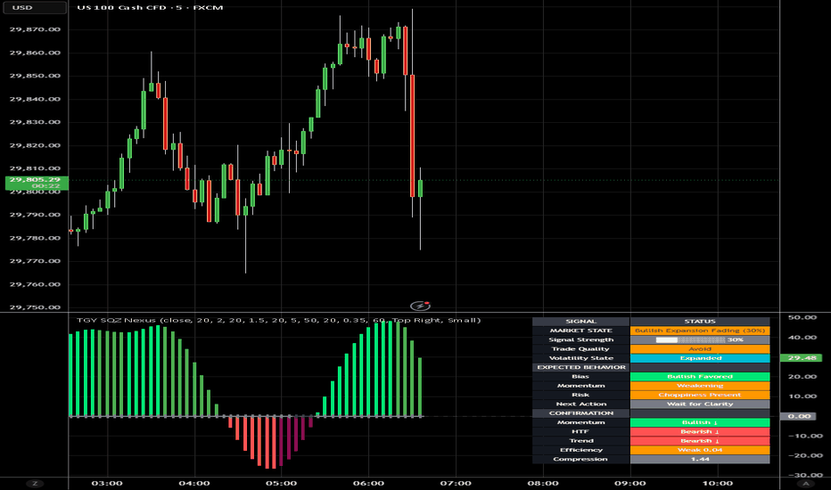
Helios Volatility Forecast is a Yang-Zhang volatility estimator with regime classification, a volatility cone (historical percentile bands), an HMA-smoothed forecast line, and a position-size suggestion. Volatility is classified into four regimes (LOW / NORMAL / ELEVATED / EXTREME) by percentile rank against its own history. Cross-pane elements paint a soft regime tint and a position-multiplier suggestion onto the price chart.
What makes it different
Most volatility indicators use a simple close-to-close standard deviation, which discards intraday range information and ignores overnight gaps. The Yang-Zhang estimator combines four components — overnight close-to-open variance, intraday open-to-close variance, and a Rogers-Satchell range term — into a single estimator that is more accurate than close-to-close for instruments that gap.
A 4-band volatility cone (5th, 25th, 50th, 75th, 95th percentile of the past 100 bars) is plotted around the current volatility, with gradient fills bracketing tails and the interquartile range.
A 4-regime classifier (LOW / NORMAL / ELEVATED / EXTREME by percentile thresholds at 25, 65, 90) drives a cross-pane tint on the price chart and a numeric position-size multiplier suggestion. The suggestion scales inversely with realized vol — wider sizes in low-vol regimes, halved sizes in extreme-vol regimes.
An HMA forecast line projects the smoothed vol trajectory ahead. Forecast-crossing-realized alerts fire when expansion or contraction is imminent.
How it works
Yang-Zhang formula combines overnight return, intraday return, and Rogers-Satchell range term, weighted by k = 0.34 / (1.34 + (len + 1) / (len - 1)).
Percentile rank of sigma_yz over a 100-bar history equals vol_pct.
Regime classification: LOW below 25, NORMAL 25 to 65, ELEVATED 65 to 90, EXTREME above 90.
HMA of sigma_yz equals the forecast. Forecast direction equals the sign of (forecast minus current).
Position-size multiplier equals clamp(1.5 minus vol_pct / 100, 0.3, 1.5).
Vol-of-vol (stdev of recent realized vol) feeds a regime stickiness indicator.
Reading the chart
In-pane : regime-tinted volatility line (vivid mint for LOW, neutral white for NORMAL, amber for ELEVATED, vivid red for EXTREME), HMA forecast line with direction-color flow, five vol-cone percentile lines.
Cross-pane : soft regime tint background on the price chart, plus a Size x0.50 EXTREME vol label updating each bar.
A vol-of-vol panel as a sub-strip at the top of the pane.
Five right-edge cone percentile labels (p5 / p25 / p50 / p75 / p95).
A current-vol percentile rank label.
Regime change timeline labels on the price chart at each regime transition.
Cross-pane vol-cone touch markers when vol crosses p95 (breakout) or p5 (contraction).
A regime stickiness indicator (how long the regime has been in its current state).
Forward expected-range lines on the price chart (close plus or minus forecast times ATR scalar).
Signals
Regime up / down (any percentile-bucket transition)
Extreme vol entry
Low vol entry
Vol breakout (sigma crosses above p95 of its own history)
Vol contract (sigma crosses below p5)
Vol Z-shock up / down (when vol z-score exceeds plus or minus 2)
Forecast cross up / down (forecast vs realized)
All gated on barstate.isconfirmed or barstate.ishistory. No future references. No lookahead_on.
Inputs
Volatility : Yang-Zhang window, regime percentile lookback, forecast HMA length.
Visual : bullish (low vol) color, bearish (extreme vol) color, elevated (amber) color, cone toggle, forecast toggle, cross-pane candles toggle, regime pulse toggle.
Dashboard : position, size.
How traders use this
Position sizing : scale entries inversely with the regime. Full size in LOW, default in NORMAL, half in ELEVATED, third in EXTREME. The multiplier label provides the suggested factor.
Volatility breakouts : vol crossing above p95 historically precedes large directional moves. Tighten trailing stops or reduce holding time.
Volatility contraction : vol crossing below p5 historically precedes range / chop. Reduce directional bias. Consider mean-reversion strategies.
Regime-aware stops : in ELEVATED or EXTREME regimes, ATR-based stops should be wider. In LOW regimes, tighter. The pos-mult label codifies this implicitly.
Limitations
Yang-Zhang assumes log-normal returns and lognormality breaks down during fat-tail events (it under-estimates vol in true crash regimes).
Percentile classification needs sufficient history. The default 100-bar lookback can be lengthened for stable instruments.
The position-size multiplier is a heuristic, not a portfolio-management recommendation. Combine with your own risk-management framework.
The HMA forecast lags slightly behind real-time changes. Treat as smoothed trend, not pinpoint prediction.
Compatibility
Pine Script v6 open-source indicator (pane plus cross-pane). Any symbol, any timeframe. Cross-pane elements use force_overlay=true. No request.security calls.
Defaults
20-bar Yang-Zhang window, 100-bar regime lookback, 5-bar HMA forecast, mint / red / amber palette, top-right medium dashboard.
Credits
Yang-Zhang estimator from D. Yang and Q. Zhang, Drift-Independent Volatility Estimation Based on High, Low, Open, and Close Prices , Journal of Business (2000).
Wskaźnik

EMA 40 Pullback Pyramid StrategyEMA 40 Pullback Pyramid Strategy
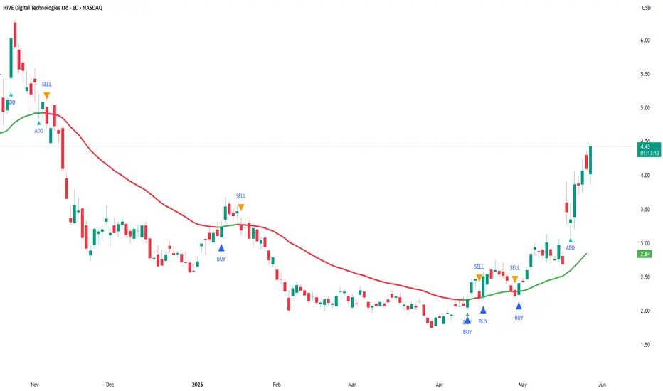
EMA 40 Pullback Pyramid Strategy is an educational trend-following strategy designed to study long-side entries around a rising 40-period Exponential Moving Average, with optional pullback re-entry logic, ADX trend-strength filtering, and EMA cross-based entry/exit conditions.
This is a strategy script, not a prediction tool and not financial advice. It is intended for research, backtesting, and forward-testing only. Historical results are hypothetical and can differ significantly from live trading due to slippage, commissions, liquidity, order execution, symbol behavior, timeframe selection, and market regime changes.
What the strategy does
The strategy uses the 40-period EMA as its main directional reference.
The EMA color changes according to its slope:
- Green EMA: the EMA is rising.
- Red EMA: the EMA is falling.
- Gray EMA: the EMA is flat or unchanged.
The strategy can enter long positions when selected bullish conditions occur and can close positions when selected bearish or exit conditions occur.
Core logic
1. EMA 40 trend direction
The strategy calculates a fast EMA using the selected EMA length. The default value is 40.
A bullish trend condition exists when the EMA is rising. A bearish condition exists when the EMA is falling.
The original base entry occurs when the EMA changes from not rising to rising, and ADX is above the selected minimum threshold.
2. ADX trend-strength filter
The strategy uses DMI / ADX to filter weak trend conditions.
A trade can qualify only when ADX is above the selected ADX threshold. The default threshold is 20.
This filter is intended to reduce entries during weak or sideways market conditions, but it does not eliminate false signals.
3. Pullback re-entry logic
When enabled, the pullback module looks for price to retrace toward the EMA by a selected ATR-based distance and then recover above the EMA.
The pullback condition uses:
- ATR length.
- Pullback distance multiplied by ATR.
- Recovery candle logic, where the candle closes above the EMA and closes above its open.
This feature is designed to study additional entries during an existing upward EMA trend. Because pyramiding is enabled, these pullback signals can add to an existing long position depending on the strategy settings.
4. EMA 40 cross signals
The strategy includes optional EMA cross buy/sell logic.
The cross detection mode can be:
- Close mode: uses close crossing above or below the EMA.
- Wick mode: uses wick interaction with the EMA followed by a close on the opposite side.
When “Use EMA cross signals in strategy orders” is enabled, these signals can participate in actual strategy entries and exits. When disabled, they can be used only as visual reference signals.
5. Minimum bars between entries
The strategy includes a minimum-bars-between-entries setting. This helps reduce immediate repeated entries and gives users control over signal spacing.
6. Pyramiding
The strategy uses pyramiding to allow multiple long entries when qualifying conditions appear. This is mainly intended to study whether adding into a trend after pullbacks improves or worsens the tested behavior.
Users should review this setting carefully. Pyramiding increases exposure and can materially increase both potential returns and potential drawdowns.
Default strategy properties
The script uses the following default strategy properties:
- Initial capital: 1,000
- Position sizing: percent of equity
- Default order size: 33% of equity
- Pyramiding: 3
- Commission: 0.1%
- Slippage: defined in the strategy settings
- Bar magnifier: disabled
- Calculate on every tick: disabled
- Process orders on close: disabled
These settings are included for testing purposes only. They may not be suitable for every market, timeframe, or trader. Users should adjust position sizing, commission, slippage, pyramiding, and test date range to reflect realistic conditions for the instrument being tested.
Important backtesting note
TradingView strategy results are simulations based on historical bar data. They are not live trading results.
Backtest results can change significantly depending on:
- Symbol
- Timeframe
- Date range
- Commission
- Slippage
- Liquidity
- Spread
- EMA length
- ADX threshold
- ATR length
- Pullback multiplier
- Minimum bars between entries
- EMA cross mode
- Whether EMA cross signals are used for orders
- Pyramiding setting
- Market regime
Users should test the strategy on a sufficiently large sample of trades and across different market conditions before drawing conclusions. A small number of trades is not enough to evaluate a strategy reliably.
How to use it
A practical workflow is:
1. Select the symbol and timeframe to test.
2. Use a realistic date range that includes different market conditions.
3. Review whether the strategy produces a sufficient number of trades.
4. Adjust commission and slippage to match the market being tested.
5. Review the impact of position size and pyramiding on drawdown.
6. Compare results with and without pullback re-entry.
7. Compare results with and without EMA cross signals being used for strategy orders.
8. Forward-test before considering any real-world use.
Inputs
Date Range
- Start Date: first date included in the test.
- End Date: last date included in the test.
Moving Average
- Fast EMA Length: controls the EMA used for trend direction, pullbacks, and cross signals.
DMI / ADX
- DI Length: DMI calculation period.
- ADX Smoothing: smoothing period for ADX.
- ADX minimum to trade: minimum ADX value required for qualifying trend entries.
Pullback Re-entry
- Enable pullback re-entry: enables or disables ATR-based pullback entries.
- Pullback distance × ATR: controls how close price must pull back toward the EMA.
- ATR Length: ATR period used for pullback distance.
Signal Control
- Minimum bars between entries: controls spacing between entries.
EMA 40 Cross Signals
- Use EMA 40 cross buy/sell signals: enables visual EMA cross signals.
- EMA cross detection mode: chooses Close mode or Wick mode.
- Use EMA cross signals in strategy orders: determines whether EMA cross signals affect actual strategy orders.
Visual elements
The script plots:
- The EMA line, colored by slope.
- Base entry markers.
- Pullback add-entry markers.
- Optional EMA cross buy/sell markers.
- Hidden ADX and ADX threshold plots available for reference.
Limitations
This strategy is long-side focused and does not create independent short positions.
The strategy can underperform during sideways or choppy market conditions, even with the ADX filter.
EMA-based systems are inherently lagging because moving averages react to prior price data.
ADX can confirm trend strength but does not determine trade direction by itself.
Pullback and pyramiding logic can increase exposure and may increase drawdown.
No strategy setting can guarantee profitability or future performance.
Recommended use
This strategy is best used as an educational framework for testing EMA trend continuation, ATR-based pullback re-entry, ADX trend-strength filtering, and pyramiding behavior.
It should be used with realistic backtesting assumptions, conservative risk controls, and additional independent analysis before any trading decision. Strategia

Wskaźnik

Compass | AnonycryptousCompass | Anonycryptous
Description & user manual
Credits
The weekly psychological level calculation in this indicator is based on open-source code originally published on TradingView. The original script was created by plasmapug. Continued development was done by infernixx, Peshocore, and xtech5192 in collaboration with TradersReality. Significant modifications have been made to integrate this component into the Compass framework.
Why this indicator is different
Most indicators answer one question. A moving average tells you the trend direction. An oscillator tells you momentum. A session box tells you the time. A volume indicator tells you participation. Each one is useful. None of them tells you where you are.
Before placing a trade, a trader needs to answer several questions simultaneously. What session is active and what does that mean for the type of price action to expect? Where does the macro trend stand? Is volume confirming the move or contradicting it? Are there open imbalances nearby that price may return to? How much of the day's expected range has already been consumed? Where are the key structural levels — pivots, the daily open, prior week references?
Answering each of these questions separately requires stacking tool after tool until the chart becomes unreadable. Compass answers all of them at once.
It is not a signal indicator. It does not fire arrows or tell you when to buy or sell. What it does is something more fundamental: it gives you a complete read of the market environment before any decision is made. Sessions, trend, volume, imbalances, range levels, pivots, psychological references — all in one overlay, all configurable, all on one chart.
The design philosophy is orientation first. Decision second. Compass tells you where you are. What you do with that is your responsibility.
Important notice
Compass does not generate trading signals.
It does not tell you when to buy or sell.
It does not predict market direction.
It does not replace your trading strategy or your own analysis.
All illustrative examples in this manual are for educational purposes only and are not trading recommendations.
All trading decisions remain entirely with the user.
Always apply your own judgment and manage your own risk.
1. Overview
Compass is a comprehensive market context indicator that combines eleven independent analysis frameworks into one unified overlay. Every component is individually toggleable. Six presets are included for different trading styles, from fast scalping to full multi-component analysis.
What it includes:
- Five-EMA suite with adaptive cloud around the EMA 50
- EMA crossover system with configurable signals and candle coloring
- Stochastic RSI background alerts with four alert types and RSI divergence detection
- PVSRA volume vector candle analysis with zone tracking and configurable thresholds
- Eight global market sessions with automatic DST awareness
- Average daily, weekly, and monthly range levels with 50% midpoints
- Classic pivot points with mid-point levels
- Daily open reference line with historical opens
- Fair value gap detection with partial absorption tracking
- Weekly psychological level tracking
- Live dashboard with eighteen data points across all active components
2. EMA suite
Five exponential moving averages are plotted simultaneously: EMA 5, EMA 13, EMA 50, EMA 200, and EMA 800. Together they cover short-term momentum, medium-term trend direction, macro trend, and long-term structural bias.
The EMA 50 is wrapped in a dynamic cloud calculated from two standard deviations of price. The cloud expands during volatility and contracts during consolidation. A widening cloud indicates active price discovery. A thinning cloud indicates equilibrium or compression before a directional move.
The EMA 200 is the primary macro bias filter. Price above it defines a broadly bullish environment. Price below it defines a broadly bearish environment. This is shown in the dashboard at all times.
The EMA 800 provides long-term structural context, particularly useful on mid to higher timeframes where it marks the gravitational center of multi-month price structure.
All five EMA lengths are configurable. Each has individual color and transparency controls. An EMA label option displays the current value at the right edge of each line.
3. EMA cross system
The EMA cross tracks a configurable fast EMA crossing a configurable slow EMA and marks the crossover bar. All candles after a cross continue in the direction of that cross until the opposite cross fires.
Three display modes are available: show both the fast and slow EMA lines, show a single consolidated EMA line, or hide the EMA lines entirely while keeping the crossover signals visible.
This component is a trend state indicator, not a trade trigger. A bull cross does not mean buy. It means the short-term trend has shifted upward relative to the medium-term average.
Signals and candle coloring can be toggled independently.
4. Stochastic RSI
The stochastic RSI component runs a standard stochastic RSI calculation and generates background color alerts based on crossover conditions at configurable band levels.
Four alert types are available, each independently toggleable:
Middle band crossover — K line crosses D line near the 50 level. Indicates a possible trend shift in momentum.
Overbought/oversold crossover — K line crosses D line from overbought or oversold territory. Indicates a potential reversal from an extreme.
Entering overbought — K line crosses above the upper band. Indicates that momentum has moved into overbought territory.
Entering oversold — K line crosses below the lower band. Indicates that momentum has moved into oversold territory.
The dashboard displays the current stochastic RSI state and the RSI value. RSI appears in green when above the midline and in red when below. Regular bullish and bearish divergence is detected automatically and shown in the dashboard as a directional label. When divergence is active, a thin reference line appears on the price chart marking the divergence candles.
5. PVSRA volume vector analysis
PVSRA analysis colors candles based on volume relative to the 10-bar average and the relationship between volume and candle spread.
Four vector types:
Green vector — bullish bar where volume is at or above the green/red threshold (default 200% of the 10-bar average), or where volume multiplied by spread is the highest of the last 10 bars. Indicates strong bullish institutional participation.
Red vector — same conditions on a bearish bar. Indicates strong bearish institutional participation.
Blue vector — bullish bar where volume is at or above the blue/violet threshold (default 150% of average). Indicates elevated bullish volume below the institutional threshold.
Violet vector — same conditions on a bearish bar. Indicates elevated bearish volume.
Grey — no vector conditions met. Normal volume.
Both thresholds are configurable directly from the settings panel. Blue and violet signals are strictly exclusive from green and red — a bar cannot qualify for both simultaneously.
Vector candle zones draw boxes at each vector candle location and remain active until price moves through the zone, marking areas where elevated institutional activity was detected at the time the candle formed.
The PVSRA override input allows a different symbol to be used for the volume calculation. This is useful when the charted instrument has unreliable volume data, such as CFDs, perpetual swaps, or instruments where the primary volume is on a related market.
6. Market sessions
Eight global trading sessions are tracked simultaneously, each with automatic DST awareness. Sessions are displayed as expanding boxes with high and low lines and a real-time label showing the session open.
Sessions included:
- London: 08:00–16:30 UTC
- New York: 14:30–21:00 UTC
- Tokyo: 00:00–06:00 UTC
- Hong Kong: 01:30–08:00 UTC
- Sydney: 22:00–06:00 UTC
- EU brinks: 08:00–09:00 UTC
- US brinks: 14:00–15:00 UTC
- Frankfurt: 07:00–16:30 UTC
DST is handled automatically for London, New York, and Sydney. No manual adjustment is needed. Each session can be toggled individually, and box color, transparency, and label color are fully configurable per session.
Session context matters because market behavior differs significantly depending on which participants are active. London and New York overlap produces the highest volume and fastest price movement. Tokyo and Sydney sessions tend to consolidate. The brinks windows mark the transition periods where session highs and lows often form.
7. Range levels
Three statistical range frameworks measure the expected price range for the current period based on historical averages.
Average daily range (ADR) — the expected high and low for the current trading day. When price reaches the ADR level, the day's expected range has been consumed. Moves beyond the ADR are extension moves that occur with lower statistical probability and often mean-revert. The dashboard shows ADR % used — how much of today's expected range has already been consumed. Above 80% indicates the day is approaching its expected limit.
Average weekly range (AWR) — the same concept applied to the current week. Useful for assessing how much room the week has left to move.
Average monthly range (AMR) — the same concept applied to the current month. Provides macro context for position sizing and target expectations.
Each framework includes a 50% midpoint level marking the center of the expected range. The ADR measure from daily open option calculates the range starting from that day's open price rather than the statistical high, making the levels static for the entire day.
All three frameworks have individual lookback period inputs, color controls, line styles, and label toggles.
8. Pivot points
Classic pivot points are calculated from the prior day's high, low, and close. Levels include PP, R1/S1, R2/S2, R3/S3, and M mid-point levels between each major level.
Pivot points provide structural reference for the current session. Price above PP defines a broadly bullish day structure. R levels act as potential resistance targets. S levels act as potential support targets. M levels provide intermediate precision references between major pivots.
All levels can be toggled individually. Lines extend rightward from the prior session and can optionally extend in both directions. Each level has individual color and line style controls.
9. Daily open
A horizontal line marks the current day's opening price. This is one of the most referenced structural levels among short-term traders because it defines the starting point for the day's price discovery.
Price above the daily open reflects a bullish session bias. Price below reflects a bearish session bias. When price oscillates around the daily open without committing direction, the session is in balance — a lower probability environment for trend trades.
Historical daily opens can optionally be shown as reference for prior day context.
10. Fair value gaps
A fair value gap is a three-bar imbalance where price moved through a range without leaving two-sided trade — the low of the upper candle is above the high of the lower candle (bullish gap) or vice versa (bearish gap). These areas represent unfinished business where the market may return to achieve balance.
Gaps are filtered by a minimum width threshold expressed as a multiple of ATR. Gaps narrower than the threshold are excluded. Partial absorption is tracked — as price returns into the gap, the fill color changes to show how much of the imbalance has been recovered.
Fully mitigated gaps can be kept on the chart as historical reference or deleted automatically to maintain a clean view.
11. Psychological levels
Weekly psychological levels mark the prior week's high and low as calculated by a specific session-anchored method. These levels represent deliberate structural references where participants have previously committed size — breakouts and rejections around these levels tend to be more intentional than random price noise.
Three GMT offset options accommodate the session anchor calculation for different global market structures. Two mode options are available: crypto (weekly reset on Saturday Sydney open) and forex (weekly reset on Monday Tokyo open).
12. Settings reference
Preset
- Custom: full manual control over all settings.
- Clean scalper: sessions, EMA suite, FVG, subtle candle coloring. Low noise.
- Full context: everything on, medium transparency. Best for analysis.
- Signal focus: EMA cross, stoch RSI background, PVSRA bar color prominent. Rest subtle.
- Minimal: sessions, daily open, ADR only. No signals.
- PVSRA pro: PVSRA and vector candle zones central. EMA 200 and 800 only.
Global settings
- Master opacity offset (custom preset only): shifts all transparency values simultaneously.
- Show bull/bear label text: shows or hides text on EMA cross signal triangles.
EMA suite
- Show EMA suite and labels
- Individual EMA color and transparency controls
- EMA cloud fill and border transparency
- EMA line width
EMA cross
- Show EMA cross signals
- Fast EMA, slow EMA, and consolidated EMA lengths
- Show both EMAs or consolidated only
- Bull, bear, and neutral colors and transparency
- Cross EMA line width
Stochastic RSI
- Show stochastic RSI background alerts
- RSI length and stochastic length
- Overbought and oversold band levels
- Individual alert type toggles (four types)
- Alert colors and transparency
- RSI divergence lookback period
- Divergence line color and width
PVSRA
- Vector colors (red, green, violet, blue, regular up/down)
- Green/red threshold (× average volume, default 2.0)
- Blue/violet threshold (× average volume, default 1.5)
- Include spread filter for green/red classification
- Override symbol toggle and input
- Show vector candle zones with transparency and width settings
Candle coloring
- Enable candle coloring
- Coloring mode: EMA cross / PVSRA / EMA 200 / off
- Bull and bear candle color and transparency
Market sessions
- Show market sessions
- Session timezone
- Show sessions on weekends
- Session high/low line style and width
- Per session: toggle, box color, transparency, label color
Range levels
- Show ADR, AWR, AMR (individual toggles)
- Lookback periods for each
- Show 50% midpoint levels
- Measure from daily open (ADR only)
- Color, transparency, line width, line style, labels
Pivot points
- Show PP, R1/S1, R2/S2, R3/S3, M levels individually
- Show labels
- Extend lines both directions
- Individual level colors and line styles
- Pivot line width
Daily open
- Show daily open
- Show label
- Show historical daily opens
- Color, transparency, line width
Fair value gaps
- Show fair value gaps
- Width filter (ATR multiplier)
- Extend to current bar
- Bullish and bearish FVG colors
- Mitigation fill colors
- Keep historical FVGs after mitigation
Psychological levels
- Show psy levels and labels
- Show historical psy levels
- GMT offset (GMT+1, GMT+2, GMT+3)
- Psy type: crypto or forex
- High and low colors and transparency
Dashboard
- Show dashboard
- Position: top left, top right, bottom left, bottom right
- Size: tiny, small, normal
13. Dashboard reference
The dashboard provides eighteen live data points across all active components:
Session — the currently active market session.
EMA cross — current EMA cross direction: bull or bear.
EMA 200 — whether price is above or below the EMA 200.
Stoch RSI — current stochastic RSI condition.
RSI — current RSI value, colored green above midline and red below.
RSI divergence — active bullish or bearish divergence, or none.
PVSRA — current candle vector type.
ADR % used — how much of today's expected daily range has been consumed.
FVG active — count of open unmitigated fair value gaps and mitigation percentage.
Psy level — whether price is above or below the prior week's psychological level.
Timezone — active session timezone setting.
VCZ active — count of active vector candle zones above and below current price.
Pivot PP — current pivot point value.
Daily open — current daily open price and direction.
14. How to use
14.1 Initial setup
Select a preset that matches your primary trading style. Adjust the session timezone to match your location or your primary exchange. If you trade an instrument with unreliable volume data, enable the PVSRA override and set it to a correlated liquid instrument. Set the ADR lookback period to your preference — 14 days is a standard starting point. For FVGs, set the width filter to 0.5 or higher to exclude minor gaps.
14.2 Reading the dashboard
The dashboard is the fastest way to orient yourself on a new chart or a new session. Check session, EMA cross direction, EMA 200 position, stoch RSI state, and ADR consumed before anything else. Five seconds to a full picture of where the market stands.
14.3 Reading the chart
Check EMA alignment. When EMA 13, EMA 50, and EMA 200 are stacked in the same direction, the trend is more significant than a single crossover. Divergence between them reflects a transition or competing timeframe pressures.
Check ADR percentage. Below 50% means the day has statistical room to move. Above 80% means the day is near its expected limit and extension moves are less probable.
Look for open FVGs near current price. An unmitigated FVG in the direction of the prevailing trend is a precision reference area where price has historically returned.
Check the psy level. If price is approaching the prior week's high or low, be aware that participant behavior around those references tends to be deliberate.
14.4 Timeframe guide
1 minute to 3 minutes — clean scalper preset, candle coloring set to EMA cross.
5 minutes to 15 minutes — clean scalper or signal focus preset.
30 minutes to 1 hour — full context preset, use ADR and pivot points.
4 hours to daily — full context or minimal preset.
14.5 Tips
PVSRA override — use when your broker's volume data is unreliable, when you trade a CFD or derivative with synthetic volume, or when you want spot market volume for a futures chart.
Master opacity offset — adding 10 to 20 increases overall transparency and dims the chart if it feels cluttered. Subtracting 10 to 20 makes all elements more prominent. This shifts all transparency values simultaneously without changing individual settings. Only active in custom preset.
Not every component needs to be active at once. Most traders will find three to four components provide the context they need for their specific setup.
15. Disclaimer
This indicator is provided for educational and informational purposes only.
Nothing in this document constitutes financial advice or any form of trading recommendation.
Trading financial instruments involves substantial risk of loss.
Past performance is not indicative of future results.
You may lose all of your invested capital.
All trading decisions are made entirely by the user.
Use at your own discretion.
Wskaźnik

Executed Volume Restraint Zones - Bigger Candle RangeExecuted Volume Restraint Zones
This indicator detects potential buy and sell restraint zones using actual traded volume, candle rejection, wick behavior, and ATR-based zone sizing.
It does not use pending order book data. Instead, it focuses only on executed market activity shown through chart volume.
How it works:
A SELL zone is created when a high-volume candle pushes upward but gets rejected with a strong upper wick. This may suggest sellers absorbed buying pressure and stopped price from moving higher.
A BUY zone is created when a high-volume candle pushes downward but gets rejected with a strong lower wick. This may suggest buyers absorbed selling pressure and stopped price from moving lower.
The indicator compares current candle volume against a moving average volume baseline. By default, it uses 200 candles to define normal volume. When volume is significantly higher than average and the candle shows rejection, a zone is drawn.
Label meaning:
V = volume of the candle that created the zone.
T = estimated volume traded inside the zone during later retests.
# = how many times price has touched/retested the zone.
STRONG = the zone has been touched enough times based on the user setting.
Main features:
- Detects buy and sell executed-volume restraint zones
- Uses high-volume rejection candles
- Uses ATR to control zone thickness
- Tracks future zone retests
- Estimates volume traded inside each zone
- Marks stronger zones after repeated touches
- Auto-removes invalidated zones
- Multi-column adaptive labels to reduce chart overlap
- Adjustable volume, ATR, wick, body, label, and zone settings
Best used on intraday charts such as 5m, 15m, 30m, and 1h.
Important note:
This indicator does not show real order book or hidden limit orders. TradingView Pine Script cannot access live Level 2 / DOM order book data. The zones are based only on executed volume from OHLCV candles. Wskaźnik

Phase Exhaustion Reversal [BullByte]Phase Exhaustion Reversal (PXR) is an intraday reversal engine that measures one specific market phenomenon: the moment a short-horizon directional burst exhausts itself against a broader structural gradient. It is built on a single mathematical primitive - directional efficiency - applied at two horizons, and turns the gap between them into an exhaustion-detection framework.
This is not a mashup of existing indicators. The entire engine is derived from one calculation family: how cleanly price travels over a window. The regime classifier, the signal trigger, the risk engine, and the dashboard are all layers of that single concept rather than separate components.
---
Why This Indicator Exists
Most reversal tools fire on oscillator extremes or candlestick patterns. They answer the question "is price stretched?" but not "has the energy actually run out? " A market can stay stretched for a long time before reverting. PXR was built to answer a more precise question: when has a short-horizon momentum burst exhausted its energy against the prevailing structural direction? That moment - the exhaustion-and-recede - is what PXR isolates.
The phenomenon being studied can be observed on historical price data.
When price moves with high short-horizon efficiency in a direction that contradicts the medium-horizon efficiency gradient, that move is consuming energy faster than structure supports. Such bursts can appear to exhaust and then realign with the broader gradient on historical data. PXR visualizes that potential realignment as an observation worth studying.
---
Why a Trader Might Use It
Intraday traders on 5-minute and 15-minute charts frequently face counter-trend bursts that look like reversals but are actually just temporary dislocations. PXR offers a structured way to read those bursts: it waits for the burst to peak, confirms the peak has begun receding, and only then marks the realignment as armed. The next-bar open execution model means the entry price on the chart matches what a real-time observer could actually have achieved.
PXR is designed for traders who want a single coherent reading of market state - regime, bias, setup progression, and signal - rather than juggling multiple unrelated indicators.
---
The Concept
Imagine price as a hiker walking through terrain. Two things can be measured about that hiker over any window of time:
One - how far they ended up from where they started. This is transport.
Two - how much total ground they covered while getting there. This is agitation.
The ratio of transport to agitation is efficiency. If a hiker walked 100 meters in a straight line, transport equals agitation, and efficiency is 1.0 - perfectly directional. If a hiker zigzagged 500 meters total but ended up only 100 meters away, efficiency is 0.2 - most of the energy was wasted on the zigzag.
PXR computes this efficiency at two horizons simultaneously. The short horizon (around 35 minutes of bars, regardless of timeframe, by default) captures reactive bursts. The medium horizon (around 2 hours of bars by default) captures the structural gradient - the broader direction price is actually flowing in.
When the short-horizon efficiency spikes far from the medium-horizon efficiency, the two have dislocated. PXR normalizes this dislocation into a value called the Phase Gap. When the Phase Gap stretches to an extreme and then begins to recede, the short-horizon burst is exhausting. If the medium-horizon gradient points the opposite direction at that moment, PXR marks a realignment signal - the observed behavior is a possible realignment with the structural gradient.
---
What Makes This Different From a Standard Momentum Tool
Three architectural choices separate PXR from typical oscillator-based reversal tools.
First, the use of two-horizon efficiency phase-gap normalization. The raw difference between two efficiency readings is rescaled by its own rolling maximum so the threshold stays meaningful across all volatility regimes. A 0.6 reading means the same thing on a quiet day as on a volatile one.
Second, regime-conditional adaptive thresholds. The signal threshold is not a fixed constant. It adapts based on whether the market is currently classified as Extended (clean trend), Compressed (range), Transitioning (regime shifting), or Neutral. Each regime gets a different sensitivity, and each timeframe gets its own scaling on top of that.
Third, an exhaustion-and-recede state machine gated by structural gradient sign. The signal does not fire when the Phase Gap simply crosses a level. It fires only when the gap has first reached a qualified peak and then receded by a meaningful fraction of that peak - confirming exhaustion has begun - and only when that exhaustion direction opposes the sign of the medium-horizon efficiency. This is a directional fade of short-horizon energy against the prevailing structural gradient.
---
Mathematical Foundation
The script is built from three primitive calculations. All other logic flows from these.
Transport over n bars equals close minus close n bars ago. This measures net displacement.
Agitation over n bars equals the sum of absolute bar-to-bar price changes across that window. This measures total path length.
Efficiency over n bars equals transport divided by agitation. This produces a signed value bounded between -1 and +1. Positive values indicate net upward directional purity, negative values indicate net downward directional purity, and values near zero indicate chop.
The Phase Gap is the short-horizon efficiency minus the medium-horizon efficiency, divided by the rolling maximum of the absolute raw gap. This normalization keeps the Phase Gap roughly within plus or minus one regardless of market conditions.
A realignment signal fires when the Phase Gap has peaked beyond a regime-adjusted threshold and then receded by a meaningful fraction of that peak, AND the sign of the medium-horizon efficiency points in the direction opposite to the burst that just exhausted.
This calculation family is conceptually related to efficiency-ratio style measurements. PXR's originality lies in the multi-horizon phase-gap construction, the regime-adaptive thresholding, and the exhaustion-and-recede state machine.
---
Recommended Timeframes and Markets
PXR is built for intraday operation. The timeframe-adaptive logic is tuned for 1-minute through 15-minute charts. The default Auto-Scale setting recalibrates the horizons so the same physical time window of analysis is used regardless of timeframe.
The phenomenon PXR studies appears most cleanly on liquid intraday instruments. Crypto majors such as BTCUSDT and ETHUSDT on 5-minute and 15-minute charts work well because crypto exhibits meaningful path tortuosity - the agitation-to-transport ratio carries real information. Index futures such as NQ and ES on 5-minute and 15-minute charts also work, though session boundaries can affect the normalization window on overnight sessions.
PXR is built for intraday use. Higher timeframes such as 1H, 4H, or daily may behave differently because the regime thresholds and recede fractions are tuned for intraday energy cycles rather than multi-day structural shifts.
---
Chart Examples
The two examples below are illustrative historical signals chosen to show the engine's mechanics and visual elements. They are not representative of typical or expected outcomes. Many signals fail and reach the INVALIDATION level instead. These examples are educational only.
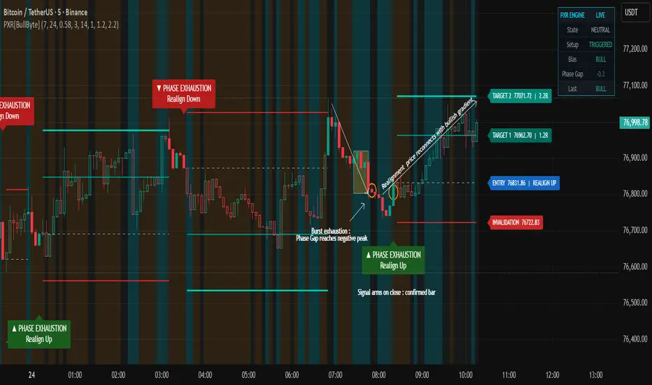
1. Example - Bull Realignment on BTCUSDT 15m
The annotated chart shows a complete PXR realignment cycle.
Price experienced a sharp short-horizon bearish burst from roughly 77,650 down to 76,150. During this drop, the medium-horizon efficiency gradient remained bullish - the slower 24-bar window still carried the structural upward bias from earlier hours. The yellow diagonal line traces this bullish medium-horizon gradient that the bearish burst was working against.
At the bottom of the move, the Phase Gap reached its negative peak . The bearish burst's energy was fully spent. The yellow rectangle marks the exhaustion zone where two indecision candles stalled the fall.
Beginning shortly after, the Phase Gap began receding from its negative peak. Once it had receded by the configured fraction, the exhaustion-and-recede condition was satisfied. The medium-horizon efficiency was still positive, so the structural gradient gate qualified the direction. The state machine flipped upward and the signal armed on the close of the trigger bar.
On the next bar, the entry executed at the open at 76,410. The four rails drew automatically - INVALIDATION at 75,982, TARGET 1 at 76,923, TARGET 2 at 77,351.
In this illustrative example, the price moved upward after the signal and later reached TARGET 1 and TARGET 2. This is one historical instance only. Outcomes vary, and many signals reach the INVALIDATION level instead.
2. Example - Bear Realignment and Engine
This chart illustrates three aspects of PXR that complement the phenomenon view.
First, the engine is bidirectional. The red downward callout marks a BEAR realignment signal. A short-horizon bullish burst pushed price upward over several hours. When that burst exhausted near 77,400, the Phase Gap reached its positive peak . As the gap began receding and the medium-horizon gradient pointed bearish, the exhaustion-and-recede condition triggered a BEAR signal . The four rails drew at INVALIDATION 77,465, ENTRY 76,765, TARGET 1 75,925, and TARGET 2 75,226.
Second, the regime ribbon is visible across the background. Subtle orange tints mark COMPRESSED periods where both efficiencies are low and the market is consolidating. Subtle cyan tints mark TRANSITIONING periods where the Phase Gap has stretched far and a regime shift is underway. These background colors give an at-a-glance read of market state without requiring a glance at the dashboard.
Third, the live dashboard in the top-right shows engine state in real time. State, Setup, Bias, Phase Gap, and Last all update on every bar. The five-line legend overlay explains what each field represents. At the moment of this screenshot, the BEAR signal was Triggered, the regime was COMPRESSED , and the Phase Gap reading was -0.07 - a sign the dislocation had largely normalized after the signal fired.
Together with the dashboard and regime ribbon, the engine provides a continuous reading of market state - not just point-in-time signals, but a live framework that contextualizes each signal as it forms.
---
How to Read the Chart
PXR draws several elements. Each one represents something specific.
The PHASE EXHAUSTION label, marked with an upward or downward arrow, appears at the bar where the signal arms. An upward arrow with the text " Realign Up " means a short-horizon bearish burst has exhausted against a bullish gradient , and the studied behavior is upward realignment. A downward arrow means the opposite. The label is anchored outside the bar's price extreme so it does not clash with other chart elements.
The ENTRY rail is a dashed line drawn at the open of the bar immediately after the signal armed. This is the reference entry level. The script does not place orders - it visualizes the reference level a real-time user could have acted on.
The INVALIDATION rail is a solid red line. If price reaches this level, the realignment thesis is rejected. This level is calculated as the worse of two values: a structural swing high or low with an ATR buffer, or a minimum ATR-floored distance from entry. Whichever is further from entry is used. This guarantees the invalidation level is never crammed inside short-term noise.
The TARGET 1 and TARGET 2 rails are teal solid lines placed at user-configurable R-multiples of the invalidation distance. These represent profit objectives. The defaults are 1.2R and 2.2R, which can be modified in the Risk Settings group.
All four rails extend forward bar by bar while the trade is conceptually active, and their labels trail slightly ahead of the live bar so they remain visible at the right edge of the chart.
The regime ribbon is a subtle background tint. Red indicates an Extended regime, orange indicates Compressed, cyan indicates Transitioning, and faint grey indicates Neutral. The ribbon helps users see at a glance which regime the engine currently classifies the market in.
The active tint colors bars green during an active long observation and red during an active short observation. This is purely visual and can be toggled off.
---
How to Read the Dashboard
The dashboard sits in the top-right of the chart and shows six live readings.
State shows the current regime classification. Extended means the medium-horizon efficiency is high - the market has a clean directional gradient. Compressed means both efficiencies are low - the market is ranging. Transitioning means the Phase Gap has stretched far - a regime change is in progress. Neutral means none of the above.
Setup shows the realignment setup progress. No Setup means nothing is forming. Forming means the Phase Gap has reached 60 percent of the threshold. Watching means the Phase Gap has reached 85 percent of the threshold - a setup is building but no signal has fired yet. Armed means a confirmed signal has fired and is awaiting next-bar execution. Triggered means a trade observation is currently active.
Bias shows the direction of the medium-horizon efficiency gradient. BULL means the structural gradient points up. BEAR means it points down. A dash means it is neutral.
Phase Gap shows the live normalized Phase Gap value, roughly bounded within plus or minus one. The color brightens when the absolute value exceeds the threshold.
Last shows the direction of the most recently triggered realignment.
---
Settings Explained
Core Settings.
Auto-Scale Horizons: when on, the Short and Medium horizons are automatically recomputed per timeframe so the analysis covers similar physical time on every chart. When off, the manually entered horizon lengths are used. Recommended on for users who switch between timeframes.
Short Horizon: bars used to measure short-horizon efficiency. Lower values are more reactive but noisier. Default 7. Ignored when Auto-Scale is on.
Medium Horizon: bars used to measure the structural efficiency gradient. Should span one meaningful intraday cycle. Default 24. Ignored when Auto-Scale is on.
Phase Gap Threshold: the normalized Phase Gap level required for a peak to qualify as exhaustion-grade. Higher values yield fewer but stronger signals. Default 0.58.
Cooldown Bars: minimum bars between two consecutive signals. Prevents clustering during noisy regimes. Default 3.
Risk Settings.
ATR Length: the ATR window used for the volatility-based stop floor. Default 14.
ATR Floor Multiplier: minimum stop distance expressed as a multiple of ATR. Ensures the stop is never inside short-term noise. Default 1.0.
TP1 R-Multiple: first profit target expressed as a multiple of the invalidation distance. Default 1.2.
TP2 R-Multiple: final profit target expressed as a multiple of the invalidation distance. Default 2.2.
Visuals.
Show Regime Ribbon: toggles the background regime tint.
Show Active Tint: toggles the green or red bar coloring during an active observation.
Show Dashboard: toggles the top-right state dashboard.
---
Execution Model - Why This Is Honest
PXR uses a strict two-bar workflow. The signal arms only on the close of a confirmed bar - this is enforced by a barstate-confirmed gate inside the engine. The entry then executes at the open of the next bar. This means the entry price shown on the chart matches what a real-time user could have achieved by placing a market order the moment the signal arms.
This workflow prevents the most common form of repaint illusion. The script does not use lookahead data. It does not use future bars. It does not modify past signal positions. Historical signals on the chart represent the same logic that fires in real time.
---
What the Indicator Does Not Do
PXR does not predict future price. It identifies a measurable energy state and labels the observation. It does not place trades. It does not guarantee outcomes. It does not work on all markets in all conditions. It is not a substitute for risk management, position sizing, or contextual judgment.
The realignment behavior is an observed tendency on historical data, not a certainty or guarantee.
The invalidation rail exists precisely because failure is expected and must be bounded.
---
Limitations You Should Know
Session boundaries on instruments such as NQ and ES can compress the rolling normalization window during overnight low-liquidity periods. This can make the Phase Gap appear weaker than it would on a continuous session.
The engine is intentionally reversal-focused. It does not generate continuation signals. In strong trending markets, reversal signals may underperform compared to a continuation tool because the structural gradient is not exhausting - it is reinforcing itself.
Auto-Scale produces horizon values that may differ substantially from the manual input defaults. If a user toggles Auto-Scale off after operating with it on, the manual values will be used immediately and behavior will shift.
On very long historical lookbacks at 1-minute resolution, the efficiency calculation may require additional processing time due to the bar-by-bar path-length computation. If performance is a concern, reducing the Medium Horizon input or enabling Auto-Scale on faster timeframes will reduce the load.
---
Disclaimer
This script is provided for educational and analytical use only. It does not provide financial, investment, or trading advice. It does not guarantee any specific outcome. Past behavior of the indicator on historical data does not imply future results. Markets carry risk. Use independent judgment, sound risk control, and full market context before acting on any signal or observation produced by this tool. The author is not responsible for any decisions made on the basis of this script.
Wskaźnik

Roy CCI Price BandRoy CCI Price Band
Roy CCI Price Band is a momentum-volatility indicator that combines the strength of the Commodity Channel Index (CCI) with a dynamic Bollinger-style price band system to help traders identify bullish pressure, bearish pressure, volatility expansion, and potential reversal zones directly on the price chart.
Unlike traditional CCI indicators that appear in a separate lower panel, this indicator transforms CCI momentum into a live adaptive price wave that reacts dynamically to market conditions.
The bands expand during strong momentum and volatility, and contract during slow or sideways market conditions.
This indicator is highly suitable for:
Trend following
Momentum breakout trading
Pullback trading
Volatility analysis
Scalping and intraday trading
Mobile TradingView users
━━━━━━━━━━━━━━━━━━
FEATURES
━━━━━━━━━━━━━━━━━━
• Dynamic CCI Price Band
• Bullish & Bearish Volatility Wave
• Adaptive ATR Expansion System
• Dynamic Momentum Pressure Detection
• Trend Balance Middle Line
• Reversal Dot Signals
• Mobile Friendly Visualization
• Adjustable Opacity & Color System
• Smooth Cinematic Band Display
━━━━━━━━━━━━━━━━━━
HOW TO READ THE INDICATOR
━━━━━━━━━━━━━━━━━━
GREEN BAND = BULLISH MOMENTUM
When the band turns green, it indicates bullish momentum is dominating the market.
The larger and wider the green band becomes:
→ the stronger the buying pressure.
━━━━━━━━━━━━━━━━━━
RED BAND = BEARISH MOMENTUM
When the band turns red, it indicates bearish momentum is dominating the market.
The larger and wider the red band becomes:
→ the stronger the selling pressure.
━━━━━━━━━━━━━━━━━━
EXPANDING BAND
When the upper and lower bands move further apart:
→ market volatility is increasing.
→ this often happens during strong trends or breakout movements.
━━━━━━━━━━━━━━━━━━
CONTRACTING BAND
When the band becomes narrow:
→ the market is slowing down or moving sideways.
This condition often appears before a major breakout occurs.
━━━━━━━━━━━━━━━━━━
WHITE MIDDLE LINE
The white middle line represents the equilibrium or trend balance area.
Price above the white line:
→ bullish bias.
Price below the white line:
→ bearish bias.
━━━━━━━━━━━━━━━━━━
SIGNAL DOTS
Green dot:
→ potential bullish momentum recovery.
Red dot:
→ potential bullish weakness or bearish reversal.
━━━━━━━━━━━━━━━━━━
SUGGESTED USAGE
━━━━━━━━━━━━━━━━━━
• Use together with market structure or support & resistance
• Highly effective when combined with EMA or trend filters
• Suitable for XAUUSD, Forex, Crypto, and Indices
• Works best in trending market conditions
• Recommended timeframes:
Scalping: M1–M5
Intraday: M15–H1
Swing Trading: H4–D1
━━━━━━━━━━━━━━━━━━
RECOMMENDED SETTINGS
━━━━━━━━━━━━━━━━━━
Band Fill Opacity: 85
Band Line Opacity: 50
Middle Line Opacity: 40
Band Strength: 1.5
━━━━━━━━━━━━━━━━━━
DISCLAIMER
━━━━━━━━━━━━━━━━━━
This indicator is designed to assist market analysis and does not guarantee profits. Always apply proper risk management before entering any trade. Wskaźnik

Wskaźnik

RocketFlowRocketFlow is a volatility-compression breakout indicator designed to identify when price is preparing to aggressively challenge or cross the Ichimoku Cloud. The system combines cloud structure, ATR-based resistance proximity, momentum acceleration, candle expansion, RSI pressure, trend behavior, and compression analysis to detect high-pressure market conditions before expansion moves occur. Signals are graded into multiple strength tiers based on breakout quality, momentum force, and structural alignment, helping traders identify early pressure buildup as well as stronger breakout attempts. The indicator is built around the idea that explosive moves often originate from compressed price action positioned just beneath key resistance zones, particularly near the Ichimoku Cloud and ATR-defined pressure areas.
In addition to the Rocket breakout system, the indicator also includes ATR-based LONG signals designed to detect reclaim setups, support holds, and momentum continuation opportunities near dynamic ATR support zones.
The visual system is designed to show the different stages of breakout development and post-signal behavior:
Red, yellow, and dark green circles represent “Pre-Rocket” formation stages, showing when pressure and momentum are beginning to build beneath the cloud before a full breakout signal is confirmed.
Green and aqua triangles represent Rocket breakout signals. Smaller green triangles indicate weaker or earlier breakout attempts, while larger aqua triangles represent the strongest “God Rocket” expansion conditions with the highest momentum and breakout quality.
LONG triangles below price represent ATR Support LONG signals triggered from reclaim or support continuation setups.
Orange and red squares monitor post-breakout behavior. Orange squares warn of weakening momentum or rejection behavior after a launch, while red squares indicate more serious breakdown or stop-risk conditions.
Yellow and green lower squares track healthy pullbacks and potential re-entry opportunities after an initial breakout move.
The purple ATR line acts as a dynamic volatility-based support and trailing structure level.
The Ichimoku Cloud itself functions as the primary resistance and pressure zone the system is attempting to predict price crossing through. Wskaźnik

Wskaźnik
Crowded Trend Exhaustion Index [TradeDots]Crowded Trend Exhaustion Index
Summary
This indicator measures how statistically crowded the current trade has become and reports the reading on a 0 to 100 scale with four named tiers: Healthy, Late, Crowded, and Climax Risk. It is not a top or bottom caller. The goal is to give traders an explicit picture of how stretched price has become relative to historical context, so they can avoid late entries, tighten stops, or take profit when the reading enters extreme territory.
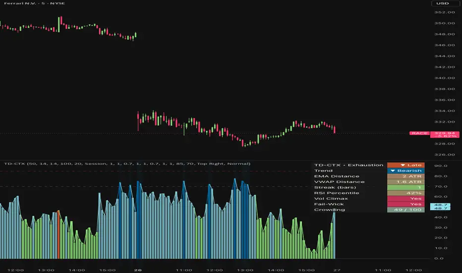
Eight independent factors are combined into the composite score. The pane shows a histogram of the score plus reference lines at the tier thresholds; the background of the pane is tinted when the reading enters the Crowded or Climax Risk tier; a dashboard summarizes the contributing factors.
What is original here
Many public indicators measure one dimension of exhaustion (most commonly distance from a moving average, or RSI level). The contribution of this script is the combination of eight diverse factors that together describe trade crowding from different angles: spatial extension (EMA distance, VWAP distance), persistence (consecutive same-direction candles), momentum exhaustion (RSI percentile), participation extreme (volume climax), volatility expansion (ATR percentile), behavioural rejection (failed continuation wicks with hysteresis), and price/momentum divergence. Each factor weight is exposed as an input so users can audit and tune the composite. The script also deliberately treats divergence and failed-wick signals with a multi-bar hysteresis so single-bar prints do not produce one-bar spikes in the score.
How it works
The trend direction used by the script is the immediate-bar EMA slope. The trend EMA length is configurable (default 50).
The eight factors are computed each bar.
1. EMA distance. Absolute distance from the trend EMA in ATR units, scaled to 0-100.
2. VWAP distance. Absolute distance from an anchored VWAP (Session, Week, or Month — user-selectable) in ATR units, scaled.
3. Candle streak. Number of consecutive same-direction candles aligned with the trend. The counter resets to zero on the first counter-direction bar and the score scales with the streak length.
4. RSI percentile. RSI is computed and percentile-ranked over the configurable lookback. The percentile is taken on the trend side (uptrend uses RSI percentile directly; downtrend uses 100 minus the percentile) so that extreme readings always indicate crowding in the direction of the trend .
5. Volume climax. A discrete score: 100 when volume is in the top decile, 60 in the top quartile, 30 above the median, 0 otherwise.
6. ATR percentile. Current ATR percentile over the lookback.
7. Failed continuation wick. When the current bar prints a wick against the trend direction that exceeds the body by a factor of two, a five-bar hysteresis counter is set. The score decays linearly to zero over five bars. This prevents one-bar wick noise from spiking the score and then disappearing.
8. Price-momentum divergence. Price prints a new N-bar extreme but RSI does not. Bearish divergence in an uptrend, or bullish divergence in a downtrend, sets a five-bar hysteresis just like factor 7.
All factors are weighted (user-configurable), averaged, and clamped to 0-100. Tier mapping:
Healthy : 0 to 40
Late : 40 to crowded_threshold (default 70)
Crowded : crowded_threshold to extreme_threshold (default 85)
Climax Risk : extreme_threshold to 100
Repainting and data integrity
All factors are computed on confirmed-bar values; alerts are gated by barstate.isconfirmed. No request.security() calls are made — the script operates entirely on the chart timeframe. The hysteresis counters for divergence and failed-wick reset deterministically and do not look forward.
How to read the chart
The composite is plotted as a colored histogram in the indicator pane. The color reflects the current tier (green for Healthy, orange for Late, pink for Crowded, red for Climax Risk).
Reference lines mark the tier thresholds.
The pane background is tinted when the reading enters the Crowded or Climax Risk tier.
The dashboard panel shows the current tier, each contributing factor's reading, and the composite score.
Inputs
Inputs are grouped into four sections.
Core Settings : trend EMA length, ATR length, RSI length, percentile lookback, divergence lookback, VWAP anchor.
Score Tuning : a 0 to N weight for each of the eight factors, the Climax Risk threshold, the Crowded threshold.
Visual Settings : histogram toggle, dashboard toggle, background-tint toggle, panel position and size, panel background color.
Any Alert() function call conditions : per-alert toggles.
Alerts
Four alert conditions are provided:
Entered Crowded Zone (score crossed the Crowded threshold from below)
Entered Climax Risk Zone (score crossed the Climax Risk threshold from below)
Divergence Detected (a price-momentum divergence triggered this bar)
Exhaustion Cooling (score fell back below the Crowded threshold from above)
Each is declared via alertcondition() and is fired programmatically through alert() when the corresponding input toggle is enabled, using alert.freq_once_per_bar_close. Alert messages include {{ticker}} and {{interval}} placeholders.
How to use this script
This is a profit-taking and late-entry-avoidance tool, not an entry trigger.
Apply on the timeframe where you make trading decisions.
While the score is Healthy or Late, the trend can continue to extend; this is not a fade signal.
When the score enters Crowded or Climax Risk on the trend side, tighten stops on existing trend trades, scale out, or avoid late entries.
The Divergence alert is a secondary signal — it indicates internal momentum disagreement but is not a reversal call on its own.
The Exhaustion Cooling alert can be used to identify the end of a stretched move, which sometimes precedes a fresh trend or a multi-bar consolidation.
Limitations and honest caveats
"Crowded" does not mean "imminent reversal". Strong trends can stay crowded for extended periods.
The composite is a heuristic, not a probability.
The divergence factor requires that price prints a new N-bar extreme. Divergences that occur without a fresh extreme will not be detected.
The VWAP factor uses a single anchor at a time (Session, Week, or Month). Multiple simultaneous VWAP comparisons are not supported.
The streak counter resets on a single counter-direction candle, which can cause sharp drops in the streak factor that do not necessarily indicate the trend is over.
The script makes no prediction about when or how a stretched trend will end.
Disclaimer
This script is published for informational and educational purposes. It is not investment advice and is not a recommendation to buy or sell any instrument. A high crowding reading is not a signal to reverse; it is a description of statistical extension. Users are solely responsible for their own trading decisions and risk management.
Wskaźnik

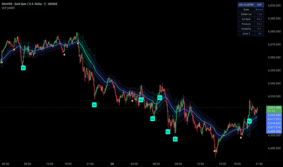
Volatility Cluster Pressure [JOAT]Volatility Cluster Pressure
Introduction
Volatility Cluster Pressure tracks EWMA variance, realized volatility, vol-of-vol, jump intensity, compression, expansion, and unstable cluster states.
This open-source indicator is designed as a context tool, not a standalone trading system. It focuses on explaining the current market state with restrained visuals and confirmed-bar logic where signals are used.
Core Concepts
1. EWMA Variance
A recursive lambda model emphasizes recent returns while retaining volatility memory.
2. Volatility Rank
EWMA volatility is ranked within a historical window.
3. Jump Intensity
Absolute return deviations identify abnormal movement relative to recent behavior.
4. Pressure Rails
Volatility and instability expand adaptive pressure rails around price.
ewmaVar := lambda * ewmaVar + (1 - lambda) * logRet * logRet
Features
EWMA/GARCH-style variance pressure
Volatility rank and vol-of-vol
Jump z-score
Compression, expansion, and unstable states
Adaptive pressure rails and HUD
Input Parameters
Cluster window and EWMA lambda
Cluster pressure and compression gates
Cooldown
Rails, candles, and HUD toggles
HUD position selector
How to Use This Script
Use VCP to understand volatility conditions before interpreting signals. Compression, expansion, and unstable states describe risk environment.
Limitations
The script uses historical OHLCV data and cannot know future prices.
Signals and states can be late during fast reversals because confirmed-bar logic is used to reduce repainting.
Model outputs should be interpreted with market context, risk controls, and independent analysis.
No visual state should be treated as a certain trade outcome.
Originality Statement
VCP is original in combining recursive variance, vol rank, jump pressure, instability, and adaptive rails.
Disclaimer
This indicator is provided for educational and informational purposes only. It is not financial advice, investment advice, or a recommendation to buy or sell any financial instrument. All calculations are derived from historical market data and may produce inaccurate readings in some market conditions. No indicator can predict future market behavior. Use proper risk management and independent judgment.
-Made with passion by jackofalltrades
Wskaźnik
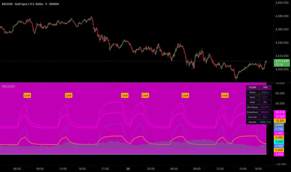
Thorp Kelly Risk Engine [JOAT]Thorp Kelly Risk Engine
Introduction
Thorp Kelly Risk Engine is a risk-quality study that tracks virtual outcomes, Kelly estimates, Bayesian shrinkage, drawdown pressure, survival score, and deployment state.
This open-source indicator is designed as a context tool, not a standalone trading system. It focuses on explaining the current market state with restrained visuals and confirmed-bar logic where signals are used.
Core Concepts
1. Virtual Outcome Tracker
Trend setups create virtual reward/risk outcomes measured in ATR units.
2. Kelly Estimate
Win rate and payoff ratio produce full and fractional Kelly-style estimates.
3. Bayesian Shrinkage
A prior win rate reduces overconfidence when sample size is small.
4. Survival and Desk Score
Drawdown, volatility, signal density, convexity, and uncertainty combine into risk state.
kelly = (payoff * winRate - lossRate) / payoff
Features
Virtual outcome sampling
Fractional and Bayesian Kelly estimates
Drawdown throttle and volatility brake
Ruin-adjusted Kelly
Prime, defense, and lockdown states
Input Parameters
Trend, RSI, and ATR lengths
Reward and risk ATR
Kelly fraction and max allocation
Minimum sample and drawdown brake
Display toggles and HUD position
How to Use This Script
Use TKR as risk context. Prime states suggest healthier virtual samples; defensive and lockdown states warn that model risk is elevated.
Limitations
The script uses historical OHLCV data and cannot know future prices.
Signals and states can be late during fast reversals because confirmed-bar logic is used to reduce repainting.
Model outputs should be interpreted with market context, risk controls, and independent analysis.
No visual state should be treated as a certain trade outcome.
Originality Statement
TKR is original in combining Kelly math, Bayesian shrinkage, drawdown throttling, survival scoring, and uncertainty cones.
Disclaimer
This indicator is provided for educational and informational purposes only. It is not financial advice, investment advice, or a recommendation to buy or sell any financial instrument. All calculations are derived from historical market data and may produce inaccurate readings in some market conditions. No indicator can predict future market behavior. Use proper risk management and independent judgment.
-Made with passion by jackofalltrades
Wskaźnik

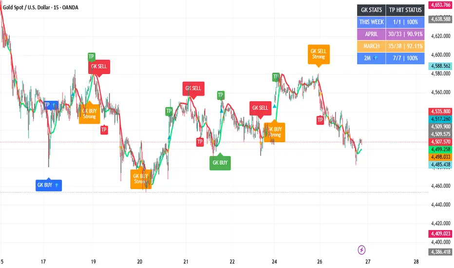
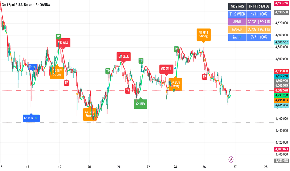
GK XAUUSD Diamond SniperWhat GK XAUUSD Diamond Sniper Does
GK XAUUSD Diamond Sniper is a Gold-focused trend and signal tool designed to help identify high-probability directional moves on XAU/USD.
The system combines:
GK BUY / GK SELL trend prints
Strong trend context filtering
A main 10-pip TP system
1-minute diamond confirmation prints projected onto selected timeframes
A separate diamond TP system
Trend-state filtering
Cooldown logic to reduce overprinting
Weekly and previous-month TP hit-status tracking
A 2-month diamond hit-status tracker
The goal is to help traders follow the current Gold structure instead of forcing random entries.
How The Main Signals Work
The main GK BUY and GK SELL prints are generated using a combination of:
Zero-lag style trend logic
Fast and main trend line separation
ATR-based movement filtering
Candle strength filtering
Range/chop avoidance
Breakout confirmation
One-print-per-trend logic
Cooldown protection
When the system detects enough trend pressure, it prints either:
GK BUY
or
GK SELL
These are designed to catch directional movement in line with the current market pressure.
The main TP target is set to 10 pips.
How The Diamond Prints Work
The diamond prints are an additional confirmation layer.
They appear as:
GK BUY 💎
or
GK SELL 💎
These are based on the faster 1-minute logic and projected onto the active trading chart. The purpose of the diamond prints is to highlight sharper momentum shifts and possible continuation/reversal opportunities.
The diamond TP is set to 19 pips.
Diamond prints are separate from the normal GK BUY / GK SELL prints and have their own TP logic.
TP Hit Status
The indicator includes a built-in stats table showing:
This week’s TP hit status
Previous month TP hit status
Two-month-back TP hit status
2-month diamond TP hit status
This helps users visually track how the system has been performing over recent historical structure.
The stats are there for guidance and review, not as a guarantee of future results.
How To Use It
The best way to use GK XAUUSD Diamond Sniper is to combine the signals with your own analysis.
Recommended use:
Focus mainly on XAU/USD only
Use the 15-minute timeframe as the preferred timeframe
Watch the overall market structure before taking a signal
Do not blindly enter every print without checking trend, support, resistance, news, and volatility
Understand that price can sometimes move into drawdown first before pushing toward TP
Trust the process, but always manage risk properly
Avoid overtrading between signals
Let the market come to you
Sometimes a print may appear and price may pull back first before continuing toward TP. This is normal in Gold because XAU/USD often retests, sweeps liquidity, or creates temporary drawdown before continuing in the intended direction.
The indicator is designed to assist decision-making, not replace your own trading brain.
Important Trading Disclaimer
This indicator does not guarantee profits and is not financial advice.
No trading indicator is 100% accurate. Losses can happen, and users should always apply proper risk management, position sizing, and their own analysis before entering any trade.
Gold is highly volatile and can move aggressively during news events, market opens, liquidity grabs, and geopolitical headlines. Always trade responsibly. Wskaźnik
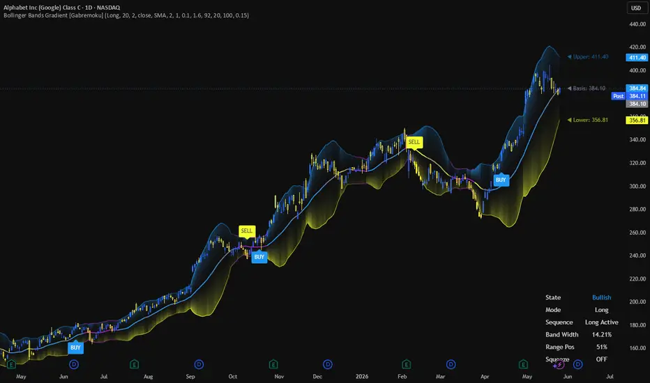
Bollinger Bands Gradient [Gabremoku]Bollinger Bands Gradient is an enhanced Bollinger Band overlay designed to turn classic volatility bands into a richer visual and signal-based trading framework.
The indicator keeps the core structure of Bollinger Bands — Upper Band, Basis, and Lower Band — but adds a dynamic gradient fill, squeeze detection, state-based bar coloring, strategy-side signal logic, and an optional dashboard for fast chart interpretation. Bollinger Bands are widely used to read volatility compression, expansion, and breakout behavior, especially when traders want more context than a standard three-line display can offer.
This script is built for traders who want Bollinger Bands to feel more alive: clearer transitions, better volatility awareness, and cleaner breakout mapping directly on price.
What it shows
🌈 Dynamic Gradient Fill — the area between Upper/Basis and Basis/Lower is filled with adaptive color intensity that changes according to price distance from the basis.
🗜️ Squeeze Detection — the script monitors Bollinger Band compression and flags low-volatility states when band width contracts relative to its recent range. Bollinger squeezes are commonly used to identify volatility contraction before a possible breakout.
🎨 State-Based Coloring — basis line, bands, bars, and optional background can all shift visually depending on whether the market is bullish, bearish, neutral, or in squeeze mode.
📍 Breakout Signals — optional labels for:
BUY / SELL in Long mode
SHORT / CLOSE in Short mode
🪧 Dashboard — a compact panel showing current state, strategy mode, sequence status, band width, range position, and squeeze condition.
🏷️ Last Value Labels — optional live labels for Upper, Basis, and Lower band values.
Core logic
This script combines volatility structure and signal sequence control.
At the core, Bollinger Bands define the dynamic range around a moving average using standard deviation, which helps visualize whether price is relatively stretched or compressed versus its recent behavior. Narrow bands usually reflect low volatility, while wide bands reflect expansion.
On top of that, this version introduces:
a basis color gradient tied to price position inside the band structure,
a fill intensity model tied to distance from the basis,
and a state machine that prevents repeated entry signals in the same sequence.
That makes the indicator more structured than a plain breakout marker, especially for traders who want cleaner signal flow.
Signal logic
The indicator supports two operating modes:
Long Mode
BUY = breakout above the Upper Band
SELL = breakdown below the Lower Band
Short Mode
SHORT = breakdown below the Lower Band
CLOSE = breakout above the Upper Band
This logic reflects one of the most common ways traders use Bollinger Bands: watching for volatility compression, then responding to expansion outside the bands. At the same time, Bollinger-based strategies can also be used for mean reversion, which is why breakout signals generally work best when confirmed by price structure, momentum, or volume.
Features
✅ Classic Bollinger Bands with selectable basis type
✅ Dynamic gradient fill above and below the basis
✅ Adaptive basis coloring based on price position
✅ Squeeze detection using band-width normalization
✅ Optional squeeze background highlighting
✅ Optional bar coloring by state
✅ Strategy-side selector: Long or Short
✅ Breakout signal state machine
✅ BUY / SELL / SHORT / CLOSE labels
✅ On-chart dashboard
✅ Optional last-value labels
✅ Fully customizable colors and style inputs
How to use
A practical reading flow is:
Watch for band contraction and squeeze conditions.
Treat that as a volatility compression phase.
Monitor for price expansion outside the bands.
Use the selected strategy mode to interpret the resulting signal sequence.
In practice:
tight bands + squeeze on = market compression
break above upper band = bullish expansion candidate
break below lower band = bearish expansion candidate
That said, Bollinger breakouts can fail in choppy environments, so many traders confirm them with momentum, volume, or higher timeframe structure rather than using them in isolation.
Notes
This indicator is designed as an enhanced Bollinger workflow tool, not as a complete trading system with full risk management. Bollinger Bands can support both breakout and mean-reversion approaches, so the best interpretation depends on market regime and confirmation methods.
Author: Gabremoku
Pine Script v6 Wskaźnik

Wskaźnik
Wskaźnik

Markowitz Frontier Compass [JOAT]Markowitz Frontier Compass
Introduction
Markowitz Frontier Compass compares the chart symbol against a peer basket using inverse-volatility weights, correlation drag, diversification benefit, factor scores, and active risk budget.
This open-source indicator is designed as a context tool, not a standalone trading system. It focuses on explaining the current market state with restrained visuals and confirmed-bar logic where signals are used.
Core Concepts
1. Inverse-Volatility Basket
Each peer receives an inverse-volatility weight to form a portfolio-context benchmark.
2. Correlation Drag
Average pairwise correlation reduces diversification value when assets move together.
3. Factor Composite
Quality, momentum, low-volatility, and carry-style behavior are combined.
4. Risk Budget
Institutional grade, entropy, concentration, and factor state become active or defensive budget context.
frontierScore = efficiency + diversification - correlationDrag - concentration
Features
Peer basket context
Inverse-volatility weighting
Correlation drag and diversification benefit
Factor composite and allocation entropy
Risk-on, defense, and factor-prime states
Input Parameters
Peer symbols
Return window and smoothing
Risk-free annual percent
Correlation stress and concentration gates
Display toggles and HUD position
How to Use This Script
Use MFC as cross-asset context. Risk-on or factor-prime states suggest constructive basket behavior; defense states warn of stress.
Limitations
The script uses historical OHLCV data and cannot know future prices.
Signals and states can be late during fast reversals because confirmed-bar logic is used to reduce repainting.
Model outputs should be interpreted with market context, risk controls, and independent analysis.
No visual state should be treated as a certain trade outcome.
Originality Statement
MFC is original in combining portfolio theory, factor scoring, entropy, and risk-budget logic in one open-source study.
Disclaimer
This indicator is provided for educational and informational purposes only. It is not financial advice, investment advice, or a recommendation to buy or sell any financial instrument. All calculations are derived from historical market data and may produce inaccurate readings in some market conditions. No indicator can predict future market behavior. Use proper risk management and independent judgment.
-Made with passion by jackofalltrades
Wskaźnik

Squeeze Momentum IQ Trade Management SimplifiedSqueeze Momentum IQ Trade Management Simplified
A trade management and position conviction engine designed to help determine whether to continue holding, manage cautiously, take profits, or avoid new entries.
Most indicators focus on finding entries.
Squeeze Momentum Nexus Conviction focuses on a different question:
"Does the trade still deserve my conviction?"
Rather than generating simple buy and sell signals, Conviction continuously evaluates trend quality, momentum behavior, efficiency, and confirmation conditions to determine whether current market conditions still support remaining in a trade.
The objective is to help traders avoid two common mistakes:
• Exiting strong trends too early
• Holding weakening trades too long
Core Concept
Conviction transforms multiple market variables into a simplified trade management framework:
HOLD
Strong trend quality and confirmation
Momentum remains healthy
Higher timeframe and trend conditions supportive
HOLD CAUTIOUSLY
Trend remains intact, but signs of weakening or conflict begin to appear
Increased probability of pullback or slower continuation
TAKE PROFIT / DO NOT ENTER
Trade quality deteriorating
Momentum weakening significantly
Choppy or conflicting conditions increasing
Features
Trade Quality Engine
Evaluates market conditions through a weighted scoring model using:
• Momentum behavior
• Trend confirmation
• Higher timeframe agreement
• Efficiency ratio
• Volatility state
• Expansion quality
Conviction State Engine
Converts raw calculations into actionable states:
HOLD
Strong continuation conditions
Trend quality remains elevated
HOLD CAUTIOUSLY
Moderate quality conditions
Continuation possible but with increasing caution
TAKE PROFIT / DO NOT ENTER
Weak conditions
Elevated risk of deterioration, pullback, or lower probability continuation
Visual Hold Zones
Vertical highlighted chart regions visually display current conviction states:
Green
HOLD
Orange
HOLD CAUTIOUSLY
Red
TAKE PROFIT / DO NOT ENTER
Designed to allow immediate interpretation directly from price action without requiring constant dashboard monitoring.
Simple Decision Dashboard
Displays only the essential information:
Action
HOLD
HOLD CAUTIOUSLY
TAKE PROFIT / DO NOT ENTER
Trade Quality
Current trade-grade evaluation
Score
Weighted confidence reading
Suggested Uses
Can be used for:
• Managing existing positions
• Scaling out of trades
• Holding trend positions longer
• Filtering poor continuation conditions
• Preventing emotional exits
• Avoiding lower quality entries
Works well alongside:
• Market structure
• Trend systems
• Volume Profile / POC analysis
• Supply and demand zones
• Higher timeframe bias
• Risk management systems
About TrendGenY Indicators
TrendGenY indicators are built from market experience, creative concepts, and a constant pursuit of unique perspectives. Rather than following conventional ideas, the focus is on uncovering alternative insights and viewing market behavior through different angles to reveal information that traditional tools may overlook and help traders build a more meaningful edge in the market. Wskaźnik

ATR Position SizerATR Position Sizer
A simple position sizing tool for futures traders. Calculates how many contracts to trade based on your risk tolerance and the current ATR-based stop distance.
How it works
The indicator uses the standard formula:
Contracts = Risk $ ÷ (ATR × Stop Multiplier × Dollar per Point)
It pulls the contract's dollar-per-point value directly from the symbol info, so you don't need to enter it manually. At the close of each bar, the calculation updates and displays in the bottom right of your chart.
Inputs
ATR Lookback (bars): How many bars to use for the ATR calculation. Default is 14.
Risk Tolerance ($): Maximum dollar amount you're willing to lose on the trade. Default is $250.
Stop Multiplier (xATR): How wide your stop is relative to ATR. Default is 1.5x.
How to use it
Add the indicator to your chart.
Set your ATR lookback, risk tolerance, and stop multiplier in the settings.
At the close of your entry candle, look at the contracts value in the bottom right.
Size your trade accordingly.
The output is a decimal so you can see exactly where you stand. Round down if you want to stay within your risk, round up if you're comfortable taking slightly more.
Supported instruments
This indicator was designed and tested on the following futures contracts:
S&P 500: ES, MES
Nasdaq 100: NQ, MNQ
Russell 2000: RTY, M2K
Dow: YM, MYM
Nikkei 225: NKD, NIY
Gold: GC, MGC
Crude Oil: CL, QM, MCL
It may work on other futures contracts that have a defined point value in TradingView, but results outside the listed instruments are not guaranteed.
Disclaimers
This indicator is for educational and informational purposes only. It is not financial advice, investment advice, or a trading recommendation.
The calculations assume your actual stop loss will be placed at the ATR-based distance. If you use a different stop placement method, your real risk will differ from what this indicator shows. Always verify your stop placement and position size before entering a trade.
ATR is a backward-looking measure of volatility. It does not predict future price movement, slippage, gaps, or news-driven volatility expansion. Your actual loss on a trade can exceed the calculated risk amount, especially on thinly traded instruments, around economic releases, or during overnight sessions.
This tool does not account for commissions, exchange fees, margin requirements, account size, or overall portfolio exposure. You are responsible for ensuring any position size is appropriate for your account and risk profile.
Futures trading involves substantial risk of loss and is not suitable for every investor. Past performance is not indicative of future results. Trade at your own risk. Wskaźnik

Wskaźnik
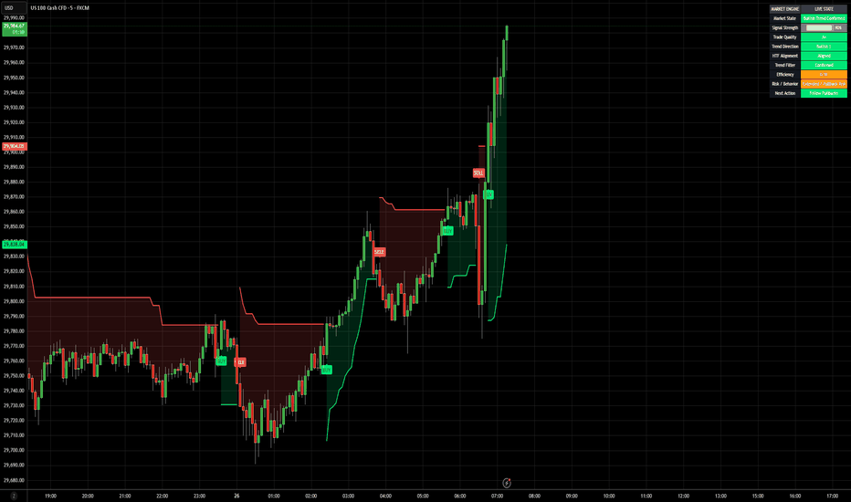
Trend Volatility RegimeThe Trend Volatility Regime is an all-in-one trend-following model that identifies changes in the market regime by combining moving-average crossover signals with volatility-adaptive trailing stops. It features an integrated backtesting engine that provides institutional-grade insights into historical strategy performance, along with a built-in alert system that notifies investors in real time when regime changes occur. The model integrates seamlessly into the price chart and presents backtest results in a clear, color-coded table benchmarked against buy-and-hold.
At its core, the model combines two complementary trend detection components to determine the prevailing market regime. The first component identifies the underlying structural trend using a volatility-adjusted moving-average crossover based on the spread between fast and slow moving averages. The second component identifies trend reversals using an adaptive trailing stop based on changes in price and volatility. Bullish and bearish regimes occur when both crossover and volatility signals are directionally aligned, while conflicting signals result in neutral regimes.
Bullish Crossover Signal = (Fast MA – Slow MA) > (ATR × Trend Margin)
Bearish Crossover Signal = (Fast MA – Slow MA) < –(ATR × Trend Margin)
Bullish Volatility Signal = Price > (Highest Price – (Volatility × Stop Factor))
Bearish Volatility Signal = Price < (Lowest Price + (Volatility × Stop Factor))
By default, the model applies an asymmetric regime design in which conflicting signals default to a bullish regime unless half-equity positions are enabled in the menu. This asymmetric design reflects the tendency of risk assets to deteriorate gradually while recovering more abruptly. The moving-average component captures the slower deterioration typically observed during market tops, while the trailing stop component responds more dynamically to faster reversals typically observed at market bottoms. This helps reduce overreaction to corrections during uptrends while still allowing for faster re-entry following sharp recoveries. To evaluate the performance of different parameter configurations, the model includes a built-in table with the following metrics:
CAGR = Compounded Annual Growth Rate.
Excess = CAGR in excess of buy-and-hold.
Sharpe = CAGR per unit of standard deviation.
Sortino = CAGR per unit of downside deviation.
Calmar = CAGR relative to maximum drawdown.
Max DD = Largest peak-to-trough decline in value.
Alpha (α) = Excess annualized risk-adjusted returns.
Win Rate = Ratio of profitable trades to total trades.
Profit Factor = Total gross profit per unit of losses.
Expectancy = Average expected return per trade.
Turnover = Average annualized change in exposure.
This indicator is designed with flexibility in mind, enabling users to specify the start date of the backtesting period, the preferred trend type, volatility type, and regime visualization. Supported regime visualizations include line, candle, and shaded background. Supported moving-average types include the Exponential Moving Average (EMA), Simple Moving Average (SMA), Wilder’s Moving Average (RMA), and Weighted Moving Average (WMA). Supported volatility types include the Average True Range (ATR), Standard Deviation (SD), and Mean Absolute Deviation (MAD). Supported price sources include Close, HL2, HLC3, and OHLC4. The table follows an intuitive color-coded logic that allows for quick performance comparison against buy-and-hold (B&H):
CAGR = Green indicates above 0%, while red indicates below 0%.
Excess = Green indicates above 0%, while red indicates below 0%.
Sharpe = Green indicates better than B&H, while red indicates worse.
Sortino = Green indicates better than B&H, while red indicates worse.
Calmar = Green indicates better than B&H, while red indicates worse.
Max DD = Green indicates better than B&H, while red indicates worse.
Alpha (α) = Green indicates above 0%, while red indicates below 0%.
Win Rate = Green indicates above 50%, while red indicates below 50%.
Profit Factor = Green indicates above 2, while red indicates below 1.
Expectancy = Green indicates above 0%, while red indicates below 0%.
In summary, the Trend Volatility Regime is a comprehensive trend-following tool designed to help investors stay on the right side of the market by identifying key changes in the market regime. By combining volatility-adjusted moving-average crossover signals with adaptive volatility-based trailing stops, the model seeks to maximise participation during uptrends while reducing exposure during sustained downtrends. While the model provides valuable historical insights, users should remain mindful that past results may not necessarily persist under future market conditions. Wskaźnik

Wskaźnik