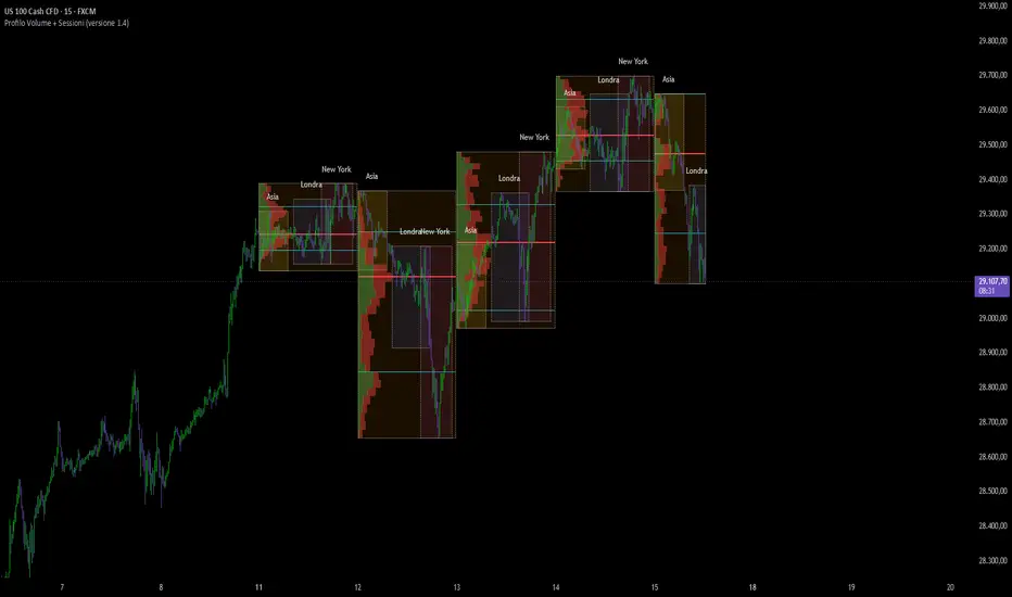
Elaris Volume Intelligence ProElaris Volume Intelligence Pro is a professional-grade volume analysis and smart money intelligence indicator designed to help traders understand market participation, hidden pressure, and potential reversal activity in real time.
Instead of displaying raw volume alone, Elaris Volume Intelligence Pro transforms market volume into actionable intelligence by combining relative volume analysis, volume delta estimation, CVD (Cumulative Volume Delta), absorption detection, climax activity, and smart flow momentum into a single clean and trader-friendly system.
The indicator is built for discretionary traders, scalpers, intraday traders, swing traders, and crypto traders who want deeper insight into market behavior beyond standard candles.
━━━━━━━━━━━━━━━━━━
FEATURES
━━━━━━━━━━━━━━━━━━
• Smart Volume Columns
Dynamically colored volume bars help identify bullish pressure, bearish pressure, climax activity, and absorption zones instantly.
• Relative Volume & Z-Score Engine
Detects abnormal market participation using relative volume and statistical volume expansion analysis.
• Volume Flow Momentum
A smoothed institutional-style flow model that helps traders identify whether aggressive buying or selling pressure is dominating the market.
• Bullish & Bearish Climax Detection
Highlights potential exhaustion candles during extreme participation and volatility conditions.
• Demand & Supply Absorption Detection
Detects high-volume compression behavior that may indicate hidden accumulation or distribution by larger participants.
• Volume & CVD Divergence Signals
Identifies possible reversal conditions when price action and cumulative volume behavior diverge.
• Smart Market State Dashboard
A clean built-in intelligence panel provides:
* Market bias
* Smart score
* Relative volume strength
* Volume Z-score
* Delta pressure
* Active signal state
• Dark Mode Optimized UI
Professionally designed visuals optimized for both dark and light TradingView themes.
• Fully Configurable
All thresholds, smoothing values, divergence sensitivity, and visual layers can be customized for different trading styles and markets.
━━━━━━━━━━━━━━━━━━
HOW TO USE
━━━━━━━━━━━━━━━━━━
• Strong Bullish Conditions
Look for:
* Bullish volume climax
* Positive flow momentum
* Increasing relative volume
* Bullish divergences
* Demand absorption
• Strong Bearish Conditions
Look for:
* Bearish climax candles
* Negative flow momentum
* High sell-side pressure
* Bearish divergences
* Supply absorption
• Best Use Cases
* Crypto futures trading
* Intraday momentum trading
* Breakout confirmation
* Reversal detection
* Smart money analysis
* Volume-based confluence systems
━━━━━━━━━━━━━━━━━━
ALERTS INCLUDED
━━━━━━━━━━━━━━━━━━
The indicator includes built-in alerts for:
* Bullish/Bearish Volume Climax
* Demand/Supply Absorption
* Bullish/Bearish Divergence
* Bullish/Bearish Pressure States
━━━━━━━━━━━━━━━━━━
IMPORTANT NOTES
━━━━━━━━━━━━━━━━━━
• This indicator does not use repainting logic.
• Signals are generated using confirmed candle data.
• Works best on liquid markets with reliable volume data.
• Designed for confirmation and confluence, not standalone financial advice.
Built by Elaris Group.
Financial intelligence for modern markets.
Wskaźnik

Elaris Smart Scalping IndicatorElaris Smart Scalping Indicator is a non-repainting trend and momentum scalping tool designed to help traders identify higher-quality buy and sell conditions using a structured confluence model.
The indicator combines EMA trend direction, RSI momentum, MACD histogram confirmation, volume strength, ATR volatility filtering, optional higher-timeframe bias, and session filtering into a clean signal-scoring system. Signals are confirmed only after candle close, helping reduce intrabar noise and repainting behavior.
It also includes visual TP/SL guide levels, trend background shading, buy/sell labels, alert conditions, and a compact dashboard showing trend state, HTF bias, RSI, ATR percentage, volume filter status, and signal score.
This tool is designed for scalping and short-term trading analysis across crypto, forex, indices, and other liquid markets. It is not financial advice and should be used with proper risk management and additional market context.
Key Features
Non-repainting confirmed buy/sell signals
EMA-based trend engine with adjustable strictness
RSI and MACD momentum confirmation
Optional higher-timeframe trend filter
Volume and ATR volatility quality filters
Optional session filter
Signal score system from 0–100
Visual entry, stop loss, TP1, and TP2 guide levels
Clean dashboard for live market state
Built-in TradingView alert conditions Wskaźnik

MGI Walls | Rainbow MatrixGENERAL OVERVIEW
The MGI Walls is a multi-timeframe institutional liquidity radar that extracts and renders the price zones where institutional capital concentrates: Volume Profile blocks (Point of Control, Value Area High, Value Area Low), Anchored VWAPs, and Parabolic SAR levels. Instead of showing these levels for a single chart timeframe, the indicator scans up to five macro timeframes simultaneously and merges overlapping zones into a single intensified block whenever multiple timeframes agree on the same price area.
The main goal of this indicator is to give traders a clean, automatic read on where the structural barriers in the market are — without having to manually flip between timeframes, mark POCs by hand, or guess which level the next reaction will respect. Every line, box, and confluence zone you see on the chart was extracted from real volume distribution data, not drawn manually.
It plots up to four level types per timeframe (POC, VAH, VAL, VWAP, SAR), each weighted by the structural significance of its timeframe — a Weekly POC carries five times the gravitational weight of a 15-minute POC. The Wall Fusion Engine then detects when levels from different timeframes fall within a configurable percentage threshold and consolidates them into a single block. The Nearest Wall HUD panel and the institutional collision alerts complete the toolkit.
This indicator was developed for traders who already understand Volume Profile and VWAP concepts and want to see them across multiple timeframes in a single visual, with automatic confluence detection.
WHAT IS THE THEORY BEHIND THIS INDICATOR?
Most Volume Profile indicators on TradingView — including the standard built-in profiles, Fixed Range Volume Profile, and the various session/visible-range derivatives — share a common architectural choice: they operate on a single timeframe. They show you the POC and Value Area for the current chart only. This treats each timeframe as an isolated decision space.
The problem: institutional flow is not isolated to one timeframe. The market makers operating on the daily horizon see different value areas than those operating on the weekly or 4-hour horizon. Their orders sit at their own POCs and Value Area boundaries. When price approaches a level that only one institutional horizon defends, the reaction is often modest. When price approaches a level that multiple horizons defend simultaneously, the reaction is structurally stronger — that confluence is where the largest pools of resting liquidity accumulate.
This indicator addresses that by performing the extraction across five user-configured timeframes simultaneously via `request.security()`, weighting each level by the gravitational significance of its parent timeframe, and then fusing levels from different timeframes that fall within a configurable margin. The math is standard Volume Profile (POC at the volume-weighted mode, VAH/VAL at the ±2.51σ boundary that approximates the 70% Value Area) — what makes it useful is doing it across five timeframes at once, with hierarchical weighting and confluence merging.
Why traders use it: each block represents an institutional decision zone. A standalone POC line from the 15-minute timeframe is a local reaction point. A POC line that simultaneously aligns with the 4-hour VAH and the daily VWAP is a multi-horizon barrier — a zone defended by three independent pools of institutional capital at once. The fusion engine makes these confluences immediately visible as thicker, more opaque blocks; the polarity of each block reflects the accumulated weight balance of the levels that compose it, not the polarity of the last level to be merged.
The three rendered components — Volume Profile zones, Anchored VWAPs, and Parabolic SAR levels — are not independent layers stacked on the same chart. They map three different aspects of institutional positioning at the same set of timeframes: where past volume concentrated (Volume Profile), where the live volume-weighted consensus price currently sits (VWAPs), and which directional trend regime each timeframe is in (SARs). The Wall Fusion Engine operates across all three layers indiscriminately — a POC from the 4-hour timeframe and a VWAP from the daily timeframe at the same price are fused into a single block, because from the perspective of institutional defense they represent the same structural barrier reinforced by two independent mechanisms. This integration is the reason the three components exist in a single script rather than as three separate indicators: the cross-layer fusion is what surfaces multi-mechanism confluence, which a separate-script approach cannot do.
MGI WALLS FEATURES
The indicator includes 6 main features:
Multi-Timeframe Volume Profile Engine
Anchored MTF VWAPs
Parabolic SAR Levels (MTF)
Wall Fusion Engine with Polarity-Balance Coloring
Nearest Wall HUD Panel
Institutional Collision Alerts
Multilingual interface and full customization across all visual layers.
MULTI-TIMEFRAME VOLUME PROFILE ENGINE
🔹 What It Does
The core of the indicator. For each of the five configured radar timeframes, the engine performs three operations:
◇ Locates the price level that received the highest traded volume in the lookback window — the Point of Control (POC).
◇ Computes the volume-weighted standard deviation of price around that POC.
◇ Builds the Value Area High (VAH) and Value Area Low (VAL) at a calibrated multiplier (±2.51σ) of that deviation, approximating the price range that contained 70% of the total volume.
The result is three institutional reference levels per timeframe — POC, VAH, VAL — extracted natively at the granularity of each timeframe rather than approximated from the current chart's data.
🔹 Method
The extraction runs via `request.security()` with `lookahead=barmerge.lookahead_off` to prevent repainting. The POC is identified as the volume-weighted mode within the lookback window. The Value Area boundaries are derived statistically from the volume-weighted variance of price around the POC, using a calibration factor (vp_k = 2.51) tuned to approximate the conventional 70% Value Area definition. Each level is plotted on the chart as a line or box at its native price location, color-coded by whether it sits above (resistance) or below (support) the current price, and weighted by the timeframe it originated from.
🔹 Hierarchical Weighting
The five timeframes are weighted by structural significance:
◇ TF1 (Micro, default 15m): weight 1 — local reaction point.
◇ TF2 (Intraday, default 1h): weight 1 — session-scale level.
◇ TF3 (Macro 1, default 4h): weight 2 — multi-session level.
◇ TF4 (Macro 2, default Daily): weight 3 — multi-day level.
◇ TF5 (Global, default Weekly): weight 5 — multi-week structural barrier.
The weight controls visual prominence (opacity, border thickness) and, when fusion occurs, the contribution of each level to the polarity balance of the resulting block.
ANCHORED MTF VWAPS
🔹 What It Does
For each of the five radar timeframes, an Anchored VWAP is extracted and rendered as a separate level. The Global VWAP — the average of all five — is also plotted, marked with a globe emoji to distinguish it from the per-timeframe VWAPs.
🔹 Method
The per-timeframe VWAP is computed via a volume-weighted moving average of hlc3 on the native bars of each timeframe, then reported back to the current chart through `request.security()`. The Global VWAP is the unweighted average of the five timeframe VWAPs that are currently available (NA values are skipped).
🔹 Why It Matters
The Volume Profile blocks tell you where past volume concentrated. The VWAPs tell you what the volume-weighted consensus price is for each horizon, updated bar by bar. Together they give a complete read on every bar: where the past institutional reference zones are (the blocks) and where the live volume-weighted average for each horizon currently sits (the VWAPs).
PARABOLIC SAR LEVELS (MTF)
🔹 What It Does
The Parabolic SAR for each of the five radar timeframes is extracted and rendered as an institutional trend-direction anchor. SAR levels are toggleable independently of the Volume Profile and VWAP layers.
🔹 Why It Matters
The SAR provides a directional trend reference per timeframe — when the Weekly SAR sits above price and the Daily SAR sits below, the structure is in conflict and the resolution of that conflict often drives the next swing. When multiple SARs align on the same side, the directional bias is structurally agreed across horizons.
WALL FUSION ENGINE WITH POLARITY-BALANCE COLORING
🔹 What It Does
When two or more levels from different timeframes fall within a configurable percentage threshold (default 0.30%), the engine fuses them into a single block. The fused block inherits the combined weight of all its components — visually thicker, more opaque, more visible than a standalone level. The label of the fused block accumulates the directional triangles of each contributing level (▲ for support, ▼ for resistance).
🔹 Polarity-Balance Coloring
The color of a fused block reflects the accumulated weight balance of its constituent levels — not the polarity of the last level to be merged. A block containing four resistance levels (▼▼▼▼) and two support levels (▲▲) will render red, because the resistance weight dominates. A block where support and resistance weights are equal uses a tiebreaker: the position of the current price relative to the block's midpoint. Price above midpoint resolves to support (green); price below resolves to resistance (red). This produces a coloring scheme that is internally consistent with the triangle labels and with the price's current location.
🔹 Customization
The Wall Merge Margin (%) input controls how aggressively levels are fused. Lower values produce many separate precise lines. Higher values produce massive consolidated institutional blocks. The default of 0.30% is calibrated for liquid instruments on intraday timeframes; for higher-volatility assets or higher timeframes, larger margins (0.50–1.00%) may produce more readable charts.
NEAREST WALL HUD PANEL
🔹 What It Shows
A compact corner panel reports four live values:
◇ RESISTANCE — the price of the nearest wall above the current price
◇ DIST. — the percentage distance from current price to that resistance
◇ SUPPORT — the price of the nearest wall below the current price
◇ DIST. — the percentage distance from current price to that support
The distances are computed against the midpoint of each fused block, so the values reflect the consolidated wall, not any single contributing level.
🔹 Why It Helps
The HUD removes the need to visually measure distances to the walls on every bar. It tells you in plain numerical form how far the nearest barriers are in each direction. Useful for stop placement, target placement, and live decision-making where the visual chart is busy with multiple levels.
🔹 Customization
The HUD can be positioned in any of the four chart corners and rendered in any of five font sizes. The display language is controlled by the System Language input.
snapshot
INSTITUTIONAL COLLISION ALERTS
🔹 What Triggers
Two alert types are available:
◇ VWAP Collision — fires when price crosses or touches the daily, weekly, or monthly VWAP within a 0.15% proximity band.
◇ Volume Profile Wall Hit — fires when price crosses or touches the Global POC, VAH, or VAL within the same proximity band.
🔹 How They Fire
Alerts are gated by `barstate.isconfirmed`, which means they only trigger on the close of the bar that touched the level — not intra-bar. This prevents false signals from wicks that get rejected before the bar closes. Each alert uses `alert.freq_once_per_bar`, ensuring no duplicate firings on the same candle.
🔹 alertcondition() Mode
For users who prefer the TradingView alert UI rather than the `alert()` function call, two `alertcondition` blocks are also exposed: "VWAP Collision" and "Volume Profile Wall Hit". A third dummy `alertcondition` titled "HOW TO SETUP ALERTS (READ)" provides setup guidance in the alert condition menu.
MULTILINGUAL INTERFACE
The indicator supports five languages for the HUD display and alert messages: English (default), Português, Español, Русский, and 中文 (Chinese). Code, comments, and configuration tooltips remain in English regardless of the selected language.
For reference, the English text of all multilingual UI strings used in the HUD and alerts:
◇ (SUPPORT) / (RESISTANCE) — appended to wall labels indicating polarity
◇ RESISTANCE: / SUPPORT: — HUD row labels for nearest walls
◇ DIST.: — HUD row label for distance percentage
◇ VWAP Collision Alert: "🛡️ Price collided with Institutional VWAP. Defense zone active."
◇ Volume Profile Wall Alert: "🧱 Price hit Macro Volume Profile zone (POC/VAH/VAL). Institutional decision imminent."
HOW TO USE
This indicator is not a signal generator. It is a structural map: it tells you where the institutional barriers are, how strong each one is (by weight and fusion), and how far the nearest one is in each direction.
🔹 Reading the Walls
◇ Each line or block on the chart marks an institutional decision zone.
◇ The triangles in the label (▲ or ▼) and their count indicate the polarity and weight of the level.
◇ Walls with multiple triangles in the same direction are stronger reaction points than single-triangle walls.
◇ A block with mixed triangles is a fused confluence — the color shows which side dominates by weight.
🔹 Reading the HUD
◇ The HUD reports the nearest resistance above and nearest support below the current price.
◇ The percentage distances help size stops and targets against the structural barriers rather than against arbitrary fixed values.
🔹 Tactical Reading
◇ Price approaching a heavy multi-triangle wall: zone of elevated structural significance, where multiple institutional horizons coincide.
◇ Price sitting between two close walls of opposite polarity: ranging structure, defined by two opposing barriers of comparable weight.
◇ Price breaking through a heavy wall on confirmed close: structural shift. The wall often inverts polarity on subsequent retests.
◇ VWAP collision alerts: useful as a contextual reference for mean-reversion or trend-continuation analysis.
🔹 Multi-Timeframe Reading
◇ On lower timeframes (1m, 5m, 15m), configure shorter radar timeframes to track intraday institutional flow.
◇ On higher timeframes (1h, 4h, daily), keep the default 15m/1h/4h/D/W configuration to read multi-day and multi-week structural zones.
◇ The Global VWAP and Global POC (marked with 🌎) represent the consensus across all five timeframes — the most structurally significant single reference.
INPUTS EXPLAINED
🔹 System Language
Display language for the HUD and alert messages. Options: English (default), Português, Español, Русский, 中文 (Chinese).
🔹 Radar Timeframes (TF1 to TF5)
Configure each of the five macro periods to scan. Defaults: 15m, 1h, 4h, Daily, Weekly. The shortest timeframe carries weight 1; the longest carries weight 5.
🔹 Show MTF VWAPs (Radar)
Toggle for the Volume-Weighted Average Price extracted from each radar timeframe.
🔹 Show POC Lines
Toggle for the Point of Control lines — the price level with the highest traded volume in each timeframe.
🔹 Show VA Boxes (VAH / VAL)
Toggle for the Value Area High and Value Area Low — the upper and lower boundaries of the 70% volume zone.
🔹 Show SAR Levels
Toggle for the Parabolic SAR levels from each timeframe.
🔹 Fuse Overlapping Walls
Toggle for the confluence merging engine. When enabled, levels from different timeframes that fall within the Wall Merge Margin are consolidated into a single intensified block.
🔹 Wall Merge Margin (%)
Distance threshold to fuse nearby walls. Range 0.01–3.00, default 0.30. Lower values produce separate precise lines; higher values produce consolidated institutional blocks.
🔹 Show Nearest Wall Panel
Toggle for the corner HUD reporting nearest resistance, nearest support, and the percentage distances.
🔹 Panel Position
Position of the HUD on the chart. Four corners available: Top Right (default), Top Left, Bottom Right, Bottom Left.
🔹 Font Size
HUD font size. Options: Tiny, Small (default), Normal, Large, Huge.
🔹 VWAP Collision Alert
Toggle for the alert that fires when price collides with the daily, weekly, or monthly VWAP.
🔹 Volume Profile Wall Alert (POC/VAH/VAL)
Toggle for the alert that fires when price touches the Global POC, VAH, or VAL.
IMPORTANT NOTES
The MGI Walls works on any timeframe. The default radar configuration (15m/1h/4h/D/W) is calibrated for intraday and swing trading on liquid instruments. For position trading or scalping, the radar timeframes can be reconfigured to scan longer or shorter horizons respectively.
The indicator works best on instruments with reliable volume data: crypto perpetual contracts, large-cap equities, futures, major forex pairs. On low-volume instruments, the Volume Profile component becomes less reliable, though the VWAP and SAR components continue to function correctly.
Alerts fire once per confirmed bar. Historical bars never repaint after they close. The live bar updates intra-bar as expected for a real-time indicator.
The Value Area calibration factor (vp_k = 2.51) is tuned to approximate the conventional 70% Value Area definition under volume-weighted standard deviation. It is a calibration constant derived from observation rather than an arbitrary choice.
Pine Script v6. Open-source under Mozilla Public License 2.0.
UNIQUENESS
The MGI Walls is unique in three ways. First, it performs the Volume Profile, VWAP, and SAR extraction across five timeframes simultaneously rather than on the current chart only, surfacing the institutional reference zones that multiple time horizons agree on rather than only those visible on the active timeframe. Second, it weights each level by the structural significance of its parent timeframe — a Weekly POC carries five times the gravitational weight of a 15-minute POC — and the Wall Fusion Engine consolidates levels from different timeframes that fall within a configurable margin into a single intensified block, making multi-horizon confluence zones immediately visible as visually thicker walls. Third, the fused-block coloring reflects the accumulated weight balance of all constituent levels rather than the polarity of the last level to be merged, producing a visual scheme that is internally consistent with the triangle labels (▲ for support, ▼ for resistance) and with the price's current position relative to the block. The combination of multi-timeframe simultaneous extraction, hierarchical weighting with automatic confluence fusion, and balance-driven block coloring produces a structural map that behaves differently from single-timeframe Volume Profile indicators, particularly at price zones where multiple institutional horizons converge and where the strongest reactions tend to occur.
PUBLICATION METADATA (handoff to operator — not part of description)
Title: MGI Walls | Rainbow Matrix
Visibility: Open-source / Public
Category suggestion: Volume-based (primary) — TradingView's category for Volume Profile / volume-driven indicators
Tag suggestions (TV allows up to 10; pick the 9 most relevant):
- volume-profile
- poc
- value-area
- vwap
- multi-timeframe
- mtf
- confluence
- institutional
- support-resistance
- parabolic-sar (optional, swap for one above if SAR is a key selling point)
License declaration: Mozilla Public License 2.0 (already in script header)
Screenshot slots in the description (5 "snapshot" placeholders):
1. After GENERAL OVERVIEW — wide chart showing the indicator running on BTC or major instrument, with walls visible across multiple TFs
2. After Multi-Timeframe Volume Profile Engine section — chart annotated with POC/VAH/VAL lines from different TFs
3. After Wall Fusion Engine section — close-up of a fused confluence block with mixed triangles (▲▼) and the polarity-balance color clearly visible
4. After Nearest Wall HUD Panel section — HUD close-up showing the 5-row layout with real values
5. (Optional, swap into one of the above slots) — Black Swan-style touch event showing a collision alert firing
Wskaźnik

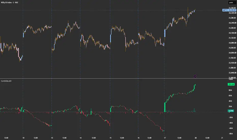
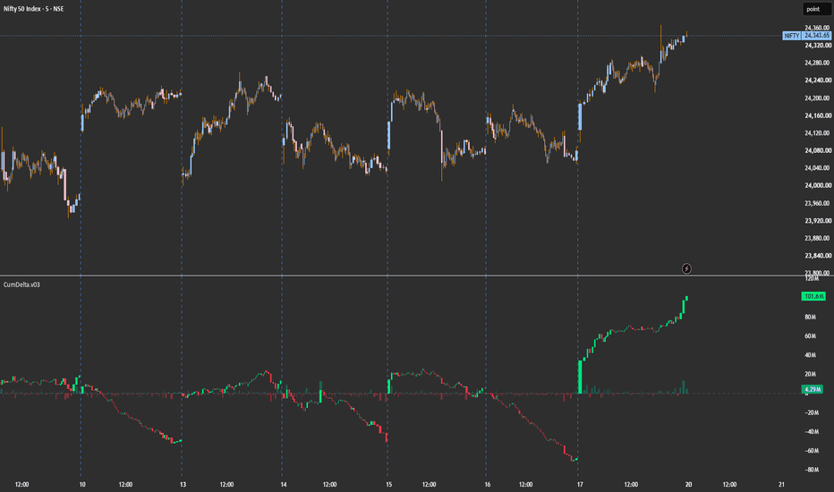
Cumulative Volume DeltaCumDelta — Cumulative Volume Delta with Session Reset
A clean cumulative volume delta (CVD) indicator that visualizes the running balance of buying vs. selling aggression using lower-timeframe up/down volume. Designed for intraday traders who want to read order flow alongside price.
What it does
Each bar's delta is calculated by pulling lower-timeframe volume data and classifying it as buying or selling pressure based on whether each sub-bar closed up or down. These per-bar deltas are then cumulated into a running total that resets on your chosen schedule (day, session, week, month, year, or N bars back).
The cumulative delta is rendered as candles — each candle's open chains from the previous close, and the body shows whether net flow on that bar was positive or negative. A histogram below shows the raw per-bar delta for quick reference.
How to read it
Rising green candles — sustained buying pressure
Falling red candles — sustained selling pressure
Divergence vs. price — price makes a new high but CVD doesn't (or vice versa) often precedes reversals
Reset bars (optional yellow highlight) — fresh session start, useful for marking where the cumulation restarts
Settings
Reset Period — Day, Session (RTH-aware), Week, Month, Year, or Bars Back
Lower Timeframe — auto-selects based on chart TF, or set manually for finer/coarser resolution
Doji Handling — choose how to attribute volume when a bar closes flat (Split 50/50, Up, Down, or Skip)
Display toggles — bar delta histogram, cumulative candles, reset markers Wskaźnik
Wskaźnik

Wskaźnik

Enhanced VolumeEnhanced Volume (EV)
A comprehensive volume analysis tool designed to give traders a complete picture of buying and selling activity at a glance.
Key Features:
Relative Volume Colour Coding
Bars are automatically colour-coded based on volume significance — high relative volume bars stand out immediately, while low relative volume bars are flagged to help you avoid low-conviction moves.
Smart Labels
Automatically labels notable volume events directly on the chart:
High relative volume bars (2× average and above)
Highest volume in the past year (HV1Y)
Highest volume ever recorded for the instrument (★ HVE)
All labels display the raw volume figure and the percentage above average so you can assess conviction instantly.
Projected Volume
During the trading session, a projected end-of-day volume bar is calculated based on the current rate of flow. A projected run-rate percentage tells you whether today is on track to be a high or low volume day before the session closes.
2× and 3× Average Lines
Visual reference lines show exactly where 2× and 3× average volume sit, making it easy to gauge how significant the current bar really is.
Up/Down Volume Ratio
Tracks cumulative buying versus selling volume over a configurable lookback period, giving you a directional bias reading based on actual volume flow rather than price alone.
Summary Table
A clean on-chart table displays all key metrics in one place — current volume, average volume, average dollar volume, up/down ratio, relative volume percentage, projected volume, and volume ratio.
Inputs:
SMA length for average volume calculation
High and low relative volume thresholds
1-year lookback period for HV1Y detection
Up/Down volume lookback period
Toggle projected volume bar and 2×/3× lines on or off
Full colour customisation for all bar states
Built for momentum and breakout traders who use volume as a primary confirmation tool. Wskaźnik

Wskaźnik
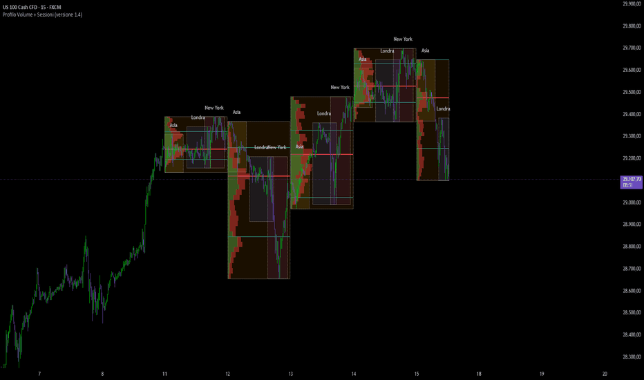
AVDO + Proporcion de volumen SR by TraderDeConfianzaEste es un indicador todo-en-uno que combina dos sistemas complementarios para detectar zonas de interés institucional y dirección de tendencia. Es una herramienta de análisis basada en lectura de volumen real, por lo que su efectividad depende directamente de la calidad y autenticidad de los datos de volumen del activo que analizas.
Importante: dónde funciona y dónde no
El motor principal del indicador es el volumen real (transacciones efectivamente ejecutadas en un exchange centralizado). Por eso, su rendimiento varía dramáticamente según el tipo de activo:
Activos recomendados (volumen real y confiable):
Futuros de CME Group: especialmente los futuros de índices americanos como MNQ, NQ, ES, MES, YM, MYM, RTY, M2K. También funciona bien en futuros de commodities (CL, GC, SI, NG) y de bonos (ZN, ZB, ZF). El volumen de CME es centralizado y refleja transacciones reales.
Criptomonedas (preferentemente Binance): BTC, ETH, SOL y altcoins principales. Binance concentra el mayor volumen real del mercado cripto spot y de perpetuos. Otros exchanges grandes como Bybit, OKX o Coinbase también funcionan bien. Evita exchanges menores con volumen inflado.
Acciones directas (NYSE, NASDAQ, ARCA, AMEX): AAPL, TSLA, NVDA, SPY, QQQ y cualquier acción de alta liquidez listada en exchanges americanos primarios. El volumen es transparente y auditable.
No recomendado:
CFDs (Contracts for Difference): el volumen mostrado en CFDs es sintético, derivado del proveedor del broker, y no representa transacciones reales del mercado subyacente. El indicador perderá fiabilidad porque sus señales se basarán en datos artificiales.
Forex spot retail: el mercado forex no es centralizado, no existe un volumen "real" verificable. Lo que se muestra como volumen suele ser tick count del broker, no contratos negociados.
Mercados ilíquidos o de bajo volumen: acciones penny, criptos con poca capitalización, instrumentos exóticos. El ruido en los datos hace que las señales no sean confiables.
¿Qué hace el indicador?
Combina dos motores independientes que trabajan en armonía:
Motor 1 — AVDO (Anchored Value Distribution Oscillator): un sistema avanzado de distribución de valor anclada. Construye un perfil de volumen dinámico, identifica las zonas de valor (donde se ha negociado la mayor parte del volumen) y deriva una línea de tendencia adaptativa (trailing) que se mueve con el precio. Además, colorea las velas según el "estado" del mercado: alcista, bajista o neutral. Cuando detecta velas con volumen crítico histórico, las pinta de amarillo como advertencia de actividad institucional excepcional.
Motor 2 — VolProp SR (Volumen Proporcional Soporte/Resistencia): detecta velas donde el volumen actual supera al de la vela anterior en una proporción configurable. Marca esa vela con una caja que cubre todo su rango (high-low) y la proyecta hacia la derecha como zona activa de soporte o resistencia. La caja se mantiene viva hasta que el precio cierre atravesándola — momento en que se considera "mitigada" y se vuelve gris.
Cuando ambos motores se alinean, tienes confluencia institucional: precisamente las zonas donde los grandes operadores están dejando huella.
Filosofía de configuración
La mayoría del indicador viene listo para usar tal como está. Los componentes de AVDO y Volumen Crítico están afinados con parámetros robustos que funcionan bien en la mayoría de activos sin necesidad de ajuste. Déjalos en sus valores por defecto a menos que tengas una razón muy específica para tocarlos.
El verdadero trabajo de calibración está en el Motor 2 (VolProp SR), específicamente en dos parámetros: la proporción de volumen y el multiplicador ATR. Estos dos son los que adaptas a cada activo y timeframe que operes. El objetivo es encontrar el balance donde el indicador te marca solo las zonas verdaderamente institucionales, sin saturar el gráfico con ruido ni dejar pasar señales válidas.
Cómo calibrar VolProp para cada activo
Proceso recomendado:
Carga el indicador en el activo y timeframe que vas a operar. Déjalo en valores default (proporción 1.5, ATR multiplicador 1.0).
Observa 30 a 50 señales históricas sin tocar nada. Anota cuántas cajas aparecen por sesión y cuántas funcionaron realmente como S/R cuando el precio regresó a tocarlas.
Si aparecen demasiadas cajas y muchas no funcionan (gráfico saturado, señales ruidosas):
Sube la proporción de volumen en pasos de 0.2 (de 1.5 → 1.7 → 2.0).
Sube el multiplicador ATR en pasos de 0.2 (de 1.0 → 1.2 → 1.5).
Repite la observación.
Si aparecen muy pocas cajas (gráfico vacío, te pierdes movimientos importantes):
Baja la proporción de volumen en pasos de 0.1 (de 1.5 → 1.4 → 1.3).
Baja el multiplicador ATR (de 1.0 → 0.8).
O desactiva temporalmente el filtro ATR para diagnosticar dónde se está bloqueando.
Repite hasta que cada sesión te entregue entre 3 y 8 cajas activas de calidad — suficientes para tener oportunidades, no tantas que ensucien el análisis.
Y ajusta también según timeframe: timeframes bajos (1m–5m) toleran proporciones más bajas, timeframes altos (1H+) requieren proporciones más altas para que la señal sea significativa.
Parámetros del indicador
Grupo AVDO • Core (déjalo como está)
Lookback (default 233): número de barras usadas para construir la distribución de volumen. Solo bájalo si quieres reactividad extrema en scalping, o súbelo para contextos macro.
Canvas Pad (default 0.03) y Rebuild Drift (default 0.2): afinan internamente cómo se construye el perfil. No los toques sin razón específica.
Grupo AVDO • Signal (déjalo como está)
Signal Line Length (default 50): línea de señal interna del oscilador. Bájalo solo si quieres cruces más rápidos para scalping agresivo.
Grupo AVDO • Trend Logic (déjalo como está)
Show Trail on Chart, Fill, Profile Center Bias, Trail Acceleration, Max Trail Acceleration: todos vienen optimizados. Solo modifica si entiendes el efecto exacto que buscas — por ejemplo, subir Trail Acceleration si quieres un trailing más agresivo en mercados de alta volatilidad.
Grupo AVDO • Display
Show Reversal Marks (default OFF): actívalo si quieres diamantes de reversión visuales. Útil para alertas tempranas de techo/piso.
Trend Candlesticks (default ON): si lo desactivas, las velas se ven con su color real verde/rojo nativo. Recomendado dejar ON.
Grupo AVDO • Colors (estética)
Personaliza los colores a tu gusto. El amarillo del Volumen Crítico tiene prioridad sobre los demás, así que recuerda que ese color destaca lo más relevante.
Grupo AVDO • Volumen Crítico (déjalo como está)
Lookback Volumen (89), Suavizado Volumen (21), Umbral Crítico (0.618 — ratio áureo): los defaults están finamente calibrados con principios de teoría de mercado clásica. Solo súbelos si tu activo es muy ruidoso y aparecen demasiadas velas amarillas, o bájalos si casi nunca aparecen.
Grupo VolProp • Detección (★ AJUSTE PRINCIPAL)
Proporción de volumen (default 1.5): el parámetro más importante del indicador. Define cuánto debe crecer el volumen de la vela actual respecto a la anterior para disparar una caja.
Este es uno de los dos parámetros que debes calibrar para cada activo. Sigue el proceso descrito arriba.
Grupo VolProp • Filtro ATR (★ AJUSTE PRINCIPAL)
Activar filtro ATR (default ON): mantenlo activado, descarta velas pequeñas que tuvieron volumen alto pero no movieron precio.
Período ATR (default 14): estándar técnico, no necesita ajuste.
Multiplicador ATR (default 1.0): el segundo parámetro a calibrar por activo. Define qué tan grande debe ser la vela respecto a la volatilidad promedio reciente. Ajústalo según el proceso de calibración descrito.
Grupo VolProp • Filtro Cuerpo
Activar filtro cuerpo dominante (default ON): descarta dojis y velas indecisas. Mantenlo ON.
% mínimo del cuerpo (default 60%): ajusta solo si notas que se cuelan velas con mucha mecha y cuerpo chico. Súbelo a 70-75% para mayor exigencia.
Grupo VolProp • Cajas S/R
Modo extensión (default Dinámica): déjalo en Dinámica para que las cajas se proyecten hasta que el precio las rompa. Cambia a "Fija" solo si quieres que duren un número específico de barras.
Mostrar cajas mitigadas (default ON): las cajas rotas quedan en gris como contexto histórico. Desactívalo si quieres el gráfico más limpio sin contexto previo.
Colores y ancho de borde: estética pura.
Grupo VolProp • Etiqueta
Mostrar etiqueta con ratio (default ON): muestra el "2.3x" debajo de la vela marcada para que veas qué tan fuerte fue la señal.
Tamaño y color de texto: ajustes visuales.
Ejemplo de uso paso a paso
Imagina que abres el chart de MNQ a las 8:30 AM CST (apertura de NYSE). El indicador ya está calibrado para este activo (proporción 1.8, ATR multiplicador 1.1 después de tu proceso de prueba).
Paso 1 — Lectura del contexto general (AVDO):
A las 8:30 ves que las velas vienen pintadas de verde intenso y el trailing line está claramente por debajo del precio. AVDO confirma tendencia alcista, el precio está aceptado en la zona alta del perfil de valor. No operas en contra de esto. Tu sesgo es alcista.
Paso 2 — Aparece una caja VolProp:
A las 9:15 AM, una vela explota de volumen y cumple los filtros. Aparece una caja verde semitransparente cubriendo todo su rango con etiqueta "2.4x" abajo. Significa que esa vela tuvo 2.4 veces el volumen de la anterior y pasó los filtros. Esta es tu zona de entrada potencial.
Paso 3 — Confluencia élite:
A las 9:45 AM, otra vela alcista. Esta vez la vela aparece pintada en amarillo (Volumen Crítico AVDO) y se le dibuja una caja verde de VolProp con etiqueta "3.1x". Setup A+: confluencia triple — volumen crítico histórico, ratio proporcional, y tendencia AVDO alineada.
Paso 4 — Espera el pullback:
No entras al breakout. Esperas a que el precio se aleje y regrese a tocar la caja. A las 10:20 AM, el precio retrocede y entra dentro de la caja amarilla. Esta es la señal de entrada.
Paso 5 — Entrada, stop y target:
Long con stop justo por debajo del low de la caja (extremo inferior, no el cuerpo). Target en el siguiente nivel claro: otra caja superior, una zona AVDO de resistencia, o un múltiplo de R según tu plan.
Paso 6 — Gestión:
Si el precio sigue subiendo: ¿aparece otra caja verde más arriba? → toma parcial o trail. ¿La trail de AVDO se voltea a bajista? → cierre. ¿Una caja gris previa ahora actúa como resistencia? → cuida la posición.
Reglas de oro
El AVDO da contexto, VolProp SR da zonas. No operes una caja contra el contexto. Caja verde con AVDO bajista → mejor pásala.
Vela amarilla + caja del mismo color = setup A+. Estas son las raras y valiosas. Espéralas con paciencia.
La caja gris no es zona activa. Es referencia histórica. Si el precio regresa a una caja gris y reacciona, considera el principio de polaridad (soporte roto = posible resistencia).
Operación de retorno, no de breakout. El indicador marca dónde estuvieron los institucionales. Operas el pullback a la zona, no el breakout inicial.
Calibración por activo. Lo que funciona en MNQ no funciona idéntico en BTC, ni en NVDA, ni en cada timeframe. Dedica tiempo al proceso de ajuste de proporción y ATR antes de operar en vivo.
Activa las alertas de confluencia. En la lista de alertas hay tres claves: "VolProp + Volumen Crítico", "VolProp + AVDO Bull Stack" y "VolProp + AVDO Bear Stack". Activa esas como push — son las que realmente vale la pena mirar.
Cuándo NO operarlo
Aperturas con gap brutal (primeros 5–10 minutos en días de noticia macro): el indicador necesita unas pocas velas para estabilizar el perfil.
Activos con volumen sintético o no confiable (CFDs, forex retail, mercados ilíquidos).
Cuando el contexto AVDO es plano (trailing cerca del precio, oscilador cerca de cero): el mercado está en consolidación, las cajas son menos confiables.
Sin calibración previa al activo: si lo cargas en un instrumento nuevo y operas con defaults sin observar primero, vas a ciegas.
Resumen ejecutivo
Tienes un sistema que mapea las zonas donde los institucionales dejaron huella (cajas verdes/rojas), te dice cuándo esas zonas son especialmente significativas (vela amarilla), te da la dirección de la corriente principal (trailing AVDO), y te avisa cuando todo se alinea (alertas de confluencia).
La estructura del indicador está prácticamente lista de fábrica — la parte de AVDO y Volumen Crítico viene optimizada. Tu trabajo de calibración se concentra en dos parámetros del Motor 2 (VolProp): proporción de volumen y multiplicador ATR. Ajústalos para cada activo hasta que las cajas sean significativas y proporcionadas a la sesión, y el indicador se vuelve una extensión natural de tu análisis.
Recuerda siempre: este indicador es tan bueno como el volumen real del activo que analizas. Úsalo en mercados centralizados con datos auténticos, y rendirá. Evita los mercados con volumen sintético, ahí no tiene cómo brillar. Wskaźnik

Exhaustion Fuel Gauge [AGPro Series]Exhaustion Fuel Gauge
🧠 Core Idea
Is the current move still powered by real participation, or is the trend running on exhausted fuel?
📌 Overview / What it does
Exhaustion Fuel Gauge is a premium TradingView overlay that evaluates trend fuel, participation strength, extension pressure, wick reaction, and momentum efficiency to map whether a directional move is still active, fading, or entering exhaustion territory.
The script produces a forward-projected fuel zone, compact state labels, current context tags, and an AGPro-style panel that summarizes the active gauge state. It is designed to help users read whether a move has enough internal fuel to continue or whether the chart is showing signs of weakening participation and exhaustion risk.
It does not predict price direction, automate trades, or provide guaranteed signals. It is a visual decision-support map for market context.
🎯 Purpose & Design Philosophy
This script was built to fill the gap between simple momentum indicators and real chart context. Many tools show whether price is moving fast, but they do not clearly explain whether the move still has fuel or whether the movement is becoming fragile.
Exhaustion Fuel Gauge helps discretionary traders, swing traders, intraday traders, and market-structure readers evaluate the quality of a move before overreacting to a single candle.
The design philosophy is simple: trend continuation should be judged by fuel, participation, efficiency, and reaction quality together.
⚡ Why This Script Is Different
Most tools focus on overbought or oversold readings.
This script does NOT treat exhaustion as a single oscillator value or a generic reversal signal.
Instead, it combines directional persistence, participation strength, range behavior, move efficiency, wick pressure, and extension risk into a clean overlay that explains whether the current move still has usable fuel.
⚙️ Methodology
1. Context Detection
The script identifies the active directional context using recent price movement and trend baseline behavior.
2. Fuel Evaluation
It measures persistence, participation, range expansion, and efficiency to estimate how much usable fuel remains in the move.
3. Exhaustion Risk Mapping
It evaluates extension, fuel fade, wick pressure, and participation fade to estimate whether the move is becoming vulnerable.
4. Visual Output
The script displays a forward-projected fuel zone, event labels, right-side context tags, and a structured AGPro panel.
🗺️ How to Read the Chart
Zones represent the current fuel reference area where the active move should be evaluated.
Labels mark important changes such as fuel activation, fuel fading, exhaustion watch, exhaustion hit, or reset build.
Colors represent state context:
• Green = active fuel
• Pink = exhaustion risk or exhaustion hit
• Yellow = caution / watch state
• Indigo = fading or reset context
The panel summarizes the current gauge state, direction, fuel score, exhaustion risk, participation, extension, and next context.
🚦 Signals & States
• FUEL ACTIVE → directional move still has usable internal fuel
• FUEL FADING → move is still present, but internal support is weakening
• EXHAUSTION WATCH → extension and reaction pressure are elevated
• EXHAUSTION HIT → exhaustion evidence is strong and fuel has weakened
• RESET BUILD → no clean directional fuel is currently confirmed
🔔 Alerts Logic
Alerts trigger when the script detects a new fuel-active state, fuel-fading state, exhaustion-watch state, exhaustion-hit state, or reset-build state.
Alerts are attention markers only. They are not trade instructions and should not be interpreted as guaranteed outcomes.
🧩 Confluence Logic
The strongest exhaustion context appears when extension pressure, participation fade, wick reaction, and weak fuel score align.
The strongest continuation context appears when fuel score remains high while exhaustion risk stays contained.
📊 When to Use
• Trending markets where continuation quality matters
• Extended moves where exhaustion risk needs to be evaluated
• Breakout follow-through analysis
• Swing-trading context review
• Intraday movement quality checks
⚠️ When NOT to Use
• Extremely low-liquidity markets
• Randomly choppy symbols with poor structure
• News spikes where normal participation behavior is distorted
• Very low timeframes with excessive noise
🎛️ Key Inputs
• Trend Length → adjusts the baseline used to define directional context
• Fuel Lookback → controls how many bars are used for fuel evaluation
• Exhaustion Threshold → adjusts how strict exhaustion detection is
• Fuel Fade Threshold → defines when a move is considered fuel-fading
• Zone Projection Bars → keeps the active zone visible for publication screenshots
• Panel and label settings → control visual readability
🖥️ Interface & Visual Design
The interface is built for quick visual interpretation.
The panel provides structured context without dominating the chart. The fuel zone gives the main story visually, while compact labels and right-side tags provide the current state without clutter.
The goal is a premium, publication-ready TradingView chart.
🧪 Practical Usage Workflow
1. Read the panel state.
2. Check whether fuel is active, fading, or exhausted.
3. Observe the active fuel zone and current right-side tags.
4. Compare exhaustion risk with participation and extension.
5. Use broader market structure before making any decision.
🔍 Interpretation Guidelines
High fuel with low exhaustion risk suggests the move still has internal support.
High exhaustion risk with weak fuel suggests the move may be vulnerable to reaction or reset.
Fuel fading does not mean reversal. It means continuation quality is weakening.
Exhaustion hit does not guarantee a top or bottom. It marks a context that deserves caution.
🚫 What This Script Is NOT
This script is not a prediction engine.
It is not financial advice.
It is not an automated trading system.
It does not provide guaranteed buy or sell signals.
It does not replace risk management or independent analysis.
⚠️ Limitations & Transparency
The script is rule-based and depends on market conditions.
Different timeframes may produce different readings.
Volatility, liquidity, gaps, and news-driven moves may affect signal quality.
Outputs should always be interpreted with broader market context.
🧠 Market Context Notes
Exhaustion is not only about price distance.
It also depends on whether participation remains strong, whether candles still close efficiently, and whether wick pressure begins to appear against the current direction.
This script is designed to make those conditions easier to read visually.
🧾 Use Case Examples
When price extends strongly but fuel remains high and exhaustion risk is contained, the move may still have continuation quality.
When price extends while participation fades and wick pressure increases, the chart may be entering exhaustion-watch territory.
When exhaustion risk rises while fuel drops, the context becomes more fragile.
🧱 System Philosophy
AGPro Series tools are designed as professional visual maps, not signal machines.
The goal is to make complex market context easier to interpret without reducing it to a simplistic buy or sell label.
🔐 Non-Promise Statement
No script can guarantee future price movement.
This tool provides structured context, not certainty.
📉 Risk Disclosure
Trading involves risk.
Past behavior does not guarantee future results.
Users are responsible for their own decisions, position sizing, and risk management.
This script does not provide financial advice.
📚 Educational Note
Use this script as a learning and analysis tool to better understand momentum quality, trend fuel, and exhaustion behavior across different market conditions.
Wskaźnik

Candle Intent Map [AGPro Series]Candle Intent Map
🧠 Core Idea
Does this candle show initiative, absorption, rejection, indecision, or a real shift in intent?
📌 Overview / What it does
Candle Intent Map is a candle behavior and market reaction tool designed to read the internal message of price candles beyond simple bullish or bearish color.
The script evaluates body pressure, wick reaction, close location, volume context, short follow-through, and recent intent changes to classify whether the market is showing initiative, absorption, rejection, indecision, or an intent shift.
It produces compact labels, a visible intent pressure zone, right-side context tags, and a clean AG Pro panel. It does not predict price, automate decisions, or promise that a candle pattern will continue.
🎯 Purpose & Design Philosophy
This script was built because many candlestick tools stop at basic pattern recognition.
A candle is not only a shape. It is a relationship between body commitment, wick reaction, volume participation, close location, and what happens immediately after that candle forms.
Candle Intent Map helps traders who want to read candle quality, initiative pressure, reaction zones, and follow-through context without turning the chart into a crowded pattern scanner.
⚡ Why This Script Is Different
Most candle tools focus on named formations such as engulfing candles, pin bars, doji candles, or simple color changes.
This script does NOT treat every candle pattern as an automatic signal.
Instead, it studies whether the candle has enough internal pressure, reaction quality, volume context, and follow-through to deserve attention.
The goal is not to label more candles. The goal is to label the candles that tell a clearer market story.
⚙️ Methodology
1. Context Detection
The script measures body-to-range ratio, upper wick pressure, lower wick pressure, close location, and relative volume participation.
2. Intent Classification
Candles are classified into initiative, absorption, rejection, indecision, or intent shift conditions based on body pressure, wick behavior, and directional commitment.
3. Reaction Evaluation
The script builds a reaction-quality score using body strength, wick reaction, close placement, volume context, and short follow-through behavior.
4. Visual Output
The strongest current candle intent context is mapped as a visible intent zone, compact event labels, right-side state tags, and a structured AG Pro panel.
🗺️ How to Read the Chart
Zones represent the most recent candle intent pressure area.
Labels show important candle intent events such as bullish intent, bearish intent, absorption, rejection, indecision, or intent shift.
Colors separate constructive pressure, defensive pressure, neutral reaction, and absorption-style behavior.
The panel summarizes current intent, direction, body pressure, wick reaction, follow-through, quality score, and next context.
🚦 Signals & States
• BULL INTENT → bullish body pressure with meaningful close location and participation
• BEAR INTENT → bearish body pressure with meaningful close location and participation
• ABSORPTION → strong reaction behavior with compressed body and meaningful volume
• LOWER REJECT → lower wick reaction suggesting downside rejection
• UPPER REJECT → upper wick reaction suggesting upside rejection
• INDECISION → low body commitment with balanced wick behavior
• INTENT SHIFT → recent candle intent changes direction with enough pressure to matter
🔔 Alerts Logic
Alerts trigger when the script detects bullish candle intent, bearish candle intent, candle absorption, or candle intent shift.
These alerts are attention markers only. They highlight a candle context that may deserve review, not a trade instruction.
🧩 Confluence Logic
The strongest context appears when candle body pressure, wick reaction, close location, volume participation, and follow-through point in the same direction.
When these components align, the candle intent quality score becomes stronger.
📊 When to Use
• During active trend continuation phases
• Around reaction zones and pullback areas
• Near support, resistance, VWAP, or liquidity references
• When evaluating whether a candle has real participation behind it
• When comparing initiative candles against absorption or rejection candles
⚠️ When NOT to Use
• Extremely illiquid markets
• Very noisy low-timeframe environments
• News-driven candles with abnormal spreads
• Symbols with unreliable volume data
• Situations where broader market context is ignored
🎛️ Key Inputs
• Volume Context Length → controls the relative volume comparison window
• Follow-Through Length → controls how short-term continuation is measured
• Initiative Body Ratio → changes how strict the initiative candle filter is
• Reaction Wick Ratio → changes how strict wick-based rejection and absorption filters are
• Visible Zone Bars → controls how much of the recent chart the intent zone covers
• Label and Panel Font Size → controls visual readability
🖥️ Interface & Visual Design
The interface is designed to stay clean, readable, and publication-friendly.
The chart focuses on one main intent zone, compact event labels, right-side context tags, and a structured panel.
The visual hierarchy is intentional: zone first, current state second, historical intent events third.
🧪 Practical Usage Workflow
1. Read the panel to understand the current candle intent state
2. Check the intent zone and its position relative to price
3. Review recent labels to understand whether initiative, absorption, or rejection has dominated
4. Compare the quality score with current follow-through
5. Interpret the output inside broader market context
🔍 Interpretation Guidelines
A strong intent label does not mean price must continue.
A rejection label does not mean reversal is guaranteed.
An absorption label means the candle structure showed reaction and participation, but confirmation still depends on the following market behavior.
The best interpretation comes from combining candle intent with structure, liquidity, volatility, and timeframe context.
🚫 What This Script Is NOT
This script is not a prediction engine.
It is not financial advice.
It is not an auto-trading system.
It does not provide guaranteed buy or sell signals.
It does not replace risk management or independent analysis.
⚠️ Limitations & Transparency
Candlestick interpretation changes across timeframes.
Volume quality may differ between markets and exchanges.
Fast volatility expansion can make recent candle intent less stable.
Low-liquidity conditions may create misleading wick or body readings.
Users should always interpret outputs within broader market context.
🧠 Market Context Notes
Candle intent is most useful when combined with structure, liquidity, trend quality, volatility, and acceptance behavior.
One candle rarely tells the whole story. The value comes from understanding whether candle pressure is supported or rejected by what comes next.
🧾 Use Case Examples
When price reaches a known support area and the script prints a lower rejection label with improving quality, the trader can study whether downside pressure is being rejected.
When a strong body candle prints with high quality and follow-through, the trader can evaluate whether initiative pressure is entering the market.
When absorption appears inside a range, the trader can watch whether trapped pressure develops or fades.
🧱 System Philosophy
Candle Intent Map is part of the AGPro Series approach: clean visual tools that focus on market context, reaction quality, and decision support rather than prediction claims.
The script is designed to make candle behavior easier to read while keeping the trader responsible for interpretation.
🔐 Non-Promise Statement
No script can know the future.
No candle label guarantees continuation or reversal.
This tool provides structured visual context only.
📉 Risk Disclosure
Trading involves risk.
Market conditions can change quickly.
All decisions remain the responsibility of the user.
This script does not provide financial advice or guaranteed trading outcomes.
📚 Educational Note
Use this script as an educational and analytical companion for studying candle behavior, reaction quality, and short-term intent context.
Wskaźnik

VWAP Control Shift Map [AGPro Series]VWAP Control Shift Map
🧠 Core Idea
Has VWAP control shifted from mean reversion to directional acceptance?
📌 Overview / What it does
VWAP Control Shift Map is a VWAP control and acceptance visualization tool built to identify when price is balanced around value, accepted above control, accepted below control, or rejected back into the VWAP band.
The script builds a rolling volume-weighted control line, maps a VWAP control band, labels acceptance and rejection events, and summarizes the current VWAP state in a compact AG Pro panel.
This script does not predict future price direction, automate trades, or provide guaranteed buy/sell signals. It is a structured decision-support map for VWAP control, acceptance quality, mean-reversion risk, and shift context.
🎯 Purpose & Design Philosophy
VWAP is one of the most watched value references across intraday and swing trading contexts.
The problem is that price can cross VWAP many times without meaningful control transfer. This script was built to separate casual VWAP interaction from stronger acceptance, rejection, and reversion behavior.
The design philosophy is to make VWAP context visually readable: where control sits, which side is accepted, whether reversion risk is rising, and whether the shift has quality.
⚡ Why This Script Is Different
Most VWAP tools plot a line, add bands, and leave interpretation entirely to the user.
This script does NOT simply mark every VWAP touch as important and does NOT treat every cross as a trend signal.
Instead, it frames VWAP as a control zone: acceptance above, acceptance below, rejection back into value, and mean-reversion risk are all organized into one visual map.
⚙️ Methodology
1. VWAP Control Detection
The script calculates a rolling volume-weighted control line using price and volume over the selected control window.
2. Control Band Mapping
It builds a volatility-adjusted band around VWAP to represent the current value-control area.
3. Acceptance Evaluation
Consecutive closes outside the band are used to identify directional acceptance.
4. Rejection Evaluation
If price returns into the band after a shift, the script marks VWAP rejection behavior.
5. Visual Output
The chart displays the VWAP control line, bordered control zone, centered band label, event labels, right-side state tags, and AG Pro panel.
🗺️ How to Read the Chart
The VWAP control line represents the rolling volume-weighted value reference.
The control band represents the active VWAP acceptance area.
Labels mark acceptance, rejection, and mean-reversion events.
Right-side tags show the current control state and shift quality.
The panel summarizes VWAP control, acceptance state, control side, reversion risk, shift quality, control band, and next context.
🚦 Signals & States
• VWAP BALANCE → price has not established a clear accepted side
• ACCEPT ABOVE → price has accepted above the VWAP control band
• ACCEPT BELOW → price has accepted below the VWAP control band
• VWAP REJECTION → a control shift returned back into the band
• REVERSION RISK → price is back inside the band after a directional control state
🔔 Alerts Logic
VWAP Control Shift Up alert triggers when price accepts above the VWAP control band.
VWAP Control Shift Down alert triggers when price accepts below the VWAP control band.
VWAP Rejection alert triggers when price returns back into the band after a control shift.
Alerts are attention markers. They are not trade instructions.
🧩 Confluence Logic
The context becomes stronger when acceptance direction, VWAP slope, distance from VWAP, and candle body pressure align.
The context becomes weaker when price quickly returns into the control band after an attempted shift.
📊 When to Use
• VWAP-based intraday analysis
• Swing charts where volume-weighted value remains relevant
• Mean-reversion versus directional acceptance decisions
• Markets with liquid volume and clean price structure
• Trend continuation or failed acceptance review
⚠️ When NOT to Use
• Very illiquid symbols
• Markets with unreliable volume
• Extremely noisy low-timeframe charts
• News shock environments where VWAP control changes abruptly
• Any context where a single indicator is being used without broader structure
🎛️ Key Inputs
• VWAP Control Length → controls the rolling volume-weighted control window
• Band Volatility Length → controls how the band width is calculated
• Control Band Multiplier → adjusts VWAP control band width
• Acceptance Bars → defines how many closes are needed for acceptance
• Rejection Window → controls failed-shift timing
• Visual settings → control the panel, zone, labels, font sizes, and projection
🖥️ Interface & Visual Design
The interface is designed for clean, premium chart reading.
The VWAP band uses visible four-edge zone boundaries so the control area remains clear in both editor and published TradingView views.
The panel uses the AG Pro merged blue header standard and keeps the current context readable without covering the main chart.
🧪 Practical Usage Workflow
1. Read the panel state.
2. Check whether price is inside, above, or below the VWAP control band.
3. Review acceptance or rejection labels.
4. Compare shift quality with reversion risk.
5. Use broader market structure before making any decision.
🔍 Interpretation Guidelines
VWAP control is not a prediction.
Acceptance shows where price has spent enough time outside the control band to suggest directional control.
Rejection shows that the attempted control shift returned back toward value.
Mean-reversion risk increases when price moves back into the VWAP control area after directional acceptance.
🚫 What This Script Is NOT
This script is not a prediction engine.
It is not financial advice.
It is not an auto-trading system.
It does not guarantee profitable trades.
It does not replace risk management or independent analysis.
⚠️ Limitations & Transparency
VWAP behavior can vary by timeframe, market session, liquidity, and volume quality.
Rolling VWAP control may differ from exchange-session VWAP or anchored VWAP tools.
Extreme volatility can temporarily reduce the usefulness of control-band interpretation.
Outputs should always be interpreted within broader market context.
🧠 Market Context Notes
VWAP often works as a value reference, but value can shift when acceptance becomes persistent.
A clean control shift is stronger when price accepts outside the band while VWAP slope supports the move.
A weak shift often returns back into the band and becomes a rejection or mean-reversion context.
🧾 Use Case Examples
When price accepts above the VWAP control band with strong shift quality, the chart may be showing directional control above value.
When price accepts below the band and VWAP turns down, the control context may favor downside acceptance.
When price quickly returns into the band after acceptance, VWAP rejection risk becomes more important.
🧱 System Philosophy
AGPro Series tools are built to convert complex market behavior into visual decision maps.
The goal is not certainty. The goal is structured context, cleaner interpretation, and better chart discipline.
🔐 Non-Promise Statement
No script can know the future.
No signal is certain.
No visual state should be treated as a guaranteed outcome.
📉 Risk Disclosure
Trading involves risk.
Markets can move unexpectedly.
Users are responsible for their own decisions, risk management, and trade execution.
This script does not provide financial advice.
📚 Educational Note
This tool is intended for educational and analytical use. It can help traders study VWAP control, acceptance shifts, rejection behavior, and mean-reversion risk.
Wskaźnik

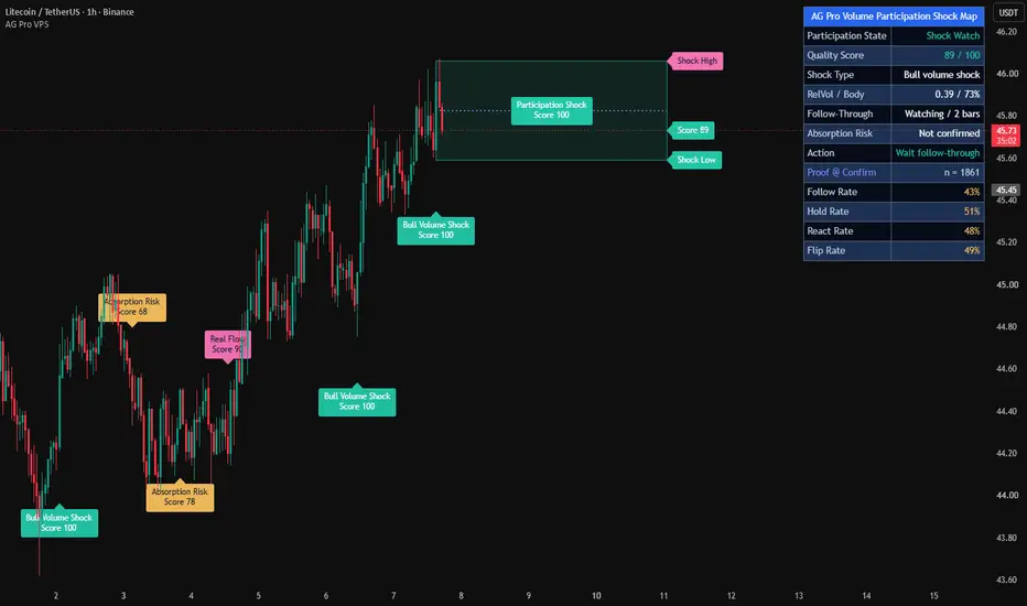
Volume Participation Shock Map [AGPro Series]Volume Participation Shock Map
🧠 Core Idea
Did the volume shock bring real participation, or did the move get absorbed after the first impulse?
📌 Overview / What it does
Volume Participation Shock Map is a volume-flow interpretation tool designed to study what happens after a major participation candle appears.
The script identifies high-quality volume shocks by combining relative volume, candle body participation, ATR-adjusted range expansion, and close location. It then projects the active shock zone, tracks follow-through, detects absorption risk, highlights thin continuation attempts, and summarizes the current participation state in an AG Pro panel.
It does not predict price direction, automate trades, or claim that every high-volume candle will continue. It is a structured visualization tool for reading participation quality after volume events.
🎯 Purpose & Design Philosophy
Many volume tools stop at the first spike.
This script was built to answer the next question:
Did the market continue to participate after the shock, or was the impulse absorbed?
The design goal is to help traders separate meaningful volume expansion from one-bar excitement, thin breakouts, and failed participation.
⚡ Why This Script Is Different
Most tools focus on volume spikes, climax candles, or simple high-volume alerts.
This script does NOT treat high volume as automatically bullish or bearish.
Instead, it checks whether the candle had real body participation, whether price followed through beyond the shock zone, whether the move was absorbed back through the zone, and whether later breakouts happened with weak participation.
⚙️ Methodology
1. Shock Detection
The script compares current volume with recent average volume, checks candle body share, evaluates ATR-adjusted range expansion, and scores close location.
2. Shock Zone Mapping
When a qualified shock appears, the candle range becomes an active participation shock zone.
3. Follow-Through Evaluation
After the shock, the script watches whether price accepts beyond the shock high or low with enough relative volume.
4. Absorption Evaluation
If price closes back through the shock zone after the impulse, the script can mark absorption risk.
5. Visual Output
The chart displays the active shock zone, midpoint participation rail, event labels, right-side context tags, alerts, and a compact AG Pro panel.
🗺️ How to Read the Chart
Participation Shock Zone = the active high-volume candle range being evaluated.
Participation Rail = the midpoint of the shock zone.
BULL VOLUME SHOCK = a bullish shock candle with strong volume, body participation, and range expansion.
BEAR VOLUME SHOCK = a bearish shock candle with strong volume, body participation, and range expansion.
REAL FLOW CONTINUATION = price followed through beyond the shock zone with acceptable participation.
ABSORPTION RISK = price moved back through the shock zone after the initial impulse.
THIN MOVE = price moved beyond the shock edge without enough relative volume. This appears in Detailed label mode.
Panel = summarizes participation state, quality score, shock type, relative volume, body participation, follow-through, absorption risk, and next context.
🚦 Signals & States
• BULL VOLUME SHOCK → bullish high-participation impulse appeared.
• BEAR VOLUME SHOCK → bearish high-participation impulse appeared.
• REAL FLOW UP → bullish shock followed through with acceptable participation.
• REAL FLOW DOWN → bearish shock followed through with acceptable participation.
• BULL SHOCK ABSORBED → bullish shock lost participation back through the zone.
• BEAR SHOCK ABSORBED → bearish shock lost participation back through the zone.
• SHOCK WATCH → an active shock is still being evaluated.
• QUIET FLOW → no active participation shock is currently dominant.
🔔 Alerts Logic
Alerts trigger when a major participation state appears.
• Volume Participation Shock → a high-quality volume shock appears.
• Real-Flow Continuation → price follows through beyond the active shock zone with acceptable participation.
• Absorption Risk → price closes back through the active shock zone after the shock.
• Thin Move → price moves beyond the shock edge without enough relative volume.
Alerts are attention markers, not trade instructions.
🧩 Confluence Logic
The context becomes stronger when:
• Relative volume is clearly above normal
• Candle body participation is strong
• Candle range expands versus ATR
• Price closes near the directional side of the candle
• Follow-through appears before the evaluation window expires
• The panel state agrees with the chart label
If these elements do not align, the script avoids treating volume as automatic conviction.
📊 When to Use
• Breakout participation review
• Trend continuation validation
• Reversal impulse analysis
• High-volume candle interpretation
• Futures, stocks, forex, crypto, and liquid markets
• 15m, 30m, 1H, 4H, and 1D charts where volume data is meaningful
⚠️ When NOT to Use
• Symbols with unreliable or missing volume data
• Very low-liquidity markets
• Extremely noisy micro timeframes
• News spikes where volume behavior may be abnormal
• Markets where candle volume does not represent real participation well
• Situations where a single volume event should not be over-interpreted
🎛️ Key Inputs
• Relative Volume Length → defines the volume baseline.
• Shock Relative Volume → sets how strong volume must be before a shock can qualify.
• Minimum Body Participation % → controls how much candle body commitment is required.
• Minimum Range ATR → filters out small candles with high volume.
• Shock Quality Threshold → controls how selective the main shock labels are.
• Follow-Through Window → defines how long after a shock the script watches for continuation or absorption.
• Minimum Follow Relative Volume → defines whether continuation has enough participation.
• Absorption Midline Threshold % → controls how deeply price must return into the shock zone before absorption risk is marked.
• Event Label Mode → Premium focuses on major shock, continuation, and absorption events. Detailed also allows thin-move labels.
🖥️ Interface & Visual Design
The visual hierarchy is built around the active shock zone.
The zone shows the high-volume impulse range.
The midpoint rail helps judge acceptance versus absorption.
Event labels highlight the most important participation behavior.
Right-side tags keep the current shock context visible.
The AG Pro panel compresses the current state into a fast, readable decision-support summary.
🧪 Practical Usage Workflow
1. Read the panel participation state.
2. Check whether an active shock zone is present.
3. Watch whether price accepts beyond the shock high or low.
4. Evaluate whether follow-through has enough relative volume.
5. Watch for absorption back through the shock zone.
6. Confirm the chart context with structure, trend, liquidity, and risk planning.
🔍 Interpretation Guidelines
A volume shock is not automatically a valid trade signal.
Continuation is stronger when price accepts beyond the shock zone with participation.
Absorption matters when the first impulse cannot hold its zone.
Thin moves can warn that price is extending without enough participation.
The script is best used as a participation-reading layer, not as a standalone decision system.
🚫 What This Script Is NOT
This script is not a prediction engine.
It is not financial advice.
It is not an auto-trading system.
It does not provide guaranteed entry or exit signals.
It is not a simple volume spike alert.
⚠️ Limitations & Transparency
Volume quality depends on the symbol and market.
Crypto, futures, stocks, and forex may represent volume differently.
High volatility can create sudden shock labels that need broader context.
Low-liquidity assets may produce misleading relative volume readings.
Different timeframes may show different participation behavior.
🧠 Market Context Notes
Volume can be useful only when it is read together with price behavior.
A strong candle with high volume may show participation.
But if price cannot follow through, that same candle may become an absorption reference.
This script is designed to make that difference easier to see.
🧾 Use Case Examples
If a strong bullish candle appears with high relative volume, large body participation, and range expansion, the script may mark BULL VOLUME SHOCK.
If price later closes above the shock high with enough participation, the script may mark REAL FLOW CONTINUATION.
If price closes back through the shock zone after the impulse, the script may mark ABSORPTION RISK.
If price breaks beyond the shock edge with weak relative volume, Detailed mode may mark THIN MOVE.
🧱 System Philosophy
The goal is not to make volume louder.
The goal is to make volume behavior more interpretable.
This script treats participation as a sequence:
shock → acceptance → follow-through → absorption or continuation.
🔐 Non-Promise Statement
No script can guarantee market direction.
No volume event guarantees continuation.
No absorption label guarantees reversal.
All outputs should be interpreted as analytical context.
📉 Risk Disclosure
Trading involves risk.
This script is for educational and analytical purposes only.
It does not provide financial advice, investment advice, or guaranteed trading outcomes.
Users are fully responsible for their own decisions, risk management, and trade execution.
📚 Educational Note
Use the script to study how markets behave after high-participation candles.
The most important question is not only whether volume appeared.
The better question is whether price continued to accept that participation afterward.
Wskaźnik

AI SMC Pro v2AI SMC Order Flow Pro v2.0 is an advanced Smart Money Concepts indicator combining ICT methodology, multi-timeframe analysis, Bayesian AI scoring, and order flow estimation — all in a single non-repainting overlay.
Core Features:
BOS & CHoCH structure detection
Bullish & Bearish Order Blocks (auto-invalidation)
Fair Value Gaps (auto-fill detection)
Liquidity levels (LQH / LQL)
Premium & Discount zones
Session High/Low (Asia, London, New York)
Support & Resistance (50-bar dynamic)
AI Engine:
Bayesian confidence score (0–100%) combining trend, momentum, MACD, volume, structure, order flow, MTF bias, session and zone
Three modes: Conservative / Balanced / Aggressive
Order Flow Module:
Estimated buy/sell pressure
Estimated delta & cumulative delta
Volume spike detection
Signals:
LONG / SHORT entries with SL, TP1, TP2
ATR-based risk management (customizable multipliers)
Minimum R:R filter (1:2 / 1:3 / 1:4)
Session filter (London & New York only)
MTF confirmation required
Built-in Backtest:
Win rate, Profit Factor, Expectancy
Max win/loss streak
Trailing stop & Break-even options
Best used on: EUR/USD · GBP/USD · 15m timeframe during London or New York session. Wskaźnik

Buy and Sell Candle PressureBuy and Sell Candle Pressure takes the candle-pressure model used in my closed-source script "Predictive Volume MTF Pro" workflow and brings that Buy/Sell pressure read directly onto the price chart. Instead of viewing the Buy/Sell split only inside a table, the candles themselves can now show whether the active candle structure is leaning bullish, bearish, neutral, or moving through stronger pressure tiers.
The goal is simple:
• keep the real OHLC candle shape intact
• recolor the candle body, wick, and border from the candle-pressure engine
• make candle-by-candle pressure easier to see directly on the chart
• add local and higher-timeframe bias trails for extra context
This is not meant to replace the main Predictive Volume dashboard. It is meant to be a lightweight visual companion that helps bring the Buy/Sell pressure read into your chart space.
────────────────────────────
What the Candle Colors Represent
────────────────────────────
The candle overlay uses a candle-structure pressure estimate built from OHLC and volume behavior.
The pressure model looks at more than just whether a candle closed green or red. It considers:
• where the close sits inside the full candle range
• how much directional conviction is shown by the candle body
• how upper and lower wicks may reflect rejection, absorption, or imbalance
That pressure score is then converted into a rounded Buy/Sell split and used to color the candle overlay.
Important:
This is not true order flow, bid/ask volume, or exchange-level volume delta. It is a candle-structure pressure estimate designed to give visual context from the candle itself.
────────────────────────────
Bias Modes
────────────────────────────
The script includes two candle color modes:
Standard
A simple bull / bear / neutral color mode.
This is the cleanest option if you only want to know whether the candle-pressure read is leaning toward buy pressure, sell pressure, or balance.
Standard II
A stronger tiered color mode.
This mode expands the Buy/Sell pressure split into multiple bull and bear intensity levels. Lighter colors represent earlier pressure development, while stronger colors represent more aggressive Buy/Sell pressure readings.
────────────────────────────
Pressure Bias Trail
────────────────────────────
The Pressure Bias Trail is a rolling price-bias reference line designed to pair with the pressure candles.
In plain terms:
• candles show current-bar Buy/Sell pressure
• the Pressure Bias Trail shows the local rolling price-bias reference
The trail is calculated from the selected price source, average type, and length. Its color is based on whether the current close is above or below the trail.
This gives the chart two layers of context:
• candle pressure = what the current candle is showing
• trail position = whether price is holding above or below its rolling bias reference
────────────────────────────
HTF Pressure Bias Trail
────────────────────────────
The HTF Pressure Bias Trail applies the same trail formula on an automatically selected higher timeframe.
The HTF value is stabilized using SimpleCryptoLife’s HighTimeframeSampling library so the higher-timeframe trail behaves more smoothly on the active chart timeframe.
This can help users compare:
• current candle pressure
• local rolling price bias
• higher-timeframe rolling price bias
When price is above both the local and HTF trails, the chart can show stronger alignment. When price is trapped between them, fading through one, or repeatedly rejecting one, the trails can provide useful context around pressure transitions.
────────────────────────────
Included Visual Tools
────────────────────────────
• Buy/Sell Pressure Candle Overlay
• Standard and Standard II pressure color modes
• Chart-timeframe Pressure Bias Trail
• HTF Pressure Bias Trail
• Bar-to-Bar Close Follow Line
• Last-Bar Index Follow Line
• Last-Bar Buy/Sell + Pressure Label
The pressure label shows the rounded Buy/Sell split on the first line and the normalized pressure value on the second line. It can auto-position above bullish pressure and below bearish pressure.
────────────────────────────
How I Use It
────────────────────────────
I view this script as a chart-side pressure layer.
The main Predictive Volume + MTF script gives the broader table-based multi-timeframe volume view. This script brings one important part of that workflow — candle pressure — directly onto the candles.
Useful ways to read it:
• Standard II candles can highlight stronger Buy/Sell pressure tiers
• the local Pressure Bias Trail can show whether price is holding its short-term bias
• the HTF Pressure Bias Trail can show where higher-timeframe bias may be acting as context
• the pressure label gives a quick last-bar read without needing a full table
This is not a buy/sell signal system by itself. It is a visual context tool.
────────────────────────────
Companion Script
────────────────────────────
This script is designed to work hand in hand with:
Predictive Volume + MTF
Predictive Volume + MTF remains the larger dashboard-style workflow for multi-timeframe predictive volume, current volume, previous volume, average volume, relative volume, and Buy/Sell pressure context.
Buy and Sell Candle Pressure is the lightweight open-source candle-overlay companion.
────────────────────────────
Attribution
────────────────────────────
Special thanks to SimpleCryptoLife for the original Predictive Volume foundation and for the HighTimeframeSampling library used to stabilize the HTF Pressure Bias Trail.
This open-source script is published as a companion visualization layer for "Predictive Volume + MTF ".
Wskaźnik

Volume Run RateVolume Run Rate
What it does
This indicator answers a simple question that raw volume bars can't: "At this point in the trading day, are we trading more or less than usual?"
It accumulates volume from the start of each day, expresses that running total as a percentage of the average full-day volume over a lookback window, and then compares the current reading to where the run rate typically sits at the same time of day historically. When today's pace pushes meaningfully above that historical norm (default: more than 2 standard deviations), the background highlights yellow.
Three lines are plotted:
Green stepline — today's cumulative volume so far, as a % of the average daily total over the lookback window.
Gray line — the average run rate at this same time-of-day across the lookback days.
Orange crosses — the upper threshold (historical same-time mean + N standard deviations). When the green line breaks above it, the day is participating unusually heavily for this point in the session.
Why intraday cumulative volume vs. history beats looking at volume alone
A single volume bar tells you only what happened in the last 5 minutes (or 15, or whatever your timeframe is). That's a noisy, low-context signal. Volume is naturally lumpy intraday — the open and close are always heavy, lunch is always thin — so a "big" bar at 10:00 might be completely normal, and a "small" bar at 14:30 might actually be elevated for that time slot. Eyeballing bar height tells you almost nothing about whether real interest is building.
Cumulative volume from the day's open smooths out that bar-to-bar noise and captures a more meaningful quantity: how much total participation has shown up so far today. But "a lot" or "a little" only means something when measured against a baseline. Comparing today's cumulative volume at 11:00 to the typical cumulative volume at 11:00 over the last 20 days gives you a like-for-like read on whether today is unusually busy for where we are in the session. Two standard deviations above that historical mean is statistically rare — roughly the top 2-3% of historical readings at this time slot — which is why it's a useful alert level.
How to use it
Volume tends to confirm or contradict price moves. The run rate makes that confirmation legible in real time:
Breakout validation. Price breaks a key level intraday and the run rate is already running hot above the threshold — participation is real, the move has fuel behind it. Same breakout on a depressed run rate is much more likely to fail or fade.
Trend day vs. chop day, early. If the run rate pushes through the upper threshold in the first hour or two, the day is on track for an above-average volume session, which historically correlates with directional follow-through. A run rate stuck near or below the historical average suggests a low-conviction, mean-reverting tape — fade the edges, don't chase.
News and event reaction. When something hits the tape, the question isn't "did volume go up" (it almost always does for one bar) but "is the market actually engaging with this." A run rate that gaps above the threshold and stays there says yes. A spike that immediately reverts says the market dismissed it.
Distribution and accumulation timing. Sustained elevated run rate at a price plateau, especially near prior highs or lows, suggests something larger going on than the price action alone reveals.
Avoiding low-conviction setups. If your trade thesis depends on participation but the run rate is well below average for this time of day, that's a real signal to size down or skip.
Inputs
Lookback days — how many prior days to use as the historical baseline. Default 20 (≈ one trading month).
Std Dev threshold — how many standard deviations above the historical same-time mean triggers the elevated-volume background. Default 2.0.
Exclude weekends — turn on for crypto or other 24/7 markets where weekend sessions have structurally different volume profiles than weekdays. Off by default (correct for traditional Mon-Fri markets).
Notes
Use on intraday timeframes only (anything lower than Daily). On Daily or higher, an error message is shown — the "cumulative vs. history at the same time of day" comparison only makes sense within a day.
The indicator stores every intraday bar's run rate in persistent arrays, which lets it look back further than Pine's standard 5000-bar history limit and compare apples to apples across the full lookback window.
The historical comparison uses the bar's position within the day (1st bar, 2nd bar, etc.), so it works on any intraday timeframe automatically.
Wskaźnik

Wskaźnik

SMC Supply & Demand Zones - H4 / H1 / M10Automatically identifies and draws supply and demand zones across three timeframes (H4, H1, and M10) simultaneously on any chart, using a strict volume-confirmed impulse candle definition rooted in Smart Money Concepts (SMC).
How zones are built
A zone is created only when all three conditions are met on the same candle:
Body size ≥ 1.5 × ATR(14) — filters out indecision candles
Close breaks beyond the prior 5 candles' high (demand) or low (supply) — confirms impulsive intent
Volume ≥ 1.5 × SMA(volume, 20) — requires institutional-level participation
Zone boundaries follow the SMC base candle rule: demand zones span from the impulse candle's open down to its low; supply zones span from its high down to its open.
Visual design
Each timeframe uses a distinct colour family so you can read confluence at a glance — H4 in blue, H1 in orange, M10 in green. Lighter shades mark demand, darker shades mark supply. When price closes fully through a zone, it fades to grey and is tagged with (mitigated) — it stays on the chart for context but is visually de-emphasised. Each zone carries a label (e.g. "H4 D", "H1 S") pinned to its right edge.
Settings
Toggle each timeframe on/off independently
Adjust the body multiplier, prior-bar lookback, and volume multiplier to match the instrument
Set separate caps for active and mitigated zones per timeframe (FIFO — oldest removed first)
Full colour control per timeframe and direction
Toggle labels and borders separately
Non-repainting
All three timeframe feeds use request.security() with lookahead = barmerge.lookahead_off and gaps = barmerge.gaps_off. Zones are created only on the bar where an impulse candle's close is first confirmed — no bar-0 data is used.
Recommended use
Load on your entry timeframe (M10 or M5) and use the H4/H1 zones as bias and confluence levels. Look for price to sweep into a higher-TF zone and react — that is your area of interest for entry confirmation on the lower timeframe. Wskaźnik

Wskaźnik

Volume Spike Aftershock Planner [AGPro Series]Volume Spike Aftershock Planner
🧠 Core Idea
After a volume spike, is price actually defending the impulse, absorbing it, or losing control completely?
📌 Overview / What it does
Volume Spike Aftershock Planner is designed to evaluate what happens after an abnormal volume expansion candle appears on the chart. Instead of stopping at the spike itself, the script studies the post-impulse behavior and organizes that structure into a readable decision-support framework.
The script maps a spike anchor, an active aftershock band, a failure boundary, and a target-room reference. It also produces contextual labels, right-side price tags, and a compact information panel that summarizes the current aftershock condition with a rule-based score.
This script does not attempt to predict the next candle, automate entries, or generate guaranteed continuation signals. It is an analytical visualization tool that helps users judge whether the spike is still being respected, partially absorbed, or fully invalidated.
🎯 Purpose & Design Philosophy
This script was built to solve a common gap in volume analysis.
Most traders can see when volume suddenly expands. The harder question is what to do with that information after the impulse bar closes. A large volume candle can lead to continuation, rejection, absorption, or complete failure, and those outcomes do not deserve the same interpretation.
This tool helps traders who want a more structured way to read post-spike behavior. It supports a patient, evidence-based mindset by focusing on participation quality, impulse defense, failure thresholds, and available room rather than hype or prediction.
⚡ Why This Script Is Different
Most volume tools focus on spike detection, raw histogram expansion, or one-bar climax alerts.
This script does NOT stop at identifying unusual participation.
Instead, it tracks the aftershock environment that forms after the spike, measures whether price is holding the impulse anchor, maps when the move is being absorbed, and highlights when the context has either matured or failed. The result is not just a volume event marker, but a structured framework for interpreting what the spike still means.
⚙️ Methodology
1. Context Detection
The script scans for abnormal volume participation and range expansion relative to recent behavior. It also reviews body quality so that weak, indecisive candles are filtered more carefully.
2. Reference Mapping
Once a valid spike is confirmed, the script establishes a spike anchor and builds an aftershock band around that reference. It also defines a failure boundary and a room projection.
3. Reaction Evaluation
Price is then evaluated relative to the anchor and surrounding rails. The script checks whether the impulse is being defended, fading back through the anchor, or failing beyond the allowed structure.
4. Visual Output
The final output includes the aftershock band, anchor reference, room line, failure line, event labels, right-side tags, optional bar coloring, and a dashboard panel that summarizes the current state.
🗺️ How to Read the Chart
Zones:
The aftershock band represents the active post-spike area where the market is being evaluated. It is the main structure zone for interpreting whether the impulse still matters.
Labels:
Labels mark important contextual events such as bull spike, bear spike, holding behavior, absorbed behavior, target review, and failure.
Colors:
Teal highlights constructive bullish behavior or defended impulse structure.
Pink highlights bearish structure, invalidation, or failed context.
Gold highlights review areas such as absorption or target-room interaction.
Indigo highlights the spike anchor reference.
Panel:
The panel summarizes the spike state, the Aftershock Score, participation quality, available room, and the current action state.
🚦 Signals & States
• Bull Spike → A bullish high-participation impulse anchor has been detected.
• Bear Spike → A bearish high-participation impulse anchor has been detected.
• Holding → Price is still defending the impulse structure after the spike.
• Aftershock Ready → The post-spike condition is strong enough to deserve active attention.
• Absorbed → Price has moved back through the anchor and the impulse is losing control.
• Target Review → The projected first room objective has been reached and context should be reassessed.
• Failed → The active aftershock structure has broken down beyond the allowed limit.
• Wait Spike → No valid active spike context is currently available.
• Expired → The spike is too old to remain actionable within the current framework.
🔔 Alerts Logic
Alerts can trigger when a new bullish or bearish spike is detected, when price begins to hold the impulse, when the aftershock condition becomes ready, when the move becomes absorbed, when target room is reached, or when the context fails.
These alerts are attention markers only. They highlight a structural event inside the script logic. They are not trade instructions, automated entries, or guarantees of follow-through.
🧩 Confluence Logic
The context becomes stronger when multiple conditions align at the same time.
For example, a high relative-volume spike with strong candle expansion, defended anchor structure, stable participation decay, and clear room beyond the band creates a much stronger environment than a spike that immediately collapses back through its reference level.
This confluence logic is what separates a meaningful aftershock structure from a noisy one-bar event.
📊 When to Use
• Markets with reliable volume behavior
• Crypto pairs with clean participation swings
• Stocks and indices with readable impulse candles
• Breakout or breakdown follow-through evaluation
• Continuation review after a strong reaction candle
• 1H, 4H, and 1D chart studies where impulse quality matters
⚠️ When NOT to Use
• Illiquid symbols with distorted or unreliable volume
• Extremely noisy low-range environments
• Symbols where volume feed quality is poor
• Isolated one-bar anomalies with no structural follow-through
• Extreme volatility conditions where impulse rails become unstable too quickly
🎛️ Key Inputs
• Relative Volume Length → Controls the participation baseline used for spike comparison.
• Minimum Relative Volume → Controls how large the volume expansion must be before the candle qualifies as a spike.
• Minimum Range Ratio → Controls how much price expansion is required.
• Minimum Body Ratio → Filters out weak spike candles with poor body commitment.
• Aftershock Band ATR → Controls the depth of the active aftershock zone.
• Failure Buffer → Controls how far price can move before the spike idea is considered broken.
• Minimum Ready Score → Controls how strict the script is before showing stronger actionable states.
• Visual Settings → Control labels, panel location, theme, font size, and optional chart styling.
🖥️ Interface & Visual Design
The visual design is built around clarity at first glance.
The panel gives a fast structural summary without forcing the user to inspect every line manually. The chart layer uses premium contrast and a clear hierarchy so the aftershock band, anchor, failure boundary, and room references remain readable without overwhelming the candles.
The goal is not decoration. The goal is clean interpretation under live market conditions.
🧪 Practical Usage Workflow
1. Read the panel to understand the current spike state and score.
2. Check whether a valid spike anchor and aftershock band are active.
3. Evaluate whether price is holding, absorbed, or failing relative to the anchor.
4. Review available room and decide whether the current context is mature, early, or already extended.
5. Use labels and tags as structured context markers, not as automatic commands.
🔍 Interpretation Guidelines
Treat the script as a structured reading framework.
A stronger score suggests that the spike had better participation, cleaner range expansion, and more stable post-spike structure. A weaker score suggests that the move may be losing informational value.
An absorbed state does not mean reversal is guaranteed. It means the original impulse is no longer being defended as cleanly as before.
A target-review state does not mean the move must stop. It means the first projected room objective has already been reached and the user should reassess the context rather than assuming endless continuation.
🚫 What This Script Is NOT
This script is not a prediction engine.
It is not a financial advice tool.
It is not an automated trading system.
It is not a broker integration.
It does not place orders.
It does not guarantee continuation, reversal, or profitability.
⚠️ Limitations & Transparency
This script is rule-based and depends on the quality of the underlying market data.
Timeframe changes can materially alter how spikes, bands, and room projections appear. High-volatility environments can also reduce the stability of post-spike structures. In thin or distorted markets, volume expansion may look meaningful while carrying very little analytical value.
The script should always be interpreted in broader market context rather than in isolation.
🧠 Market Context Notes
Volume spikes are often strongest when they appear at meaningful structure transitions, liquidity shifts, or expansion points where the market is forced to reveal intent.
That said, not every spike represents sustainable conviction. Some are exhaustion bursts, some are absorption events, and some are temporary reactions inside a larger opposing structure. The aftershock behavior is often more important than the spike itself.
🧾 Use Case Examples
Example 1:
Price breaks above a local range with a large bullish volume surge. The script marks a bull spike, price holds above the anchor, and the panel shifts into a stronger aftershock state. This suggests the impulse still deserves attention.
Example 2:
Price prints a large bearish impulse, but then quickly moves back through the anchor. The script shifts into an absorbed condition, signaling that the original downside impulse is losing control.
Example 3:
A high-volume move expands sharply, then reaches the target-room area. The script marks target review, reminding the user to reassess the move rather than assuming continuation is still efficient.
🧱 System Philosophy
AGPro Series tools are designed as decision-support frameworks, not signal vending machines.
The philosophy is simple: map structure clearly, make states readable, reduce noise, and help the user think better around live price behavior.
🔐 Non-Promise Statement
This script does not promise certainty.
It does not promise that a volume spike will continue, reverse, hold, or fail in any predetermined way. It simply organizes the available structure so the user can evaluate the situation with more clarity.
📉 Risk Disclosure
Trading and investing involve risk.
Market conditions can change quickly, and any analytical tool can produce outputs that become invalid under new volatility, liquidity, or structural conditions. Users remain fully responsible for their own decisions, risk management, and execution.
This script is provided for educational and analytical purposes only. It is not financial advice.
📚 Educational Note
This tool is most useful when treated as a market-reading assistant.
The best results usually come from combining it with broader structure analysis, liquidity awareness, and disciplined risk management rather than using it as a standalone trigger system.
Wskaźnik

Liquidity Grab Detector v4What is this and why do you need it?
The indicator shows where the market maker is hunting stops and when the price is likely to reverse afterwards.
The logic is simple: before a reversal, price often sweeps beyond a key level, takes out retail traders’ stop-losses, and then reverses back. This is called a Liquidity Grab. LGD v4 detects these moments and evaluates the quality of each signal from 0 to 100.
What you see on the chart
Colored zones — Liquidity pools where stops have accumulated. The more touches, the more stops are sitting there.
Signal label (e.g. REJ 72 or ABS 85) — The word is the reversal type, the number is the signal quality (0–100).
Green/Red background — The system is “armed” and waiting for confirmation to enter.
TP and SL lines — Appear only on a valid signal. SL is always placed behind the probe extreme, not on the level itself.
Four Types of Signals
A+ (85–100) — Rare, enter with full size
A (70–84) — Strong signal
B (50–69) — Good, use with additional confirmation
C (<50) — Skip or only in perfect context
TypeIn Simple TermsShould You Enter?ABS (Absorption)A big player absorbed all the pressure with a wall of ordersYes, full sizeREJ (Rejection)Sharp rejection — nobody wanted to continue buying/sellingYes, full sizeDIV (Divergence)Came in with volume but couldn’t holdHalf sizeEXH (Exhaustion)Quiet sweep on low volume, unclear strengthBetter to skip
Simple Entry Algorithm
Check the 1H chart — what’s the daily bias (up or down)?
Check the 5M chart — is LGD showing a signal in the same direction?
Is the signal type ABS or REJ with score above 60?
Place SL where the red box is, and TP at the next liquidity zone.
If any of these conditions aren’t met — skip the trade.
Best Trading Times
Trade Tuesday to Thursday, during the window 09:45–11:30 ET.
Avoid trading on NFP, FOMC, and CPI days — signals are unreliable during high-impact news.
What the Indicator Does
LGD v4 is a liquidity sweep detector for CME micro-futures. It combines three independent engines:
Pool Engine — Creates dynamic liquidity pools from swing highs/lows with a full lifecycle: birth → touches → sweep → death.
Sweep Scoring — Evaluates every sweep using 11 different criteria (0–100 score) and determines the type of reversal.
SFP Trigger Engine — AVWAP exhaustion + percentile rank gating + BOS confirmation.
How to Read the Chart
ElementMeaningColored zones (rectangles)Liquidity pools labeled: source × touches, health%REJ 72.4 / ABS 85.1Reversal type + score out of 100 on sweepSFP | PR 7.2BullByte-style trigger with percentile rankTeal lineImpulse AVWAP (resets on every N-bar extreme)Aqua lineDaily AVWAP (resets every day)Dark green backgroundArmed Long — system is ready, waiting for BOS upDark red backgroundArmed Short — system is ready, waiting for BOS downSFP / SFP-LSwing Failure Pattern (Pivot / Level)Green/Red boxRisk Zone: SL + TP1 + TP2
Reversal Types
TypeWhat HappenedSignal StrengthRecommended SizingABS (Absorption)Large limit order absorbed the stop flow. Huge volume, strong wick★★★★★Full sizeREJ (Rejection)Volume delta opposite to sweep direction★★★★☆Full sizeDIV (Divergence)High volume pushed into the zone, but close didn’t hold★★★☆☆Half sizeEXH (Exhaustion)Sweep on thin volume, weak rejection★★☆☆☆Skip or 1/4 size
Wskaźnik
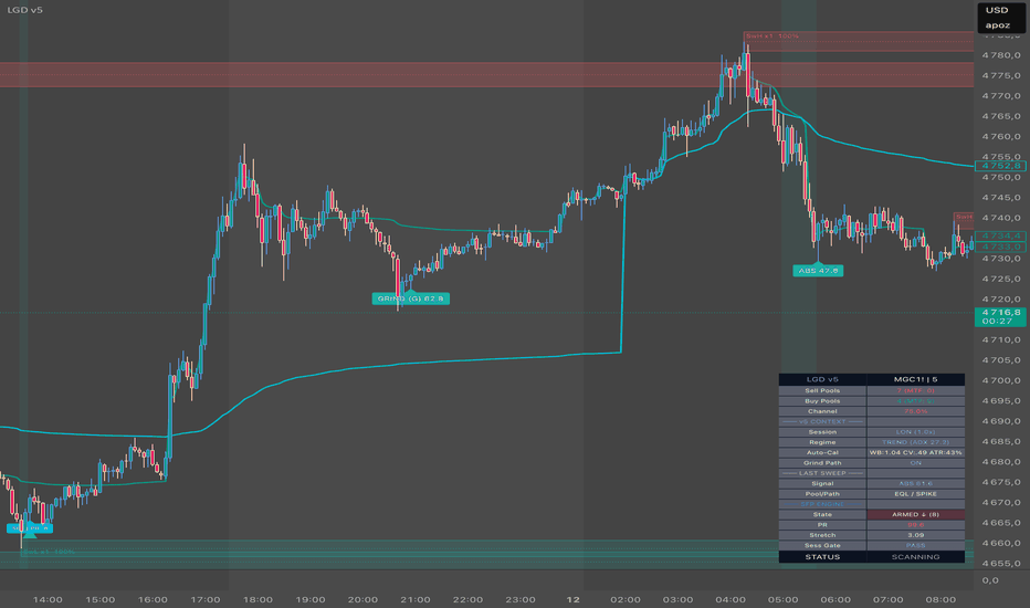
Wskaźnik

Volume Dry-Up Reversal Planner [AGPro Series]Volume Dry-Up Reversal Planner
🧠 Core Idea
Is the market losing participation before a reversal attempt?
📌 Overview / What it does
Volume Dry-Up Reversal Planner detects low-participation pockets where relative volume contracts and candle range compresses.
The script maps a dry-up pocket, tracks whether price attempts to reverse out of that pocket, and displays reversal rails, failure shelves, follow-through references, event labels, and a compact AG Pro dashboard.
It does not predict reversals. It helps organize participation, compression, reaction quality, failure risk, and current action state around a potential dry-up reversal context.
🎯 Purpose & Design Philosophy
Many reversal tools focus on dramatic exhaustion candles or high-volume climaxes.
This script was built for a quieter but important condition: participation drying up before the next reaction.
It helps traders evaluate whether the market is simply inactive, compressing before movement, or beginning a structured reversal attempt from a low-participation pocket.
⚡ Why This Script Is Different
Most volume indicators highlight high-volume events.
This script does NOT chase volume climax or generic reversal signals.
Instead, it focuses on volume dry-up, range compression, reversal rails, failure shelves, follow-through context, and a 0-100 readiness score.
⚙️ Methodology
1. Participation Detection
The script compares current volume against recent average volume to identify low-participation candles.
2. Compression Mapping
Current candle range is compared with recent average range. A dry-up pocket requires both lower participation and controlled range compression.
3. Reversal Evaluation
After a dry-up pocket appears, the script watches whether price breaks beyond the pocket with enough quality to form a reversal attempt.
4. Visual Output
The chart receives a dry-up pocket, reversal rail, failure shelf, follow-through rail, right-side tags, event labels, optional bar coloring, and a dashboard panel.
🗺️ How to Read the Chart
The dry-up pocket marks the area where participation and range compressed.
The reversal rail shows the level price must clear to begin a reversal attempt.
The failure shelf marks where the active reversal context fails.
The follow-through rail marks the first reaction reference after a reversal attempt.
Labels highlight dry-up pockets, bullish reversal attempts, bearish reversal attempts, follow-through, and invalidation.
Colors represent context:
• Teal → bullish reversal attempt
• Pink → bearish reversal attempt or invalidation
• Gold → follow-through or waiting context
• Indigo → dry-up pocket / monitoring context
The panel summarizes:
• Dry-Up state
• Reversal Score
• Participation
• Failure Risk
• Action
🚦 Signals & States
• Dry-Up Pocket → relative volume and range both contracted
• Bull Reversal → price broke above the dry-up pocket
• Bear Reversal → price broke below the dry-up pocket
• Follow-Through → price reached the first reaction rail
• Invalidated → price crossed the failure shelf after a reversal attempt
• READY → reversal context has enough score quality to monitor
• MONITOR → reversal attempt is active but not fully ready
• WAIT → no strong active context exists
• EXPIRED → the dry-up pocket is too old to remain active
🔔 Alerts Logic
Alerts can trigger when a dry-up pocket appears, when a bullish or bearish reversal attempt begins, when the context reaches READY state, when follow-through appears, or when invalidation occurs.
Alerts are attention markers only. They are not trade instructions.
🧩 Confluence Logic
The context becomes stronger when relative volume contraction, range compression, close response, rejection quality, and volatility fit align.
For example, a low-volume compression pocket followed by a strong close outside the pocket can create a more structured reversal context than a random low-volume candle.
📊 When to Use
• Potential reversal areas after participation fades
• Pullback zones where volume dries up
• Ranging markets before directional reaction
• Trend pauses where continuation or reversal depends on participation
• Liquid crypto, indices, forex, and equities with readable volume behavior
⚠️ When NOT to Use
• Very low-liquidity symbols
• Markets with unreliable volume data
• News spikes and unstable spread conditions
• Extremely noisy candles without structure
• Situations where low volume simply means no meaningful market participation
🎛️ Key Inputs
• Relative Volume Length → controls the volume baseline
• Dry-Up Volume Threshold → controls how strict low-participation detection is
• Range Compression Length → controls the range baseline
• Maximum Range Ratio → controls how compressed the candle must be
• Dry-Up Pocket Window → controls how the pocket is mapped
• Reversal Buffer ATR → controls how far price must clear the pocket
• Failure Shelf ATR → controls where the reversal context fails
• Follow-Through ATR → controls the first reaction reference
• Visual settings → control pockets, rails, labels, tags, panel, and bar colors
🖥️ Interface & Visual Design
The interface is designed to make participation shifts visible without turning the chart into a noisy signal board.
The dry-up pocket defines context, the reversal rail defines the first reaction threshold, the failure shelf defines risk, and the panel summarizes the current state.
The goal is a premium, readable visual map for traders who care about participation and reaction quality.
🧪 Practical Usage Workflow
1. Check whether a dry-up pocket is active
2. Read the panel score and action state
3. Watch the reversal rail
4. Compare follow-through with failure risk
5. Confirm the context with broader market structure and timeframe alignment
🔍 Interpretation Guidelines
A dry-up pocket means participation and range compressed. It does not mean a reversal must happen.
A reversal attempt means price broke out of the pocket with enough reaction to monitor.
A READY state means the rule-based score has enough quality for attention.
Failure risk helps keep the reversal context grounded instead of treating every low-volume area as important.
🚫 What This Script Is NOT
This script is not a prediction engine.
It is not a guaranteed reversal system.
It is not a high-volume climax detector.
It is not an automated trading tool.
It does not provide financial advice.
It does not guarantee reversal, continuation, profit, or a specific target.
⚠️ Limitations & Transparency
Volume behavior differs across markets, exchanges, sessions, and timeframes.
Some dry-up pockets may lead to no meaningful reaction.
Some reversals may begin without a clean dry-up pattern.
The score is a rule-based context score, not a certainty model.
🧠 Market Context Notes
Volume dry-up can represent hesitation, absorption, exhaustion, or simple inactivity.
The important question is not whether volume is low by itself, but whether price reacts cleanly after participation contracts.
Use the pocket as context, not confirmation by itself.
🧾 Use Case Examples
When price pulls back with shrinking volume and compressed candles, the script can map a dry-up pocket.
If price later breaks above that pocket, the script marks a bullish reversal attempt and tracks follow-through.
If price breaks below the failure shelf after a reversal attempt, the script marks invalidation.
🧱 System Philosophy
This script follows the AGPro Series approach: turn a specific market condition into a structured decision-support map.
The focus is not prediction. The focus is participation, compression, reaction quality, failure awareness, and visual clarity.
🔐 Non-Promise Statement
No script can remove uncertainty from markets.
This tool does not promise accuracy, profitability, or future price movement.
Its purpose is to organize volume dry-up context so the user can interpret the chart more clearly.
📉 Risk Disclosure
Trading involves risk.
Market conditions can change quickly, and any analytical output can fail.
Users are responsible for their own decisions, risk management, and trade execution.
This script is for educational and analytical purposes only and does not provide financial advice.
📚 Educational Note
Low volume is not automatically bullish or bearish.
The best reads usually come when volume dry-up, range compression, reaction quality, and market structure all support the same context.
Wskaźnik