ShareScope Weiss Wave approximation v1ShareScope Weis Wave Approximation v1
Overview
This indicator is an attempt to reproduce the behaviour of the Weis Wave implementation available in ShareScope using TradingView Pine Script.
The objective is not to recreate every interpretation of David H. Weis's work, but rather to approximate the wave-construction and cumulative volume behaviour observed in ShareScope's Volume Weis Wave indicator.
Methodology
The indicator organises market volume into directional price waves using a percentage-based ZigZag reversal threshold.
A wave remains active while price continues moving in the current direction. When price reverses by the specified percentage amount, the current wave is completed and a new wave begins. Volume is accumulated throughout the life of each wave and displayed as a cumulative histogram.
Available options include:
• ZigZag Value (%) – percentage reversal required to start a new wave.
• Use High/Low – uses candle extremes rather than closing prices when determining wave reversals.
• Symmetric Calculation – applies proportional reversal mathematics so that up and down reversals are geometrically symmetrical.
The calculation updates dynamically as new price data arrives and completed waves become fixed only after the reversal threshold has been reached.
What This Indicator Is Not
Please note - This is not an ATR-based Weis Wave model.
Some modern Weis Wave implementations use Average True Range (ATR), volatility measurements, adaptive thresholds or other dynamic methods to determine wave reversals. This indicator does not use ATR, volatility bands, adaptive filters, moving averages or volume-based reversal logic.
Wave changes are driven solely by the selected percentage reversal threshold, consistent with the behaviour described for ShareScope's Weis Wave implementation.
Notes
David H. Weis never published a single definitive formula for constructing Weis Waves and various software platforms implement the concept differently. As a result, indicators carrying the "Weis Wave" name may produce substantially different results depending on the wave-construction methodology used.
This script focuses specifically on approximating ShareScope's percentage-based wave model rather than ATR-based, volatility-based or proprietary alternatives.
For research and comparison purposes, several exportable data series are included:
• Wave Direction
• New Wave Trigger
• Active Wave Volume
• ZigZag Value
• Current Swing Extreme
These outputs can be accessed through TradingView's Data Window and CSV export facilities.
Wskaźnik

Wskaźnik
6 GAN 8 TIMEFRAME POWER FUSION6 GAN 8 TIMEFRAME POWER FUSION
6 GAN 8 Timeframe Power Fusion is a multi-layer market analysis engine designed to combine trend structure, market participation, momentum, volatility, and price flow into a single decision framework.
The purpose of this indicator is not to generate signals from a single formula or a single oscillator. Instead, it attempts to evaluate the market through multiple independent perspectives and only produces high-confidence signals when those perspectives begin to align.
Multi-Timeframe Analysis Engine
One of the core components of the system is the 8 Timeframe Synchronization Model.
The indicator continuously analyzes:
1 Minute
5 Minute
15 Minute
30 Minute
1 Hour
4 Hour
Daily
Weekly
Rather than relying on one chart timeframe, the system evaluates directional agreement across all monitored periods.
When multiple timeframes begin moving in the same direction, market structure becomes stronger and directional confidence increases.
The TF score displayed in the panel represents how many timeframes currently support the active direction.
Example:
TF 3/8 = Weak alignment
TF 5/8 = Moderate alignment
TF 7/8 = Strong alignment
TF 8/8 = Maximum synchronization
The highest-quality trade opportunities often emerge when higher and lower timeframes begin moving together.
6 GAN Trend Structure Layer
The second core component is the 6 GAN Trend Engine.
Instead of using a single trend line, the system analyzes multiple GAN-inspired trend structures simultaneously.
Each GAN layer evaluates price behavior from a different perspective and trend duration.
The purpose is to measure whether trend strength exists across short-term, medium-term, and long-term structures.
When most GAN layers agree, trend reliability increases significantly.
Example:
GAN 2/6 = Weak trend structure
GAN 4/6 = Developing trend
GAN 5/6 = Strong trend
GAN 6/6 = Full trend agreement
A signal supported by both Timeframe Synchronization and GAN Synchronization generally carries more weight than a signal supported by only one of them.
Volume Fusion Layer
The Volume Fusion Engine combines:
Delta
CVD (Cumulative Volume Delta)
OBV (On Balance Volume)
These components help evaluate participation behind price movement.
Price can move without conviction, but sustainable trends are usually supported by volume.
The FLOW section of the panel provides insight into whether buying pressure or selling pressure is strengthening.
Special attention should be given to:
RES↑ (Resistance Break)
SUP↓ (Support Break)
These events often indicate significant shifts in market participation.
RSI Momentum Layer
The RSI component is not used as a standalone overbought/oversold tool.
Instead, it acts as a momentum confirmation layer.
Strong trends tend to maintain strong RSI conditions for extended periods.
The indicator uses RSI to measure whether market momentum supports the direction suggested by the GAN and Timeframe engines.
ATR Volatility Layer
ATR is used to evaluate market activity and volatility expansion.
Two important states are monitored:
COMP (Compression)
Low volatility environment.
Markets often consolidate and store energy during compression phases.
EXP (Expansion)
Volatility expansion.
This frequently occurs after compression and can lead to directional movements or breakout opportunities.
Compression zones should not automatically be considered entry zones. Instead, they should be viewed as areas where the market may be preparing for its next significant move.
Understanding the Power Score
The Power Score combines all major layers:
8 Timeframe Engine
6 GAN Engine
Volume Fusion
RSI Momentum
ATR Volatility
The score is designed to provide a quick overview of overall market strength.
General interpretation:
Below 35 = Bearish pressure
35–65 = Neutral zone
Above 65 = Bullish pressure
Above 80 = Strong directional environment
The score should not be interpreted as a prediction. It is a measurement of current market conditions.
Best Use Cases
The indicator performs best when multiple layers align simultaneously.
A stronger bullish scenario may include:
TF 7/8 or higher
GAN 5/6 or higher
FLOW showing buying pressure
ATR in expansion mode
Power Score above 65
A stronger bearish scenario may include:
TF 7/8 or higher in the opposite direction
GAN 5/6 or higher bearish alignment
FLOW showing selling pressure
ATR expansion
Power Score below 35
The highest-quality opportunities generally occur when Timeframes, GAN structures, volume flow, and volatility expansion all point in the same direction.
This indicator should be viewed as a market analysis framework rather than a standalone signal generator.
Its primary objective is to help traders understand when multiple layers of market information begin to align and when the probability of directional continuation may be increasing.
TÜRKÇE
6 GAN × 8 TIMEFRAME POWER FUSION
6 GAN × 8 Timeframe Power Fusion, trend yapısını, piyasa katılımını, momentumu, volatiliteyi ve fiyat akışını tek bir analiz motorunda birleştirmek amacıyla geliştirilmiş çok katmanlı bir piyasa okuma sistemidir.
Bu göstergenin amacı tek bir formülden veya tek bir osilatörden sinyal üretmek değildir. Bunun yerine piyasanın farklı katmanlarını aynı anda değerlendirerek yalnızca bu katmanlar uyum göstermeye başladığında yüksek güvenilirlikli bölgeleri ortaya çıkarmaya çalışır.
8 Zaman Dilimli Senkronizasyon Motoru
Sistemin temel taşlarından biri 8 Timeframe Senkronizasyon Motorudur.
Gösterge aynı anda şu zaman dilimlerini analiz eder:
1 Dakika
5 Dakika
15 Dakika
30 Dakika
1 Saat
4 Saat
Günlük
Haftalık
Tek bir zaman dilimine bağlı kalmak yerine farklı zaman dilimlerinin yönsel uyumunu ölçer.
Birden fazla zaman dilimi aynı yönde hareket etmeye başladığında piyasa yapısı güçlenir ve yönsel güven artar.
Panelde görülen TF değeri kaç zaman diliminin aynı yönü desteklediğini gösterir.
Örnek:
TF 3/8 = Zayıf uyum
TF 5/8 = Orta seviye uyum
TF 7/8 = Güçlü uyum
TF 8/8 = Maksimum senkronizasyon
En kaliteli işlem bölgeleri genellikle alt ve üst zaman dilimlerinin birlikte hareket etmeye başladığı alanlarda oluşur.
6 GAN Trend Yapısı Motoru
Sistemin ikinci temel katmanı 6 GAN Trend Motorudur.
Tek bir trend çizgisi kullanmak yerine farklı periyotlarda çalışan çoklu GAN yapıları analiz edilir.
Her GAN katmanı piyasaya farklı bir açıdan bakar ve farklı sürelerdeki trend gücünü ölçer.
Amaç kısa, orta ve uzun vadeli trendlerin aynı anda destek verip vermediğini belirlemektir.
GAN katmanları arasında uyum arttıkça trend güvenilirliği de artar.
Örnek:
GAN 2/6 = Zayıf trend yapısı
GAN 4/6 = Trend oluşumu
GAN 5/6 = Güçlü trend
GAN 6/6 = Tam trend uyumu
Hem Timeframe hem de GAN katmanları aynı yönde birleştiğinde sinyal kalitesi belirgin şekilde yükselir.
Volume Fusion Katmanı
Volume Fusion Motoru üç farklı hacim bileşenini bir araya getirir:
Delta
CVD (Kümülatif Hacim Delta)
OBV (On Balance Volume)
Bu yapı fiyat hareketinin arkasındaki gerçek katılımı ölçmeye çalışır.
Fiyat yükselebilir veya düşebilir ancak kalıcı hareketler genellikle hacim desteği ile oluşur.
Paneldeki FLOW bölümü piyasanın alım veya satım baskısını göstermeye yardımcı olur.
Özellikle:
RES↑ (Direnç Kırılımı)
SUP↓ (Destek Kırılımı)
durumları piyasa katılımında önemli değişimlere işaret edebilir.
RSI Momentum Katmanı
RSI burada klasik aşırı alım veya aşırı satım göstergesi olarak kullanılmaz.
Görevi momentumu doğrulamaktır.
Güçlü trendler genellikle güçlü RSI değerlerini uzun süre koruyabilir.
Bu nedenle RSI, Timeframe ve GAN motorlarının gösterdiği yönü destekleyip desteklemediğini ölçen ek bir filtre görevi görür.
ATR Volatilite Katmanı
ATR piyasadaki hareketliliği ve volatilite genişlemesini ölçmek için kullanılır.
İki temel durum takip edilir:
COMP (Compression)
Düşük volatilite dönemi.
Piyasa bu bölgelerde enerji toplama eğilimindedir.
EXP (Expansion)
Volatilite genişlemesi.
Genellikle sıkışma dönemlerinden sonra ortaya çıkar ve güçlü hareketlere zemin hazırlayabilir.
Sıkışma bölgeleri doğrudan işlem sinyali olarak değerlendirilmemelidir. Daha çok yaklaşan hareketin hazırlık aşaması olarak görülmelidir.
Power Score Nasıl Yorumlanmalı?
Power Score şu katmanların birleşiminden oluşur:
8 Timeframe Motoru
6 GAN Motoru
Volume Fusion
RSI Momentum
ATR Volatilite
Bu skor piyasanın genel gücünü hızlı şekilde değerlendirmeyi amaçlar.
Genel yorum:
35 altı = Ayı baskısı
35–65 = Nötr bölge
65 üzeri = Boğa baskısı
80 üzeri = Güçlü yönsel ortam
Power Score bir tahmin değildir.
Mevcut piyasa koşullarının gücünü ölçen birleşik bir değerlendirme sistemidir.
En Verimli Kullanım Şekli
Gösterge en iyi sonucu katmanların birlikte hizalandığı bölgelerde verir.
Güçlü bir yükseliş senaryosunda genellikle:
TF 7/8 veya üzeri
GAN 5/6 veya üzeri
FLOW alım yönünde
ATR EXP durumunda
Power Score 65 üzeri
görülür.
Güçlü bir düşüş senaryosunda ise:
TF 7/8 veya üzeri aşağı yönlü
GAN 5/6 veya üzeri aşağı yönlü
FLOW satış yönünde
ATR EXP durumunda
Power Score 35 altı
görülebilir.
En yüksek kaliteli işlem bölgeleri Timeframe uyumu, GAN uyumu, hacim akışı ve volatilite genişlemesinin aynı yönde birleştiği alanlarda ortaya çıkar.
Bu nedenle gösterge bir sinyal makinesinden çok, piyasayı çok katmanlı şekilde okumaya yardımcı olan kapsamlı bir analiz motoru olarak değerlendirilmelidir. Wskaźnik

Wskaźnik

Goertzel Algorithm [LB]🔬 Concept
The Goertzel Algorithm, developed by Gerald Goertzel in 1958, is a digital signal processing technique that efficiently computes individual terms of the Discrete Fourier Transform (DFT). Unlike a full FFT which calculates all frequency bins, the Goertzel Algorithm targets a single predetermined frequency — making it the optimal tool for detecting the presence and power of a specific cycle period within a price series.
📐 Mathematical Foundation
The algorithm implements a second‑order recursive filter with a resonance at the target frequency. For a target period T , the normalized angular frequency is :
ω = 2π / T
The recurrence relation is applied to each sample x in the window :
Q = x + 2·cos(ω)·Q - Q
After processing N samples, the complex DFT coefficient is extracted without storing intermediate values :
Re = Q - Q ·cos(ω)
Im = Q ·sin(ω)
The output is the squared magnitude (power) of that frequency component :
Power = Re² + Im²
This approach requires only one multiply and two additions per sample, making it substantially lighter than a full FFT when monitoring a single cycle.
🎯 What Problem Does It Solve ?
Classic oscillators and moving averages operate blindly across all frequencies, mixing signal and noise. FFT‑based indicators attempt spectral analysis but compute hundreds of unnecessary frequency bins, wasting computational resources and introducing lag. The Goertzel Algorithm isolates the exact cycle period the trader wants to monitor, delivering pure frequency‑domain intelligence with minimal overhead.
📊 How To Interpret
Power rising and sustained at high levels → the target cycle period is strongly present in the price action ; the market is respecting the chosen rhythm.
Power declining toward zero → the target cycle has faded ; the market is no longer oscillating at that frequency.
Sharp power spike → the cycle has suddenly emerged ; potential entry signal when a known period (e.g., 20‑bar) becomes active.
Compare multiple instances with different periods → add the indicator twice with different target periods (e.g., 10 and 20 bars) to see which cycle dominates.
⚙️ Parameters
Target Period (bars) – the exact cycle length to detect ; typical values are 10, 20, 50, or any dominant cycle observed on the chart.
Analysis Window Length – number of bars over which the algorithm computes the power ; longer windows give more frequency resolution but slower response.
Source – price data used as input (close, HLC3, etc.).
📚 Reference
Goertzel G., "An Algorithm for the Evaluation of Finite Trigonometric Series", The American Mathematical Monthly, Vol. 65, No. 1, pp. 34‑35, January 1958.
Proakis J.G. & Manolakis D.G., "Digital Signal Processing : Principles, Algorithms, and Applications", Chapter 6 – Efficient Computation of the DFT, Prentice Hall, 1996. Wskaźnik

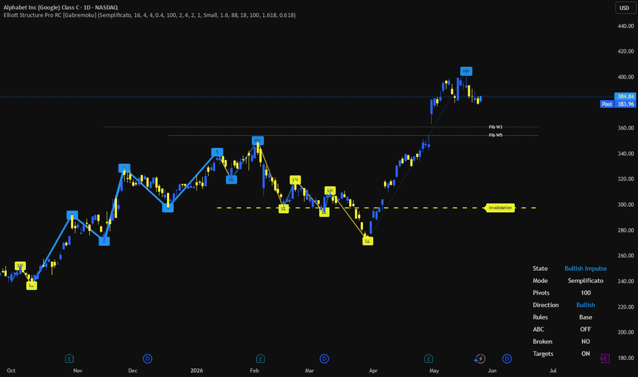
Elliott Structure Pro RC [Gabremoku]Elliott Structure Pro RC is a market structure and wave-mapping overlay designed to detect candidate Elliott impulse patterns using pivot logic, ZigZag structure, validation rules, invalidation levels, and projected Fibonacci targets.
This script does not claim to produce definitive Elliott Wave counts. Instead, it scans recent pivot structure and highlights the most coherent bullish or bearish candidate sequence based on alternating swing logic, structural progression, and optional Elliott validation filters. That framing is important because Elliott Wave interpretation is inherently subjective, while the classic impulse model still relies on a few widely accepted structural rules.
What it shows
🔺 ZigZag market structure — the script builds a cleaned pivot path from swing highs and lows, filtering out smaller fluctuations to make structure easier to read. ZigZag-style logic is commonly used to reduce chart noise and highlight meaningful turning points.
🏷️ HH / HL / LH / LL tags — every pivot can be classified into higher high, higher low, lower high, or lower low structure, helping the user read trend progression directly from price swings.
🌊 Candidate Elliott 1–5 sequence — the script scans recent pivots and searches for the best bullish or bearish 5-wave impulse candidate.
❌ Invalidation tracking — once a candidate is found, the script projects an invalidation level and can flag when the structure has been broken.
🔤 Optional ABC correction — after a 5-wave sequence, the indicator can also look for a basic A-B-C corrective continuation.
📏 Fibonacci projections — projected target levels for Wave 3 and Wave 5 are plotted using configurable Fibonacci multipliers. Fibonacci extensions are commonly used in Elliott analysis to estimate probable Wave 3 and Wave 5 zones.
🪧 Dashboard — shows state, mode, pivot count, direction, validation strictness, ABC status, broken structure state, and target visibility.
Core logic
The script begins with pivot highs and pivot lows, then compresses them into a cleaner alternating sequence. From there, it builds a structural map and scans the most recent pivots to find a valid 6-point sequence that can represent a 5-wave bullish or bearish impulse candidate.
In practical terms, it combines:
market structure
ZigZag logic
Elliott candidate matching
rule-based validation
invalidation and target projection
That makes it useful as a structure-reading tool first, and an Elliott helper second.
Validation model
The script offers two operating styles:
Semplificato
Avanzato
In simplified mode, the indicator focuses more on structural coherence and swing progression. In advanced mode, it can apply stricter Elliott-style validation rules such as:
Wave 3 not shortest
Wave 4 no overlap with Wave 1 territory
invalid candidate marking when rules are not respected
Those rules align with widely cited core Elliott impulse rules. In standard impulse structures, Wave 3 may not be the shortest of Waves 1, 3, and 5, and Wave 4 should not overlap Wave 1 territory except in special formations such as certain diagonals.
Fibonacci targets
The indicator also projects two practical target references:
Wave 3 target
Wave 5 target
In Elliott analysis, Wave 3 is often projected using Fibonacci expansion of Wave 1, with 1.618 being one of the most common reference ratios, while Wave 5 is often estimated from prior impulse relationships or partial trend expansion logic.
Your script uses configurable multipliers, which is a good choice because different markets and timeframes can produce different expansion behaviors.
How to use
A practical workflow is:
Let the script identify the active pivot structure.
Check whether the chart is printing HH/HL or LH/LL logic.
Watch for a highlighted bullish or bearish 1–5 candidate.
Use the invalidation level to judge whether the count remains structurally valid.
Use projected Fib targets as reference zones, not guaranteed endpoints.
If enabled, monitor whether a simple ABC correction starts forming after the impulse.
This is best used as a decision-support overlay, especially for traders who already read market structure and want an automated way to visualize possible wave candidates.
Features
✅ Pivot-based market structure engine
✅ ZigZag overlay with configurable sensitivity
✅ HH / HL / LH / LL classification
✅ Candidate bullish and bearish Elliott impulse detection
✅ Simplified or advanced scan mode
✅ Optional strict Elliott validation
✅ Wave 3 not shortest filter
✅ Wave 4 overlap validation
✅ Broken-structure detection
✅ Invalidation level plotting
✅ Optional ABC correction detection
✅ Fibonacci Wave 3 / Wave 5 projections
✅ Dashboard and optional bar coloring
✅ Gradient-based swing visualization
Notes
This indicator is designed to identify candidate Elliott structures, not to replace discretionary wave analysis. Elliott interpretation is partly rule-based and partly interpretative, so projected counts and targets should always be confirmed with broader market context, price action, and risk management.
Author: Gabremoku
Pine Script v6 Wskaźnik
Structural Inefficiency Radar [JOAT]Structural Inefficiency Radar
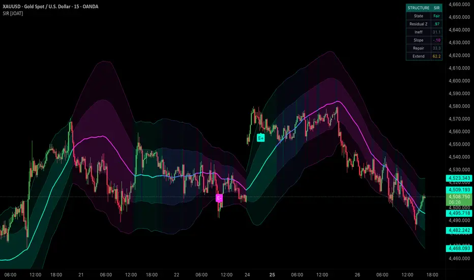
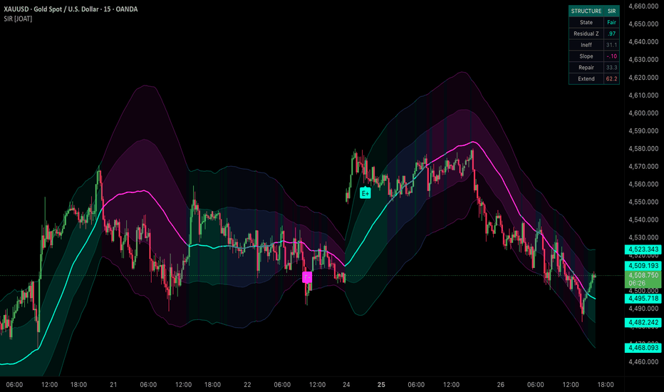
Introduction
Structural Inefficiency Radar measures regression fair value, residual z-score, path asymmetry, volatility clustering, and repair/extension force.
This open-source indicator is designed as a context tool, not a standalone trading system. It focuses on explaining the current market state with restrained visuals and confirmed-bar logic where signals are used.
Core Concepts
1. Regression Fair Value
A linear regression spine represents statistical fair value.
2. Residual Z-Score
Distance from fair value is normalized by residual standard deviation.
3. Path Asymmetry
Upward and downward path movement are compared to detect directional distortion.
4. Repair and Extension Force
Deviation, slope, asymmetry, and clustering determine whether price is extending or repairing.
z = (close - fairValue) / residualDeviation
Features
Fair-value spine
Inner and outer inefficiency bands
Residual z-score
Repair and extension scoring
E+ and E- labels plus repair markers
Input Parameters
Regression and residual windows
Deviation gate
Repair quality gate
Cooldown
Bands, candles, and HUD toggles
How to Use This Script
Use the spine and bands to frame structural stretch. Extension labels indicate directional inefficiency; gold markers indicate fair-value repair.
Limitations
The script uses historical OHLCV data and cannot know future prices.
Signals and states can be late during fast reversals because confirmed-bar logic is used to reduce repainting.
Model outputs should be interpreted with market context, risk controls, and independent analysis.
No visual state should be treated as a certain trade outcome.
Originality Statement
SIR is original in combining regression residuals, path asymmetry, clustering, repair force, and extension force.
Disclaimer
This indicator is provided for educational and informational purposes only. It is not financial advice, investment advice, or a recommendation to buy or sell any financial instrument. All calculations are derived from historical market data and may produce inaccurate readings in some market conditions. No indicator can predict future market behavior. Use proper risk management and independent judgment.
-Made with passion by jackofalltrades
Wskaźnik
Probabilistic Regime Tensor [JOAT]Probabilistic Regime Tensor
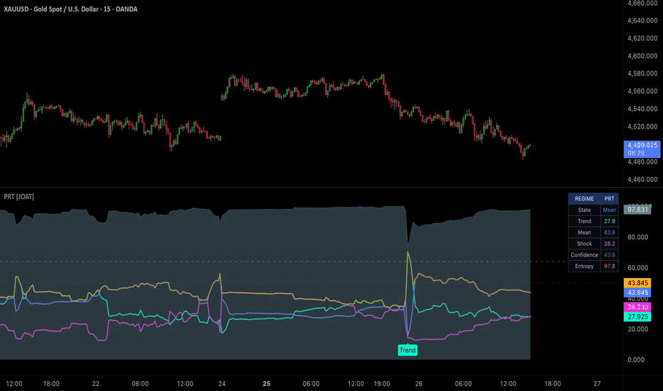
Introduction
Probabilistic Regime Tensor classifies market state into Trend, Mean Reversion, or Shock using logistic transforms of statistical inputs.
This open-source indicator is designed as a context tool, not a standalone trading system. It focuses on explaining the current market state with restrained visuals and confirmed-bar logic where signals are used.
Core Concepts
1. Trend Probability
Regression slope, variance ratio, and normalized return behavior feed the trend model.
2. Mean-Reversion Probability
Contracting variance ratio, weak slope, and autocorrelation behavior feed the reversion model.
3. Shock Probability
Volatility rank and fast/slow return divergence feed the shock model.
4. Probability Entropy
The three probabilities are normalized and entropy shows whether the classifier is decisive or uncertain.
pTrend = logistic(trendInput) / probabilitySum
Features
Three-state probability model
Trend, mean, and shock probabilities
Dominant confidence and entropy
Sparse regime labels
Movable quant HUD
Input Parameters
Statistical and fast windows
Dominant probability gate
Cooldown
Candle and HUD toggles
HUD position selector
How to Use This Script
Use PRT to decide which style of analysis is more appropriate: continuation, mean reversion, or volatility caution.
Limitations
The script uses historical OHLCV data and cannot know future prices.
Signals and states can be late during fast reversals because confirmed-bar logic is used to reduce repainting.
Model outputs should be interpreted with market context, risk controls, and independent analysis.
No visual state should be treated as a certain trade outcome.
Originality Statement
PRT is original in using normalized logistic probabilities and entropy to classify market regime.
Disclaimer
This indicator is provided for educational and informational purposes only. It is not financial advice, investment advice, or a recommendation to buy or sell any financial instrument. All calculations are derived from historical market data and may produce inaccurate readings in some market conditions. No indicator can predict future market behavior. Use proper risk management and independent judgment.
-Made with passion by jackofalltrades
Wskaźnik
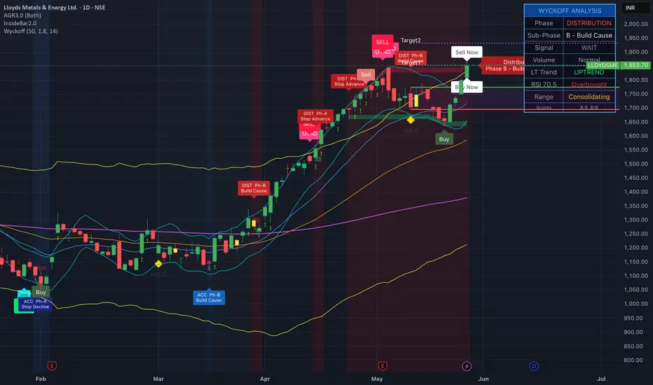
Wyckoff Pattern Indicator-AlmostPerfectWyckoff Pattern Indicator — Accumulation & Distribution Phase Tracker
Overview
This indicator automatically identifies **Wyckoff market phases** in real time and plots **BUY, SELL, and HOLD signals** directly on the chart. It works on all timeframes and all instruments (stocks, indices, crypto, forex, commodities).
The Wyckoff Method, developed by Richard Wyckoff in the early 1900s, is one of the most enduring frameworks in technical analysis. It describes how large institutional operators ("Composite Operator") accumulate or distribute positions within a trading range before the next major price move. This indicator brings that logic into a structured, automated form.
How It Works
#### Phase Detection
Every bar is scored across six independent factors:
| Factor | Favours Accumulation | Favours Distribution |
|---|---|---|
| Price position in range | Lower 35% | Upper 65% |
| Long-term trend (EMA 50 vs 200) | Below EMA 200 | Above EMA 200 |
| Consolidation (low realised volatility) | In range | In range |
| Volume dry-up inside range | Yes | Yes |
| RSI | Below 50 | Above 50 |
| MACD histogram slope | Rising | Falling |
A 3-bar consecutive confirmation is required before the phase is declared. This debounce prevents single-bar RSI or MACD wobbles from flipping the phase flag and causing false signals.
Wyckoff Schematic Events Detected
| Label | Event | What it means |
|---|---|---|
| **SC** | Selling Climax | Wide bearish bar on high volume at period low — panic selling exhausted |
| **BC** | Buying Climax | Wide bullish bar on high volume at period high — euphoric buying exhausted |
| **SP** | Spring | Price dips below support then snaps back — a trap for weak hands |
| **UTAD** | Upthrust After Distribution | Price pierces resistance then fails — a bull trap |
| **SOS** | Sign of Strength | Wide up-bar on rising volume breaking short-term resistance |
| **SOW** | Sign of Weakness | Wide down-bar on rising volume breaking short-term support |
| **LPS** | Last Point of Support | Low-volume pullback during mark-up — healthy retest |
| **LPSY** | Last Point of Supply | Low-volume rally during mark-down — weak bounce |
Phase Progression (A → E)
Accumulation Phases
- **Phase A** — Stopping the downtrend (SC, Preliminary Support)
- **Phase B** — Building a cause (secondary tests, range establishing)
- **Phase C** — The spring / shakeout test (potential final trap)
- **Phase D** — Mark-up begins (SOS, LPS sequence)
- **Phase E** — Trending higher out of the trading range
**Distribution Phases**
- **Phase A** — Stopping the uptrend (BC, Preliminary Supply)
- **Phase B** — Building a cause for decline (secondary tests)
- **Phase C** — UTAD / upthrust test (bull trap)
- **Phase D** — Mark-down begins (SOW, LPSY sequence)
- **Phase E** — Trending lower out of the trading range
A label appears **once on the chart at the exact bar the phase transitions** — not on every bar — so the chart stays clean.
Signals
Signals fire only on the **first bar of a new signal state**, not continuously. They will never contradict the phase:
- **▲ BUY** (green) — Fires during Accumulation Phase C or D, on a Spring, or on an LPS. **Completely suppressed during Distribution.**
- **▼ SELL** (red) — Fires during Distribution Phase C or D, on a UTAD, or on an LPSY. **Completely suppressed during Accumulation.**
- **◆ HOLD** (yellow) — Fires when entering Phase B consolidation on either side, or when the range is ambiguous. Means: wait for confirmation.
Supply & Demand Zones
Two shaded bands track the current phase's trading range in real time:
- **Red band (Supply Zone)** — upper boundary of the current phase range
- **Green band (Demand Zone)** — lower boundary of the current phase range
The bands use `plot()` + `fill()` (not static boxes) so they move correctly with any chart pan, zoom, or scroll on all scale modes.
Info Table (top-right)
A live dashboard shows:
- Current major phase (Accumulation / Distribution / Neutral)
- Sub-phase (A through E)
- Active signal
- Volume condition (Climax / Dry-Up / Normal)
- Long-term trend
- RSI reading
- Consolidation / Trending status
- Raw Accumulation and Distribution scores
Settings
| Setting | Default | Description |
|---|---|---|
| Lookback Period | 50 | Bars used to define the trading range high/low |
| Volume Climax Multiplier | 1.8× | How many times avg volume = climax |
| RSI Length | 14 | RSI period |
| Phase Background | On | Blue/red background shading per phase |
| Show Wyckoff Events | On | SC, BC, SP, UTAD, SOS, SOW markers |
| Show Buy/Sell Signals | On | BUY / SELL / HOLD labels |
| Show Phase Labels | On | Phase transition labels on candles |
| Show Supply/Demand Zones | On | Red/green zone bands |
| Show EMAs | On | EMA 20 / 50 / 200 |
Alerts
Nine alert conditions are built in:
- Wyckoff BUY / SELL / HOLD
- Spring detected
- UTAD detected
- Selling Climax / Buying Climax
- Sign of Strength / Sign of Weakness
Important Notes
- This indicator is based on **pattern recognition and scoring**, not exact Wyckoff schematic fitting. It is a decision-support tool, not a mechanical trading system.
- Always confirm signals with **volume context** and **broader market structure** before trading.
- On lower timeframes (1m–5m), increase the Lookback Period to reduce noise.
- On higher timeframes (Daily+), the phase transitions are more reliable and slower-moving.
---
*Based on the Wyckoff Market Cycle framework developed by Richard D. Wyckoff (1873–1934).*
Wskaźnik

Voss Predictor Multi-Symbol RankingVoss Predictor Multi-Symbol Ranking (VPSR) is a multi-market dashboard that scans up to 40 assets and ranks them based on momentum, trend strength, and underlying market structure.
Instead of analysing one chart at a time, this tool compares all selected symbols side-by-side and highlights which markets are currently showing the strongest or weakest conditions in real time.
It classifies each asset as:
Bullish (strength building)
Bearish (weakening or declining)
Neutral (no clear direction)
What it helps you do
Quickly identify the strongest trending markets
Spot weakening or reversing assets earlier
Compare stocks, forex, and crypto in one view
Focus only on the highest-quality opportunities
Reduce time spent switching between charts
Key Features
Live ranking of up to 40 symbols
Simple bullish / bearish / neutral signals
Composite strength score for each asset
Built-in trend and momentum comparison
Context-based tooltips for deeper interpretation
Adaptive settings based on market type and trading style
Theoretical Background (Ehlers-Based Approach)
This indicator is inspired by the work of John Ehlers, a pioneer in applying digital signal processing to financial markets.
Ehlers' core idea is that price action is not purely random, but instead contains hidden cyclical structures that can be revealed using filtering techniques similar to those used in engineering and physics.
Rather than relying on traditional lagging indicators, this approach focuses on:
Cycle extraction: isolating the dominant "wave" within market noise
Bandpass filtering: removing both long-term trend distortion and short-term randomness
Adaptive market cycles: recognising that cycle length and volatility constantly change
Phase and momentum behaviour: identifying where price sits within its cycle (expansion, contraction, or transition)
This indicator applies these principles using:
An Ehlers-style bandpass filter to isolate market structure
A leading filter (Ehlers' Voss) to estimate short-term directional bias
A correlation-based component to measure structural alignment and consistency across price movement
The result is a system that focuses on cycle behaviour and momentum flow, rather than lagging averages or reactive signals.
Signal Logic Overview
Bullish: Leading momentum aligns with upward structural movement
Bearish: Downward momentum dominates or structure weakens
Neutral: Mixed or unclear directional conditions
Divergence states highlight potential exhaustion or early reversal conditions
Intended Use
This indicator is designed as a multi-asset scanning and ranking tool, helping traders quickly identify where momentum and structure are strongest or weakest across markets.
It is best used for:
Relative strength analysis
Opportunity scanning across multiple assets
Early detection of momentum shifts
Filtering out weak or low-quality setups
It is not a standalone buy/sell system, but a decision-support layer for market selection and timing context. Wskaźnik

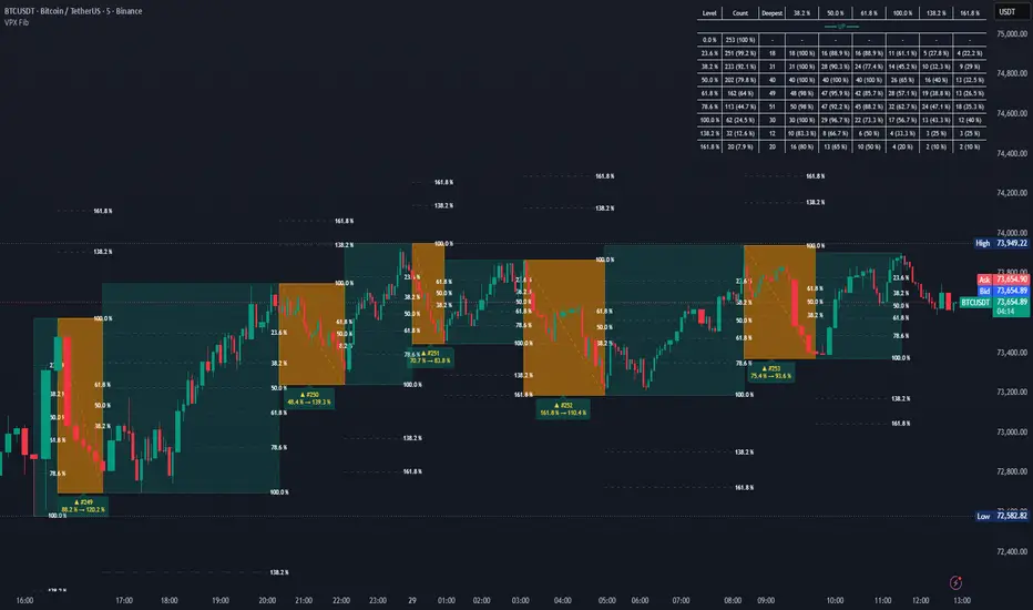
Fibonacci Retracement Statistics by VolProfexFIBONACCI RETRACEMENT STATISTICS BY VOLPROFEX
=============================================
DESCRIPTION
-----------
Fibonacci Retracement Statistics is an analysis tool that
automatically detects price swings, tracks retracements within each trend,
and calculates how often price retraces to various Fibonacci levels. The
indicator labels every completed swing with its swing number and deepest
fib level reached (e.g. "▲ #12 78.6%"), and displays a statistics table
showing the count and percentage of swings reaching each level.
All visual elements (trend boxes, fib lines, retracement boxes, labels, and
the statistics table) are drawn only on the last chart bar, keeping the
indicator performant during real-time scrolling. Retracement labels update
in real time so you always see the current value for the active swing.
HOW IT WORKS
------------
1. SWING DETECTION (ATR-Deviation ZigZag)
A volatility-adaptive ZigZag engine finds pivot highs and lows. A pivot
is confirmed when price moves against the current leg by at least
ATR(period) × deviation multiplier. A minimum swing size filter discards
insignificant wiggles. A spike filter rejects reversals triggered by
bars with extreme wick-to-body ratios.
2. HIGHER-TIMEFRAME (HTF) CONTEXT (optional)
When enabled, the indicator loads data from a higher timeframe (default: 1h)
and runs the same ZigZag engine on it. Completed HTF swings are drawn as
translucent boxes on the chart. Local swings are filtered to only count
when their direction matches the HTF swing they fall inside. This removes
counter-trend noise within the larger structure.
A separate gate ("Exclude Retracements outside HTF swing") further filters
retracement contributions: only retracements where both the trend leg and
the counter-trend leg fall inside the same completed HTF box are counted
in statistics and drawn on the chart.
3. TREND & RETRACEMENT TRACKING
Alternating pivot types (high → low → high → ...) create directional
trends. For each unfinalised trend, the indicator tracks the extreme
retracement price bar by bar. When the trend completes, the retracement
percentage is calculated using the actual counter-trend leg. This value is
then compared against each enabled Fibonacci level.
4. FIBONACCI LEVEL COUNTING
A cumulative counting system tallies how many trends have retraced to
each enabled level. Levels available include: 23.6%, 38.2%, 50.0%, 61.8%,
78.6%, 88.6%, 100.0%, 127.2%, 138.2%, 150.0%, 161.8%, plus up to 5
custom levels (0–500%). The statistics table is split into UP and DOWN
sections, each with its own Level / Count / Percent columns.
5. INTRADAY TIME WINDOW (optional)
On intraday charts, you can set a session window (e.g. 09:30–16:00) to
restrict which swings are analysed. Choose between "Pivot Confirmed Inside"
(the confirming bar's timestamp must fall in the window) or "Full Cycle
Inside" (both the pivot start and confirmation must fall in the window).
A visual box overlay can be enabled to highlight the active window.
6. SPIKE FILTER
Optionally discard ZigZag reversals triggered by bars where the upper or
lower wick exceeds the body by a user-defined ratio. This helps avoid
false pivot signals from sudden, low-liquidity spikes.
SETTINGS REFERENCE (defaults optimised for BTCUSDT, 5m chart, 1h HTF)
---------------------------------------------------------------------
── SWING ENGINE ──
- ATR Period: 14
Period for ATR calculations. Shared by local ZigZag and HTF swing detection.
- ZigZag Deviation Multiplier (ATR ×): 3.0
Pivot confirmed when price reverses by ATR × this value.
- Min Swing Size (ATR multiple): 0.8
Legs smaller than ATR × this are discarded. Set 0 to disable.
── HTF CONTEXT ──
- Use Higher Timeframe Swing Context: ON
When enabled, local swings are counted only when their direction matches the
current HTF swing bias.
- HTF Timeframe: 60
Higher timeframe for context. Must be higher than the chart timeframe.
- HTF Swing Deviation (ATR ×): 3.5
ATR multiplier for HTF pivot reversals.
- HTF Min Swing Size (ATR ×): 1.5
Minimum leg size for HTF swings. Set 0 to disable.
- Exclude Retracements outside HTF swing: ON
When enabled, only retracements fully contained within a completed HTF swing
box contribute to statistics and visual output.
- Show HTF Swings: ON
Draws HTF major swing boxes on the chart (Blue = upswing, Red = downswing).
- HTF Bull Color / HTF Bear Color: Blue (50% transp) / Red (50% transp)
── FIBONACCI LEVELS ──
- Levels enabled by default: 23.6%, 38.2%, 50.0%, 61.8%, 78.6%, 100.0%,
138.2%, 161.8%
- 5 custom level slots, each 0.0–500.0%. Set to 0.0 to disable. Default: all 0.0
── FILTERS ──
- Trend Direction: Both
Options: Both / Uptrends Only / Downtrends Only
- Use Intraday Time Window: OFF
When ON, applies a daily clock window on intraday charts.
- Window Session: 0930-1600
- Window Mode: Pivot Confirmed Inside
Options: Pivot Confirmed Inside / Full Cycle Inside
- Window Timezone: Exchange (uses the symbol's exchange timezone)
- Show Time Window Box: OFF
Visual box highlighting the active intraday window.
- Enable Spike Filter: ON
Discard reversals triggered by spike bars.
- Max Wick-to-Body Ratio: 4.0
Threshold for spike detection (wick ≥ this × body).
── DISPLAY ──
- Show Trend Boxes: ON (Border Width: 1)
Bullish: Teal / Bearish: Maroon
- Show Fib Lines: ON (Width: 1, Style: Dashed, Color: Gray at 60% transp)
- Show Fib Labels: ON (Position: Right, Vertical: Center, Size: Small, Color: White)
- Show Retracement Boxes: ON (Color: Orange at 40% transp)
- Show Retracement Labels: ON (Position: Center, Vertical: Below, Size: Small, Color: Yellow)
- Max Trends Drawn: 50 (1–500)
── TABLE ──
- Table Position: Top Right
- Font Size: Small
VISUAL OUTPUT
-------------
1. Trend Boxes: Translucent coloured boxes spanning each completed swing leg.
2. Fib Lines & Labels: Dashed (or solid/dotted) lines at each Fibonacci level
with optional percentage labels on every completed swing.
3. Retracement Boxes: Overlay boxes on the counter-trend leg with a connecting
diagonal line, colour-coded by trend direction.
4. Retracement Labels: Labels on each retracement showing:
- Arrow direction (▲ = uptrend, ▼ = downtrend)
- Filtered swing number
- Deepest Fibonacci level reached
5. HTF Swing Boxes: Larger translucent boxes showing higher-timeframe swing
structure (blue = up, red = down).
6. Statistics Table: A table in one of four corners displaying:
- Level | Count | Percent for uptrends (teal header)
- Level | Count | Percent for downtrends (maroon header) Wskaźnik

Dynamic Mitigation Imbalances - Price Invasion Tracking### Overview
This closed-source indicator introduces a novel methodology for tracking market inefficiencies (Imbalances / Fair Value Gaps) by incorporating a real-time, price-action-driven dynamic resizing mechanism. Unlike conventional FVG indicators that keep blocks static until full mitigation or delete them abruptly upon a simple touch, this script visually "consumes" and shrinks the historical boxes proportionally to price invasion.
### Core Logic & Mathematical Concepts
The script scans consecutive candle sequences to detect structurally significant displacement zones:
- **Bearish Imbalances:** Identified when a green candle sequence encounters a red sequence, and the lowest low of the green origin remains completely above the high of the current corrective development.
- **Bullish Imbalances:** Identified when a red candle sequence meets a green sequence, leaving a price gap where the highest high of the red origin remains below the low of the current corrective development.
### The Innovation: Dynamic Consumption
The cornerstone of this script is its dynamic recalculation engine via arrays:
1. **Original Metrics Storage:** The script memorizes the absolute height (size) of the original inefficiency upon creation.
2. **Invasion Tracking:** As subsequent candles develop, the script monitors intra-bar tracking (`high ` for bearish zones, `low ` for bullish zones). If the price breaches the box limits, the dimensions are recalculated on the fly (`box.set_bottom()` / `box.set_top()`), visually shrinking the box area.
3. **Percentage-Based Elimination Threshold:** Through an adjustable input parameter (`pctMitigacion`), users can establish an exact percentage threshold (e.g., 95%). The indicator actively calculates:
Remaining Size <= Original Size * (1.0 - Mitigation Factor)
Once this threshold is breached, the script efficiently flushes the box data from memory.
### How to Use
- **Visualizing Inefficiencies:** Broad zones display active, unmitigated market gaps.
- **Shrinking Boxes:** A shrinking box indicates institutional orders are actively filling the liquidity vacuum.
- **Execution Areas:** The remaining unmitigated fractions of the boxes serve as highly precise refined zones for entry or risk management. Wskaźnik

Wskaźnik

Cipher Wave BCipher Wave B bundles five classic oscillators into a single, color-coded momentum pane so you can read trend, momentum, and exhaustion at a glance — without stacking five separate indicators.
What's inside
🌊 Blue Wave (WaveTrend) — the centerpiece. A fast wave and a smoothed signal line; when the signal crosses the wave at an extreme, you get a turn. Long/short thresholds at ±60.
🟢🔴 Money Flow — a volume-weighted directional area. Fills green above zero when buyers dominate, red below when sellers do. Use it to read the environment before acting on any signal.
🟣 RSI — heavily smoothed, plotted 0–100 so you can spot divergences against price.
🟢🔴 Stochastic RSI — a smoothed line that shifts green (rising) or red (falling) to flag momentum divergences.
🟡 VWAP oscillator — a self-normalizing yellow area showing whether price is stretched above or below its volume-weighted mean. Snaps back toward zero over time.
Signals
Green dots fire on a Blue Wave cross-up while oversold (potential bottom); red dots on a cross-down while overbought (potential top). They're pinned to the bottom ribbon and intentionally selective — tune sensitivity with the Dot Level inputs. Alerts are built in for both dots and raw wave crosses (set them to "Once Per Bar Close" to avoid intrabar flicker).
Notes
Calculates on Heikin Ashi internally by default (toggle in settings) for smoother reads.
Every component, threshold, color, and dot size is adjustable.
Built on the open-source WaveTrend oscillator by LazyBear — full credit to the original author.
This is a momentum visualization tool, not a crystal ball. No oscillator predicts price. Use it to filter and confirm, manage risk, and combine timeframes — not as a standalone buy/sell machine.
Not financial advice. For educational purposes. Wskaźnik
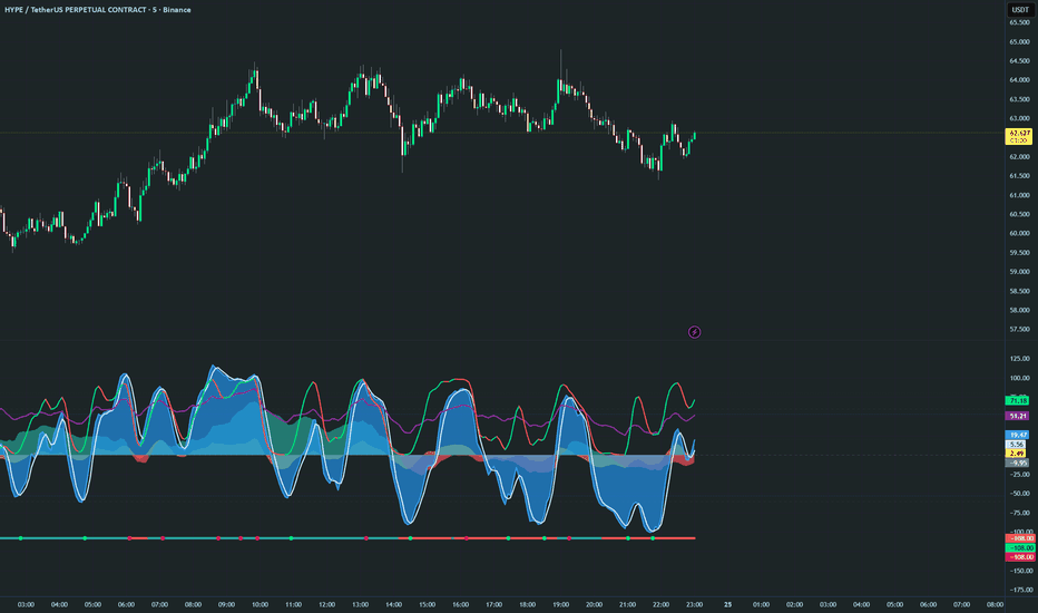
Artemis Wave Oscillator🟦 Artemis Wave Oscillator is a Pine v6 reimagination of the classical WaveTrend family, built on a Welford running-stdev channel and EMA-smoothed normalization. Unlike fixed-band WaveTrend variants that ship with hard-coded levels, the engine continuously rescales itself against its own dispersion — producing a momentum curve that stays perfectly bounded between visually consistent reversion bands on every asset and every timeframe, with no manual recalibration.
The indicator integrates six analytical layers — WaveTrend core, dynamic reversion bands, histogram momentum gauge, extremity reversion dots, regular + hidden divergence detection with a Smart AI Filter, and a theme-adaptive PRO dashboard — each operating independently and rendered on a single, clean oscillator panel.
🟦 HOW THE CORE ENGINE WORKS
**WaveTrend Channel**
Each bar, the engine builds an EMA-smoothed midline from the selected price aggregate over the Channel Length window. In parallel, a Welford single-pass running standard deviation measures the channel width — a numerically stable O(N) algorithm that updates the running mean and squared deviation simultaneously, preserving precision on long histories where naive sum-of-squares accumulators drift.
The raw wave is then computed as:
wave_raw = (src − chanMid) / chanDev × 100
This produces a z-score-like signal scaled to the ±100 range. Dividing by the running standard deviation normalizes the output regardless of asset volatility — BTC, EURUSD, SPY, and a small-cap stock all swing through the same band structure without parameter changes.
**EMA Smoothing**
The raw wave is then passed through an EMA of length Average Length to produce the visible `wave` line. This is the dominant responsiveness control — larger values produce a calmer curve with fewer reversion-zone touches.
**Signal Line**
An SMA of the wave (Signal Length) builds the trigger line. Crossovers between the wave and signal line mark momentum regime changes — the same convention used by classical MACD and Stochastic.
**Histogram**
The wave − signal delta is rendered as a filled area. Two opacity tiers distinguish rising momentum (brighter) from fading momentum (dimmer), so the eye picks up acceleration vs. deceleration at a glance.
**Source Selector**
Nine price aggregates are available:
| Source | Formula | Use case |
|---|---|---|
| Open | open | Open-of-bar bias |
| High | high | Top-of-range tracking |
| Low | low | Bottom-of-range tracking |
| Close | close | Standard, fastest reaction |
| OC2 | (open + close) / 2 | Body midpoint |
| HL2 | (high + low) / 2 | Body-independent midpoint |
| HLC3 | (high + low + close) / 3 | Typical mean — default |
| OHLC4 | (open + high + low + close) / 4 | Smoothest |
| HLCC4 | (high + low + 2×close) / 4 | Close-weighted |
🟦 REVERSION BANDS
The user picks a single Reversion Threshold (T) — the distance from zero (in normalized wave units) beyond which the wave is considered overbought (positive side) or oversold (negative side). Three proportional tiers render automatically:
| Tier | Level | Visual |
|---|---|---|
| Inner | ±T | Outer ring of the gradient fill |
| Middle | ±T × 1.25 | Boundary between outer ring and inner extreme |
| Outer | ±T × 1.5 | Hard outer boundary of the gradient fill |
Because the bands are derived from T, they always wrap the threshold no matter how the user tunes it. A trader scaling T from 80 (volatile assets) to 150 (trending assets) keeps the visual context intact without retuning the band levels.
The Reversion Threshold itself drives three downstream features:
- Extremity Dot triggers
- The "Extremities" bar-coloring mode
- The Dashboard Zone tag (OB / MID / OS)
🟦 EXTREMITY DOTS
OB / OS reversion markers — small dual-layer dots that fire when the wave crosses the signal line beyond the Reversion Threshold:
- **OS dot** (bull theme color) → wave crossed UP past −T
- **OB dot** (bear theme color) → wave crossed DOWN past +T
These are the highest-conviction mean-reversion triggers in the script. The dots use a two-track rendering — a pixel-perfect glow + core visual via `plot.style_circles`, paired with an invisible `label.style_circle` carrying a rich tooltip. Hovering on a dot surfaces:
- Direction (Crossed UP / DOWN through Signal)
- Active zone (Below −T / Above +T)
- Current wave value
- Current signal value
- Trading interpretation (mean-reversion long / short opportunity)
🟦 DIVERGENCE DETECTION
Pivots are calculated using `ta.pivothigh` and `ta.pivotlow` with an arm of `Channel Length / 2`. All divergence results appear `Channel Length / 2` bars late — this is standard Pine Script pivot behavior, not a bug.
**Four divergence types:**
| Type | Price | Wave | Signal |
|---|---|---|---|
| Regular Bull (D▲) | Lower Low | Higher Low | Potential reversal up |
| Regular Bear (D▼) | Higher High | Lower High | Potential reversal down |
| Hidden Bull (H▲) | Higher Low | Lower Low | Uptrend continuation |
| Hidden Bear (H▼) | Lower High | Higher High | Downtrend continuation |
Regular divergence uses solid lines (width 2). Hidden divergence uses dashed lines (width 1) — the thinner, dashed style makes the continuation signal visually quieter than the reversal signal, matching their respective conviction tiers. Labels use bracketed symbols (D▲ / D▼ / H▲ / H▼) and each carries a tooltip-rich hover with price + wave context.
**Smart Divergence Filter (AI)**
An optional pre-filter that rejects low-quality divergences before they render. Three independent gates:
1. **Min Wave Swing** — minimum oscillator swing between the two pivots (default: 5 units). Drops noise-level differences where the wave barely moved between pivots.
2. **Min Price Swing (%)** — minimum price swing between pivots as a percentage of the recent `Channel Length × 4` high-low range (default: 0.3%). Drops divergences where price barely moved relative to recent volatility.
3. **Zone Confirmation** — the wave at the current pivot must sit in the matching reversion half:
- Bullish divergence → wave at LL pivot ≤ −T × 0.5 (oversold half)
- Bearish divergence → wave at HH pivot ≥ +T × 0.5 (overbought half)
This encodes the classical "best divergences form at extremes" rule using the wave value itself as the gate — no MFI or volume input required.
When the master toggle is OFF (default), all detected divergences render. When ON, only divergences that clear all three gates survive. The filter applies identically to both chart rendering and alert conditions — no mismatch between visual and alert signals.
🟦 HISTOGRAM
The wave − signal histogram is rendered as a filled area between the histogram value and the zero line. Two opacity tiers per side:
| State | Color | Opacity |
|---|---|---|
| Bull, rising | thBull | Rising Opacity (default 60) |
| Bull, fading | thBull | Fading Opacity (default 40) |
| Bear, rising | thBear | Rising Opacity (default 60) |
| Bear, fading | thBear | Fading Opacity (default 40) |
Rising bars are the most actionable visual cue — they mark momentum that is accelerating in the active direction. Fading bars indicate momentum stalling.
🟦 BAR COLORING
Five mutually exclusive modes apply a wave-driven color to every price bar on the chart:
| Mode | Behavior |
|---|---|
| None | Leave bars untouched (default) |
| Midline Cross | Bull above zero, bear below zero |
| Extremities | Bull beyond +T, bear beyond −T, neutral elsewhere |
| Reversions | Bull on OS dot trigger, bear on OB dot trigger |
| Slope | Bull when wave > signal, bear when wave < signal |
Colors are pulled from the active theme — no per-mode color picker needed.
🟦 DASHBOARD
A compact 2-column, 7-row data panel renders on the last bar when enabled. Every value derives from variables already computed upstream, so the dashboard adds zero overhead until the final bar.
| Row | Left | Right |
|---|---|---|
| Header | Artemis Wave | ▲ BULL / ▼ BEAR / ■ NEUTRAL |
| Wave | Wave | Current value + trend arrow (▲ ▼ ■) |
| Signal | Signal | Current SMA trigger value |
| Strength | Strength | 10-block monospace bar gauge |
| Zone | Zone | OB / MID / OS tag |
| Div | Div | Most recent divergence within last 50 bars (▲ REG / ▼ REG / ▲ HID / ▼ HID / —) |
| Slope | Slope | ▲ UP / ▼ DOWN / ■ FLAT |
The strength gauge normalizes `|wave − signal|` against 50 (typical mid-amplitude swing) and buckets the result into 10 monospace blocks (`█` filled, `░` empty), giving an at-a-glance read of crossover conviction.
**Theme-Adaptive Chrome**
The dashboard auto-inverts its layout based on the active theme:
- **Dark themes** (Tropic, Amber, Pastel, Cyber, Helios, Electric, Candy, Bloomberg, Solar, Royal): header and footer use a faint `thBull` tint, middle rows stay solid dark, text uses full-saturation `thBull`. Border uses `thBull` at 20% transparency for strong theme presence.
- **Light themes** (Midnight, Graphite): backgrounds flip to white, text stays `thBull` (which is itself dark on these themes), border uses `thBull` at 40% transparency.
This guarantees text legibility against every palette without per-theme manual tuning.
**Position & Size**
Six anchor slots (Top/Middle/Bottom × Left/Right) and four text sizes (Tiny / Small / Normal / Large).
🟦 COLOR THEMES
Twelve cohesive palettes, each resolving to four axis colors:
| Theme | Character | Bull | Bear |
|---|---|---|---|
| Tropic | Cyan steel + deep orange | #00bcd4 | #ff6d00 |
| Amber | Warm amber + indigo blue | #ff9800 | #e53935 |
| Pastel | Sky blue + soft lavender | #4fc3f7 | #9575cd |
| Cyber | Neon lime + hot crimson | #00e676 | #ff1744 |
| Helios | Bright gold + scarlet | #ffd600 | #ef5350 |
| Electric | Electric aqua + magenta | #00e5ff | #e040fb |
| Candy | Neon green + hot pink | #69F0AE | #FF4081 |
| Bloomberg | Terminal orange + cyan | #ff8c00 | #00b0ff |
| Solar | Solarized olive + crimson | #859900 | #dc322f |
| Royal | Imperial gold + deep purple | #ffd700 | #6a0dad |
| Midnight | Deep navy + dark crimson | #0d47a1 | #b71c1c |
| Graphite | Near-black + silver grey | #1a1a1a | #757575 |
All four color roles (bull / bear / neutral / signal) change simultaneously when the theme changes. The whole script reads through these four variables — nothing below the resolver references a raw hex literal, so a single dropdown selection drives every plot, fill, dot, divergence line, dashboard cell and border.
🟦 ALERT SYSTEM
Ten alert conditions, all using `alert.freq_once_per_bar_close`:
| Alert | Condition |
|---|---|
| OS Reversion | Wave crossed UP through signal while wave < −T |
| OB Reversion | Wave crossed DOWN through signal while wave > +T |
| Regular Divergence | D▲ or D▼ detected (respects Smart Filter) |
| Hidden Divergence | H▲ or H▼ detected (respects Smart Filter) |
| Bullish Trend | Wave crossed above the midline (zero) |
| Bearish Trend | Wave crossed below the midline (zero) |
| Bullish Swing | Wave × signal upward cross, regardless of zone |
| Bearish Swing | Wave × signal downward cross, regardless of zone |
Each alert fires through `alert()` so the message body carries live context — direction, current wave value, and the threshold that triggered. Divergence alerts respect the Smart Divergence Filter — if the filter is ON and a divergence is rejected visually, the alert will also not fire.
🟦 SETTINGS REFERENCE
**WaveTrend Core**
- Source — 9 price aggregates. Default: HLC3
- Channel Length — EMA midline + Welford stdev lookback. Default: 10
- Average Length — EMA smoothing of the normalized wave. Default: 21
- Signal Length — SMA smoothing of the wave to build the trigger. Default: 4
**Reversion Bands**
- Reversion Threshold — 50–200, step 5. Default: 100
- Show Band Fills — Toggle. Default: ON
- Band Opacity — 0–100. Default: 30
**Histogram**
- Show Histogram — Toggle. Default: ON
- Rising Opacity — Default: 60
- Fading Opacity — Default: 40
**Extremity Dots**
- Show Extremity Dots — Toggle. Default: ON
**Divergence**
- Regular Divergence — Toggle. Default: ON
- Regular Opacity — Default: 80
- Hidden Divergence — Toggle. Default: ON
- Hidden Opacity — Default: 80
- Label Size — Tiny / Small / Normal / Large. Default: Tiny
- Smart Divergence Filter (AI) — Master toggle. Default: OFF
- Min Wave Swing — Default: 5.0
- Min Price Swing (%) — Default: 0.3%
- Require Zone Confirmation — Default: ON
**Bar Coloring**
- Bar Color Mode — None / Midline Cross / Extremities / Reversions / Slope. Default: None
**Dashboard**
- Show Dashboard — Toggle. Default: ON
- Panel Position — 6 anchor slots. Default: Middle Right
- Panel Text Size — Tiny / Small / Normal / Large. Default: Small
**Alerts**
- OS Reversion — Default: ON
- OB Reversion — Default: ON
- Regular Divergence — Default: ON
- Hidden Divergence — Default: OFF
- Bullish Trend — Default: ON
- Bearish Trend — Default: ON
- Bullish Swing — Default: OFF
- Bearish Swing — Default: OFF
🟦 COMPATIBILITY
Works on all asset classes and all timeframes in TradingView Pine Script v6.
- Crypto: Spot, futures, perpetual contracts
- Forex: All pairs
- Equities: Stocks, ETFs, indices
- Commodities: Metals, energy, agriculture
- Timeframes: 1m through Monthly
The Welford running standard deviation normalizes the wave against its own dispersion, making the engine fully volatility-agnostic. The same default settings work on a 5-second BTC chart and a weekly index chart without retuning.
🟦 TECHNICAL NOTES
- Pine Script v6
- `max_lines_count = 500`, `max_labels_count = 500` (divergence drawings + extremity dot hover labels)
- No repainting — all values calculated on bar close. Pivot-based divergence results appear `Channel Length / 2` bars late by design
- WaveTrend engine intentionally mirrors EliCobra's original Enhanced WaveTrend formulation — the value added by Artemis Wave is in the Pine v6 idioms, the dynamic band scaling, the divergence engine, the Smart Filter, the theme system, and the dashboard, not in altering the well-tested core curve
- UDT fields declared without defaults to comply with Pine v6's compile-time-literal requirement; objects constructed via `Bar.new(...)` and `WaveReading.new(...)`
- `var int x = int(na)` pattern used for safe persistent integer state (pivot bar indices)
- Reversion-band anchors rendered as hidden `plot()`s rather than `hline()`s — `hline()` only accepts compile-time constants, but the band levels are series values driven by the user-tunable Reversion Threshold
- Extremity Dots use a dual-track rendering: `plot.style_circles` for the pixel-perfect visual, plus a parallel invisible `label.style_circle` carrying the hover tooltip (since `plot()` does not support the `tooltip` argument)
🟦 DISCLAIMER
This indicator is provided for educational and informational purposes only. It does not constitute financial advice. Past performance does not guarantee future results. Always conduct your own analysis and apply proper risk management. Wskaźnik

Wskaźnik

Wskaźnik

Wskaźnik

Wskaźnik
Wskaźnik
Wskaźnik

Wskaźnik

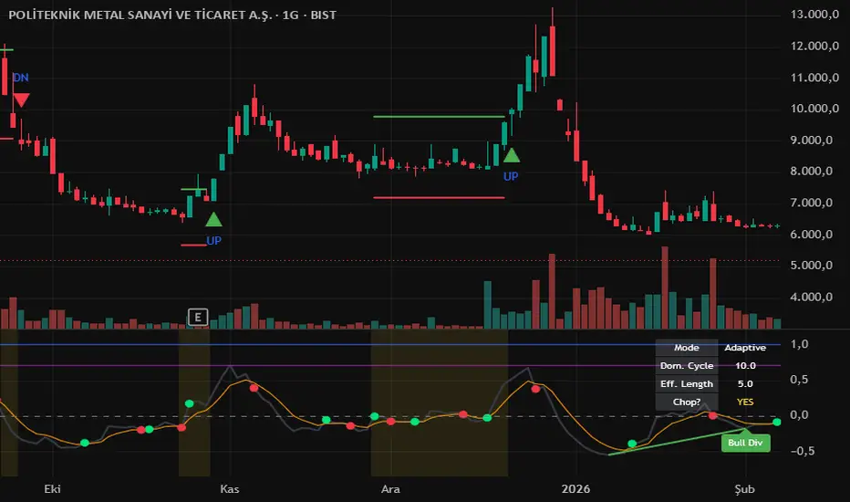
Stable Cycle Core (Adaptive Ehlers Edition)## English
**Stable Cycle Core — Adaptive Ehlers Edition**
A next-generation cycle oscillator that doesn't rely on a fixed length. Most oscillators (RSI, MACD, Stoch) use a hard-coded period like 14 — which is arbitrary. This script instead **measures the market's actual dominant cycle period in real time** and adapts itself to it.
**Engine: Ehlers Autocorrelation Periodogram**
Based on John F. Ehlers' work in *Cycle Analytics for Traders*. The pipeline:
1. **High-Pass filter** removes long-term trend so only the cyclical component remains.
2. **SuperSmoother** cleans high-frequency noise without lag.
3. **Pearson autocorrelation** is calculated for periods 10–48.
4. A **Discrete Fourier Transform** of those correlations reveals which period carries the most power.
5. The **dominant cycle** is computed as a power-weighted center of gravity, then halved to drive an adaptive EMA + adaptive ATR.
The result: when the market breathes faster, the indicator shortens itself. When it slows, it lengthens. No more guessing the right "length" parameter.
**Visual layout (lower panel)**
- **Black line — Cycle:** Adaptive momentum, ATR-normalized.
- **Orange line — Signal:** Smoothed cycle. Dot crossovers = entry triggers.
- **Blue / Purple — Sine Wave & Lead Sine:** Phase-based true sinusoidal cycle. Their crossovers often **lead price tops/bottoms by a few bars** — this is the real "cycle leading edge" Ehlers describes.
- **Green / Red dots:** Buy/Sell triggers from cycle-signal crossover.
**On the price chart**
- **Chop Filter:** When buy/sell signals fire too frequently in a short window, the script locks an upper green ATR line and a lower red ATR line on the chart, plus a soft yellow background to mark the choppy zone. The first **band break = real direction** (green/red triangle).
- Outside chop conditions, no bands draw — chart stays clean.
**Divergence (lower panel)**
Pivot-based bullish (green) and bearish (red) divergences between price and the cycle oscillator, drawn automatically with line + label.
**Info Table (top right)**
- Mode (Adaptive / Manual)
- Detected Dominant Cycle
- Effective length being used
- Whether the market is currently in a chop zone
**Alerts**
Buy / Sell / Chop Break Up / Chop Break Down / Bullish Divergence / Bearish Divergence.
**How to read it**
- A **stable Dom. Cycle reading** (e.g., sitting around 22 for many bars) means the market is rhythmically rotating — trade the dots and Sine crosses.
- A **jumpy Dom. Cycle** (12 → 35 → 14) means no clean cycle exists — wait for an ATR band break.
- Use **Sine + Lead Sine crossovers as early warning** (they lead price), and the cycle dots as the **trigger**.
- Divergences = confirmation, not standalone entry.
Works on every market and timeframe — the adaptive engine handles the rest.
Not financial advice. Combine with proper risk management.
---
## Türkçe
**Stable Cycle Core — Adaptif Ehlers Sürümü**
Sabit periyot kullanmayan yeni nesil bir döngü osilatörü. Klasik göstergeler (RSI, MACD, Stoch) sabit `14` gibi rastgele bir periyot kullanır. Bu script ise **piyasanın o anki gerçek dominant döngü periyodunu canlı olarak ölçer** ve kendini ona göre ayarlar.
**Motor: Ehlers Autocorrelation Periodogram**
John F. Ehlers'ın *Cycle Analytics for Traders* kitabındaki yönteme dayanır. İşlem zinciri:
1. **High-Pass filtre** uzun vadeli trendi temizler, sadece döngüsel kısım kalır.
2. **SuperSmoother** gecikme yaratmadan yüksek frekanslı gürültüyü siler.
3. **Pearson otokorelasyonu** 10–48 arasındaki her periyot için hesaplanır.
4. Bu korelasyonların **DFT (Discrete Fourier Transform)** dönüşümü, hangi periyodun en çok güç taşıdığını ortaya çıkarır.
5. **Dominant cycle**, güç-ağırlıklı bir ağırlık merkezi olarak bulunur ve yarısı adaptif EMA + adaptif ATR'ye beslenir.
Sonuç: piyasa hızlandığında gösterge kısalır, yavaşladığında uzar. "Doğru length kaç olmalı?" sorusu ortadan kalkar.
**Alt panel görseli**
- **Siyah çizgi — Cycle:** ATR ile normalize edilmiş adaptif momentum.
- **Turuncu çizgi — Signal:** Cycle'ın yumuşatılmış hâli. Kesişimler giriş tetikleyicisidir.
- **Mavi / Mor — Sine Wave ve Lead Sine:** Faz tabanlı gerçek sinüzoidal döngü. Kesişimleri çoğu zaman **fiyat tepe/diplerini birkaç bar önceden işaret eder** — Ehlers'ın bahsettiği "cycle leading edge" budur.
- **Yeşil / Kırmızı noktalar:** Cycle-Signal kesişiminden Buy/Sell tetikleri.
**Ana grafik üstünde**
- **Chop Filtresi:** Kısa bir pencerede çok sık buy/sell sinyali gelirse, fiyatın üstüne yeşil, altına kırmızı ATR çizgisi kilitlenir, arka plan hafif sarıya döner. **Hangi bant önce kırılırsa gerçek yön orasıdır** (yeşil/kırmızı üçgen ile işaretlenir).
- Karışıklık yokken hiçbir bant çizilmez, grafik temiz kalır.
**Divergence (alt panelde)**
Pivot tabanlı boğa (yeşil) ve ayı (kırmızı) uyumsuzlukları otomatik olarak çizgi + etiketle işaretlenir.
**Bilgi Tablosu (sağ üst)**
- Mod (Adaptif / Manuel)
- Tespit edilen Dominant Cycle
- Kullanılan etkili length
- Piyasa şu an chop bölgesinde mi
**Alarmlar**
Buy / Sell / Chop Break Up / Chop Break Down / Boğa Uyumsuzluğu / Ayı Uyumsuzluğu.
**Nasıl okunur**
- **Dom. Cycle değeri sabit kalıyorsa** (örn. uzun süre 22 civarında) piyasa ritmik dönüyor demektir — noktaları ve Sine kesişimlerini değerlendirebilirsin.
- **Dom. Cycle zıplıyorsa** (12 → 35 → 14) net bir döngü yok — ATR bant kırılımını beklemek mantıklı.
- **Sine + Lead Sine kesişimini erken uyarı** (fiyatı önceler), cycle noktalarını **tetikleyici** olarak kullan.
- Divergence = teyit aracı, tek başına giriş değil.
Her enstrümanda ve her zaman diliminde çalışır — adaptif motor gerisini halleder.
Bu paylaşım yatırım tavsiyesi değildir. Her zaman kendi risk yönetiminle birleştir. Wskaźnik