Performance chart
The Performance chart is a fundamental tool in the Strategy Report that visualizes the dynamic changes in your account balance based on closed trades. It helps you understand the "character" of your strategy — how steadily your capital grows.
How to read the chart
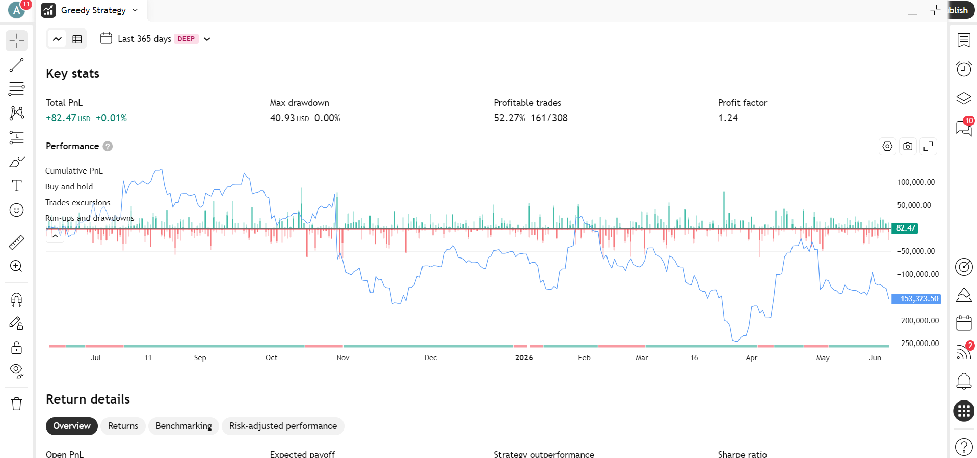
The chart provides a multi-layered analysis of every trade. The visible layers are controlled via the collapsible panel on the left side of the chart — you can show or hide each layer independently:
- Cumulative PnL: Shows the accumulated profit or loss after each closed trade. Each dot on the line represents a specific closed trade result.
- Buy and Hold (Blue line): Displays what your capital would look like if you simply bought the asset at the start of the test period and held it. Toggle this layer on or off in the side panel.
- Trades excursions (Vertical bars): Visualize price movement during each trade. Toggle on or off in the side panel:
- Favorable excursion (green bar): The maximum unrealized profit during the trade (MFE).
- Adverse excursion (red bar): The maximum unrealized drawdown during the trade (MAE).
- Run-ups and drawdowns: An additional layer showing the peak gains and peak losses relative to the entry point across the trade's lifetime. Toggle on or off in the side panel.
- Equity chart Tooltip: Hover over any point to see specific trade details:
- Trade #: The trade number and type (Long/Short).
- Cumulative PnL: The total capital at the time of closing that trade.
- Favorable/Adverse excursion: Specific currency values for the potential profit and risk within that position.
- Buy and hold: The benchmark value at that specific time.
- Run-ups and drawdowns Tooltip: Hover over any point to see specific trade details:
- Run-up or Drawdown: the peak unrealized gain or loss for that period, in currency and percentage.
- Date range: the start and end dates of that run-up or drawdown period.
! Note: The chart defaults to Absolute values (currency), but you can switch to Percentage using the toggle on the right side of the chart area.
Return details
This section focuses on comparing strategy returns against the benchmark and analyzing the profit structure.

Visualizations:
- Profit structure: A bar chart showing the relationship between Total profit, Open PnL, Total loss, Total PnL, and Commission.
- Benchmarking: A comparison of the return ranges (Max, Current, Min) for the strategy versus Buy and Hold.
Metrics:
- Returns: Initial capital, Net PnL, Gross profit, Gross loss, Profit factor, Commission paid, Expectancy.
- Benchmark comparison: Buy and hold PnL, Buy and hold % gain, Strategy outperformance
- Risk-adjusted performance: Sharpe ratio, Sortino ratio.
Trades analysis
This section provides a detailed statistical breakdown of all executed trading operations.
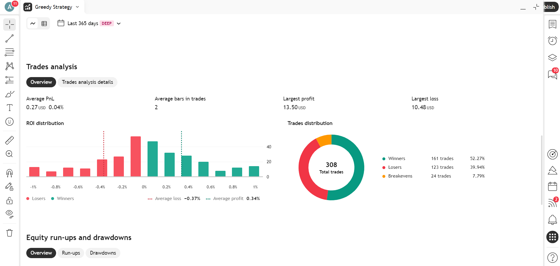
Visualizations:
- ROI distribution: A histogram showing the frequency of trades at different profit/loss levels, including Average loss and Average profit lines.
- Trades distribution: A donut chart showing the proportion of Winners, Losers, and Breakevens trades.
Metrics: Total trades, Total open trades, Total winners, Total losers, Percent profitable, Expectancy, Average profit, Average loss, Average profit / average loss, Largest profit, Largest profit %, Largest profit as % of gross profit, Largest loss, Largest loss %, Largest loss as % of gross loss, Outliers, Outliers PnL, Average bars in trades, Average bars in winners, Average bars in losers.
Equity run-ups and drawdowns
An analysis of the strategy's peak growth periods and deepest declines.
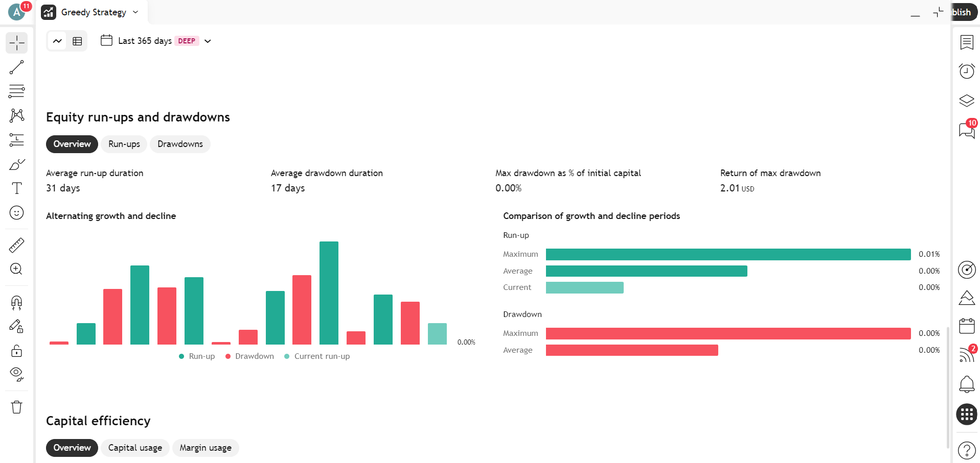
Visualizations:
- Alternating growth and decline: A bar chart showing alternating run-up (green) and drawdown (red) periods.
- Comparison of growth and decline periods: A horizontal bar chart showing the maximum, average, and current values for run-up and drawdown phases.
Metrics:
- Run-ups: Average run-up duration (close-to-close), Average run-up (close-to-close), Max run-up (close-to-close), Max run-up (intrabar), Max run-up as % of initial capital (intrabar).
- Drawdowns: Average drawdown duration (close-to-close), Average drawdown (close-to-close), Max drawdown (close-to-close), Max drawdown (intrabar), Max drawdown as % of initial capital (intrabar), Return of max drawdown.
Capital efficiency
This section evaluates how effectively the strategy uses available funds and margin requirements.
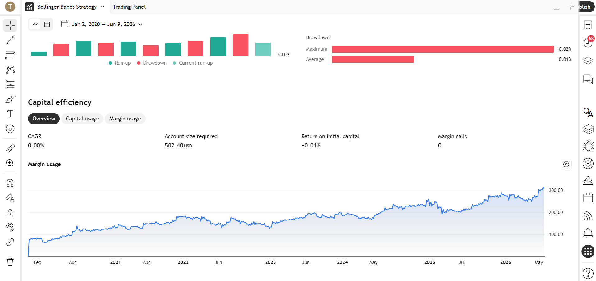
Visualizations:
- Margin usage: A chart showing how much capital was used to maintain open positions at any given time. Sharp drops to zero indicate periods with no open positions.
Metrics:
- Capital usage: Annualized return (CAGR), Return on initial capital, Account size required, Return on account size required, Net PnL as % of largest loss.
- Margin usage: Average margin used, Max margin used, Margin efficiency, Margin calls.
Main use cases
- Market comparison: Use the Benchmarking block in the Performance section. If your Cumulative PnL line is consistently below the Buy and Hold line, the strategy might be less effective than simply holding the asset.
- Optimizing exits: Analyze the Favorable excursion (green bars) on the chart. If green tails are significantly higher than the closing points (the dots), your strategy might be "giving back" too much profit, suggesting you should refine your exit rules.
- Risk assessment: Review the Adverse excursion (red bars). Long red bars followed by small profit dots indicate that the strategy takes excessive risks for modest gains.
- Psychological resilience: Check the Drawdown duration. This helps you understand if you can tolerate the time periods where the account remains "underwater" before hitting new highs.