JASMY: bears in trouble? key levels and targets for todayJASMY – are the bears about to get rug-pulled or rewarded here? Altcoins are cooling off after the recent BTC swings, and according to market chatter the small-cap IOT names like JASMY are back on watch as “high beta” plays for the next leg. That makes this 4H level battle pretty interesting right now.
On the 4H chart, price is sitting right on top of that green demand zone around 0.0054–0.0057 after rejecting the red supply above. Volume profile shows a fat node just overhead, so any bounce can accelerate fast as shorts cover. RSI has dipped under 50 but isn’t oversold yet, so I’m leaning toward a short-term sweep a bit deeper into the green zone then a pop back up rather than a full breakdown.
My base case: bullish reaction in the green block and a push toward the lower red zone first, then possibly the upper resistance area if momentum returns ✅. I’m eyeing longs only after a strong 4H bullish candle from demand; invalidation for me is a clean 4H close below the green zone low, which would open the door to a slide toward the next liquidity pocket below ⚠️. I might be wrong, but for now this still looks more like dip accumulation than trend reversal.
Supply Zone
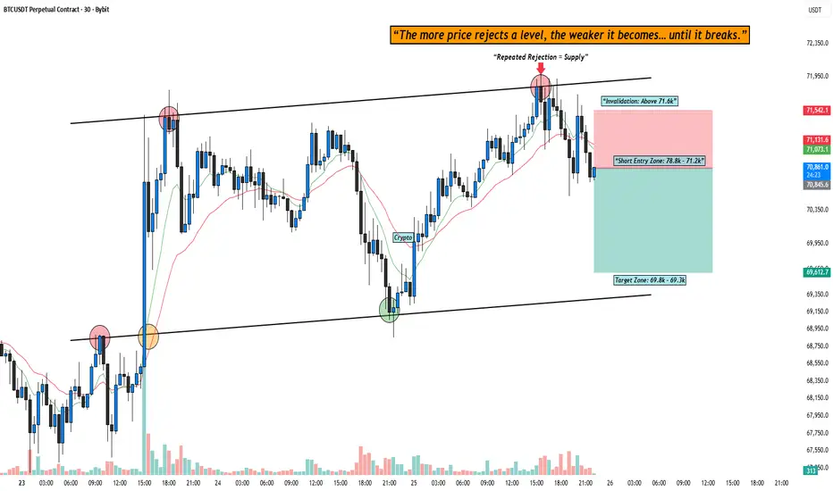
Supply & Demand TradingSupply and Demand is one of the most powerful price-based concepts in trading.
Unlike indicators, supply and demand focuses purely on price imbalances — areas where aggressive buying or selling overwhelmed the market.
At its core, price moves because of imbalance. When aggressive buyers step in, price rallies. When aggressive sellers step in, price drops. The areas where that imbalance originates are what we call supply and demand zones.
These zones are not random boxes. They represent areas where large orders entered the market.
1. What Is a Supply or Demand Zone?
A Supply Zone is an area where sellers overwhelmed buyers and forced price down.
A Demand Zone is an area where buyers overwhelmed sellers and pushed price up.
You’ll usually see:
• A short consolidation
• Followed by a strong, impulsive move away
The move away is what matters. That’s the footprint. Institutions don’t get fully filled in one shot. When price comes back, it often reacts again.
That reaction is your opportunity.
2. How Zones Actually Form
High-quality zones usually form like this:
• Price pauses briefly
• Large orders enter
• Market explodes away
• Structure gets broken
That break of structure is important. It tells you the imbalance wasn’t small — it shifted control.
Don’t obsess over drawing perfect rectangles. Focus on what actually matters:
• Strong, impulsive departure
• Clean, decisive candles
• Minimal overlap or chop
• Clear directional intent
Structure tells the story — not the box.
3. The Types You’ll See
You’ll hear terms like:
• Rally Base Rally (RBR)
• Drop Base Rally (DBR)
• Drop Base Drop (DBD)
• Rally Base Drop (RBD)
Don’t get caught up in the acronyms.
Just understand:
Base = where orders were absorbed (consolidation)
Rally = where control shifted (price aggressively pushing higher/lower)
That’s it.
4. Two Possible Entries
I use two different ways to approach supply and demand. There is multiple other ways you can do this, but this is just what I do.
1. Proactive (Limit) Entry — Anticipation
This is positioning at the zone before the market confirms. You are betting on the imbalance holding.
Requirements before I consider this:
• The zone is fresh (never revisited)
• Strong, explosive departure
• Clear break of structure from the zone
• Higher timeframe bias aligned
• Obvious opposing liquidity or target
Why this works:
Institutions rarely get fully filled in one move. When price returns, unfilled orders often remain.
This gives the best R:R — but less confirmation.
You’re getting paid for being early.
2. Reactive (Confirmation) Entry — Validation
This is the higher-probability approach.
Instead of assuming the zone will hold, I wait for proof.
The sequence I want to see:
• Price trades into supply or demand
• Momentum slows or compresses
• Internal structure begins shifting
• A minor high/low gets broken
• I enter on the pullback or continuation
Price taps supply → forms a lower high → breaks a minor low → I enter short.
This reduces R:R slightly but dramatically increases accuracy.
You’re getting paid for patience.
5. Stop Loss Placement
Keep it simple.
Supply → stop above the zone.
Demand → stop below the zone.
(image is just an example of where the that stop loss needs to be)
If the zone gets fully violated, you’re wrong. No ego. No hoping.
Invalidation is part of the game.
!!!!!DONT GO CHANGING YOUR STRATEGY BECAUSE YOU LOST ONE TRADE!!!!!
6. Targets
I usually target:
• Opposing zones
• Liquidity highs/lows
• Previous structure points
Scaling out works well:
TP1 at 1R
TP2 at opposing zone
Leave a runner if structure continues
Let the market pay you in stages.
7. Multi-Timeframe Is Everything
An important part of making this even stronger is by stacking timeframes.
Example:
Daily demand
1-4H retrace
5-15M confirmation
30S-3M price entry
That alignment increases probability.
Higher timeframe gives direction.
Lower timeframe gives precision.
8. Common Mistakes I See
• Drawing zones everywhere
• Trading heavily tested levels
• Ignoring structure
• Entering mid-range
• Trading against higher timeframe bias
Fresh zones are stronger.
Zones that caused structure breaks are stronger.
Zones in premium/discount matter.
9. Advanced Layering
If you want to refine this further:
• Look for liquidity sweeps into zones
• Watch for fair value gaps (FVG) inside the zone
• Refine entries on lower timeframes
• Pay attention to where retail stops are likely resting (big one)
The best setups often look like this:
Liquidity sweep → tap into zone → structure shift → expansion
10. The Psychology Behind It
Supply and demand works because:
• Retail traders chase breakouts
• Institutions accumulate in consolidation
• Stops cluster at obvious highs and lows
• Imbalance creates movement
You’re not predicting the future. You’re reacting to where real money already stepped in.
Final Thoughts
Supply & Demand isn’t about drawing boxes and hoping.
It’s about understanding:
Where control shifted
Where orders entered
Where risk is clearly defined
If you focus on this, you’ll be ahead of 90% of traders.
— Taylor DeMario — The Crafted Trader
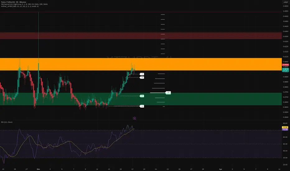
Stacks: poised for a drop? key levels to watch for todayStacks traders, ready for a play on the Bitcoin L2 kid that everyone watches but few actually trade? Lately headlines around Bitcoin ecosystem projects are heating up again, while Stacks is just grinding sideways under local resistance. That combo often ends with a sharp move when late money finally wakes up.
On the 4H chart price is stuck in a heavy supply zone around 0.27-0.28 with clear lower highs and a tired RSI rolling down from near 60. Volume profile shows a fat node right above, so if bulls cannot reclaim it fast, sellers usually press it back toward the next demand around 0.25 and then 0.23. I lean short here, expecting another leg down before any serious trend change.
My base plan ✅ wait for a rejection pattern in this red zone and ride a short into 0.25, maybe extend toward 0.23 if momentum stays bearish. Invalidation for me is a confident 4H close above roughly 0.285-0.29, which would open the door for a squeeze toward 0.30-0.32 instead ⚠️ I might be wrong, but until that breakout happens I prefer to stay with the prevailing downtrend.
SPX: bounce or rug pull? key levels to watch in the coming daysSPX6900. Are you buying this bounce or waiting for the next rug pull? After a brutal bleed, the token finally popped off the lows, while traders are rotating back into higher beta plays according to market chatter. That fresh volatility is exactly where I like to hunt for asymmetric setups.
On the 4H chart price rejected the first red supply zone around 0.34 and is now stalling just above the orange high-volume band near 0.29-0.31. RSI already rolled down from overbought, so I’m leaning toward a corrective leg rather than an instant moonshot. Base case for me is a pullback into the green demand area around 0.27-0.28 where the last real buyers appeared.
My plan: I’m not chasing here. I want either a dip into 0.27-0.28 for a reactive long back toward 0.33-0.35, or if we get a clean 4H close below the green zone, I flip bias and expect continuation lower with 0.24+ on the table. I might be wrong, but up at resistance I see more edge in patience than in FOMO. ✅ Key takeaway: let price come to your levels, not your emotions.
STRK: falling knife or hidden gem? key levels to watchSTRK. Still hoping this thing suddenly moons after the airdrop hype? While the ecosystem keeps dropping “growth” headlines, the market is clearly focused on unlocks and fresh supply, and you can see it in the price action – every bounce gets sold almost instantly. According to industry sources, funds are still rotating into majors, so small caps like STRK are left to fend for themselves.
On the 4H chart we’re in a clean downtrend, and the last bounce stalled right under the main volume node around 0.050–0.052 – classic supply zone. RSI just rolled down from overbought back under 50, confirming fading momentum, so I’m leaning short, expecting continuation of the grind lower rather than a sudden reversal. I might be wrong, but right now STRK looks more like a falling knife than a hidden gem.
My base case ✅ short bias while price stays below 0.052 with targets toward 0.046 first and then 0.043 if the selloff accelerates. If buyers suddenly punch through 0.052 and hold above that on volume, the script flips and we can easily squeeze into 0.056–0.058 where the next heavy resistance sits. I’m watching for weak retests of 0.050 to build shorts, and I’ll step aside fast if that level starts acting as firm support.
NEXO: rally or correction? key levels to watch for todayNEXO. Who’s hunting yields instead of meme pumps right now? Lending tokens are back on the radar as the market rotates into higher‑yield plays, and after that nasty flush NEXO already squeezed hard off the lows. According to market chatter, centralized earn platforms are seeing renewed interest, so this move is not happening in a vacuum.
On the 4H chart price is parked right in a fat supply zone around 0.84‑0.87 where we last distributed before the dump. RSI just cooled from overbought and is rolling over, while VPVR shows the main volume magnet lower, near 0.79‑0.80. So short term I lean to a corrective move down before any serious breakout. I might be wrong, but fading euphoric bounces into old supply has paid my bills more than once.
My base case: rejection from this zone and a pullback toward 0.80, maybe 0.76, where I’ll watch for a fresh long setup ✅. Aggressive traders can look for shorts here with invalidation above 0.88, targeting that 0.80 cluster. If bulls punch through 0.87 on strong volume, the door opens to 0.93 then the psychological 1.00, but a clean break and hold below 0.80 would be a warning to step aside ⚠️.
Price Action Blocks and Trading Levels to IndicatorsIn this video, I’m not teaching a strategy as much as I’m walking beside you inside the process.
You’re watching me map a trade in real time — not just the mechanics of entry and exit — but the thought pattern behind it. The patience. The restraint. The conversation happening internally before capital is ever deployed.
Because trading, at its highest level, is not technical. It is personal.
As price moves, I’m outlining the path to the next level — where the market is most likely to travel if momentum holds. Not predicting. Not forcing. Simply reading what is already unfolding.
You’ll see the levels laid out clearly — structure points where decisions live. Areas where opportunity either expands… or disappears.
I talk through my Go / No-Go zones — the places where a trade is either validated or immediately disqualified. There is power in knowing where not to participate. Preservation of capital is preservation of peace.
You’ll also hear me reference what I call Right or Right Out trades — positions where my stop sits directly at my entry. No wiggle room. No hope trades. Price moves in alignment quickly… or I step aside without damage.
This is not aggression.
This is alignment.
The Lens I’m Viewing Through
My charts are structured, but they are not cluttered.
I use tools to create context, not dependency:
• Bollinger Bands to observe volatility breathing
• Ichimoku Cloud — with a heavy respect for the Lagging Span — to confirm whether price has clean air or friction behind it
• The 50, 100, and 200 SMA to understand macro trend structure
• The 5 SMA to feel immediate momentum
• The 9 / 21 EMA cross to time rhythm shifts
I do not use volume.
I do not use time grids.
I am watching behavior. Not noise.
Timeframes
I’m observing price across three lenses:
Hourly for directional posture.
15-minute for formation.
5-minute for precision.
Each timeframe is a conversation.
When they agree, clarity expands.
The Deeper Message
But this video is not about indicators.
It is about trust.
Trusting your preparation.
Trusting your ability to read structure.
Trusting the integration of your mind, heart, and gut when you engage risk.
Prosperity is not created from forcing trades.
It is created from alignment with opportunity.
Abundance comes from discipline… not frequency.
My intention in sharing this inside the community is simple:
To empower you to find your setup.
To refine your lens.
To build a relationship with the market that is grounded, calm, and self-directed.
Because when you learn to read opportunity clearly…
You stop chasing money.
And you start participating in prosperity.
Flare: ready to break out? key levels and targets for todayFlare. Tired of watching only the majors while small caps sneak in the real moves? According to industry sources, Flare just got fresh attention around new data and DeFi integrations, and the price quietly reacted with a solid bounce from local lows. Market mood is still cautious, which is exactly when charts like this tend to surprise latecomers.
On the 4H chart we bounced cleanly from the green demand around 0.0090 and are now grinding just under a fat volume node and red supply near 0.0100 - 0.0105. RSI is back above 50 and pointing up, looks more like accumulation than distribution to me. If buyers punch through this first supply, the next liquidity pocket sits higher, roughly in the 0.011 area.
My base plan: I prefer longs on pullbacks into 0.0092 - 0.0094 with targets at 0.0105 and then 0.011 ✅. Invalidation for the idea is a confident 4H close below 0.0090 - that opens the door for a slide toward 0.0083 and I would flip to short bias there ⚠️. I might be wrong, but shorting straight into this demand zone looks like volunteering as exit liquidity.
ARB: is the bounce finally here? key levels to watch todayARB. Tired of watching this thing bleed and asking if the bounce is finally real? After a brutal selloff, headlines around layer‑2 activity and renewed interest in scaling stories are slowly coming back, and the market stopped panic‑dumping this one. Today we see ARB stabilizing while the rest of the market cools off a bit, which is often how quiet reversals start.
On the 4H chart price is building a base above 0.11 after that waterfall move. RSI has ripped from oversold to above 60, and the volume profile shows a fat node near 0.115 where buyers keep defending. As long as we hold 0.112, I lean to the upside, with a squeeze into the first red supply zone around 0.128‑0.13 on the table.
✅ My base plan: I’m interested in dips to 0.113‑0.115 for a short‑term long toward 0.128‑0.135, maybe 0.14 if momentum really bites. If we get 4H closes back under 0.11, I step aside and expect another leg toward 0.10‑0.095. I might be wrong, but this looks more like late capitulation than the start of a fresh downtrend, so I’m trading the bounce, not marrying the coin.
EMR at Demand Zone: ATH Breakout Meets Polarity SupportEMR is currently presenting a technically powerful setup where classical Support–Resistance theory and Demand–Supply concepts are perfectly aligned. The price structure is clean, the trend is strong, and the location adds conviction.
Let’s break this down step by step.
📊 Trend Structure – Multi Timeframe Strength 📊
The most important rule in trading: Trade with the trend .
Daily trend is clearly UP — higher highs and higher lows.
Weekly trend is also UP — confirming higher timeframe strength.
Price recently broke previous All-Time High (ATH).
When a stock makes a fresh ATH, it signals strong institutional participation. Breakouts at ATH levels are rarely random — they usually indicate aggressive demand absorption.
Here, the leg-out candle from the demand zone broke the previous ATH , which significantly increases the credibility of this zone.
🏗️ Demand Zone Quality & Structure 🏗️
Price is currently trading inside a Best Quality Demand Zone .
Why is this zone strong?
Leg-out created new ATH.
Fresh zone — not deeply tested.
Zone aligns with higher timeframe uptrend.
In supply-demand terminology, this reflects unfilled institutional buy orders sitting in this area.
"Strong moves leave footprints. Smart money cannot hide their accumulation."
🔄 Act of Polarity – Classical + Institutional Alignment 🔄
From traditional technical analysis:
Previous resistance is now acting as support.
Retest into prior resistance = polarity in action.
Now here’s the powerful part:
👉 That previous resistance area overlaps with the demand zone.
This means:
Classical traders see support.
Supply-demand traders see institutional demand.
Both groups may participate at similar levels.
When two different technical frameworks agree, probability increases.
🎯 Trade Plan – Risk Controlled Opportunity 🎯
The marked levels suggest a structured 1:2 Risk–Reward setup .
🧠 Market Psychology 🧠
Let’s understand what may be happening behind the scenes:
Breakout traders entered on ATH break.
Late buyers may panic on pullback.
Institutions use pullbacks to re-accumulate.
Weak hands exit, strong hands absorb.
Pullbacks into demand during an uptrend are often inventory reload zones .
⚖️ What Would Invalidate This Setup? ⚖️
Always think two steps ahead.
Strong close below distal line.
Demand zone violation.
Consecutive supply breaches on lower timeframe.
If demand fails, bias changes. Discipline is everything.
📌 Summary of Confluence 📌
Daily trend – UP
Weekly trend – UP
Break of All-Time High
Previous resistance acting as support
Fresh high-quality demand zone
Clean 1:2 RR structure
This is the kind of alignment traders wait for — trend, structure, and institutional footprint in one place.
💬 Lastly, Thank you for your support, your likes & comments. Feel free to ask if you have questions.
📈✨ Stay patient, trade with structure, and let probabilities work in your favour. Consistency beats excitement in trading! ✨📈
Reading volume flow: $38 billion real-time example 🎤 Testing testing. 1 million, 2 million, 3 million...
That's how much volume is flowing into Bitcoin ETF (IBIT). If you multiply it a dozen thousand times. Last week we saw highest ever recorded volume on Bitcoin ETF. It's about two to three times more than the typical weekly volume.
Here's IBIT on a weekly timeframe.
945 million shares. Or about 38 billion in USD, spiking out like a monolith in an empty desert.
Who's buying? Deep pockets at Wall Street? Wrong question for reading flows. We actually don't care who, or why. We only take note that someone is buying (and someone sold), with a lot of money on the table.
Let's study how to read volume flows, what they might mean and how we can find confluence to form trading bias for them. With a real-time, practical example.
🔍 Interpreting the flows
Let's start with where the price is located. We're sitting at around $40, which served as higher timeframe resistance for 245 days in the past.
This in itself is significant. This is where you'd expect price to naturally struggle moving through. What was once resistance, is now support. But why is that?
Resistance is created by liquidity, in other words buy and sell orders sitting in an orderbook. When large amount of orders is clustered around a narrow area, overwhelming supply is created. Demand needs to exceed it in order for price to move through.
This is what we call "deep liquidity". We know there was deep liquidity hanging around the price level, because it held for 245 days despite many attempts. Supply simply exceeded demand.
Ultimately the supply gave in and buyers got through it, but this doesn't mean the level becomes irrelevant. Liquidity that is broken through leaves a "memory imprint" where it once was, for psychological and structural reasons. Trading algorithms for example take note of volume clusters like this and place bets at them.
This same level is likely to gather liquidity again in the future, and we can tell this is exactly what happened, as seen by the volume spike. The sudden burst of volume tells us liquidity (advertised orders) was realized into volume (finalized orders), suddenly and fast.
We can observe price is truly struggling to move through, meaning the same level has dense liquidity, once again.
📚 Historical case study: Apple
We can find volume spikes everywhere, but one that matches particularly well is Apple, also on weekly timeframe. Higher timeframe resistance turned into support, with high volume spike.
Here too, price found dense liquidity at the 336-day resistance and found it again on a re-test, as shown by the volume spike. What follows is a reversal, but let's again think through why.
Deep liquidity is the path of hard resistance. In other words, opposite direction is the path of least resistance. Moving price up takes less effort than moving it down.
Like a balloon under water, the harder you push it down, the more the force works against you. The natural, effortless motion is to the opposite direction, making it the higher probability one.
This is why price tends to reverse. Not for any particular reason in itself, just because it's the easy way. That's all there is to it, and from a trading perspective, that's all you need to know.
So, does this mean IBIT will reverse too? Before we get ahead of ourselves, let's stick to what we can observe now - path of hard resistance is found. This is thinking in terms of flows, not price.
Let's then look at what supporting factors we can find to get more conviction for this path of least resistance realizing into proper upside. One simple way is to find evidence of pain.
➕ Confluence from open interest
One way to look for pain trade evidence is by seeing how trading positions are forming. Many ways to do this too, but arguably one of the most accurate ones is using open interest.
Open interest tells us amount of open trading positions in terms of contracts (e.g. 1 contract = 1 unit of the asset). That doesn't tell us whether the trading position is long or short, though. We also can't easily conclude how many contracts is significant or insignificant.
This is Open Interest Flow, one of our TradingView indicators completing that information. The indicator estimates whether open interest is from longs or shorts and how extreme the flows are, displayed in a human friendly format.
Here we have hopped on the daily chart for more detail, feeding open interest from Binance to the indicator. This tells us how Binance traders in particular are positioning. We can see green bars pointing down to a value of -1.5 or so.
This tells us long outflows (buyers closing their positions) are 1.5x higher than average, for a few days straight. This coincides in an interesting way with what we see with the volume spike - we can tell longs are exiting on actual crypto markets.
That's +1 evidence for a pain trade thesis.
🔗 Get Open Interest Flow on TradingView
Open Interest Flow is an open source indicator, available for everyone to use on TradingView. Find more information about the indicator, how it works and how to use it here:
📌 Pinning it down
Major level, outrageous volume and longs bleeding. So, what's the verdict for charts like these?
The underlying truly observable fact is that price found liquidity. A lot of it. Someone puked it and someone absorbed it. On Apple (and many other charts if you pay attention), this kind of anomaly is significant and typically precedes a reversal.
Open interest tells us longs are exiting at extreme rates, speaking of pain. Path of least resistance is to the upside and early longs got flushed out. This forms a solid foundation for expecting a reversal or at the very least a halt for the downtrend.
Given we are on a weekly timeframe, setups like this can play out over weeks. Maybe longer. But as with any type of analysis it's best to stick with what's in front of you and take it as it comes. Reacting > predicting.
Thanks for reading. May the flows be in your favor.
KAS: ready for a surprise rally? key levels and targets aheadKAS. Still watching this PoW rocket sleep after the last hype wave? Today the headlines talk about growing miner activity and new listing rumors, and according to industry sources network metrics are ticking up again while price is still stuck in the basement. That combo often gives us those nasty short squeezes when nobody expects them.
On the 4H chart price is sitting on a big volume node around 0.031 - 0.033 with RSI curling up from the mid zone, after a brutal flush into that green demand area below. Structure is still bearish overall, but I see a short term accumulation box and higher lows, so I lean to a relief push toward the nearest red supply at 0.0345 - 0.036. I might be wrong, but this looks like classic "dead trend, live bounce" territory.
My base plan ✅ wait for a confident 4H close above 0.0335 and then look long into 0.036 first and 0.038 as an extension, with invalidation under 0.030. If buyers fail and we lose 0.030 on volume, I step aside or even look for a quick short toward the green zone at 0.027 - 0.025 ⚠️. For now I stay patient and let price show who is really in control.
ASTER: ready for a pullback? key levels to watch aheadASTER. Who’s been riding this crazy bounce up? I don’t see any fresh game‑changing headlines on ASTER itself, but according to market chatter altcoins are catching a bid again while majors chop around, so money is hunting volatility here. Perfect time to look at the 4H chart instead of Twitter drama.
On the 4H we just slammed straight into a thick supply zone around 0.63‑0.66, exactly where the last local distribution started. RSI is hovering near overbought and you can see the whole leg up was almost vertical, classic move into resistance after a downtrend. I’m leaning short bias or at least expecting a healthy pullback before any serious breakout talk.
My base plan ✅: watch for rejection in this zone and potential move back toward the 0.56 support, with 0.53 and then 0.46 as deeper liquidity pockets if sellers really press. If price closes above this supply area with strong volume and RSI cools off through time, that flips the script and opens the door to the next resistance cluster higher. I might be wrong, but for now I’m staying patient and only interested in longs after a shakeout, not at the top of a vertical pump.
Order Block Tapped – Monitoring for Rejection vs. BreakoutGold has officially arrived at the $5,090 – $5,115 Bearish Order Block, a critical zone that previously acted as a "trap" for buyers before the recent crash. The price is currently reacting to this level, and while we are seeing a "small rejection" in the form of upper wicks on the 1H and 4H charts, the overall structure remains in a precarious balance.
Technical Evidence at the Block:
The Tap: The price hit the lower boundary of the supply cluster near $5,081 earlier today.
Rejection Signs: We are seeing initial signs of selling pressure as the RSI nears the overbought territory (60+) on smaller timeframes, which often triggers a "mean reversion" back toward the psychological $5,000 handle.
Liquidity Context: This Order Block sits right at the 50% retracement of the massive January collapse. Historically, smart money uses this "Premium" zone to close out long positions or enter new shorts.
Wait-and-See: With the US monthly jobs report delayed to February 11, the market is currently lacking the high-volume catalyst needed to break through this wall Decisively
The Rejection Case (Short-Term Bearish):
If 4H candles continue to close with long wicks inside the $5,090 – $5,115 zone, expect a "small rejection" back toward $4,937 – $4,950 (The Discount Demand).
The Breakout Case (Long-Term Bullish):
A clean daily close above $5,115 would invalidate this Order Block, turning it into a "Breaker Block" and opening the doors for a parabolic move toward $5,269 – $5,400.
Current Key Levels:
Immediate Resistance: $5,090 – $5,115 (The Tapped OB)
Immediate Support: $5,000 (Psychological Floor)
The "Safety" Zone: $4,937 (200-period EMA)
Final Thought: The Order Block has been tapped. We aren't chasing the move here—we are waiting to see if the rejection holds. If the bears can't push it back below $5,000, then this "rejection" is just a pause before a massive breakout.
Cronos: poised for a move? key levels to watch this weekCronos. Waiting for this thing to finally wake up or just tired of the slow bleed? Alt market is still in risk-off mode and, according to industry sources, headlines around centralized platforms and regulation keep exchange-linked coins under pressure. Price is chopping sideways, but it's doing it right under a heavy supply zone - not my favorite place to marry a long.
On the 4H chart Cronos is in a clean downtrend with a ladder of supply blocks from 0.080 to 0.090. RSI is stuck around 50 after failing to break higher, so momentum is more "dead cat" than fresh trend. I lean short from this consolidation, expecting sellers to defend the 0.080-0.082 zone and push price back to the recent liquidity pockets below. I might be wrong, but a straight moonshot through all that supply would really surprise me.
My base plan: look for rejection wicks or bearish candles around 0.080-0.082 and aim for 0.072 first, then 0.068 as an extended target ✅. If Cronos closes a clean 4H above 0.084 and holds it as support, that invalidates the short idea and opens a squeeze toward 0.090-0.095 instead. I'm flat for now and waiting for price to tap the zone and show its hand.
NZDCHF: Supply Reaction Within 350 EMA Downtrend ContextStructure:
Price reacting into defined supply zone following corrective push.
Context:
350 EMA remains downward sloping, maintaining broader bearish pressure.
50 and 200 EMAs compressed beneath supply, signalling weakened upside momentum.
Key Level:
Supply zone rejection required for continuation lower.
Invalidation:
Sustained acceptance above supply shifts short-term bias neutral.
Bias:
Bearish while price remains below supply and 350 EMA slope persists.
Gold ( important zone )As you can see in the attached TradingView chart (1-hour timeframe, XAU/USD around 4,964.62), gold has recently rallied sharply from lower levels (around the green demand zone near 4,700–4,750) and is now approaching a multi-layered supply zone highlighted in red.
Key observations from the chart:
Price has tested and reacted to the red supply bands multiple times, particularly around 5,024–5,035 and higher at 5,074–5,100.
The current price is consolidating/testing the lower edge of this supply area (~4,986–5,024), with yellow arrows indicating potential rejection and downward moves.
Bearish structure is visible with the price failing to hold higher after the recent pump, showing signs of exhaustion near these resistance layers.
On the 1H chart, we see potential bearish candlestick formations or rejection wicks at these levels.
I expect gold to show a very strong reaction (rejection) from these supply zones. With proper confirmations — such as a bearish engulfing candle, failure to break above 5,000–5,024 decisively, increased volume on downside, or bearish divergence on RSI/MACD — we can look to enter a sell trade targeting longer-term downside objectives, potentially back toward 4,850–4,900 initially, and deeper if momentum builds (e.g., toward the prior low zones or 4,700 area).
Risk management: Stops should be placed above the supply zone (e.g., above 5,074 or recent swing high) to protect against a breakout invalidation.
This is not financial advice; always DYOR and manage risk carefully.
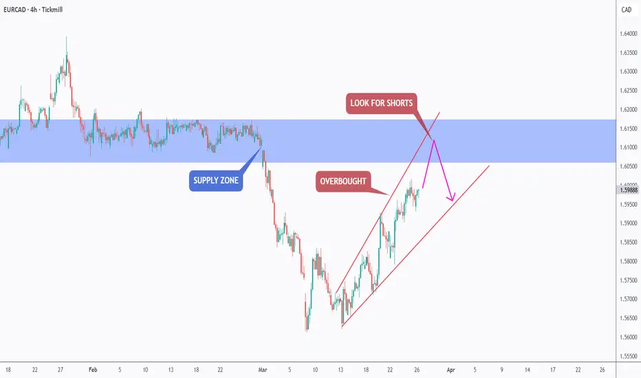
EURJPY - Market is at Overbought Zone, Expecting Correction..!The image provided is a forex trading chart for the EUR/JPY currency pair, illustrating a technical analysis strategy.
The analysis identifies a "daily resistance" level where traders are advised to "look for shorts" (sell positions), anticipating a price decline.
Technical Analysis Overview 📊
Currency Pair: Euro / Japanese Yen (EUR/JPY). 💴
Strategy: The chart highlights a resistance level (the upper horizontal line around 185.5 JPY per Euro) where selling pressure has historically increased.
Actionable Insight: The text "LOOK FOR SHORTS" suggests implementing a trading strategy to profit from an expected downward price movement, often used when a market is considered overbought. ⬇️
Market Context: As of recent data (January 2026), the EUR/JPY pair has been trading near record highs, with some analyses noting potential bearish divergence in technical indicators, which could support the short-selling idea. ⬇️
Bitcoin Cash (BCH): ready for another drop? key levels to monitoBitcoin Cash. Tired of watching it bleed while bitcoin steals the spotlight again? Recent headlines talk about money rotating back into the main coins and, according to market sources, interest in BCH on the spot side has cooled off after the last hype spike - price action is reflecting that mood perfectly.
On the 4H chart we are stuck in a tight range under a heavy supply zone around 535-550, right below a big volume node that keeps capping every bounce. RSI is hanging under 50, so momentum is still bearish, and the last recovery came on declining volume - for me that favors another leg down rather than a full reversal.
My base case: I am hunting shorts while price is under 540, with potential targets at the local supports near 505 and, if that breaks, 480 ✅. If price suddenly rips above 545 and holds there with strong volume, that would cancel the short idea and open room for a squeeze toward 575-600. I might be wrong, but until the market proves otherwise I treat every bounce here as fuel for sellers, not the start of a new uptrend ⚠️.
In the next 1-2 weeks, the price is between 4600-5200.In the next 1-2 weeks, the price is between 4600-5200.
Gold spot prices fluctuated wildly last week, falling from a high of $5,602 on Thursday, January 29th, to a low of $4,679 on Friday, January 30th, a difference of approximately $900, marking the largest price swing since 1983. Looking at the daily candlestick chart, Friday's candlestick has a long lower shadow, indicating strong buying support below $4,800. The key level to watch in the first week of February is the psychological support level of $4,800, while the resistance level of $5,000. In the next 1-2 weeks, prices are unlikely to reach new highs, and are expected to fluctuate between $4,600 and $5,200.
H4: As shown in the chart, the long lower shadow on the last candlestick of the H4 pattern indicates support at $4800. However, a sharp drop will likely create selling pressure above $5000 due to buying pressure from the previous 1-2 weeks. In the coming days, a long position can be considered primarily in the $4580-$4820 range. Short positions can be considered around the $5000 psychological level and the $5250 resistance zone. See the strategy below for details.
H4 Strategy:
Buy Zone @ 4580 - 4820
SL: 40-80, TP: 120-240
Sell Zone 1 @ 4960 - 5080
SL: 40-60, TP: 120-180
Sell Zone 2 @ 5200 - 5300
SL: 40-60, TP: 120-180
EUR/JPY Market Analysis: Macro + Structure [MaB]1. The Macro Context (The "Why") 🌍
Hi traders! Before looking at the candles, let's look at the money.
My fundamental scoring table speaks clearly: there is a huge differential that we cannot ignore.
Key Factor Analysis:
🏦 Rate Expectations: Explanation: The BCE remains neutral with a trend holding stance and no clear bias in recent decisions, while the BOJ is the only hawkish central bank in the G7 with a recent +25bp hike and an aggressive stance. Score EUR: 0 Score JPY: +2
🎈 Inflation: Explanation: Eurozone inflation is at 2.14%, close to the 2% target, representing a controlled situation. JPY inflation at 2.91% is above target, justifying the BOJ's hawkish stance. Score EUR: 0 Score JPY: +1
📈 Growth/GDP: Explanation: Europe is facing worrying economic stagnation with a GDP of 0.7%. Japan's growth is also weak at 0.5%, which limits the space for overly aggressive rate hikes. Score EUR: -1 Score JPY: -1
🏭 PMI Data: Explanation: EUR PMI is neutral (weighted 50.65). JPY shows manufacturing expansion with a weighted PMI of 52.66. Score EUR: 0 Score JPY: +1
⚖️ Risk Sentiment: Explanation: Market is currently in a neutral regime; EUR is semi-cyclical and JPY is a safe-haven, but no significant risk-off flows are present. Score EUR: 0 Score JPY: 0
🗞️ News Catalyst: Explanation: Recent EUR CPI came in at 1.9% vs 2.0% expected, a moderate negative surprise. JPY benefits from exceptional hawkish policy momentum. Score EUR: 0 Score JPY: 0
Currency Score Summary:
Total Score EUR: -1 ( ) Total Score JPY: +2 ( )
Synthesis:
EUR (Weak, Score -1): The Euro is under pressure due to economic stagnation and a neutral central bank. JPY (Strong, Score +2): The Yen is strong, supported by a hawkish BOJ that stands out as an outlier in the G7. Conclusion: With this scenario, we are only looking for .
Going against this bias would be statistical suicide.
2. The Technical Setup (The "Where") 📉
Timeframe: 4h | Pair: EUR/JPY
The SMC Market Structure + Price Zones indicator gave us the confirmation we needed for our statistical edge.
Here is where the indicator makes the difference. Look at the dashboard on the right, numbers don't lie:
🚀 Continuation Rate (60%): We are exactly at the 60% threshold.
This tells us the market is in a healthy, directional trend.
Statistically, betting on continuation pays off more than looking for a reversal.
🔥 Streak (0) & Streak Pct: 2 We are at the start of a potential new leg after a period of correction.
It's a mature trend (we are in the 2nd percentile of trend extension), so watch those stop losses, but as long as the music plays, we dance.
🔄 Retest (85.4%): The indicator tells us that statistically, when price creates a new Break of Structure (BOS), it retraces into the previous zone 85.4% of the time.
Therefore, it pays to wait for a deep retracement into the supply zone to maximize our Risk/Reward ratio.
💥 BOS/Ret Rate (41.5%): This parameter tells us that once price retraces inside the previous zone, it has a 41.5% probability of reacting and creating a new BOS.
🎯 Extension Rate (1.82x): The algorithm projects an ambitious target.
We expect this move to extend 1.82 times the current pullback leg. That's where we'll take profit.
3. Execution Plan on Chart
Moving to the chart, the SMC Market Structure + Price Zones indicator supports us in pinpointing liquidity to define entry and stop loss:
Entry and Stop Loss: We place a limit entry in the Supply Zone 4h (Red Band) and the stop loss a few pips above the zone.
Take Profit: We leverage the asset's statistical analysis offered by the Extension Rate and place the target by measuring with Fibonacci at 1.8x relative to the pullback leg.
Trade Parameters:
Entry Price: 185.416 Stop Loss: 186.181 Take Profit: 178.850
⚠️ Disclaimer: This analysis is based on a proprietary algorithm and is shared exclusively for educational and didactic purposes.
It does not constitute financial advice or investment solicitation in any way. Trading involves significant risk.