OPEN-SOURCE SCRIPT
Обновлено Intuitive Trade Regime [TraderZen]
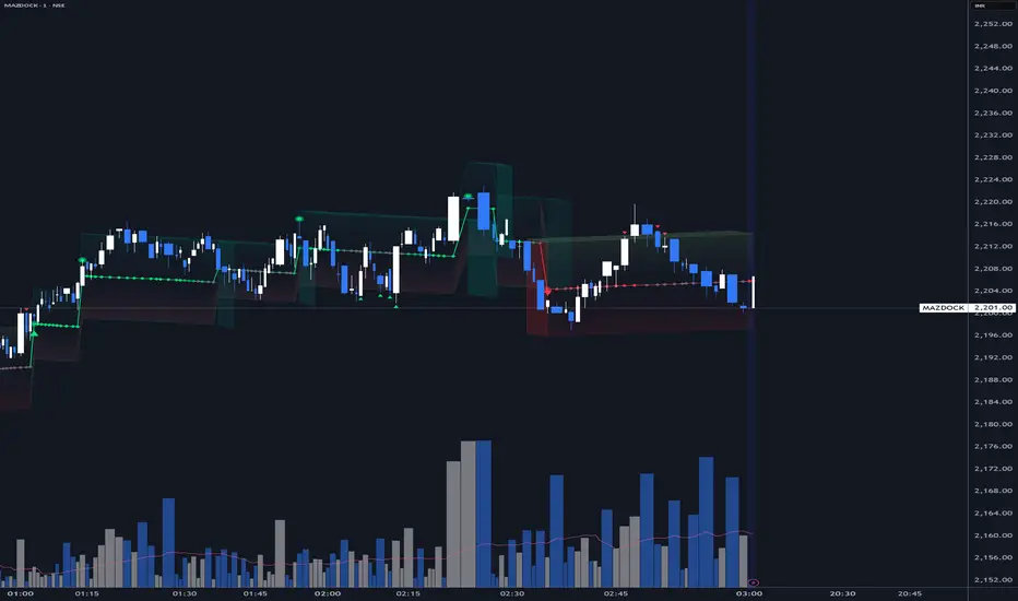
The 3D Geometry of Momentum.
Try this on your favorite chart! Every trader thinks in images. We say the market "took a turn," that price is "going sideways" .. that a breakout "jumped over resistance." We describe a selloff as a "cliff drop" and a rally as a "rapid rise." We watch price "bounce off support" or "breach the borders" of a range. These are not casual metaphors — they are how the mind actually processes price action.
This indicator is built for that visual mind. It translates the structure of price movement into shapes that feel familiar — not because they have been studied, but because they have been seen. The goal is not to add more data to the chart. It is to make what is already there easier to perceive.
The Staircase
Price does not move in lines. It moves in segments — rises and flats, drops and pauses. In structure, this is no different from a staircase. Each trend segment is a step, and the shape of that step tells a story.
The tread — the horizontal span — shows how long a regime held. A wide tread means price spent time consolidating before the next move. A narrow one means momentum carried through without pause.
The riser — the vertical face between steps — shows the magnitude of the shift. A tall riser marks a decisive regime change. A short one marks a continuation, a nudge in the same direction.
The landing — a wider, flatter segment — appears when the market pauses to establish a range before committing. It is the moment between moves where direction has not yet been decided.
And the nosing — the overshoot at each edge — reveals how aggressively price tested the boundary before accepting it.
When these elements are narrow and steep, the staircase is rickety — momentum is high but potentially unstable. When they are wide and gradual, the staircase is solid — a measured, deliberate trend. When they alternate in size, the staircase is winding — a market searching for direction.
This is not a metaphor layered onto the chart. It is what the channel segments actually form. The indicator simply makes the staircase visible.
Perspective as Information
One of the more unusual features of this indicator is its use of 3D depth — not for decoration, but for orientation.
In a downward move, the depth faces project upward and behind, as if you are standing above and looking down at the price descending below you. The top surface of each segment is visible. You see where price came from.
In an upward move, the depth reverses. The faces project downward and forward, as if you are looking up at a structure rising above you. The underside of each segment is exposed. You see the climb from below.
This is not arbitrary. It mirrors how we naturally perceive direction. Looking down implies a fall. Looking up implies a rise. The perspective reinforces the regime — making it something you feel, not just something you read from a label.
The direction of depth is fully configurable, with independent control for bull and bear segments. But the defaults are set to match this natural orientation: upward moves seen from below, downward moves seen from above.
Compression and Expansion
The width of the channel adapts to volatility. When the channel tightens, price is compressing — energy is building. When it widens, expansion is underway — the move is in progress.
In tight bear segments, the depth face breaks into a cascading waterfall pattern — stepped terraces that descend like water over ledges. This is not cosmetic. Narrow bear channels often represent rapid, liquidation-driven moves, and the waterfall texture makes that character immediately visible.
In tight bull segments, the depth face becomes jagged — an ascending cliff with rough, uneven edges. Narrow bull channels often reflect sharp, momentum-driven rallies, and the rocky texture communicates that energy at a glance.
These effects activate automatically when the channel compresses below a configurable threshold relative to ATR. When the channel is wide, the faces remain smooth and clean.
What the Channel Tells You
The mid line is the structural anchor. In Lead mode, it sits on the opposite side of price — acting as support in uptrends and resistance in downtrends, decaying slowly away from price like a trailing reference. In Follow mode, it tracks toward price, blending with the local basis.
The bands define the expected range. Price staying within the bands confirms the current regime. A confirmed break beyond the band triggers a regime change — marked by a triangle on the chart.
Retests occur when price touches the far band without conviction. These are marked with smaller arrows and often represent pullback entries within the trend.
Continuation steps fire when price pushes further in the current direction, extending the trend. Refresh events occur when a segment has aged out or drifted too far from the local basis — the channel quietly re-anchors without changing direction.
Each of these events reshapes the staircase. A regime flip starts a new step. A continuation extends the current one. A refresh adjusts the footing without changing the path.
Themes
The indicator ships with preset visual themes that configure the gradient, transparency, and 3D settings as a group:
All themes respect your chosen colors. Switching themes changes the structure and feel — not the palette.
A Note on Design Philosophy
Most indicators ask the trader to interpret numbers. This one asks the trader to observe shapes. The thesis is simple: if the visual representation is honest — if the shapes genuinely correspond to the character of the move — then pattern recognition does what it has always done. The trader sees what is happening, and the chart stops being a puzzle to decode.
The 3D effects, the staircase structure, the perspective shifts — these are not aesthetic choices. They are attempts to give price action a physical presence on the chart, so that reading a trend feels less like analyzing data and more like watching something move.
That is what intuitive means here. Not simplified. Not dumbed down. Just shaped for the way the eye already works.
Disclaimer
This indicator is a visual analysis tool designed to aid in the interpretation of price action. It does not generate buy or sell signals, and nothing presented here constitutes financial advice, a trading recommendation, or a solicitation to trade any financial instrument. Past visual patterns do not guarantee future price behavior. All trading involves risk, including the potential loss of principal. Users are solely responsible for their own trading decisions and should consult a qualified financial advisor before acting on any information derived from this or any other technical tool. The author assumes no liability for any losses incurred through the use of this indicator.
Built by TraderZen
Try this on your favorite chart! Every trader thinks in images. We say the market "took a turn," that price is "going sideways" .. that a breakout "jumped over resistance." We describe a selloff as a "cliff drop" and a rally as a "rapid rise." We watch price "bounce off support" or "breach the borders" of a range. These are not casual metaphors — they are how the mind actually processes price action.
This indicator is built for that visual mind. It translates the structure of price movement into shapes that feel familiar — not because they have been studied, but because they have been seen. The goal is not to add more data to the chart. It is to make what is already there easier to perceive.
The Staircase
Price does not move in lines. It moves in segments — rises and flats, drops and pauses. In structure, this is no different from a staircase. Each trend segment is a step, and the shape of that step tells a story.
The tread — the horizontal span — shows how long a regime held. A wide tread means price spent time consolidating before the next move. A narrow one means momentum carried through without pause.
The riser — the vertical face between steps — shows the magnitude of the shift. A tall riser marks a decisive regime change. A short one marks a continuation, a nudge in the same direction.
The landing — a wider, flatter segment — appears when the market pauses to establish a range before committing. It is the moment between moves where direction has not yet been decided.
And the nosing — the overshoot at each edge — reveals how aggressively price tested the boundary before accepting it.
When these elements are narrow and steep, the staircase is rickety — momentum is high but potentially unstable. When they are wide and gradual, the staircase is solid — a measured, deliberate trend. When they alternate in size, the staircase is winding — a market searching for direction.
This is not a metaphor layered onto the chart. It is what the channel segments actually form. The indicator simply makes the staircase visible.
Perspective as Information
One of the more unusual features of this indicator is its use of 3D depth — not for decoration, but for orientation.
In a downward move, the depth faces project upward and behind, as if you are standing above and looking down at the price descending below you. The top surface of each segment is visible. You see where price came from.
In an upward move, the depth reverses. The faces project downward and forward, as if you are looking up at a structure rising above you. The underside of each segment is exposed. You see the climb from below.
This is not arbitrary. It mirrors how we naturally perceive direction. Looking down implies a fall. Looking up implies a rise. The perspective reinforces the regime — making it something you feel, not just something you read from a label.
The direction of depth is fully configurable, with independent control for bull and bear segments. But the defaults are set to match this natural orientation: upward moves seen from below, downward moves seen from above.
Compression and Expansion
The width of the channel adapts to volatility. When the channel tightens, price is compressing — energy is building. When it widens, expansion is underway — the move is in progress.
In tight bear segments, the depth face breaks into a cascading waterfall pattern — stepped terraces that descend like water over ledges. This is not cosmetic. Narrow bear channels often represent rapid, liquidation-driven moves, and the waterfall texture makes that character immediately visible.
In tight bull segments, the depth face becomes jagged — an ascending cliff with rough, uneven edges. Narrow bull channels often reflect sharp, momentum-driven rallies, and the rocky texture communicates that energy at a glance.
These effects activate automatically when the channel compresses below a configurable threshold relative to ATR. When the channel is wide, the faces remain smooth and clean.
What the Channel Tells You
The mid line is the structural anchor. In Lead mode, it sits on the opposite side of price — acting as support in uptrends and resistance in downtrends, decaying slowly away from price like a trailing reference. In Follow mode, it tracks toward price, blending with the local basis.
The bands define the expected range. Price staying within the bands confirms the current regime. A confirmed break beyond the band triggers a regime change — marked by a triangle on the chart.
Retests occur when price touches the far band without conviction. These are marked with smaller arrows and often represent pullback entries within the trend.
Continuation steps fire when price pushes further in the current direction, extending the trend. Refresh events occur when a segment has aged out or drifted too far from the local basis — the channel quietly re-anchors without changing direction.
Each of these events reshapes the staircase. A regime flip starts a new step. A continuation extends the current one. A refresh adjusts the footing without changing the path.
Themes
The indicator ships with preset visual themes that configure the gradient, transparency, and 3D settings as a group:
- Classic — Clean channel with gradient fills. No 3D effects. The original look for those who prefer simplicity.
- Price Slabs — Solid 3D segments with depth and perspective. The staircase made tangible. Waterfall and cliff effects enabled.
- Neon Glass — Translucent 3D segments with a lighter touch. The structure is visible but does not dominate the chart.
- Custom — Full control over every parameter. Build your own visual language.
All themes respect your chosen colors. Switching themes changes the structure and feel — not the palette.
A Note on Design Philosophy
Most indicators ask the trader to interpret numbers. This one asks the trader to observe shapes. The thesis is simple: if the visual representation is honest — if the shapes genuinely correspond to the character of the move — then pattern recognition does what it has always done. The trader sees what is happening, and the chart stops being a puzzle to decode.
The 3D effects, the staircase structure, the perspective shifts — these are not aesthetic choices. They are attempts to give price action a physical presence on the chart, so that reading a trend feels less like analyzing data and more like watching something move.
That is what intuitive means here. Not simplified. Not dumbed down. Just shaped for the way the eye already works.
Disclaimer
This indicator is a visual analysis tool designed to aid in the interpretation of price action. It does not generate buy or sell signals, and nothing presented here constitutes financial advice, a trading recommendation, or a solicitation to trade any financial instrument. Past visual patterns do not guarantee future price behavior. All trading involves risk, including the potential loss of principal. Users are solely responsible for their own trading decisions and should consult a qualified financial advisor before acting on any information derived from this or any other technical tool. The author assumes no liability for any losses incurred through the use of this indicator.
Built by TraderZen
Информация о релизе
Upgraded Momentum Engine now features:- VWMA Delta Integration — A lightweight momentum engine computes the delta between fast VWMA(10) and slow VWMA(30), normalized by ATR. No additional security calls. Works on any timeframe and any instrument.
- Confluence Score — A 0-to-1 score measuring how strongly current momentum aligns with the active regime direction. Combines momentum magnitude (65%) with acceleration direction (35%).
- 3D Opacity Modulation — The confluence score directly drives 3D face transparency. Strong momentum confirmation produces solid, vivid blocks. Weak or opposing momentum produces ghostly, faded blocks. You read momentum strength from the shape itself.
- Dynamic Glow — The mid-line glow brightens when momentum confirms the regime and dims when it weakens. No labels or numbers needed — the line pulses with conviction.
- Confluence Diamond — An optional small diamond on the mid-line shows momentum-regime alignment at a glance. Vivid color when strong, gray when weak. Toggled independently.
- Volume-Aware Fallback — On instruments without volume data, the engine falls back to EMA-based momentum calculation automatically.
Информация о релизе
[b Updated the Theme PresetsFive visual themes let you switch the entire look in one click. All themes preserve your chosen gradient colors — they only change structural settings like line weight, transparency, depth, and cap style.
- Dual Band (default) — Slim, understated lines with subtle 3D depth. Glow width 2, main line width 1, outer transparency at 80%. Designed for clean readability on busy charts. The channel whispers rather than shouts — the 3D blocks add spatial context without overwhelming the price action.
- Classic — The original channel with no 3D effects. Thick glow, prominent mid-line, solid cap lines. For traders who prefer a traditional overlay without the dimensional rendering. All regime detection and momentum logic still runs — you just see it as a flat channel.
- Price Slabs — Bold, opaque 3D blocks that make each regime segment look like a physical price slab laid across the chart. Higher gradient inner ratio (0.60) for wider color bands. Dotted cap lines at segment boundaries. Best on dark themes where the blocks stand out against the background.
- Neon Glass — Translucent 3D faces with a glowing, glass-like quality. Shallower depth (0.10), tighter bar offset (2), and lower face transparency (75%) creating a luminous see-through effect. Dashed cap lines. Pairs well with vibrant gradient colors on dark backgrounds.
- Cu
Информация о релизе
* Dual Band (default) — Slim, understated lines with subtle 3D depth. Glow width 2, main line width 1, 5 rendered segments at 75% face and side transparency. Depth width 3 bars. Bull gradient runs teal upper to salmon lower, bear gradient runs soft green upper to deep red lower. Designed for clean readability on busy charts. The channel whispers rather than shouts — the 3D blocks add spatial context without overwhelming the price action.Информация о релизе
Image updated Информация о релизе
Visual improvements. Скрипт с открытым кодом
В истинном духе TradingView, создатель этого скрипта сделал его открытым исходным кодом, чтобы трейдеры могли проверить и убедиться в его функциональности. Браво автору! Вы можете использовать его бесплатно, но помните, что перепубликация кода подчиняется нашим Правилам поведения.

Отказ от ответственности
Информация и публикации не предназначены для предоставления и не являются финансовыми, инвестиционными, торговыми или другими видами советов или рекомендаций, предоставленных или одобренных TradingView. Подробнее читайте в Условиях использования.
Скрипт с открытым кодом
В истинном духе TradingView, создатель этого скрипта сделал его открытым исходным кодом, чтобы трейдеры могли проверить и убедиться в его функциональности. Браво автору! Вы можете использовать его бесплатно, но помните, что перепубликация кода подчиняется нашим Правилам поведения.
Отказ от ответственности
Информация и публикации не предназначены для предоставления и не являются финансовыми, инвестиционными, торговыми или другими видами советов или рекомендаций, предоставленных или одобренных TradingView. Подробнее читайте в Условиях использования.