OPEN-SOURCE SCRIPT
Обновлено Bishop Biryani Ribbons V2
What this indicator is
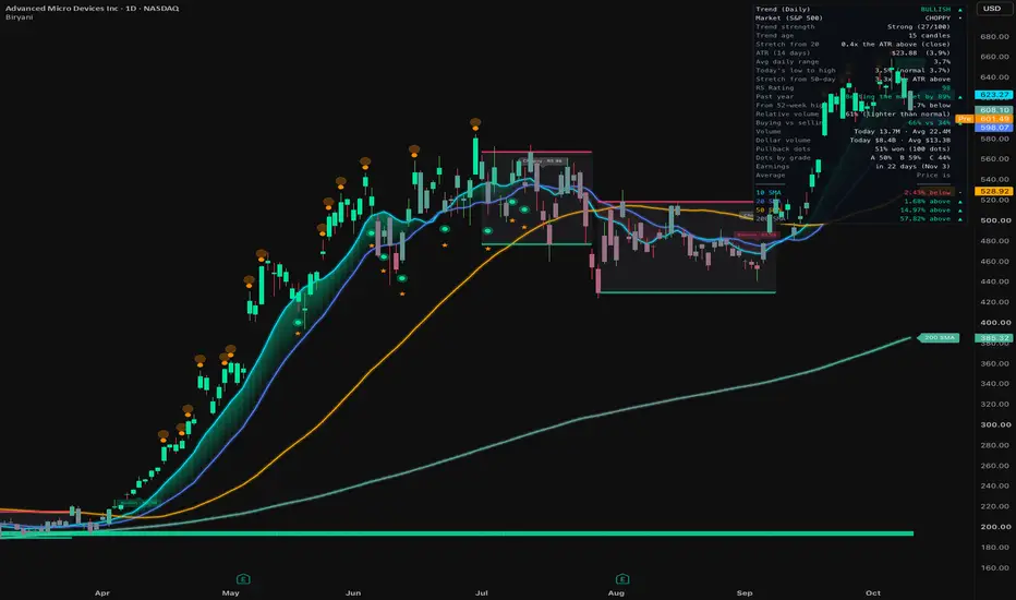
Bishop Biryani Ribbons V2 is a moving-average ribbon that reads the trend for you and puts the numbers that matter for a trade in one place. On the chart you get up to 7 moving averages with a shaded cloud between them, candles colored by trend, and optional signals. In the corner you get a dashboard that spells everything out in plain English: trend, trend strength, relative strength vs the market, volume, how stretched price is, earnings and more.
Out of the box it stays simple: four simple moving averages (10, 20, 50 and 200), one cloud, colored candles and a small dashboard. Everything else is off until you turn it on, so you only add what you actually use.
Why everything is in one indicator
The simple answer is that it lets any swing trader or day trader see the most important stuff up front. I built it to help traders, especially newer ones, look at numbers that matter that they were not looking at before, especially in a market like this one.
Most of you guys check the same few things before every trade: is it trending, how strong is that trend, is the stock beating the market, is volume behind the move, is price too stretched to chase, and is earnings coming up. Normally that means stacking five or six separate indicators that do not talk to each other. Here, those pieces are wired together so each one feeds the next:
1) The trend reading comes from the moving-average stack, filtered by trend strength (ADX), so sideways chop is not called a trend.
2) The cloud, candle colors and background all show that one reading, and they dim when the market is choppy.
3) Pullback dots only fire in the direction of that trend reading, so a dot is a dip inside a trend and not a random touch of a line.
4) The A / B / C grade on each dot uses the other pieces: the bigger-timeframe trend, trend strength, volume on the dip and the RS Rating.
5) The scoreboard then checks how past dots on that same chart actually played out, overall and by grade, so you can see whether the setup has worked on that stock.
6) The dashboard shows all of it in words, with the scale in parentheses, so nothing needs to be decoded.
So the pieces are wired to work together on one chart, and they answer one question in order: is there a trend, is this a good place to join it, and has that worked here before.
Why the RS Rating matters for every style
The RS Rating is the number most traders never look at, and it matters no matter how you trade. For swing traders, it keeps you in the stocks leading the market instead of the ones lagging it. For day traders, it tells you which names are worth trading today. Leaders tend to follow through when the market is strong and hold up better when it is weak, and because the rating works on any timeframe, you can see it right on a 1 or 5 minute chart. For LEAPS traders (long-dated options held for months), it shows whether a stock has been beating the market for most of the past year, not just the past few days. That is the kind of strength you want behind a position you plan to hold.
How it works
Moving averages. Up to 7 lines, each one can be SMA, EMA, WMA, HMA, ALMA, T3 or VWMA. Any line can be colored by direction: green while it is rising, pink while it is falling, gray when it is flat.
Trend reading. Every candle gets one of four readings, worked out in this order:
Cloud and candles. The cloud between two averages is green when the faster line is on top and pink when it is below. It fades as the lines come together. Candles are colored by how far price is from Average 2, so the color gets stronger as price runs away from the line.
Pullback dots (optional). A green dot prints when, in a Bullish reading, the candle's low dips to Average 1 but the candle closes above Average 2. That means buyers defended the dip. A pink dot is the mirror of that in a Bearish reading. Both lines can be changed.
Grade (optional). Each dot earns 1 point for each of these: the trend on a bigger timeframe agrees (Daily by default, or the next one up when the chart is already Daily or bigger), trend strength is 25 or more, the dip came on lighter volume than its 20-candle average, and the stock is beating the S&P 500 over the past year. A = 3 or 4 points, B = 2, C = 0 or 1.
Scoreboard (optional). For the last 100 dots on the chart, a dot "won" if price moved 1 ATR in its favor (measured from the dot candle's close) before it moved 1 ATR against it. Dots that hit neither within 60 candles are not counted. ATR means average true range, the size of a normal candle including gaps.
RS Rating (1 to 99). This is an IBD-style Relative Strength Rating. The stock's performance vs the S&P 500 is measured over 3, 6, 9 and 12 months, with the last 3 months counting double. That score is then ranked against about 6,100 US stocks, so 99 means stronger than 99% of them. It is worked out on daily data, so it reads the same on any chart timeframe. Ranking thousands of stocks every day is something an indicator cannot do on its own, so the daily ranking cutoffs come from Fred6724's free daily data feed (see Credits).
RS line new highs (optional). The RS line is the stock's price divided by the S&P 500. An orange dot prints when it makes a new high over the last 250 candles (52 on weekly). A rising RS line means the stock is beating the market, and a new RS high often shows up before price breaks out.
Settings guide
The settings are split into 18 numbered sections in plain English, in the same order as below. Every setting also has an (i) you can hover for the full explanation.
1) Quick Setup. Presets set things up in one click.
While a preset is picked, the settings it controls are locked, and the boxes in the menu will not change to show it (an indicator cannot tick its own boxes). To change a locked setting, pick Custom. Scalp and Minimal read the trend from just their two lines.
2) Moving Averages. Up to 7 lines, each with an on/off tick, length, color and a "by direction" tick. Defaults: 10, 20, 50 and 200 on, with the 200 colored by direction. One average type and price source apply to every line. Line colors are changed here, not in the Style tab, and a changed color is used in every theme.
3) Look. Color theme: Auto (default) uses Bishop Neon on dark charts and Bishop Light on white charts. Bishop Neon, Bishop Light, Classic and Custom can also be picked. Also in this section: line look (thin line or soft band), the glow, how steep a line must be for full direction color, and line prices on the right edge.
4) Trend Cloud. Cloud 1 (on, between Average 1 and 2) and Cloud 2 (off, between Average 3 and 4). Each one can use any pair of lines, look faded or solid, and has its own on/off tick, so it stays on even if you hide its lines. Also in this section: tint the whole background by the trend reading.
5) Candle Colors. Colors candles green above Average 2 and pink below it, stronger the farther price runs. Bold, Balanced (default) or Subtle sets how fast candles reach full color.
6) Trend Reading. Spot choppy (sideways) markets (on), the trend strength look-back (14), the "trending when strength is above" number (20), show new trends early (on), and what happens to the cloud and candles when it is choppy: turn gray, dim their color (default) or stay normal. In the dashboard, strength reads as Weak (under 20), Waking up, Building (20 to 25), Strong (25 to 40) or Very strong (40 and up), shown like "Strong (27/100)".
7) Pullback Dots. Off by default. Pick the side (both, uptrend only, downtrend only), which line the dip must reach and which line it must close beyond, and when dots count (Bullish/Bearish reading, Cloud 1 color, or any time). Optional filters: a touch tolerance in ATRs, minimum candles between dots, only the first pullback of each trend, and only dips on lighter volume. Also in this section: dot position, the A / B / C grade, and the bigger "vs" timeframe for the grade.
8) Other Chart Signals.
9) Range Channel. Off by default. Draws support and resistance around a sideways range while the market is choppy, and freezes it when price breaks out or the trend returns. You can pick candle bodies or wicks, the minimum choppy length and how many old channels to keep.
10) Previous Day Levels. Off by default, intraday charts only. Yesterday's high and low (dashed amber) and close (dotted gray).
11) Auto Fib Extensions (Beta). Off by default. Draws trend-based fib extensions the way you would draw them by hand: from the trend's starting low, to the high, back to the pullback low. Each new pullback adds the next fib. You pick the levels, how many fibs, the direction, the smallest pullback that counts and when a deep pullback starts a new trend.
12) Dashboard. Full or Compact, position and text size. Choose which rows show: trend on other timeframes (30 min and Daily on by default, and only timeframes bigger than the chart appear), trend age and stretch from Average 2, RS Rating and past year vs the market, the pullback scoreboard and its split by grade, and the earnings countdown. Hover any row for an explanation.
13) Dashboard: Swing Stats. Each row is off until you tick it, except relative volume:
The volume look-back is 20 days by default. All of these come from daily candles, so they read the same on any chart timeframe.
14) Dashboard: Compact Style. One tick for each dashboard row, with shorter wording made for phones. A row shows in Compact only when it is ticked here and also turned on in section 12 or 13.
15) Name Tags. A label like "10 SMA" right at the end of each line. You can set the distance from the last candle and push overlapping tags apart.
16) Bigger-Timeframe Lines. Off by default. Up to 4 averages from a bigger timeframe on the current chart, for example the daily 100 on a 15 minute chart. They only update when the bigger candle closes, so they look like steps and never repaint.
17) Alerts. Tick the events you want: trend reading changes (on), changes into or out of Mixed, cloud color changes, pullback dots and squeezes. Then create one alert with Biryani as the condition and "Any alert() function call", and that one alert covers all of them.
18) Pine Screener. Four values for TradingView's Pine Screener: Trend (1 Bullish, -1 Bearish, 0 Choppy, 2 Mixed), Pullback dot (1 up, -1 down, 0 none), Trend strength (0 to 100) and RS Rating (1 to 99). The script has to be in your favorites to show up there.
How to use it
Think of it as a checklist that is always on your chart, not a buy or sell button. Here is how a typical swing trade on a daily chart would go:
1) Check the dashboard. Look for a Bullish reading with trend strength at least Building or Strong.
2) Check the RS Rating. 80 and up means the stock is a market leader. An orange RS new-high dot is a bonus.
3) Wait for a pullback dot near the 10 or 20 instead of chasing. A or B grades have more in their favor.
4) Check stretch. If it says "very stretched", price is far from its line and a pullback is more likely than a clean entry.
5) Check relative volume, buying vs selling, and the earnings countdown before you size the trade.
6) Look at the scoreboard to see how dots have played out on that stock before.
For day trading, pick the Day trade preset on a 5 or 15 minute chart, turn on the 1 hour and Daily trend rows, previous day levels, and signals during regular market hours only. The Simple preset is there if you just want clean lines.
Always set your own stop and position size. None of this is financial advice.
No repainting
Limitations
Credits
The RS Rating uses Fred6724's free daily rating data, and the rating curve is adapted from his RS Rating script (Mozilla Public License 2.0). Thank you Fred, really appreciate it. A real 1 to 99 rating means ranking every US stock against each other every single day, which an indicator cannot do on its own. That ranking has to come from an outside daily data feed (TradingView calls these Pine Seeds), and TradingView no longer lets anyone start a new one. Fred's feed already does this and it is free, so it made sense to use it.
This script is open source under the Mozilla Public License 2.0, © TheMarketBishop.
The original Bishop Chicken Biryani Ribbon (V14) stays up on my profile for anyone who prefers the old version. If you run into anything or have questions, let me know in the comments. Hopefully it helps
Fun fact: the best biryani is cooked dum style. The pot gets sealed shut with dough so everything cooks in its own steam. Patience pays off, in biryani and in trading
Bishop Biryani Ribbons V2 is a moving-average ribbon that reads the trend for you and puts the numbers that matter for a trade in one place. On the chart you get up to 7 moving averages with a shaded cloud between them, candles colored by trend, and optional signals. In the corner you get a dashboard that spells everything out in plain English: trend, trend strength, relative strength vs the market, volume, how stretched price is, earnings and more.
Out of the box it stays simple: four simple moving averages (10, 20, 50 and 200), one cloud, colored candles and a small dashboard. Everything else is off until you turn it on, so you only add what you actually use.
Why everything is in one indicator
The simple answer is that it lets any swing trader or day trader see the most important stuff up front. I built it to help traders, especially newer ones, look at numbers that matter that they were not looking at before, especially in a market like this one.
Most of you guys check the same few things before every trade: is it trending, how strong is that trend, is the stock beating the market, is volume behind the move, is price too stretched to chase, and is earnings coming up. Normally that means stacking five or six separate indicators that do not talk to each other. Here, those pieces are wired together so each one feeds the next:
1) The trend reading comes from the moving-average stack, filtered by trend strength (ADX), so sideways chop is not called a trend.
2) The cloud, candle colors and background all show that one reading, and they dim when the market is choppy.
3) Pullback dots only fire in the direction of that trend reading, so a dot is a dip inside a trend and not a random touch of a line.
4) The A / B / C grade on each dot uses the other pieces: the bigger-timeframe trend, trend strength, volume on the dip and the RS Rating.
5) The scoreboard then checks how past dots on that same chart actually played out, overall and by grade, so you can see whether the setup has worked on that stock.
6) The dashboard shows all of it in words, with the scale in parentheses, so nothing needs to be decoded.
So the pieces are wired to work together on one chart, and they answer one question in order: is there a trend, is this a good place to join it, and has that worked here before.
Why the RS Rating matters for every style
The RS Rating is the number most traders never look at, and it matters no matter how you trade. For swing traders, it keeps you in the stocks leading the market instead of the ones lagging it. For day traders, it tells you which names are worth trading today. Leaders tend to follow through when the market is strong and hold up better when it is weak, and because the rating works on any timeframe, you can see it right on a 1 or 5 minute chart. For LEAPS traders (long-dated options held for months), it shows whether a stock has been beating the market for most of the past year, not just the past few days. That is the kind of strength you want behind a position you plan to hold.
How it works
Moving averages. Up to 7 lines, each one can be SMA, EMA, WMA, HMA, ALMA, T3 or VWMA. Any line can be colored by direction: green while it is rising, pink while it is falling, gray when it is flat.
Trend reading. Every candle gets one of four readings, worked out in this order:
- Choppy: trend strength (ADX, 14 candles) is below 20. If strength is still under 20 but has risen at least 1 point over the last 3 candles, the new trend is allowed to show early.
- Bullish: Average 1 is above Average 2, Average 2 is above Average 3, and price closes above Average 3. On the default setup that is the 10 above the 20 above the 50, with price above the 50.
- Bearish: the exact mirror of Bullish.
- Mixed: there is enough strength, but the lines are not lined up either way.
Cloud and candles. The cloud between two averages is green when the faster line is on top and pink when it is below. It fades as the lines come together. Candles are colored by how far price is from Average 2, so the color gets stronger as price runs away from the line.
Pullback dots (optional). A green dot prints when, in a Bullish reading, the candle's low dips to Average 1 but the candle closes above Average 2. That means buyers defended the dip. A pink dot is the mirror of that in a Bearish reading. Both lines can be changed.
Grade (optional). Each dot earns 1 point for each of these: the trend on a bigger timeframe agrees (Daily by default, or the next one up when the chart is already Daily or bigger), trend strength is 25 or more, the dip came on lighter volume than its 20-candle average, and the stock is beating the S&P 500 over the past year. A = 3 or 4 points, B = 2, C = 0 or 1.
Scoreboard (optional). For the last 100 dots on the chart, a dot "won" if price moved 1 ATR in its favor (measured from the dot candle's close) before it moved 1 ATR against it. Dots that hit neither within 60 candles are not counted. ATR means average true range, the size of a normal candle including gaps.
RS Rating (1 to 99). This is an IBD-style Relative Strength Rating. The stock's performance vs the S&P 500 is measured over 3, 6, 9 and 12 months, with the last 3 months counting double. That score is then ranked against about 6,100 US stocks, so 99 means stronger than 99% of them. It is worked out on daily data, so it reads the same on any chart timeframe. Ranking thousands of stocks every day is something an indicator cannot do on its own, so the daily ranking cutoffs come from Fred6724's free daily data feed (see Credits).
RS line new highs (optional). The RS line is the stock's price divided by the S&P 500. An orange dot prints when it makes a new high over the last 250 candles (52 on weekly). A rising RS line means the stock is beating the market, and a new RS high often shows up before price breaks out.
Settings guide
The settings are split into 18 numbered sections in plain English, in the same order as below. Every setting also has an (i) you can hover for the full explanation.
1) Quick Setup. Presets set things up in one click.
- Custom (default): uses your own settings.
- Bishop Bullish Swing + RS: SMA 10/20/50/200 plus my own swing setup, which turns on pullback dots (uptrend only), trend tags with RS, the RS chart extras, the range channel and the swing stats in the dashboard.
- Simple: just the 10, 20, 50 and 200 lines with their name tags and prices. No cloud, candle colors, signals or dashboard.
- Swing: SMA 10/20/50/200.
- Day trade: EMA 9/21/50/200.
- Scalp: EMA 8/21.
- Minimal: SMA 50/200.
While a preset is picked, the settings it controls are locked, and the boxes in the menu will not change to show it (an indicator cannot tick its own boxes). To change a locked setting, pick Custom. Scalp and Minimal read the trend from just their two lines.
2) Moving Averages. Up to 7 lines, each with an on/off tick, length, color and a "by direction" tick. Defaults: 10, 20, 50 and 200 on, with the 200 colored by direction. One average type and price source apply to every line. Line colors are changed here, not in the Style tab, and a changed color is used in every theme.
3) Look. Color theme: Auto (default) uses Bishop Neon on dark charts and Bishop Light on white charts. Bishop Neon, Bishop Light, Classic and Custom can also be picked. Also in this section: line look (thin line or soft band), the glow, how steep a line must be for full direction color, and line prices on the right edge.
4) Trend Cloud. Cloud 1 (on, between Average 1 and 2) and Cloud 2 (off, between Average 3 and 4). Each one can use any pair of lines, look faded or solid, and has its own on/off tick, so it stays on even if you hide its lines. Also in this section: tint the whole background by the trend reading.
5) Candle Colors. Colors candles green above Average 2 and pink below it, stronger the farther price runs. Bold, Balanced (default) or Subtle sets how fast candles reach full color.
6) Trend Reading. Spot choppy (sideways) markets (on), the trend strength look-back (14), the "trending when strength is above" number (20), show new trends early (on), and what happens to the cloud and candles when it is choppy: turn gray, dim their color (default) or stay normal. In the dashboard, strength reads as Weak (under 20), Waking up, Building (20 to 25), Strong (25 to 40) or Very strong (40 and up), shown like "Strong (27/100)".
7) Pullback Dots. Off by default. Pick the side (both, uptrend only, downtrend only), which line the dip must reach and which line it must close beyond, and when dots count (Bullish/Bearish reading, Cloud 1 color, or any time). Optional filters: a touch tolerance in ATRs, minimum candles between dots, only the first pullback of each trend, and only dips on lighter volume. Also in this section: dot position, the A / B / C grade, and the bigger "vs" timeframe for the grade.
8) Other Chart Signals.
- Only show signals after the candle closes (on), and signals only during regular market hours (off).
- Optional markers: triangles when Cloud 1 changes color, trend change tags, and purple shading when the lines bunch up (a squeeze, which often comes before a big move).
- RS on the chart: orange dots on RS line new highs (every new high, or only when RS leads price), an "RS 92" badge on the last candle, leader stars on pullback dots (RS 80 and up for up dots, 20 and under for down dots), a green / gray / red RS strip along the bottom, and the RS Rating added to trend change tags.
9) Range Channel. Off by default. Draws support and resistance around a sideways range while the market is choppy, and freezes it when price breaks out or the trend returns. You can pick candle bodies or wicks, the minimum choppy length and how many old channels to keep.
10) Previous Day Levels. Off by default, intraday charts only. Yesterday's high and low (dashed amber) and close (dotted gray).
11) Auto Fib Extensions (Beta). Off by default. Draws trend-based fib extensions the way you would draw them by hand: from the trend's starting low, to the high, back to the pullback low. Each new pullback adds the next fib. You pick the levels, how many fibs, the direction, the smallest pullback that counts and when a deep pullback starts a new trend.
12) Dashboard. Full or Compact, position and text size. Choose which rows show: trend on other timeframes (30 min and Daily on by default, and only timeframes bigger than the chart appear), trend age and stretch from Average 2, RS Rating and past year vs the market, the pullback scoreboard and its split by grade, and the earnings countdown. Hover any row for an explanation.
13) Dashboard: Swing Stats. Each row is off until you tick it, except relative volume:
- Market (S&P 500) trend
- ATR in $ and %, and average daily range %
- Today's low to high next to a normal day
- Stretch from the 50-day line
- Distance from the 52-week high
- Relative volume, like "61% (lighter than normal)"
- Buying vs selling volume
- Volume and dollar volume, today vs average
- Sector and industry
The volume look-back is 20 days by default. All of these come from daily candles, so they read the same on any chart timeframe.
14) Dashboard: Compact Style. One tick for each dashboard row, with shorter wording made for phones. A row shows in Compact only when it is ticked here and also turned on in section 12 or 13.
15) Name Tags. A label like "10 SMA" right at the end of each line. You can set the distance from the last candle and push overlapping tags apart.
16) Bigger-Timeframe Lines. Off by default. Up to 4 averages from a bigger timeframe on the current chart, for example the daily 100 on a 15 minute chart. They only update when the bigger candle closes, so they look like steps and never repaint.
17) Alerts. Tick the events you want: trend reading changes (on), changes into or out of Mixed, cloud color changes, pullback dots and squeezes. Then create one alert with Biryani as the condition and "Any alert() function call", and that one alert covers all of them.
18) Pine Screener. Four values for TradingView's Pine Screener: Trend (1 Bullish, -1 Bearish, 0 Choppy, 2 Mixed), Pullback dot (1 up, -1 down, 0 none), Trend strength (0 to 100) and RS Rating (1 to 99). The script has to be in your favorites to show up there.
How to use it
Think of it as a checklist that is always on your chart, not a buy or sell button. Here is how a typical swing trade on a daily chart would go:
1) Check the dashboard. Look for a Bullish reading with trend strength at least Building or Strong.
2) Check the RS Rating. 80 and up means the stock is a market leader. An orange RS new-high dot is a bonus.
3) Wait for a pullback dot near the 10 or 20 instead of chasing. A or B grades have more in their favor.
4) Check stretch. If it says "very stretched", price is far from its line and a pullback is more likely than a clean entry.
5) Check relative volume, buying vs selling, and the earnings countdown before you size the trade.
6) Look at the scoreboard to see how dots have played out on that stock before.
For day trading, pick the Day trade preset on a 5 or 15 minute chart, turn on the 1 hour and Daily trend rows, previous day levels, and signals during regular market hours only. The Simple preset is there if you just want clean lines.
Always set your own stop and position size. None of this is financial advice.
No repainting
- By default, dots, triangles, tags and stars only appear after the candle closes, and alerts fire on the close.
- Bigger-timeframe lines and the grade's bigger-timeframe point only use finished candles.
- On intraday charts, the RS strip, stars, RS on tags and the grade's RS point use the previous day's finished rating.
- The candle that is still forming updates its colors, cloud and dashboard live, like any indicator.
Limitations
- Moving averages lag. The trend reading confirms a trend after it starts, not at the exact turn.
- The scoreboard uses a simple 1 ATR win / 1 ATR loss test on past dots of that one chart. It ignores fees and slippage and does not promise future results.
- The RS Rating depends on Fred6724's daily feed. If the feed is more than 7 days late, the last numbers it sent are used and the rating shows a * (like "RS 92*"). If the feed cannot be read at all, backup numbers saved in the script are used. Older parts of the RS strip are estimates for the same reason.
- Orange RS dots are turned off on the S&P 500 itself and on funds that track it.
- Swing Stats come from daily candles. During market hours "today" means so far today, so relative volume starts low in the morning and builds through the day.
- The range channel and the auto fibs are drawn from past candles and can move while they are still live: the channel until it freezes, the fibs as new swings confirm. Auto fibs are Beta, so I personally would check them against your own drawing.
- If you turn off "only show signals after the candle closes", dots and tags can appear mid-candle and disappear before the close.
- On very long charts, the oldest labels (stars, tags, grade letters) drop off because of TradingView's label limit. This is cosmetic only.
- No plots are offset into the past.
Credits
The RS Rating uses Fred6724's free daily rating data, and the rating curve is adapted from his RS Rating script (Mozilla Public License 2.0). Thank you Fred, really appreciate it. A real 1 to 99 rating means ranking every US stock against each other every single day, which an indicator cannot do on its own. That ranking has to come from an outside daily data feed (TradingView calls these Pine Seeds), and TradingView no longer lets anyone start a new one. Fred's feed already does this and it is free, so it made sense to use it.
This script is open source under the Mozilla Public License 2.0, © TheMarketBishop.
The original Bishop Chicken Biryani Ribbon (V14) stays up on my profile for anyone who prefers the old version. If you run into anything or have questions, let me know in the comments. Hopefully it helps
Fun fact: the best biryani is cooked dum style. The pot gets sealed shut with dough so everything cooks in its own steam. Patience pays off, in biryani and in trading
Информация о релизе
Multi-Timeframe Moving Averages- Section 16 is now called "Multi-Timeframe Moving Averages" (it used to say Bigger-Timeframe Lines). The lines are now MTF MA 1 to 4.
- Each MTF MA now has its own average type. Pick SMA, EMA, WMA, HMA, ALMA, T3 or VWMA, or leave it on "Same as main" to match your main lines.
- Name tags and the dashboard now show each line's own type, for example "1H 20 EMA".
- Heads up: if you had turned on any MTF MAs or changed your alert ticks, double-check them, since those settings reset with this update.
Fun fact: in Hyderabadi kacchi biryani, the raw marinated meat and rice go into the sealed pot together, and you don't open it until it's done. No peeking, no panic selling.
Информация о релизе
New: History row for new stocks- On stocks that just IPO'd, some averages can't draw yet because there isn't enough price history. Before, the lines, cloud and candle colors just went missing with no explanation.
- The dashboard now shows a History row right under the trend, for example "84 candles (20 T3 needs about 115)", in amber with a !. Hover it for what it means.
- Quick fix when you see it: switch Average type to SMA or EMA. A T3 stacks six averages, so it needs about 6 times its length in candles. SMA and EMA only need their length.
- On stocks with plenty of history nothing changes, and no settings were reset.
Fun fact: biryani is so loved in India that it has been the most ordered dish on the country's biggest food delivery apps year after year. That's an RS 99 leader if I've ever seen one.
Скрипт с открытым кодом
В истинном духе TradingView, создатель этого скрипта сделал его открытым исходным кодом, чтобы трейдеры могли проверить и убедиться в его функциональности. Браво автору! Вы можете использовать его бесплатно, но помните, что перепубликация кода подчиняется нашим Правилам поведения.

Отказ от ответственности
Информация и публикации не предназначены для предоставления и не являются финансовыми, инвестиционными, торговыми или другими видами советов или рекомендаций, предоставленных или одобренных TradingView. Подробнее читайте в Условиях использования.
Скрипт с открытым кодом
В истинном духе TradingView, создатель этого скрипта сделал его открытым исходным кодом, чтобы трейдеры могли проверить и убедиться в его функциональности. Браво автору! Вы можете использовать его бесплатно, но помните, что перепубликация кода подчиняется нашим Правилам поведения.
Отказ от ответственности
Информация и публикации не предназначены для предоставления и не являются финансовыми, инвестиционными, торговыми или другими видами советов или рекомендаций, предоставленных или одобренных TradingView. Подробнее читайте в Условиях использования.