Индикатор

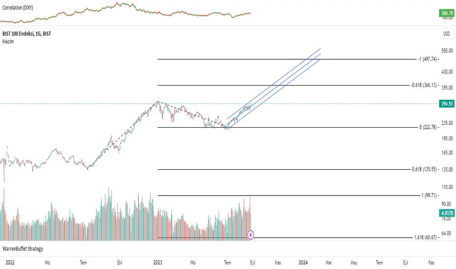
Economic Growth Index (XLY/XLP)Keeping an eye on the macroeconomic environment is an essential part of a successful investing and trading strategy. Piecing together and analysing its complex patterns are important to detect probable changing trends. This may seem complicated, or even better left to experts and gurus, but it’s made a whole lot easier by this indicator, the Economic Growth Index (EGI).
Common sense shows that in an expanding economy, consumers have access to cash and credit in the form of disposable income, and spend it on all sorts of goods, but mainly crap they don’t need (consumer discretionary items). Companies making these goods do well in this phase of the economy, and can charge well for their products.
Conversely, in a contracting economy, disposable income and credit dry up, so demand for consumer discretionary products slows, because people have no choice but to spend what they have on essential goods. Now, companies making staple goods do well, and keep their pricing power.
These dynamics are represented in EGI, which plots the Rate of Change of the Consumer Discretionary ETF (XLY) in relation to the Consumer Staples ETF (XLP). Put simply, green is an expanding phase of the economy, and red shrinking. The signal line is the market, a smoothed RSI of the S&P500. Run this on a Daily timeframe or higher. Check it occasionally to see where the smart money is heading.
Индикатор

Индикатор

Индикатор

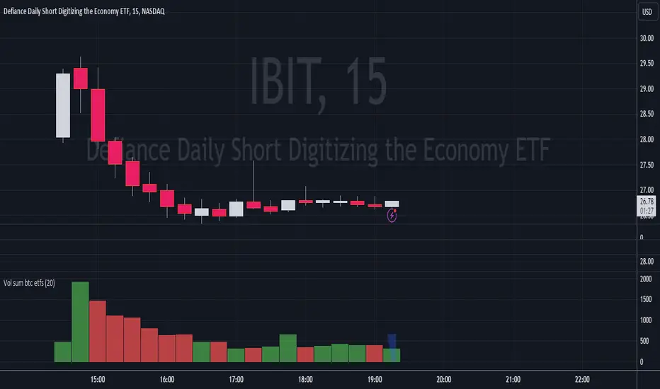
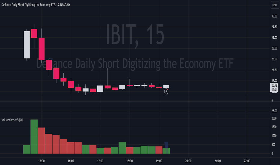
Volume Sum BTC ETFsThis volume indicator tracks the volume of these 10 bitcoin ETFS:
AMEX:GBTC, NASDAQ:IBIT, AMEX:BTCO, AMEX:ARKB, AMEX:HODL, AMEX:EZBC, NASDAQ:BRRR, AMEX:BTCW, AMEX:DEFI, AMEX:BITB
It multiplies the traded shares with the hl2 share price and then devides the volume by the bitcoin hl2 price.
You can change to usd volume in settings.
Enjoy!
Notice that historical volume comes from etfs which traded already before launch like GBTC.
Also notice that that btc trades also when tradfi markets are closed, so then the indicator will show the last available volume. Something to fix later. Индикатор
EFTENG: Inflation Price Forecast indicator
With this indicator, when you add monthly and annual positive inflation rates, the price of the parity is estimated according to inflation. You can enter inflation rates as either positive or negative. You can write positive inflation rates as they are, but when writing negative inflation rates, the rate must be preceded by a negative phrase. A (-) sign should be placed in front of the negative inflation rate. Their codes are open and anyone can develop these codes. In the use of indicators, it is useful to look at the monthly chart because inflation rates are given on a monthly basis. As a result of these data, you can see the most accurate results on the monthly chart. The green line shows the positive inflation, the red line the negative inflation, and the gray line shows the annual positive and negative inflation. You can arrange the colors and line formats according to your desire.
TR: Enflasyon Fiyat Tahmini indikatörü
Bu indikatör ile aylık, yıllık pozitif enflasyon oranları eklediğinizde paritenin fiyatını enflasyona göre fiyat tahminde bulunmaktadır. Enflasyon oranlarını isterseniz pozitif isterseniz negatif olarak giriş yapabilirsiniz. Pozitif enflasyon oranlarını olduğu gibi yazabilirsiniz ancak negatif enflasyon oranını yazarken oranın başında negatif ibaresi bulunmalıdır. Negatif enflasyon girişini oranın önüne (-) işareti konulmalıdır. Kodları açık ve herkes bu kodları geliştirebilir. İndikatör kullanımında ise Aylık grafikte bakmanızda fayda var çünkü enflasyon oranları aylık bazda verilmektedir. Bu veriler neticesinde en doğru sonuçları aylık grafikte görebilirisiniz. Yeşil çizgi pozitif enflasyonu kırmızı çizgi negatif enflasyonu gri çizgi yıllık pozitif ve negatif enflasyonu göstermektedir. Renkleri, çizgi biçimleri isteğinize göre düzenleyebilirsiniz. Индикатор

Стратегия
Индикатор

Индикатор

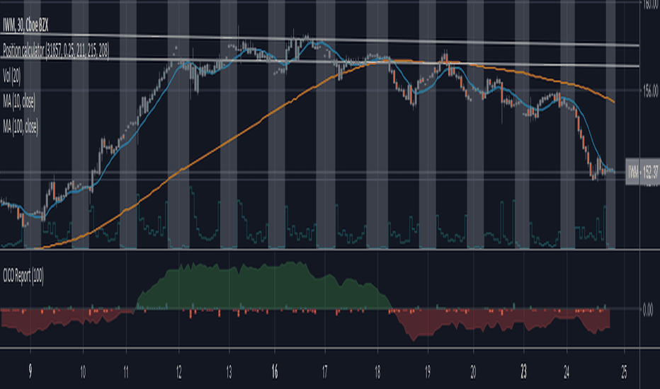
Cash in/Cash out Report (CICO) - Quiets market noiseThe cash in/cash out report (CICO for short) was built with the intent to quiet the market noise. The blunt way to say it, this indicator quiets the market manipulators voice and helps the retail investor make more money. I believe money is better of in the 99% hands versus the greedy hoarding that is currently going on. There are dozens of companies in the SP500 that have the same tax rate as unborn babies, nada. These hoarders also have machine learning high frequency trading bots that purposely create fear and anxiety in the markets. When all of the major markets move at the exact same time of day on frequent occasions, I see red flags. I recommend looking into Authorized participants in the ETF market to understand how the markets can be manipulated, specifically Creation and Redemption.
Enough of my rant. This indicator is open source. Directions on how to use the indicator can be found within the code. The basic summary is, clear your charts to bare minimums. Make the colors gray on all candles. Then apply this indicator. The indicator will color the "buy" and "sell" signals on the chart. Keep in mind, markets are manipulated to create fear in the retail investors little heart and can change drastically at any second. This indicator will show real time changes in running sum into and out of the market, it is estimated by average prices and not exact.
Once the chart is all greyed out and the indicator is applied you will see an area colored red and green. What this indicator does is takes a running sum of the new money into and out of the market. It takes the average of the high and low price times the volume. If the price is going up the value is positive, going down will be negative. Then the running sum is displayed. The area section is the running sum and the column bars are each value. When a market is steadily increasing in value you will see the large green area grow. When markets shift, values and display will change in color and vector. Full descriptions are available within the script in the comment sections.
I hope this help you make more money. If this helps you grow profits, give it a like!
Happy investing 99%er! Индикатор
Индикатор