Индикатор

Adil Deger v3.5.2What's New
Multi-method fair value indicator that estimates intrinsic stock price using 10 valuation methods simultaneously, with sector-aware weighting and full BIST + US market support.
Key Features
10 Valuation Methods
Net Earnings P/E (historical average)
ROE-Based
EV/EBIT, EV/EBITDA, EV/Revenue
Forward P/E (uses real analyst consensus when available, falls back to naive annualization)
Forward P/S
P/FCF (Free Cash Flow)
Graham Number
DCF (5-year projection with terminal value, configurable WACC)
Smart Aggregation
Sector Weighted (default) — assigns method weights based on industry (banks favor P/B + ROE, tech favors revenue multiples, utilities favor DCF, etc.)
Median, Trim Mean, Mean alternatives
Confidence indicator (CV across methods) — flags when valuations diverge
Auto Market Detection
Detects BIST vs US automatically from symbol
Picks correct bond benchmark (TR10Y / US10Y) dynamically
Tracks regional inflation (TR / US CPI) with high-inflation warning
Currency-aware
Visual Tools
Bilingual UI (Turkish / English)
Compact info panel: market, rate, inflation, currency, sector, method, forward EPS source, confidence
Discount/Premium bands (configurable threshold) with shaded zones
8-quarter financials table (Net Earnings, Revenue, EBIT, EBITDA, FCF, ROE)
Alerts
Discount opportunity (price crosses below fair value − threshold)
Premium warning (price crosses above fair value + threshold)
Low confidence (method divergence)
New earnings released
Technical
Pine Script v6
Rate floor + cap protection (handles both high-rate emerging markets and low-rate ZIRP environments)
Cash-adjusted Net Debt for accurate EV calculation
Historical rolling average for "normal" multiples (default 252 bars = 1 year)
Robust to missing financial fields (BIST stocks with limited data still work)
Settings Highlights
Language: TR / EN
Market: Auto / BIST / US / Manual
Aggregation Method: Sector Weighted / Median / Trim Mean / Mean
Historical Average Period: configurable (default 252 bars)
DCF: forecast years, equity risk premium, terminal growth, growth cap
Alerts: discount/premium thresholds, low confidence threshold Индикатор

Индикатор

Индикатор
Индикатор

Индикатор

Индикатор

AG Pro Trend Continuation Quality [AGPro Series]AG Pro Trend Continuation Quality
Overview / What it does
AG Pro Trend Continuation Quality is an overlay built to evaluate whether a pullback is behaving like a healthy retracement inside an active trend, or whether the move is losing structural quality before continuation can develop.
Instead of treating every dip in an uptrend or every pop in a downtrend as equally important, the script isolates pullback sequences and scores them through a continuation-quality framework. The goal is not to predict every next candle. The goal is to help traders judge whether the market is showing disciplined retracement behavior that often precedes trend continuation.
The model combines trend alignment, pullback depth, pullback duration, relative volume behavior during the retracement, and the strength of the bounce candle that attempts to resume the trend. These conditions are translated into a compact quality score so the user can quickly separate cleaner continuation structures from weaker ones.
On the chart, the script highlights pullback zones, tracks the retracement box, displays a continuation-quality label, and maintains an information panel that summarizes trend state, recent quality readings, best quality, average quality, and internal distribution data. The result is a workflow-oriented continuation map rather than a simple trend-following overlay.
Unique Edge
The distinctive part of this script is that it does not label trend continuation from trend direction alone. A bullish EMA stack or bearish EMA stack is not enough by itself. The script specifically evaluates the quality of the retracement before the continuation attempt is scored.
That makes it meaningfully different from basic EMA trend tools, pullback highlighters, or single-condition continuation signals. Many tools can say that price is above or below an average. Fewer tools attempt to measure whether the internal anatomy of the pullback remains constructive for continuation.
The scoring engine focuses on five practical questions:
1. Is the broader trend aligned?
2. Is the pullback still structurally controlled rather than excessively deep?
3. Did the retracement last a reasonable number of bars?
4. Did volume contract during the pullback instead of expanding aggressively against trend?
5. Did the bounce show enough intent to suggest renewed directional participation?
This creates a cleaner framework for evaluating continuation setups in a way that is visual, systematic, and easier to compare across multiple pullbacks on the same chart.
Methodology
The script first determines directional context using EMA alignment and, when needed, swing-structure logic. This creates a working trend state that frames whether the script should be looking for bullish or bearish pullback behavior.
Once a directional leg is active, the script begins tracking a pullback when price retraces against that trend. During the retracement, it measures:
- how far the pullback travels relative to the prior trend leg,
- how many bars the pullback lasts,
- how pullback volume compares with the prior expansion leg,
- and whether the bounce candle shows convincing re-engagement.
These components are translated into a 0 to 10 quality score. Higher scores represent more orderly and structurally coherent pullbacks. Lower scores represent weaker or more suspect retracements.
The visual output is designed to make those evaluations easier to read in real time:
- pullback boxes frame the retracement zone,
- optional fib-depth line shows the deepest retracement point tracked inside the pullback,
- labels display score, quality grade, depth, duration, and relative volume,
- panel metrics summarize the current continuation environment.
Signals & Alerts
The script is designed as a quality-mapping tool, not as an automatic trade system.
Its event logic revolves around the completion of a pullback and the appearance of a bounce candle that attempts to resume the trend. When that bounce qualifies, the script calculates the final continuation-quality score and can display the setup if it meets the user-defined minimum score threshold.
Available workflow signals include:
- active bullish or bearish trend state,
- pullback in progress,
- completed pullback with scored continuation attempt,
- high-quality continuation events when the score reaches stronger thresholds.
Optional alerts can be used for:
- high-quality continuation conditions,
- or any scored pullback event, depending on user preference.
Because alerts are tied to the script’s scoring and confirmation logic, they are intended to support chart review and decision-making rather than act as guaranteed execution instructions.
Key Inputs
EMA Fast Length / EMA Mid Length / EMA Slow Length
These define the trend stack used to frame directional bias.
Swing Pivot Length
Controls the swing-structure sensitivity used in secondary trend detection.
Max Pullback Depth (%)
Defines how strict the script is when assessing whether a retracement remains healthy relative to the prior trend leg.
Min Pullback Bars / Max Pullback Bars
Controls the acceptable pullback duration window.
Volume Decline Ratio
Helps determine whether the retracement is occurring on lighter activity relative to the prior directional leg.
Minimum Score to Display
Filters weaker continuation events from the chart.
Label Size / Label Offset / Reduce Label Overlap
Lets the user adapt chart readability to their own zoom level and instrument volatility.
Panel Position / Panel Font Size / Panel Theme
Allows the continuation dashboard to be integrated into different chart layouts without dominating screen space.
Limitations & Transparency
This script does not know future market intent. It evaluates observable price and volume behavior after conditions form on the chart.
A high score does not guarantee continuation. It only indicates that the completed pullback meets the script’s internal definition of stronger continuation quality relative to other pullbacks.
The model is also sensitive to market regime. Trend continuation behavior tends to be clearer in directional markets and less reliable in highly compressed, erratic, or news-driven conditions.
Volume behavior can vary across instruments and data feeds. On some assets, especially where volume data is synthetic, limited, or structurally uneven, the volume component should be interpreted with caution.
Like other structure-based tools, this script can produce different practical usefulness depending on timeframe, instrument, volatility regime, and chart cleanliness. Users should calibrate inputs based on the market they are studying rather than treating defaults as universal settings.
This script should not be viewed as:
- a prediction engine,
- a standalone trade system,
- a replacement for risk management,
- or a guarantee that a bounce will develop into a full continuation leg.
Risk Disclosure
This script is for chart analysis and educational use. It is designed to help users study pullback quality inside established trends, not to provide financial, investment, or trading advice.
All trading and investing involve risk. Market conditions can change quickly, and even high-quality continuation structures can fail. Users should apply their own confirmation process, position sizing rules, and risk controls before acting on any market observation.
Use the script as a structured continuation framework, not as certainty.
Индикатор

Индикатор

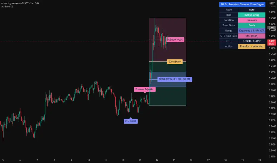
AG Pro Premium Discount Zone Engine [AGPro Series]AG Pro Premium Discount Zone Engine
Overview / What it does
AG Pro Premium Discount Zone Engine is a dealing-range and retracement context overlay built to map relative value inside a selected swing. Instead of treating price as a sequence of isolated candles, the script frames current price location against an active high-low range and highlights where price is trading relative to equilibrium, premium, discount, and the OTE area.
The core purpose of this tool is organizational. It is designed to help traders read where price is positioned inside a live swing and how price reacts when it moves into higher-value or lower-value retracement zones. This is especially useful when a chart is moving inside a pullback, when trend continuation is being evaluated, or when users want to distinguish between shallow retracements and deeper repricing within an existing range.
The script supports multiple ways to define the active range. Users can work with an automatically detected swing, a higher-timeframe dealing range, or a manual-lite anchor mode based on bar offsets. Once a valid range is identified, the script projects premium and discount territory, marks the 50% equilibrium, and highlights the OTE area using the 61.8, 70.5, and 78.6 retracement levels.
The output is intentionally visual, structured, and restrained. Premium and discount zones are shown as clean value blocks. The OTE area is treated as the main focus zone rather than a minor detail. The panel summarizes the active bias, current location, zone state, equilibrium level, and OTE boundaries so that users can read the chart quickly without relying on aggressive signal language.
Unique Edge
What makes this script different is that it is not built as a market-structure detector, imbalance mapper, liquidity event scanner, or order-block locator. Its job is narrower and more specific: it organizes relative price location inside a defined dealing range.
That distinction matters. Many overlays attempt to explain everything on the chart at once. This script does not. It does not try to label breaks of structure, detect fair value gaps, mark liquidity sweeps, or classify institutional zones. Instead, it answers a more focused question: where is price trading inside the current swing, and how is it behaving as it enters or leaves important retracement territory?
This also separates the script from other AG Pro tools. Some AG Pro overlays are built around structure transitions, some around imbalance behavior, some around reaction quality, and some around event detection. AG Pro Premium Discount Zone Engine is built around valuation context. It does not compete with those tools directly. It complements them by adding a relative-value map around a selected range.
Another difference is the zone-state logic. The script does not stop at drawing premium and discount blocks. It also tracks how price interacts with the OTE area and classifies that interaction using a simple state model such as Fresh, First tap, Retested, Rejected, Accepted, and Invalidated. This creates a more contextual read than a static retracement overlay.
Methodology
The script begins by identifying an active swing range. In Auto Swing mode, it uses pivot-based range detection. In HTF Swing mode, it builds the range from a higher-timeframe high-low window. In Manual-Lite Swing mode, it uses bar-offset anchors to let the user define a practical swing reference without requiring manual drawing tools.
Once the active range is available, the script calculates the internal value map:
- Swing High
- Swing Low
- 50% Equilibrium
- Premium territory above equilibrium
- Discount territory below equilibrium
- OTE zone using 61.8, 70.5, and 78.6 retracement levels
The script then monitors how price behaves around those levels. This produces context states rather than directional promises. For example, price entering the OTE area is not treated the same as price rejecting from it, accepting beyond it, or invalidating the active range. These are intentionally different events because they describe different chart conditions.
The equilibrium level is included as a centerline reference, while the OTE band is given stronger visual emphasis. This helps distinguish broad valuation territory from the narrower retracement pocket that many users monitor more closely.
Signals & Alerts
The signals in this script are event-based and deterministic. They are not designed as standalone trade instructions. They are designed to describe interaction with the active range.
Available event logic includes:
- OTE Test
- OTE Reject
- OTE Accept
- Discount Reaction
- Premium Rejection
- Equilibrium Cross
- Range Invalidated
- OTE Failure
These events are intended to provide chart context. For example, an OTE Test simply means price entered the active OTE zone. A Premium Rejection means price traded into the premium side and closed back below the local premium threshold used by the script. A Discount Reaction means price interacted with the discount side and responded upward under the script's rules. These are context events, not guarantees of continuation.
Alerts follow the same philosophy. They are defined in a rules-based way so users can monitor range interaction without needing to watch the chart continuously. The alert layer is most useful when the script is used as a location filter inside a broader workflow.
Key Inputs
Swing mode
Lets the user choose between Auto Swing, HTF Swing, and Manual-Lite Swing depending on whether the goal is reactive automation, higher-timeframe framing, or a more controlled local range definition.
Auto pivot length
Controls how sensitive the pivot-based swing detection is in Auto mode.
HTF timeframe and HTF lookback
Used to define the broader dealing range in higher-timeframe mode.
Manual high bars back / manual low bars back
Used to create a manual-lite range by referencing earlier bars as anchors.
Render bars back / render bars forward
Controls how far the active range projection extends on the chart.
Zone opacity and theme
Used to refine the visual balance between premium, discount, and OTE areas.
Label controls
Used to reduce visual noise by controlling label cooldown, label render window, and maximum visible labels.
Panel controls
Allow the user to reposition the panel and adjust its text size to fit different chart layouts.
Limitations & Transparency
This script does not predict direction. It does not forecast reversals. It does not decide whether a chart should trend, break, or fail. It maps relative value inside a selected range and reports interaction events inside that framework.
The quality of the output depends on the quality of the active swing. If the selected or detected range is not meaningful for the user's workflow, the valuation map will also be less meaningful. This is especially important in highly compressed, extremely noisy, or structurally unclear conditions.
Auto Swing mode is practical, but like any automated swing model, it depends on pivot confirmation and may update as newer pivots become available. HTF mode provides broader context but may feel less reactive on smaller charts. Manual-Lite mode gives more control but still depends on the user choosing sensible anchor distances.
OTE logic is range-relative. It does not incorporate unrelated concepts such as order blocks, liquidity pools, fair value gaps, session models, or external structure classifications unless the user combines those ideas manually in a separate workflow.
This script is best understood as a valuation-context overlay. It is not a complete strategy, not a full decision engine, and not a substitute for risk management.
How this differs from other AG Pro scripts
AG Pro Premium Discount Zone Engine is intentionally not a structure-break tool, not a CHoCH/BOS detector, not a liquidity sweep scanner, not an FVG engine, and not an order-block mapper.
Its role inside the AG Pro family is to answer a different question:
Where is price trading inside the active dealing range, and what is the quality of its interaction with that value map?
That makes it particularly useful for users who already understand direction from another process and want cleaner execution context. In other words, some tools focus on structural change, some focus on imbalance, and some focus on reaction events. This one focuses on valuation location.
Risk Disclosure
This script is for chart analysis and educational use only. It does not provide financial advice, investment advice, or guaranteed trade signals. Any use of this tool should be combined with independent analysis, risk controls, position management, and market-specific judgment.
The presence of an alert, label, premium zone, discount zone, or OTE interaction does not imply that price must react in a specific way. Markets can continue, reverse, compress, or invalidate a range without warning. Users should treat this script as a context tool, not as a promise of outcome.
Индикатор

Индикатор

Индикатор

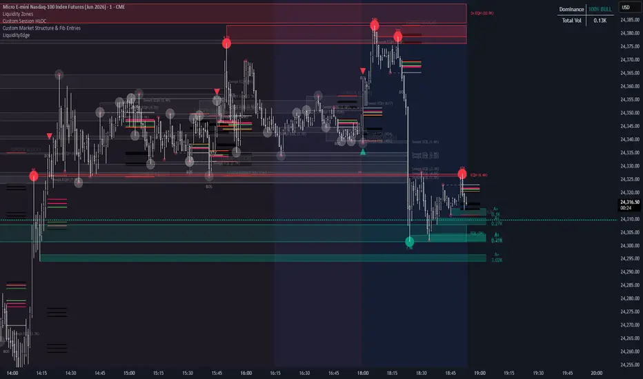
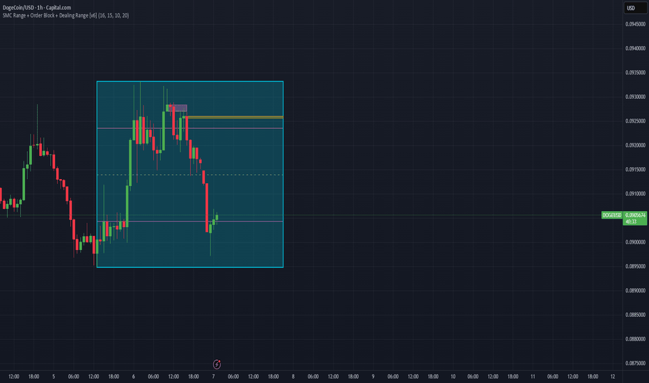
SMC Range + Order Block + Dealing Range [v6]This indicator is designed to help you visually track three core Smart Money Concepts on the chart:
Range / Consolidation Zones
Order Blocks
Dealing Ranges / Expansion Legs
Together, those three things help you answer the real trading questions:
Where is price compressing?
Where did price launch from?
Where is price likely to react or rebalance?
Is price in discount, premium, or near equilibrium?
Is this move continuation, manipulation, or distribution?
That’s what this script is trying to solve.
What the indicator is made of
This script is built from five main parts:
1) Swing High / Swing Low Detection
This is the foundation of the whole script.
It uses pivot logic to detect recent:
swing highs
swing lows
These are the “reference points” used to build:
ranges
structure levels
dealing zones
Why this matters:
SMC is based on price delivery.
If you can’t identify the meaningful highs and lows, you can’t identify:
liquidity
reaction zones
premium / discount
valid breakout / breakdown structure
So this part of the script is what gives it structure awareness.
2) Range Detection
This is the consolidation box part of the indicator.
The script checks whether recent swing highs and swing lows are staying close enough together to suggest price is trading inside a range, instead of trending cleanly.
When it finds that, it draws a range box.
What it represents:
This zone is where price is:
compressing
pausing
balancing
trapping traders
building liquidity
Why it matters:
A range is often where smart money is:
accumulating
distributing
engineering liquidity
setting up the next expansion
This is one of the most useful parts of the script because it helps you stop entering in the middle of random noise and instead focus on:
range highs
range lows
range deviations
range breakdowns / breakouts
3) Structure Lines
Once a range is found, the script plots key internal levels:
It draws:
Range High
Range Low
Equilibrium (EQ)
Inner Premium Level
Inner Discount Level
These are very important.
Range High
This is the top of the dealing range.
It often acts as:
buy-side liquidity
resistance
distribution edge
premium side of price
Range Low
This is the bottom of the dealing range.
It often acts as:
sell-side liquidity
support
accumulation edge
discount side of price
Equilibrium (EQ)
This is the midpoint of the range.
This is where price is “fairly priced” inside that range.
Why it matters:
EQ helps you know whether price is currently:
too expensive to buy
too cheap to sell
balanced
in a likely reaction zone
In SMC language:
above EQ = more premium
below EQ = more discount
Inner Levels
These are “internal structure levels” between the high/low and EQ.
These help you track micro reaction zones inside the larger range.
Why they matter:
Sometimes price won’t reach the full range high or range low.
Instead, it reacts from:
internal liquidity
mini OB zones
inner premium / discount areas
That’s why these inner levels are useful.
4) Order Blocks
This is the launch candle zone part of the indicator.
The script tries to identify candles that acted like a possible:
Bullish Order Block
Bearish Order Block
These are shown as gold / amber boxes.
Bullish Order Block
This usually means:
a down candle existed before a strong move up
that candle may have been where smart money accumulated
That area can later act as:
support
retracement buy zone
re-entry zone
Bearish Order Block
This usually means:
an up candle existed before a strong move down
that candle may have been where smart money distributed
That area can later act as:
resistance
retracement short zone
re-entry zone
Important truth about OBs
Not every candle box is a real institutional order block.
A lot of traders misuse order blocks.
A valid OB usually works best when it lines up with:
a sweep
displacement
BOS / CHOCH
premium / discount logic
range edge
liquidity event
So this indicator helps you see potential OBs, but you still need context.
That’s why the indicator works best when you combine the OBs with the range and dealing range logic, not by themselves.
5) Micro Order Block
This is the smaller pink box inside the broader structure.
This is meant to represent a smaller internal reaction candle or micro launch area.
Why it matters:
Sometimes your best entries are not from the big OB.
They’re from the smaller refined reaction zone inside the larger move.
This is especially useful if you trade:
1H entries
15M sniper entries
retests after displacement
That makes the micro OB very useful for refining entries.
6) Dealing Range Projection
This is one of the better conceptual parts of the script.
It detects an impulsive expansion move and then projects a dealing range / channel forward.
What it shows:
It visually maps:
where the move started
where the expansion leg traveled
what price is likely “working off” after the impulse
This helps you think in terms of:
expansion → retracement → continuation
impulse → rebalance → reaction Индикатор
Индикатор

Индикатор

Индикатор

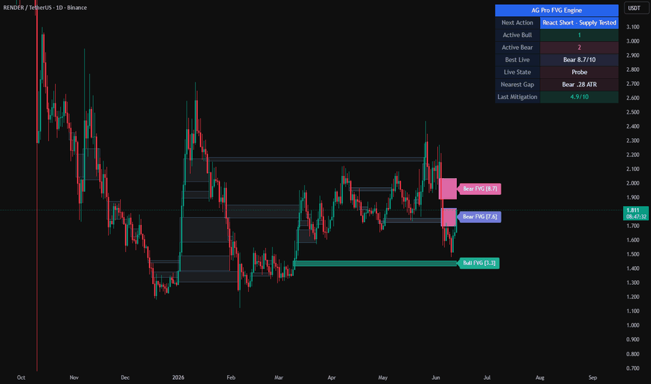
AG Pro Fair Value Gap Engine [AGPro Series]AG Pro Fair Value Gap Engine
OVERVIEW / WHAT IT DOES
AG Pro Fair Value Gap Engine is a rules-based overlay built to detect 3-bar fair value gap structures and organize them as a living imbalance map on the chart.
The script identifies bullish fair value gaps when the current low is above the high from two bars earlier, and bearish fair value gaps when the current high is below the low from two bars earlier. Once detected, each zone is stored, rendered, tracked through time, and updated as price interacts with it.
Instead of stopping at basic FVG detection, this script continues to follow the structure after creation. It monitors whether the gap remains active, whether price returns into it, whether mitigation occurs, how old the structure has become, and how strong or weak that mitigation event appears relative to the gap itself.
The result is not just a visual list of imbalances. It is an FVG lifecycle model designed to help traders distinguish between fresh gaps, aging gaps, mitigated gaps, and higher-quality mitigation events.
UNIQUE EDGE
Many fair value gap tools simply highlight every detected gap and leave the user to interpret the rest.
This script is built around a different idea:
not all FVGs deserve the same attention, and not every mitigation event carries the same informational value.
AG Pro Fair Value Gap Engine separates itself by combining detection, aging, prioritization, mitigation tracking, and scoring in a single structured workflow. Gaps are not treated as static rectangles. They are treated as evolving chart objects with a lifecycle.
Within the AG Pro Series, this script is also distinct from breakout-quality, reclaim, rotation, pressure, or acceptance-style overlays. Those models focus on trend behavior, reclaim behavior, structural confirmation, momentum pressure, or price acceptance around a reference. This one is centered on imbalance structure itself: where the 3-bar gap formed, how long it stayed relevant, whether price returned, and how credible that mitigation looked once interaction happened.
In practical terms, the script is designed to answer questions such as:
Which FVGs are still active?
Which ones are becoming stale?
Which mitigation events happened with better quality?
Which visible zones are worth keeping in focus, and which are just legacy context?
That is the core difference. This is not a generic FVG highlighter. It is an imbalance-ranking and mitigation-quality engine.
METHODOLOGY
1) Detection Logic
The script scans for standard 3-bar fair value gap structures.
Bullish FVG:
current low > high from two bars back
Bearish FVG:
current high < low from two bars back
A minimum size filter relative to ATR is applied so that very small gaps can be ignored when desired.
2) Structure Tracking
After detection, each FVG is stored and tracked over time. The script keeps the zone on the chart, extends active zones forward when enabled, and updates their visual state as the market evolves.
This allows the chart to preserve the structural memory of imbalance zones instead of treating every new gap as an isolated event.
3) Aging and Visual Decay
Older gaps gradually lose visual priority through fade logic. This helps newer or more relevant structures stay readable while old zones move into the background.
Optional controls can also suppress distant legacy zones when they become both old and far from current price.
4) Mitigation Logic
The script monitors how deeply price returns into each gap. When the user-defined mitigation threshold is reached, the FVG is marked as mitigated.
Mitigated zones can remain visible as context or be hidden for a cleaner chart, depending on preference.
5) Quality Scoring
Mitigation is not treated as a simple yes/no event. The script evaluates mitigation quality using a weighted model that includes:
- Gap size relative to ATR
- Speed of return into the zone
- Relative volume during the mitigation event
- Return strength after contact with the gap
This produces a normalized score intended to help separate weaker fills from stronger, better-formed mitigation behavior.
6) Focus and Prioritization
To reduce chart noise, the script includes focused labeling, active-zone prioritization, top-zone filtering, and legacy suppression logic.
This means the visual output can be tuned away from “show everything” and toward “show what matters most.”
SIGNALS & ALERTS
This script provides alert conditions for:
- Newly detected bullish fair value gaps
- Newly detected bearish fair value gaps
- Bullish fair value gaps reaching mitigation
- Bearish fair value gaps reaching mitigation
These alerts are event-based and rules-based. They are not forecasts, predictions, or trade instructions.
The labels and panel are designed to summarize state, not to replace the user’s broader market process.
KEY INPUTS
Core Settings
- Minimum FVG Size (ATR)
- Mitigation Threshold (%)
- Maximum Tracked FVG Count
- Age Fade Length
- Extend Active FVG Boxes
Scoring Engine
- Speed Score Reference
- Volume Score SMA Length
- Volume Score Max Ratio
- Size Score Max ATR
Visual Settings
- Show FVG Labels
- Focused Label Mode
- Focused Label Minimum Score
- Active / Mitigated Label Age Limits
- Highlight Score Threshold
- Theme Preset
- Show Mitigated Zones
- Show Mitigated Zone Labels
- Label Horizontal Offset
- Hide Distant Legacy FVGs
- Legacy Hide Age
- Legacy Hide Distance
- Show Only Top Active Zones
- Top Active Zones Count
- Label Stack Spacing
Panel Settings
- Show Panel
- Panel Position
- Panel Font Size
These controls allow the same logic to be used in a more information-dense mode or in a much cleaner presentation mode, depending on the charting style of the user.
LIMITATIONS & TRANSPARENCY
This script detects and organizes 3-bar imbalance structures. It does not claim to identify every meaningful liquidity event, order-flow shift, or broader smart money context factor on its own.
A fair value gap can remain open for a long time, fail quickly, or be revisited multiple times. A high score does not guarantee a directional outcome. A low score does not automatically invalidate the zone as context.
The mitigation score is a structured ranking model, not an objective truth about future price behavior. It is designed to help compare events inside the framework of this script.
Because chart structure, volatility, timeframe, and instrument behavior vary, users should expect different FVG densities and different score distributions across markets.
This tool is best used as a market-organization layer for imbalance analysis, not as a standalone execution system.
RISK DISCLOSURE
AG Pro Fair Value Gap Engine is an analytical charting tool for educational and informational use.
It does not provide financial advice, does not promise outcomes, and should not be interpreted as a standalone buy or sell system. Fair value gaps, mitigation events, and score readings should be evaluated together with market structure, volatility, timeframe context, liquidity conditions, and the user’s own risk framework.
Trading involves risk. Past chart behavior does not guarantee future results.
Индикатор
Индикатор

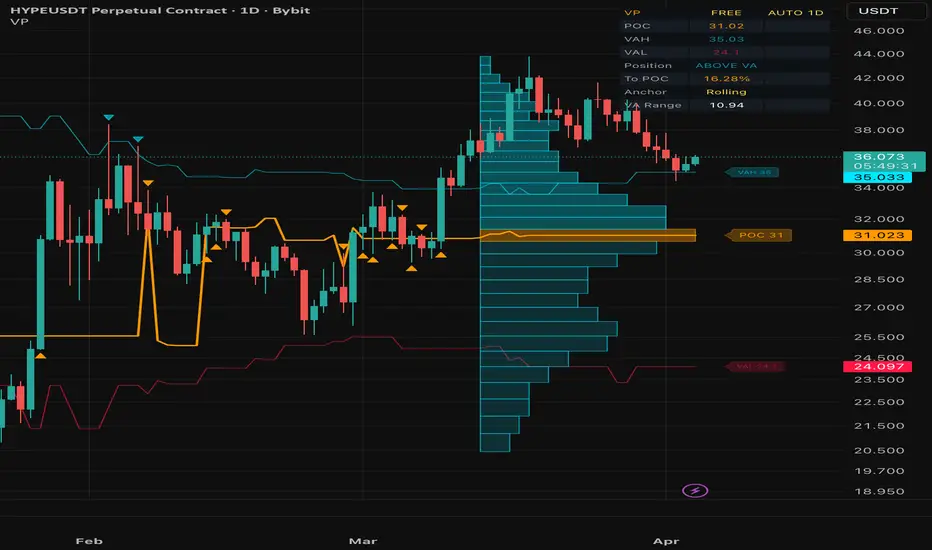
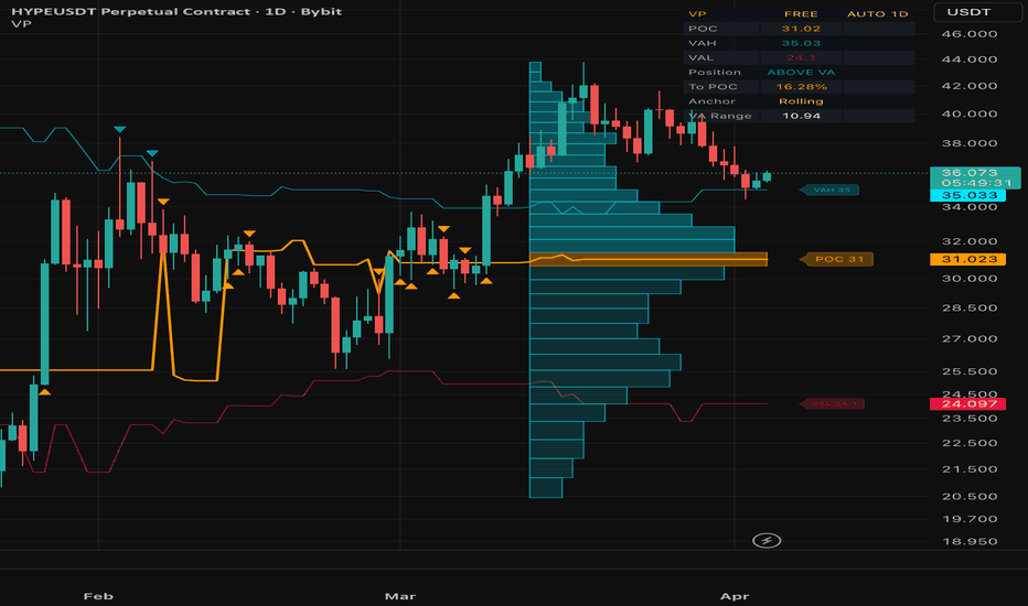
Volume Profile█ VOLUME PROFILE
Volume-at-Price Analysis with POC, VAH & VAL
A powerful volume-at-price analysis overlay that calculates and visualizes the Point of Control (POC) , Value Area High (VAH) , and Value Area Low (VAL) directly on your chart. It reveals where the most trading activity occurred and provides real-time price position analysis — helping you identify high-probability support/resistance levels and mean-reversion zones.
Free and Open Source.
█ THE CONCEPT: WHY VOLUME PROFILE MATTERS
Price charts show when trading happened. Volume Profile shows where it happened. The distribution of volume across price levels reveals the market's true valuation zones:
Point of Control (POC) — The price with the highest accumulated volume. Acts as a magnet for price and the strongest single S/R level.
Value Area (70%) — The range containing 70% of all traded volume. Defines what the market considers "fair value."
Above/Below VA — Price outside the value area signals potential overextension or breakout.
Institutional traders, market makers, and algorithmic systems all reference volume profile levels.
█ CORE FEATURES
1. Volume Profile Engine
Distributes each bar's volume proportionally across the price rows it spans, building a precise volume-at-price histogram:
POC — Highest volume row = strongest support/resistance
VAH — Upper boundary of the 70% value area = resistance
VAL — Lower boundary of the 70% value area = support
Row count is configurable (10-50 levels).
2. Profile Anchoring
Three anchor modes control how the profile is built:
Rolling — Continuously recalculated over the last N bars. Best for real-time analysis.
Session — Resets every new trading day. Best for intraday context.
Week — Resets every new trading week. Best for swing context.
3. Price Position Analysis
Real-time classification of price relative to the value area:
ABOVE VA — Potential overextension or breakout
BELOW VA — Potential undervaluation or breakdown
AT POC — High-probability mean-reversion zone
IN VA — Normal trading range
4. Bounce & Rejection Signals
Automatic detection of price interaction with key volume levels:
POC Bounce Up/Down — Price touches POC and reverses
VAL Rejection — Price tests VAL and bounces up (bullish)
VAH Rejection — Price tests VAH and bounces down (bearish)
5. Volume Histogram Visualization
A horizontal bar chart displayed directly on the price chart showing the volume distribution. POC row highlighted with a distinct color.
█ AUTO-TIMEFRAME ADAPTATION
All parameters automatically adjust based on the chart timeframe:
1-5 min → Lookback 30, 18 Rows, Histogram Width 8
15-30 min → Lookback 40, 20 Rows, Histogram Width 10
1 Hour → Lookback 50, 24 Rows, Histogram Width 15
4 Hour → Lookback 70, 28 Rows, Histogram Width 18
Daily → Lookback 100, 32 Rows, Histogram Width 22
Weekly+ → Lookback 150, 40 Rows, Histogram Width 30
█ DASHBOARD
A compact, dark-themed info panel displaying:
POC — Current Point of Control price level
VAH / VAL — Value Area boundaries
Position — Current price position (ABOVE VA / BELOW VA / AT POC / IN VA)
To POC — Distance from current price to POC in percent
Anchor — Active profile anchor mode
VA Range — Width of the value area in price units
█ ALERTS (4 CONDITIONS)
POC Bounce Up — Bullish bounce off the Point of Control
POC Bounce Down — Bearish bounce off the Point of Control
VAL Rejection — Bullish rejection at Value Area Low
VAH Rejection — Bearish rejection at Value Area High
█ NON-REPAINTING
The volume profile is calculated from confirmed bar data only. Rolling mode recalculates the full lookback window on each bar using historical high/low/volume — no future data is used. Session and Week modes accumulate incrementally within the anchor period. No repainting.
█ WORKS ON
Crypto, Forex, Stocks, Futures, Indices — any timeframe from 1 minute to Monthly.
█ DISCLAIMER
This indicator is for educational and informational purposes only. It does not constitute financial advice. Always do your own research and manage your risk. Past performance does not guarantee future results. Trading involves substantial risk of loss.
Индикатор
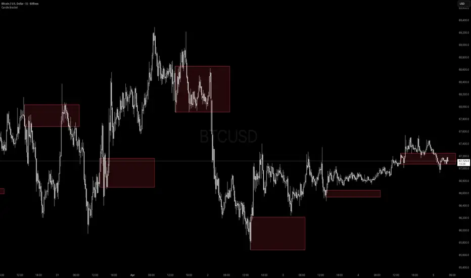
Candle Bracket - Mark Any HTF Candle's Range at a Specific TimeWhat It Does
Candle Bracket draws a visual range box using the High and Low of any higher timeframe candle at a user-defined time of day. Set it to the 9:30 AM 15-minute candle and you get the Opening Range. Set it to the London open, the New York open, or any key session candle — the indicator marks it automatically, every day.
Use Cases
- Opening Range Breakout (ORB) - Mark the 9:30 or 9:45 AM candle as your initial range
- Session Opens - London (3:00 AM ET), New York (9:30 AM ET), Asia (8:00 PM ET)
- News Candles - Mark a recurring economic release time (e.g. 8:30 AM CPI/NFP candle)
- Custom Reference Ranges - Any time-based candle you want as a daily anchor
Settings
- Fixed Timeframe - The HTF candle to pull from (e.g. 15, 30, 60, D)
- Target Hour / Minute - The exact time of the candle you want to mark
- Timezone - Defaults to America/New_York. Adjustable for any global session
- Rectangle Width (Bars) - How far the box extends to the right
- Box Color + Opacity Full visual customization
How to Use It
1. Set the timeframe to match your candle of interest (e.g. '15' for a 15-minute candle)
2. Set the target time to the candle's open time (e.g. '9:30' for the NY open candle)
3. The box draws automatically on every matching candle going back in history
4. Use the High and Low of the box as your key levels breakout, rejection, or retest
Notes
- Works on any asset and any chart timeframe
- Keeps the last 20 boxes by default to manage memory efficiently
- Best used on intraday charts (1m, 5m, 15m) when targeting session-level candles Индикатор

Индикатор

Индикатор

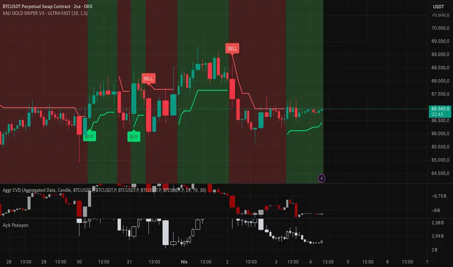
BTC XAU GOLD SNIPER V3 - ULTRA-FASTXAU GOLD SNIPER V3 - ULTRA-FAST
📋 Description
XAU GOLD SNIPER V3 is an advanced technical analysis tool specifically optimized for capturing high-velocity price movements and short-term trend reversals in XAU/USD (Gold). This version integrates Dynamic Momentum tracking with an Adaptive Trend Filtering algorithm to filter out market noise and identify high-probability entry points.
Designed specifically for the unique volatility of Gold, it performs exceptionally well on lower timeframes such as 1m, 5m, and 15m.
🛠 Key Features
Ultra-Fast Response: Unlike lagging indicators, this script uses a specialized smoothing algorithm to minimize signal delay.
Smart Trend Guard: Automatically filters out risky counter-trend signals by analyzing the institutional trend direction.
Volatility Adaptation: Fine-tuned to handle Gold's characteristic "fake-outs," ensuring cleaner signals during high-impact news.
Minimalist UI: Clean and intuitive "BUY/SELL" labels to keep your charts clutter-free and focus on price action.
💡 How to Trade (Strategy Guide)
Best Timeframe: Optimized for 15-Minute (15m) charts, but highly effective for 5m scalping.
Entry: Follow the BUY or SELL labels as they appear at the close of the candle.
Confirmation: Accuracy is significantly higher when the signal aligns with the background trend (e.g., price above/below the 200 EMA).
Risk Management: Gold is highly volatile. We recommend placing a Stop-Loss slightly below the previous swing low for Longs, or above the swing high for Shorts.
⚠️ Disclaimer
This indicator is for educational and informational purposes only. Trading financial markets involves significant risk. Always backtest the strategy against your own trading style before using it on a live account.
💻 Updated Pine Script (English Version)
TradingView'de yayınlarken kodun içindeki isimlendirmelerin de İngilizce olması profesyonelliği tamamlar:
Pine Script
//@version=5
indicator("XAU GOLD SNIPER V3 - ULTRA-FAST", shorttitle="GOLD_SNIPER_V3", overlay=true, precision=2)
// --- Inputs ---
fastLen = input.int(7, "Fast Period")
slowLen = input.int(21, "Slow Period")
src = close
// --- Ultra-Fast Momentum Calculation ---
fastEMA = ta.ema(src, fastLen)
slowEMA = ta.ema(src, slowLen)
// --- Trend Filter (EMA 200) ---
trendFilter = ta.ema(src, 200)
isUpTrend = src > trendFilter
isDownTrend = src < trendFilter
// --- Signal Logic ---
buyCond = ta.crossunder(slowEMA, fastEMA) and isUpTrend
sellCond = ta.crossover(slowEMA, fastEMA) and isDownTrend
// --- Visuals ---
plotshape(buyCond, title="BUY SIGNAL", style=shape.labelup, location=location.belowbar, color=color.new(#00ff00, 0), textcolor=color.black, size=size.small, text="BUY")
plotshape(sellCond, title="SELL SIGNAL", style=shape.labeldown, location=location.abovebar, color=color.new(#ff0000, 0), textcolor=color.white, size=size.small, text="SELL")
// Trend Line
plot(trendFilter, color=color.new(color.gray, 50), title="Institutional Trend Line") Индикатор