Индикатор
Индикатор

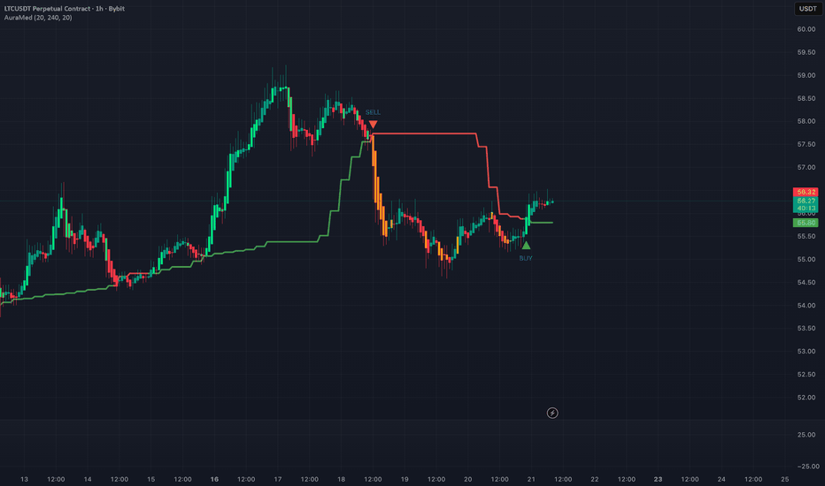
EMA 5/21/50/63/84/200EMA 5/21/50/63/84/200 Overlay
This TradingView indicator plots six exponential moving averages (EMAs) of different periods directly on your chart: 5, 21, 50, 63, 84, and 200. It allows traders to quickly visualize short-, medium-, and long-term trends in price action. Each EMA is color-coded for clarity:
EMA 5 — Orange (fastest, very short-term trend)
EMA 21 — Yellow (short-term trend)
EMA 50 — White (medium-term trend)
EMA 63 — Green (intermediate trend)
EMA 84 — Blue (long-term trend)
EMA 200 — Red (slowest, major trend indicator)
This setup is useful for identifying trend direction, crossovers, and dynamic support/resistance levels across multiple timeframes. Индикатор

Индикатор

Индикатор

Индикатор
Индикатор

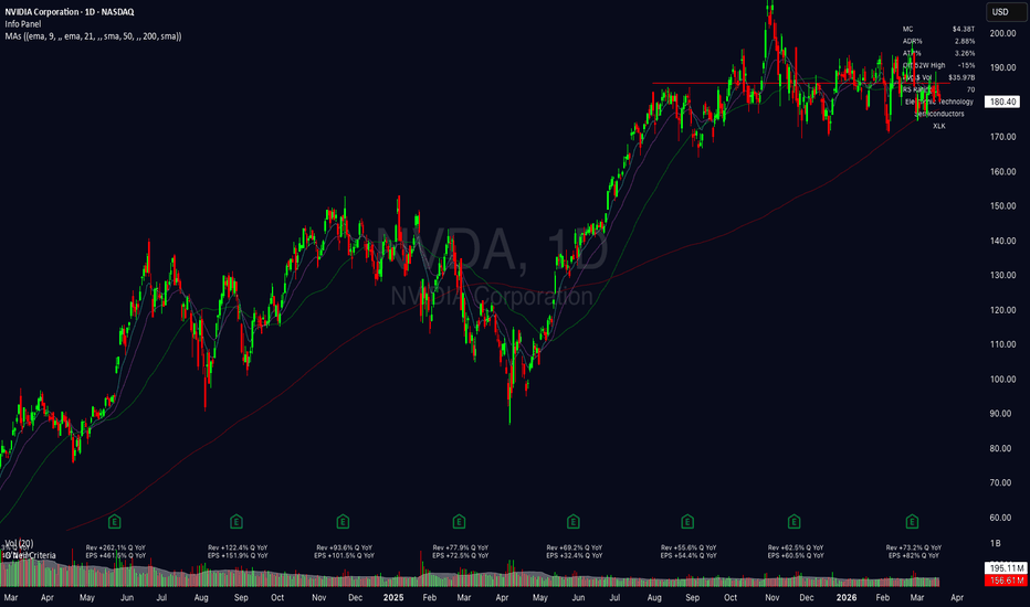
Esco Theory v4Esco Theory maps the hidden geometry of price action. It identifies swing structure, plots geometric rails between pivots, detects supply and demand zones, fair value gaps, liquidity pools, compression patterns, and confluence clusters.
All signals are synthesized into a real-time dashboard so traders can read market structure and volatility conditions at a glance.
Built for traders who study displacement, structure shifts, and the expansion–compression cycles that drive price.
Features
Market Structure (BOS / MSS)
Automatically detects Break of Structure (BOS) and Market Structure Shifts (MSS) using configurable swing lookback. Bullish and bearish shifts are labeled directly on the chart with color-coded markers.
Displacement candles (body greater than 1.5× ATR) are highlighted to confirm impulsive moves.
Geometric Rails
Trendlines (“rails”) are drawn between consecutive swing highs and swing lows and extended forward.
Two tiers are available:
Minor Rails
Short-term pivots for intraday and swing geometry.
Major Cycle Rails
Higher-timeframe pivots that reveal broader structural channels.
Cross-rails connect swing highs to swing lows using dotted diagonals, revealing convergence and divergence patterns.
Cycle Fan
A fan of rays projects from the deepest major swing low through each major swing high (and vice versa), mapping the angular geometry of the current market cycle.
These angles often highlight reaction zones where time and price intersect.
Supply & Demand Zones
Zones are created at pivot candles confirmed by displacement on the following bar.
Each zone tracks retests and gradually fades in transparency as it is touched.
Mitigated zones are automatically removed to keep charts clean.
Fair Value Gaps (FVG) & Inverted FVGs
Three-candle imbalance gaps are detected and drawn as shaded boxes.
When a gap fills to its midpoint it converts into an inverted FVG, which can act as a continuation or re-entry zone.
Both gap types have independent color settings and optional auto-expiration.
Premium / Discount Zones
Using the most recent major swing high and low, price is divided into:
Premium (upper 25%)
Discount (lower 25%)
Equilibrium (midpoint)
A dotted equilibrium line marks fair value and helps filter entries.
Support & Resistance Clustering
All pivot prices are grouped by proximity.
Levels with multiple touches are drawn as dashed horizontal lines labeled with touch count:
S (3)
R (4)
Stronger clusters appear as thicker lines.
Confluence Zones
When three or more levels from different sources cluster together (pivots, S/R levels, supply and demand), a shaded confluence zone is drawn.
These areas often produce the strongest market reactions.
Liquidity — Equal Highs / Equal Lows
Swing highs and lows within a defined tolerance are identified as EQH and EQL liquidity pools.
These levels extend forward and often attract price before reversals or breakouts.
Liquidity Sweeps
When price wicks through an equal high or low and closes back inside the level, a sweep marker (✕) appears.
Sweeps often signal liquidity grabs before reversals.
Compression & Squeeze Detection
Two compression signals identify volatility contraction.
ATR Compression
Occurs when fast ATR drops below 60% of slow ATR.
Bollinger / Keltner Squeeze
When Bollinger Bands contract inside Keltner Channels.
When the squeeze releases, a triangle marker signals expansion.
A wedge overlay connects compression pivots to visualize tightening ranges.
Real-Time Dashboard
A compact panel displays current market conditions.
Bias
Current structure trend (Bullish / Bearish / Neutral)
Zone
Premium, Discount, or Equilibrium
Volatility
Squeeze, Compression, or Expansion
ATR Ratio
Fast ATR vs Slow ATR
BBW
Bollinger Band Width percentage
Wedge
Active compression wedge detection
FVG
Active gap count
Sweeps
Recent liquidity sweep count
Inputs & Customization
Every module can be toggled independently.
Key settings include:
Swing Lookback (minor and major)
Rail Extension length
Max Cross-Rails
Supply / Demand Pivot Length
FVG Minimum Size and Max Age
Support / Resistance Tolerance and Minimum Touches
Confluence Width and Minimum Levels
Equal High / Low Tolerance
All colors are fully customizable.
How to Use
Identify bias
Check the dashboard for current structure direction and premium/discount location.
Find confluence
Look for areas where rails, zones, gaps, and support/resistance overlap.
Watch compression
Squeeze diamonds and wedges signal volatility building.
Trade displacement
Highlighted candles confirm impulsive moves through key levels.
Monitor liquidity sweeps
EQH/EQL sweeps often precede reversals or expansions.
Notes
Overlay indicator designed for use directly on price charts.
Compatible with all markets and timeframes.
Lower timeframes with large bar counts may increase drawing load. Adjust lookback settings if needed.
Best used alongside discretionary price action and market context. Индикатор

Индикатор
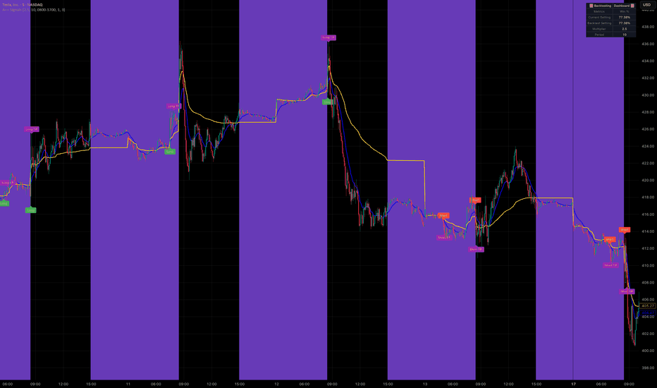
Business Cycle Composite [v6]The Business Cycle Composite is a macro oscillator that aggregates ten independently scored economic signals into a single weighted composite, designed to identify where the U.S. economy currently stands within the four classical cycle phases: Expansion, Late Cycle, Contraction, and Trough.
Each signal is normalized to a −1 to +1 scale before being weighted and combined. The yield curve (10Y−2Y spread) carries the highest weight at 18%, reflecting its historically reliable recession-forecasting track record. Credit market health is captured through the HYG/LQD ratio (15%), while Fed Funds trend, CPI momentum, consumer sentiment, risk appetite (XLY/XLP), and housing permits each contribute between 8–10%. The Copper/Gold ratio and the Sahm Rule unemployment trigger round out the composite at lower weights, serving as real-economy confirmation signals. The final score is smoothed with a configurable EMA and requires a minimum number of consecutive bars before a phase transition is confirmed, reducing noise-driven whipsaws.
The resulting oscillator crosses four threshold zones. A score above +0.35 signals Expansion — broad macro conditions are supportive of risk assets. Between zero and +0.35 the indicator reads Late Cycle, characterized by tightening conditions and fading momentum. Below zero but above −0.30 marks Contraction, where recessionary pressure is building. Below −0.30 the indicator enters the Trough phase, historically the zone where forward-looking assets begin to bottom ahead of the real economy.
The indicator plots both the smoothed composite and the underlying raw score, with color-coded phase backgrounds for instant visual context. A dashboard table in the top-right corner shows the current phase label, composite score, Sahm Rule status, and individual signal readings with a simple bar-style strength display. Five built-in alert conditions notify on every phase transition, including a dedicated Sahm Rule trigger alert.
All data is pulled automatically from FRED and standard U.S. equity ETFs. The indicator is best used on the weekly chart. All weights and thresholds are fully adjustable via the settings panel. For educational purposes only — not financial advice. Индикатор

Индикатор

Индикатор
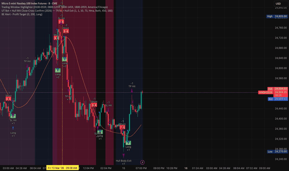
SMC Core Lite - Signals█ OVERVIEW
SMC Core Lite is a lightweight, performance-optimized Smart Money Concepts (SMC) indicator designed to help traders identify institutional trading patterns and generate high-probability trade signals.
This indicator combines the most essential SMC elements - Fair Value Gaps (FVG), Order Blocks (OB), and Break of Structure (BOS) - into a single, easy-to-use tool with automatic LONG/SHORT signal generation.
█ CONCEPTS
The indicator is built on the foundation of Smart Money Concepts, a trading methodology that focuses on understanding how institutional traders (banks, hedge funds, market makers) move the markets.
🔹 Break of Structure (BOS)
When price breaks above a swing high or below a swing low, it signals a potential continuation of the trend. This confirms the market's directional bias.
🔹 Change of Character (CHoCH)
When BOS occurs against the prevailing trend, it signals a potential trend reversal. This is a powerful early warning sign of shifting market sentiment.
🔹 Fair Value Gaps (FVG)
Also known as imbalances, FVGs are areas on the chart where price moved so quickly that it left a "gap" in the price action. These zones often act as magnets for price to return and fill.
🔹 Order Blocks (OB)
Order blocks represent the last opposing candle before a strong impulsive move. These zones mark areas where institutional orders were placed and often act as strong support/resistance levels.
█ FEATURES
• ✅ Break of Structure (BOS) Detection
• ✅ Change of Character (CHoCH) Detection
• ✅ Fair Value Gap (FVG) Identification
• ✅ Order Block (OB) Detection
• ✅ Automatic LONG/SHORT Signals
• ✅ Auto Stop Loss & Take Profit Levels
• ✅ Market Bias Dashboard
• ✅ Customizable Risk:Reward Ratio
• ✅ Signal Cooldown Filter
• ✅ Alert Conditions for All Events
• ✅ Lightweight & Fast Loading
█ HOW IT WORKS
The signal generation follows a confluence-based approach:
🟢 LONG SIGNAL CONDITIONS:
1. Price pulls back into a bullish zone (Bullish FVG or Bullish OB)
2. Recent Bullish BOS/CHoCH confirmed OR Market Bias is Bullish
3. Current candle closes bullish (confirmation)
4. Signal cooldown period has passed
🔴 SHORT SIGNAL CONDITIONS:
1. Price pulls back into a bearish zone (Bearish FVG or Bearish OB)
2. Recent Bearish BOS/CHoCH confirmed OR Market Bias is Bearish
3. Current candle closes bearish (confirmation)
4. Signal cooldown period has passed
█ HOW TO USE
1. Add the indicator to your chart
2. Wait for market structure to develop (BOS/CHoCH labels)
3. Observe the Market Bias in the dashboard (BULL 🐂 or BEAR 🐻)
4. Look for LONG signals in bullish bias, SHORT signals in bearish bias
5. Use the auto-generated SL/TP levels for trade management
6. Set alerts to get notified of new signals
█ SETTINGS
═══ SIGNALS ═══
• Show LONG/SHORT Signals → Enable/disable signal labels
• Show SL/TP Lines → Display stop loss and take profit levels
• Risk:Reward → Set your desired R:R ratio (1:1 to 1:5)
• Signal Cooldown → Minimum bars between signals (reduces noise)
═══ STRUCTURE ═══
• Show BOS/CHoCH → Display structure break labels
• Swing Length → Lookback period for swing point detection
═══ ZONES ═══
• Show FVG → Display Fair Value Gap boxes
• Show Order Blocks → Display Order Block boxes
• Zone Lookback → Historical bars to analyze
• OB Strength → ATR multiplier for impulse move detection
█ ALERTS
The indicator includes 4 alert conditions:
1. 🟢 LONG Signal → Triggered when a buy signal appears
2. 🔴 SHORT Signal → Triggered when a sell signal appears
3. 🟢 Bullish BOS → Triggered on bullish break of structure
4. 🔴 Bearish BOS → Triggered on bearish break of structure
To set alerts: Right-click on chart → Add Alert → Select this indicator → Choose condition
█ IMPORTANT NOTES
⚠️ This indicator is optimized for speed and performance. It stores only the most recent 10 FVGs and 10 Order Blocks to ensure fast loading times.
⚠️ Works best on higher timeframes (15m, 1H, 4H, Daily) where market structure is cleaner.
⚠️ Always use proper risk management. No indicator is 100% accurate.
█ BEST PRACTICES
✅ Trade in the direction of the higher timeframe bias
✅ Wait for price to pull back to zones before entering
✅ Use the 50% level of zones for optimal entries
✅ Combine with your own analysis for best results
✅ Backtest before using with real capital
█ DISCLAIMER
This indicator is for educational and informational purposes only. It is not financial advice. Trading involves substantial risk of loss and is not suitable for all investors. Past performance is not indicative of future results. Always do your own research and consider your financial situation before making any trading decisions.
█ CREDITS
Inspired by the Smart Money Concepts trading methodology and ICT (Inner Circle Trader) concepts.
If you find this indicator helpful, please consider giving it a boost 🚀 and following for more trading tools!
█ VERSION HISTORY
v1.0 - Initial Release
• BOS/CHoCH Detection
• FVG & Order Block Identification
• LONG/SHORT Signal Generation
• Auto SL/TP Calculation
• Market Bias Dashboard
• Alert Conditions Индикатор

Индикатор

Smart Confluence█ SMART CONFLUENCE (SC)
Multi-Factor SMC Trading System
Smart Confluence combines multiple market structure signals into a single confluence score . When enough signals align, it generates BUY/SELL setups with precise Entry Zones, Stop Loss, and 3 Take Profit levels — all fully automated.
Free and Open Source.
█ THE CONCEPT: WHY CONFLUENCE MATTERS
No single indicator is reliable on its own. A CHOCH can fail. An Order Block can break. A sweep can be a fakeout. But when 4-6 different signals all agree at the same time — that's when the probability is in your favor.
Smart Confluence requires a core trigger (CHOCH, Sweep, or EQ-Grab) PLUS enough confirmations to reach the minimum confluence threshold before any signal fires. This eliminates most false signals.
█ CORE FEATURES
1. Market Structure Detection
Automatic Swing High/Low identification with Change of Character (CHOCH) — the moment a downtrend breaks above the last swing high (bullish) or an uptrend breaks below the last swing low (bearish). CHOCH is worth 2 confluence points.
2. Liquidity Sweeps
Detects stop-hunt patterns where price sweeps below recent lows (or above recent highs) and reverses. These sweeps indicate smart money collecting liquidity before the real move. Worth 2 confluence points.
3. EQH/EQL (Equal Highs/Lows)
Identifies liquidity pools where multiple swing points cluster at the same price level. When price sweeps through these clusters (EQ-Grab), it signals institutional order flow. Worth 3 confluence points (configurable).
4. Order Blocks & Fair Value Gaps
Order Blocks — The last opposing candle before a strong move — institutional supply/demand zones. +1 point when price is inside.
FVGs — Price imbalances (gaps between candles) that act as magnets. +1 point when price is inside.
5. Premium/Discount Zones
Calculates where price is relative to the current range. Buy in discount (<50%), sell in premium (>50%). OTE (Optimal Trade Entry) bonus for the 62-79% retracement zone. Up to +3 confluence points.
6. Confirmation Filters
Volume — High volume confirms institutional activity (+1-2 points)
RSI Divergence — Momentum exhaustion = strong reversal signal (+2 points)
EMA Trend Filter — Price vs EMA21/50/200 alignment (+1-2 points)
ATR Volatility — High volatility confirms market activity (+1 point)
HTF Trend — Higher timeframe trend agreement (+1 point)
Candlestick Patterns — Engulfing, Hammer, Shooting Star (+1 point)
█ AUTO-TIMEFRAME ADAPTATION
All parameters auto-adjust to your chart timeframe: Swing Length, Cooldown, OB Lookback, Min Confluence, HTF selection, SL Buffer, Min R:R, EQ Tolerance, EQ Age, Setup duration, S/R Cluster. Supports 1m to Monthly.
█ S/R ZONE DETECTION
Automatic Support/Resistance zones built from clustering multiple sources: Swing points, Order Blocks, FVGs, EQH/EQL levels, HTF levels. Each zone gets a strength score (1-5). Only shows the strongest zones.
█ ENTRY / SL / TP SYSTEM
Entry Zone — Based on active Order Block or FVG. Falls back to current candle range.
Stop Loss — 4 modes: Entry-Based, Swing, ATR, or SMC (below OB/FVG). R:R filter ensures minimum reward.
Take Profit — 4 modes: Structure (next swing), Fixed R:R, ATR-based, or Hybrid (structure if available, else R:R).
Partial TP — Configurable distribution (50/30/20, 33/33/34, 40/40/20, 60/30/10).
█ DASHBOARD
Compact dark-themed info panel showing: Mode (Auto/Manual + TF), Trend direction, HTF confirmation, Premium/Discount zone, S/R levels with strength, Bull/Bear confluence scores, Active setup details (direction, R:R, SL, Entry, TP1-3), SL/TP mode, Partial distribution.
█ ALERTS (8 CONDITIONS)
BUY Signal — Full confluence with valid R:R
SELL Signal — Full confluence with valid R:R
Bullish CHOCH — Trend reversal detected
Bearish CHOCH — Trend reversal detected
EQH Grab — Liquidity pool swept (bearish)
EQL Grab — Liquidity pool swept (bullish)
Bullish Sweep — Stop hunt detected
Bearish Sweep — Stop hunt detected
█ PRO VERSION
The PRO version (Smart Confluence Pro) adds:
Signal Profile Presets — Scalping, Intraday, Swing, Position, Aggressive, Conservative, SMC Pure
Asset Auto-Detection — Crypto, Forex, Stock, Futures with 8 scaling factors
A/B/C Signal Grading — Quality scoring based on Zone, HTF, Volume, Session, Divergence
Risk Management — Account size, risk %, position sizing, custom partial distributions
Session Filter — London, New York, Asia sessions with overlap detection
Funding Rate — Crypto perpetual funding rate as contrarian confluence
Trailing Stop Loss — Break-Even + Trail TP modes
Trade Management Alerts — TP1/TP2/TP3 hit, SL hit, Trailing updates, Setup expiry
14+ Alert Types — Including A-Grade only alerts
█ NON-REPAINTING
All signals require confirmed bars (barstate.isconfirmed for EQH/EQL). Signal confirmation waits for the next candle. HTF data uses lookahead=barmerge.lookahead_off. No future data leakage. No repainting.
█ WORKS ON
Crypto, Forex, Stocks, Futures, Indices — any timeframe from 1 minute to Monthly.
█ DISCLAIMER
This indicator is for educational and informational purposes only. It does not constitute financial advice. Always do your own research and manage your risk. Past performance does not guarantee future results. Trading involves substantial risk of loss.
Индикатор

Индикатор

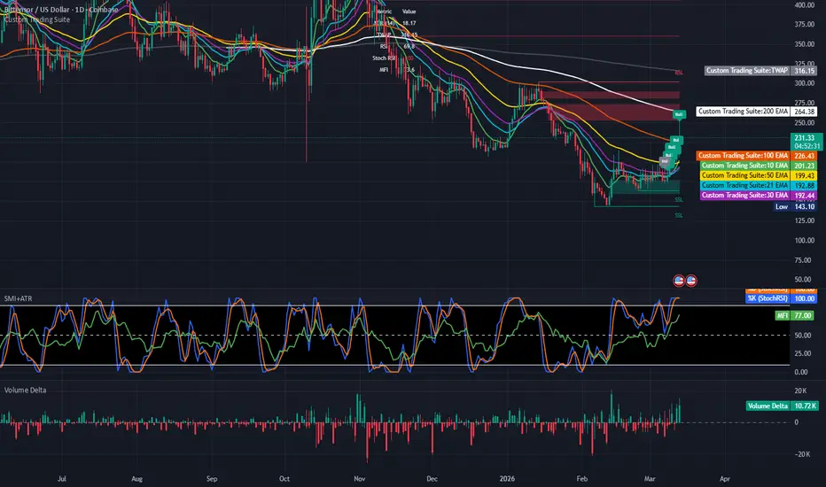
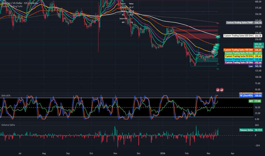
DNS finalized Custom Trading SuiteA total indicator for your analysis needs.
Market Dashboard Upgrades:
New Metrics: The dashboard now includes real-time values for:
RSI: Relative Strength Index.
Stoch RSI: Stochastic RSI (the %K value).
MFI: Money Flow Index.
Dynamic Coloring: These values are now color-coded. For example, the RSI will turn red when it hits your overbought level (70) and green when it hits your oversold level (30), giving you an immediate visual cue for market exhaustion.
Flexible Positioning: You can now move the dashboard to the Top Center (Top Middle) or any other corner of the chart via the settings.
Adjustable Size: I've added a Dashboard Size setting that allows you to choose between Tiny, Small, Normal, or Large text, so you can perfectly scale it to your screen.
Summary of Existing Features:
TWAP & ADR: Still calculated and displayed in the same dashboard.
Candle Labels: Restricted to the last 7 candles only (Bull/Bear/Ind).
EMA Suite: All 6 EMAs with customizable colors and line designs.
Wick S&R: Zones that map to candle wicks and remove when price closes through them.
Liquidity: BSL/SSL lines and Fair Value Gaps with dynamic removal.
Improvements & Fixes Made:
Data Safety: Added nz() (non-zero) and na() (not available) checks for the RSI, ADR, and TWAP calculations. This prevents the indicator from displaying "NaN" or empty values on the first few bars of a chart.
TWAP Logic Refinement: Modified the TWAP calculation to only activate on intraday timeframes. This ensures the "Daily Reset" logic doesn't cause errors or misleading lines when you are looking at Daily, Weekly, or Monthly charts.
Table Feedback: The Market Data table now displays "Calculating..." if the ADR or TWAP data isn't ready yet, rather than leaving the cells blank.
Label Protection: Added a bar index check in the candle analysis loop. This prevents the script from trying to draw labels "before" the first bar of the chart, which could cause a runtime error on very small data sets.
Code Consistency: Updated the label colors to strictly follow the defined BULL_COLOR and BEAR_COLOR constants for a perfectly unified look.
License Header: Ensured the official license header is at the top of the file as per PineScript best practices.
Candle Status Notations:
How it works: Every candle is now analyzed relative to an adjustable Analysis Lookback Period (defaulting to 7 periods).
Classifications:
Bull: Appears above the candle in green when the price is trending upward (relative to the 7-period average) and the candle body is significantly bullish.
Bear: Appears below the candle in red when the price is trending downward and the candle body is significantly bearish.
Ind: Appears above the candle in gray when the price action is tight or the candle body is small relative to the recent 7-period average, indicating Indecision.
Adjustability: You can change the "Analysis Lookback Period" from 7 to any other value in the settings to make the analysis more or less sensitive to recent price history.
Toggle: You can easily turn these labels on or off using the "Show Candle Status Labels" checkbox in the settings.
The script also retains all previous functionality, including the custom EMA styles, dynamic liquidity lines, and wick-based S&R zones. Индикатор
Индикатор

Индикатор

Индикатор

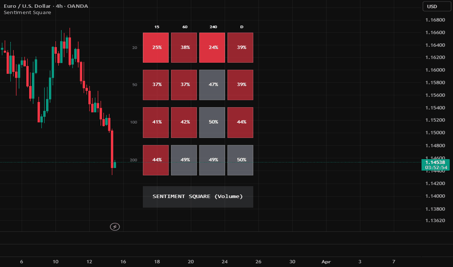
Sentiment SquareThe Sentiment Square is a multi-timeframe (MTF) and multi-length volume analysis tool designed for TradingView. It provides a top-down visualization of market conviction by calculating the ratio of bullish volume to total volume across 16 different data points simultaneously.
1.Core Logic: How it Works
The indicator calculates a Bullish Volume Ratio (BVR) for every square in the grid.
BVR = sum ( Volume of Up Candles)/ sum(Total Volume) X 100
Up Candle: Any candle where Close > Open .
Total Volume: The sum of all volume within the lookback window.
Each percentage represents the "Share of Power" held by buyers. For example, a value of 70% means bulls provided 70% of the volume, while bears provided the remaining 30%.
2. Visual Interface
The indicator uses a Transposed Matrix layout to match standard top-down trading analysis:
X-Axis: Timeframes : Moves from your lowest selected timeframe (Left) to your highest (Right).
Y-Axis: Lookback Windows: Moves from short-term momentum (Top) to long-term structure (Bottom).
Color Definitions
Green (Bullish): The percentage is above your Neutral Max (default 55%). Brighter green indicates extreme conviction (>70%).
Red (Bearish): The percentage is below your Neutral Min (default 45%). Brighter red indicates extreme selling (<30%).
Gray (Neutral): The percentage falls between 45% and 55%. This indicates a "tug-of-war" or sideways consolidation where neither side has a decisive majority.
Input Settings
Timeframes Window: Select four different intervals (e.g., 15m, 1h, 4h, 1D).
Speed Window: Set four different lookback lengths (e.g., 20, 50, 100, 200 bars).
Neutral Zone: Adjust the sensitivity of the Gray boxes. A wider range (e.g., 40%–60%) filter out more noise but responds slower to new trends.
How to Interpret the Data
Vertical Alignment (Columns): If a whole column is Green, that specific timeframe is bullish across all horizons (from fast momentum to slow structure).
Horizontal Alignment (Rows): If a whole row is Green, it means that specific "window length" is showing buying pressure across all timeframes.
The "Waiting Time" Signal: When a box is Gray, the volume is balanced. Traders typically wait for the percentage to move out of the 45%–55% range before confirming an entry.
Trend Resilience: If the 15M (tactical) squares turn Red while the 1D (structural) squares remain Green, the market is likely undergoing a healthy pullback rather than a total reversal.
Technical Limitations
Data Lag: Higher timeframe squares (like 1D or 4H) only update when their respective candles close.
Volume Requirement: This indicator requires volume data. It is most effective on Centralized Exchanges (Stocks, Crypto, Futures). On Forex, it uses "Tick Volume," which serves as a proxy for activity.
Common Trade Setup Examples
By observing the transition of colors and percentages across the matrix, you can identify high-probability market conditions.
1.The Trend Continuation (The "Dip-Buy")
Condition: The right-most columns (4H and 1D) and the bottom rows (100 and 200) are solid Green.
Setup: The top-left squares (15M / 20 Window) flip to Red or Gray.
Trigger: Wait for the 15M / 20 square to flip back to Green (above 55%).
Logic: The macro structure is bullish; the red squares indicate a temporary pullback that has now found buyers.
2. The Volatility Squeeze (The "Wait for Breakout")
Condition: A cluster of Gray squares (45%–55%) appears in the middle of the matrix.
Logic: Volume is perfectly balanced between buyers and sellers. This often precedes a massive "expansion" move.
Strategy: Avoid entering while the cluster is Gray. Wait for the majority of the cluster to flip to either solid Green or solid Red.
3. The Top/Bottom Exhaustion
Condition: All 16 squares are Vibrant Green (above 70%) or Vibrant Red (below 30%).
Logic: The market is "over-extended." While the trend is strong, the probability of a reversal increases because there are few buyers/sellers left to push the price further.
Strategy: Tighten stop-losses or look for "Divergence" where the price makes a new high but the percentages in the 20-window start dropping toward 60%.
Summary of the "Wait Time" Metric
The closer a number is to 50%, the more "waiting time" is required. As the numbers move toward 0% or 100%, the market conviction is increasing, and the "actionable" window is opening.
Additional Information:
1. Core Logic
The Sentiment Square calculates the Bullish Volume Ratio (BVR) across 16 data points. It measures "Share of Power" by dividing the volume of "Up Candles" (where Close > Open) by the total volume within a lookback window.
2. Visual Grid Layout
X-Axis (Timeframes): Displays user-selected intervals from lowest (Left) to highest (Right).
Y-Axis (Lookback Windows): Displays "Speeds" from short-term momentum (Top) to long-term structural sentiment (Bottom).
3. Color Definitions
Green (>55%): Bullish conviction. Bright green (>70%) signals extreme strength.
Red (<45%): Bearish conviction. Bright red (<30%) signals extreme selling.
Gray (45%–55%): Neutral "Waiting Time." Indicates volume balance or consolidation.
4. Common Trade Setups
The Dip-Buy: Occurs when macro columns (Right) are Green but tactical squares (Top-Left) temporarily turn Red/Gray. Entry is triggered when tactical squares flip back to Green.
Volatility Squeeze: Identified by a cluster of Gray squares. Traders wait for a majority of the cluster to flip to a solid color before entering.
Exhaustion: When all 16 squares reach extreme vibrant colors, the market is over-extended, increasing the probability of a reversal.
Индикатор
Sales & EPS Qrtly YoY% TableDescription:
For growth investors and swing traders (especially those utilizing CAN SLIM or Mark Minervini-style strategies), fundamental strength is just as important as technical price action. This indicator brings essential fundamental data directly to your chart, allowing you to instantly assess a company's earnings and revenue growth without needing to switch tabs or open external screeners.
Inspired by MarketSurge, this script calculates the Year-over-Year (YoY) percentage growth for both Quarterly Sales (Total Revenue) and Earnings Per Share (EPS), displaying the history in a clean, customizable table.
Key Features:
Instant Fundamental Snapshot: Displays a historical table of the most recent quarters, showing the exact date, Sales YoY%, and EPS YoY%.
Color-Coded for Speed: Positive growth is highlighted in green, and negative growth in red, allowing you to gauge fundamental acceleration or deceleration at a glance.
Highly Customizable UI: Choose exactly where the table sits on your chart (Top, Middle, or Bottom / Left or Right) so it never blocks your price action. You can also adjust the number of quarters displayed and the decimal precision of the percentages.
Growth Filtering: Includes a toggle to "Show negative growth labels." If turned off, the table will only display quarters where the company achieved positive growth in either Sales or EPS, helping you filter out fundamental noise.
EPS Options: Choose between using Standardized EPS or Reported/Actual EPS based on your analytical preference.
How it Works:
The script utilizes TradingView's request.earnings() and request.financial() functions to pull quarterly data. It then compares the current quarter's figures to the exact same quarter from the previous year (4 quarters prior) to calculate the true YoY growth rate, presenting it seamlessly on your timeframe of choice.
Add this to your chart to ensure you are only trading stocks with the fundamental horsepower required to make explosive moves! Индикатор

Индикатор