Индикатор

Индикатор

Индикатор

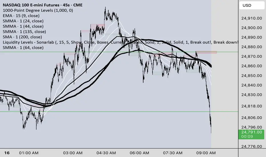
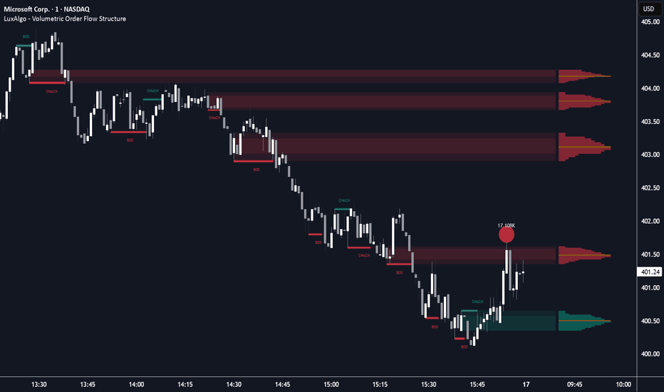
Volumetric Order Flow Structure [LuxAlgo]The Volumetric Order Flow Structure indicator is a comprehensive technical analysis tool designed to visualize market structure through the lens of volumetric distribution and institutional order flow.
🔶 USAGE
Traders can use this tool to identify institutional supply and demand zones backed by high-volume nodes. The glowing structure bars provide immediate feedback on breakout conviction, while the manipulation bubbles highlight areas where institutional players may be trapping retail traders before a reversal.
The indicator is particularly useful for identifying:
High-conviction breakouts versus low-volume "fakeouts."
Precise price levels within a zone where the most volume was transacted (POC).
Liquidity raids that suggest a potential reversal or trend continuation.
🔹 Volumetric Market Structure
The script automatically detects Change of Character (CHoCH) and Break of Structure (BOS). Breakout levels are represented by glowing "Volumetric Bars" that fill horizontally based on the breakout bar's volume delta, representing the internal buying or selling pressure of the move.
🔹 Stepped Volume Profiles
Active Order Blocks feature a 15-row horizontal histogram. The script calculates the volume distribution within the pivot candle, highlighting the Point of Control (POC) in orange to identify the most significant price node within the supply or demand zone.
🔹 Manipulation Bubbles
This feature identifies liquidity raids where price wicks beyond a zone but fails to close through it. These events are marked with circular "bubbles" sized dynamically by volume, featuring external volume data labels for precise analysis of institutional activity.
🔶 DETAILS
The script employs a dynamic zone management system where zones extend across the screen until the price closes beyond them. An advanced 'Hide Overlapping' filter ensures that if multiple zones occur in the same price range, only the most relevant (highest volume) block is displayed to maintain chart clarity.
Additionally, the indicator utilizes ATR-based scaling to ensure visual thickness and label sizes are perfectly proportional across all assets, ensuring a consistent experience whether trading Forex, Stocks, or high-priced Cryptocurrencies.
🔶 SETTINGS
🔹 Detection
Pivot Length: Sets the lookback period for detecting high and low pivots used for structure.
Volume Lookback: The window used to calculate relative volume for scaling and sensitivity.
🔹 Visuals
Max Recent Blocks: The maximum number of active supply/demand zones to display on the chart.
Base Transparency: Controls the overall opacity of the volumetric zones.
Hide Overlapping Blocks: When enabled, the script removes smaller/lower volume blocks that reside within the price range of a more significant block.
🔹 Manipulation
Show Manipulation Bubbles: Toggles the visibility of liquidity raid markers.
Size Sensitivity: Adjusts how aggressively the bubble sizes react to volume spikes.
Индикатор
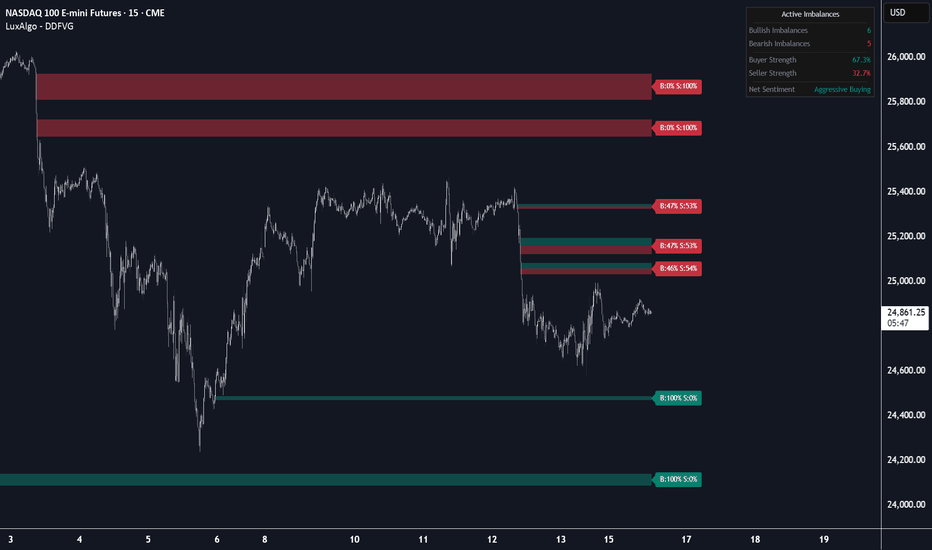
Dynamic Delta FVG [LuxAlgo]The Dynamic Delta FVG indicator provides a comprehensive analysis of Fair Value Gaps (FVGs) by integrating intra-bar volume delta to visualize the internal buying and selling pressure within price imbalances.
🔶 USAGE
The script identifies standard Fair Value Gaps and enhances them by splitting the visual representation into two distinct segments based on volume delta. This allows traders to see exactly where institutional aggressive orders were concentrated during the formation of the gap.
Users can utilize this tool to:
Identify high-probability FVGs where the volume delta aligns with the gap direction. Determine specific price levels within a gap that acted as the primary "point of control" for buyers or sellers. Monitor real-time sentiment through a dynamic dashboard that aggregates the delta of all active imbalances. Filter out insignificant market noise using ATR and volume-based threshold settings.
🔹 Detailed Buyer/Seller Tags
Each active FVG features a dynamic tag on the right edge displaying the specific percentage of buying (B) and selling (S) volume that occurred within that price range. The tag background color shifts based on the dominant force, providing an immediate visual cue of the gap's internal strength. These tags move dynamically as the boxes expand, ensuring they always remain at the current price action edge.
🔹 Filter Overlapping
When enabled, the script will automatically remove existing active FVGs that overlap with a new discovery. This ensures only the most recent "current" imbalance is displayed in a specific price zone, preventing visual clutter and focusing on the most relevant institutional levels.
🔹 Mitigation Modes
The script supports two mitigation modes to suit different trading styles:
**Touch:** A gap is considered mitigated as soon as price enters the range. **Full Fill:** A gap remains active until price has completely traversed the entire range of the imbalance.
🔶 DETAILS
The indicator utilizes
request.security_lower_tf()
to fetch granular volume data from lower timeframes (e.g., 1-second data). This allows for a precise calculation of "Buy Volume" versus "Sell Volume". The split in the FVG box represents the ratio of these volumes. For example, if an FVG has 70% buying volume, the green segment will occupy 70% of the vertical height of the box, while the red segment occupies the remaining 30%.
🔹 Aggregate Sentiment Dashboard
The dashboard calculates market strength across all active imbalances rather than just categorizing by gap direction. This means if multiple bullish FVGs contain significant "absorbed" selling volume, the "Seller Strength" metric will accurately reflect this bearish pressure. The Net Sentiment is derived from the net difference between aggregate buyer and seller percentages across all active gaps.
🔶 SETTINGS
🔹 Detection Filters
**Min Volume Threshold:** Multiplier for the 20-period average volume. Gaps forming on volume lower than this threshold are ignored. **Min ATR Magnitude:** Sets the minimum required size of the FVG relative to the current ATR. **Mitigation Mode:** Determines whether a touch or a full fill "closes" the gap. **Filter Overlapping:** When enabled, the script deletes older active gaps that overlap with new ones.
🔹 Volume Delta Analysis
**Delta Timeframe:** The lower timeframe used for volume calculations. Required for higher precision on 1m charts.
🔹 Visuals
**Max Active Gaps:** Limits the number of boxes displayed on the chart (Default: 10). **Buyer/Seller Color:** Customizable colors for the split segments within the FVG. **Show Mitigated Gaps:** When enabled, mitigated gaps remain on the chart with a faded appearance.
🔹 Dashboard
**Show Dashboard:** Toggles the real-time sentiment and imbalance summary table. **Position/Size:** Controls the UI placement and scale of the dashboard. Индикатор
Ultra Single Session +Alerts [1CG]Ultra Single Session +Alerts
Session Range, Trade Windows, and Alerts
Overview
Ultra Single Session +Alerts marks a single trading session on your chart, tracks that session’s high and low, and helps you watch for breaks when price moves away from the session range.
It’s made for traders who want accurate session levels across timeframes, optional trade windows, and alerts that don’t fire outside the times they care about.
Session Display
During the session, the indicator can draw a box to show the session range. It also draws the Session High and Session Low levels. After the session ends, those levels can stay on the chart so you can reference them later.
Sessions
Choose a preset session (London / New York / Asia / cross sessions) or set your own start and end times. Time zone handling is included so the session stays aligned to the clock you expect.
Customization
Most visual elements can be adjusted so it fits your chart:
Colors for box/lines/background
Line style (solid/dotted/dashed) and thickness
Labels (show/hide) and text settings
Box fill options
History options (if enabled)
Line Extensions
You can control how the High/Low lines behave:
Where the lines begin (from price behavior vs from the session start, depending on your settings)
How far they extend after the session
Optional “frontrun”/projection behavior (if enabled)
Optional history display for prior sessions (if enabled)
Trade Windows
Trade windows are optional time blocks you define. When enabled, the script can mark the window boundaries (and optionally highlight the background) so it’s easy to see when your “allowed trading time” is active.
Alerts
Alerts trigger from breaks of the Session High or Session Low. You can choose one of these modes:
On Break : alerts on the first touch/break of the level.
Close Out : alerts only when a candle closes beyond the level.
Close In (Sweep) : alerts when price breaks the level but closes back inside the session range.
Trade Window Gating: If trade window gating is enabled, alerts only fire when the break happens inside your trade window(s).
Higher Timeframe Accuracy
To keep the session high/low accurate on higher timeframes, the indicator uses 1-minute data for session tracking. This helps prevent missed highs/lows that can happen when a session starts or ends inside a larger candle.
Daily Sessions
You can also use this for daily session templates (for example midnight-to-midnight, or market open-to-close) to track daily ranges and daily breaks using the same workflow.
Help / Feedback
If you need help setting this up, notice something that looks wrong, or have an idea for improvements, feel free to message me.
Questions about settings or getting it to match your session times
Bug reports (please include symbol, timeframe, and your session/trade window settings)
Interest in a version that supports more sessions
Индикатор

Индикатор

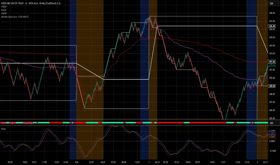
Key Price Levels Daily Ver [structJCWL]As an independent developer and active trader, I built this tool to address a personal frustration: the lack of precision in standard session-level indicators. For those who trade based on market micro-structure, a level that is "approximately" correct is a logic error.
Key Price Levels Daily Ver is an engineering implementation focused on reconstructing session data with surgical accuracy. It is designed for traders who require reliable, noise-filtered benchmarks to anchor their daily execution.
THE ENGINEERING LOGIC:
1-Second (1S) Intrabar Reconstruction : Standard scripts often rely on daily-bar data, which can be imprecise. This tool re-aggregates the session using 1-Second (1S) granularity . By processing every sub-candle, it ensures that POC, Value Area, and Extremes are anchored to the true weight of capital commitment.
The 15-Minute Threshold (Technical Rationale) : To maintain the high fidelity of 1S data aggregation, this indicator is optimized for timeframes ≤ 15 minutes . Calculating micro-structure on higher timeframes leads to data thinning and reduced precision—limitations I refuse to accept in my personal trading setup.
Adaptive Visual Hierarchy (Fade & Limits) : To prevent visual clutter, I’ve integrated Fade Strength and Timeframe Limits . Lines automatically adjust their transparency or visibility based on your current timeframe, ensuring that the most relevant levels remain clear while secondary noise recedes.
Reliability by Design : In 24/7 markets, script stability is paramount. I have implemented defensive programming (including a 98,000-unit memory circuit breaker ) to prevent overflows during extreme volatility. I strive for absolute dependability; if you encounter any issues, your feedback is highly welcome as we refine and improve this tool together.
作为一名独立开发者与实战交易者,我构建此工具是为了解决一个长期的困扰:标准时段指标精度的缺失。对于基于市场微观结构进行交易的人来说,“大约准确”的水位本身就是一种逻辑错误。
Key Price Levels Daily Ver 是我对日内关键水位线的个人工程化实现,专注于以“外科手术式”的精度重构时段数据。它专为那些需要可靠、过滤噪音的基准位来锚定日内执行的交易者而设计。
核心设计逻辑:
1秒级微观重构 (1S Precision) :我不满足于直接调用现成的日线数据。脚本通过扫描 1秒 (1S) 微观颗粒度数据 来重构整个交易时段,确保 POC 和价值区的计算基准来自于最真实的成交细节。
15分钟周期硬限制 :为了保证 1S 数据聚合的极致精度,本脚本仅限在 15分钟及以下周期 运行。在更长周期调用微观数据会导致精度大幅下降。作为开发者,我不允许“大约准确”的逻辑存在于我的系统里。
自适应视觉层级 (Fade & Limits) :通过内置的 淡化强度 (Fade) 与 周期限制 (Limits) ,水位线会根据你当前的图表周期自动调节透明度或可见性。
可靠性设计 :在 24/7 不间断的交易中,脚本的稳定性至关重要。我在代码底层加入了防御性设计(包括 98,000 数组容量熔断机制 ),旨在防止极端行情下的计算溢出或图表崩溃。我追求的是一个能让人放心的工具,若你在使用中发现任何问题,欢迎随时反馈,我们共同完善。
Feedback & Interaction:
As a personal project, this script is continuously refined. I welcome any bug reports or suggestions for improvement to make this tool even more robust for the community.
Compliance & Credits:
Author: structJCWL (Independent Developer & Trader)
License: Mozilla Public License 2.0 (MPL 2.0)
Attribution: Core data aggregation and state-machine logic are 100% original implementations Индикатор

Индикатор
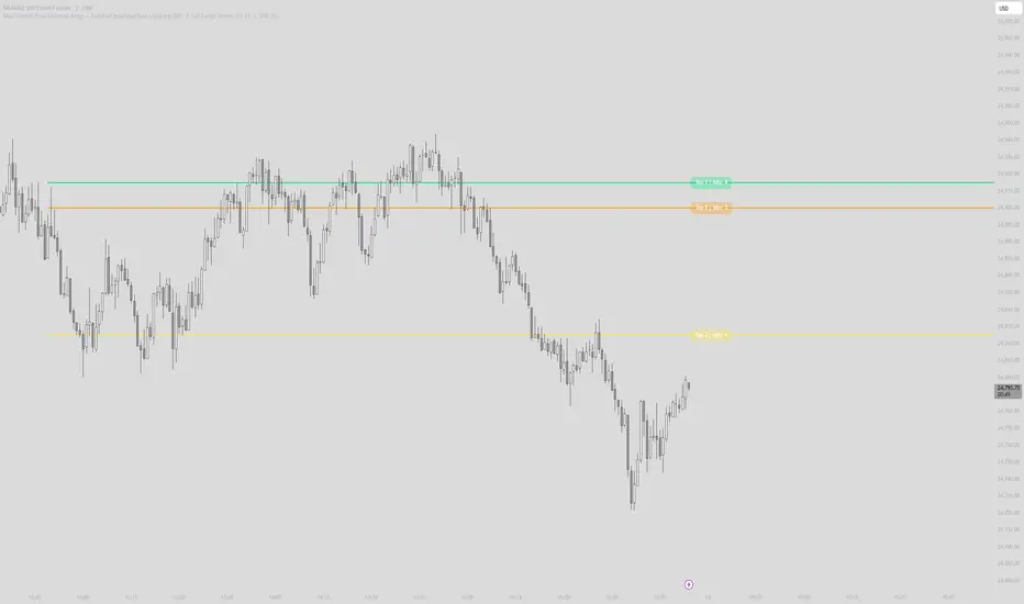
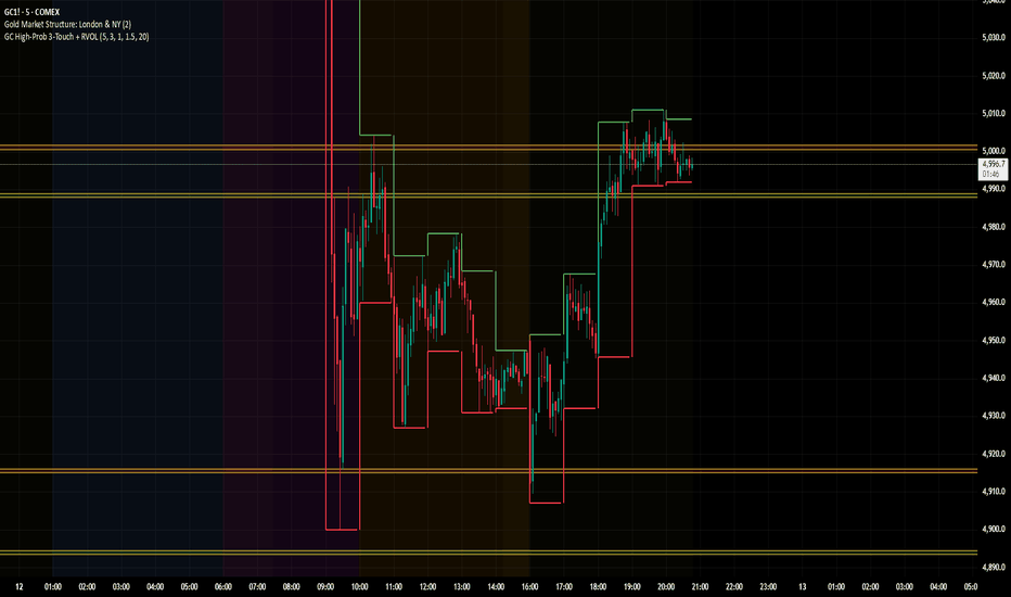
GC High-Prob 3-Touch + RVOLWhen publishing your script to TradingView, the description is your "sales pitch" to the community. TradingView’s moderators and users look for three things: What it does, Why it’s useful, and How to interpret it.
Here is a structured, professional description you can copy and paste into the publishing field.
Title Suggestion: GC High-Prob Liquidity Zones: 3-Touch + RVOL Surge
Description:
Overview
This indicator is designed specifically for Gold (GC) and other highly liquid futures, focusing on identifying high-probability support and resistance zones. Rather than plotting every minor pivot, this script filters market noise by requiring a "clustering" of price action and institutional volume confirmation.
It identifies levels where the price has been rejected at least three times within a narrow range and validates the strength of these zones using Relative Volume (RVOL).
Key Features
3-Touch Requirement: The script only plots a zone once it detects 3 separate rejections at a specific price level. This identifies "battlegrounds" where supply and demand are truly established.
RVOL Surge Filter: To prevent "lazy" or low-liquidity fake-outs, the zone is only highlighted if the most recent touch occurred with a volume spike (Relative Volume > 1.5x average).
Dynamic Price Anchoring: Built using Pine Script v6 force_overlay, these zones are physically anchored to the price candles. They scale and move perfectly with the chart as you zoom or scroll, avoiding the "floating" issues common in standard drawing scripts.
Smart Proximity: Includes a proximity filter (default $0.50 for Gold) that groups nearby wicks into a single unified zone of interest.
How to Use
Identify the Zone: When a Red (Resistance) or Green (Support) box appears with a thick yellow border, it indicates a high-probability institutional level.
Wait for the Sweep: Look for price to "hunt" the liquidity inside the box.
The Rejection: A successful trade setup often occurs when a candle wicks into the zone but closes back outside of it on high volume.
Risk Management: The edges of these boxes provide clear, objective levels for stop-loss placement.
Settings
Pivot Strength: Adjusts how "significant" a peak must be to be recorded. (10 is recommended for 1m/5m charts).
RVOL Threshold: Sets the multiplier for volume spikes. 1.5 means 150% of the recent average volume.
Touch Proximity: Defines how close rejections must be to each other to be considered part of the same "cluster." Индикатор
Индикатор

Индикатор
Индикатор

Стратегия

Индикатор

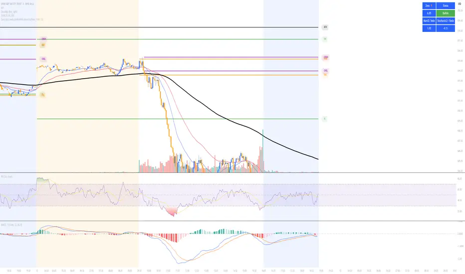
Volume Profile S/R Zones (Peaks)Volume Profile S/R Zones (Peaks) is a volume-profile based support/resistance tool that converts significant volume nodes into tradable zones, then ranks them by how consistently price respected them over the selected lookback.
The script builds a rolling Volume Profile over a user-defined window (default 81 days) using a fixed number of price bins (default 33 rows). For each price bin it accumulates:
Total volume traded inside that price region
Bullish volume (lower-timeframe bars that close above open)
Bearish volume (implied as total − bullish)
The profile is plotted on the left side of the chart. All profile elements and zones are intentionally forced to a single clean style: white at 20% opacity (labels keep the chart’s default text color styling).
What it detects
1) High Volume Nodes (Peaks)
The script scans the profile rows and detects local maxima (HVNs). To prevent noisy “micro peaks,” a peak must pass two quality filters:
Relative-to-Max filter: peak volume must be at least a % of the largest node’s volume
Prominence filter: peak volume must exceed the average of nearby nodes by a minimum ratio
These filters remove weak nodes and keep only meaningful price areas where the market traded heavily.
2) Optional Low Volume Nodes (Troughs / LVNs)
When enabled, the script also detects local minima (LVNs). LVNs can behave like “barrier” areas where price rejects or moves quickly through.
Zones instead of lines
Each detected node becomes a zone, not a single price line.
Zone center = middle of the profile row
Zone thickness is adaptive:
Zone Half-Width = max(price bin size, ATR × fraction)
This makes zones robust to volatility and reduces “false breaks” caused by small wicks.
Zone merging (reduces clutter)
Nodes close to each other are merged into a single zone if their centers are within:
Merge Distance = ATR × fraction
The merged zone center becomes volume-weighted, so stronger nodes dominate.
Reliability scoring (the core feature)
Every zone is scored by replaying price interaction over the lookback window:
Events
Touch: candle range intersects the zone
Valid rejection: touch + close exits the zone in the expected direction
Confirmed break: close outside the zone, confirmed by:
distance beyond the zone (ATR-based), or
a minimum number of consecutive closes outside
Scoring
Touch adds points
Rejection adds more points
Confirmed break subtracts points
A decay factor is applied each bar so older interactions matter less than recent ones
This produces a practical ranking: zones that get repeatedly respected score high; zones that fail score low.
What you see on the chart
Left-side Volume Profile (white 20% opacity)
Top N strongest zones (ranked by score), drawn as horizontal bands across the chart
Right-side price labels showing each zone’s center price
Label tooltip includes:
zone center price
reliability score
current “role” (support-side vs resistance-side)
polarity bias (bull/bear/neutral based on volume delta)
Inputs and how to tune
Volume Profile
Profile Lookback (Days): defines market memory (short = tactical, long = structural)
Rows: resolution of price bins (higher = more detailed, lower = smoother)
Profile Width: visual width of the profile histogram
POC mode: optional regular or developing POC line
Zones
Top N Zones: limits clutter by plotting only the strongest zones
ATR Length / Zone Half-Width: controls how wide zones are
Prominence / Relative-to-Max: controls strictness of peak detection
Merge Distance: merges nearby zones into one
Scoring
Touch / Rejection / Break points
Decay factor (higher = longer memory)
Break confirmation settings (ATR distance + consecutive closes)
How to use (practical framework)
This indicator is designed to treat volume nodes as acceptance/rejection areas, not perfect lines:
Focus on high-score zones (they have the most recent evidence of being respected)
Use zones as:
potential accumulation/defense areas (support-side)
potential supply/ceiling areas (resistance-side)
Break confirmation is ATR-based to reduce false breakdowns/breakouts
For investing, many users run two instances:
long lookback (e.g., 252 days) for macro zones
shorter lookback (e.g., 81 days) for tactical entries
Notes / Limitations
The script is a historical structure tool, not a predictor.
Zones can shift gradually as the rolling lookback window updates.
Different assets (high volatility vs low volatility) may require different row counts and filter strictness.
License / Credits
Based on LuxAlgo’s Volume Profile foundation and heavily modified to add zone construction, merging, and reliability scoring.
Licensed under CC BY-NC-SA 4.0 (Attribution–NonCommercial–ShareAlike). Индикатор

ZenAlgo - ABCThis indicator identifies a three-point price structure (X, A, B) and projects proportional price levels forward from point B. It uses either automatically detected swing points or manually selected anchors and then builds a forward projection framework based on the relative movement between X and A.
1. Anchor Point Selection (X, A, B)
The script first determines three key price points that define the reference movement.
Automatic mode
When manual anchors are disabled, the indicator scans historical bars to detect local highs and lows using a fixed number of bars on the left and right side. A pivot high is confirmed only after enough future bars exist, and the same applies to pivot lows. This avoids using information that is not yet available in real time.
Detected pivots are stored in sequence:
The previous confirmed pivot becomes X
The next confirmed pivot becomes A
The most recent confirmed pivot becomes B
To avoid repeatedly using the same type of pivot, the script alternates between highs and lows. This ensures that X, A, and B always represent a swing structure instead of a flat sequence.
Manual mode
When manual anchors are enabled, the user defines three timestamps. The script captures the price and bar index at those times. After all three points are collected, the script adjusts them to represent true extremes inside their bars. Depending on direction, it replaces closes with highs or lows so that X and A form a valid swing, and B represents a corrective endpoint.
If manual anchors are incomplete, the script falls back to the automatic pivots.
2. Validation and Direction Detection
After anchors are collected, the script checks whether all three points are available. If any of them is missing, no projection is drawn.
When X, A, and B exist, the script determines the directional context:
If A is above X, the structure is treated as bullish
If A is below X, the structure is treated as bearish
The vertical distance between X and A defines the reference movement. This distance is treated as the base unit for all further projections.
This approach assumes that the impulse move from X to A represents the dominant directional leg, and that B represents a retracement or pause within that structure.
3. Projection Calculation
All projected levels are derived from the difference between X and A and are applied starting from point B.
For each predefined ratio:
In bullish structures, the distance from X to A is added upward from B
In bearish structures, the distance is subtracted downward from B
This produces a set of horizontal price levels that are proportional to the initial impulse.
No fixed price values are used. All levels scale automatically with market volatility and with the size of the X–A movement.
4. Configurable Levels and Naming
The indicator defines a list of projection ratios that represent retracement, extension, and continuation zones. Each level can be enabled or disabled and has an adjustable color and transparency.
Each level may be displayed in two ways:
As a descriptive name combined with the ratio
As a numeric ratio combined with the projected price
The naming system maps specific ratios to semantic labels such as base, entry, intermediate targets, main target, and extended continuation levels. These names are fixed in the script and reflect their relative position in the projection structure.
5. Visual Construction
On the most recent bar, the script clears all previously drawn elements and rebuilds the full structure.
It then draws:
A dashed line from X to A and from A to B to visualize the underlying swing
Labels at X, A, and B with direction-aware placement
Horizontal lines from B into the future for each enabled level
Text labels at the end of each level line
All level lines extend a configurable number of bars to the right of the current bar, creating a forward projection area.
Transparency values are fixed to maintain visual consistency and to avoid obscuring price action.
6. Zone Construction
In addition to individual lines, the script can draw shaded zones between selected pairs of levels.
These zones include:
A retracement zone between two closely spaced mid-range ratios
A target zone between the main extension levels
An extended continuation zone above or below the main target
Zones are drawn as semi-transparent rectangles from point B to the right extension limit. Their vertical boundaries are defined by the corresponding projected levels.
These zones highlight areas where price interaction with multiple proportional levels is expected.
7. Display and Update Logic
The drawing process runs only on the most recent bar. This prevents excessive historical objects and ensures that projections always reflect the latest confirmed X, A, and B.
All graphical objects are stored internally and deleted before redrawing. This avoids overlap and keeps the chart synchronized with the current structure.
8. Interpretation of Levels
The projected levels represent proportional price distances derived from the prior impulse.
They should be interpreted as:
Reference zones for potential reactions
Areas of interest for continuation or exhaustion
Context for managing existing positions
Lower ratios correspond to shallow projections near B. Higher ratios correspond to extended moves away from B.
No level represents a guaranteed support or resistance. All values are conditional on the validity of the underlying X–A–B structure.
9. Practical Usage
Typical usage follows this workflow:
Wait for the script to confirm X, A, and B
Observe whether the structure is bullish or bearish
Use projected levels as reference for planning entries, exits, and risk placement
Re-evaluate when a new pivot replaces X, A, or B
Manual anchors can be used when the user wants to enforce a specific structure that differs from the automatic pivot logic.
The indicator is designed for contextual analysis rather than standalone signal generation.
10. Limitations and Disclaimers
This indicator depends on confirmed pivots. In fast or highly volatile markets, pivot confirmation can lag, which delays projections.
Structures may be invalidated when:
Price forms new extremes before a pivot is confirmed
Market conditions change abruptly
Range-bound markets produce frequent small pivots
In such conditions, projected levels may shift frequently or lose relevance.
The method assumes that past impulse size is a meaningful reference for future movement. This assumption does not hold in all market regimes.
The indicator does not incorporate volume, order flow, trend filters, or volatility regimes. It should therefore be combined with additional analysis.
11. Relationship to Manual Fibonacci and ABC Tools
Unlike standard manual Fibonacci retracement or projection tools, this indicator does not rely on subjective anchor placement. In automatic mode, swing points are selected using a fixed pivot detection process, which enforces consistent structural rules.
Anchor points are derived from confirmed price pivots instead of manual selection
The X–A–B structure is maintained automatically as new swings form
All projection levels and zones are recalculated and redrawn dynamically
This removes the need for repeated manual adjustments when market structure changes.
Compared to typical ABC projection tools, the script formalizes the entire workflow. The selection of reference points, the construction of proportional levels, and the management of graphical objects are handled programmatically. This prevents inconsistent anchor choices, reduces user interpretation bias, and ensures that projections always reflect the most recent validated structure.
The integrated zone construction further extends standard projection methods by grouping related levels into continuous price regions, rather than displaying only isolated horizontal lines.
Summary
This script identifies swing-based X–A–B structures using confirmed pivots or manual anchors, measures the impulse between X and A, and projects proportional levels from B. All displayed lines and zones are derived from this single reference movement and update dynamically as new pivots appear. The indicator provides a structured projection framework based on historical price geometry rather than predictive signals.
Индикатор

Liquidation Heatmap by RumiancevLiquidation Heatmap by Rumiancev
Overview
Liquidation Heatmap is an open-source visual map of estimated liquidation zones built from activity spikes .
When the script detects an unusually large spike, it projects liquidation levels for multiple leverage tiers and aggregates them into horizontal price “bins”. Each bin accumulates weight over time and is displayed as a color gradient:
• Brighter / hotter = higher accumulated weight
• Darker / colder = lower accumulated weight
Important: This is not an exchange liquidation feed and it does not display “real liquidation prices”. It is a proxy model designed to visualize where liquidation pressure could be clustering based on abnormal market activity.
Why BTCUSDT.P is recommended
For the most consistent and “liquidation-relevant” behavior, use a perpetual futures symbol such as BTCUSDT.P .
Perpetual markets provide Open Interest , so the script can use OI Delta (change in OI) as the spike stream. OI delta typically reflects leveraged positioning changes (build-up / flushes) more directly than spot volume.
• On perpetuals → OI data is available → spikes are usually cleaner for this model
• On spot → OI is not available → the script may fall back to volume, which can be noisier
If needed, set OI Symbol Override manually (examples are shown in the input tooltip).
How it works (logic)
1) Select a spike stream
• AUTO : uses OI Delta if available, otherwise Volume
• OI : forces OI Delta
• VOL : forces Volume only
2) Detect spike events
The script measures abnormal activity using a Z-score style approach on the absolute stream:
• Spike Lookback defines the baseline window
• Sensitivity maps to a threshold (lower = more events, higher = fewer events)
• Min bars between events optionally reduces clustering on lower timeframes
3) Project liquidation prices
For each spike event, liquidation estimates are calculated for up to three leverage tiers:
• Long liquidations are projected below the reference price
• Short liquidations are projected above the reference price
4) Bin, accumulate, and colorize
Projected levels are snapped into bins using Bin Scale (ticks) .
Bin weight is accumulated and displayed as a gradient between Low density and High density .
5) Freeze on touch
When price touches a bin (wick or close, depending on settings), the bin is frozen :
• it stops updating
• it becomes dotted / high transparency
This keeps a lightweight history of zones that have been interacted with.
How to read the map
• Bins below price often represent potential long-liquidation pressure zones
• Bins above price often represent potential short-liquidation pressure zones
• Brighter bins = more accumulated spike weight → potentially more crowded zone
• Frozen dotted bins = price already touched that zone (historical interaction)
Timeframes (recommendations)
This indicator runs on any timeframe, but density/noise changes significantly.
Best balance (recommended):
• 15m / 1H / 4H — good signal-to-noise and clean structure
Higher timeframes (cleaner, fewer zones):
• 12H / 1D — fewer events, more “macro” zones
Lower timeframes (noisier by nature):
• 1m / 3m / 5m — more spikes and more bins
To reduce clutter on low TF, consider:
• increasing Sensitivity (e.g., 14–18)
• enabling Min bars between events (e.g., 10–30)
• increasing Bin Scale (ticks) (thicker bins → fewer levels)
• enabling Keep only local range bins
Inputs (what each setting does)
Source
• Source Mode : AUTO / VOL / OI
• OI Symbol Override : manual OI source if AUTO is not suitable
Event (Spike) Filter
• Spike Lookback : baseline window for mean/stdev
• Sensitivity : lower = more events, higher = fewer events
• Use high/low for touch test : wick-based touches
• Min bars between events : reduces spike clustering
Liquidation Levels (bins)
• Reference Price : base price for projections (close/hl2/etc.)
• Leverage 1/2/3 : leverage tiers (set to 0 to disable any tier)
• Bin Scale (ticks) : bin thickness (bigger = fewer bins)
• Extend (bars) : how long active bins extend
• Max active bins per side : cap for active bins
• Dispersion (%) : splits part of the weight to the opposite side
• Keep only local range bins + Local range lookback : trims bins far from recent range
Visual
• Gradient colors, frozen transparency, legend, and debug marker
Limitations / Disclaimer
This script is provided for research and educational purposes only . It is not financial advice .
The plotted zones are estimates derived from a simplified model (spike detection + leverage projections). Results depend on symbol, exchange data availability (OI), and timeframe.
Индикатор

Индикатор

Индикатор

Индикатор

MST Medio v1.0MST Medio — 3-Phase Price Action Confirmation
MST Medio is a structured price action indicator that detects high-probability reversal entries using a 3-phase confirmation process: Break → Confirm → Retest. It waits for a confirmed Higher High / Lower Low, validates the impulse wave, then triggers only when price retests the key level.
No repainting. No lagging indicators. Pure price action logic built on swing structure.
────────────────
How It Works
Phase 1 — Break
Price forms a Higher High (HH) above the previous Swing High, or a Lower Low (LL) below the previous Swing Low. The break must pass two filters:
Break Strength — The break distance must exceed a minimum percentage of the previous swing range (configurable, default 0.25×).
Impulse Body Filter — The first candle closing beyond the old high/low must have a body ≥ 1.5× the 20-bar average body. This ensures the break is driven by momentum, not a weak drift.
The indicator then identifies the W1 impulse wave — the highest high (BUY) or lowest low (SELL) from the break candle until the first opposing candle.
Phase 2 — Confirm
After the impulse wave, price must pull back and then close beyond the W1 peak (for BUY) or below the W1 trough (for SELL). This confirms that momentum has resumed after the correction.
Invalidation rules:
Price returns to the entry level (old SH/SL) before confirmation → structure broken, cancel.
Price hits the Stop Loss level → cancel.
Phase 3 — Retest Entry
Once confirmed, the indicator waits for price to retest the original Swing High (BUY) or Swing Low (SELL). This is your entry point — buying at the old resistance turned support, or selling at the old support turned resistance.
Invalidation rules:
Price hits Stop Loss → cancel.
Price breaks below the W1 trough (BUY) or above the W1 peak (SELL) → cancel.
────────────────
Visual Elements
Entry / SL / TP lines (dashed) — Drawn at signal confirmation with labels showing levels and R:R ratio.
Risk/Reward zones — Colored boxes: red zone (Entry → SL) and green zone (Entry → TP) for instant visual assessment.
Confirm Break label — "▲ Confirm Break" / "▼ Confirm Break" at the wave confirmation candle.
Pending state — Dotted lines and phase labels ("Phase 1 BUY", "Phase 2 SELL") showing the indicator is tracking a potential setup before it triggers.
Swing markers (optional) — Small triangles at detected pivot highs and lows.
────────────────
Take Profit Logic
TP is placed at the high of the Confirm Break candle (BUY) or the low of the Confirm Break candle (SELL). This represents the point where momentum was confirmed — a natural target that aligns with the structure of the move.
────────────────
Inputs
Pivot Lookback (default: 5) — Bars left/right to confirm a swing point. Higher values = fewer but stronger pivots.
Break Strength (default: 0.25) — Break distance must be ≥ this multiple of the previous swing range. Set 0 to disable.
Impulse Body Filter (default: 1.5) — The break candle body must be ≥ this multiple of the 20-bar average body. Set 0 to disable.
Show Entry / SL / TP Lines — Toggle dashed level lines and labels.
Show Risk/Reward Zones — Toggle colored risk/reward boxes.
Show Pending State — Toggle the dotted lines and phase labels for setups being tracked.
Show Confirm Break Label — Toggle the confirmation label.
Show Swing Points — Toggle swing high/low markers on the chart.
Full color customization for all visual elements.
────────────────
Alerts
BUY Signal — Fires when Phase 3 retest is triggered on a bullish setup.
SELL Signal — Fires when Phase 3 retest is triggered on a bearish setup.
Any Signal — Fires on either direction.
────────────────
Notes
Works on all timeframes and all instruments.
Non-repainting — All signals use confirmed (closed) pivots. No lookahead.
This is a detection tool , not a strategy. Use it alongside your own risk management and confluence analysis.
Best suited for trending markets where HH/LL structures form clean impulse waves.
The 3-phase confirmation significantly reduces false signals compared to raw breakout detection.
Индикатор

Game Theory Strategic Indicator - Archery & Horse Riding Model# Game Theory Strategic Indicator - Archery & Horse Riding Model
## Overview
This indicator applies rigorous game theory mathematics to market analysis, modeling price action as a strategic two-player game between buyers and sellers. The methodology draws from economic game theory, evolutionary dynamics, and zero-sum game optimization.
## Theoretical Foundation
The indicator implements five core game theory concepts:
**1. Expected Utility (Mixed Strategies)**
Calculates E = p×U₁ + (1-p)×U₂ where:
- p = probability distribution based on volume dynamics
- U₁, U₂ = utility payoffs for aggressive vs defensive strategies
- Uses RSI momentum and ATR volatility to quantify payoffs
**2. Nash Equilibrium Detection**
Identifies market states where ui(σᵢ*, σ₋ᵢ*) ≥ ui(σᵢ, σ₋ᵢ*):
- Measures when no participant can improve by changing strategy
- Highlighted with yellow background zones
- Signals reduced edge environments (avoid trading)
**3. Replicator Dynamics**
Models evolutionary strategy adaptation: dx/dt = x(f(x) - φ(x))
- Tracks frequency changes in bullish vs bearish strategies
- Shows which approach is gaining evolutionary fitness
- Purple line indicates strategy evolution trend
**4. Minimax Algorithm**
Implements zero-sum game optimal strategy L(x,y):
- Calculates win/loss ratio over lookback period
- Values > 1.0 suggest favorable risk/reward
- Orange line shows deviation from neutral state
**5. Best Response Function**
Determines optimal action maximizing ui(aᵢ, a₋ᵢ):
- Compares buyer vs seller expected utilities
- Generates primary long/short signals
- Confidence weighted by utility differential
## Visual Elements
**Chart Plots:**
- **Blue Line (Utility Differential)**: Buyer utility minus seller utility. Positive favors longs, negative favors shorts
- **Purple Line (Replicator Dynamics)**: Rate of strategy evolution. Rising = bullish strategies gaining fitness
- **Orange Line (Minimax Deviation)**: Zero-sum game value. Above zero = favorable conditions
- **Pink Area (Mixed Strategy Bias)**: Probability-weighted strategy preference
- **Yellow Background**: Nash equilibrium zones where no player has edge
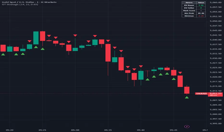
**Signals:**
- **Green Triangle Up**: Long signal - buyer utility dominates outside equilibrium
- **Red Triangle Down**: Short signal - seller utility dominates outside equilibrium
- **Yellow Diamond**: Equilibrium warning - reduced edge state
**Info Table (Top Right):**
- EU Buyer/Seller: Current expected utilities
- Nash Score: Equilibrium strength (>0.65 = equilibrium)
- Mix Prob: Volume-based probability distribution
- Minimax: Win/loss ratio indicator
## Strategy Metaphors
**Archery (Buyer Strategy)**: Represents precision attacks - targeted entries at optimal risk/reward points, high accuracy required
**Horse Riding (Seller Strategy)**: Represents mobile defense - flexible positioning, quick exits, adaptive to changing terrain
## Parameters
- **Strategy Period (14)**: Lookback for RSI and ATR calculations
- **Mixed Strategy Length (21)**: Period for minimax win/loss analysis
- **Nash Equilibrium Threshold (0.65)**: Minimum score to identify equilibrium (0.5-0.9)
- **Show Trade Signals**: Toggle buy/sell arrows
- **Show Equilibrium Zones**: Toggle background highlighting
## How to Use
1. **Trend Trading**: Take long signals when utility differential (blue) is rising and no equilibrium zone present
2. **Counter-Trend**: Take signals when replicator dynamics (purple) diverges from price
3. **Risk Management**: Avoid trading during yellow equilibrium zones - market has no clear edge
4. **Confirmation**: Best signals occur when minimax > 1.0 and best response aligns with utility differential
5. **Monitoring**: Watch info table for real-time utility balance and equilibrium status
## Alerts
Three alert conditions available:
- **GT Long Signal**: Buyer utility dominates, composite score > 0.5
- **GT Short Signal**: Seller utility dominates, composite score < -0.5
- **Nash Equilibrium**: Market reaches balanced state, avoid new entries
## Mathematical Rigor
All calculations use proper game theory formulations:
- Payoff functions normalized by volatility
- Probability distributions bounded
- Zero-division protection implemented
- Utilities properly weighted in composite score
## Originality Statement
This indicator is original work implementing classical game theory mathematics in a novel market analysis framework. The code, calculations, and interpretation methodology are entirely my own creation. No external scripts were copied or modified.
## Disclaimer
This indicator is for educational purposes. Game theory provides a framework for analyzing strategic interaction but does not guarantee profitable trading. Always use proper risk management, test thoroughly, and understand that past performance does not indicate future results.
---
**Educational Resource**: For deeper understanding of game theory in economics, see Nash (1950) "Equilibrium Points in N-Person Games" and Maynard Smith (1982) "Evolution and the Theory of Games"
```
--- Индикатор