Delta Flow Ribbon [AlgoNorth]Delta Flow Ribbon
Picture two bars with the same heavy volume. In one, price travels the way that volume was leaning. In the other, it barely moves. A volume histogram draws them the same height. Delta Flow Ribbon is built to tell them apart.
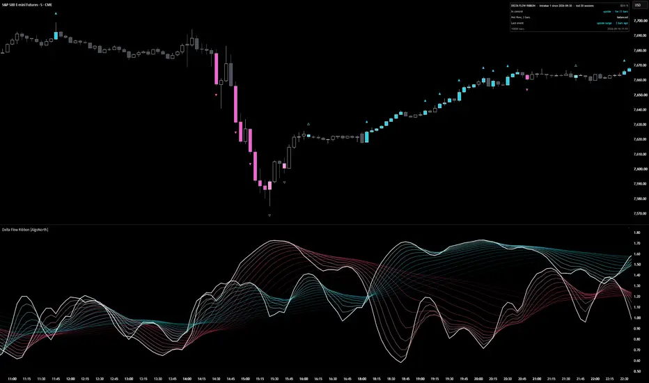
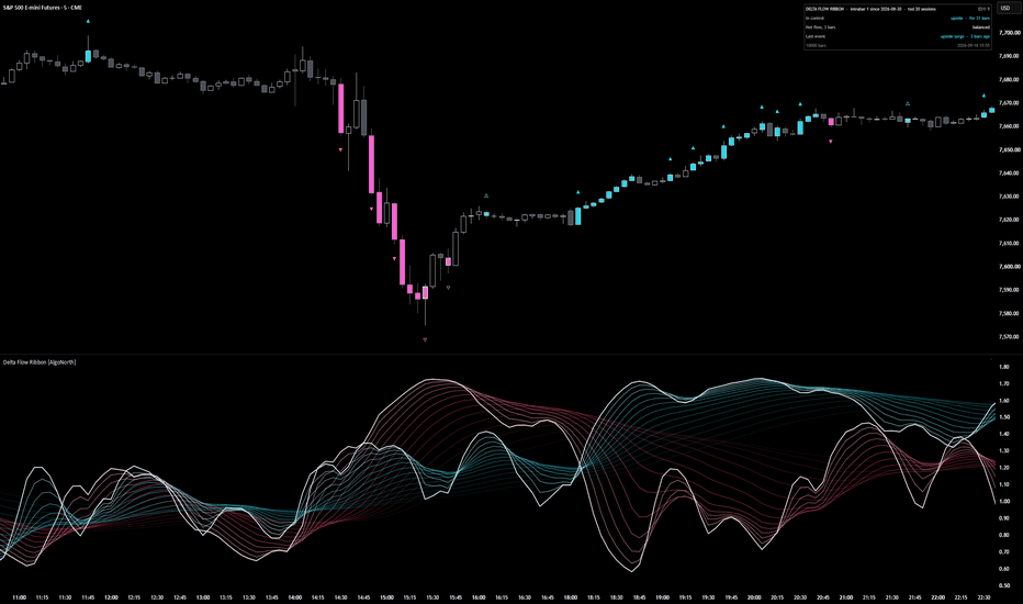
It starts with which way the volume was leaning. Two 14‑strand ribbons, blue for upside flow and pink for downside, each measured against what is normal for that exact time of day. Whichever ribbon sits on top is in control, and the fan opening or closing shows whether that control is building or fading.
The flow behind the ribbons is estimated volume delta: volume with a direction. The script looks at the 1‑minute bars inside every chart bar. Each one's volume counts as upside if it closed up, and downside if it closed down.
Then it checks whether the push worked. Candles light up where flow surges (net flow at least 2.0× normal over three bars, with price travelling with it) and where a hard push stalls (at least 1.5× normal with price travelling 0.35× or less of what that flow would usually move it). Blue for upside, pink for downside, and a lighter shade where the flow was absorbed.
It is a context tool for your own setups. It shows who is in control and when that control is being tested. It does not say what price does next.
🔶 USAGE
🔸 Start with the ribbons. Blue on top means upside flow is running ahead of downside; pink on top means downside is ahead. The bright line on top of each ribbon is its core, the quickest strand. Where the two cores cross, control has changed hands. A ribbon spread wide is flow on the move; a ribbon pulled tight is flow that has settled.
🔸 Then look up at the candles. A solid ▲ above a blue candle marks the start of an upside surge, a solid ▼ below a pink candle, the start of a downside one. A hollow △ or ▽ on a lighter candle marks absorbed flow: a heavy push went in and price barely moved. One arrow per run keeps the chart clean, and the run continues for as long as the candles stay coloured.
🔸 The candles come first and the ribbon confirms. The ribbon is smoothed over 5 to 30 bars, so its peak lands a few bars after the last coloured candle. Read the candle as the event and the ribbon as how much flow has built up behind it (the smoothing can be lowered in the settings for a quicker reaction).
🔸 The sequence worth learning: pink surge candles into a low, a light‑pink absorbed candle at the bottom, then the blue core rising up through the pink. Heavy downside flow met size, then upside flow took over. Weigh it against your own levels. It is context, not a trigger.
🔸 Price climbing while the blue ribbon slides back towards 1.0 is a move running on less flow than it started with. Price flat while a ribbon stays high is flow being soaked up. Both ribbons near 1.0 means nobody is pushing.
🔸 The panel reads the most recent bar, not the part of the chart you have scrolled to: who is in control and for how long, net flow over the last three bars, and the last event. On a live bar it says "forming now" until the bar closes. Full mode adds the raw readings, the delta source and running counts.
🔸 One thing that surprises people: the 09:30 open often shows no coloured candles at all. That is deliberate. Every bar is compared with the average for that same time of day over the last 20 sessions, so heavy flow at the open is just average for the open. A candle only colours when its flow is well above the average for its time of day.
🔶 DETAILS
🔸 Estimated delta. Each chart bar is split into its 1‑minute bars (5‑minute on charts above an hour, hourly on daily). A 1‑minute bar that closed above the previous close puts its volume into upside flow, one that closed below puts it into downside, and an unchanged close keeps the previous direction. Add them up and that is the bar's estimated delta. Where that smaller data is not available, the script places volume by where the close sits in the bar's range instead, and the panel says so.
🔸 Normal for the time of day. Volume, upside flow, downside flow and close‑to‑close travel are each averaged per time slot over the previous 20 sessions. A 5‑minute chart has 288 slots a day, and each one only ever compares itself with its own history. On charts above four hours, or until a slot has enough history, a rolling 300‑bar average takes over and the panel header shows which is in use.
🔸 The ribbons. Upside flow divided by its normal feeds the blue ribbon, downside flow divided by its normal feeds the pink. 1.0 is normal, and each side is measured up to 5×. Every ribbon is the same reading drawn at 14 smoothing lengths spaced from 5 to 30 bars, each passed through three rounds of exponential smoothing, which is what makes the fan open and close. Bars trading under 0.6× normal volume are eased back towards 1.0 so thin trade cannot throw the ribbons around.
🔸 Surge. Net flow = the 3‑bar average of delta ÷ the average one‑way flow for that time of day. A surge is net flow of at least 2.0×, with price travelling in the flow's direction.
🔸 Absorbed flow. Net flow of at least 1.5×, but the 3‑bar price change ÷ the average price change for that time of day comes to 0.35× or less of what that much flow should produce. Expected travel grows with roughly the square root of flow (exponent 0.5): four times the flow is expected to move price about twice as far, not four times. The script measures only the mismatch. Resting size on the other side is one common reason for it, not something the script can see.
🔸 Colours adapt to the chart. Put it on a white or light‑grey background and the ribbons, candles, arrows and panel darken instead of fading out.
🔶 SETTINGS
🔸 Delta: intrabar (default) or bar shape, with the intrabar timeframe on Auto or fixed at 1, 5 or 15 minutes.
🔸 Calibration: time of day (20 sessions per slot) or recent bars (300), plus the quiet threshold (0.6× normal volume).
🔸 Look: fastest strand 5, strand span 25, three smoothing passes, 14 strands, and the two ribbon colours. The defaults are smoothed on purpose. Drop the fastest strand or the passes for a twitchier ribbon.
🔸 Candles: surge at 2.0×, absorbed at 1.5× with price response 0.35×, exponent 0.5, the two candle colours, absorbed shade, arrows once per run or on every candle, arrow size, optional glow.
🔸 Alerts: control change, flow surge and absorbed flow. Pick them as named conditions, or choose "Any alert() function call" to get all three in one alert with the symbol, timeframe and readings in the message.
🔸 Scale: soft (default), log or none, with a knee for how hard extremes are squeezed. Panel: compact or full, on the price chart or in the pane, any corner.
🔶 LIMITATIONS
🔸 The delta is an estimate. It comes from 1‑minute price direction and volume, not exchange‑reported bid and ask trades, and it will differ from a true trade‑by‑trade delta.
🔸 Intrabar history runs out. Older bars beyond it use the bar‑shape fallback, and the panel shows the date the intrabar data begins.
🔸 On a 1‑minute chart there is no smaller timeframe and too few sessions inside the 10,000‑bar window, so it runs on bar shape and the recent‑bars baseline. The panel says so.
🔸 On symbols whose feed reports tick counts rather than traded size (most spot forex and CFDs), the reading is a net tick count, not a volume delta, and the panel flags it.
🔸 The script calculates the most recent 10,000 bars. Readings above 5× normal are shown as 5×.
🔸 The forming bar updates until it closes. Everything on closed bars is fixed.
🔸 Time‑of‑day calibration needs an intraday chart of four hours or less. Daily and weekly charts use the recent‑bars window.
🔶 SUMMARY
Delta Flow Ribbon turns estimated volume delta into two things you can read at a glance. The ribbons show which side is pushing and how hard for that time of day. The candles show where that push surged or was absorbed. Blue for upside, pink for downside, lighter where the flow stalled. It marks conditions, not outcomes.
Индикатор
Trend My Friend🚀 Trend My Friend (TMF)
Dynamic Midrange Breakout & Multi-Candle Confirmation System
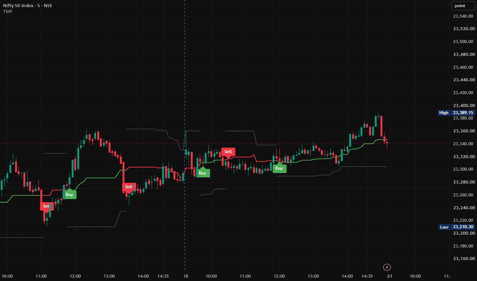
Trend My Friend (TMF) is a Pine Script® v6 trend and momentum indicator designed to identify bullish and bearish market regimes using a Dynamic Price Range, Equilibrium Midrange, and Multi-Candle Confirmation methodology.
Rather than relying on a single candle crossing the midrange, TMF evaluates consecutive candle closes relative to the dynamically calculated equilibrium level. This provides a structured framework for monitoring directional momentum, trend transitions, and dynamic market structure.
________________________________________
📊 Core Concept
TMF is built around three primary components:
Dynamic Range → Midrange Equilibrium → Multi-Candle Confirmation
The indicator continuously calculates the recent high and low of the selected lookback period, determines the midpoint between those extremes, and then evaluates consecutive candle closes around that midpoint.
This creates a simple framework for identifying whether the current market structure is developing above or below its dynamic equilibrium.
________________________________________
⚙️ How Trend My Friend Works
1. Dynamic Range Calculation
TMF first calculates the current market range using the Range Sensitivity Set.
With the default setting of 25, the indicator calculates:
• Upper Range = Highest High of the selected lookback period
• Lower Range = Lowest Low of the selected lookback period
These boundaries update dynamically as new candles are formed.
Upper Range
Represents the highest price recorded during the selected lookback period.
Lower Range
Represents the lowest price recorded during the selected lookback period.
Together, they form the indicator's dynamic structural range.
________________________________________
2. Equilibrium Midrange
After calculating the Upper Range and Lower Range, TMF calculates their midpoint:
Midrange = Lower Range + (Upper Range − Lower Range) ÷ 2
The midrange represents the central equilibrium level of the current range.
It provides the primary directional reference:
Price above Midrange → Bullish Zone
Price below Midrange → Bearish Zone
________________________________________
3. Multi-Candle Confirmation
The key feature of TMF is its Multi-Candle Confirmation mechanism.
The indicator does not confirm a directional regime simply because one candle crosses the midrange.
Instead, TMF checks the number of consecutive candles specified by the Signal Confirmation setting.
The default setting is 3 candles.
🟢 Bullish Confirmation
A bullish regime is confirmed when the required number of consecutive candles close strictly above the midrange.
For the default setting of 3:
Candle 1 → Above Midrange ✓
Candle 2 → Above Midrange ✓
Candle 3 → Above Midrange ✓
Once all required candles satisfy the condition, the bullish regime becomes active.
🔴 Bearish Confirmation
A bearish regime is confirmed when the required number of consecutive candles close strictly below the midrange.
For the default setting of 3:
Candle 1 → Below Midrange ✓
Candle 2 → Below Midrange ✓
Candle 3 → Below Midrange ✓
Once all required candles satisfy the condition, the bearish regime becomes active.
________________________________________
4. Directional Regime
Once the confirmation condition is satisfied, TMF establishes the corresponding market regime.
🟢 Bullish Regime
When the required consecutive closes are above the midrange:
• Trend state becomes Bullish
• Midrange is displayed in Green
• Lower Range becomes the active downside structural reference
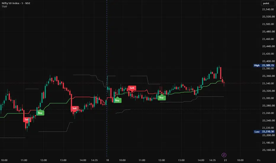
• A new Buy signal can be generated
🔴 Bearish Regime
When the required consecutive closes are below the midrange:
• Trend state becomes Bearish
• Midrange is displayed in Red
• Upper Range becomes the active upside structural reference
• A new Sell signal can be generated
________________________________________
🎯 Buy & Sell Signal Generation
TMF is designed to generate signals when a new directional regime is established, rather than repeatedly printing the same signal while the regime remains active.
🟢 Buy Signal
A Buy signal is generated when the bullish regime changes from inactive to active.
Previous State → Not Bullish
Current State → Bullish
→ BUY
This means the Buy label represents the newly established bullish condition according to the indicator's confirmation rules.
🔴 Sell Signal
A Sell signal is generated when the bearish regime changes from inactive to active.
Previous State → Not Bearish
Current State → Bearish
→ SELL
Once the bearish regime remains active, TMF does not repeatedly print Sell labels on every candle.
________________________________________
📈 Visual Interpretation
TMF uses three primary structural lines:
Upper Range
Midrange — Directional Equilibrium
Lower Range
The Midrange changes color according to the confirmed directional state:
🟢 Green Midrange → Bullish Regime
🔴 Red Midrange → Bearish Regime
⚪ Gray Midrange → No Confirmed Directional Regime
The selected SL Line Color is used for the appropriate structural range boundary according to the active trend state.
________________________________________
🔄 TMF Logic — Complete Process
The complete methodology can be summarized as:
1. Highest High + Lowest Low
2. Dynamic Price Range
3. Calculate Equilibrium Midrange
4. Check Consecutive Candle Closes
5. Confirm Bullish or Bearish Regime
6. Detect New Directional Transition
7. Generate Buy / Sell Signal
8. Continue Monitoring the Dynamic Range
This creates a straightforward process for reading directional market structure.
________________________________________
🎛️ Input Parameters
Parameter Default Function
Range Sensitivity Set 25 Number of bars used to calculate the Upper and Lower Range.
Signal Confirmation 3 Number of consecutive candle closes required above or below the Midrange.
SL Line Color Gray Controls the color used for the structural range boundary.
Range Sensitivity Set
This controls the lookback period used to calculate the dynamic range.
Lower value
• More responsive to recent price movements
• Faster structural changes
• More sensitive to short-term market movement
Higher value
• Broader range
• Slower structural changes
• More focused on larger market movements
Signal Confirmation
This controls how many consecutive closes are required to establish a directional regime.
Lower value
• Earlier confirmation
• More responsive to price changes
Higher value
• Requires more sustained movement
• Later confirmation
The appropriate setting depends on the instrument, timeframe, volatility, and trading methodology.
________________________________________
🧭 Trading Framework
TMF can be incorporated into a broader trading methodology as a trend-confirmation and market-structure tool.
🟢 Bullish Framework
After a Buy signal, traders may evaluate:
• Price structure above the Midrange
• Higher highs and higher lows
• Momentum continuation
• Breakout or retest conditions
• Volume confirmation
• Broader market trend
🔴 Bearish Framework
After a Sell signal, traders may evaluate:
• Price structure below the Midrange
• Lower highs and lower lows
• Momentum continuation
• Breakdown or retest conditions
• Volume confirmation
• Broader market trend
TMF is therefore best understood as a technical confirmation tool, rather than a complete standalone trading system.
________________________________________
🛡️ Risk Management
The dynamic range boundaries can be monitored as structural reference levels when developing a risk-management plan.
Long Positions
The Lower Range can be monitored as a potential downside structural reference.
Short Positions
The Upper Range can be monitored as a potential upside structural reference.
Stop-loss placement should be determined according to the trader's individual strategy, volatility, position sizing, market structure, and risk tolerance.
________________________________________
🎯 Trade Management
TMF does not prescribe a mandatory profit-taking method.
Traders can combine TMF signals with their preferred trade-management techniques, such as:
• Fixed risk-to-reward targets
• Previous swing highs/lows
• Trailing stops
• Structural support/resistance
• Opposite TMF regime signals
• Volatility-based exits
An opposing TMF signal may also be monitored as an indication that the current directional regime has changed.
________________________________________
🌐 Suitable Markets
TMF can be applied across a variety of actively traded markets, including:
• Equities
• Index Futures
• Forex
• Cryptocurrencies
• Commodities
• Other liquid instruments
Signal behavior can vary depending on the instrument, timeframe, volatility, liquidity, and selected parameters.
________________________________________
⏱️ Timeframe Considerations
TMF can be used across multiple timeframes, including:
Intraday
• 5-Minute
• 15-Minute
• 1-Hour
Swing / Higher Timeframes
• 4-Hour
• Daily
• Weekly
There is no single parameter configuration that is optimal for every market. Traders should evaluate the settings according to their specific instrument, timeframe, and methodology.
________________________________________
🔔 TradingView Alerts
TMF includes built-in TradingView alert conditions for directional regime transitions.
TMF Long
Triggered when a new bullish regime is established.
TMF Short
Triggered when a new bearish regime is established.
These alerts can be used for chart monitoring and compatible TradingView automation workflows.
________________________________________
💡 Why Multi-Candle Confirmation?
A single candle can temporarily move above or below an important price level before quickly reversing.
TMF therefore requires consecutive candle closes for directional confirmation.
For example, with:
Signal Confirmation = 3
One isolated close above the Midrange is not enough to establish a bullish regime.
The required three consecutive closes must remain above the Midrange.
Likewise, three consecutive closes below the Midrange are required for bearish confirmation.
This makes the methodology focused on confirmed directional movement rather than a single-candle price crossing.
________________________________________
⚠️ Important Considerations
TMF is a technical-analysis and market-structure indicator. It does not predict future prices and does not guarantee profitable trades.
No indicator can completely eliminate market noise, false breakouts, or losing trades under all market conditions.
Signal behavior may differ during:
• Sideways markets
• Low-liquidity conditions
• High-volatility events
• Sharp reversals
• Gap movements
• Rapidly changing market regimes
Users should apply appropriate risk management and consider additional market-structure or confirmation techniques where appropriate.
________________________________________
🔥 Trend My Friend (TMF)
Dynamic Midrange. Multi-Candle Confirmation. Clear Market Structure.
Trend My Friend (TMF) transforms rolling price extremes into a structured visual framework for monitoring directional market regimes.
By combining a Dynamic Price Range, Equilibrium Midrange, and Multi-Candle Confirmation, TMF provides a clean way to monitor when price establishes sustained movement above or below its dynamic equilibrium.
Structured Confirmation — Dynamic Market Structure — Clear Directional Signals
________________________________________
📌 Disclaimer
This indicator is provided for analytical and educational purposes to assist with technical analysis. Past performance does not guarantee future results. Trading involves substantial risk, and users should manage risk appropriately.
Индикатор
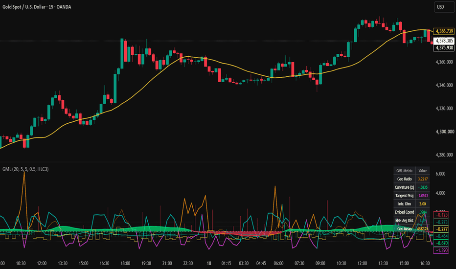
Geometry | Manifold LearningGeometry | Manifold Learning (GML) is an experimental market-structure indicator that analyzes price movement from a geometric perspective.
Traditional technical indicators often reduce market behavior to trend, momentum, volatility, or moving averages. GML takes a different approach: it treats recent price observations as points belonging to a locally evolving geometric structure, or "manifold."
The objective is not to predict future prices. Instead, the indicator attempts to describe the current structure of price movement by measuring:
• Geodesic path behavior
• Local price curvature
• Tangent projection
• Local neighborhood density using k-nearest-neighbor concepts
• Intrinsic dimensionality
• Normalized embedding direction
• Local geometric mean
These measurements are combined into a multi-component oscillator designed to help traders study whether recent price action is relatively directional, compressed, dispersed, curved, or undergoing a structural transition.
Core Concept
Financial prices do not always move efficiently from one level to another.
For example , price may begin at 100 and end at 105.
The direct displacement is only 5 points, but the actual path could have travelled:
100 → 103 → 101 → 106 → 102 → 105
The total distance travelled is substantially greater than the final displacement.
GML uses this distinction between direct displacement and travelled path as one way of describing the geometry of recent price action.
A relatively direct path may indicate more organized directional movement, while a large travelled path relative to displacement can indicate a more complex or inefficient local structure.
This concept forms the foundation of the indicator's Geodesic Ratio.
1. Geodesic Ratio
The indicator calculates two distances over the selected embedding window.
Euclidean Distance:
The absolute difference between the current price and the price at the opposite end of the observation window.
Geodesic Distance:
The cumulative absolute movement between consecutive observations within the same window.
The ratio is then calculated conceptually as:
Geodesic Ratio = Travelled Path / Direct Displacement
A larger ratio means price travelled a relatively complicated path to reach its current location.
A smaller ratio represents a more direct path.
The ratio is normalized using its historical mean and standard deviation to produce the displayed Geodesic Ratio Z-score.
Interpretation
Positive/high readings can indicate that the recent path is relatively complex or indirect.
Negative/low readings indicate that the path is relatively more linear compared with its recent behavior.
This measurement should not independently be interpreted as bullish or bearish. It describes the geometry of the path rather than its direction.
2. Local Curvature
GML estimates local curvature using first- and second-order changes in price.
The first difference measures local price movement, while the second difference measures how rapidly that movement itself is changing.
Conceptually, high curvature represents a sharper local bend in the price path.
The raw curvature measurement is normalized into a Z-score relative to its recent history.
Interpretation
Higher positive Curvature Z-scores indicate that the current local bend is unusually large compared with recent observations.
Lower readings indicate a relatively smoother local trajectory.
High curvature does NOT automatically indicate a market reversal.
It simply identifies an area where the local geometry of price has changed more sharply than normal.
The Curvature Threshold input controls how unusual curvature must become before it qualifies as a high-curvature condition within the signal logic.
3. Tangent Projection
The Tangent Projection measures the position of current price relative to a locally smoothed price structure.
The script calculates a local mean and standard deviation over the selected smoothing period and normalizes the current deviation from that local mean.
This creates a standardized representation of where price currently sits relative to its recent local structure.
General interpretation
Above zero:
Price is positioned above its local mean.
Below zero:
Price is positioned below its local mean.
Movement toward zero:
Price is returning toward its local center.
Movement away from zero:
Price is extending farther away from the local center.
The reversal logic additionally examines whether a negative tangent projection has begun recovering.
4. k-Nearest-Neighborhood Distance
The indicator compares the current price with observations inside the selected embedding window and identifies nearby observations based on absolute price distance.
The average distance of the nearest observations provides a local neighborhood-radius estimate.
This value is then normalized relative to its recent history.
Interpretation
Negative kNN Z-score:
The local neighborhood is relatively tight compared with recent conditions.
Positive kNN Z-score:
The local neighborhood is relatively dispersed.
This can be thought of as a geometric measure of local price concentration rather than a conventional volatility indicator.
The signal engine uses this information to distinguish between tighter and looser local structures.
5. Intrinsic Dimensionality
Intrinsic Dimensionality attempts to estimate how the local observations populate the surrounding price neighborhood.
The indicator compares the proportion of observations located inside:
Radius R and Radius 2R
The change in neighborhood occupancy as the radius expands provides a simplified estimate of local dimensional structure.
The result is bounded according to the configured k-nearest-neighbor setting and normalized for visualization.
Interpretation
Rather than giving a direct bullish/bearish signal, Intrinsic Dimensionality is intended as a structural diagnostic.
Changes in this value can indicate that the local organization of price observations is changing.
It is best interpreted together with the other geometric measurements rather than independently.
6. Embedding Coordinate
GML also calculates a directional coordinate from the signed movement of price relative to the total travelled geodesic distance.
The value is bounded between -1 and +1 and subsequently smoothed.
This produces the Embedding Coordinate displayed as an area plot.
General interpretation
Toward +1:
Recent movement is increasingly aligned in the positive direction.
Toward -1:
Recent movement is increasingly aligned in the negative direction.
Around zero:
Directional movement is more balanced relative to the travelled path.
The script specifically monitors transitions through -0.5 and +0.5 as components of its signal logic.
7. Geodesic Mean
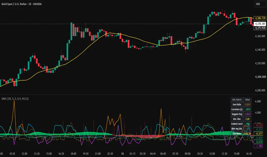
The yellow Geodesic Mean displayed on the main price chart is the simple average of the selected price source across the embedding window.
It provides a price-level reference alongside the geometric measurements displayed in the oscillator pane.
It should not be interpreted as a standalone entry or exit signal.
Signal Logic
GML includes two types of visual signals.
R — Manifold Reversal
The green "R" marker represents a potential local structural reversal condition.
It requires several conditions to occur together:
• Local curvature is unusually high
• The embedding coordinate crosses upward through its lower structural region
• The local kNN neighborhood is relatively tight
• Tangent projection is still negative but recovering
The purpose of combining these conditions is to identify situations where price has experienced significant local bending while its embedded directional structure begins recovering from a negative region.
An R marker does not mean that price must reverse.
It indicates that the script's specific geometric reversal conditions have occurred simultaneously.
C — Manifold Continuation
The red "C" marker represents a potential directional continuation condition.
It requires:
• A relatively linear geodesic path
• The embedding coordinate crossing downward through its upper structural region
• A relatively loose kNN neighborhood
This combination is intended to identify a different geometric regime from the reversal condition.
The C marker should therefore be interpreted as a structural continuation condition generated by the model, not as a guaranteed short signal.
How to Read the Indicator
Instead of focusing on a single line, GML is designed to be interpreted as a collection of geometric measurements.
A practical workflow is:
Step 1 — Observe the Embedding Coordinate
Start with the green/red area plot.
Watch how the coordinate behaves around:
+0.5
0
-0.5
Movement from an extreme region toward the center can indicate a change in the directional organization of the recent path.
Step 2 — Check Curvature
Next, examine Local Curvature.
A curvature expansion indicates that price is bending more sharply than it normally has during the current observation period.
High curvature combined with a change in embedding direction can be more informative than curvature alone.
Step 3 — Examine Neighborhood Structure
Use kNN Tightness to determine whether recent observations are relatively concentrated or dispersed.
This helps distinguish different local geometric environments.
Step 4 — Check Tangent Projection
Tangent Projection helps determine where price sits relative to its recent local structure.
For example, a negative tangent projection that begins rising can indicate recovery toward the local center.
Step 5 — Examine Geodesic Behavior
Use the Geodesic Ratio Z-score to understand whether the current price path is relatively direct or unusually indirect.
This provides additional context regarding the efficiency and complexity of recent movement.
Step 6 — Use Signals as Confluence
R and C markers are intentionally generated from multiple conditions.
They are best treated as indications that a specific combination of geometric conditions has occurred rather than as automatic trade instructions.
Users can combine GML with their own analysis of:
• Market structure
• Support and resistance
• Trend direction
• Volume
• Volatility
• Risk management
How Traders Can Use GML
GML can be used in several ways.
Structural Reversal Analysis
Look for situations where curvature expands while the embedding coordinate begins recovering from an extreme region.
This can help identify areas where the geometry of recent price movement is changing.
Trend/Path Quality Analysis
The Geodesic Ratio can help distinguish relatively direct price movement from more complicated paths.
This can provide additional context when evaluating an existing trend.
Compression and Dispersion Analysis
kNN neighborhood measurements provide information about whether recent observations are relatively concentrated or dispersed.
This can help characterize the local market regime.
Confirmation Tool
GML can also be used as a secondary analytical layer alongside an existing trading methodology.
For example, a trader may first identify a setup using market structure and then examine whether GML shows a corresponding change in curvature, embedding direction, or neighborhood structure.
Inputs
Embedding Dimension (N)
Defines the number of recent observations used to construct the local geometric window.
Lower values make the measurements more sensitive to recent price changes.
Higher values analyze a broader local structure and generally produce slower-changing measurements.
Default: 20
k-Nearest Neighbors
Controls the dimensional normalization/reference used by the local-neighborhood calculations.
Default: 5
Smoothing Length
Controls smoothing of the embedding coordinate and the local window used by the tangent-related calculation.
Lower values respond more quickly.
Higher values produce smoother measurements.
Default: 5
Curvature Threshold
Controls the Z-score threshold required for curvature to qualify as unusually high within the reversal condition.
Higher values require more extreme curvature.
Default: 0.5
Price Source
Available sources include:
Close
Open
HL2
HLC3
OHLC4
Default: HLC3
Changing the source changes the price series used by the geometric calculations.
Display Controls
Individual components can be enabled or disabled from the settings:
Show Geodesic Distance
Show Local Curvature
Show Tangent Projection
Show Intrinsic Dimensionality
Show Geodesic Mean on Price Chart
Show Signals
This allows users to simplify the display and focus on the measurements relevant to their analysis.
Information Table
The table in the upper-right corner provides the current values of several important measurements:
Geo Ratio
Curvature Z-score
Tangent Projection
Intrinsic Dimension
Embedding Coordinate
kNN Average Distance
Geodesic Mean
The table is intended to provide a compact numerical view of the current geometric state.
Alerts
The indicator provides alert conditions for:
Manifold Reversal
and
Manifold Continuation
Users can create TradingView alerts from these conditions if they want to monitor when the corresponding geometric setup occurs.
An alert indicates that the defined conditions were satisfied; it does not guarantee that the subsequent market movement will follow any particular direction or magnitude.
Why This Indicator Is Different
GML is not intended to be another conventional oscillator created by combining RSI, MACD, or moving-average crossover conditions.
Its primary calculations are built around geometric characteristics of the recent price path:
• travelled path versus direct displacement
• local curvature
• local tangent/deviation
• nearest-neighborhood distances
• neighborhood scaling
• directional embedding
These measurements are combined to provide a different representation of local market structure.
The purpose is to explore how the geometry of recent price observations changes over time rather than attempting to directly forecast future prices.
Important Limitations
GML is a simplified application of geometric and manifold-inspired concepts to a one-dimensional market price series.
It should not be interpreted as a full academic manifold-learning implementation such as Isomap, locally linear embedding, diffusion maps, or another high-dimensional machine-learning algorithm.
The kNN, geodesic, curvature, dimensionality, and embedding calculations used here are purpose-built approximations designed for real-time chart analysis within Pine Script.
Market prices are noisy and non-stationary. Similar geometric conditions can lead to different outcomes under different market environments.
Signals may also occur during sideways markets, volatile periods, news events, gaps, or other abnormal conditions.
No geometric measurement can determine future market direction with certainty.
Recommended Usage
GML is best used as an analytical and confluence tool rather than as a standalone trading system.
Users should evaluate signals in the context of their own:
market structure analysis, risk tolerance, instrument, timeframe, execution method, and risk-management rules.
Different instruments and timeframes can produce substantially different geometric behavior, so users are encouraged to study the indicator across historical market conditions before incorporating it into their process.
Educational Purpose
Geometry | Manifold Learning is provided as an analytical and educational tool for studying price behavior.
It does not provide investment advice, does not guarantee trading performance, and does not predict future market outcomes.
The calculations describe mathematical properties of historical and current price observations. Any trading decision and associated risk remain the responsibility of the user. Индикатор
Rolling Beta Drift Monitor [Pineify]Rolling Beta Drift Monitor
Overview
Tracks an asset's changing return relationship with a benchmark through rolling beta, a prior beta corridor, correlation, residual volatility, and confirmed state. It diagnoses exposure rather than predicting returns.
Problem Definition
Beta is a sample estimate, not a stable property. A moving beta can change because of covariance, low benchmark variance, unmatched sessions, or asset-specific noise. Equal betas may have different correlations. The monitor must pair observations, expose coverage, compare beta with its history, and isolate unexplained variation. Otherwise a precise coefficient may describe a fragile relationship.
Design Rationale
Log returns are scale independent. Benchmark returns use the chart timeframe, preserve gaps, disable future access, and count only with a valid asset return. This prevents forward filling but reduces cross-session coverage. Weighted moments expose missing pairs. Current beta is compared with prior estimates, excluding itself. Correlation tests coherence and residual volatility measures unexplained variation. Confirmed states use lower release thresholds to reduce chatter at the cost of delay.
Key Features
Synchronized beta and coverage gate.
Prior-only mean and one-sigma corridor.
Correlation and residual shock.
Five hysteretic states.
Optional dashboard, markers, and alerts.
How It Works
Each bar supplies asset and benchmark log returns for the same timeframe. A weight is one only when both exist. Weighted sums, squares, and cross-products over the relationship window produce means, variances, and covariance. Beta equals covariance divided by benchmark variance. Correlation scales covariance by both standard deviations. Residual variance is what the beta projection leaves; its root is shown in basis points per bar.
Output is withheld below the coverage floor or when variance is effectively zero. A second window uses prior valid beta, correlation, and residual estimates. Beta Drift Z compares current beta with its prior distribution; residual volatility is standardized likewise. At close, extreme drift enters beta-up or beta-down. Weak correlation plus residual shock, or a qualified sign change, enters decoupling. Lower releases add hysteresis. Lines develop live; states and alerts wait for close.
How Multiple Indicators Work Together
One regression supplies every component: moments determine exposure, correlation tests coherence, and residual volatility measures what beta misses. Prior standardization makes change local, coverage requires enough evidence, and hysteresis confirms state. Without correlation, weak fit resembles exposure. Without residuals, specific disturbance is hidden. Without history, drift thresholds are not comparable.
Trading Ideas and Insights
Use the monitor for portfolio and hedge context, not entries. Beta-up with firm correlation means stronger sampled benchmark sensitivity; beta-down means reduced or inverted sensitivity. Decoupling flags that a prior hedge ratio deserves review because correlation changed sign or residual noise rose. On compatible 1H–1W charts, verify coverage and assess events, liquidity, execution, and sizing separately.
Unique Aspects
Typical studies stop at rolling beta or a fixed threshold. Here one synchronized moment set drives a relationship lifecycle. Beta is judged against prior estimates; sign change requires material correlation on both sides; residual shock can reveal weak-correlation decoupling; and coverage gates each stage. Corridor opacity reports evidence quality; state color stays consistent. The contribution is this decomposition and confirmed state model, not the beta formula.
How to Use
Choose a benchmark for the exposure under review and a standard chart with a compatible calendar. Wait for WARMUP to clear. The thick line is beta; the tunnel is prior mean plus or minus one sigma; gold is correlation. Violet columns show capped residual shock; exact values stay in the dashboard and Data Window. Read confirmed transitions only after checking paired and history coverage.
Customization
Relationship Window sets covariance history; Drift Reference sets coefficient history. Minimum Coverage handles session mismatch. Beta Drift Entry controls sensitivity, while Release must be lower for hysteresis. Correlation Floor rejects tiny sign changes. Residual thresholds govern weak-correlation decoupling. Short windows vary faster; long windows retain regimes. Visual switches do not alter calculations or alerts.
Assumptions and Limitations
The method assumes comparable synchronized returns and a useful local one-factor line. Calendars, stale prices, illiquidity, actions, rolls, and benchmark choice alter estimates. Gaps are not filled. Near-zero benchmark variance is blocked, but economic relevance is not proven. Z-scores are empirical, not probabilities; references lag breaks. Residual risk is per bar, not annualized. Live visuals change; states wait for close, while inputs or loaded history can recalculate values. Causality, extra factors, costs, sizing, profitability, and execution are outside scope.
Conclusion
The monitor turns one changing coefficient into a coverage-aware diagnosis. The layers separate coherent repricing from decoupling. Review confirmed changes with independent portfolio and risk analysis.
Индикатор

D.vis Swing Engine - RP + RVOL + Trend## English
**D.vis Swing Engine – Relative Performance + Relative Volume + Trend**
D.vis Swing Engine is a swing trading indicator designed to identify stocks that combine positive trend structure, relative strength versus the S&P 500, and above-average trading volume.
The indicator combines several technical components into a single visual framework:
**Relative Performance (RP)** compares the stock's performance with the S&P 500, using SPY as the default benchmark. A positive RP value means the stock has outperformed the benchmark during the selected lookback period. The indicator also measures whether Relative Performance is improving or deteriorating.
**Relative Volume (RVOL)** compares the current trading volume with the stock's average volume over a selected period. An RVOL above 1.0 indicates above-average volume, while values such as 1.5x or 2.0x indicate significantly increased market participation.
The indicator classifies high relative volume on bullish candles as **Money In** and high relative volume on bearish candles as **Money Out**. These readings should be interpreted as proxies for buying and selling pressure rather than literal capital inflows or outflows.
The trend component uses:
- EMA 9
- EMA 21
- SMA 50
- SMA 200
The primary bullish trend condition requires price to trade above EMA 9 while EMA 9 is above EMA 21. SMA 50, SMA 200, and EMA 21 slope filters can optionally be enabled for more restrictive setups.
The indicator also calculates a **Setup Score from 0 to 5** based on five conditions:
1. Price is above EMA 21.
2. EMA 9 is above EMA 21.
3. Relative Performance is positive.
4. Relative Performance is rising.
5. Relative Volume exceeds the selected threshold on a bullish candle.
The dashboard classifies the setup as:
**WAIT** – insufficient conditions are aligned.
**WATCH** – most conditions are aligned and the stock may be approaching a valid setup.
**BUY 5/5** – trend, Relative Performance, and Relative Volume conditions are fully aligned.
A BUY label is displayed only when the complete bullish setup becomes valid for the first time, helping reduce repeated signals during an already established trend.
The indicator also includes a **RISK** condition designed to highlight potential distribution. This occurs when price falls below EMA 21, Relative Performance becomes negative, and strong relative volume appears on a bearish candle.
### Suggested settings for swing trading
- Benchmark: SPY
- Relative Performance Timeframe: Daily
- RP Lookback: 63 trading days
- RP Momentum Period: 5 trading days
- RVOL Average Length: 20
- RVOL Threshold: 1.5x
- SMA 50 Filter: Optional
- SMA 200 Filter: Optional
This indicator is intended as a decision-support tool and should not be used as a standalone trading system. Market structure, support and resistance, earnings, fundamental factors, risk management, and broader market conditions should also be considered.
---
## Română
**D.vis Swing Engine – Performanță Relativă + Volum Relativ + Trend**
D.vis Swing Engine este un indicator pentru swing trading conceput pentru a identifica acțiunile care combină o structură tehnică pozitivă, performanță relativă superioară față de S&P 500 și volum de tranzacționare peste medie.
Indicatorul combină mai multe componente tehnice într-un singur sistem vizual:
**Relative Performance (RP)** compară performanța acțiunii cu S&P 500, folosind implicit SPY drept benchmark. O valoare RP pozitivă înseamnă că acțiunea a performat mai bine decât benchmark-ul în perioada selectată. Indicatorul măsoară și dacă performanța relativă se îmbunătățește sau se deteriorează.
**Relative Volume (RVOL)** compară volumul curent de tranzacționare cu volumul mediu al acțiunii din perioada selectată. Un RVOL peste 1,0 indică un volum peste medie, iar valori precum 1,5x sau 2,0x indică o creștere semnificativă a participării în piață.
Indicatorul clasifică volumul relativ ridicat pe lumânări bullish drept **Money In**, iar volumul relativ ridicat pe lumânări bearish drept **Money Out**. Aceste valori trebuie interpretate ca aproximări ale presiunii de cumpărare sau vânzare, nu ca intrări sau ieșiri literale de capital.
Componenta de trend utilizează:
- EMA 9
- EMA 21
- SMA 50
- SMA 200
Condiția bullish principală cere ca prețul să fie peste EMA 9, iar EMA 9 să fie peste EMA 21. Filtrele SMA 50, SMA 200 și panta EMA 21 pot fi activate opțional pentru setup-uri mai restrictive.
Indicatorul calculează și un **Setup Score de la 0 la 5**, bazat pe cinci condiții:
1. Prețul este peste EMA 21.
2. EMA 9 este peste EMA 21.
3. Relative Performance este pozitiv.
4. Relative Performance este în creștere.
5. Relative Volume depășește pragul selectat pe o lumânare bullish.
Dashboard-ul clasifică setup-ul astfel:
**WAIT** – nu sunt îndeplinite suficiente condiții.
**WATCH** – majoritatea condițiilor sunt îndeplinite, iar acțiunea se poate apropia de un setup valid.
**BUY 5/5** – condițiile de trend, Relative Performance și Relative Volume sunt complet aliniate.
Eticheta BUY este afișată doar în momentul în care setup-ul bullish complet devine valid pentru prima dată, reducând astfel semnalele repetate în timpul unui trend deja confirmat.
Indicatorul include și o condiție **RISK**, concepută pentru a evidenția posibile perioade de distribuție. Aceasta apare atunci când prețul scade sub EMA 21, Relative Performance devine negativ, iar pe o lumânare bearish apare un volum relativ ridicat.
### Setări recomandate pentru swing trading
- Benchmark: SPY
- Timeframe Relative Performance: Daily
- RP Lookback: 63 zile de tranzacționare
- RP Momentum Period: 5 zile
- Media pentru RVOL: 20 perioade
- Prag RVOL: 1,5x
- Filtru SMA 50: Opțional
- Filtru SMA 200: Opțional
Indicatorul este conceput ca instrument de suport pentru luarea deciziilor și nu trebuie utilizat ca sistem de tranzacționare independent. Structura pieței, suporturile și rezistențele, raportările financiare, factorii fundamentali, managementul riscului și condițiile generale ale pieței trebuie analizate separat. Индикатор

TrendLock | Multi-Timeframe Supertrend Donchian BreakoutStrategy Explanation
TrendLock combines three independent confirmations before it will ever open a trade: a primary Supertrend for local trend direction, a higher-timeframe Supertrend that must agree before entries are allowed, and a Donchian channel breakout that times the actual entry once both trend layers align. A volume-spike filter adds a final check that real participation is behind the move, not just drift.
The idea is simple: most Supertrend scripts fire on every local flip and get chopped up in ranges. TrendLock only engages when the bigger picture and the immediate price action are both pointing the same way, and only pulls the trigger on a genuine breakout — not just a trend-line touch.
Exits are ATR-based (stop and target sized off current volatility, not fixed percentages), with an optional early exit if the primary Supertrend flips against the position.
Features
Dual-timeframe Supertrend agreement filter (toggle on/off)
Donchian channel breakout entry trigger, plotted with a shaded channel
Volume-spike confirmation filter
ATR-based stop loss and take profit
Optional trend-flip exit independent of the stop/target
Long-only, short-only, or both-direction modes
Background tint shows HTF/LTF agreement at a glance
Built-in alert conditions for long and short signals
Tips
Pick an HTF meaningfully above your trading timeframe (e.g. 15m chart → 4H filter, 1H chart → 1D filter). Too close and the filter does nothing; too far and setups become rare.
Test the HTF filter on and off separately — it should reduce trade count and whipsaws, not just trade count.
Donchian lookback and ATR lengths interact: a longer Donchian window means fewer, larger breakouts, so widen your ATR stop/target multipliers accordingly.
Try disabling the volume filter on lower-liquidity assets, where volume data can be noisy or unreliable.
Backtest across several unrelated symbols and timeframes using the same input values — if it only works on one chart, the settings are likely overfit rather than a real edge.
Warnings
This is a backtesting and research tool, not financial advice — past performance in the Strategy Tester does not predict future results.
request.security calls for the HTF Supertrend can behave differently between the visible chart and actual live execution; always forward-test on a paper account before risking real capital.
Breakout strategies are prone to false starts in choppy markets even with trend filters — expect a real losing-streak tail in the backtest, not just the equity curve's best stretch.
Commission, slippage, and order-fill assumptions in the Strategy Tester are approximations; verify against your actual broker/exchange fee schedule before sizing a live position.
The HTF filter and volume filter are optional and default to specific settings — review every input before deploying, don't assume the defaults suit your instrument or timeframe.
Стратегия

Daily Stock Stats | ADR, Levels & LiquidityDaily Stock Stats displays key stock metrics in a compact panel that can be positioned anywhere on your chart.
• ADR%: Average high-to-low percentage range over the selected lookback, defaulting to 20 daily bars. Choose Daily or Chart timeframe calculations.
• Move: Today’s percentage change from the previous regular-session close, expressed as a multiple of ADR. A stock up 4% with a 2% ADR displays +2.00x.
• LOD / HOD: Percentage distance from the current price to today’s low and high, using the current price as the denominator.
• Avg $ Volume: Average daily close × volume over completed trading days, defaulting to 20 days and adjustable to 30 or another lookback.
• Market Cap: Latest available shares outstanding × current price, converted to USD and formatted with two decimals and K/M/B suffixes.
• Sector / Industry: TradingView’s classifications for the symbol.
Customization includes nine panel positions, text size, background color, line order, and separate colors for each label—including its colon—and value. Set a line’s order to 0 to hide it.
Daily statistics use regular-session candles. Intraday HOD and LOD include the sessions visible on the chart. Daily ADR includes the developing day. Unavailable data displays as N/A. Индикатор

Volatility# Volatility — Body vs. Wick Decomposition
**Every standard volatility tool collapses a candle into one number. That number throws away the
only thing you actually needed to know: whether the range was earned or rejected.**
ATR tells you a bar was 12 points. It cannot tell you whether that was a 12-point body driving t
hrough offers, or a 1-point body with 11 points of wick where price went there and got slammed b
ack. Those two bars have identical ATR. They are opposite trades.
This indicator refuses to average them together.
---
## What it does
**Two independent histograms, volume-style.**
- **Bodies** plot up from zero — the portion of the range that *held*. Committed movement. What
actually printed a close somewhere new.
- **Wicks** plot down from zero — the portion that was *rejected*. Price went, and price came ba
ck. Failed exploration.
Each histogram has its own rolling average and its own spike threshold. A wick spike and a body
spike are different events, and the indicator scores them separately instead of blending them in
to one meaningless mean.
That separation is the whole idea. Range is not a single quantity — it is two opposing forces th
at happen to share a bar.
---
## How to read it
**Tall bodies, short wicks** — trend. The range is being converted into progress. Continuation s
etups work, mean-reversion gets ru
**Short bodies, long wicks** — a fut nobody keeps it. Fades work, brea
kouts fail. This is the state that looks identical to a trend on ATR and costs people money.
**Both compressing** — a coil. Genuine low volatility, not just quiet direction. Expansion pendi
ng.
**Wick spike with no body spike** e tried, got rejected, and the tape
told you so in real time.
**Body share of range** (in the readout) is the single cleanest number here. High share = convic
tion. Low share = indecision. Watc
Split the wick histogram into **upich side* is doing the rejecting. A
run of long upper wicks under a flat high is supply, plainly drawn.
---
## The average candle
On the price pane, the indicator draws a single synthetic candle built from the lookback: averag
e body, average upper wick, averagd separately and drawn to scale.
Crucially, the body is the **net s− open`, not the absolute average. T
his matters more than it sounds:
- In a **trend**, the moves don't cancel — you get a tall body pointing the way the market is ac
tually going.
- In **consolidation**, up and down bars cancel each other out and the body **collapses to a stu
b**, with the wicks left standing
An absolute average can't do that. body in pure chop, because it has d
iscarded the sign. Here, the shape of the average candle *is* the market regime — you read it th
e same way you read any candle, be
Switch to `Body represents: Absolulassic reading where body + wicks eq
uals the average range.
---
## Settings
**Average over** — `Candles` for a fixed bar count (default 50), or `Time` for a clock window co
nverted to bars on your timeframe.urrent leg; long windows describe th
e session's character. A very long window on a fast chart will read flat by design, because that
is the truth about a long window.
**Layout** — `Mirrored` for two ind a zero line, or `Stacked` for one
range column with the body solid inside it, preserving body + wick = range.
**Color mode** — `Above/below average` (default), `Up/down candle` for classic direction tinting
, or `Flat`.
**Spike threshold** — multiple of drawn as a step line on both.
**Avg candle** — position, width, r the body reads net or absolute.
Every color is exposed.
---
## Honest limitations
- Mirrored mode auto-scales to whiwicks routinely dwarf bodies on your
instrument, the body histogram will look compressed — use Stacked.
- The average candle is anchored iight of price, so it drifts closer a
s you zoom out. Adjust the offset.
- Wicks are measured to the extrem will distort a short lookback. That
is a feature when you want to see it and a nuisance when you don't.
---
## Why bother
Volatility is not one number. It is a *composition*. A market can be loud and going nowhere, or
quiet and going somewhere, and thet distinguish those cases because th
e information is destroyed before it reaches you.
This puts the composition back on the chart. Индикатор

Adaptive Statistical Location + Pressure Engine V1Adaptive Statistical Location + Pressure Engine — V1
ASLP describes where price sits relative to historical daily and session excursions, whether the current movement is directional or two-sided, and whether expansion is strengthening or deteriorating. When enough comparable resolved events exist, it also displays empirical first-touch outcome estimates.
Its distinguishing design combines separate upside/downside excursion distributions, independent daily/session context, non-overlapping pressure observations, and a causal event database. It keeps statistical location, movement consumption and future outcomes separate.
A high percentile describes an extended location. It does not, by itself, imply a reversal or provide a buy/sell instruction.
1. Reading the display
Teal curve: signed location relative to the selected session open.
Purple curve: signed location relative to the trading-day open.
Positive values: price is above the corresponding open; magnitude is its upper-excursion percentile.
Negative values: price is below the corresponding open; magnitude is its lower-excursion percentile. A reading of -90 means the 90th percentile of downside excursion, not the 10th percentile of a symmetric price distribution.
Zero: the corresponding open. Location is not a distance scale: a 10-point change on the pane does not mean a fixed price change.
State ribbon: green indicates expansion, darker green strong expansion, gold two-sided volatility, blue an extreme state, orange/red an exhaustion candidate, and purple reversion in progress. Gray shades represent normal, compressed or unavailable context. The ribbon's vertical position is a layout choice, not a score.
Small pane markers: circles identify extreme entries; red diamonds identify exhaustion candidates. Price-chart text and event paths are off by default.
Dashboard: Compact emphasizes location, state, pressure and the most recent event forecast. Detailed and Research expose additional diagnostics.
Curves deliberately break when their session/day reference changes or a valid estimate is unavailable. Connecting different opens would imply continuity that does not exist. The subtle daily boundary tint appears in the indicator pane.
2. What location measures
For each completed historical period, the engine stores percentage Open-to-High and Open-to-Low excursions separately. During an active period it compares the current close's displacement from that period's open with the appropriate historical distribution.
Upper location = 100 × fraction of matched historical upper excursions less than or equal to the current upward displacement.
Lower location = 100 × fraction of matched historical lower excursions less than or equal to the current downward displacement.
For example, an upper reading of 90 means the current upward displacement equals or exceeds 90% of sampled historical upper excursions. It does not mean a 90% chance of continuation or reversal. Finite-sample readings can reach 100 without imposing a price ceiling.
Movement matching uses weekday, session, completed-day volatility regime and previous completed-period state where supported, then relaxes conditioning when samples are sparse. The selected historical distributions are frozen at the start of the active period.
Default location regions
Below 25: Central.
25 to below 75: Normal.
75 to below 90: Stretch.
90 to below 95: Extreme.
95 and above: Tail.
The direction is reported separately as Upper or Lower. These are empirical descriptive regions, not fair-value estimates. Daily and session location use independent opens and distributions; a stretched session can coexist with a normal daily reading. Benchmarks are completed-period distributions, not same-minute-of-session distributions, so an early session can naturally look compressed.
3. Range, efficiency and pressure
Range percentile: ranks the active High-Low range against historical completed ranges. It measures total movement, not where the close sits.
Consumption: current range divided by historical Q50, Q75 or Q90 range. Consumption above 100% means that historical quantile has been exceeded; it does not mean price has exhausted a fixed allowance.
Directional efficiency: abs(Close-Open)/(High-Low). High values indicate net displacement accounts for much of the observed range.
Close Location Value: ((Close-Low)-(High-Close))/(High-Low). Its -1 to +1 scale identifies where the close sits inside the active range. A separate direction-adjusted close rank evaluates proximity to the movement's own extreme.
Marginal progress: over completed non-overlapping blocks, the engine divides signed close progress by incremental range, with a denominator floor of 0.05 × frozen Q50 by default. This limits instability when range barely grows. The value can exceed 1 and is not a probability.
Marginal progress is ranked against historical blocks from the same session and elapsed-age bucket. The direction must remain consistent across the block. Default blocks are 30 minutes.
Pressure categories
Strengthening: efficiency and direction-adjusted close ranks are at least the 75th percentile, marginal progress rank is at least the 50th percentile, signed progress is positive, and price extends the directional extreme.
Weakening: efficiency declines, price retreats from the directional extreme, and either marginal rank is at or below the 25th percentile or signed progress is negative.
Stable: a rated block meets neither condition.
Unrated: insufficient valid block history. This is not evidence of stable pressure.
Pressure reflects completed blocks and can remain unchanged between them. Efficiency and close ranks use completed-period benchmarks; they are descriptive comparisons, not calibrated future-outcome probabilities.
4. State and exhaustion logic
Compressed so far: range percentile is below the Central boundary. This does not predict that the completed session will remain compressed.
Directional expansion: range percentile reaches the Stretch threshold, while efficiency and directed-close ranks both reach 75.
Strong expansion: directional expansion plus strengthening pressure.
Two-sided volatility: range reaches the Stretch threshold while efficiency rank is 25 or lower.
Statistical extreme: location reaches the Extreme threshold when a higher-priority state does not apply.
Exhaustion candidate: the same direction previously expanded during this session, location remains extreme, range reaches the Stretch threshold, and pressure weakens.
Reversion in progress: after an exhaustion candidate, price crosses the session open in the opposing direction.
States follow an explicit precedence rather than displaying overlapping categories. Exhaustion requires deterioration after expansion. The separate toward-open event outcome below can occur before any cross of the session open.
5. Empirical first-touch outcomes
Eligible observations come from expansion, extreme-entry and post-expansion weakening states. Their forecasts and barriers are frozen at the confirmed entry close. Observation starts on the following candle.
With default settings, an event records which of these happens first:
Continuation first (C): price travels another 0.25 × frozen session Q50 in the event direction.
Toward-open first (R): price travels 0.35 × Q50 against that direction, capped at the distance back to the session open. R means a retracement toward the open, not necessarily a full trend reversal.
Timeout: neither barrier is reached within 120 minutes or before the source session ends, whichever comes first.
Ambiguous: both barriers are touched in the same candle and OHLC cannot establish their order. If the candle opens beyond a barrier, that known first observation is used; otherwise the event remains a separate ambiguous class.
Invalid/gapped observations can be censored and excluded from outcome training. There is one pending event across the engine at a time. Each session instance can admit each direction/family combination only once, with optional admission at completed-block checkpoints. This prevents repeatedly labeling every candle of one sustained condition.
The dashboard percentages belong to the timestamped last admitted event. They are not continuously recalculated predictions for the latest candle. Compact shows C and R; Detailed also shows Timeout and Ambiguous. The four classes sum to 100% before display rounding.
6. Samples, fallback and uncertainty
A forecast requires at least 40 resolved events in its selected bucket by default. Total learned events can be much larger than the number matching a particular state.
Core matching uses session, location and pressure, while always preserving direction, elapsed-age bucket and event family. Fallback progressively removes session, pressure and location. The optional broadest fallback also pools event families while retaining direction and age. Such estimates are explicitly labeled broad/pooled; they are not precise forecasts for one narrow state.
When at least 20 records exist in the broader parent group outside the selected bucket, estimates are shrunk toward that disjoint group's frequencies. The default prior weight is 20. Otherwise raw frequencies are used. Prior weight never increases the reported observed sample count.
Optional regime, weekday or previous-state refinement is selected only when supported by paired historical forecast errors: at least 60 evaluations and mean Brier improvement greater than 2.4 estimated standard errors. Only one additional feature is selected at a time. This is a practical screening rule, not proof that a feature will remain useful.
Reliability labels follow explicit rules:
Insufficient: fewer observations than Minimum outcome bucket n.
Low / broad fallback: location-only, family-base or pooled-family matching.
Moderate: a more specific bucket with at least 80 events and maximum raw class-wise Wilson interval width no greater than 22 percentage points.
Good (nominal): a more specific bucket with at least 160 events and maximum interval width no greater than 16 percentage points.
Low: other supported forecasts.
Research mode reports raw 95% Wilson intervals for C and R. These are nominal binomial intervals around unshrunk class frequencies, not posterior intervals around the displayed shrunk probabilities. Serial dependence and market change can make actual uncertainty larger.
7. Setup and daily/session timing
Use standard time-based candles on a positive-priced instrument. Start with 5-minute or 15-minute charts. The script accepts 1–30 minutes; pressure blocks and outcome horizons must be exact multiples of the selected timeframe.
Leave Daily reset reference at Symbol trading day to follow the data feed's daily-bar boundaries. Use Custom timezone boundary only when a different analytical day is intended. DAY START shows the active anchor and its timezone.
Configure sessions to match available trading hours. Session candles must not straddle configured boundaries. Each session's IANA timezone handles its own daylight-saving changes; changing the chart's display timezone does not redefine these sessions.
For 24/7 crypto, enable Include weekends. Defaults exclude weekends.
Wait for movement and event warm-up. Start with Compact, then use Detailed to inspect consumption and Research to inspect forecast evidence.
Default independent session windows:
Asia: 09:00–17:00, Asia/Tokyo.
London: 08:00–12:00, Europe/London.
London/NY overlap: 12:00–16:00, Europe/London.
New York: 09:00–15:00, America/New_York.
NY PM: 15:00–17:00, America/New_York; disabled by default.
These are configurable analytical windows, not universal exchange definitions. The overlap window is London-timed and does not automatically recalculate the true intersection of London and New York hours during differing DST transition weeks. Auto priority selects the highest-numbered enabled active session: NY PM, New York, overlap, London, then Asia. Independent session statistics continue to update, but event admission follows the focus session.
8. Parameter guide
Sampling: completed session/day/block caps default to 1200/500/2400. Minimum distribution n is 30. These caps bound retained records, not how much data TradingView loads. Completed-day regime mean length defaults to 10; the period-range data guard is 50%. Regime and previous-state movement conditioning are enabled.
Daily gap treatment: Observed feed permits maintenance closures inside daily aggregation. Strict contiguous rejects gaps. The default cannot distinguish planned closures from missing data; analytical sessions, pressure blocks and outcome labels still apply gap checks.
Location / pressure: Central/Stretch/Extreme/Tail boundaries default to 25/75/90/95. Pressure blocks default to 30 minutes; the marginal denominator floor is 0.05 × Q50. These thresholds are explicit model choices, not statistically optimized constants.
Outcome storage and support: retain up to 1200 resolved events; minimum bucket size 40; prior strength 20. Pooled-family fallback and completed-block checkpoint admission are enabled by default.
Outcome definition: horizon 120 minutes, continuation distance 0.25 × Q50, toward-open distance 0.35 × Q50, minimum entry displacement 0.10 × Q50. Changing these settings changes the question being estimated and rebuilds the historical labels.
Optional feature gate: enabled by default; paired evaluation window 200 and minimum evaluations 60. Turning it off uses the core/fallback model rather than forcing every optional feature into conditioning.
Probability alerts: default threshold 60%. These can fire only on a newly admitted event with sufficient empirical support.
Display: Compact, Detailed or Research; Light/Dark theme; Small/Normal/Large font. Dashboard, historical location and state ribbon are enabled by default. Price labels, nearest-level tags, active price zone and event paths are optional.
Label controls: text on price requires the master Research: allow text labels on price switch plus the relevant marker/path option. Marker cap defaults to 100; event-path retention defaults to 70. These affect drawing retention, not learning.
Historical research / audit: defaults to the last 300 eligible resolved observations. Entry-from and resolution-through timestamps filter audit inclusion, not the underlying training history. The audit table appears only in Research mode. Session-reset dots can be enabled independently.
9. Historical evaluation and alerts
Research mode compares forecasts frozen at entry with later first-touch outcomes. It reports model and broader-base Brier loss on the same supported events, Brier skill, most-likely-class accuracy, and mean predicted versus observed R frequency. Lower Brier loss is better. Zero skill means no improvement over the baseline; negative skill means worse performance. This is a forecast-quality audit, not a trading strategy backtest: it has no entries/exits, costs, slippage or portfolio P&L.
Supported historical entry forecasts, barrier prices and entry/result timestamps are available in the Data Window. Use the entry timestamp to associate an outcome with its original forecast. Unscored warm-up observations are not retroactively assigned predictions using later data.
Available alerts cover upper/lower extreme entry, strong expansion, weakening pressure, upper/lower exhaustion candidates, empirical C/R thresholds, and resolved C/R outcomes. Configure alerts for Once Per Bar Close. Statistical alerts describe observed conditions or empirical event forecasts; they are not order instructions.
10. Training and limitations
State changes use confirmed chart bars. Resolved outcomes enter training only on a later bar, never while their future outcome is unknown.
Training is reconstructed from the chart data available on each execution. There is no persistent external model, imported pretrained weights, or hidden additional intraday history.
A historical lookup buffer is different from the total number of executed chart bars. Increasing record caps cannot manufacture older candles or independent events.
Session coverage, symbol feed, chart timeframe and loaded start date affect samples and results. Some instruments cannot supply complete coverage for the default sessions.
Incomplete starting periods and invalid observations are excluded where applicable. Missing estimates remain unavailable instead of being filled with invented values.
No lower-timeframe reconstruction is used to resolve within-candle ordering. Ambiguous outcomes remain visible as their own class.
Changing parameters, chart history or feed data rebuilds the study and can change results. Confirmed-bar processing does not make the study invariant to those changes.
Adjacent events can remain dependent despite de-duplication. Small samples, feature selection and changing market structure limit inference. No predictive advantage or profitability is claimed.
Author and license
V1 is the first public release by uPaSKaL. Source code is distributed under the Mozilla Public License 2.0. Индикатор

RedK Multi-Modal TrailingStop (RedK MMTStop)█ RedK MMTStop - Release Notes
Introduction & background
RedK MMTStop is a Multi-Modal Trailing Stop indicator - Let's quickly explore the "trailing stop" concept first as a refresher - then explain what a multi-modal trailing stop indicator does.
A "Trailing Stop" is what helps traders avoid giving back profit because they held an open position for too long. A trailing stop follows (trails) the price movement in the trade direction - never moves in the opposite direction - as long as the position moves in the trade direction, the trader is watching a growing "unrealized profit".
The Trailing Stop will then alert the trader when the move is weakening, or is over (reversing). The position is then closed (automatically if the platform provides that feature, or manually by the trader) to "realize" the maximum profit.
Read more about this concept in TradingView's own support guide on Trailing Stops
A Trailing Stop is a core function for effective position & risk management, and there are various methods to implement a trailing stop. Regardless of the trailing stop method, the basic premise is the same: this mechanism is what enables the trader to maximize their position profit, and is the key to avoiding situations where profitable positions reverse into losses - which can happen to any trader, regardless of experience level - it's just the nature of trading. For that reason, there are so many Trailing Stop indicators out there, and many of them are of high quality.
What makes RedK Multi-Modal TrailingStop (RedK MMTStop) different, is that it provides traders with 5 of the most-common trailing stop methods, and packages these 5 methods into the same insights, visuals and alerts engines - in an attempt to deliver maximum trade management support with the utmost flexibility in the choice of trailing stop method - The result is a tool that can work for any style of trading (scalping, swing, position/trend...), for any timeframe, and for any traded instrument, be it FOREX, Crypto, Futures, Stocks, CFDs ...etc.
█ RedK MMTStop: Indicator Components
Below we explore the 5 trailing stop methods, the trader's insights (info panel), the visuals (the safe zone / bands) and the alerts.
The below screenshot shows the main elements of the RedK MMTStop
🔷1. The 5 Trailing Stop Methods
ATR / Supertrend: trails a volatility-based distance from price. The classic all-purpose stop.
Chandelier: hangs an ATR distance off the recent swing high (long) or low (short).
Donchian: trails to the recent swing low (long) or high (short). Turtle-style, structure-based.
StdDev Channel: trails a standard-deviation / statistical (Bollinger-style) distance.
Fixed %: trails a set percentage of price. Simple and predictable.
Switching method never changes the insights, the visuals or the alerts. Every method feeds the same stop line, the same flip logic, and the same five alerts — so your setup keeps working as you adjust to find the method that works best for a specific setup.
🔷 2. The Critical & Safe Zones
The stop line tells you where to exit. The Status line (along with the Critical / Safe bands) tells you how close you are.
The "Status Line" measures the gap between price and the stop in ATR units, then colors it:
🟢 Safe — plenty of room. Let it run.
🟡 Watch — getting close. Pay attention.
🔴 Critical — price is near the stop line. Decide now.
The colored bands sit between the stop and price on the chart. Band borders can be shown or hidden separately from the colored fill. The Safe Zone is calculated based on (user-adjustable) ATR value, so it is "volatility-aware" - It uses its own ATR setting (regardless of the selected Trailing Stop method) to ensure it works the same across all five methods — including the ones with no ATR setting of their own.
🔷3. The Info Panel
A compact panel showing the live state at a glance (some elements will update in real time):
Active trailing stop method and its key setting - color coded for direction
Current stop price and trade side
Distance from price to stop
Color-coded Status Line (Safe / Watch / Critical) with distance to stop in ATR units
The exact prices where the colors (zones) transition
For the Info Panel, text size (Small / Normal / Large) and position (Top / Middle / Bottom Right) are selectable.
🔷4. RedK MMTStop Alerts
There are 5 alerts introduced in this version to help maximize the use of the RedK MMTStop - These alerts work the same regardless of which trailing stop method is selected and the associated settings - They will also work regardless of the visual or the info panel settings.
Trend flipped up
Trend flipped down
Close crossed below the stop
Close crossed above the stop
Price entered the Critical zone
Note: A numeric flip signal is also exposed in the Data Window for use with the Pine Screener.
The below screenshot shows the 5 alerts provided by RedK MMTStop
==================================================================================
█ RedK MMTStop Indicator Settings & Usage Examples
The screenshot below shows the RedK MMTStop indicator settings box, split into 3 sections, and what each section does.
The below screenshot shows a "position trader" using RedK MMTStop on 1D timeframe to manage 5% -based trailing stops on NASDAQ:NVDA - showing examples for both a long and a short positions and how to use the indicator to identify critical zones for exit.
The below screenshot shows a swing trader using RedK MMTStop on 30min timeframe to track an ATR / SuperTrend -based trailing stop on an open long position in OANDA:XAUUSD - the position is getting an amber "Watch" alert in the Info Panel
With the way RedK MMTStop is built, the scenarios are unlimited - Please note that while every effort was made to provide the most commonly used settings for each method as default - they are not suggestions or advice - You need to adjust your trailing stop method and settings to what suits your style of trading, your timeframe and your own risk tolerance. This is critical for the proper use of this, or any other, indicator.
==================================================================================
📝 Notes on Use and Limitations
==================================================================================
This is an analysis and risk-management tool, not a signal service and not trade advice. Also a trailing stop is a mechanism that helps you manage an existing position — it does not tell you what or when to buy or sell. Test any settings on your own instruments and timeframes before trading them.
The markers and alerts here describe price action readings. They are not advice to enter or exit any position, and the indicator does not claim predictive accuracy.
==================================================================================
⚠️ Important Notes & Disclaimer
==================================================================================
Using this indicator means you have read and agreed to the following:
Not Advice. This indicator, and other work of this author, represent analytical studies of price and volume behavior. No parts should be considered buy/sell recommendations or signals — “Bulls” and “Bears” describe measured states only. Nothing here is financial, investment, or trading advice.
Risk & Responsibility. Trading involves substantial risk of loss and is not for everyone. All decisions, interpretation, and risk and money management are yours alone. Past behavior does not predict future results. The author accepts no liability for any loss or consequence arising from use of this tool.
Indicator Provided As-Is. Feature requests are welcome and can be shared with the author, but whether or when any request is implemented cannot be promised or guaranteed.
Индикатор

GM VWAP Reversal - Candle ConfirmationGM VWAP Reversal - Candle Confirmation
A mean reversion indicator that combines VWAP deviation bands with a candle-close confirmation sequence. It looks for potential reversals following price extensions away from VWAP, using VWAP as the reference for a possible return toward the mean.
HOW SIGNALS WORK
SELL sequence:
1. A candle closes above the upper outer VWAP band, starting the leading move.
2. A later bearish candle becomes C1.
3. A later bearish candle closes below C1's close and becomes C2.
4. A subsequent candle closes below C2's close, confirming SELL if the entry-zone and optional ADX conditions are satisfied.
BUY follows the opposite sequence below the lower outer band, using bullish C1 and C2 candles and a subsequent close above C2's close.
The leading move may span multiple candles. Intervening candles are allowed, and the final confirmation candle does not require a specific body direction. Wick breaks alone do not trigger signals.
VWAP AND ENTRY ZONES
Default outer bands are set at 2 standard deviations from VWAP. At confirmation, SELL must remain at least 1 standard deviation above VWAP, and BUY at least 1 standard deviation below it. This prevents signals from appearing too close to the mean.
Available VWAP anchors:
- Session
- Week
- Month
Session is the default and follows the symbol's daily session boundary. The anchor should be longer than the chart timeframe. The default calculation source is Close; HLC3 is also available.
SIGNAL FILTERS
- All setup and signal decisions use confirmed candle closes.
- One signal is allowed per excursion. A close at or beyond VWAP rearms that side.
- A new VWAP anchor resets pending setups.
- Pending setups can expire or be cancelled when price reaches VWAP or closes beyond the locked setup extreme.
- The optional ADX filter blocks confirmation when ADX is above the selected threshold and rising. It is disabled by default.
- If the first qualifying entry close fails the entry-zone or ADX check, the setup is consumed rather than producing a delayed signal.
DISPLAY AND ALERTS
- Upper and lower VWAP zones
- BUY and SELL markers
- Optional Leading, C1 and C2 markers
- C2 closing-price reference line
- Optional setup invalidation reference
- Optional dashboard
- BUY, SELL and combined alerts
The dashed target line records VWAP at the moment of the signal. The live VWAP continues to update.
USAGE AND LIMITATIONS
The indicator requires a data feed with volume and waits for a configurable number of candles after each VWAP reset. VWAP and its bands update during an open candle; signal decisions wait for the candle to close.
Price can remain outside the bands during strong trends. A signal identifies a confirmed reversal setup under these rules, not a guaranteed return to VWAP.
This is an indicator, not an automated trading or backtesting strategy. Default settings are starting points for testing, not optimized performance claims. Индикатор

Market Regime EngineKnow the market you're in before you trade it — adaptive k-means volatility + a trend/range read that tells you whether to trend-follow, fade, or stand aside.
The same setup that prints money in a trend gets chopped to pieces in a range. Market Regime Engine reads the environment first — is price TRENDING or RANGING, and is volatility LOW, NORMAL or HIGH — then tells you which playbook fits: trend-follow, fade the range, or stand aside in the chop.
── TWO HONEST, ADAPTIVE READS ──
• Volatility (self-learning) — a genuine k-means clustering (k = 3) of ATR over a rolling window. The model continually re-learns the market's own low / normal / high volatility buckets instead of using fixed thresholds, so it adapts to each symbol and timeframe. No black box, no "AI" hand-waving — just clustering you can read in the code.
• Behaviour — the Kaufman Efficiency Ratio: how much of the recent range was actual directional progress versus back-and-forth noise. Above your threshold = TRENDING, below = RANGING.
Direction (▲/▼) comes from price versus a bias EMA, so a trend is labelled TRENDING ▲ or TRENDING ▼.
── WHAT YOU SEE ──
The background (and optionally the candles) colour by regime — green up-trend, red down-trend, blue range. A label marks each regime change. Everything is confirmed on close.
── READING THE DASHBOARD ──
• Regime — the current state: TRENDING ▲, TRENDING ▼ or RANGING.
• Confidence — 0–100 conviction. For a trend it rises the further the efficiency ratio is above your threshold; for a range it rises the further below. It measures how cleanly price fits the state, not a win rate.
• Volatility — Low / Normal / High, from the k-means cluster the current ATR falls into.
• Efficiency — the raw efficiency ratio as a percent, with your threshold beside it.
• Bias — whether price is above or below the bias EMA.
• Play — the suggested approach for this regime: "Trend-follow pullbacks", "Fade the range", or "Stand aside — chop" (ranging + high volatility).
── HOW TO USE IT ──
Use it as a filter on top of your own system:
• TRENDING → take trend-following entries (pullbacks, breakouts); avoid fading.
• RANGING + Low/Normal vol → mean-reversion at the range edges works best.
• RANGING + High vol → the danger zone; expect whipsaw, size down or stand aside.
It pairs naturally with structure/SMC or momentum tools — let the regime decide which of your setups to trust right now.
── NON-REPAINTING ──
The efficiency ratio, the volatility cluster and the regime are all evaluated on closed bars (barstate.isconfirmed), so a regime label does not repaint after the fact.
── SETTINGS ──
Trend/range window, trend threshold, bias EMA, and the volatility training window (how many bars the k-means model learns from) are all adjustable, along with background/candle colouring, the regime-change labels, dashboard position/size and every colour. The defaults (efficiency window 20, trend threshold 0.35, bias EMA 100, training window 150) were chosen from out-of-sample testing across the major coins on 1H–1D — the settings where a TRENDING call carried the strongest forward directional edge.
── A NOTE ON HONESTY ──
"k-means" here is a real, transparent clustering of volatility — deliberately simple and readable, not a predictive machine-learning oracle. It classifies the current environment; it does not forecast price.
Free and open-source (Mozilla Public License 2.0) — the full logic is on the Pine tab.
This tool is for research and education. It is not financial advice and does not guarantee profit. Test on your own markets and manage your own risk.
Индикатор

RTH Gaps and Expected MoveDaily Expected Move (Rule of 16) + RTH Gaps
Two things worth knowing at the cash open: how far the day is likely to travel, and what unfilled space the overnight session left behind.
Expected move
The script divides the volatility index by sqrt(252) ≈ 16 to turn annualised implied volatility into a one-day standard deviation, then draws 0.5σ, 1σ, 2σ and 3σ around the previous RTH close (session open optional). Levels are fixed at the open and cannot repaint; the index value used is the previous session's last value. The index follows the symbol: VXN for Nasdaq, RVX for Russell, VXD for Dow, VIX otherwise, or set your own. Past sessions can be kept on the chart for backtesting; each old line stops at the last bar of its session.
RTH gaps
At each session open the script boxes the distance between that open and the previous RTH close. As price trades into a gap the box shrinks from the current bar onward while the part to the left keeps its original height, so the gap leaves a staircase showing how large it was at every bar. The box is deleted once price crosses it fully.
Table
The current session's levels, highest to lowest, with the last price slotted between the level above and below it, and the distance to each in points, ticks or percent.
Use it on an intraday chart set to regular trading hours
It runs on 24-hour charts too, but there the overnight bars mitigate the gaps, so a gap can be marked filled by a thin 3 a.m. move. Daily charts and higher are not supported.
Originality
Gap boxes and expected-move levels exist separately elsewhere. Here the gap boxes keep their history instead of erasing it, and both features share one anchor (the previous RTH close) so a gap can be read against the expected move directly.
Limitations
Gaps are only measured at session boundaries; set the session input to match your instrument. The expected move assumes normally distributed returns, so real tails are fatter than ±3σ suggests. TradingView allows 500 boxes, lines and labels per scrip; the three maximum inputs exist for that reason, and raising them past the budget makes the oldest drawings vanish silently. No levels are drawn if the volatility index has no data. Индикатор

Volume Spike Radar [AxeAlgo]Volume Spike Radar
--
What it does
This indicator flags statistically abnormal volume the moment a bar closes, and instead of just saying volume was big it classifies what kind of event likely happened based on the relationship between that volume and the price range the bar actually produced. It separates four distinct situations. Absorption is heavy volume with a compressed range, often a sign that large resting orders are soaking up buying or selling pressure without letting price travel, and is a classic early reversal tell. Breakout is heavy volume paired with a wide, expanded range, suggesting aggressive orders are actually pushing price through a level rather than just defending it. Climax is extreme volume that caps an already extended run of same direction closes without any fresh range expansion, which is the classic exhaustion or blow off signature seen at the end of a move rather than the start of one. Anything left over is treated as a plain elevated spike with no distinct character.
On top of classification, the indicator flags effort versus result divergence, which happens when an extreme volume bar pushes hard in one direction but still fails to make a new high or low compared to recent price action, suggesting participants on that side got trapped rather than rewarded. A running estimate of cumulative volume delta, built from where each candle closed within its own range, shows whether recent volume has been net accumulating or net distributing over the last several bars. Every volume reading can also be normalized against that specific hour's own historical average, so a session open that is naturally busy every single day stops being repeatedly flagged as unusual just because of the time it happens, and only a bar that is unusual even for its own hour gets the extra marker.
How it works
Volume is measured against its own rolling average using either a straightforward relative volume multiple such as three times the average, or a statistical z score measured in standard deviations, with separate moderate and extreme thresholds for whichever method you choose. Every qualifying bar's total range is compared against its own ATR to decide whether it lands in the absorption, breakout, or climax bucket, and a consecutive same direction run counter is used specifically to detect climax conditions, since a climax by definition needs an extended move behind it rather than an isolated spike. Rapid fire spikes that occur within a small, configurable number of bars of each other are merged into a single growing event badge that shows the bar count and the peak multiple reached during that cluster, instead of stacking a separate tag on every single bar, which keeps fast moving or highly volatile charts readable instead of turning into a wall of overlapping text.
An optional smart candle coloring tints each qualifying bar according to its classification so the character of a move is visible without needing to hover over every tag, and a dashboard summarizes the current volume regime as quiet, normal, elevated, or extreme, the direction of the cumulative delta trend over the last several bars, the time of day adjusted reading, how many spikes have occurred so far in the current session, and the details of the most recent qualifying event.
How to use it
Choose between relative volume and z score depending on whether you prefer an intuitive multiple of average volume or a stricter statistical outlier test that adapts automatically to how noisy a symbol's volume normally is. The badge display mode lets you choose how much detail shows up on the chart itself, from showing every qualifying spike, to only the key institutional style events such as absorption, breakout, climax, and divergence, to only the very largest outliers, to hiding badges completely and relying on candle coloring alone for a cleaner look. Session windows for the major market opens can be highlighted so a spike can be read in the context of whether it happened during a typically active window or outside of it.
The advanced tuning section exposes the exact thresholds behind every classification, including how compressed a range needs to be to count as absorption, how wide it needs to be to count as breakout, and how long a directional run needs to last before a spike there can be called a climax, so the definitions can be tightened or loosened to match how a specific symbol or timeframe normally behaves. This tool describes historical volume behavior that has already happened on a confirmed bar. It is meant to add context to your own analysis of price action, not to function as a standalone buy or sell signal on its own.
Alerts
Alerts are provided for bullish volume spikes, bearish volume spikes, extreme tier outliers regardless of direction, absorption events, breakout volume, climax and exhaustion events, and effort versus result divergence.
Non repainting
Tags, badges, classification, cumulative volume delta, and every alert are evaluated on confirmed bar closes only and never move or change once they have been printed. The background glow and the smart candle coloring are the two live elements on the chart, and both are designed to track the forming bar in real time the same way a standard volume histogram does, settling into their final state the instant the bar actually closes.
Disclaimer
This script is provided for educational and informational purposes only. It visualizes historical volume statistics based on past price and volume data, and it does not predict future price movement in any way. Nothing in this indicator constitutes financial advice or a recommendation to buy or sell any instrument. Always use proper risk management and combine this tool with your own independent analysis before making any trading decision.
Индикатор

Индикатор

Lorentzian Classifier AI - Prediction Accuracy [Dots3Red]🧭 LORENTZIAN CLASSIFIER AI - PREDICTION ACCURACY TRACKER
Lorentzian distance is a way of measuring how similar two market states are that doesn't let a single outlier feature dominate the comparison. This script uses it to find historical moments that genuinely resembled right now, has them vote on direction — and then keeps an honest, running record of whether those votes have actually been right.
✨ WHY THIS MATTERS
Most similarity-based classifiers measure "how alike" two moments are using plain squared differences — the market equivalent of a ruler. The problem: if one feature briefly spikes (a volatility burst, a momentum blow-off), a ruler-based measurement can wrongly flag two genuinely similar moments as very different, just because of that one temporary outlier.
Lorentzian distance compresses that effect. Two market states that matched closely overall still get recognized as similar, even when one feature happened to spike on one of them. The practical result is a comparison method that's less easily fooled by noise.
📊 Accuracy: 58% (n=214)
It's a scoreboard. Out of 214 predictions this classifier has made on this specific chart, 58% turned out correct. It updates continuously as more predictions resolve.
⚙️ HOW IT WORKS
📐 Four features — RSI, CCI, a directional strength measure (from DMI), and a momentum reading (ROC), each normalized to a comparable scale. Every bar's combination of these four values is treated as a "market state."
🔍 Lorentzian comparison — instead of squared Euclidean distance, similarity between the current state and every past state is measured using log-space differences: log(1 + |difference|) per feature, summed. This is the mechanism that reduces the influence of any single feature being temporarily far apart.
🗳️ K-nearest-neighbor vote — the most similar historical states (configurable count) vote on what happened next: did price rise or fall over the following bars? The vote split becomes the current lean, shown as a percentage.
🎯 Rolling, honest grading — every prediction is stored at the exact moment it's made and only graded once its outcome window has fully closed, using the vote as it stood at that time — never recalculated afterward with the benefit of hindsight. This is what makes the accuracy stat trustworthy rather than circular.
🔒 Non-repainting — predictions and their grading both happen strictly on confirmed bars.
🧭 HOW TO USE
1️⃣ Wait for the training sample to build. Early on a fresh chart, the dashboard shows "Training…" instead of a vote — the classifier needs a real base of past states before comparisons mean anything.
2️⃣ Check the Accuracy stat before weighting any single vote. A 65% accuracy over 200+ predictions is meaningfully different from 65% over 15 — the sample size tells you how much to trust the number itself.
3️⃣ Use Min Vote Confidence to filter noise. Labels only appear when the vote split is sufficiently lopsided (60%+ by default) — a near-coin-flip 52% lean isn't flagged, since that's not a meaningful signal either direction.
4️⃣ Treat the vote as a lean, not a forecast. It's an answer to "what happened after similar past moments," not a guarantee about this specific one.
5️⃣ Let the accuracy stat itself guide your confidence in the tool. If it's tracking meaningfully above 50% over a large sample, the method is finding something real on this chart. If it's hovering near 50%, that's honest information too — this particular market state may not carry much predictive signal here.
⏱️ WHICH TIMEFRAMES WORK BEST
This method needs a genuinely large history of past market states to compare against, which makes 15-minute through 4-hour the most effective range.
On very short timeframes (1-3 minute), the training sample grows quickly, but each individual state is closer to noise — indicator readings barely settle before the next bar arrives. On daily or higher timeframes, the states themselves are more meaningful, but building even a modest training sample takes considerably longer in real time. 15-minute to 4-hour balances the two: enough distinct market conditions cycle through regularly to build a genuine sample within a reasonable window, while each state still reflects settled, meaningful market behavior.
🛠️ SETTINGS
📐 Features — independent lengths for RSI, CCI, DMI, and ROC
📊 Lorentzian Engine
• Prediction Horizon — how many bars ahead each prediction looks, and the outcome used to grade it
• K Neighbors — how many similar past states vote on the current one
• Max / Min Training Samples — memory cap and the minimum before votes display
• Min Vote Confidence to Signal — how lopsided the vote must be before a label appears
🎨 Visualization — prediction labels, optional background tint by current lean, independent bullish/bearish colors
🖥️ Dashboard — show/hide, position — current vote split, training sample progress, accuracy with sample size, prediction horizon, and K neighbor count
📝 NOTES
The accuracy stat is specific to this chart, this timeframe, and these settings — it does not transfer to other instruments or configurations. A classifier that performs well on one chart may perform differently on another; the honest way to know is to let it run and check the accuracy stat for the specific setup you're using.
⚠️ DISCLAIMER
This is an analytical and visualization tool. It does not generate trade signals and does not constitute financial advice. Historical prediction accuracy does not guarantee future performance. Индикатор

Trend & Pullback %Trend & Pullback %
This indicator breaks price action into a simple sequence of legs — trend moves and pullbacks — and labels the percentage size of each one directly on the chart, so you can see at a glance how far the market ran before it corrected, and how far it corrected before resuming.
How it works
The script tracks consecutive candle direction to identify when a trend leg (green candles) is building and when it flips into a pullback leg (red candles).
When direction reverses, the leg that just ended is closed out and labeled with its % move — measured from where that leg started to its extreme (the high for a trend leg, the low for a pullback).
Each new leg always starts exactly where the previous one finished, so a pullback is measured from the prior trend's top, and the next trend leg is measured from that pullback's bottom — giving you a continuous, non-overlapping read of the swing structure.
A live label on the current bar shows the running % of whatever leg is still forming.
Separately, whenever N consecutive same-colored candles occur (default: 5, adjustable), a "Run" label shows the total % move across just that streak — useful for spotting momentum bursts independent of the broader swing.
Inputs
Consecutive candle count for run labels
Toggle leg labels, run labels, and the live running-% label
Minimum leg % filter (hides small/noisy legs)
Custom colors for trend vs. pullback legs
Notes
Works on any symbol and timeframe.
This is a visual/analytical tool for reading trend and pullback structure, not a buy/sell signal generator — use it alongside your own strategy and risk management. Индикатор

Hourly Volatility Heatmap [ZynAlgo]1. Overview
Most reversal tools look only at the candle. Hourly Volatility Heatmap starts with the clock: it keeps a rolling record of how each hour of the day behaves - how much range it produces, how often it prints the day's high or low, and whether it leans bullish or bearish - and turns that record into a 24-cell heat table. Signals are allowed only inside the hottest hours: a sweep of a recent swing high or low that gets rejected on the close, optionally confirmed by the hour's directional bias and an RSI divergence, prints a marker with the reason on hover.
2. How It Reads The Trading Day
A panel titled "HOURLY VOLATILITY HEATMAP" in the corner you choose, with an insight line "Vol peak: HH:00 | Reversal peak: HH:00".
A 6x4 grid of the 24 hours, each cell shaded from dark navy (cold) through amber (mid) to red (hot) by its Hot Hour score.
A "TOP 5" table with Rank, Time (in your timezone), Avg. Vol, Reversal % and Bull Bias.
Common mistake: a red cell means high activity and turning-point frequency, NOT a direction. Only the Bull Bias column is directional, and it gates the signal rather than forecasting.
3. How The Hot Hour Score Is Defined
Timezone (UTC Offset) - every bar is stamped with its hour in the zone you select.
Lookback Days - the rolling window of completed days (default 30); stats rebuild at the start of each new day.
Average range per hour - the high-to-low range of each bar, in points, averaged per hour across the window.
Reversal % - how often that hour held the day's high or low across the window.
Hot Hour score - average range and Reversal % are each scaled 0-100 against the best hour, then averaged. Hot Hours Filter (Top N by combined score) sets how many top-ranked hours may signal (default 5).
Bull Bias - the share of tracked hourly candles in that slot that closed above their open, used by Enable Directional Bias Filter.
Swing Length and RSI Length - define the structure sweep and the divergence check used in the signal rules.
4. Signal Rules
BUY (all required on a closed bar): the current hour is one of the Top N hot hours; the bar's low reaches or breaks the lowest low of the previous Swing Length bars and closes above its open (a rejected sweep); if the Directional Bias Filter is on, the hour's Bull Bias is at or above 50%; if the RSI Divergence Filter is on, RSI on this bar is higher than RSI was at the swept low; the cooldown has elapsed.
SELL is the mirror image on the high side.
The marker prints on the NEXT bar (its open is the entry reference); the stop reference is the extreme of the sweep bar. Hover the marker to read the exact reason, e.g. "Buy: 14:00 (UTC) is a Top 5 hot hour. (Bias Check: 58.3% Bullish) Price made a 5-bar low and rejected."
5. Trade Mode (Master Switch)
OFF (default) - chart shows markers and hover tooltips only; Stability Mode and Smart Signal Filter are bypassed; no SL/TP boxes, no Win Rate/PF tracking.
ON - each marker becomes a tracked position: a red-tinted risk box (entry to stop), a green-tinted reward box (entry to the final target: TP3 if enabled, else TP2, else TP1), a dotted entry line and a dotted stop line that steps to breakeven after TP1 and to TP1 after TP2. Small "TP1"/"TP2" tags mark those moments, a red "x" marks a clean stop-out, and Max Trade Duration (Bars) closes a stale position. The panel adds Trades (total tracked) and Win Rate / PF rows.
Stability Mode (no new signal while a trade is open) and Smart Signal Filter (force alternating Buy/Sell) then gate new entries; Max Stored Trade Records (history) caps the drawings kept.
6. Who It's For
Session-aware intraday traders who want the hour filter backed by the instrument's own numbers, not a fixed session template.
Liquidity-sweep and reversal traders - a run through a recent high or low that fails, filtered here by time, seasonal bias and momentum.
Traders on 24-hour markets: forex, gold, index CFDs and crypto all have hours that concentrate range and turning points.
Traders who prefer fewer, better-timed marks - the hot-hour gate, bias check and cooldown remove most sweeps that occur in dead hours.
The tool needs intraday bars to build its hourly statistics, so use it on hourly and lower timeframes. A marker is a well-timed candidate, not an order.
7. Notes
The Trades / Win Rate / Profit Factor figures come from an internal, non-executed simulation over the visible chart history - a study of the settings on past data, not a backtest, not a broker report, and not indicative of future results.
All signal logic processes fully closed bars only, never a still-forming bar, so signals do not repaint.
This indicator is a tool for study and education, not financial advice, and does not guarantee any trading outcome. Always apply your own analysis and risk management.
Индикатор

Forward Move Profile [AlgoNorth]Forward Move Profile
🔶 Where does price usually end up 30 bars from now?
Forward Move Profile answers that from the chart's own history. It takes every past bar (up to 20,000 of them), measures where price closed 30 bars later in units of the 14-period ATR, and stacks those outcomes into a 3D profile beside the last candle. Around it sit a path fan with 20%, 50% and 80% bands, and four ghost profiles spaced 30 bars apart. It also runs a race: from every past bar, it checks whether price reached 1 ATR above or 1 ATR below first, and how long that took.
It is a context tool, not a standalone trading indicator. It shows what a normal move looks like on the chart in front of you and gives your own setups a second opinion.
🔶 USAGE
🔸 The profile
Each row is a price band. The longer the row, the more past samples finished there. The gold row is the most common outcome, with its size written inside. By default, rows above the current price are green and rows below are red.
🔸 Percentile labels
P90, Median and P10 mark the outcome lines. About 8 in 10 past samples ended between P10 and P90. A target inside that range is an ordinary move for this chart. A target beyond it needs something unusual to happen.
🔸 The path fan
The fan runs from the last candle to the profile. The centre line is the median outcome, and the shaded bands show how far outcomes spread around it. A fan that leans one way shows past moves drifted that way. A wide fan shows outcomes were spread out.
🔸 Ghost profiles
The faded profiles further back show what the tool looked like at earlier bars. The gold dot on each marks where price actually closed 30 bars later. Scroll back to see how often price landed in the busy middle of the profile and how often it ran to the edges.
🔸 The race
The table shows how often each level was hit first and the average number of bars each side took. If the down level is usually hit first, or reached faster, drops on this chart have tended to arrive quicker than rallies.
🔸 The table
It lists past samples, how many ended higher or lower, the average move each way, P90 / median / P10, the size of P10 against P90, which level was touched first, average bars to first touch, current ATR and last bar time.
🔶 DETAILS
🔸 Every sample is measured in ATRs at the bar it started on, then drawn using the current ATR. Calm and volatile periods end up on the same scale.
🔸 The profile range fits itself so almost every past sample is drawn. You can set a fixed range instead; samples beyond it are counted in the table as outside range.
🔸 "Size of P10 ÷ size of P90" above 1 means the typical large drop was bigger than the typical large rise. The row shows "–" when P90 is zero or below.
🔸 Units are picked automatically: ticks on futures, pips on forex, percent on crypto and points on everything else.
🔸 The profile appears once 30 past samples are collected.
🔸 Four alerts: median outcome turned positive, median outcome turned negative, up level now touched first more often, down level now touched first more often.
🔶 SETTINGS
🔸 Model: horizon, ATR length, max samples and race distance.
🔸 Profile: range, row count, width, gap from the fan and units.
🔸 Look: colour palette (Green / Red, Aurora or Heat), most common row highlight and colour, 3D depth, top edge highlight, path fan, number and spacing of ghost profiles, and percentile labels.
🔸 Table: show or hide, chart corner and text size.
🔶 LIMITATIONS
🔸 The profile is built entirely from past moves on this symbol and timeframe. It shows the likely spread of outcomes if price keeps behaving the way it has, and it can be caught out when conditions change: news, a new volatility regime or a sudden trend.
🔸 Samples next to each other share most of their bars, so the sample count is larger than the number of truly separate moves.
🔸 Ghost profiles use the ATR of their own bar, so they look taller after volatile stretches and shorter after quiet ones.
🔸 Pip units assume a 5-digit forex quote.
🔶 SUMMARY
Forward Move Profile turns the chart's history into a picture of where price usually finishes 30 bars later: a 3D profile, the paths leading to it, ghosts showing how earlier profiles played out, and a race between the up and down levels. Use it next to your own analysis to judge whether a move you're planning is ordinary or a stretch.
Индикатор

Taught to Trade - Cost Hurdle🔵 OVERVIEW
Costs are usually treated as a fee subtracted at the end. They are better understood as a hurdle: a distance price must travel before a trade is worth anything at all, in either direction.
This measures how tall that hurdle is on the chart you are looking at — as a percentage, in price, and in ATR — and then reports how often this instrument has actually produced a move that size over the sample window, for four different holding periods.
Everything is computed from closed bars, looking backward only. Nothing repaints.
🔵 HOW THE HURDLE IS BUILT
Commission per side and slippage per side are both doubled, because a round trip pays each of them twice. An optional spread is added once. That total is the hurdle.
It is then expressed three ways. As a percentage, which is comparable across instruments. In price, which is what you actually see on the chart. And in ATR(14), which is the one worth paying attention to — it tells you what fraction of a typical bar's movement is consumed before you are level.
🔵 HOW TO READ THE TABLE
Each row is a holding period measured in bars. Bars is how many observations the window produced for that period.
Cleared is the share of those observations where price moved further than the hurdle, in absolute terms. It turns red below 50 percent, because at that point most of the moves this instrument produces over that holding period are smaller than what it costs you to participate in them.
Median move is the middle-sized absolute move over that period. Compare it directly with the hurdle. If the hurdle is close to the median, the typical trade is a coin flip against a fee.
🔵 WHAT THIS DOES NOT MEAN
Clearing the hurdle is not profit. It only means the move was big enough to have been worth trading — the direction still has to be right, and this measures absolute distance, so a move that cleared the hurdle downward counts exactly the same as one that cleared it upward.
A table that is entirely green does not mean a strategy will work here. It means costs are not the thing stopping it. That is a much smaller claim, and it is the only one this tool is entitled to make.
🔵 SETTINGS
Commission and slippage per side, plus an optional spread. Four holding periods, defaulting to 1, 5, 10 and 20 bars. Sample window length. Table position and text size.
Two alert conditions fire when a round trip costs more than half an ATR, and more than a full ATR. Neither fires on its own; you arm them in the alerts dialog. This script does not send buy or sell signals and never will.
🔵 WHERE IT FAILS
The cost inputs are yours, and the tool cannot verify them. Enter zero slippage and you will get a flattering table that means nothing. Zero slippage is the most common dishonest backtest setting there is, and this will not catch it for you.
It uses a single fixed cost figure. Real slippage is worse in fast markets and worse on larger size, which is exactly when it matters most. A constant understates the tail.
Absolute moves ignore direction entirely. Half of every number in the Cleared column came from moves that would have gone against you.
Close-to-close movement is not the path. A move that ends 1% away may have travelled 3% getting there and taken out a stop on the way. This says nothing about the route.
The median is a poor summary of a fat-tailed distribution. A large share of real trading outcomes live in the tails this column deliberately ignores.
The holding periods are fixed bar counts, not your actual holding times, and a strategy that exits on a condition rather than a bar count will not match any row here.
Percentage-based costs suit crypto and equities. Futures and forex price commissions per contract or per lot, and converting those into a percentage of notional is an approximation that gets worse at small position sizes.
Open source, so you can read every calculation instead of taking any of this on trust.
Educational tool only, not investment advice. It does not predict anything and does not generate signals. Trading involves substantial risk of loss. Индикатор

Reaction Path [BullByte]Reaction Path is a price-action, pressure, volatility, and trade-geometry indicator designed to organize two different market behaviours into one integrated framework:
1. Reaction: price has displaced away from its current Fair Price area and the recent candle behaviour shows conditions consistent with a possible response back toward the opposing side.
2. Continuation: price is positioned beyond the Fair Price area while pressure is migrating in the same direction, recent movement is efficient enough to qualify as directional, and the current bar shows sufficient expansion and participation.
The purpose of Reaction Path is not to predict the future or guarantee a reversal or continuation. It is designed to help traders distinguish between changing pressure, developing movement, established directional travel, exhaustion, and neutral conditions.
The indicator combines several complementary measurements rather than relying on a conventional overbought/oversold oscillator.
The main components are:
A wick-weighted Fair Price calculation.
An adaptive Reaction Band around Fair Price.
A Pressure Centre based on where price closes within its recent ranges.
Pressure Migration to measure how that pressure balance is changing.
Market-state classification including EXHAUSTION , SHIFT , BUILDING , TRAVEL , MOVING UP , MOVING DOWN , and NEUTRAL .
Reaction and Continuation signal qualification.
Trend Efficiency as a directional regime filter for continuation conditions.
Candle-character analysis using body efficiency, wick relationships, range speed, directional dominance, depth, and volume behaviour.
Spike and immediate post- spike filtering .
Adaptive Failure Memory that becomes more selective after setup invalidations.
ATR-based Path Level 1, Path Level 2, and invalidation geometry.
A Projected Path corridor for visualizing the current route from entry toward Path Level 2.
A compact dashboard showing market state, path direction, Fair Price location, and active setup levels.
Historical setup visualization for reviewing completed setups.
Bar-close alert events for new signals, target completion, and invalidation.
Reaction Path is intended as an analytical framework. The signals and plotted levels are references for decision-making and should be evaluated together with the actual market context, instrument behaviour, liquidity, execution conditions, and the trader's own risk process.
---
ORIGINALITY - WHY THIS IS NOT A MASHUP
Reaction Path is built as a single integrated behavioural engine rather than a collection of unrelated indicators placed together.
The individual measurements are not displayed as independent conventional indicators which are combined with arbitrary voting rules.
Instead, the engine builds a connected chain:
Fair Price
Price displacement from Fair Price
Pressure Centre
Pressure Migration
Market state
Candle character
Trend efficiency
Signal qualification
Trade geometry
Setup lifecycle
Failure Memory
Each stage contributes information to the stages that follow it.
Fair Price establishes the current reference area.
Pressure Centre measures where recent closes are occurring within their candle ranges.
Migration measures whether that pressure balance is moving.
Market-state logic classifies the behaviour of that migration.
Reaction and Continuation conditions then use several independent characteristics of price behaviour before a setup is created.
Failure Memory adds another layer by recording the characteristics surrounding an invalidated setup and making subsequent qualification more selective when sufficiently similar conditions reappear.
This structure is what makes the indicator an integrated system rather than a simple mashup of unrelated calculations.
---
PURPOSE OF THE INDICATOR
Markets do not move in only one way.
Sometimes price stretches away from its current area of accepted value and begins to show rejection.
Sometimes price moves away from that area and continues because pressure remains aligned with the direction of travel.
Sometimes a large candle creates apparent momentum but is primarily wick and produces little decisive progress.
Sometimes pressure begins changing before a visible directional move becomes established.
Reaction Path is designed to separate these situations.
The central question is not simply:
"Is price going up or down?"
Instead, the framework asks:
Where is price relative to its current Fair Price area?
Is recent closing pressure migrating?
Is that migration strengthening, weakening, shifting, or reaching an extreme?
Is the recent movement efficient or highly rotational?
Is the current bar expanding relative to recent activity?
Are wicks and candle bodies supporting the intended behaviour?
Is volume informative on the current symbol?
Has a similar setup recently failed?
Has the current setup reached Path Level 1, Path Level 2, or its invalidation reference?
---
WHY THESE SPECIFIC MECHANICS
FAIR PRICE
Fair Price is calculated from a custom typical-price measure:
(high + low + 2 x close) / 4
The calculation is weighted according to candle body efficiency.
Candles with a smaller body relative to their total range receive greater weight. This gives more influence to candles that spent more of their range away from their decisive body.
The result is a rolling reference value intended to represent the recent area around which price has been behaving.
An adaptive deviation value is calculated from the same weighted observations.
Together they create:
Fair Price
Fair Price Upper
Fair Price Lower
This gives the indicator a dynamic reference zone rather than relying on a fixed percentage distance.
REACTION BAND
The Reaction Band visualizes the Fair Price area as three nested bands.
The inner and outer areas represent progressively wider deviations around the current Fair Price.
The band therefore provides context for whether price is:
Inside the current fair area.
Moving toward an edge.
Beyond the upper region.
Beyond the lower region.
The band color also reflects the current pressure/state classification.
PRESSURE CENTRE
The Pressure Centre does not ask whether a candle is simply green or red.
Instead, it examines where the close occurred inside the candle's own high-low range.
A close near the high represents stronger upward closing pressure for that candle.
A close near the low represents stronger downward closing pressure.
The measurement is averaged over a rolling window and weighted using the same candle-character concept used by Fair Price.
This produces a smoother representation of recent closing-pressure behaviour.
PRESSURE MIGRATION
Pressure Migration measures how much the Pressure Centre has changed between two points in time.
A positive migration indicates that the recent closing-pressure balance has shifted upward.
A negative migration indicates that it has shifted downward.
The engine then evaluates the magnitude and context of this migration instead of treating every zero crossing as a signal.
This is important because very small changes around an inflection point can alternate direction without representing meaningful behavioural change.
---
MARKET STATES
REACTION PATH classifies the current market into several behavioural states.
EXHAUSTION
Pressure has reached an extreme zone.
This does not automatically mean that price must reverse.
It means the Pressure Centre has reached one of the defined extreme regions used by the engine.
SHIFT
A meaningful migration transition has occurred across the configured stall threshold.
The purpose is to identify a stronger change in pressure rather than reacting to a minor zero-line fluctuation.
BUILDING
Pressure is moving in the upward direction and is approaching or has reached the internal building region.
MOVING UP
Upward pressure migration has become sufficiently strong to qualify as upward movement outside the building state.
MOVING DOWN
Downward pressure migration has become sufficiently strong to qualify as downward movement.
TRAVEL
Directional continuation conditions are active while price is positioned on the corresponding side of Fair Price.
NEUTRAL
None of the above behavioural classifications currently has priority.
---
WHAT MAKES A REACTION SIGNAL
A Reaction signal is not generated simply because price is above or below Fair Price.
For a long Reaction setup, the engine looks for a combination of conditions including:
Price displacement sufficiently below Fair Price.
Recent directional efficiency supporting the intended reaction.
Sufficient directional dominance.
A stronger lower-wick response than the opposing wick.
Adequate recent range speed.
Sufficient volume participation when volume is informative.
Sufficient recent depth below Fair Price.
Absence of a qualifying spike or immediate post-spike retracement condition.
The short Reaction condition is the mirrored structure.
The important concept is that displacement alone is not enough.
The engine looks for displacement together with evidence that recent candle behaviour is producing a meaningful response.
---
WHAT MAKES A CONTINUATION SIGNAL
Continuation setups use a different logic.
A long Continuation setup requires price to be positioned above the Fair Price region together with:
A qualifying expansion bar.
Limited opposing wick behaviour.
Sufficient candle efficiency.
Adequate range speed.
Sufficient volume participation when volume is informative.
Positive trend direction.
Adequate trend efficiency.
A normal bar rather than a qualifying spike condition.
Short Continuation setups use the corresponding bearish structure.
Two consecutive closes outside the Fair Price band are recognized as acceptance by the state engine. A Continuation signal itself does not universally require two consecutive closes; the current bar can qualify when the other continuation conditions are satisfied.
---
EXPANSION LOGIC
A continuation setup requires more than simply producing the largest candle of a recent window.
The current range must satisfy both:
1. It must be at least as large as the previous recent maximum range.
2. It must also exceed an ATR-based expansion floor.
This prevents a relatively large candle inside a very quiet environment from being treated as meaningful expansion solely because it happens to be the largest recent candle.
ATR is therefore used as a volatility scale and also as part of the expansion qualification.ATR is not used as a standalone directional signal.
---
CANDLE CHARACTER AND QUALITY FILTERS
Reaction Path evaluates several aspects of recent candle behaviour.
BODY EFFICIENCY
Measures the body relative to the full candle range.
Higher efficiency means more of the candle's movement occurred through the body rather than through wicks.
WICK BALANCE
Compares upper and lower wick behaviour to determine whether the candle is showing rejection characteristics or cleaner directional movement.
RANGE SPEED
Compares the current range with recent average range behaviour.
VOLUME RATIO
Compares current volume with its recent baseline when the symbol provides meaningful volume information.
On symbols where volume is flat, missing, or otherwise uninformative, the engine avoids pretending that volume provides meaningful confirmation and uses a neutral treatment instead.
DEPTH
Measures how far recent price movement has extended beyond the Fair Price reference.
DIRECTIONAL DOMINANCE
Measures how much of the recent short window has been directionally aligned with the candidate setup.These dimensions are evaluated together rather than allowing one measurement to create a setup by itself.
---
SPIKE FILTER
Large candles are not automatically treated as strong momentum.
Reaction Path identifies oversized, low-efficiency bars where a substantial portion of the range is wick rather than decisive body movement.
Signal generation is withheld during such qualifying spike conditions.
The engine also checks the bar immediately following a qualifying spike. If that next bar is simply retracing inside the previous spike's range, it is also treated as a lower-quality setup environment.
The goal is to avoid treating every unusually large candle as meaningful directional expansion.
---
FAILURE MEMORY
Reaction Path includes an adaptive Failure Memory system.
When an active setup reaches its invalidation boundary before reaching Path Level 2, the engine records characteristics of the failed environment, including elements such as:
Direction.
Signal family.
Displacement.
Pressure Migration.
Directional efficiency.
Speed.
Depth.
Volume behaviour.
Pressure state.
Range relative to ATR.
The system then uses two related forms of adaptation.
GLOBAL FAILURE TIGHTENING
After consecutive invalidations, the qualification requirements become progressively more selective, with the escalation capped by the internal maximum failure count.
This means repeated failed conditions do not simply produce an unlimited stream of identical setups.
SIMILARITY-BASED MEMORY
The current environment can also be compared with the recorded failed environment.
A sufficiently similar setup can be blocked when it belongs to the same relevant signal family and direction.
A failed Reaction therefore weighs most strongly against a highly similar subsequent Reaction attempt, while the global failure tightening can still affect other qualifying setups.
Failure Memory uses two independent lifecycles. The direction and similarity block can clear when the market behaviour resets or the memory window expires, allowing a genuinely changed market environment to qualify again. The consecutive-failure count follows a separate lifecycle and is cleared when Path Level 2 is reached or when its own time-based expiry occurs. This allows the system to remember a losing sequence without permanently blocking a direction.
This is a behavioural filter, not a guarantee that future similar setups will fail.
---
SETUP SENSITIVITY
The Setup Sensitivity input provides a single control for the overall selectivity of the engine.
Adjusts the overall qualification balance. Lower values tighten distance and expansion requirements while relaxing several quality thresholds; higher values do the opposite. Use this control to adapt overall setup selectivity.
The thresholds are coupled rather than exposing every individual internal gate.
This is intentional.
Changing one isolated component independently could create an internal imbalance between distance, efficiency, speed, depth, volume, expansion, and trend requirements.The sensitivity control therefore moves these requirements together.
---
TRADE GEOMETRY
When a setup is created, Reaction Path establishes four primary reference levels:
ENTRY
The setup's entry reference is the signal-bar closing price.
PATH LEVEL 1
Path Level 1 is calculated from the setup entry using the configured ATR distance.
PATH LEVEL 2
Path Level 2 is the primary larger projected objective used by the setup geometry and is also calculated from the setup entry using ATR.
INVALIDATION
For Reaction setups, the invalidation boundary is derived beyond the relevant reaction extreme using the configured ATR distance.
For Continuation setups, the invalidation reference is the Fair Price value captured when the setup is created.
These are analytical reference levels.
They do not guarantee execution, fill price, stop execution, or trading outcomes.
---
PROJECTED PATH
The Projected Path is a visual corridor extending from the setup entry toward Path Level 2.
It is not a forecast.
It does not use future prices to calculate where the path should go.
Instead, the corridor is shaped using the confirmed setup and the current market-state information available after the setup has been created.
Its curvature responds to pressure migration and displacement.
Its width responds to the current state and field energy, allowing the visual route to become wider when the market environment is more uncertain and narrower when conditions are calmer.
Because the path can respond to subsequent confirmed market conditions, it should be read as a dynamic visual reference rather than a promised route taken by price.
---
PATH LEVEL EXTENSIONS
When a continuation setup remains active and another qualifying continuation condition appears in the same direction, Path Level 2 can be extended.
Extensions are limited by an internal maximum so that one continuously trending environment cannot expand the objective indefinitely.
The extension uses the configured Path Level 1 ATR distance as the incremental extension amount.
WHY THE REACTION FIELD EXISTS
The Reaction Field was created to solve a specific problem:
Price candles show what happened, but they do not always make the change in underlying closing pressure easy to read.
A market can move higher while its internal pressure is weakening.
A market can move lower while selling pressure is beginning to lose control.
A reversal can develop through several candles before the change becomes obvious from price alone.
Likewise, a strong-looking candle does not automatically mean that directional pressure is continuing. The candle may contain a large amount of wick, may occur inside a rotational market, or may simply be an isolated expansion.
Reaction Path therefore separates two ideas:
PRICE LOCATION : Where price is relative to the current Fair Price area.
PRESSURE MIGRATION : How the recent balance of closing pressure is changing.
The Reaction Field is the visual representation of that second component.
For every candle, the engine examines where the close occurred inside the candle's own high-low range.
A close near the high contributes stronger upward closing pressure.
A close near the low contributes stronger downward closing pressure.
Those observations are averaged over a rolling window using the same wick-weighting concept used by the Fair Price calculation.
The engine then compares the current Pressure Centre with an earlier Pressure Centre.
That difference is called Migration .
In simplified form:
Pressure Centre = weighted average of close location within recent candle ranges
Migration = Current Pressure Centre - Prior Pressure Centre
The Reaction Field plots this migration as a behavioural field.
This creates a visual layer that answers a different question from the price chart:
"Is control shifting, and in which direction?"
That is why the oscillator is not intended to behave like RSI, MACD, Stochastic, or a traditional overbought/oversold oscillator.
It is also not intended to be used as a standalone buy/sell trigger.
Its purpose is to provide continuous context around the discrete events identified by the main engine.
For example:
Price can be below Fair Price while pressure begins migrating upward.
Pressure can continue building before a full Reaction setup qualifies.
Migration can reverse direction across the configured stall threshold, creating a SHIFT condition.
Pressure can reach an extreme zone, producing an EXHAUSTION state.
Pressure can remain directionally aligned while price travels beyond Fair Price, supporting continuation context.
The oscillator therefore acts as the behavioural " state layer " between raw candles and the final setup qualification.
The candle chart shows the movement.
The Fair Price Band shows location.
The Reaction Field shows pressure migration.
The signal engine combines these and additional price, volume, speed, depth, efficiency, expansion, and trend conditions before creating a Reaction or Continuation setup.
This separation is intentional.
The Reaction Field is there to help the trader understand the condition that surrounds a signal, rather than simply displaying another indicator that generates an independent signal.
---
REACTION FIELD - HOW TO READ THE PANE
The lower Reaction Field is the indicator's dedicated analytical pane.
It is intentionally not designed as a conventional overbought/oversold oscillator.
The field visualizes the direction and magnitude of Pressure Migration.
REACTION SPINE
The main line represents the scaled migration value.
Positive territory indicates upward pressure migration.
Negative territory indicates downward pressure migration.
The distance from the centre gives additional visual context about migration magnitude.
REACTION FLOW
Reaction Flow is a scaled companion to the Reaction Spine.
It provides a secondary visual representation of the same migration field so smaller movements can be compared more easily.
REACTION CENTRE
The centre line provides the zero reference.
REACTION FIELD
The shaded field surrounds the Reaction Spine.
Its width responds to field energy, which reflects migration magnitude and range-speed behaviour.
REACTION TRANSITION
A small transition marker can appear when the engine identifies a SHIFT or EXHAUSTION condition.
The Reaction Field should therefore be interpreted as a pressure-behaviour visualization, not as an independent buy/sell oscillator.
---
DASHBOARD - WHAT EACH ROW MEANS
The on-chart dashboard summarizes the current state without requiring the trader to interpret every calculation separately.
MARKET STATE
Displays the current behavioural classification such as:
EXHAUSTION
SHIFT
BUILDING
TRAVEL
MOVING UP
MOVING DOWN
NEUTRAL
PATH
Shows whether the current pressure/path condition is:
UP OPEN
DOWN OPEN
WAIT
LOCATION
Shows where the current close sits relative to the Fair Price region:
ABOVE FAIR
BELOW FAIR
AT FAIR
ACTIVE SETUP
When a setup is active, the dashboard provides:
ENTRY
PATH LEVEL 1
PATH LEVEL 2
INVALIDATION
When no setup is active, the dashboard displays that no active setup is currently present.
The dashboard also displays the current symbol and chart timeframe.
---
VISUAL SETTINGS
SHOW HISTORICAL SETUPS
When enabled, completed setups remain visible so historical behaviour can be reviewed.
The number of retained completed setups is capped by the Maximum Historical Setups setting.
The current implementation allows up to 25 retained historical setups.
SHOW REACTION BAND
Displays the three nested Fair Price bands directly on the price chart.
SHOW PROJECTED PATH
Displays the dynamic corridor between the setup entry and Path Level 2.
This can be disabled when a cleaner chart is preferred.
SHOW DASHBOARD
Displays the current market-state and setup summary.
DASHBOARD SIZE
Available sizes:
Small
Medium
Large
DASHBOARD POSITION
Available positions:
Top Left
Top Right
Bottom Left
Bottom Right
---
INPUTS - GROUPED BY SETTINGS PANEL
ENGINE SENSITIVITY
Signal Mode
Reaction Only
Continuation Only
Both
This determines which signal family the engine is allowed to generate.
Setup Sensitivity
Controls overall selectivity.
Lower values allow more setups.
Higher values require stronger market behaviour.
TRADE GEOMETRY
Path Level 1
Defines the distance from the setup entry to Path Level 1 in ATR units.
Path Level 2
Defines the distance from the setup entry to Path Level 2 in ATR units.
Invalidation
Defines the invalidation distance used for Reaction setup geometry.
VISUAL SYSTEM
Show Historical Setups
Keeps completed setups visible for historical review.
Maximum Historical Setups
Controls the maximum number of completed setup drawings retained at once.
Show Reaction Band
Controls visibility of the Fair Price bands.
Show Projected Path
Controls visibility of the dynamic path corridor.
DASHBOARD
Show Dashboard
Controls dashboard visibility.
Dashboard Size
Controls dashboard text size.
Dashboard Position
Controls dashboard placement.
---
HOW TO USE REACTION PATH
A practical workflow is to begin with the market state rather than immediately reacting to an individual signal.
STEP 1 - CHECK LOCATION
Determine whether price is:
ABOVE FAIR
BELOW FAIR
AT FAIR
This establishes the current relationship between price and the Fair Price area.
STEP 2 - CHECK PRESSURE
Read the Reaction Field and Pressure Migration.
Look for whether pressure is:
Building.
Moving.
Shifting.
Reaching exhaustion.
Remaining neutral.
STEP 3 - IDENTIFY THE BEHAVIOUR
A Reaction condition and a Continuation condition represent different market behaviours.
Do not interpret every long condition as interchangeable with every other long condition.
Reaction setups are based on displacement and response characteristics.
Continuation setups are based on directional persistence, expansion, efficiency, and trend alignment.
STEP 4 - CHECK THE SETUP GEOMETRY
When a signal appears, review:
ENTRY
PATH LEVEL 1
PATH LEVEL 2
INVALIDATION
These levels provide the framework for evaluating the setup rather than requiring the trader to estimate distances visually.
STEP 5 - OBSERVE THE PROJECTED PATH
When enabled, use the Projected Path as a visual representation of the current route and uncertainty.
It is not a prediction.
STEP 6 - REVIEW FAILURE MEMORY
When the engine has recently experienced an invalidation, subsequent qualification may become more selective.
This can result in fewer signals during repeated similar conditions.
STEP 7 - APPLY YOUR OWN RISK PROCESS
The indicator provides analytical references.
Position size, leverage, execution, risk per trade, market selection, trading hours, and final trade decisions remain the responsibility of the trader.
---
RECOMMENDED TIMEFRAMES
Reaction Path can be applied to different chart timeframes, but it is particularly suited to intraday analysis where changes in candle behaviour, pressure migration, and directional expansion can be observed clearly.
As a practical starting point, traders may evaluate it on:
1 minute
3 minute
5 minute
15 minute
The appropriate timeframe depends on the instrument, liquidity, trading style, and desired holding period.
The same settings should not automatically be assumed to behave identically across every market or timeframe.
The indicator does not use multi-timeframe security requests, so its calculations are based on the selected chart's own data.
---
REAL-LIFE EXAMPLE - CONSOLIDATED
Consider a market trading below its current Fair Price area.
Price has recently displaced downward, but the recent candles begin showing stronger lower-wick response while upward closing pressure starts migrating.
The engine may classify the environment as BUILDING or SHIFT depending on the measured pressure transition.
If the remaining Reaction requirements are also satisfied, a REACTION LONG setup can be created.
The chart then provides:
ENTRY
PATH LEVEL 1
PATH LEVEL 2
INVALIDATION
The trader can now evaluate the situation using a defined reference structure rather than treating every tick as a new decision.
A different scenario can occur when price is already above Fair Price.
Suppose the market maintains positive pressure migration, the recent trend is efficient rather than highly rotational, the current range expands beyond its recent range window and the ATR expansion floor, opposing wick behaviour remains limited, and the other continuation requirements are satisfied.
The engine can then produce a CONTINUATION LONG setup.
If the market instead produces an oversized low-efficiency spike, the signal can be withheld.
If an existing setup becomes invalidated, Failure Memory records the characteristics of the environment and can make highly similar subsequent attempts more selective.
LIVE CHART EXAMPLE: REACTION LONG ON QQQ (15m)
Price spent an extended stretch below the lower edge of the wick-weighted Fair Price band, with the Reaction Field spine sitting in negative territory, a sign that recent candles had been closing nearer their lows than their highs, reflecting sustained downward closing pressure.
As price pushed further beneath Fair Price, the depth of that penetration cleared the engine's minimum requirement, and the bars driving it stayed clean of spike behaviour, sufficient range, volume, and body efficiency, without any oversized, low-quality wick bar in the mix.
On the signal candle itself, the lower wick grew clearly longer than the upper wick: a decisive rejection of the downside rather than an indecisive drift. At the same moment, the Pressure Centre had already begun migrating upward, flipping the Reaction Field spine from negative to positive on that identical bar.
It was this convergence, sufficient displacement and depth below Fair Price, a wick-confirmed rejection, and a same-bar pressure flip - that opened the gate for a Reaction Long setup, rather than any single condition acting alone.
LIVE CHART EXAMPLE - CONTINUATION LONG ON BTC/USDT (5m)
Price had already pushed above the fair-price band and, over the signal bar and the one immediately before it, closed above it both times- the engine's threshold for acceptance rather than a single overshoot. Over the same stretch, the broader move up from the earlier local low remained efficient enough to qualify as a genuine trend rather than rotational chop, and the Reaction Field spine was already migrating upward, meaning closing pressure was actively supporting the direction of the setup.
On the signal candle, range expanded beyond the recent local maximum and cleared the ATR-based expansion floor, while the upper wick stayed minimal and the body dominated the bar, a decisive, clean directional bar regardless of its color. It was these conditions holding together on that one bar- acceptance above fair, a qualifying expansion bar, clean wick geometry, and trend efficiency- that opened the gate for a Continuation Long setup, rather than any single measurement acting alone.
These examples describe how the engine behaves conceptually. They are not historical performance claims or guarantees of what price will do next.
---
ALERTS
Reaction Path provides alert events for the setup lifecycle.
NEW SIGNAL
Triggered when a new Reaction or Continuation setup is created.
TARGET REACHED
Triggered when the active setup reaches its Path Level 2 completion condition.
INVALIDATED
Triggered when the active setup reaches its invalidation condition.
Signal, target, and invalidation alerts are generated on confirmed bar events using once-per-bar-close alert frequency.
The alert message includes the chart symbol, timeframe, event type, signal type, and relevant price level.
Use TradingView's alert system to create the desired alert from the indicator.
---
CONFIRMATION, REPAINTING, AND DATA BEHAVIOUR
Current-bar signal decisions are restricted to confirmed bar data.
The indicator does not use request.security().
It does not use lookahead.
The signal lifecycle is therefore based on closed-bar confirmation rather than intrabar creation of a setup followed by later modification of that signal.
Some visual elements, such as live setup labels and dashboard presentation, may update while the current chart bar is forming.
Those visual updates do not create, close, or modify the confirmed signal decision.
The indicator is also intentionally disabled on non-standard chart types such as Heikin Ashi, Renko, Kagi, Point & Figure, and Range charts.
Use a standard chart type when evaluating the indicator.
---
LIMITATIONS
Reaction Path is an analytical indicator, not an automatic trading system.
No indicator can determine with certainty whether a market will reverse, continue, reach a target, or respect an invalidation level.
The calculations are sensitive to the characteristics of the selected instrument and timeframe.
Low-liquidity markets, unusual spreads, sudden news events, market gaps, abnormal volatility, and unreliable volume data can affect the behaviour of any price-based analytical model.
Volume-dependent qualification also depends on the quality of volume supplied by the symbol.
The Projected Path is a visual representation of the current confirmed setup and market state. It is not a future-price forecast.
Path Level 1, Path Level 2, and Invalidation are reference levels derived from the configured geometry and current market information. They do not represent guaranteed execution levels or guaranteed outcomes.
Historical setup drawings are provided for visual review and should not be interpreted as a verified backtest or performance record.
If Path Level 2 and Invalidation are both touched during the same bar, the script cannot determine the true intrabar sequence from OHLC data alone. It resolves this ambiguity conservatively by treating the setup as invalidated when both levels are touched on the same bar.
The indicator does not replace independent analysis, risk management, or execution planning.
---
IMPORTANT NOTES
For consistent interpretation:
Use standard chart types.
Evaluate signals on closed bars.
Understand the difference between Reaction and Continuation signals.
Treat the Fair Price area as a dynamic reference, not an absolute support or resistance level.
Read the Reaction Field as pressure migration rather than a traditional overbought/oversold oscillator.
Consider the dashboard as a summary of the engine state, not an independent signal source.
Treat Failure Memory as an adaptive qualification filter, not as a prediction of future failure.
Review Path Level 1, Path Level 2, and Invalidation together.
Do not assume identical behaviour across different symbols and timeframes.
Use your own risk and execution rules before acting on any setup.
---
DISCLAIMER
This indicator is provided for informational and educational purposes only and does not constitute financial, investment, trading, or other professional advice.
Trading financial markets involves substantial risk, including the possible loss of capital.
The signals, states, levels, visualizations, and alerts generated by Reaction Path are analytical references only. They do not guarantee market direction, execution, profitability, target achievement, or avoidance of losses.
Past market behaviour and historical setup visualization do not guarantee future results.
Users are responsible for their own trading decisions, risk management, position sizing, and execution. Индикатор

Delta Run ConfluenceDelta Run Confluence
Any bar can show net buying or net selling in its volume delta. This looks for the runs: several bars of the same flow that moved price the way flow should, with nothing pushing back.
That's what this indicator finds. It watches every bar for a run of one-sided delta, checks whether price responded to it, checks that the other side has gone quiet, and marks the bar where all three line up.
It's a confluence tool, not a standalone indicator. Here's the approach. Put it on your chart and keep trading your own setup. When a marked run shows up at a level you're already watching, you can start asking a real question: do reversals happen more often when a run lands there? Or do continuations? The chart shows you the runs and the table gives you the numbers, so you can work that out on your own symbol and timeframe.
🔸 Three checks, one bar
It runs three checks on estimated volume delta and only marks a bar when all three pass:
▪ 3-Bar Delta Run. Delta is estimated from lower-timeframe candles (1-second candles on a 1-minute chart, 1-minute candles up to 15 minutes), each one's volume signed by its direction. A run is three bars in a row with net delta on the same side, buying or selling. Three is the default and you can change it. It means one side kept pressing.
▪ Delta Efficiency. Take the run's price range and divide it by the delta behind it. Compare that with the last 100 bars. Above average, price moved more than it normally does for that much delta. Below average, price barely moved for it, which is what absorption looks like. You can look for either, or both.
▪ Isolation Test. No run the other way in the last 45 minutes. One-sided flow, not a tug-of-war.
Persistent, effective and uncontested, all on the same bar. When that happens the run is marked, green for buy-flow, red for sell-flow. That's the confluence.
Every threshold is a plain number you can turn up or down. Want only the cleanest runs? Widen the isolation window. Curious about absorption near session highs and lows? Set the efficiency filter to Absorbed.
🔶 WHAT YOU'LL SEE
▪ Marked runs take the flow colour. The rest of your chart stays as it is.
▪ A soft glow around the marked candles, so you spot them zoomed right out.
▪ A triangle under a buy-flow run, or over a sell-flow run, on the bar that completed it.
▪ Dots along the bottom count runs as they build. A faded stack is a run that didn't pass. A bright one-two-three staircase is one that did.
▪ Alerts for buy-flow and sell-flow runs.
🔶 THE TABLE
It tells you what marked runs did on the chart you have open right now:
▪ Marked runs ▲ / ▼ and how many per session.
▪ Avg run size · flow strength. How big the runs were in ticks, and how heavy their delta was compared with normal. Above one means heavier than usual.
▪ Next candle continued / reversed. What the very next candle did.
▪ Follow-through / pullback. Over the next five bars (adjustable), how far price ran with the flow and how far against it, in ticks.
▪ Delta source. Where the delta came from and how much of the chart had real lower-timeframe data.
▪ Last bar. So you know it's live.
Load it on the timeframe you actually trade. Look at the numbers. Then decide whether run confluence adds anything to your entries, long or short.
🔶 HOW IT'S BUILT
▪ Each lower-timeframe candle's volume takes the sign of that candle. If open equals close, the sign comes from the previous candle's close.
▪ Signed volumes are added up for each chart bar.
▪ 1-minute charts use 1-second data. Up to 15 minutes, 1-minute data. Above that, 5-minute data. Or pick a source manually.
▪ Bars with no lower-timeframe data fall back to candle direction times volume. The table tells you how much of the chart that applies to.
All three checks run on that one delta series. No second data source, no third-party code. Everything is evaluated on closed bars.
🔶 SETTINGS
▪ Run length. Default 3.
▪ Delta source timeframe. Auto, or fixed.
▪ Efficiency filter and baseline. Any, Efficient or Absorbed. Baseline default 100 bars.
▪ Require isolation and window. Default on, 45 minutes.
▪ Follow-through window. Default 5 bars.
▪ Palette. Green / Red by default. Already on green and red candles? Aurora (cyan and magenta) stands out more. Heat (yellow and orange) if you want something else.
▪ Dim all other candles. Off by default. Turn it on and the marked runs become the only colour on the chart.
▪ Glow and glow size. Sized in ATR multiples so it scales with volatility.
▪ Run dots. Marked runs only, completed runs, all run bars, or off.
▪ Table. On or off, corner, text size.
🔶 LIMITATIONS
▪ Delta comes from lower-timeframe candles, not bid and ask ticks. It won't match a footprint.
▪ Lower-timeframe history is limited. Older bars use the fallback, and that boundary moves
forward over time. Check the Delta source row before trusting long histories.
▪ Real-time intrabars can differ slightly from historical ones specifically after a refresh.
▪ No volume, no runs. Minute-based intraday charts only.
▪ The glow draws on recent runs only. Older runs keep their colours, markers and dots.
▪ The table is descriptive and in-sample. No costs, no backtest, and the numbers change with every symbol and timeframe.
🔶 SUMMARY
Three checks on estimated volume delta, marked on the chart at the bar where all three pass, with a live table showing what those runs did on your chart. Built as confluence for traders who want to know whether one-sided flow, buying or selling, is behind the setups they already take.
Индикатор

Session Range & Volatility MonitorSession Range & Volatility Monitor is an intraday chart overlay that tracks the Asia, London, and New York sessions and compares each session's developing range with what was historically typical at the same stage of that session. It is designed to answer not only "How wide is this session?" but also "Is its range developing faster or slower than usual right now?"
WHAT IT SHOWS
The indicator displays:
• Configurable Asia, London, and New York session boxes
• Each session's developing high-to-low range
• Range Pace states: Quiet, On Pace, Active, Extended, or Learning
• Current Range and Typical Range Now in a compact dashboard
• Session progress and the completed-session median range
• Optional Initial Balance boxes
• Optional session midpoint references
• Up to 20 recent session days on the chart, with 3 shown by default
The colored session boxes provide time and range context. The Range Pace percentage and state provide the main comparison with recent completed sessions.
WHAT RANGE PACE MEANS
Range Pace compares:
current session range ÷ historically typical range at the same elapsed session stage
For example, a reading of 106% means the current session range is 6% larger than the historical median range expected at this point in the session.
It does not mean there is a 106% probability of any outcome. It is not a forecast of the final session range and does not predict future price direction.
The default Range Pace states are:
• Quiet: below 75% of the typical range at this stage
• On Pace: from 75% to below 115%
• Active: from 115% to below 150%
• Extended: 150% or more
• Learning: insufficient completed-session history or the session has only just started
All thresholds are configurable.
HOW IT WORKS
For each enabled session, the script tracks the running high, low, range, elapsed progress, and Initial Balance.
When a session completes, its range is stored at four checkpoints:
• 25% of the session
• 50% of the session
• 75% of the session
• Full session
The script calculates historical medians for those checkpoints and interpolates between them. This produces a same-stage reference range for the currently active session instead of comparing an early-session range with a full-session average.
The default calculation retains 20 completed sessions and requires at least 5 before Range Pace leaves the Learning state.
Session windows use IANA timezones such as Asia/Tokyo, Europe/London, and America/New_York, allowing TradingView to account for daylight-saving changes. The script also detects long gaps in chart data so regular-hours feeds can start a fresh session correctly even when no overnight bars are available.
HOW TO USE IT
Use the indicator as a session-volatility context tool alongside your own market analysis:
• Quiet means the session range is developing more slowly than its recent same-stage norm.
• On Pace means the range is close to its recent same-stage norm.
• Active means the range is developing faster than usual.
• Extended means the range is substantially larger than usual for this point in the session.
• Learning means more completed sessions or more elapsed session time is required. Индикатор