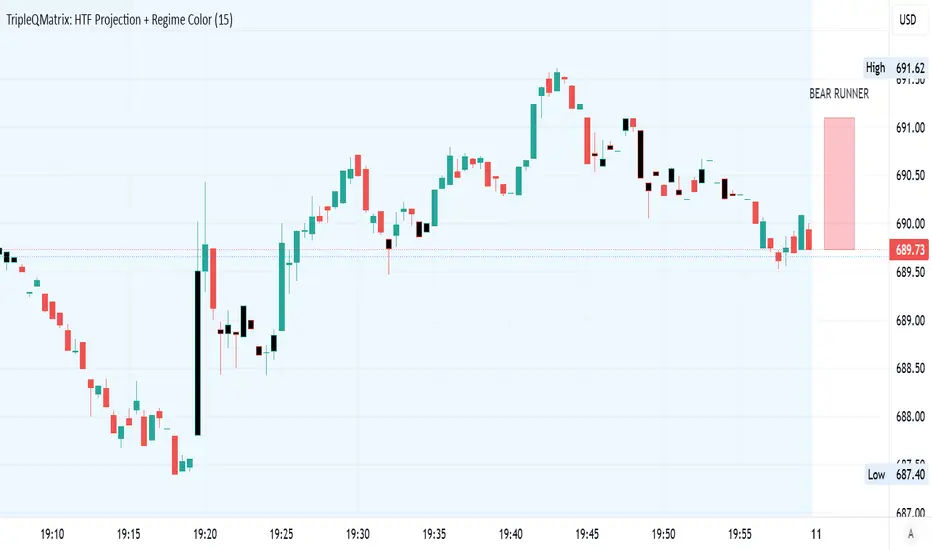
Smart Money Renko Matrix [MarkitTick]💡 The Smart Money Renko Matrix is a comprehensive, multi-dimensional analytical tool designed to bridge the gap between noise-free price action and complex market microstructure. By stripping away time-based market noise using an Average True Range (ATR) based price framework, this script isolates pure directional movement and volume distribution. It synthesizes Multiple Time Frame (MTF) trend convergence, order flow dynamics, and quantitative statistical exhaustion models into a single, cohesive interface. This indicator constructs a dynamic environment where traders can objectively measure trend strength, identify structural shifts, and manage risk systematically.
✨ Originality and Utility
Traditional indicators often rely on time-based charts, which can introduce significant noise during periods of high volatility or sideways consolidation. This script departs from the norm by utilizing a volatility-adjusted mathematical matrix to construct its baseline. What makes this tool exceptionally useful is its ability to merge quantitative statistical models—such as Z-Score based trend exhaustion and rolling Volume Profile Point of Control (POC)—with modern structural market concepts. Instead of viewing trend, volume, and structure as isolated elements, this script computes a unified algorithmic score, presenting actionable setups without the clutter of traditional multi-indicator chart layouts.
🔬 Methodology and Concepts
● Volatility-Adjusted Baseline
The core of the script calculates synthetic open, close, and volume values using an underlying ATR resolution. This ensures that a new computational block is only formed when price moves beyond a dynamically adjusting volatility threshold, completely disregarding the passage of time.
● Multiple Time Frame (MTF) Convergence
The script evaluates trend momentum across three independent higher timeframes (e.g., 1H, 4H, Daily) by measuring price relative to a 50-period Exponential Moving Average (EMA). It assigns a logical integer score. A trend is only considered fully converged (Bullish or Bearish) if it achieves a score of 2 or higher across the matrix, filtering out lower-timeframe false breaks.
● Quantitative Z-Score Trend Exhaustion
To identify overextended movements, the script maintains a dynamic array of historical directional streaks. It calculates the rolling mean and standard deviation of these streaks. When a current directional run exceeds a Z-Score of 2.0 (meaning it is two standard deviations beyond the historical average), the trend is mathematically flagged as exhausted, warning of a high-probability mean reversion event.
● Rolling Volume Profile and Point of Control (POC)
A continuous volume profile is constructed by indexing the traded volume at specific price levels over a rolling 100-block window. The algorithmic engine identifies the price node with the maximum aggregated volume, establishing the dynamic Point of Control (POC), which serves as a highly reactive structural support or resistance level.
● Structural Sweeps and Order Blocks
The logic continuously scans for structural liquidity sweeps. A sweep occurs when price pierces a predefined historical high or low (based on user lookback) but fails to close beyond it, indicating trapped volume. Following a confirmed sweep and a change in directional momentum, the system algorithmically generates boundary boxes that represent significant structural order blocks.
🎨 Visual Guide
● Heatmap Candles
Bullish Streaks: Represented by a color gradient starting from Dark Green and transitioning to Bright Green as the directional streak matures.
Bearish Streaks: Represented by a color gradient starting from Dark Red and transitioning to Bright Orange.
Exhaustion State: If the Z-Score exhaustion threshold is breached, the candles become highly transparent or gray, visually warning of a fading trend.
● Core Matrix Lines
Renko Upper/Lower Bounds: Solid lines plotting the mathematical extremes of the current volatility block.
Renko Midline: A dotted line tracking the exact median of the active block structure.
Reversal Close: Prominent circular markers highlighting the exact pivot point where the directional streak changes state.
● Risk Management Visuals
Trailing Stop: A dashed line appearing below bullish price action or above bearish price action, dictating the dynamic trailing invalidation level.
Entry and Target Lines: When a setup triggers, a distinct set of dashed lines appear: Gold for the Entry price, Pink for the Stop Loss (SL), Cyan for Take Profit 1 (TP1), Blue for Take Profit 2 (TP2), and Orange for Take Profit 3 (TP3). Small textual labels accompany each line displaying the exact price.
● Order Flow and Structural Shapes
Sweep Labels: Small text labels reading "Liq" appear above or below the wicks when a structural sweep is confirmed.
Wick Rejections: Displayed as small cross shapes (`xcross`). Pink crosses above price denote clustered bearish rejections; Cyan crosses below denote clustered bullish rejections.
Volume Divergence: Small circular shapes appear above or below the bar when a directional push occurs without the support of a moving average volume breakout, signaling potential weakness.
● Heads-Up Dashboard
A specialized table located in the top right corner. It displays the current ticker, active timeframe, the MTF Convergence Tier score (color-coded green or orange), the dynamic block size in absolute price terms, the current Volume Profile POC level, and the calculated numerical values for the active Entry, SL, and TP targets.
📖 How to Use
● Identifying Trend Direction
Observe the primary color gradient of the main chart layout. Trade strictly in the direction of the bright, saturated colors. Ensure that the dashboard confirms the trend with a "Tier 2" or "Tier 3" MTF Convergence score before looking for entries.
● Spotting Reversals
Wait for the emergence of a Liquidity Sweep label ("Liq"). Once this prints, monitor the chart for a color transition (e.g., green shifting to red). A reversal is further validated if a structural Order Block box is painted immediately following the sweep, or if exhaustion logic visually grays out the prior trend.
● Executing and Managing Risk
When a directional change occurs that aligns with the higher timeframe score, utilize the auto-generated dashed risk lines. Place your entry at the Gold dashed line. Set your structural invalidation at the Pink dashed line. As price progresses, manually scale out of the position by targeting the Cyan, Blue, and Orange dashed lines. Utilize the dynamic trailing stop line to protect open profits as the trend matures.
⚙️ Inputs and Settings
• Volatility Settings
Adjust the base lookback period for the Average True Range calculation. Increasing the multiplier directly increases the price distance required to generate a new block, effectively filtering out more noise but delaying signal generation.
• Visual Gradients
Users can customize the starting and ending colors for both bullish and bearish streaks, as well as define the specific streak depth required to reach maximum color saturation.
• Risk Management Configurations
Allows traders to toggle between dynamic standard risk or structure-based stop losses. Users can input specific multiplier values to independently adjust the distance of the Stop Loss and all three Take Profit levels.
• MTF Tier Scoring
Select the three specific higher timeframes the algorithmic engine will use to calculate the baseline trend momentum. By default, these are structured as Intraday, Medium, and Macro.
• Structural Lookbacks
Define the historical bar count used to identify major swing points. A higher lookback period will result in fewer, but mathematically more significant, sweep identifications and order block generation.
🔍 Deconstruction of the Underlying Scientific and Academic Framework
● Absolute Mean Deviation and ATR Computation
The foundational framework of this matrix relies on the Average True Range, a volatility metric introduced by J. Welles Wilder. The script calculates the greatest of the current high minus the current low, the absolute value of the current high minus the previous close, and the absolute value of the current low minus the previous close. By applying a smoothing function to this true range over a defined period, the script normalizes the non-stationary nature of financial time series into a standardized unit of volatility.
● Standard Score (Z-Score) Application on Serial Dependence
To model trend exhaustion quantitatively, the script measures the serial dependence of consecutive directional outcomes (streaks). By storing the historical lengths of these streaks in a dynamically updating array, the engine computes the population mean (μ) and standard deviation (σ). The current streak length (x) is evaluated using the standard Z-Score formula: z = (x - μ) / σ. A result greater than 2.0 indicates that the current movement lies beyond the 95th percentile of the normal distribution curve, mathematically classifying the trend as statistically anomalous and prone to immediate mean reversion.
● Volume Distribution Theory
The Point of Control (POC) logic is rooted in volume distribution profiling. It assumes that market participants execute trades at equilibrium prices. By segmenting the Y-axis into distinct price nodes and accumulating the corresponding traded volume over a rolling lookback window, the script identifies the mode of the distribution curve. This maximum volume node represents the price level with the highest historical consensus of value, naturally acting as a dense algorithmic barrier for future price action.
⚠️ Disclaimer
All provided scripts and indicators are strictly for educational exploration and must not be interpreted as financial advice or a recommendation to execute trades. We expressly disclaim all liability for any financial losses or damages that may result, directly or indirectly, from the reliance on or application of these tools. Market participation carries inherent risk where past performance never guarantees future returns, leaving all investment decisions and due diligence solely at your own discretion. Индикатор

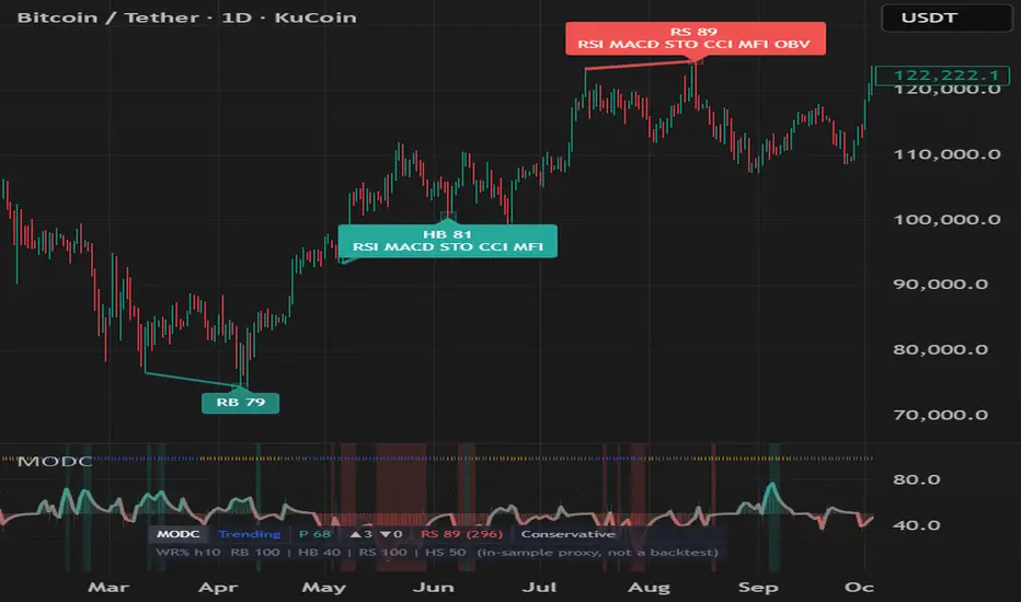
Multi-Oscillator Divergence ConfluenceMulti-Oscillator Divergence Confluence (MODC)
MODC is a three-layer divergence analysis indicator built to make oscillator divergence easier to read without turning the chart into a wall of labels.
The script evaluates RSI, MACD, Stochastic, CCI, MFI, and OBV at the same confirmed price pivots. This shared-pivot approach keeps oscillator votes aligned to the same market structure point instead of mixing unrelated oscillator pivots.
The goal is not to create a standalone buy/sell system. MODC is designed as a visual confirmation and context tool for traders who already use market structure, trend context, and risk management.
What makes MODC different
MODC is built as a three-layer system:
1. Always-on market context
The pane stays useful on every bar, even when no divergence signal is active.
It includes:
- A Confluence Pressure Wave from 0 to 100.
- A regime ribbon identifying Trending, Ranging, Volatile, or Quiet conditions using ADX and ATR percentile.
- An oscillator stack histogram showing whether more enabled oscillators are leaning bullish or bearish.
- Subtle pressure background zones when divergence pressure builds.
This layer helps show the “story” before a confirmed signal appears.
2. Informational Setup layer
In Exploratory mode, subtle setup dots appear when divergence pressure builds near a recent swing extreme.
A Setup is not a confirmed divergence signal. It is only a watch-list event.
Setup dots require:
- Pressure wave crossover.
- At least two oscillators leaning in the same direction.
- Price near a recent swing high or swing low using ATR-based proximity.
Setup alerts are disabled by default because Setups are pre-confirmation events and may never become confirmed pivot divergences.
3. Confirmed Valid and Elite signals
Confirmed signals are based on price pivots. A pivot only confirms after the selected Pivot Right Bars have closed.
Valid signals require:
- A confirmed price pivot.
- Minimum oscillator confluence.
- A base score threshold.
- Hidden divergences aligned with EMA context.
Elite signals require Valid conditions plus a stricter quality gate:
- EMA context.
- ADX trend-strength rules.
- Regime-adaptive score threshold.
- Optional volume gate.
- Optional historical forward-return proxy gate.
Signal labels are compact:
- RB = Regular Bullish
- HB = Hidden Bullish
- RS = Regular Bearish
- HS = Hidden Bearish
The number beside the label is the signal score. Visual intensity scales with score:
- 50-65 = muted
- 66-79 = clear
- 80+ = premium / Elite
How the scoring works
Scoring is intentionally conservative and always based on confluence out of six oscillators. Disabling oscillators does not inflate the score.
The score considers:
- Oscillator confluence count.
- Correct reversal or continuation context.
- Whether enabled oscillators are in exhaustion zones.
- Volume participation.
- Pivot spacing quality.
- Market regime alignment.
- A penalty when fewer than four oscillators are enabled.
Regular divergence and hidden divergence are treated differently:
- Regular Bullish = potential reversal from weakness.
- Regular Bearish = potential reversal from strength.
- Hidden Bullish = potential trend continuation above the EMA.
- Hidden Bearish = potential trend continuation below the EMA.
Display modes
Signal Density:
- Conservative: Elite only.
- Balanced: Valid + Elite. This is the default.
- Exploratory: Setup + Valid + Elite.
Visual Intensity:
- Minimal: pressure wave and confirmed badges only.
- Standard: pressure wave, regime ribbon, stack histogram, confirmed lines and badges.
- Cinematic: Standard mode plus Elite aura, candle tint, stronger atmosphere, and compact HUD stats.
Suggested usage
Start with:
- Signal Density: Balanced
- Visual Intensity: Standard
Use Layer 1 to understand market context. Treat Setup dots as early watch-list information only. Use Valid and Elite signals as confirmation points, not automatic entries.
For alerts, use the confirmed Valid or Elite alert conditions and set alerts to Once Per Bar Close.
Repaint and delay disclosure
Confirmed Valid and Elite outputs are evaluated on closed bars.
Because this script uses confirmed pivots, a divergence signal is only known after Pivot Right Bars have closed. The marker is drawn back on the pivot bar for visual alignment only. The signal was not actionable on the original pivot bar.
The Setup layer is different: Setups are informational pressure events, not confirmed divergence signals. They may never become confirmed signals.
Forward-return proxy disclosure
MODC includes optional forward-return proxy statistics for visible chart history. These are in-sample summaries only.
They are not a backtest. They do not include commissions, slippage, position sizing, stops, targets, or risk management. They should not be interpreted as expected future performance.
Limitations
Divergence can fail, especially during strong trends or news-driven moves. Oscillators are related momentum tools, so confluence does not guarantee independence. This indicator should be used with broader market structure, trend analysis, and a defined risk plan.
This script is for analysis and education only. It is not financial advice and is not a standalone trading system. Индикатор

Индикатор

Индикатор
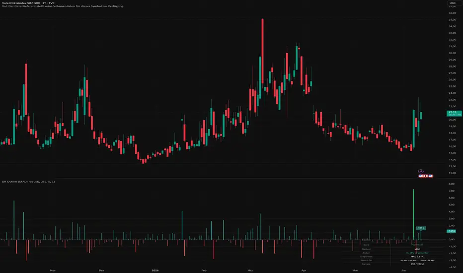
Daily Return Z-Score / OutlierDaily Return Z-Score / Outlier
What this indicator does
Daily Return Z-Score / Outlier measures how unusual today's daily return is relative to the instrument's own historical return distribution. It converts the current return into a Z-Score (standard-deviation scale) and colours the bars according to whether the return sits in the normal range, a warning zone, or an extreme zone (fat-tail event).
The goal is to make statistical outliers visible — days on which the price move is materially larger than the recent history would suggest.
How it works
Data basis (daily context): Daily returns are sampled on the daily timeframe ("D") via request.security, independent of the chart timeframe currently displayed. This keeps the statistical reference consistent.
Return calculation: Either simple percentage returns (close − close ) / close or log returns ln(close / close ).
Distribution statistics over a rolling window (default: 252 trading days ≈ 1 year). Two methods are available:
MAD (robust): Median and median absolute deviation. Insensitive to individual extreme values. The Z-Score is computed as 0.6745 · (return − median) / MAD (scaled to the normal distribution).
Classic: Mean and standard deviation. Z = (return − mean) / stdev. More reactive to, and distorted by, extreme values.
Empirical percentiles: In addition to the Z-Score, warning and extreme thresholds are derived directly from the observed percentiles of the return distribution (e.g. 5% / 95% for warning, 1% / 99% for extreme). Bar colour follows these empirical percentiles rather than normality assumptions.
Live return: The running return is computed against yesterday's daily close, so the classification updates intraday as the current day develops.
Display
Histogram of the Z-Score on a common sigma scale.
Reference lines at 0, ±1, ±2 and ±3 sigma for visual orientation.
Live label showing the current Z-Score on the last bar.
Values table (optional, bottom-right) with Z-Score, band classification, selected method, today's return, the dispersion measure (MAD or stdev), warning/extreme thresholds, and the effective sample size.
Colour logic
Normal — return within the warning percentiles.
Warn + / − — return beyond the warning percentile.
EXTREME + / − — return beyond the extreme percentile (fat tail).
Settings
Method: MAD (robust) or Classic (mean/stdev).
Lookback (days): Length of the statistics window (5–1000).
Log returns: Log instead of percentage returns.
Warning percentile % and Extreme percentile %: Colouring thresholds.
Colours for bullish/bearish warning and extreme zones.
Show values table.
Alerts
Extreme outlier UP — daily return beyond the upper extreme percentile.
Extreme outlier DOWN — daily return beyond the lower extreme percentile.
Extreme outlier (both directions) — combined condition.
How to use it
The indicator helps highlight days with a statistically notable move — for example to add context to news days, to watch for volatility clustering, or as a filter alongside an existing strategy. The MAD method is recommended when the history contains isolated strong outliers.
Notes
A Z-Score measures how unusual a move is, not its direction as a forecast.
Significance depends on a sufficiently large sample (see the "Sample" field in the table).
This script is an analysis tool and does not constitute financial advice. Past distributions are no guarantee of future behaviour.
═══════════════════════════════════════
Daily Return Z-Score / Outlier — Deutsch
Was macht dieser Indikator?
Daily Return Z-Score / Outlier misst, wie ungewöhnlich der heutige Tages-Return im Vergleich zur eigenen historischen Verteilung des Wertpapiers ist. Der Indikator wandelt den aktuellen Return in einen Z-Score (Standardabweichungs-Skala) um und färbt die Balken danach ein, ob sich der Return im normalen Bereich, in einer Warn-Zone oder in einer Extrem-Zone (Fat-Tail-Ereignis) befindet.
Ziel ist es, statistische Ausreisser sichtbar zu machen — also Tage, an denen die Kursbewegung deutlich grösser ausfällt, als es die jüngste Historie nahelegt.
Wie es funktioniert
Datenbasis (Daily-Kontext): Über request.security werden die Tages-Returns auf dem Tages-Timeframe ("D") erhoben, unabhängig vom aktuell angezeigten Chart-Timeframe. So bleibt der statistische Bezug konsistent.
Return-Berechnung: Wahlweise einfache prozentuale Returns (close − close ) / close oder Log-Returns ln(close / close ).
Verteilungsstatistik über ein rollierendes Fenster (Standard: 252 Handelstage ≈ 1 Jahr). Zwei Methoden stehen zur Wahl:
MAD (robust): Median und Median-Absolutabweichung. Unempfindlich gegen einzelne Extremwerte. Der Z-Score wird als 0.6745 · (Return − Median) / MAD berechnet (skaliert auf die Normalverteilung).
Klassisch: Mittelwert und Standardabweichung. Z = (Return − Mean) / Stdev. Reagiert stärker auf Extremwerte und wird von diesen verzerrt.
Empirische Perzentile: Zusätzlich zum Z-Score werden Warn- und Extrem-Schwellen direkt aus den beobachteten Perzentilen der Return-Verteilung gebildet (z. B. 5% / 95% für Warnung, 1% / 99% für Extrem). Die Balkenfarbe richtet sich nach diesen empirischen Perzentilen, nicht nach Normalverteilungs-Annahmen.
Live-Return: Der laufende Return wird gegen den gestrigen Tages-Schluss berechnet, sodass die Einordnung schon während des laufenden Tages aktualisiert wird.
Anzeige
Histogramm des Z-Scores auf einer gemeinsamen Sigma-Skala.
Referenzlinien bei 0, ±1, ±2 und ±3 Sigma zur visuellen Orientierung.
Live-Label mit dem aktuellen Z-Score am letzten Balken.
Werte-Tabelle (optional, unten rechts) mit Z-Score, Band-Einstufung, gewählter Methode, heutigem Return, Streuungsmass (MAD bzw. Stdev), Warn-/Extrem-Schwellen sowie der effektiven Stichprobengrösse.
Farb-Logik
Normal — Return innerhalb der Warn-Perzentile.
Warn + / − — Return jenseits des Warn-Perzentils.
EXTREM + / − — Return jenseits des Extrem-Perzentils (Fat Tail).
Einstellungen
Methode: MAD (robust) oder Klassisch (mean/stdev).
Lookback (Tage): Länge des Statistik-Fensters (5–1000).
Log-Returns: Log- statt prozentuale Returns.
Warn-Perzentil % und Extrem-Perzentil %: Schwellen für die Färbung.
Farben für bullische/bärische Warn- und Extrem-Zonen.
Werte-Tabelle anzeigen.
Alerts
Extrem-Ausreisser HOCH — Tagesreturn jenseits des oberen Extrem-Perzentils.
Extrem-Ausreisser RUNTER — Tagesreturn jenseits des unteren Extrem-Perzentils.
Extrem-Ausreisser (beide Richtungen) — kombinierte Bedingung.
Verwendung
Der Indikator eignet sich, um Tage mit statistisch auffälliger Bewegung hervorzuheben — etwa zur Kontext-Einordnung von News-Tagen, zur Beobachtung von Volatilitäts-Clustern oder als Filter neben einer bestehenden Strategie. Die MAD-Methode wird empfohlen, wenn die Historie einzelne starke Ausreisser enthält.
Hinweise
Ein Z-Score misst die Ungewöhnlichkeit einer Bewegung, nicht deren Richtung im Sinne einer Prognose.
Die Aussagekraft hängt von einer ausreichend grossen Stichprobe ab (siehe Feld "Sample" in der Tabelle).
Dieses Skript ist ein Analyse-Werkzeug und stellt keine Anlageberatung dar. Vergangene Verteilungen sind keine Garantie für zukünftiges Verhalten.
Индикатор

Bollinger Bands Unbound [Probalist Essentials]A Bollinger Bands that actually tells you when not to fade the band. Most BBand scripts show a band touch and leave you to guess whether it's a reversal or the first bar of a trend walk. This one answers that. The Band-Walk Guard flags every stretch where price keeps closing outside the band — trend mode, fade suppressed — and the Reversion Map measures, on your actual chart history, where confirmed fades went: what fraction tagged the basis, what the median reversion distance was, how wide the 1σ spread is, and whether the recent regime still matches the long-run.
Built for traders who want more than a line on a chart. The squeeze regime, the walk length, the basis-reach rate, the distribution panel — each answers a specific question about volatility state and mean-reversion quality that the default indicator leaves you to figure out yourself.
🟡 WHY THIS VERSION
Most Bollinger scripts treat every band touch as a trade. This one flags the band walk so you know when it's a trend, not a fade. The Reversion Map goes further: it counts how often your own chart's confirmed fades actually tagged the basis, shows the median reversion distance and a 1σ spread as a bell curve right of price, and splits bull from bear (they're different animals in a drifting market). You get a Wilson-backed verdict — not a fixed 60% bar, but a proper statistical lower bound — plus recent vs long-run form so you can see when the edge has changed regime. The edge clock shows when backed evidence last fired, not just whether it 'exists'. It keeps score honestly: small n prints 'gathering', wide bands stay wide, no numbers are hidden.
🟡 HOW IT WORKS
Bollinger Bands: basis = SMA(src, len) — or EMA via the Basis MA type input (the bands stay basis ± mult × stdev either way); upper/lower = basis ± mult × stdev(src, len). %B = (src − lower) / (upper − lower). Bandwidth = (upper − lower) / basis × 100, expressed as a percentage of price so it's scale-free across any instrument.
The Band-Walk Guard counts consecutive confirmed closes outside each band. A walk counter ticking upward is trend state — the outer band edge ignites in the heat ramp colour so you see it immediately. The Reversion Map fires only when price confirms back inside: a confirmed re-entry after a close beyond the lower band is a bullish fade; beyond the upper band is bearish. Each confirmed fade's outcome is recorded i_horizon bars later (the distance in %return, signed in the signal's direction), building two rolling arrays (bull/bear) of up to 200 outcomes. From those arrays: win-rate, median, 16th–84th percentile (≈1σ), Wilson lower bound, and recent-form over the last 60 outcomes. The bell curve drawn right of price is the kernel-smoothed empirical density of those returns — what actually happened, not a fitted model. Squeeze uses a rolling bandwidth percentile: self-calibrating, never an absolute number, works across all volatility regimes. With the optional RSI confluence filter on, a fade only counts when RSI was at an extreme on the excursion bar — and because the outcome arrays rebuild over the full history, toggling the filter shows like-for-like what the classic BB+RSI double-confirm does to the numbers on this chart.
🟡 KEY FEATURES
Band-Walk Guard: counts consecutive outside closes and flags trend state with an ignited band edge. During a walk no fade can fire by definition — a fade requires the confirmed close back inside, the very bar that ends the walk — so the guard shows you why the tool is silent
Reversion Map: empirical forward-return distribution per direction (bull/bear fades tracked separately), shown as a kernel-smoothed bell curve right of price
Basis-reach rate: % of past fades that tagged the basis within the horizon, displayed as a compact label on the basis line — the natural mean-reversion target with its own base rate
Squeeze detection: self-calibrating bandwidth percentile (default 10th over 120 bars), squeeze shading, release-breakout alert
Weighted signal dots: excursion depth (in rolling stdev units) drives dot size via self-calibrating 60th/90th percentile thresholds — tier 3 dots are the deep outlier fades
Wilson-backed verdict: lower bound of win-rate tested against 50% at user-chosen confidence (80/90/95%); recent form (last 60 outcomes) vs long-run both shown
Edge clock: stamps when backed (●) and leaning (◐) evidence last appeared on an actual signal — tells you if the edge is live or stale
Probalist heat ramp: %B mapped to ±100 drives the fill colour from strong blue (price at lower band) through mint neutral to orange/amber (price at upper band)
Optional RSI confluence filter — the classic BB+RSI double-confirm, built in. With the filter on, the Reversion Map measures the filtered signal, so you can A/B on your own chart whether the famous combo actually improves the outcomes.
Reversion-complete markers: a small ✓ on the basis line the moment a live fade tags its mean-reversion target — the exact event the basis-reach rate counts, so the entry dot and the exit ✓ tell the whole arc on the chart.
🟡 HOW TO USE
Band walk in readout? That's trend state. The outer band edge ignites — use it as a filter, not a fade setup. Wait for the walk to end and a confirmed re-entry before looking for a fade.
Fade signal (gold dot below price = bullish, blue dot above = bearish) fires on confirmed close back inside the band. Dot size = excursion depth; larger dots = deeper, statistically rarer excursions.
Check the Reversion Map rows in the readout: 'n' below 20 = gathering, don't weight the stats. Once n grows, median and the 1σ band tell you how far fades typically carried and how consistent they were.
Basis-reach rate on the basis line: if 70%+ of past lower-band fades tagged the basis within 20 bars, the basis is the realistic mean-reversion target on this chart — a number to weigh, not an instruction.
Squeeze shading (green tint) = bandwidth at the bottom decile. A squeeze release with a close outside the band often starts a new walk, not a fade — the readout flags it.
Evidence-gated alerts fire only when Wilson lower bound > 50% — that's a statistical bar, not a 50/50 flip. A backed signal with a small median (e.g. +0.15% on a 5-minute chart) may not survive round-trip costs; the edge read is about direction bias, not net P&L.
Combine with a trend filter above (e.g. price vs 200 SMA) to take only same-direction fades — bullish fades when above the 200, bearish when below. Reduces signal count, improves composition.
Non-repainting by construction: the confirmation bar closes, then the signal fires. Realtime mode (confirm=0) updates on the unconfirmed bar — note the repaint risk if you use it.
Curious whether the BB+RSI double-confirm helps on your chart? Turn on the RSI confluence filter and compare the readout stats with the filter off — the arrays rebuild over the full history, so the comparison is like-for-like.
🟡 PAIRS WELL WITH
A simple trend filter (price vs a longer moving average, or ADX slope direction) tells you which side of the mean-reversion to favour — the Reversion Map treats bull and bear fades separately, but a trend context makes even those reads sharper. Volume (relative volume or OBV) helps validate whether a fade has the force to carry: a low-volume re-entry into the band after a walk is weaker context than one with a volume spike. For timing confluence, a momentum oscillator (RSI or Stochastic) reaching oversold/overbought at the same time as a fade signal gives a second read on exhaustion. Key daily or weekly support/resistance levels provide a structural backdrop — a lower-band fade off a major S/R is meaningfully different from one in open air. None of these gate the signal here; they're the context a trader builds around it.
Bollinger Bands Unbound gives you the two answers the default version never does: whether a band excursion is a walk (stay out) or a confirmed fade (measure it), and where that fade actually went on your own chart. The statistics are descriptive — your history, counted honestly. Use the walk guard to stay out of trend mode, the Reversion Map to understand what confirmed fades have been worth, and the evidence-gated alerts when the record actually supports a bias.
Open source under MPL-2.0. The probability layer describes past signals on your chart — it is a measurement, not a prediction, and nothing here is financial advice.
Индикатор

Session Intelligence Architecture [Microstructure]SESSION INTELLIGENCE ARCHITECTURE
An institutional-grade session & market-structure overlay for crypto.
━━━━━━━━━━━━━━━━━━━━━━━━━━━━━━━━━━━━━━━━━━
WHAT IT DOES
━━━━━━━━━━━━━━━━━━━━━━━━━━━━━━━━━━━━━━━━━━
Crypto trades 24/7, but it "breathes" in three waves — Asia, Europe and the US.
Each session has its own character. This indicator marks those sessions directly on
your chart and translates institutional metrics into clear, jargon-free signals.
It answers three questions at a glance:
• Who is in control right now — buyers or sellers?
• Is a move real, or just a liquidity trap?
• Which session is actually driving the market today?
━━━━━━━━━━━━━━━━━━━━━━━━━━━━━━━━━━━━━━━━━━
ON-CHART VISUALS
━━━━━━━━━━━━━━━━━━━━━━━━━━━━━━━━━━━━━━━━━━
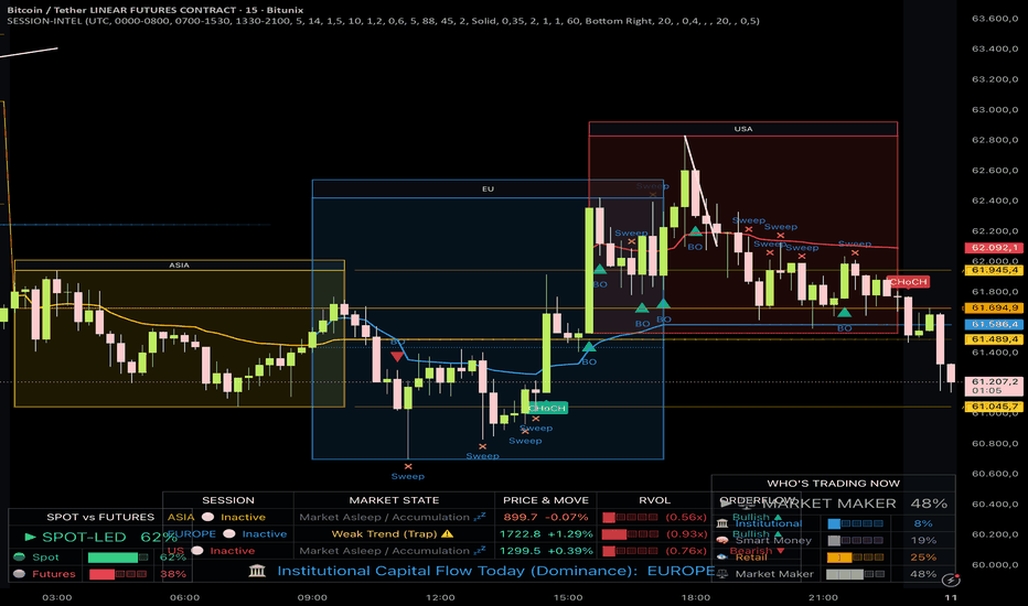
• Session Boxes — a live, growing rectangle clamped to each session's high & low
(yellow = Asia, blue = Europe, red = US). The active box border turns SOLID & thicker
when a strong, volume-backed move is underway, and DASHED when the market is quiet.
• Session VWAP — an anchored fair-value line per session that fades out after close.
• Open / Equilibrium Line — a dotted line at each session's opening price.
• Sweep & Breakout Markers — ✕ for liquidity sweeps (stop hunts), ▲/▼ triangles for
genuine structural breakouts of the Asia range.
• Focus Mode — gently dims the gaps between sessions so the active session pops.
━━━━━━━━━━━━━━━━━━━━━━━━━━━━━━━━━━━━━━━━━━
THE ENGINE (why it's different)
━━━━━━━━━━━━━━━━━━━━━━━━━━━━━━━━━━━━━━━━━━
• ATR-NORMALIZED, not static %. A move is only flagged as a "Significant Expansion"
when |Close − Open| exceeds a multiple of the current ATR(14). This adapts to
volatility instead of using a fixed, one-size-fits-all percentage.
• SESSION-SPECIFIC RVOL. Each session's cumulative volume is compared against the
average of the last 10 SAME-type sessions (Asia vs Asia, US vs US). Above the
threshold = institutional drive; below = suspect.
• LIQUIDITY SWEEP vs. BREAKOUT. A wick beyond the Asia high/low that closes back
inside is tagged as a trap. A close outside with an expansion body (≥60% of range)
is tagged as a real breakout.
━━━━━━━━━━━━━━━━━━━━━━━━━━━━━━━━━━━━━━━━━━
THE DASHBOARD (bottom-center)
━━━━━━━━━━━━━━━━━━━━━━━━━━━━━━━━━━━━━━━━━━
One row per session, read left to right:
• SESSION — name + status (🟢 Active / ⚪ Inactive)
• MARKET STATE — plain language, color-coded:
🚀 Buyer Dominance (Strong) — expansion up + valid volume
🩸 Seller Dominance (Strong) — expansion down + valid volume
⚠️ Weak Trend (Trap) — expansion without volume (fake-move protection)
💤 Market Asleep / Accumulation — price still inside the ATR threshold
• PRICE & MOVE — session range + net % change
• RVOL — a 5-block progress bar (████░) with the raw ratio, e.g. (1.45x)
• ORDERFLOW — Bullish ▲ / Bearish ▼ based on price vs. session VWAP
Plus a merged bottom row: today's dominant session by combined volume & expansion.
━━━━━━━━━━━━━━━━━━━━━━━━━━━━━━━━━━━━━━━━━━
ALERTS
━━━━━━━━━━━━━━━━━━━━━━━━━━━━━━━━━━━━━━━━━━
• "Breakout detected" — fires once per bar close (confirmed, no repaint).
• "Liquidity Sweep detected" — fires once per bar (sweeps often form intrabar).
━━━━━━━━━━━━━━━━━━━━━━━━━━━━━━━━━━━━━━━━━━
SETTINGS OVERVIEW
━━━━━━━━━━━━━━━━━━━━━━━━━━━━━━━━━━━━━━━━━━
① Sessions — timezone + the three session windows + historical lookback (days)
② Engine — ATR length & multiplier, RVOL lookback & threshold
③ Market Structure — breakout body ratio, toggle sweeps/breakouts
④ Visualization — colors, line widths, box fill color & saturation,
VWAP fade-out, Focus Mode + dim color, and on/off toggles for every element
━━━━━━━━━━━━━━━━━━━━━━━━━━━━━━━━━━━━━━━━━━
HOW TO USE
━━━━━━━━━━━━━━━━━━━━━━━━━━━━━━━━━━━━━━━━━━
Best on intraday timeframes (5m–1h), where sessions are most meaningful. Watch the
dashboard for the current regime, use the Asia range + sweep/breakout markers for
structure, and the VWAP/orderflow bias to gauge who has the upper hand.
This script is an analysis tool, not financial advice. Always do your own research
and manage risk. Past behavior does not guarantee future results. Индикатор
CQ_(7)_[TACHIMETER] v2================================================================================
CQ_(7)_ v2 — USER MANUAL
© CQuevedo345
Pine Script v6 | TradingView Indicator
================================================================================
────────────────────────────────────────────────────────────────────────────────
WHAT IT DOES
────────────────────────────────────────────────────────────────────────────────
The Tachimeter is a real-time momentum speed gauge displayed as a table overlay
on your TradingView chart. It measures how fast price is moving by comparing the
current close to the close of the previous 20-minute bar (RPM = price delta).
The result is visualized as two emoji-based bar gauges — similar to a rev counter
on a car dashboard — that fill up as momentum increases. A label describes the
strength of the move in plain English, and the current price is shown with a
colored background that reflects the current trend direction.
The indicator is LIVE-ONLY: it only renders during real-time bars and hides on
historical bars to avoid repainting.
────────────────────────────────────────────────────────────────────────────────
KEY CONCEPTS
────────────────────────────────────────────────────────────────────────────────
RPM (Rate of Price Movement)
RPM = Current Close minus Close of the previous 20-minute bar.
Positive RPM = bullish momentum. Negative RPM = bearish momentum.
The absolute value of RPM drives how many blocks fill up on the gauges.
Daily Tendency
Compares current close to the daily open.
Close >= Daily Open → Bullish (teal header/footer)
Close < Daily Open → Bearish (red header/footer)
Bull / Bear (RPM Tendency)
Determined by whether RPM is positive or negative.
Drives gauge square colors, overdrive colors, and price cell background.
────────────────────────────────────────────────────────────────────────────────
THE GAUGES
────────────────────────────────────────────────────────────────────────────────
Two 13-block bar gauges are shown stacked:
X10 Bar (top gauge)
One block lights up per 10 RPM, up to a maximum of 10 blocks (100 RPM).
If |RPM| reaches 101 or above, all 13 blocks fill instantly — indicating
the move has gone into overdrive range.
X100 Bar (bottom gauge)
Only activates when |RPM| >= 101.
Each block represents 100 RPM of additional momentum beyond the first 100.
Blocks 1–10 use the primary color. Blocks 11–13 use the overdrive color,
signaling extreme momentum.
X100 Block Mapping:
101–199 → 1 block
200–299 → 2 blocks
300–399 → 3 blocks
400–499 → 4 blocks
500–599 → 5 blocks
600–699 → 6 blocks
700–799 → 7 blocks
800–899 → 8 blocks
900–999 → 9 blocks
1000–1099 → 10 blocks
1100–1199 → 11 blocks (overdrive zone begins)
1200–1299 → 12 blocks
1300+ → 13 blocks
────────────────────────────────────────────────────────────────────────────────
ACCELERATION LABELS
────────────────────────────────────────────────────────────────────────────────
A text label below the title describes the strength of the current move.
The label applies to both bullish and bearish directions equally.
|RPM| 0 – 9 → S T O P P E D
|RPM| 10 – 100 → I D L I N G
|RPM| 101 – 199 → E X T R E M E L Y W E A K
|RPM| 200 – 299 → V E R Y W E A K
|RPM| 300 – 399 → W E A K
|RPM| 400 – 499 → M O S T L Y W E A K
|RPM| 500 – 599 → S O M E W H A T W E A K
|RPM| 600 – 699 → M O D E R A T E L Y W E A K
|RPM| 700 – 799 → M O D E R A T E
|RPM| 800 – 899 → M O D E R A T E L Y S T R O N G
|RPM| 900 – 999 → M O S T L Y S T R O N G
|RPM| 1000 – 1099 → S T R O N G
|RPM| 1100 – 1199 → V E R Y S T R O N G
|RPM| 1200 – 1299 → E X C E P T I O N A L L Y S T R O N G
|RPM| 1300+ → U L T R A S T R O N G
────────────────────────────────────────────────────────────────────────────────
TABLE LAYOUT
────────────────────────────────────────────────────────────────────────────────
The dashboard is a 5-column × 5-row table. Here is what each cell displays:
Row 0, Cols 0–2 (merged) → Title: "T A C H I M E T E R" in Rounded font
Background: teal (bullish) or red (bearish)
based on daily open vs. close.
Row 0, Col 3 → Acceleration label (strength of move in text).
Same background color as the title.
Row 1, Col 0 → Scale labels: "X10" and "X100"
Row 1, Col 1 → The gauge display:
Scale ruler (⏒ tick marks)
X10 bar (13 emoji blocks)
Number scale (₂ ₄ ₆ ₈ ₁₀ ₁₁ ₁₂ ₁₃)
X100 bar (13 emoji blocks)
Scale ruler (⏒ tick marks)
Row 1, Col 2 → Raw RPM value (formatted as a 2-digit number).
Row 1, Col 3 → Current price + tendency dot (🟢 or 🔴).
Background: teal (bull) or red (bear) at 50%
transparency, based on RPM tendency.
────────────────────────────────────────────────────────────────────────────────
COLOR GUIDE
────────────────────────────────────────────────────────────────────────────────
Gauge squares — Trend Color mode (default):
🟩 Bullish fill (X10 and X100 bars, blocks 1–10)
🟦 Bullish overdrive (X100 bar, blocks 11–13)
🟥 Bearish fill (X10 and X100 bars, blocks 1–10)
🟨 Bearish overdrive (X100 bar, blocks 11–13)
⬛ Empty block
Gauge squares — White mode:
⬜ All active blocks (both bars, all slots)
⬛ Empty block
Tendency dot (price cell):
🟢 RPM is positive (bullish)
🔴 RPM is negative (bearish)
Header / Acceleration cell background:
Teal → Close >= Daily Open
Red → Close < Daily Open
Price cell background:
Teal at 50% transparency → RPM bullish
Red at 50% transparency → RPM bearish
────────────────────────────────────────────────────────────────────────────────
SETTINGS & INPUTS
────────────────────────────────────────────────────────────────────────────────
Group: PRICE LABELS
Show Current Price and Tachimeter (toggle, default: ON)
Master on/off switch. When disabled, the entire table is hidden.
Group: EMA Dashboard
Dashboard Position (dropdown, default: Top Center)
Controls where the table is anchored on the chart.
Options: Bottom Left, Top Center, Middle Left, Middle Right,
Bottom Right, Top Right.
Dashboard Size (dropdown, default: Tiny)
Controls the text size of the gauge content.
Options: Auto, Tiny, Small, Normal, Large, Huge.
Recommendation: Tiny for mobile, Small for desktop browser.
Group: GAUGE STYLE
Gauge Square Color Mode (dropdown, default: Trend Color)
Trend Color (Green/Red): squares reflect bull/bear direction.
White: all active squares display as white (⬜) regardless of direction.
Useful for minimalist or light-theme charts.
────────────────────────────────────────────────────────────────────────────────
IMPORTANT NOTES
────────────────────────────────────────────────────────────────────────────────
- The indicator renders ONLY on real-time, unconfirmed bars. It will not
display on historical bars. This is by design to prevent repainting.
- RPM is measured against the 20-minute timeframe close , making it most
meaningful on intraday charts (1m, 3m, 5m, 15m, etc.).
- On slower timeframes (Daily, Weekly) the RPM values will be very large
and the X100 bar will almost always be fully lit. The indicator is
optimized for intraday use.
- The weekly_open and monthly_open security calls are fetched but currently
reserved for future use. They do not affect the current display.
────────────────────────────────────────────────────────────────────────────────
CREDITS
────────────────────────────────────────────────────────────────────────────────
Author : © CQuevedo345
Library : fikira/Text/1 (used for Rounded font rendering in title)
License : Mozilla Public License 2.0
mozilla.org
================================================================================
Индикатор

Volatility Forecast [EXCAVO]Forward Projection of the Bollinger Envelope with Adaptive Horizon and Slope Clamp
The Volatility Forecast takes the classical Bollinger Bands and
projects the basis and the bands forward by a configurable number of bars.
Slopes of the basis, standard deviation and ATR are estimated from linear
regression over a lookback window, then extrapolated through a smooth
curve into the right side of the chart. Small orange dots mark band
reclaim events on confirmed closed bars.
The forecast horizon adapts to the chart timeframe so the projection
stays meaningful at every TF, and a slope clamp prevents the bands from
ballooning into unrealistic territory after sharp regime shifts.
━━━━━━━━━━━━━━━━━━━━━━━━━━━━━━━━━━━━━━━
▸ HOW TO USE
Step 1 → Add the indicator. The current Bollinger Bands are
plotted on the chart and a dashed envelope extends to the
right with the projected basis and bands.
Step 2 → Read the projection. The projected upper and lower
bands show the most likely volatility envelope over the
next bars under the current trend and volatility regime.
Wider end = expansion expected; narrower end = compression.
Step 3 → Use the reclaim dots. A small orange dot below a bar
marks a confirmed bull band reclaim (price tagged the lower
band and pulled back inside). A dot above a bar marks a
bear reclaim. These are context, not entries.
Step 4 → Check the dashboard. The top right panel reads the
projection mode, current width vs its rolling average,
band state, and the last reclaim.
Step 5 → Combine with structure. The envelope pairs well with
trend and structure tools. A breakout that aligns with an
expanding projected envelope tends to continue; one against
a contracting envelope tends to fade.
━━━━━━━━━━━━━━━━━━━━━━━━━━━━━━━━━━━━━━━
▸ HOW IT CALCULATES
◆ Bollinger Bands
Basis is a simple moving average of the source over Length (default 20).
Standard deviation is computed over the same window. Bands are basis plus
or minus Multiplier times standard deviation (default 2.0). These are the
solid plotted lines on the chart.
◆ Linear Regression Slopes
For the projection, the algorithm estimates per-bar slopes from a linear
regression of the basis, the standard deviation, and the ATR over the
Slope Lookback window (default 40). Slope is taken as the difference
between the linreg value at offset 0 and offset 1 - the per-bar drift
the regression expects to continue.
◆ Slope Clamp
Each slope is then clamped to a safety bound so that the cumulative
projected displacement stays sensible. End to end, the projected basis
cannot drift more than two current band-widths, and the projected
standard deviation or ATR cannot grow more than 50% of its current value.
Sign of the slope is preserved so trend direction is intact, only the
magnitude is bounded. This keeps the projection meaningful after sharp
regime shifts.
◆ Forward Projection
Three modes turn slopes into a projected envelope across the forecast
horizon:
Linear extends basis and width on a straight line using the
current slope at every step.
Smooth Curve (default) eases from the current value toward a
dynamic endpoint via a smoothstep curve so the projection has a
natural arc instead of a hard linear extrapolation.
Adaptive Volatility drives the projected width with ATR slope
instead of standard-deviation slope. Useful when volatility is
regime-dependent and the ATR captures it better than stdev.
A projection floor at 50% ensures the envelope never collapses to a
single point on declining-volatility regimes.
◆ Auto Timeframe Forecast
Forecast Bars defaults to Auto, which picks the horizon from the chart
timeframe: 40 bars on 4h and below, 20 on Daily, 10 on Weekly, 6 on
Monthly+. Manual override is available for operators who want a fixed
bar count regardless of timeframe.
◆ Band Reclaim Markers
A bull reclaim fires when the prior bar's low touched the lower band,
the current bar's low has pulled back above the lower band, and the
close sits below the basis. A bear reclaim is symmetric on the upper
band. Cooldown of Length bars prevents same-direction stacking. The
optional Trend MA filter keeps bull marks only above the MA and bear
marks only below. By default markers fire only on confirmed closed bars
(no repaint); Real-time Markers can be enabled if intra-bar feedback is
preferred.
━━━━━━━━━━━━━━━━━━━━━━━━━━━━━━━━━━━━━━━
▸ WHAT MAKES IT DIFFERENT
◆ Adaptive Horizon
The forecast horizon scales with the chart timeframe. The projection
shows a comparable arc on intraday, daily, weekly and monthly without
manual tuning per chart.
◆ Slope Clamp Safety Net
Linear-regression slopes can overshoot after sharp moves or on long
horizons. The clamp caps the cumulative displacement so the projection
cannot grow into unrealistic ranges, regardless of the underlying slope.
◆ Three Projection Modes
Linear, Smooth Curve and Adaptive Volatility cover the common shapes a
volatility envelope can take. Smooth Curve uses smoothstep easing for
a natural arc; Adaptive Volatility ignores stdev drift and tracks ATR
instead.
◆ Confirmed Reclaim Markers
Small orange dots above or below the bar mark band reclaim events. They
fire on confirmed closed bars by default (no repaint), with an optional
real-time mode for operators who prefer intra-bar feedback. A trend-MA
filter keeps the bias clean.
━━━━━━━━━━━━━━━━━━━━━━━━━━━━━━━━━━━━━━━
▸ DASHBOARD
Real-time panel with the current state read:
Mode - Linear / Smooth Curve / Adaptive Volatility
Width vs Avg - current band width relative to its rolling average
Band State - where price sits in the bands (Above Upper / Below Lower / Upper Half / Lower Half)
Last Marker - direction and bars since the last band reclaim
Legend table explains every on-chart element. Both panels toggle in the
Dashboard settings.
━━━━━━━━━━━━━━━━━━━━━━━━━━━━━━━━━━━━━━━
▸ SETTINGS
Bollinger Bands
Source - close (price series used for basis and stdev)
Length - 20 (lookback for basis and stdev)
Multiplier - 2.0 (band width in stdev units)
Basis / Band / Fill Colors - default palette
Forecast Envelope
Forecast Bars Mode - Auto (adapts to chart TF) or Manual
Forecast Bars (Manual) - 40 (used when Mode = Manual)
Slope Lookback - 40 (linreg window for slope estimation)
Mode - Smooth Curve (Linear / Smooth Curve / Adaptive Volatility)
Projection Style / Width / Colors - dashed, default palette
Fill Projection - ON
Reclaim Markers
Show Markers - ON
Real-time Markers - OFF (no repaint by default; closed bars only)
Filter by Trend MA - ON
Trend MA Type - SMA (SMA / EMA / WMA / HMA)
Trend MA Length - 100
Marker Color - orange (#FF8C00)
Show Trend MA - OFF
Dashboard
Show Dashboard - ON
Dashboard Position - Top Right
Show Legend - ON
━━━━━━━━━━━━━━━━━━━━━━━━━━━━━━━━━━━━━━━
▸ ALERTS
Two directional alertconditions are exposed:
Bull Band Reclaim - fires on a confirmed bull reclaim event
Bear Band Reclaim - fires on a confirmed bear reclaim event
Set the alert condition to "Once Per Bar Close" for clean, non-repainting
delivery. Trend-MA filter and cooldown apply to alerts the same way they
apply to the on-chart markers.
━━━━━━━━━━━━━━━━━━━━━━━━━━━━━━━━━━━━━━━
Best regards,
EXCAVO
Disclaimer
Trading involves significant risk. This indicator is a technical analysis
tool and does not constitute financial advice, investment recommendations,
or a guarantee of future results. Past indicator behavior does not
guarantee future performance. Always use proper risk management and your
own judgment.
Индикатор

Velocity Breakout Strategy (VBS)Overview
The Velocity Breakout Strategy (VBS) is a comprehensive, institutional-grade swing trading system designed to identify high-probability momentum shifts. Rather than relying on a single lagging indicator, VBS synthesizes five distinct dimensions of market data: Macro Trend, Market Structure, Smart Money Concepts (SMC) valuation, Volatility (ATR/ADX), and Intrabar Volume Delta.
The goal of VBS is to filter out low-probability "chop" and only trigger entries when structural momentum aligns with aggressive buying volume.
Core Mechanics & Underlying Logic
1. Trend & Gradient Cloud Baseline The foundation of VBS is a multi-timeframe moving average system utilizing a Micro (9), Fast (20), and Slow (50) EMA. The relationship between the Fast and Slow EMAs paints a dynamic Gradient Cloud, instantly visualizing the macro trend.
2. Intrabar Volume Delta Estimation Standard volume tells you how much was traded, but not who was in control. VBS includes a custom Volume Delta Estimation engine. It approximates buying vs. selling pressure within a single candle by analyzing where the candle closes relative to its total high-to-low range.
The Filter: VBS can be configured to strictly block any buy signals if the current candle exhibits negative Delta (where estimated selling pressure outweighs buying pressure), preventing entries into hidden institutional distribution.
3. Smart Money Concepts (SMC) Valuation Zones VBS calculates a rolling 100-bar Dealing Range to map out institutional liquidity. It splits this range to identify "Premium" (overvalued) and "Discount" (undervalued) zones. The strategy actively looks for pullback entries (Reloads) when the asset drops into the Discount zone.
4. Volatility & Dynamic ATR Trailing Stops Risk management is handled by a responsive ATR Trailing Stop that adapts to the Average Directional Index (ADX).
During trending phases, the ATR multiplier is wide to let the trade breathe.
When the ADX detects a volatility "Squeeze" (ADX < 20), VBS dynamically tightens the ATR multiplier, protecting profits before a sudden volatile expansion occurs.
5. Master Candle Consolidation VBS scans for extreme volatility contraction using a "Master Candle" concept. If the price prints 4 consecutive bars entirely within the High/Low bounds of a previous Master Candle, the system arms a Breakout Trigger.
Entry Signals (When to Buy)
VBS generates specific, visual entry signals on the chart:
A+ Buy (Lime Triangle): A Golden Cross (20/50 EMA) occurs simultaneously with a verified Higher Low in market structure, backed by positive volume delta.
Risky Buy (Orange Triangle): A Golden Cross occurs, but the strict Higher Low market structure is not yet confirmed.
Bullish Reload (Blue Arrow): A zero-lag pullback entry. Price dips into the SMC Discount zone, touches the Fast EMA, and sweeps liquidity (long lower wick), closing with positive delta.
Consolidation Breakout (Purple Arrow): Price violently breaks the bounds of a 4-bar Master Candle consolidation in the direction of the macro trend.
Exit Strategy (When to Sell)
ATR Trail Exit (Red Down Triangle): The primary exit. Triggers when price closes below the dynamic ATR Trailing Stop.
Macro Break: A failsafe exit triggered if a Death Cross (20 EMA crossing under 50 EMA) occurs while holding a position.
The Strategy Manual: How to Use the Settings
We have built a professional-grade algorithm, which means it has "levers" designed to adapt to almost any market condition. Think of these settings as the steering wheel, gas pedal, and brakes for your strategy. Here is your complete manual on exactly what each setting does, when to change it, and how to use it.
1. Moving Averages & Trend These define the "macro environment." They tell the algorithm whether it is allowed to look for long setups or if it needs to stay out.
Micro EMA Length (Default: 9): The fast-moving trigger line. Decrease to 5 if you are scalping on a 1-minute chart. Increase to 12 if you want to ignore tiny 1-bar pullbacks.
Fast/Slow EMA Length (Default: 20/50): The core trend cloud. If you are swing trading daily charts and want to catch massive, long-term trends, change these to the traditional 50 and 200.
2. Smart Triggers & Structure This is the "Brain" of the algorithm that filters out bad setups.
Real-Time Lookback (Micro) (Default: 12): How many candles backward the script looks to verify a recent "Higher Low" was made before a crossover. If the script is missing valid entries because the pullback was long and drawn out, increase this to 20.
Pivot Lookback/Forward (Macro) (Default: 5): Purely visual. It dictates how many candles are needed to confirm the HH/LL text labels on the chart.
Require Higher Low for A+ Entry (Default: Checked): The strictest safety filter. Uncheck this if you are trading highly volatile assets (like Crypto) that often V-bottom and explode upward without stopping to form a higher low.
Max Run-up % (Chase Filter) (Default: 10.0): Stops the algorithm from buying if the price has already pumped 10% from the bottom. If you are trading Small Caps that regularly pump 30% in a single candle, you must increase this to 20 or 30.
Block Entries in Gray Chop Zone (Default: Checked): The anti-whipsaw filter. Uncheck only if you are actively trying to buy at the absolute bottom of a sideways consolidation box before the momentum officially kicks in.
3. Master Candle Consolidation Your custom logic for catching coiled breakouts.
Required Follow-up Bars (Default: 4): How many candles must get trapped inside the Master Candle. Reduce to 3 on high-timeframes (Daily/Weekly) where 4 days of resting is rare. Increase to 6 or 8 on 5-minute charts to ensure the consolidation is truly exhausted.
Use Master High/Low Bounds (Default: Checked): If unchecked, it only uses the candle body (Open to Close). Uncheck this on highly volatile, "wicky" charts where a single stray wick keeps ruining your consolidation count.
Require Bull Trend & Green ATR for Breakout (Default: Checked): Uncheck this if you want to trade "Reversal Breakouts" (buying an upward breakout before the macro trend has officially flipped bullish).
4. Smart Money Concepts (SMC) Ensures you are buying at a wholesale price.
Dealing Range Lookback (Default: 100): Decrease to 50 for faster, more aggressive zone shifting during rapid market regimes.
Require SMC Zone for Reloads (Default: Checked): Uncheck this during a raging, parabolic bull market where price never pulls back deep enough to hit the discount zone.
5. Dynamic ATR Exits (ADX Squeeze) Your trailing stop-loss manager.
Base ATR Multiplier (Trend) (Default: 3.0): Change to 2.0 for tighter risk management on large-cap stocks. Increase to 4.0 or 5.0 for highly erratic Crypto assets.
Tight ATR Multiplier (Chop) (Default: 1.5): The "choke" stop. Keep this very tight (1.0 to 1.5) to protect profits when momentum dies.
ADX Squeeze Threshold (Default: 20): Increase to 25 if you want the algorithm to aggressively lock in profits the second a trend shows minor weakness.
6. Volume Analysis & POC (Visuals)
Volume Lookback & StDev Multiplier: These dictate when the Fuchsia (Distribution) and Blue (Accumulation) diamonds appear. If you are getting too many diamond alerts, increase the Multiplier to 4.0 so it only flags true anomaly volume.
POC Profile Rows (Default: 40): Resolution of the Volume Profile calculation that draws the yellow Point of Control line. Increase to 100 for a more precise POC line. Decrease to 20 if your TradingView app is lagging.
The VBS Dashboard
The script features a built-in, non-intrusive HUD (Heads Up Display) utilizing a "Lazy-Draw" architecture to prevent memory buffer crashes. It provides a real-time readout of:
Current Macro Trend & Market Structure (HH/HL/LL/LH)
Intrabar Delta State (Positive/Negative)
Volatility State (Expanding vs. ADX Squeeze)
Current SMC Zone (Premium vs. Discount)
Real-time Stop Risk (%)
Usage & Backtesting Notes
By default, the strategy is optimized for comprehensive backtesting. It utilizes a fixed quantity size (qty=1) and allows pyramiding. This ensures the Strategy Tester captures and records the success rate of every single signal generated by the engine, providing a pure, unclouded view of the strategy's mathematical edge.
Disclaimer: VBS is an educational tool designed for analyzing market structure and volume dynamics. It does not guarantee profits. Always use proper risk management and test extensively on paper before deploying real capital.
Стратегия

Индикатор

Индикатор

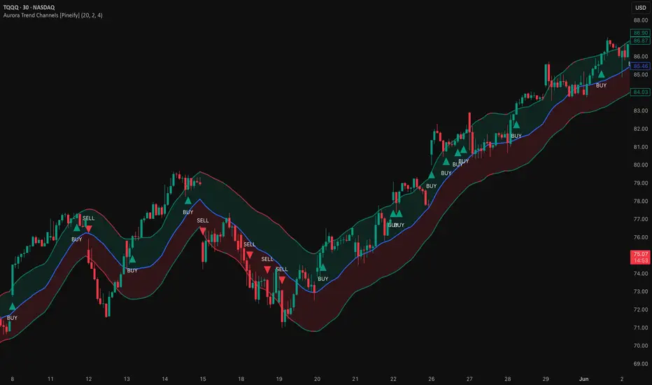
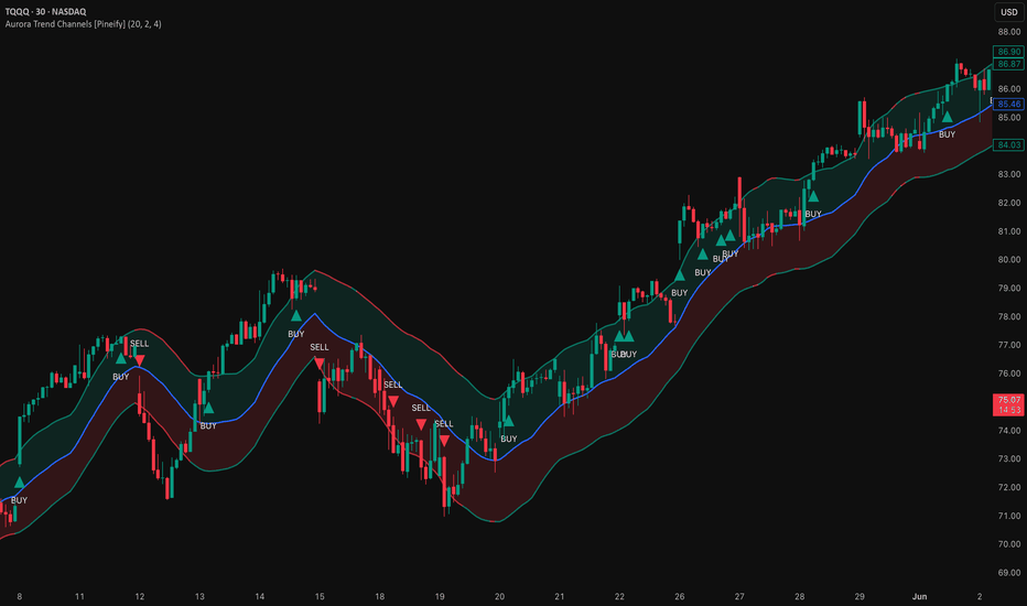
Aurora Trend Channels [Pineify]Aurora Trend Channels
A volatility-adjusted trend channel built around a Volume-Weighted Moving Average (VWMA) center and Average True Range (ATR) outer bands. Unlike standard Bollinger Bands — which expand with statistical price deviation — the outer bands here track true-range volatility, including gap moves, and the center responds to volume weight rather than giving every candle equal influence. The channel shifts color with trend direction, and breakout signals fire only when price exits the outer ATR envelope, filtering out the weak cross-center noise that produces most false signals in simpler systems.
Key Features
VWMA center line: high-volume candles steer the trend reference more than low-volume ones, aligning the basis with where real trading activity occurred
ATR-scaled bands: channel width expands during volatile sessions and contracts during quiet ones — the envelope automatically adapts to current market conditions
EMA post-smoothing: a second smoothing pass over the raw VWMA and ATR values removes single-bar spikes without adding significant lag, producing cleaner channel edges
Dynamic color coding: the entire channel flips between bullish green and bearish red in real time, giving an instant visual read on the current trend state
Split-zone fills: the upper half of the channel is shaded bullish, the lower half bearish, so you can immediately see where price sits within the structure
Outer-band breakout signals: BUY and SELL labels appear only when price crosses outside the ATR bands — a higher bar than a simple basis crossover
Alert conditions for both breakout directions, compatible with TradingView's built-in alert system
How It Works
The calculation runs in two stages: building the channel, then smoothing it.
VWMA basis: Each bar's close is weighted by its volume over the Channel Length lookback. High-volume candles pull the moving average toward the prices at which the most trading happened — a demand-weighted trend reference rather than a simple time average.
ATR envelope: The Average True Range over the same lookback is multiplied by the Band Multiplier and added/subtracted from the VWMA. ATR accounts for gap moves that high-low range ignores, so the bands genuinely reflect the full volatility environment.
EMA smoothing: Both the raw VWMA and the raw band values are passed through an EMA of length Smoothing Factor . This second pass removes the jagged edges that appear when a single high-volatility bar distorts the ATR calculation, without requiring a longer primary lookback.
Trend coloring: A simple price-versus-basis comparison determines channel color on each bar. The VWMA already embeds volume context, so a bare close comparison is sufficient — no additional filter is needed.
Signal conditions: Buy signals trigger on crossover (close crosses above the upper band), sell signals on crossunder (close crosses below the lower band). Crossing the outer ATR band means price moved beyond the typical volatility range, not merely through the center — it takes more momentum to get there.
How the Components Work Together
The core design choice here is pairing a volume-sensitive center with a volatility-sensitive envelope. Either alone has a weakness: a VWMA reacts to where volume traded but does not adapt its width to current market conditions; ATR bands sized around a simple SMA treat every candle's price equally regardless of liquidity. Combining them gives a channel that is anchored to real trading activity on the vertical axis and calibrated to actual volatility on the horizontal axis.
The EMA smoothing layer serves a specific function that would be lost with a single longer lookback. A longer primary window reduces noise but also makes the channel slower to respond to trend changes. Post-smoothing via a short EMA removes the erratic single-bar edges while keeping the primary length aggressive enough to track trends in real time. The result is a channel that reacts quickly but does not telegraph every spike.
Because signals require a full close outside the outer band rather than a touch or intrabar breach, they are naturally scarce. On a daily chart using default settings, expect a few signals per month rather than a few per week — which means each one carries more weight but also that the indicator is not designed for high-frequency entries.
Trading Ideas and Insights
Use the buy signal as an initial breakout entry trigger, then use retests of the upper band as add-on levels on the assumption the band becomes dynamic support after a breakout. A failure to hold the band after retest may indicate the move is exhausting.
The channel fill colors work well as a trend filter for a separate entry system. If the channel is red, consider suppressing buy signals from another indicator until the channel flips green — a simple but effective regime filter.
On higher timeframes (daily, weekly), the VWMA center often acts as a mean-reversion target after extended moves. Price that runs far from the basis and then loses momentum may retrace toward it; this is not directly signaled, but visually obvious on the chart.
In ranging markets, price will oscillate between the bands without triggering outer-band breakouts. This is by design — the indicator is quiet in ranges and active in trending environments. If you see frequent small candles touching but not closing outside the bands, that is the market telling you conditions are not favorable for breakout trades.
Past patterns do not guarantee future results. All signals should be evaluated within the context of the broader market structure and combined with appropriate risk management.
Unique Aspects
VWMA as the trend center, not SMA or EMA — the volume weighting means the channel is anchored where liquidity was concentrated, not just where time passed
ATR bands instead of standard-deviation bands: the outer envelope reflects the full range including gaps, making it more robust on instruments with frequent overnight moves or news-driven spikes
Two-stage smoothing design: the primary length drives responsiveness, the post-smooth EMA removes erratic band edges — decoupling these two concerns rather than collapsing them into a single longer period
Breakout signals on outer band crosses only — no signals on basis crossovers, which substantially reduces noise on trending instruments
Split fill that shades upper and lower zones in separate colors, giving an intuitive sense of channel structure without relying solely on the band lines
How to Use
Add the indicator to any chart. It works on all timeframes and instruments, though it was designed primarily for trending markets on the daily and 4-hour charts.
Observe the channel color. Green indicates price is above the VWMA (bullish); red indicates below (bearish). Use this as a broad market context filter.
Watch for BUY labels (triangle below bar) when price closes above the upper band, and SELL labels (triangle above bar) when price closes below the lower band. These indicate breakouts beyond the typical ATR volatility range.
After a breakout signal, watch whether price holds the outer band on any pullback. A clean retest and bounce can serve as a secondary entry point.
To set alerts: right-click the indicator → Add Alert → select "Aurora Buy Alert" or "Aurora Sell Alert".
Customization
Channel Length (default: 20) — Controls both the VWMA lookback and the ATR period. Lower values (10–14) produce a fast, reactive channel suitable for intraday charts. Higher values (30–50) create a more stable channel that filters out shorter swing noise, better suited to daily or weekly context.
Band Multiplier (default: 2.0) — Scales the ATR to set band width. At 2.0 on most instruments, outer band crosses are relatively uncommon — perhaps a few per month on a daily chart. Reducing to 1.5 produces more frequent signals; increasing to 2.5 or 3.0 reserves signals for only the most decisive momentum moves.
Smoothing Factor (default: 4) — The EMA period applied after the primary calculation. Values of 1–3 produce crisper but more jagged band edges; values of 5–8 create visually cleaner bands with slightly more lag at band turns. Most users will not need to change this.
Bullish/Bearish/Basis colors — Adjust to match your chart theme or personal preference without affecting calculation.
Conclusion
Aurora Trend Channels targets the specific problem of defining when a price move is large enough to matter — not just trending, but trending beyond the normal noise range. The VWMA-plus-ATR construction ties the channel to both volume activity and realized volatility, giving it more market context than either component alone. It works best as part of a broader system: the channel for trend direction and breakout signals, combined with a secondary tool for entry timing and position sizing within the trend.
Индикатор
Adaptive Volatility Envelope [QuantAlgo]🟢 Overview
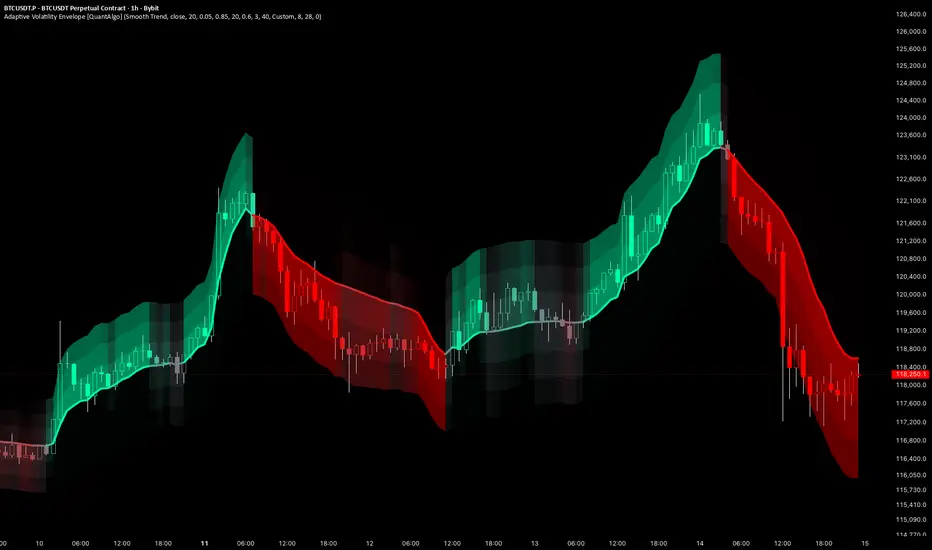
The Adaptive Volatility Envelope wraps price in a dynamic field of volatility bands centred on a self-adjusting baseline. Rather than tracking price at a fixed speed, the centerline measures how efficiently price is moving and accelerates when movement is more directional while slowing down in choppy conditions, so the baseline follows sustained moves more closely and reacts less to sideways noise. Around this adaptive centerline, layered ATR-scaled bands form a heat map that brightens toward the side price is moving into, giving traders a visual read on both trend state and momentum strength across any instrument or timeframe.
🟢 How It Works
The indicator's core methodology combines two mechanisms: an efficiency-driven centerline that adapts its tracking speed to market conditions, and a volatility-scaled band field that visualises momentum through colour and brightness.
First, market efficiency is measured by comparing net directional movement against total movement over the adaptation window. This ratio approaches one when movement is more directional and falls toward zero in choppy conditions, and it is used to blend between a slow choppy speed and a fast trending speed. The result is a smoothing factor that automatically tightens the centerline's tracking in directional moves and loosens it in noise, without manual recalibration:
efficiencyRatio = totalMovement != 0 ? priceChange / totalMovement : 0.0
smoothingFactor = choppySpeed + (trendSpeed - choppySpeed) * efficiencyRatio
Next, the centerline advances toward price by the smoothing factor on each bar, producing an adaptive baseline that closes the gap quickly when efficiency is high and slowly when it is low:
centerline := na(centerline ) ? src : centerline + smoothingFactor * (src - centerline )
Band width is then derived from Average True Range scaled by the band spacing, with a safety cap that measures total envelope height against the recent fifty bar price range. If the raw width would exceed this cap, every band is scaled down proportionally, preventing the field from blowing out and distorting the chart scale during volatility spikes:
widthScale = rawWidth > maxWidth and rawWidth != 0 and maxWidth > 0 ? maxWidth / rawWidth : 1.0
bandUnit = atr * bandSpacing * widthScale
Momentum is resolved from the centerline's slope normalised by ATR and scaled by the colour sensitivity, then clamped to a range of minus one to one. This drives a gradient that runs from the neutral colour at flat momentum toward the bullish or bearish colour as the move strengthens, while a directional brightness offset lights up the leading side of the envelope more than the trailing side:
momentumRaw = not na(atr) and atr != 0 ? slope / atr * colorSens : 0.0
momentum = math.max(-1.0, math.min(1.0, momentumRaw))
Finally, a confirmed-bars toggle governs what the script computes. In Live mode the centerline, momentum, bands and signals update intrabar on the developing bar for the fastest response, with the current bar able to change until it closes. In Confirmed mode everything is locked to closed bars only, so signals do not repaint and print on the bar that closes the move.
🟢 Signal Interpretation
▶ Bullish Momentum (Centerline and Bands Brightening Toward the Bullish Colour): When the centerline slopes upward relative to volatility, momentum turns positive and the envelope gradient shifts toward the bullish colour. The leading upper side of the field brightens through the directional brightness offset, making the direction of the move easier to read. The bullish state persists as long as the centerline continues rising, and a "Momentum Turned Bullish" alert fires on the bar where momentum crosses above zero.
▶ Bearish Momentum (Centerline and Bands Brightening Toward the Bearish Colour): When the centerline slopes downward relative to volatility, momentum turns negative and the gradient shifts toward the bearish colour, with the leading lower side of the field brightening to flag the downturn. As with the bullish state, the colour saturates as the move strengthens and fades toward neutral as momentum flattens. A "Momentum Turned Bearish" alert fires on the bar where momentum crosses below zero, flagging a potential short or exit condition.
▶ Neutral Momentum (Centerline and Bands at the Neutral Colour): When the centerline is flat or moving slowly relative to volatility, momentum sits near zero and the gradient settles at the neutral colour at the middle of its range. This indicates low conviction or sideways drift rather than a directional move, and the envelope brightens away from neutral only as the slope steepens enough to register on either side. Reading the neutral state helps separate genuine momentum from chop, since the field stays muted until price generates a meaningful directional slope.
🟢 Features
▶ Preconfigured Presets: Three parameter sets cover a range of trading styles and timeframes. "Default" delivers a balanced engine for swing trading on 4-hour and daily charts. "Fast Response" shortens the adaptation window and quickens both market speeds for tighter, more reactive bands on 5-minute to 1-hour charts, suiting intraday and scalping use. "Smooth Trend" lengthens the adaptation window and slows the speeds for wider, steadier bands on daily and weekly charts, suiting position trading. The presets deliberately leave Volatility Length untouched, so band width stays under independent manual control.
▶ Built-in Alerts: Three alert conditions support automated monitoring of momentum transitions. "Momentum Turned Bullish" fires on the bar momentum crosses above zero. "Momentum Turned Bearish" fires on the bar momentum crosses below zero. "Any Momentum Change" triggers on either transition for traders who want a single unified alert regardless of direction. All alerts include the exchange, ticker, and timeframe in the message for immediate context, and the confirmed-bars toggle determines whether they evaluate on live or closed-bar data.
▶ Visual Customisation: Six colour presets, Classic, Aqua, Cosmic, Cyber, Neon, and Custom, provide coordinated bullish and bearish colour pairings suited to different chart themes and personal preferences. Selecting Custom exposes independent colour pickers for full manual control over both states, alongside an adjustable neutral colour for the midpoint of the gradient. The number of band layers is configurable from one for a clean minimal look up to eight for a rich gradient field, and the bands can be hidden entirely to display only the centerline. Optional bar colouring tints price candles with the active trend colour at a configurable transparency level, reflecting the current momentum state without reading the centerline directly.
Индикатор

Индикатор

Индикатор

CM Grand Sling Engine**CM Grand Sling Engine**
CM Grand Sling Engine is a clean trend-following overlay designed to keep the chart readable while focusing on the dominant market direction.
The system uses a dual expanding rail structure based on two different lookback lengths: a fast rail and a slow rail. These rails are not standard moving averages. They are adaptive trend rails built from the indicator’s own calculation engine, combining price structure, volatility, multi-timeframe strength, momentum, flow behavior, PI energy logic, and internal market pressure.
When the fast rail stays above the slow rail, the system identifies a bullish trend environment. When the fast rail moves below the slow rail, the system identifies a bearish trend environment. The colored area between the rails helps traders visually understand the current trend regime without adding unnecessary chart noise.
The candle coloring is designed to separate normal trend movement from possible pullback and re-entry zones:
Yellow candles highlight aggressive pullback areas inside the active trend.
Aqua candles highlight conservative re-entry confirmation after price returns back in the trend direction.
Green rail structure represents bullish trend control.
Red rail structure represents bearish trend control.
CM Grand Sling Engine is built more for trend direction, pullback reading, and market structure clarity than for crowded buy/sell signals. The goal is to provide a cleaner view of trend continuation, weakness, and possible re-entry zones directly on the chart.
It can be useful on liquid markets and higher-volume instruments where trend behavior is clearer. As with any technical tool, it should be used together with risk management and broader market context.
Индикатор

Adaptive SuperTrend Map | Alpha S+Adaptive SuperTrend Map | Alpha S+
Adaptive SuperTrend Map is a trend-following and regime-aware SuperTrend tool built on the standard SuperTrend calculation structure.
It uses a classic ATR-based SuperTrend formula, then adds an adaptive multiplier, market-regime filtering, flip confirmation logic, and a smoother curved visual line for cleaner chart presentation.
The main purpose of this script is to help users study trend direction, trend-following structure, volatility-adjusted trailing levels, and changing market conditions directly on the price chart.
────────────────────
Core Concept
────────────────────
The core idea of this script is to keep the logic of a standard SuperTrend while improving how it adapts to different market environments.
A normal SuperTrend uses:
• a source price
• ATR
• an ATR multiplier
• upper and lower trailing bands
• trend direction changes when price crosses the previous active band
This script keeps that structure but adds adaptive behavior.
The multiplier can adjust based on:
• relative volatility expansion or contraction
• ADX-based trend or chop conditions
• user-defined minimum and maximum multiplier limits
This means the SuperTrend can become more conservative during choppy conditions and more responsive during stronger trend conditions, depending on the selected settings.
The script also separates the calculation logic from the visual display.
The raw SuperTrend line is used for trend direction, flip logic, and alerts.
The curved visual line is used only for chart readability, allowing the trend path to appear smoother without replacing the underlying calculation logic.
────────────────────
What This Script Shows
────────────────────
This script can display:
• adaptive SuperTrend line
• curved visual trend line
• optional raw SuperTrend reference line
• bullish trend flips
• bearish trend flips
• regime ribbon
• current trend state label
• chop / wait state
• adaptive multiplier value
• ADX-based market regime
• volatility ratio between fast ATR and slow ATR
The visual structure is designed to help users quickly see whether the market is trending upward, trending downward, or moving through a weaker sideways environment.
────────────────────
How It Works
────────────────────
1. The script calculates ATR using the selected ATR method.
2. It builds standard SuperTrend upper and lower bands using the selected source price and multiplier.
3. The trend direction changes when price closes beyond the previous active SuperTrend band.
4. The active SuperTrend line becomes the trailing reference for the current trend.
5. The script measures relative volatility by comparing fast ATR and slow ATR.
6. ADX is used to classify whether the market is closer to a trend condition or a choppy condition.
7. The base multiplier can be adjusted upward or downward depending on volatility and regime conditions.
8. Optional flip filters can require EMA position, minimum ADX, and candle body confirmation.
9. The raw SuperTrend line remains the logic reference for trend direction and alerts.
10. The curved visual line smooths the displayed SuperTrend path for better chart readability.
11. A regime ribbon can be displayed around the visual line to emphasize the current trend environment.
12. A current-state label can display trend state, multiplier, ADX, curve mode, and ATR mode.
This structure is designed to keep the indicator understandable while adding adaptive behavior to the classic SuperTrend framework.
────────────────────
Inputs And Customization
────────────────────
Users can adjust:
• ATR period
• source price
• base multiplier
• ATR calculation method
• adaptive multiplier on/off
• minimum multiplier
• maximum multiplier
• fast ATR length
• slow ATR length
• volatility sensitivity
• ADX length
• ADX smoothing
• chop ADX threshold
• trend ADX threshold
• chop multiplier adjustment
• trend multiplier adjustment
• flip quality filter
• EMA filter length
• minimum ADX for flip markers
• candle body confirmation
• minimum body size relative to ATR
• curved visual line on/off
• curve smoothing mode
• curve smoothing length
• curve reset on trend flip
• raw line reference
• main line visibility
• glow line visibility
• flip markers
• regime ribbon
• current state label
• background highlight
• line width
• glow width
• colors and transparency
These settings allow the script to be adjusted for different symbols, timeframes, and trading styles.
────────────────────
Visual Elements
────────────────────
The script includes several visual elements:
• Main SuperTrend line:
Shows the active adaptive SuperTrend path.
• Glow line:
Adds a wider transparent layer around the main line for better visibility.
• Curved visual line:
Smooths the displayed SuperTrend path while keeping raw SuperTrend logic as the calculation reference.
• Raw SuperTrend reference:
Optional line that shows the unsmoothed SuperTrend value.
• UP / DN markers:
Optional markers that appear when filtered bullish or bearish trend flips are detected.
• Regime ribbon:
A subtle ribbon around the SuperTrend line that helps visualize the current trend or chop state.
• Current state label:
Displays the current trend state, adaptive multiplier, ADX, curve mode, and ATR mode.
• Optional background:
Can lightly highlight bullish, bearish, or chop environments.
────────────────────
Reference States
────────────────────
Trend Up:
The active SuperTrend direction is bullish. Price has moved above the previous bearish band and the trend state is upward.
Trend Down:
The active SuperTrend direction is bearish. Price has moved below the previous bullish band and the trend state is downward.
Chop / Wait:
ADX is below the selected chop threshold. This indicates that the environment may be weaker, more sideways, or less suitable for aggressive trend-following interpretation.
Bullish Flip:
A bullish transition occurs when the SuperTrend changes from bearish to bullish. If flip filtering is enabled, the marker appears only when the additional quality conditions are met.
Bearish Flip:
A bearish transition occurs when the SuperTrend changes from bullish to bearish. If flip filtering is enabled, the marker appears only when the additional quality conditions are met.
Adaptive Multiplier:
The multiplier can expand or contract based on volatility and regime conditions. This helps the SuperTrend behave differently in trend and chop environments.
Curved Visual Line:
The curved line is a display layer. It is designed for readability and does not replace the raw SuperTrend calculation used for direction and alerts.
────────────────────
How To Use
────────────────────
This script can be used as a trend structure and regime filter.
General interpretation examples:
• When the SuperTrend line is below price and the trend state is bullish, the market is in an upward SuperTrend structure.
• When the SuperTrend line is above price and the trend state is bearish, the market is in a downward SuperTrend structure.
• UP markers can highlight bullish trend flip conditions.
• DN markers can highlight bearish trend flip conditions.
• When the script shows a chop or wait condition, trend-following signals may require more caution.
• The regime ribbon can help users visually separate cleaner trend environments from weaker or more uncertain conditions.
• The raw reference line can be enabled when users want to compare the smoothed visual line with the underlying calculation line.
This script is best used together with price action, support and resistance, volume, volatility, momentum, and higher-timeframe context.
It should be treated as a trend-following structure tool, not as a standalone entry or exit system.
────────────────────
Confirmation And Repainting Notes
────────────────────
The script uses standard SuperTrend-style bar-based logic.
Trend direction and flip conditions are based on the raw SuperTrend calculation.
The curved visual line is only a smoothing layer for display. It is not intended to replace the raw trend logic.
On realtime candles, values can update before the candle closes because price, ATR, ADX, and volatility conditions can still change intrabar.
For more conservative interpretation, users should wait for candle close confirmation before acting on trend flips or state changes.
The script does not use future price data to predict market direction.
────────────────────
Limitations
────────────────────
This script does not predict future price movement.
It does not identify exact tops or bottoms.
It does not guarantee that a SuperTrend flip will lead to a sustained trend.
Like most trend-following tools, it can react late during sharp reversals.
In sideways or noisy markets, false flips can still occur.
The adaptive multiplier may reduce some noise, but it cannot remove all false signals.
Different symbols and timeframes may require different settings.
The curved visual line can make the chart easier to read, but users should remember that raw SuperTrend logic is the actual calculation reference.
This script should not be used as a standalone trading system.
────────────────────
Disclaimer
────────────────────
This publication is for educational and informational chart analysis only.
It does not constitute financial advice, investment advice, or a recommendation to trade any financial instrument.
All trading and investment decisions are the responsibility of the user.
━━━━━━━━━━━━━━━━━━━━
Adaptive SuperTrend Map | Alpha S+
Adaptive SuperTrend Map은 표준 SuperTrend 계산 구조를 기반으로 만든 추세 추종 및 시장 상태 분석 지표입니다.
기본적인 ATR 기반 SuperTrend 공식에 adaptive multiplier, 시장 상태 필터, 추세 전환 확인 로직, 그리고 더 부드러운 곡선형 시각화 라인을 결합했습니다.
이 스크립트의 목적은 추세 방향, 추세 추적 구조, 변동성 기반 trailing level, 그리고 변화하는 시장 상태를 가격 차트 위에서 직접 분석할 수 있도록 돕는 것입니다.
────────────────────
핵심 개념
────────────────────
이 스크립트의 핵심은 표준 SuperTrend의 논리를 유지하면서, 다양한 시장 환경에 더 유연하게 반응하도록 만드는 것입니다.
일반적인 SuperTrend는 다음 요소를 사용합니다.
• 기준 가격
• ATR
• ATR multiplier
• 상단 및 하단 trailing band
• 가격이 이전 활성 밴드를 돌파하면 추세 방향 전환
이 스크립트는 이 구조를 유지하면서 adaptive behavior를 추가합니다.
Multiplier는 다음 조건에 따라 조정될 수 있습니다.
• 상대적인 변동성 확대 또는 축소
• ADX 기반 추세 또는 횡보 상태
• 사용자가 설정한 최소 및 최대 multiplier 제한
이를 통해 SuperTrend는 횡보 구간에서는 더 보수적으로, 강한 추세 구간에서는 더 민감하게 반응할 수 있습니다.
또한 이 스크립트는 계산 논리와 시각적 표시를 분리합니다.
Raw SuperTrend line은 추세 방향, 전환 판단, 알림 조건의 기준으로 사용됩니다.
Curved visual line은 차트 가독성을 위한 표시용 라인으로 사용되며, 실제 계산 논리를 대체하지 않습니다.
────────────────────
이 스크립트가 보여주는 것
────────────────────
이 스크립트는 다음 요소를 표시할 수 있습니다.
• adaptive SuperTrend line
• 곡선형 visual trend line
• 선택 가능한 raw SuperTrend reference line
• 상승 추세 전환
• 하락 추세 전환
• regime ribbon
• 현재 추세 상태 라벨
• chop / wait 상태
• adaptive multiplier 값
• ADX 기반 시장 상태
• fast ATR과 slow ATR 사이의 변동성 비율
이 시각 구조는 시장이 상승 추세인지, 하락 추세인지, 또는 약한 횡보 환경인지 빠르게 파악하는 데 도움을 주도록 설계되었습니다.
────────────────────
작동 방식
────────────────────
1. 스크립트는 선택된 ATR 방식으로 ATR을 계산합니다.
2. 선택한 기준 가격과 multiplier를 사용해 표준 SuperTrend 상단 및 하단 밴드를 만듭니다.
3. 가격이 이전 활성 SuperTrend band를 종가 기준으로 벗어나면 추세 방향이 전환됩니다.
4. 활성 SuperTrend line은 현재 추세의 trailing reference 역할을 합니다.
5. Fast ATR과 Slow ATR을 비교해 상대적인 변동성 상태를 측정합니다.
6. ADX를 사용해 시장이 추세 환경에 가까운지, 횡보 환경에 가까운지 분류합니다.
7. 기본 multiplier는 변동성과 시장 상태에 따라 위아래로 조정될 수 있습니다.
8. 선택형 flip filter는 EMA 위치, 최소 ADX, 캔들 몸통 확인 조건을 요구할 수 있습니다.
9. Raw SuperTrend line은 추세 방향과 알림의 기준으로 유지됩니다.
10. Curved visual line은 차트 가독성을 위해 SuperTrend 경로를 부드럽게 표시합니다.
11. Regime ribbon은 현재 추세 환경을 더 시각적으로 보여줄 수 있습니다.
12. Current state label은 추세 상태, multiplier, ADX, curve mode, ATR mode를 표시할 수 있습니다.
이 구조는 클래식 SuperTrend의 이해하기 쉬운 구조를 유지하면서 adaptive behavior를 추가하기 위해 설계되었습니다.
────────────────────
입력값 및 설정
────────────────────
사용자는 다음 항목을 조정할 수 있습니다.
• ATR period
• 기준 가격
• 기본 multiplier
• ATR 계산 방식
• adaptive multiplier 사용 여부
• 최소 multiplier
• 최대 multiplier
• fast ATR length
• slow ATR length
• volatility sensitivity
• ADX length
• ADX smoothing
• chop ADX threshold
• trend ADX threshold
• chop multiplier adjustment
• trend multiplier adjustment
• flip quality filter
• EMA filter length
• flip marker용 최소 ADX
• 캔들 몸통 확인 조건
• ATR 대비 최소 몸통 크기
• 곡선형 visual line 사용 여부
• curve smoothing 방식
• curve smoothing length
• 추세 전환 시 curve reset 여부
• raw line reference
• main line 표시 여부
• glow line 표시 여부
• flip marker
• regime ribbon
• current state label
• background highlight
• line width
• glow width
• 색상 및 투명도
이 설정들을 통해 서로 다른 종목, 시간대, 매매 스타일에 맞게 조정할 수 있습니다.
────────────────────
시각 요소
────────────────────
이 스크립트는 다음 시각 요소를 포함합니다.
• Main SuperTrend line:
활성 adaptive SuperTrend 경로를 보여줍니다.
• Glow line:
메인 라인 주변에 더 넓은 반투명 레이어를 추가해 가시성을 높입니다.
• Curved visual line:
Raw SuperTrend logic은 유지하면서, 화면에 표시되는 SuperTrend 경로를 더 부드럽게 보여줍니다.
• Raw SuperTrend reference:
스무딩되지 않은 SuperTrend 값을 확인할 수 있는 선택형 라인입니다.
• UP / DN markers:
필터링된 상승 또는 하락 추세 전환이 감지될 때 나타나는 선택형 마커입니다.
• Regime ribbon:
SuperTrend line 주변에 표시되는 얇은 리본으로, 현재 추세 또는 횡보 상태를 시각적으로 구분하는 데 도움을 줍니다.
• Current state label:
현재 추세 상태, adaptive multiplier, ADX, curve mode, ATR mode를 표시합니다.
• Optional background:
상승, 하락, 횡보 환경을 약하게 배경으로 강조할 수 있습니다.
────────────────────
참고 상태
────────────────────
Trend Up:
활성 SuperTrend 방향이 상승 상태입니다. 가격이 이전 bearish band 위로 이동했고, 추세 상태가 상승으로 전환된 상태입니다.
Trend Down:
활성 SuperTrend 방향이 하락 상태입니다. 가격이 이전 bullish band 아래로 이동했고, 추세 상태가 하락으로 전환된 상태입니다.
Chop / Wait:
ADX가 설정된 chop threshold보다 낮은 상태입니다. 이는 시장 환경이 약하거나, 횡보 성격이 강하거나, 공격적인 추세 추종 해석에 적합하지 않을 수 있음을 의미합니다.
Bullish Flip:
SuperTrend가 하락에서 상승으로 전환되는 상태입니다. Flip filter가 켜져 있으면 추가 품질 조건이 충족될 때만 마커가 표시됩니다.
Bearish Flip:
SuperTrend가 상승에서 하락으로 전환되는 상태입니다. Flip filter가 켜져 있으면 추가 품질 조건이 충족될 때만 마커가 표시됩니다.
Adaptive Multiplier:
변동성과 시장 상태에 따라 multiplier가 확장되거나 축소될 수 있습니다. 이는 SuperTrend가 추세와 횡보 환경에서 다르게 반응하도록 돕습니다.
Curved Visual Line:
곡선형 라인은 표시용 레이어입니다. 방향과 알림에 사용되는 raw SuperTrend 계산을 대체하지 않습니다.
────────────────────
사용 방법
────────────────────
이 스크립트는 추세 구조와 시장 상태를 확인하는 필터로 사용할 수 있습니다.
일반적인 해석 예시는 다음과 같습니다.
• SuperTrend line이 가격 아래에 있고 추세 상태가 bullish라면 상승 SuperTrend 구조로 볼 수 있습니다.
• SuperTrend line이 가격 위에 있고 추세 상태가 bearish라면 하락 SuperTrend 구조로 볼 수 있습니다.
• UP marker는 상승 추세 전환 조건을 보여줄 수 있습니다.
• DN marker는 하락 추세 전환 조건을 보여줄 수 있습니다.
• 스크립트가 chop 또는 wait 상태를 표시할 때는 추세 추종 신호를 더 보수적으로 해석하는 것이 좋습니다.
• Regime ribbon은 더 깨끗한 추세 환경과 약하거나 불확실한 구간을 시각적으로 구분하는 데 도움을 줄 수 있습니다.
• Raw reference line은 스무딩된 visual line과 실제 계산 라인을 비교하고 싶을 때 켤 수 있습니다.
이 스크립트는 가격 행동, 지지와 저항, 거래량, 변동성, 모멘텀, 상위 시간대 흐름과 함께 사용하는 것이 좋습니다.
단독 진입 또는 청산 시스템이 아니라, 추세 추종 구조 분석 도구로 보는 것이 적절합니다.
────────────────────
확인봉 및 리페인트 안내
────────────────────
이 스크립트는 표준 SuperTrend 방식의 봉 기반 로직을 사용합니다.
추세 방향과 flip 조건은 raw SuperTrend 계산값을 기준으로 합니다.
Curved visual line은 표시를 위한 smoothing layer일 뿐, raw trend logic을 대체하지 않습니다.
실시간 캔들에서는 가격, ATR, ADX, 변동성 조건이 봉 마감 전까지 변할 수 있으므로 값이 변동될 수 있습니다.
보다 보수적인 해석을 원한다면 추세 전환 또는 상태 변경은 봉 마감 이후 확인하는 것이 적절합니다.
이 스크립트는 미래 가격 데이터를 사용해 시장 방향을 예측하지 않습니다.
────────────────────
한계
────────────────────
이 스크립트는 미래 가격 움직임을 예측하지 않습니다.
정확한 고점 또는 저점을 식별하기 위한 도구가 아닙니다.
SuperTrend flip이 지속적인 추세로 이어진다는 보장은 없습니다.
대부분의 추세 추종형 도구처럼 급격한 반전 구간에서는 반응이 늦을 수 있습니다.
횡보 또는 노이즈가 많은 시장에서는 false flip이 발생할 수 있습니다.
Adaptive multiplier는 일부 노이즈를 줄이는 데 도움을 줄 수 있지만, 모든 가짜 신호를 제거하지는 못합니다.
종목과 시간대에 따라 다른 설정이 필요할 수 있습니다.
곡선형 visual line은 차트 가독성을 높일 수 있지만, raw SuperTrend logic이 실제 계산 기준이라는 점을 기억해야 합니다.
이 스크립트를 단독 매매 시스템으로 사용해서는 안 됩니다.
────────────────────
중요 고지
────────────────────
본 게시물은 교육 및 정보 제공 목적의 차트 분석 자료입니다.
투자 자문, 특정 금융상품 거래 권유, 또는 수익 보장을 의미하지 않습니다.
모든 투자 판단과 그 결과에 대한 책임은 이용자 본인에게 있습니다. Индикатор

AetherEdge - TIDE | Flow + RL Oscillator🖊️ Overview
AE-TIDE is a lower-panel oscillator measuring participation-weighted money flow and its excess — the "Overflow" of one-sided activity. Where most flow tools simply display that excess, AE-TIDE adds a reinforcement-learning agent that learns, from realized outcomes, whether fading an Overflow exhaustion actually leads to a reversal in this market. It also scores every divergence with a Bayesian posterior, automatically down-weighting the divergences that do not work. It is a flow oscillator that gets smarter per market rather than relying on fixed thresholds.
🔶 Key Features
Participation-weighted Money Flow ( ) plus an Overflow band for one-sided extremes
A fast Hyperwave momentum line for early shifts in drive
An RL (tabular Q-learning) agent that learns when fading exhaustion pays, firing reversal signals only then
Beta-Bernoulli online reliability scoring for divergences — each one shows a learned reliability %
Divergences below relGate are hidden automatically
Gold-framed HUD; no repaint — every signal gates on bar close
🧠 Technical Architecture
Flow: impulse = (ATR-normalized return) × (relative volume), EMA-smoothed and z-scored into a Money Flow; the part beyond ± threshold is the Overflow. Hyperwave is the same normalization on a short EMA.
RL (Q-learning, TD(0)): state = flow regime (overflow side ×3 × momentum slope ×2 = 6 states), actions = {wait, fade}. The fade reward is the realized return conditioned on the overflow side at the moment the fade was taken (fade an overbought flow → rewarded if price falls). Update Q(s,a) ← Q + α ; the fade action is optimistically initialized to guarantee exploration. A signal fires only when fade-value > 0 (learned to pay) and an Overflow exhaustion triggers.
Bayesian divergences: regular divergences are detected on oscillator pivots; each (side × extreme) bucket holds a Beta(a, b) posterior, updated by the realized outcome divK bars later. The displayed reliability is the posterior mean.
Honest scope: classic tabular Q-learning plus Beta-Bernoulli estimation — not deep RL, not a crystal ball.
⚙️ Recommended Settings & Tuning Guide
Key parameters: ofThr (Overflow threshold), rlAlpha / rlGamma / warmup, divK (outcome horizon), relGate (minimum reliability to show).
Raise ofThr → stricter overflow (suits alts); lower → more sensitive
Crypto starting points (tune on your chart):
BTC / ETH (1H–4H): defaults are the baseline (ofThr = 30)
SOL / XRP and high-vol alts: wicky and spiky — ofThr = 35–40, relGate = 0.6 for proven divergences only
Scalping (5–15m): shorter hwLen, divK = 5–8 for quick verdicts
Swing (daily): divK = 15–20, longer warmup so the agent learns enough
The RL needs time to learn a market's character; in trending markets fade signals thin out automatically (correct behavior)
💡 How to Use in Practice
FADE signals: appear only when Overflow recedes from an extreme AND the agent has learned that fading pays in this regime — use as a reversal trigger
Reading Overflow: a bright color is excessive one-sided participation; when it stalls or recedes, that exhaustion often precedes a reversal
Reliability-scored divergences: readings above ~70% mark contexts that historically reversed; ~50% means stand aside
Multi-timeframe: combine higher-timeframe flow direction with lower-timeframe FADE entries
Combinations: pair AE-TIDE's exhaustion fades with directional signals from AE-QUORUM or AE-KALMAN to separate trend pullbacks from range reversals
⚠️ Important Notes
Learning period: no FADE signals appear until the Q-learning agent spins up (warmup bars) — this is by design
Reliability starts at 50%: each divergence bucket sits near neutral until its posterior accumulates enough samples
Learning reset: changing inputs, symbol, or timeframe re-learns the internal state
Fading is countertrend: fading a strong trend too early is dangerous; even when the agent suppresses it, the final call is yours
🚨 Disclaimer
This indicator is for educational and informational purposes only and is not financial advice or a recommendation to buy or sell. No method guarantees future profits; past performance does not indicate future results, and trading carries the risk of loss. All trading decisions are your own — use proper backtesting and disciplined risk management. Индикатор

AetherEdge - Adaptive Trend Bandit🖊️ Overview
AE-ATB is an adaptive SuperTrend whose ATR multiplier is chosen by a learning bandit. A fixed-multiplier SuperTrend is too tight in calm markets and too loose in volatile ones. AE-ATB first discovers volatility regimes with online k-means, then a contextual bandit (UCB) learns which ATR multiplier has actually paid in each regime. It does not just switch the multiplier with volatility — it learns the best one from reward.
🔶 Key Features
Streaming k-means sorts relative volatility into calm / normal / volatile regimes (not hard-coded thresholds)
A contextual multi-armed bandit (UCB) learns the best ATR multiplier per regime from realized return
A time-varying adaptive SuperTrend that tightens or widens by regime automatically
Direction-colored line and fill, with BUY/SELL signals on trend flips
A gold HUD showing trend, volatility regime, selected multiplier, learned best multiplier, arm value, and pull count
Deterministic exploration (UCB) — identical across reloads, no repaint
🧠 Technical Architecture
k-means (unsupervised): relative volatility = ATR / SMA(ATR) is the feature; three centroids update by competitive learning (only the winning centroid moves, c += lr·(x − c)). Centroid order ranks calm/normal/volatile.
UCB bandit (RL): candidate ATR multipliers (base, base+step, …) are the arms and the volatility cluster is the context. Each (context, arm) value Q is an incremental mean; selection is UCB1: argmax(Q + c·√(ln(total pulls)/pulls)), prioritizing untried arms while balancing exploration and exploitation. Reward = held direction × realized return (ATR units), so multipliers that kept us on the right side of the move score higher.
Adaptive SuperTrend: standard bands = hl2 ± (selected multiplier × ATR), updated each bar with the selected multiplier; direction flips on a break of the active band.
Honest scope: online k-means plus a UCB contextual bandit. SuperTrend is a public concept; this is not a neural network and not a crystal ball.
⚙️ Recommended Settings & Tuning Guide
Key parameters: ATR length, volatility baseline length, multiplier base/step/count, ucbC (exploration), warmup.
Raise ucbC → more exploration (tries more multipliers); lower → more exploitation (sticks to the learned best)
Match the multiplier range (base … base + step×(count−1)) to the instrument's volatility character
Crypto starting points (tune on your chart):
BTC / ETH (1H–4H): defaults are the baseline (base 1.5, step 0.5, 5 arms)
SOL / XRP and high-vol alts: base 2.0 / step 0.5 for a wider range to avoid wick stop-outs
Scalping (5–15m): shorter ATR length, slightly tighter multiplier range
Swing (daily): wider multiplier range, longer warmup so each regime is learned
Right after a new regime appears, behavior is unsettled until each multiplier has been tried once (UCB exploration)
💡 How to Use in Practice
Trend-following: ride the line color and BUY/SELL; a larger multiplier means a roomier trail, a smaller one a tighter trail
Reading the regime: in VOLATILE the multiplier widens to avoid fakeout stop-outs; in CALM it tightens to get on board sooner — automatic adaptation
Best-multiplier panel: shows the learned best multiplier for the current regime, useful as a manual-trail reference
Multi-timeframe: higher-timeframe AE-ATB for the trend, lower for timing
Combinations: pair with AE-QUORUM's directional probability or AE-VECTOR's target band, and let AE-ATB's trail run the winner
⚠️ Important Notes
Learning period: no signals fire until warmup bars; the bandit needs time to learn each regime's multiplier
Learning reset: changing inputs, symbol, or timeframe re-learns the centroids and arm values
Multiplier moves while exploring: early on the multiplier shifts and the adaptive SuperTrend can jump or whipsaw (it settles as pulls accumulate)
Trend-following's nature: in ranges it can suffer repeated stop-outs — use the regime read and position sizing together
🚨 Disclaimer
This indicator is for educational and informational purposes only and is not financial advice or a recommendation to buy or sell. No method guarantees future profits; past performance does not indicate future results, and trading carries the risk of loss. All trading decisions are your own — use proper backtesting and disciplined risk management. Индикатор

AetherEdge - VECTOR | Conformal Forecast🖊️ Overview
AE-VECTOR forecasts the move over the next H bars and attaches a calibrated prediction interval to the target. A point estimate alone cannot be trusted or sized. AE-VECTOR learns the expected move with online regression and uses conformal prediction to draw a band around the target within which the realized value lands roughly 1 − α of the time. Its essence is quantifying the uncertainty of the forecast, not just its center.
🔶 Key Features
Online linear regression that learns the H-bar move (in ATR units) — m̂
A calibrated target band via conformal regression (target ± q·ATR, coverage ≈ 1 − α)
The band is volatility-normalized, so it widens in high vol and tightens in low vol automatically
A target cone at the right edge (projection line + band box + target/coverage label)
A highly selective signal that fires only when decisive (even the pessimistic band end is beyond price)
A gold HUD showing direction, predicted move, target, band width, coverage, and decisiveness
No repaint — signals gate on bar close; labels use the H-bar-lagged realized move
🧠 Technical Architecture
Regression: trend slope, RSI momentum, short momentum, range position, and volatility regime are standardized (EWMA), and a linear model m̂ = w·x + b is trained by SGD (squared loss, L2). The label is the realized H-bar move (ATR units); the current forecast uses no future data.
Conformal target band: the realized absolute residuals of past forecasts (in ATR units, i.e. volatility-normalized) are stored in a rolling calibration set. For a new forecast, the (1 − α) empirical quantile q gives the band target ± q·ATR. By the split (inductive) conformal guarantee, the realized value falls inside this band with coverage calibrated to about 1 − α.
Honest scope: a linear regressor plus inductive conformal prediction — not a neural network, and not a guarantee of the point estimate. What is guaranteed is the band's coverage.
⚙️ Recommended Settings & Tuning Guide
Key parameters: H (horizon), α (band coverage = 1 − α), moveThr (minimum predicted move), lr (learning rate), warmup.
Lower α → wider, higher-coverage band (conservative); higher → tighter band
H: small (5–8) for scalping, large (20–40) for swing
Crypto starting points (tune on your chart):
BTC / ETH (1H–4H): defaults are the baseline (H = 10, α = 0.10)
SOL / XRP and high-vol alts: moveThr ≈ 0.8 to filter small noisy forecasts; α = 0.08 for a slightly wider band
Scalping (5–15m): H = 5–8, lr = 0.02 for fast adaptation
Swing (daily): H = 20–40, raise calibN to stabilize the quantile estimate
Requiring "decisive" narrows to confident targets where even the pessimistic band end favors the trade
💡 How to Use in Practice
As a target: the cone's center line is the target, the band its uncertainty — an objective basis for take-profit levels and R:R
Reading band width: narrow = stable forecast (model confident), wide = uncertain (stand aside or downsize)
Decisive signals: a calibrated, strong condition that the target sits beyond price even pessimistically — useful at the start of a move
What coverage means: a 90% band has historically contained ~90% of realized values — a calibrated expectation
Multi-timeframe: target direction from a higher-timeframe VECTOR, timing on a lower one
Combinations: pair with AE-QUORUM's directional probability or AE-HELM's trade management, and design exits with VECTOR's band
⚠️ Important Notes
Learning period: until both the regression and the calibration spin up (warmup + minCalib bars), the target shows "warming" and no signals fire
Learning reset: changing inputs, symbol, or timeframe re-learns the internal state
The band is guaranteed, not the center: the point estimate can be wrong, and during shocks the band can briefly under-cover
Linear extrapolation has limits: it is weak to sharp regime changes and unforeseen news — treat it as a projection of the current state
🚨 Disclaimer
This indicator is for educational and informational purposes only and is not financial advice or a recommendation to buy or sell. No method guarantees future profits; past performance does not indicate future results, and trading carries the risk of loss. All trading decisions are your own — use proper backtesting and disciplined risk management. Индикатор
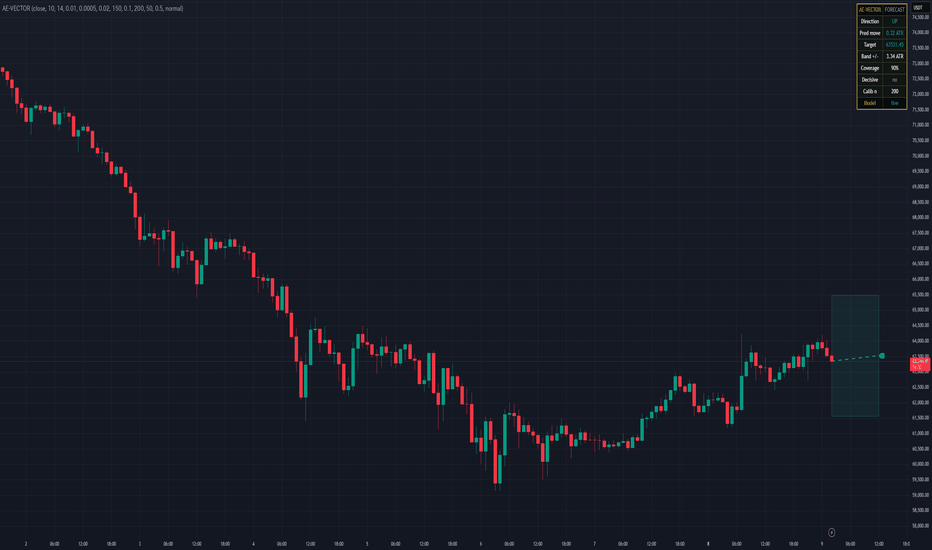
AetherEdge - KALMAN | State-Space Trend🖊️ Overview
AE-KALMAN treats price as a noisy observation and recursively estimates the true underlying trend level and velocity (slope) behind it with a two-state Kalman filter. Rather than averaging the past like a moving average, it runs a predict → observe → correct cycle on every bar. Crucially, the filter re-estimates how noisy the market is from its own forecast residuals, so it adapts automatically as volatility shifts. The lag-versus-smoothness trade-off is resolved probabilistically instead of by a fixed setting — that is the essence of AE-KALMAN.
🔶 Key Features
A slope-colored Kalman trend line estimating level and velocity (slope) simultaneously
Predictive bands whose width adapts to the predictive variance S — not a fixed multiplier
Shock detection via a standardized innovation "surprise" z-score — flags moves and regime breaks the model did not expect, with a marker and background tint
Innovation-based adaptive measurement noise — the filter learns the market's noise level from its own residuals and self-tunes (toggle)
A multi-step forecast ray (level + n·slope) with the projected price labeled
A gold-framed HUD showing trend, velocity, surprise z, Kalman gain, band width, noise, and forecast
No repaint — every signal is gated on bar close
Process/measurement noise is ATR-scaled, aligning automatically with each symbol's volatility
🧠 Technical Architecture
The state-space model is a local linear trend. The state vector is x = , with transition F = [ , ] (level advances by slope; slope is a random walk) and observation H = (price = level + measurement noise). Each bar runs the standard recursion:
Predict: level' = level + slope; covariance P' = F·P·Fᵀ + Q
Update: innovation y = price − level'; predictive variance S = P'₁₁ + R; Kalman gain K = P'·Hᵀ / S; state correction x = x' + K·y; covariance P = (I − K·H)·P'
The 2×2 case is implemented in closed form by hand, so it needs no matrix inversion and stays numerically transparent.
Adaptive noise: the observed innovation variance estimates S = P'₁₁ + R, so R ≈ Var(y) − P'₁₁ is tracked online with an EWMA (with a floor). The filter therefore behaves smoothly in quiet conditions and responsively when the market turns turbulent.
Regime adaptation: velocity = slope ÷ ATR is compared against a dead-zone (slopeThr) to classify UP / DOWN / FLAT, while the magnitude of the surprise z = y ÷ √S detects shocks (news, fast moves).
Honest scope: this is a linear-Gaussian state-space filter (Kalman) — not a neural network and not a crystal ball. The forecast is a linear extrapolation of the current state.
⚙️ Recommended Settings & Tuning Guide
The defaults are tuned for crypto. The parameters that matter most are measurement noise (measR), process noise (procLvl / procSlp), band width (bandMult), the flat dead-zone (slopeThr), and the shock threshold (shockThr).
Smoother / slower: raise measR / lower procLvl
Faster / more reactive: raise procLvl / lower measR
procSlp controls how quickly trend direction may change — smaller keeps direction stable
Crypto starting points (tune on your chart):
BTC / ETH (1H–4H): defaults are a solid baseline; raise procLvl toward 0.4 to catch turns faster
SOL / XRP and high-volatility alts: wicky and noisy — use measR 2.0–2.5 and slopeThr 0.03–0.05 to suppress false FLAT/flip reads
Scalping (1–15m): raise procLvl (0.5+) for responsiveness; bandMult 1.5–2.0 for reversion entries
Swing (daily): lower procSlp (0.01–0.02) to stabilize slope; raise measR for a smoother line
For volatile crypto, keep adaptive noise ON; switch it off only when you want a fixed, predictable feel
💡 How to Use in Practice
Trend-following: ride the line color (velocity sign) and the UP/DN signals; treat FLAT as a range/stand-aside state
Mean-reversion: taps of the upper/lower predictive band flag overextension; because band width scales with S, small stretches in low vol and large stretches in high vol are judged on the same footing
S/R flips & breakouts: a decisive close through the Kalman level with a velocity flip marks the start of a regime change
Shock markers: highlight news, liquidations, and fakeouts — useful as an overextension warning or the onset of a volatility expansion
Forecast ray: the extrapolation of current level + velocity, handy for higher-timeframe bias and rough targets
Multi-timeframe: read directional velocity from a higher-timeframe AE-KALMAN and time entries on a lower one; agreement of both line colors is a high-confidence filter
Combinations: pair with AE-STRATA (SMC structure + ML/RL) and act only when Kalman velocity and STRATA's smart-money probability agree
⚠️ Important Notes
Initial convergence: from a large initial uncertainty, the filter takes a few dozen bars to settle — wait for values to stabilize at the start of history or right after switching symbols
Lag vs smoothness is a trade-off: smoother means slower; faster means noisier — there is no universal setting
The forecast is not a guarantee: it is a linear extrapolation (level + n·slope) and will miss sharp turns; treat it as a projection of the current state only
Parameter sensitivity: optimal noise settings vary by timeframe and symbol — always tune on the chart
🚨 Disclaimer
This indicator is provided for educational and informational purposes only and is not financial advice or a recommendation to buy or sell. No method guarantees future profits; past performance does not indicate future results, and trading carries the risk of loss. All trading decisions are your own — please use proper backtesting and disciplined risk management. Индикатор

MACD Pressure Zones | Alpha S+Range Compression Map | Alpha S+
Range Compression Map is a chart-based range and sideways-structure detection tool designed to help users study price compression directly on the chart.
Instead of displaying a separate oscillator or status panel, this script draws volatility-adjusted range boxes around areas where price remains contained inside a controlled structure. The box then changes its border and background state when price breaks above, breaks below, or returns back into the range after a failed break.
The script does not provide entry or exit recommendations. Its purpose is to help users study range compression, sideways structure, breakout context, failed breaks, and the relationship between price action and volatility-adjusted boundaries.
────────────────────
Core Concept
────────────────────
Markets often alternate between expansion and compression.
During compression, price tends to remain inside a relatively narrow structure before a directional move develops.
This script uses a volatility-adjusted range model to identify when recent closing prices remain inside an ATR-based boundary around a central price line.
The main concept is:
• calculate a central range reference
• build upper and lower boundaries using ATR-based volatility
• check whether recent closing prices remain inside those boundaries
• draw a range box when price is contained
• keep the visual focus on the box instead of adding many chart labels
• change the box state when price breaks upward or downward
• optionally detect failed breaks when price returns back into the range
• use border and background color changes instead of heavy signal markers
This makes the indicator useful as a chart-based range structure viewer rather than a standalone buy or sell signal tool.
────────────────────
What This Script Shows
────────────────────
The script can display:
• range compression boxes
• active sideways structure zones
• volatility-adjusted upper and lower range boundaries
• dotted range midpoint line
• unbroken range state
• upward break state
• downward break state
• optional fakeout state
• optional break labels
• optional fakeout labels
• optional adaptive center mode
• optional top and bottom range lines
These elements are designed to help users identify whether price is still compressed inside a range or has moved outside of the structure.
────────────────────
How It Works
────────────────────
1. The script calculates a central price reference using the selected center mode.
2. In SMA mode, the center is based on a moving average of the selected source.
3. In Adaptive mode, the center updates only when price moves far enough from the previous center using an ATR-based step.
4. The script builds an upper and lower range boundary around the center.
5. It checks whether recent closing prices remain inside the volatility-adjusted range.
6. When the selected number of recent bars stays inside the range, the script draws a range compression box.
7. If a new detected range overlaps with an existing box, the structure can be merged instead of creating unnecessary duplicate boxes.
8. While the range remains unbroken, the box stays in its neutral range color.
9. If price closes above the active range boundary, the box changes into an upward break state.
10. If price closes below the active range boundary, the box changes into a downward break state.
11. If fakeout detection is enabled, the script can change the box into a fakeout state when price returns back inside after a break.
12. The midpoint line helps users visually track the center of the detected range structure.
13. Optional labels can be enabled, but the default design keeps the chart clean by using box color states.
This structure helps users study compression, range behavior, breakout context, and failed-break behavior without relying on crowded markers.
────────────────────
Inputs And Customization
────────────────────
Users can adjust:
• minimum range length
• range width multiplier
• ATR length
• source price
• center mode: SMA or Adaptive
• adaptive ATR length
• adaptive factor
• overlap merging behavior
• cooldown after break
• maximum active range duration
• trend pause classification using ADX
• break buffer
• body confirmation for break conditions
• fakeout detection
• fakeout window
• midpoint line visibility
• top and bottom range line visibility
• optional break labels
• optional fakeout labels
• range box colors
• break box colors
• fakeout box colors
• border transparency
• background transparency
• border width
• signal border width
The default settings are designed to keep the chart clean while making range structures visible directly on the price chart.
────────────────────
Visual Elements
────────────────────
The script includes:
• range box
• midpoint line
• optional range top and bottom lines
• border color state
• background color state
• optional break labels
• optional fakeout labels
The range box is the main visual element.
The midpoint line shows the central level of the detected structure.
The border and background color provide the main state information without requiring large labels.
Optional labels can be enabled for users who prefer explicit text confirmation, but the primary design is based on clean chart boxes.
────────────────────
Reference States
────────────────────
Unbroken Range:
Price remains inside the detected volatility-adjusted range. The box stays in its neutral range color.
Upward Break:
Price closes above the active range boundary. The box changes to the upward break color.
Downward Break:
Price closes below the active range boundary. The box changes to the downward break color.
Fakeout:
If fakeout detection is enabled, price breaks out of the range and then returns back inside the structure within the selected fakeout window. The box changes to the fakeout color.
Trend Pause:
When ADX-based classification is enabled, some range structures can be treated as trend-pause zones rather than pure sideways ranges. This can help distinguish quiet consolidation from temporary pauses inside a stronger directional environment.
Adaptive Range:
When Adaptive mode is selected, the center line updates less frequently and only shifts when price moves far enough away from the previous center. This can create a more stable range reference in some market conditions.
These states are informational and should not be interpreted as trading instructions.
────────────────────
How To Use
────────────────────
Use this script as a chart-based range structure viewer.
General interpretation examples:
• A neutral range box can help users identify where price is moving inside a controlled sideways or compression structure.
• A green upward-break box can help users review where price moved above the detected range.
• A red downward-break box can help users review where price moved below the detected range.
• A yellow fakeout box, when enabled, can help users study failed range breaks.
• The midpoint line can be used as a visual reference for the center of the range.
• The adaptive center mode can be tested when users want a slower-moving center reference.
• The SMA center mode can be used when users want a more standard range-detection approach.
• Optional labels can be turned on for explicit break text, but the box color state is designed to be the primary visual guide.
This script is best reviewed together with price action, volume, volatility, support and resistance, trend structure, and higher-timeframe context.
────────────────────
Confirmation And Repainting Notes
────────────────────
The script uses recent closing prices and ATR-based boundaries to detect range structures.
Range boxes can update as new candles appear.
On realtime candles, values can change before the candle closes because price, ATR, and range conditions can update intrabar.
Break states are based on price moving beyond the active range boundary.
For more conservative analysis, users should evaluate range breaks after candle confirmation.
The script does not use future price data to predict market direction.
────────────────────
Limitations
────────────────────
This script does not predict future price movement.
It does not provide entry or exit recommendations.
A range break does not guarantee trend continuation.
A fakeout state does not guarantee reversal.
ATR length, range length, and width multiplier can materially change how often ranges appear.
Very low-liquidity markets, large gaps, news-driven moves, and extreme volatility can reduce the usefulness of range-based analysis.
In strong trending markets, some detected ranges may represent temporary pauses rather than true sideways structures.
This script should not be used as a standalone trading system.
────────────────────
Disclaimer
────────────────────
This publication is for educational and informational chart analysis only.
It does not constitute financial advice, investment advice, or a recommendation to trade any financial instrument.
All trading and investment decisions are the responsibility of the user.
━━━━━━━━━━━━━━━━━━━━
Range Compression Map | Alpha S+
Range Compression Map은 가격이 일정한 변동성 기준 범위 안에서 압축되거나 횡보하는 구조를 차트 위에 직접 표시하는 Range 구조 분석 도구입니다.
별도의 오실레이터나 큰 상태 패널을 중심으로 보여주는 방식이 아니라, 가격이 통제된 범위 안에 머무르는 구간을 박스로 표시하고, 이후 상단 돌파·하단 이탈·Fakeout 상태를 박스의 테두리와 배경색 변화로 구분합니다.
이 스크립트는 진입 또는 청산 추천을 제공하지 않습니다. 목적은 횡보 압축, 박스권 구조, 돌파 컨텍스트, 실패 돌파, 그리고 가격 행동과 변동성 기반 경계 사이의 관계를 분석하는 것입니다.
────────────────────
핵심 개념
────────────────────
시장은 확장과 압축을 반복하는 경우가 많습니다.
압축 구간에서는 가격이 비교적 제한된 구조 안에 머물다가 이후 방향성 움직임이 나타날 수 있습니다.
이 스크립트는 중심 가격선을 기준으로 ATR 기반 상단·하단 경계를 만들고, 최근 종가들이 해당 범위 안에 머무르는지를 확인해 Range 구조를 감지합니다.
핵심 개념은 다음과 같습니다.
• 중심 Range 기준선 계산
• ATR 기반 상단·하단 경계 생성
• 최근 종가들이 해당 경계 안에 머무르는지 확인
• 가격이 통제된 범위 안에 있으면 Range 박스 표시
• 많은 라벨보다 박스 자체를 중심으로 시각화
• 상단 돌파 또는 하단 이탈 시 박스 상태 변경
• 선택적으로 돌파 실패 후 Range 안으로 복귀하는 Fakeout 감지
• 무거운 마커 대신 테두리와 배경색 변화 중심으로 표현
이 구조는 단독 매수·매도 신호가 아니라, 차트 위에서 Range 구조를 분석하는 데 적합합니다.
────────────────────
이 스크립트가 보여주는 것
────────────────────
이 스크립트는 다음 요소를 표시할 수 있습니다.
• 횡보 압축 박스
• 활성 sideways structure zone
• 변동성 기반 상단·하단 Range 경계
• 점선 중앙선
• 아직 돌파되지 않은 Range 상태
• 상단 돌파 상태
• 하단 이탈 상태
• 선택 가능한 Fakeout 상태
• 선택 가능한 돌파 라벨
• 선택 가능한 Fakeout 라벨
• 선택 가능한 Adaptive Center 모드
• 선택 가능한 상단·하단 Range 라인
이 요소들은 가격이 아직 Range 안에서 압축 중인지, 또는 해당 구조를 벗어났는지를 확인하는 데 도움을 줍니다.
────────────────────
작동 방식
────────────────────
1. 스크립트는 선택한 center mode를 기준으로 중심 가격선을 계산합니다.
2. SMA 모드에서는 선택한 기준 가격의 이동평균을 중심선으로 사용합니다.
3. Adaptive 모드에서는 가격이 이전 중심선에서 ATR 기반 기준 이상으로 멀어졌을 때만 중심선이 단계적으로 갱신됩니다.
4. 중심선을 기준으로 상단·하단 Range 경계를 만듭니다.
5. 최근 종가들이 변동성 기반 Range 안에 머무르는지 확인합니다.
6. 설정된 기간 동안 가격이 Range 안에 머무르면 차트 위에 Range Compression 박스를 표시합니다.
7. 새로 감지된 Range가 기존 박스와 겹치면 불필요한 중복 박스를 만들지 않고 병합할 수 있습니다.
8. Range가 돌파되지 않은 동안 박스는 기본 Range 색상으로 유지됩니다.
9. 가격이 활성 Range 상단을 종가 기준으로 돌파하면 박스가 상방 돌파 상태로 변경됩니다.
10. 가격이 활성 Range 하단을 종가 기준으로 이탈하면 박스가 하방 이탈 상태로 변경됩니다.
11. Fakeout 감지를 켜면 돌파 후 다시 Range 안으로 복귀하는 경우 박스가 Fakeout 상태로 변경될 수 있습니다.
12. 중앙선은 감지된 Range 구조의 중심 위치를 시각적으로 확인하는 데 도움을 줍니다.
13. 선택형 라벨을 켤 수 있지만, 기본 설계는 박스 색상 상태를 중심으로 차트를 깔끔하게 유지하는 방식입니다.
이 구조는 복잡한 마커 없이 압축, Range 행동, 돌파 컨텍스트, 실패 돌파를 분석하는 데 도움을 줍니다.
────────────────────
입력값 및 설정
────────────────────
사용자는 다음 항목을 조정할 수 있습니다.
• 최소 Range 길이
• Range 폭 배수
• ATR 길이
• 기준 가격
• 중심선 모드: SMA 또는 Adaptive
• Adaptive ATR 길이
• Adaptive factor
• 겹치는 Range 병합 여부
• 돌파 후 cooldown
• 최대 활성 Range 유지 기간
• ADX 기반 Trend Pause 분류
• 돌파 버퍼
• 돌파 조건의 몸통 확인 여부
• Fakeout 감지
• Fakeout 확인 기간
• 중앙선 표시 여부
• 상단·하단 Range 라인 표시 여부
• 선택형 돌파 라벨
• 선택형 Fakeout 라벨
• Range 박스 색상
• 돌파 박스 색상
• Fakeout 박스 색상
• 테두리 투명도
• 배경 투명도
• 테두리 두께
• 신호 상태 테두리 두께
기본 설정은 차트를 깔끔하게 유지하면서 Range 구조를 가격 차트 위에서 직접 읽을 수 있도록 설계되어 있습니다.
────────────────────
시각 요소
────────────────────
이 스크립트는 다음 시각 요소를 포함합니다.
• Range box
• Midpoint line
• 선택 가능한 Range top / bottom lines
• Border color state
• Background color state
• 선택 가능한 break labels
• 선택 가능한 fakeout labels
Range box는 이 지표의 핵심 시각 요소입니다.
Midpoint line은 감지된 구조의 중심 레벨을 보여줍니다.
테두리와 배경색은 큰 라벨 없이도 현재 Range 상태를 구분할 수 있게 합니다.
선택형 라벨은 명시적인 텍스트 확인을 원하는 사용자를 위해 제공되지만, 기본 설계는 박스 색상 상태를 중심으로 합니다.
────────────────────
참고 상태
────────────────────
Unbroken Range:
가격이 감지된 변동성 기반 Range 안에 머무르는 상태입니다. 박스는 기본 Range 색상으로 유지됩니다.
Upward Break:
가격이 활성 Range 상단을 종가 기준으로 돌파한 상태입니다. 박스는 상방 돌파 색상으로 변경됩니다.
Downward Break:
가격이 활성 Range 하단을 종가 기준으로 이탈한 상태입니다. 박스는 하방 이탈 색상으로 변경됩니다.
Fakeout:
Fakeout 감지가 켜져 있을 때, 가격이 Range를 돌파한 뒤 설정된 기간 안에 다시 Range 안으로 복귀한 상태입니다. 박스는 Fakeout 색상으로 변경됩니다.
Trend Pause:
ADX 기반 분류가 켜져 있을 때, 일부 Range 구조는 순수 횡보가 아니라 강한 방향성 흐름 중의 일시적 휴식 구간으로 분류될 수 있습니다.
Adaptive Range:
Adaptive mode를 선택하면 중심선이 매 봉마다 계속 흔들리지 않고, 가격이 이전 중심선에서 충분히 멀어졌을 때만 갱신됩니다. 일부 시장 조건에서는 더 안정적인 Range 기준을 제공할 수 있습니다.
이 상태들은 정보 제공용이며, 매매 지시로 해석해서는 안 됩니다.
────────────────────
사용 방법
────────────────────
이 스크립트는 차트 기반 Range 구조 분석 도구로 사용하는 것이 적절합니다.
일반적인 해석 예시는 다음과 같습니다.
• 기본 Range 박스는 가격이 통제된 횡보 또는 압축 구조 안에서 움직이는 구간을 확인하는 데 사용할 수 있습니다.
• 초록색 상방 돌파 박스는 가격이 감지된 Range 상단을 벗어난 구간을 복기하는 데 사용할 수 있습니다.
• 빨간색 하방 이탈 박스는 가격이 감지된 Range 하단을 벗어난 구간을 복기하는 데 사용할 수 있습니다.
• 노란색 Fakeout 박스는 Fakeout 감지를 켰을 때 실패한 Range 돌파를 검토하는 데 사용할 수 있습니다.
• 중앙선은 Range 중심 위치를 확인하는 시각 기준으로 사용할 수 있습니다.
• Adaptive Center 모드는 더 느리게 움직이는 중심 기준을 테스트하고 싶을 때 사용할 수 있습니다.
• SMA Center 모드는 더 표준적인 Range 감지 방식을 원할 때 사용할 수 있습니다.
• 선택형 라벨은 명시적 돌파 텍스트를 원할 때 켤 수 있지만, 박스 색상 상태가 기본 시각 가이드로 설계되어 있습니다.
이 스크립트는 가격 행동, 거래량, 변동성, 지지와 저항, 추세 구조, 상위 시간대 컨텍스트와 함께 검토하는 것이 좋습니다.
────────────────────
확인봉 및 리페인트 안내
────────────────────
이 스크립트는 최근 종가와 ATR 기반 경계를 사용해 Range 구조를 감지합니다.
Range 박스는 새로운 캔들이 나타남에 따라 갱신될 수 있습니다.
실시간 캔들에서는 가격, ATR, Range 조건이 봉 마감 전까지 변할 수 있으므로 값이 변경될 수 있습니다.
돌파 상태는 가격이 활성 Range 경계를 벗어나는지를 기준으로 판단합니다.
보다 보수적인 분석을 원한다면 Range 돌파는 봉 마감 이후 확인하는 것이 적절합니다.
이 스크립트는 미래 가격 데이터를 사용해 시장 방향을 예측하지 않습니다.
────────────────────
한계
────────────────────
이 스크립트는 미래 가격 움직임을 예측하지 않습니다.
진입 또는 청산 추천을 제공하지 않습니다.
Range 돌파가 추세 지속을 보장하지 않습니다.
Fakeout 상태가 추세 반전을 보장하지 않습니다.
ATR 길이, Range 길이, 폭 배수는 Range가 표시되는 빈도에 큰 영향을 줄 수 있습니다.
저유동성 시장, 큰 갭, 뉴스 기반 급변동, 극단적 변동성 구간에서는 Range 기반 분석의 효율이 낮아질 수 있습니다.
강한 추세장에서는 일부 Range가 순수 횡보가 아니라 일시적 휴식 구간일 수 있습니다.
이 스크립트를 단독 매매 시스템으로 사용해서는 안 됩니다.
────────────────────
중요 고지
────────────────────
본 게시물은 교육 및 정보 제공 목적의 차트 분석 자료입니다.
투자 자문, 특정 금융상품 거래 권유, 또는 수익 보장을 의미하지 않습니다.
모든 투자 판단과 그 결과에 대한 책임은 이용자 본인에게 있습니다. Индикатор