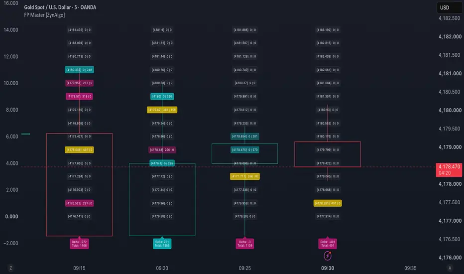
Order Flow Profiler (Zeiierman)█ Overview
Order Flow Profiler (Zeiierman) is a price-based volume profiling indicator that estimates how buying and selling activity is distributed across different price levels within a selected chart window.
Rather than displaying only total volume, the indicator divides the selected auction range into individual price cells and estimates how much buying and selling activity occurred inside each area.
Each candle’s volume is separated into estimated buy and sell participation using its close position, candle body direction, and wick structure. That activity is then distributed across the price levels the candle touched.
The result is a two-sided Order Flow Profile that helps visualize where buyers and sellers were most active, where one side dominated, and where significant pressure imbalances developed.
⚪ Order Flow Profile
The profile is divided around a central spine.
Sell activity extends to the left while buy activity extends to the right.
The width of each profile row represents the estimated amount of activity occurring at that price level. Larger profile sections therefore highlight prices where more participation was concentrated.
When Delta Dominance is enabled, the indicator also compares estimated buy and sell activity inside each individual price row.
• Positive Delta extends to the right and highlights prices where buying activity is stronger.
• Negative Delta extends to the left and highlights prices where selling activity is stronger.
• Larger and more prominent Delta cells indicate a stronger imbalance between both sides.
This allows the profile to show both where activity occurred and which side dominated at each price level.
█ How It Works
⚪ Buy and Sell Volume Estimation
Each candle’s volume is divided into estimated buy and sell activity using its close position, body direction, and wick structure.
buyVolume = volume × buyShare
sellVolume = volume - buyVolume
⚪ Price Cell Distribution
The profile range is divided into Price Cells, and each candle’s estimated buy and sell volume is distributed across the prices it traded through.
Cell Concentration controls how tightly that activity is focused around its estimated buy and sell centers.
⚪ Control Price
The Control Price is the price cell with the highest combined buy and sell activity.
Its color shows which side is dominant at that level.
⚪ Acceptance Area
Starting from the Control Price, the indicator expands through neighboring cells until the selected percentage of total profile activity is included.
This produces the Upper Acceptance Level and Lower Acceptance Level shown in the Data Window.
⚪ Delta Dominance
Delta measures the difference between estimated buy and sell activity at each price cell.
delta = buyVolume - sellVolume
• Positive Delta shows buy dominance.
• Negative Delta shows sell dominance.
Stronger imbalances create larger Delta cells.
⚪ Pressure Detection
Pressure Flags detect significant diagonal imbalances between neighboring price cells.
Buy Pressure compares buying activity with sell activity below, while Sell Pressure compares selling activity with buy activity above.
▲ indicates Buy Pressure.
▼ indicates Sell Pressure.
⚪ Active Profile Readout
The live profile is divided into broader price segments that compare total buy and sell activity within each area.
• BUY x MORE shows buyer dominance.
• SELL x MORE shows seller dominance.
• BALANCED shows no meaningful directional advantage.
This provides a faster summary of directional activity across the profile.
⚪ Historical Profiles
Historical Profiles preserve earlier profile snapshots, including the profile wings, Delta, Control Price, range caps, and Pressure Flags.
This allows traders to compare how the auction structure changes over time.
█ How to Use
⚪ Identify High-Volume Areas
Wide sections of the profile show price levels where activity was higher. These areas can help highlight important zones of participation, support, resistance, or consolidation.
⚪ Use the Control Price
The Control Price marks the price level with the highest combined buy and sell activity.
Traders can use it as a key reference level for acceptance, rejection, or potential mean reversion.
⚪ Read Buy and Sell Dominance
The profile wings, Delta cells, and Active Profile Readout help show which side is stronger at different price levels.
• Buy dominance can support bullish continuation or absorption.
• Sell dominance can support bearish continuation or rejection.
• Balanced areas show more even participation between both sides.
⚪ Compare Historical Profiles
Historical Profiles help show how the auction changes over time.
A rising Control Price and stronger buy activity can suggest improving bullish participation, while a falling Control Price and stronger sell activity can suggest increasing bearish participation.
The profile is most useful when combined with price structure, trend, support and resistance, and the surrounding market context.
█ Settings
Lookback Bars: Sets how many chart candles are used to build the profile.
Price Cells: Controls the number of price levels used inside the profile.
Cell Concentration: Controls how tightly estimated buy and sell activity is distributed around each candle’s activity centers.
Pressure Ratio %: Sets how strong a buy or sell imbalance must be before a Pressure Flag can appear.
Historical Profiles: Enables previous profile snapshots on the chart.
Snapshot Every Bars: Sets how often historical profiles are created.
Active Profile Readout: Enables the segmented BUY, SELL, and BALANCED summary beside the live profile.
Segments: Controls how many price sections are used in the Active Profile Readout.
Balanced Below x: Sets how close buy and sell activity must be for a segment to display BALANCED.
Delta Dominance: Shows which side dominates at each individual price cell.
Pressure Flags: Enables buy and sell pressure markers.
Wing Width: Controls the maximum width of the buy and sell profile wings.
-----------------
Disclaimer
The content provided in my scripts, indicators, ideas, algorithms, and systems is for educational and informational purposes only. It does not constitute financial advice, investment recommendations, or a solicitation to buy or sell any financial instruments. I will not accept liability for any loss or damage, including without limitation any loss of profit, which may arise directly or indirectly from the use of or reliance on such information.
All investments involve risk, and the past performance of a security, industry, sector, market, financial product, trading strategy, backtest, or individual's trading does not guarantee future results or returns. Investors are fully responsible for any investment decisions they make. Such decisions should be based solely on an evaluation of their financial circumstances, investment objectives, risk tolerance, and liquidity needs.
Индикатор

Structural Liquidity & POC Matrix [BigBeluga]🔵 OVERVIEW
The Structural Liquidity & POC Matrix is a clean, automated price action terminal built to track institutional key levels. It isolates important market highs and lows over a set lookback period and instantly projects them onto your chart as trailing liquidity lines.
Additionally, the script calculates a dynamic volume profile between those major high and low structural markers. Instead of scattering lines everywhere, it neatly draws this volume breakdown on the right side of your workspace to reveal exactly where the heaviest trading occurred and highlights the Point of Control (POC).
🔵 FEATURES
The toolkit maps out key market interaction zones using a streamlined structural tracking framework:
1 — Dynamic Liquidity Range Tracking
Automated Sweep Highs & Lows: The engine scans your chart using a set lookback period ( Liquidity Length ) to find key historical highs and lows, drawing sharp levels right at those turning points.
Smart Fading Level Lines: Once a liquidity line is plotted, it trails forward until it hits a customizable timer limit ( Fade Liquidity ). The line smoothly fades out and resets over time, ensuring your chart stays perfectly clean.
Visual Breakout Diamond Markers: The exact moment price action breaks or shifts out of a previously established liquidity level, the script prints a sharp diamond symbol (◆) to flag the market sweep.
2 — Adaptive Sidebar Volume Profile & Matrix
Right-Side Profile Alignment: To keep your workspace completely clear of clutter, the script shifts the historical volume breakdown out of the way, plotting it onto the right margin of your screen ( Profile Offset ).
Structural Volume Distribution: The engine tallies up all volume traded between the active major high and low blocks. It dynamically projects the results as a clean structural polyline matrix block, colored to match the dominant market flow.
Point of Control (POC) Target Line: The system automatically scans your volume data to pinpoint the absolute heaviest volume node ( Point of Control (POC) ). It stretches a bright line ( POC Color ) from the start of the structure all the way through the profile to reveal major institutional fair value anchors.
// Volume Profile Array Bins & POC Target Index Lookup
volBins = array.new(size, 0.0)
for i = start to bar_index
price = close
binIdx = math.floor((price - profBot) / atr)
if binIdx >= 0 and binIdx < size
array.set(volBins, binIdx, array.get(volBins, binIdx) + volume )
maxVol = array.max(volBins)
pocBinIdx = volBins.indexof(maxVol) // Find the exact index of the POC
🔵 HOW TO USE
Integrating these structural matrix lines into an everyday trading plan follows a clear, step-by-step strategy structure:
Isolate the Active Range Boundaries: Monitor the top orange and bottom blue tracking lines to instantly map the current structural playing field. These trailing boundaries reveal exactly where short-term stops and market liquidity pool rest.
Locate the Institutional Fair Value Anchor: Look for the bright yellow Point of Control line stretching across the chart. This level shows you where the largest amount of volume has changed hands, identifying a strong support or resistance anchor for future retests.
Execute Trades Off Range Sweeps: Watch the chart closely when price sweeps past an outer liquidity line and prints a diamond indicator. If price snaps back inside the range, look to ride the reversal momentum straight across the matrix toward the yellow POC target line.
🔵 NOTES
Why this implementation is unique:
It acts as a compact, self-cleaning support and resistance tool by automatically fading out old level lines before they can crowd your screen.
Rather than forcing you to look at a fixed, unmoving session volume profile, it anchors its volume calculation directly between the active high and low price pivots.
The smart polyline rendering engine keeps your trading window uncluttered by cleanly shifting detailed volume histograms entirely over to the right margin space.
Индикатор

Trade Wzrd - Tide [Rampage Series]✨ TRADE WZRD - TIDE ✨
Every price level has an owner. Not a metaphor - a measurement.
Tide splits the range's volume row by row into buy mass and sell mass , finds the levels one side owns outright, and draws them as living lines on the chart - with a graveyard of the levels that came before.
⚡ THE RAMPAGE SERIES ⚡
Tide is a release in the Rampage Series - a growing family of volume-and-levels tools built by Trade Wzrd. Every Rampage script ships with the same built-in automation layer: signals don't just paint, they speak. One alert, one webhook, and every entry, exit and fill fires a plain-text order string.
⚡ THE OWNERSHIP ZONES (THE HERO) ✨
Every bar's volume is divided by who won the close - bars that closed high are buyers' mass, bars that closed low are sellers' mass - then spread across the price rows it touched. When one side owns 65%+ of everything traded at a row (your threshold), that row is a SHELF. Tide paints the two that matter right now as ownership ZONES : the highest buyer shelf below price as a soft cyan field, the lowest seller shelf above it in red - the exact band one side owns, a glow bed under a bright edge, and the ownership printed right inside the zone: "78% OWNED BY BUYERS" . A tag at the right edge carries the price and the percentage; hover it for who owns it, since when, and exactly where it dies. A zone stays alive until price closes clean through it - then it dies where it fell, no ghost, because a failed level is just a line.
⚡ THE FOSSILS (THE HISTORY) ✨
When a shelf is replaced - not broken, just handed off to the next level - it fades into a fossil: a dotted ghost in its owner's color, frozen at the bar it was born. Fossils stay on the chart until the market mitigates them: price trades through a ghost and it's erased. What's left is the archaeology of the setup - every level that used to matter, still standing where it stood, until the market itself takes it down. Cap the graveyard or turn it off in the Fossils group.
⚡ THE POOLS (THE LIQUIDITY) ✨
Equal highs and equal lows are not coincidences - they're where the stops rest. Tide clusters swings within a tolerance you set into liquidity POOLS, and draws them as gold levels: the exact price, the touch count that built them (×3 = three equal highs worth of stops), dashed while the liquidity rests. Then the raid comes: a wick through the pool that closes back = the sweep. The chart stamps it in gold, the pool marks itself TAKEN in dots, and it dies honestly when price consumes it or time forgets it. And here's the fusion: a fresh sweep near a shelf fuels the defense - conviction rises, and the chip's hover tells you exactly why: "the sell stops are already taken." The dashboard's POOLS row names the nearest pool each side with its touches and distance in ATR.
⚡ THE CROWN & THE CENTER ✨
The dashed white line is the Point of Control - the row where the most mass traded in the range, price tagged at its end. The optional volume-center line is the 50/50 magnet every defense aims for. The full ownership numbers - undertow, POC, shelf count, balance - live on the dashboard, one glance away.
⚡ THE DEFENSE (THE SIGNAL) ✨
Price returns to a shelf and the owners defend it: a dip into a buyer shelf that closes back above = BUY · DEF. A poke into a seller shelf that closes back below = SELL · DEF. One defense per shelf per touch - a fired shelf releases only when price escapes it cleanly, so fresh touches can defend again but wick-spam cannot. Stops frame the shelf's far edge: if price trades through the shelf, the defense failed, honestly. Targets default to the VOLUME CENTER - the 50/50 magnet of the range's mass - capped at 3R with an R-multiple fallback.
⚡ THE UNDERTOW ✨
Beneath the rows, one number: the range's net delta. BULL +18% means the mass leans long; BEAR -12% means it leans short; BALANCED means the tide is slack. It's the dashboard's top row because it's the context every defense swims in.
⚡ CONVICTION & THE DATABASE ✨
Every defense carries one compact number - CONVICTION. Underneath: this chart's own live database, defenses bucketed by the shelf's dominance (owned / dominated / ruled) . That tier win rate is the base - then the score bends with the scenario: how owned the shelf is, balance alignment (defending from the side of value), kinetic fuel, absorption. Fused into one grade from 5 to 95. Hover any chip: the shelf's exact price band, who owns it and by how much, the tier's win rate and sample depth, balance, undertow, fuel. Nothing hidden.
⚡ THE SCHEDULE ✨
Every closed trade is filed by session - Asia, London, New York, off hours - and the dashboard learns which hours the defenses hold on this chart, with this logic. When the schedule has enough receipts, BEST SESSION names the shift.
⚡ BUILT-IN AUTOMATION ⚡
One alert ("Any alert() function call") + your webhook URL, and Tide speaks Trade Wzrd order strings:
⚡ Entries with SL/TP prices attached
⚡ Optional opposite-signal close prepended to new entries
⚡ TP/SL-hit close alerts that mirror the on-chart trade box
The same readable comma syntax drives automation across 7+ platforms - percent-risk or fixed-volume sizing, magic numbers, order comments. No lock-in: plain text, any endpoint.
✨ HOW TO READ IT ✨
⚡ Cyan zone below price = the band buyers own, defending longs - ownership % printed inside, price + % on the edge tag
⚡ Red zone above price = the band sellers own, defending shorts - same receipts
⚡ A zone that vanishes without a ghost = it broke: price closed clean through it. Failed levels leave no fossils
⚡ Dotted colored ghosts = fossils: shelves that handed the job off, standing until the market mitigates them
⚡ Gold dashed levels = liquidity pools: equal highs/lows where stops rest - tag shows price × touches
⚡ Gold POOL ×3 stamps = the raid: stops swept and rejected; the pool goes dotted TAKEN until it dies
⚡ A defense firing right after a sweep = the strongest setup Tide knows - conviction gets the fuel, hover says why
⚡ Dashed white line = the Point of Control, price tagged - where the most mass traded in the range
⚡ BUY · DEF 68 / SELL · DEF 71 chips = a shelf defended itself - the number is conviction
⚡ Gold diamonds = absorption: climax volume, no progress - someone ate the book right there
⚡ Dashboard: undertow, POC, shelf count, who's defending, database, best session, record, fuel
⚡ HOW TO USE ⚡
⚡ Drop it on any liquid symbol with volume, 15m to 4H - ownership maps everywhere
⚡ Let it run. The database and the session schedule start empty - they grow teeth from this chart's own history
⚡ Watch the tiers: if ruled shelves (90%+ ownership) earn more than owned ones, raise Shelf Dominance and let the weak ones go
⚡ Set Min Win Probability once the tiers have samples - cold tiers filter themselves out
⚡ Turn on Balance Alignment to defend only from the side of value
⚡ Wire one alert when you're ready to automate
✨ LIMITATIONS ✨
⚡ Buy/sell mass is estimated from where each bar closed inside its range - a proven approximation, not exchange order-flow. On symbols without volume, the profile, undertow and conviction stand down
⚡ Conviction starts from this chart's own history , tiered - a sample, not a promise. Small samples lie confidently; the hover tells you when a tier is young
⚡ The database resets when you change symbols, timeframes, or core settings - every context earns its own track record
⚡ Shelves defend best in rotation; in runaway breakouts price doesn't come back to defend anything - that's what the trade box's stop is for
Rift maps WHERE the volume traded. Tide knows WHO OWNS EVERY PRICE - and watches them defend it. Null Range knows WHERE THE VOLUME NETS TO NOTHING.
Educational shell. Not financial advice. Not a signal service.
Индикатор

Auction Regime Engine [v1.4 Historical Auction Spans]Here’s a polished TradingView-ready description in the same BBCode style you’ve used before.
Overview
Auction Regime Engine is a volume-profile and footprint-based auction analysis tool designed to visualize how value forms, migrates, compresses, expands and gets revisited over time.
The indicator combines a broad adaptive volume profile with historical auction episodes and a stateful regime engine.
Instead of asking only:
“Where is the current POC / VAH / VAL?”
it tries to answer a more useful set of questions:
Where has meaningful value formed?
Was that value built once or revisited multiple times?
Is participation increasing or decreasing between revisits?
Is price currently balancing, compressing, probing, accepting or rejecting value?
If price leaves value, is the auction migrating toward another volume cluster or rotating back toward POC?
Core Concept
Traditional volume profiles aggregate volume by price, but they do not always make it easy to understand when that volume was created.
Auction Regime Engine adds a time dimension.
A broad volume concentration may contain several separate historical auctions:
C2A — Initial value development
Price leaves the area
C2B — Later revisit and value development
Each episode is displayed separately so changes in participation and accepted value can be compared directly.
Adaptive Volume Cluster Map
The right-side profile builds a high-resolution composite volume map across a broad adaptive lookback.
The engine:
Aggregates native TradingView footprint volume by price
Automatically adapts the profile horizon to the chart timeframe
Adjusts profile resolution based on market range and volatility
Applies Gaussian smoothing to identify meaningful volume concentrations
Detects dominant HVN-style clusters
Uses low-volume valleys to separate neighboring distributions
Calculates local POC, VAH and VAL for each cluster
The result is a map of the major accepted-value regions currently present in the auction.
Historical Auction Spans
The indicator also searches the profile history for distinct periods where each price cluster was actively accepted.
For every significant episode it draws:
The full historical time span of the auction
Episode-specific VAH and VAL
Episode-specific POC
A compact volume profile inside the historical span
This makes repeated development in the same price region visible as separate auctions rather than combining everything into one historical box.
For example:
C2A BASE
...
C2B VOL -18% POC ↑
This means the same broad value region was revisited later, but the second auction developed approximately 18% less participation per bar while its accepted POC migrated higher.
Auction Evolution
Historical episodes belonging to the same cluster are connected with subtle dotted lines.
These connections help visualize two important changes:
Value migration — whether the episode POC moved higher or lower
Participation change — whether volume intensity strengthened or weakened on the revisit
This allows the historical map to show not only where value existed, but how the auction evolved each time price returned.
Current Auction Regime
The live engine evaluates the active cluster and classifies the current market environment.
Possible states include:
BALANCE
COMPRESSION
PROBE ↑ / ↓
ACCEPTED ↑ / ↓
ROTATING ↑ / ↓
MIGRATED ↑ / ↓
The goal is not to predict the next candle.
The goal is to distinguish between two very different auction outcomes:
Price leaves value + participation expands + acceptance develops
→ potential value migration / continuation
Price tests outside value + participation fails + price returns
→ rejection / rotation toward POC
Expansion and Acceptance Model
The live scoring engine evaluates several components together:
Relative volume
Range expansion relative to ATR
Footprint delta
Percentage of current footprint volume trading outside value
Current footprint POC migration
Consecutive closes outside the value area
These are combined into Participation, Expansion and Acceptance scores.
The dashboard displays them as:
P / E / A
for both bullish and bearish directions.
Dashboard
The compact dashboard separates three different concepts:
MARKET — compression / expansion environment
AUCTION — current cluster and whether price is inside or outside accepted value
FLOW — current state-machine transition such as rotation, probe or acceptance
It also displays:
Active VAH / VAL
Active cluster
Relative volume
Footprint delta
Participation / Expansion / Acceptance scores
Current auction target
Event Tape
Important auction transitions can also be shown directly on the candles.
Events include:
P↑ / P↓ — Probe
A↑ / A↓ — Accepted expansion
F↑ / F↓ — Failed break
M↑ / M↓ — Migration
R↑ / R↓ — Rejection / rotation
The indicator uses event priority and cooldown logic to reduce repeated signals and chart clutter.
Target Logic
When price remains inside accepted value, POC remains the natural rotational reference.
When price achieves accepted expansion outside value, the engine can instead reference the POC of the next detected volume cluster.
Conceptually:
Rejected breakout
→ rotate toward current POC
Accepted breakout
→ migrate toward neighboring value / next POC
Adaptive Mode
Adaptive Mode is enabled by default.
It automatically adjusts:
Profile lookback
Price-bin resolution
Gaussian smoothing
Cluster separation
Cluster selectivity
Historical event lookback
Structure refresh cadence
Compression thresholds
Expansion / acceptance thresholds
The intention is for the indicator to require minimal configuration across different timeframes.
Advanced manual overrides remain available for users who want more control.
Visual Modes
Clean
Designed for normal chart use.
Shows:
Current context profile
Most important historical auction spans
Active value structure
Sparse event markers
Dashboard
Full
Adds additional diagnostic information, including secondary events and more structural detail.
How I Use It
The indicator is intended as an auction-context tool rather than a standalone entry system.
A simple workflow is:
Identify the active value cluster.
Observe whether the market is balancing or compressing.
Watch what happens when price reaches VAH / VAL or an LVN transition.
Use the expansion and acceptance information to distinguish a genuine auction change from a failed excursion.
Use footprint / execution confirmation for the actual trade trigger.
Important Notes
Auction Regime Engine uses TradingView's native footprint data through Pine Script.
The high-resolution current map is built directly from footprint volume rows.
For performance, the historical event state machine uses a lighter structural model between profile refreshes rather than rebuilding the entire composite footprint map on every historical bar.
Historical auction episodes are analytical reconstructions based on volume participation and should be treated as contextual structure rather than exact exchange-defined sessions.
Requirements
This script uses `request.footprint()` and therefore requires access to TradingView's Pine footprint functionality.
Disclaimer
This indicator is an analytical tool and does not provide financial advice or guarantee future price movement.
Volume, footprint, value-area and regime information should be interpreted together with market context, liquidity, risk management and execution conditions.
Индикатор

NW Volume Profile - Kernel-Smoothed [Dots3Red]📊 NW VOLUME PROFILE - KERNEL-SMOOTHED
A volume profile answers a different question than a normal chart. Instead of "how much traded today," it asks "how much traded at each price." This version applies Nadaraya-Watson kernel smoothing to that profile before reading any level off it — turning a jagged, noisy histogram into the actual underlying distribution of where volume concentrated.
🎯 WHY THIS MATTERS
A raw volume profile is built from independent price bins — each one only knows its own volume, nothing about its neighbors. That makes it noisy: a single oversized candle can create a spike that looks like an important level but is really just where one bar happened to land. Reading real structure off a raw histogram means squinting past that noise.
This script smooths the profile before drawing anything. Every bin's displayed value becomes a weighted average of its neighborhood — nearby bins count heavily, distant bins barely at all, following a Gaussian curve. The lumps from individual candles melt away, and what's left is the true shape of the distribution that was underneath the noise the whole time. All the levels described below — POC, Value Area, HVN, LVN — are read from that smoothed curve, not the raw one.
🧮 HOW THE SMOOTHING WORKS
Each price bin's raw volume gets replaced by:
smoothed(i) = Σⱼ w(i,j) · raw / Σⱼ w(i,j)
where w(i,j) is a Gaussian weight based on how many bins apart i and j are, controlled by the Bandwidth setting. A small bandwidth stays close to the raw histogram; a large one produces one broad, simplified hump. This is genuine kernel regression applied across the price axis, not a moving average or a visual blur — it's the same mathematical technique used in the smoothed lines several Dots3Red scripts already use for slope/trend estimation, applied here to a distribution instead of a time series.
Toggle "Show Raw Histogram Behind" to see the original jagged bars faintly displayed underneath the smoothed profile — a direct before/after comparison on your own chart.
📏 WHAT EACH LEVEL MEANS
🟡 POC (Point of Control) — the single price with the highest smoothed volume. The market's center of gravity for the current window; price tends to be pulled back toward it.
🔵 Value Area — the price region around the POC containing a configurable share of total volume (default 70%). Price trading inside it is trading at a level the market recently agreed was fair — chop and rotation are common here. Price breaking out of it is the market rejecting that agreement, which is often when moves extend rather than stall.
🟢 HVN (High Volume Node) — a secondary local peak in the smoothed distribution. Acts like a sticky zone; price tends to slow down or pause when revisiting one.
🔴 LVN (Low Volume Node) — a local trough where very little volume ever traded. Acts like a thin spot; price tends to move through it quickly rather than lingering, since few positions were ever opened there.
HVN and LVN are drawn as full-width dotted lines across the chart (not just labels at the profile edge), specifically so they stay visible and trackable even after price has moved well away from where the profile itself was drawn.
🧭 HOW TO USE
👀 Start with where price sits relative to the Value Area. Inside it: expect rotation and two-way trade. Outside it: the move has already broken from recent consensus, which historically has more follow-through than reversion.
🧲 Treat POC as a magnet, not a wall. It is the level most likely to be revisited, not a guaranteed reversal point. How price behaves when it gets there — accepted or rejected — is the actual signal, not the level itself.
🐌 Expect hesitation at HVNs. A move approaching an HVN from your prior window is approaching a zone where the market has previously done a lot of business — some slowing or consolidation there is common.
⚡ Expect speed through LVNs. A thin zone with very little historical volume tends to get crossed quickly rather than acting as support or resistance. If price is moving toward one, a fast move through it before finding real support/resistance at the next node is a reasonable expectation.
🔧 Adjust Bandwidth to match what you're looking for. A tighter bandwidth reveals more granular structure (closer to raw); a wider one collapses the profile into its dominant, unmistakable levels. There's no universally correct setting — it depends on whether you want detail or clarity.
💡 EXAMPLE
Say the profile shows POC at 61,200, a Value Area from 60,400 to 62,100, and an LVN line sitting at 59,800. Price later drops to 60,450 — right at the edge of the Value Area. Two distinct scenarios are now readable from the profile: if price holds and turns back up, the 61,200 POC above is the natural target the market has repeatedly gravitated toward. If instead price breaks below 60,400, the empty LVN at 59,800 offers little historical volume to slow the decline — a fast move through that zone before finding the next real level is the more likely path. Same chart, two different expectations, both read directly off the same profile without any additional indicator.
⚙️ SETTINGS
📊 Profile
• Lookback (bars) — size of the rolling window the profile is built from
• Price Bins — vertical resolution of the profile
• Body Volume Only — distribute volume across the candle body instead of the full high-low range
🧮 Kernel Smoothing
• Bandwidth — width of the Gaussian kernel in bin units; controls detail vs. simplification
📏 Levels
• Value Area % — share of total volume the Value Area is expanded to contain
• Node Detection Leg — how many neighboring bins define a local peak/trough
• LVN Max Ratio of POC — how thin a trough must be, relative to POC, to count as an LVN
🎨 Visualization
• Show Raw Histogram Behind, POC Line, Value Area, HVN/LVN Marks — each independently toggleable
• Profile Width — how far the profile extends horizontally
🖥️ Dashboard
• Show/hide, position — displays current POC, Value Area bounds, node counts, and the active window/bandwidth settings
📝 NOTES
This profile is a rolling window — its levels update as the window slides forward with each new bar, which is expected behavior for a volume profile rather than a repainting signal (nothing appears and then vanishes; the underlying window is simply moving). Thin-volume symbols will produce a ragged profile regardless of smoothing settings — this tool is most informative on liquid instruments with consistent volume.
⚠️ DISCLAIMER
This is an analytical and visualization tool. It does not generate trade signals and does not constitute financial advice. Historical volume concentration at a given level does not guarantee how price will behave there in the future. Индикатор

Rogue VP ProRogue VP Pro is an advanced Previous Day Volume Profile indicator built for traders who rely on volume-based market structure to identify high-probability trading opportunities.
The indicator generates a detailed volume profile from the previous trading session and projects the most important price levels onto the current session, providing a clear framework for identifying support, resistance, acceptance, rejection, and potential liquidity areas.
Designed for intraday traders, Rogue VP Pro offers extensive customization while remaining lightweight and easy to read.
Features:
Previous Day Volume Profile
High-resolution volume profile with configurable calculation and rendering density.
Displays the previous session's volume distribution directly on the current trading day.
Supports:
Regular Trading Hours (RTH)
Previous Overnight Session
All Sessions
Automatically calculates and plots:
• Point of Control (POC)
• Value Area High (VAH)
• Value Area Low (VAL)
Optional labels display the exact price of each level.
Value Area Deviations
Project customizable deviation levels above and below the Value Area, allowing traders to identify potential extension targets and exhaustion zones.
Default deviation levels include:
• ±0.25 VA
• ±1.0 VA
• ±2.0 VA
Volume Nodes
Automatically identifies:
• High Volume Nodes (HVNs) – areas of heavy participation
• Low Volume Nodes (LVNs) – potential rejection or low-liquidity zones
Detection sensitivity and filtering thresholds are fully customizable.
Volume Surge Highlights
Identify unusually high-volume bars during Regular Trading Hours.
Bars exceeding a user-defined multiple of average volume are highlighted, making it easy to spot institutional participation and momentum events.
EMA Overlay
Includes an optional Exponential Moving Average for additional trend confirmation and trade confluence.
Customizable Appearance
Customize nearly every aspect of the indicator, including:
• Profile colors
• Value Area colors
• Node colors
• Deviation colors
• Line widths
• Label visibility
• Profile placement (left or right)
• Profile width and rendering resolution
Alerts
Create TradingView alerts whenever price touches one of the key Previous Day Volume Profile levels:
• POC
• VAH
• VAL
Alerts are limited to Regular Trading Hours for more relevant intraday notifications.
Ideal For
• Futures traders
• Index traders
• Options traders
• Scalpers
• Day traders
• Volume Profile enthusiasts
• Price Action traders
How It Can Be Used
Many traders use previous session volume information to:
• Identify high-probability support and resistance
• Monitor acceptance versus rejection around key value areas
• Locate potential breakout and reversal zones
• Trade rotations back toward the Point of Control
• Find confluence with other technical tools and market structure
Rogue VP Pro provides these important reference levels in a clean, highly configurable format, allowing traders to integrate volume profile analysis into virtually any trading strategy.
Disclaimer: This indicator is intended as a market analysis tool and should be used alongside sound risk management and your own trading plan. Индикатор

Time-Price Volume Heatmap with Liquidity SweepsWhat it does
Most volume tools compress everything into a single vertical profile, so you can see at which price volume traded, but not when. This script splits the lookback window into a grid of time columns × price rows and paints each cell by how much volume was actually traded inside it — producing a time-and-price heatmap of where activity concentrated as the market moved.
On top of that map it tracks the resting liquidity pools that price left behind, and flags the exact bar where each pool is taken.
How it is calculated
The heatmap
The lookback window (default 300 bars) is divided into Time Resolution columns (default 16) and Price Resolution rows (default 26), built between the highest high and lowest low of the window.
For every bar, its volume is distributed evenly across all price rows its high-low range covers. A bar spanning 5 rows adds one fifth of its volume to each. This approximates where inside the candle the activity sat, rather than assigning it all to the close.
Each cell is normalised against the busiest cell in the grid and coloured on a 3-stop gradient. Transparency scales with intensity, so cold zones stay faint and hot zones glow. Cells below Min Intensity are not drawn at all — this keeps the chart readable and stays inside the 500-object limit.
Point of Control Rows are summed across all columns; the heaviest row is drawn as the POC line. The panel also shows POC Density — that row's share of total mapped volume. A high number means volume is concentrated on one shelf; a low number means it is spread out.
Liquidity pools Confirmed pivot highs and lows (Pivot Strength, default 8) mark levels where stop orders typically rest. Each is drawn as a dotted line extending right, labelled with its price. When price trades through a level it is re-drawn solid grey and marked SWEPT, and the sweep counter increments. Levels older than Level Max Age are removed automatically.
Volume bursts Volume is converted to a z-score over Volume Window bars. Two dot sizes mark bars above the strong (2σ) and extreme (3.5σ) thresholds — useful for spotting which bar actually did the damage at a level.
Volume Pressure Volume of up-closes minus volume of down-closes across the window, expressed as a percentage of total. A rough directional bias for the mapped period.
How to read it
Hot zones = price spent time and volume there. They tend to act as magnets and as friction; moves through them are usually slower.
Cold gaps = thin areas. Price often travels through them quickly.
A sweep followed by an immediate move back inside the previous range is the classic liquidity-grab pattern. The sweep marker plus an extreme volume dot on the same bar is the strongest version of it.
POC as reference: the panel tells you whether price is above or below the heaviest shelf. Индикатор

Volume Profile XL**Volume Profile XL — Overview**
Volume Profile XL shows *where* trading activity concentrated across price, rather than just when it happened. It divides price into horizontal bins and draws a sideways histogram: the longer a row, the more volume traded at that price. This reveals the levels the market accepted (heavy rows) and the levels it passed through quickly (thin rows), plus three key reference prices — the POC and the Value Area boundaries.
**The two ways it can display**
- **Per Day (Historical)** — the default. It draws a separate profile over each of the last several periods, sitting on top of that period's candles. This lets you see how accepted price shifted from one day to the next.
- **Combined** — one single profile built from a fixed number of recent bars, drawn off to one side of price. This gives a clean, current read of fair value across the recent move without splitting it by day.
**The three reference markers on every profile**
- **POC (Point of Control)** — the single price with the most volume; the profile's center of gravity.
- **VAH / VAL (Value Area High / Low)** — the top and bottom of the price band containing the chosen percentage of volume. Price inside this band is "in balance"; price leaving it signals the market is exploring new territory.
---
**Mode settings (top of the panel)**
- **Profile Mode** — switches between Per Day and Combined, as described above.
- **Split Up/Down Volume** — when on, each row is colored in two parts, showing how much of that level's volume came from up-closing versus down-closing bars, so you can read buying vs. selling pressure within a level. When off, each row is a single color based on whichever side dominated. Turning it off also halves the drawing load, which lets you display roughly twice as many days at the same detail — the main lever when you want more history on screen.
**Calculation settings**
- **Number of Rows** — how finely price is sliced. More rows means more detail but, in Per Day mode, fewer days fit on screen at once. Fewer rows means a coarser profile but more history.
- **Value Area %** — the share of volume the Value Area captures. Seventy percent is the long-standing market convention; raising or lowering it widens or narrows the VAH–VAL band.
**Per Day (Historical) settings**
- **Period** — whether each profile covers a Day, a Week, or a Month.
- **Historical Lookback (Days)** — how many periods back to draw. If you request more than the screen can hold, it automatically shows as many as fit rather than erroring.
- **Profile Width (% of period)** — how much of each period's horizontal space the widest row fills. Lower values make slimmer, less overlapping profiles; higher values make bolder ones.
**Combined settings**
- **Lookback Bars** — how many recent bars feed the single combined profile.
- **Placement** — draws the profile to the Left or Right of current price.
- **Max Profile Width** — the on-screen length of the busiest row; controls the overall size of the histogram.
- **Gap From Price** — spacing between the profile and the candles.
**Colors & Lines settings**
- **Up Volume / Down Volume** — the two histogram colors.
- **Show POC** and **POC Color / POC Line Style** — toggle the Point of Control line and set its color and style (Solid, Dashed, or Dotted).
- **Show Value Area** and **VA Color / VA Line Style** — toggle the Value Area lines and set their color and style.
- **Label Size** — the size of the POC, VAH, and VAL price tags, from Tiny to Huge.
---
**How to use it in practice**
- **Read the shape first.** Fat rows are magnets where price tends to stall; thin rows and gaps are fast zones price tends to slice through.
- **Watch behavior at the edges.** Price stalling at VAH or VAL and turning back suggests balance and a move toward the POC. Price pushing through an edge and *holding* there suggests acceptance and a possible trend in that direction.
- **Compare day to day (Per Day mode).** Overlapping value areas across days point to a sideways, balancing market; value areas stepping steadily up or down point to a trend. Where today opens relative to yesterday's Value Area is one of the most useful tells for whether the session is likely to rotate or run.
- **Use Combined for the big picture.** When you want one clean map of the current support and resistance shelves rather than a day-by-day breakdown, switch to Combined and place it on whichever side keeps your price action clear.
**A note on the data**
The profile is built from each bar's price range and volume, which is the standard approach for this kind of tool on this platform. It's a close approximation of the true volume-at-price distribution, not a tick-by-tick reconstruction, so treat the levels as high-quality reference points rather than exact measurements. Индикатор

Volume Profile Multi-ModeDESCRIPTION
VP Multi-Mode builds a volume-by-price profile from REAL traded volume and lets you choose, from one dropdown, what stretch of the chart each profile covers.
WHAT A VOLUME PROFILE IS (skip if you know) A normal chart shows how much volume traded per unit of TIME — the bars along the bottom. A volume profile flips that: it shows how much volume traded at each PRICE. The result is a sideways histogram. Long bars are prices where a lot of business got done; short bars are prices the market passed through quickly. Traders use the fat areas as reference (price tends to revisit and pause there) and the thin areas as places price tends to move through fast.
Three levels come out of it:
POC (Point of Control) — the single price bin with the most volume. The fairest price of that range by traded-volume consensus.
VAH / VAL (Value Area High / Low) — the band around the POC containing a chosen share of the range's volume (70% by default, the Market Profile convention). Inside the value area = accepted price; outside = the market is exploring.
WHAT MAKES THIS ONE DIFFERENT
Real volume, not an approximation. Each chart bar is decomposed into intrabar sub-bars (1-minute by default) via request.security_lower_tf(), and each sub-bar's ACTUAL reported volume is distributed into the price grid. It does not use tick data and it does not use the up/down-tick estimate that the built-in SVP relies on. You can also choose how a sub-bar's volume is spread:
Range/Uniform (default, the honest one) — spread evenly over every bin the sub-bar's low-to-high touched.
Close — dump the whole sub-bar's volume in its closing-price bin.
Five range modes in one script. Most profile tools pick one anchoring scheme. This one lets you switch:
Time Window — any HHMM start/end, wraps past midnight.
Session Open->Close — Asia / London / US, each with editable open and close times. One profile per selected session per day.
External Swing — anchors between an external higher-high (a pivot high above the previous pivot high, i.e. liquidity taken above) and an external lower-low. Strictly point-in-time: a pivot is only used once confirmed.
Manual Drag — two click-to-place time handles, the Pine analog of dragging the built-in SVP's handles.
Weekly + N Days — anchored at the Monday 09:30 ET cash open and running to (that Monday + 7 + N) days. Rolling, so these profiles deliberately overlap.
Optional volume delta, labelled honestly. Turn on Show Volume Delta and each bin is coloured by net buying vs selling, with the profile's total delta printed on the POC label. This is a BAR-CLASSIFIED PROXY: each 1-minute sub-bar's real volume is signed by its own close-vs-open direction. It is NOT true aggressor / bid-ask delta — no tick or order-book data is used, and it cannot tell who lifted the offer from who hit the bid inside a sub-bar. It is stated that way in the tooltip too.
Placement that sits on the price action. The histogram is anchored to the range's right edge and grows LEFT across the candles by default, so it overlays the bars it was built from instead of being parked in the right margin. Anchor edge, direction, width and offset are all inputs. Everything is drawn on bar_index, so it does not drift when you zoom.
HOW TO USE
Quick start: add it to the chart and leave everything alone. You get the US cash session (09:30-16:00 ET) profiled once per day for the last 12 days, POC as a solid red line, VAH/VAL as dashed orange lines, and the value area shaded.
Then adjust in this order:
Pick the range that matches your question (Range Mode group).
"Where is value for today's session?" -> Session Open->Close, US.
"What did the overnight build?" -> Session Open->Close, Asia (or Time Window with your own hours).
"Where did volume sit across this leg up?" -> External Swing.
"Just profile this bit here" -> Manual Drag, then click the two handles on the chart when prompted.
"Where is the week's value, with carry-over into the next few days?" -> Weekly + N Days.
Set resolution and detail (Engine group).
Intrabar resolution: 1 minute is the default and works on most charts. Finer (e.g. 1S) is more faithful but TradingView only serves intrabar data for a limited number of recent bars, so finer settings shorten how far back profiles can be built.
Price bins: 25 default. More bins = finer profile, but see the limit below.
Value Area %: 70 is the convention; lower it to see a tighter core of value.
Timezone: America/New_York by default, since the session presets are ET.
Fit it to your chart (Display group). Profile extension sets how many bars wide the POC bin is drawn; the rest scale to their volume. Profile offset nudges the whole thing left or right. Extend direction flips it between overlaying the candles and sitting in the empty margin.
Optional: turn on Show Volume Delta to colour bins green/red by net direction and read the range's total delta off the POC label — bearing in mind the proxy caveat above.
READING IT
Price accepted inside the value area, POC flat and centred -> balanced/rotational; the edges (VAH/VAL) are the reference for fading.
Price leaving the value area and holding outside -> the market is seeking new value; the old VAH or VAL often becomes the level that has to hold on a retest.
A thin patch in the histogram is a price the market moved through with little business done. Revisits often travel across it quickly.
A POC that migrates day over day in one direction is a trend in where business is being done, not just in price.
The script draws levels and volume. It gives no buy/sell signals and makes no performance claims — it is a context tool.
IMPORTANT LIMIT (please read before reporting a bug)
TradingView caps a script at 500 boxes, 500 lines and 500 labels. Each profile costs roughly (bins + 1) boxes. With the defaults, 25 bins x 12 profiles is about 312 boxes. The script auto-clamps the number of profiles it draws to whichever is smaller: your "Max profiles back" setting, or floor(490 / (bins + 1)).
So: painting every session across all history is not possible in Pine, by any script. You always see the most recent N. If you raise the bin count, the number of visible profiles automatically drops to compensate.
Similarly, intrabar data is only available for a limited number of recent chart bars. Older profiles may thin out or stop — that is a data-availability limit, not a fault in the script.
Open source. Comments in the code explain the engine, the delta proxy, and the object budget. Индикатор

Fib-Weighted Volume ProfilesFib-Weighted Volume Profiles combines Fibonacci retracement levels with a swing-based volume profile on the most recent confirmed pivot leg. Instead of drawing Fib levels in isolation, this indicator shows how much of the swing's traded volume accumulated near each Fib price — helping you spot high-confluence support, resistance, and reaction zones.
What makes it different
Volume-weighted Fib analysis on the active swing leg (not a fixed session profile)
POC (Point of Control), 70% Value Area, and horizontal volume histogram
Golden Pocket zone (0.618–0.66) highlighted for OTE / pullback trading
Confluence star ratings (★ to ★★★) based on volume %, POC proximity, and Golden Pocket
Ghost POC lines from prior swings for historical liquidity context
Optional HTF EMA trend filter to fade counter-trend levels
Developing swing extension (SH* / SL*) before pivot confirmation
Built-in alerts for strong Fib confluence, POC touch, and Golden Pocket volume
How it works
Detects the latest swing using confirmed pivot highs/lows (default 5 left / 5 right bars — no repaint).
Builds a volume profile across that swing range using configurable price bins.
Plots standard Fib levels (0, 0.236, 0.382, 0.5, 0.618, 0.786, 1) and measures the % of total swing volume near each level.
Colors and line weight reflect volume strength: strong (≥20%), medium (≥10%), weak.
When POC aligns with a Fib level, labels merge into a single POC+Fib tag.
Value Area box turns green/red on breakout; dashed style indicates a developing (unconfirmed) swing.
Chart elements
Yellow dashed line — POC (highest volume price in the swing)
Blue box — Value Area (~70% of volume); dashed border = developing leg
Purple box — Golden Pocket (0.618–0.66)
Grey histogram — Volume distribution by price bin
Colored Fib lines — Volume strength at each retracement level
P-1, P-2 labels — Ghost POC from previous swings
SH / SL — Swing high / low markers (asterisk = developing)
Recommended settings
Stocks / Forex (15m–1H): Bin Count 24–32, Pivot 5/5
Crypto (5m–15m): Bin Count 32, enable LTF Volume Distribution if on higher TF
No volume data (some CFDs): Enable "Synthetic Profile If No Volume" — Fib + swing only, or equal-weight approximation
Crowded labels: Increase "Label Horizontal Spacing" to 12–16 bars
Alerts
Strong 0.618 Volume — volume confluence at the 0.618 Fib level
Strong Fib Confluence — any Fib level exceeds the strong threshold (default 20%)
POC First Touch — price touches POC for the first time in the current swing
Golden Pocket + Volume — price in Golden Pocket with strong zone volume
Limitations
Designed for the latest swing leg — not a full-session anchored profile.
Very long swings are trimmed to Max Bar Range (default 500) for performance.
LTF volume applies to the current bar only; history uses chart-timeframe volume.
Pivot settings affect swing detection — adjust for your market and timeframe.
Drawing limits (500 lines/labels/boxes) may clip visuals on extremely active charts.
Disclaimer: This indicator is for educational and analytical purposes only. It does not constitute financial, investment, or trading advice. Past volume distribution patterns do not guarantee future price behavior. Always manage risk and do your own research before making trading decisions.
Индикатор

Rolling Volume Delta█ OVERVIEW
Rolling Volume Delta (RVD) estimates net buying vs. selling pressure per bar, then weights that pressure by how much price actually moved — so a strong directional bar counts for more than a quiet, indecisive one. The result is summed over a rolling window, smoothed, and normalized against total volume so it reads consistently across different instruments and volume regimes.
█ CONCEPT
Most volume delta tools estimate buy/sell pressure and stop there. RVD adds one more step: it multiplies each bar's estimated delta by the magnitude of that bar's price change. The logic is that a bar where buyers dominate AND price actually moved higher represents more conviction than a bar with the same buy/sell split during a flat, choppy stretch. That weighted delta is then summed over a rolling window and smoothed, so the final line reflects sustained pressure rather than single-bar noise.
█ HOW IT WORKS
1. Buy/sell split: each bar's volume is divided between buy and sell based on where the close landed within that bar's high-low range (close near the high = buy-weighted, close near the low = sell-weighted).
2. Price weighting: that delta is multiplied by the percentage price change over a configurable lookback, so bars with bigger moves are weighted more heavily.
3. Rolling sum: the weighted delta is summed over a configurable lookback window.
4. Smoothing: an EMA is applied to reduce noise.
5. Normalization: the smoothed result is divided by total volume over the same window and expressed as a percentage, keeping the scale comparable across tickers and sessions.
█ HOW IT DIFFERS FROM OTHER VOLUME DELTA SCRIPTS
Other delta oscillators calculate buy/sell pressure and smooth it directly. RVD's price-weighting step means the indicator isn't just "how much delta happened" but "how much delta happened relative to how much the market actually moved" — filtering out high-volume, low-conviction chop from the signal.
█ SETTINGS
- Lookback Length — bars summed together for the rolling delta. Longer = smoother, slower.
- Smoothing — EMA length applied to the rolling sum.
- Momentum Lookback — bars back used to measure price change for weighting. Higher values emphasize sustained moves over single-bar spikes.
As bars carry more information on their own (higher timeframes), less summing and smoothing is needed for a clean read. Within any timeframe, trending conditions benefit from longer/smoother settings that confirm sustained pressure and filter chop, while ranging conditions benefit from shorter/quicker settings that catch reversals near the extremes at the cost of more false flips in the middle of the range.
Suggested starting points:
Timeframe | Condition | Length | Smoothing | Momentum Lookback
5-30 min | Trend / Price Discovery | 14-20 | 3-5 | 1-2
5-30 min | Range / Accumulation | 8-10 | 1-2 | 1
1-4 hour | Trend / Price Discovery | 10-14 | 2-3 | 2-4
1-4 hour | Range / Accumulation | 6-8 | 1-2 | 1-2
Daily+ | Trend / Price Discovery | 8-10 | 2 | 3-5
Daily+ | Range / Accumulation | 5-6 | 1 | 2
These are included in each input's tooltip in the settings popup as well.
█ NOTES
This is a volume-estimation tool based on standard OHLCV data (bar range and close position), not true tick-level buy/sell data — most retail data feeds don't provide that, so this is the same practical tradeoff most public volume delta scripts make. It's intended as a context tool for reading order flow alongside price action, not a standalone signal generator.
This publication is for educational purposes only and does not constitute financial advice. Past performance and visual patterns do not guarantee future results. Индикатор

IQ Session Bayesian Particle Filter [TradingIQ]🔹 OVERVIEW
This indicator runs a genuine Sequential Monte Carlo particle filter; the Bayesian architecture used in robotics and signal tracking... on your chart! Session by session, it learns where trading volume concentrates and paints a forecast of the coming session's entire volume-by-price distribution before that session unfolds: every expected high-volume level at once, not a single line.
It is not a moving average wearing a costume. Each finished session is treated as evidence: hundreds of particles are weighed against what actually traded, resampled, and mutated. Predict → observe → update, honestly Bayesian, every session.
🔹 HOW IT WORKS
Two particle swarms run side by side:
• A shape swarm learns the form of the distribution; one lump or several, wide or tight, and where each volume node sits.
• A drift swarm learns how far from the open the session's center of gravity tends to land.
An empirical-Bayes trust term scales the drift forecast by how much it has actually earned: when its track record is poor, the forecast automatically hugs the open. The prediction you see is the shape swarm's density, re-anchored by the trusted fraction of the drift forecast, rendered through a kernel density estimate whose bandwidth follows Silverman's rule.
🔸 HOW TO READ IT
• Session heatmap — the predicted density painted from the session open to the profile. A two-tone gradient split at the open; the tones swap roles across it, so each side mirrors the other. Bold color = expected business, fade = expected quiet.
• Mirrored profile — the forecast on the left, split bullish/bearish at the session open; the realized session volume on the right in a single neutral color.
• Confidence honesty — the prediction's glow scales with the filter's live confidence. When it has been wrong lately, its side visibly goes quiet. The realized side never fades, because reality doesn't.
• Bias info box — seated between the halves: the share of predicted volume above vs below the open (🢁 / 🢃).
• Expected levels — dashed lines at the probability-weighted average predicted price of each half: the session's expected bull and bear magnets.
• HVN lines + POC — the predicted high-volume levels. The point of control always shows; the HVN Threshold input is your dial between a few safe targets and every level worth watching.
🔹 SELF-TUNING
Every statistical free parameter tunes itself from data: the KDE bandwidth (Silverman's rule for visual convenience), the observation noise, the swarms' search domain (tracks the observed session spread), the mutation rate (genetic adaptation), the scout rate (scales with recent error), and the center trust (regression shrinkage). The inputs you are given are visual preferences plus a compute preset. There is nothing statistical to fiddle with, on purpose.
🔸 INPUTS
• Session Engine — Session Timeframe (the session boundary; must exceed the chart timeframe), Prediction Quality (particles per swarm, Fast 100 → Max 4000), Sessions to Keep.
• Volume Profile — toggles for the profile, bias box and expected levels; width, offset, info-box width, transparency.
• Session Heatmap — toggle, faint/bold density transparencies, Tone A / Tone B.
• High Volume Nodes — toggle, HVN Threshold %, reach, color.
• Colors — Bullish, Bearish, Realized.
🔹 VALIDATION
The filter was tested on real intraday data; 10 large-cap symbols, three session horizons, every prediction one-step-ahead and out-of-sample, against uniform, yesterday's-profile, Gaussian-fit, rolling-average and EWMA baselines, with the test harness itself audited too.
• Against naive prediction (uniform prior, yesterday's profile) it wins every metric tested at every horizon.
• Against the strongest profile-averaging methods it trades wins: they edge the single-lump fit metrics; the filter captures materially more of the session's actual traded volume with its predicted levels, and is the only method that reliably names multiple simultaneous targets .
• On sessions with two or more real volume peaks; roughly 4 in 10 sessions, its targets covered 19–42% more realized volume than the best alternative.
🔸 LIMITATIONS AND HONEST NOTES
• The forecast for a session is set when that session opens and is not repainted ; the realized half updates live as the session trades.
• It estimates a distribution of volume , not a promise of direction. The bias %, expected levels and HVN set are probability-weighted readings of that distribution.
• The filter is stochastic by nature: two chart reloads can differ in fine detail, the way two runs of any Monte Carlo method do. The structure it finds is stable; the pixel-level noise is not.
• Requires volume data from your data feed. Not supported on non-standard chart types.
• The chart timeframe must be lower than the session timeframe.
Индикатор

Previous Day Volume Profile (VAH / POC / VAL)Previous Day Volume Profile — VAH / POC / VAL
Automatically calculates the previous trading day's Volume Profile and projects its three key levels — Value Area High, Point of Control, and Value Area Low — as dotted horizontal lines across the current trading day. Levels roll forward automatically at each new session, so yesterday's value area is always on your chart without manual drawing.
How it works
The trading day is defined by a configurable session and timezone (not midnight), so it works correctly on nearly-24h futures — e.g. 23:00–21:55 UK for CME index futures.
The profile is built from intrabar data (request.security_lower_tf, default 1-minute; seconds timeframes supported on Premium+ plans), giving near-tick resolution regardless of your chart timeframe. Where intrabar history isn't available it falls back to chart bars.
Each intrabar's volume is pro-rated across the price bins its high-low range overlaps (with an even-split option).
Bins are anchored to the absolute price grid, exactly N ticks wide (configurable, default 2 ticks), or alternatively a fixed row count.
POC = the highest-volume bin. The Value Area (default 70% of the day's volume) expands outward from the POC using the classic Market Profile "double" method — comparing the sum of the two bins above the band vs. the two below and adding the fuller pair (a simpler single-bin mode is also available). VAH and VAL are the band's top and bottom edges.
Inputs
Session and timezone defining the trading-day boundary
Row sizing: ticks per row, or fixed number of rows
Value Area percentage and expansion method (double / single)
Volume distribution: pro-rated or even split
Intrabar timeframe (1S–5min) with on/off toggle
Colour and line width per level, label toggle and offset
Notes
Lines are drawn only on the current day, from its first bar to the right edge — the previous day's candles stay clean. Old drawings are removed at each session roll.
Computed values are also exposed in the Data Window for verification.
Pine cannot access true tick data; on plans without seconds timeframes, 1-minute intrabars are the finest available resolution (the same resolution TradingView's built-in profiles use on those plans), so levels may differ from tick-based profiles by a row or so. Индикатор

Rogue Overnight Volume ProfileRogue Overnight Volume Profile
The Rogue Overnight Volume Profile is an institutional-style overnight volume profile designed specifically for futures traders who use overnight auction structure to prepare for the Regular Trading Hours (RTH) session.
Unlike traditional session volume profiles that remain fixed throughout the day, Rogue Overnight Profile automatically builds the overnight distribution, identifies the most important price levels, and projects them into the current trading session for easy decision making.
Features:
Overnight Volume Profile
Automatically builds a complete volume profile during the overnight session.
Adjustable profile resolution with up to 1,000 price rows.
Value Area (default 70%)
Point of Control (POC)
Value Area High (OVAH)
Value Area Low (OVAL)
Customizable profile colors and placement.
Dynamic Overnight Levels
The indicator automatically calculates and plots:
OVAH (Overnight Value Area High)
OPOC (Overnight Point of Control)
OVAL (Overnight Value Area Low)
These levels begin at the start of the completed overnight profile and extend just beyond current price during the New York session, keeping the chart clean while maintaining important reference levels.
Historical overnight levels are retained for previous sessions to assist with market structure analysis.
Developing Overnight Range:
Monitor the overnight auction as it forms with an optional shaded developing range, allowing traders to visualize overnight balance before the market opens.
Weekly VWAP
Includes a built-in Weekly VWAP with customizable color and line width to provide higher-timeframe context and institutional bias.
5-Period Moving Average
A configurable 5-period moving average (EMA or SMA) can be displayed to help identify short-term momentum and trend direction.
First Touch Detection
Automatically identifies the first interaction with overnight profile levels during the New York session.
Supported first-touch signals include:
OVAH First Touch
OPOC First Touch
OVAL First Touch
These areas often act as important decision points where responsive buyers or sellers may enter the market.
Break & Retest Detection
The indicator can also detect break-and-retest setups after price establishes acceptance above or below an overnight level.
Bullish and bearish retest opportunities are labeled automatically, making it easier to identify continuation setups around key profile references.
Fully Customizable
Every major component can be enabled, disabled, or customized, including:
Session times
Profile resolution
Value Area percentage
Historical sessions displayed
Colors
Labels
Weekly VWAP
Moving Average
Touch detection
Retest detection
Designed For
Nasdaq Futures (NQ)
S&P Futures (ES)
Dow Futures (YM)
Russell Futures (RTY)
Crude Oil (CL)
Any market where overnight auction structure influences the regular session.
Best Used For
Identifying overnight support and resistance.
Planning opening scenarios.
Fade and acceptance trades around OVAH, OPOC, and OVAL.
Breakout confirmation.
Break-and-retest continuation setups.
Understanding overnight market positioning before the RTH open.
Disclaimer: This indicator is intended as a decision-support tool and does not provide financial advice. Always incorporate sound risk management and additional market context before entering any trade. Индикатор

Seller Exhaustion DetectorSeller Exhaustion Detector (SED)
Overview
Seller Exhaustion Detector identifies the point where a downtrend's selling pressure is spent and buyers begin absorbing supply — the transition from distribution to accumulation. Instead of reacting to a single pattern, it scores seven independent exhaustion footprints and only confirms a signal when structural gates prove the low is actually holding.
How It Works
The detector scores confluence across a 16-point scale:
Liquidity Sweep + Reclaim (3 pts) — tracks untapped pivot-low liquidity pools; a wick below a pool followed by a close back above it marks a stop run absorbed by passive buyers.
CVD Bullish Divergence (3 pts) — price makes a lower low while session-reset cumulative volume delta makes a higher low: sell orders are no longer moving price.
RSI Bullish Divergence (2 pts) — momentum fails to confirm the new price low.
Sell-Volume Dry-Up (2 pts) — red-candle volume contracts near the lows; motivated sellers are done.
Absorption (2 pts) — elevated volume, compressed range, close in the upper half: supply being eaten without downside progress.
Higher Low (2 pts) — first structural higher pivot after the low.
Selling Climax Watch (1 pt) and Confirmed Wick Rejection (1 pt) — capitulation context and next-bar-confirmed hammer rejections.
A score alone never fires a signal. Three hard gates must also pass: the low must have held for a configurable number of bars (or a fresh sweep-reclaim substitutes as confirmation), price must be above a rising/flat EMA9, and fast volume delta must be positive. This eliminates premature signals printed while price is still making new lows.
Signals
Orange circle — selling climax (capitulation bar; watch window begins)
Gold diamond — liquidity pool swept and reclaimed
EXHAUSTION label — confirmed exhaustion (score + all gates)
ACCUMULATE label — post-exhaustion structure reclaim with positive delta
STOP-OUT label — the exhaustion low broke; the signal is invalid
Dashboard — live score breakdown and gate status, with selectable text size
Recommended Use
Built for 1-minute to 5-minute intraday charts on liquid symbols. Use EXHAUSTION as location, ACCUMULATE as trigger, and the invalidation print as a hard exit reference. Tune Climax Multiplier down (~1.7) and Pivot Left/Right to 3–4 for faster symbols.
Limitations
Volume delta is approximated from candle direction (up-volume minus down-volume), not exchange bid/ask data, so absorption and CVD reads are estimates. All components are derived from OHLCV and confirm after the fact by design — the detector locates high-probability reversal conditions; it does not predict bottoms. Not financial advice. Индикатор

Volume Profile Levels - POC, Value Area, HVP/LVPVolume Profile Levels — POC, Value Area, HVP/LVP
OVERVIEW
This indicator builds a fixed-range volume profile over a user-defined lookback window and extracts its key structural levels as horizontal lines: the Point of Control (POC), the Value Area boundaries (VAH/VAL), and local High/Low Volume Peaks (HVP/LVP). The goal is not the histogram itself but the levels it produces — clean, alertable support/resistance derived from where volume actually traded.
HOW IT WORKS
Volume distribution. For each bar in the lookback window, its volume is distributed evenly across the price bins that the bar's high–low range spans. The full range of the window is divided into a configurable number of rows.
POC and Value Area. The POC is the bin with the highest accumulated volume. The Value Area is expanded outward from the POC, adding the larger neighboring bin at each step, until the target percentage of total volume (70% by default) is covered.
HVP / LVP detection. A bin qualifies as a High Volume Peak when it is a local maximum and exceeds the bin average by a configurable multiplier. A Low Volume Peak is a local minimum below the average by a configurable multiplier. Up to six levels of each type are shown, ranked by volume.
MTF mode. The profile can be calculated on a higher timeframe while displayed on the current chart. In MTF mode the lookback is counted in higher-timeframe bars, and the histogram can be hidden automatically to keep the chart readable while the levels remain.
FEATURES
- Fixed-range volume profile with adjustable lookback, row count, and Value Area percentage
- POC, VAH/VAL, HVP, and LVP levels drawn as lines across the analyzed range
- Optional profile histogram on the right or left side of the chart
- Higher-timeframe profile calculation with automatic histogram hiding
- Three label modes: full text labels, minimal dots, or both
- Diagnostics table showing the profile's range, bin size, total volume, and level counts
ALERTS
All alerts use the generic alert() function: create one alert on the indicator with "Any alert() function call" and enable the events you want in the settings.
- POC / VAH / VAL cross (close crossing the level)
- HVP / LVP level cross (optional; can be noisy)
- SR Flip: after a level is broken, the alert fires if price retests the level with a wick within a configurable bar window while the close holds the breakout direction
- Value Area entry / exit
NOTES
- The profile is an approximation: volume is split evenly across each bar's range, as tick-level data is not available in Pine. Results depend on the chart timeframe and the lookback setting.
- Levels are recalculated on every bar, so they shift as the window rolls forward. This is a rolling analysis tool, not a fixed anchored profile.
- Works on any symbol that provides volume data. Индикатор

Intrabar Profile [Kioseff Trading]Hello Traders!
🔹 Intrabar Profile
Intrabar Profile is a lower-timeframe profile tool designed to draw a volume profile or delta profile on each individual candle .
Instead of only looking at where a candle opened, closed, wicked, or changed color, this indicator attempts to show:
Where did volume actually trade inside the bar?
It focuses on answering a deeper question:
What happened inside the candle that normal candlesticks do not show?
volume profile on every visible bar
delta profile on every visible bar
lower-timeframe volume distribution
POC detection per candle
value area visualization
buy-side vs sell-side imbalance display
optional volume-at-level labels
adaptive scaling as the chart zooms in or out
🔹 What the indicator shows
🔸 Intrabar Volume Profile
The indicator reconstructs a mini volume profile for each candle using lower timeframe data.
This allows you to see:
where volume was concentrated inside each bar
which price level had the highest volume
how volume was distributed across the candle range
whether volume was balanced or concentrated near specific levels
This shifts your perspective from:
“this candle closed bullish or bearish”
to:
“where did participation actually take place inside this candle?”
🔸 POC Per Candle
Each intrabar profile includes a Point of Control , or POC.
The POC marks the price level inside the candle where the highest amount of volume was detected.
This helps identify:
where the most trading activity occurred inside the bar
whether volume was concentrated near the high, low, or middle of the candle
potential areas of intrabar acceptance or rejection
where participation clustered before price moved away
🔸 Value Area Per Candle
The indicator can also display a value area for each profile.
The value area is calculated from total volume and highlights the region where the majority of volume occurred inside the bar.
This helps separate:
high-participation areas
lower-participation areas
balanced candles
thin or inefficient areas of the candle
Together, the POC and value area help show the internal structure of each candle instead of only the candle body and wick.
🔸 Intrabar Delta Profile
Intrabar Profile can also switch from standard volume profile mode to delta profile mode .
Delta mode estimates buy-side and sell-side pressure using lower timeframe price movement and volume.
This allows you to see:
where positive delta appeared inside the candle
where negative delta appeared inside the candle
whether aggressive activity was concentrated at the top, middle, or bottom of the bar
when total volume and directional pressure tell different stories
This can help answer:
Was volume only present, or was it meaningfully skewed toward buyers or sellers?
🔸 Volume Profile vs Delta Profile
The indicator includes two profile modes:
VP - displays total volume distribution inside each candle
Delta - displays directional volume imbalance inside each candle
Volume profile mode focuses on:
where participation occurred
where volume was concentrated
where the candle’s POC and value area formed
Delta profile mode focuses on:
which side had more pressure
where buy-side or sell-side imbalance appeared
whether pressure was distributed evenly or concentrated at specific levels
🔸 Adaptive Mini Profiles
The profiles are drawn directly on top of the chart candles and are designed to stay proportional as the chart is adjusted.
This means the visual structure adapts as you:
zoom in
zoom out
stretch the chart
compress the chart
The goal is to keep the profile readable without turning the chart into visual clutter.
🔹 Granularity Options
The indicator uses lower timeframe data to build each intrabar profile.
Available granularity options include:
5-minute
1-minute
1-second
1-tick
Lower granularity can provide a more detailed reconstruction of intrabar activity, depending on the symbol and data available from TradingView.
Important Note
Some lower timeframe data options may require specific TradingView data access or plan availability. If a selected granularity is not available on your chart or account, the indicator can only work with the data TradingView provides.
🔹 How to read it
Each candle can be read as its own mini profile.
larger profile rows show more volume or stronger absolute delta
the POC marks the highest-volume level inside the candle
the value area highlights the primary participation zone
gray areas show volume outside the selected value area
positive delta shows stronger buy-side pressure
negative delta shows stronger sell-side pressure
This helps you compare:
where the candle closed
where the most volume traded
where delta was strongest
whether the candle’s appearance matches its internal activity
🔹 Example interpretations
bullish candle + volume concentrated near the high → possible acceptance higher
bullish candle + heavy volume near the low → possible absorption or delayed response
bearish candle + negative delta near the low → aggressive selling into the bottom of the bar
large candle + thin profile → fast movement with less balanced participation
small candle + heavy profile → high activity with limited price movement
strong delta but weak candle movement → potential absorption or opposition
🔹 Why this indicator is useful
Intrabar Profile gives you a way to look beyond standard candles.
It helps you see:
where volume formed inside each candle
where the candle’s POC developed
whether participation was concentrated or spread out
whether buyers or sellers dominated specific levels
how volume and delta behaved inside the bar
whether the candle’s structure supports or contradicts the price action
Instead of only asking:
“Did this candle close green or red?”
you can ask:
“Where did the trading actually happen inside this candle?”
🔹 Best use cases
studying intrabar volume structure
analyzing candle quality
identifying high-volume zones inside individual bars
spotting possible absorption or imbalance
comparing price action against internal volume distribution
enhancing volume profile, order flow, or liquidity-based analysis
🔹 Inputs you can customize
profile type: VP or Delta
granularity: 5-minute, 1-minute, 1-second, or 1-tick
number of profile rows
buy-side and sell-side colors
POC color
mini profile transparency
value area visibility
volume-at-level labels
🔹 Important note
This script uses lower timeframe data to approximate intrabar volume and delta structure.
This means:
accuracy depends on available lower timeframe data
different symbols may behave differently
1-second or tick data may not be available for every user or market
delta is estimated from lower timeframe price movement and volume
this is an analytical visualization tool, not a predictive engine
Closing Notes
Intrabar Profile is built to show the internal volume structure of each candle .
It helps turn a normal candlestick chart into a more detailed profile-based view of participation, imbalance, and intrabar activity.
As always, thank you TradingView! Индикатор
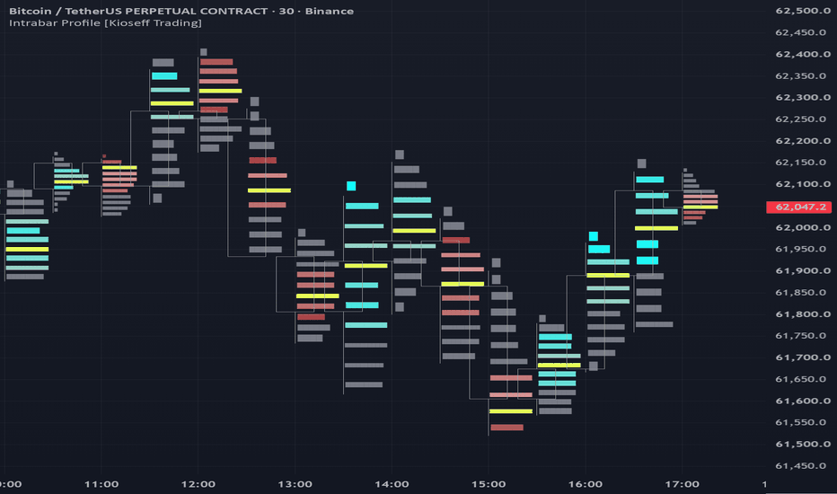
Индикатор

Footprint Master Pane [ZynAlgo]Overview
ZynAlgo Footprint Master Pane is an order-flow and footprint-style volume analysis indicator designed to help traders study micro-liquidity behavior inside each candlestick.
The tool displays intrabar volume-side activity as a matrix-style Footprint Profile in a separate pane. Instead of only observing open, high, low, and close movement, traders can study where buying and selling pressure appears across different price levels inside recent candles.
This can help users evaluate:
Intrabar volume concentration
Buy-side and sell-side pressure
Delta behavior inside each candle
Point of Control placement
Liquidity concentration at candle highs and lows
Potential absorption or exhaustion behavior
Chart example:
How to Read the Footprint Matrix
Each data block on the chart is displayed in this format:
Bid | Ask
Price Level
The price level represented by that row of the footprint matrix.
Bid - Left Number
Represents sell-side volume activity classified by the script for that price level.
Ask - Right Number
Represents buy-side volume activity classified by the script for that price level.
Background Color - Heatmap
The higher the volume at a price level, the stronger the heatmap intensity.
Default color logic:
Cyan: buy-side activity is dominant at that price level.
Pink: sell-side activity is dominant at that price level.
Gray: low or inactive liquidity area.
Key Highlights
POC - Point of Control
The Point of Control is the price level with the highest total trading volume within the selected candlestick.
It is displayed as the gold zone and represents the main volume concentration area for that candle.
Footer Metrics
The bottom of each footprint column displays summary data for the candle.
Delta
Delta represents the net difference between buy-side and sell-side volume activity.
A positive delta indicates that buy-side pressure is dominant. A negative delta indicates that sell-side pressure is dominant.
Total Volume
Total volume represents the combined volume activity for the entire candlestick.
Configuration Settings
1. Order Flow Engine
Intrabar Timeframe
Defines the lower timeframe used by the tool to extract intrabar volume information.
Lower intrabar timeframes can provide more detailed footprint construction, while higher intrabar timeframes may produce a smoother and lighter display.
Stack Levels - Height
Controls how many price levels each candlestick is divided into.
Higher values:
Show more footprint detail
Create a finer price-level breakdown
May increase chart processing load
Lower values:
Create a simpler footprint view
Reduce visual density
May run more smoothly on slower charts
Auto Detect Asset - Smart Grid
When enabled, the system attempts to measure the current asset's volatility and calculate an appropriate grid size automatically.
This is useful when switching between markets such as gold, crypto, forex, indices, or stocks.
Manual Tick Size
When Auto Detect Asset is disabled, users can manually define the tick or grid size.
This can be useful when a symbol requires a custom footprint scale.
2. Pane Visuals
Recent Bars to Render
Controls how many recent candles are displayed in detailed footprint form.
Limiting the number of rendered candles can help keep the chart responsive on TradingView.
Color Customization
Users can customize the colors for:
Buy-side activity
Sell-side activity
Point of Control zone
Heatmap display
This allows the footprint pane to match different chart themes and visual preferences.
Basic Analytical Applications
1. Absorption Observation
When price approaches a key support or resistance area, footprint data can help traders study whether one side of the market is being absorbed.
For example, if a bearish candle shows positive delta and large volume near the lower part of the candle, it may suggest that sell pressure is being absorbed by buy-side participation.
2. POC Migration
Point of Control migration can help traders evaluate where value is shifting across consecutive candles.
In an uptrend, POC zones that continue to migrate higher may suggest that market participation is accepting higher prices.
3. Liquidity at Highs and Lows
Traders can inspect volume activity near candle highs and lows to study exhaustion behavior.
For example, if price reaches a new high but the top levels show very low participation, that may indicate weaker continuation pressure.
How to Use
Add the indicator to the chart.
Choose an intrabar timeframe suitable for the chart timeframe and market.
Adjust stack levels to control footprint detail.
Use the heatmap to identify price levels with stronger participation.
Monitor the POC to study where volume concentration forms inside each candle.
Compare delta and total volume to evaluate buy-side or sell-side pressure.
Combine footprint observations with market structure, support and resistance, liquidity zones, and risk planning.
Best Use Cases
This indicator may be useful for:
Order-flow style analysis
Footprint chart reading
Intrabar volume analysis
Delta observation
Point of Control tracking
Absorption study
Exhaustion analysis
Liquidity-zone confirmation
Limitations
Footprint values depend on the intrabar data available from TradingView for the selected symbol and timeframe.
The Bid and Ask display is based on the script's volume-side classification logic and should be interpreted as analytical volume-side data.
Lower intrabar timeframes may provide more detail but can increase processing load.
A footprint imbalance does not guarantee price continuation or reversal.
The indicator does not provide automatic trade entries, exits, or position management.
Past order-flow or footprint behavior does not guarantee future results.
Important Note
This indicator is an analysis tool only. It does not provide financial advice, investment advice, or guaranteed trading results. Users are responsible for their own trading decisions and risk management.
Индикатор

Swiftedge Auction Volume ProfileSwing-Anchored Auction Volume Profile
This indicator automatically builds a separate volume profile for each market swing, instead of using one fixed range or session. It is based on auction market theory: a market alternates between balance (acceptance) and imbalance (a directional swing). By anchoring a fresh profile to every significant swing leg, you can read where value was built during each individual move — and how those value areas line up as support and resistance.
What it does
Detects significant swings using an ATR- or point-based zigzag, so only moves above a size you choose are treated as new swings.
At every confirmed swing pivot (high or low), it freezes the previous leg's profile and starts a new one, running from one pivot to the next.
For each leg it calculates and plots three levels:
POC (Point of Control) – the most-traded price of that swing (the magnet / fair value).
VAH (Value Area High) and VAL (Value Area Low) – the upper and lower bounds of the area containing the chosen percentage of volume (70% by default).
It also draws two optional zones per profile: a strong box for the value area, and a faint box for the full swing range (high to low), so you can see both the 70% core and the extremes that were rejected on low volume.
Triangles mark each detected swing high and low.
How it works
Each bar's volume is distributed across the price levels it spans (low to high), accumulated into price bins for the current swing leg. The Point of Control is the bin with the most volume; the value area is then expanded outward from the POC, adding the higher-volume neighbouring level at each step until the target volume percentage is reached. When price closes beyond the swing extreme by more than the chosen swing size, a reversal is confirmed: the leg's profile is locked in place from pivot to pivot, and a new profile is anchored from the actual extreme.
Settings
Min. swing size (points) – the most important input. The smallest move (in price) that counts as a new swing. Larger values produce fewer, larger profiles; set to 0 to use the ATR-based alternative instead.
Swing size (× ATR) – used only when the point value is 0.
Bin size – the price resolution of the profile (smaller = finer).
Value Area % – the share of volume that defines the value area (default 70%).
Number of profiles shown – how many completed profiles remain on the chart.
Display toggles for the value-area box, full-range box, level labels and swing markers.
How to use it
Treat the POC of each completed swing as a fair-value reference; price often returns to and reacts at prior POCs.
Use VAH/VAL as the edges of accepted value: acceptance above a prior VAH or below a prior VAL signals a shift, while rejection at these levels can mark a turn.
Compare the current swing's value area against earlier ones to judge whether the market is building value higher, lower, or overlapping.
Notes and limitations
Pine cannot access true tick-by-tick traded volume at price, so each bar's volume is approximated across its high-low range. The profile shape is therefore an estimate, not exchange-level data, and the Point of Control may differ slightly from a native volume-profile tool. Use a lower chart timeframe for a finer approximation. On symbols without volume, time is used as a fallback so the tool still works.
Swing detection is rule-based; the Min. swing size input should be tuned to the instrument and timeframe so the marked swings match the structure you trade.
This script is provided for chart analysis and educational purposes only. It is not financial advice and does not predict future prices. Always do your own research and manage your own risk. Индикатор

ORDER BOOKorder book vp
order book vp is a visual trading tool designed to read volume, buy pressure, sell pressure, and important price zones directly on the chart.
it combines a visual order book panel, a volume profile, an intrabar buy / sell engine, delta tracking, poc, value area, hvn / lvn zones, quantity labels on candles, and a compact dashboard.
the goal is simple: help the trader see where volume is building, where price is reacting, where buyers dominate, where sellers dominate, and which price zones can become important decision areas.
important: pine script does not have access to real level 2 order book data or resting limit orders. this tool does not display real exchange depth. it builds an order book style view from traded volume, volume-at-price, and intrabar analysis.
this gives a clean reading of traded flow, not a promise of real exchange order book depth.
---
main features
order book panel
shows a price ladder with levels around the current price. levels above price represent ask / sell pressure. levels below price represent bid / buy pressure.
fast order book effect
adds a fast reactive effect to the panel. the panel reacts to current buy / sell pressure, volume, candle body, and close position inside the candle.
volume profile
displays traded volume by price level. this helps identify where the market has exchanged the most volume.
poc
the point of control shows the price level with the highest volume inside the selected lookback window. it is often an equilibrium, reaction, or decision zone.
vah and val
vah is the upper boundary of the value area.
val is the lower boundary of the value area.
these levels help define the main area where the market built volume.
hvn and lvn
hvn means high volume node.
lvn means low volume node.
hvn zones can act as acceptance areas. lvn zones can act as rejection areas, acceleration zones, or liquidity gaps.
quantity labels
shows traded quantity on recent candles, with delta if enabled. green labels show buy dominance. red labels show sell dominance.
delta candle coloring
colors candles based on buy / sell delta dominance.
dashboard
summarizes important data: poc, vah, val, current candle buy / sell, delta, cvd, pressure, and intrabar source.
---
inputs guide
intrabar timeframe
lower timeframe used to estimate buy and sell volume. the lower the timeframe, the more detailed the reading. for example, on a 15 minute chart, using 1 minute gives a finer intrabar view.
lookback
number of candles used to build the volume profile. a higher value gives a broader view. a lower value makes the profile more reactive.
price levels
number of rows used in the volume profile. more rows give more precision, but also use more resources.
show order book panel
turns the order book panel on or off.
visible levels
number of price levels displayed inside the order book panel.
depth bar length
visual length of the depth bars inside the order book panel.
panel position
sets the position of the order book panel on the chart.
detect walls
enables detection of large volume levels.
wall multiplier
defines when a level is considered a wall compared to average level volume.
fast order book effect
turns on the fast reactive order book effect.
fast effect power
makes the order book effect more or less aggressive. higher values make the panel react faster.
fast level decay
controls how far the fast pressure effect spreads around the current price.
flash active levels
highlights active levels when buy or sell pressure is strong.
show volume profile
turns the volume profile on or off.
split buy / sell
splits the profile into buy volume and sell volume.
profile width
sets the visual width of the volume profile.
profile offset
sets the visual offset used for profile elements.
show poc
shows the point of control.
show value area
shows vah and val.
value area percent
sets the percentage used to calculate the value area.
mark hvn / lvn
shows high volume nodes and low volume nodes.
hvn multiplier
sets the threshold for high volume nodes.
lvn multiplier
sets the threshold for low volume nodes.
vp buy opacity
controls the opacity of the buy side of the volume profile.
vp sell opacity
controls the opacity of the sell side of the volume profile.
show quantity labels
turns quantity labels on or off.
on last n candles
defines how many recent candles display quantity labels.
show delta
shows buy minus sell delta inside the quantity labels.
quantity label spacing
increases or decreases the distance between candle labels and candles.
color candles by delta
colors candles based on delta dominance.
show dashboard
turns the small information panel on or off.
dashboard position
sets the position of the dashboard.
strong bar ratio
sets the threshold used for strong buy or strong sell alerts.
bid / buy
sets the buy side color.
ask / sell
sets the sell side color.
poc / accent
sets the poc and main accent color.
neutral
sets the neutral color.
---
how to use order book vp
start by choosing the asset and timeframe that match your trading style.
for scalping, use 1 minute, 3 minutes, 5 minutes, or 15 minutes.
for intraday trading, use 15 minutes, 30 minutes, or 1 hour.
for swing trading, use 4 hours or daily.
turn on the volume profile and watch the poc.
when price stays around the poc, the market is often balanced.
when price moves far away from the poc, the market may be in a displacement phase.
watch vah and val.
between vah and val, price is inside the main value area.
above vah, the market may be in bullish expansion or excess.
below val, the market may be in bearish expansion or excess.
watch hvn zones.
an hvn is a zone where a lot of volume was traded. price can return to this area because it represents acceptance.
watch lvn zones.
an lvn is a zone where little volume was traded. price can move quickly through these areas because there is less acceptance.
watch the order book panel.
if buy levels become stronger below price, it can show buying pressure.
if sell levels become stronger above price, it can show selling pressure.
watch the candle quantity labels.
positive delta means more buy volume.
negative delta means more sell volume.
if price rises with positive delta, buyers are supporting the move.
if price rises while delta turns negative, it can show weakness or absorption.
watch cvd inside the dashboard.
rising cvd shows cumulative buy pressure.
falling cvd shows cumulative sell pressure.
---
simple beginner workflow
1. find the poc.
2. find vah and val.
3. check if price is inside or outside the value area.
4. check if the order book panel shows more buy pressure or sell pressure.
5. confirm with the quantity labels on candles.
6. look for reactions around poc, vah, val, hvn, or lvn.
7. always use a stop loss and risk management.
---
scalping example
on a lower timeframe, order book vp can help identify fast reaction zones.
example:
price comes into val.
the order book panel shows buy pressure.
candle labels show positive delta.
price rejects val.
this can become a long scalp observation zone if market structure confirms.
another example:
price comes into vah.
the order book panel shows sell pressure.
candle labels turn red.
price rejects vah.
this can become a short scalp observation zone if market structure confirms.
---
intraday example
on a medium timeframe, the tool helps identify important volume zones.
if price returns to the poc, it may react because this level is the center of traded volume.
if price breaks above vah with buy pressure, continuation can become possible.
if price breaks below val with sell pressure, bearish continuation can become possible.
---
swing trading example
on higher timeframes, the volume profile helps identify major acceptance and rejection zones.
hvn zones can act as return zones.
lvn zones can act as acceleration zones.
the poc can act as a major equilibrium level.
---
beginner settings
intrabar timeframe: 1
lookback: 300
price levels: 80
visible levels: 16
show order book panel: on
fast order book effect: on
show volume profile: on
split buy / sell: on
show poc: on
show value area: on
mark hvn / lvn: on
vp buy opacity: 25
vp sell opacity: 25
show quantity labels: on
show delta: on
color candles by delta: off
show dashboard: on
this setup keeps the chart complete while staying readable.
---
important notes
do not take a trade only because the panel turns green or red.
use the panel as pressure confirmation, not as a standalone signal.
the most important levels to watch are usually poc, vah, val, hvn, and lvn.
a clean reaction on a level with matching delta is more useful than an isolated signal.
the larger the volume window, the more important the level can become.
order book vp is built to give a clear view of traded flow, volume by price, and buy / sell pressure, so the chart becomes a decision map instead of a random price display.
Индикатор

AlphaSpark Levels v6AlphaSpark Levels v6
Complete trading levels indicator with Volume Profile, VWAPs, Liquidity Swings, Previous Session H/L, and Gamma Exposure (GEX) Levels.
Features:
• Volume Profile (periodic + developing)
• VWAPs (Daily/Weekly/Monthly) with naked levels
• Liquidity Swings (15m, 4h, Daily, Weekly)
• Previous Session H/L (Daily, Weekly, Monthly) with labels
• GEX Levels (Gamma Flip, Call Wall, Put Wall, Highest OI, 0DTE Magnet)
• Dashboard widget with level summary
• Alerts for level crosses
How to use GEX Levels:
1. Join Discord for live GEX updates (link in comments)
2. Copy values from Discord posts
3. Paste into indicator inputs
4. Levels appear on chart automatically
Based on market maker hedging mechanics. Free for community members. Индикатор

Volume Profile Supertrend [HexaTrades]Volume Profile Supertrend re-imagines the classic Supertrend. Instead of trailing bands built from pure volatility (ATR), it builds them around the levels where real volume has traded the Point of Control and Value Area.
The philosophy is simple: a normal Supertrend follows volatility; this one follows where the market accepts value. Price tends to gravitate to, and trend away from, the zones where the most business gets done. By anchoring the trend engine to value migration, the indicator aims to stay on the right side of the move while filtering out a portion of low-quality volatility noise.
Everything is computed internally in Pine; no built-in Volume Profile tool is used, so it works on any symbol and timeframe that has volume.
💡How it works
1. Rolling Volume Profile:
It looks back over the last Profile Lookback bars, finds the high–low range, and divides it into Number of Rows price buckets. Every historical bar's volume is distributed across the buckets its range spans, producing a fresh volume distribution on every candle.
2. POC, VAH & VAL:
POC (Point of Control) : the price bucket with the highest traded volume (the "fairest price").
Value Area: the script expands outward from the POC until it captures the chosen Value Area % (default 70%) of total volume.
VAH / VAL: the upper and lower edges of that Value Area.
3. Smoothing & Supertrend bands:
POC, VAH, and VAL are smoothed with EMAs to remove jitter. Two trailing bands are then built, exactly like a Supertrend:
Lower band = smoothed VAL − (ATR × buffer) → support used while bullish.
Upper band = smoothed VAH + (ATR × buffer) → resistance used while bearish.
The bands only trail in the trend-following direction, so they lock in as the price advances.
4. Trend flip:
The trend is bullish while price holds above the lower band, and flips bearish when price closes below it (and vice-versa). The flip is evaluated against the previous bar's confirmed bands, so closed candles never change.
💡How to read it
🔶Bullish:A green line sits below the price. The market is accepting a higher value; treat pullbacks toward the line as the trend "breathing." A flip to red is your warning.
🔶Bearish: A red line sits above the price. Value is migrating lower; rallies into the line are where sellers tend to re-engage. A flip to green signals a potential turn.
🔶Choppy Markets: When price is inside the value area and trend strength is low, the market may be sideways.
In these conditions, signals can be weaker. It may be better to wait for a clear value breakout or stronger trend strength.
🔺Signals
- BUY label prints when the trend flips from bearish to bullish.
- SELL label prints when the trend flips from bullish to bearish.
- A flip dot marks the exact bar of the change on the trend line.
- Trend Strength Filter: Set Minimum Trend Strength above 0 to filter out weak trend flips and display only higher-conviction signals. (Available in the indicator settings.)
┼ Dashboard
-Trend: Current direction Bullish or Bearish.
-Strength: 0–100% conviction score blending distance from POC, POC slope, and whether price has broken outside the Value Area.
-Price Position: Above / Inside / Below Value Area.
-Last Signal: The most recent BUY or SELL that fired.
Alerts
The indicator includes alerts for important events:
-Buy Signal / Sell Signal
-Bullish Trend / Bearish Trend (flip)
-Price Above Value Area / Price Below Value Area
-Price Crossing POC EMA
Suggested Settings
For Intraday Trading
Use lower lookback and medium rows for faster signals.
Example:
-Profile Lookback: 50–100
-Rows: 30–50
-EMA Smoothing: 8–14
-ATR Buffer: 0.5–1.0
For Swing trading
Use higher lookback and smoother settings for cleaner signals.
Example:
-Profile Lookback: 100–250
-Rows: 40–70
-EMA Smoothing: 10–21
-ATR Buffer: 0.8–1.5
For Cleaner Signals
-Increase EMA Smoothing Length
-AIncrease TR Buffer
-Increase Minimum Trend Strength
Volume Profile Supertrend combines the proven structure of a Supertrend with the market's true area of value derived from a rolling Volume Profile. Instead of relying solely on price volatility, it follows the migration of value through the Point of Control (POC) and Value Area (VAH/VAL) to identify higher-quality trend changes.
Whether you're a day trader or swing trader, this indicator helps you visualize trend direction, identify dynamic support and resistance, filter weak reversals, and stay aligned with the prevailing market structure. Use it as a standalone trend-following tool or alongside your existing trading strategy for additional confirmation.
We would love to hear your suggestions. If you have ideas for new features, indicators, analytics, or improvements, please share your feedback. Your input helps guide future updates and improve the indicator for all traders.
This indicator is for educational and analytical purposes only. It is not financial advice. Trading involves risk. Always use proper risk management and combine this indicator with your own analysis before taking any trade.
Индикатор