Это пространство с платным контентом LevelUpTools. Теперь вы можете получить доступ к индикаторам пользователя напрямую на TradingView. Читайте подробнее о платном контенте Ants Pro - MVP Leaders [LevelUp] Ants Pro identifies exceptionally strong momentum, volume, and price action (MVP) — often one of the earliest signs of institutional accumulation. It offers extensive customization, powerful historical analysis tools, and advanced screening features to give traders a meaningful edge.
Ants Pro was developed in collaboration with David Ryan, three-time winner of the U.S. Investing Championship. David worked with William O’Neil and managed the New USA Growth Fund at William O’Neil + Company, where the Ants idea originated.
Ants Pro helps answer an important question posed by David:
“What separates a stock that makes a 15–20% move from one that rises 15–20%, builds a base, and then continues significantly higher?”
Through his research, David found that many of the market’s biggest winners showed consistent buying over 12 to 15 days, on high volume — a sign of steady institutional accumulation that often unfolds over days or weeks as institutions establish large positions in a stock.
In addition to spotting early accumulation, Ants Pro can flag signs of topping patterns, alerting traders to possible shifts in market sentiment and helping them navigate momentum changes effectively.
🔹—— Key Features ——🔹
▪ Automated detection and highlighting of Ants.
▪ Extensive customization options to match your trading style.
▪ Hover over Ants for detailed stats.
▪ Optional table showing progress towards a new Ant.
▪ Pine Screener support to find new and historical Ants.
▪ Create symbol or watchlist alerts to get real-time notifications of new Ants.
🔹—— Ants Pro Overview ——🔹
The original Ants indicator was published on TradingView in 2021, before Ant integration became available in MarketSurge — a premium charting platform developed by Investor’s Business Daily, the company founded by William O’Neil. Ants Pro is a complete rewrite designed to deliver a similar visual experience while adding extensive customization options, real-time and historical Ant statistics, unique alert features, and support for the Pine Screener to enable comprehensive stock screening.
🔹—— Ants ▪ Momentum, Volume & Price (MVP) ——🔹
The default criteria for a new Ant are based on the daily timeframe and are as follows:
▪ Momentum: Stock closed higher at least 12 of the past 15 days.
▪ Volume: Volume 20%+ above its 50-day average over the past 15 days.
▪ Price: Price up 20%+ over the past 15 days.
You can adjust these parameters based on your trading style and preferences. See the Settings section below for more details.
If you’re wondering about the name “Ants,” it comes from the original implementation, where small black marks were plotted above price bars whenever the MVP criteria were met, resembling ants on the chart.
🔹—— Ants As MVP Leaders ——🔹
Ants highlight significant strength in price and volume, yet they aren’t a buy signal on their own. With the default criteria, a stock that’s up 12 of the past 15 days with price and volume running 20%+ above average is showing exceptional momentum — yet it's important to avoid chasing price.
Instead, add stocks showing Ants to a watchlist and wait for a pullback to an area of support, such as a moving average or a prior price zone where support was evident. Another strong setup is sideways consolidation followed by a decisive breakout above the consolidation high.
CELH
FTAI
IREN
🔹—— Ants As Topping Signal ——🔹
The Ants indicator can be helpful for spotting topping formations. When you compare the definition of a climax top with Ants, they have similar price and volume characteristics.
Climax Top
▪ Stock in a strong, extended uptrend, followed by a 20%+ surge in price over 2 to 3 weeks.
▪ Multiple high-volume up days and/or a large gap up near the absolute peak.
▪ Highest price of move occurs, followed immediately by a reversal.
Because the default Ant settings are essentially looking for the same combination of extreme price acceleration and volume surge, the indicator will often show Ants at or just before a topping pattern. That visual cue begs the question, is this the final blow-off, or just another leg higher?
Context is everything. Paying close attention to where the stock has already been — how extended it is from your preferred moving averages, a prior base, or institutional support levels — is what separates a high-probability profit-taking opportunity from an early exit on a still trending leader.
The distance from the 50-day SMA helps show how far price has stretched above its intermediate trend; when a stock extends too far above this level, it often reflects unsustainable strength and a higher risk of a pullback.
The Average True Range (ATR) multiple helps quantify how far price has moved relative to its average volatility, giving a normalized read on how stretched a stock is. The ATR multiple is simply the distance between price and the 50-SMA expressed in ATR units. For example, an ATR multiple of 5 means price is five times its ATR above the 50-SMA. Ants Pro uses a 20-day ATR.
OKLO
APLD
🔹—— Stats Table ▪ Progress Towards New Ant ——🔹
There is an optional table that highlights every requirement and how current price and volume are tracking toward qualifying as a new Ant. When conditions are close, a shallow pullback or consolidation may offer a possible early entry.
TSLA
🔹—— Hover Over Ants For Stats ——🔹
As shown above in the charts of OKLO and APLD, you can hover your cursor over any Ant to get detailed price and volume stats.
▪ Close Up: number of bars up versus the requirement.
▪ Volume % Change: % change versus the requirement.
▪ Price % Change: % change versus the requirement.
▪ From 50-SMA: how far is the price from the 50-SMA.
▪ ATR Multiple: how many ATR multiples is the price from the 50-SMA.
Note: To hover over an Ant, the Ants Pro indicator needs to be shown on top of all other indicators. Follow the steps in the chart below to bring Ants Pro to the front.
🔹—— Context-Sensitive Help ——🔹
All help tooltips are context-aware and update based on your Settings. If you adjust the Ant requirements, for example, changing the default 12 of 15 days to 7 of 10 days, the Ants popup and table values will automatically reflect those changes.
🔹—— Configuring Alerts ——🔹
New Ant Alert
Using the TradingView alert dialog, choose the option for "New Ant" to be notified when price and volume meet the requirements for a new Ant.
Watchlist Alerts
To be notified when there is a new Ant across a range symbols, you can use a watchlist alert as outlined below.
Historical Ants Alert
In the Condition drop-down menu of the alert dialog, there is an option for Historical Ants . This setting is intended for use with the Pine Screener. If you select this for an alert on a stock, an alert will be generated if there are one or more Ants going back in time based on the Historical Bars To Search value in Settings. For example, if Historical Bars To Search is set to 50, and there is an Ant on the chart within the past 50 bars, an alert will be triggered.
🔹—— Stock Screening ——🔹
Ants Pro works with the Pine Screener, eliminating the need for a separate screening indicator.
Screening For New Ants
To search for new Ants on the most recent bar:
The new Ant might appear only on the last bar, or it could be part of a longer series of Ants.
Screening For Historical Ants
When searching historical bars, you can configure how far back to search:
Screening And Custom Ant Requirements
You can change any of the default price and volume requirements. For example, instead of 12 of 15 days up and 20%+ gains, your preference may be 8 of 10 days up and 10%+ gains.
🔹—— Settings ——🔹
Ant Requirements
You can customize the default price and volume requirements to align with your preferences.
Table Of Ant Stats
The table showing status towards the progress of a new Ant has several configurable options:
▪ Current Progress: shows the stats of price and volume.
▪ Always On: table will always be visible, even if there is an Ant on the last bar.
Historical Bars To Search
This option is only applicable when using the Pine Screener. By default, searching historical bars will look back approximately one year (250 daily bars). However, you might prefer to screen over a shorter period of time. For example, change the value to 50 to look for Ants that occurred over the past 50 bars.
🔹—— Studying Past Winners & Reviewing Trades ——🔹
TradingView’s Bar Replay is an incredibly useful feature that lets you step through any historical chart bar by bar, simulating real-time price movement as it unfolded. You can revisit past big winners, review your own trades, test whether a pattern would have influenced your decisions at the time, and use those insights to refine your price and volume analysis.
AXON
🔹—— Best Practices ——🔹
In technical analysis, it’s essential to understand where price is coming from. Never evaluate a pattern in isolation — always zoom out and study the broader context of price and volume.
The same applies to Ants. Remember, Ants are not a buy signal. When they appear, zoom out on the chart and assess where price is in relation to moving averages and prior areas of support or resistance. Review higher timeframes to see the bigger picture.
▪ Build a watchlist as new Ants appear. Review the watchlist regularly for potential trades.
▪ Relative strength is essential. Look for the RS Line to be trending up.
▪ Look for earnings and sales acceleration as confirmation of strength.
▪ Always define risk before entering a trade — know where you’ll exit.
▪ Size positions based on volatility and conviction, not emotion.
▪ Be patient — trends take time to develop.
🔹—— Acknowledgements ——🔹
A sincere thank you to David Ryan for sharing his expertise on Ant requirements and for offering insightful suggestions to improve the Ants Pro indicator.
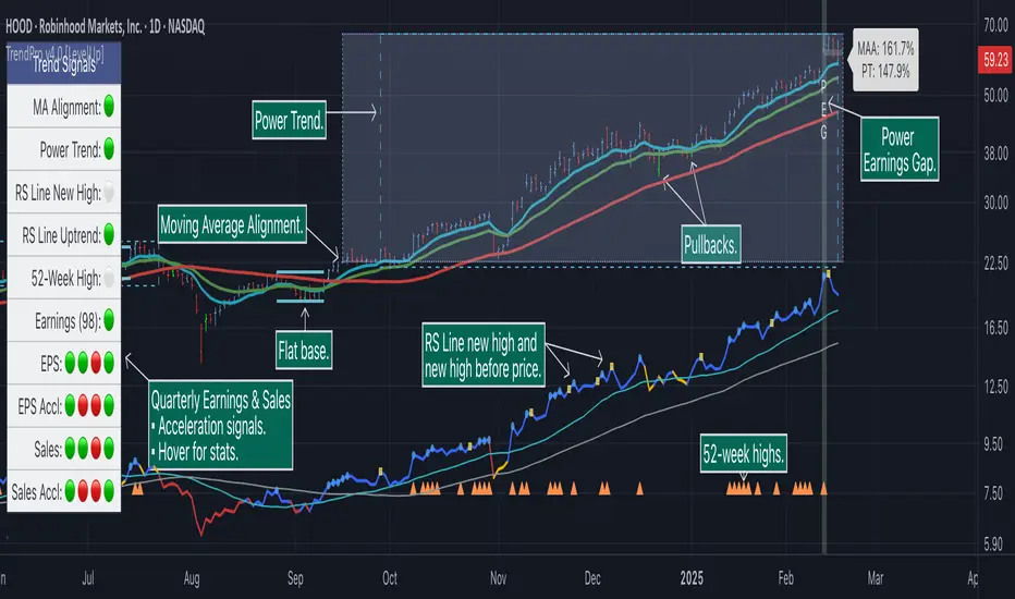
Trend Alignment Pro [LevelUp] Trend Alignment Pro™ is designed for traders who focus on trading with the trend. This indicator automates key aspects of fundamental and technical analysis to identify and highlight chart patterns and signals, drawing on the proven techniques of legendary trend-following traders such as William O'Neil, Jesse Livermore, and Stan Weinstein.
The indicator name, Trend Alignment , emphasizes the importance of confirming price action, patterns, and signals across multiple timeframes. It provides both daily and weekly analysis to enable accurate and timely trend identification.
🔹—— Key Features ——🔹
Daily Timeframe
Moving Average Alignment™
▪ Highlight trends based on moving averages and price action.
▪ Specify price in relation to moving averages (e.g. close above).
▪ Specify which moving averages are required to be in an uptrend.
▪ Specify moving average stacking requirements (e.g. fast above slow).
▪ Require active Power Trend (optional).
▪ Set stop-loss and requirements to end Moving Average Alignment.
Power Trend Tools and Analysis
▪ Highlight Power Trends with box or symbols at start/end points.
▪ Auto-tracking of key metrics towards a new Power Trend.
Custom Moving Averages
▪ Specify type (EMA/SMA), length and color.
▪ View 10-week SMA on daily chart.
Stats Table
▪ Comprehensive daily price and percent change stats.
Signals Table
▪ Track important trend signals with clear visuals.
Power Earnings Gap (PEG) Detection
▪ Auto-detect and highlight Power Earnings Gaps.
▪ Customize requirements, such as gap-up percent and earnings surprise.
Weekly Timeframe
Custom Moving Averages
▪ Specify type (EMA/SMA), length and color.
Tight Weeks and Up Weeks
▪ Specify weekly and percent change requirements.
Stats Table
▪ Comprehensive weekly price and percent change stats.
Daily & Weekly Timeframes
Flat Base & Consolidation
▪ Automated detection with defaults based on the active timeframe.
Custom Relative Strength Line
▪ Specify index and lookback range.
▪ Symbols plotted on RS Line indicating new high and new high before price.
▪ Two custom moving averages for daily & weekly timeframes.
Anchored VWAP (AVWAP)
▪ Multiple anchor options: year-to-date, year-to-date low/high.
Pullbacks
▪ Set key requirements and minimum number of bars.
52-Week and All-Time Highs
▪ Bullish indicators indicating outperformance.
Marked Highs & Lows
▪ Identify potential areas of support/resistance.
🔹—— Daily Chart Examples ——🔹
Daily charts are ideal for analyzing short to intermediate term trends and spotting actionable setups as they develop.
🔹—— Weekly Chart Example ——🔹
Weekly charts are helpful for identifying longer-term trends and patterns.
🔹—— Moving Average Alignment (Daily) ——🔹
Moving Average Alignment™ (MAA) is a trend-identification tool that uses moving averages, price action and their relationships to one another to detect momentum and upward trends. MAA offers extensive customization, including the following:
▪ Moving average types (EMA/SMA) and length.
▪ Which moving averages are required to be in an uptrend.
▪ Requirements on the order of moving averages (e.g. fast above slow).
▪ Optional requirement that the stock be in a Power Trend.
▪ Set stop-loss and requirements to signal the end of the MAA.
MAA delivers clear visual confirmation of trend strength and helps identify both the start and potential end of an uptrend.
🔹—— Power Trend (Daily) ——🔹
The concept of a Power Trend was created by Mike Webster, Justin Nielsen and Charles Harris while working with William O’Neil, founder of Investor's Business Daily and creator of the CANSLIM methodology. When a Power Trend is active, there is a stronger than usual uptrend underway.
A Power Trend by definition uses a major index, such as the Nasdaq Composite (IXIC), as the data source for determining a Power Trend's state. The Trend Alignment indicator builds upon this concept by enabling the current chart symbol to be the data source for the Power Trend, thus offering traders a unique and quantifiable signal when a stock is in a strong uptrend.
What Starts A Power Trend
▪ Low is above the 21-EMA for at least 10 days.
▪ 21-EMA is above the 50-SMA for at least five days.
▪ 50-SMA is in an uptrend.
▪ Close up for the day.
What Ends A Power Trend
▪ 21-EMA crosses under 50-SMA and the close is below prior day close.
▪ Close below the 50-SMA and low is 10% below recent high.
One unique feature of the Trend Alignment indicator is that you can track the progress towards a new Power Trend beginning. See the chart below for more details.
🔹—— Power Earnings Gap (Daily) ——🔹
A Power Earnings Gap refers to a stock experiencing a significant price gap-up, on high volume, following an earnings report. This typically occurs when the stock opens at least 5-10% (or more) above the prior day's close, forming a gap-up bar on the chart that signals strong retail and/or institutional buying and the start or continuation of a major uptrend. It's a bullish pattern seen in leading growth stocks that often continue to outperform.
There are extensive customization options including required gap-up percent, minimum volume change over the average volume and preferred earnings surprise requirements.
🔹—— Relative Strength Line ▪ RS Line (Daily & Weekly) ——🔹
The Relative Strength Line (RS Line), another concept popularized by William O’Neil, is a technical indicator used in stock analysis to measure a stock's performance relative to a benchmark index, such as the S&P 500. An upward-trending RS Line indicates the stock is outperforming the market, while a downward trend shows underperformance. This helps identify potential leaders or laggards regardless of market conditions.
RS Line New High
When the RS Line reaches a new high, this signals that the stock's relative strength against the benchmark is at its highest point over the current lookback range — clear evidence of market leadership.
RS Line New High Before Price
When the RS Line hits a new high ahead of the stock's price reaching a new high, this can be a leading indicator of impending price strength, as it shows the stock gaining momentum relative to the market before that strength is reflected in its price. This signal shows early outperformance and potential market leadership, often preceding a breakout or trend continuation.
New High and New High Before Price Symbols
Easily spot RS Line new highs and new highs before price; a small circle on the RS Line indicates new highs and a small square highlights new high before price.
Highlight Breaks of Moving Averages
There are two custom moving averages of the RS Line that can be configured. Looking for breaks above or below these moving averages can be helpful to effectively manage positions, such as scaling out of a trade systematically.
🔹—— Tight Weeks and Up Weeks (Weekly) ——🔹
In William O'Neil's CANSLIM methodology, tight weekly closes and up weeks are key technical indicators used to evaluate stock chart patterns and identify potential buying opportunities. Tight and up weeks may indicate institutional accumulation and price strength.
Tight closes on a weekly timeframe refer to consecutive weeks where closing prices stay within a narrow 1-1.5% range of the prior week's close, often with declining volume. This signals buyer control and accumulation, making it a bullish indicator, particularly in patterns like three-weeks-tight after an initial breakout.
When a stock closes higher than the prior week, this signals positive momentum. Multiple up weeks often indicate sustained buying and may help to spotlight emerging leaders. Increased volume on up weeks show institutional support and increase the potential for a breakout.
🔹—— Automated Anchored VWAP ▪ AVWAP (Daily & Weekly) ——🔹
Based on the work of Brian Shannon, CMT, the anchored VWAP (AVWAP) shows the average price a stock has traded at, weighted by volume, starting from a specific point in time, the anchor. AVWAP can be helpful for trend confirmation and reversals, breakout and breakdown signals as well as risk management for placing stops.
The AVWAP works with any exchange around the globe, respecting trading days, hours and holidays. Use the AVWAP with the TradingView Replay feature for historical and post-mortem analysis.
🔹—— Marked Highs and Lows (Daily & Weekly) ——🔹
Pivot highs and pivot lows are core principles in technical analysis for identifying potential turning points, support/resistance, and trends. Shown on the chart as either price or a triangle symbol, these visual cues help to quickly spot significant price levels.
Pivots highlight historical turning points in price, serving as reliable zones for potential bounces or breakouts. They can also help determine overall market direction, for example, higher highs and higher lows in uptrends. Pivots also represent where demand overwhelms supply or vice versa.
🔹—— Price Stats and Signals Tables (Daily & Weekly) ——🔹
Comprehensive daily and weekly price stats. Daily charts also includes real-time signals to monitor the trend as well as quarterly earnings and sales data.
🔹—— Custom Alerts ——🔹
The Trend Alignment indicator supports custom alerts:
▪ Moving Average Alignment started.
▪ Moving Average Alignment ended.
▪ Power Trend started.
▪ Power Trend ended.
▪ Power Earnings Gap started.
🔹—— Best Practices ——🔹
▪ Look for confirmation of an uptrend on multiple timeframes.
▪ Use multiple signals and/or patterns for confirmation of the trend.
▪ Relative strength is key to find stocks outperforming the market.
▪ Focus on companies with earnings and sales acceleration.
▪ Avoid chasing extended stocks.
▪ Always define risk before entering a trade — know where you’ll exit.
▪ Size positions based on volatility and conviction, not emotion.
▪ Be patient — trends take time to develop.
Power Trend Detector Pro [LevelUp] A Power Trend signals that a stronger-than-usual market uptrend is underway. The concept comes from Investor's Business Daily (IBD), specifically the Market School program developed to reflect the trading principles of IBD founder William O'Neil.
The rules defining a Power Trend were established by Mike Webster, Justin Nielsen, and Charles Harris during their work with O'Neil at IBD. They meticulously studied major uptrends, identifying common technical characteristics across the most powerful market advances. From that research came a precise set of rules marking when a Power Trend begins and ends.
For traders, recognizing when a Power Trend is active provides valuable context for position sizing and risk management. Simply put, it helps you decide when to be more aggressive — or more cautious — with your trades.
By definition, a Power Trend is calculated using a major index such as the Nasdaq Composite (IXIC) as its data source. This indicator extends that concept by allowing any security to serve as the data source — meaning the same precise rules that define a Power Trend in the broader market can now be applied directly to any stock, ETF, crypto, index, etc. The result is a quantifiable signal for identifying when any security is in a strong, sustained uptrend.
🔹—— What Starts A Power Trend? ——🔹
▪ Low is above the 21-EMA for at least 10 days.
▪ 21-EMA is above the 50-SMA for at least five days.
▪ 50-SMA is in an uptrend.
▪ Close up for the day (close >= open).
🔹—— What Ends A Power Trend? ——🔹
▪ 21-EMA crosses under 50-SMA.
▪ Close 10% below recent high and below the 50-SMA.
🔹—— Show Power Trend Status ——🔹
With this indicator there are three ways to highlight Power Trends, each is shown in the chart that follows:
For traders who prefer a clean chart, the stoplight display is a simple and effective option. Rather than overlaying additional lines or labels, it communicates Power Trend status through a single colored indicator — green, yellow, or gray.
▪ Green - Power Trend is active.
▪ Yellow - Power Trend is active, however, price is below the 50-SMA, signaling a potential weakening of the trend.
▪ Gray - Power Trend is off.
🔹—— Progress Towards New Power Trend ——🔹
One unique feature of the Power Trend indicator is that you can track the progress towards the start of a new Power Trend. See the chart below for more details.
🔹—— Additional Examples Of Power Trends ——🔹
🔹—— Alerts On Start & End Of A Power Trend ——🔹
In addition to the visual signals, the indicator supports alerts so you are notified the moment a Power Trend starts or ends. Alerts can be set on any symbol — whether you are monitoring the Nasdaq Composite for broader market conditions or tracking an individual stock or ETF for a potential trading signal.
🔹—— Key Features ——🔹
▪ Three options to highlight active Power Trends:
• Box around Power Trend.
• Stoplight with configurable location.
• Custom symbol for each bar in an active Power Trend.
▪ Show recent high price, configurable font size and color.
▪ Custom alerts on the start and/or end of a Power Trend.
Alpha Edge Pro - Intraday [LevelUp] Alpha Edge Pro™ is a collection of tools for intraday analysis built in collaboration with Brian Shannon, CMT, creator of the anchored VWAP (AVWAP) and the author of two best-selling books on technical analysis.
🔹—— Key Features ——🔹
▪ AVWAP auto-anchored on 1-day, 2-day, week-to-date and month-to-date.
▪ AVWAP works with any global exchange, respecting trading days, hours & holidays.
▪ AVWAP and the TradingView Replay are excellent for historical analysis.
▪ 5-day moving average auto-calculated based on the chart timeframe.
▪ 5-day moving average auto-adjusts the minutes in the trading day for crypto and futures.
▪ View up to two daily moving averages on intraday charts.
▪ Pivot points (floor trader pivots) highlight support/resistance levels (R1/S1, R2/S2, etc).
▪ Highlight current and prior day highs/lows as these are areas of potential support and resistance.
▪ Comprehensive stats tables for AVWAP, price highs/low, pivots and ATR (average true range).
▪ Custom alerts for AVWAP, pivot points and 5-day moving average.
🔹—— AVWAP ——🔹
The Volume Weighted Average Price (VWAP) is the cumulative average price a stock traded for one day. AVWAP is the same as the VWAP with the exception that the start point (the anchor) is configurable based on a trader's preference, not simply the start of the trading day. From the anchor point forward, on each bar, AVWAP is calculated based on the cumulative volume and average price.
The AVWAP shows the relationship between price and volume over any time period based on the anchor point. At a glance we can see who is in control, the buyers (bulls) or the sellers (bears).
AVWAP Concepts
▪ When a stock is above an advancing AVWAP, buyers are in control for that timeframe, as the average price is increasing.
▪ When prices are below a declining AVWAP, sellers are in control for that timeframe, as the average price is declining.
▪ When prices oscillate above and below the AVWAP it indicates indecision for that timeframe.
What's unique about AVWAP in this indicator is that it is auto-anchored on 1-day, 2-day, week-to-date and month-to-date. In addition, Alpha Edge supports any exchange around the globe, respecting trading days, hours and holidays. You can also use the TradingView Replay feature with this indicator, a powerful tool for historical and post-mortem analysis.
▪ 1-Day, 2-Day and Week-To-Date
▪ Saudi Exchange (Tadāwul)
Trading Days: Sunday to Thursday, 10:00am to 3:00pm.
Auto-Anchor: Detects start of trading week.
▪ London Stock Exchange (LSE)
Trading days: Monday to Friday, 8:00am to 4:30pm.
Auto-Anchor: Detects U.K. bank holiday.
▪ Review Historical Data and Past Trades
🔹—— 5-Day Moving Average ——🔹
A common trend following theme is to look for stocks where the trend of the 50-SMA is upward. We can view intraday charts to see if the price action is setting up for a low risk trade by verifying that the shorter timeframe aligns with the longer. As we look at various timeframes, we need to make sure the moving average is consistent across the timeframes, which is done via the 5-day moving average as explained by Brian Shannon:
"If you want to see a five DAY moving average on a chart with 10 minute candles, you have to consider how many 10 minute periods of trading there are in the trading day. The US equities markets are open from 9:30- 4:00 each day, which is 6.5 hours per trading day. In each hour of trading, there are 6-10 minute periods, so during the regular session for equities, the market is open for 390 minutes or 39-10 minute periods per day. If we are to get a five day moving average, we would take the 39-10 minute periods the market is open each day and then multiply that by five days. 39 x 5 = 195. So a 5 DAY moving average is represented by a 195 PERIOD moving average when looking at a 10 minute timeframe."
As trend followers, our goal is to find stocks where the 5-day moving average is trending up.
In Alpha Edge, the default value for the minutes per day is 390, the number of minutes in one trading day in the U.S. This value can be changed to match any exchange. For example, if trading the India National Stock Exchange (NSE), which is open from 9:15am to 3:30pm, the minutes per day could be set to 375.
Minutes per day are auto-adjusted for crypto and futures:
▪ Crypto: 1440 minutes per day based on 24 hrs per day.
▪ Futures: 1380 minutes per day based on 23 hrs per day.
▪ 5-Day Moving Average Trending Up
Important Note: Based on the math as described above using the minutes in the trading day, there will be chart timeframes where the 5-day moving average is not shown. If you have the 5-day moving average enabled from within the indicator Settings, yet the 5-day line is not visible, try changing to another timeframe.
🔹—— Vertical Start Line - Anticipating Direction ——🔹
By placing a vertical line on the bar where the 5-day moving average begins, one can anticipate the trend by viewing the bars that will fall off the moving average as new bars are added. This can be helpful to gauge if the trend will continue in its current trajectory or begin to move in a different direction.
▪ 5-Day Vertical Line
🔹—— Intraday and Daily Moving Averages ——🔹
In addition to custom moving averages based on intraday price action, there are two configurable daily moving averages. Viewing daily moving averages on intraday charts can be helpful as they often act as areas of support/resistance.
▪ Daily 10-EMA on Intraday Chart - Acting as Support
▪ Daily 50-SMA on Intraday Chart - Acting as Resistance
🔹—— Current and Prior Day Highs & Lows ——🔹
Linda Raschke, a legendary trader featured in Jack Schwager’s book, New Market Wizards, on the importance of tracking the previous day's price range:
"If I could trade with only one indicator, it would be with the previous day’s high and low. The reason why they are so important is this is where support and resistance come in and they are also the most visible chart points for all market participants. They are very strong psychological markers.”
With Alpha Edge, there are clear visual indicators, with optional price data, marking both current and prior day high/low values. This makes it easy to view potential areas of support/resistance. These areas can also be considered for entering, exiting or profit taking.
▪ Prior Day & Current Day Highs/Lows
🔹—— Pivot Points ——🔹
Floor trader pivot points are price levels that may act as areas of support or resistance. These pivot points were initially created by floor traders operating within the trading pits of the equity futures exchange in Chicago, Illinois.
The calculations for determining these pivots are based on the prior day's high, low and close:
Pivot (P) = (prevHigh + prevLow + prevClose) / 3
Resistance R1 = (2 * P) - prevLow
Support S1 = (2 * P) - prevHigh
Resistance R2 = P + (prevHigh - prevLow)
Support S2 = P - (prevHigh - prevLow)
Resistance R3 = prevHigh + (2 * (pivot - prevLow))
Support S3 = prevLow - (2 * (prevHigh - pivot))
▪ R1 Acting as Resistance
▪ S1 Acting as Support
🔹—— Stats Table ——🔹
With the stats table, at a glance you can view AVWAP values, current and prior days highs/lows, pivot points as well as the ATR (average true range). Each section in the table can be toggled on/off.
▪ Stats Table
🔹—— Custom Alerts ——🔹
Alpha Edge indicator supports the following custom alerts:
▪ 1-day & 2-day AVWAP cross.
▪ WTD/MTD AVWAP cross.
▪ R1/R2 and S1/S2 cross.
▪ 5-day moving average cross.
🔹—— Best Practices ——🔹
▪ Look for confirmation of an uptrend on multiple timeframes.
▪ Use multiple signals and/or patterns for confirmation of the trend.
▪ Avoid chasing extended stocks.
▪ Always define risk before entering a trade — know where you’ll exit.
▪ Size positions based on volatility and conviction, not emotion.
▪ Be patient — trends take time to develop.
50% Retracement & Fibonacci Levels [LevelUp] The 50% retracement level has been observed by traders across Dow Theory, Gann analysis, and Fibonacci frameworks for over a century — and when that many independent methodologies agree on the same level, it's worth paying attention. This indicator brings those levels directly to your chart, automatically identifying high-probability zones where a pullback may stall and the trend resume.
Retracement refers to a price reversal after reaching a recent high or low, where price finds an area of support or resistance before continuing in the direction of the larger trend. Among the various retracement levels traders use, the 50% level has proven to be one of the most reliable and widely observed.
The 50% retracement concept has roots stretching back over a century. Charles Dow wrote about the tendency of markets to retrace roughly half of a prior move in the late 1800s. W.D. Gann incorporated it into his trading principles in the early 20th century. Fibonacci traders recognize it as sitting squarely between the 38.2% and 61.8% levels. The fact that this level appears across so many independent frameworks and methodologies is itself meaningful — it suggests the 50% level reflects something real about how markets behave rather than being the invention of any single theorist.
That something real is market psychology. After a sustained price move in either direction, two forces come into tension. Traders who participated in the move begin taking profits, while new participants — having missed the initial move — are waiting for a pullback before entering. These competing interests tend to resolve around the midpoint of the prior move, which is why the 50% level so frequently acts as a meaningful area of support or resistance.
What's important to understand is that retracement applies in both directions. When price is trending upward and begins to pull back, the 50% level of the prior advance becomes a potential area of support where the trend may resume. When price is declining and stages a bounce, that same level becomes potential resistance. This bidirectional quality makes the 50% retracement a versatile tool regardless of market conditions.
The primary reason we are interested to gauge levels of retracement is that once a retracement is complete, there is often a continuation of the previous trend.
🔹—— Retracement to Area of Support ——🔹
When price completes a sustained move upward from a recent low to a recent high, traders watch for a pullback to the 50% level of that move as a potential area of support. For example, if a stock climbs from $50 to $100, the 50% retracement level sits at $75 — the midpoint of the move. As price pulls back toward that $75 area, it becomes a high-probability zone where buying interest may re-emerge and the uptrend resume.
🔹—— Retracement to Area of Resistance ——🔹
Retracement works in the other direction as well. When price completes a sustained move downward from a recent high to a new low and then begins to bounce, traders watch for that bounce to stall at the 50% level of the prior decline. For example, if a stock drops from $100 to $50, the 50% retracement level sits at $75. As price rallies back toward that $75 area, it becomes a high-probability zone where selling pressure may re-emerge and the downtrend resume.
🔹—— Direction of Retracement ——🔹
When measuring from a recent low to a recent high, the retracement levels plot downward from the high. If multiple levels are displayed, they are ordered from smallest retracement percentage at the top to largest at the bottom.
When measuring from a recent high to a recent low, the retracement levels plot upward from the low. If multiple levels are displayed, they are ordered from smallest retracement percentage at the bottom to largest at the top.
See the charts in the sections above more details.
🔹—— Retracement Versus Reversal ——🔹
Retracement is a temporary counter-trend move — a pullback within an uptrend that finds support and resumes higher, or a bounce within a downtrend that finds resistance and resumes lower. The key word is temporary. A retracement does not break the prevailing trend; it tests it. A reversal, by contrast, is a more significant move that breaks the trend structure itself, signaling that the prior move may be over rather than simply pausing.
🔹—— Additional Retracement Levels ——🔹
When working with the indicator, you can choose your preference for additional retracement levels.
Classic Retracement Levels — 33%, 50%, 66%
These levels are rooted in Dow Theory, one of the oldest frameworks in technical analysis. Dow theorists observed that healthy trend corrections tend to retrace between one-third and two-thirds of the prior move.
A pullback that holds above the 33% level suggests strong underlying momentum, while a retracement approaching 66% represents the outer boundary of what the trend can absorb before the move is considered compromised. Traders who prefer round numbers, clean structure, and a methodology with deep historical roots in price action tend to gravitate toward these levels. W.D. Gann also referenced these levels alongside his 50% work, so there's overlap in his methodology as well.
Fibonacci Levels — 38.2%, 50%, 61.8%
These levels derive from the Fibonacci sequence and the golden ratio, mathematical relationships that appear throughout nature and have been applied to financial markets since the mid-20th century. These levels are now among the most widely watched in technical analysis, which creates a self-reinforcing dynamic: because so many traders are aware of them, price tends to react at these levels with some frequency. Traders drawn to mathematical precision, or who use other Fibonacci-based tools in their analysis, often find these levels integrate naturally into their existing approach.
In practice, the 33%/38.2% pairing and the 66%/61.8% pairing are close enough that they often point to the same general zone on a chart. The choice between them comes down to your broader methodology and what you're already using. If your system is built around classical price action and trend analysis, the Classic levels will feel like a natural fit. If you're already working with Fibonacci extensions, fans, or time analysis, the Fibonacci levels will keep your toolkit consistent.
🔹—— Automated & Manual Pivot Selection ——🔹
There are two options as it relates to managing retracement: auto-generated pivot highs/lows and manual selection of highs/lows.
Auto-Generated Pivot Highs/Lows
The default pivot highs and lows are based on traditional pivot point concepts. You set the number of bars to the left and right of a potential pivot, and the indicator identifies the high or low where no higher high or lower low exists within that range. These pivot points are then used as the anchor points for calculating retracement levels.
The main advantage of the automated approach is convenience — levels are calculated automatically as you move between symbols. The tradeoff is that auto-detected pivots can sometimes be close together in price, resulting in compressed retracement levels that offer little practical value for identifying meaningful support or resistance.
All the examples shown above are using auto-generated pivots.
Manual Selection Highs/Lows
With manual selection, you choose the pivot high and low directly on the chart by dragging the vertical line to your desired anchor points. The benefit is precision — you control exactly which price points are used, allowing you to anchor pivot points to the most meaningful highs and lows for the current chart.
The tradeoff is that when you switch to a new symbol, the same anchor points carry over, and since price levels differ across symbols, you will typically need to reposition the lines to points relevant to the new chart's price action.
🔹—— Pivot Point Extensions As Support/Resistance ——🔹
When using auto-generated pivot levels, you have the option to display horizontal lines extended from each pivot point. These lines mark the pivot highs and lows, which can serve as additional areas to watch for potential support and resistance beyond the retracement levels.
🔹—— Key Features ——🔹
▪ Classic levels (33%, 50%, 66%) or Fibonacci levels (38.2%, 50%, 61.8%).
▪ Auto-generated pivots or manual selection.
▪ Customization all levels, colors and line styles.
▪ Show lines at pivot points as potential areas of support/resistance.
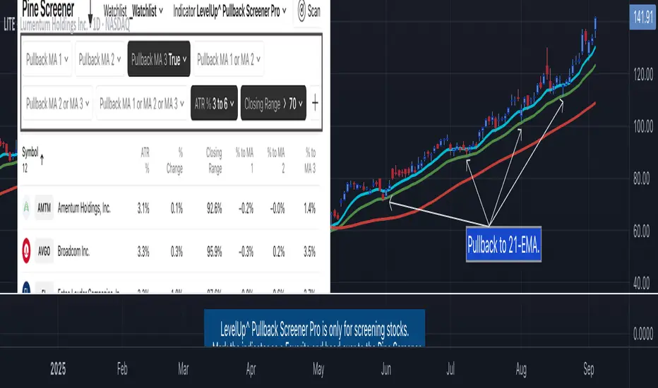
Pullback Screener Pro [LevelUp] Pullbacks are often considered high-probability entry points within trending markets. This screener helps streamline the search for such opportunities using trend analysis through customizable moving averages, price action and volatility filters with ATR (Average True Range).
🔹 Why Trade Pullbacks
Pullbacks represent temporary counter-moves within a broader trend. Instead of chasing extended moves, traders can enter at more favorable price levels.
Pros
▪ Improved Entry Prices : Entering closer to support or resistance levels often provides a better risk/reward ratio.
▪ Trend Alignment : Pullbacks occur within established trends, allowing traders to participate in potential continuation moves.
▪ Defined Risk Levels : Key moving averages and recent swing points can be used to set stop-loss orders.
Cons
▪ Not all pullbacks resume the trend; some signal reversals.
▪ Price can temporarily overshoot levels, creating whipsaws.
▪ Pullback strategies work best in trending markets and may underperform in sideways conditions.
🔹 Custom Feature : Require Lower Low
The optional requirement for a lower low may help confirm that an actual pullback is occurring, rather than just sideways chop or continuation strength.
Stricter Definition of a Pullback
▪ A pullback implies some retracement against the prevailing trend.
▪ By requiring a lower low, you ensure price is genuinely pulling back, not just consolidating at the highs.
Avoids False Triggers
▪ Without this filter, you might catch stocks that simply paused for a bar (small doji, tiny inside candle) but haven’t really pulled back.
▪ The lower low condition filters for bars where sellers actually pushed price down.
Improves Entry Timing
▪ Many traders want to enter as pullbacks are maturing, not while price is still pushing higher.
▪ A lower low shows some weakness that may soon transition into support, giving a cleaner “buy-the-dip” opportunity.
Psychological Confirmation
▪ From a trader psychology standpoint, a lower low indicates that at least some holders are taking profits and that short-term participants are testing the trend.
▪ This is often the moment when strong hands step in if the trend is healthy.
🔹 Custom Feature : Specify Closing Range
Closing range % is another optional feature that can be very useful when scanning for pullbacks as it helps separate healthy retracements from weak price action.
Shows Buyer Support Within the Bar
▪ Closing near the top of the day’s range (e.g., above 60–70%) signals that even though price pulled back intraday, buyers stepped in and pushed it higher by the close.
▪ That strength is a good sign the pullback may be stabilizing.
Filters Out Weak Pullbacks
▪ If a stock closes near the low of the day, sellers are still in control — the “dip” might not be done.
▪ By requiring a higher Closing Range, you filter out setups that may keep falling.
Timing Advantage
▪ Many traders prefer entering when a pullback shows early signs of turning.
▪ A strong closing range is an objective way to catch that transition, often right before the next leg higher.
Psychological Read
▪ Closing strength suggests demand is stepping back in — traders and investors still want exposure to the trend.
▪ It reflects confidence, whereas weak closes show hesitation or distribution.
🔹 Custom Feature : ATR % Filter
Specifying an ATR (Average True Range) filter is helpful when scanning for stocks because it normalizes volatility relative to price, enabling traders to identify stocks with suitable price movement for their strategy while managing volatility by filtering out excessively erratic stocks (high ATR %) or those with insufficient movement (low ATR %), thus aligning with risk tolerance and optimizing position sizing and stop-loss placement.
Focus on Stocks With Tradable Volatility
▪ ATR measures how much a stock typically moves in a day.
▪ By setting a minimum ATR, you avoid slow, low-volatility stocks that don’t move enough to create good opportunities.
Filters Out “Too Wild” Stocks
▪ Extremely high ATR stocks can be erratic, difficult to size properly, and risky to trade.
▪ By specifying a maximum ATR (or ATR % relative to price), you can avoid setups where risk is too unpredictable.
Normalizes Price Differences
▪ A $20 stock and a $200 stock can’t be compared just on raw dollar moves.
▪ ATR (or ATR as a % of price) gives a volatility-adjusted way to compare them, so your screen is consistent across all price levels.
Improves Entry & Stop Placement
▪ Knowing that a stock typically moves, say, 2% daily versus 0.5% daily helps you set realistic stops and targets.
▪ Screening for stocks with ATR in your preferred range means trades will line up better with your risk/reward model.
Psychology
▪ ATR captures behavior. Stocks with healthy, steady volatility attract active traders because they offer movement without chaos.
▪ Too quiet = boring, too wild = stressful. ATR filters help you stay in the sweet spot.
🔹 Customization Options
With extensive customization options, traders can fine-tune pullback scans by adjusting moving averages, proximity to those averages, bar structure, closing range strength, and volatility filters. This flexibility supports different trading styles, timeframes, and risk preferences.
Configurable Moving Averages
Scanning is optimized for daily and weekly timeframes.
▪ Select up to three moving average lengths and types (e.g. 20 EMA, 50 SMA, 200 SMA) for daily and weekly timeframes.
▪ Tailor scans to different trading styles:
• Short-term traders may prefer faster averages (e.g. 10–20 EMA).
• Swing traders often use medium-term averages (e.g. 50 SMA).
• Long-term investors may focus on slower averages (e.g. 200 SMA).
Pullback Within X % of Moving Average
▪ Specify the total range of a pullback using % above and % below a moving average. The bar low is used for this comparison.
▪ For example, .5% above and .5% below a moving average, giving price a total range of 1%. If the low is outside the range, it's not considered a valid pullback.
Require Low Lower
▪ Optional setting to require that the current bar to be a lower low compared to the prior bar.
▪ See above section for more information.
Closing Range %
▪ Specify a closing range to help you spot pullbacks where buyers are reasserting control.
▪ Define how close the closing price is to the daily high or low.
▪ See above section for more information.
ATR % Filter
▪ Incorporates volatility by measuring price movement relative to Average True Range (ATR).
▪ Options include:
• Above a specified ATR %
• Below a specified ATR %
• Within a specified ATR range
This options enables filtering for setups that align with volatility preferences and risk tolerance.
🔹 Trader Psychology
Pullback trading requires both patience and discipline. Understanding the psychology behind it can improve decision-making:
▪ Patience Over FOMO: Traders must resist the urge to chase extended moves. Waiting for a pullback often leads to better entries.
▪ Confidence in the Trend : Entering during a pullback can feel counterintuitive, as price is moving against the trend in the short term. Trusting the larger trend is essential.
▪ Managing Doubt: False pullbacks and whipsaws can create frustration. Keeping risk small and consistent helps maintain emotional balance.
▪ Discipline in Risk Control: Stops should be respected. Moving or ignoring stop-loss levels during a pullback can turn a small loss into a large one.
Successful pullback traders focus on process over outcome , knowing that consistency across many trades matters more than the result of any single trade.
🔹 True Market Leader Pullbacks
▪ GEV: Pullback to 10-EMA and 21-EMA
▪ NVDA: Pullback to 50-SMA
🔹 Best Practices
▪ Trend First : Pullbacks are most effective when traded in the direction of the larger trend. Confirm trend strength before acting on screener results.
▪ Combine Filters : Use moving average, closing range, and ATR filters together for higher-quality setups.
▪ Chart Review : Always verify results visually before trading.
▪ Risk Management : Consider swing lows (uptrends) or highs (downtrends) to define stop-loss placement.
🔹 Summary
The Pullback Screener helps traders quickly locate potential opportunities where price retraces toward key moving averages within an ongoing trend. With customizable filters for moving averages, closing range, and ATR, the screener adapts to a wide range of strategies and risk profiles.
Pullback trading offers favorable entries and defined risk, but success requires patience, discipline, and confirmation of trend conditions.
Multi-Timeframe Trend Analysis [LevelUp] Multi-Timeframe Trend Analysis makes it easy to visualize higher timeframe trend structure without leaving your current chart — view weekly trends from a daily chart, monthly trends from a weekly chart, and quarterly trends from a monthly chart.
By identifying patterns such as three consecutive higher highs or lower lows, and classifying price action into four box types — up, down, inside, and outside — the indicator helps traders spot early trend changes in both individual stocks and major market indices.
Multi-Timeframe Trend Analysis was developed in collaboration with David Ryan, three-time winner of the U.S. Investing Championship. David worked with William O’Neil and managed the New USA Growth Fund at William O’Neil + Company, where the idea for multi-timeframe boxes originated.
🔹—— Stock Multi-Timeframe Trend Analysis ——🔹
When applied to individual stocks, this indicator makes it easy to see the larger trend structure without switching timeframes. Viewing weekly boxes on a daily chart reveals whether a stock is in a healthy uptrend, breaking down, or moving through a period of consolidation. Three consecutive higher highs on the weekly timeframe is a strong signal that institutional money is moving into a stock, while three consecutive lower lows may indicate distribution and a reason to avoid or exit a position.
This multi-timeframe perspective is especially useful for growth stock traders looking to separate true market leaders from the rest of the field. A stock showing a series of higher highs on the weekly timeframe creates a clear picture of institutional accumulation and directional conviction. When that same structure begins to break down — weekly boxes printing lower lows or inside boxes signaling a loss of momentum — the indicator provides an early warning that the trend may be changing before it becomes obvious on the daily chart.
🔹—— Broader Market Multi-Timeframe Trend Analysis ——🔹
This indicator can analyze trend structure on any symbol, applying it to SPY, QQQ, or IXIC (NASDAQ Composite) provides valuable insight into the overall health and direction of the broader market. By viewing monthly boxes on a weekly chart, or quarterly boxes on a monthly chart, you can quickly assess whether the broader market is in a sustained uptrend, downtrend, or entering a period of consolidation. This higher timeframe perspective helps cut through short-term noise and keeps you focused on the dominant trend.
Watching for three consecutive higher highs on an index can signal that a new uptrend may be establishing itself — a potential green light for increasing exposure to leading growth stocks. Conversely, three consecutive lower lows on a major index may suggest the market is under distribution, warranting a more defensive posture and reduced exposure.
This context is particularly valuable for growth stock traders. Even the strongest stocks tend to struggle when the broader market is in a downtrend, and the best opportunities typically emerge when index trend structure confirms a healthy market environment. Using this indicator on major indices alongside your individual stock analysis adds an additional layer of confirmation before committing to new positions.
🔹—— Identifying Trends and Box Types ——🔹
It's easy to get caught up with the noise of tracking price movement, bar by bar. This is even more relevant on lower timeframes. When performing trend analysis, it can be very helpful to step back and look at the bigger picture.
To help facilitate visualizing trends, with this indicator you can view higher timeframe data without changing to a new chart:
▪ View the weekly trend from a daily chart.
▪ View the monthly trend from a weekly chart.
▪ View the quarterly trend from a monthly chart.
The weekly chart of GOOGL is shown below. Each box encapsulates one month of trading activity. You can also see the four types of boxes that may be shown: up, down, inside and outside.
Up Box - When a box highest high is above the previous box high, it is considered an up box. The percent change shows the increase from the previous box highest high to the highest high of the current box.
Down Box - When a box lowest low is below the previous box lowest low, it is considered a down box. The percent change shows the decrease from the previous box lowest low to the lowest low of the current box.
Inside Box - When a box highest high is below the previous box highest high, and the box lowest low is greater than the previous box lowest low, it is considered an inside box. Two percent changes are shown. One indicating the decrease from previous box highest high to the highest high of the current box. The other indicating the increase from the previous box lowest low to the lowest low of the current box.
An inside box signals there is reduced volatility with a balance between buyers and sellers. There is no clear directional conviction.
Outside Box - When a box highest high is above the previous box highest high, and the box lowest low is below the previous box lowest low, it is considered an outside box. Two percent changes are shown. One indicating the increase from previous box highest high to the highest high of the current box. The other indicating the decrease from the previous box lowest low to the lowest low of the current box.
Special Note for Outside Boxes: As far as outside boxes and whether they are continuing or changing the trend, it depends on the action of the most recent high or low. The box is considered to be an up box if the highest high is more recent than the lowest low, and vice versa.
🔹—— How to Use Multi-Timeframe Trend Analysis ——🔹
The goal of this indicator is to help spot changes in the trend. Historical price data has shown that movements up/down often occur in threes. By looking for boxes encapsulating higher timeframe moves, we can see when a trend may be changing.
Three Higher Highs - If price movement is sideways or down and is followed by three consecutive higher highs, this may be the start of an uptrend.
Three Lower Lows - If price movement is sideways or up and is followed by three consecutive lower lows, this may be the start of a downtrend.
🔹—— Percent Change Information ——🔹
Each box has an optional percent (%) change value. Refer to the image and description below for more information.
🔹—— Additional Examples ——🔹
AAPL on Monthly Chart - Quarterly Analysis
QQQ on Weekly Chart - Monthly Analysis
Earnings Line Pro - EPS Tracker [LevelUp] Earnings Line Pro plots quarterly earnings data, including earnings surprises and estimates, while also highlighting earnings acceleration. It allows you to track and visualize the trend of earnings across daily, weekly, and monthly timeframes.
🔹—— Key Features ——🔹
▪ Quarterly earnings per share, surprises and estimates.
▪ View earnings based on type: reported (non-GAAP), basic or diluted.
▪ Visualize the estimated trajectory of the next quarter earnings estimate.
▪ Year-Over-Year (YOY) data is included for each quarterly earnings summary.
▪ Visualize earnings acceleration, quarter over quarter.
▪ Plot on daily, weekly and monthly timeframes.
🔹—— Earnings Data ——🔹
Earnings are a foundational concept in stock analysis, often exerting a significant influence on a company's long-term performance. By visualizing earnings data as a plot rather than just a table of statistics, investors can more easily spot patterns of acceleration or deceleration. For instance, a steep upward slope between earnings releases — or a sequence of progressively higher earnings — signals a robust earnings trajectory. The sharper the acceleration, the greater the likelihood that the stock will outperform the broader market.
Historical studies show that top-performing companies consistently deliver steady earnings growth. Whether your focus is short-term trading or long-term investing, recognizing the direction and rate of earnings growth is essential for evaluating potential price movement.
While quarterly earnings data remains consistent across all timeframes, the perspective shifts depending on your goals. A monthly chart highlights multi-year growth and is ideal for investors with a buy-and-hold mindset. In contrast, weekly or daily charts have fewer data points, making them better suited for traders focused on positions lasting weeks or months.
🔹—— Choose Earnings Type ——🔹
With the Earnings Line indicator, you can view reported (non-GAAP), basic and/or diluted earnings.
▪ Reported (non-GAAP) earnings typically refer to a company’s net income as disclosed in its financial statements. This figure represents overall profitability after accounting for all expenses, taxes, and adjustments.
▪ Basic earnings per share (EPS) is calculated by dividing net income by the weighted average number of common shares outstanding during the reporting period. It provides a straightforward measure of earnings attributable to each existing share.
▪ Diluted earnings per share (EPS) goes a step further by incorporating the potential impact of additional shares from convertible securities, stock options, or warrants. This presents a more conservative, “what-if” scenario that assumes all possible dilution has occurred.
Reviewing these various types is important as they provide a bigger picture view of company performance: reported earnings show overall profitability, basic EPS reflects earnings per existing share, and diluted EPS highlights the potential impact of share dilution.
In the Settings dialog, select your preference on the earnings type. Check the box "Show Data For All Earnings Types" to view all types when hovering over an earnings data point.
🔹—— Year-Over-Year Data ——🔹
Viewing year-over-year (YOY) data for earnings is essential because it provides a clear picture of a company's growth trajectory by comparing current earnings to the same period in the prior year, helping to identify sustainable trends rather than short-term anomalies.
This metric helps eliminate seasonal fluctuations, offering a more accurate assessment of operational performance and efficiency improvements over time. Additionally, consistent YOY earnings growth can signal a company's competitive strength and potential for stock price appreciation, aiding in informed investment decisions.
🔹—— Earnings Acceleration ——🔹
Looking for earnings acceleration — where the rate of earnings growth is increasing — helps identify companies with strengthening momentum. This often reflects improving business operations, market expansion, or competitive advantages that can drive outsized returns. Viewing acceleration data can help you spot potential leaders early while avoiding stocks with flat or slowing earnings that may underperform the market.
🔹—— Visualize Earnings Estimate ——🔹
At a glance, view the next-quarter estimate to gauge the likely direction of the earnings trend. These forward-looking insights provide an early view of a company’s expected financial performance and can help anticipate potential stock price movements depending on whether actual results meet, exceed, or miss expectations.
The estimates — often based on analyst consensus — reflect market sentiment and can highlight both growth opportunities and risks.
🔹—— Plot Earnings Line On Main Chart ——🔹
By default, earnings data is plotted in a separate pane below the main chart. Follow the steps below to plot the earnings line on the main chart.
▪ Click on the indicator name on left side of the chart.
▪ Select the "..." option.
▪ Use the "Move-to" option to change the location of the earnings line.
▪ To hide the EPS scale on the left, select the "..." option.
▪ In "Pin to scale" select the "No scale (fullscreen)" option.
🔹—— Best Practices ——🔹
▪ Compare year-over-year, not just quarter-over-quarter as YOY changes help filter out seasonality.
▪ Positive surprises can spark strong price reactions, recurring surprises strengthen confidence.
▪ Look for divergence. If earnings accelerate but price lags, it may signal an early opportunity.
▪ Review daily, weekly, and quarterly charts to align short and long-term trends.
▪ Combine fundamentals with technicals, including volume analysis.
▪ Always define risk before entering a trade — know where you’ll exit.
▪ Size positions based on volatility and conviction, not emotion.
▪ Be patient — trends take time to develop.
Earnings Gap-Up & Acceleration Screener Pro [LevelUp] Earnings drive institutional accumulation. Scan for gap-ups and accelerating earnings and sales with this customizable Pine Screener, designed to surface stocks with the highest potential for sustained price moves.
🔹 Earnings Gap-Up
An earnings gap-up refers to a significant price gap up after an earnings report, reflecting a rapid shift in investor sentiment and perceived value. Ideally, the move is sharp, sustained, and accompanied by high trading volume, signaling a potential trend continuation or reversal.
A gap is the difference between the closing price of a stock on the day before an earnings report and the opening price the next trading day. An earnings gap-up typically exceeds a defined threshold (e.g., 8-10%) and is driven by earnings surprises, guidance changes, or other significant news.
Strong earnings beats, misses, or forward-looking guidance can trigger these gaps. For example, a company reporting higher-than-expected profits or raising guidance might gap-up, while a miss or weak outlook could cause a gap-down.
The gap-up is often accompanied by above-average trading volume, confirming the move's strength. Earnings gap-ups often lead to sustained price movement in the direction of the gap (continuation) or signal a reversal if the gap fills quickly.
🔹 Earnings Gap-Ups: Why They Matter to Traders
▪ Earnings gap-ups often indicate strong momentum. Traders can capitalize on this by entering trades in the direction of the gap (e.g., buying on a gap-up if momentum continues).
Example: If a stock gaps-up 10% after a stellar earnings report and shows high volume, traders might buy, expecting further upside as momentum builds.
▪ Breakout Opportunities: A gap-up through key technical levels (e.g., resistance or support) can signal a breakout. Traders use these gap-ups to identify potential long-term trends.
Example: A stock breaking above a resistance level on an earnings gap-up may continue to rally, offering a setup for swing or position traders.
▪ Volatility for Short-Term Trades: Earnings gap-ups create heightened volatility, ideal for day traders or scalpers. The large price swings can allow for quick profits when timed correctly.
Example: A trader might use options (e.g., calls for a gap-up, puts for a gap-down) to leverage the volatility around earnings.
▪ Confirmation of Fundamental Strength/Weakness: An earnings gap-up often reflects a fundamental shift, e.g., strong earnings growth or a major business development. Traders can use this to align technical setups with fundamental catalysts.
Example: A gap-up after a company raises its full-year guidance might signal a long-term buying opportunity.
▪ Risk Management and Stop Losses: Gap-ups provide clear levels for setting stop-loss orders. For instance, traders might place stops at or below the gap-up bar low to protect against a potential reversal.
Example: If a stock gaps-up from $100 to $110 and intraday hits a low of $105, a trader might set a stop at $105 or lower to limit downside risk.
▪ Gap Fill Strategies: Some traders anticipate gaps filling, meaning the stock returns to its pre-gap price. If an earnings gap-up seems overextended (e.g., due to market overreaction), contrarian traders might short a gap-up, anticipating a pullback.
Example: A stock gaps up 15% but lacks volume or follow-through; a trader might short it, expecting the price to retreat.
🔹 Earnings & Sales Acceleration
Earnings and sales acceleration refers to the increasing rate of growth in a company's earnings and revenue over consecutive quarters. It highlights companies that are not only growing but doing so at an accelerating pace, signaling improving financial health and operational momentum. This metric is derived from earnings reports, which detail a company's financial performance.
Key Concepts
▪ Earnings Acceleration: When a company's earnings per share (EPS) growth rate increases over time (e.g., EPS growth of 10% in Q1, 15% in Q2, 20% in Q3). It indicates improving profitability, often due to cost efficiencies, margin expansion, and strong demand.
▪ Sales Acceleration: When revenue growth rates increase over time (e.g., revenue growth of 5% in Q1, 8% in Q2, 12% in Q3). This reflects rising demand for products/services and operational efficiency.
▪ Relation to Earnings Reports: Acceleration is calculated by comparing sequential quarter-over-year growth rates in earnings and sales, often highlighted in earnings reports or analyst commentary. It signals fundamental strength when both metrics accelerate simultaneously.
🔹 Earnings & Sales Acceleration: Why It Matters to Traders
▪ Identify High-Potential Stocks: Stocks with accelerating earnings and sales often attract investor attention, as they signal that a company is outperforming expectations and gaining market share. This can lead to sustained price appreciation.
Example: A tech company reporting 20% EPS growth and 15% sales growth quarter-over-quarter may see bullish price action as investors bet on continued momentum.
▪ Momentum Trading Opportunities: Acceleration often fuels stock price momentum, especially post-earnings. Traders can ride these trends using technical setups like breakouts or pullbacks.
Example: A stock breaking above a key resistance level after reporting accelerating growth may be a buy signal for swing traders.
▪ Early Indicator of Breakouts: Companies with accelerating fundamentals are more likely to experience price breakouts, as institutional investors (e.g., hedge funds, mutual funds) pile in. Traders can use this to position early.
Example: A retailer with accelerating sales due to strong holiday demand might gap-up post-earnings, offering a breakout trade.
▪ Confirmation of Fundamental Strength: Acceleration validates a company's growth story, reducing the risk of investing in stocks with inconsistent performance. Traders can align technical trades with strong fundamentals.
Example: A biotech with accelerating sales from a new drug launch may sustain a rally, giving traders confidence in long positions.
▪ Volatility for Short-Term Trades: Earnings reports showing acceleration often lead to significant price gaps or volatility, creating opportunities for day traders or options traders.
Example: A trader might buy call options on a stock expected to report accelerating earnings, anticipating a sharp post-earnings move.
🔹 Earnings Gap-Up - Examples
🔹 Screening Features - Setting Your Search Criteria
Earnings Gap-Up
▪ Search Range
How many bars back to search for earnings gap-ups, anywhere between 1 and 90 bars.
▪ Last Bar Only
Look only at the last bar for an earnings gap-up. This is useful when screening at the end of a trading day for the most recent price action. When this option is selected, the Search Range setting will be ignored.
▪ Minimum Price % Gap Up From Prior Close
The minimum price gap percentage required to qualify as an earnings gap-up.
▪ Minimum Volume % Change Over Average
The minimum volume increase, relative to the 50-day average, required to confirm an earnings gap-up.
▪ Require Positive Surprise
When enabled, the screener will only return results where the company reported earnings that exceeded analyst estimates. The minimum surprise percentage can be configured to filter out marginal beats and focus on meaningful outperformance.
▪ Require Closing Range
Specify a minimum closing range (as a percentage of the bar's daily range) to confirm the stock closed near its highs.
▪ Gap-Up Bar Requirement
The gap-up bar can be configured to require one of the following:
- Open Above Prior High - The bar opens above the prior bar's high, ensuring a clean, visible gap with no price overlap between sessions.
- Low Above Prior High - The bar opens above the prior high but allows intraday price action to dip below it. This is a less strict requirement that captures gap-ups with some intraday retracement.
- No Requirement - No gap condition is enforced on the bar itself; only the other configured criteria must be met.
▪ Require Price > Earnings Gap-Up Day Low
Require current price to be above the gap-up bar low. This can help identify stocks showing continued momentum and an upward trend.
Earnings And Sales Acceleration
▪ Quarters of Acceleration
You can specify between 1 and 4 quarters of earnings and/or sales acceleration.
🔹 Installation And Usage
▪ Mark this indicator as a Favorite.
▪ Use the Pine Screener to search for stocks.
▪ Save the search results to a watchlist.
▪ View the watchlist in TradingView.
🔹 Note
▪ Reversal Risk: Not all gap-ups follow through, overreactions often lead to partial or full gap fills.
▪ High Volatility: Gap-ups can be unpredictable, requiring quick decision-making and discipline.