
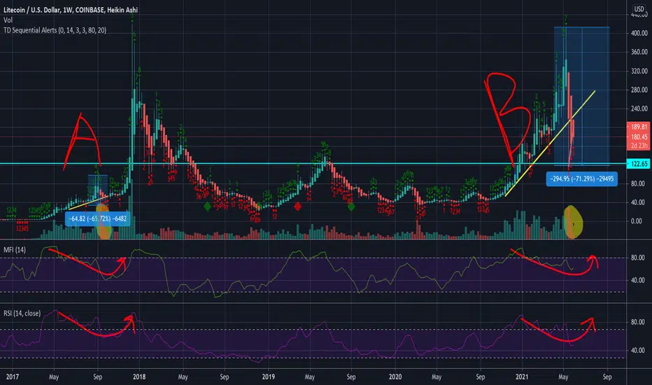
Looking at the graph A & B you see some similarities.
1.) The drop in both was close to 70%.
2.) You will also notice the volume candles highlighted in yellow. Only time in LTC weekly chart that you see that similarity in decreasing selling volume candles
3.) MFI and RSI seem to be following similar patterns to the 2017 crash.
IF I had to take a calculated guess I would expect a new all time high within the next couple of months depending on the overall health of the financial markets.
1.) The drop in both was close to 70%.
2.) You will also notice the volume candles highlighted in yellow. Only time in LTC weekly chart that you see that similarity in decreasing selling volume candles
3.) MFI and RSI seem to be following similar patterns to the 2017 crash.
IF I had to take a calculated guess I would expect a new all time high within the next couple of months depending on the overall health of the financial markets.

คำจำกัดสิทธิ์ความรับผิดชอบ
ข้อมูลและบทความไม่ได้มีวัตถุประสงค์เพื่อก่อให้เกิดกิจกรรมทางการเงิน, การลงทุน, การซื้อขาย, ข้อเสนอแนะ หรือคำแนะนำประเภทอื่น ๆ ที่ให้หรือรับรองโดย TradingView อ่านเพิ่มเติมใน ข้อกำหนดการใช้งาน
คำจำกัดสิทธิ์ความรับผิดชอบ
ข้อมูลและบทความไม่ได้มีวัตถุประสงค์เพื่อก่อให้เกิดกิจกรรมทางการเงิน, การลงทุน, การซื้อขาย, ข้อเสนอแนะ หรือคำแนะนำประเภทอื่น ๆ ที่ให้หรือรับรองโดย TradingView อ่านเพิ่มเติมใน ข้อกำหนดการใช้งาน