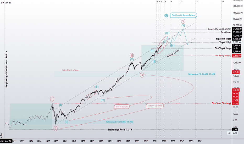
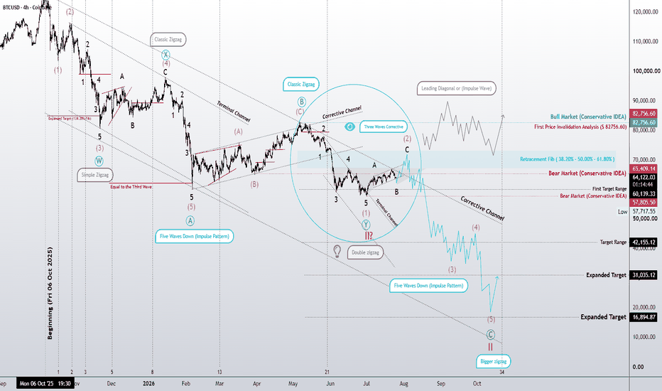
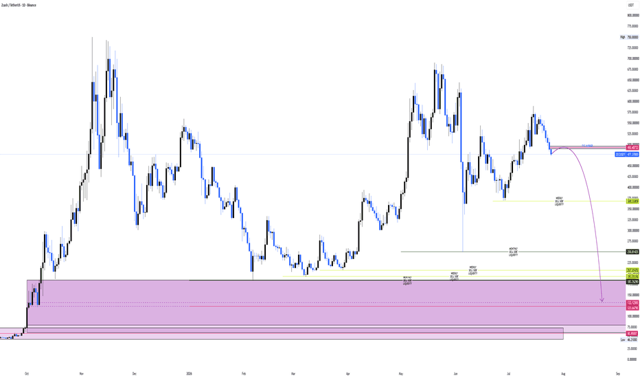
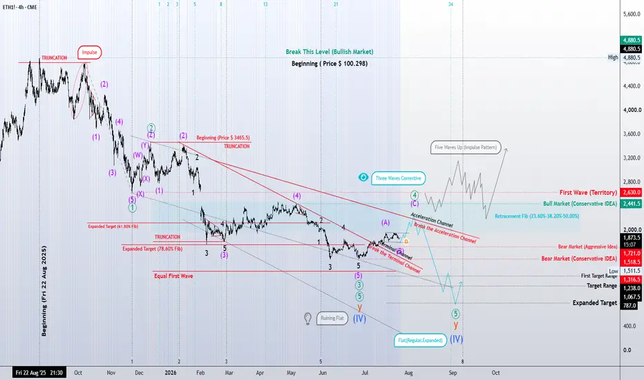
Multiple Time Frame Analysis
EUR/USD - Sell All Your Euros! S**t Looking To Drop Hard!For All You Legendary Traders Out There, Having A Framework To Work Inside Is The Best Way To Stay Onside And Right Now Could Be A Opportunity Of A Lifetime To Short The S**t Out Of Euro!
It's Been A Long Time Since Volatility Has Stepped Into The Forex Markets..... Are The Days Getting Closer For Capitulation Of Bulls??
I'm Ready To Capitalise!
Are You???
ETH: We have stricken the 1st meaningful support zonePrice will easily make it back to nearby untested break points when the opposing orders are present. We hit a massive support zone and were able to recover the nearest bearish imbalance.
Bullish OB holding us up well right now. If we get a bearish OB on 4H we should be on alert for bearish continuation if price has a hard time pushing up through it ⚠️
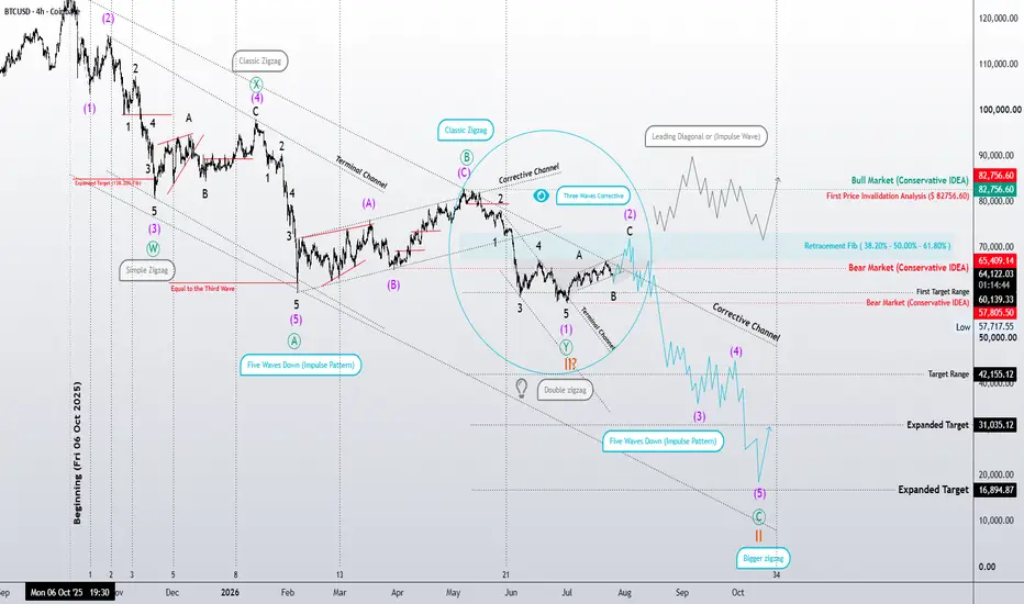
BTCUSD Next Liquid PoolBitcoin next liquid zone where orders rest is at $54,150 and we can possibly tap this area this week or soon. Historically from what I know this price has been very liquid as in the past fell like $8k back in 2021 in less than an hour. Also, back in 2024 it bounces around in price a lot in this exact price so we can possibly see big moves. Since mid-May bitcoin been dropping and that has to do with investors, financial institutions, and banks trusting the USA economy and dollar, making them comfortable/safe to pull their money from safe heavens like Gold, Oil, Bitcoin and put their money elsewhere for bigger gains. INDEX:BTCUSD CRYPTOCAP:BTC
Liquidity Sweep & Supply Zone Reversal ScenarioHow to trade this setup?
After completing the multi-timeframe analysis, price delivered a strong bearish reaction after sweeping the liquidity pool and rejecting from the supply zone, exactly as outlined in the previous analysis. Since then, the US Dollar has recovered almost the entire move, bringing price back into a critical decision area.
Price is now trading just below the nearest supply zone around 160.500. Although this zone remains technically valid due to the strong bearish departure, taking a direct short from this level carries higher risk. The reason is simple: price is currently moving within a strong bullish leg, and shorting into that momentum without confirmation could easily result in a stop-loss sweep.
For that reason, the cleaner approach is not to react immediately from the nearest supply. Instead, we want to let price reveal its intention first. If price rejects from this area and forms a valid lower-timeframe setup, there may be a short-term intraday opportunity. However, if bullish momentum continues, the better play is to wait for a pullback and look for buying opportunities toward the next major supply zone above, located around 161.239–161.950.
The higher-probability short scenario would come from the major supply zone, not the nearest one. Ideally, price sweeps the nearest swing high first, takes buy-side liquidity, then shows a clear shift in structure. That would indicate that smart money has engineered liquidity before potentially reversing price.
The short setup becomes valid only after confirmation on the lower timeframe. Drop to the 5-minute chart and wait for price to sweep a recent high, followed by the first clear BoS or CHoCH. For stronger confirmation, wait for displacement after the structural shift, then allow price to retrace back into the newly created displacement supply zone. That retest would provide the cleaner short entry.
The stop loss should not be placed blindly above the full higher-timeframe supply zone, because the zone is too wide. Instead, refine the entry on the 5-minute timeframe and place the stop loss above the newly formed lower-timeframe high. This keeps the risk controlled and improves the reward-to-risk profile.
Primary short target remains 159.000. If bearish displacement expands and momentum confirms, price could potentially continue deeper toward 158.000.
In summary, the supply is valid, but the timing matters. Do not short simply because price is inside supply. Wait for liquidity to be taken, wait for structure to shift, and only then execute from a refined lower-timeframe supply zone.
EURUSD at Critical Support – Reversal Opportunity AheadEURUSD is currently testing a key demand/support area around 1.1440–1.1460, a zone that has previously attracted strong buying interest. Price remains under short-term pressure, but this support region could act as a foundation for a potential bullish recovery.
A confirmed bullish reaction from this zone may open the path toward 1.1600 initially, with the major resistance area near 1.1800 becoming the next upside objective. However, patience is important here, as confirmation from price action is needed before considering a stronger bullish outlook.
Key Levels:
• Support: 1.1440 – 1.1460
• Confirmation Area: 1.1500 – 1.1550
• Target 1: 1.1600
• Target 2: 1.1800
Summary:
EURUSD is trading at a critical support zone. A confirmed bullish reaction could trigger a recovery toward higher resistance levels, while traders should wait for clear confirmation before expecting a sustained move higher.
NVDA — NASDAQ, 4HEATF+CE v13 — NVDA at the centre of a regime turn the 4H is already confirming
NVDA — NASDAQ, 4H
NVDA itself is the most useful illustration of why this matters. On the daily NASDAQ AI infrastructure basket, NVDA still sits in the Elite tier under broader regime classification of "Broad Uptrend (turning down)". On the 4H verification timeframe — the screen above — NVDA has already dropped to the Confirmed tier with a TRIM·Adapt warn+fading label. The Adapt filter has flipped bearish at the 4H resolution; Fast and Core still see uptrend. The cycle detector is calling weakness ahead of the slower filters.
This is the multi-timeframe workflow v13 was built to surface clearly: daily for primary detection, 4H for verification. When the daily cluster reaches sustained or mature, the 4H confirms whether the structural turn is broadly aligned across timescales. The 4H here is showing it more developed than the daily — 55 bars of cluster activity (roughly 9 trading days), 9 names in the Adapt cluster, the broader Regime already classified as Distributed Uptrend (turning down) rather than the daily's Broad Uptrend. The breadth has already broadened away from concentrated Elite leadership; the next stage is breadth weakness.
The backdrop explains the urgency. SpaceX prices its IPO June 11 targeting $1.77 trillion (raising $40-80B). Anthropic filed confidentially June 1. The unprecedented IPO concentration is producing broad cash-raising selling — investors raising capital to participate, propagating from extended speculative names downward through quality. The cluster signals have been tracking that propagation accurately since late last week.
Where the 4H is showing structurally worse news than the daily
The equipment layer — historically the structural anchor in AI infrastructure cycles — is already showing cluster maturity at 4H. LRCX sits at #10 in Elite with REDUCE·Cluster mature; AMAT at #11 with the same label. Earlier in the week these names were the cleanest part of the basket, the defensive holdings recommended to anchor positions through the turn. At the 4H verification level today, they are showing the same cluster-mature pressure that the speculative end of the basket has been showing for two weeks.
This matters because the defensive thesis for holding through this turn rested on the assumption that the equipment layer would stay clean while the speculative names rolled over — a contained cycle digestion. If LRCX and AMAT have already lost defensive characteristics at 4H, that thesis is weakening earlier than the framework anticipated. The 4H is leading the daily; what's true here today will likely become true at daily within 1-3 sessions if the pattern persists.
NVDA's position fits the same pattern. On the daily it still reads as part of the strong basket. On the 4H it has dropped to Confirmed with TRIM·Adapt warn+fading. The Adapt-divergence pattern at 4H historically precedes cluster propagation into Confirmed tier at daily, and then into broader Elite tier degradation.
The new direction-explicit cluster language makes the read direct
Distributed Uptrend (turning down) tells the reader the regime that has prevailed is reversing — no inference work required. Mature — regime turn-down underway tells the reader individual warnings are firing alongside the cluster maturity. 2 candidates remaining in the ADD basket tells the reader how much of the prior leadership has already degraded.
A few read scenarios from here:
Scenario A (35-45%, revised downward from earlier in the week): selling resolves after the SpaceX listing absorbs cash demand through mid-June. Bearish cluster stops advancing as the IPO completes; bullish cluster setup on daily Emerging tier (currently SMCI, MSFT, ORCL, VST at mature stage) propagates into Confirmed as slower filters catch up to MAMA. NVDA's TRIM·Adapt warn+fading resolves back to Elite consensus as 4H filters re-align. Probability has shifted lower because the equipment-layer cluster pressure at 4H suggests the defensive sub-sector thesis is weaker than earlier in the week's read assumed.
Scenario B (35-45%, revised upward): selling broadens beyond IPO cash-raising into broader cycle concerns. Bearish cluster propagates from current 9 names at 4H toward 12+; NVDA's 4H Adapt-divergence develops into Adapt-only-bearish; the daily cluster advances from sustained to mature on the custom basket; equipment layer cluster pressure visible at 4H today propagates into daily-chart confirmation. Bullish cluster setup fails to mature into actual reversal — "setup confirmed" never becomes turn-up underway.
Scenario C (15-25%, revised upward): full semi-cycle turn. NVDA breaks Confirmed and drops to Emerging or Bear on 4H over the next 1-3 sessions; equipment-layer cluster pressure persists and broadens at 4H; bearish cluster reaches saturation across the basket; bullish cluster signal dies entirely. Regime classification transitions to Risk-Off — breadth deteriorating. Defensive sub-sectors break (storage, construction, utilities). The regime turn is structural rather than IPO-driven.
The probability distribution has shifted toward the structural read since earlier in the week. The equipment-layer 4H read is the meaningful new information — yesterday's framework treated the equipment layer as the cleanest defensive holding; today's 4H verification shows it carrying cluster pressure equal to the speculative names.
Watch signals from here:
If NVDA's daily-chart tag progresses from current Elite consensus toward TRIM·Adapt warn+fading over the next 1-3 sessions (catching up to what the 4H already shows), Scenario A weakens further and Scenario B is in progress.
If LRCX and AMAT on the daily chart show any progression toward REDUCE·Cluster sustained or mature labels, the structural-anchor thesis breaks fully. Scenario C activates.
If SMCI, MSFT, ORCL, VST hold their ENTRY·Bullish cluster tags through the next sessions and propagate into Confirmed tier with positive rank trends, the bullish setup is materially developing — supporting Scenario A.
The indicator now reads each of these through symmetric cluster signals and direction-explicit language. State machine notifications on the daily chart prompt verification on the 4H — exactly the workflow this NVDA 4H read demonstrates. When something material changes on the daily, the indicator surfaces it rather than leaving users to discover it on their next manual check.
Not a recommendation. Not a prediction. A probability read across three scenarios, made readable enough to act on under time pressure, and updated with new structural information when the verification timeframe reveals it.
BNB | Day Chart | June Q2 26'Zoom out.
Along the top of the screen you'll notice Yr26' & 27' marked by vertical black lines. Between them are Quarters of the year.
Portfolio rebalancing happens at 25% events or at time intervals like Day, Week, month, quarter, or annual intervals - These time horizons are different for each investor and is a large reason why so many bicker in chat groups. What goes down on your timeframe as bearish is a bullish signal for another timeframe.
adding quarters to the X-Axis of time with vertical lines naturally frames price action between support and resistance. Fractally, the picture becomes clear as the T.A. illustrates the story.
----------------------------------
Multiple Time-Frame Analysis; Color Code | Strength favors the higher timeframe.
Yearly timeframe = black
Monthly timeframe = pink
weekly = grey
daily = red
4hr = orange
1hr = yellow
15min = blue
5min = green if they are shown. (Level visibility on intervals is set to timeframe the level was found on and below to keep chart view organized.)
MTVA | Day Chart | June Q2 26' MetaVia Inc. || "clinical-stage biotechnology company, which engages in developing and commercializing multi-modal disease-modifying therapies... which has the potential to treat the symptoms of cognitive impairment and modify the progression of neurodegenerative diseases."
-----------------------------------
MARKET-BEATING SCORE -1/10
MTVA FCF $-15.70M negative — cash burn is a risk factor against market-beating returns.
Investors seeking consistent market-beating returns favor: U.S. small-cap, emerging markets, and value-style equities.
This stock appeared on the radar with 5% rel vol for day, 40M stock float, price $1.5 - $20, premarket change of 5%.
Also filtering by strong FCF growth of 25-50% + R&D budget $1M+
----------------------------------
WHAT COULD TURN NEGATIVES POSITIVE:
EPS turns positive via: revenue acceleration, operating cost cuts, or non-recurring charges.
FCF turns positive when capex matures, working capital improves, or revenue passes fixed-cost base.
ADA | 4hr Chart
** T.A explained **
Multiple Time-Frame Analysis; Color Code | Strength favors the higher timeframe.
Yearly timeframe = black
Monthly timeframe = pink
weekly = grey
daily = red
4hr = orange
1hr = yellow
15min = blue
5min = green if they are shown. (Level visibility on intervals is set to timeframe the level was found on and below to keep chart view organized.)
Ranges defined
A Range = two or more consecutive color candles (2+ in a row, same color creates a range)
There are two types of ranges - Accumulation Ranges &
Distribution Ranges.
*A single candle is a range on a lower timeframe. Mark the candle and then find the range / level on a lower timeframe aka "Range Finding".
Some people use boxes and call this boxing finding the zone - supply & demand zones - and marking the entire range top to bottom. This is acceptable but introduces risk by increasing probability of orders getting filled.
Candle Science further defines the zone / range into levels. So. after finding a range, identify and label the first and last candle of the range.
This is Candle Science. Everything has a default expectation and users thinking is guided by IF/THEN statements.
Below are the default expectations for each range and the first and last candle within the range.
DISTRIBUTION RANGES:
When price is above a distribution range its default expectation is to support price accumulation.
The first distribution candle in a distribution range is labeled as the BackSide Candle (BS).
Expectation = strong reaction to price. Look for price action to create long wicks reaching to or away from level. A steep angle trend is expected to form so Fair Value Gaps are expected to form on the timeframe of the level and lower timeframes.
If a steep angle trend is not forming, and long wicks are not being created then the idea is that liquidity is not there, confidence in the level is low. Price Action may then be looking for more liquidity to and seek it out at the FrontSide Candle.
FrontSide (FS) Candle = The last distribution candle in a distribution range.
Expectation = create a low angle accumulation trend reversal.
3 bar reversal patterns laddering up
like the distribution candles are the rungs of an accumulation ladder. price uses the top side of the BackSide Candle or the top side of the FrontSide Candle as support. They are used in bull flags to break distribution trends.
IF price fails to gain a BackSide or FrontSide level THEN they act as RESISTANCE. But we will then train our eyes to look at the bottom side of Accumulation Ranges because they have a default expectation as Resistance.
When Price is below an accumulation candle, the bottom side of the accumulation candle is the level of resistance.
ACCUMULATION RANGES DEFINED:
Inverse BackSide Candle (Inv.BS) = the first accumulation candle in an accumulation range.
Expectation. = strong reaction to price. long wicks reaching to or away from level. Creates a steep angle distribution trend. Usually create F.V.G's and impulsive, volatile moves like the BackSide Candle.
Inverse FrontSide Candle (Inv.FS) = The last accumulation candle in an accumulation range.
Expectation = reversal, create a low angle distribution trend. The bottom side of the accumulation candles are used as resistance levels.
TOOLS USED:
Boxes - used to define a zone by marking the entire range (if its small) or just one entire candle or just the wick of the candle to define the zone.
Horizontal Ray tool - used to define the level.
levels when dashed lines are untested, active level where buyers or sellers are waiting to create a level of interest.
Tested levels are dotted lines. If used, they reference the range and could become Origin levels or R.a.t.s in the future (levels where new trends originate or where traders are using Rejection as A Target to scalp and reverse position - aka stoploss hunters; like the rats they are.
Again the color code:
Yearly timeframe color is Black
Monthly timeframe is color pink
weekly grey
daily is red
4hr is orange
1hr is yellow
15min is blue
5min is green if they are shown.
strength favors the higher timeframe.
SGB | 26' Q2 | May wk 20 | 4hr Chart** T.A explained **
Multiple Time-Frame Analysis; Color Code | Strength favors the higher timeframe.
Yearly timeframe = black
Monthly timeframe = pink
weekly = grey
daily = red
4hr = orange
1hr = yellow
15min = blue
5min = green if they are shown. (Level visibility on intervals is set to timeframe the level was found on and below to keep chart view organized.)
SPY | 26' Q2 | May | Day Charttop down analysis from yearly timeframe to Daily Timeframe.
All levels of interest are color coded line and label.
Some labels will be a different color from the line. This means the timeframe started on the color of the label and was adapted down to the lower timeframe.
Pink Vertical lines are Quarters which helps me frame the market structure and see price action better.
** T.A explained **
Multiple Time-Frame Analysis; Color Code | Strength favors the higher timeframe.
Yearly timeframe = black
Monthly timeframe = pink
weekly = grey
daily = red
4hr = orange
1hr = yellow
15min = blue
5min = green if they are shown. (Level visibility on intervals is set to timeframe the level was found on and below to keep chart view organized.)
Ranges defined
A Range = two or more consecutive color candles (2+ in a row, same color creates a range)
There are two types of ranges - Accumulation Ranges &
Distribution Ranges.
*A single candle is a range on a lower timeframe. Mark the candle and then find the range / level on a lower timeframe aka "Range Finding".
Some people use boxes and call this boxing finding the zone - supply & demand zones - and marking the entire range top to bottom. This is acceptable but introduces risk by increasing probability of orders getting filled.
Candle Science further defines the zone / range into levels. So. after finding a range, identify and label the first and last candle of the range.
This is Candle Science. Everything has a default expectation and users thinking is guided by IF/THEN statements.
Below are the default expectations for each range and the first and last candle within the range.
DISTRIBUTION RANGES:
When price is above a distribution range its default expectation is to support price accumulation.
The first distribution candle in a distribution range is labeled as the BackSide Candle (BS).
Expectation = strong reaction to price. Look for price action to create long wicks reaching to or away from level. A steep angle trend is expected to form so Fair Value Gaps are expected to form on the timeframe of the level and lower timeframes.
If a steep angle trend is not forming, and long wicks are not being created then the idea is that liquidity is not there, confidence in the level is low. Price Action may then be looking for more liquidity to and seek it out at the FrontSide Candle.
FrontSide (FS) Candle = The last distribution candle in a distribution range.
Expectation = create a low angle accumulation trend reversal.
3 bar reversal patterns laddering up
like the distribution candles are the rungs of an accumulation ladder. price uses the top side of the BackSide Candle or the top side of the FrontSide Candle as support. They are used in bull flags to break distribution trends.
IF price fails to gain a BackSide or FrontSide level THEN they act as RESISTANCE. But we will then train our eyes to look at the bottom side of Accumulation Ranges because they have a default expectation as Resistance.
When Price is below an accumulation candle, the bottom side of the accumulation candle is the level of resistance.
ACCUMULATION RANGES DEFINED:
Inverse BackSide Candle (Inv.BS) = the first accumulation candle in an accumulation range.
Expectation. = strong reaction to price. long wicks reaching to or away from level. Creates a steep angle distribution trend. Usually create F.V.G's and impulsive, volatile moves like the BackSide Candle.
Inverse FrontSide Candle (Inv.FS) = The last accumulation candle in an accumulation range.
Expectation = reversal, create a low angle distribution trend. The bottom side of the accumulation candles are used as resistance levels.
XRP | May 2026 | 4hr chart** T.A explained **
Multiple Time-Frame Analysis; Color Code:
Strength favors the higher timeframe.
Yearly timeframe = black
Monthly timeframe = pink
weekly = grey
daily = red
4hr = orange
1hr = yellow
15min = blue
5min = green if they are shown. (Level visibility on intervals is set to timeframe the level was found on and below to keep chart view organized.)
Ranges defined
A Range = two or more consecutive color candles (2+ in a row, same color creates a range)
There are two types of ranges - Accumulation Ranges &
Distribution Ranges.
*A single candle is a range on a lower timeframe. Mark the candle and then find the range / level on a lower timeframe aka "Range Finding".
Some people use boxes and call this boxing finding the zone - supply & demand zones - and marking the entire range top to bottom. This is acceptable but introduces risk by increasing probability of orders getting filled.
Candle Science further defines the zone / range into levels. So. after finding a range, identify and label the first and last candle of the range.
This is Candle Science. Everything has a default expectation and users thinking is guided by IF/THEN statements.
Below are the default expectations for each range and the first and last candle within the range.
DISTRIBUTION RANGES:
When price is above a distribution range its default expectation is to support price accumulation.
The first distribution candle in a distribution range is labeled as the BackSide Candle (BS).
Expectation = strong reaction to price. Look for price action to create long wicks reaching to or away from level. A steep angle trend is expected to form so Fair Value Gaps are expected to form on the timeframe of the level and lower timeframes.
If a steep angle trend is not forming, and long wicks are not being created then the idea is that liquidity is not there, confidence in the level is low. Price Action may then be looking for more liquidity to and seek it out at the FrontSide Candle.
FrontSide (FS) Candle = The last distribution candle in a distribution range.
Expectation = create a low angle accumulation trend reversal.
3 bar reversal patterns laddering up
like the distribution candles are the rungs of an accumulation ladder. price uses the top side of the BackSide Candle or the top side of the FrontSide Candle as support. They are used in bull flags to break distribution trends.
IF price fails to gain a BackSide or FrontSide level THEN they act as RESISTANCE. But we will then train our eyes to look at the bottom side of Accumulation Ranges because they have a default expectation as Resistance.
When Price is below an accumulation candle, the bottom side of the accumulation candle is the level of resistance.
ACCUMULATION RANGES DEFINED:
Inverse BackSide Candle (Inv.BS) = the first accumulation candle in an accumulation range.
Expectation. = strong reaction to price. long wicks reaching to or away from level. Creates a steep angle distribution trend. Usually create F.V.G's and impulsive, volatile moves like the BackSide Candle.
Inverse FrontSide Candle (Inv.FS) = The last accumulation candle in an accumulation range.
Expectation = reversal, create a low angle distribution trend. The bottom side of the accumulation candles are used as resistance levels.
TOOLS USED:
Boxes - used to define a zone by marking the entire range (if its small) or just one entire candle or just the wick of the candle to define the zone.
Horizontal Ray tool - used to define the level.
levels when dashed lines are untested, active level where buyers or sellers are waiting to create a level of interest.
Tested levels are dotted lines. If used, they reference the range and could become Origin levels or R.a.t.s in the future (levels where new trends originate or where traders are using Rejection as A Target to scalp and reverse position - aka stoploss hunters; like the rats they are.
Again the color code:
Yearly timeframe color is Black
Monthly timeframe is color pink
weekly grey
daily is red
4hr is orange
1hr is yellow
15min is blue
5min is green if they are shown.
strength favors the higher timeframe.
Everyone is waiting for the dip… May 2026What if it never came?
A few days ago the idea of an approaching resistance “ Expect resistance 86-87k - May 2026 ” was published. It is clear from various quarters this is interpreted as a forecast “crash” event prediction as and when resistance is tested. An event that’ll cover long orders to those that panic sold around $65k now looking to capture a missed opportunity.
Here's the thing, resistances can be broken. Resistances, just like support, can fool the market. The trade or opportunity only makes sense after confirmation. Never guess, never fall victim to the popular narrative. Right now the popular narrative remains, a mega crash is coming.
Let’s be honest, had you bought instead of sold around 65k, you’d not be reading this post. It would be entirely irrelevant. Instead participants now face the worry of a resistance confirmation that might never come. What if price action slices straight through resistance? Continues with higher lows?
Why would it do that?
Very simple. The market is driven by emotion. We all know this resistance is here. Emotional participants emptied their pockets at the lows during the panic. They gladly sold every last Sat to shrewd investors for cheap, my favourite price. Participants now repeat this activity with their alt tokens. Latterly there are folks sitting in cash waiting for an even larger drop to levels like $50k, or even $40k as they’ve been promised. Well, that’s not going to happen.
How do I know this?
Look left. (That includes the influencers!)
On the above 9 day chart you’ll see the 100 day Rolling Moving average. Since Bitcoin began life way back in 2011, you would see new highs print with each confirmation of support on the 100 RMA.
Price action has confirmed support on the 100 RMA @ $65k. That is the only reason I now know that lower lows are very improbable. The herd has missed out, and the FOMO is quietly building, as is the frustration. Perhaps price might double bottom on the RMA, as it has done in the past. Treat that opportunity as a gift horse should it happen.
But a stock market crash is coming!
The “ Sell in May come back another day - The Truth 2026 ” is also receiving much pushback despite an 86% probability the stock market closes higher in the next 6-8 months from now at the same time most continue to call for a crash. The market it seems refuses to oblige.
But Warren Buffet’s cash position is the largest it’s ever been!
The inbox has shown that message once or twice. “He sits on huge cash position waiting for the crash!"
One of the most mis-informed statements flying around influencer circles at the moment is Warren Buffet maintains a large cash position. Two things:
1. Every trader and investor should maintain a cash position larger than their tradable portfolio. It is the core facet to good risk management. It’s how I sleep at night.
2. He’s not all in cash, he’s mostly long treasury Bonds. That’s not cash, that’s cash with a guaranteed rate of return as interest.
In other words, he’s reduced his risk during a period of increased volatility.
But recession!! Recession is coming.
Another popular narrative doing the rounds. For the majority of folks, recession = bear market.
That’s a reasonable assertion with one problem, the facts do not support such a point of view. The truth is much more compelling. Overlay historical recessions during the business cycles of the last 100 years and you’ll learn the stock market does not care. Think about it, the conflicts (Plural?!) America is engaged in is often used as a narrative to explain why an economic downturn is coming, which will crash the market. The evidence is, the stock market does not care. As a matter of fact, recessions are one of the greatest wealth transfers you’ll have in your lifetime. While everyone else panics, you act decisively.
Have said this before elsewhere…. if you wish to participate in this transfer, be invested.
Read “ S&P 500 to 10,000 inside the next 4 years - December 2025 ” for a detailed breakdown why the stock market is going make much higher moves.
Bis später!
Ww
=========================================================
Disclaimer
This post reflects personal market opinions and interpretations of historical price action. It is not financial advice, investment advice, or a recommendation to buy or sell any asset. Markets are inherently unpredictable and all investments carry risk, including the potential loss of capital. Past performance, historical probabilities, and technical indicators do not guarantee future results.
ZEC | Day Chart | June Q2 26'Multiple Time-Frame Analysis; Color Code | Strength favors the higher timeframe.
Yearly timeframe = black
Monthly timeframe = pink
weekly = grey
daily = red
4hr = orange
1hr = yellow
15min = blue
5min = green if they are shown. (Level visibility on intervals is set to timeframe the level was found on and below to keep chart view organized.)
** Candle Science explained **
A Range = two or more consecutive color candles.
There are two types of ranges - accumulation and distribution.
DISTRIBUTION RANGES DEFINED: BackSide (BS) Candle - First distribution candle in a distribution range. Expectation = strong reaction to price. long wicks reaching to or away from level.
FrontSide (FS) Candle - Last distribution candle in a distribution range. Expectation = reversal, create a trend in the opposite direction. Distribution candles are used as support.
ACCUMULATION RANGES DEFINED:
Inverse BS (Inv.BS) - First Accumulation candle in an accumulation range. Expectation. = strong reaction to price. long wicks reaching to or away from level.
Inverse FS (Inv.FS) - Last accumulation candle in an accumulation range. Expectation = reversal, create a trend in the opposite direction. Accumulation candles are used as resistance.
Horizontal Ray tool on BS & FS levels are default support levels when dashed lines, tested when dotted lines and resistance when solid lines.
Horizontal Ray tool on Inverse BS & Inverse FS levels default as resistance and shown with a dashed line, tested when 1x dotted line, and support when solid line.
The inverse is true for the Inv. BS Inv. FS levels, they are resistance as dashed lines, tested as dotted and support as solid lines.
ZBCN | Day Chart | June Q2 26'Multiple Time-Frame Analysis; Color Code | Strength favors the higher timeframe.
Yearly timeframe = black
Monthly timeframe = pink
weekly = grey
daily = red
4hr = orange
1hr = yellow
15min = blue
5min = green if they are shown. (Level visibility on intervals is set to timeframe the level was found on and below to keep chart view organized.)
** Candle Science explained **
A Range = two or more consecutive color candles.
There are two types of ranges - accumulation and distribution.
DISTRIBUTION RANGES DEFINED: BackSide (BS) Candle - First distribution candle in a distribution range. Expectation = strong reaction to price. long wicks reaching to or away from level.
FrontSide (FS) Candle - Last distribution candle in a distribution range. Expectation = reversal, create a trend in the opposite direction. Distribution candles are used as support.
ACCUMULATION RANGES DEFINED:
Inverse BS (Inv.BS) - First Accumulation candle in an accumulation range. Expectation. = strong reaction to price. long wicks reaching to or away from level.
Inverse FS (Inv.FS) - Last accumulation candle in an accumulation range. Expectation = reversal, create a trend in the opposite direction. Accumulation candles are used as resistance.
Horizontal Ray tool on BS & FS levels are default support levels when dashed lines, tested when dotted lines and resistance when solid lines.
Horizontal Ray tool on Inverse BS & Inverse FS levels default as resistance and shown with a dashed line, tested when 1x dotted line, and support when solid line.
The inverse is true for the Inv. BS Inv. FS levels, they are resistance as dashed lines, tested as dotted and support as solid lines.
BTC | Day Chart | June Q2 26'Multiple Time-Frame Analysis; Color Code | Strength favors the higher timeframe.
Yearly timeframe = black
Monthly timeframe = pink
weekly = grey
daily = red
4hr = orange
1hr = yellow
15min = blue
5min = green if they are shown. (Level visibility on intervals is set to timeframe the level was found on and below to keep chart view organized.)
** Candle Science explained **
A Range = two or more consecutive color candles.
There are two types of ranges - accumulation and distribution.
DISTRIBUTION RANGES DEFINED: BackSide (BS) Candle - First distribution candle in a distribution range. Expectation = strong reaction to price. long wicks reaching to or away from level.
FrontSide (FS) Candle - Last distribution candle in a distribution range. Expectation = reversal, create a trend in the opposite direction. Distribution candles are used as support.
ACCUMULATION RANGES DEFINED:
Inverse BS (Inv.BS) - First Accumulation candle in an accumulation range. Expectation. = strong reaction to price. long wicks reaching to or away from level.
Inverse FS (Inv.FS) - Last accumulation candle in an accumulation range. Expectation = reversal, create a trend in the opposite direction. Accumulation candles are used as resistance.
Horizontal Ray tool on BS & FS levels are default support levels when dashed lines, tested when dotted lines and resistance when solid lines.
Horizontal Ray tool on Inverse BS & Inverse FS levels default as resistance and shown with a dashed line, tested when 1x dotted line, and support when solid line.
The inverse is true for the Inv. BS Inv. FS levels, they are resistance as dashed lines, tested as dotted and support as solid lines.
The AI Infrastructure Trade — A Probability Read on Where We AreThe AI Infrastructure Trade — A Probability Read on Where We Are
If you're holding from the broader AI infrastructure basket — NVDA, AVGO, AMD, ARM, MU, MRVL, TSM, LRCX, AMAT, KLAC, ASML, ANET, SMCI, DELL, HPE, VRT, ETN, PWR, HUBB, JCI, TT, GEV, CEG, VST, EQIX, DLR, GOOGL, AMZN, META, MSFT, plus SMH/QQQ/SPY benchmarks — here's what a multi-filter structural read says about the probability distribution of where the basket is likely going over the next 1-12 weeks. Not a recommendation, not a prediction. The structure speaking honestly about what it can and cannot say.
A note before reading. All trading indicators define probability distributions over future states. They never predict; they shift the conditional probability of outcomes given the observed signal. The cluster signal in this screen is no different. What follows isn't a claim that something has or will happen — it's a description of how the observable evidence shifts the relative likelihood of different scenarios. Read it as such.
Where we are by the screen's measures. The broader AI infrastructure basket is showing what the indicator classifies as a "mature cluster" reading. Eight Confirmed-tier names show simultaneous cycle-adaptive bearish dissent (VRT, GEV, PWR, DLR, TT, GOOGL, HUBB, AMZN). The cluster has been active for 17 bars — roughly three and a half trading weeks. Individual warnings have begun firing on names crossing 10-bar persistence thresholds. The Elite count has contracted from a peak around 32 to 23. The actionable ADD·Strengthening basket has reduced from 17 to 7 candidates.
The indicator's role here is to surface the simultaneity of cycle-detector signals that no individual chart would show. Three weeks ago, the cycle-adaptive filter flipped bearish on five Elite-tier leadership names while every slower filter still saw clean uptrends. That's the kind of cross-name correlation the multi-filter consensus structure exists to detect. The cluster then expanded, persisted past the noise window, and matured to its current state. None of this happened overnight, and each stage was observable in real time.
What the indicator's reading shifts probabilities toward. A mature-cluster reading in a multi-filter framework historically correlates with higher conditional probability of three classes of outcome over the following 1-12 weeks. The relative weights I'd attach are necessarily soft — base rates for this specific configuration aren't reliably calibrated — but the direction of the probability shift is what the indicator structurally implies.
Class A: Digestion, no broad turn (probability ≈ 40-50%). The cluster stabilizes at current levels, Elite count holds at 20-24, individual warnings cap at 1-2 names. The basket absorbs the cycle-level pressure over 3-6 weeks. Drawdowns of 15-25% on the most extended names (the infrastructure-adjacent group: VRT, GEV, PWR, GOOGL, HUBB), 5-10% on the cleaner names, 0-5% on defensive sub-sectors (storage, equipment). Basing process begins within 3-6 weeks. Equipment layer never gets pulled in. Sub-sector rotation continues. This is the constructive resolution and is consistent with how AI/semi cycles have historically resolved when cluster pressure was real but contained to a specific sub-sector. It corresponds to the slower filters not propagating the cycle-detector's bearishness.
Class B: Broader weakness, propagation into chip designers (probability ≈ 30-40%). The cluster expands to 12-15 names. Adapt-divergence appears on at least one of NVDA, AMD, AVGO. Elite count contracts to 15-18. Infrastructure-adjacent names that have already given back 15-25% give back another 10-20%. Chip designers see 10-20% drawdowns from current levels. The basket transitions to "Transitional — mixed regime" on the screen's classifier. Time to basing: 6-12 weeks from current state. This is the medium-severity resolution — a broader AI cycle pause, not collapse. Equipment layer typically resists 4-8 weeks before participating in this scenario.
Class C: Full semi-cycle turn (probability ≈ 10-20%). Adapt-divergence propagates to the equipment layer (ASML, AMAT, LRCX, KLAC). Cluster expands to 15+ names. Elite count below 15. The screen reaches "Risk-Off — breadth deteriorating." This is the full semiconductor cycle turn scenario, similar in shape to 2022 but unfolding over its own timeframe. Drawdowns of 30-50% on extended names, 15-30% on cleaner ones. Time to basing: 4-8 months. This is the tail-risk resolution and would require the cluster pressure to propagate through layers that have so far remained clean.
These probabilities aren't calibrated against a large sample of historical cluster maturations in this exact configuration — that sample doesn't exist. They're directional estimates from the structural read of the indicator alone, drawing on broader pattern-recognition about how multi-filter cycle pressure tends to resolve in tech baskets. Treat them as ordinal (A > B > C in likelihood) rather than as precise point estimates. The point is the direction of probability mass, not the exact percentages.
What would shift probabilities further as evidence accumulates. This is what makes the indicator useful in real time. Each of the next several sessions will produce observable evidence that shifts the probability distribution toward one class or another.
Evidence shifting toward Class A (digestion). Cluster count stabilizes at 8 or drops to 6-7. Elite count holds steady at 23 or drifts up. No new cluster names appear. Equipment layer remains clean. Sub-sector rotation continues with defensive names outperforming infrastructure names. Storage and memory hold up while cluster-adjacent names continue to underperform. Each of these shifts probability away from B and C and toward A.
Evidence shifting toward Class B (broader weakness). Cluster count expands toward 10-12. Adapt-divergence appears on at least one chip designer (NVDA, AMD, AVGO). Elite count drifts toward 18-20. The semi-defensive names (storage, memory) start participating in basket weakness with drawdowns matching the infrastructure layer. Hyperscaler cohort behavior degrades together (GOOGL, AMZN, META, MSFT moving in coordinated weakness rather than independently). Each shifts probability toward B.
Evidence shifting toward Class C (full cycle turn). Adapt-divergence appears on any of ASML, AMAT, LRCX, KLAC. Cluster count expands past 12. Elite count drops below 15. The screen's regime classifier moves to "Risk-Off." This is the threshold where the read changes materially. As long as equipment stays clean, C remains tail-risk.
The structural canary is the equipment layer. Right now ASML, AMAT, LRCX, KLAC are all in Elite with no Adapt-divergence. They're the layer most resistant to short-term cycle pressure (equipment orders are committed 12-18 months ahead of underlying demand). If they remain clean, probability mass stays in A and B. If they get pulled in, probability shifts meaningfully toward C.
The sub-sector pattern as it stands. The cluster pressure is concentrated, not basket-wide. It's showing up in the capex-buyer layer of the AI infrastructure chain: data-center power (VRT, GEV, PWR, ETN), data-center real estate (DLR, EQIX adjacency), networking infrastructure (HUBB, TT), and mega-cap hyperscalers (GOOGL, AMZN — the buyers of the infrastructure). The chip designer layer remains structurally cleaner. The equipment layer is cleanest. The storage/memory defensive sub-sector has been holding up (SNDK, WDC up while broader basket is down).
This pattern is informative. It suggests the cycle-level pressure is hitting the part of the AI capex cycle that ran hardest into peak data-center buildout euphoria — the cooling, power, networking layer — while the underlying technology cycle (chip design, equipment) remains on its own dynamics. If this pattern persists, it's an argument for Class A — sub-sector rotation within an intact basket rather than basket-wide turn. If the pattern breaks (defensive sub-sectors start participating in weakness), it's an argument for B or C.
What this means practically for someone holding the basket. The probability distribution above shifts the conditional expected value of holding extended positions in the cluster-adjacent names lower than it was four weeks ago. Whether that's enough to justify action depends on factors outside the indicator — your conviction in the secular AI thesis, your time horizon, your tax situation, your tolerance for further drawdown.
What the indicator can say with structural confidence: the most extended names in the cluster-adjacent sub-sectors (highest RankVal in the cooling/power/networking layer) are the most exposed to further downside across all three scenarios. Trimming exposure here doesn't bet on any specific scenario — it reduces exposure proportional to the probability-weighted downside across the distribution.
What the indicator cannot tell you: whether the AI capex cycle is fundamentally over or pausing within a 5-year secular uptrend. The cluster signal detects cycle-level turns at 17-bar lead times. It doesn't distinguish secular ending from cyclical pause. That distinction is made by fundamental analysis, demand trajectories, and time — not by an indicator.
What to watch over the next 1-4 weeks. The signposts above, in priority order: equipment layer remaining clean (most important — if it changes, the read changes), chip designer layer remaining clean (second most important — if Adapt-divergence appears here, Class A weakens), cluster count direction (continues growing → B; stabilizes → A; drops → A more strongly), Elite count direction, defensive sub-sector behavior (holding up → A; participating in weakness → B/C). Each session's update on these dimensions shifts the probability distribution. By 4 weeks from now, the distinction between A, B, and C should be substantially clearer than it is now.
What the indicator's role actually is in all this. The structural read can detect the cluster-level pressure 17 bars before slower indicators confirm. It can name the signposts that distinguish scenarios as evidence accumulates. It can show, in real time, which scenario is becoming more likely. What it cannot do is tell you what will happen. The future remains uncertain; what shifts is the distribution over possible futures, not certainty about any single one.
A reader who internalizes that distinction is positioned to use the indicator well: watch the signposts, update the probability distribution as evidence accumulates, make decisions consistent with that probability-weighted view rather than betting on a single outcome. A reader who treats the indicator as predictive will either over-commit to one scenario and be punished when probability resolves elsewhere, or distrust the indicator entirely when it doesn't perform like a forecaster. Both readings miss what the indicator actually is.
The honest closing. Three weeks ago this basket showed early cluster pressure that could have been noise. Now it shows mature cluster pressure with corroborating evidence (Elite count contraction, individual warnings firing, sub-sector rotation visible in price action). The probability distribution over the next 1-12 weeks has shifted meaningfully toward the digestion-or-worse scenarios and away from the clean-continuation outcome. Whether any individual scenario plays out is unknowable. That the distribution has shifted is observable in the screen.
Tomorrow's reading will update the distribution again. The signposts are named. The probability framework is the right way to hold this — not as a bet on any single outcome but as a real-time updating view of where the structural evidence sits.
Not a recommendation. Not a prediction. A probability read on where the basket structurally is.
XAU/USD 05 June 2026 Intraday AnalysisH4 Analysis:
-> Swing: Bullish.
-> Internal: Bearish.
Analysis and bias to remain the same as analysis dated 24 March 2026.
Price has printed a bullish CHoCH to indicate bullish pullback phase initiation.
Price is currently trading within an Established internal range.
Intraday expectation:
Price to react at either premium of 50% internal EQ, or H4 demand zone before targeting weak internal low currently priced at 4,099.125.
Note:
Gold remains volatile as tensions between the US, Israel, and Iran keep safe‑haven demand elevated.
Markets are reacting quickly to every headline, while uncertainty around the Fed’s easing path and shifting U.S. policy under President Trump, especially tariffs continues to fuel choppy price action.
For newer traders, the key is simple, stay flexible and manage risk carefully, as fast spikes and sudden reversals are a normal part of the current XAU/USD environment.
H4 Chart:
M15 Analysis:
-> Swing: Bearish.
-> Internal: Bullish.
Analysis and bias to remain the same as analysis dated 01 June 2026.
Price has not printed according to my analysis dated 28 May 2026.
Price did not target weak internal low, instead printing a bullish iBOS. However, I am not entirely convinced of the bullish iBOS to the insignificant nature of the iBOS.
Nonetheless, I shall follow a systematic procedure and classify this as an iBOS.
Price has subsequently printed a bearish iBOS to indicate, but not confirm bearish pullback phase initiation.
Intraday expectation:
Price to trade down to either discount of 50% internal EQ, or M15 demand zone before targeting weak internal high, priced at 4,595.330.
Note:
Gold remains highly reactive on the M15 as geopolitical risk continues to drive quick, headline‑led moves.
The tension between the US, Israel, and Iran is keeping safe‑haven demand elevated, with markets still sensitive to any sign of escalation.
At the same time, shifting US tariff policy under President Trump is adding extra uncertainty, fuelling sharp intraday swings and increasing the likelihood of sudden sentiment flips. Liquidity pockets and whipsaws remain common, making disciplined risk management essential.
Gold’s geopolitical premium is still firmly in place, and until tensions ease, short‑term volatility is likely to stay front‑loaded.
M15 Chart:
BTC Daily AnalysisPrice action appears to be mean-reverting based on the Fibonacci tool I placed on the daily time frame. The daily narrative remains bearish, with price testing the 1.2 Fibonacci level once again. Whether it closes above or below that level is still uncertain and will become clearer later.
If price closes below the 1.2 level with strong bearish momentum and a decisive candle close, it would suggest that sellers remain in control today, and there is potential for bearish continuation tomorrow. I expect price action to remain choppy for some time before making its way back toward my daily FVG, where I will be watching closely for a reaction.
Logically, it makes sense for price to revisit that area because there is a daily FVG and the imbalance was created by a very aggressive move. The mean appears to be closer to the previous level around 74K. However, the bands have flipped red, which supports the bearish narrative. For price to reverse bullishly, it will likely take some time unless a strong reaction occurs at a key level.
XAUUSD Swing Buy / Long SetupMultiple confirmation at that level, trade carefully as weekly and higher tf are still Bearish, so use small lots, and also use SL, if this low has been taken out, and price again re-claims this level then take it again and set sl below the new low in this scenario target the previous weekly high, cause market has no strong poi for now just taking high and lows liquidity. I will not sell from this level only look for buy cause price is at discount zone. Best Of lUck!