OPEN-SOURCE SCRIPT
Correlation Exposure Dashboard [Pineify]
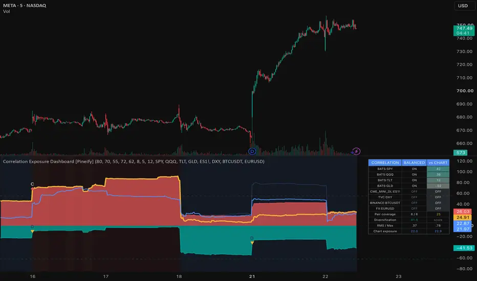
Correlation Exposure Dashboard [Pineify]
Overview
This indicator compares chart returns with up to eight references. It maps rolling relationships into a risk field, correlation spine, exposure line, and heatmap. It describes co-movement only; it cannot read positions or issue trades.
Problem Definition
Different tickers do not guarantee different risk. During a shared shock, several holdings can move as one cluster. A chart-to-benchmark correlation misses relationships inside the basket, while a raw average can look calm because closed sessions or invalid symbols removed most pairs. The real question is whether enough pairwise relationships show shrinking independent breadth, and whether the chart symbol joins that cluster.
Design Rationale
Log returns make price levels comparable. References use the chart timeframe with gaps preserved, so a closed market is not treated as new flat data. Each pair uses one window and equal importance. Positive correlation drives concentration; negative correlation is not assumed to be a guaranteed hedge. Effective breadth converts clustering into a 0-100 score. A covariance model was rejected because it needs weights, volatility forecasts, currency conversion, and account data. This model is portable but not portfolio-specific.
Key Features
How It Works
The script calculates log(current close / prior close), then rolling Pearson correlation for every enabled reference pair and for the chart against each reference. Unavailable pairs remain missing, not zero.
Pair Coverage is usable pairs divided by expected pairs; no summary appears before its gate. Usable pairs produce signed mean, mean positive, RMS, and maximum absolute correlation. Concentration Pressure is positive mean times 100. Effective Breadth divides enabled count by one plus (count minus one) times positive mean, then normalizes the result as Diversification Score.
The red field is concentration; teal below zero is reserve. Gold is average pair correlation; blue is chart exposure. States confirm at bar close, with a release buffer against one-bar noise. Warm-up or poor coverage is Unavailable, not neutral.
How Multiple Indicators Work Together
The layers form one chain. Pairwise correlation detects a basket cluster; coverage tests its evidence; effective breadth expresses independent components; chart exposure shows whether the displayed symbol participates. Without pairwise structure, exposure is only a benchmark average. Without coverage, the average can rest on sparse data. Without the chart link, basket concentration says nothing about the current symbol. These are coordinated measurements, not an arbitrary mashup.
Trading Ideas and Insights
Use the dashboard as risk context, not an entry command. Rising red pressure with weakening teal reserve means references share more directional behavior. High chart absolute exposure adds evidence that the displayed symbol joins the cluster; low exposure means it may remain less connected. A rapid-decline marker flags a path change to compare with actual weights, volatility, liquidity, and event risk.
Unique Aspects
This is a coverage-gated co-movement ladder, not a renamed correlation oscillator. It evaluates all enabled pairs, separates positive clustering from signed direction, converts clustering into normalized breadth, and keeps chart exposure distinct. Reliability controls availability and opacity. Red/teal fields show concentration versus reserve, while the heatmap retains instrument evidence. No retrieved LuxAlgo implementation informed the script.
How to Use
Customization
Rolling Window trades responsiveness for stability. Minimum Pair Coverage controls how much of the enabled matrix must exist. Concentration and Severe thresholds set state entry; Release Buffer adds exit hysteresis. Diversification Threshold labels high reserve. Rapid Decline Lookback and Points define a path alert, not a forecast. The field remains usable when the spine, exposure, background, markers, or heatmap are hidden.
Assumptions and Limitations
Correlation describes linear history; it does not prove causation, tail dependence, hedge effectiveness, or future behavior. Effective breadth assumes equal importance and equicorrelation. It ignores weights, volatility, currency, leverage, options, costs, and nonlinear dependence. Sessions, holidays, illiquidity, permissions, invalid tickers, and gaps can make samples economically uneven after the numerical gate passes. Live values change before close; states and alerts confirm only at close. Input, history, or feed changes recalculate results. Defaults are examples, and the score cannot guarantee diversification or loss protection.
Conclusion
The dashboard makes clustering, breadth, coverage, and chart participation auditable. It shows no state without enough usable pairs. Treat it as a review aid, not advice or prediction.
Overview
This indicator compares chart returns with up to eight references. It maps rolling relationships into a risk field, correlation spine, exposure line, and heatmap. It describes co-movement only; it cannot read positions or issue trades.
Problem Definition
Different tickers do not guarantee different risk. During a shared shock, several holdings can move as one cluster. A chart-to-benchmark correlation misses relationships inside the basket, while a raw average can look calm because closed sessions or invalid symbols removed most pairs. The real question is whether enough pairwise relationships show shrinking independent breadth, and whether the chart symbol joins that cluster.
Design Rationale
Log returns make price levels comparable. References use the chart timeframe with gaps preserved, so a closed market is not treated as new flat data. Each pair uses one window and equal importance. Positive correlation drives concentration; negative correlation is not assumed to be a guaranteed hedge. Effective breadth converts clustering into a 0-100 score. A covariance model was rejected because it needs weights, volatility forecasts, currency conversion, and account data. This model is portable but not portfolio-specific.
Key Features
- Eight configurable reference symbols.
- All enabled pairwise correlations with coverage gating.
- Effective breadth and chart-to-basket exposure.
- Confirmed hysteretic states and two alerts.
- Optional heatmap and layered risk field.
How It Works
The script calculates log(current close / prior close), then rolling Pearson correlation for every enabled reference pair and for the chart against each reference. Unavailable pairs remain missing, not zero.
Pair Coverage is usable pairs divided by expected pairs; no summary appears before its gate. Usable pairs produce signed mean, mean positive, RMS, and maximum absolute correlation. Concentration Pressure is positive mean times 100. Effective Breadth divides enabled count by one plus (count minus one) times positive mean, then normalizes the result as Diversification Score.
The red field is concentration; teal below zero is reserve. Gold is average pair correlation; blue is chart exposure. States confirm at bar close, with a release buffer against one-bar noise. Warm-up or poor coverage is Unavailable, not neutral.
How Multiple Indicators Work Together
The layers form one chain. Pairwise correlation detects a basket cluster; coverage tests its evidence; effective breadth expresses independent components; chart exposure shows whether the displayed symbol participates. Without pairwise structure, exposure is only a benchmark average. Without coverage, the average can rest on sparse data. Without the chart link, basket concentration says nothing about the current symbol. These are coordinated measurements, not an arbitrary mashup.
Trading Ideas and Insights
Use the dashboard as risk context, not an entry command. Rising red pressure with weakening teal reserve means references share more directional behavior. High chart absolute exposure adds evidence that the displayed symbol joins the cluster; low exposure means it may remain less connected. A rapid-decline marker flags a path change to compare with actual weights, volatility, liquidity, and event risk.
Unique Aspects
This is a coverage-gated co-movement ladder, not a renamed correlation oscillator. It evaluates all enabled pairs, separates positive clustering from signed direction, converts clustering into normalized breadth, and keeps chart exposure distinct. Reliability controls availability and opacity. Red/teal fields show concentration versus reserve, while the heatmap retains instrument evidence. No retrieved LuxAlgo implementation informed the script.
How to Use
- Enable two to eight relevant references and avoid accidental duplicates.
- Choose a window, then wait for Pair Coverage to pass.
- Read the risk field, pairwise spine, and chart exposure in that order.
- Inspect heatmap rows when sessions differ or values disappear.
- Use confirmed alerts with position limits maintained elsewhere.
Customization
Rolling Window trades responsiveness for stability. Minimum Pair Coverage controls how much of the enabled matrix must exist. Concentration and Severe thresholds set state entry; Release Buffer adds exit hysteresis. Diversification Threshold labels high reserve. Rapid Decline Lookback and Points define a path alert, not a forecast. The field remains usable when the spine, exposure, background, markers, or heatmap are hidden.
Assumptions and Limitations
Correlation describes linear history; it does not prove causation, tail dependence, hedge effectiveness, or future behavior. Effective breadth assumes equal importance and equicorrelation. It ignores weights, volatility, currency, leverage, options, costs, and nonlinear dependence. Sessions, holidays, illiquidity, permissions, invalid tickers, and gaps can make samples economically uneven after the numerical gate passes. Live values change before close; states and alerts confirm only at close. Input, history, or feed changes recalculate results. Defaults are examples, and the score cannot guarantee diversification or loss protection.
Conclusion
The dashboard makes clustering, breadth, coverage, and chart participation auditable. It shows no state without enough usable pairs. Treat it as a review aid, not advice or prediction.
สคริปต์แบบโอเพนซอร์ส
ด้วยเจตนารมณ์หลักของ TradingView ผู้สร้างสคริปต์นี้ได้ทำให้เป็นโอเพนซอร์ส เพื่อให้เทรดเดอร์สามารถตรวจสอบและยืนยันฟังก์ชันการทำงานของมันได้ ขอชื่นชมผู้เขียน! แม้ว่าคุณจะใช้งานได้ฟรี แต่โปรดจำไว้ว่าการเผยแพร่โค้ดซ้ำจะต้องเป็นไปตาม กฎระเบียบการใช้งาน ของเรา

🚀🚀🚀 Pineify - pineify.app
Essential Toolkit for Every Trader
- AI Pine Script Generator
- Finance AI Agent
- AI Stock Picker
- Pine Script Visual Editor
- Invited indicators
- Strategy Optimizer
- Trading Journal
- Backtest Report
Essential Toolkit for Every Trader
- AI Pine Script Generator
- Finance AI Agent
- AI Stock Picker
- Pine Script Visual Editor
- Invited indicators
- Strategy Optimizer
- Trading Journal
- Backtest Report
คำจำกัดสิทธิ์ความรับผิดชอบ
ข้อมูลและบทความไม่ได้มีวัตถุประสงค์เพื่อก่อให้เกิดกิจกรรมทางการเงิน, การลงทุน, การซื้อขาย, ข้อเสนอแนะ หรือคำแนะนำประเภทอื่น ๆ ที่ให้หรือรับรองโดย TradingView อ่านเพิ่มเติมใน ข้อกำหนดการใช้งาน
สคริปต์แบบโอเพนซอร์ส
ด้วยเจตนารมณ์หลักของ TradingView ผู้สร้างสคริปต์นี้ได้ทำให้เป็นโอเพนซอร์ส เพื่อให้เทรดเดอร์สามารถตรวจสอบและยืนยันฟังก์ชันการทำงานของมันได้ ขอชื่นชมผู้เขียน! แม้ว่าคุณจะใช้งานได้ฟรี แต่โปรดจำไว้ว่าการเผยแพร่โค้ดซ้ำจะต้องเป็นไปตาม กฎระเบียบการใช้งาน ของเรา
🚀🚀🚀 Pineify - pineify.app
Essential Toolkit for Every Trader
- AI Pine Script Generator
- Finance AI Agent
- AI Stock Picker
- Pine Script Visual Editor
- Invited indicators
- Strategy Optimizer
- Trading Journal
- Backtest Report
Essential Toolkit for Every Trader
- AI Pine Script Generator
- Finance AI Agent
- AI Stock Picker
- Pine Script Visual Editor
- Invited indicators
- Strategy Optimizer
- Trading Journal
- Backtest Report
คำจำกัดสิทธิ์ความรับผิดชอบ
ข้อมูลและบทความไม่ได้มีวัตถุประสงค์เพื่อก่อให้เกิดกิจกรรมทางการเงิน, การลงทุน, การซื้อขาย, ข้อเสนอแนะ หรือคำแนะนำประเภทอื่น ๆ ที่ให้หรือรับรองโดย TradingView อ่านเพิ่มเติมใน ข้อกำหนดการใช้งาน