อินดิเคเตอร์
Quantum Momentum Wave [Pineify]Quantum Momentum Wave
Quantum Momentum Wave is a signed peak-momentum oscillator paired with a Kaufman-style adaptive filter. Instead of measuring the net change from one point to another, the wave scans the full lookback window and returns the largest absolute price displacement with its original sign. The wave is linearly smoothed and then tracked by an adaptive signal line, so entry markers fire on context-filtered reversals rather than every momentum flip.
Key Features
Signed peak-momentum engine that isolates the strongest move inside the lookback
Linear regression smoothing to tame the step-change behavior of raw peak readings
Adaptive signal line that speeds up when the wave is stretched and slows down in noise
Zone-filtered BUY and SELL markers that only fire when the wave is past zero in the opposite direction
Gradient fill between the wave and zero — bullish above, bearish below
Alerts for reversal setups and for zero-line regime shifts
How It Works
The core function is a QMW scan. On each bar it walks the last Momentum Lookback bars, computes price minus each historical bar, and keeps the comparison that produced the largest absolute change. It returns that value with its original sign. So a -6 reading means the single strongest move inside the window was a 6-unit drop, even if the bar-to-bar change right now is small.
Raw peak readings step when a new candle takes over as the dominant move, so the output is passed through linear regression over the Signal Smoothing length. LR fits a straight line through the recent raw values and returns its endpoint, preserving signed direction while cutting short-term jitter.
The adaptive signal runs a Kaufman-style update on top of the smoothed wave. Its coefficient is the ratio of the wave's absolute value to the sum of its recent absolute one-bar changes. When momentum is clearly extended and directional, the ratio is high and the signal follows quickly. When the wave oscillates near zero, the ratio collapses and the line nearly freezes.
How the Components Work Together
Three layers combine into one output. The peak scan answers how hard has price moved inside the window, not just where it ended. Linear regression answers what is the underlying direction of the peak reading after filtering out one-bar swaps between competing peak bars. The adaptive signal answers when has that direction actually shifted by providing a responsive reference line.
Entries layer a location filter on top. A crossover only qualifies when the wave is on the opposite side of zero — buys look for the wave turning up while stretched below zero, sells for the wave rolling over while stretched above it. Crosses near the midline are ignored because they tend to be low-conviction flips without prior displacement, so the setup is biased toward reversals from extended states rather than trend-chasing entries.
Trading Ideas and Insights
BUY triangles below zero can flag exhaustion of a downside push and a possible rotation back toward the mean
SELL triangles above zero can flag fading upside strength after an extended rally
Zero-line crosses act as broader regime markers; alerts on those can frame intraday bias
During strong trends the wave may stay on one side of zero for many bars. Counter-trend BUY or SELL labels in that state often need extra confirmation from price structure or higher-timeframe context
Signals are context aids, not standalone trade instructions. Past reactions at these conditions do not guarantee future ones.
Unique Aspects
The momentum calculation returns the peak signed displacement within the lookback, not a simple close-minus-close value. The reading stays elevated while the dominant move is still inside the window, which tracks the strongest displacement in memory rather than just endpoint delta
The adaptive signal uses a non-standard variation of Kaufman's efficiency ratio — absolute wave value divided by total absolute wave travel — tuned for oscillator input rather than raw price
Entry markers require both a crossover and a zone match. No label prints for a crossover that happens in the neutral zone around zero, which filters out the weakest setups
How to Use
Add the indicator to the chart and start with the defaults. The thicker line is the Quantum Wave; the fainter line is the Adaptive Signal
Read the wave color and the gradient fill to see which side of zero the wave is on and how stretched it is
Watch for BUY triangles when the wave is clearly below zero and turning up through the signal line
Watch for SELL triangles when the wave is clearly above zero and turning down through the signal line
Configure alerts for buy, sell, or zero-cross conditions if you want notifications outside the chart
Customization
Source Data (default: close) — Price series used for the peak momentum scan
Momentum Lookback (default: 14) — Window size for the peak displacement scan. Higher values capture broader swings; lower values react faster
Signal Smoothing (default: 9) — Linear regression length applied to the raw wave. Higher values produce a cleaner line with more lag
Bullish Color / Bearish Color — Wave color in positive and negative territory, and the BUY/SELL marker colors
Adaptive Signal Color — Color of the adaptive reference line; a subtle contrast against the wave usually reads cleanest
Limitations
Linear regression smoothing introduces a small amount of lag. On fast reversals the wave can reach the crossover a few bars after price has already moved
Because the adaptive ratio uses the wave's own value, very small wave readings near zero make the signal line nearly freeze. This is deliberate but means the reference reacts slowly while momentum is mild
Mean-reversion style BUY and SELL labels can occur repeatedly during strong trends. Pair them with price structure or higher-timeframe bias instead of using them in isolation
Conclusion
Quantum Momentum Wave is for traders who want an oscillator that reflects the strongest recent move rather than the endpoint delta. Its value comes from the combination of peak-momentum measurement, linear regression smoothing, and an adaptive reference line that only produces labels when the wave is both stretched past zero and visibly turning back. อินดิเคเตอร์

Squeeze Momentum Indicator [AGPro Series]Squeeze Momentum Indicator
🔷 OVERVIEW
Squeeze Momentum Indicator is a lower-pane volatility and momentum engine built for traders who want more structure than the classic squeeze workflow usually provides.
At its core, the script studies a very specific sequence in market behavior:
volatility compression,
compression release,
directional pressure after release,
and whether that pressure is strengthening, fading, or slipping back toward balance.
Most squeeze-style indicators stop at a simple yes/no squeeze condition and a basic momentum histogram around the zero line. This script is designed to go further without becoming noisy. It keeps the familiar Bollinger Band vs Keltner Channel compression logic that many traders already understand, but it rebuilds the momentum side around a different internal model so the post-squeeze move can be judged with more nuance.
The result is a more structured answer to an important practical question:
when volatility finally expands, is the move actually carrying useful directional pressure, or is it only a shallow release that may lose energy quickly?
🔷 WHAT THIS SCRIPT DOES
This indicator combines four layers into one compact oscillator workflow:
1. Volatility compression detection
It identifies squeeze conditions using Bollinger Band and Keltner Channel relationship logic.
2. Compression depth tracking
It does not only ask whether a squeeze exists. It also tracks how tightly the Bollinger envelope sits inside the Keltner envelope, which helps frame how compressed the market really is.
3. ATR-normalized momentum pressure
Instead of using the classic legacy-style squeeze momentum formula, this script blends:
- displacement from equilibrium
- directional velocity of that equilibrium
- path efficiency of recent price travel
This creates a momentum engine that is designed to evaluate the quality of directional pressure after release, not just whether a histogram is above or below zero.
4. Adaptive expansion / fade context
The script builds dynamic balance and burst zones around momentum, then classifies whether price is:
- compressing
- releasing with bullish pressure
- releasing with bearish pressure
- continuing directionally
- fading after an elevated move
- rotating back toward balance
This makes the tool especially useful for traders who want squeeze timing, but do not want to treat every release as equally meaningful.
🔷 WHAT MAKES THIS DIFFERENT FROM MOST SQUEEZE INDICATORS
The squeeze concept is widely known, but many public versions still revolve around the same structure:
a binary compression state and a very simple momentum histogram.
This script is intentionally different in several ways:
• It treats squeeze as a volatility gate, not as the full identity of the indicator.
• It uses an original blended momentum model rather than reusing the standard linear-regression style momentum formula associated with many older versions.
• It adds adaptive momentum zones so the oscillator can distinguish between ordinary movement and higher-energy expansion.
• It marks not only burst phases, but also momentum fade phases, which helps separate continuation pressure from cooling pressure.
• It includes restrained release labels, release boxes, and a compact information panel so the visual output stays premium and readable instead of overloaded.
In short, this script is not trying to be another cosmetic variation of an old squeeze formula.
Its objective is narrower and more analytical:
measure the quality of post-compression directional pressure in a clean lower-pane environment.
🔷 HOW THIS SCRIPT IS DIFFERENT FROM OTHER AGPRO TOOLS
This part matters because originality and role separation inside a script catalog are important.
Within the AGPro Series, this indicator is intentionally separate from nearby concepts:
• AG Pro Bollinger Bands Squeeze Map
That script is an on-chart volatility regime map built to show how compression and release behave directly on price.
This script is different.
It is a dedicated lower-pane momentum-quality engine focused on what happens after compression begins to resolve.
• AG Pro ROC Momentum Shift Map
That script studies momentum regime transitions through ROC behavior.
It is a broader momentum-state classifier.
This script is narrower by design and specifically anchored to squeeze-release behavior.
• AG Pro Structural Momentum Oscillator
That script evaluates momentum through internal price structure and bar behavior.
This script does not try to read momentum that way.
Its purpose is to organize volatility compression and post-compression expansion into a squeeze-specific workflow.
That distinction is central to this release:
this is not a re-labeled overlap script.
It is a purpose-built squeeze momentum tool with its own logic, its own visual model, and its own analytical role.
🔷 HOW THE ENGINE WORKS
The script begins with a standard compression framework:
- Bollinger Bands define the volatility envelope.
- Keltner Channels define the containment envelope.
- When the Bollinger structure contracts inside the Keltner structure, squeeze conditions are present.
From there, the script moves into a separate momentum model.
Instead of relying on one traditional oscillator formula, the engine blends three components:
1. Displacement from equilibrium
Measures how far price has moved from its equilibrium anchor relative to ATR.
2. Equilibrium velocity
Measures whether that equilibrium is moving directionally and how quickly.
3. Path efficiency
Measures how efficiently price has traveled over the selected lookback instead of simply how far it moved.
Those three components are blended into a normalized momentum-pressure read, then smoothed for cleaner interpretation.
The script then builds two adaptive internal thresholds:
- a balance band
- a burst band
These dynamic bands help classify whether momentum is:
- quiet / balanced
- directional but ordinary
- strong enough to qualify as a burst
- elevated but beginning to fade
This adaptive structure matters because a fixed threshold often reads very differently across symbols, volatility regimes, and timeframes.
🔷 VISUAL DESIGN
The visual design is built around premium clarity rather than signal overload.
The pane includes:
• A momentum histogram with four directional states
- bullish expansion strengthening
- bullish pressure fading
- bearish expansion strengthening
- bearish pressure fading
• Adaptive upper and lower momentum zones
These show where momentum is operating in balance versus expansion territory.
• Squeeze markers on the zero line
These quickly show whether volatility is still compressed or has just released.
• Optional release boxes
These create rectangular burst zones that make active expansion phases easier to scan visually.
• Restrained release / fade labels
Labels are intentionally filtered and spaced so the chart remains informative without looking crowded.
• AG Pro information panel
The panel summarizes squeeze state, phase, bias, momentum, energy, and current signal context.
The goal is to keep the script visually rich, but still clean enough for repeated real-world use.
🔷 HOW TO READ IT
A practical way to interpret the script:
• Squeeze ON
Volatility is compressed.
This is preparation, not directional confirmation.
• Bull Burst / Bear Burst
Compression has released and momentum has cleared the adaptive balance zone with directional pressure.
This is the main transition event in the workflow.
• Bull Drive / Bear Drive
The market is still carrying directional pressure after release.
• Bull Fade / Bear Fade
Momentum remains elevated, but acceleration is cooling.
This does not automatically mean reversal.
It means the move is no longer improving in quality.
• Balance
The market is not in an active burst condition and momentum is closer to neutral internal behavior.
This makes the script useful not only for timing expansion, but also for judging whether that expansion is still healthy or beginning to lose structure.
🔷 WHO THIS MAY BE USEFUL FOR
This script may be useful for traders who want to:
- track volatility compression and release in a dedicated oscillator pane
- filter squeeze releases by actual momentum quality
- distinguish stronger directional expansion from weaker post-release drift
- pair volatility timing with structure, trend, VWAP, or support/resistance analysis
- reduce overreaction to every simple zero-line shift
- organize post-squeeze behavior more cleanly in discretionary workflows
It is especially suitable for users who like the squeeze concept, but want more context than a traditional dot-plus-histogram implementation.
🔷 KEY INPUTS
Core settings include:
- BB Length
- BB StdDev
- KC Length
- KC ATR Multiplier
- True Range toggle for Keltner construction
Momentum settings include:
- Equilibrium Length
- Velocity Length
- Momentum Smoothing
- Adaptive Band Length
- Burst Band Multiplier
Visual and workflow settings include:
- Adaptive momentum zones
- Signal line
- Histogram width
- Release boxes
- Release box persistence
- Label spacing
- Label size
- Panel position
- Theme
- Panel font size
This gives users enough control to adapt the script to different symbols and timeframes without turning the interface into a settings overload.
🔷 LIMITATIONS AND TRANSPARENCY
This indicator is a chart-analysis tool.
It is not a guarantee of breakout continuation, not a prediction engine, and not a substitute for trade planning or risk management.
A few important points should be kept in mind:
- A squeeze can resolve in either direction.
- A valid release can still fail.
- Strong momentum can cool without immediately reversing.
- Some instruments will produce noisier momentum behavior than others.
- Settings may need adjustment depending on timeframe, volatility regime, and instrument structure.
The script is best treated as a decision-support layer for reading volatility expansion and momentum quality more clearly.
It is not presented as a standalone trading system.
🔷 IN ONE SENTENCE
Squeeze Momentum Indicator is designed to show not only when volatility is ready to move, but whether the actual post-squeeze move is carrying enough directional pressure, quality, and persistence to deserve attention. อินดิเคเตอร์

Prism Strategy## Prism Strategy: Multi-Dimensional Trend & Structural Flow
**Prism Strategy** is a high-precision trend-following and momentum execution engine designed to capture institutional-grade moves while providing a comprehensive structural analysis of the market. It integrates a dynamic EMA Ribbon, RSI momentum filtering, automated Fibonacci levels, and a proprietary "Structural Wall" logic to determine the most logical points for entry and risk management.
### 1. Trend Identification (The EMA Ribbon)
The strategy utilizes a 12-layer EMA Ribbon to identify trend alignment.
* **Short-Term Stack:** 3, 5, 8, 10, 12, 15 EMAs.
* **Long-Term Stack:** 30, 35, 40, 45, 50, 60 EMAs.
A signal is only considered valid when the ribbon is in a **Full Stack** configuration (perfectly ordered from fastest to slowest), ensuring the trend is established across multiple time-cycles.
### 2. Momentum Filtering
To prevent "whipsaws" in low-volatility environments, the strategy incorporates **RSI (14)**.
* **Long Positions:** Require RSI > 50.
* **Short Positions:** Require RSI < 50.
This ensures that the price is not just trending, but moving with sufficient velocity.
### 3. The "Structural Wall" Logic
One of the most advanced features of this strategy is the **Structural Wall Analysis**. The algorithm identifies the strongest confluence between:
* **Dynamic Support/Resistance:** The Base EMA (12).
* **Static Support/Resistance:** Auto-calculated Fibonacci Retracement levels (0.0 to 1.618).
The "Wall" is formed by selecting the maximum (for Longs) or minimum (for Shorts) of these two values, creating a "Hard Floor/Ceiling" that acts as the primary anchor for the trailing stop.
### 4. Dynamic Risk Management (ATR-Based)
* **Stop Loss & Take Profit:** Initial levels are calculated using **ATR (Average True Range)** multiplied by a user-defined factor (default 1.5x for stops and a 2.0 RR ratio).
* **Intelligent Trailing Stop:** The strategy tracks the "Structural Wall" and updates the stop loss in real-time. It only moves in the direction of the trade (up for long, down for short) to lock in profits while giving the price enough room to breathe based on current volatility.
### 5. Integrated Execution Dashboard
The built-in UI provides real-time data for professional monitoring:
* **System Mode:** Displays current trend bias (Bullish/Bearish/Neutral).
* **Entry Advice:** An AI-driven logic that evaluates if the current price is "Ideal," "Overextended," or if the "Risk > Reward" is currently unfavorable for new entries.
* **Fibonacci Alerts:** Warns the user when the price is approaching a major Fibonacci level (⚠️ Alert) to prepare for potential reversals or pullbacks.
### 6. Exit Logic
The strategy employs a **Unified Exit Engine** based on three criteria:
1. **Hard Stop/TP:** Triggered if price hits the ATR-based levels.
2. **Structural Violation:** Triggered if the "Trailing Stop" (Structural Wall) is breached.
3. **Trend Break:** Triggered if the EMA Ribbon loses its "Full Stack" alignment, indicating a loss of trend momentum.
---
### **How to Use**
* **Timeframes:** Optimized for trend-rich environments (5m, 15m, 1h, and Daily).
* **Markets:** Effective on liquid assets including Equities, Forex, and Crypto.
* **Entry:** Look for "IDEAL ENTRY" status on the dashboard for the highest probability setups.
---
**Disclaimer:** *Trading involves significant risk. This strategy is an analytical tool and does not guarantee profits. Past performance is not indicative of future results. This is not investment advice; it is for educational purposes only.* กลยุทธ์

Parabolic Move Detector [AGPro Series]🚀 Parabolic Move Detector
A dedicated framework for identifying, measuring, and classifying parabolic price acceleration across any asset and any timeframe. Built on a single transparent metric — Parabolic Pace — the tool objectively detects the start bar of a parabolic move, tracks its age, scores its intensity on a 0-100 scale, classifies its lifecycle phase, and contextualizes each move against the asset's own historical parabolic events.
🔹 OVERVIEW
Parabolic moves are notoriously difficult to recognize in real time. By the time they look obvious, the move is already late-stage. Conventional momentum tools (RSI, MACD, standard ROC) measure speed, not the underlying structural character of a parabolic move. They fire constantly on ordinary trends and miss what makes a parabolic move structurally different: the rate at which price is covering ATR-sized distance per bar.
Parabolic Move Detector closes that gap with a single, transparent metric. It measures how many ATRs price has moved per bar over a configurable lookback window. That is the literal mathematical definition of a parabolic move: sustained directional travel at an unusual speed relative to recent volatility. The framework auto-calibrates per timeframe and per asset, so a 15m memecoin pump and a 1D large-cap rally are measured with the same structural definition.
🔹 UNIQUE EDGE
Most acceleration or momentum indicators in the public space fall into two buckets: oscillators with hardcoded thresholds that need retuning per symbol, or composite "trend strength" meters that blur acceleration into raw trend direction. This tool is different in four concrete ways:
1. Single-metric detection engine. The entire detection pipeline is driven by one transparent number: Parabolic Pace = cumulative price move divided by cumulative ATR over the lookback. No percentiles, no hidden regressions, no black-box composite. This makes the tool easy to audit, fast to calibrate, and consistent across assets.
2. ATR-normalized by design. Because pace is expressed in ATRs per bar, it is inherently timeframe-adaptive and asset-adaptive. No need to retune for BTC vs a thin-volume altcoin, or for 15m vs 1W.
3. Four-phase state machine. Each move is classified through a deterministic lifecycle — Accelerating → Peaking → Decelerating → Exhaustion — with explicit transition conditions rather than heuristic labels. This turns a vague concept ("it looks parabolic") into a reproducible state with measurable transitions.
4. Per-asset historical statistics. The tool logs every completed parabolic cycle on the current chart, filters out micro-events, and reports the average duration and average drawdown from peak. That gives structural context no oscillator provides: what has this specific asset actually done the last N times it went parabolic.
🔹 METHODOLOGY
Core detection pipeline:
• Pace is computed as (close − close ) divided by (ATR14 × N), where N is the lookback window. The result is the number of ATRs traveled per bar.
• Pace is lightly smoothed with a short SMA to reduce single-bar noise.
• Detection triggers when smoothed pace exceeds the Pace Threshold and the move is directionally up.
• A minimum-duration filter requires the pace condition to persist for N consecutive bars before confirming the start, eliminating single-bar spikes.
• A post-move cooldown prevents the same move being re-detected as multiple events.
State machine transitions:
• Idle → Accelerating : pace sustained above threshold for the minimum duration.
• Accelerating → Peaking : Acceleration Score drops >20% from its cycle peak while still elevated.
• Any phase → Decelerating : score drops below 40% of cycle peak.
• Decelerating → Exhaustion : pace rolls over below half-threshold, and the move has lived at least 6 bars.
• Exhaustion → Idle : cooldown bars elapsed and score collapsed.
Acceleration Score (0-100) is a direct function of pace: score rises linearly with pace and receives a small persistence bonus for sustained upward momentum, capped at 100.
Historical statistics:
Each time a full cycle closes on the chart, the tool checks whether the move traveled at least the minimum ATRs from start to peak. If it qualifies, duration (start bar to peak bar) and drawdown from move high to subsequent low are averaged into rolling per-asset statistics.
🔹 STATES AND VISUALS
• Parabolic Zone : gradient background across the active move. Color reflects phase (brand blue in Accelerating, indigo in Peaking, amber in Decelerating). Intensity scales with Acceleration Score.
• Parabolic Start label : marks the confirmed start bar of a new move.
• Peaking / Decelerating labels : mark phase transitions. Labels are automatically suppressed within a confluence window to prevent stacking.
• Exhaustion label : marks the bar where the move has structurally collapsed.
• Duration Projection : dotted forward line sized to the asset's historical average parabolic duration, shown only while a move is active.
🔹 KEY INPUTS
Detection group:
• Pace Lookback — window over which parabolic pace is measured.
• Pace Threshold — minimum ATRs-per-bar required to qualify as parabolic.
• Minimum Move Duration — bars of sustained pace required before confirming a start.
• Minimum Event Size — minimum ATR-normalized move size required to log an event in historical statistics.
• Post-Move Cooldown — minimum bars after a completed move before a new one can start.
Historical Stats group:
• Show Duration Projection — toggle the forward projection line.
• Projection Length — forward projection cap in bars.
Visuals group:
• Parabolic Zone Background, Ambient Score Tint, Parabolic Start Label, Exhaustion Warning Label, Phase Transition Labels — all independently toggleable.
Style group:
• Label Size, Panel Size, Help Text Size — default Normal.
• Panel Location — six anchor positions.
• Panel Theme — Dark or Light.
Alerts group:
• Parabolic Start, Peaking Phase Reached, Exhaustion Detected — individually toggleable alerts.
🔹 HOW TO USE
• On any asset and any timeframe, wait for a confirmed Accelerating phase. The Parabolic Start label marks the reference bar.
• Track the Acceleration Score as the move develops. A score climbing toward 60-100 indicates a textbook parabolic.
• Compare Move Age against the panel's Avg Duration statistic. Moves significantly older than the asset's historical average are in late-cycle territory.
• Compare Move Change % against the Avg Reversal statistic for post-move drawdown context.
• Watch for the Peaking transition — this is the first structural deceleration, not a reversal call.
• The Exhaustion state marks where pace has decisively collapsed and the move is structurally over.
• Combine with your existing trend, structure, or volume framework. This tool is designed to complement directional analysis, not replace it.
🔹 LIMITATIONS AND TRANSPARENCY
• The tool detects and classifies acceleration structure. It does not predict reversals, tops, or bottoms. Avg Reversal is a post-cycle statistic computed from completed events on the current chart, not a forward-looking forecast.
• Historical statistics require completed cycles on the chart. Newly loaded symbols with few prior parabolic events will show low sample sizes until more cycles complete.
• The tool confirms a move only after pace has been sustained for the minimum duration. The start label is therefore plotted retroactively on its true start bar, which is the correct academic behavior for a sustained-condition detector.
• All computations are on confirmed bar close logic. No repainting of historical signals once a bar closes.
• The Pace metric requires a valid ATR reading, so at least 14+ bars of history are needed before the tool becomes active on a fresh chart.
🔹 RISK DISCLOSURE
This script is an analytical tool provided for educational and research purposes only. It is not a trading strategy, not financial advice, and does not generate buy or sell recommendations. Trading any market involves substantial risk of loss. All decisions and their consequences are the sole responsibility of the user. Past behavior of parabolic cycles on any asset does not guarantee future behavior.
อินดิเคเตอร์

Matrix Market Structure [Institutional Edition]Matrix Market Structure Institutional is a price action analysis tool designed to help users interpret market direction through objective structural behavior.
The script focuses on swing highs, swing lows, break of structure events, and continuation patterns to organize chart movement into a cleaner decision framework.
Instead of relying only on lagging indicators, this tool helps traders observe how price is building, breaking, or transitioning structure over time.
It is intended for users who study trend behavior, directional bias, and structural shifts across multiple markets and timeframes.
Designed with clarity and usability in mind, the script aims to simplify market structure reading without overloading the chart.
This tool may help users with:
Identifying bullish or bearish structure bias
Detecting break of structure (BOS) zones
Reading swing high / swing low formations
Following continuation vs reversal behavior
Supporting trend analysis decisions
Organizing raw price action visually
Suitable for:
Price action traders
Smart money concept users
Swing traders
Intraday traders
Trend traders
Traders seeking cleaner market context
If structure-based chart analysis is part of your trading process, you may also find additional research tools available on this profile worth exploring. อินดิเคเตอร์

อินดิเคเตอร์

อินดิเคเตอร์

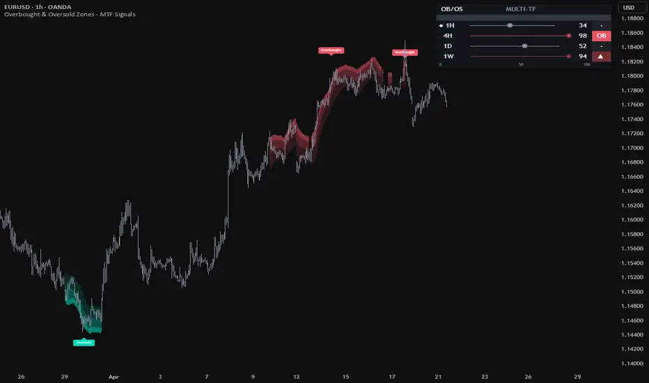
Overbought & Oversold Zones - MTF SignalsOverbought & Oversold Zones - MTF Signals
Overbought & Oversold Zones - MTF Signals is a visual analytical indicator that highlights extreme directional conditions directly on the price chart and across multiple timeframes. Instead of plotting an oscillator line in a separate pane, it paints gradient zones around price during periods of sustained buying or selling pressure, helping traders see exhaustion states at a glance.
The indicator combines a custom Pressure Index calculation with a volatility-adjusted envelope to shape the zones, and a compact multi-timeframe panel that scans the current timeframe plus the three higher ones.
This is a visual analytical tool intended for chart reading and context. It does not execute trades and does not provide financial advice.
Key Features
On-chart gradient zones highlighting overbought and oversold conditions
Zones follow the shape of a dynamic volatility envelope (not rectangles)
Multi-timeframe panel scanning current TF plus three higher TFs
Merged phase logic that groups close-proximity conditions into single zones
Adjustable sensitivity through ten preset levels
Fully customizable colors and optional text labels
Core Concept
The indicator uses a custom Pressure Index model to evaluate how consistently price has been pushing above or below a volatility-adjusted baseline. Unlike traditional oscillators such as RSI (which measures gain/loss ratios) or Stochastic (which measures position within a range), Pressure Index combines two complementary components:
Persistence — how consistently price has stayed above or below a volatility-adjusted baseline over the measurement window, weighted by normalized distance rather than as a binary above/below count
Displacement — how far current price is from that baseline in ATR-normalized units
The baseline adapts to volatility regime: during high-volatility periods the reference band widens to reduce false exhaustion signals, and during calm periods it tightens. Final output is bounded to a 0–100 scale and smoothed with a sensitivity-scaled EMA.
Zone Visualization
When the Pressure Index enters an extreme region, the indicator renders a three-layer gradient zone that follows the shape of the dynamic envelope:
Overbought zones fade downward from the upper envelope into the channel
Oversold zones fade upward from the lower envelope into the channel
Zone thickness scales with ATR so the visual is comparable across markets and timeframes
The gradient has three layers: a dense core band close to the envelope, a middle fade band, and an outer soft fade. This layered approach helps the zones visually surround the candles inside the extreme state rather than appearing as flat bars.
Multi-Timeframe Panel
A compact panel in the top-right corner of the chart displays the Pressure Index across the current timeframe and three higher timeframes (automatically selected from the standard ladder: 1m, 5m, 15m, 30m, 1H, 4H, 1D, 1W, 1M).
Each row shows:
Timeframe label
Horizontal gauge bar with a position marker
Numeric Pressure Index value (0–100)
State pill indicating Overbought (OB), Oversold (OS), or neutral direction
The panel adapts its higher timeframes to whichever chart timeframe is currently active. The current chart timeframe is marked with a bullet indicator.
Typical Analysis Workflow
A common analytical workflow may include:
Observing gradient zones on the main chart to identify extended conditions
Checking the MTF panel to place the current reading in higher-timeframe context
Evaluating price structure and candle behavior near zone edges
Combining zone information with other forms of analysis and risk management
Configuration
Sensitivity — Controls how quickly the Pressure Index reacts to changes in price pressure. Lower values produce faster, more frequent signals. Higher values produce slower, steadier signals.
Lower settings (1-3) — Faster reactivity, suitable for intraday charts and shorter timeframes
Middle settings (4-6) — Balanced sensitivity, default for most markets and timeframes
Higher settings (7-10) — Slower reactivity, suitable for swing and position-style chart reading
On-Chart Display — Toggles the gradient zones on or off.
Show Text Labels — Toggles "Overbought" and "Oversold" text labels that appear once per merged phase. Can be disabled for a cleaner chart.
Show MTF Panel — Toggles the multi-timeframe panel.
Appearance — Customizable colors for Overbought and Oversold zones, panel text size, and history rendering depth.
Markets and Timeframes
The indicator can be applied across multiple markets and timeframes:
Forex
Stocks and Indices
Commodities
Cryptocurrencies
Because the zone thickness and Pressure Index smoothing are both normalized by ATR and sensitivity presets, the visual behavior remains consistent across different instruments and timeframes without manual re-tuning.
Alerts
Two alert conditions are available:
Overbought Entry — triggers on the first bar a new Overbought state begins
Oversold Entry — triggers on the first bar a new Oversold state begins
Important Notes
This indicator is an analytical visualization tool. It does not execute trades and does not provide financial advice. All outputs are informational and should be interpreted within the context of independent market analysis and proper risk management.
Past behavior of any technical indicator does not guarantee future results.
If you find this indicator useful, feel free to add it to your favorites and share your feedback in the comments. Community feedback helps improve future updates. อินดิเคเตอร์

Ultimate Scalping Tool 2.0 [BullByte]Ultimate Scalping Tool 2.0
What This Tool Was Built For
UST 2.0 is a flux oscillator designed to help scalpers and intraday traders read market state more clearly. It sits in the lower pane of your chart and shows you whether the current market environment is trending cleanly, compressing before a move, chopping in a range, or losing momentum after an extension.
The core idea is simple. Four internal measurements feed into one oscillator. Each measurement looks at a different part of market behavior: how cleanly price is traveling, whether momentum is meaningful given current volatility, what volatility itself is doing, and whether participation is building or fading. These four readings are weighted differently depending on what the market is doing right now. During a trend, directional measurements get more weight. During compression, volatility and flow get more weight. During a range, momentum and participation matter most.
The output is displayed as a candle on the oscillator pane. The candle color, the regime label, the confluence histogram, and the structural overlays all update on every bar to give you a current read on conditions. This is not a signal generator. It is a state monitor. You still need to decide when and how to act.
---
Why Version 2.0 Exists Separately
Ultimate Scalping Tool Version 1.0 is still published. It uses a different internal structure and outputs labeled signals like Strong Buy and Pullback Sell. Many traders built their workflows around that approach, and changing it would have broken their setups. Keeping both versions available lets traders choose the workflow that fits how they trade.
Version 2.0 shifts away from signal labels toward market state classification. The four internal measurements are different. The adaptive weighting engine is different. The visual output is different. The confluence scoring, multi-timeframe context, and oscillator-native zones are all new. The two scripts serve related but different purposes, which is why they exist side by side rather than as an update that replaces the first one.
The continuity between them is the Flux State Candle concept. That visualization approach worked well enough in version 1.0 that it became the foundation for how version 2.0 displays its output.
---
One Engine, Not a Collection of Indicators
This is worth addressing directly because it is easy to look at a script that mentions RSI, ATR, and Bollinger Bands and assume it is just wrapping existing indicators together. That is not what is happening here.
RSI does not appear on the chart. ATR does not appear on the chart. Bollinger Bands do not appear on the chart. None of the four internal measurements produce a visible output of their own. They are inputs into a calculation that produces one single output: the Flux Oscillator value. That value is then displayed as a candle.
The reason RSI is used inside the Adaptive Momentum subsystem is not because RSI is a good indicator to show. It is because RSI gives a normalized momentum reading on a known scale, which makes it easier to combine mathematically with the other three measurements on equal footing. The period is not fixed. It changes at runtime based on current volatility, which standard RSI does not do. The output is scaled before it enters the weighting engine. What comes out the other side is not RSI. It is one weighted component of a composite reading.
The same logic applies to ATR inside the Volatility Regime subsystem and to bar-structure calculations inside the Flow Proxy. These are raw materials, not finished products. They feed a pipeline that produces something different from any of them individually.
The four subsystems were chosen because they answer four different questions: is price traveling efficiently, is momentum meaningful right now, is volatility expanding or contracting, and is participation building or fading. Those four questions together give a more complete picture of market state than any one of them alone. That is the design intent, and it is why the adaptive weighting engine matters. Different market conditions make different questions more relevant. The engine adjusts accordingly.
---
The Four Internal Measurements
The oscillator is built on four subsystems. Each one measures something the others do not.
Directional Efficiency looks at how cleanly price is moving. A market that travels 100 points in a straight line has high efficiency. A market that gyrates up and down while netting only 20 points forward has low efficiency. This helps you see whether a trending move is organized or grinding. For scalping, clean efficient moves are easier to work with than choppy grinders.
Adaptive Momentum uses RSI internally but selects the period based on current volatility. When volatility is high, it uses a shorter period to stay responsive. When volatility is low, it uses a longer period to reduce noise. The reading is then adjusted so that momentum in a high-volatility environment is not overstated and momentum in a quiet environment is not understated.
Volatility Regime combines three volatility signals: where ATR sits within its recent range, whether short-window ATR is rising or falling relative to long-window ATR, and where Bollinger Band width sits within its range. Positive values mean volatility is expanding. Negative values mean it is contracting. Deep negative values below -0.20 usually mean the market is compressing hard, which often precedes directional expansion.
Flow Proxy estimates directional participation from bar structure and relative volume. It approximates buying versus selling pressure using close position within range, price velocity weighted by volume, and absorption detection for high-volume bars with small bodies. This is not true order flow because that requires tick data. It is a proxy built from OHLCV data, and it behaves like one.
These four readings are combined using weights that shift based on what the market is doing. You get one oscillator value per bar. That value is displayed as a candle, classified into a regime state, scored for confluence, and optionally blended with a higher-timeframe context reading.
---
How the Regime Classification Works
The script classifies every bar into one of four states: TREND UP, TREND DOWN, COIL, or RANGE.
When efficiency is strong, momentum is aligned, and volatility is not compressing, the regime is TREND . When efficiency is low, volatility is compressing hard, and participation is building, the regime is COIL . When none of those conditions are met, the regime is RANGE .
The regime label appears near the bottom of the pane on the last bar. The background tint changes subtly based on the regime. This classification affects how the four measurements are weighted before they combine into the oscillator value.
---
The Confluence Histogram
The gold histogram at the bottom of the pane shows the confluence score from 0 to 100. The score measures how aligned six independent factors are: regime matches oscillator direction, oscillator magnitude is strong, the four internal measurements agree on direction, the higher timeframe aligns with the current one, flow quality is clean without absorption, and volatility context supports the current structure.
A low score means conditions are mixed or weak. A high score means the environment is organized and several factors are confirming the same picture. The histogram grows taller as the score rises. When the bar is short and dark amber, confluence is low. When the bar is tall and bright gold, confluence is high.
This is useful for filtering. If you are watching for a breakout from a consolidation and confluence is at 80, the setup has more environmental support than the same breakout pattern with confluence at 30. The score does not tell you to enter or exit. It tells you whether the broader conditions are organized or scattered.
---
How to Read the Flux State Candle
The candle is built from the oscillator value, not from price. Green candles mean the oscillator is above its moving average. Red candles mean it is below. Violet candles mean a volume absorption bar was detected , which is a specific condition where high volume produced a small-bodied bar.
The border brightness increases when the oscillator is further from its moving average. A bright border means conviction. A dim border means the reading is close to neutral.
When the candle is consistently green and the cloud below it is stacked with the fast line above the slow line, the oscillator trend is internally aligned in a bullish direction. When the candle flips to red and the cloud inverts, the oscillator trend is bearish. When the cloud is mixed and candles are alternating color frequently, the oscillator is in a transition or range state.
---
Oscillator-Native Zones and Trendlines
The red and green-cyan lines you see on the oscillator pane are support and resistance zones, but they are zones on the oscillator itself, not on price. They mark levels where the oscillator has repeatedly turned. These are built from confirmed pivot highs and lows.
When the oscillator approaches a red resistance zone that has been touched five times, you know the flux reading is approaching a level where it has reversed before. If price is near a key price level at the same time and confluence is high, that convergence can add weight to a reversal setup you are already watching on the price chart.
The cyan and orange trendlines work the same way. They connect confirmed swing points on the oscillator. A cyan ascending trendline from oscillator swing lows tells you the oscillator structure is building higher. An orange descending trendline from oscillator swing highs tells you the oscillator structure is weakening lower. These lines appear after the swing points are confirmed, not before.
All of these structural tools use confirmed pivot logic, which means they appear a few bars after the actual turning point. This is intentional. Unconfirmed pivots fail frequently. Waiting for confirmation removes most of the false starts. When you see a zone or trendline appear or update, it is showing you structure that has been validated by subsequent price action, not structure that might form.
Reading the oscillator structure in practice looks like this.
Two red resistance lines sitting around +25 and +30 on the oscillator, both labelled R MAJO R, tell you that every time flux has pushed up into that band it has been rejected. That ceiling has held six and seven touches respectively. Until flux breaks and closes above those two red lines, the upside is capped on the oscillator. Below there is an S ZONE 3T sitting near -15. That is the floor that has caught the most recent bounce.
On the trendline side, three cyan ascending lines rising from the lower left are bull trendlines built from oscillator swing lows. The lowest at TL 52% is the broadest support. The middle at TL 66% is tighter. The top at TL 74% is the steepest and most recent. If flux bounces off the TL 74% line, that is the most important touch right now. An orange descending line pressing down from above is the bear trendline. When flux is squeezed between a rising cyan trendline and a falling orange trendline, that is a classic wedge compression on the oscillator and it often precedes a directional expansion once one side breaks.
---
Divergence Labels
When the oscillator and price stop agreeing on direction, the divergence engine marks it on the chart.
There are four labels. Each one means something specific.
DIV+ appears below the oscillator at a swing low. It means price made a lower low on the price chart, but the oscillator made a higher low at the same point. The downward move is losing internal support. This is regular bullish divergence and it tends to appear near potential exhaustion of a downward move.
DIV- appears above the oscillator at a swing high. It means price made a higher high on the price chart, but the oscillator made a lower high at the same point. The upward move is losing internal support. This is regular bearish divergence and it tends to appear near potential exhaustion of an upward move.
H+ appears as a small circle at a swing low. It means price made a higher low, a normal pullback in an uptrend, but the oscillator made a lower low. The oscillator dipped deeper than price did. This is hidden bullish divergence. It often appears mid-trend during a pullback and can suggest the trend is likely to continue.
H- appears as a small circle at a swing high. It means price made a lower high, a normal pullback in a downtrend, but the oscillator made a higher high. The oscillator pushed higher than price did. This is hidden bearish divergence. It often appears mid-trend during a bounce and can suggest the downtrend is likely to continue.
All four labels appear a few bars after the actual swing point because the pivot must be confirmed by subsequent bars before the label is placed. When you see a label appear, it is sitting on a past bar where the swing has already been validated. Nothing is marked in advance. The label was not there before, and it will not move or disappear after it appears.
---
How This Fits Into a Price Action Workflow
Here is one example of how the tool can layer into a real trade setup.
You are watching a 5-minute chart. Price has been consolidating in a tight range for the last hour. On the main price chart, you see a clean horizontal level being tested multiple times. That is your setup area. You are waiting for a breakout.
You glance at the oscillator pane. The regime label says COIL. The flux candles are small and alternating color near the zero line. The confluence histogram is rising and just reached 65. VRI in the dashboard shows -0.25, which is hard compression. COFP is positive and building.
This tells you the oscillator agrees with what you are seeing on price: the market is compressing. Volatility is contracting. Participation is starting to build in one direction. Confluence is improving, meaning the internal measurements are starting to agree.
You wait. Price breaks the consolidation upward on increased volume. At the same moment, the flux candle turns bright green with a strong border. The regime label flips to TREND UP. The confluence histogram jumps to 78. The cloud stacks bullish. The dashboard shows all four internal measurements turned positive.
You already know where your entry is from the price chart. The oscillator is not telling you to buy. The oscillator is telling you the conditions support the breakout you are watching. Efficiency turned positive, meaning price is traveling cleanly. Momentum confirmed. Volatility started expanding. Flow is directional. The environment is organized.
You take the trade based on your price-action plan. You manage the trade from price structure. But while you are in the trade, you glance at the oscillator occasionally. If the flux candle stays green and confluence stays high, conditions remain supportive. If the candle turns red and confluence drops, you tighten your management because the internal read is weakening.
A real chart example of what COIL into expansion looks like: Gold on the 3-minute chart shows a full cycle, a base building through the early session, a strong impulsive rally, then a controlled rollover where the oscillator hugs just above zero with the regime label reading COIL. The oscillator has compressed hard after the post-peak selloff, and the cyan ascending bull trendline is now acting as the floor of the oscillator structure. This is the compression phase the tool is designed to identify before the next directional move develops.
---
What This Tool Does Not Do
This script does not tell you where to enter or exit. It does not produce buy and sell signals. The flux candle, the regime label, the confluence score, and the structural overlays all describe conditions, not actions.
The zones and trendlines on the oscillator are not price levels. They are oscillator levels. They tell you where the oscillator has turned before, not where price will turn next.
The HTF oscillator is a simplified version of the current-timeframe calculation. It uses fixed parameters and reduced components for cross-timeframe stability. It is useful for context, but it is not identical to the full engine running on the higher timeframe.
Pivot-based elements appear after confirmation, which means they lag the actual pivot by the confirmation period . This is intentional. The tradeoff is fewer false signals at the cost of slightly delayed information.
Confluence measures environmental alignment, not trade direction. A high score means conditions are organized. A low score means they are not. Neither tells you to buy or sell.
---
Recommended Timeframes and Settings
This tool works best on intraday timeframes from 1 minute to 1 hour. For active scalping, use 1-minute to 5-minute charts with the HTF set to 15 minutes. For slightly slower intraday swings, use 15-minute to 60-minute charts with the HTF set to 4 hours or daily.
The multi-timeframe panel should show timeframes that are meaningfully different from your chart timeframe. If you are on 5 minutes, set the panel to 15 minutes, 60 minutes, and 240 minutes. If the panel shows timeframes that are too close together, the readings will be nearly identical and provide no additional information.
The default settings are balanced for general use. If the oscillator is too noisy, increase the DER length or the AMVS base period. If the oscillator is too slow, decrease them. If zones and trendlines are appearing too frequently, increase the minimum touch requirements. If they are not appearing enough, decrease them.
The adaptive weighting setting should generally stay on unless you have a specific reason to use fixed manual weights. The adaptive behavior is part of how the tool adjusts to different market conditions.
---
Understanding the Limitations
No indicator can predict the future . This tool shows you the current state of several internal measurements and how aligned they are. It does not know what will happen next.
Markets can shift from organized to chaotic in seconds. A high confluence reading can drop to low confluence on the next bar if one of the internal measurements changes direction. That is normal. The tool is reactive, not predictive .
The S/R zones and trendlines are based on past oscillator behavior. Just because the oscillator turned at a zone five times before does not mean it will turn there again. Past structure informs context but does not guarantee repetition.
Divergence suggests momentum quality is changing. It does not guarantee reversal. Many divergences resolve with price continuing in the original direction after a brief pause or consolidation.
Volume absorption detection is based on relative volume and body size. It identifies a specific bar condition but does not tell you how the market will respond to that condition.
---
A Note on Expectations
This script was built to give scalpers and intraday traders more clarity about market state. It was not built to replace chart reading, price action analysis, or trade management discipline.
If you are looking for a tool that tells you exactly when to enter and exit, this is not that tool. If you are looking for a tool that helps you see whether the current environment is organized or messy, whether internal measurements are aligned or conflicting, and whether higher-timeframe context supports or opposes your intended direction, this can help with that.
The best results come when the oscillator is used as confirmation for setups you are already identifying from price structure, not as a standalone signal generator. The flux candle, regime label, confluence score, and structural overlays are all context layers. They work best when layered on top of solid price action principles, not in place of them.
---
Disclaimer
This script is published for educational purposes. Trading involves substantial risk of loss. No indicator or tool can eliminate that risk. Past performance of any indicator does not predict future results. The author is not responsible for any trading decisions made using this script. Always apply your own risk management, test thoroughly on demo or simulation before live use, and never risk more than you can afford to lose.
- BullByte อินดิเคเตอร์

AI Predictive Flow (Zeiierman)█ Overview
AI Predictive Flow (Zeiierman) is a pattern-based oscillator that estimates future price direction by comparing the current market state to similar historical conditions.
Instead of relying on traditional indicators like momentum or moving averages alone, the script builds a multi-feature representation of price behavior and uses a k-Nearest Neighbors (kNN) model to identify past patterns that closely resemble the present.
From those matches, it derives an expected forward return, which is then transformed into a smooth oscillator and a predicted trend regime.
The result is a forward-looking signal that reflects a data-driven expectation based on similar past patterns, not just current price movement.
█ How It Works
⚪ Feature Extraction (Market State Model)
The script converts price into a compact feature set that describes the current market state.
It uses four core features:
Short-term return
Momentum
RSI bias
EMA spread
These are created inside the feature function:
feat(shift, mode) =>
c = close
c1 = close
cm = close
ef = ta.ema(close, fLen)
es = ta.ema(close, sLen)
r = ta.rsi(close, rsiLn)
float v = 0.0
if mode == 1
v := c1 != 0 ? math.log(c / c1) : 0.0
else if mode == 2
v := cm != 0 ? (c - cm) / cm : 0.0
else if mode == 3
v := (r - 50.0) / 50.0
else
v := c != 0 ? (ef - es) / c : 0.0
v
Each feature captures a different dimension of price behavior:
return measures immediate movement
momentum measures directional displacement
RSI bias measures internal pressure
EMA spread measures trend structure
These values are then stacked across multiple bars to form the pattern used for comparison.
⚪ Pattern Memory (Historical Pattern Library)
The script stores rolling sequences of each feature into separate matrices so the current market state can be compared against past states.
That process is built here:
pushFeat(mat, mode) =>
vals = array.new(tot, 0.0)
for i = 0 to tot - 1
array.set(vals, tot - 1 - i, feat(i, mode))
cur = array.slice(vals, tot - len, tot)
old = array.slice(vals, 0, len)
matrix out = matrix.new(1, len, 0.0)
for i = 0 to len - 1
matrix.set(out, 0, i, array.get(cur, i))
hist = array.new(len, 0.0)
for i = 0 to len - 1
array.set(hist, i, array.get(old, i))
if mat.rows() >= mem
mat.remove_row(0)
mat.add_row(mat.rows(), hist)
out
This creates:
a current feature row
a rolling history of prior feature patterns
So rather than comparing single-bar values, the model compares multi-bar pattern structure.
⚪ Pattern Matching Engine (kNN Distance Model)
Once the current feature pattern is built, it is compared to all stored historical patterns.
Distance is measured feature-by-feature across the full pattern length:
getDist(matrix a1, matrix a2, matrix a3, matrix a4, matrix b1, matrix b2, matrix b3, matrix b4) =>
out = array.new(b1.rows(), 0.0)
for i = 0 to b1.rows() - 1
s = 0.0
d1 = a1.diff(b1.submatrix(i, i + 1)).row(0)
d2 = a2.diff(b2.submatrix(i, i + 1)).row(0)
d3 = a3.diff(b3.submatrix(i, i + 1)).row(0)
d4 = a4.diff(b4.submatrix(i, i + 1)).row(0)
for j = 0 to len - 1
s += math.pow(d1.get(j), 2) * 0.25 +
math.pow(d2.get(j), 2) * 0.25 +
math.pow(d3.get(j), 2) * 0.25 +
math.pow(d4.get(j), 2) * 0.25
out.set(i, math.sqrt(s))
out
This produces a similarity score for every stored pattern. A smaller distance means the past setup looked more like the present one.
⚪ Prediction Model (kNN Forward Expectation)
After the distances are ranked, the script selects the nearest neighbors and averages their future outcomes.
The kNN model is implemented here:
knn(dist, n) =>
ix = dist.sort_indices()
useN = math.min(n, ix.size())
sumD = 0.0
avg = 0.0
for i = 0 to useN - 1
sumD += dist.get(ix.get(i))
if useN > 0
for i = 0 to useN - 1
d = dist.get(ix.get(i))
w = useN > 1 ? (sumD != 0 ? (1 - d / sumD) : 1.0) : 1.0
avg += Y.get(ix.get(i)) * w
avg
The forward return used for comparison is defined here:
y := math.log(base) - math.log(base )
This represents the forward return following each historical pattern. The result is a weighted expectation of future movement, not just a reading of current trend.
⚪ Predictive Oscillator
The raw kNN prediction is smoothed and transformed into the main oscillator and signal line.
pred_ = ta.ema(pred, smth)
if not na(pred)
predSm := smth > 1 ? pred_ : pred
osc = ta.ema(predSm, oscLn)
sig = ta.ema(osc, sigLn)
hist = osc - sig
This creates:
Oscillator = smoothed expected return
Signal line = secondary smoothing for crossover confirmation
Histogram = distance between oscillator and signal
⚪ Predicted Trend Regime
Beyond the oscillator, the script also builds a broader trend regime using the predicted price path.
First, the raw prediction is converted into a projected price line:
predLine := base + base * (math.exp(pred) - 1)
Then a regime band is created using ATR:
hiRef = predLine + bandM * atr
loRef = predLine - bandM * atr
if ta.highest(hiRef, regLn) == hiRef
trendUp := true
if ta.lowest(loRef, regLn) == loRef
trendUp := false
This background state represents:
bullish predicted regime when the projected path is pressing into new highs
bearish predicted regime when the projected path is pressing into new lows
So the background is not showing the raw price trend. It is showing the model’s predicted regime bias.
█ How to Use
⚪ Read the Oscillator
Above 0 → bullish expectation
Below 0 → bearish expectation
Near 0 → neutral/low conviction
Far from 0 → strong directional push
Use crossovers for entry timing:
Bullish crossover → potential upward continuation
Bearish crossover → potential downward continuation
⚪ Use the Predicted Trend Regime
The background highlights the model’s broader directional bias:
Green → predicted bullish regime
Red → predicted bearish regime
Regime shifts often indicate:
early trend transitions
continuation confirmation
structural changes in expectation
⚪ Combine Signals
Best use comes from alignment:
Oscillator above zero + bullish regime + signal → strong continuation bias
Oscillator below zero + bearish regime + signal → strong downside bias
Divergence between the two → caution / mixed signals
█ Settings
Pattern Length – Controls how many bars define the current pattern. Higher values capture more structure, lower values increase responsiveness.
Memory Size – Number of historical patterns stored for comparison. Larger values improve context but increase computation.
Neighbors (k) – Number of closest matches used in prediction. Lower values are more reactive, higher values are smoother.
Prediction Smoothing – EMA smoothing applied to the raw prediction. Reduces noise at the cost of lag.
Signal Length – Smoothing of the signal line used for crossover signals.
-----------------
Disclaimer
The content provided in my scripts, indicators, ideas, algorithms, and systems is for educational and informational purposes only. It does not constitute financial advice, investment recommendations, or a solicitation to buy or sell any financial instruments. I will not accept liability for any loss or damage, including without limitation any loss of profit, which may arise directly or indirectly from the use of or reliance on such information.
All investments involve risk, and the past performance of a security, industry, sector, market, financial product, trading strategy, backtest, or individual's trading does not guarantee future results or returns. Investors are fully responsible for any investment decisions they make. Such decisions should be based solely on an evaluation of their financial circumstances, investment objectives, risk tolerance, and liquidity needs.
อินดิเคเตอร์

Divergence Stack Scanner [AGPro Series]Divergence Stack Scanner
🔹 Overview
Divergence Stack Scanner scans five independent momentum and volume oscillators simultaneously — RSI, MACD Histogram, CCI, MFI, and OBV — and grades every confirmed pivot by how many of them show regular divergence at the same time. The result is a 0 to 5 STACK score that isolates rare, high-conviction reversal zones which single-divergence tools simply cannot surface.
Most divergence indicators track one oscillator at a time. Strong reversals, however, tend to leave fingerprints across momentum and volume at once. This tool quantifies that confluence in a single, objective number you can act on.
🔸 Unique Edge
What separates this script from the crowded divergence space:
1. Five-oscillator confluence in one engine — not one divergence, five divergences graded together.
2. Strict versus Window classification — a 5/5 STRICT stack (all five on the exact same pivot) is marked with a star flash, while a 5/5 WINDOW stack (all five within a small bar tolerance) is tagged separately. The distinction matters because strict stacks are statistically rarer and sharper.
3. Pressure Zones — a rectangular, SR-style zone is drawn forward from each qualifying pivot, so the reversal level stays visible long after the signal fires.
4. Rolling win-rate panel — the last N decided signals are evaluated N bars forward, and the win percentage is displayed live on the panel.
5. Per-oscillator live state — you see at a glance which oscillators are already in divergence and how long ago they triggered.
🔹 Methodology
Pivots are detected using the standard TradingView pivot method with a configurable lookback (default 5 bars each side, confirmed, non-repainting).
When a pivot is confirmed, the script compares the current pivot price and oscillator value to the previous same-direction pivot:
- Regular bullish divergence: price prints a lower low while the oscillator prints a higher low.
- Regular bearish divergence: price prints a higher high while the oscillator prints a lower high.
This comparison runs independently for RSI, MACD Histogram, CCI, MFI, and OBV. Each oscillator stores the bar index of its most recent divergence. The stack engine then counts how many oscillators have fired within a tolerance window of the current pivot:
- Strict stack (window = 0): all counted oscillators fired on the exact same pivot bar.
- Window stack (window = 1 to N bars): oscillators fired within N bars of each other.
Pressure zones are drawn only when the stack meets a configurable minimum (default 4/5). Zone height is ATR-scaled so it stays proportional across instruments and timeframes. A proximity filter prevents label clutter: once a label is drawn in a given direction, a new label in the same direction within a short window is only drawn if its stack level is strictly higher.
🔸 Signals & Alerts
On-chart signals:
- ★ N/5 STACK label (filled color) — strict same-bar stack at level N.
- N/5 NEAR label (lighter color) — window stack (near-miss of strict).
- Pressure zone rectangle — drawn forward from the pivot for qualifying stacks.
Alerts available:
- 5/5 Strict Stack (bull and bear, separate) — the rarest and sharpest signal.
- Minimum Stack threshold — fires whenever the stack reaches your configured minimum level.
All alerts use alert.freq_once_per_bar_close and include ticker plus timeframe in the message.
🔹 Key Inputs
Core Engine:
- Pivot Lookback — bars each side to confirm a pivot (default 5).
- RSI, MACD, CCI, MFI lengths — standard defaults, all configurable.
Stack Configuration:
- Minimum Stack Level — display threshold (default 3/5).
- Window Tolerance — bar tolerance for near-stacks (default 3).
- Win-Rate Lookback — number of recent signals used for rolling win rate (default 20).
- Win Evaluation Bars — forward bars to decide win or loss (default 10).
Pressure Zones:
- Minimum Stack for Zone (default 4/5) — keeps the chart premium and uncluttered.
- Zone Extend and Height (ATR%) — tune the visual footprint to your taste.
- Max Active Zones — oldest zones are automatically trimmed.
Panel and Theme:
- Location (6 anchors), Dark or Light theme, font size presets.
- Fully brand-consistent AGPro color palette built in.
🔸 How to Use
- Treat 5/5 STRICT stacks as the headline signal. They are rare by construction and typically appear at genuine inflection points.
- Use 4/5 stacks as early-warning context around support, resistance, or higher-timeframe levels.
- Read the per-oscillator live state on the panel. When RSI, MACD, CCI, MFI are all in the same direction and OBV is the last holdout, a full stack is often imminent.
- Pressure zones work well as re-entry or invalidation levels after the initial signal fires.
- The rolling win rate is a sanity check for the current asset and timeframe — if it degrades meaningfully, raise the minimum stack level or widen the pivot lookback.
🔹 Limitations and Transparency
- This is a confluence tool, not a standalone trading system. Divergence by nature can persist in strong trends before any reversal.
- The engine is pivot-based and therefore delayed by the pivot lookback. Labels appear on the bar the pivot is confirmed, not on the pivot itself.
- Win rate is computed on the last N decided signals on the current chart. It is not a backtest, it is an evolving statistic and it does not include slippage, spread, or position sizing.
- Window stacks are lower-confidence than strict stacks by design. The visual distinction is intentional.
- Session-based "Today's Max" uses calendar-day rollover.
🔸 Risk Disclosure
This indicator is a technical analysis tool for research and education. It is not financial advice, not a signal service, and not a trading strategy. Past patterns do not guarantee future behavior. You are solely responsible for your trading decisions, risk management, and position sizing. Always combine any indicator with independent analysis, higher-timeframe context, and strict risk controls.
🔹 Technical Notes
- Pine Script v6, overlay indicator.
- Fully non-repainting. All divergences are evaluated only on confirmed pivots.
- Drawing objects (labels, boxes) are capped to avoid resource overruns.
- MPL 2.0 licensed — open source. อินดิเคเตอร์

อินดิเคเตอร์

Deca-Oscillator Ultra SuiteDeca-Oscillator Ultra Suite
The Multi-Heuristic Consensus Framework
In modern algorithmic trading, the reliance on a single technical oscillator often leads to "analysis paralysis" or, conversely, frequent false signals due to indicator lag and market noise. The Deca-Oscillator Ultra Suite addresses these inefficiencies by utilizing a Multi-Heuristic Consensus Framework. This model synthesizes ten independent mathematical oscillators into a singular, normalized composite score, providing a high-fidelity view of market momentum.
Mathematical Foundation
1. Linear Feature Normalization
To integrate disparate oscillators (e.g., CCI ranging from -300 to +300 vs. RSI ranging from 0 to 100), the engine applies a Min-Max scaling algorithm to every internal component. This ensures that every indicator contributes to the final score within a standardized 0–100 probability space.
N(x) = 100 * \frac{x - min(x)}{max(x) - min(x)} *
2. Weighted Composite Calculation
The final composite score (C) is derived from a weighted arithmetic mean of the normalized inputs. The weightings allow the model to prioritize historically reliable metrics like the RSI and Fisher Transform over more volatile indicators.
C = \frac{\sum_{i=1}^{10} (w_i \cdot N(o_i))}{\sum_{i=1}^{10} w_i}
3. Consensus Logic (k-Agreement)
Beyond simple crossovers, the signal engine employs a k-agreement filter. A signal is only validated if the number of primary components agreeing with the direction meets the required threshold.
Consensus \ge n
The Ten Core Components
This suite does not just average values; it analyzes market state through ten distinct lenses:
RSI: Standard momentum relative to price change.
MFI: Volume-weighted momentum (Money Flow).
Stochastic: Position of current price relative to the high-low range.
CCI: Statistical deviation from the average.
Williams %R: Inverse momentum for extreme overbought/oversold detection.
ROC: Pure velocity of price change.
Bull/Bear Power: Interaction between high/low and EMA.
Awesome Oscillator: Comparison of short-term and long-term momentum.
Momentum: Simple price-distance velocity.
Fisher Transform: Transforming price distributions into Gaussian normal distributions.
Visual Architecture
High-Contrast Theme: Features Blue (Bullish) and White (Bearish) for optimal visibility on dark-themed charts.
Precision Matrix: A real-time dashboard displaying the consensus of internal components, the HTF trend state, and the total composite score.
Heuristic Divergence: Automates pivot detection to draw momentum-price divergence lines, signaling potential exhaustion before price action confirms the reversal.
Reply below with comments, critiques, or criticisms. All is welcome! อินดิเคเตอร์
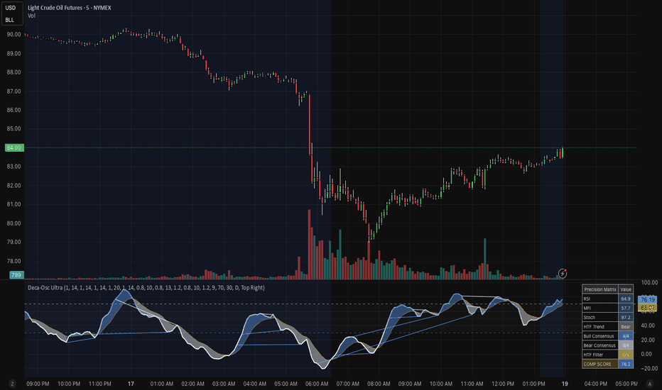
อินดิเคเตอร์

Aura Trend Cloud Navigator [Pineify]Aura Trend Cloud Navigator
This indicator builds a trend-following system around a Trend Regularity Adaptive Moving Average — an adaptive MA that adjusts its responsiveness based on how frequently price makes new period highs or lows. When the market trends, the baseline tracks price closely; when it ranges, the baseline goes nearly flat, cutting down on false crossover signals. An ATR-based volatility cloud wraps around the baseline to frame the trend's expected range.
Key Features
Adaptive baseline that self-adjusts speed — fast in trends, nearly frozen in ranges
Dynamic ATR cloud that expands and contracts with real-time volatility
Gradient-filled cloud with automatic color shifts between bullish and bearish states
Crossover-based buy/sell signals filtered by the adaptive regime detection
Bar coloring for quick visual trend identification
How It Works
The core is a recursive adaptive moving average controlled by a trend coefficient derived from market structure:
On each bar, the script checks whether a new highest high or lowest low has been established over the lookback period (default 99 bars). If either condition is met, a binary signal of 1 is recorded; otherwise 0.
The average of this binary signal over the same period is computed via SMA, then squared. Squaring creates a nonlinear response — the coefficient drops sharply when trend activity fades and rises steeply when price consistently prints new extremes.
This squared value becomes the smoothing factor in a recursive formula: baseline = baseline + coefficient × (close − baseline) . A high coefficient pulls the baseline toward price; a near-zero coefficient locks it in place.
An Average True Range envelope is then added above and below the baseline, scaled by a user-defined multiplier. This forms the cloud — a corridor representing expected price movement around the trend.
How the Components Work Together
The adaptive baseline and the ATR cloud serve complementary roles. The baseline handles trend direction and generates entry signals, but because it adapts to market regime, it sidesteps the main weakness of fixed-period moving averages: constant whipsawing during consolidation. The cloud adds a volatility dimension on top of that directional read. When price stays inside the cloud, it is oscillating within the normal range of the current trend. Price pushing beyond the cloud edges may signal overextension or trend acceleration. In short, the baseline answers "which direction" while the cloud answers "how far is normal."
Trading Ideas and Insights
When the baseline shifts color and a triangle signal fires, treat it as a potential trend change. Confirmation improves if the crossover happens near or beyond the opposite cloud edge, suggesting genuine momentum rather than a range poke.
In a bullish regime, price hugging the upper cloud boundary suggests strong follow-through. A pullback toward the baseline that holds can offer a continuation entry — especially if the baseline remains clearly sloped upward.
Watch for the baseline going flat while the cloud tightens — this is the indicator explicitly telling you to stand aside. Crossovers that occur while the baseline is flat carry less conviction than those during a clearly sloped baseline, since the adaptive mechanism has detected a low-regularity environment.
Unique Aspects
The trend regularity approach counts how often new period extremes occur rather than measuring price direction or momentum directly. Most adaptive MAs rely on efficiency ratios or volatility scaling; this one responds to the structural behavior of the market itself — whether it is consistently making progress or stalling out.
Squaring the trend coefficient means the MA doesn't merely slow down in ranges — it practically stops. This creates clear visual separation between trending and non-trending regimes that is immediately readable on the chart.
The gradient cloud gives volatility context without the visual clutter of multi-line band systems. One glance tells you both direction and how stretched the current move is.
How to Use
Add the indicator to your chart. The thick colored line is the adaptive baseline — green for bullish, red for bearish.
Triangle markers appear at crossover points: upward green triangles below bars for potential long entries, downward red triangles above bars for potential short entries or exits.
Use the cloud as context. Price within the cloud is behaving normally for the trend. Moves beyond the cloud edges are stretched and may revert or signal acceleration.
On higher timeframes (4H, Daily), the default 99-period length works well as a medium-term trend filter. On lower timeframes, consider reducing the length for faster adaptation — though this increases sensitivity to noise.
Customization
Trend Filter Length (default: 99) — How many bars are used to assess trend regularity. Higher values produce a smoother, slower baseline that only reacts to sustained directional moves. Lower values increase sensitivity but also raise whipsaw risk in choppy markets.
Cloud Width / ATR Multiplier (default: 2.0) — Scales the ATR-based cloud. Wider values capture more price action within the corridor; tighter values make cloud-edge touches more frequent and potentially more meaningful as overextension signals.
ATR Length (default: 14) — Period for the Average True Range calculation. The standard 14 suits most instruments. Increase it for smoother cloud behavior on volatile assets.
Conclusion
The Aura Trend Cloud Navigator provides a regime-adaptive trend filter that goes quiet when the market goes quiet. The TRAMA baseline combined with an ATR cloud delivers both directional guidance and volatility context in a single overlay. It suits swing and position traders looking for a trend filter that avoids generating noise during consolidation — though the adaptive smoothing does introduce lag at trend reversals, so pairing it with a momentum oscillator for timing may improve entries on faster-moving instruments. อินดิเคเตอร์

Trend Momentum (Algionics) - Ribbon Pressure FieldTrend Momentum interprets a 28-line EMA ribbon field as a physical force landscape. It reads what directional pressure price is under, how strong that pressure is, and what the current market state is, all within a single framework.
The ribbon spans periods 20 to 236 in steps of 8. Each line is not a simple EMA. It passes through a multi-stage smoothing kernel:
f_rb(int len) =>
float ama = (ta.ema(src, len) + ta.sma(src, len)) / 2
int k = int(math.ceil(len * 0.08))
float kl = ta.ema(ama, k)
(kl + ta.sma(kl, k + 2)) / 2
The average of EMA and SMA is computed first, then a secondary smoothing pass is applied using a kernel length equal to 8 percent of the original period. This dual-smoothing structure suppresses both the phase lag of a pure EMA and the ripple noise of a pure SMA simultaneously. Because the kernel ratio scales proportionally with the period, short lines and long lines maintain consistent smoothing characteristics across the entire ribbon.
Force Boundary
The histogram plots Bull Force above the zero line and Bear Force below it.
float bullForce = math.max(v001 - rb_min, 0.0)
float bearForce = math.min(v001 - rb_max, 0.0)
Bull Force is the distance from price to the bottom edge of the field. Bear Force is the distance from price to the top edge. When price is inside the field, both are active. When price breaks above, Bear Force converges to zero. When price drops below, Bull Force converges to zero.
The space between them defines the force boundary. When the boundary widens, price is moving away from the field edges. When it narrows, price is returning toward the center.
Pressure Ratio
Where Force Boundary measures raw displacement between price and the field edges, Pressure Ratio measures the internal pressure distribution within the field.
float bp_a = math.max(v001-v020,0)+math.max(v001-v028,0)+math.max(v001- v036,0)+math.max(v001-v044,0)+...
float total_p = bull_pressure + bear_pressure
float bull_dom = total_p > 0 ? (bull_pressure / total_p) * 100.0 : 50.0
For each of the 28 lines, the distance from price is measured individually. Lines below price contribute to bull pressure. Lines above contribute to bear pressure. Both sides are summed independently, then the ratio is computed.
This is not a simple count of how many lines are above or below. A line 10 points below price contributes 10 times more bull pressure than a line 1 point below. The ratio reflects both the number of lines favoring each side and how far they are from price.
At 100, every line sits below price. At 0, every line sits above. At 50, the total upward and downward distances are equal.
Bias Line
The Bias Line sits inside the force boundary. Its position is determined by the pressure ratio.
float biasLine = bearForce + (bullForce - bearForce) * (bull_dom / 100.0)
It divides the space between Bull Force and Bear Force using the pressure ratio as a positioning weight. A 73 percent bull reading does not place the line at 73 percent of the field. It places the line at 73 percent of the distance between Bear Force and Bull Force at that moment.
The Bias Line responds to two independent inputs: how far the field edges are from price, and how the internal pressure is distributed. The separation between boundary logic and positioning logic is the structural core of this design.
The color follows a gradient based on its position within the force boundary.
Ribbon Overlay
The ribbon draws two boundary lines on the price chart. The upper line marks the highest value across the field. The lower line marks the lowest.
Each boundary changes color independently based on price crossovers. When price crosses above a boundary, it turns bull color. When price crosses below, it turns bear color. The moment both boundaries switch to the same color confirms that price has moved fully to one side of the field.
A gradient fill appears between price and the nearest boundary, fading as price moves away from the edge.
Price Candles
When enabled, candles on the main chart are colored based on where the Bias Line sits within the force boundary.
float sig_pos = tm_range > 0 ? ((biasLine - bearForce) / tm_range) * 2.0 - 1.0 : 0.0
color candle_col = color.from_gradient(sig_pos, -1.0, 1.0, C_BEAR, C_BULL)
The Bias Line position is converted to a scale from minus 1 to plus 1, then mapped to a color gradient. Bear color at the bottom, bull color at the top.
This coloring reflects pressure balance, not price direction. A rising candle with bear coloring means price moved up but field pressure remains tilted to the downside. When candle color and price direction disagree, the field is telling a different story than the bar itself.
Dashboard
BIAS
Displays bull and bear pressure percentages. Each value updates with a directional arrow indicating whether the percentage increased or decreased from the previous bar. A segment bar provides a visual representation of the pressure distribution.
Flow
Tracks whether the dominant pressure is accelerating or decelerating. It compares the current pressure percentage against its own smoothed average.
float bias_smooth = ta.ema(bull_dom, GM_LEN)
The smoothing length is derived as the geometric mean of the ribbon endpoints:
int GM_LEN = int(math.round(math.sqrt(float(START_P) * float(END_P))))
No arbitrary period. A natural interaction scale derived from the ribbon structure.
When the percentage is above its average, the label reads Rising. When below, Falling. When pressure reaches full saturation, Maxed.
Status
A four-state market condition classifier.
Trend activates when price moves outside the field entirely. Hold activates when the dominant side remains intact but price is inside the field. Weakening activates when the dominant side still leads but its pressure is declining. Reversal Warning activates when price crosses the center of mass to the opposing side.
The state engine uses two mechanisms. A trend latch and a condition matrix.
if bull_dom >= 100
is_bull := true
if bull_dom <= 0
is_bull := false
The latch sets only when the pressure ratio touches either extreme. It does not reset at any intermediate value. It only changes at the next full saturation on the opposite side. 100 and 0 are mathematical boundaries. 50 is the equilibrium point where upward and downward pressure are equal. There is no arbitrary threshold in this system.
The natural state progression is Trend to Hold to Weakening to Reversal Warning. When states skip steps, for example jumping from Trend directly to Reversal Warning, it signals a sharp shift in pressure. The faster the sequence moves, the less time available to react.
Trend
Confirms the established directional bias. It reads Bull when the last confirmed extreme was at full bullish saturation, and Bear when at full bearish saturation. The direction holds until the opposite extreme is reached.
Note
A one-line contextual summary tied to the active status. Each of the four states has its own message describing the current condition and what to watch for.
Technical Implementation
Ribbon Kernel Structure
Each ribbon line is not a simple EMA. The EMA-SMA average serves as a first-stage compromise between exponential responsiveness and rectangular stability. The secondary kernel, scaled to 8 percent of the input period, applies consistent proportional smoothing across the entire ribbon. Short-period lines receive short kernels. Long-period lines receive long kernels. The noise suppression ratio remains uniform regardless of where a line sits in the ribbon.
Distance-Weighted Pressure Measurement
Conventional ribbon-based indicators measure strength as the count of lines above or below price divided by the total number of lines. This approach treats every line equally. A line barely below price and a line far below price contribute the same.
This engine converts the absolute distance to each line into pressure. A line 10 points below price contributes 10 times more bull pressure than a line 1 point below. Because this distance weighting is embedded in the ratio, the system reads the pressure gradient inside the field, which a simple count cannot capture.
Dual Separation Architecture
Force Boundary and Pressure Ratio are computed independently. Force Boundary measures only the raw displacement between price and the field edges. Pressure Ratio measures only the distance-weighted sum across all 28 individual lines.
The Bias Line is the sole point where these two independent inputs converge. The boundary defines the range of possible positions. The pressure ratio determines the position within that range. A change in one does not affect the calculation of the other.
Latch-Based State Engine
State transitions are driven by mathematical extremes, not arbitrary thresholds. The latch sets only at 100 (all lines below price) or 0 (all lines above price). These are physical limits of the distribution, not chosen values.
50 is the point where the sum of upward distances exactly equals the sum of downward distances. The condition matrix uses only these three structural boundaries: 0, 50, and 100.
Interlocking Constant Architecture
Every parameter in this system branches from a single root:
int START_P = 20
int END_P = 236
From these two constants the 28-line ribbon is defined, and from that ribbon: Force Boundary, Pressure Ratio, Bias Line, Flow smoothing length, and every boundary in the state engine are all derived. The smoothing length used for Flow is the geometric mean of the two endpoints. The state classification boundaries of 0, 50, and 100 derive directly from the mathematical limits of the pressure distribution.
Change one constant and the ribbon structure shifts, the field boundaries move, the pressure distribution recalculates, and every downstream output cascades accordingly.
Settings
Ribbon Overlay:
displays the upper and lower field boundaries on the price chart with color-coded crossover states.
Price Candles:
colors candles on the main chart based on the Bias Line position within the force boundary.
Dashboard:
shows the status panel with BIAS percentages, segment bar, Flow, Status classification, Trend direction, and Note.
Force Boundary:
plots the Bull Force and Bear Force histogram in the indicator pane.
Bias Line:
plots the pressure-weighted position line inside the force boundary.
Position Point:
marks the current Bias position on the last bar. อินดิเคเตอร์

SQZ Pro JS [MTF + ADX + Divergencias + Giros]El ecosistema definitivo del Squeeze Momentum. Basado en la estrategia clásica del Squeeze, este indicador ha sido reconstruido desde cero para traders exigentes que buscan precisión matemática y gráficos extremadamente limpios. Hemos eliminado el "ruido" y las señales falsas para centrarnos en lo que realmente importa: la fuerza de la tendencia, la alineación de temporalidades y las divergencias estructurales.
🎯 CARACTERÍSTICAS PRINCIPALES:
1. Motor de Divergencias PRO (Lógica de Olas)
Olvídate de las divergencias falsas causadas por pequeños baches en el precio. Este indicador utiliza un rastreador de "Olas" (Wave Tracker) que identifica el pico absoluto de la fuerza compradora/vendedora y lo compara estrictamente con la ola anterior.
Regla de Cero Estricta: Las divergencias alcistas solo se calculan en la zona roja (valles) y las bajistas en la zona verde (picos). Trazado limpio "de palo a palo".
2. Panel Dinámico Multi-Timeframe (MTF)
Un monitor lateral que te permite escanear el mercado desde 5 Minutos hasta Mensual. La tabla es inteligente: su tamaño se adapta dinámicamente según las temporalidades que actives.
Para cada temporalidad, el panel analiza simultáneamente:
La dirección del Squeeze.
La fuerza de la tendencia (Filtro ADX y cruces DI+/DI- integrados matemáticamente).
Eventos en tiempo real (Giros de color y cruces de la línea cero).
3. Señales Verticales de Precisión (Sin ensuciar el gráfico)
El indicador traza líneas verticales directamente en tu gráfico solo en la temporalidad en la que te encuentras, marcando los momentos críticos:
Giro Buy / Sell: Cuando el momentum cambia de dirección perdiendo fuerza.
Cruce 0 UP / DN: Cuando el momentum cruza la línea cero confirmando el cambio de bando.
Totalmente personalizables: Elige el grosor, color y estilo (línea sólida, punteada o discontinua) para adaptar el gráfico a tu estilo visual.
4. Estética "Clean Chart" (Cero distracciones)
Diseñado para no estorbar.
El Momentum se muestra en formato de columnas limpias (Verde oscuro para fuerza creciente, Rojo para fuerza decreciente).
Elementos secundarios como el ADX, las líneas DI o los puntos del Squeeze (dots) vienen ocultos de fábrica para mantener el gráfico puro, aunque su matemática sigue trabajando en segundo plano para la tabla MTF.
Las etiquetas molestas de la escala de precios han sido desactivadas por defecto.
💡 CÓMO UTILIZARLO:
El Panel (El Bosque): Utiliza la tabla MTF para confirmar que las temporalidades mayores (ej. Diario y 4H) están alineadas en la misma dirección (Fuerza + ADX).
El Histograma (El Árbol): Busca entradas en tu temporalidad operativa cuando el histograma confirme un "Giro" a favor de la tendencia mayor, o cuando detecte una Divergencia Pro confirmada.
⚙️ CONFIGURACIÓN DE FÁBRICA:
El indicador viene pre-configurado para operar "Out of the box" con colores intuitivos y sensibilidad profesional, pero ofrece control absoluto en sus ajustes para activar temporalidades menores (5m, 15m, 30m), mostrar las líneas del ADX o ajustar los periodos del canal de Keltner y las Bandas de Bollinger.
(Descargo de responsabilidad: Este indicador es una herramienta de análisis técnico y no constituye asesoramiento financiero. Úsalo en confluencia con tu propia gestión de riesgo). อินดิเคเตอร์

อินดิเคเตอร์

อินดิเคเตอร์

Vigilant Asset Allocation (VAA)1. Where VAA comes from
The basic observation behind VAA is not new. Jegadeesh and Titman showed in 1993 that stocks with strong recent returns keep outperforming for roughly three to twelve months. That finding was initially confined to equities, but Asness, Moskowitz and Pedersen (2013) later confirmed that the same pattern holds across bonds, currencies and commodities. Momentum, it turns out, is not just a stock-picking anomaly. It works at the asset-class level too.
Moskowitz, Ooi and Pedersen (2012) took this one step further. They looked at time-series momentum rather than cross-sectional momentum. The distinction matters: cross-sectional momentum asks "which asset is doing best?", while time-series momentum asks "is this asset going up at all?". VAA uses both questions, but the time-series version is what drives the breadth filter.
Faber (2007) probably deserves credit for bringing momentum into mainstream tactical allocation. His rule was simple: hold an asset when it trades above its ten-month average, sell when it drops below. Crude, but it cut drawdowns significantly. Antonacci (2014) refined this into dual momentum, combining trend direction with relative strength across two universes.
Keller and Keuning (2017) built on all of this but added something the earlier models lacked: a breadth dimension. Instead of looking at each asset independently, they count how many offensive assets carry positive momentum. If even one drops below zero (in the aggressive B=1 variant), the entire allocation goes defensive. The reasoning is straightforward. When breadth deteriorates, trouble is usually on the way. Waiting for every asset to turn negative is waiting too long.
In their original backtest (1970-2016, using Shiller extended data for the early period and ETF prices from inception), VAA-G4 produced roughly 17.7% annualised with a maximum drawdown of about 16.1% (Keller and Keuning, 2017, Table 2). These are in-sample numbers. They tell you what happened, not what will happen.
2. How the model works
2.1 Momentum scoring
Every asset gets a 13612W score, a weighted combination of four return lookbacks:
mom = 12 * r1 + 4 * r3 + 2 * r6 + r12
The r values are simple returns: r1 = close / close - 1, and so on for 63, 126 and 252 bars. The one-month return gets the heaviest weight (12), the twelve-month return the lightest (1). Recent momentum matters more, but the yearly anchor keeps the score from overreacting to short-term noise.
There is no normalisation. The raw score is used only for two things: ranking assets within each universe, and checking whether it is positive or negative for the breadth count.
2.2 The two universes
Keller and Keuning specified these defaults:
Offensive (growth):
- SPY (S&P 500)
- EFA (international developed)
- EEM (emerging markets)
- AGG (US aggregate bonds)
Defensive (preservation):
- LQD (investment-grade corporate bonds)
- IEF (7-10 year treasuries)
- SHY (1-3 year treasuries)
All seven are changeable in the settings. If you swap in other ETFs, make sure they have enough history.
2.3 The breadth rule
Each day the indicator counts how many offensive assets have positive momentum. Call the count of non-positive ones n_negative. The rule:
- n_negative >= B (default 1): go to the top defensive asset
- n_negative < B: go to the top offensive asset
With B=1, one single negative asset triggers the switch. That is aggressive in the sense of being quick to flee. Keller and Keuning argue this is the right trade-off. Breadth erosion tends to precede broader sell-offs, so early rotation is worth the occasional whipsaw.
2.4 Rebalancing
The paper prescribes monthly rebalancing. The indicator locks the allocation at the close of the last trading day of each month. Everything that happens between rebalances is monitoring only. The dashboard shows both the locked position ("held") and what the model would do today ("live").
Daily rebalancing is available as an option. It is not what the paper tested.
2.5 Ties
When two assets have the exact same momentum score, the one listed first wins. Sounds arbitrary because it is. But four overlapping return windows make exact ties rare in practice.
3. What you need
- TradingView, any plan (free works, Pro lifts the alert cap)
- A daily chart. The lookbacks assume daily bars. On weekly or intraday charts the periods are wrong and the dashboard flags it.
- 252 bars of history for every symbol. Until that is available, the model shows "warming up".
4. Setup and settings
4.1 Getting started
Add the indicator to any daily chart via the TradingView indicator search. It loads with the Keller/Keuning defaults. The status row at the bottom of the dashboard tells you when the model is ready.
4.2 Strategy
Breadth Threshold (B): 1 matches the paper. Raising it to 2 means two assets have to go negative before the model rotates. Fewer whipsaws, slower reaction.
Monthly Rebalancing: On by default. Off gives you daily updates, which is useful for experimentation but not what the literature tested.
4.3 Symbols
Offensive and defensive universes are fully configurable. If you replace an ETF, check that TradingView has daily data going back at least a year.
4.4 Visuals
Background Mode: "Position" tints the background green (offensive) or red (defensive). "Off" removes it.
Candle Colouring: Paints candles by breadth strength. Full green at 4/4 positive, full red at 0/4, faded tones in between. Transparency is adjustable.
Color Theme: Eight palettes. All of them work in both dark and light mode.
Glow Effect: Adds layered transparent lines behind the main plot. Useful if the signal gets lost in a busy chart. Off by default.
4.5 Dashboard
The table in the top right (moveable) shows:
- Regime: offensive or defensive, with the breadth count
- Allocate: which specific ETF to hold (100% always)
- Live: intra-month reading (only visible in monthly mode)
- Individual asset rows: 13612W scores and a trend arrow (up, down, or flat compared to 5 bars ago)
- Status: "active", "warming up", or "wrong timeframe"
4.6 Alerts
Five conditions, all behind a master switch:
- Regime switches to offensive at month-end
- Regime switches to defensive at month-end
- Held asset changed (same regime, different pick)
- Live breadth dropped between rebalances
- Live breadth recovered between rebalances
The live alerts are early warnings, not trade signals. They tell you the next rebalance might produce a change.
5. Reading the chart
The step line maps the breadth count to a 0-10 scale:
| Breadth | Value | What it means |
| 4/4 positive | 0.0 | Everything trending up |
| 3/4 positive | 2.5 | One weak link, still offensive with B=1 |
| 2/4 positive | 5.0 | Defensive if B is 2 or below |
| 1/4 positive | 7.5 | Broad weakness |
| 0/4 positive | 10.0 | Nothing working |
The threshold line sits at B * 2.5. Above it means defensive. The zone fill below the threshold marks the offensive region.
One thing to keep in mind: the distances between these steps do not mean anything quantitative. 5.0 is not "twice as bad" as 2.5. It is an ordinal display, not a risk score.
6. How to actually use it
The simplest workflow: check the dashboard on the last trading day of the month. Look at the "Allocate" row. Buy that ETF at the open of the next session. Done until next month.
If you want a heads-up, turn on the live alerts. A "breadth dropped" alert mid-month tells you the next rebalance might flip regimes. That gives you time to plan, not to act early. The month-end values are what count.
VAA does not know about your taxes, your broker fees, or your risk tolerance. Treat it as one input to your decision process, not the whole process.
7. What the model does not do
It does not model execution. There is no bid-ask spread, no slippage, no market impact.
It cannot protect you from whipsaws. Momentum systems by nature struggle in choppy, directionless markets. The breadth filter helps, but a month where sentiment flips back and forth will still produce unnecessary trades.
Monthly rebalancing is both a feature and a weakness. It keeps you from overtrading, but it also means a crash in the middle of a month does not trigger any action until month-end.
The backtests in the paper used extended data that goes back to 1970. The actual ETFs (EEM, AGG) only started trading in 2003. TradingView data will not replicate the full historical period.
The model is always invested. There is no cash option. You are either in the top offensive or the top defensive ETF.
Momentum can stop working. Correlations change. What the academic literature documents as a persistent anomaly can go through multi-year stretches of underperformance. The 2009 recovery, for instance, was fast enough to catch most trend-following systems off-guard.
8. Common questions
Why does it say "warming up"?
The model needs 252 daily bars per symbol. Loading the indicator on a chart without enough history means it cannot compute the twelve-month return component.
Can I run this on a 4-hour chart?
You can, but 21 bars on a 4-hour chart is not a month. The lookbacks will be wrong. The dashboard will flag this.
I changed the symbols and the readings look off.
Make sure the replacement ETFs actually have a year of daily data on TradingView. Some regional ETFs or newer funds do not.
The live reading disagrees with the held position.
That is expected in monthly mode. The held position only updates at month-end. The live reading shows what would happen if you rebalanced today. They diverge by design.
Should I trade every time the live reading changes?
No. Unless you deliberately turned off monthly rebalancing, the live reading is for awareness, not for execution.
References
Antonacci, G. (2014) Dual Momentum Investing: An Innovative Strategy for Higher Returns with Lower Risk. New York: McGraw-Hill.
Asness, C.S., Moskowitz, T.J. and Pedersen, L.H. (2013) 'Value and Momentum Everywhere', The Journal of Finance, 68(3), pp. 929-985. doi:10.1111/jofi.12021.
Faber, M.T. (2007) 'A Quantitative Approach to Tactical Asset Allocation', The Journal of Wealth Management, 9(4), pp. 69-79.
Jegadeesh, N. and Titman, S. (1993) 'Returns to Buying Winners and Selling Losers: Implications for Stock Market Efficiency', The Journal of Finance, 48(1), pp. 65-91. doi:10.1111/j.1540-6261.1993.tb04702.x.
Keller, W. and Keuning, J.W. (2017) 'Breadth Momentum and Vigilant Asset Allocation (VAA): Winning More by Losing Less', SSRN Electronic Journal. doi:10.2139/ssrn.3002624.
Moskowitz, T.J., Ooi, Y.H. and Pedersen, L.H. (2012) 'Time series momentum', Journal of Financial Economics, 104(2), pp. 228-250. doi:10.1016/j.jfineco.2011.11.003.
อินดิเคเตอร์

Apex Volatility Squeeze & Breakout [Pineify]Apex Volatility Squeeze & Breakout
The Apex Volatility Squeeze & Breakout indicator is a dynamic volatility analysis tool that identifies market compression (squeeze) phases and highlights potential breakout opportunities in real time. Built on the well-established principles of Bollinger Bands and Keltner Channels, this indicator synthesizes both into a single, unified volatility channel with a clear three-state trend system — giving traders an intuitive and actionable view of market volatility conditions on any symbol and timeframe.
Key Features
Unified volatility channel combining Bollinger Band width and Keltner Channel (ATR) threshold
Three-state trend detection: Bullish, Bearish, and Squeeze (consolidation)
Smoothed bands using EMA to reduce noise and false signals
Color-coded volatility cloud with dynamic candle coloring
Built-in Buy and Sell breakout signal labels
Alert conditions for automated trading notifications
Fully customizable parameters for lookback period, multipliers, smoothing, and colors
How It Works
This indicator operates on a core concept: when volatility contracts, a breakout is imminent . Here is how the calculation pipeline works:
A Simple Moving Average (SMA) of the close price is calculated over the user-defined lookback period to establish the basis line.
Standard deviation of price is computed and scaled by a Band Multiplier to determine the upper and lower Bollinger-style volatility bands.
The Average True Range (ATR) is computed over the same period and scaled by a Squeeze Multiplier to establish the Keltner Channel threshold.
A squeeze state is detected when the Bollinger Band width (scaled standard deviation) is less than the Keltner Channel width (scaled ATR) — this means volatility has compressed below normal levels.
Both the upper band, lower band, and basis are smoothed using an Exponential Moving Average (EMA) to produce a clean, noiseless visual channel.
A trend state machine determines the current market phase: Bullish (+1) when price trades above the upper band outside a squeeze, Bearish (-1) when price trades below the lower band outside a squeeze, and Squeeze (0) when volatility is compressed.
Trading Ideas and Insights
The squeeze state is the most critical signal this indicator provides. When the bands contract and the channel turns orange (default squeeze color), the market is consolidating and building energy. Traders should watch closely for the following scenarios:
A bullish breakout occurs when price crosses above the upper smoothed band after a squeeze period, indicating upward momentum.
A bearish breakout occurs when price crosses below the lower smoothed band after a squeeze period, indicating downward momentum.
During the squeeze phase, traders may choose to reduce position sizes and wait for directional confirmation.
The color transition of the volatility cloud — from orange (squeeze) to green (bullish) or red (bearish) — provides a clear visual cue for trend changes.
How Multiple Indicators Work Together
This script merges two complementary volatility methodologies into a single coherent system:
Bollinger Bands (Standard Deviation) measure statistical volatility — how far price deviates from the mean. They expand during volatile markets and contract during quiet markets.
Keltner Channels (ATR) measure range-based volatility — the average true range of price movement. They provide a more stable, less reactive volatility baseline.
By comparing these two measures, the indicator identifies squeeze conditions: when the faster-reacting Bollinger Band width falls below the slower ATR threshold, it signals abnormal compression. This is the classic "squeeze" concept pioneered by John Carter's TTM Squeeze, adapted here with EMA smoothing for cleaner signals.
The EMA smoothing layer is applied on top of the raw bands to eliminate whipsaw noise. This creates a smoother channel that is easier to read and trade, especially on lower timeframes.
The trend state machine ties everything together by classifying the market into three clear phases, which then drive the dynamic coloring of the bands, cloud fill, and candle colors — creating a unified visual experience.
Unique Aspects
Unlike standard squeeze indicators that only display a binary squeeze/no-squeeze state, this indicator provides a full directional trend classification with three states, color-coded across all visual elements.
The EMA-smoothed volatility channel is visually cleaner than traditional Bollinger Bands or Keltner Channels, making it easier to identify trend direction at a glance.
The volatility cloud fill adapts its color in real time based on the current trend state, providing immediate visual feedback on whether the market is trending bullish, bearish, or consolidating.
Candle coloring is also driven by the volatility state, allowing traders to spot trend alignment without needing to inspect the bands directly.
How to Use
Add the indicator to your chart. It overlays directly on the price chart.
Watch for the orange squeeze zone — this indicates low volatility and a potential breakout ahead.
When the channel transitions from orange to green, the market is breaking out bullish. When it turns red, the breakout is bearish.
Use the BUY and SELL labels as entry signals when price escapes the squeeze zone and crosses the smoothed bands.
Set up alerts using the built-in alert conditions ("Bullish Volatility Breakout" and "Bearish Volatility Breakout") to receive notifications without watching the chart.
Combine with volume analysis or momentum oscillators for additional confirmation of breakout strength.
Customization
Lookback Length (default: 20) — The period for calculating the SMA, Standard Deviation, and ATR. Shorter periods make the indicator more reactive; longer periods produce smoother, more reliable signals.
Band Multiplier (StDev) (default: 2.0) — Controls the width of the volatility bands. Higher values create wider bands and fewer breakout signals.
Squeeze Multiplier (ATR) (default: 1.5) — Sets the threshold for squeeze detection. Lower values detect squeezes more aggressively; higher values require stronger compression.
Band Smoothing (default: 5) — The EMA smoothing period applied to the bands. Higher values produce smoother bands with more lag.
Color Settings — Fully customizable colors for bullish, bearish, and squeeze states.
Candle Coloring — Toggle on/off to color candles based on the current volatility trend state.
Conclusion
The Apex Volatility Squeeze & Breakout indicator offers traders a clean, intuitive way to identify low-volatility squeeze conditions and potential breakout points. By fusing Bollinger Band width analysis with Keltner Channel ATR thresholds and applying EMA smoothing, it delivers a unified volatility channel that is both visually elegant and analytically powerful. Whether you trade stocks, forex, crypto, or futures, this tool helps you spot the moments when the market is coiling for its next big move — and positions you to act on it with confidence. อินดิเคเตอร์

กลยุทธ์