อินดิเคเตอร์

Nested SMA Fib WaveA multi-timeframe-style moving average ribbon made of 8 Simple Moving Averages (SMAs) whose lengths follow consecutive Fibonacci numbers, each scaled by a user-chosen base length.You pick a starting Fibonacci number (e.g. 5, 8, 13, 21, 34…) via dropdown
The script takes the next 7 Fibonacci numbers in sequence
Each is multiplied by your base length → produces 8 progressively longer SMAs
Plots them as a colorful “wave” ribbon + optional zone shading between pairs
Includes bar-coloring modes based on distance from a chosen reference MA (gradient strength, simple above/below, etc.)
Example (base = 10, start Fib = 13):
Lengths → 130, 210, 340, 550, 890, 1 440, 2 330, 3 770Primary Use CasesTrend Strength & Multi-Timeframe Context Wider ribbon = strong trend / high volatility
Narrow / converging ribbon = consolidation / potential reversal
Price riding the upper/lower edge = strong directional momentum
Dynamic Support/Resistance Zones The shaded areas between MAs act as natural support/resistance layers
Price reactions at different Fib-based levels often highlight key zones
Trend-Following Entries & Exits Pullbacks to a middle MA (e.g. MA4 or MA5) in a trending ribbon → higher-probability entries
Ribbon inversion / major expansion → potential trend-change signal
Filtering Noise on Lower Timeframes Use a higher base length (or later-starting Fib) to create very smooth, longer-term context
Combine with shorter base/start for tactical entries on the same chart
Visual “Market Regime” Identification Tight, flat, overlapping MAs → ranging/choppy market
Strongly fanned-out ribbon → trending market (bullish or bearish depending on slope)
In short: It’s a visually intuitive way to see trend persistence, strength, and hierarchy of support/resistance using Fibonacci-proportioned smoothing periods instead of arbitrary or power-of-2 steps.
อินดิเคเตอร์

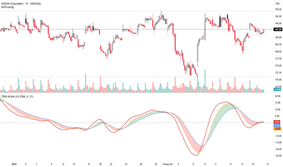
TRIX - ALMA [Bysel]Besel
Below is the complete Handbook: From Code Understanding to Live Trading, specifically designed for the TRIX Advanced (TRIX-ALMA) system that we have just built.
PART 1: DECODING THE TRIX ADVANCED "ENGINE"
To use a weapon, you must understand its structure. Unlike RSI or MACD, TRIX measures the momentum of momentum (the Rate of Change of a triple-smoothed moving average).
According to your code logic:
Absolute Noise Filtering (Triple Smoothing):
Take the logarithm of price → Smooth 1st time → 2nd time → 3rd time.
Since using the shared function f_ma, if you select ALMA, this becomes Triple ALMA. This removes 99% of market noise (lag spikes).
Velocity Measurement (TRIX Main - Red Line):
ta.change(smooth3) is essentially acceleration. When the Red line slopes upward, price is not only increasing, but the upward momentum is strengthening.
Acceleration Measurement (Signal Cloud):
By creating two lines Fast (Orange) and Slow (Blue) and filling the cloud, it tells us:
“Has this increase/decrease reached saturation, or is it just beginning?”
PART 2: PRACTICAL PARAMETER CONFIGURATION (SETTINGS)
The Crypto market runs 24/7 and is very noisy, while Stocks tend to have longer trends, and Forex often moves sideways with two-way volatility. You need proper settings for each “battlefield”.
1. Select "Filter Algorithm" (Smoothing Algorithm) – The soul of the system
This is the most valuable part of your code. Choose based on trading style:
ALMA (Arnaud Legoux):
Recommended for Swing Trading (H4, D1).
Gaussian algorithm provides extremely smooth curves, closely tracks price, and filters out wick-based stop-loss hunts in Crypto/Gold.
LSMA (Least Squares):
Recommended for Scalping/Day Trading (M5, M15).
Uses linear regression as the core, near Zero-lag.
Very early signals, but more noise.
HMA (Hull MA):
Fast but smoother than LSMA, very suitable for Forex (EURUSD, GBPUSD).
EMA:
Classic mode. Slower, more stable, suitable for less volatile stock markets.
2. Golden Parameter Sets (Length Settings)
You have 3 parameters: TRIX Length, Fast Signal, Slow Signal.
Setup #1: Day Trading / Scalping (M5 – M15)
Algorithm: LSMA or HMA
TRIX Length: 12 (faster reaction to price)
Fast / Slow: 7 / 14 (capture short waves)
Setup #2: Standard Swing Trading (H1 – H4) – Recommended
Algorithm: ALMA
TRIX Length: 18 (long enough to filter noise)
Fast / Slow: 9 / 21 (optimal Fibonacci ratio for Signal Cloud)
Setup #3: Position Trading / Crypto Trend (D1)
Algorithm: ALMA or SMA
TRIX Length: 21
Fast / Slow: 13 / 34
PART 3: TRADING STRATEGIES (LIVE TRADING)
Your system provides 3 layers of information. Combine them as follows:
Strategy 1: Momentum Cloud Trading (Trend Following)
This is the safest strategy, capturing full trend waves.
BUY Signal:
Signal Cloud changes from Red to Blue (Fast crosses above Slow)
AND the entire cloud is above the Zero Line.
SELL Signal:
Signal Cloud changes from Blue to Red (Fast crosses below Slow)
AND the entire cloud is below the Zero Line.
Execution Note:
Do NOT BUY if the cloud is blue but still deeply below Zero (this is only a pullback in a downtrend).
Strategy 2: TRIX Main Crossover (Breakout Hunting)
The TRIX Main (Red) is the fastest line among the three.
Early Buy Signal (Aggressive Entry):
When price is forming a consolidation base, and TRIX Main (Red) sharply crosses above the entire Signal Cloud (through both Orange and Blue) from below.
This indicates Smart Money inflow.
Place Stop-loss below the breakout candle low.
Strategy 3: TRIX Main Divergence – Peak/Bottom Catching Technique
Since TRIX is triple-smoothed (especially with ALMA), its peaks and troughs are highly reliable and less noisy than RSI.
Bullish Divergence:
Price makes a Lower Low, but TRIX Main makes a Higher Low.
This indicates weakening bearish momentum → Look for BUY.
Bearish Divergence:
Price makes a Higher High, but TRIX Main makes a Lower High or moves sideways.
Upward force is artificial → Look for SELL or Take Profit.
PART 4: RISK MANAGEMENT NOTES
Anti-Sideways (Choppy Market):
When the market moves sideways in a narrow range, the Signal Cloud continuously flips Red/Blue, and TRIX sticks near the Zero Line.
→ Action: Stay out. TRIX is a momentum indicator and works best in trending markets.
Combine with Price Action:
Indicators are the map, candlesticks are the terrain.
A TRIX crossover at a key Support/Resistance level will have a win rate twice as high as a signal occurring mid-cycle.
The TRIX-ALMA system you built has truly reached Institutional Grade standards in terms of mathematical elegance and flexibility. อินดิเคเตอร์
อินดิเคเตอร์
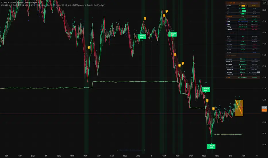
WHF - Wave Health and FailureWHF — Neural Adaptive Wave Health and Failure Engine
This is not an indicator. This is a unified intelligence system. It is a super-system built upon a suite of seven specialized DAFE libraries, designed to analyze the market through the lens of physics, machine learning, and quantitative finance. Its core thesis is revolutionary: Assume every trend is failing until it proves itself healthy.
█ CHAPTER 1: THE PHILOSOPHY - A PARADIGM SHIFT IN TREND ANALYSIS
Traditional trend analysis is a discipline of hope and confirmation bias. We see a series of higher highs and higher lows, and we assume the trend is healthy. We buy the dip, only to see the structure collapse. We are taught to ignore failed moves as "noise." This is a fundamental, costly mistake.
The WHF (Wave Health & Failure) Engine is built on a radically different, institutional-grade philosophy: A trend's failure is not noise; it is a first-class signal. The moments where momentum fails, where volume fails to confirm price, where the underlying structure fractures—these are the most information-rich moments in any market. They are the moments that signal a change of control from one party to another.
This indicator is not a simple "mashup." It is the seamless, hierarchical integration of seven distinct, professional-grade DAFE libraries, each a masterpiece in its own right. It creates a multi-layered, artificially intelligent system that doesn't just measure a trend's existence; it performs a deep, diagnostic health check on every market wave. It quantifies its efficiency, its consistency, its structural integrity, and its underlying institutional support. The result is a system that not only helps you ride healthy, powerful trends but, more importantly, provides you with high-probability reversal signals at the precise moment a trend's health has critically failed.
█ CHAPTER 2: THE UNIFIED FIELD - A DEEP DIVE INTO THE 7 LIBRARIES
The unparalleled power of the WHF Engine comes from the synergy of its seven integrated libraries. Each library acts as a specialized "organ," performing a critical function, with the main indicator acting as the "central nervous system" that synthesizes their intelligence.
1. The Wick Pressure Kernel (wpk): The Physics Engine
This is the system's eyes on the microstructure. The WPK is a physics and machine learning engine that reconstructs the "invisible auction" inside every candle. It analyzes the geometry of wicks versus the body to estimate institutional Delta, calculates the "Kinetic Force" of each bar, and tracks the "Siege Decay" of support and resistance levels. It provides the deep, contextual data on order flow pressure that is essential for a true health assessment.
2. The Neural Pattern Library (pattern): The Recognition Engine
This is the system's pattern recognition brain. It is a self-learning library that doesn't just find patterns; it tracks their outcomes via reinforcement learning. It uses its own Dynamic Volatility Scaling (DVS) to adapt its scanning to the market's character, identifying candlestick, geometric, and market structure patterns, and then scoring them with a "Neural Confidence" based on their recent performance.
3. The Reinforcement Learning Library (ml): The Tactical AI
This is the core tactical decision-making brain. It is a true Reinforcement Learning engine, equipped with advanced algorithms like Actor-Critic and Q-Learning. In the WHF, it is fed a rich state vector of over a dozen market metrics (RSI, ATR, Wave Health, WPK Anomaly Score, etc.) and learns, through trial and error against historical data, to map these complex states to an optimal action (e.g., Strong Long, Neutral, Fade Short).
4. The Strategy Portfolio Library (spa): The Strategic AI
This is the high-level portfolio manager. It takes the signals from different internal "strategies" (e.g., a "Healthy Trend Continuation" strategy, a "Failed Wave Fade" strategy) and runs them in parallel shadow portfolios. It uses Thompson Sampling to dynamically allocate trust to the strategy that is performing best in the current market regime. It is the system's risk manager and strategic overlay.
5. The ML-SPA Bridge Library (bridge): The Synapse
This is the master communication protocol that fuses the tactical ML engine with the strategic SPA engine. The ML proposes a set of actions, the bridge translates them into a portfolio of micro-strategies, and the SPA selects the winner based on performance. The final P&L is then routed back through the bridge as a reward signal to train the ML engine. It creates a hybrid super-system that is more robust than either AI operating alone.
6. The Visuals Library (viz): The Artist
Data without intuition is useless. This library is an AI-powered artist. It takes the final, synthesized data from the WHF engine and renders it using intelligent, context-aware visualization techniques. It's responsible for the health-coded Neural Zigzag, the dynamic glow effects, and the adaptive candle coloring.
7. The Dashboard Library (dafe): The AI Assistant
This is the conversational interface. It takes the final, high-level analysis from the entire system and presents it in a human-readable format. The ASCII art "AI Assistant" provides a summary of the market state, its "mood" based on confidence, and a list of recommended actions, transforming complex quantitative data into clear, actionable intelligence.
█ CHAPTER 3: THE WAVE HEALTH ALGORITHM - THE THREE PILLARS OF A TREND
At its core, the WHF engine calculates a "Wave Health" score from 0 to 100 based on three proprietary pillars:
Relative Efficiency Quotient (REQ): This measures the "bang for the buck" of a price move. It asks: How much directional price progress was achieved relative to the total volume and volatility expended? A trend that grinds higher on massive, overlapping candles is inefficient and unhealthy. A trend that moves cleanly on focused volume is efficient and healthy.
Participation Consistency (PC): This measures the "fuel supply" of a trend. It analyzes the trend of volume and the correlation between price direction and order flow delta. A healthy trend is supported by consistent, confirming participation. A trend where volume is drying up or where delta is diverging from price is starved of fuel and likely to fail.
Structural Extension (SE): This measures the geometric purity of the trend. It uses concepts like "Churn" (high volume, low range) and "Failed Follow-Through" to penalize price action that is choppy, overlapping, and struggling to extend. A healthy trend should make clean, decisive progress.
These three scores are weighted and combined into a single, smoothed "Wave Health" line. A score above 70 is a "HEALTHY" trend. A score between 40 and 70 is "FRAGILE." A score below 40 signals a "FAILED" wave, a high-probability setup for a reversal or "fade" trade.
█ CHAPTER 4: A VISUAL GUIDE - DECODING THE DISPLAYS
THE MAIN CHART OVERLAYS
The Neural Zigzag: This is not a standard zigzag. It is the visual representation of the market's wave structure, with each leg of the wave dynamically colored by its calculated health score: bright green for "Healthy," cautionary orange for "Fragile," and alarming red for "Failed."
The Health Trail: An innovative, dynamic trailing stop line displayed in a separate pane. Its distance from the price is a direct function of the current Wave Health. In a healthy trend, the trail is aggressive and tight. As health deteriorates, the trail automatically loosens, giving the price more room and preventing a premature stop-out.
Health Zones: The entire chart background can be subtly tinted green or red, providing an atmospheric, at-a-glance indication of the current health regime.
Signal Labels: Clear, professional labels appear for "HEALTHY" trend continuation signals and, uniquely, for "FAILED" trend fade (reversal) signals, complete with the system's final confidence score.
THE DASHBOARD & AI ASSISTANT
***Only one dashboard can be active at any given time
The Main Dashboard: Your quantitative command center. It provides a numerical breakdown of the overall Wave Health score and the scores of its three pillars (REQ, PC, SE). It also displays the final, synthesized output from the entire ML-SPA-WPK system, including the final direction, confidence, and recommended action.
The Library Validation Panel: In a commitment to transparency, this special section of the dashboard shows the live connection status of all seven integrated DAFE libraries, confirming that the entire super-system is active and synchronized.
The AI Assistant: This unique panel features a conversational AI (powered by the DafeDashboardLib) that translates the complex quantitative analysis into human-readable insights. It states its "mood" based on system confidence and provides a list of actionable thoughts and recommendations.
█ CHAPTER 5: DEVELOPMENT PHILOSOPHY
The WHF Engine is the culmination of the DAFE philosophy: that the future of trading analysis lies in the intelligent, hierarchical fusion of multiple, specialized expert systems. By unifying our most advanced libraries for machine learning, portfolio management, microstructure analysis, and visualization, we have created a tool that is not just a collection of features, but a cohesive, intelligent entity. It is for the serious trader who understands that the market is a complex, adaptive system and demands a tool that is equally sophisticated.
This system is designed to be a tool for that discipline. By providing an objective, data-driven, and multi-faceted health assessment of every market move, it helps to remove the hope, fear, and guesswork that plagues so many traders, allowing you to act with the cold, calculated confidence of a machine.
█ DISCLAIMER AND BEST PRACTICES
THIS IS AN ADVANCED ANALYTICAL TOOL: This indicator provides a highly sophisticated market analysis, not direct financial advice. It is a decision-support tool.
RISK MANAGEMENT IS PARAMOUNT: All trading involves substantial risk. The AI's decisions are based on statistical probabilities learned from past data.
UNDERSTAND THE CORE THESIS: The most powerful signals from this indicator are often the "Failed" signals. Learning to trade the failure of a weak move is a professional-grade skill that this indicator is specifically designed to teach and enable.
USE THE DASHBOARD: The dashboard is your window into the AI's "mind." Before taking a signal, check the dashboard. Is the overall Wave Health strong? Is the confidence high? Are the underlying libraries all validated and active? Use the full spectrum of data to inform your decisions.
"The key to trading success is emotional discipline. If intelligence were the key, there would be a lot more people making money trading."
— Victor Sperandeo, Market Wizard
Get on my level — Dskyz, Trade with insight. Trade with anticipation. อินดิเคเตอร์

อินดิเคเตอร์

อินดิเคเตอร์

Multi-Timeframe Strength Scanner [JOAT]Multi-Timeframe Strength Scanner
Introduction
The Multi-Timeframe Strength Scanner is an open-source indicator that combines higher timeframe trend analysis with current timeframe momentum indicators to create a comprehensive market strength assessment system. This mashup integrates ADX (Average Directional Index), Donchian Channels, VWAP (Volume Weighted Average Price), RSI divergence detection, and multi-timeframe EMA analysis into a unified scanner that identifies when trend strength aligns across multiple timeframes.
The indicator addresses a critical trading challenge: signals that look strong on one timeframe often fail because higher timeframes are moving in the opposite direction. By analyzing 15-minute, 1-hour, and 4-hour timeframes simultaneously while monitoring current timeframe momentum, this tool helps traders avoid counter-trend trades and identify high-probability setups where multiple timeframes align.
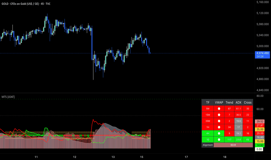
Chart showing multi-timeframe alignment dashboard and strength indicators on 15M timeframe
Why This Mashup Exists
This indicator combines five analytical frameworks that address different aspects of trend strength:
ADX Analysis: Measures trend strength regardless of direction using directional movement
Donchian Channels: Identifies breakouts and trend continuation using price extremes
VWAP: Shows institutional average price and volume-weighted fair value
RSI Divergence: Detects momentum exhaustion at current timeframe swing points
Multi-Timeframe EMAs: Confirms trend direction across 15M, 1H, and 4H timeframes
Each component serves a specific purpose: ADX quantifies trend strength, Donchian Channels identify breakout momentum, VWAP reveals institutional positioning, RSI divergences warn of reversals, and multi-timeframe EMAs ensure directional alignment. Together, they create a strength scanner that filters out weak, counter-trend setups and highlights only those with multi-timeframe confirmation.
The mashup is justified because these components use fundamentally different data (directional movement, price extremes, volume-weighted averages, momentum oscillators, moving averages) that respond to different market conditions. When they align, it indicates genuine trend strength rather than temporary momentum.
Core Components Explained
1. ADX Trend Strength System
ADX (Average Directional Index) measures trend strength on a scale of 0-100:
= ta.dmi(adxLength, adxLength)
// Trend strength classification
strongTrend = adx > adxThreshold // Default: 20
veryStrongTrend = adx > 40
extremeTrend = adx > 60
// Direction determination
bullishTrend = plus > minus
bearishTrend = minus > plus
ADX interpretation:
ADX < 20: Weak trend or ranging market - avoid trend-following strategies
ADX 20-40: Moderate trend strength - standard trend-following viable
ADX 40-60: Strong trend - high-probability trend continuation
ADX > 60: Extreme trend - potential exhaustion or very strong momentum
The indicator plots ADX as a line with color coding:
Green: Strong bullish trend (ADX > 20, +DI > -DI)
Red: Strong bearish trend (ADX > 20, -DI > +DI)
Gray: Weak trend or ranging (ADX < 20)
2. Donchian Channel Breakout System
Donchian Channels track the highest high and lowest low over a specified period:
donchianLength = 20 // Configurable
upperChannel = ta.highest(high, donchianLength)
lowerChannel = ta.lowest(low, donchianLength)
midChannel = (upperChannel + lowerChannel) / 2
Breakout signals:
Bullish Breakout: Close above upper channel = new 20-bar high
Bearish Breakout: Close below lower channel = new 20-bar low
Channel Position: Price near upper channel = bullish strength, near lower = bearish strength
The indicator uses Donchian breakouts to confirm trend strength. When price breaks out of the channel with strong ADX, it signals high-momentum trend continuation.
3. VWAP Analysis
VWAP (Volume Weighted Average Price) calculates the average price weighted by volume:
vwap = ta.vwap(hlc3)
// Position analysis
aboveVWAP = close > vwap // Bullish positioning
belowVWAP = close < vwap // Bearish positioning
// Distance from VWAP
vwapDistance = ((close - vwap) / vwap) * 100
VWAP significance:
Institutional traders use VWAP as benchmark for execution quality
Price above VWAP = buyers in control, institutions paying premium
Price below VWAP = sellers in control, institutions getting discount
Large distance from VWAP = potential mean reversion opportunity
VWAP acts as dynamic support/resistance level
The indicator plots VWAP with dynamic coloring based on price position and uses it for trend confirmation.
4. RSI Divergence Detection
The indicator detects divergences using pivot-based analysis:
rsi = ta.rsi(close, 14)
// Identify swing points
pivotHigh = ta.pivothigh(rsi, 5, 5)
pivotLow = ta.pivotlow(rsi, 5, 5)
// Compare current pivot with previous pivot
bullishDivergence = price makes lower low AND rsi makes higher low
bearishDivergence = price makes higher high AND rsi makes lower high
Divergence types:
Regular Bullish: Price LL, RSI HL - momentum improving, potential reversal up
Regular Bearish: Price HH, RSI LH - momentum deteriorating, potential reversal down
Hidden Bullish: Price HL, RSI LL - trend continuation signal in uptrend
Hidden Bearish: Price LH, RSI HH - trend continuation signal in downtrend
Divergences are marked with "DIV" labels and used to warn of potential trend exhaustion or continuation.
5. Multi-Timeframe EMA Analysis
The indicator analyzes trend direction across three higher timeframes:
// Request higher timeframe data
htf15mEMA = request.security(syminfo.tickerid, "15", ta.ema(close, 21))
htf1hEMA = request.security(syminfo.tickerid, "60", ta.ema(close, 21))
htf4hEMA = request.security(syminfo.tickerid, "240", ta.ema(close, 21))
// Determine trend direction
htf15mBullish = close > htf15mEMA
htf1hBullish = close > htf1hEMA
htf4hBullish = close > htf4hEMA
// Count aligned timeframes
bullishCount = (htf15mBullish ? 1 : 0) + (htf1hBullish ? 1 : 0) + (htf4hBullish ? 1 : 0)
bearishCount = (!htf15mBullish ? 1 : 0) + (!htf1hBullish ? 1 : 0) + (!htf4hBullish ? 1 : 0)
Alignment classification:
STRONG BULL: All 3 timeframes bullish (3/3 alignment)
BULL: 2 out of 3 timeframes bullish
MIXED: Timeframes conflicting (1-1-1 or 2-1 split)
BEAR: 2 out of 3 timeframes bearish
STRONG BEAR: All 3 timeframes bearish (3/3 alignment)
Example showing multi-timeframe alignment dashboard with all three timeframes bullish
Strength Scoring System
The indicator calculates a comprehensive strength score (0-100) by evaluating:
Strength Score Components:
- ADX Strength: Up to 25 points (ADX > 40 = 25, ADX > 20 = 15, ADX < 20 = 0)
- ADX Direction: Up to 15 points (+DI > -DI = 15 for bull, -DI > +DI = 15 for bear)
- Donchian Position: Up to 15 points (breakout = 15, near channel = 10, mid-channel = 5)
- VWAP Position: Up to 15 points (above VWAP = 15 for bull, below = 15 for bear)
- MTF Alignment: Up to 20 points (3/3 = 20, 2/3 = 13, 1/3 = 7)
- RSI Level: Up to 10 points (healthy range = 10, extreme = 5, divergence = -5)
Score interpretation:
80-100: Extremely strong trend - high-probability continuation
60-79: Strong trend - favorable for trend-following
40-59: Moderate trend - selective trend trades
20-39: Weak trend - caution, potential reversal
0-19: Very weak or counter-trend - avoid trend-following
The dashboard displays the strength score with color coding and individual component breakdown.
Visual Elements
ADX Line: Main trend strength indicator with dynamic coloring
+DI/-DI Lines: Directional movement indicators
ADX Threshold: Horizontal line at 20 (configurable)
Donchian Channels: Upper, middle, and lower channel lines
VWAP Line: Volume-weighted average price with dynamic coloring
Divergence Labels: "DIV" markers at RSI divergence points
Strength Bars: Background coloring based on strength score
Dashboard: Comprehensive table showing:
- Current strength score
- ADX value and direction
- Donchian position
- VWAP position
- MTF alignment (15M, 1H, 4H status)
- RSI level
- Overall trend classification
Chart showing strength dashboard with component breakdown and visual indicators
How Components Work Together
The mashup creates a layered strength analysis:
Layer 1 - Trend Strength: ADX quantifies how strong the trend is
Layer 2 - Breakout Momentum: Donchian Channels identify momentum surges
Layer 3 - Institutional Positioning: VWAP shows where smart money is positioned
Layer 4 - Momentum Health: RSI divergences warn of exhaustion
Layer 5 - Multi-Timeframe Confirmation: HTF EMAs ensure directional alignment
Layer 6 - Synthesis: Strength score combines all factors into actionable metric
Example scenario: ADX is 45 (Layer 1), price breaks above Donchian upper channel (Layer 2), trading above VWAP (Layer 3), no RSI divergence (Layer 4), and all three higher timeframes are bullish (Layer 5). The strength score reaches 90 (Layer 6), signaling extremely strong bullish trend with high continuation probability.
Input Parameters
ADX Settings:
ADX Length: Period for ADX calculation (default: 14)
ADX Threshold: Minimum ADX for strong trend (default: 20)
Show +DI/-DI: Toggle directional indicators (default: enabled)
Donchian Settings:
Donchian Length: Period for channel calculation (default: 20)
Show Channels: Toggle channel display (default: enabled)
Breakout Sensitivity: Threshold for breakout signals (default: close beyond channel)
VWAP Settings:
Show VWAP: Toggle VWAP line (default: enabled)
VWAP Reset: Session, Week, Month, or Never (default: Daily)
Distance Alert: Alert when price moves X% from VWAP (default: 2%)
RSI Settings:
RSI Length: Period for RSI calculation (default: 14)
Show Divergences: Toggle divergence markers (default: enabled)
Pivot Lookback: Bars for pivot detection (default: 5)
Multi-Timeframe Settings:
HTF 1: First higher timeframe (default: 15 minutes)
HTF 2: Second higher timeframe (default: 1 hour)
HTF 3: Third higher timeframe (default: 4 hours)
EMA Length: Period for HTF EMAs (default: 21)
Min Alignment: Minimum timeframes aligned for signal (default: 2/3)
Display Options:
Show Dashboard: Toggle strength score table (default: enabled)
Show Strength Bars: Toggle background coloring (default: enabled)
Dashboard Position: Top-right, top-left, bottom-right, bottom-left
Color Theme: Choose between multiple color schemes
How to Use This Indicator
Step 1: Check Multi-Timeframe Alignment
Review the dashboard MTF section. Look for 2/3 or 3/3 alignment in your intended trade direction. Avoid trades when timeframes are mixed or opposing.
Step 2: Verify ADX Strength
Ensure ADX is above 20 (preferably above 30) for trend-following trades. ADX below 20 suggests ranging market where trend strategies underperform.
Step 3: Confirm Donchian Position
Check if price is near or breaking through Donchian channels. Breakouts with strong ADX signal high-momentum moves.
Step 4: Assess VWAP Position
For long trades, prefer price above VWAP. For short trades, prefer price below VWAP. Large distances from VWAP may indicate overextension.
Step 5: Check for Divergences
Look for RSI divergence warnings. If divergence appears with extreme strength score, consider taking profits or tightening stops.
Step 6: Review Strength Score
Use the overall strength score as final filter. Scores above 70 indicate strong trend conditions favorable for trend-following. Scores below 40 suggest caution.
Best Practices
Use on 5-minute to 1-hour timeframes for optimal multi-timeframe analysis
Wait for 2/3 or 3/3 MTF alignment before entering trend trades
Strong ADX (> 30) with MTF alignment produces highest-probability setups
Donchian breakouts with ADX > 25 often lead to sustained moves
VWAP acts as dynamic support/resistance - use for entry refinement
RSI divergences in strong trends often lead to pullbacks, not reversals
Strength score above 80 suggests strong trend continuation potential
Avoid trading when strength score is below 40 unless counter-trend trading
Combine with price action and key levels for precise entries
Indicator Limitations
ADX is lagging indicator - trend strength confirmed after move has started
Donchian breakouts can produce false signals in choppy markets
VWAP resets daily, may not reflect longer-term institutional positioning
Multi-timeframe analysis requires sufficient data history
Strength score is mathematical calculation, not prediction of future movement
Strong trends can reverse suddenly despite high strength scores
Divergences can persist for extended periods in strong trends
Higher timeframe data may repaint on lower timeframes
Requires understanding of trend analysis concepts for effective use
Technical Implementation
Built with Pine Script v6 using:
DMI/ADX calculation with directional indicators
Donchian Channel calculation with breakout detection
VWAP calculation with session reset options
Pivot-based RSI divergence detection
request.security() for multi-timeframe EMA analysis
Comprehensive strength scoring algorithm
Dynamic dashboard with component breakdown
Background coloring based on strength levels
The code is fully open-source and can be modified to adjust timeframes, thresholds, and scoring weights.
Originality Statement
This indicator is original in its multi-timeframe strength integration approach. While individual components (ADX, Donchian Channels, VWAP, RSI divergence, EMAs) are established tools, this mashup is justified because:
It combines trend strength measurement with multi-timeframe directional confirmation
The strength scoring system quantifies trend quality across multiple dimensions
Multi-timeframe analysis prevents counter-trend trades on lower timeframes
Integration of volume-weighted analysis (VWAP) with momentum indicators
Divergence detection provides early warning within trend strength context
Comprehensive dashboard presents complex multi-timeframe data clearly
Each component contributes unique information: ADX measures trend strength, Donchian identifies breakout momentum, VWAP shows institutional positioning, RSI divergences warn of exhaustion, and MTF EMAs ensure alignment. The mashup's value lies in filtering out weak, counter-trend setups and highlighting only those with genuine multi-timeframe strength confirmation.
Disclaimer
This indicator is provided for educational and informational purposes only. It is not financial advice or a recommendation to buy or sell any financial instrument. Trading involves substantial risk of loss and is not suitable for all investors.
Trend strength indicators are lagging tools that confirm trends after they've begun. Strong trends can reverse suddenly, and high strength scores do not guarantee trend continuation. Multi-timeframe analysis does not eliminate the risk of losses.
The strength score is a mathematical calculation based on current market data, not a prediction of future price movement. Past trend strength does not guarantee future performance. Market conditions change, and trends that appear strong can reverse without warning.
Always use proper risk management, including stop losses and position sizing appropriate for your account size and risk tolerance. Never risk more than you can afford to lose. Consider consulting with a qualified financial advisor before making investment decisions.
The author is not responsible for any losses incurred from using this indicator. Users assume full responsibility for all trading decisions made using this tool.
-Made with passion by officialjackofalltrades อินดิเคเตอร์
Elliott Wave Predictor (9-Step Cycle + Full Year Projection)Elliott Wave Predictor (9-Step Cycle + Full Year Projection)
This indicator provides an advanced Elliott Wave structure analysis and projection tool, designed to visualize a complete hypothetical market cycle based on classic Fibonacci ratios. It models a complex 9-step Impulse Wave (1, 2A, 2B, 2C, 3, 4A, 4B, 4C, 5) followed by a post-cycle Correction (A-B-C), giving you a comprehensive roadmap for potential price action over the next ~1 year.
Key Features
🌊 Advanced 9-Step Impulse Cycle
Unlike simple 5-wave counters, this script models the internal sub-waves of corrections for greater precision:
Wave 1: Initial Impulse
Wave 2 (A-B-C): A detailed 3-step correction (ZigZag) targeting specific Fibonacci retracement levels (0.382, 0.50, 0.618).
Wave 3: The major impulse leg targeting the 1.618 extension.
Wave 4 (A-B-C): Another layered 3-step correction, providing realistic paused setups before the final leg.
Wave 5: The final impulse targeting the 2.618 extension.
🔮 Full "Year-Ahead" Projections
The script projects price action 12 steps into the future (Wave 1-5 + Correction A-B-C), visualized as a dotted path extending from the current price. This offers a long-term "what if" scenario based on ideal Elliott Wave structures.
🤖 Smart "Overshoot" Detection
The prediction engine is context-aware. If the live price has already moved past a projected target (e.g., dropped deeper than expected for Wave A), the script automatically:
Detects the overshoot.
Assumes the current move is the completion of that wave.
Instantly recalculates and projects the next leg (e.g., the Wave B bounce) from the current price.
🛠️ Manual & Auto Controls
Auto Trend Detection: Analyzes recent price action (last 6 swings) to determine the dominant trend (Bullish/Bearish).
Manual Overrides: Need to force a specific count? You can manually set the "Last Completed Wave" (e.g., "Just finished Wave 3") to align the projection with your own analysis.
📊 Comprehensive Dashboard
A built-in table displays:
Targets: Exact price levels for every upcoming wave.
% Change: Standardized percent moves to reach each target.
Fib Levels: The Fibonacci logic behind each target (e.g., "0.618 Retrace", "1.618 Ext").
📈 Additional Overlays
50 & 200 WMA: Trend-following moving averages color-coded for instant bias confirmation.
Fibonacci Levels: Dotted horizontal lines showing key support/resistance zones relative to the wave structure.
How to Use
Add to Chart: Works best on Daily (D) or Weekly (W) timeframes for swing trading contexts.
Check Trend: Ensure the "Trend Direction" setting matches your market view (or leave it on "Auto").
Align Count: If the automatic count seems off (e.g., market is clearly in Wave 4 but script says Wave 2), use the "Manual Last Wave" setting to tell the script "I just finished Wave 3". The projection will instantly snap to the correct Wave 4->5 path.
Disclaimer: This tool projects hypothetical geometric paths based on standard Elliott Wave theory. Markets do not always follow theory. Use this for planning and scenario analysis, not as a guaranteed signal.
อินดิเคเตอร์

Price Simplification [LuxAlgo]The Price Simplification indicator provides a streamlined representation of price action by reducing complex market movements into essential trend segments using the Ramer-Douglas-Peucker (RDP) algorithm.
This indicator calculates its output based on a fixed window of historical data. Consequently, the line segments are displayed retrospectively and are subject to repainting as new bars develop and the calculation window shifts.
🔶 USAGE
The indicator is designed to help traders identify the core structure of price movement by filtering out "noise"—small fluctuations that do not significantly impact the overall trend. By simplifying the price into a series of connected segments, it becomes easier to visualize support/resistance levels, trend slopes, and market geometry.
Users can adjust the level of simplification to suit their needs:
A lower ATR Multiplier will result in a line that follows price closely, capturing more minor swings.
A higher ATR Multiplier will produce a more aggressive simplification, highlighting only the most significant market turns.
🔹 Extension Line
The script includes an "Extend Last Segment" feature. When enabled, it projects the trajectory of the final simplified segment into the future using a dashed line. This projection begins one bar after the most recent data point, providing a visual guide for the current price momentum without overlapping the historical simplification.
🔶 DETAILS
The core logic of this tool relies on the Ramer-Douglas-Peucker (RDP) algorithm, a classic algorithm used in computer graphics and cartography to reduce the number of points in a curve.
The algorithm works through an iterative process:
It starts with a line segment connecting the first and last points of the lookback window.
It identifies the point between these two ends that is furthest from the segment (perpendicular distance).
If this maximum distance is greater than a specified threshold, that point is kept as a "key point," and the algorithm splits the segment into two parts, repeating the process for each.
If no point is further than the threshold, all intermediate points are discarded, and the segment remains a straight line.
To ensure the simplification remains consistent across different assets and timeframes, the script normalizes price coordinates using the Average True Range (ATR) . This means the threshold for keeping a point is relative to the current market volatility rather than a fixed price value.
🔶 SETTINGS
Window Size : The number of recent bars used to apply the RDP algorithm to.
ATR Multiplier : The sensitivity of the simplification. Higher values lead to fewer segments and a simpler line.
ATR Length : The period used to calculate the ATR for price normalization.
Line Color : The color of the simplified polyline.
Line Width : The thickness of the polyline and extension.
Extend Last Segment : When enabled, projects the slope of the final segment forward as a dashed line starting one bar after the last point.
อินดิเคเตอร์

อินดิเคเตอร์

อินดิเคเตอร์

MASU+ v7.2 (NW+ELM+BOS)# MASU+ v7.2 — Institutional Multi-Strategy Framework (NW + ELM + BOS)
## Overview
MASU+ v7.2 is an advanced multi-strategy trading system that combines institutional-grade Smart Money Concepts (SMC), machine learning signal filtering, and adaptive risk management into a single unified framework. The strategy is designed for intraday and swing trading across forex, indices, and commodities.
The core philosophy is **high-confluence entries only** — every trade must pass through multiple independent filters before execution, ensuring that only the strongest setups are taken.
---
## Key Components
### 1. Nadaraya-Watson Kernel Ribbon
An 8-line non-parametric regression ribbon built on a Fibonacci bandwidth grid (3, 5, 8, 13, 21, 34, 55, 89). The ribbon acts as a dynamic trend filter with three operating modes:
- **Strict** — all 8 lines must be perfectly ordered
- **Relaxed** — a configurable threshold of ordered pairs (default 6/7)
- **Expansion** — ribbon width is increasing in the trend direction
The bandwidth can operate in **Fixed** or **Adaptive** mode. In Adaptive mode, bandwidth auto-scales based on ATR-normalized volatility, making the ribbon more responsive in volatile conditions and smoother in calm markets.
### 2. ELM Neural Filter (Extreme Learning Machine)
A lightweight online-learning neural network that trains in real time on 7 normalized features:
- RSI, Rate of Change, Distance from EMA 200, ADX, NW Kernel Slope, Ribbon Order Score, and Relative Volume
The ELM predicts price direction over a configurable lookahead window (default: 5 bars) and outputs a probability score (0–1). Key v7.2 improvements include:
- **Weight decay regularization** to prevent parameter drift
- **Real-time accuracy calibration** — the ELM tracks its own prediction accuracy and adjusts its voting weight accordingly. An ELM with <50% accuracy effectively gets silenced.
- The ELM can act as a soft vote (bonus confluence), a hard blocker, or influence position sizing — all configurable.
### 3. Smart Money Concepts (SMC)
Full institutional order flow toolkit:
- **Order Blocks** — bullish/bearish engulfing patterns with body-to-range ratio filtering
- **Fair Value Gaps (FVG)** — imbalance detection with ATR-scaled minimum size
- **Liquidity Sweeps** — stop hunt detection at recent swing highs/lows
- **Break of Structure (BOS)** — pivot-based market structure tracking
- **Demand/Supply Zones** — impulse-based zones that auto-expire when violated
### 4. BOS Immediate Entry (v7.2)
A dedicated scalp-style entry that fires **immediately** when a Break of Structure is detected — no confirmation bars required. Features:
- **TP = 0.75 × ATR** — tight scalp target for quick profit capture
- **Aggressive trailing** — activates at just 0.1 × ATR from entry with a 0.15 × ATR offset
- **Full confluence gate** — BOS entries require the same high confluence score (≥ 7.0) as all other entries, preventing low-quality breakout chasing
### 5. Multi-Timeframe (MTF) Filter
Higher timeframe EMA alignment check (default: 4H). Both fast and slow EMAs on the higher timeframe must agree with the trade direction, and price must be on the correct side of the fast EMA.
### 6. Order Flow Analysis
- **VWAP** with 3 standard deviation bands (±1σ, ±2σ, ±3σ)
- **Cumulative Volume Delta (CVD)** — divergence detection between price and volume delta
- **Volume Profile POC** — Point of Control visualization
---
## Confluence Engine (v7.2)
Every entry — whether trend-following, breakout, mean-reversion, or BOS — must achieve a **minimum weighted confluence score of 7.0** (out of a maximum 7.5 with default weights).
Each filter contributes a configurable weight:
| Filter | Default Weight |
|---|---|
| MTF Alignment | 2.0 |
| NW Ribbon | 1.5 |
| ELM AI | 1.0 (calibration-adjusted) |
| Order Flow | 1.0 |
| Smart Money | 1.0 |
| ADX Trend Strength | 0.5 |
| NW Slope Direction | 0.5 |
| **Total** | **7.5** |
With the default threshold of 7.0, nearly all filters must agree before a trade is placed. This dramatically reduces noise trades and false signals.
---
## Risk Management
### Volatility Regime Adaptation
The strategy classifies the market into 4 regimes and adapts SL/TP accordingly:
| Regime | SL Mult | TP Mult |
|---|---|---|
| High Vol + Trending | 1.5× ATR | 2.5× ATR |
| High Vol + Ranging | 1.2× ATR | 1.8× ATR |
| Low Vol + Trending | 1.5× ATR | 2.5× ATR |
| Low Vol + Ranging | 1.0× ATR | 1.5× ATR |
### Trailing Stop
Configurable trailing stop that activates at 25% of the TP distance (default) with a tight 0.2 × ATR offset. Designed to lock in profits early while giving trades room to breathe.
### Kelly Criterion Sizing
Position size is dynamically calculated using the Kelly formula based on real-time win rate and win/loss ratio, capped at 25% to prevent over-leverage.
### Quality-Based Sizing
Signal confluence score directly affects position size: high-quality setups get full allocation, moderate setups get 80%, and weaker setups get 60%.
### Equity Guard
Automatic circuit breaker that pauses trading after a configurable number of consecutive losses (default: 5) or when drawdown exceeds a threshold (default: 15%). Resumes after a cooldown period to prevent emotional revenge trading.
### Cost-Aware Filter
Estimates total round-trip cost (spread + commission) and blocks entries where ATR is too small relative to trading costs. Prevents churning in low-volatility environments.
---
## Entry Types
1. **Trend Following** — EMA crossover + volume spike + bullish/bearish trend confirmation
2. **Breakout** — New high/low break + volume spike + EMA filter alignment
3. **Mean Reversion** — Bollinger Band extreme + RSI oversold/overbought + ranging regime
4. **BOS Scalp** — Immediate entry on Break of Structure with tight TP and aggressive trailing
All entries require: session filter ✓ | confluence ≥ 7.0 ✓ | R:R check ✓ | cost filter ✓ | equity guard clear ✓ | ELM not blocking ✓
---
## Dashboard
A comprehensive real-time institutional dashboard displays:
- Multi-timeframe trend alignment (15M / 1H / 4H)
- NW Ribbon state and bandwidth scale
- ELM AI probability, accuracy, and confidence weight
- Volatility regime classification
- Order flow and Smart Money signals
- Confluence score with quality rating
- Adapted SL/TP levels with regime multipliers
- Kelly position sizing
- Equity guard status with drawdown tracking
- BOS entry status
- Session detection (London / New York / Asia / Overlap)
- Active demand/supply zone count
---
## What's New in v7.2
- **Confluence threshold raised to 7.0** for all entry types — only the highest-conviction trades are taken
- **BOS immediate entry** — no confirmation bar delay; enters on the breakout candle itself
- **BOS TP = 0.75 × ATR** — tighter scalp target optimized for quick captures with trailing doing the heavy lifting
- **Unified confluence gate** — BOS entries now use the same min_confluence_score as standard entries (no separate hardcoded threshold)
---
## Recommended Settings
- **Timeframe:** 1H (primary), with 4H MTF filter
- **Session:** 09:00–22:00 (covers London + New York)
- **Assets:** Forex majors, Gold (XAUUSD), US indices (NAS100, SPX500)
- **Account:** Works with standard lot sizing; commission and spread inputs should be adjusted to your broker
---
## Disclaimer
This strategy is provided for educational and research purposes. Past performance does not guarantee future results. Always backtest thoroughly and trade with proper risk management. The ELM neural component learns in real time and its accuracy varies across market conditions. กลยุทธ์

อินดิเคเตอร์

กลยุทธ์

อินดิเคเตอร์

[CT] Displacement FVG Toolkit Displacement FVG Toolkit is a complete ICT market-structure and execution toolkit designed to help you identify when price is truly repricing, where that repricing left inefficiencies, and how to frame trades with clear context, confirmation, and invalidation. The indicator brings together six institutional-grade concepts into one workflow, Displacement, Fair Value Gaps, Reload Zones, Dealing Range premium and discount, CISD, and Market Structure breaks, so you can stop reacting to random candles and start trading the sequence that professional order flow tends to follow, impulse, imbalance, retrace, and continuation or reversal.
The Displacement tool is the engine that decides whether a candle represents meaningful participation or ordinary noise. Displacement is measured by comparing the current candle’s size to the average candle size over a user-defined lookback. You can choose whether the script uses the candle body size or the full high-to-low range for this calculation. When the candle exceeds the average by your selected displacement factor, it is flagged as displacement. Displacement is important because it is the clearest visible clue that the market has moved from balanced auction to aggressive repricing, which is the environment where inefficiencies form and where your best retest trades are born. In the photo, the yellow bars represent the displacement bars, and the indicator prints Buy and Sell markers on those displacement events. The user also has full control to color displacement bars to a color of their choice, so whether you prefer bright yellow, muted gray, or any custom brand color, you can set the exact bullish and bearish displacement bar colors in the inputs. If you do not want bar coloring at all, you can simply turn off displacement bar coloring and use only the markers.
The Structure Filter is a powerful addition that prevents displacement from becoming “any big candle.” When enabled, the indicator requires the displacement candle to also break recent structure, meaning price must break above a recent high for bullish displacement or below a recent low for bearish displacement. You can decide whether the structure break is judged by a candle close beyond the prior structure level or by a wick that pierces it. Close-based structure breaks are cleaner and generally reduce false positives, while wick-based breaks are more sensitive and can trigger earlier at the cost of more noise. This filter matters because a large candle in the middle of chop is not the same as a large candle that actually breaks a meaningful swing point, and the indicator gives you a way to enforce that distinction mechanically.
The Fair Value Gap tool identifies the most valuable type of imbalance, the three-candle FVG, but it only plots those gaps when they are created by validated displacement. A bullish FVG forms when the current candle’s low is above the high from two candles ago, showing that price skipped a region without fully transacting through it. A bearish FVG forms when the current candle’s high is below the low from two candles ago. These gaps represent unfinished auction, a fast repricing that often leaves behind an inefficiency the market may later revisit to rebalance. You can choose to extend FVGs to the right for a set number of bars so you can see the levels well into the future, or you can keep them confined to the period when they formed. You can also choose whether mitigated FVGs remain visible or are hidden. Mitigation in this script means price has traded back into the gap far enough to invalidate it as an active inefficiency, and when that happens you can either keep it on the chart as historical context or remove it to keep your chart clean. The script also manages object limits by keeping only a user-defined maximum number of FVGs, trimming older ones as needed so the indicator remains stable.
Reload Zones are derived directly from the FVGs and are built for execution. Instead of treating the entire gap as the same, the indicator highlights the portion of the imbalance that most often functions as the highest-quality retest area for continuation entries. For bullish FVGs, the Reload Zone is drawn as the upper portion of the gap, and for bearish FVGs it is drawn as the lower portion, which keeps your focus on the retest region that is closest to the direction of repricing and typically provides tighter invalidation. The indicator also includes an optional Invalidation line that marks the far edge of the full FVG, giving you a clean and consistent “line in the sand” for risk management. The intended use is straightforward, you wait for displacement to print and create an FVG, you allow price to retrace into the Reload Zone, and you look for rejection behavior that confirms responsive participation, such as wicks into the zone that close back out, sharp reaction candles, or structure holding in the direction of the displacement. When price accepts inside the zone with multiple closes and slow grind, that’s often a sign the inefficiency is being repaired rather than defended, and the reload entry loses quality. Because reload zones are tied to displacement-generated FVGs, they naturally filter out weaker imbalances and focus you on the kind created during true repricing.
The Dealing Range tool provides context by defining a rolling high-to-low range over a user-defined lookback, then splitting that range into premium and discount. The indicator plots DR High, DR Low, and a DR Mid 50% line, and can optionally show PD 62% and PD 38% reference levels inside the range. The fill visually highlights premium above the midpoint and discount below it, which helps you avoid the most common retail mistake, buying in premium and selling in discount without a strong reason. The dealing range is not meant to be a rigid “support and resistance box.” It is meant to help you frame location. In general, long ideas have better location when price is in discount or reclaiming the midpoint with momentum, and short ideas have better location when price is in premium or rejecting the midpoint from below. This becomes especially powerful when combined with your other tools, because a bullish displacement and FVG that forms in discount and then holds the reload zone tends to have much better continuation odds than the same pattern forming at the very top of premium into overhead liquidity.
CISD in this indicator is your liquidity-sweep and directional-shift engine, designed to answer a very specific question, did price just take liquidity and then flip orderflow enough to justify a new directional bias. The script first maps swing liquidity using pivot highs and pivot lows over your selected swing period, then tracks when those levels are wicked or mitigated within an expiry window. When a swing high or swing low is taken, the CISD logic watches for the characteristic shift pattern that follows, and when it qualifies it prints a CISD level and establishes a trend state. The “Noise Filter” setting controls how strict the CISD trigger is, higher values reduce noise and produce fewer but more meaningful CISDs, while lower values produce more signals but may include weaker shifts. The indicator also distinguishes between a normal CISD and a stronger CISD that occurs after opposing liquidity was recently wicked within your liquidity lookback, and those stronger events are marked with the directional ▲/▼ symbols so you can immediately recognize when a sweep-and-shift sequence likely occurred instead of a random flip.
A key feature you asked for, and that this indicator includes, is that CISD levels can extend in a very controlled way so you can keep trading them without guessing where the level “ends.” The current timeframe CISD lines are drawn at the origin level and then the script can extend only the most recent X CISD lines out past the current bar by a user-defined number of bars, without creating gaps or redrawing incorrectly. This means your newest CISD levels remain visually “live” and tradable into the immediate future, while older CISDs automatically restore to their original endpoints and behave normally. This is important for execution because it keeps the focus on the levels that are most likely to matter now, while still preserving history without clutter.
The MTF CISD add-on is what gives you institutional alignment, because it allows a higher timeframe CISD to print onto your execution timeframe. The script computes CISD on the selected HTF using request.security and then draws HTF CISD lines on your chart in real time. You can choose “Confirmed HTF only,” which means the HTF CISD only prints when the higher timeframe candle closes, or you can turn confirmation off to see developing HTF CISDs while the HTF candle is still building. The HTF line style is configurable, and the HTF lines can extend to the right so they behave like real mapped levels. The HTF label is also supported and can be pinned to the right edge with an x-offset, so you always know which timeframe the CISD came from without having to guess. Optional HTF markers can print ▲/▼ on the bar where a new HTF CISD event is detected, which gives you a fast “regime shift” alert that pairs extremely well with your displacement and FVG tools.
CISD also includes a candle coloring option so you can visually trade the bias without constantly reading every label. You can keep candle coloring off, turn on an overlay candle layer using plot candle, or use bar color to recolor the native chart candles. The trend that drives candle color can be the current timeframe CISD trend or, if enabled, the HTF CISD trend so your execution timeframe candles reflect the higher timeframe shift. In the combined script, displacement bar coloring still has priority if you leave it enabled, meaning displacement bars will show your displacement color choice first, and the CISD candle coloring will apply where displacement is not overriding. That’s intentional, because displacement bars are “event bars,” while CISD coloring is “state,” and you want to see both without confusion.
In terms of how to use CISD with the rest of this indicator, the cleanest institutional workflow is to treat CISD as the directional context and trigger, and use displacement, FVG, and Reload Zones as the execution framework. A fresh HTF CISD is your “macro shift” that tells you which side is likely building control, then you wait for displacement on your execution timeframe that agrees with that bias and produces an FVG. The Reload Zone becomes your location for entry on the retrace, BOS/CHOCH tells you if structure is truly transitioning or continuing, and your invalidation stays anchored to the far edge of the FVG or the CISD level depending on which is tighter and more structurally meaningful. When CISD and displacement disagree, that’s usually a “stand down or reduce size” condition unless you’re explicitly trading a reversal, because it often means the market is still in rotation or repairing imbalance rather than trending cleanly.
The BOS and CHOCH tool is the structure confirmation layer. The indicator finds swing highs and swing lows using a pivot-based swing length and then plots structure lines at those pivots. Breaks are detected either by close or by wick, based on your setting. BOS, Break of Structure, signals continuation in the current structural regime, while CHOCH, Change of Character, signals a likely regime change. The indicator uses a simple internal state to differentiate BOS from CHOCH, so you can read structure shifts in real time rather than labeling everything as a generic “break.” You can display structure as lines, labels, or both. The lines extend until price breaks them, then they stop at the break so you can visually see exactly where the market transitioned. This module is especially useful for keeping you out of the trap of assuming a pullback is a reversal. If you see displacement and FVGs but no structural confirmation, you can reduce size or wait. If you see a CHOCH that aligns with a displacement shift and then price returns to a reload zone, you have a much higher quality reversal framework.
When you put these tools together, the intended trading workflow becomes a complete narrative. First you identify meaningful movement through displacement, and if you use the structure filter you ensure it is not just a large candle but a break in the auction. That displacement then creates an FVG, the inefficiency left behind by repricing. The Reload Zone marks the most tradable retest area of that inefficiency, and the invalidation line gives you a clear risk boundary. The Dealing Range tells you whether you are taking that setup from a favorable location, discount for longs or premium for shorts. BOS and CHOCH provide the final confirmation layer that tells you whether you are trading continuation or a genuine structural shift. This structure keeps you from chasing breakouts, because it naturally trains you to wait for the pullback into the reload zone and to only participate when price proves acceptance and rejection behavior at the level.
This indicator is built to be flexible. You can run it as a clean displacement plus imbalance tool by focusing on displacement, FVGs, and reload zones, or you can turn it into a full context-and-confirmation system by adding dealing range and BOS/CHOCH. If you want a high-signal, low-noise chart, keep the structure break requirement on, use close-based breaks, limit the number of active gaps, and hide mitigated gaps. If you want more sensitivity and earlier signals, use wick-based breaks and allow more gaps to remain visible. The goal is always the same, to help you see when the market is actually repricing, to mark the price areas where that repricing left unfinished business, and to give you a consistent way to execute retests with defined risk and clear structural context. อินดิเคเตอร์

Auction Weighted Support and Resistance [Metrify]This script builds an “auction-weighted” S/R map that’s intentionally closer to a microstructure proxy than a classic “draw pivots → draw lines” approach.
The core idea: treat repeated interactions around the same price as evidence of auction behavior (acceptance vs rejection), then compress that behavior into a small set of ranked horizontal zones per horizon. Instead of outputting dozens of levels, it runs a selection pass to keep only the strongest, spatially distinct levels.
Candidate discovery is pivot-driven, but not used naively. The script collects pivot highs/lows into rolling buffers for three horizons (Micro/Short/Medium) with different pivot lengths and memory caps. Those candidates don’t become “levels” directly; they’re just seeds that get clustered and rescored. Clustering is ATR-normalized (distance measured in ATR multiples), so the same logic doesn’t fall apart when you change symbol volatility or timeframe. Each horizon has its own clustering radius (distATR_micro/short/medium), which makes Micro more granular and Medium more tolerant.
The “weight” you see is not a single metric. It’s a composite score that tries to approximate how meaningful a price is in an auction sense:
Touch count (distinct): interactions are counted only when the candle range gets within a near-band threshold (ATR-normalized), and then gated by minimum bar separation so you don’t get spam from chop printing 20 touches in a row. (this is done with a stride-based loop to avoid blowing runtime on deep lookbacks)
Acceptance: a rolling overlap rate of candle ranges inside the box. It’s exponentially weighted (half-life decay), so recent acceptance matters more, but older acceptance still contributes. If price has been “living” around that level, acceptance rises.
Rejection quality: wick-aware rejection, but range-gated (not close-gated). The scoring looks at whether the candle range overlaps/approaches the level, then measures wick dominance on the rejecting side plus where the close sits inside the bar range.
Age decay: older levels aren’t thrown away automatically, but they get downweighted via an exponential decay term so stale structure doesn’t dominate forever.
Those components get combined by f_weightCompose() into a bounded weight using saturating transforms (so touches don’t scale linearly forever) and a decay factor tied to age. When multiple candidates land in the same cluster, the merge is done with a saturating union on weights (1 - (1-oldW)*(1-wAdd)) rather than simple addition, so weights don’t explode and a level can converge toward 1.0 without becoming meaningless. The cluster center price is updated via a weight-based average to prevent random drift from weak additions.
After clustering, we does an explicit selection pass instead of drawing everything. First it filters by minScore, then sorts by weight, then applies a spatial suppression step (basically NMS for horizontal levels). The minimum spacing is ATR-based and incorporates both a horizon spacing floor and the zone thickness, so you don’t end up with two bands that overlap visually or convey the same information. On top of that, there’s a global cross-horizon collision gate (f_canDraw) so Medium zones can coexist with Short/Micro without the chart turning into a layered fog of rectangles.
Visualization is intentionally “zone-first.” Each selected level becomes a box band whose half-thickness is ATR-scaled per horizon (bandThicknessATR_*). Opacity isn’t linear: it normalizes weight above minScore, applies a power curve to compress mid-range values, and also scales relative to the strongest level in that horizon (so you still get contrast when everything is “kind of strong”).
The pressure overlay is not volume-based and not orderflow (pine can’t read L2), but it tries to expose short-term imbalance while price is inside a band. When the last price is inside a zone, it computes a pressure score from two parts: proximity to the center (closer = higher) and a directional imbalance proxy from recent returns sampled only on bars that intersect the band. It then draws two thin lines at the band edges with alpha proportional to that pressure score. This is meant as a “are we being pushed out or absorbed here” hint (not a prediction engine).
If you enable the audit panel, the script builds a table listing the levels that actually got drawn (post-selection + collision filtering). The columns map directly to the internal metrics (weight, touches, acceptance, rejection), so you can sanity-check why a level exists. Level IDs are horizon-prefixed (MC/ST/MD) and assigned based on ranking within each horizon.
note:
rebuild is throttled (rebuildEveryN) and only runs on the last bar. Loops that can go deep use a stride heuristic (1/2/4) to keep runtime predictable on large lookbacks. Arrays are used as bounded buffers for candidate storage, and drawing objects are aggressively deleted/rebuilt to avoid object leaks. อินดิเคเตอร์

Adaptive BSP v6The Adaptive Buying and Selling Pressure (ABSP) indicator is the "engine" of your system. Unlike standard volume oscillators that just look at total quantity, this logic dissects the internal price action of every candle to determine who is actually in control.
1. The Core Calculation (Intra-Bar Delta)
Instead of just looking at the candle color, the ABSP logic calculates pressure based on where the price closes relative to the high and low of the bar:
• Buying Pressure (BP): Measured as the distance from the candle's Low to its Close.
BP = Close - min(Low, Close)
• Selling Pressure (SP): Measured as the distance from the candle's High to its Close.
SP = max(High, Close) - Close
2. The Adaptive Lookback (The "Pulse")
Standard indicators use a "static" period (like 14 or 20). The ABSP is different; it uses the Market Pulse to change its own length:
• It tracks the number of bars since the last significant structural pivot.
• If the market is moving fast with frequent pivots, the lookback shortens (more sensitive).
• If the market is trending smoothly without pivots, the lookback lengthens (more stable).
3. Statistical Normalization (Z-Score)
To make the data readable across different assets (like Crypto vs. Forex), we apply a Z-Score calculation. This measures how many standard deviations the current pressure is away from the mean:
• Neutral: Z = approx 0 (Balanced market).
• High Intensity: Z > 2.0 (Significant buying surge).
• Extreme Exhaustion: Z > 3.0 (Potential blow-off top/bottom).
4. Key Logic Points
Feature | Function | Trading Benefit
=============================
Net Delta | Subtracts SP from BP. | Instant view of which side is winning the tug-of-war.
----------------------------------------------------------------------------
EMA Smoothing | Uses a Series EMA on the raw values. | Filters out "noise" while remaining responsive to price.
----------------------------------------------------------------------------
Divergence Logic | Compares Price Highs to Pressure Highs. | Flags when a trend is losing "gas" before price actually drops.
----------------------------------------------------------------------------
Z-Intensity Filter | Only flags "PRO" signals at extremes. | Ensures you aren't entering during "retail chop."
How it drives the "Fusion" System:
In your current setup, the ABSP acts as the ultimate filter. A "Wave" is just a zig-zag on the chart, but the ABSP tells the script: "This wave is legitimate because the Z-Score is at 2.1 and Buying Pressure is exponentially higher than Selling Pressure."
Would you like me to add a specific "Exhaustion" alert to the ABSP logic that pings you when the Z-Score hits an extreme level (>3.0), even if a new wave hasn't formed yet? อินดิเคเตอร์

อินดิเคเตอร์

อินดิเคเตอร์
อินดิเคเตอร์

อินดิเคเตอร์